If you’re on the lookout for a paint color that brings a sleek, modern vibe to your space, you might want to check out SW 7649 Silverplate by Sherwin Williams. This particular shade is a subtle gray that balances perfectly between being too dark and too light, making it incredibly versatile for any room in your home.
What I love about Silverplate is its ability to blend seamlessly with different decor styles. Whether you have a contemporary living area or a classic kitchen setup, this color can complement your furnishings and enhance the overall aesthetic. It’s gentle on the eyes yet distinctive enough to make a statement.
Another great thing about using Silverplate is its adaptability with natural light. In rooms with plenty of sunlight, it appears brighter and more vibrant, while in less lit areas, it maintains its subtle elegance without turning dull. This characteristic makes Silverplate a reliable choice for large projects or spaces that transition from indoor to outdoor.
So if you’re looking for a paint color that offers sophistication without being overly dramatic, Silverplate could be just what you need. It’s a color that works well across various settings and is sure to give your home a fresh, updated look.
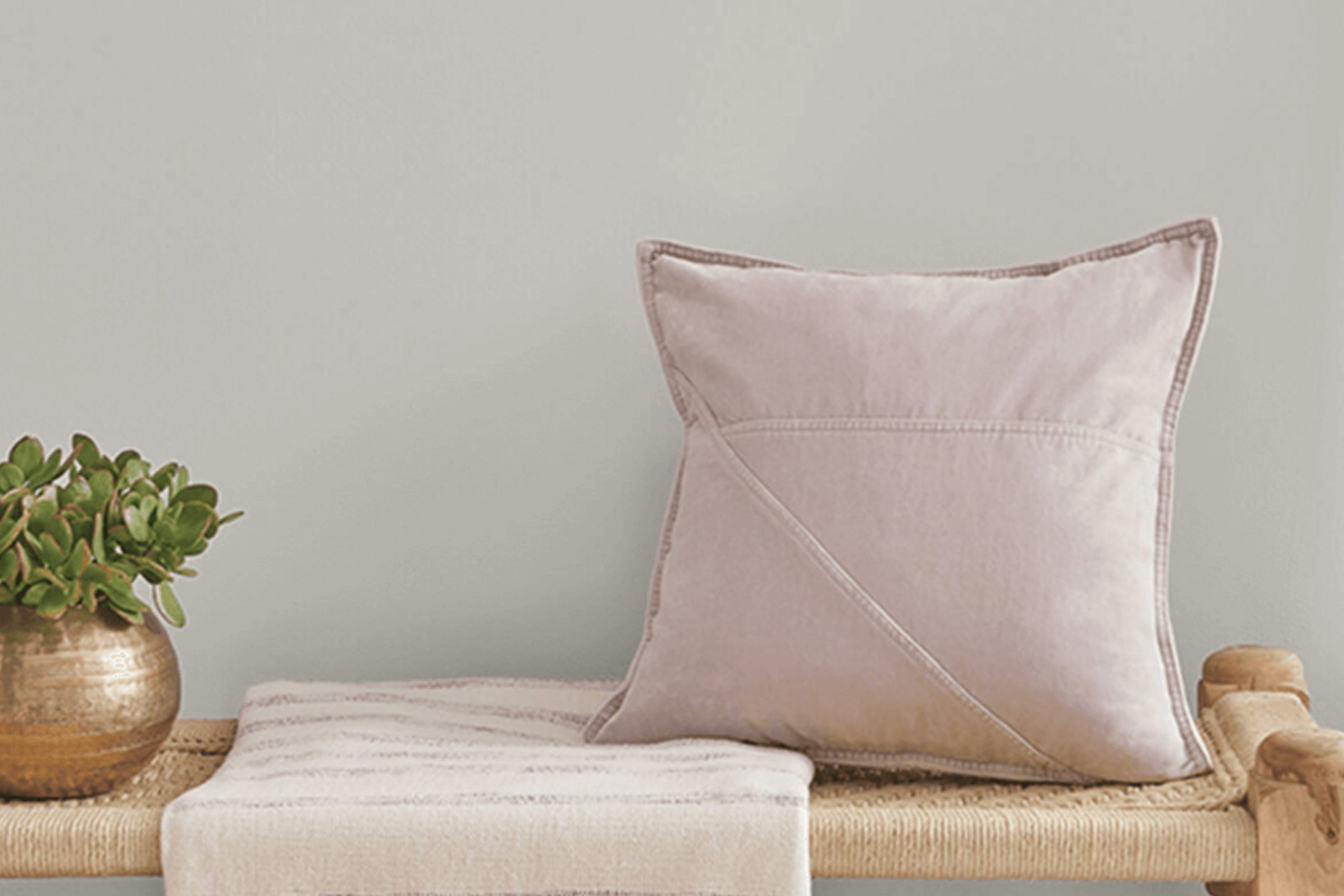
What Color Is Silverplate SW 7649 by Sherwin Williams?
Silverplate by Sherwin-Williams is a subtle shade of gray that boasts a modern and clean vibe, making it an excellent choice for various interior designs. This color has a balanced, neutral tone that provides a fresh backdrop for any room, adapting well to both bright and subdued lighting conditions.
Silverplate is particularly effective in minimalist or contemporary settings where its simplicity can be a foundation for bolder colors or serve as a calming neutral on its own. It is also suitable for industrial themes, as its cool gray mimics the look of metal and stone, complementing exposed brick, polished concrete floors, and metal fixtures perfectly.
When it comes to pairing with materials, Silverplate works beautifully with natural wood, helping to bring out its warm tones. It also matches well with leather, adding a touch of luxury and comfort to spaces. Textiles and fabrics with subtle patterns in similar gray shades can add depth and interest without overwhelming the overall aesthetic.
In terms of textures, Silverplate pairs well with glossy finishes like glass or lacquered furniture, creating a sleek look. It also contrasts nicely with the texture of plush rugs or throws, providing a cozy feel to the living spaces. This versatile shade can definitely help achieve a balanced and inviting interior.

Is Silverplate SW 7649 by Sherwin Williams Warm or Cool color?
Silverplate by Sherwin Williams is a soft, neutral gray paint color that has the knack for blending effortlessly into various home settings. Its subtle charm makes it a popular choice among homeowners looking to achieve a fresh, modern look without overwhelming the space. This specific shade of gray stands out because it balances warmth and coolness, making it versatile enough to use in any room, whether it’s a sunny kitchen or a dimly lit bedroom.
Its lightness helps to make small rooms appear larger and more open, while in larger spaces, it contributes to a cohesive atmosphere. Silverplate is particularly useful for creating a clean and seamless backdrop for both vibrant and muted decor styles. If paired with white trims or furniture, it accentuates the architecture without creating stark contrasts.
Additionally, its calming effect makes it ideal for rooms where relaxation is key, such as bedrooms and bathrooms. Overall, Silverplate is a practical choice that works beautifully to refresh your home environment.
Undertones of Silverplate SW 7649 by Sherwin Williams
SilverplateSW 7649 is a unique paint color that contains a blend of various subtle undertones. These undertones include pale yellow, light purple, light blue, pale pink, mint, lilac, and grey. Each undertone plays a significant role in how the color appears under different lighting conditions and can influence the ambiance of a room.
Undertones are the underlying hues in any color of paint that become more apparent under different light sources or when the paint is placed next to other colors. They can make a color appear warmer or cooler and can either complement or clash with the decor and furnishings within a space.
In the case of Silverplate SW 7649, the presence of undertones like pale yellow and mint give the color a subtle warmth, making it welcoming and soft. Light purple and lilac add a hint of coolness, providing a balanced and versatile backdrop that works well in many interior settings.
When used on interior walls, the complexity of these undertones means that Silverplate SW 7649 can appear differently based on the room’s natural and artificial lighting, as well as the colors of nearby objects. This versatility makes it an excellent choice for those who appreciate a dynamic interior atmosphere.
The grey undertone ensures that the color maintains a neutral base, allowing it to blend seamlessly with various decor styles and color schemes.
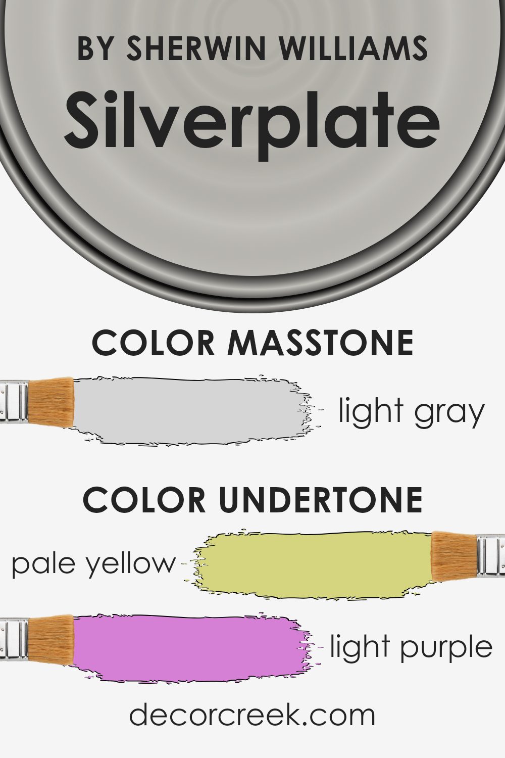
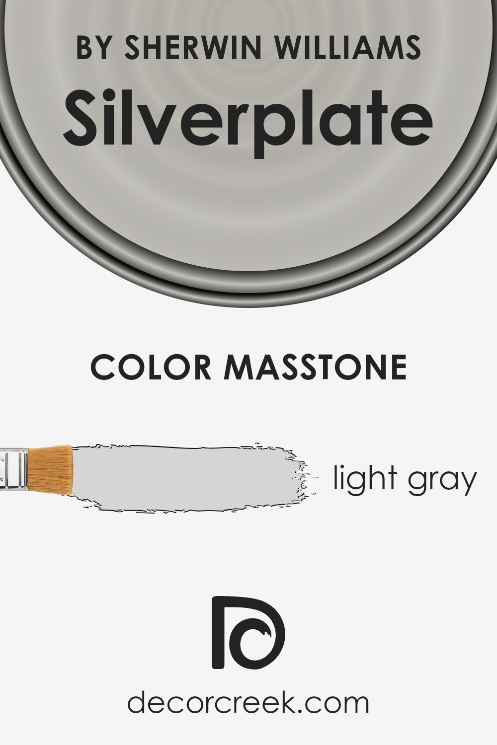
What is the Masstone of the Silverplate SW 7649 by Sherwin Williams?
Silverplate, with its masstone of light gray, provides a calm and gentle backdrop for any room. This hue is versatile, making it perfect for both traditional and modern home styles. Its light gray shade helps small spaces appear bigger and brighter, inviting natural light to reflect beautifully.
This color is especially useful in living rooms or bedrooms where you want a neutral yet inviting atmosphere. Because it doesn’t overpower, Silverplate works well with various colors, from soft pastels to bold tones, allowing for easy decoration changes without needing to repaint.
Additionally, being a light color, it helps hide minor imperfections on walls better than darker shades. This makes it a practical choice for busy homes where walls might get small marks from day-to-day activities. Overall, Silverplate is a go-to for creating a fresh, clean look in any home setting.
How Does Lighting Affect Silverplate SW 7649 by Sherwin Williams?
Lighting plays a crucial role in how we perceive colors in our environments. Different types of light can change the appearance of a color, making it look very different under natural sunlight compared to artificial lighting.
Take the color Silverplate by Sherwin Williams, for example. This is a neutral gray that can appear slightly different depending on the lighting conditions. Under artificial light, such as LED or fluorescent lights, Silverplate may lean towards a cooler tone, bringing out more of its subtle blue or green undertones.
This can make the color appear crisper and more modern, which is great for spaces where you want a clean and fresh look.
In natural light, Silverplate takes on a warmer tone, especially if the light is abundant. Sunlight can soften the color, reducing its starkness and making it feel more welcoming. This quality makes it suitable for living spaces or any area where a softer, more natural appearance is desired.
The orientation of a room also affects how Silverplate looks. In north-facing rooms, which receive less direct sunlight and more indirect, cooler light throughout the day, Silverplate might appear slightly more shadowy and cooler. This can give a calm, understated vibe to the space.
In south-facing rooms, where sunlight is more direct and warmer, Silverplate can look lighter and warmer. This adds a bit of brightness to the room, making it feel more lively and vibrant.
East-facing rooms get bright light in the morning, which can make Silverplate look very lively and vibrant at sunrise, gradually turning softer as the day progresses. Conversely, in west-facing rooms, the color will start off cooler in the morning and grow gradually warmer and more vivid towards the evening as the sunset light comes in.
Overall, the impact of lighting on the color Silverplate demonstrates the variability and versatility of this shade, helping individuals choose the right room and lighting combination to achieve their desired atmosphere.

What is the LRV of Silverplate SW 7649 by Sherwin Williams?
LRV stands for Light Reflectance Value, which is a measure of the amount of light a color reflects when it’s painted on a surface. In simple terms, it tells you how bright or dark a color will look under natural or artificial light. High numbers mean the color reflects more light, making spaces feel more open and airy, while low numbers mean the color absorbs more light, creating a cozier, more enclosed feel.
For Silverplate SW 7649 by Sherwin Williams, with an LRV of 52.595, the color is right in the middle range. This means it strikes a balance between reflecting and absorbing light. In a well-lit room, this color will look lighter and can help the room feel more spacious.
In a room with less light, however, it could appear slightly darker, giving the room a more intimate atmosphere. This versatility makes it a great option for many spaces, adapting well to different lighting conditions.

Coordinating Colors of Silverplate SW 7649 by Sherwin Williams
Coordinating colors are essentially hues that complement each other and are often used together to create a harmonious and visually appealing palette in interior design. These colors are chosen based on their ability to enhance the aesthetic and mood of a space, balancing out tones to achieve a friendly and cohesive look.
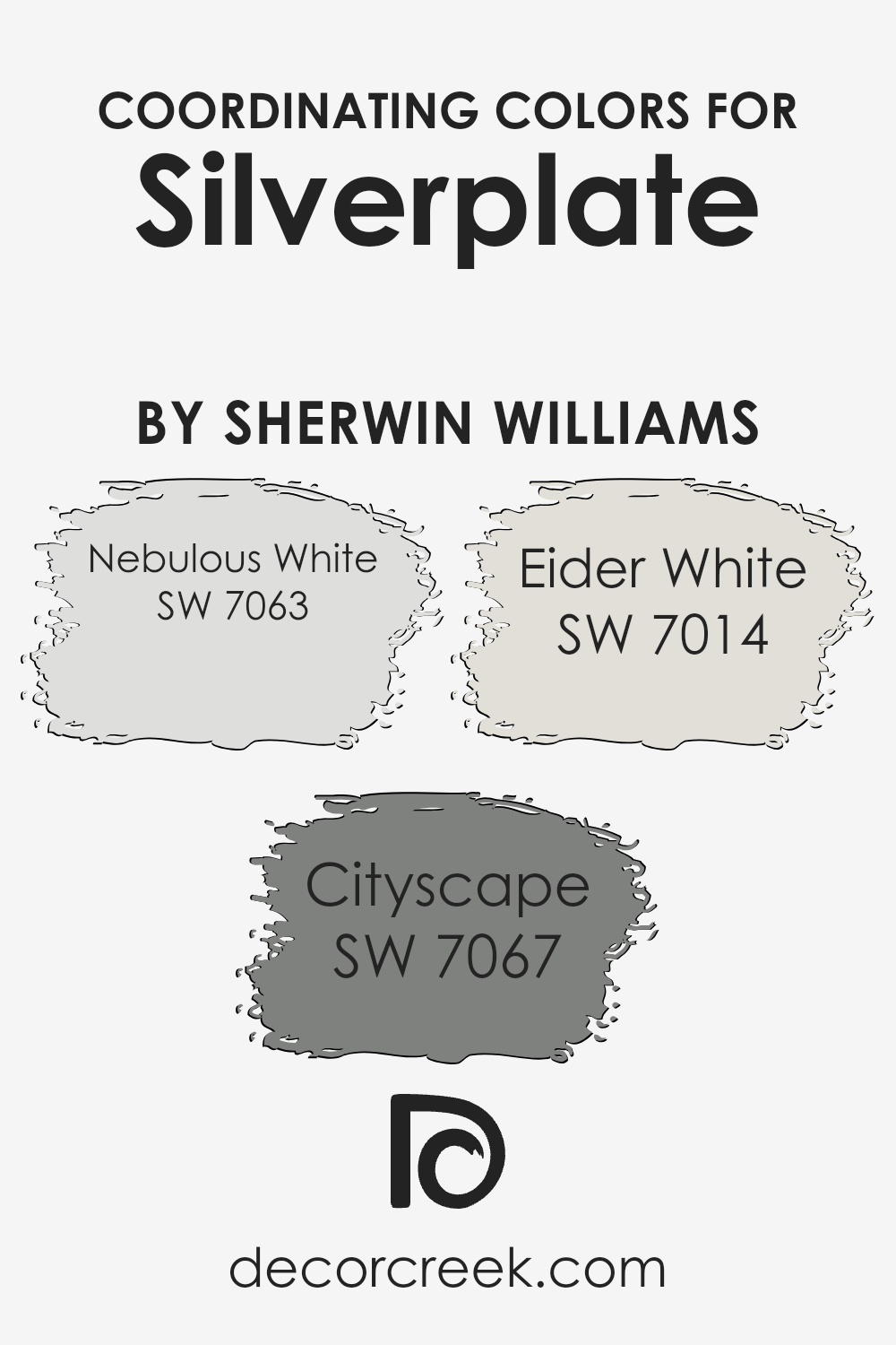
For example, Silverplate by Sherwin Williams, a subtle gray, pairs well with a range of coordinating colors according to the brand’s recommendations.
One of the coordinating colors for Silverplate is Nebulous White, a soft and clean shade that leans towards a very light gray. This color is ideal for creating a sense of openness and light in any room, making it appear more spacious and airy. Another coordinating shade is Cityscape, which presents as a deeper, charcoal-like gray. This color adds depth and a touch of drama without overwhelming a space, making it perfect for accent walls or furniture pieces.
Rounding off the set is Eider White, which despite its name, is a pale gray that provides a subtle contrast to the deeper tones of Silverplate. It works well for trim or ceilings, providing an understated break between wall colors and other architectural elements, ensuring the room feels connected yet distinct.
By using these coordinated colors, the room’s decor can achieve a balanced and modern look that is pleasing to the eye.
You can see recommended paint colors below:
- SW 7063 Nebulous White (CHECK A SAMPLE)
- SW 7067 Cityscape (CHECK A SAMPLE)
- SW 7014 Eider White (CHECK A SAMPLE)
What are the Trim colors of Silverplate SW 7649 by Sherwin Williams?
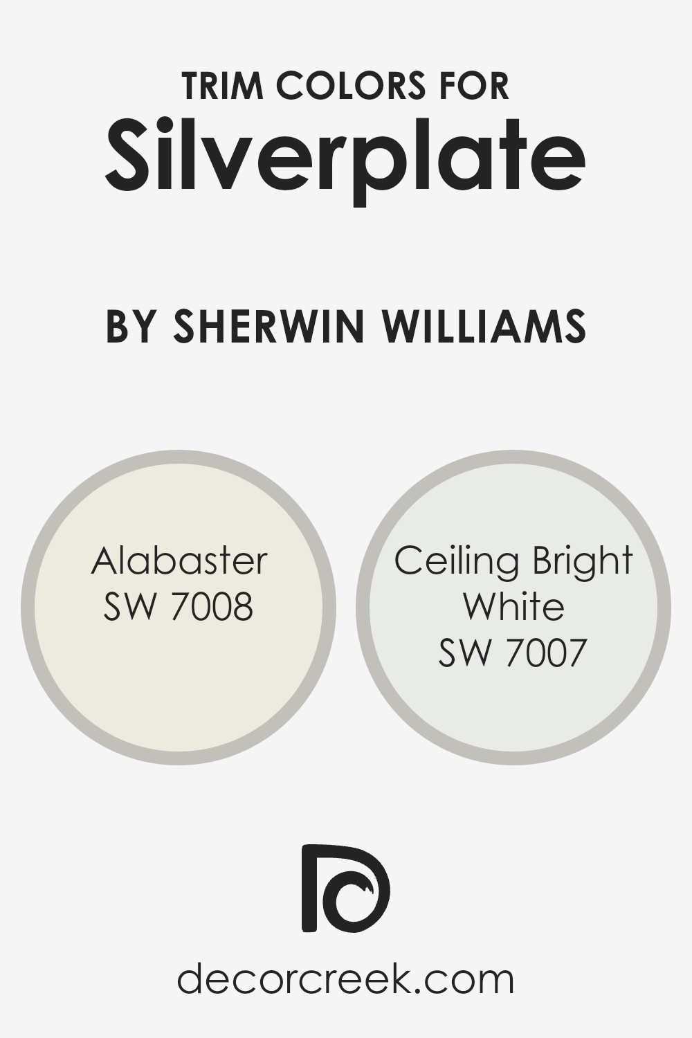
Trim colors are selected to complement or contrast the main color used on walls or surfaces, serving as an aesthetic highlight to features like door frames, skirtings, and window sills. When choosing trim colors for Silverplate SW 7649, a light neutral gray, options like SW 7008-Alabaster and SW 7007-Ceiling Bright White are ideal because they provide a clean, crisp boundary that defines and enhances the visual structure of the room.
SW 7008 – Alabaster is a warm and creamy white that creates a soft contrast with Silverplate, offering a gentle transition from the stronger main wall color which helps in making spaces feel more cohesive and inviting.
SW 7007 – Ceiling Bright White is a very pure, bright white that gives a stark, clear delineation against the cooler tones of Silverplate, which can help to make architectural details pop and give a more defined look to interior spaces. Both colors support the main hue without overwhelming it, ensuring that the design remains balanced and pleasant.
You can see recommended paint colors below:
Colors Similar to Silverplate SW 7649 by Sherwin Williams
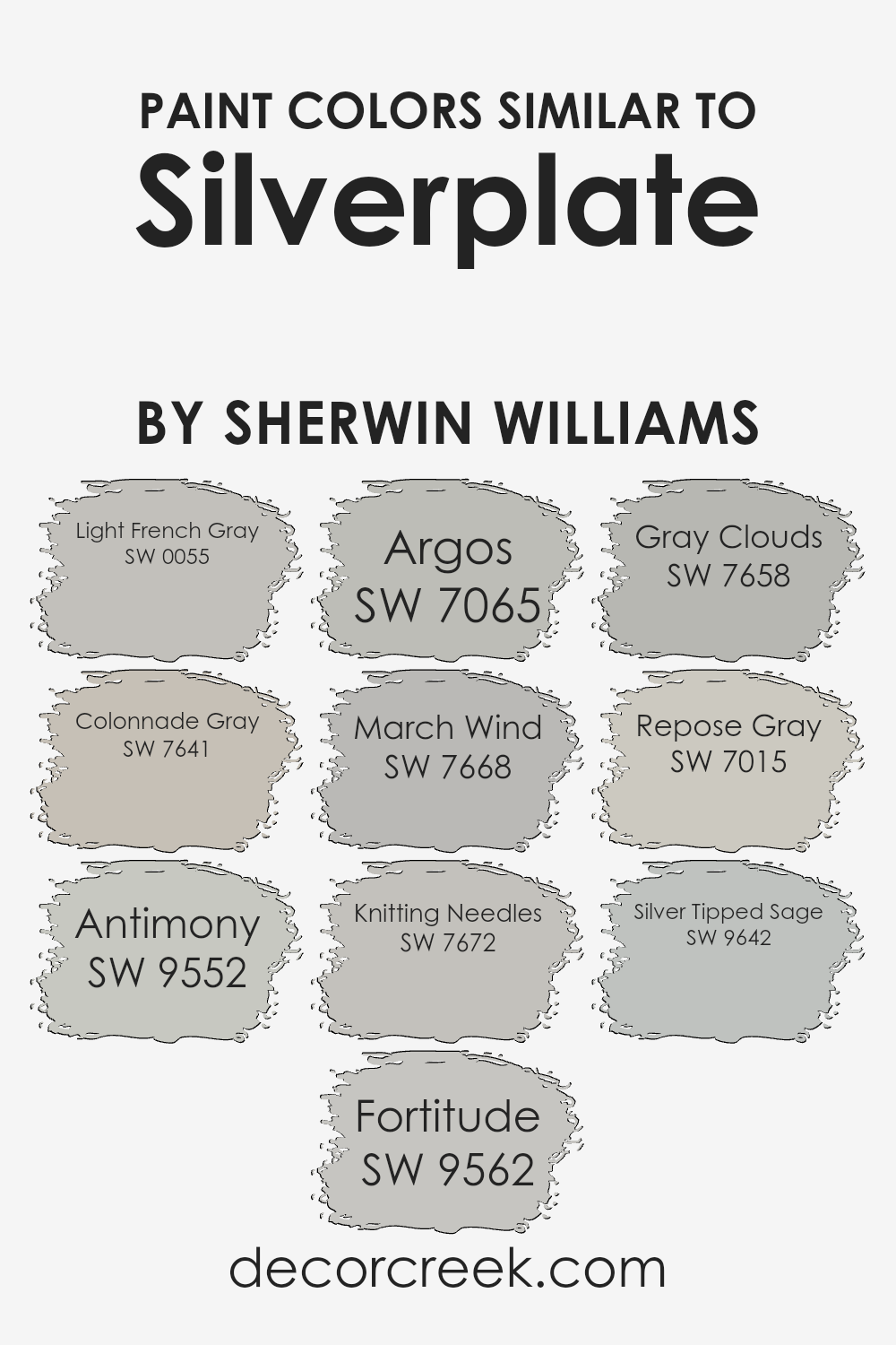
Using similar colors like those associated with Silverplate SW 7649 by Sherwin Williams can greatly enhance the aesthetic appeal of a space by creating a seamless visual flow and unity. Colors like SW 0055 – Light French Gray, SW 7641 – Colonnade Gray, and others in this tonal family can effortlessly harmonize with Silverplate, developing a cohesive color scheme throughout a room or an entire home.
This approach is particularly effective in open floor plans, where adjacent walls and spaces benefit from subtle transitions between shades. Additionally, this color consistency can make smaller spaces appear larger and more open, as the eye moves smoothly from area to area without abrupt color changes interrupting the visual pathway.
For instance, Light French Gray offers a gentle, unobtrusive gray that pairs well with lighter textiles or furniture, while Colonnade Gray steps in with a slightly warmer tone, excellent for spaces that require a hint of coziness. Argos and March Wind provide deeper gray options, suitable for creating accent walls or grounding brighter decor elements.
Colors like Knitting Needles and Gray Clouds, which share a chromatic kinship, work superbly in reflecting natural light, hence making them ideal for rooms with ample sunlight. Repose Gray serves as a neutral base that complements a wide range of colors, enhancing flexibility in decor choices.
Finally, tones like Silver Tipped Sage introduce a subtle hint of color, perfect for spaces that benefit from a touch of uniqueness without overwhelming the senses. By opting for these similar hues, you ensure a polished, visually connected environment that remains stylish and cohesive.
You can see recommended paint colors below:
- SW 0055 Light French Gray (CHECK A SAMPLE)
- SW 7641 Colonnade Gray (CHECK A SAMPLE)
- SW 9552 Antimony (CHECK A SAMPLE)
- SW 9562 Fortitude (CHECK A SAMPLE)
- SW 7065 Argos (CHECK A SAMPLE)
- SW 7668 March Wind (CHECK A SAMPLE)
- SW 7672 Knitting Needles (CHECK A SAMPLE)
- SW 7658 Gray Clouds (CHECK A SAMPLE)
- SW 7015 Repose Gray (CHECK A SAMPLE)
- SW 9642 Silver Tipped Sage (CHECK A SAMPLE)
Colors that Go With Silverplate SW 7649 by Sherwin Williams
Choosing colors to complement Silverplate SW 7649 by Sherwin Williams is crucial because it ensures that the spaces you decorate look harmonious and appealing. Silverplate SW 7649 is a versatile gray that can easily be paired with other shades to create a cohesive and stylish ambiance.
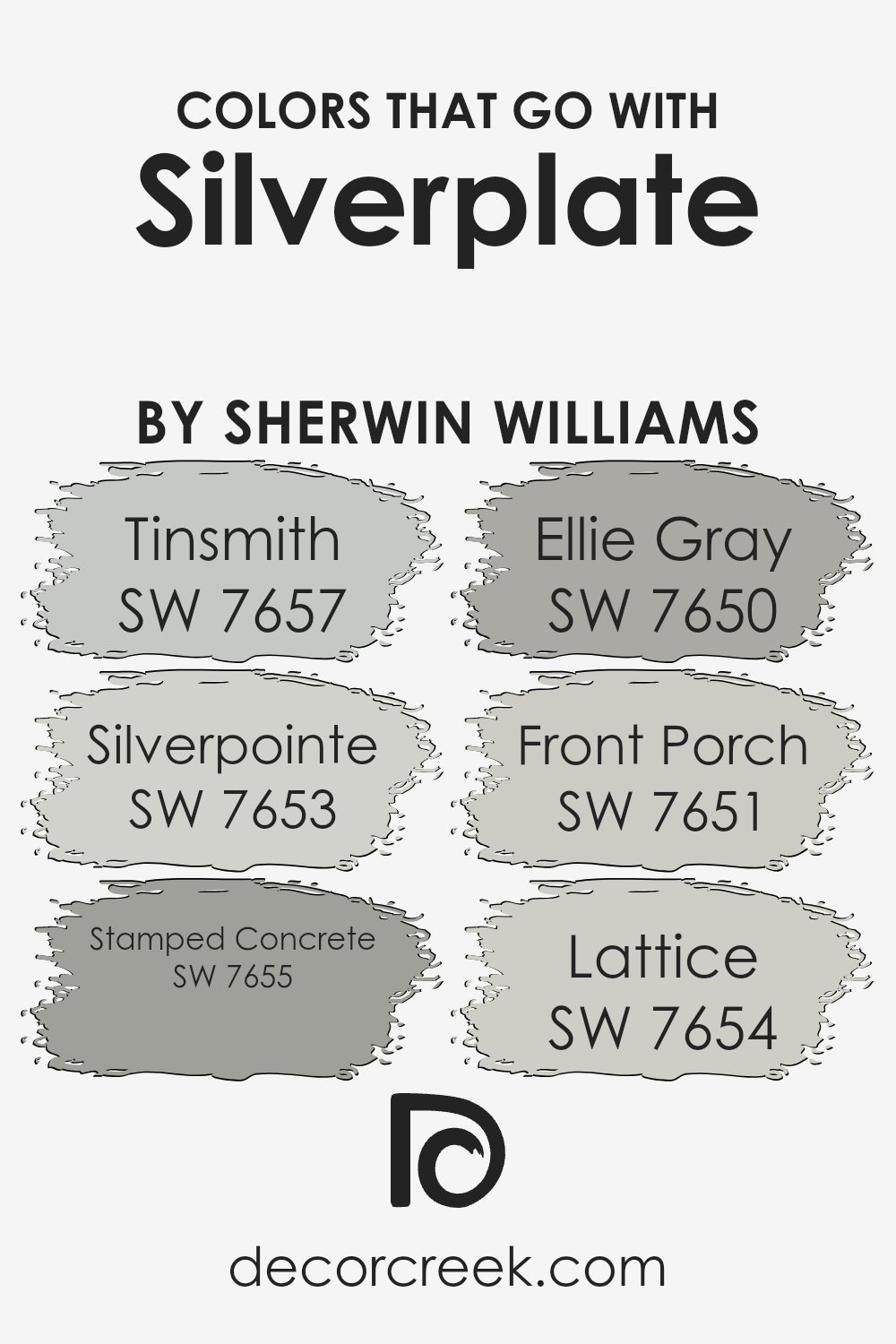
By combining it with colors like SW 7657 – Tinsmith, SW 7653 – Silverpointe, and others, you can achieve a balanced look that works well for any room.
For instance, Tinsmith is a light gray that has a soft touch, making it perfect for creating a subtle contrast with the deeper tones of Silverplate. Silverpointe is another gray, but with a hint of silver, adding a slight variation that can enhance the dimensional feel of a space. Stamped Concrete is a darker gray that adds depth and can be used in areas where you want to draw attention or create a focal point. Ellie Gray offers a smoky shade, which works beautifully for adding a bit of drama without overwhelming the senses.
The color Front Porch is a pale gray with a soothing feel, ideal for spaces where you want a lighter, airier feel. Lastly, Lattice is a unique gray that strikes a nice balance between being distinctive yet gentle enough to support the main color without clashing.
Together, these colors complement Silverplate by creating visually appealing environments that are coherent and aesthetically pleasing.
You can see recommended paint colors below:
- SW 7657 Tinsmith (CHECK A SAMPLE)
- SW 7653 Silverpointe (CHECK A SAMPLE)
- SW 7655 Stamped Concrete (CHECK A SAMPLE)
- SW 7650 Ellie Gray (CHECK A SAMPLE)
- SW 7651 Front Porch (CHECK A SAMPLE)
- SW 7654 Lattice (CHECK A SAMPLE)
How to Use Silverplate SW 7649 by Sherwin Williams In Your Home?
Silverplate by Sherwin Williams is a neutral gray paint color that offers both simplicity and modernity to any room. Its balanced shade makes it a great choice for almost any space in your home. Whether you want to paint your living room, bedroom, or kitchen, Silverplate provides a clean and fresh look that pairs well with many other colors and decor styles.
This color is particularly useful for smaller rooms, as the light gray tone can help make the space appear larger and more open. In a living room, pairing it with vibrant throw pillows or colorful artwork can add just the right amount of pop. For a calming bedroom setup, match it with soft blues or greens in your bedding and curtains.
Silverplate is also excellent for bathrooms and kitchens, where it complements white cabinets and metallic finishes like chrome or stainless steel. It creates a backdrop that’s easy to accessorize and update without a need for frequent repainting. Whether you’re refreshing an old space or decorating a new one, Silverplate is a versatile option that fits easily into any home.
Silverplate SW 7649 by Sherwin Williams vs Silver Tipped Sage SW 9642 by Sherwin Williams
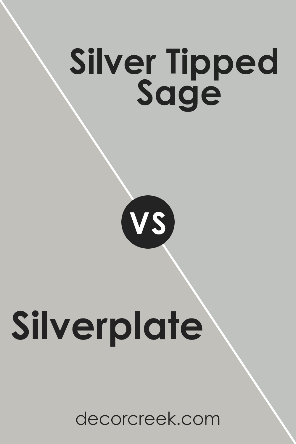
Silverplate by Sherwin Williams is a cool, neutral gray that provides a clean and subtle backdrop, making it easy to pair with various decor styles. It’s versatile enough to use in spaces like kitchens and living rooms, offering a contemporary look without being too bold.
On the other hand, Silver Tipped Sage by Sherwin Williams is a unique color that blends gray with soft green undertones. This combination gives a slightly more distinctive feel, adding a hint of nature and freshness to a room without overwhelming it. It’s ideal for creating a calm, inviting space like a bedroom or bathroom.
While both colors share a gray base, Silver Tipped Sage offers a touch of color that can warm up a room, whereas Silverplate sticks to a pure, straightforward gray palette. Depending on your room’s theme and purpose, you might choose Silverplate for a more modern feel or Silver Tipped Sage for a gentle, soothing vibe.
You can see recommended paint color below:
- SW 9642 Silver Tipped Sage (CHECK A SAMPLE)
Silverplate SW 7649 by Sherwin Williams vs Colonnade Gray SW 7641 by Sherwin Williams
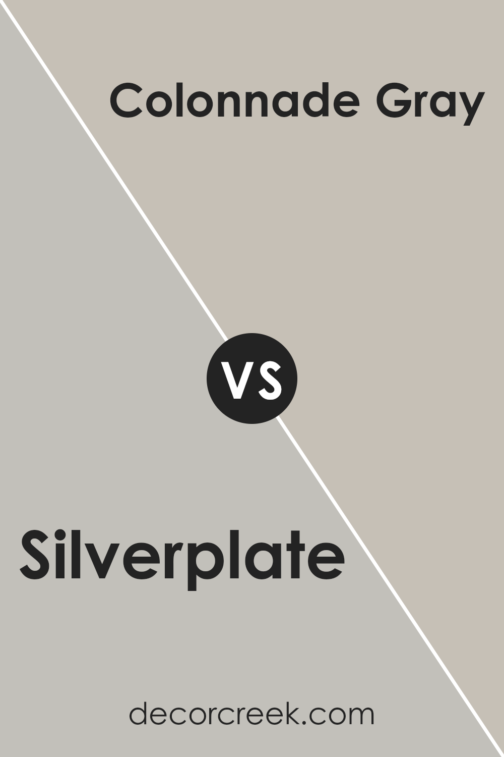
Silverplate and Colonnade Gray, both by Sherwin Williams, are distinct yet harmonious shades of gray. Silverplate presents as a lighter, almost silvery gray that can bring a more open and airy feel to a room. It reflects light well, making it suitable for spaces that you want to keep bright and welcoming.
On the other hand, Colonnade Gray is a deeper tone, offering a warmer and more grounding energy. It’s a versatile color that pairs well with a wide range of decor, providing a cozy atmosphere in both well-lit and darker rooms.
When choosing between these two, consider the mood you want to set. Silverplate might be better suited for a modern, minimalistic look, while Colonnade Gray could work wonderfully in a more traditional or relaxed setting._due to its slightly warmer undertones. Both colors are neutral, making them easy to integrate into various interior styles without overpowering existing design elements.
You can see recommended paint color below:
Silverplate SW 7649 by Sherwin Williams vs Knitting Needles SW 7672 by Sherwin Williams
Silverplate and Knitting Needles by Sherwin Williams are both trendy shades of gray, but they have distinct differences. Silverplate is a lighter gray that offers a clean and subtle look. It’s neutral enough to use in any space but adds just enough color to keep rooms from feeling bare. This shade works well if you’re aiming for a brighter, more open feeling in your areas.
On the other hand, Knitting Needles is a deeper gray. This color provides a slightly more pronounced presence due to its darker tone. It’s excellent for adding a bit more drama or for grounding a space with its stronger hue. Knitting Needles could be ideal for accent walls or for creating a cozy, inviting atmosphere.
Both colors pair well with a wide range of decor styles and are flexible for different spaces, whether you’re painting a bedroom, living room, or kitchen. They also coordinate well with other colors, allowing for various design possibilities.
You can see recommended paint color below:
- SW 7672 Knitting Needles (CHECK A SAMPLE)

Silverplate SW 7649 by Sherwin Williams vs Repose Gray SW 7015 by Sherwin Williams
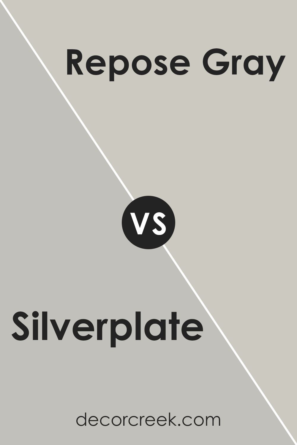
Silverplate and Repose Gray are both popular shades from Sherwin Williams, but they have different tones and vibes. Silverplate is a cooler, light gray that sometimes looks almost silver, giving a clean and modern feel to spaces. It’s great for a sleek, contemporary look.
On the other hand, Repose Gray is a warmer shade of gray. It has undertones of brown and taupe, making it a cozier and more inviting color than Silverplate. This color works well in a variety of settings, adding a touch of warmth to any room without becoming too dark.
Whether you choose Silverplate for its crisp, fresh appeal or Repose Gray for its cozy warmth, each color offers a unique way to freshen up your space.
You can see recommended paint color below:
Silverplate SW 7649 by Sherwin Williams vs Antimony SW 9552 by Sherwin Williams
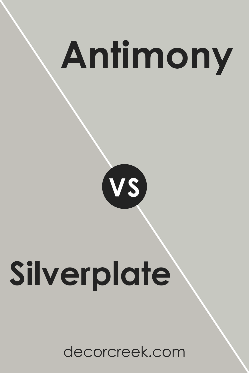
The main color, Silverplate, and the second color, Antimony, both by Sherwin Williams, have distinct tones that set them apart. Silverplate is a soft, light gray that carries a subtle neutral tone, making it versatile for any space. It’s light enough to make small rooms feel bigger while maintaining a cozy vibe in larger areas.
On the other hand, Antimony is darker and closer to a charcoal gray. This depth makes it a great option for creating striking contrasts, especially when used for accent walls or paired with lighter colors.
Whereas Silverplate offers a gentle backdrop, Antimony provides a bolder statement, suitable for modern spaces and design elements focusing on minimalism and contrast. Together, these colors can be used effectively to set different moods in a home, from airy and light to moody and bold.
You can see recommended paint color below:
Silverplate SW 7649 by Sherwin Williams vs Argos SW 7065 by Sherwin Williams
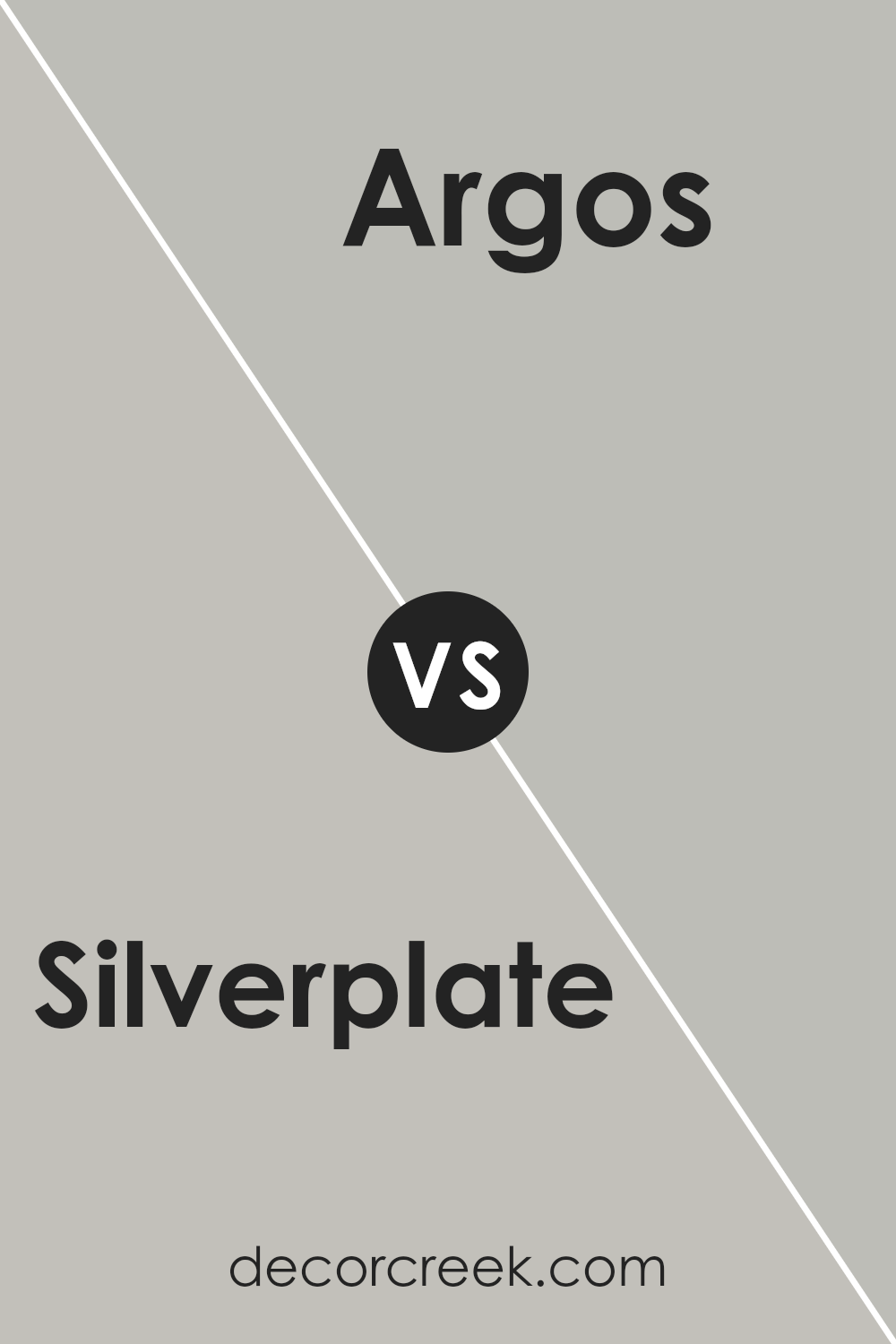
Silverplate and Argos, both by Sherwin Williams, are two shades of gray that have their unique characteristics. Silverplate is a lighter gray that brings a bright and airy feel to a room. It leans towards a neutral, subtle silver, offering a clean and modern look that can make small spaces appear larger.
On the other hand, Argos is a deeper gray with slightly cool undertones. This color is perfect for adding a bit of drama without overwhelming a space. It works well in areas that need a stronger color presence to complement elements like bold furniture or artwork.
While Silverplate provides a gentle backdrop, Argos stands out more, making a statement in a variety of settings. Both colors are versatile and work well in modern interior designs, but your choice depends on the mood and space you want to create.
You can see recommended paint color below:
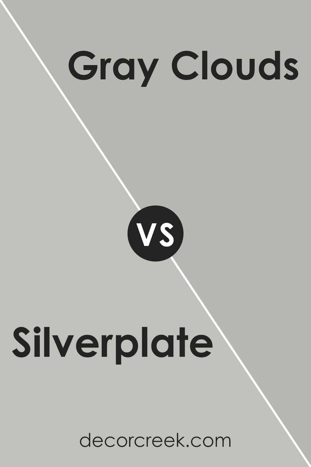
Silverplate SW 7649 by Sherwin Williams vs Gray Clouds SW 7658 by Sherwin Williams
Silverplate and Gray Clouds are two distinct gray shades from Sherwin Williams. Silverplate is a light gray that has a clean and neutral look. It’s versatile, making it suitable for various spaces; it neither darkens a room nor overwhelms with brightness.
In contrast, Gray Clouds is a mid-tone gray. This color is slightly darker, adding a bit more depth to a space compared to Silverplate. While both colors offer a modern feel and can fit well in many designs, Silverplate works best if you’re going for a brighter, airier feel, whereas Gray Clouds suits those looking for a hint of coziness.
Despite their differences, both colors maintain a fresh and tidy appearance, contributing to a peaceful setting. They can also be combined in different areas of a home for a nuanced approach to using grays.
You can see recommended paint color below:
- SW 7658 Gray Clouds (CHECK A SAMPLE)
Silverplate SW 7649 by Sherwin Williams vs Fortitude SW 9562 by Sherwin Williams
Silverplate by Sherwin Williams is a light gray that has a neutral and clean look. It’s quite versatile and can easily fit with various decor styles, making it a good choice for spaces where you want a modern yet unobtrusive backdrop.
On the other hand, Fortitude by Sherwin Williams is a much darker shade. This color is rich and vivid, providing a bold statement in a room. It’s perfect if you want to add drama or a focal point to your space.
In direct comparison, Silverplate is softer and more understated, making rooms feel more open and airy. Fortitude, being a deeper tone, tends to make spaces feel more enclosed but also adds a lot of character and depth to a room’s atmosphere. These two colors could work well together, with Silverplate providing a calm base and Fortitude acting as an accent.
You can see recommended paint color below:
- SW 9562 Fortitude (CHECK A SAMPLE)

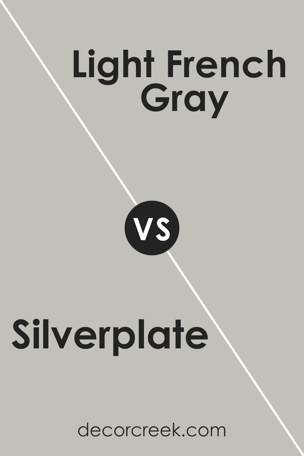
Silverplate SW 7649 by Sherwin Williams vs Light French Gray SW 0055 by Sherwin Williams
Silverplate and Light French Gray, both from Sherwin Williams, offer subtle yet distinct tones for any space. Silverplate is a cooler, more neutral gray that nearly mirrors the sleek look of metal, making it ideal for creating a modern feel. It has a slightly metallic essence without being too bold, which helps in maintaining a soft overall ambiance.
On the other hand, Light French Gray is a warmer shade that leans slightly towards a softer, more traditional gray. This color can make a room feel more inviting and cozy compared to the cooler Silverplate. It works well in spaces where a gentle, soothing touch is desired.
Both colors are versatile and can be used in various settings like living rooms, bedrooms, and offices. They serve as excellent backdrops for both bold and muted accent colors. However, the choice between them depends largely on the mood and atmosphere you aim to create: cooler and more modern with Silverplate, or warmer and cozier with Light French Gray.
You can see recommended paint color below:
Silverplate SW 7649 by Sherwin Williams vs March Wind SW 7668 by Sherwin Williams
Silverplate and March Wind, both by Sherwin Williams, are two distinct shades of gray that can create different moods in a room. Silverplate is a light gray that almost seems like a soft, muted silver. This color is excellent for spaces where you want a clean, open feel. It reflects light well, making it a good choice for smaller or darker spaces to help them appear more spacious.
March Wind, on the other hand, is a deeper gray. It offers a more pronounced color presence, making it ideal for adding a bit of drama or grounding in a space. It works particularly well in areas where a bolder statement is desired, without venturing too much into the darkness.
Both colors can work beautifully in modern decor styles. Silverplate is likely better for those who prefer a more gentle, subtle backdrop, while March Wind suits those looking for a stronger, more defined look. They complement each other well when used together in different parts of a home or in a single space to create a layered look.
You can see recommended paint color below:
- SW 7668 March Wind (CHECK A SAMPLE)

Conclusion
In wrapping up, SW 7649 Silverplate by Sherwin Williams is a really cool shade of grey that can make any room look sleek and modern. It’s not too dark or too light, so it’s perfect for making a space feel just right. Imagine it like the color of clouds on a rainy day – calm and soothing.
I’ve learned that this color pairs well with lots of other colors, whether you want to add some bright pops of color or keep things more muted. It’s great because it works in any room, be it the kitchen, living room, or even a bedroom. Plus, it has a timeless feel, so you won’t get tired of it quickly.
Silverplate is also practical because it covers well and lasts a long time, meaning you won’t have to repaint often. This makes it a smart choice if you like a color that’s both stylish and easy to take care of.
So, if you’re thinking of giving your room a new look, SW 7649 Silverplate might be just what you need. It’s flexible, pretty, and just really handy for creating a space you’ll enjoy spending time in. I think it’s a great option for anyone looking to freshen up their home!

Ever wished paint sampling was as easy as sticking a sticker? Guess what? Now it is! Discover Samplize's unique Peel & Stick samples.
Get paint samples


