When you think about the perfect paint color to tie a room together, SW 9521 Simple Stone by Sherwin Williams might just be what you’re looking for. It’s a shade that defines subtle elegance, a blend of soft gray with warm undertones that can instantly make a space feel inviting and harmonious.
I found myself appreciating how this color works beautifully with various design styles, from modern minimalism to rustic charm. It seems to balance perfectly between cool and warm, making it versatile and adaptable to different settings and moods.
As I considered it for my living space, I noticed how Simple Stone harmonized with natural materials like wood and stone, enhancing their raw beauty. It never overpowers; instead, it complements and rounds out the atmosphere of a room.
Light plays wonderfully with this color, reflecting its gentle hue in a way that feels both soothing and stylish.
You’re dealing with a paint color that isn’t just about aesthetics; it’s about creating a sense of calm and comfort. Simple Stone makes a subtle statement without shouting for attention.
If you’re searching for an understated yet impactful color, giving SW 9521 Simple Stone a try could be the perfect choice to bring your vision to life.
What Color Is Simple Stone SW 9521 by Sherwin Williams?
Simple Stone by Sherwin Williams is a subtle, muted gray color with earthy undertones. It is part of the brand’s refined palette, providing a calming and understated backdrop ideal for various interior styles. This color works excellently in minimalist and contemporary interiors, where its clean and neutral characteristics enhance the sleekness and simplicity of the design. It also complements Scandinavian styles, which often emphasize light colors and natural materials.
In terms of materials and textures, Simple Stone pairs well with natural elements like wood and stone. Imagine a room with oak flooring or pine wood furniture, where the muted gray walls harmonize beautifully with the warm, natural tones.
Metallic accents, such as brushed nickel or matte black, also work nicely, adding a modern touch without clashing with its subtle hue.
In spaces like living rooms or bedrooms, combine Simple Stone with soft textiles such as woven throws, linen curtains, and plush rugs.
These elements add warmth and comfort to the space. In kitchens or bathrooms, consider using glossy tiles or matte finishes to contrast with the understated walls, creating a balanced and inviting atmosphere that feels both modern and timeless.
Is Simple Stone SW 9521 by Sherwin Williams Warm or Cool color?
Simple Stone (SW 9521) by Sherwin Williams is a versatile, neutral paint color that effortlessly fits into many home styles. This soft, light gray has a subtle warmth, making it an excellent choice for creating a calm and inviting atmosphere. Its neutral tone allows it to blend seamlessly with various color schemes, whether you’re looking to complement bold hues or pair it with other neutrals for a more consistent look.
In living spaces, Simple Stone works well as a backdrop, allowing furniture and decor to stand out. Its adaptable nature means it’s equally suited for use in bedrooms, kitchens, or bathrooms. It reflects light nicely, helping to brighten up spaces without feeling too stark or cold.
Because of its understated appeal, Simple Stone can make rooms feel more open and airy. It’s an excellent option for anyone looking to refresh their home with a timeless and easy-going color.
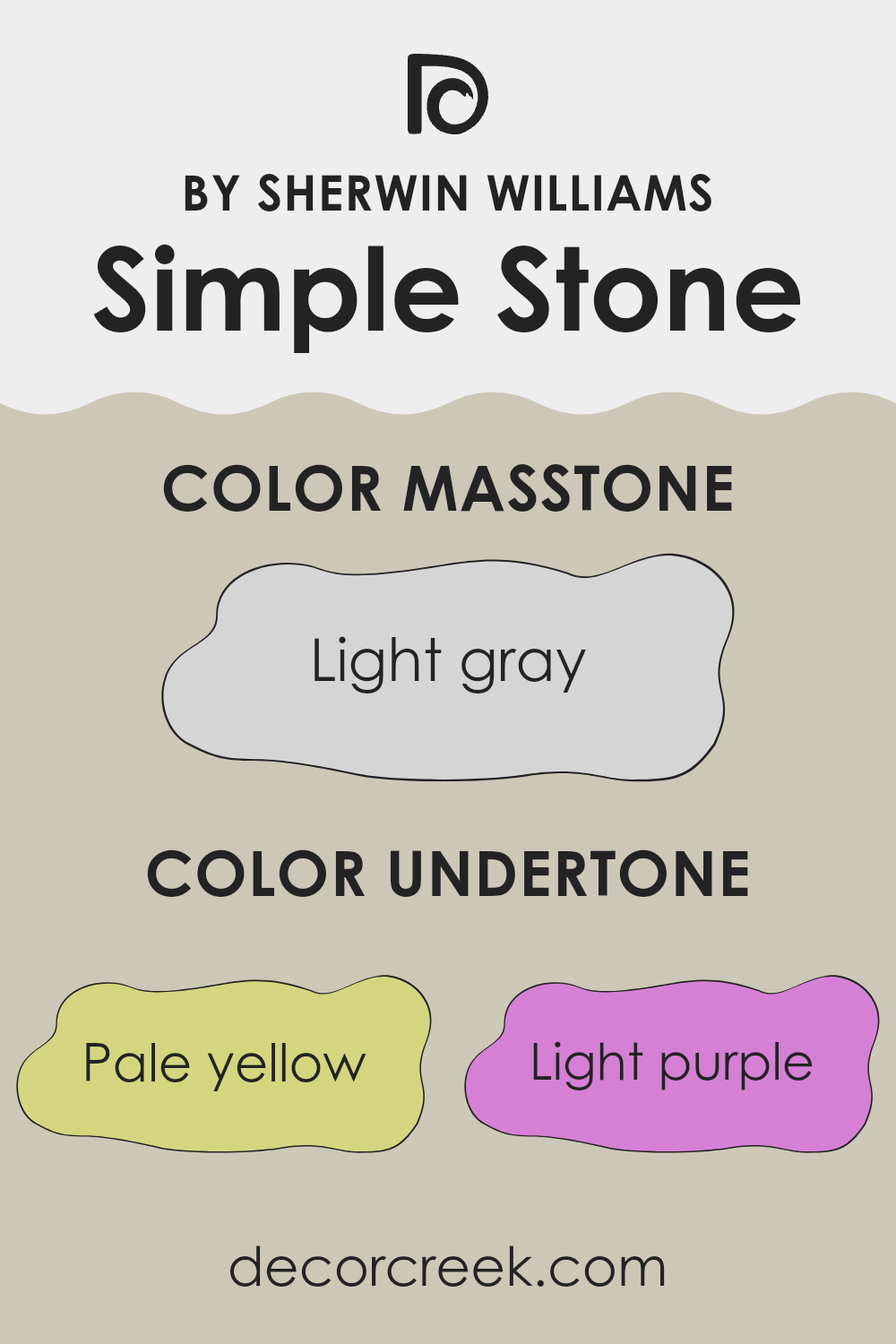
Undertones of Simple Stone SW 9521 by Sherwin Williams
Simple Stone by Sherwin Williams is a complex color with multiple undertones that influence how we perceive it on interior walls. The undertones of pale yellow, light purple, light blue, pale pink, mint, lilac, and grey combine to give this color a unique character.
Undertones are the underlying hues that can be seen when the main color is viewed in different lighting or paired with other colors. They play a crucial role in how a paint color looks in various settings. For instance, a light purple undertone might add coolness, while a pale yellow undertone could bring warmth.
In the case of Simple Stone, the pale yellow undertone adds a subtle warmth to the color, making it feel cozy and welcoming. Light purple and lilac undertones introduce a gentle coolness, which balances the warmth and keeps the color from feeling too yellow.
The mint and pale pink undertones provide a fresh and soft vibe, adding depth to the color. Finally, the grey undertone helps ground the color, giving it a neutral base.
When applied to interior walls, these undertones can make Simple Stone appear light and airy in some lights, while feeling more muted and soft in others. The room’s brightness and surrounding colors greatly affect its appearance, but overall, the mix of undertones creates a versatile and comfortable ambiance.
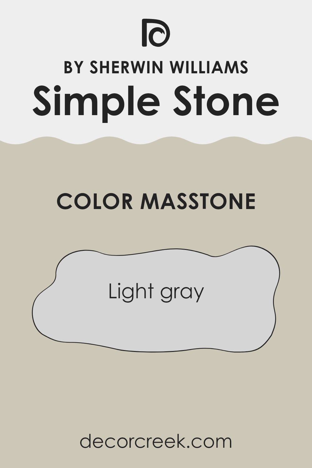
What is the Masstone of the Simple Stone SW 9521 by Sherwin Williams?
Simple Stone (SW 9521) by Sherwin Williams is a light gray color that easily adapts to various home settings. With its soft gray tone, it provides a neutral backdrop that enhances other decor elements without being overwhelming. This subtle shade of gray works well in any room, offering a clean and modern look.
When used on walls, Simple Stone creates an open and airy feeling, making spaces look bigger and brighter. It pairs well with both warm and cool colors, allowing homeowners to mix different styles and finishes.
Because of its neutrality, it can match various furnishings and accessories, whether they’re bold or simple.
In living rooms or bedrooms, this color contributes to a calming atmosphere, while in kitchens or bathrooms, it adds a fresh, tidy appearance.
Overall, Simple Stone is a versatile choice that blends well, offering a timeless look that’s easy to live with and suits different design preferences.
How Does Lighting Affect Simple Stone SW 9521 by Sherwin Williams?
Lighting plays a big role in how we perceive colors. The color you see in paint can look quite different depending on the type and direction of light in a room. Let’s look at how the color Simple Stone SW 9521 by Sherwin Williams changes in various lighting conditions.
In artificial light, especially under incandescent bulbs, Simple Stone may appear warmer. Incandescent lighting tends to add a yellow or soft orange tint, thus intensifying any warmer undertones the color might have. Under fluorescent lighting, which has a cooler, bluish tint, Simple Stone may look slightly cooler or more subdued.
Natural lighting changes throughout the day and affects how colors look. In north-facing rooms, where the light is cooler and indirect, Simple Stone can appear more muted and grayer. North-facing windows do not receive direct sunlight, often enhancing the cooler tones in paint colors.
In south-facing rooms, where there is an abundance of warm light throughout the day, Simple Stone can appear lighter and sometimes softer. The direct light can bring out any warmer tones in the paint, making it feel cozier and more inviting.
East-facing rooms receive natural light primarily in the morning, and this light can be bright and direct. Simple Stone in east-facing rooms may look fresh and vibrant during the morning but might take on a more neutral tone as the sun shifts away in the afternoon.
West-facing rooms have the opposite light pattern. They start with cooler light in the morning and gain warmth as the sun sets. This can make Simple Stone look cooler early in the day and much warmer and richer in the late afternoon and evening.
Understanding these lighting effects can help you better anticipate how Simple Stone will look at different times and in different spaces of your home.
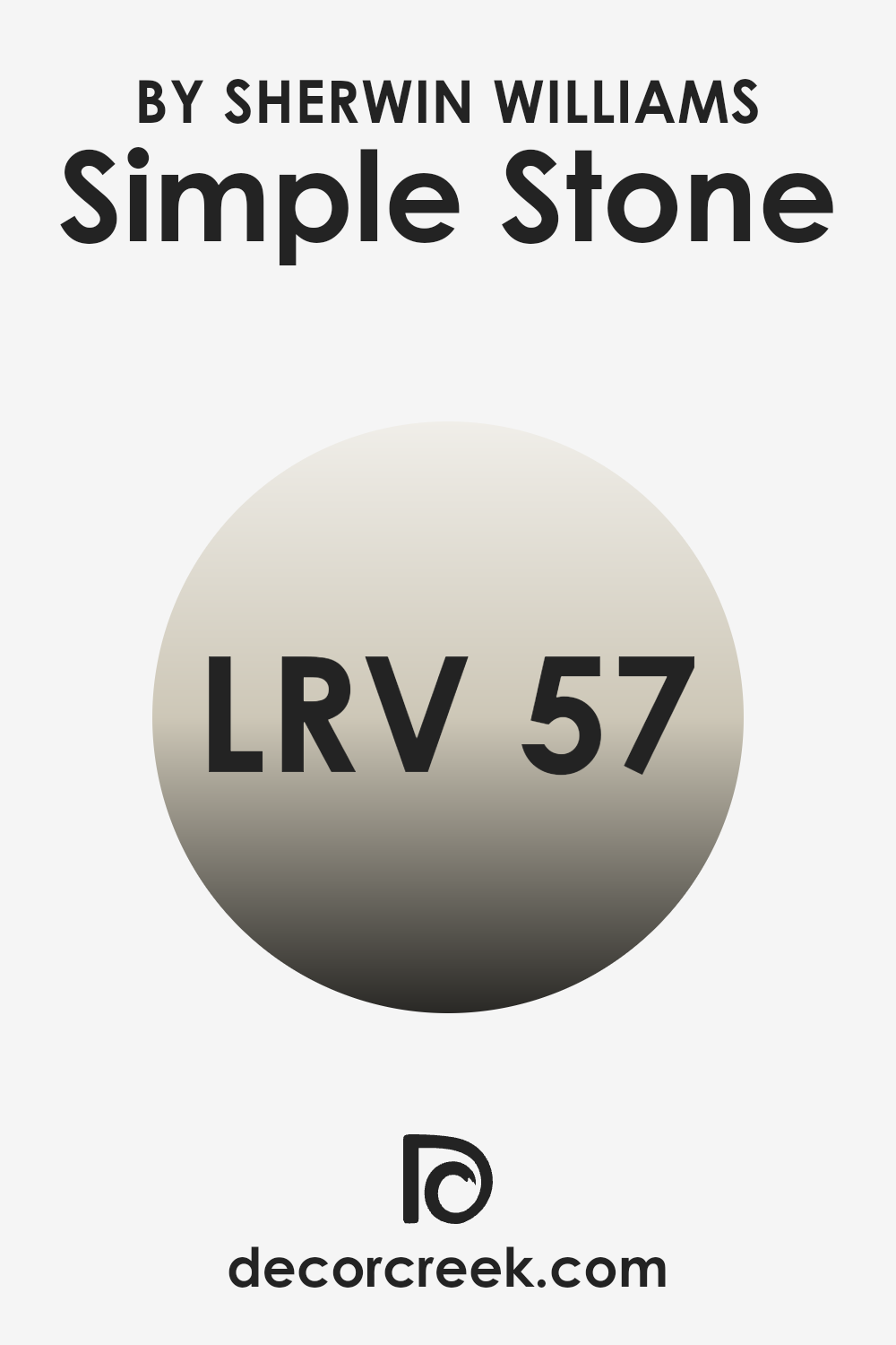
What is the LRV of Simple Stone SW 9521 by Sherwin Williams?
LRV, or Light Reflectance Value, is a measure of how much light a color reflects off a surface, such as a wall. The scale goes from 0, which means the color absorbs all light and reflects none, to 100, where the color reflects all light and absorbs none.
Simply put, LRV tells us how light or dark a color will appear. A low LRV means a color will look darker because it absorbs more light, whereas a high LRV means a color will look lighter due to reflecting more light.
This is important when choosing paint colors, especially for interior spaces, because the LRV can impact how the room looks in different lighting conditions.
Simple Stone by Sherwin Williams has an LRV of 57.343, which places it in the mid-range of the scale. This means it will reflect a moderate amount of light.
The color won’t make the walls feel overly dark or too bright. With its balanced LRV, Simple Stone can help create a comfortable and cozy atmosphere, making it versatile for different rooms and lighting conditions. It will retain enough brightness to open up spaces without feeling stark, and it can also complement other colors and materials in the room.
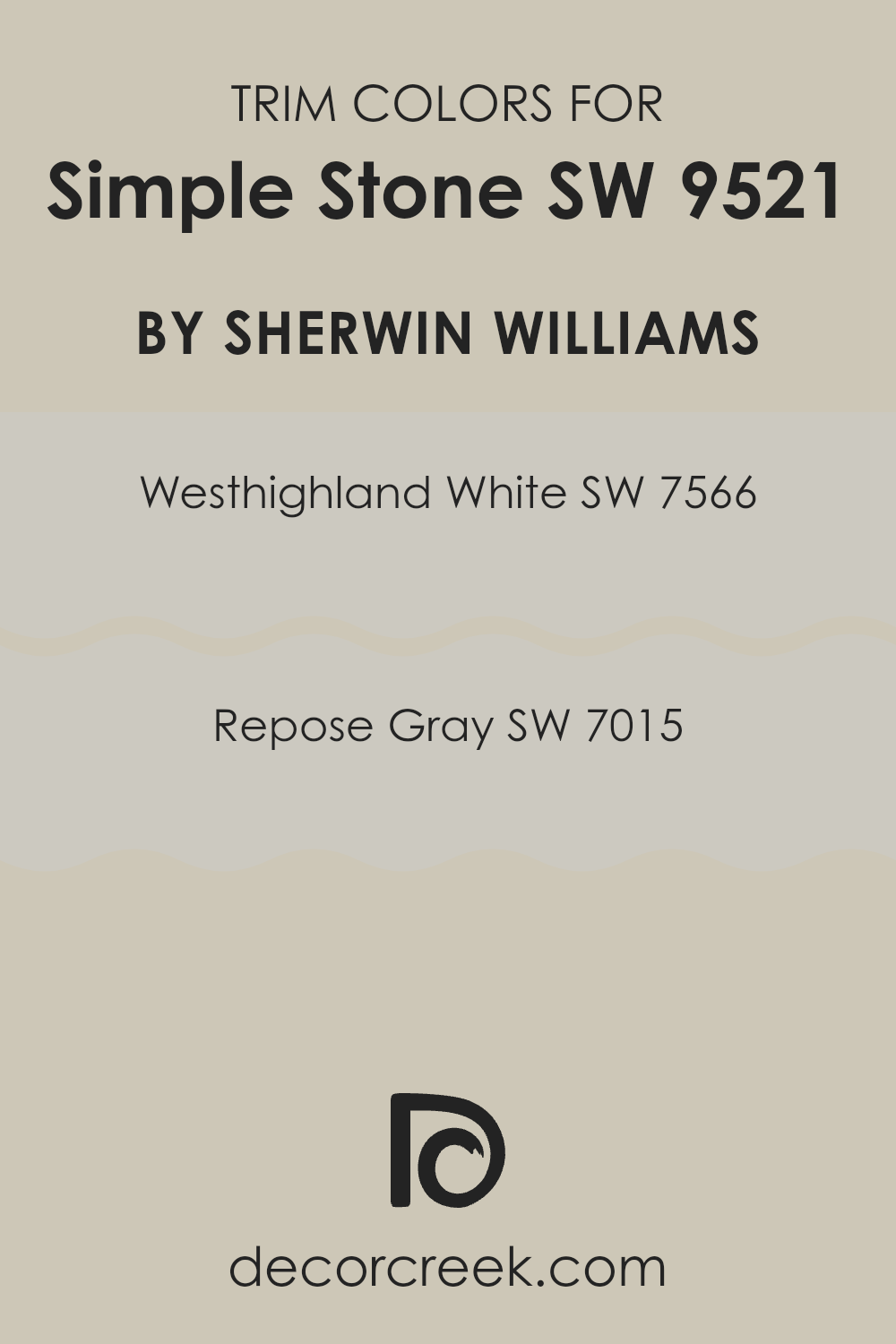
What are the Trim colors of Simple Stone SW 9521 by Sherwin Williams?
Trim colors are the shades used on the edges and borders of walls, doors, windows, and other structural details of a room or building. They play a crucial role in highlighting architectural features, creating contrast, and adding depth to a space.
When choosing trim colors to complement a wall color like Simple Stone, it’s important to pick shades that either blend seamlessly or offer a pleasing contrast.
Westhighland White and Repose Gray are excellent choices for such purposes. These trim colors can either subtly define a space or add a touch of distinction without overshadowing the primary wall color.
Westhighland White is a soft, warm white that brings a gentle brightness to any room. It provides a clean, crisp finish that works well with Simple Stone, offering a subtle contrast that feels inviting.
Repose Gray, on the other hand, is a light gray with warm undertones, which can lend a modern touch with an understated elegance.
This color harmonizes with Simple Stone by adding a hint of depth. Both colors can help enhance the beauty of Simple Stone, making them effective choices for trim that completes the look of a room.
You can see recommended paint colors below:
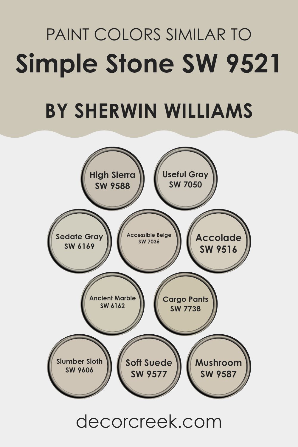
Colors Similar to Simple Stone SW 9521 by Sherwin Williams
Similar colors play a crucial role in design because they create harmony and cohesion in a space. When colors are closely related, like those similar to Simple Stone by Sherwin Williams, they work together to produce a seamless and calming effect.
Colors such as High Sierra and Soft Suede offer a warm and inviting atmosphere, making spaces feel more comfortable and inviting. These two colors have earthy undertones that enhance the natural feel of a room.
Meanwhile, Useful Gray and Sedate Gray provide subtle sophistication with their gentle gray tones, which make them perfect for creating a neutral backdrop.
Accolade and Ancient Marble add a sense of depth to any space, thanks to their rich yet soft tones that mimic natural stone.
Accessible Beige is a versatile color that pairs well with nearly any other shade, lending a balanced and cohesive feel. Cargo Pants offers a bit of earthiness with its muted green tone, adding interest without overwhelming the senses. Mushroom provides a soft, brownish undertone that compliments a variety of design elements. Finally, Slumber Sloth brings in a sense of coziness with its soft, muted hue, perfect for making spaces feel relaxing and welcoming. Together, these similar colors create a palette that is both comforting and stylish, ideal for any interior.
You can see recommended paint colors below:
- SW 9588 High Sierra
- SW 7050 Useful Gray
- SW 6169 Sedate Gray
- SW 7036 Accessible Beige
- SW 9516 Accolade
- SW 6162 Ancient Marble
- SW 7738 Cargo Pants
- SW 9606 Slumber Sloth
- SW 9577 Soft Suede
- SW 9587 Mushroom
How to Use Simple Stone SW 9521 by Sherwin Williams In Your Home?
Simple Stone by Sherwin Williams is a versatile paint color that fits well in many homes. It’s a neutral shade that feels comforting and warm, making it ideal for different rooms. In the living room, Simple Stone can create a cozy atmosphere, especially when paired with darker furniture or colorful accents.
For bedrooms, this color provides a calm setting, perfect for unwinding after a long day. It also works well in a home office, giving it a clean, organized look without being too stark.
In the kitchen, Simple Stone pairs nicely with wood cabinets or metal fixtures, bringing all the elements together for a unified feel. You can also use it in the bathroom for a spa-like retreat, especially when matched with soft white towels or natural textures. Simple Stone is a great choice for open spaces, as it blends seamlessly with various styles and enhances the overall feel of the home without overwhelming it.
Simple Stone SW 9521 by Sherwin Williams vs Mushroom SW 9587 by Sherwin Williams
Simple Stone SW 9521 is a light, muted gray with warm undertones, making it versatile and subtle. It’s great for creating a relaxed and calming atmosphere, blending well with both modern and classic styles. This color works well in any room, providing a neutral backdrop that allows other design elements to stand out.
On the other hand, Mushroom SW 9587 is a richer, earthy taupe shade. It has more depth and warmth compared to Simple Stone. The taupe tones in Mushroom add a cozy, inviting feel to spaces, making it an excellent choice for areas like living rooms or bedrooms.
It pairs well with natural materials and can add a touch of elegance.
Both colors work within neutral palettes, but Simple Stone is airier and more understated, while Mushroom provides a bolder, warmer statement. Depending on the mood and style you want to achieve, each offers its distinct charm.
You can see recommended paint color below:
Simple Stone SW 9521 by Sherwin Williams vs High Sierra SW 9588 by Sherwin Williams
Simple Stone SW 9521 and High Sierra SW 9588 by Sherwin Williams are two distinct yet complementary colors. Simple Stone is a soft, muted gray with warm undertones, creating a comforting and neutral backdrop. It’s versatile, fitting well in various spaces like living rooms or bedrooms due to its calming presence.
On the other hand, High Sierra is a deeper, richer gray with stronger earthy tones. It brings a sense of depth and coziness, ideal for accent walls or spaces where a bolder look is desired.
Both colors work well together, offering a subtle contrast that can enhance any room’s aesthetic. Simple Stone acts as a versatile base, while High Sierra adds a touch of drama. They harmonize beautifully, balancing warmth and depth, making them a popular choice for modern and classic interiors alike.
You can see recommended paint color below:
Simple Stone SW 9521 by Sherwin Williams vs Useful Gray SW 7050 by Sherwin Williams
Simple Stone SW 9521 and Useful Gray SW 7050 by Sherwin Williams are both subtle, neutral colors, making them versatile choices for various spaces. Simple Stone is a lighter shade with soft, muted tones that create an airy and light atmosphere. It’s excellent for spaces where you want to bring a sense of openness and simplicity.
On the other hand, Useful Gray has a slightly warmer undertone, offering a cozy and inviting feel. It’s a bit darker compared to Simple Stone, which can add depth and contrast to a room. Useful Gray works well in areas where a little more warmth and coziness are desired, while still maintaining a neutral backdrop.
Both colors can complement different styles of decor and pair well with other colors. Simple Stone might be more suitable for modern, minimalist spaces due to its lighter feel, whereas Useful Gray can add a touch of warmth to traditional settings.
You can see recommended paint color below:
Simple Stone SW 9521 by Sherwin Williams vs Ancient Marble SW 6162 by Sherwin Williams
Simple Stone SW 9521 and Ancient Marble SW 6162 are two colors from Sherwin Williams that offer different vibes for interior spaces. Simple Stone is a soft and neutral gray, providing a calm and subtle backdrop that works well in modern settings.
It’s understated and versatile, making it ideal for highlighting other design elements without overpowering them. On the other hand, Ancient Marble is a warm, earthy green-gray. It brings a natural and organic feel to a room, adding a touch of warmth that Simple Stone doesn’t.
Ancient Marble can make spaces feel more inviting and cozy, reminiscent of nature. While both colors are muted, Simple Stone leans cooler and more neutral, whereas Ancient Marble is warmer and more grounded. They both pair well with various accent colors, but the choice between them depends on whether you prefer the understated elegance of gray or the warm embrace of green.
You can see recommended paint color below:
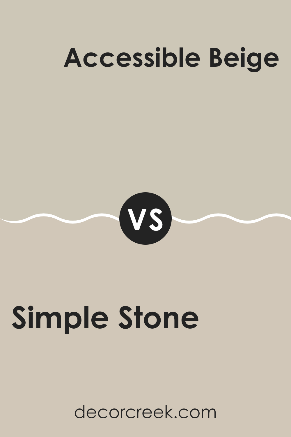
Simple Stone SW 9521 by Sherwin Williams vs Accessible Beige SW 7036 by Sherwin Williams
Simple Stone SW 9521 and Accessible Beige SW 7036 by Sherwin Williams are both neutral colors, yet each offers a distinct vibe for interior spaces. Simple Stone is a light gray shade with subtle earthy undertones, giving it a soft, modern appearance that works well in contemporary designs. It is versatile, pairing nicely with both warm and cool accents.
Accessible Beige, on the other hand, is a warm beige with a hint of gray, making it a good bridge between cooler and warmer colors. It has a cozy feel and suits traditional and transitional styles. It’s a bit warmer than Simple Stone, which tends to be cooler due to its gray undertones.
Both colors can make rooms feel light and open. Simple Stone offers a more minimalist and crisp look, while Accessible Beige adds a welcoming warmth. Each serves as an excellent backdrop, but the choice depends on your desired mood: cool and modern, or warm and inviting.
You can see recommended paint color below:
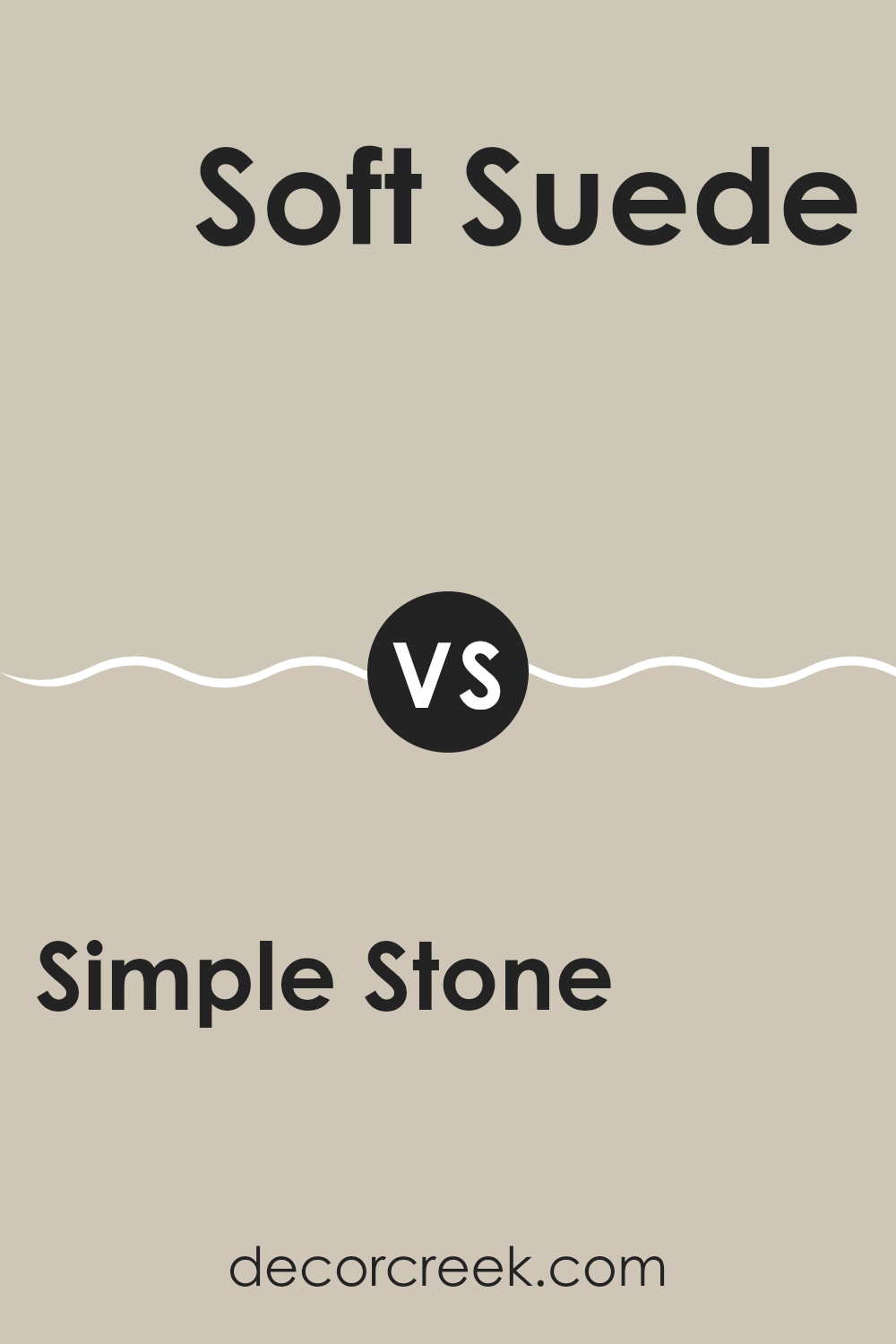
Simple Stone SW 9521 by Sherwin Williams vs Soft Suede SW 9577 by Sherwin Williams
Simple Stone (SW 9521) and Soft Suede (SW 9577) by Sherwin Williams are two distinct colors. Simple Stone is a soft, neutral gray that creates a calm and subtle backdrop. It’s versatile and pairs well with various design styles, providing a clean and fresh look.
On the other hand, Soft Suede is a warm, earthy beige. This color adds coziness and warmth to a room, making it feel more inviting. It’s an excellent choice for spaces where you want to feel relaxed and comfortable.
When comparing the two, Simple Stone’s cool tone can make a space feel more airy, perfect for modern and minimalist designs. Soft Suede’s warm tone, however, brings a sense of comfort, ideal for traditional or cozy settings. Both colors are neutral, yet they create different atmospheres, with Simple Stone being brighter and crisper, while Soft Suede offers warmth and softness.
You can see recommended paint color below:
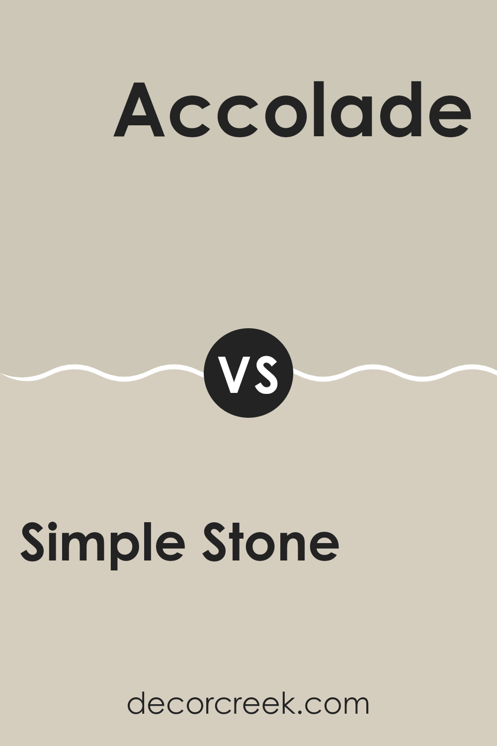
Simple Stone SW 9521 by Sherwin Williams vs Accolade SW 9516 by Sherwin Williams
Simple Stone SW 9521 by Sherwin Williams is a soft, neutral color that leans towards a light gray with warm undertones. It’s a versatile shade that works well in any room, providing a calm and neutral backdrop that easily complements other colors and décor styles. With its understated appeal, Simple Stone adds a touch of warmth and coziness without being overwhelming.
Accolade SW 9516, on the other hand, is a slightly darker hue but still remains within the neutral family. It has more depth with greige tones, combining gray and beige to offer a grounding effect. This color brings a subtle richness, making it ideal for spaces where you want to create a cozy or intimate ambiance.
Both colors offer timeless neutrality, but Simple Stone is lighter and airier, while Accolade provides a bit more depth and warmth. They can be used together for a layered, harmonious look in a space.
You can see recommended paint color below:
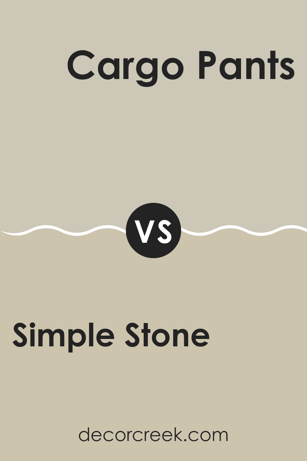
Simple Stone SW 9521 by Sherwin Williams vs Cargo Pants SW 7738 by Sherwin Williams
Simple Stone SW 9521 and Cargo Pants SW 7738 are two unique colors by Sherwin Williams, each offering distinct visual characteristics. Simple Stone is a gentle, light gray that feels calm and can make a room look spacious and bright. It’s versatile, easily matching with other colors and styles in home decor.
Cargo Pants SW 7738, on the other hand, is an earthy, greenish hue. It has a warm tone that brings a natural, cozy feel to a space. This color can add depth and a touch of nature, making it a great choice for spaces that aim for a grounded, organic look.
When comparing the two, Simple Stone is more neutral and airy, suitable for providing a subtle backdrop. Cargo Pants offers more color and character, perfect if you want a space that feels inviting and connected to the outdoors. Both colors work well in different settings depending on the atmosphere you wish to create.
You can see recommended paint color below:
- SW 7738 Cargo Pants
Simple Stone SW 9521 by Sherwin Williams vs Slumber Sloth SW 9606 by Sherwin Williams
Simple Stone SW 9521 and Slumber Sloth SW 9606 by Sherwin Williams are two calming and neutral shades, but they differ in tone and mood. Simple Stone is a soft, muted gray-beige, offering a clean and versatile backdrop suitable for any room. It provides a contemporary and fresh look, making it ideal for spaces where you want a crisp and straightforward appearance.
On the other hand, Slumber Sloth is a more cozy and warmer tone with a gentle taupe-like hue. This makes it an excellent choice for creating warm and welcoming atmospheres, perfect for bedrooms or living rooms where comfort is key.
While Simple Stone leans towards a cooler and more modern feel, Slumber Sloth wraps spaces in a more inviting and comfortable warmth.
Both colors bring a sense of calm, but choosing between them depends on whether you prefer the cool sophistication of Simple Stone or the warm embrace of Slumber Sloth.
You can see recommended paint color below:
Simple Stone SW 9521 by Sherwin Williams vs Sedate Gray SW 6169 by Sherwin Williams
Simple Stone SW 9521 by Sherwin Williams is a warm, neutral color that offers a cozy and inviting feel. It’s perfect for creating a subtle backdrop that complements various styles and decor. This color has a hint of warmth, making it versatile and easy on the eyes.
On the other hand, Sedate Gray SW 6169 is a cooler gray that leans slightly towards green. It has a calming effect, providing a clean and fresh look to any room. While it maintains its gray character, the underlying green tint differentiates it from Simple Stone.
Both colors are great choices, but they serve different purposes. Simple Stone is ideal if you’re looking for a warmer, more earthy tone. Sedate Gray works well if you prefer a cooler, more modern look. Consider the lighting and other elements in your space when choosing between these two shades to see which best fits your desired atmosphere.
You can see recommended paint color below:
- SW 6169 Sedate Gray
After learning about SW 9521 Simple Stone by Sherwin Williams, I feel like I’ve found a new favorite color. It’s like a cozy hug for your room. Simple Stone is a soft gray that works well in almost any room. Imagine a stone from the beach or a quiet path; that’s the gentle vibe this color gives. It can make a bedroom feel more peaceful and a living room just the right amount of cozy.
One thing I really like about Simple Stone is how it plays nice with lots of other colors. Whether you like bright colors or more earthy tones, this gray can be a good helper.
It’s also a pretty cool choice because it works for grown-ups and kids alike, making it easy to love for everyone in the family.
When thinking about painting a wall or a whole room, I think Simple Stone is a smart choice. It’s not too bright and not too dull.
It’s like a friendly color that wants to hang out with everyone else in your room. So, if you’re thinking about changing how a room feels, Simple Stone might just be the color you’re looking for.
Ever wished paint sampling was as easy as sticking a sticker? Guess what? Now it is! Discover Samplize's unique Peel & Stick samples.
Get paint samples

