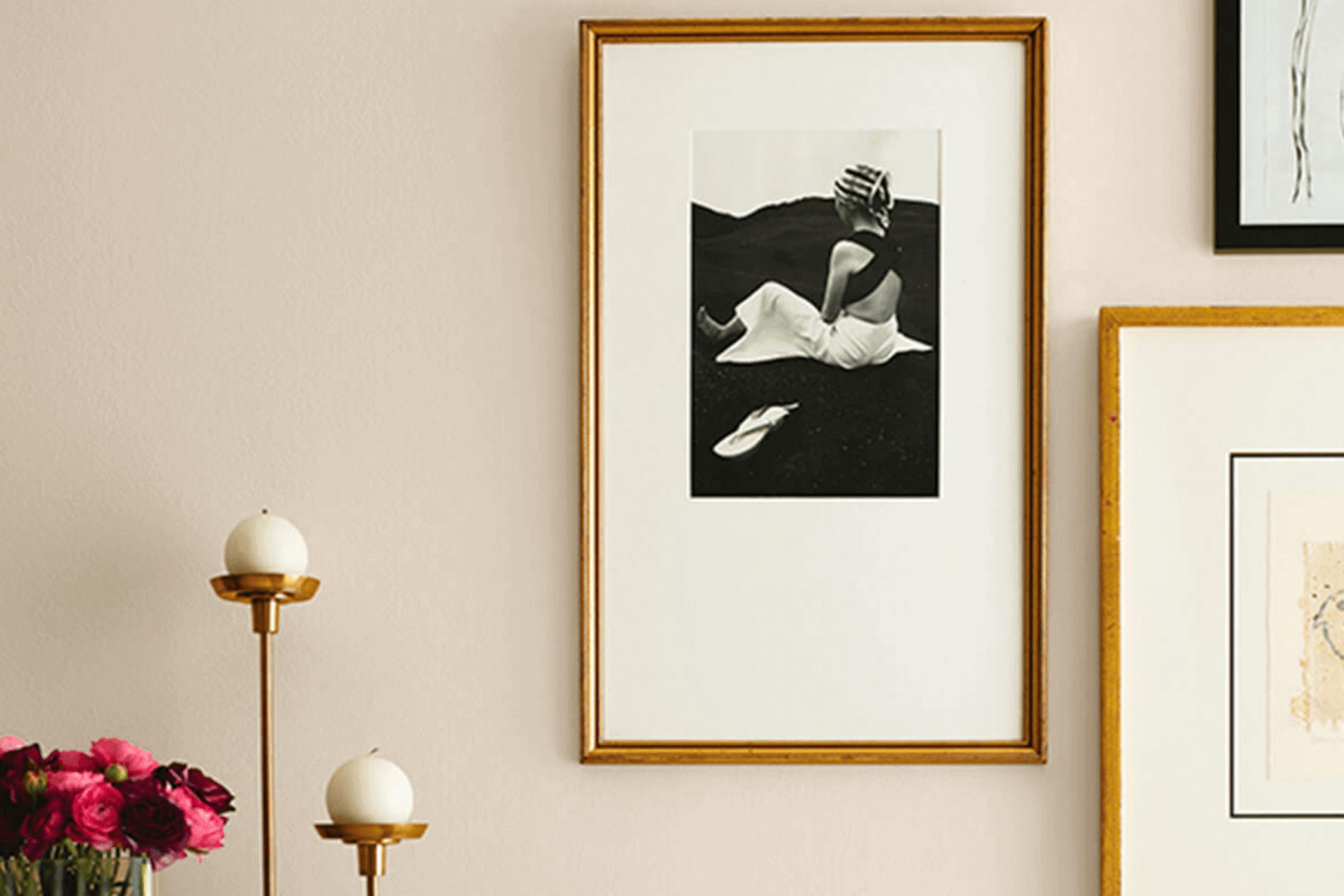
As you consider refreshing your space, SW 7517 Rivers Edge by Sherwin Williams may be the perfect choice for you. This unique shade of blue brings a gentle sense of calmness and serenity to any room without being overwhelming. Whether you’re aiming to repaint your bedroom for a soothing ambiance or looking to upgrade your living area with a touch of elegance, Rivers Edge fits beautifully within a wide range of decorating styles and tastes.
When selecting a new paint color, it’s essential to think about how it complements your existing decor and furniture. SW 7517 Rivers Edge is versatile enough to blend with both modern and traditional themes, ensuring a smooth integration into your home. Its ability to adapt makes it a smart choice for anyone wanting to refresh their living space with a new vibe.
Moreover, this color works well in various lighting conditions, maintaining its charming hue whether bathed in natural daylight or under soft artificial light. The beauty of considering Rivers Edge for your walls is that it also pairs wonderfully with numerous accent colors, giving you the flexibility to customize your interiors according to your personal taste.
So, if you’re looking for a paint color that provides both functionality and style, Rivers Edge could be the answer, delivering an inspiring change to your home environment.
What Color Is Rivers Edge SW 7517 by Sherwin Williams?
The color Rivers Edge by Sherwin Williams is a soothing shade of blue that brings to mind the calming presence of a gentle river. This cool blue has a subtle gray undertone, making it a versatile choice for many interior design styles. It’s a perfect pick for creating a relaxed atmosphere in any room of the house.
This color works exceptionally well in coastal and Scandinavian interior designs due to its clean, crisp nature. The muted blue hue lends itself beautifully to these styles, providing a fresh and airy feel that complements light woods and minimalist decor. Moreover, it’s an excellent choice for transitional spaces, where traditional meets contemporary, because of its timeless appeal.
Rivers Edge pairs wonderfully with natural materials like linen, cotton, and wool, enhancing its soft appearance. These textures add warmth to the coolness of the blue, creating a balanced and inviting environment. When it comes to furniture, whitewashed wood or light oak pieces look particularly stunning with this color, enhancing the overall feel of calmness and light in the space.
Metallic finishes like brushed nickel or matte silver can also complement this hue, adding a touch of modernity without overpowering its subtle elegance.

Is Rivers Edge SW 7517 by Sherwin Williams Warm or Cool color?
Rivers Edge by Sherwin Williams is a unique color that adds a fresh and gentle touch to rooms. This shade is a light and clean blue that appears soft and welcoming, making it perfect for creating a calm atmosphere in any home.
It works especially well in spaces like bathrooms or bedrooms where a soothing backdrop is desired. Its lightness can make small rooms appear larger and more open, which is a big bonus for homes with limited space.
Rivers Edge is also versatile, pairing well with various styles and furnishings, from modern to classic. It complements both dark and light furniture, allowing flexibility in decorating while keeping the room feeling airy and light. Using this color in common areas, such as living rooms or kitchens, can brighten the space and give it a neat, polished look without overwhelming the senses. It’s a gentle way to bring color into your home without making drastic changes to your decor.
Undertones of Rivers Edge SW 7517 by Sherwin Williams
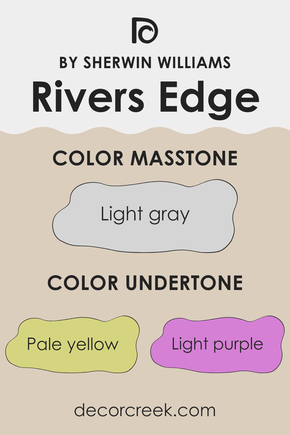
The color Rivers Edge has a unique blend of undertones which helps in adding depth and complexity to its appearance. The undertones influence how the color adapts to different lighting conditions and complements various decor styles. The pale yellow undertone offers a subtle warmth that makes the space feel cozy and inviting. Light purple adds a hint of softness, giving it a gentle appeal, while light blue brings a fresh, calm feeling to the room.
Pale pink can make the walls appear slightly flushed, adding a touch of liveliness. The mint undertone gives Rivers Edge a refreshing vibe, ideal for creating a soothing environment. Lilac reflects a mildly playful character which can help to soften the feel of a room. Grey, being a neutral undertone, helps in balancing the color, making it versatile enough to match with a variety of decoration themes.
On interior walls, Rivers Edge, influenced by these undertones, can change its perceived shade based on the light conditions. For instance, in a room with ample natural light, the pale yellow and light blue might become more pronounced, creating a vibrant yet calm atmosphere. In artificial lighting, the grey and light purple undertones could make the room feel warmer and more inviting. This adaptability allows for flexibility in pairing it with different furnishings and room uses, making it an excellent choice for anyone looking to refresh their home.
What is the Masstone of the Rivers Edge SW 7517 by Sherwin Williams?
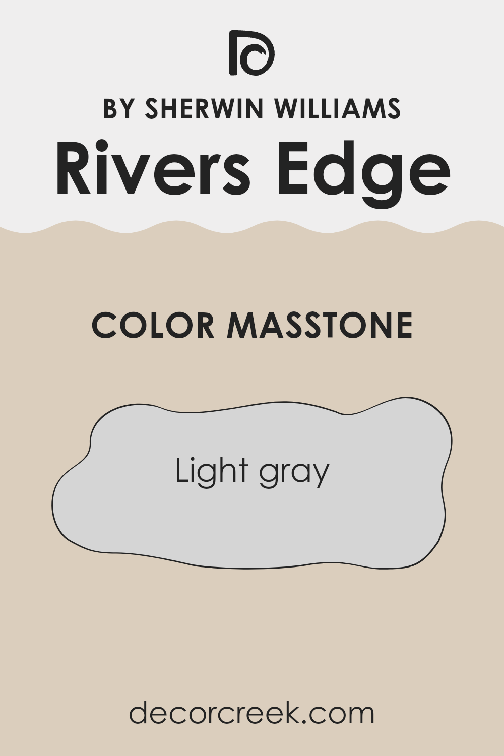
Rivers EdgeSW 7517 by Sherwin Williams is a lovely light gray color, coded #D5D5D5. The masstone of this paint, which refers to its pure color before any lightening or toning is done, is a practical and fresh shade.
This soft gray hue is perfect for homes as it offers a neutral backdrop that can complement varied decorating styles. It’s versatile enough to be used in any room, whether it’s a cozy bedroom, a bustling kitchen, or a calm living area. This color does not overpower the space but instead subtly supports a range of color schemes and furniture styles.
Light gray works well with both bright and dark colors, adding a gentle contrast without the harshness of a pure white or a stark black. Additionally, the soft gray hue can help in making spaces appear larger and more open, making it an ideal choice for smaller rooms or apartments.
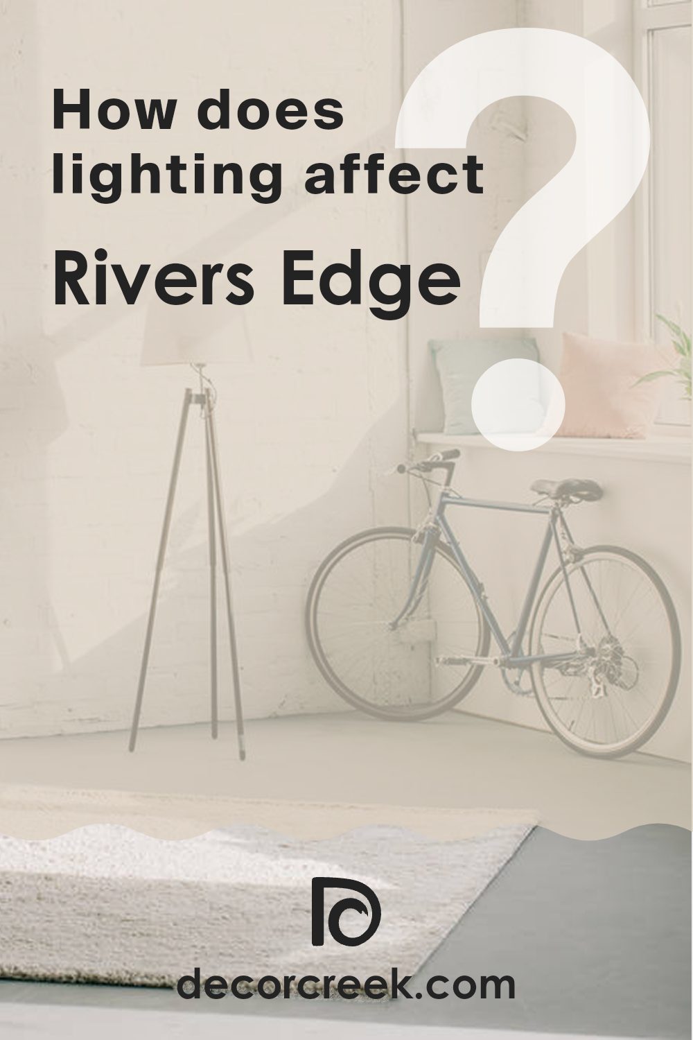
How Does Lighting Affect Rivers Edge SW 7517 by Sherwin Williams?
Lighting plays a crucial role in how we perceive colors. The same paint on a wall can look different depending on whether it’s lit by the sun or a lamp. This is because different light sources have varying color temperatures and intensities which influence how a color appears. Let’s consider a color like Rivers Edge SW 7517 by Sherwin Williams, which is a rich, earthy teal.
Under artificial light, such as incandescent bulbs which emit a warm light, this shade can appear more muted and cozy, bringing out more of its green undertones.
Fluorescent lighting, on the other hand, tends to emit a cooler, bluish light, which can make Rivers Edge look sharper and more vivid.
Natural light affects this color quite differently throughout the day and depends largely on the orientation of the room.
In north-facing rooms, light is cooler and more consistent throughout the day. Here, Rivers Edge will look more true to its base tone but might feel slightly subdued because of the lack of direct sunlight.
In south-facing rooms, where sunlight is more direct and warmer, Rivers Edge will brighten up and show more of its dynamic range, shifting with the intensity of the light throughout the day. It’s likely to feel more vibrant and energetic here than in any other room orientation.
East-facing rooms receive the morning sun, which is warm and bright early in the day but fades quickly. Here, Rivers Edge will look very lively in the morning, and its blue-green qualities will stand out, gradually becoming more subdued as the day progresses.
Lastly, in west-facing rooms, the afternoon and evening light can cast a golden glow, warming up the teal to appear more green and lively as the day ends. This warming effect can make the room feel welcoming and cozy towards the evening.
Overall, Rivers Edge’s ability to adapt its look based on varying light makes it a versatile color choice for different rooms and settings.
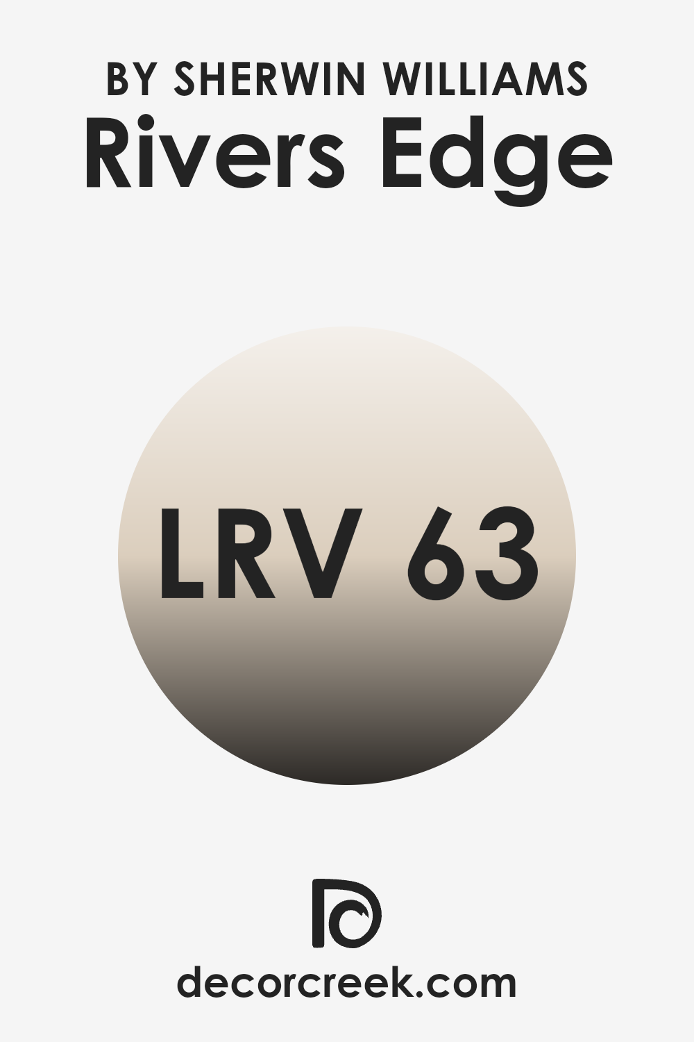
What is the LRV of Rivers Edge SW 7517 by Sherwin Williams?
LRV stands for Light Reflectance Value, which measures the percentage of light a paint color reflects back into a room. It’s a handy scale for understanding how light or dark a color will appear once applied to the walls. The higher the LRV number, the lighter the color, meaning it reflects more light back into the room.
This is particularly useful when deciding how a paint color might influence the mood and brightness of a space. A lighter color can make a room feel more open and airy, while a darker color tends to create a cozier, more enclosed feeling.
The LRV of Rivers Edge, which is 62.934, indicates that it is on the lighter side of the scale, reflecting a good amount of light without being overwhelmingly bright. This means that when used on walls, it can help enhance the natural brightness of a room while also adding a soothing, subtle presence. In spaces with less natural light or smaller rooms, this LRV can help prevent the space from feeling cramped or dark. Conversely, in very brightly lit areas, it can help balance out intense light to avoid a washed-out appearance, maintaining its distinct hue even under strong lighting.
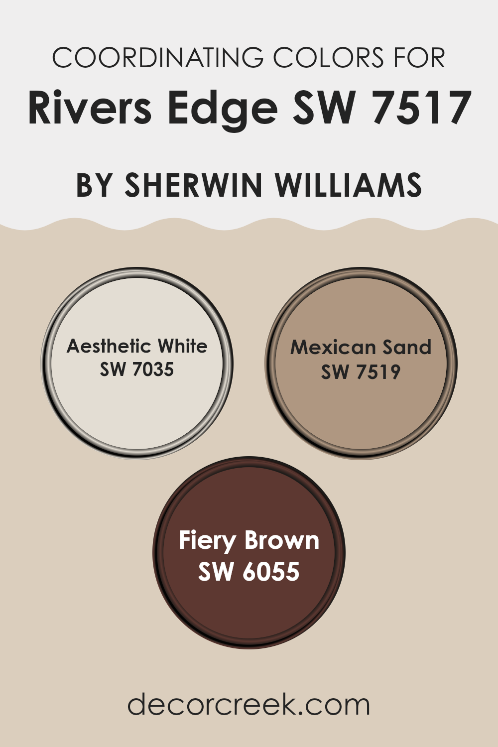
Coordinating Colors of Rivers Edge SW 7517 by Sherwin Williams
Coordinating colors are shades that harmonize well with a base paint color, enhancing the overall aesthetic of a space. When selecting coordinating colors, it’s important to choose hues that complement the main color in terms of saturation and tone, creating a balanced visual experience. This can vary from subtle nuances to contrasting shades that accentuate key features of a room.
For example, Aesthetic White (SW 7035) is a soft, neutral white with a hint of warmth, making it a versatile companion to richer and darker hues. It adds a light and airy feel to the environment, perfect for trim or accent walls that need a gentle lift.
Mexican Sand (SW 7519) is a deeper, beige color that provides a comforting and earthy feel, suitable for creating a cozy and welcoming atmosphere in living spaces or bedrooms. Lastly, Fiery Brown (SW 6055) is a robust, dark brown with warm undertones, ideal for adding depth and intensity to a design scheme. This color works well in areas that demand a striking statement or where you want to draw attention, such as on furniture or an accent wall.
You can see recommended paint colors below:
- SW 7035 Aesthetic White
- SW 7519 Mexican Sand
- SW 6055 Fiery Brown
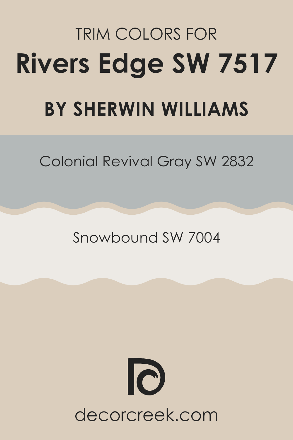
What are the Trim colors of Rivers Edge SW 7517 by Sherwin Williams?
Trim colors are selected accent colors used on features such as door frames, window sills, skirtings, and moldings to highlight and complement the main colors of a room. Choosing the right trim color is crucial as it frames the architectural details and enhances the overall aesthetic appeal of a space.
For a paint like Rivers Edge by Sherwin Williams, trim colors like SW 2832 – Colonial Revival Gray and SW 7004 – Snowbound can effectively create a pleasing contrast that outlines and enhances the wall’s features, making the space appear more defined and cohesive.
Colonial Revival Gray is a subtle gray that carries a hint of warmth, making it an ideal trim for adding a gentle contrast without overpowering the main hue. Its ability to blend seamlessly while still providing a boundary makes it a versatile choice for many decor styles.
Snowbound, on the other hand, is a clean and bright white that provides a sharp contrast, which can make the colors pop and give a fresh, clean look to the edges and corners of a room. Using either of these colors as a trim can lead to a well-balanced and visually appealing room that complements the depth and intensity of Rivers Edge.
You can see recommended paint colors below:
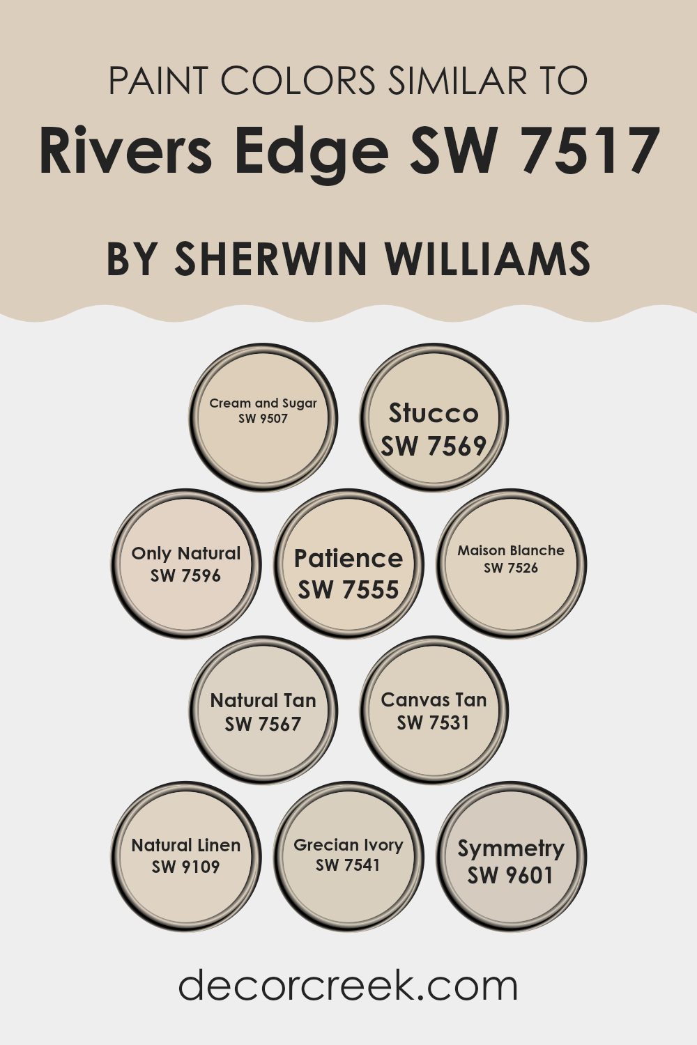
Colors Similar to Rivers Edge SW 7517 by Sherwin Williams
Similar colors play an essential role in creating a harmonious and visually appealing environment. When colors from the same family, such as those similar to Rivers Edge by Sherwin Williams, are used together, they create a cohesive look that is pleasing to the eye. These similar shades work together to enhance the overall aesthetic of a space by blending seamlessly. They provide subtle contrasts and soft transitions between walls and decor elements, which can make a room feel more cohesive and put together.
For instance, Cream and Sugar is a warm, inviting beige that adds a gentle touch of coziness to any room. Stucco follows closely, offering a slightly deeper beige tone that gives a sense of solidity and grounding. Only Natural has an earthy, neutral charm that works well in spaces that aim for a natural look. Patience is a soft peach-beige that adds a whisper of warmth to the surroundings.
Maison Blanche, a clean, light beige, injects a subtle brightness into spaces needing a lift. Natural Tan offers a mid-tone beige, providing a perfect balance between light and dark. Canvas Tan brings in a hint of sun-kissed warmth, ideal for creating a welcoming feel. Natural Linen is a muted, soft beige that works beautifully in spaces that desire a soft backdrop.
Grecian Ivory offers a touch of ancient charm with its subtly blended ivory tone. Lastly, Symmetry is a balanced, muted beige that supports a range of decorating styles by offering neutral ground. Each of these colors, with their unique tones, helps in creating spaces that are both functional and stylish without overwhelming the senses.
You can see recommended paint colors below:
- SW 9507 Cream and Sugar
- SW 7569 Stucco
- SW 7596 Only Natural
- SW 7555 Patience
- SW 7526 Maison Blanche
- SW 7567 Natural Tan
- SW 7531 Canvas Tan
- SW 9109 Natural Linen
- SW 7541 Grecian Ivory
- SW 9601 Symmetry
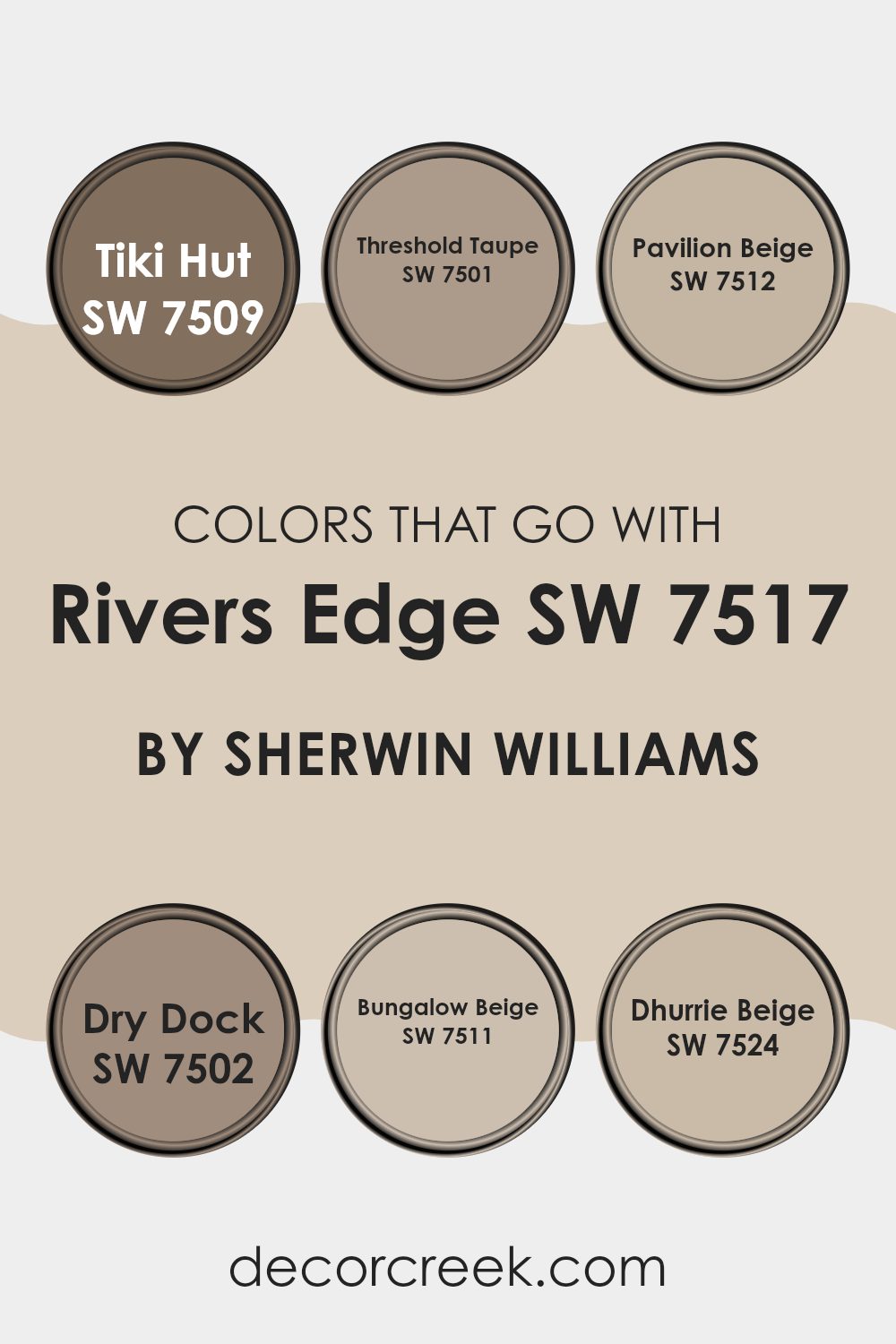
Colors that Go With Rivers Edge SW 7517 by Sherwin Williams
Choosing the right complementary colors for Riverside Edge SW 7517 by Sherwin Williams can significantly enhance the aesthetic and mood of any room. These coordinating colors help create a cohesive look that can make spaces feel more inviting and harmonious.
For example, SW 7509 Tiki Hut offers a warm, earthy brown that pairs beautifully with the cool tone of Rivers Edge, offering a balanced and natural feel to a space. Similarly, SW 7501 Threshold Taupe provides a slightly lighter neutrally warm taupe that subtly contrasts with darker shades, softening the overall effect without overpowering it.
Colors like SW 7512 Pavilion Beige bring a soft, light beige into the mix, offering a gentle lift that works well in areas needing a touch of brightness. On the other hand, SW 7502 Dry Dock features a unique grayish hue that complements tertiary and secondary colors alike, making it versatile for tying together various elements of a decor. SW 7511 Bungalow Beige offers a comfortably subtle beige shade that merges well with almost any color scheme, encouraging a clean and unified look.
Lastly, SW 7524 Dhurrie Beige stands out as a deeper beige that provides depth and warmth, perfect for adding character and warmth in spaces predominantly using Rivers Edge SW 7517. Together, these colors blend functionality and style, making it easy to achieve a professional and coherent appearance in your decorating projects.
You can see recommended paint colors below:
- SW 7509 Tiki Hut
- SW 7501 Threshold Taupe
- SW 7512 Pavilion Beige
- SW 7502 Dry Dock
- SW 7511 Bungalow Beige
- SW 7524 Dhurrie Beige
How to Use Rivers Edge SW 7517 by Sherwin Williams In Your Home?
**Rivers Edge SW 7517** is a versatile paint color from Sherwin Williams. With its soft, muted green hue, this color brings a peaceful and fresh feel to any room. It’s perfect for those looking to add a touch of nature indoors without going too bold.
You can use Rivers Edge in various rooms in your home. It works beautifully in a bathroom or bedroom, creating a calm atmosphere that’s perfect for relaxing. In living rooms or kitchens, this color pairs well with creams, browns, and whites for a balanced and welcoming look.
For a modern twist, consider using Rivers Edge on cabinetry or an accent wall. It contrasts nicely with metallic finishes like brass or copper, lending a stylish yet understated vibe to your space.
Lastly, because of its natural tones, Rivers Edge can help connect indoor spaces with the outdoors, especially when used near large windows overlooking a garden or landscape. This makes it a great choice for sunrooms or dining areas.
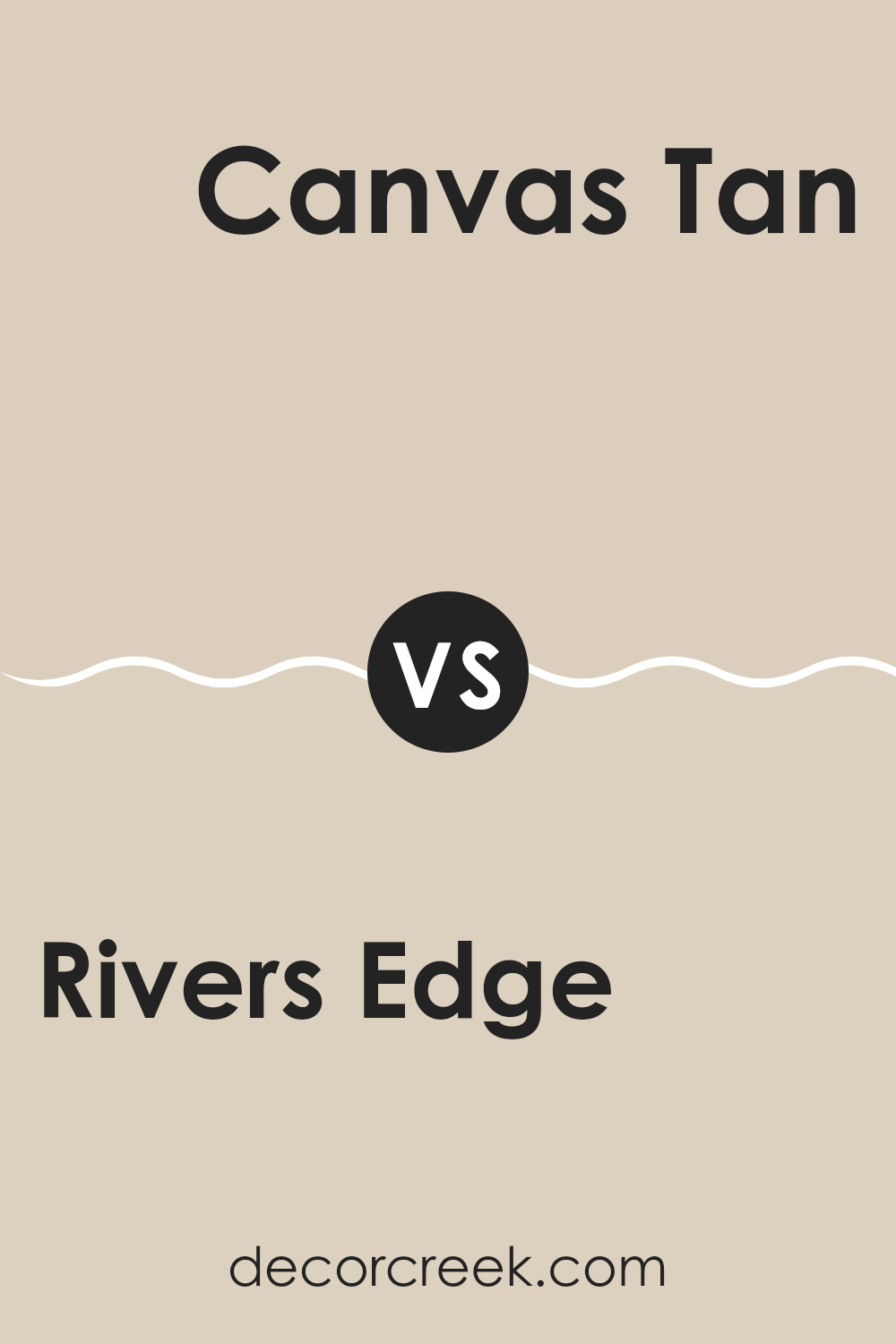
Rivers Edge SW 7517 by Sherwin Williams vs Canvas Tan SW 7531 by Sherwin Williams
Rivers Edge is a darker shade, reminiscent of a shady riverbank. It has deep, robust tones that can add a sense of grounding to spaces. Being on the cooler end, it works well in areas that benefit from a calm, collected feel, like studies or bedrooms.
On the other hand, Canvas Tan is a much lighter, warm beige. It offers a soft, welcoming vibe which makes it versatile for use in many areas of a home, including living rooms and kitchens. Its warmth can make spaces appear brighter and more inviting.
Both colors belong in different scenarios based on what mood or atmosphere you aim to achieve in a space. Rivers Edge leans towards creating a more closed, cozy environment, while Canvas Tan is about open, airy spaces.
You can see recommended paint color below:
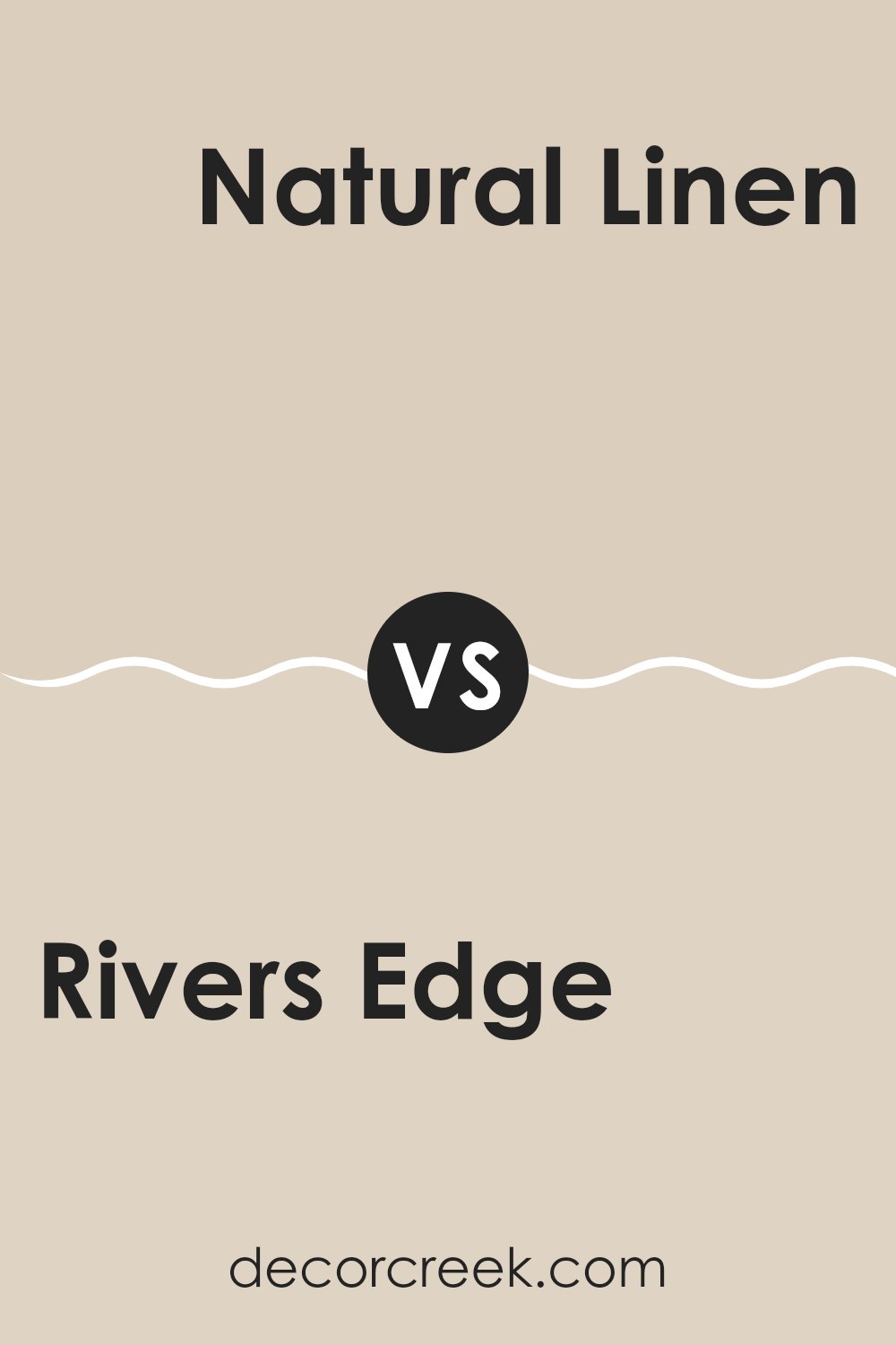
Rivers Edge SW 7517 by Sherwin Williams vs Natural Linen SW 9109 by Sherwin Williams
Rivers Edge and Natural Linen are two contrasting shades by Sherwin Williams that can create different moods in a space. Rivers Edge is a deep, greenish-gray hue that brings a sense of grounding and stability to a space. It’s a darker color that works well in areas where a bold statement is desired, such as in living rooms or as an accent wall.
On the other hand, Natural Linen is a much lighter, neutral beige that offers a soft and calming backdrop. It is ideal for creating a relaxed and airy feel in rooms, making it perfect for bedrooms and common areas where comfort is key. This color can help make small spaces appear larger and more open.
Together, these colors could complement each other, with Natural Linen providing a light contrast to the moody depth of Rivers Edge, ideal for interiors seeking balance and harmony.
You can see recommended paint color below:
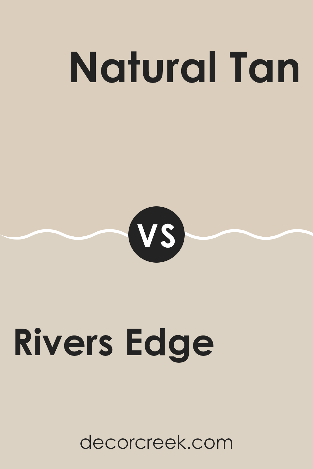
Rivers Edge SW 7517 by Sherwin Williams vs Natural Tan SW 7567 by Sherwin Williams
The main color, Rivers Edge, is a cooler shade that falls into the gray family with hints of blue, giving it a calm and fresh appearance. This color is ideal for spaces where you want to create a neutral yet slightly distinct atmosphere as it reminds one of the soothing colors seen in nature.
On the other hand, Natural Tan is a warmer choice that leans towards a beige palette. This color provides a cozy and inviting feel to any room, promoting a comfortable and relaxed environment.
When comparing the two, Rivers Edge offers a more modern and crisp look, which could be excellent for a contemporary setting or to induce a sense of cleanliness and order. In contrast, Natural Tan offers a classic warmth that works well in traditional or casual interiors, making spaces feel homely and snug. Each color has its unique charm, influencing the mood and aesthetic of a space differently.
You can see recommended paint color below:
Rivers Edge SW 7517 by Sherwin Williams vs Stucco SW 7569 by Sherwin Williams
“Rivers Edge” and “Stucco” by Sherwin Williams are both neutral colors, but each carries a distinct vibe for room styling. “Rivers Edge” is a rich, warm beige that feels cozy and inviting, making it an excellent choice for living rooms or bedrooms where comfort is key. It pairs well with a wide range of decorations, adding a soft, welcoming background to any space.
On the other hand, “Stucco” is cooler and closer to a true grey. This color gives a clean, modern feel to a room, perfect for those who prefer a minimalist or contemporary look. The grey tone of “Stucco” serves as a strong foundation for bold accent colors or works well in a monochromatic color scheme.
In essence, while both colors offer neutrality, “Rivers Edge” warms up a room with its beige tones, whereas “Stucco” provides a sleek, modern backdrop with its cooler grey shades.
You can see recommended paint color below:
- SW 7569 Stucco
Rivers Edge SW 7517 by Sherwin Williams vs Only Natural SW 7596 by Sherwin Williams
Rivers Edge and Only Natural are two paint colors that offer a subtle yet different look for any space. Rivers Edge is a deeper beige with hints of gray, creating a cozy and grounded feeling in a room. It’s a color that can make a space feel inviting and warm, ideal for living rooms or bedrooms.
On the other hand, Only Natural is a lighter shade, leaning more towards a soft, sandy beige. This color has a fresh and airy vibe, perfect for making smaller spaces appear larger and more open. It works well in areas like kitchens and bathrooms, where a light, neutral tone can enhance natural light.
When used together, these two colors can complement each other beautifully, with Rivers Edge providing depth and Only Natural bringing a lighter contrast. They can help achieve a balanced and harmonious look in a home, suitable for those wanting a neutral color palette that still offers some variation.
You can see recommended paint color below:
Rivers Edge SW 7517 by Sherwin Williams vs Maison Blanche SW 7526 by Sherwin Williams
Rivers Edge and Maison Blanche are two distinct paint colors from Sherwin Williams. Rivers Edge is a deep, earthy taupe that adds a strong but neutral presence to a room. It’s quite versatile, perfect for creating a cozy, grounded atmosphere in living spaces or bedrooms.
On the other hand, Maison Blanche is a much lighter shade, closer to an off-white with very subtle beige undertones. This color is ideal for brightening up a space and giving it a fresh, clean look.
While Rivers Edge brings depth and warmth to interiors, Maison Blanche offers a lighter, airier feel, making spaces appear larger and more open. Both colors work well in various design styles, but the mood each sets is markedly different due to their contrast in darkness and tone.
You can see recommended paint color below:
Rivers Edge SW 7517 by Sherwin Williams vs Patience SW 7555 by Sherwin Williams
Rivers Edge and Patience, both by Sherwin Williams, present subtle yet distinct tones that can enhance any space. Rivers Edge is a deeper, more saturated hue resembling the calm, stony greys found in a riverbed. It has an earthy, solid feel, perfect for creating a grounded atmosphere in a room. This color works well in areas where a strong, yet understated, background is needed.
On the other hand, Patience sports a lighter, beige tone that offers a warm and inviting vibe. This color is excellent for spaces where natural light is abundant, as its gentle warmth complements the brightness without overwhelming it. Patience is ideal for living areas and bedrooms where a soft, welcoming feel is desired.
Both colors provide unique aesthetic benefits, with Rivers Edge leaning towards a more muted, firm presence and Patience providing a soothing, light touch.
You can see recommended paint color below:
Rivers Edge SW 7517 by Sherwin Williams vs Cream and Sugar SW 9507 by Sherwin Williams
Rivers Edge and Cream and Sugar are two interesting paint colors from Sherwin Williams, each offering a distinct mood for any space. Rivers Edge is a deep, soothing grey with hints of blue, creating a calm and stable ambiance which makes it a good choice for a relaxed and steady feel. This color works well in spaces like bedrooms or offices where you want a backdrop that’s understated yet impactful.
On the other hand, Cream and Sugar is a much lighter color. It’s a warm, soft creamy white that gives rooms a bright and airy feel. This color is excellent for areas where you aim to create a gentle and inviting environment, such as living rooms or kitchens.
Pairing these two colors could work well as the lightness of Cream and Sugar could effectively offset the depth of Rivers Edge, providing a balanced contrast in a room’s color scheme. This combination can help to keep a space feeling both grounded and open.
You can see recommended paint color below:
Rivers Edge SW 7517 by Sherwin Williams vs Grecian Ivory SW 7541 by Sherwin Williams
Rivers Edge and Grecian Ivory are two distinct colors from Sherwin Williams. Rivers Edge is a deep, muted green with gray undertones. It gives off a calm, grounded feeling, making it excellent for spaces where you want to create a sense of relaxation and calmness.
This color is versatile enough for bedrooms or offices where a touch of nature’s calm is desired. On the other hand, Grecian Ivory is a light, warm beige that has a welcoming and soft appeal. This color works wonderfully in living spaces and bedrooms where a light, airy feel is preferred. It helps in making small rooms appear larger and brighter.
When comparing both, Rivers Edge provides depth and a connection to the outdoors, while Grecian Ivory offers a clean, open feel, enhancing the perceived space in a room. Both colors can work beautifully together for a balanced and harmonious look, utilizing Grecian Ivory for larger wall areas and Rivers Edge as an accent.
You can see recommended paint color below:
Rivers Edge SW 7517 by Sherwin Williams vs Symmetry SW 9601 by Sherwin Williams
The main color, Rivers Edge, is a subdued shade that hints at soft earth tones. It carries a sense of calmness and is quite neutral, making it versatile for various spaces within a home. It works well as a background color, complementing brighter accents or furniture pieces without dominating the space.
In contrast, Symmetry is much lighter and falls into the category of soft whites. It has an unobtrusive presence and can help make a room feel more open and airy. Being a very pale color, it pairs well with almost any other shade, serving as a great base for offering a fresh and clean look in any interior.
When comparing both, Rivers Edge provides a warmer atmosphere due to its earthier undertones, while Symmetry offers a cleaner, crisper background, ideal for enhancing illumination in dimmer rooms. Each has its own unique appeal depending on the aesthetic one is aiming for, with Symmetry leaning towards simplicity and lightness and Rivers Edge offering a cozy, grounding effect.
You can see recommended paint color below:
- SW 9601 Symmetry
In wrapping up my thoughts on SW 7517 Rivers Edge by Sherwin Williams, I would like to say that it’s a really cool paint color that many people can enjoy in their homes. This color is soft and calming, kind of like the color of light clay or a very milky coffee. It’s great for rooms where you want to feel relaxed, like in a living room or a bedroom, because it isn’t too bright or too dark.
I’ve learned that this color goes well with a lot of different things. You can match it with dark furniture or light curtains, and it will still look great. That’s handy because it means you don’t have to buy new stuff just to make sure it matches your walls. Also, a lot of people have said nice things about this color, which means it’s pretty popular.
Lastly, if you’re thinking about giving your room a new look, you might want to think about trying out SW 7517 Rivers Edge. It’s a peaceful color that makes it easy to relax and feel comfy in your room. Plus, it’s fun to see how changing your wall color can make your room feel brand new. So, if you’re looking to freshen up your space, this paint might just be the perfect choice.

Ever wished paint sampling was as easy as sticking a sticker? Guess what? Now it is! Discover Samplize's unique Peel & Stick samples.
Get paint samples

