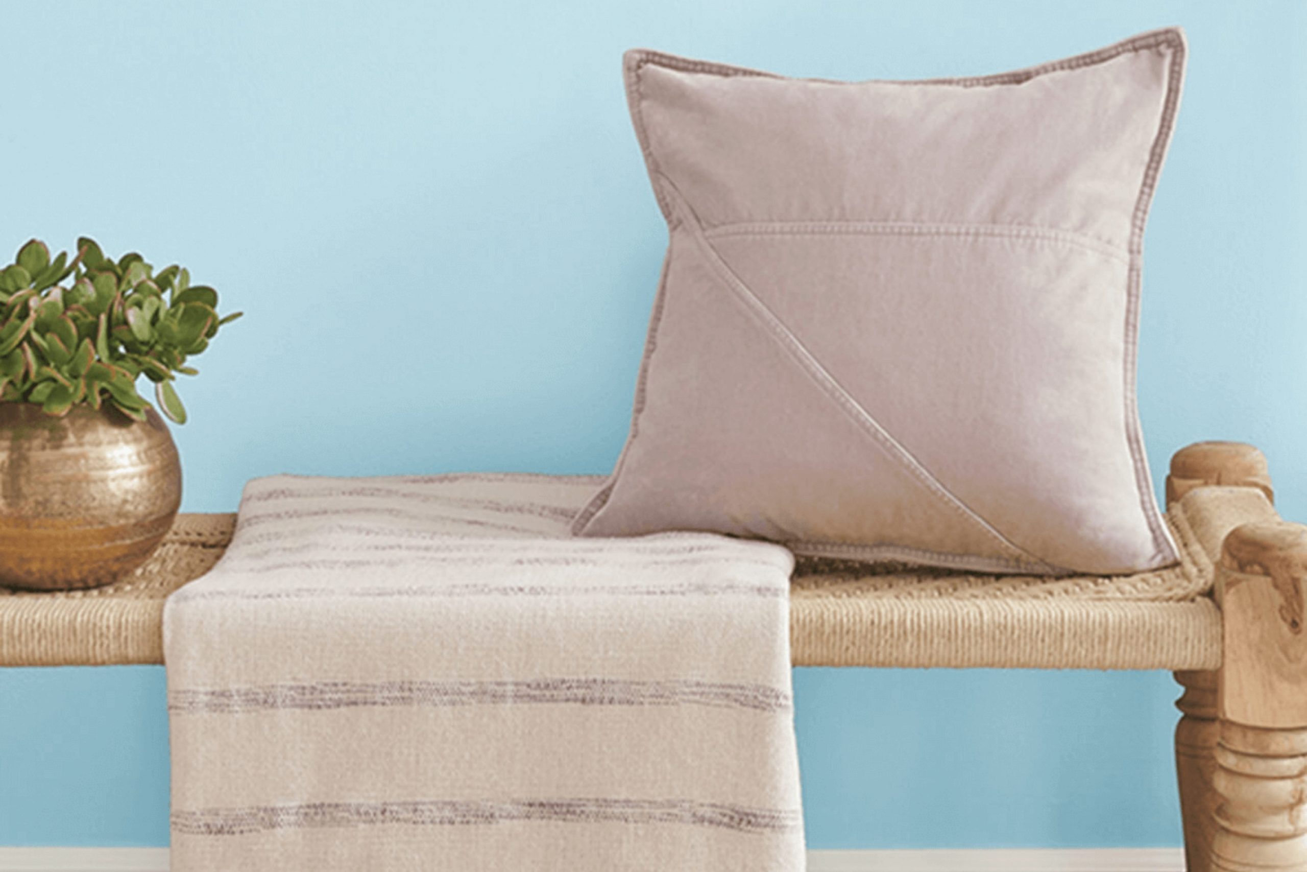
If you’re on the hunt for a fresh look in your living area, you might want to consider SW 6799 Soar by Sherwin Williams. As soon as I swiped the first stroke of this paint on my wall, I was struck by its vibrant and cheerful hue.
It’s a kind of blue that brings a light and airy feel to any room, perfect for creating an uplifting atmosphere. I’ve used it in a few different areas around my home and every time, it adds just the right touch of brightness without being too intense.
This shade of blue has a gentle clarity to it that works wonderfully in areas that need a lift. In smaller, dimly lit rooms, Soar can refresh the room, making it feel larger and more inviting. It’s also adaptable enough to blend seamlessly with a variety of decor styles and color palettes.
Whether you’re looking to refresh your kitchen, bathroom, or a cozy nook, Soar could be just what you need to give your home a renewed look. It’s more than just a color, it’s a simple way to add a splash of joy into your daily life.
What Color Is Soar SW 6799 by Sherwin Williams?
Soar by Sherwin Williams is a fresh and airy blue that brings to mind clear skies on a sunny day. This shade has a gentle, uplifting quality that pairs well with a wide range of decor styles, making it adaptable for any room.
It works exceptionally well in coastal and Scandinavian styles, where its lightness complements natural light and simple, clean lines. You can also use it in a farmhouse setting to add a splash of airy color amidst rustic elements.
In terms of materials, Soar pairs beautifully with natural wood tones from light to dark, which help ground its lightness without being too intense. It also looks stunning when teamed with whites and creams for a breezy, open feel.
For a modern edge, integrate metallics like brushed nickel or stainless steel, which contrast subtly with its calm blue hue. Textures like linen, cotton, and wool complement this paint color well, especially in softer, neutral shades, enhancing the cozy feel it brings to interiors.
Overall, Soar is a charming choice for anyone looking to add a gentle pop of color that maintains a relaxed atmosphere in their home. Its ability to pair well with both natural materials and more refined textures ensures it can fit various tastes and settings.
decorcreek.com
Is Soar SW 6799 by Sherwin Williams Warm or Cool color?
The color Soar SW 6799 by Sherwin Williams is a soft blue that offers a calming vibe to any room. Its light tone makes it perfect for creating a soothing atmosphere in homes.
This color is excellent for bedrooms or bathrooms where you want a peaceful feel. In rooms with limited natural light, such as small rooms or those facing north, Soar can help brighten the area and give it a fresher look.
Additionally, Soar pairs well with other colors. For instance, it can beautifully complement whites, grays, and even soft yellows, giving decorators flexibility with their color schemes. When used in living areas, Soar helps set a relaxed mood, making it a pleasant backdrop for relaxing or spending time with family and friends.
Overall, Soar SW 6799 is a flexible, gentle blue that can cool down busy decor or add a hint of color without being too intense. Its neutrality and lightness make it an excellent choice for anyone looking to soften their home’s aesthetic.
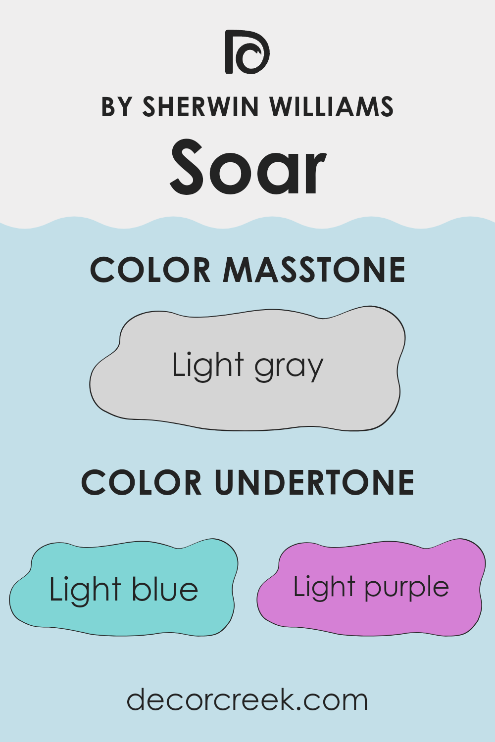
Undertones of Soar SW 6799 by Sherwin Williams
The color Soar SW 6799 by Sherwin Williams is a unique shade that appears primarily as a soft, comforting neutral but holds a complex blend of undertones that subtly influence its overall presentation and the ambiance it creates in a room.
These undertones include light blue, light purple, pale yellow, lilac, mint, pale pink, and grey. Understanding the roles of these undertones can help us see why this paint color can look slightly different under various lighting conditions or when paired with different decor elements.
Undertones are essentially the underlying qualities of a color that may emerge depending on adjacent colors or lighting. For instance, in a sunlit room, the pale yellow and mint undertones of Soar SW 6799 might make the walls feel brighter and more airy. Conversely, in a room with less natural light, the grey and lilac undertones could give the walls a more muted and calm appearance.
When used on interior walls, Soar SW 6799 can have multiple effects. In a bedroom, the light purple and lilac undertones could contribute to a gentle, restful atmosphere. In a living area, elements of pale pink and light blue can add a subtle vibrancy, enlivening the room without overpowering it.
This makes Soar SW 6799 an adaptable choice for those looking to refresh their home with a color that adjusts subtly to different rooms and decorative styles, enhancing the overall feel of the room without demanding attention.
decorcreek.com
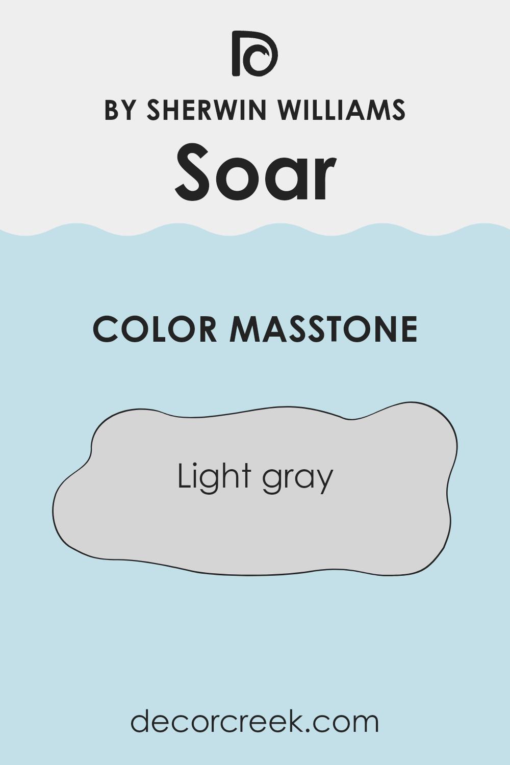
What is the Masstone of the Soar SW 6799 by Sherwin Williams?
Soar SW 6799 by Sherwin Williams displays a masstone of light gray, identified by the color code #D5D5D5. This shade of gray is very adaptable, making it a popular choice for various rooms in a home. It is neutral and soft, allowing it to blend well with many different decor styles and color schemes.
Light gray walls can open up a room, making smaller rooms appear larger and more airy. This color also has a calming effect, which is ideal for bedrooms and living areas where a peaceful atmosphere is desirable.
Additionally, light gray is practical as it doesn’t show minor marks or scuffs as easily as darker shades, which is particularly beneficial in high-traffic areas. Overall, Soar SW 6799 offers a clean and fresh look that is modern yet classic, suitable for creating a pleasant and inviting home environment.
decorcreek.com
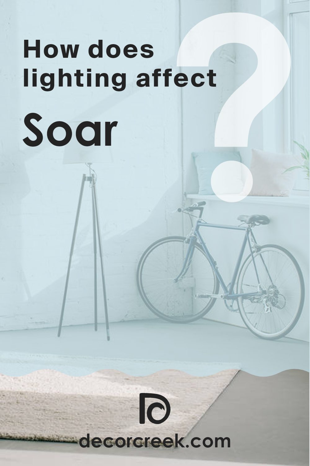
How Does Lighting Affect Soar SW 6799 by Sherwin Williams?
Lighting plays a crucial role in how we perceive colors. Different types of light can make the same color look quite different. This effect is especially noticeable with a color like Soar by Sherwin Williams. In artificial light, Soar may appear slightly more subdued compared to how it looks in natural daylight, which typically brings out the brightness and vibrancy of the color.
In rooms with natural light, the orientation of the windows significantly affects the appearance of Soar. In north-facing rooms, which generally receive cooler, more consistent light throughout the day, Soar may appear more muted and could lean slightly towards a cooler blue tone. The soft and indirect light highlights the subtle depths of the color.
In south-facing rooms, where sunlight is more direct and warmer, Soar is likely to show its full beauty by looking very vibrant and lively. This ample light can make the color appear brighter and more eye-catching, highlighting the cheerful aspect of the blue.
East-facing rooms receive strong light in the morning, which is warmer and then grows cooler as the day progresses. This means that Soar might look quite bright and vivid in the morning, offering a fresh and energizing feel, but become more relaxed and subdued by the afternoon.
Lastly, in west-facing rooms, the afternoon and evening light, which tends to be warmer and more golden, can make Soar look warmer than at other times of the day. This can add a cozy and inviting quality to the room in the later parts of the day when the light highlights the warm undertones of the color.
Understanding how lighting affects a color like Soar can help in deciding which room to use it in based on the mood and atmosphere you want to create.
decorcreek.com
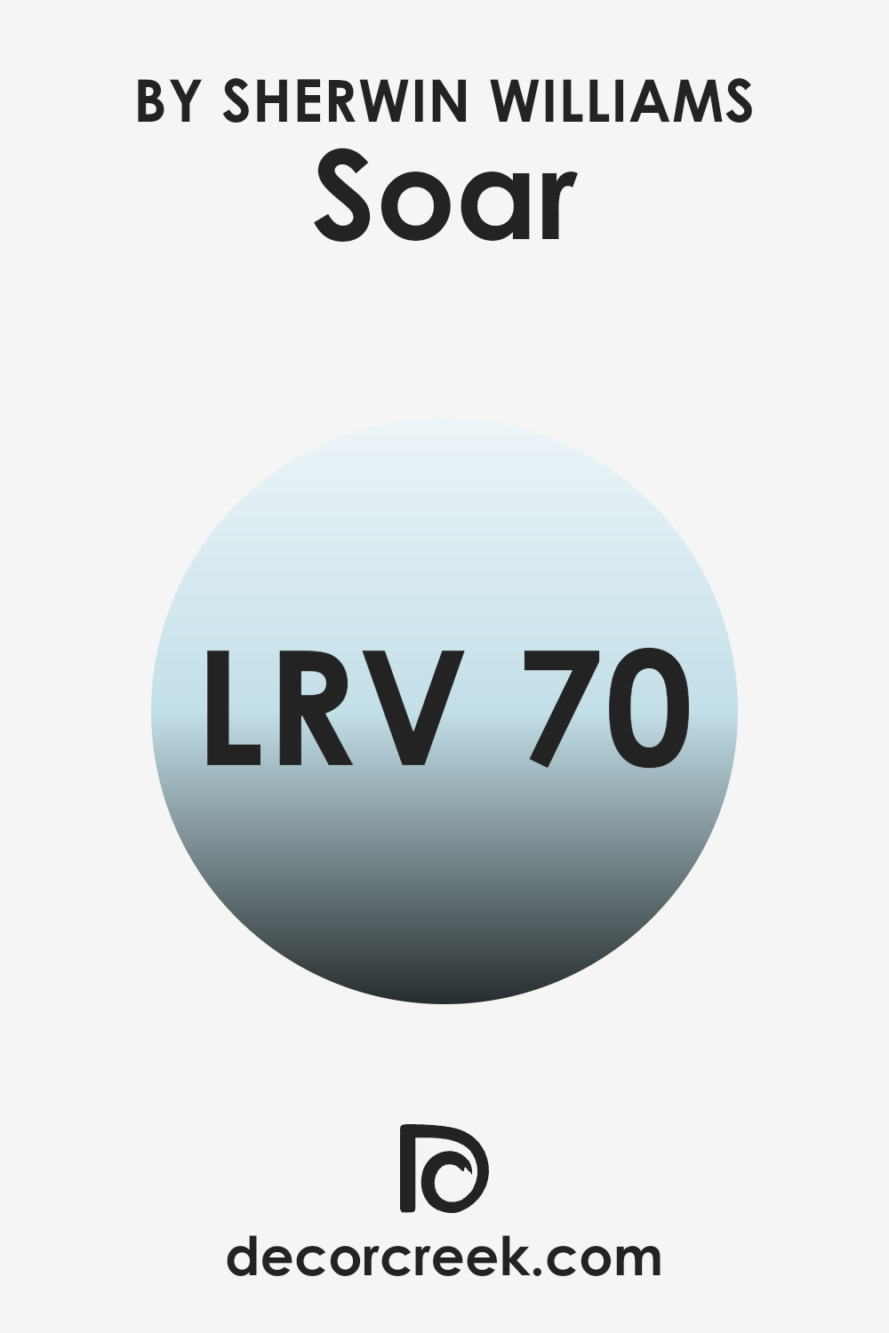
What is the LRV of Soar SW 6799 by Sherwin Williams?
LRV, or Light Reflectance Value, is a measure used to describe the amount of visible and usable light that a paint color reflects when it’s applied to a wall or any surface, essentially scoring colors on how light or dark they are. This scale ranges from a low value, which indicates a darker shade that absorbs more light, to a higher number, signaling a lighter color that reflects more light.
The higher the LRV, the lighter the color appears when used in a room, affecting not only the mood and ambiance but also how spacious a room feels. In essence, understanding LRV helps in selecting paint colors that will work best in your intended environment, ensuring the desired amount of brightness and warmth in a room.
With an LRV of 70.31, the color in question is on the lighter side of the scale, meaning it is quite effective at making rooms appear brighter and more open. This characteristic can be especially beneficial in rooms that lack natural light or are smaller in size, where the goal is to make the room feel larger and more welcoming.
As this paint reflects a good portion of light, it can help in reducing the need for excessive artificial lighting, thus also potentially lowering energy consumption in the home. When considering this shade, keep in mind that it can greatly enhance the sense of airiness in the room, making it feel more relaxed and comfortable.
decorcreek.com
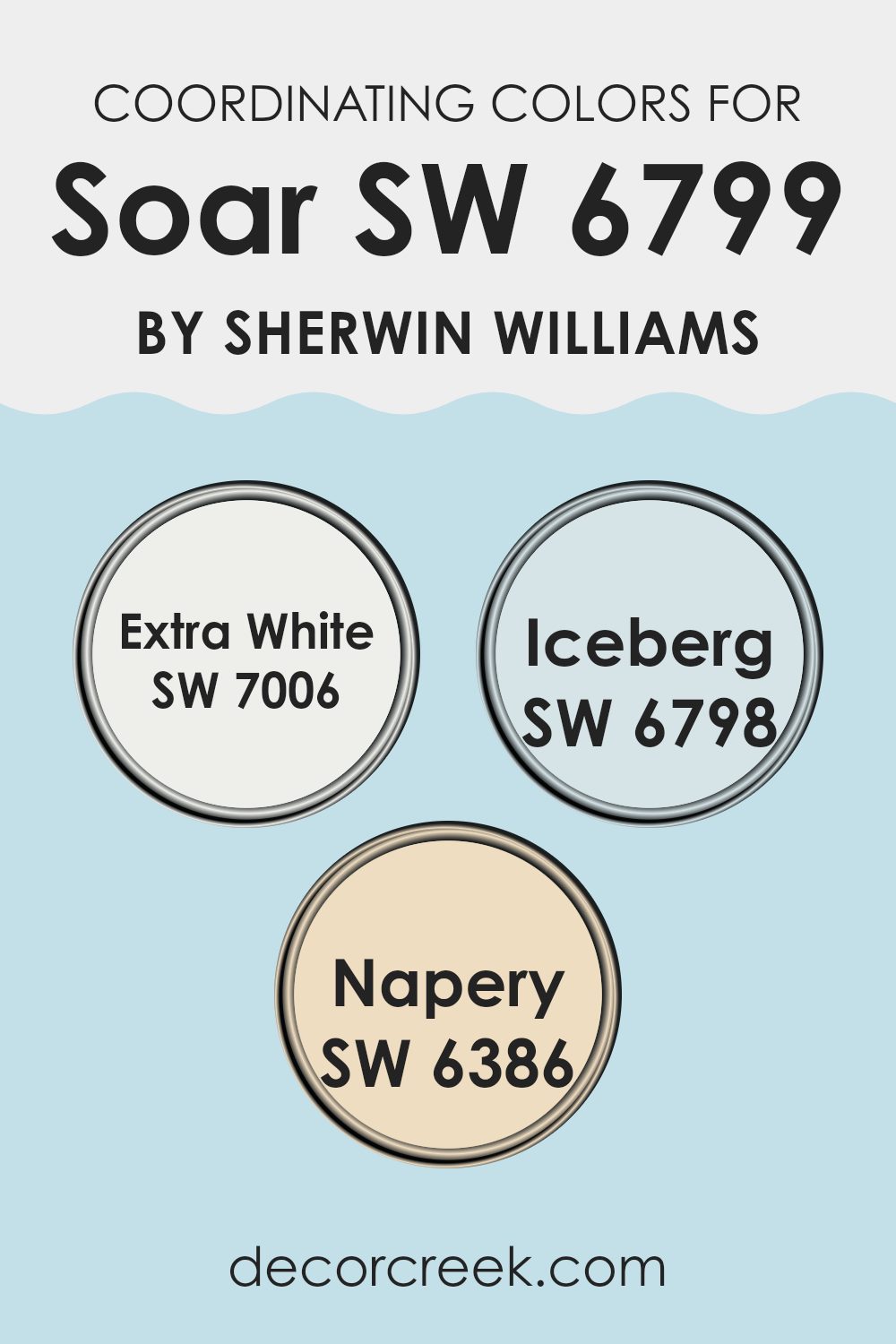
Coordinating Colors of Soar SW 6799 by Sherwin Williams
Coordinating colors are those that complement each other well when used together in decorating rooms, helping to create a harmonious atmosphere. They can be used to either contrast or blend with the main color, enhancing the overall aesthetic appeal without being too intense.
For example, if we take Soar SW 6799 by Sherwin Williams as the primary shade, various coordinating colors like SW 7006 – Extra White, SW 6798 – Iceberg, and SW 6386 – Napery can be thoughtfully employed for a balanced look.
SW 7006 – Extra White is a crisp and clean white that offers a refreshing contrast that can make the main color, like Soar, stand out beautifully. It’s great for trim, ceilings, and even accent walls where you want to add brightness. On the other hand, SW 6798 – Iceberg is a soft, light blue shade, slightly cooler, providing a subtle complement to a bold color like Soar.
It works well in rooms seeking a calm and collected feel. Lastly, SW 6386 – Napery is a warm, muted yellow. It adds a cozy warmth to the environment, pairing nicely with a vibrant shade such as Soar, ensuring the room feels welcoming and not overly energetic. This thoughtful selection and application of coordinating colors can easily enhance the character of any room.
You can see recommended paint colors below:
- SW 7006 Extra White
- SW 6798 Iceberg
- SW 6386 Napery
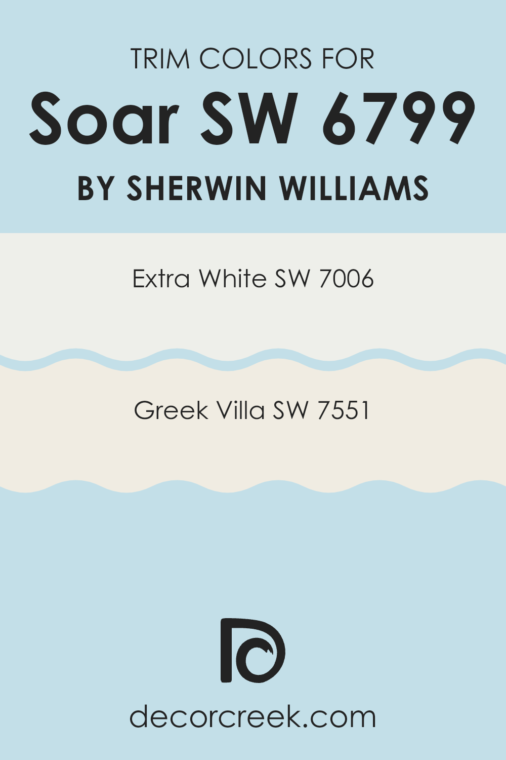
What are the Trim colors of Soar SW 6799 by Sherwin Williams?
Trim colors, such as SW 7006 – Extra White and SW 7551 – Greek Villa from Sherwin Williams, play a crucial role in defining the aesthetic and finishing touches of a room. These colors are typically used to accentuate architectural details like door frames, baseboards, and crown moldings, providing a clean and defined border that enhances the main color on the walls.
For Soar SW 6799, a harmonious trim color can enhance the depth and vibrancy, ensuring that the wall color stands out while maintaining a seamless overall look. The choice of trim color, particularly when working with a color like Soar SW 6799, is vital as it helps in creating a cohesive appearance that contributes to the visual appeal of a room.
SW 7006 – Extra White is a bright, clean white that offers a sharp contrast, often used to bring a fresh and neat appearance around wall edges, making rooms appear larger and more open. SW 7551 – Greek Villa, on the other hand, provides a slightly warmer tone compared to Extra White.
This color has undertones that lend a soft, creamy look, making it an excellent choice for adding a subtle warmth to the trim, creating a gentle transition between the wall colors and trim. Both colors are highly adaptable and can complement a variety of palettes, adding a polished finish that enhances the overall ambiance of an environment. This can greatly improve the appeal and coherence of the color scheme, playing a significant role in the visual impact of the room.
You can see recommended paint colors below:
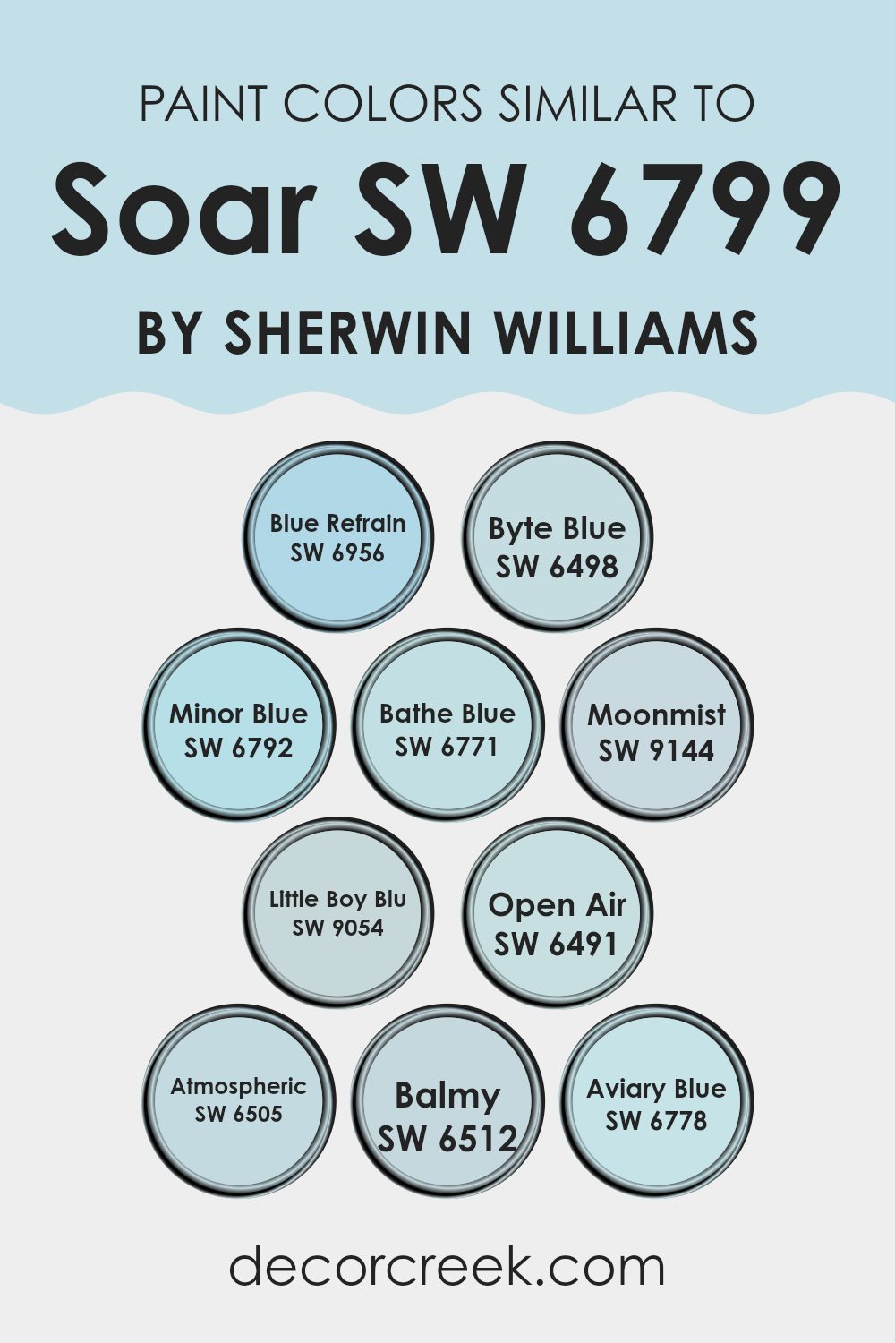
Colors Similar to Soar SW 6799 by Sherwin Williams
Utilizing similar colors in design can create a harmonious and visually appealing environment. When colors resemble one another, like shades of blue inspired by Soar SW 6799 by Sherwin Williams, they blend seamlessly, avoiding harsh contrasts and giving rooms a cohesive look. These shades help to establish a calm and consistent ambiance, making it easier to design a room that feels balanced and well thought out.
For instance, Blue Refrain SW 6956 is a deep, soothing blue that brings a sense of calm to any room. Nearby, Byte Blue SW 6498 offers a more intense hue with a touch of vibrancy, perfect for adding a bit of energy. Minor Blue SW 6792 is lighter and airier, ideal for creating a fresh and open feel in interiors. Bathe Blue SW 6771 provides a soft, sky-like appearance that is gentle to the eye.
Moonmist SW 9144 has a misty quality that pairs well with natural materials for a relaxed setting. Little Boy Blu SW 9054 is playful and bright, great for adding a cheerful touch. Open Air SW 6491 reflects the sky’s lightest tones, offering a subtle breath of fresh color.
Atmospheric SW 6505 leans into a more muted, shadowy blue, setting a more grounded tone. Balmy SW 6512 gives off a soft, calming effect perfect for peaceful retreats. Lastly, Aviary Blue SW 6778 brings a bird-like freshness to rooms, making them feel lively and inviting. Each color, while unique, shares a close connection with Soar SW 6799, making them adaptable for various design schemes.
You can see recommended paint colors below:
- SW 6956 Blue Refrain
- SW 6498 Byte Blue
- SW 6792 Minor Blue
- SW 6771 Bathe Blue
- SW 9144 Moonmist
- SW 9054 Little Boy Blu
- SW 6491 Open Air
- SW 6505 Atmospheric
- SW 6512 Balmy
- SW 6778 Aviary Blue
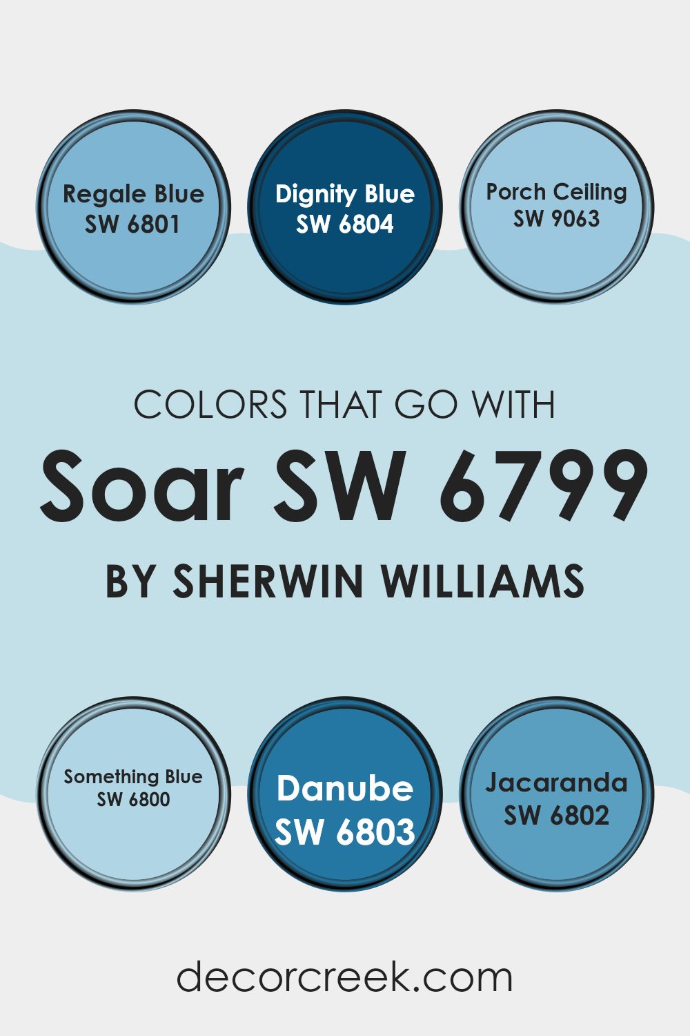
Colors that Go With Soar SW 6799 by Sherwin Williams
Choosing colors that complement Soar SW 6799 by Sherwin Williams is crucial for achieving a cohesive and visually appealing look in any room. When you select colors like SW 6801 – Regale Blue, SW 6804 – Dignity Blue, and others that harmonize well with Soar, you create a sense of continuity and flow throughout your room. These compatible colors help bring balance, allowing Soar SW 6799 to stand out without being too intense, making sure the area looks well-thought-out and professionally styled.
For example, SW 6801 – Regale Blue is a rich, royal blue that adds a bold touch to interiors, making it a prominent accent against the lighter Soar SW 6799. SW 6804 – Dignity Blue, slightly softer, offers a more muted alternative that still maintains that pop of blue.
SW 9063 – Porch Ceiling is a light, airy blue, almost like the sky on a clear day, which can help to brighten a room and pair smoothly with the calming nature of Soar. On the other hand, SW 6800 – Something Blue is vibrant and lively, injecting energy into any area.
SW 6803 – Danube brings depth with its deeper blue tone, perfect for creating a focal point or adding contrast. Lastly, SW 6802 – Jacaranda has a unique, slightly purple hue, providing a subtle twist to the traditional blue palette and offering a distinctive element to your decor. Each of these colors works together to support the primary shade of Soar SW 6799, ensuring a stylish and cohesive look.
You can see recommended paint colors below:
- SW 6801 Regale Blue
- SW 6804 Dignity Blue
- SW 9063 Porch Ceiling
- SW 6800 Something Blue
- SW 6803 Danube
- SW 6802 Jacaranda
How to Use Soar SW 6799 by Sherwin Williams In Your Home?
Soar SW 6799 by Sherwin Williams is a soft and subtle blue paint that can be a great addition to any home. It adds a calm and gentle touch to walls without being too intense. This shade is perfect for creating a relaxing atmosphere in rooms where you spend a lot of time unwinding.
For instance, it’s excellent for bedrooms where a calm environment can help you wind down and get a good night’s sleep. It’s also ideal for bathrooms, offering a spa-like feel that makes your bath time more enjoyable.
Because Soar is a muted blue, it works well in living areas too. It can complement various decor styles and color schemes, from modern to rustic. Pair it with whites for a clean and fresh look, or with grays and other neutrals for a harmonious palette. Adding this color to your home can make rooms feel more comforting and welcoming.
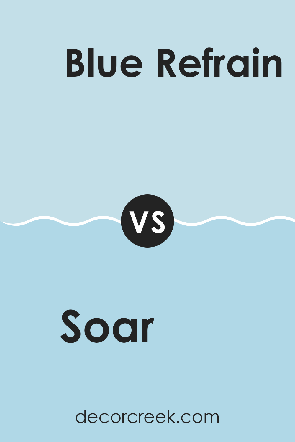
Soar SW 6799 by Sherwin Williams vs Blue Refrain SW 6956 by Sherwin Williams
The two colors Soar and Blue Refrain from Sherwin Williams have their unique traits. Soar is a light and airy blue that adds a bright, cheerful feeling to any room. It’s soft enough to be used in large areas without being too intense for the room’s aesthetic.
On the other hand, Blue Refrain is a deeper, more pronounced shade. This color provides a stronger presence and can give a room a more grounded and focused feel. While Soar might be perfect for creating a light, open atmosphere, Blue Refrain works well when you want to add a bit of drama or depth.
Both colors can be used creatively to achieve different moods and styles within a home or workplace, depending on the desired effect.
You can see recommended paint color below:
- SW 6956 Blue Refrain
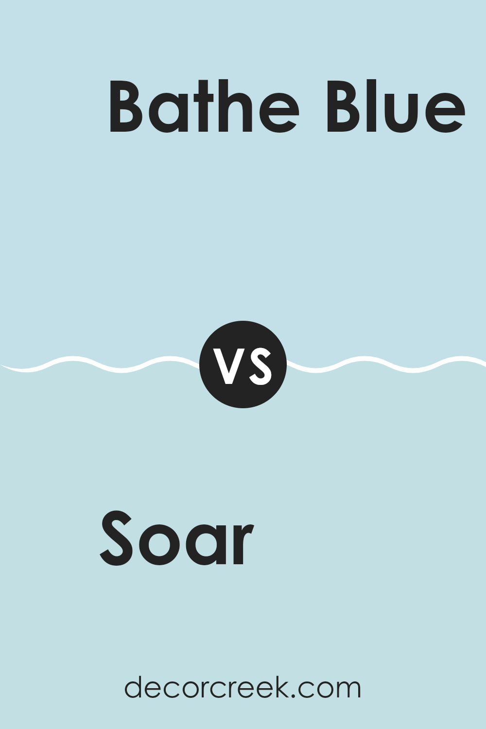
Soar SW 6799 by Sherwin Williams vs Bathe Blue SW 6771 by Sherwin Williams
Soar SW 6799 and Bathe Blue SW 6771 are both colors by Sherwin Williams, featuring cool blue hues that evoke a calm and welcoming atmosphere. Soar is subtler and lighter, almost resembling a soft sky blue. This gentle color is great for creating a peaceful vibe in rooms like bedrooms or bathrooms.
On the other hand, Bathe Blue is a more vibrant and brighter shade. It leans toward a more cheerful aquatic blue that can brighten a room and make it feel more energetic and refreshing. Both colors can be used to achieve different effects in home decor.
While Soar provides a muted backdrop for a quiet retreat, Bathe Blue stands out more, allowing for a dynamic and cheerful environment. Both are excellent choices depending on what kind of mood or style you want to achieve.
You can see recommended paint color below:
- SW 6771 Bathe Blue
Soar SW 6799 by Sherwin Williams vs Atmospheric SW 6505 by Sherwin Williams
Both Soar and Atmospheric are shades of blue offered by Sherwin Williams but have distinct vibes and uses. Soar is a vibrant sky blue that feels fresh and lively. It’s a great choice if you want to add a splash of cheerful color to a room, making it perfect for areas like children’s rooms or creative rooms where a touch of energy is welcome.
In contrast, Atmospheric is a much quieter, softer blue with a subtle gray undertone. This color lends itself well to creating a calm and restful environment, ideal for bedrooms or bathrooms where a relaxing atmosphere is important.
Both colors can be used to brighten up a room, but while Soar brings a more energetic touch, Atmospheric provides a gentle and soothing backdrop. Depending on the mood you want to create, you might choose one over the other. Soar captures the feeling of a clear, sunny day, whereas Atmospheric is more reminiscent of an overcast sky.
You can see recommended paint color below:
Soar SW 6799 by Sherwin Williams vs Aviary Blue SW 6778 by Sherwin Williams
Soar and Aviary Blue are both colors by Sherwin Williams, but they create quite different vibes. Soar is a soft, calm baby blue that brings a light and airy feel to any room, great for making a room seem a bit more open and relaxed.
On the other hand, Aviary Blue steps toward a slightly darker and richer tone that carries a hint of teal. It’s still in the blue family but offers a touch more depth, which can add a distinct character to walls or accents in a home.
In terms of where they might be best used, Soar works well in bedrooms or living areas where you want a gentle backdrop. Aviary Blue, with its extra punch, could be a better choice for a focal point or feature wall. Both paint colors help in creating a peaceful atmosphere, though in subtly different ways.
You can see recommended paint color below:
Soar SW 6799 by Sherwin Williams vs Open Air SW 6491 by Sherwin Williams
“Soar” and “Open Air” by Sherwin Williams are two refreshing colors, each bringing its unique vibe to a room. “Soar” is a bright and lively blue that injects energy into any room. It’s the kind of color that can make a room more exciting and cheerful.
Meanwhile, “Open Air” is a lighter, more subdued shade of blue. It creates a light and airy feeling, perfect for making small areas appear larger and more open. While “Soar” works great for accent walls or places where you want a pop of color, “Open Air” is ideal for a calm and peaceful setting, suitable for bedrooms or bathrooms.
Together, these colors offer a nice contrast – “Soar” being more dynamic, and “Open Air” more relaxed. Choosing between them depends on the mood you aim to set for your environment.
You can see recommended paint color below:
Soar SW 6799 by Sherwin Williams vs Byte Blue SW 6498 by Sherwin Williams
Soar and Byte Blue from Sherwin Williams are two distinct shades of blue. Soar has a light and bright tone, perfect for creating a fresh and airy feel in a room. It’s softer on the eyes and tends to spread a cheerful vibe, making it suitable for rooms like kitchens and bathrooms where a clean and uplifting atmosphere is desired.
On the other hand, Byte Blue is a deeper and more vibrant blue. It’s a striking color that carries more intensity than Soar, making it a great choice for a bold statement wall or decor elements. Byte Blue works well in areas where a dynamic and energetic look is desired, such as a home office or an entertainment room.
Both colors offer different moods and energies, with Soar leaning towards a gentle, light-hearted ambiance, and Byte Blue offering a more vivid and lively feel. The choice between them would largely depend on the type of atmosphere one wishes to create in their room.
You can see recommended paint color below:
Soar SW 6799 by Sherwin Williams vs Balmy SW 6512 by Sherwin Williams
Soar and Balmy by Sherwin Williams are two distinct shades of blue that can create different moods in a room. Soar is a vibrant, energetic light blue that feels fresh and lively, ideal for brightening up a room or creating a playful atmosphere.
In contrast, Balmy is a softer, more muted blue with a hint of green, giving it a calming, gentle, and soothing quality. This color is great for rooms where you want to relax, such as bedrooms or bathrooms.
While both colors are blues, Soar has a purer blue tone that can make a small room feel larger. Balmy, with its blend of blue and green, tends to bring a natural, peaceful vibe, reminiscent of the ocean or a quiet lake. The choice between the two would depend on the mood you’re aiming to achieve: Soar for a more cheerful and invigorating effect, or Balmy for a peaceful and comforting environment.
You can see recommended paint color below:
- SW 6512 Balmy
Soar SW 6799 by Sherwin Williams vs Minor Blue SW 6792 by Sherwin Williams
Soar and Minor Blue, both by Sherwin Williams, offer unique shades of blue for any decorating project. Soar has a vibrant, lively sky-blue hue that brightens up rooms and brings a cheerful energy.
It’s perfect for areas where you want to add a splash of freshness without being too bold. In contrast, Minor Blue is a subtler, softer shade, leaning slightly toward a greyish-blue. This color is ideal for creating a calm and gentle ambiance in rooms meant for relaxation or focus, like bedrooms or home offices.
Both colors go well with light neutrals and can be used to create a soothing palette or add a touch of color depending on surrounding decor. Minor Blue works great as a base color for a peaceful vibe, while Soar can highlight elements to make them stand out.
You can see recommended paint color below:
Soar SW 6799 by Sherwin Williams vs Moonmist SW 9144 by Sherwin Williams
Soar and Moonmist by Sherwin Williams are two distinct colors that can both refresh any room but in different ways. Soar is a vibrant, bright blue that can instantly cheer up a room with its lively hue. It’s ideal for rooms where you want to add energy or a playful touch. This color would be great in a kid’s room, a creative workspace, or any area meant to be stimulating and fun.
On the other hand, Moonmist presents a softer approach. This color is a muted green with a gentle touch, perfect for creating a calm and relaxing atmosphere. It works well in bedrooms, bathrooms, or any room where a soothing atmosphere is desired. Its understated elegance allows it to blend beautifully with natural elements and muted decor.
When comparing the two, think of Soar as the more spirited, standout shade, while Moonmist is about creating a peaceful and restful backdrop. Both colors offer unique vibes, so the choice depends on what mood you’re looking to achieve in your room.
You can see recommended paint color below:
Soar SW 6799 by Sherwin Williams vs Little Boy Blu SW 9054 by Sherwin Williams
Soar and Little Boy Blu, both by Sherwin Williams, are two distinct blue shades that can really change the mood of a room. Soar is a brighter, more vibrant color. It leans slightly toward a sky blue and brings a fresh, lively feel wherever it’s used. This color would be great in a room where you want to add a touch of cheerfulness and vibrancy, like a playroom or a creative office.
On the other hand, Little Boy Blu is a more muted, softer blue. It has an understated quality that makes it ideal for areas where you want to create a calm and peaceful atmosphere, such as a bedroom or a cozy reading nook.
In summary, if you’re looking for a blue that’s bold and energetic, Soar is your go-to. If you prefer something calmer and more subtle, then Little Boy Blu is a great choice. The selection depends on the mood and function of the room you are decorating.
You can see recommended paint color below:
- SW 9054 Little Boy Blu
As I wrap up my thoughts on SW 6799 Soar by Sherwin Williams, I have to say, I’m really impressed by this color. It’s a soft blue that feels like the sky on a sunny day. It has a way of making a room look friendly and open, which is pretty cool if you ask me. This blue isn’t too bright or too dull; it’s just right for making a room feel a bit more special.
In my own home, I tested Soar in the living room, and it changed the whole mood of the room! It turned the room into a peaceful spot for my family to relax and enjoy our time together. This color goes well with a lot of different things like white curtains and dark furniture, or even some bright yellow cushions for a fun contrast.
Overall, I think SW 6799 Soar is a fantastic pick if you want to give your room a fresh, new look. It’s definitely a color that brings out a happy, calming vibe without being too intense. I’d recommend it to anyone looking to repaint their room or even their entire home. It’s simply a nice, friendly shade of blue that many will appreciate.
decorcreek.com
Ever wished paint sampling was as easy as sticking a sticker? Guess what? Now it is! Discover Samplize's unique Peel & Stick samples.
Get paint samples

