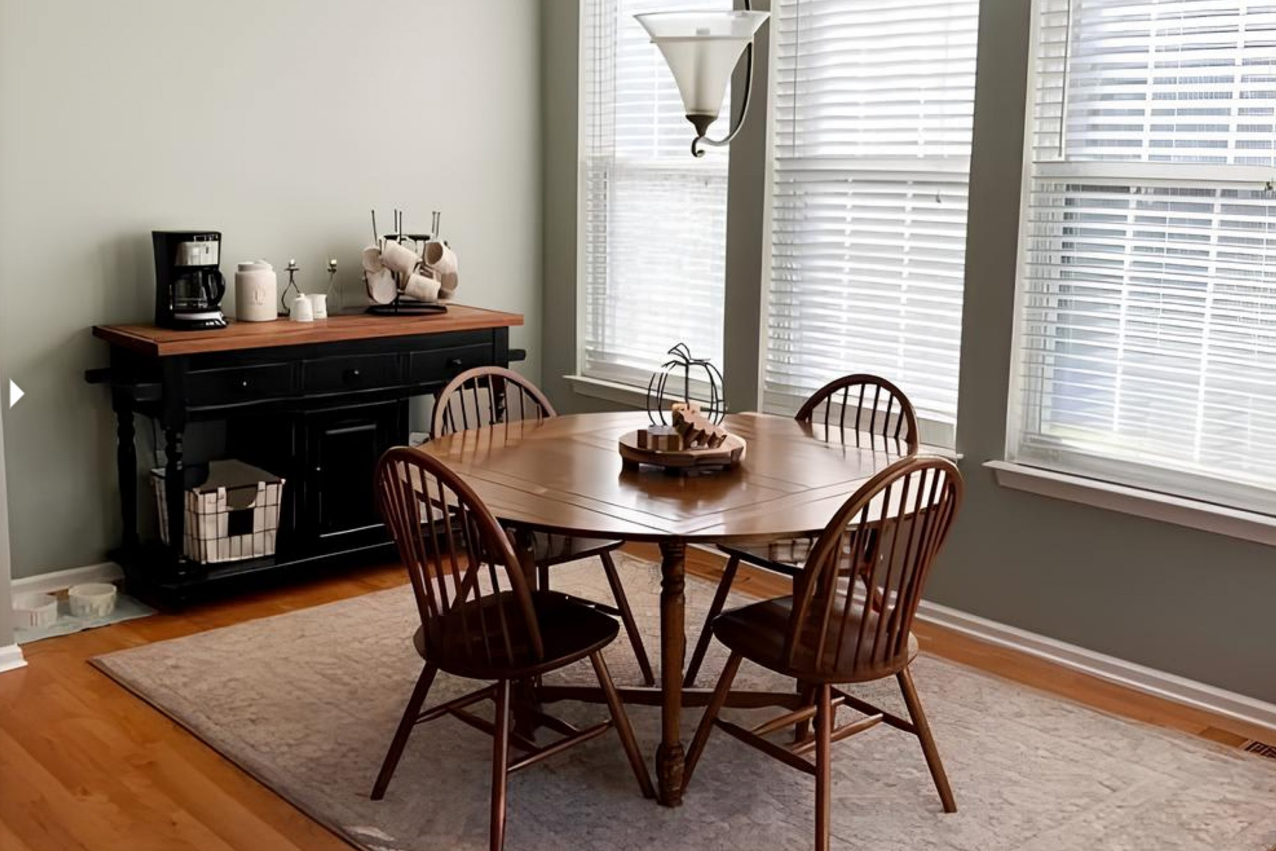
Soft Sage by Sherwin Williams, a shade of green, captures my attention with its understated elegance. When I noticed it, the color immediately gave off a sense of calm and renewal. This shade stands out in its subtlety, balancing nature’s freshness with a gentle hint of sophistication. Imagine a gentle walk through a lush garden on a bright day: that’s the essence I get with Soft Sage.
The color is versatile, blending seamlessly with many styles and spaces, whether it’s a cozy living room or a lively kitchen. Its soft green tones create a peaceful atmosphere that evokes feelings of growth and harmony. I can see Soft Sage pairing beautifully with natural materials like wood or stone, enhancing their textures without overpowering them.
Each brushstroke of this color seems to breathe life into a room, inviting a relaxed and welcoming vibe. With Soft Sage, the walls feel like they are wrapped in a soft, comforting embrace, making any space feel more inviting.
If you’re looking for a color that gently whispers elegance and comfort, Soft Sage might just be the perfect choice.
What Color Is Soft Sage SW 9647 by Sherwin Williams?
Soft Sage is a gentle and calming green with subtle gray undertones. It’s like a breath of fresh air in a room, creating a relaxed and welcoming atmosphere. This color works beautifully in a variety of interior styles, especially those that favor natural elements and a cozy vibe. For instance, it fits well with the Scandinavian style, where simplicity and minimalism are key.
It’s also a great choice for modern farmhouse interiors, offering a touch of nature without overwhelming the space.
In terms of materials, Soft Sage pairs wonderfully with natural wood, be it light or dark, as the green complements the warmth of the wood. Think of using it alongside oak or walnut furniture. It also pairs nicely with natural fibers, such as cotton or linen, bringing a tactile softness that enhances the room’s comfort. Additionally, this color goes well with textures like jute rugs or woven baskets, adding depth and interest.
When accented with brass or copper, it creates a subtle yet charming contrast, bringing a bit of shine to the calm hue. By using Soft Sage, you can create spaces that feel both inviting and grounded, making it easier to relax and enjoy your surroundings.
Is Soft Sage SW 9647 by Sherwin Williams Warm or Cool color?
Soft Sage SW 9647 by Sherwin Williams is a gentle, muted green that brings a sense of calm and nature into homes. This color works well in creating a peaceful atmosphere, making it a great choice for bedrooms and living rooms where relaxation is key. It has subtle earthy tones that pair nicely with natural wood accents and other neutral shades. The color is versatile, fitting both modern and traditional styles.
In kitchens, Soft Sage can be a refreshing choice for cabinets or walls, offering a hint of color without being overwhelming. It complements white and cream-colored countertops and backsplashes, adding a touch of warmth. In bathrooms, this soft green can create a spa-like feel, making the space inviting.
Soft Sage’s gentle quality makes it easy to live with, as it doesn’t dominate a room but instead softly enhances it, contributing to a cozy, welcoming environment for family and guests alike.
Undertones of Soft Sage SW 9647 by Sherwin Williams
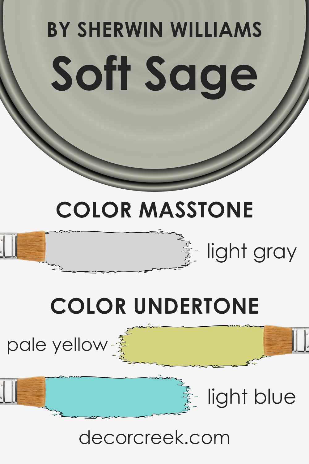
Soft Sage by Sherwin Williams is an intriguing color because of its mix of undertones that subtly change how we perceive it. Undertones are like the hidden colors beneath the surface that can influence the main color’s appearance. For example, if a color has a yellow undertone, it may look warmer, while a blue undertone can make it feel cooler.
In Soft Sage, the pale yellow and mint undertones give the color a fresh and slightly warm appearance. It makes the paint feel natural and inviting in a room. The light blue undertone adds a gentle coolness, helping balance the warmth from the yellow and mint, making the color more versatile.
The light purple and lilac undertones introduce a subtle hint of sophistication, giving the color depth without overwhelming it. Finally, the grey undertone grounds the color, providing a neutral base that helps it adapt to different lighting situations.
On interior walls, these undertones work together to create a calming and harmonious effect. Depending on the time of day and the room’s natural light, the paint might appear warmer or cooler, offering a dynamic and adaptable backdrop for various design styles and moods.
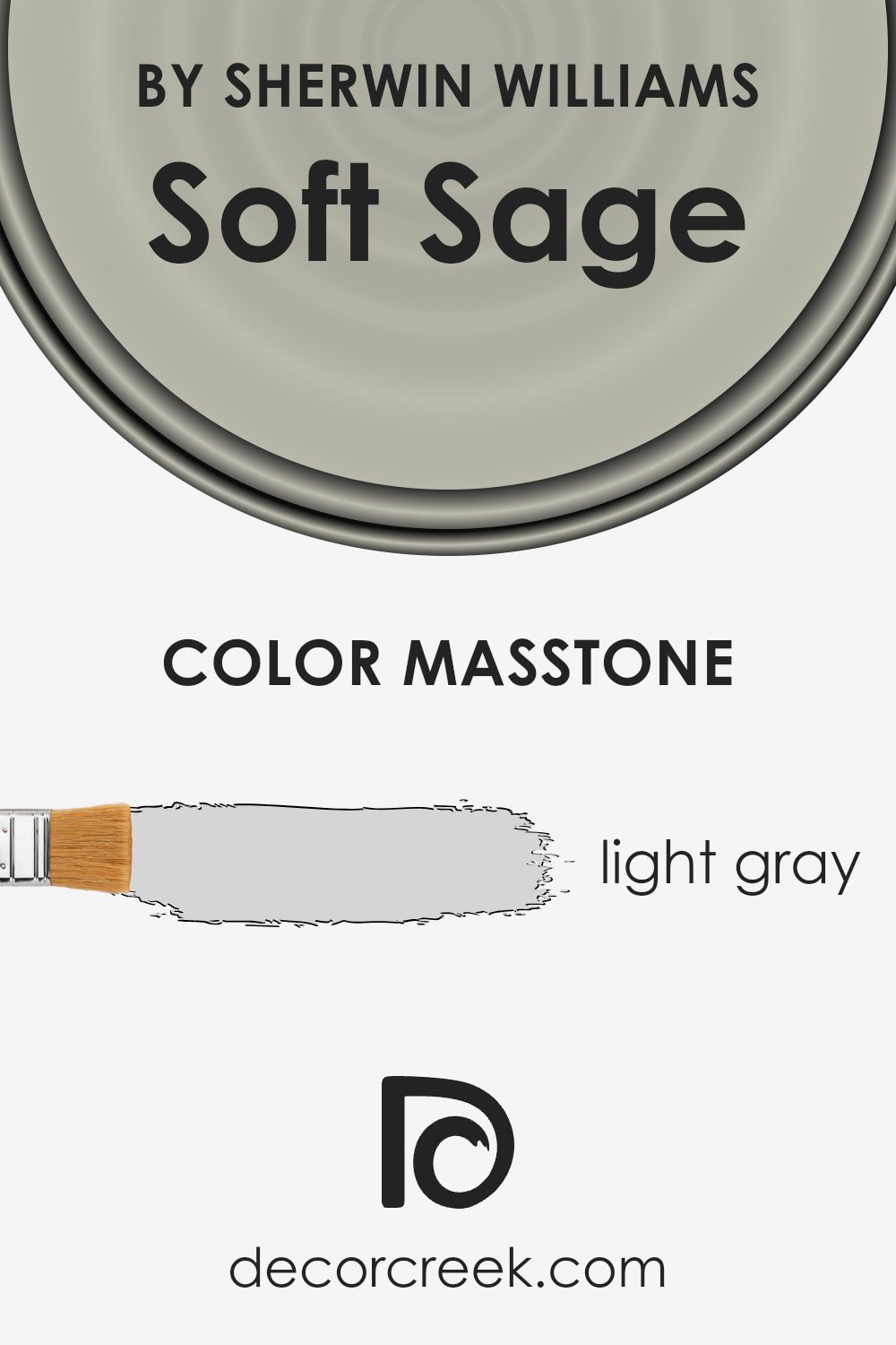
What is the Masstone of the Soft Sage SW 9647 by Sherwin Williams?
Soft Sage SW 9647 by Sherwin Williams is a gentle, light gray with a hint of sage. Its masstone, identified as light gray (#D5D5D5), contributes to its calming and subtle appearance. This color works particularly well in homes by creating a bright and airy atmosphere. Due to its lightness and neutrality, Soft Sage can easily blend with various design elements, making it a versatile choice for any room.
In living rooms, it provides a clean backdrop that pairs beautifully with both bold and pastel accents. In the kitchen, it complements stainless steel appliances and wood finishes, adding a modern yet cozy touch.
Used in bedrooms, the calming qualities of Soft Sage can promote relaxation and restfulness. Additionally, in bathrooms, it enhances natural light, making the space feel more open and refreshing. Its understated elegance makes it a popular choice among homeowners looking for a balanced and timeless look.
How Does Lighting Affect Soft Sage SW 9647 by Sherwin Williams?
Lighting plays a crucial role in how we perceive colors. Different types of light can change the appearance of a color significantly, making it seem lighter, darker, warmer, or cooler.
The color Soft Sage SW 9647 by Sherwin Williams, for example, is a gentle, muted green that can look dramatically different depending on the lighting conditions. In natural light, especially during midday when the sun is bright and overhead, Soft Sage appears as a fresh and soft green. The amount and direction of natural light it receives throughout the day can alter its appearance.
In north-facing rooms, which typically have cooler and more diffuse light, Soft Sage can take on a slightly cooler tone, making it appear more muted and subdued. This might give the space a calm and relaxing vibe, but it’s essential to consider that the color may read grayer than expected.
In south-facing rooms, the light is warmer and more direct for most of the day. Soft Sage will likely look brighter and slightly warmer, showing its green hues more vividly. This can make the room feel more inviting and cheerful.
East-facing rooms catch the warm light of the morning sun, which can enhance the green’s warmth and softness early in the day, while later, as the light becomes cooler, the color might seem neutral and balanced.
In west-facing rooms, the opposite happens: mornings may present the color as cooler and dimmer. As the day progresses, the warm afternoon and evening light can bring out a richer, warmer version of Soft Sage, giving the space a cozy feel.
In artificial light, such as LED or incandescent bulbs, Soft Sage can again appear different. While LED lights with cooler temperatures might mute the color, incandescent bulbs will give it a warm undertone. Always test paint colors in intended lighting conditions to see how they change over time.
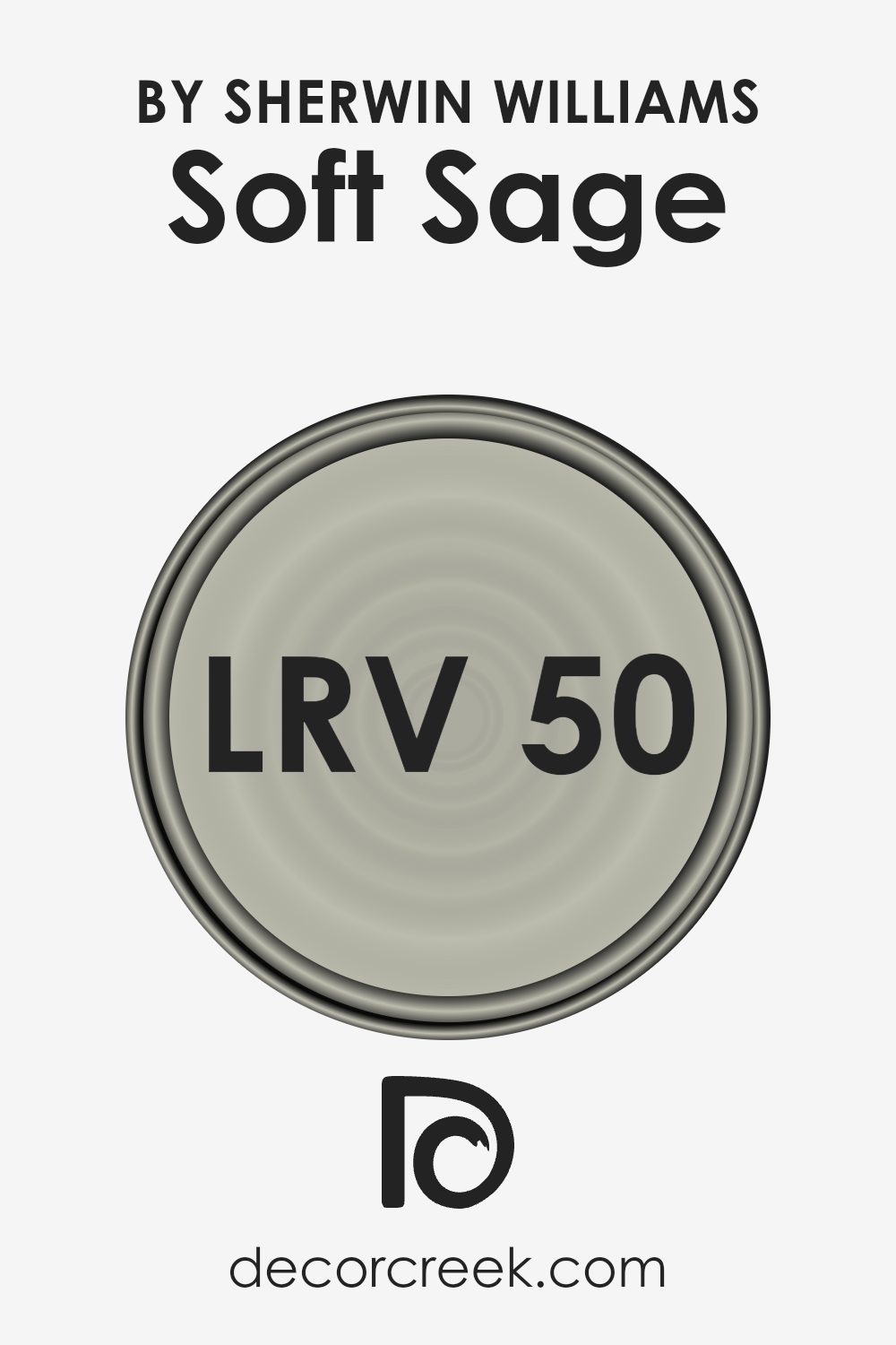
What is the LRV of Soft Sage SW 9647 by Sherwin Williams?
LRV, or Light Reflectance Value, is a measurement that indicates how much light a paint color reflects or absorbs. The scale ranges from 0, which absorbs all light (black), to 100, which reflects all light (white). An LRV of 49.538 means that this specific paint color is right around the middle of the scale. It reflects a moderate amount of light, making it neither too dark nor too light.
This middle-ground LRV is significant because it will affect how the color looks in a room. With its balance of light reflection, this paint will react to lighting conditions, sometimes appearing lighter or darker depending on how much light is present in a room.
For this particular color, having an LRV of 49.538 means it should work well in various lighting conditions. In a bright room with lots of natural light, the color can appear lighter and more vibrant. In dimmer conditions, it might look a bit deeper and more muted.
It’s versatile because it can hold its character without washing out or becoming too heavy. This balance makes it a good choice for those who want a color that adapts well to changing light throughout the day while maintaining a consistent and comfortable look.
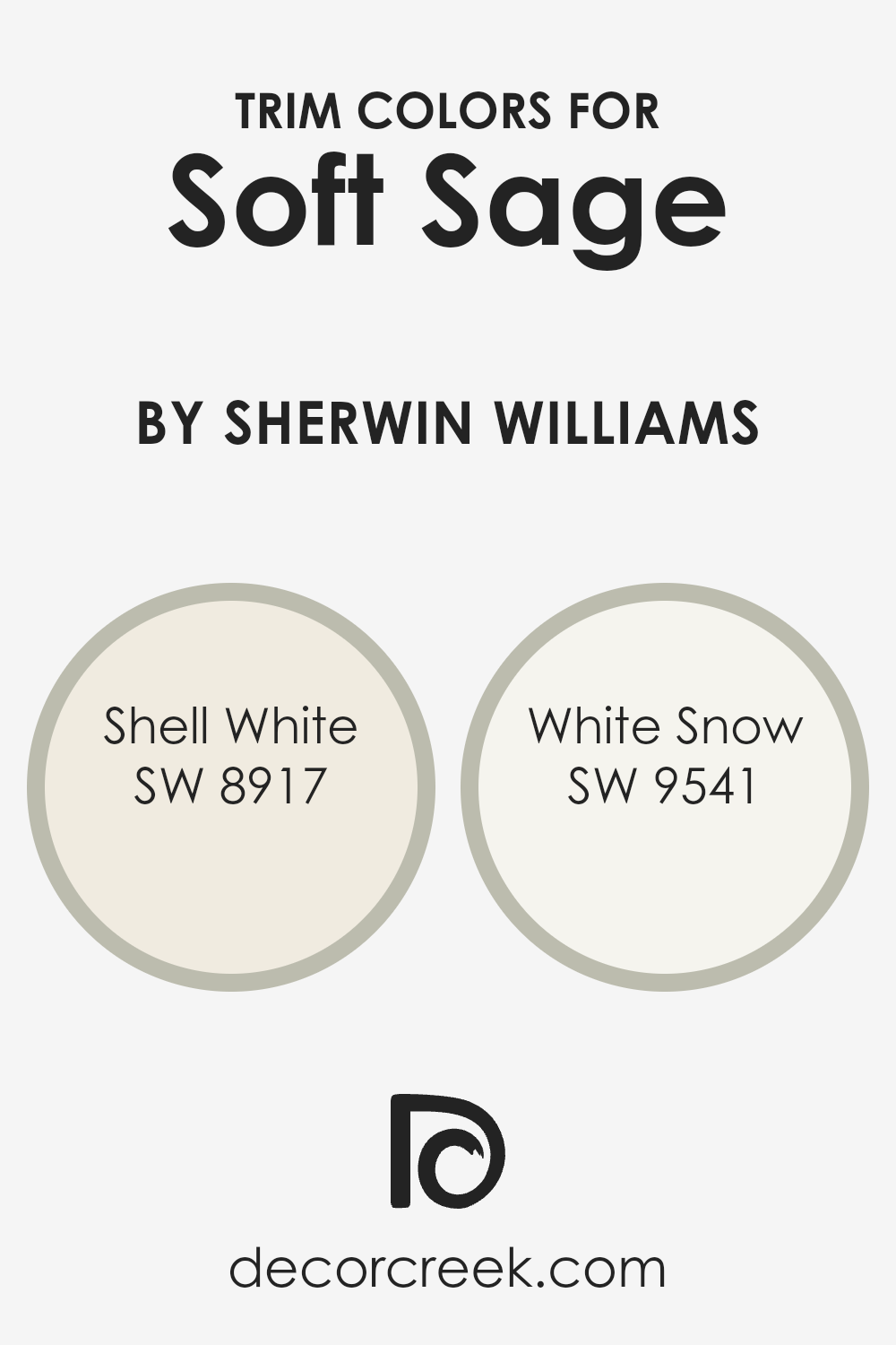
What are the Trim colors of Soft Sage SW 9647 by Sherwin Williams?
Trim colors are the colors used for the borders, moldings, and other accent pieces in a room, providing contrast and a complementary touch to the main wall color. When painting a room with Soft Sage by Sherwin Williams, trim colors are important because they help highlight the soft green tone and bring a completed look to the space.
Choosing the right trim color can enhance the beauty of Soft Sage, making the room feel more polished and cohesive. Trim colors like SW 8917 – Shell White and SW 9541 – White Snow can create a crisp, clean outline around the walls, adding a sense of depth and definition.
SW 8917 – Shell White is a warm, creamy off-white color that adds a hint of coziness without overwhelming the room’s natural tones. It pairs well with muted greens like Soft Sage, creating a warm and inviting environment. On the other hand, SW 9541 – White Snow is a bright, cool white that offers a more striking contrast.
This color brings a clean and fresh feel to the room while allowing the Soft Sage to remain the focal point. Both trim colors serve to highlight the Soft Sage, enhancing its soothing quality and providing a balanced finish to the room.
You can see recommended paint colors below:
- SW 8917 Shell White
- SW 9541 White Snow
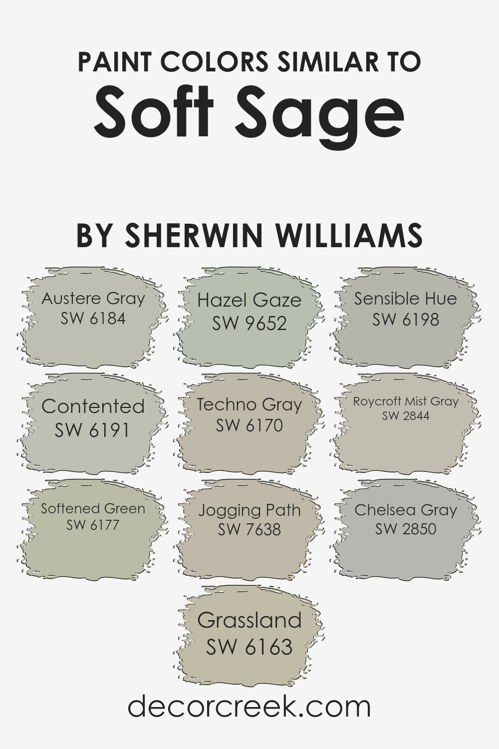
Colors Similar to Soft Sage SW 9647 by Sherwin Williams
Similar colors are important in design and decor because they create a harmonious and cohesive look. They are colors that share common undertones, making them naturally blend well together. For example, Soft Sage by Sherwin Williams pairs beautifully with other similar shades. Austere Gray is a muted gray-green tone that adds a subtle depth, while Contented offers a soft, relaxed green that complements many settings.
Softened Green provides a gentle, muted green that creates a calm atmosphere. Grassland, true to its name, is a warm, earthy green perfect for a natural feel. Hazel Gaze introduces a hint of freshness with its light green accents, offering a slightly invigorating touch.
Techno Gray integrates a hint of industrial flair with its gray base paired with green undertones, which works well in modern or transitional spaces. Jogging Path brings in a rugged, earthy tone, adding an adventurous spirit to any palette. Sensible Hue, with its grounded and balanced green-gray combination, fits backdrops or accents alike.
Roycroft Mist Gray, with its timeless character, adds historical refinement and works for both traditional and contemporary designs. Chelsea Gray rounds out the selection with a more profound, sophisticated tone that still carries a touch of warmth, unifying the whole palette. Together, these colors allow for subtle creativity while ensuring a room feels connected and well-designed.
You can see recommended paint colors below:
- SW 6184 Austere Gray
- SW 6191 Contented
- SW 6177 Softened Green
- SW 6163 Grassland
- SW 9652 Hazel Gaze
- SW 6170 Techno Gray
- SW 7638 Jogging Path
- SW 6198 Sensible Hue
- SW 2844 Roycroft Mist Gray
- SW 2850 Chelsea Gray
How to Use Soft Sage SW 9647 by Sherwin Williams In Your Home?
Soft Sage SW 9647 by Sherwin Williams is a calming green color that can add a touch of warmth and comfort to your home. It’s a versatile shade that works well in various spaces, making it easy to incorporate into your interior design. In the living room, Soft Sage can create a cozy and inviting atmosphere, complementing both modern and traditional furniture.
It pairs beautifully with neutral tones like beige and cream, adding a subtle color without overwhelming the space.
In the bedroom, this gentle green can help create a peaceful environment, perfect for relaxation and rest after a long day. You can also use Soft Sage in the kitchen, where it gives a fresh, clean look when combined with white cabinets and natural wood accents. For a cohesive feel, consider using this color in smaller touches like throw pillows, rugs, or artwork in other parts of your home.
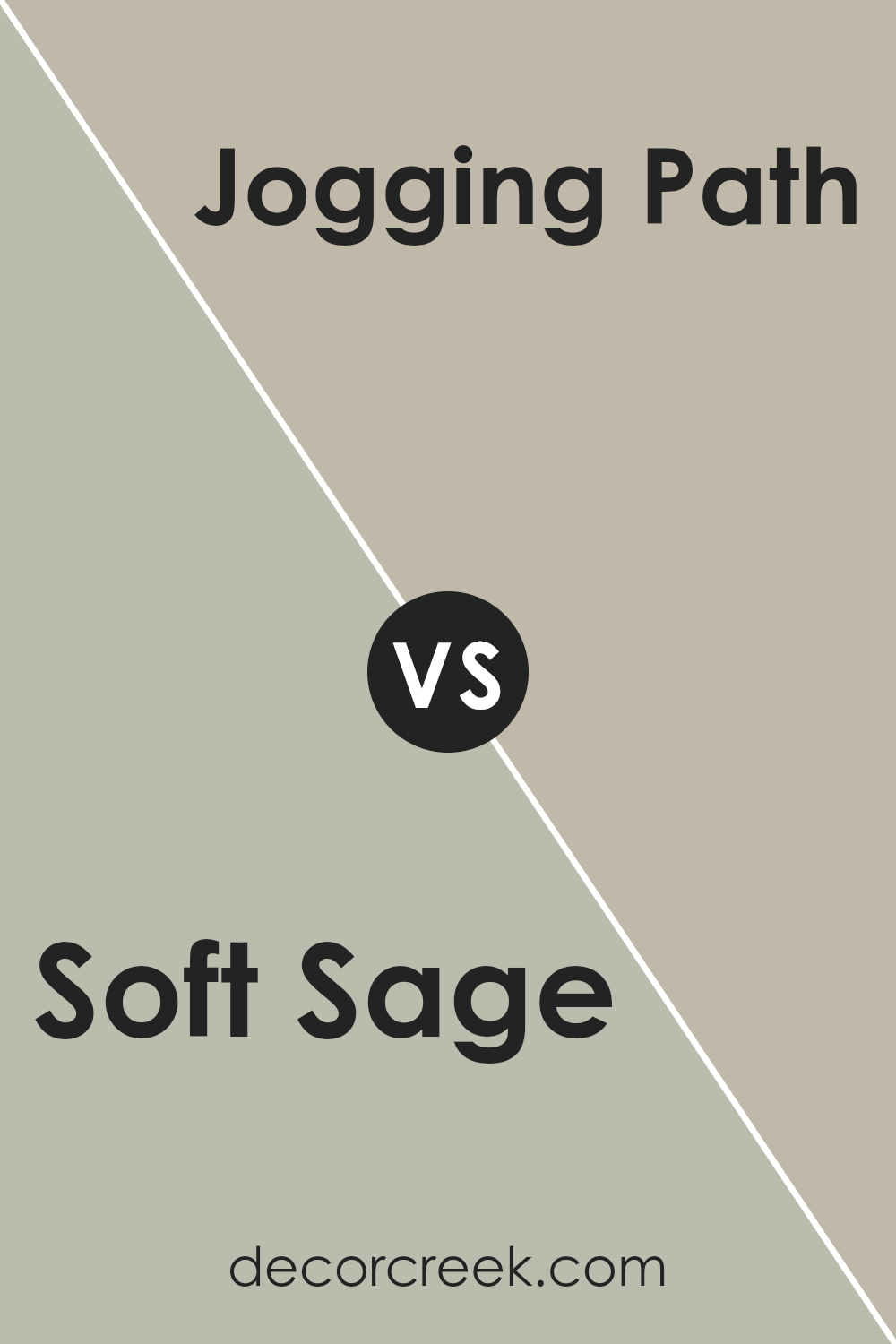
Soft Sage SW 9647 by Sherwin Williams vs Jogging Path SW 7638 by Sherwin Williams
Soft Sage (SW 9647) and Jogging Path (SW 7638) by Sherwin Williams are both greenish colors, but they have distinct tones. Soft Sage is a lighter, muted green that brings a gentle, natural feel to spaces. It’s soothing and works well in areas where you want a calm and fresh atmosphere, such as bedrooms or living rooms. The color is versatile and pairs well with whites and other soft neutrals.
Jogging Path, on the other hand, is a deeper, more earthy green. It has a warm undertone, which makes it feel cozy and inviting. It’s a great choice for spaces where you want a bit more depth and richness, such as dining rooms or accent walls.
Jogging Path can be paired with darker woods and deeper colors for a more grounded look. Both colors bring a touch of nature indoors, but Soft Sage is more airy, while Jogging Path is more warm and grounding.
You can see recommended paint color below:
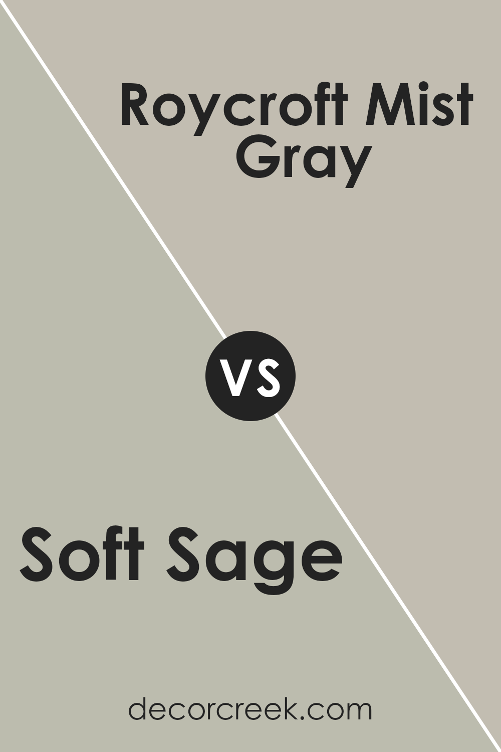
Soft Sage SW 9647 by Sherwin Williams vs Roycroft Mist Gray SW 2844 by Sherwin Williams
Soft Sage SW 9647 and Roycroft Mist Gray SW 2844 by Sherwin Williams are both subtle and calming colors, but they have distinct differences. Soft Sage is a gentle green with earthy undertones that provide a natural and fresh ambiance. It works well in spaces where you want to create a light and airy feel.
On the other hand, Roycroft Mist Gray is a more muted, cool gray with blue undertones. This color gives off a more traditional and sophisticated vibe, often seen in classic or historic settings. It pairs well with darker shades for a balanced, timeless look.
While Soft Sage brings a touch of nature indoors, making spaces feel vibrant yet relaxing, Roycroft Mist Gray adds a touch of elegance and depth. Both colors are versatile, but Soft Sage leans towards a warmer palette, whereas Roycroft Mist Gray stays cool and collected. These shades can complement each other beautifully depending on the mood you want to create.
You can see recommended paint color below:
- SW 2844 Roycroft Mist Gray
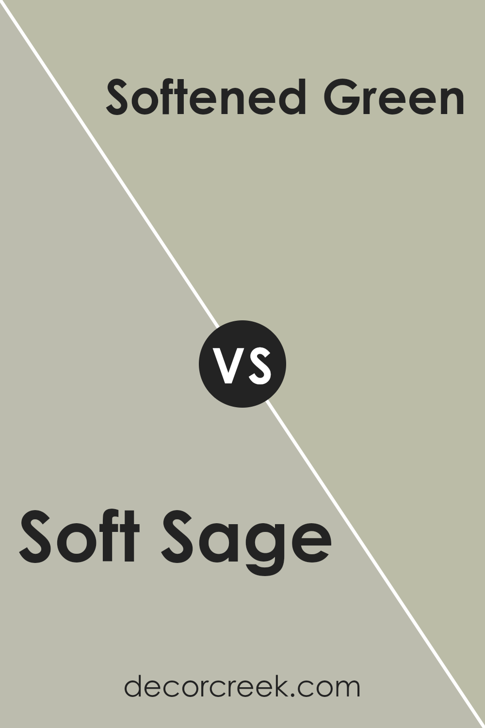
Soft Sage SW 9647 by Sherwin Williams vs Softened Green SW 6177 by Sherwin Williams
Soft Sage SW 9647 and Softened Green SW 6177 by Sherwin Williams are both gentle, muted greens, but they have distinct differences. Soft Sage SW 9647 leans more towards a grayish-green tone, offering a neutral and calming effect. It’s a color that can easily blend into various spaces without drawing too much attention, making it versatile for different design styles.
On the other hand, Softened Green SW 6177 is warmer and slightly more vibrant. It carries a soft hint of yellow, giving it a natural and lively feel compared to Soft Sage. This makes Softened Green a bit more energetic while still maintaining a soothing quality.
Both colors are excellent for creating a peaceful environment, but the choice between them depends on whether you prefer a more neutral atmosphere or one with a touch of warmth and freshness.
You can see recommended paint color below:
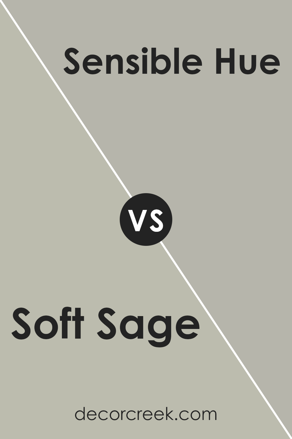
Soft Sage SW 9647 by Sherwin Williams vs Sensible Hue SW 6198 by Sherwin Williams
Soft Sage SW 9647 by Sherwin Williams is a gentle, muted green that feels fresh and natural. It is calming and can bring a touch of the outdoors inside. Its soft tone makes it versatile, suitable for living rooms or bedrooms, where a peaceful ambiance is desired.
Sensible Hue SW 6198 by Sherwin Williams is also a green, but it leans slightly more toward a grayish tone. This gives it a more understated and neutral appearance. It pairs well with various other colors due to its subtle nature.
While both colors are green, Soft Sage is a bit warmer and more inviting, while Sensible Hue offers a cooler, more restrained palette. Soft Sage works well for those wanting a hint of nature’s softness, whereas Sensible Hue might appeal to those looking for a more neutral backdrop that quietly complements other design elements. Both colors are versatile, providing calmness and subtlety.
You can see recommended paint color below:
- SW 6198 Sensible Hue
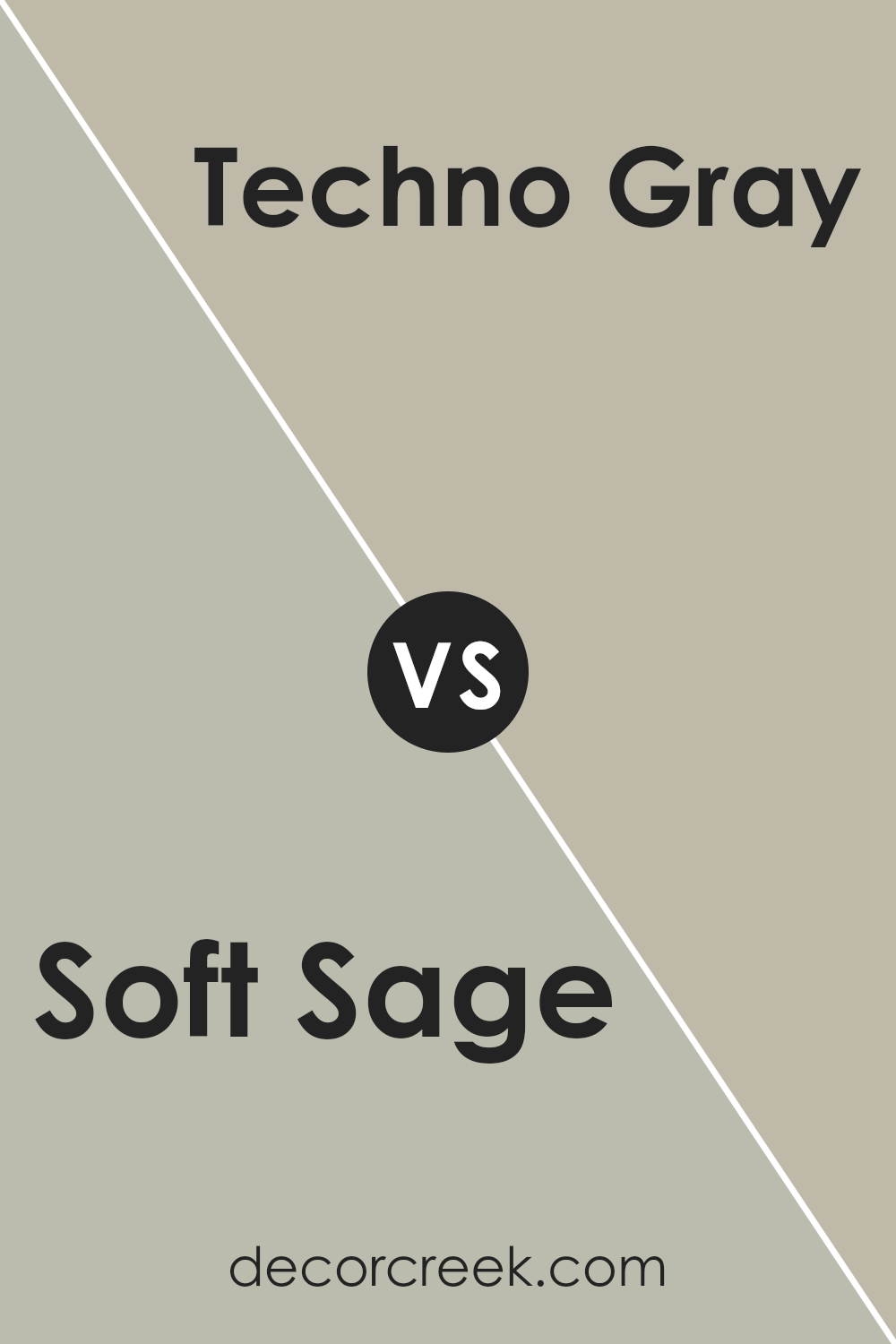
Soft Sage SW 9647 by Sherwin Williams vs Techno Gray SW 6170 by Sherwin Williams
Soft Sage SW 9647 and Techno Gray SW 6170, both by Sherwin Williams, are subtle and versatile colors. Soft Sage is a light, muted green with a gentle, calming effect. It has a slightly earthy tone, making it ideal for spaces where a touch of nature is desired. It’s perfect for creating a relaxed, comforting atmosphere in living rooms or bedrooms.
On the other hand, Techno Gray is a bit deeper and holds more of a grayish tone with a hint of green. It offers a more neutral and sophisticated look, suitable for modern and minimalist designs. It can be used in spaces where you want a more grounded and staid vibe, such as in home offices or kitchens.
Both colors blend well with natural materials like wood and stone, but Soft Sage leans more toward a fresh, airy feel, while Techno Gray provides a more balanced, understated backdrop.
You can see recommended paint color below:
- SW 6170 Techno Gray
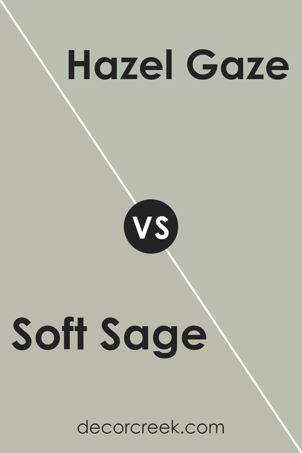
Soft Sage SW 9647 by Sherwin Williams vs Hazel Gaze SW 9652 by Sherwin Williams
Soft Sage SW 9647 and Hazel Gaze SW 9652 are both gentle, green hues from Sherwin Williams, each offering a distinct look while maintaining a natural feel. Soft Sage is a subdued, grayish-green that brings a calming and neutral presence to a room. It has enough gray in it to feel subtle and versatile, pairing well with a variety of other colors and materials.
Hazel Gaze, on the other hand, has a warm, earthy undertone. It leans slightly towards a muted olive, offering a bit more warmth compared to Soft Sage. This makes Hazel Gaze feel more inviting and cozy, especially in spaces where a comfortable and relaxed atmosphere is desired.
While both shades are green, Soft Sage works great for those seeking a neutral backdrop, whereas Hazel Gaze adds a bit more personality with its richer undertones. Both colors can create a peaceful environment but cater to slightly different décor themes.
You can see recommended paint color below:
- SW 9652 Hazel Gaze
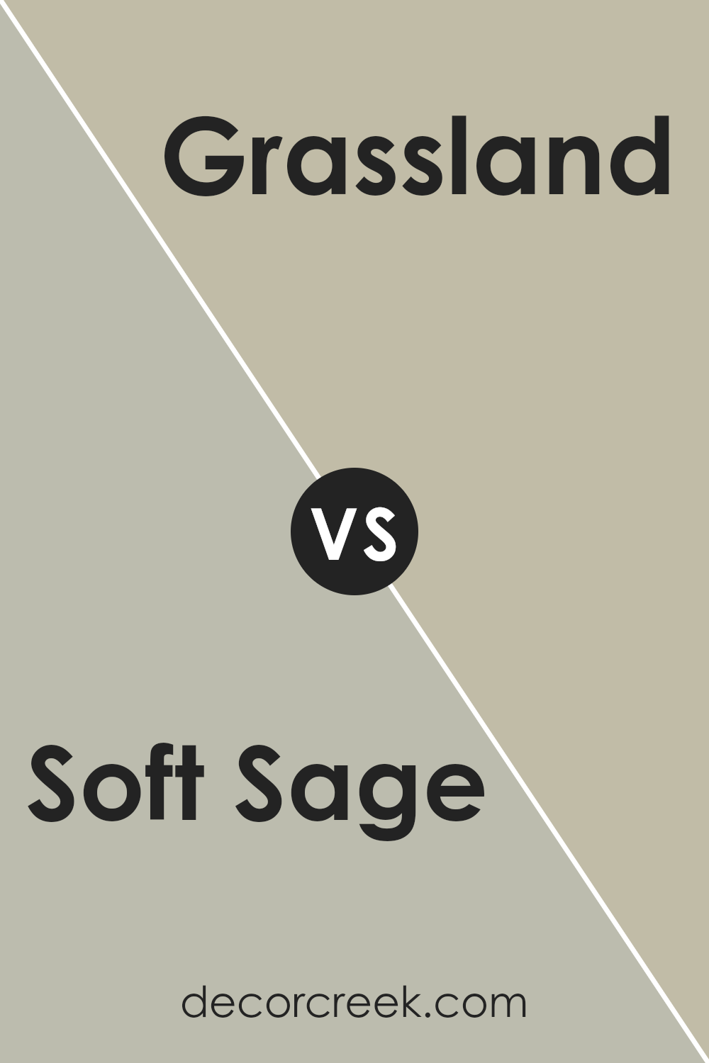
Soft Sage SW 9647 by Sherwin Williams vs Grassland SW 6163 by Sherwin Williams
Soft Sage SW 9647 and Grassland SW 6163, both by Sherwin Williams, are calming greens but differ in their shade and feel. Soft Sage is a lighter, softer green with a hint of gray, giving it a gentle, muted appearance. It’s subtle and can make rooms feel open and airy. It’s perfect for creating a relaxed atmosphere in spaces like bedrooms or bathrooms.
Grassland, on the other hand, is a bit darker and carries more warmth. It has an earthy tone that brings more depth and richness to a space. This makes it suitable for living areas or dining rooms where a touch of coziness is desired.
While both colors offer a soothing vibe, Soft Sage is better for brightness and calm spaces, whereas Grassland adds warmth and a more grounded feel. Choosing between them depends on whether you prefer an airy or cozy effect in your room.
You can see recommended paint color below:
- SW 6163 Grassland
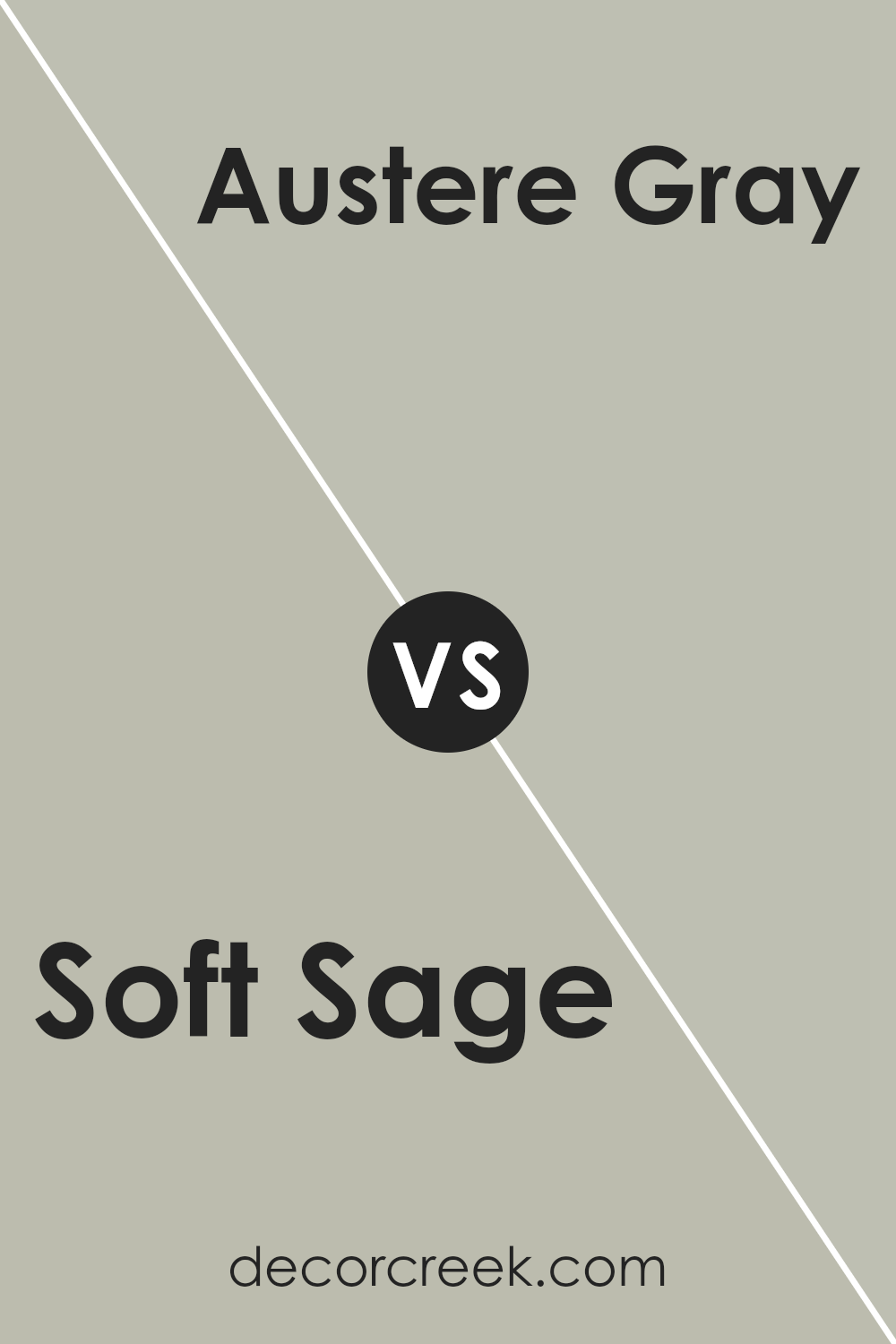
Soft Sage SW 9647 by Sherwin Williams vs Austere Gray SW 6184 by Sherwin Williams
Soft Sage SW 9647 and Austere Gray SW 6184 by Sherwin Williams are two subtle, calming colors with distinct personalities. Soft Sage is a gentle, muted green that brings a natural touch to any space. It has an earthy feel, reminiscent of fresh leaves and outdoor settings. This color is great for creating a soothing, peaceful environment in a room, offering warmth and comfort.
On the other hand, Austere Gray is a cooler color, with a slight hint of green that gives it depth without being overpowering. It is versatile and can adapt well to both traditional and modern spaces. Austere Gray provides a crisp, clean backdrop while maintaining a relaxed vibe.
When comparing the two, Soft Sage introduces a more organic and inviting feel, while Austere Gray offers a refined, understated look. Both are excellent choices for interiors, but the preference depends on whether you want more warmth or a cooler atmosphere in your space.
You can see recommended paint color below:
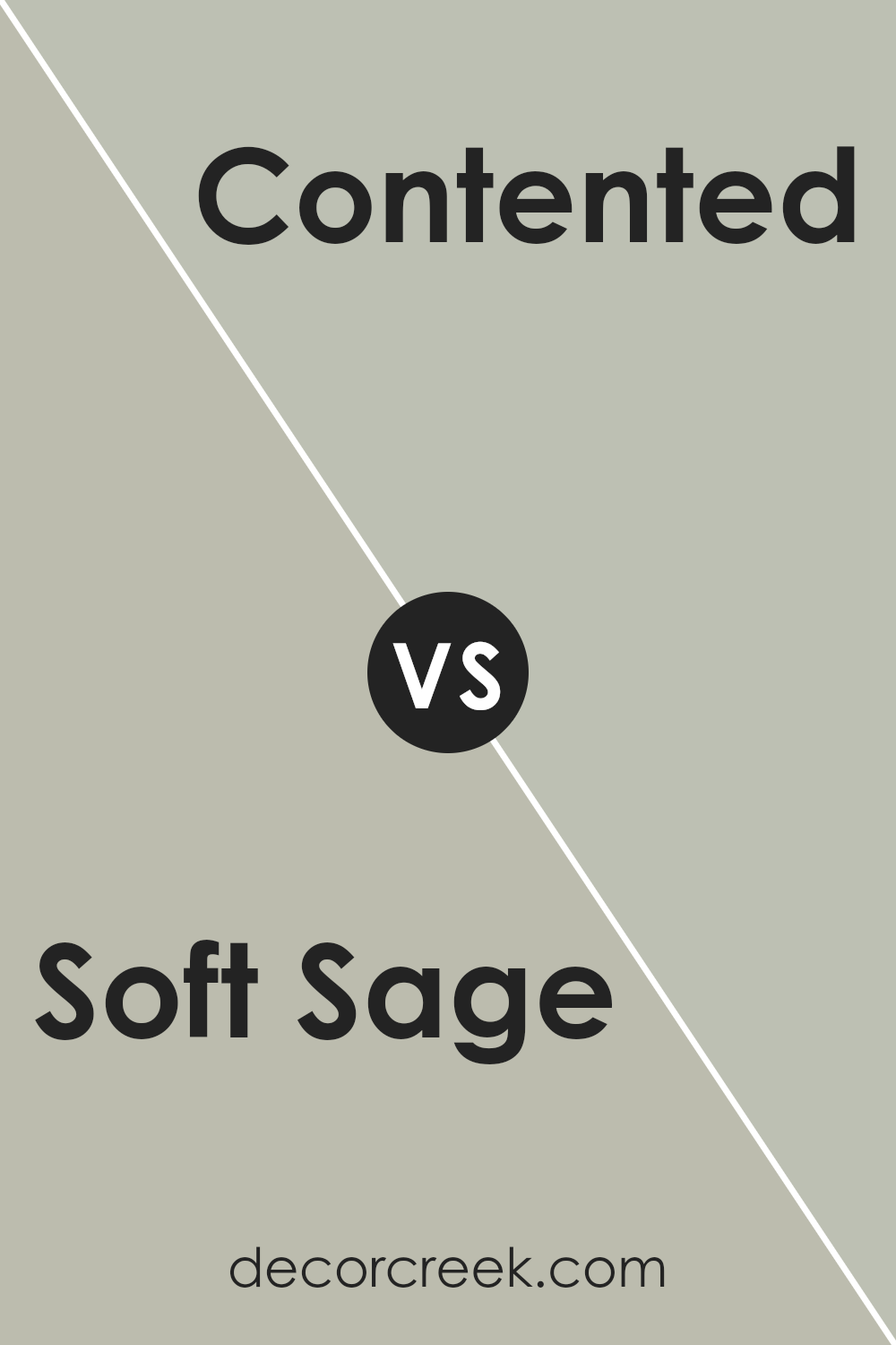
Soft Sage SW 9647 by Sherwin Williams vs Contented SW 6191 by Sherwin Williams
Soft Sage SW 9647 and Contented SW 6191 by Sherwin Williams are both gentle and calming shades of green, but they have distinct differences. Soft Sage is a lighter, more muted green with a hint of gray. This color brings a sense of gentle freshness to a space and works well as a versatile backdrop for various decor styles.
Contented, on the other hand, is a slightly deeper and richer green compared to Soft Sage. It carries more warmth and has a subtle touch of blue, giving it a comforting vibe. Contented is perfect for creating a cozy atmosphere and pairs nicely with natural wood tones and earthy accents.
While both colors promote a sense of calmness, Soft Sage is more understated and airy, making spaces feel open and bright. Contented, with its depth, adds a touch of coziness and works well in spaces where you want a bit more warmth and character.
You can see recommended paint color below:
- SW 6191 Contented
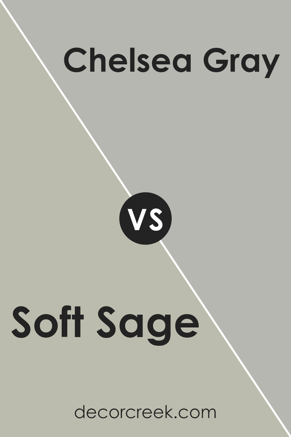
Soft Sage SW 9647 by Sherwin Williams vs Chelsea Gray SW 2850 by Sherwin Williams
Soft Sage SW 9647 and Chelsea Gray SW 2850 by Sherwin Williams are two distinct colors that can create different moods in a space. Soft Sage is a gentle, muted green that brings a sense of calm and is reminiscent of nature, making it an excellent choice for creating a peaceful atmosphere. It works well in bedrooms and living areas where a soothing environment is desired.
On the other hand, Chelsea Gray is a rich, mid-tone gray that adds depth and sophistication to a room. It’s a versatile neutral that pairs well with both light and dark colors, making it suitable for various styles and settings. Chelsea Gray is often used in dining rooms and offices to create a more formal and grounded feel.
When comparing these colors, Soft Sage brings a light and airy touch, while Chelsea Gray offers a more dramatic and bold presence. Both can complement each other or stand alone, depending on the desired ambiance.
You can see recommended paint color below:
Conclusion
After reading about SW 9647 Soft Sage by Sherwin Williams, I feel like this is a really nice color for painting walls. Soft Sage is a light green color that reminds me of nature, like leaves or fresh grass. It’s a peaceful and calming color that can make any room feel cozy and welcoming.
This color can work well in different parts of a house. For example, if you put it in a bedroom, it can help you relax and sleep better. In the living room, it makes everything feel warm and friendly, a place where you want to talk with friends or family. Even in a bathroom or kitchen, Soft Sage adds a fresh and clean feel, like a gentle breeze.
What I like most about Soft Sage is that it goes well with lots of other colors. It can match with soft whites or beige to keep things simple. Or you can pair it with deeper greens and browns for a natural look. It even looks nice with blues or pinks for something a bit more fun.
In the end, I think Soft Sage is a great choice if you want to change the feel of a room without making it too bright or bold. It’s a friendly color that makes you feel right at home, no matter where you use it.
Ever wished paint sampling was as easy as sticking a sticker? Guess what? Now it is! Discover Samplize's unique Peel & Stick samples.
Get paint samples

