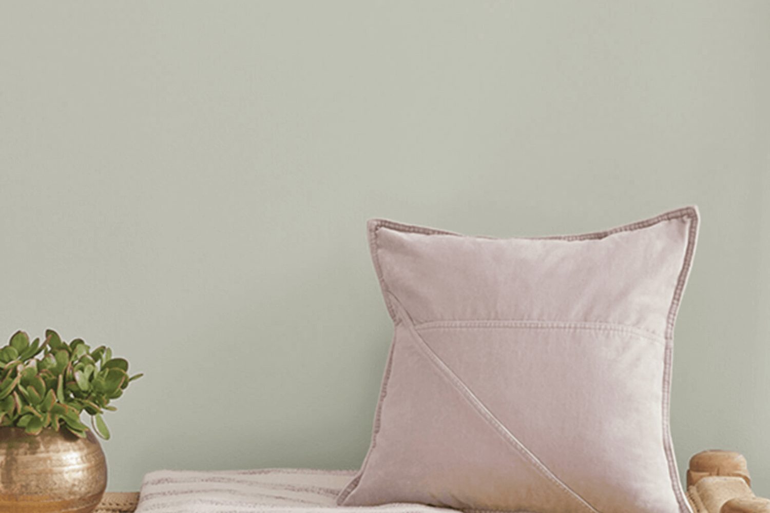
In the vast palette of colors offered by Sherwin Williams, SW 6184 Austere Gray stands out as a unique and versatile shade that can transform any space in your home. As homeowners look for colors that add a touch of sophistication without overpowering the room, Austere Gray emerges as a top choice. This color is a subtle blend of gray with warm undertones, making it perfect for creating a cozy yet refined atmosphere.
Austere Gray is more than just a simple paint color; it’s a backdrop that complements a wide range of decor styles, from modern to traditional. Whether you’re updating a living room, bedroom, or kitchen, this shade provides a neutral base that pairs beautifully with both bold accents and muted textures. The beauty of Austere Gray lies in its flexibility, allowing you to refresh your home’s look without committing to a radical change.
Choosing the right paint color is a crucial step in any home improvement project, and Sherwin Williams’ Austere Gray offers a solution that balances warmth with elegance. Its timeless appeal ensures that your space will look inviting and stylish for years to come. Whether you’re aiming for a subtle update or planning a major renovation, Austere Gray promises a fresh, new feel to any room in your house.
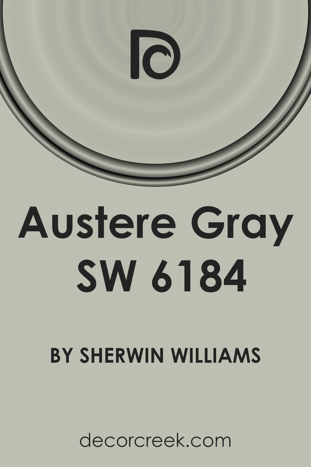
What Color Is Austere Gray SW 6184 by Sherwin Williams?
Austere Gray by Sherwin Williams is a sophisticated and versatile shade of gray that brings a calm and serene ambiance to any space. This particular gray has a unique balance, neither too dark nor too light, making it a perfect choice for those looking to achieve a subtle yet impactful interior look. Its understated elegance allows it to seamlessly fit into a variety of interior styles, from modern minimalism to cozy farmhouse and even industrial.
This neutral hue works exceptionally well in spaces where calmness and relaxation are desired, such as living rooms and bedrooms. It acts as a gentle backdrop that complements a wide range of colors, from soft pastels to vibrant accents, allowing for flexibility in decor choices.
When it comes to materials and textures, Austere Gray pairs beautifully with natural wood, bringing out its warmth and adding a touch of rustic charm to the space. It also looks stunning in contrast with metallic accents like brass or copper, adding a touch of sophistication. For a more contemporary look, pairing it with polished concrete or stone textures can create a chic, modern vibe. In terms of textiles, soft linens or plush velvets in complementary tones can enhance the cozy feel, making any room feel more inviting.
Overall, this color is a fantastic choice for anyone looking to create a space that feels both stylish and comfortable.
Is Austere Gray SW 6184 by Sherwin Williams Warm or Cool color?
Austere Gray by Sherwin Williams is a versatile color that has a unique charm and a subtle elegance. This shade of gray offers a calm and soothing vibe, making it a perfect pick for various spaces in a home. Its ability to blend well with different color schemes and décor styles means it can effortlessly fit into living rooms, bedrooms, or even kitchens, adding a touch of sophistication without overpowering the space.
The neutral tone of Austere Gray serves as an excellent backdrop, allowing furniture and artwork to stand out. This color has a way of making rooms feel more spacious and airy, bringing in a sense of tranquility. It works beautifully in well-lit areas, as natural light enhances its serene qualities, but it can also create a cozy atmosphere in spaces with less light.
In summary, Austere Gray offers a simple, yet impactful way to refresh and uplift the look of a home. Its calming effect and adaptability to different styles and settings make it a go-to choice for homeowners looking to strike a perfect balance between warmth and elegance in their décor.
Undertones of Austere Gray SW 6184 by Sherwin Williams
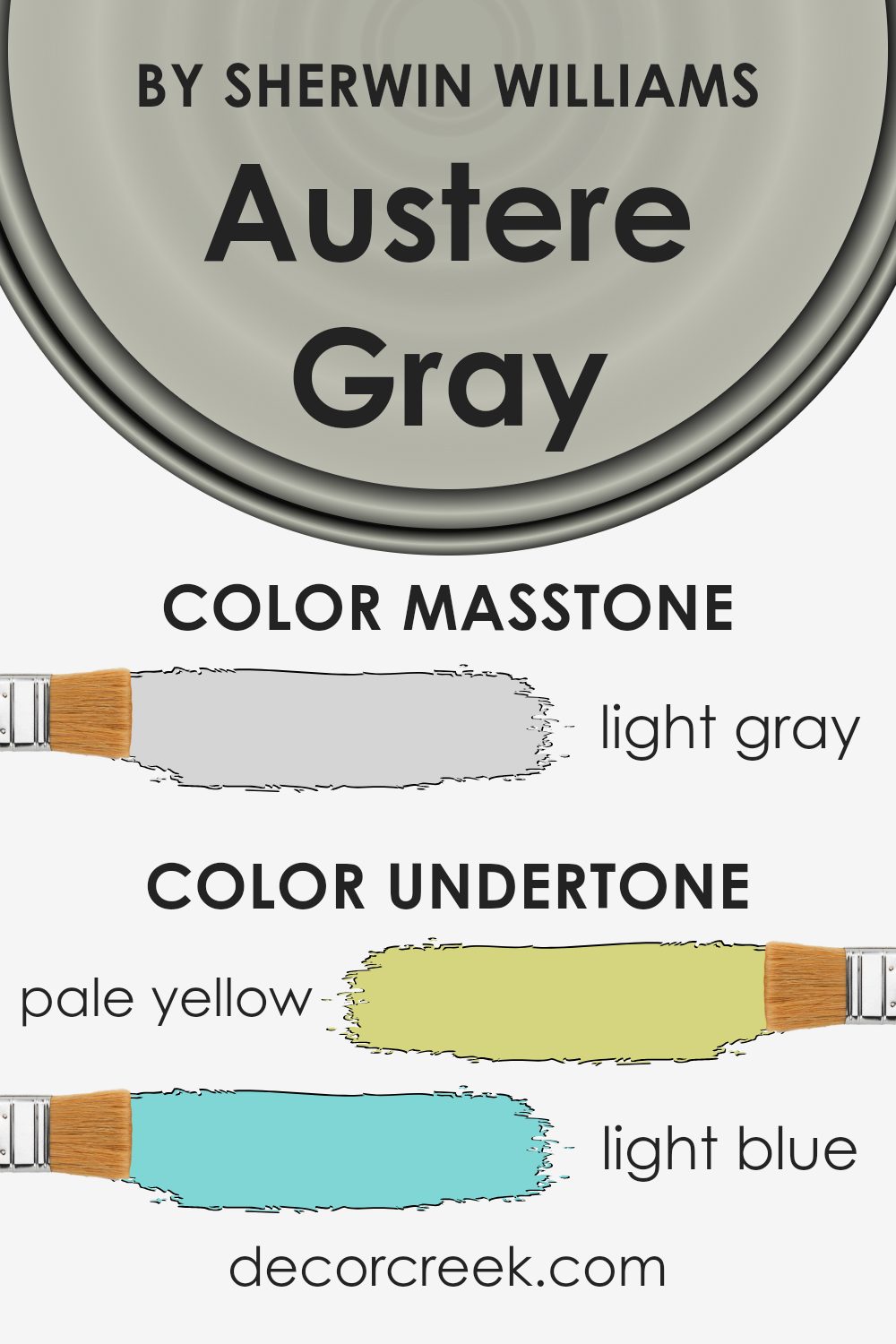
Austere Gray is a unique and complex color with a blend of subtle undertones that can add depth and dimension to any room. The mix of pale yellow, light blue, light purple, mint, pale pink, lilac, and grey undertones makes this color exceptionally versatile. These undertones play a significant role in how we perceive the overall hue, as they can emerge differently depending on the lighting and surrounding colors.
For instance, in a room flooded with natural light, the pale yellow or light blue undertones might become more apparent, giving the walls a cooler or slightly warmer appearance. On the other hand, artificial lighting might draw out the pale pink or lilac undertones, creating a more nuanced and cozy atmosphere. The mint and grey undertones contribute to the color’s balance, ensuring it remains sophisticated and refined, never leaning too heavily towards any single color spectrum.
Additionally, the presence of these undertones means that Austere Gray can complement a wide range of decor styles and color schemes. The light purple and mint undertones, for example, can enhance spaces with soft, romantic accents, while the pale pink and lilac can add a touch of warmth to minimalistic or contemporary designs. The neutral grey undertone ensures that the color maintains its grounding effect, making it an excellent backdrop for bolder colors or statement pieces.
In summary, the complex undertones of Austere Gray add a layer of richness that can transform interior walls, influencing the mood and character of the space. The ability of these undertones to subtly shift in different lights and settings makes this color a dynamic and adaptable choice for any home.
What is the Masstone of the Austere Gray SW 6184 by Sherwin Williams?
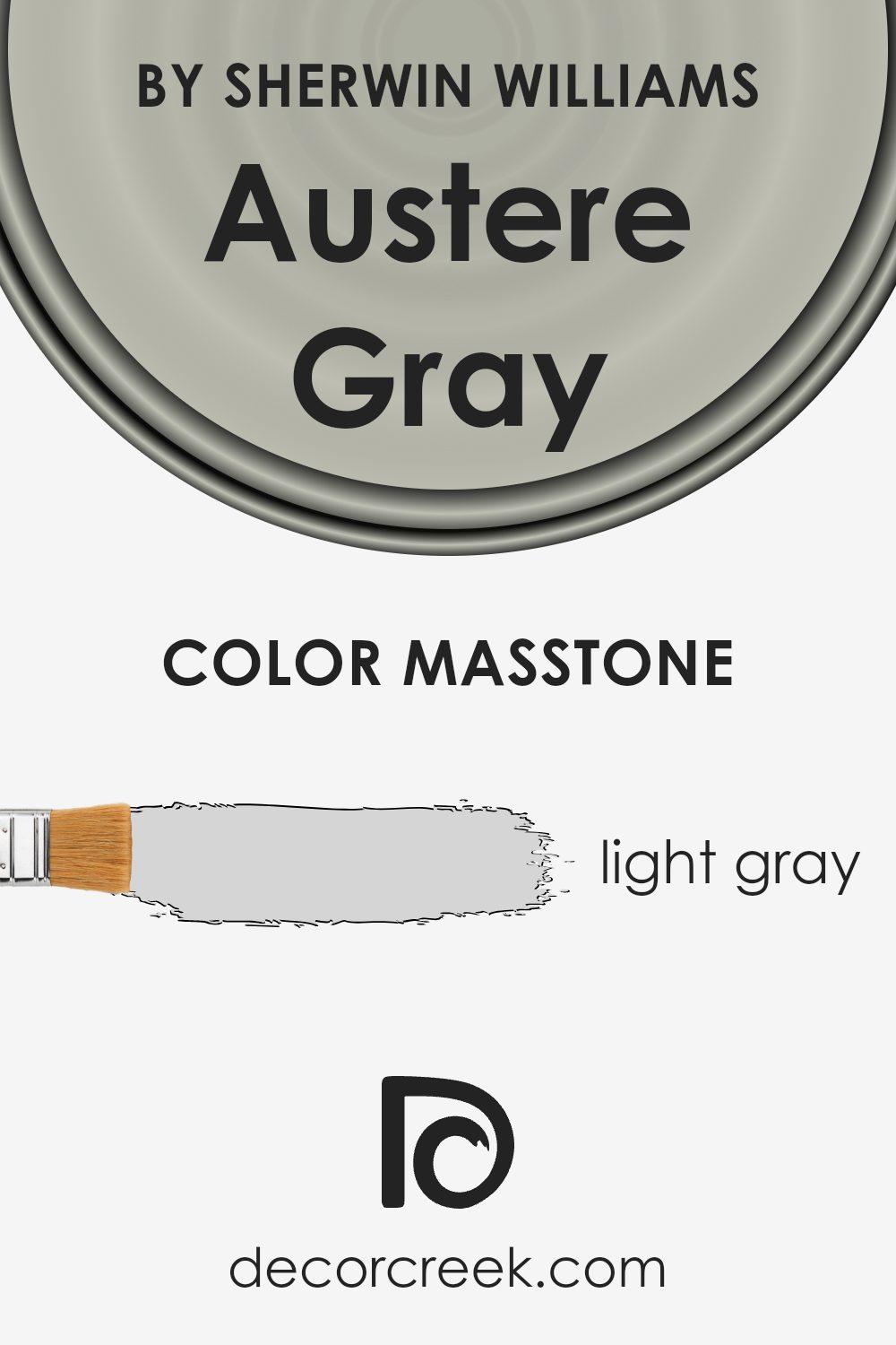
Austere Gray, with its masstone of light gray (#D5D5D5), brings a subtle and soothing presence to any home. This shade of gray stands out for its ability to blend seamlessly into various decor styles, from modern minimalism to cozy traditional. Its lightness makes small spaces appear larger and more open, inviting natural light to reflect beautifully throughout the room. This quality is particularly helpful in rooms that don’t get a lot of sunlight, as it can make such spaces feel brighter and more inviting.
Furthermore, the neutrality of this light gray allows for versatility in decorating. Whether you’re someone who loves bold color pops or prefers muted tones, it serves as a perfect backdrop, enabling art, furniture, and accent pieces to stand out. In practical terms, this shade is also forgiving of minor wear and smudges, making it a practical choice for busy households. Its ability to adapt and enhance makes it a go-to color for those looking to refresh their home environment without overwhelming it.
How Does Lighting Affect Austere Gray SW 6184 by Sherwin Williams?
Lighting plays a crucial role in how colors appear to our eyes. The same color can look different under various light sources, such as natural light from the sun or artificial light from bulbs. This is because light sources have different color temperatures, affecting how we perceive color.
Let’s take a look at how Austere Gray, a specific paint color, transforms under different lighting conditions. Austere Gray is a versatile hue that can offer a range of appearances from cool to warm, depending on the light it’s under.
In artificial light, the kind of bulb you use changes how Austere Gray looks. Cool LED bulbs can make it appear more crisp and slightly bluish, enhancing its gray qualities. Warm incandescent bulbs, on the other hand, might soften it, bringing out subtle, earthy undertones. This means that in the evening or in rooms without natural light, Austere Gray can shift from feeling fresh and modern to cozy and inviting.
Under natural light, the direction of the room plays a part. North-facing rooms receive less direct sunlight, which means cooler, softer light throughout the day. Here, Austere Gray might lean more towards its cooler side, giving off a serene and tranquil vibe. South-facing rooms bathe in warm, strong sunlight for most of the day, which can make Austere Gray look warmer and more welcoming.
East-facing rooms get bright morning light, making the color appear lively and bright in the morning, but it might turn cooler and more subdued by afternoon. West-facing rooms experience the opposite; the color might start cooler in the morning and become warmly lit by sunset, enhancing the richer aspects of Austere Gray.
In summary, Austere Gray is a dynamic color that can shift in appearance based on the light it’s under. Whether it’s a soft backdrop in a north-facing study, a cozy hue in a south-facing living room, or changing with the day in east and west-facing spaces, lighting conditions significantly influence its character.
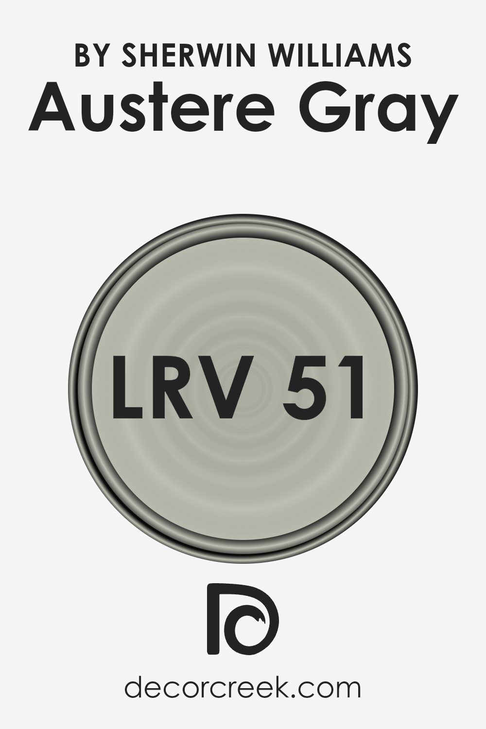
What is the LRV of Austere Gray SW 6184 by Sherwin Williams?
LRV stands for Light Reflectance Value, and it measures the amount of light a paint color reflects compared to how much it absorbs. Values range from 0 (completely absorbing all light, giving a true black) to 100 (reflecting all light, equating to a pure white). This number is crucial when choosing paint colors because it helps predict how light or dark a color will look on your walls. Higher LRVs mean the color will appear lighter and can make spaces feel more open and airy, while lower LRVs give a richer, deeper look but can make a room feel smaller or more enclosed.
Austere Gray has an LRV of 51.212, placing it in the mid-range of light reflectance. This means it’s not too light or too dark, offering a versatile balance for rooms. In rooms with plenty of natural light, Austere Gray will look lighter and can enhance the brightness of the space. In contrast, in less lit areas, it may appear slightly darker but still brings warmth without overpowering the room with darkness. Its LRV allows it to adapt to different lighting conditions and decorating styles, making it a practical choice for those looking for a color that strikes a balance between bright and cozy.
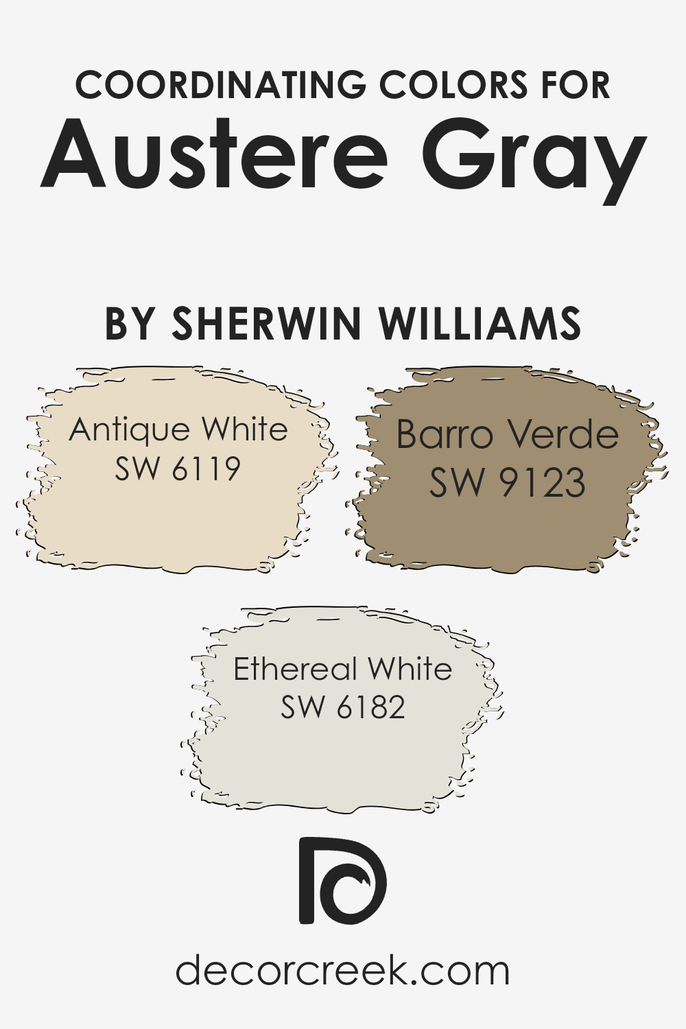
Coordinating Colors of Austere Gray SW 6184 by Sherwin Williams
Coordinating colors are hues that work in harmony with a principal color, enhancing the overall aesthetic of a space without overpowering it. In the context of Austere Gray by Sherwin Williams, a sophisticated and versatile shade, selecting the right coordinating colors is key to achieving a balanced and pleasing decor. The chosen coordinating colors for Austere Gray include Antique White, Ethereal White, and Barro Verde, each bringing its own unique contribution to the color scheme.
Antique White is a soft, muted shade that adds warmth and a sense of calm to the surroundings. It pairs beautifully with the neutrality of Austere Gray, providing a subtle backdrop that allows other elements of the decor to stand out.
Ethereal White, on the other hand, is a lighter, almost airy shade that can brighten spaces and give a sense of openness, perfectly complementing the depth of Austere Gray by adding contrast and visual interest. Barro Verde introduces an earthy, green undertone to the palette, offering a natural and grounding effect that enhances the sophistication of Austere Gray. Together, these coordinating colors create a cohesive and inviting space that feels both modern and timeless.
You can see recommended paint colors below:
- SW 6119 Antique White
- SW 6182 Ethereal White
- SW 9123 Barro Verde
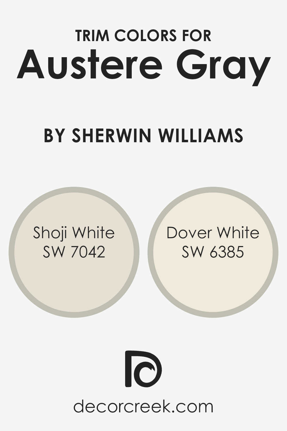
What are the Trim colors of Austere Gray SW 6184 by Sherwin Williams?
Trim colors are those hues used on the edges and borders of walls, door frames, window sills, and skirtings that complement or contrast with the main wall color, which in this case is Austere Gray by Sherwin Williams. The right trim color can significantly enhance the visual appeal and overall aesthetic of a room. It helps in defining the architectural details of a space and creates a finished look that can either subtly complement the primary color or add a striking contrast to make the features stand out. For Austere Gray, a sophisticated yet understated hue, choosing the right trim color is crucial because it can either elevate the elegance of the space or maintain a serene and cohesive atmosphere.
Shoji White SW 7042 is a soft, warm white with a slight undertone that provides a smooth transition when used as a trim color alongside Austere Gray. Its subtle warmth brings out the cool tones in Austere Gray, ensuring the space feels inviting and balanced.
On the other hand, Dover White SW 6385 is a brighter, cleaner white that offers a crisp contrast against Austere Gray, highlighting architectural details sharply and bringing a fresh energy to the space. Both Shoji White and Dover White have their unique characteristics; Shoji White leans towards creating a harmonious and seamless look, while Dover White serves to brighten and delineate, making them excellent choices for trims that complement Austere Gray.
You can see recommended paint colors below:
Colors Similar to Austere Gray SW 6184 by Sherwin Williams
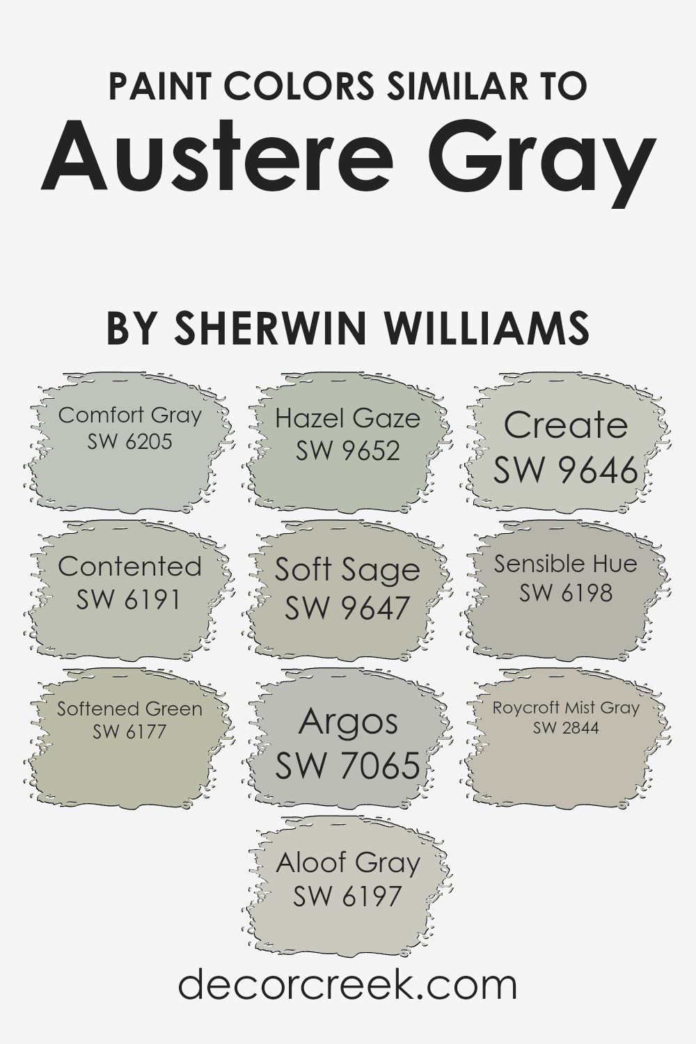
Understanding the importance of similar colors can greatly enhance any design project, especially when considering a base color like Austere Gray by Sherwin Williams. Similar colors such as Comfort Gray, Contented, Softened Green, Aloof Gray, Hazel Gaze, Soft Sage, Argos, Create, Sensible Hue, and Roycroft Mist Gray play crucial roles in creating a harmonious and visually appealing palette. These colors work together by offering subtle variations in hue and tone that can add depth and complexity to a space without overwhelming it with contrast. For instance, using shades like Comfort Gray and Aloof Gray together can provide a soothing backdrop that’s both sophisticated and inviting.
Each of these colors has its unique charm.
Comfort Gray has a serene feel, blending green and gray for a calming effect.
Contented brings a soft, muted atmosphere to interiors, offering hints of green that mimic a peaceful setting. Softened Green, with its gentle nod to nature, infuses spaces with a fresh energy.
Aloof Gray stands out for its understated elegance, providing a neutral canvas that’s versatile.
Hazel Gaze adds a touch of warmth with its deeper, inviting tones, while Soft Sage offers a whisper of green, perfect for creating a tranquil space.
Argos delivers a cooler gray, bringing a modern edge. Create, as its name suggests, encourages creativity with its subtle gray.
Sensible Hue is grounded and earthy, offering a solid foundation.
Lastly, Roycroft Mist Gray showcases a historical charm with its muted tones, perfect for adding character.
Together, these colors can create a cohesive look that enhances the aesthetics of any room.
You can see recommended paint colors below:
- SW 6205 Comfort Gray
- SW 6191 Contented
- SW 6177 Softened Green
- SW 6197 Aloof Gray
- SW 9652 Hazel Gaze
- SW 9647 Soft Sage
- SW 7065 Argos
- SW 9646 Create
- SW 6198 Sensible Hue
- SW 2844 Roycroft Mist Gray
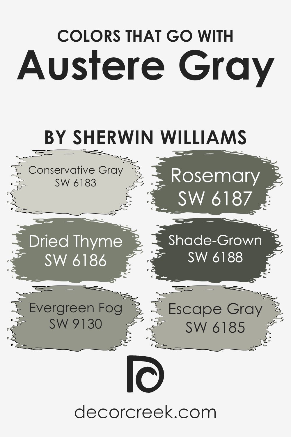
Colors that Go With Austere Gray SW 6184 by Sherwin Williams
Selecting colors that go well with Austere Gray SW 6184 by Sherwin Williams is essential for creating a harmonious and inviting space. These complementary colors, including Conservative Gray, Dried Thyme, Evergreen Fog, Rosemary, Shade-Grown, and Escape Gray, each contribute to establishing a cohesive look that enhances the ambiance of a room. By integrating these colors into your decor, you can achieve a balanced and visually pleasing environment. The importance of these matching colors lies in their ability to either contrast with or complement Austere Gray, offering versatility in design choices that can accommodate a wide range of tastes and styles.
For instance, Conservative Gray provides a subtle contrast to Austere Gray, offering a light backdrop that enhances the depth of the room without overwhelming it with color. On the other hand, Dried Thyme adds a touch of earthiness, bringing a natural and calming element to the space. Evergreen Fog presents a muted green hue, infusing a sense of serenity and freshness. Rosemary introduces a slightly darker tone, enriching the palette with sophistication. Shade-Grown anchors the space with its deeper green, adding a bold yet refined touch. Lastly, Escape Gray serves as a softer alternative to Austere Gray, ensuring the space feels open and airy. Together, these colors work in harmony to create a dynamic and layered design that complements the versatile and subtle elegance of Austere Gray.
You can see recommended paint colors below:
- SW 6183 Conservative Gray
- SW 6186 Dried Thyme
- SW 9130 Evergreen Fog
- SW 6187 Rosemary
- SW 6188 Shade-Grown
- SW 6185 Escape Gray
How to Use Austere Gray SW 6184 by Sherwin Williams In Your Home?
Austere Gray by Sherwin Williams is a unique paint color that adds a subtle touch of elegance to any space. This shade can be best described as a perfect blend between a soft gray and a hint of green. Its muted tones make it a versatile choice for your home, offering a calming atmosphere whether you use it in a busy living space or a quiet bedroom.
One way to incorporate Austere Gray into your home is by painting your living room walls with it. This will give the room a serene backdrop, perfect for relaxing or spending time with family. In the bedroom, it can help create a peaceful and restful environment, ideal for a good night’s sleep.
Austere Gray also works well in bathrooms and kitchens, where its subtle hue complements both wood and metal finishes. Adding white trim or cabinets can make the color stand out more, giving your space a modern and chic look. Whether you opt for an all-over paint job or use it as an accent, Austere Gray can certainly add a refreshing touch to your home.
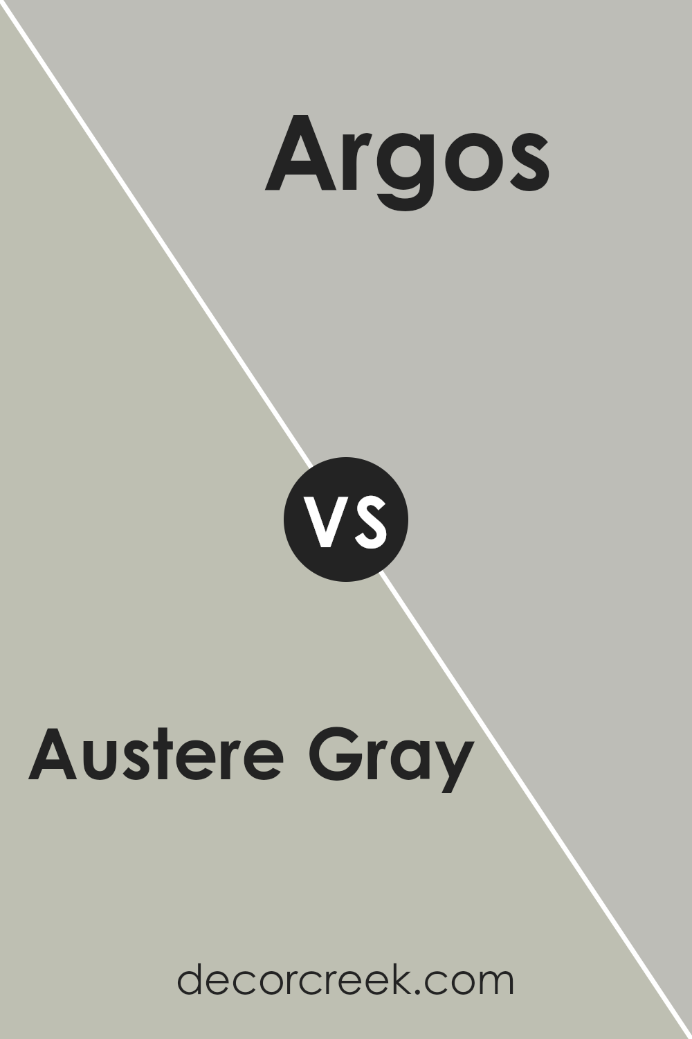
Austere Gray SW 6184 by Sherwin Williams vs Argos SW 7065 by Sherwin Williams
When you look at Austere Gray next to Argos, you notice some interesting differences even though both paints come from Sherwin Williams. Austere Gray has a warmer, slightly darker tone that brings a cozy vibe to any space. It’s the kind of color that makes a room feel inviting and comfortable, perfect for places where you want to relax.
Argos, on the other hand, leans towards a cooler, lighter gray. This gives it a fresher, more modern feel, ideal for spaces that aim for a sleek and contemporary look. It reflects light beautifully, making rooms appear brighter and more spacious.
Both colors are versatile, fitting well within various decor styles. However, Austere Gray’s warmth suits areas needing a touch of snugness, while Argos’ crisp coolness works wonders in making a space feel airy and open. Choosing between them really comes down to the atmosphere you’re looking to create in your home.
You can see recommended paint color below:
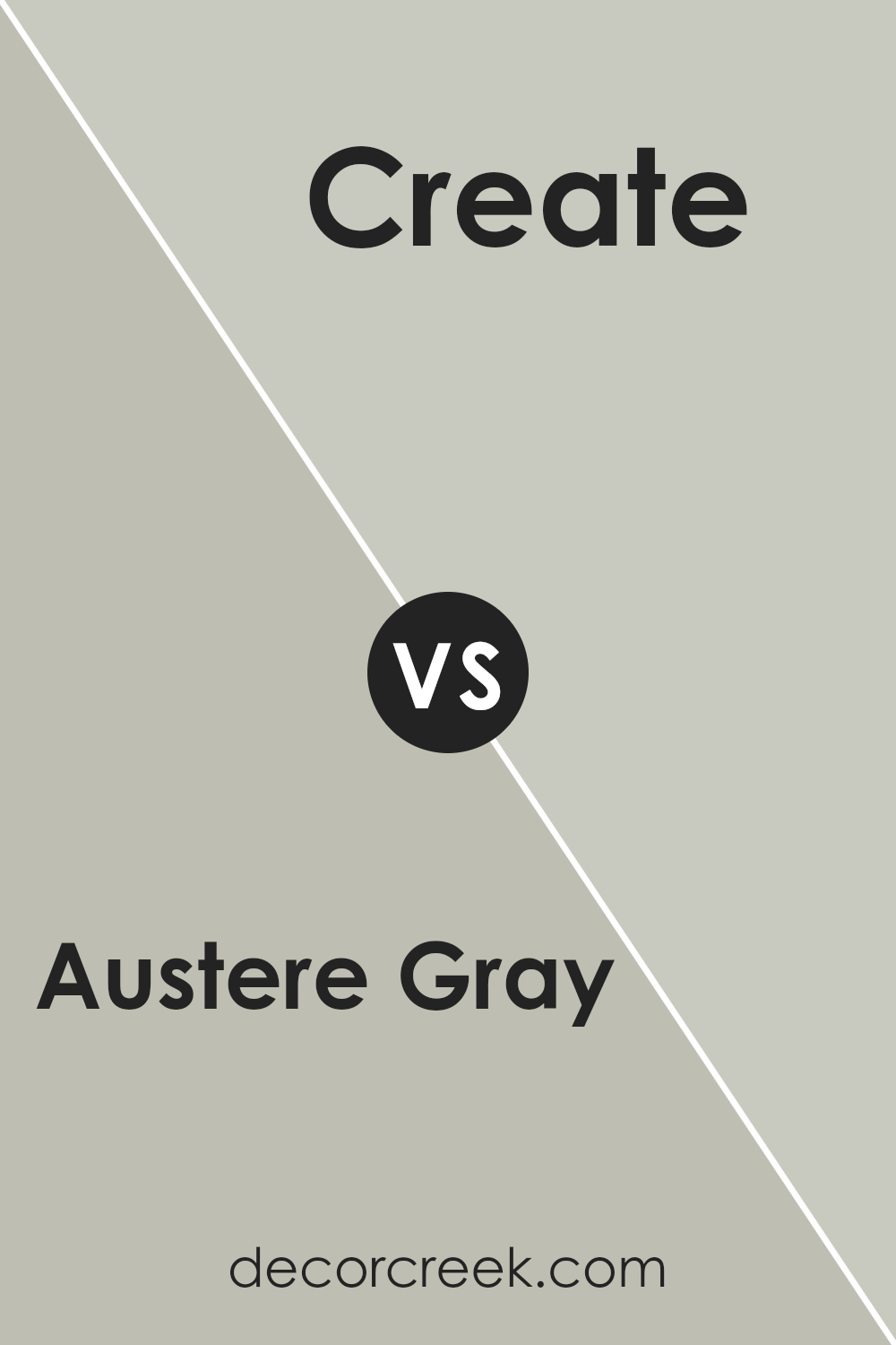
Austere Gray SW 6184 by Sherwin Williams vs Create SW 9646 by Sherwin Williams
Austere Gray and Create are two diverse colors that bring unique vibes to any space. Austere Gray is like a calm, cloudy day. It’s soft and subtle, making it perfect for those who want a neutral background that’s easy on the eyes and blends well with almost any decor. It’s the type of color that’s understated yet sophisticated, great for creating a serene and inviting environment.
On the other hand, Create is a burst of energy. It’s a color that pops, adding life and vibrancy to a room. If you’re looking to make a statement or add a splash of fun, this is your go-to. It’s the kind of color that can make accessories stand out or give a unique character to a space that might otherwise look ordinary.
Both colors offer something special: Austere Gray brings tranquility and an air of elegance, while Create offers excitement and a playful atmosphere. Choosing between them depends on what mood or style you’re aiming for in your space.
You can see recommended paint color below:
- SW 9646 Create
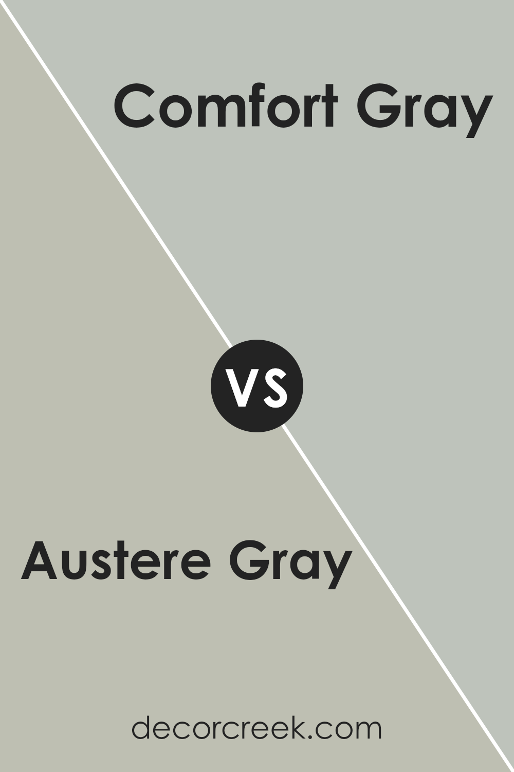
Austere Gray SW 6184 by Sherwin Williams vs Comfort Gray SW 6205 by Sherwin Williams
When you look at Austere Gray, you’re seeing a unique color that leans more towards a soft, muted gray with subtle green undertones. It’s a color that really brings a sense of calmness and simplicity to a space. It’s very versatile, making it great for any room that needs a touch of sophistication without feeling too bold.
On the other hand, Comfort Gray is like Austere Gray’s slightly more colorful cousin. It’s not just gray; it has a lovely hint of blue-green that makes it stand out. This color is fantastic for creating a serene atmosphere that’s a bit more lively than what you’d get with Austere Gray. It’s perfect for places where you want to relax but also feel a bit refreshed.
In short, Austere Gray is your go-to for a more understated elegance, something that’s really easy on the eyes. Comfort Gray, however, adds that extra bit of color for a bit more energy and warmth in the room. Both colors are beautiful in their own right, offering different moods for your home depending on what you’re looking for.
You can see recommended paint color below:
- SW 6205 Comfort Gray
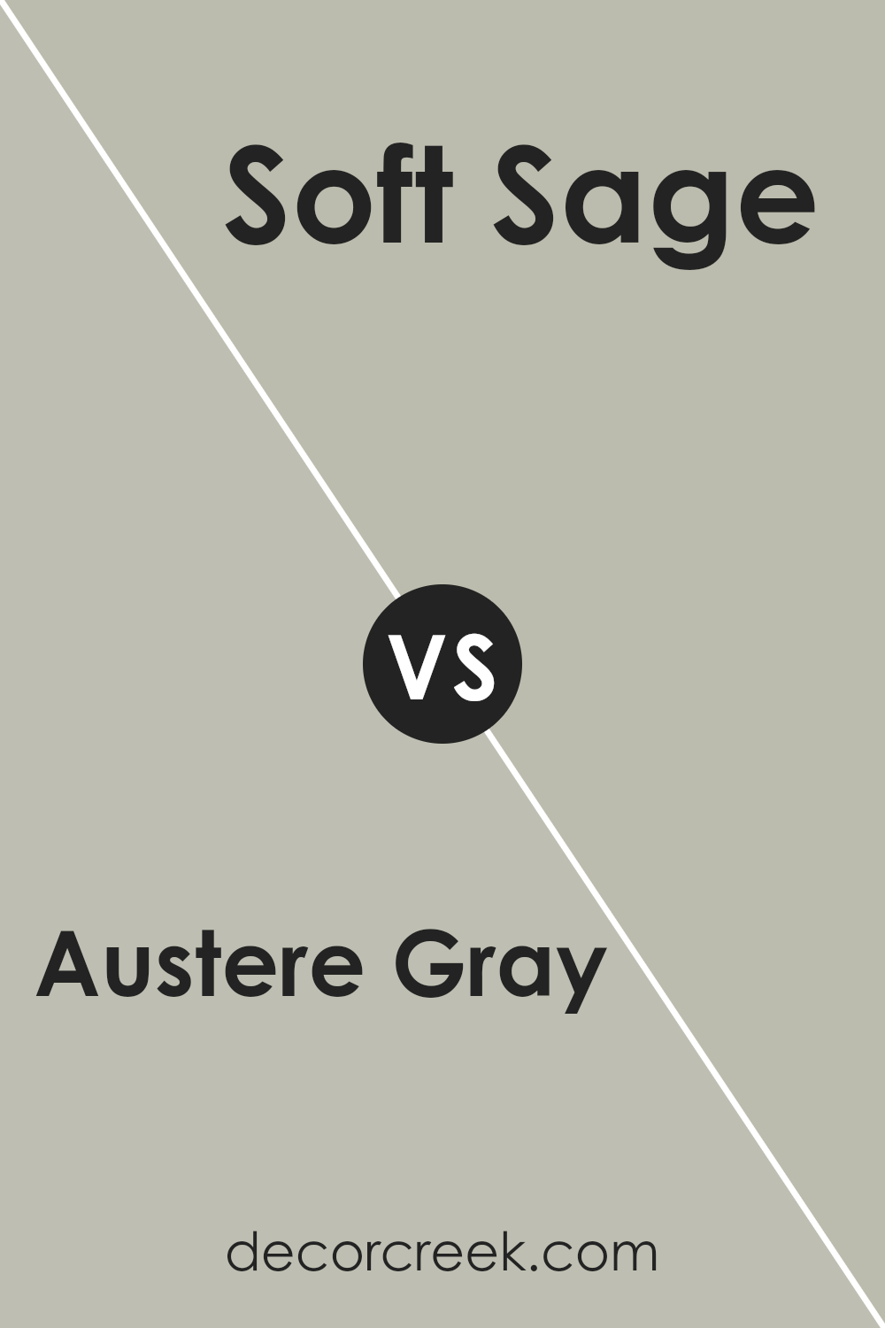
Austere Gray SW 6184 by Sherwin Williams vs Soft Sage SW 9647 by Sherwin Williams
Austere Gray is a sophisticated, muted gray color with a timeless charm. It offers a sense of calm and simplicity, making it perfect for creating a serene and understated look in any space. This color pairs well with a wide range of decor styles, from modern to traditional, adding a touch of elegance without overwhelming the space.
On the other hand, Soft Sage is a gentle, earthy green with a hint of gray. It evokes feelings of tranquility and brings a touch of nature indoors. This color is ideal for those looking to add a subtle splash of color to their rooms without going too bold. It creates a soothing ambiance, perfect for bedrooms, bathrooms, or any area meant for relaxation.
When comparing the two, Austere Gray leans more towards a classic neutrality, offering a solid foundation for various design schemes. Soft Sage brings in a natural element, infusing spaces with a fresh and calming vibe. Both colors work well to create peaceful and inviting environments, but the choice between them depends on whether you prefer a cool, sophisticated gray or a soft, nature-inspired green.
You can see recommended paint color below:
- SW 9647 Soft Sage
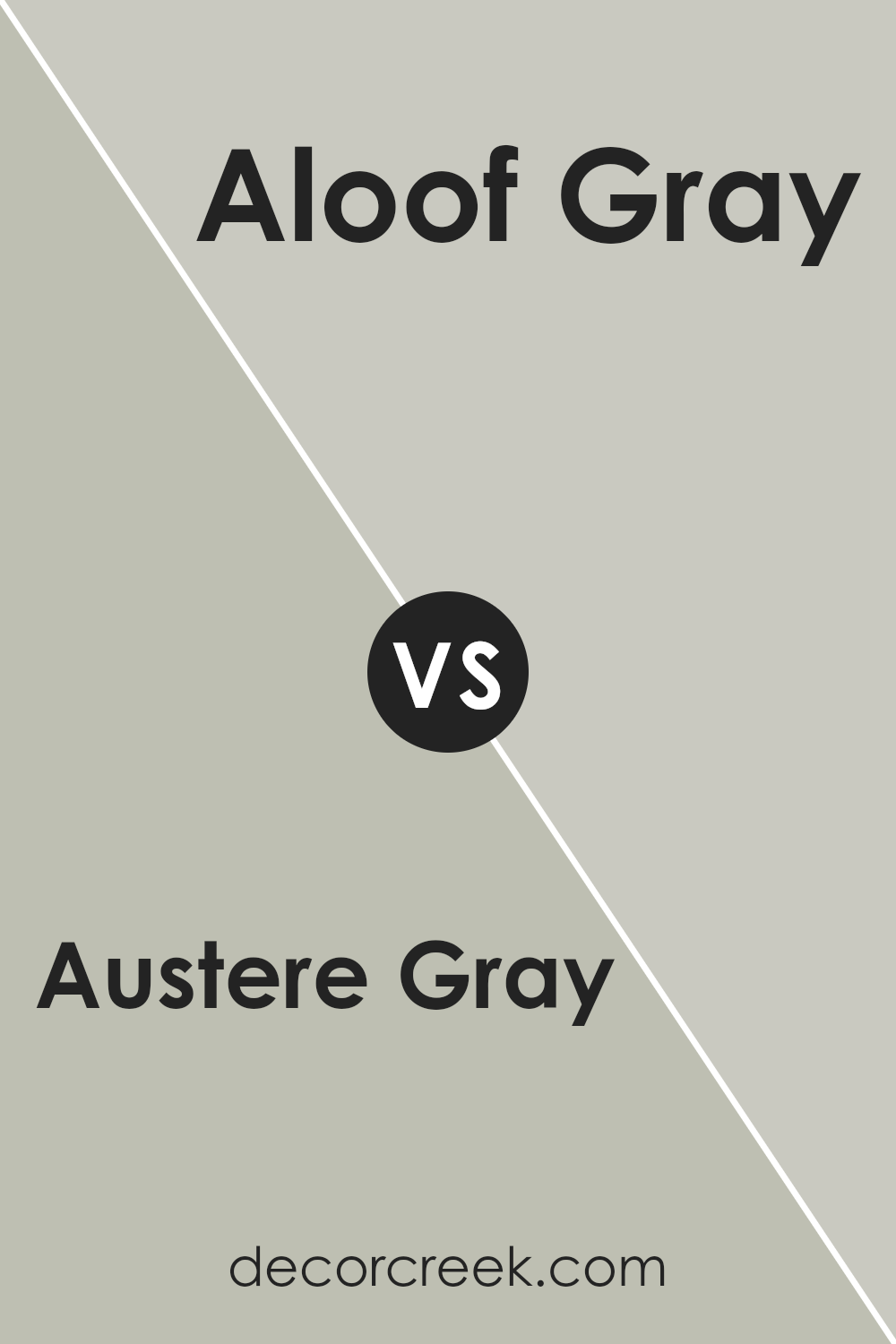
Austere Gray SW 6184 by Sherwin Williams vs Aloof Gray SW 6197 by Sherwin Williams
Austere Gray and Aloof Gray, both by Sherwin Williams, are unique shades of gray that offer subtle differences for interior walls or exterior trim. Austere Gray has a slightly warmer tone, giving a cozy, inviting feel to a room. It’s perfect for spaces where you want a bit of warmth without sacrificing the neutral, versatile backdrop that gray offers.
On the other hand, Aloof Gray leans towards a cooler palette, providing a more serene and calm atmosphere. This makes it ideal for creating a peaceful and tranquil space, such as bedrooms or bathrooms, where you want to promote relaxation.
Although both colors are grays, the choice between Austere Gray and Aloof Gray depends on the mood you wish to set in your space. Do you want the warmth and subtlety of Austere Gray, or the cool, calming effect of Aloof Gray? Both offer a beautiful base but cater to different aesthetic preferences and atmospheres within a home.
You can see recommended paint color below:
- SW 6197 Aloof Gray
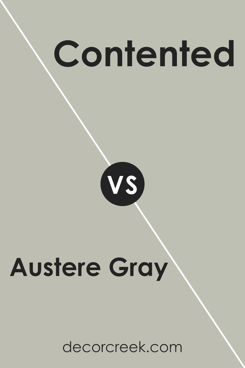
Austere Gray SW 6184 by Sherwin Williams vs Contented SW 6191 by Sherwin Williams
Austere Gray and Contented are two colors, both by Sherwin Williams, that offer unique vibes for different spaces. Austere Gray is a cool, muted gray with a gentle touch of warmth, making it versatile for rooms needing a subtle, calming presence. It’s ideal for creating a serene atmosphere without feeling too cold or impersonal, perfect for modern living areas or bedrooms seeking a touch of sophistication.
On the other hand, Contented brings a slightly more cheerful and airy feel. It’s a soft, mid-tone green with gray undertones, providing a refreshing and tranquil look. This color works wonderfully in spaces where you want to add a hint of nature-inspired calmness without overwhelming the senses. It’s excellent for bathrooms, kitchens, or any room looking for a breath of fresh air.
In comparison, while both colors aim to bring peace and calmness to a space, Austere Gray leans more towards a classic neutrality, suitable for subtle elegance. Contented, with its green-gray hues, offers a more refreshing and slightly brighter ambiance, ideal for spaces aiming for a natural, soothing vibe.
You can see recommended paint color below:
- SW 6191 Contented
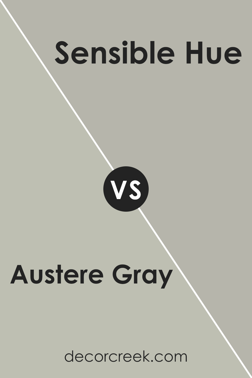
Austere Gray SW 6184 by Sherwin Williams vs Sensible Hue SW 6198 by Sherwin Williams
Austere Gray and Sensible Hue, both by Sherwin Williams, are two stylish colors that can transform any room. Austere Gray is a warm, soft gray with a subtle hint of brown. It’s a color that feels cozy yet sophisticated, perfect for creating a refined and inviting space. It’s like wrapping yourself in a soft, plush blanket on a chilly day. On the other hand, Sensible Hue is a bit lighter and leans towards a green-gray shade.
It has a fresh, calming vibe, making it great for rooms where you want to relax and unwind. Think of it as a calm morning in a lush, serene garden. While both colors share a gray base, Austere Gray brings in warmth and depth, whereas Sensible Hue offers a lighter, refreshing touch. In essence, Austere Gray is about depth and warmth, while Sensible Hue is about lightness and serenity. They both can make a room look beautiful, just in their unique ways.
You can see recommended paint color below:
- SW 6198 Sensible Hue
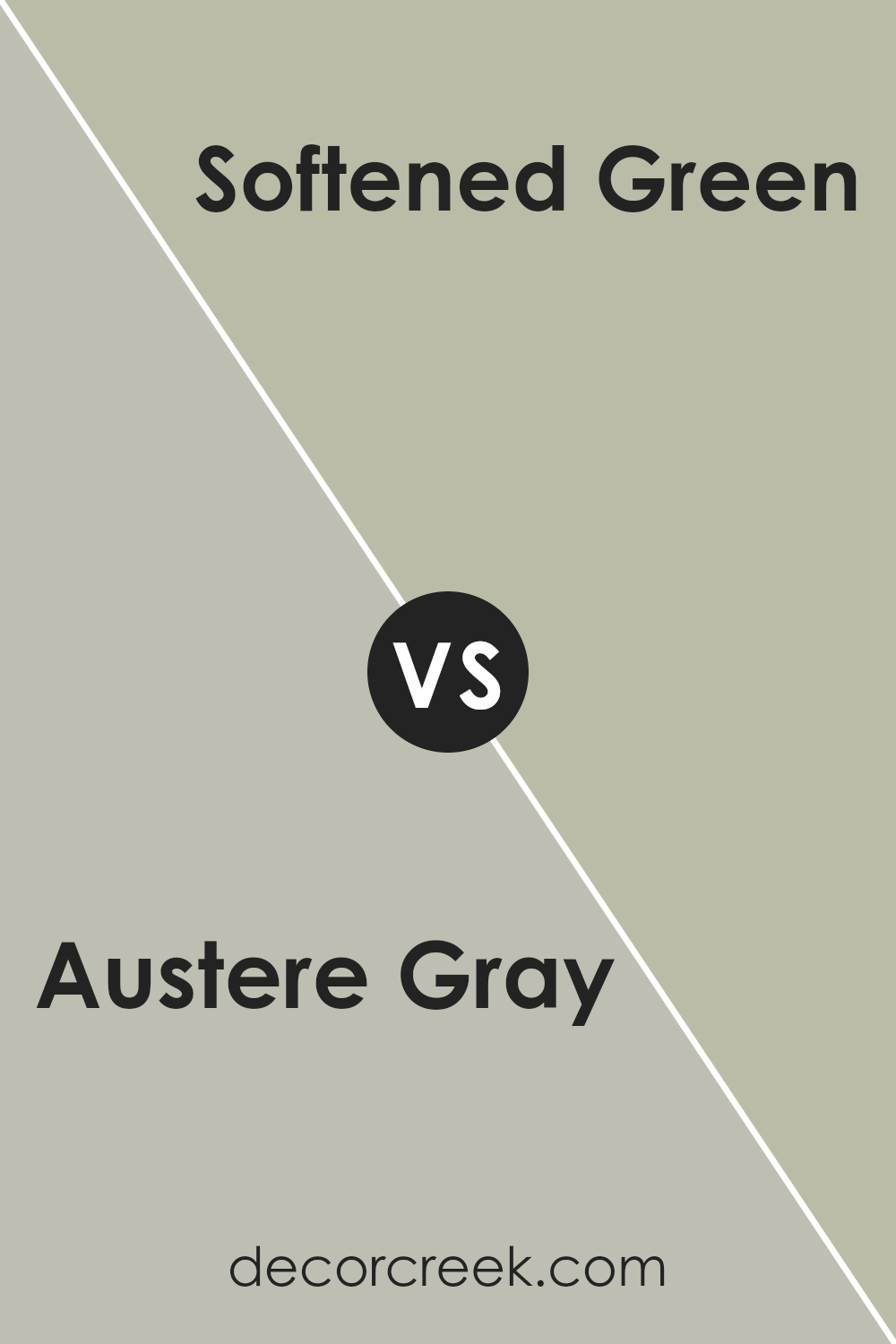
Austere Gray SW 6184 by Sherwin Williams vs Softened Green SW 6177 by Sherwin Williams
Austere Gray and Softened Green, both by Sherwin Williams, offer distinct visual experiences for any space. Austere Gray is a versatile, muted gray that brings a calm, subtle elegance. It’s a color that pairs easily with brighter colors or works well on its own to create a serene, understated look. Its neutrality makes it a go-to for those looking to add a sophisticated touch without overwhelming a room.
On the other hand, Softened Green is a light, airy green with a hint of gray. This color infuses spaces with a sense of freshness and tranquility, reminiscent of early spring leaves or a gentle morning mist. It’s perfect for creating a soothing atmosphere that still feels connected to the natural world outside.
While Austere Gray leans towards a more classic, timeless appeal, Softened Green offers a more organic, uplifting vibe. Each color has its charm, depending on the ambiance you’re aiming for. Austere Gray might be the choice for a sleek, modern look, while Softened Green could be the go-to for a breezy, nature-inspired space.
You can see recommended paint color below:
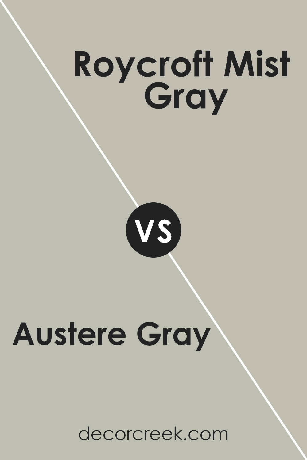
Austere Gray SW 6184 by Sherwin Williams vs Roycroft Mist Gray SW 2844 by Sherwin Williams
Austere Gray and Roycroft Mist Gray are both paint colors offered by Sherwin Williams, but they bring different nuances to the table. Austere Gray is like a soft, gentle shadow that offers a soothing and understated elegance to spaces. It harbors a coolness that can make rooms feel calm and collected, perfect for creating a serene backdrop.
On the flip side, Roycroft Mist Gray leans into a slightly warmer territory. It’s like the cozy warmth of a morning mist, providing a sense of comfort and welcoming coziness. This color can add a more inviting and slightly richer tone to walls, making spaces feel more lived-in and homey.
While both colors share the quality of being understated and versatile, Austere Gray carries a cooler, more muted touch, making it ideal for modern and minimalistic designs. Roycroft Mist Gray, with its whisper of warmth, can effortlessly bridge traditional and contemporary styles, making it a go-to for those wanting to add depth without overwhelming a space. Essentially, your choice between the two boils down to the mood you want to set: cool and calm with Austere Gray, or warm and inviting with Roycroft Mist Gray.
You can see recommended paint color below:
- SW 2844 Roycroft Mist Gray
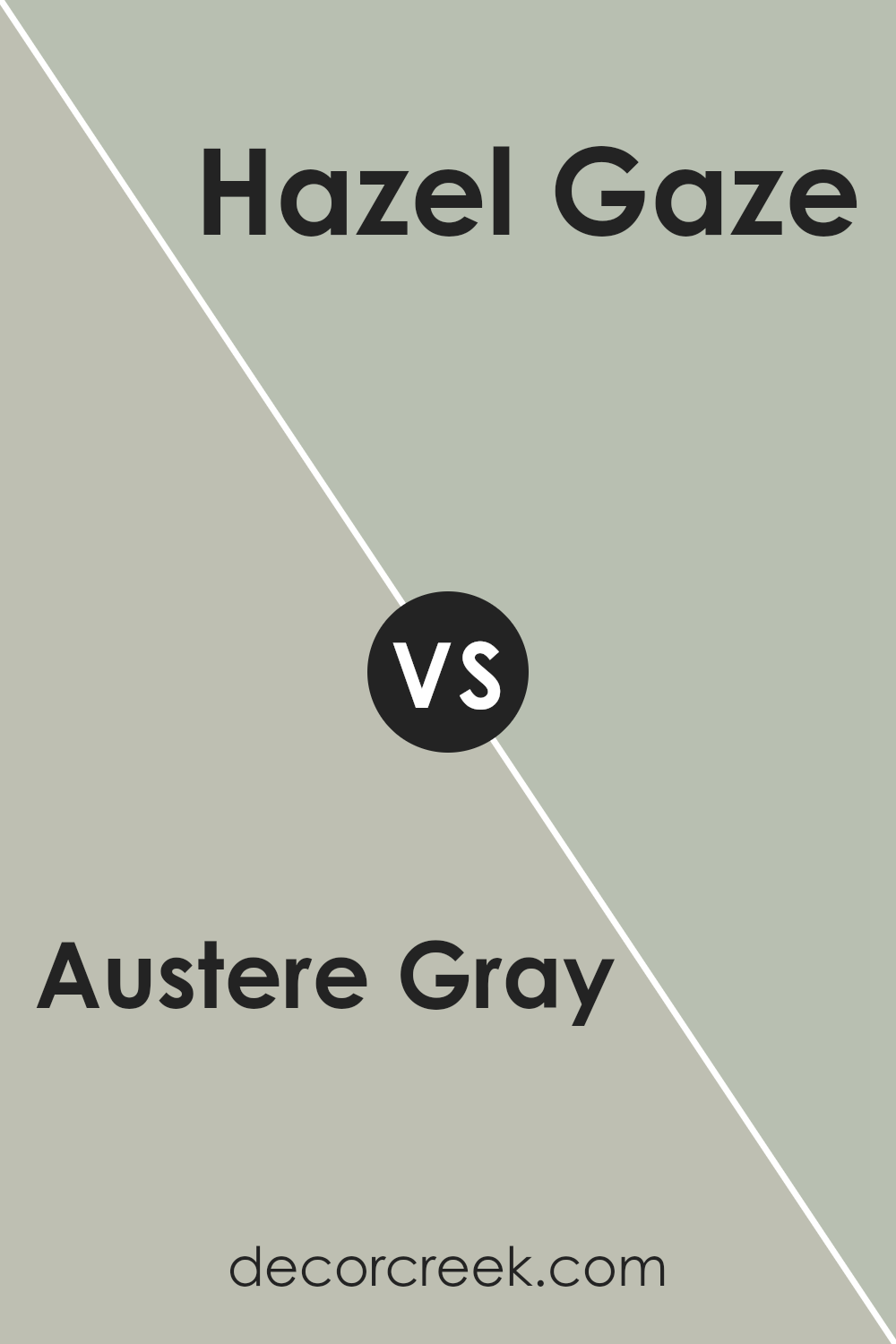
Austere Gray SW 6184 by Sherwin Williams vs Hazel Gaze SW 9652 by Sherwin Williams
Austere Gray and Hazel Gaze, both by Sherwin Williams, offer unique but complementary tones for your space. Austere Gray gives a soft, muted feel, kind of like a calm, cloudy day. It’s a versatile color, fitting in with various decors, making rooms feel cozy yet spacious. On the other hand, Hazel Gaze has a warmer touch, bringing to mind the gentle warmth of early autumn. It stands out a bit more than Austere Gray, adding a subtle cheerfulness to any room.
While Austere Gray leans towards a neutral look, making it super easy to match with a wide range of colors, Hazel Gaze invites a bit of nature indoors with its earthy vibe. If you’re deciding between the two, think about the mood you want to create. For a serene, relaxed atmosphere, go with Austere Gray. If you prefer a touch of warmth and a hint of natural beauty, Hazel Gaze is your go-to. Both colors are beautiful in their own right, setting the stage for personal style touches.
You can see recommended paint color below:
- SW 9652 Hazel Gaze
Conclusion
In conclusion, Austere Gray by Sherwin Williams stands out as a versatile and elegant color choice for homeowners and designers looking to create serene and sophisticated spaces. Its subtle balance between warmth and coolness allows it to adapt seamlessly to various decors, making it ideal for achieving a refined look in any room. Whether applied to living areas, bedrooms, or even exterior facades, this shade offers a timeless backdrop that enhances both contemporary and traditional designs.
Moreover, the adaptability of Austere Gray ensures it works well in conjunction with a wide range of color palettes, from understated neutrals to more vibrant hues, allowing for creative freedom in interior styling. Its calming effect promotes a sense of tranquility and spaciousness, making it a smart choice for those aiming to create a peaceful retreat in their home. As a result, Austere Gray from Sherwin Williams demonstrates a perfect balance of sophistication and versatility, cementing its status as a go-to color for professionals and DIY enthusiasts alike.
Ever wished paint sampling was as easy as sticking a sticker? Guess what? Now it is! Discover Samplize's unique Peel & Stick samples.
Get paint samples

