Black
Black Blue
Blue Brown
Brown Gray
Gray Green
Green Neutral
 Orange
 White
White Yellow
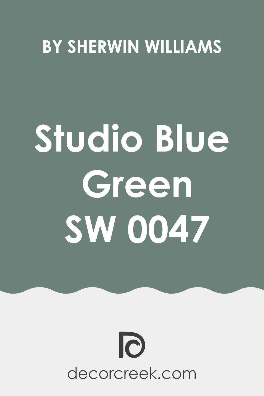
If you’re considering a fresh coat of paint and have your sights set on Sherwin Williams’ SW 0047 Studio Blue Green, here’s what you should know. As someone who’s spent a lot of time hunting for that perfect shade, I understand how the right color can change the vibe of your room. Studio Blue Green isn’t just another blue or green; it’s a unique blend that pulls elements from both to create a peaceful and refreshing atmosphere.
The tone of Studio Blue Green is subtly balanced, neither too bold nor too muted, making it a flexible choice for any room. Whether you’re aiming to give your kitchen a splash of cool elegance or want to set up a calming retreat in your bedroom, this color has the potential to meet your needs.
It also reflects light in a way that can make small rooms appear larger and more open, which is a great plus if you’re working with limited square footage.
Before you get those paint rollers out, let’s break down the nuances of this particular shade to ensure it aligns perfectly with your decorating vision.
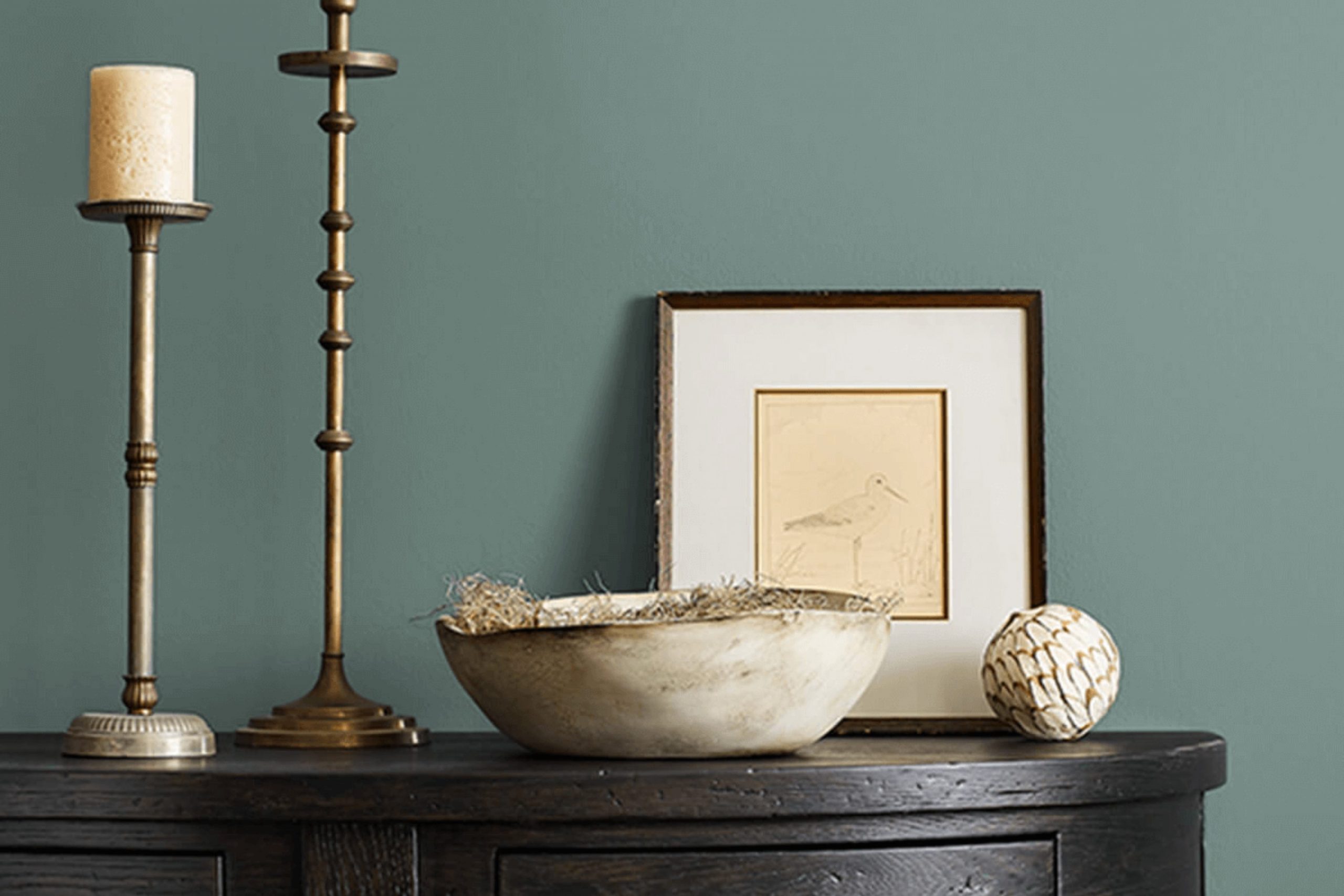
Is Studio Blue Green SW 0047 Right for My Home?
Studio Blue Green is a lovely shade that feels like a quiet morning by the sea. Its tone strikes a balance between blue and green, with a hint of gray that calms the intensity of the colors. This makes it flexible and perfect for creating a cozy, welcoming room.
In terms of interior styles, this color shines in modern and minimalistic designs because of its clean and subtle vibe. However, it also works beautifully in coastal and rustic settings. The muted quality helps it blend smoothly with natural elements often found in these environments.
When thinking about what materials go well with Studio Blue Green, I like to pair it with light woods like pine or birch to keep the room feeling airy. Textures like linen, cotton, and wool in neutral colors also complement this paint color beautifully, adding to the overall soft and cozy feel of the room. For a more contrasting look, I might introduce elements of dark metal or glass, which provide a nice visual break and add a touch of modernity to the room.
Overall, this color is a great choice if you’re looking to create a calm, welcoming area in your home that feels both fresh and classic. Whether you’re painting a bedroom, a living area, or even a bathroom, it offers a perfect backdrop that’s easy to decorate around and live with.
decorcreek.com
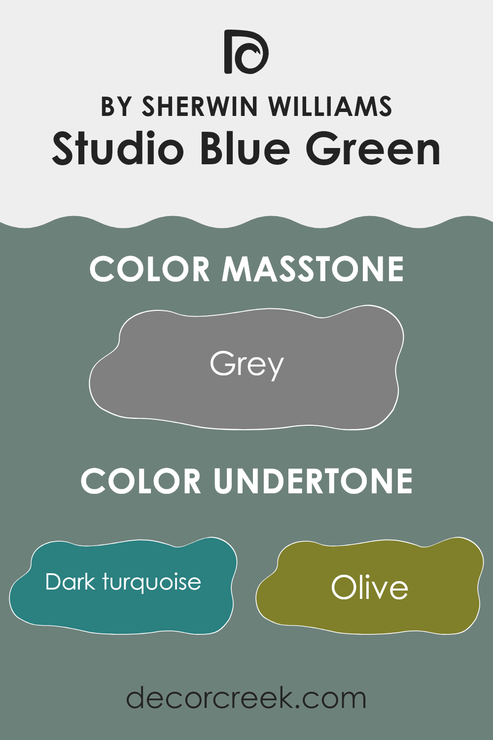
What are the right undertones of Studio Blue Green SW 0047 ?
Studio Blue Green by Sherwin Williams is a unique paint color because it carries a mix of different undertones. These undertones include a range of colors from dark turquoise and olive to lighter shades like mint and pale pink, along with deeper hues like navy and dark green. Each undertone adds a layer of depth and complexity to the color, affecting how it is perceived in different lighting conditions and settings.
When it comes to painting interior walls, these undertones play a crucial role in the overall feel of a room. For example, the dark turquoise and navy undertones might make the color feel more anchored and bold in a room, particularly in natural light or spacious rooms. In contrast, lighter undertones like mint and pale pink can bring a fresher and softer look, which could be ideal for smaller rooms or rooms with limited natural light.
The variety of undertones also means that Studio Blue Green can easily coordinate with different decor styles and color schemes. Whether paired with neutral furniture for a calming effect or with vibrant accessories to create a lively atmosphere, this color can adapt due to its rich spectrum of undertones.
Moreover, the presence of diverse undertones helps the color adjust throughout the day as the lighting changes. Morning light might highlight the lighter, fresher undertones, while evening light might draw out the deeper, more intense ones. This changing dynamic adds an interesting and interactive element to the interior room, keeping the environment engaging over time.
decorcreek.com
Best Coordinating Colors to use with Studio Blue Green SW 0047 by Sherwin Williams this year.
Coordinating colors are hues that complement each other when used together in a color scheme. They help create a harmonious look by enhancing the overall appearance of a room. When you use coordinating colors effectively, each color seems to bring out the best aspects of the others, providing balance and aesthetic appeal.
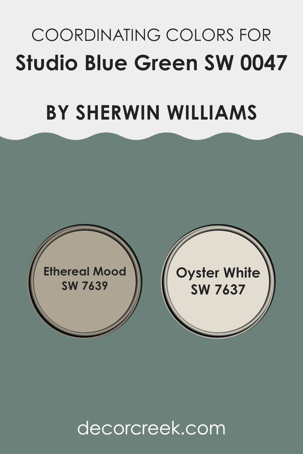
For example, when pairing certain paint colors with Studio Blue Green by Sherwin Williams, suggested coordinating colors could include Ethereal Mood and Oyster White.
Ethereal Mood is a subtle gray that has a gentle warmth to it, making it flexible enough to balance out more vivid hues without dominating the room. Its understated nature allows it to blend smoothly with both bright and muted tones.
Oyster White, on the other hand, is a soft, pale off-white that offers a clean and fresh look. Its lightness can help create a sense of openness and airiness in a room, acting as a perfect backdrop for more intense colors like Studio Blue Green. Together, these coordinating colors work in tandem to enhance the visual appeal of a room while maintaining a comfortable and welcoming atmosphere.
You can see recommended paint colors below:
Trendy Trim Colors of Studio Blue Green SW 0047 by Sherwin Williams to use this year.
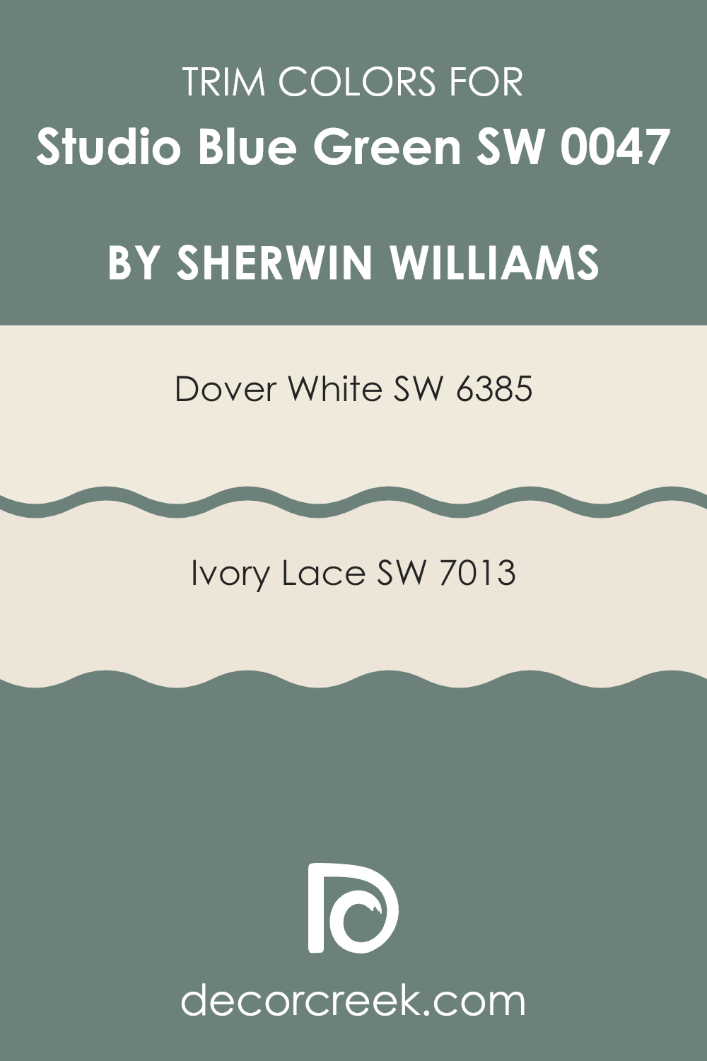
Trim colors are specifically chosen to complement or contrast the main wall colors in a room, helping to define and highlight architectural features such as doors, windows, and moldings. For a color like Studio Blue Green by Sherwin Williams, selecting the right trim colors can enhance the overall aesthetics and make the room appear more finished and polished.
Using colors like Dover White and Ivory Lace as trims provide a clean and subtle contrast that can make the blue-green hue stand out, enhancing the feeling of freshness and clarity that the color brings to a room. This can be particularly impactful in improving how coordinated and put-together the room looks, especially in areas with abundant natural light.
Dover White (SW 6385) by Sherwin Williams is a warm, soft white with a creamy undertone that makes it an ideal choice for trims, especially when paired with richer or darker wall colors, like Studio Blue Green.
It offers a gentle break from the more intense colors without losing warmth, ensuring that the room feels welcoming. Ivory Lace (SW 7013), on the other hand, has a slightly more subdued tone compared to Dover White. It’s a great option if you’re aiming for a trim color that provides a smoother transition from the wall color, lending a subtle elegance to the overall look without creating too stark of a contrast.
You can see recommended paint colors below:
- SW 6385 Dover White
- SW 7013 Ivory Lace
Evergreen Colors Similar to Studio Blue Green SW 0047 by Sherwin Williams
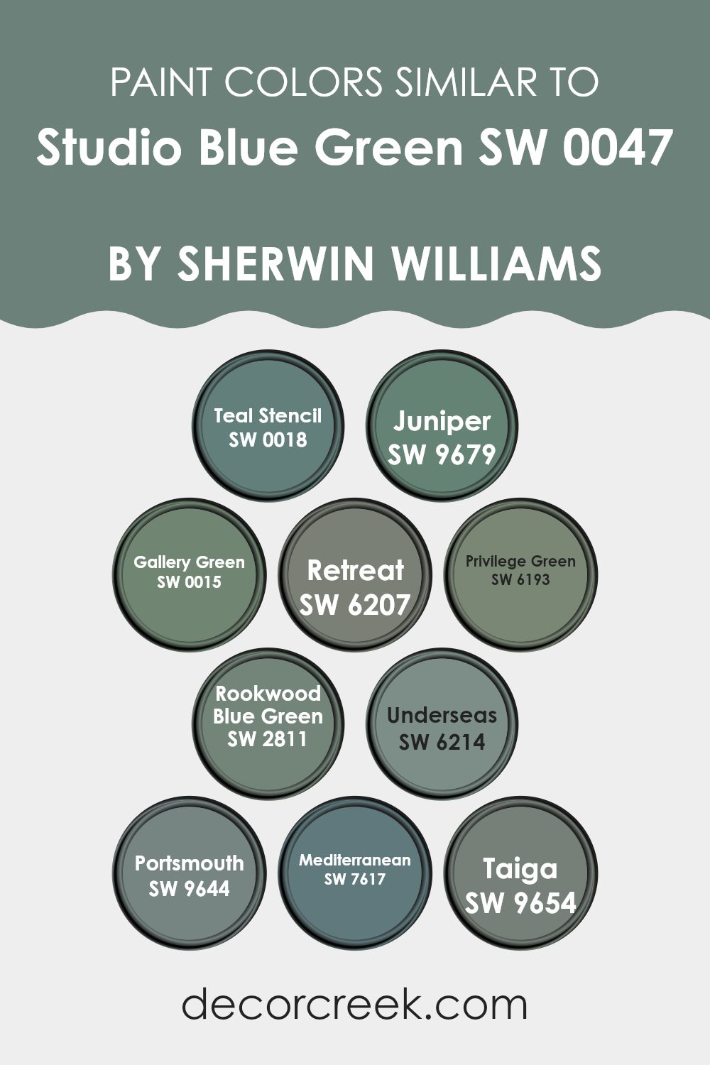
Similar colors play a crucial role in creating a cohesive and harmonious look in any interior design. By using shades like Teal Stencil, Juniper, Gallery Green, and others that closely align with Studio Blue Green, designers can ensure a smooth visual transition between wall colors which provides a subtle yet effective impact. These colors are close relatives in their hue, allowing for endless flexibility in theme and mood setting without feeling too strong.
Teal Stencil is a vibrant blue-green that brings a lively spirit to rooms, much like the deep, rich tone of Juniper which offers a touch more solemnity. Gallery Green veers slightly towards a gentle, dusky hue, providing a soft backdrop perfect for eclectic decor. Retreat offers a soothing escape with its muted green tone, akin to Privilege Green which has a slightly more reserved and understated look.
Rookwood Blue Green stands out with its deep, earthy feel that pairs beautifully with vintage or rustic themes. Underseas is a dark, enchanting green-blue that seems to pull depth from the ocean itself, while Portsmouth, slightly lighter, recalls the colors found on a foggy coastal morning. Mediterranean is bright and airy, evoking the clear, sunny skies of its namesake, and Taiga whispers of forest shadows with its cool, dark tones, wrapping up a collection that truly allows for creating rooms that feel connected and calm.
You can see recommended paint colors below:
- SW 0018 Teal Stencil
- SW 9679 Juniper
- SW 0015 Gallery Green
- SW 6207 Retreat
- SW 6193 Privilege Green
- SW 2811 Rookwood Blue Green
- SW 6214 Underseas
- SW 9644 Portsmouth
- SW 7617 Mediterranean
- SW 9654 Taiga
Studio Blue Green SW 0047 by Sherwin Williams vs Retreat SW 6207 by Sherwin Williams
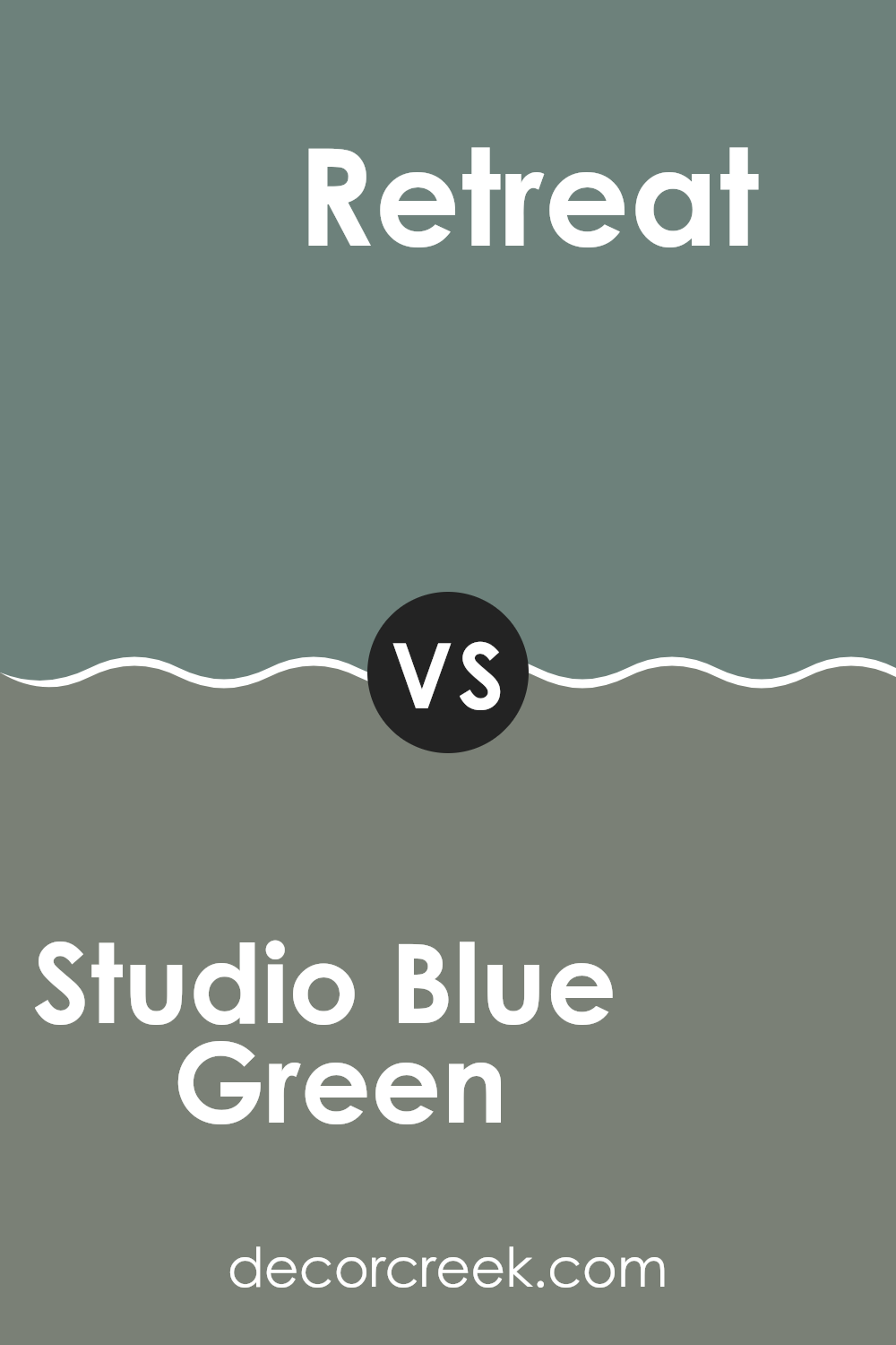
Studio Blue Green and Retreat are both colors by Sherwin Williams, but they offer distinct vibes. Studio Blue Green has a vibrant quality, reminiscent of a fresh, crisp early morning atmosphere. It blends blue and green in a way that gives a fresh, lively feel to a room, perfect for rooms aiming for a cheerful aura.
Retreat, on the other hand, leans towards a deeper, more subdued shade. It is a rich teal that provides a calming effect, making it ideal for environments where you want a more relaxed and cozy atmosphere, such as bedrooms or reading areas.
Both colors can refresh a room, but while Studio Blue Green brightens with its crisp energy, Retreat offers a soothing presence with its deeper tone. The choice between them depends on the mood you wish to create: uplifting and energetic or calm and cozy.
You can see recommended paint color below:
- SW 6207 Retreat
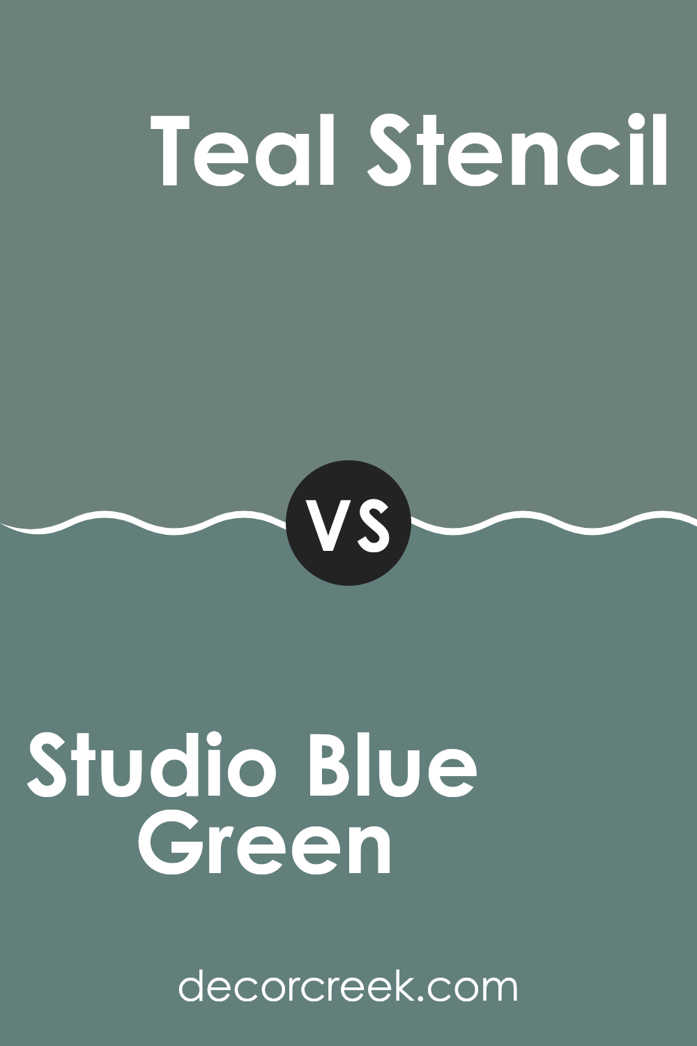
Studio Blue Green SW 0047 by Sherwin Williams vs Teal Stencil SW 0018 by Sherwin Williams
Studio Blue Green is a soft and gentle blue-green hue, almost like a misty morning sky. It has a calming feel that makes it ideal for a peaceful bedroom or a relaxing bathroom.
On the other hand, Teal Stencil is a deeper and more pronounced color that combines elements of blue and green, but with a stronger presence of green. This shade is bolder, offering a striking appearance that can really make a statement in a room, such as in a living room or as an accent wall in a dining area.
Both colors are flexible and can be used in a variety of home settings, but their intensity and tone will impact the mood and visual impact of the room differently. Studio Blue Green provides a lighter, airier vibe, while Teal Stencil is more vibrant and full of life.
You can see recommended paint color below:
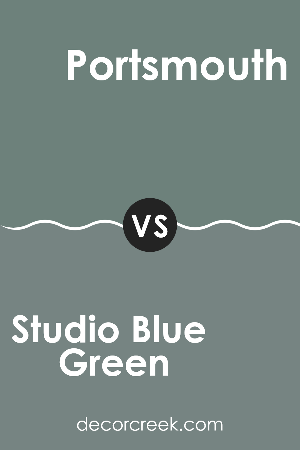
Studio Blue Green SW 0047 by Sherwin Williams vs Portsmouth SW 9644 by Sherwin Williams
Studio Blue Green and Portsmouth are two distinct colors offered by Sherwin Williams. Studio Blue Green is a soft blend of blue and green with a muted quality, giving it a gentle and calming presence in any room. It works well in rooms where you want a subtle touch of color that doesn’t feel too strong.
On the other hand, Portsmouth is a darker shade that leans more towards a true green. This color has a richer, more vibrant tone compared to Studio Blue Green. Portsmouth is ideal for creating a cozy, welcoming vibe in a room, and it pairs beautifully with natural textures and materials.
Both colors are flexible and can complement a variety of decor styles, but their impact on a room’s atmosphere will differ. Studio Blue Green is lighter and airier, promoting a relaxed environment, whereas Portsmouth, being bolder, tends to make more of a statement.
You can see recommended paint color below:
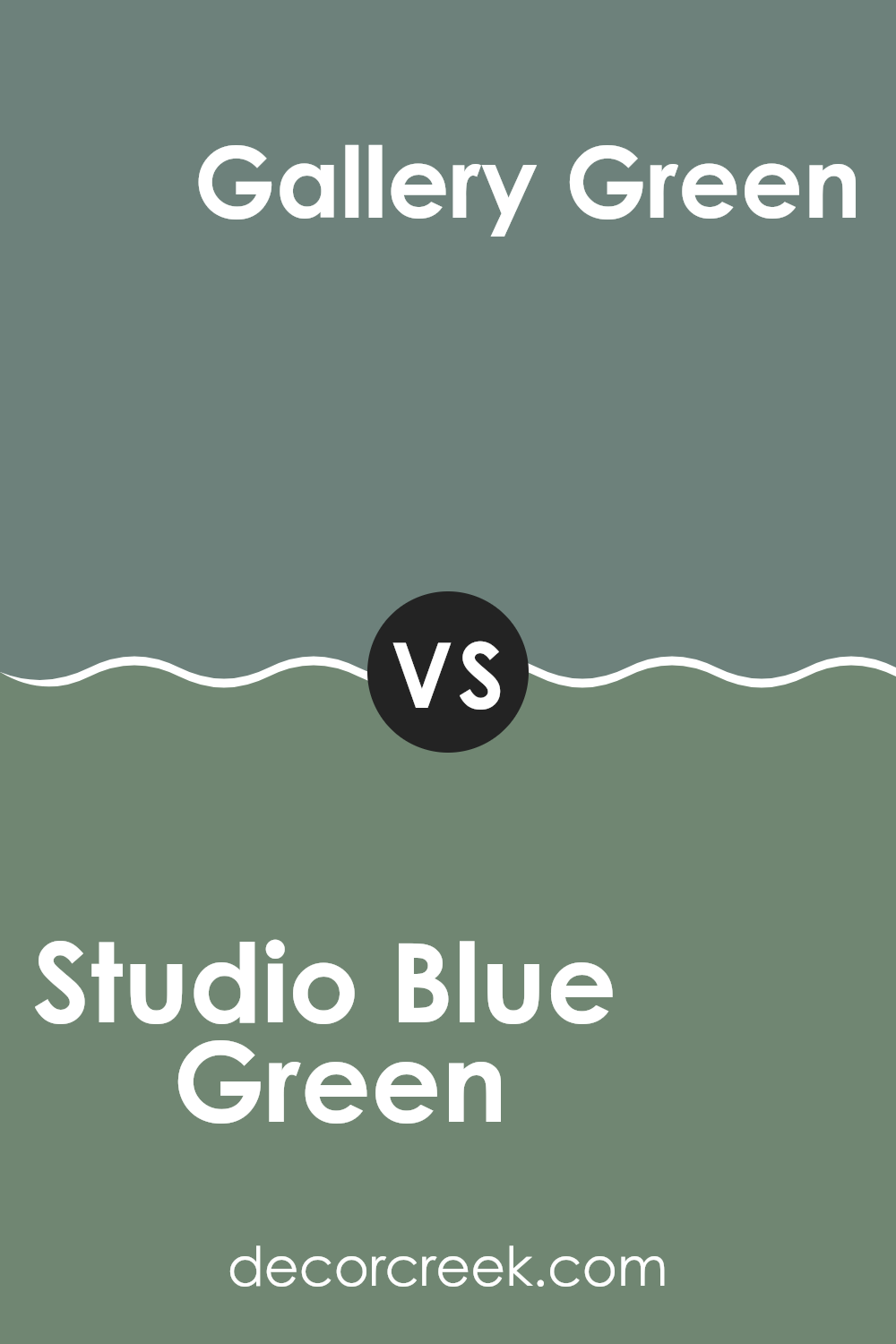
Studio Blue Green SW 0047 by Sherwin Williams vs Gallery Green SW 0015 by Sherwin Williams
Studio Blue Green is a soft and refreshing paint color with a blend of blue and green hues that give it a calm, light feel. It’s the kind of color that looks friendly in various lighting conditions, making it great for any room in your home.
On the other hand, Gallery Green is a deeper shade, pulling more towards a traditional green with a touch of elegance that makes it perfect for rooms looking to have a bit more of a cozy and rooted ambiance.
Though both colors come from a similar spectrum, Studio Blue Green has a more airy and open vibe, which can make a room feel more spacious and welcoming. Gallery Green, with its richer tone, offers a sense of grounding, ideal for highlighting areas or as an accent wall to add depth to a room. Depending on the mood and style you want to achieve, both colors offer beautiful possibilities for home decoration.
You can see recommended paint color below:
- SW 0015 Gallery Green
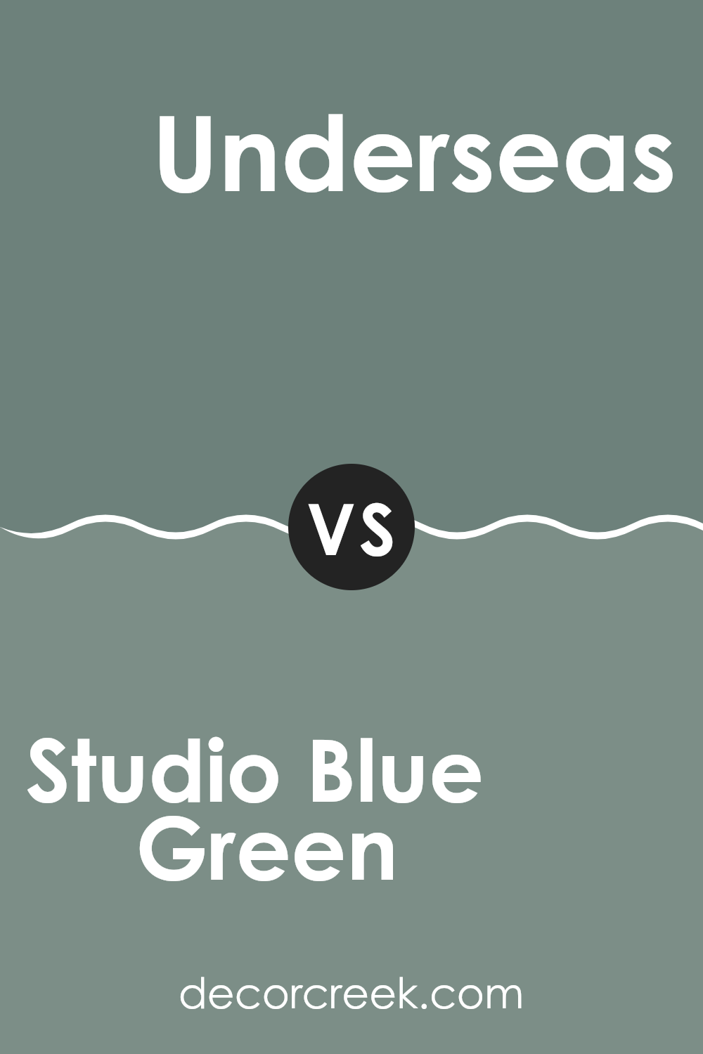
Studio Blue Green SW 0047 by Sherwin Williams vs Underseas SW 6214 by Sherwin Williams
Studio Blue Green and Underseas are two similar yet distinct shades by Sherwin Williams. Studio Blue Green has a light, airy quality, reminiscent of a soft, misty morning. It possesses a blend of blue and green with a hint of gray, making it a flexible choice for rooms aiming for a calm and inviting atmosphere.
On the other hand, Underseas is a deeper and richer hue, more inclined towards green than blue when compared to Studio Blue Green. This color brings a cozy and warm feel to rooms, suitable for areas where a touch of depth and coziness is desired.
In summary, while both colors share a common thread being in the blue-green family, Studio Blue Green offers a lighter, breezier feel, whereas Underseas presents a deeper, cozier tone, making each ideal for different types of rooms and moods. Whether brightening up a room or providing a snug ambiance, these colors provide unique options for home decorating.
You can see recommended paint color below:
- SW 6214 Underseas
Studio Blue Green SW 0047 by Sherwin Williams vs Privilege Green SW 6193 by Sherwin Williams
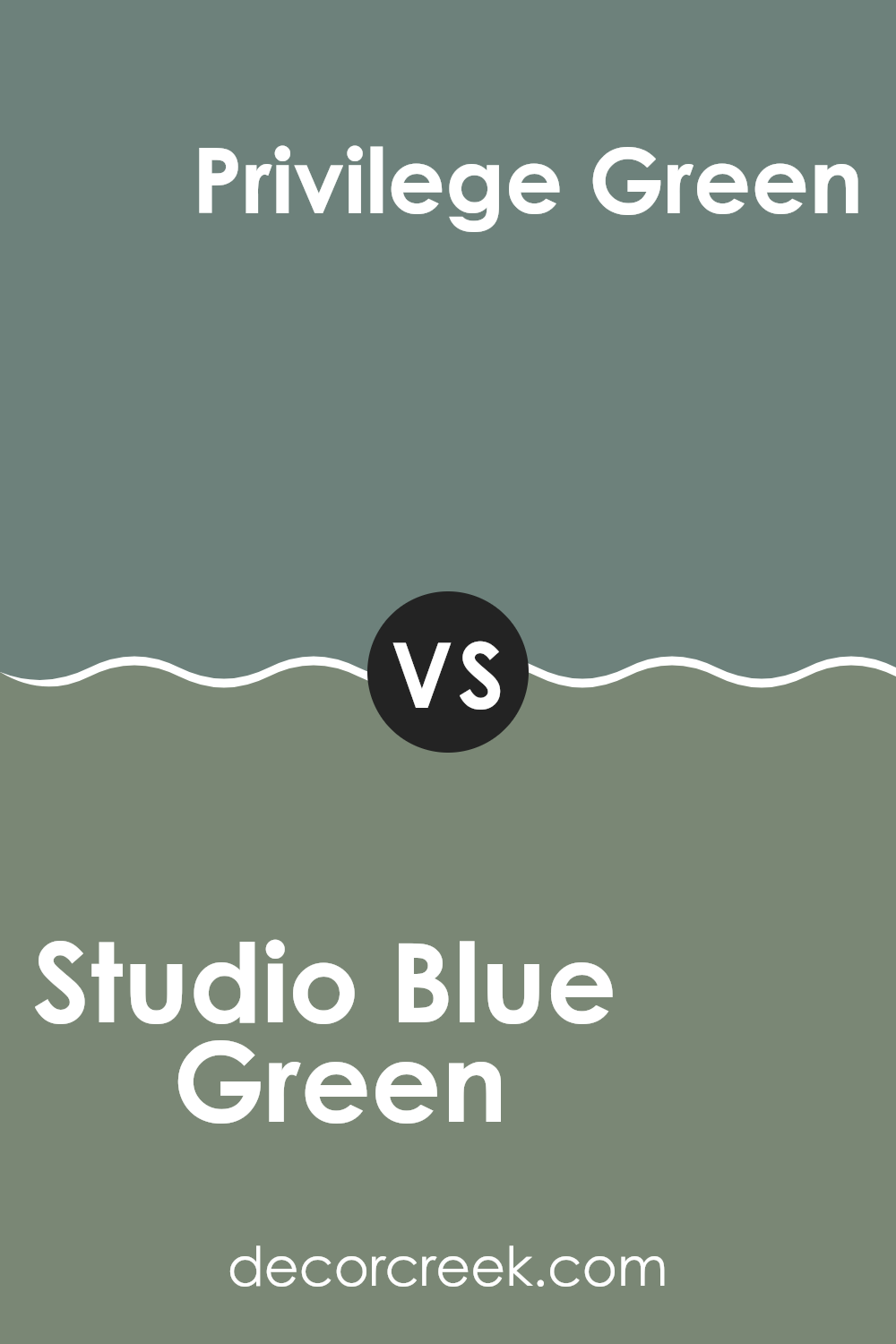
Studio Blue Green and Privilege Green from Sherwin Williams each have their unique shades that can change the feel of a room. Studio Blue Green is a fresher, lighter color, somewhat between a soft blue and a gentle green. It can brighten up small rooms and give them a cleaner, more airy feel. This color works well in bathrooms or kitchens where you want a calm, refreshing look.
On the other side, Privilege Green is a deeper, green tone with a hint of gray, making it more muted than Studio Blue Green. It suits areas where a more grounded, calm feeling is desired, such as bedrooms or offices. This color can make a room feel more cozy and enclosed.
When picking between these two, consider the kind of atmosphere you want in your room. Studio Blue Green is great for energizing a room, while Privilege Green sets a more relaxed and settled tone.
You can see recommended paint color below:
- SW 6193 Privilege Green
Studio Blue Green SW 0047 by Sherwin Williams vs Taiga SW 9654 by Sherwin Williams
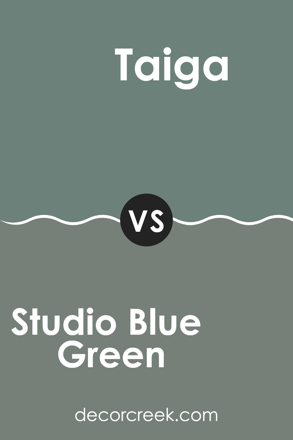
Studio Blue Green and Taiga, both from Sherwin Williams, are distinct yet harmonious shades. Studio Blue Green is a soft, muted shade with a blend of blue and green that creates a calm, refreshing atmosphere.
It’s perfect for rooms where you want a touch of nature-inspired calmness without overpowering the room. In contrast, Taiga is a deeper, more shadowy color, resembling the dense green hues of forest foliage. It leans more towards green, giving off a rich, cozy vibe that can add depth and warmth to any room.
Both colors can beautifully enhance a room, yet their impact is quite different: Studio Blue Green brings a light, airy feel, while Taiga provides a more enveloping, secure ambiance. Thus, they can be used together for a balanced approach or separately to achieve specific moods in different rooms.
You can see recommended paint color below:
Studio Blue Green SW 0047 by Sherwin Williams vs Rookwood Blue Green SW 2811 by Sherwin Williams
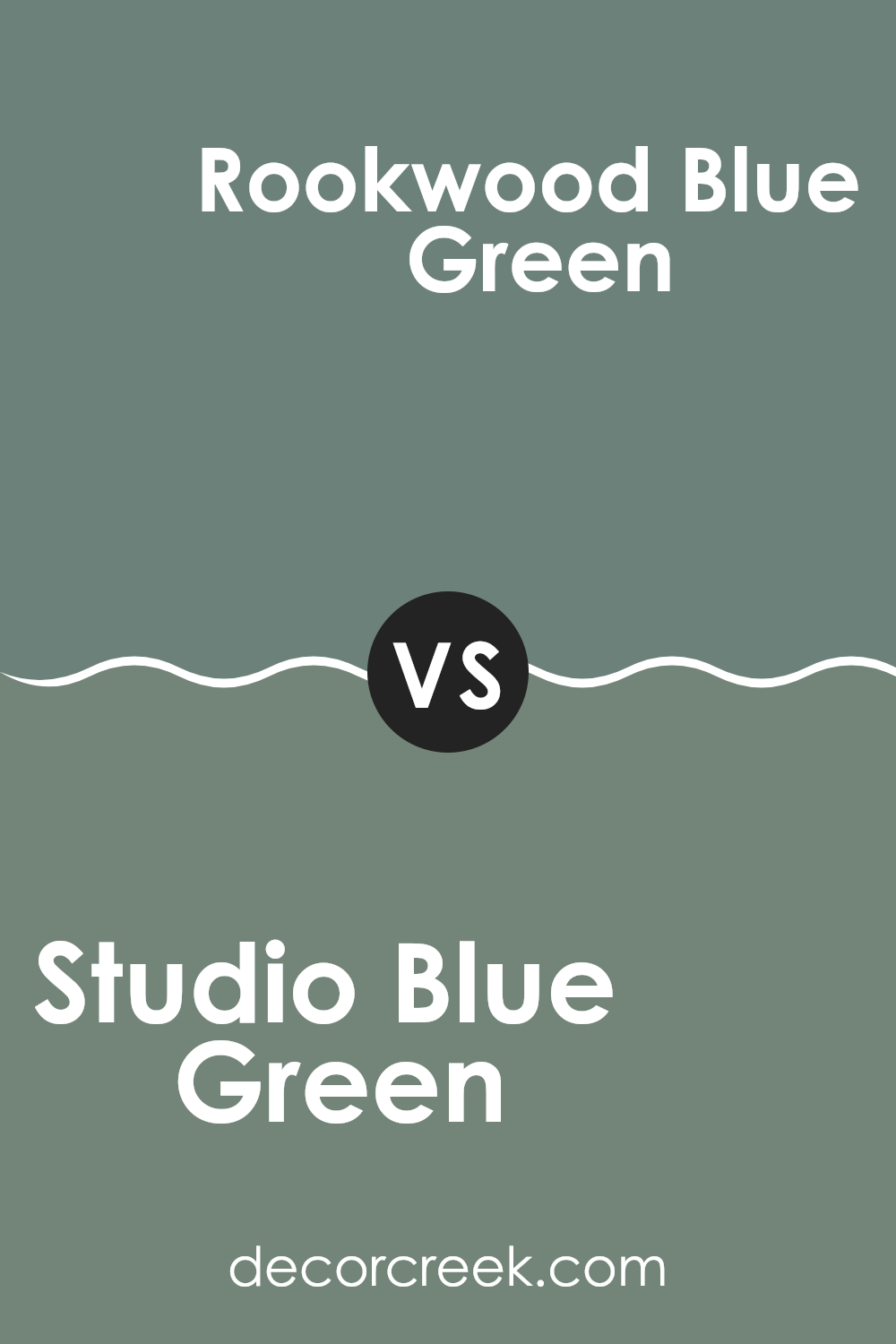
Studio Blue Green and Rookwood Blue Green by Sherwin Williams are both unique shades, but they have distinct differences. Studio Blue Green has a lighter, more refreshing feel, making it great for creating a calm atmosphere in a room. It subtly brings a sense of freshness and can open up a room, making it appear more airy and spacious.
On the other hand, Rookwood Blue Green is deeper and richer. This color is more dramatic, suitable for making a strong statement in an area. It offers a sense of depth that can make larger rooms feel cozier or give a touch of elegance to smaller rooms.
Both colors work well in various settings, but your choice might depend on the mood you’re aiming to achieve and the room you are decorating. Lighter Studio Blue Green is ideal for a relaxed vibe, while the bolder Rookwood Blue Green fits rooms meant to impress or envelop.
You can see recommended paint color below:
- SW 2811 Rookwood Blue Green
Studio Blue Green SW 0047 by Sherwin Williams vs Juniper SW 9679 by Sherwin Williams
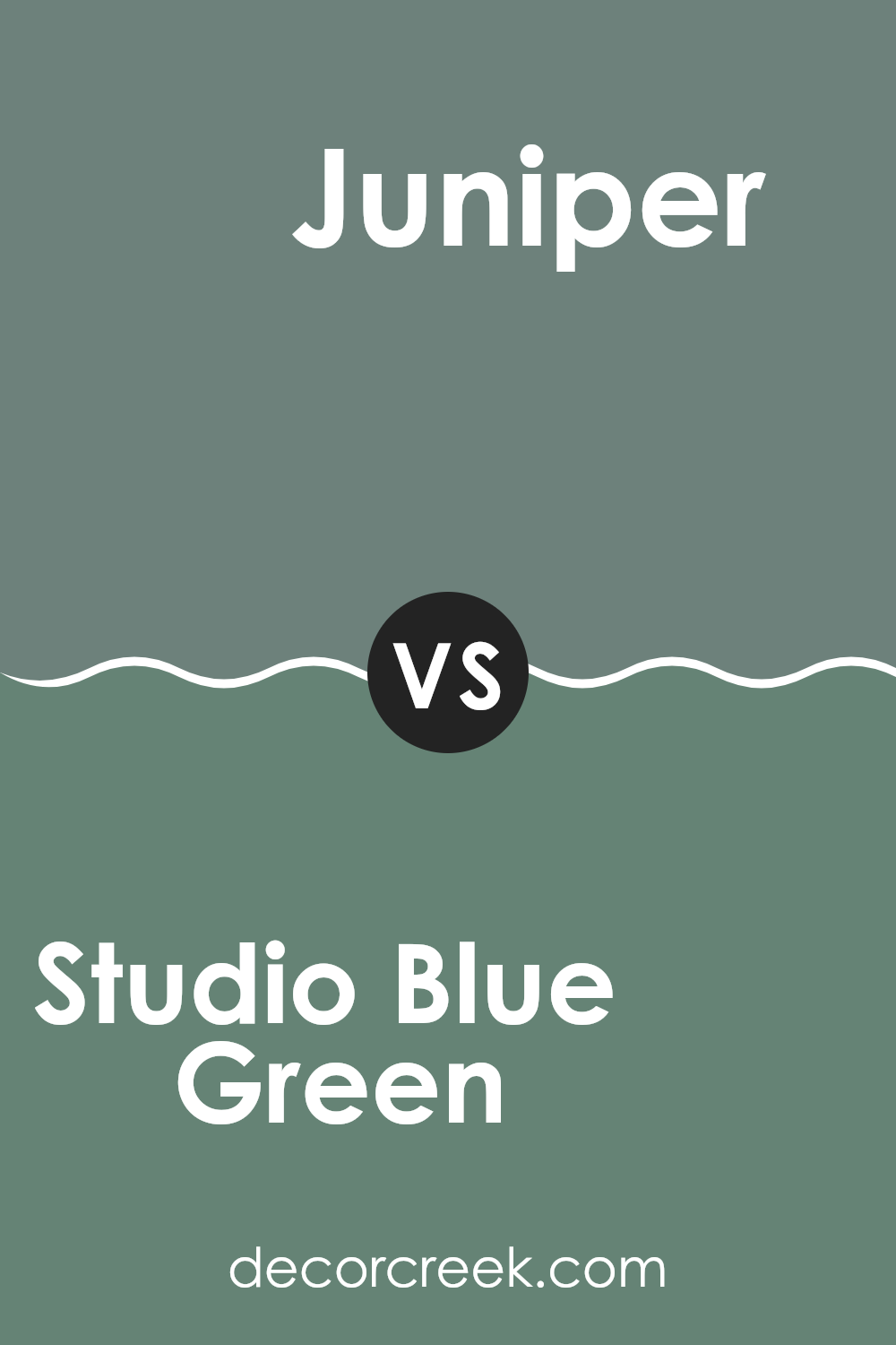
Studio Blue Green is a unique shade with a blend of blue and green tones. It gives off a calming vibe, making it great for rooms where you want a peaceful atmosphere, like bedrooms or home offices. It has a balanced and harmonious feel, which works well in various lighting situations and pairs nicely with neutral and wood tones.
On the other hand, Juniper is a much deeper and richer color. It leans more towards a traditional green but with a certain vibrancy that can add a touch of drama and personality to a room. It’s excellent for feature walls or rooms that benefit from a pop of color, such as a dining room or entryway.
While both colors bring their distinct characteristics to a room, Studio Blue Green is softer and more subdued, and Juniper is bold and lively. Depending on the mood you’re aiming for, Studio Blue Green creates a relaxed backdrop, while Juniper makes more of a statement.
You can see recommended paint color below:
- SW 9679 Juniper
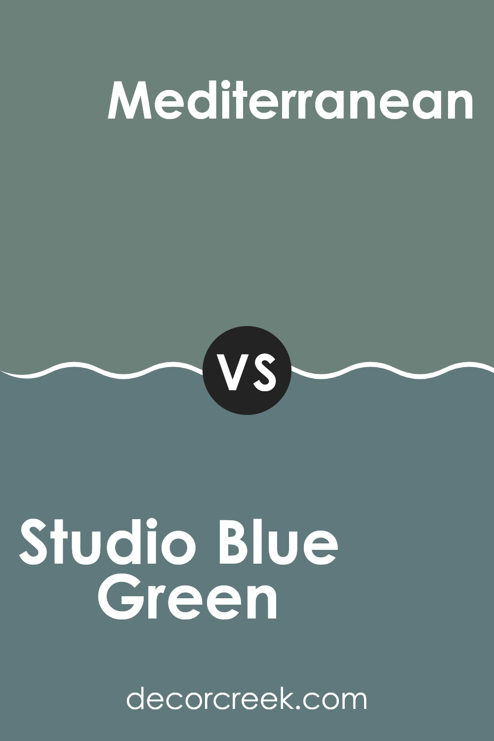
Studio Blue Green SW 0047 by Sherwin Williams vs Mediterranean SW 7617 by Sherwin Williams
Studio Blue Green and Mediterranean are both beautiful paint colors from Sherwin Williams, but they have distinct vibes and can create different moods in a room. Studio Blue Green is a soft, muted color that combines blue and green with a touch of grey. It’s subtle and almost neutral, making it flexible for use in many rooms, providing a calm and gentle backdrop that isn’t too bold.
On the other hand, Mediterranean is a richer, deeper blue with a vibrant quality that seems to reflect the lively colors of the sea and sky in that region. It’s much more vivid and can add a dramatic flair to a room, making it an excellent choice for anyone wanting to make a bold statement.
Choosing between them depends on what feel you want for your room – a softer, more understated look with Studio Blue Green, or a lively, eye-catching presence with Mediterranean. Each brings its own unique atmosphere to interiors.
You can see recommended paint color below:
In conclusion, SW 0047 Studio Blue Green by Sherwin Williams is a paint color I find truly special. It creates a calming effect in any room, which feels like a gentle hug. This color is like the ocean and the forest blended into one, making it cheerful yet relaxing at the same time. It’s perfect for places in the house where you like to relax and feel comfortable, like your bedroom or your reading nook.
When I used Studio Blue Green in my own home, it made the rooms look brighter and more welcoming. This shade has just the right mix of blue and green, so it goes well with many decorations, from modern looks to more classic styles. It can also hide small imperfections on walls pretty well, which is super helpful.
I recommend Studio Blue Green to anyone thinking about changing up their room colors. It’s not just a trend; it’s a color that makes rooms look and feel good all the time. Whether you’re looking to freshen up your living room, kitchen, or a cozy corner, this color brings a lively yet calm atmosphere that’s really enjoyable.
So, if you are planning to repaint a room or start a new painting project, consider SW 0047 Studio Blue Green. It’s a choice you’ll likely be happy with because it just makes everything look nicer and feel cozier.

decorcreek.com
Ever wished paint sampling was as easy as sticking a sticker? Guess what? Now it is! Discover Samplize's unique Peel & Stick samples.
Get paint samples