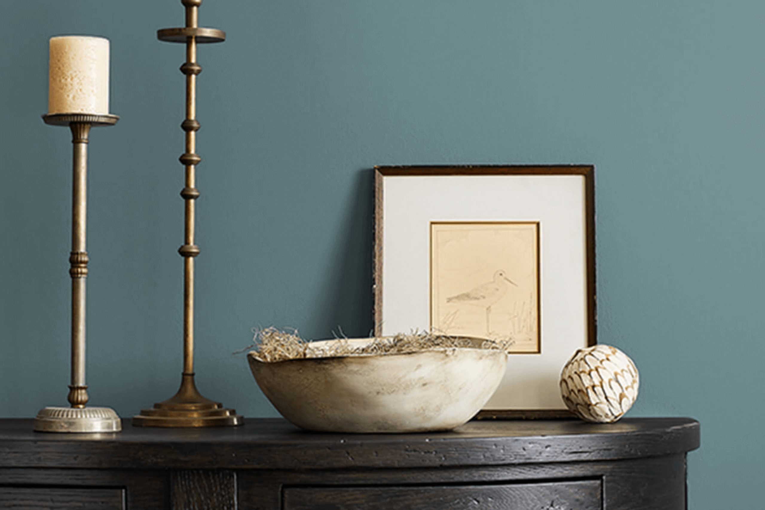
Painting your room with SW 7617 Mediterranean by Sherwin Williams can give it a fresh, vibrant feel, reminiscent of the azure waters and calm landscapes of the Mediterranean coast. The blue tone of this paint is simultaneously soothing and lively, making it a perfect choice if you want to breathe new life into your rooms without overpowering them with color.
As you plan to refresh your home or office, consider how SW 7617 Mediterranean might influence the mood and aesthetics of your room. The unique charm of this shade lies in its ability to blend well with different styles and decors, ranging from the ultra-modern to the comfortably traditional. Whether you are looking to paint a single accent wall or envision a more extensive update, this shade could be the breath of fresh air your room needs.
Additionally, the application of this paint is straightforward, offering good coverage and durability, which means it’s not only a beautiful choice but a practical one too. If you’re ready to refresh the look of your home, SW 7617 Mediterranean offers a blend of adaptability and beauty that could enhance any room.
Plus, its calming qualities can turn any area into a peaceful haven.
What Color Is Mediterranean SW 7617 by Sherwin Williams?
Mediterranean by Sherwin Williams is a vivid, cheerful shade of blue that instantly brings to mind clear skies and coastal waters. It is energetic yet soothing and can effortlessly create a refreshing and inviting atmosphere in any room. This vibrant hue, though bold, is surprisingly adaptable and fits well with various interior styles, particularly coastal, contemporary, and modern themes.
To incorporate Mediterranean into your home, consider using it as an accent wall in living rooms, kitchens, or bathrooms. It pairs exceptionally well with light, neutral colors such as whites, beiges, and soft grays, which balance its intensity and keep the room feeling airy. For a more dramatic effect, pairing this blue with contrasting shades like coral or sunny yellow can evoke a lively and playful mood.
In terms of materials, Mediterranean blue works beautifully with natural wood, whether it’s a light oak or a richer walnut, adding warmth and organic texture to the room. It also complements metallic finishes like brushed nickel and copper, which provide a subtle shimmer and elegance to the overall look.
Textiles in natural fibers like linen or cotton in simple, unpatterned designs will help maintain a light and breezy feeling, ensuring the color remains the focal point. Overall, this shade is perfect for creating rooms that feel fresh, modern, and very welcoming.
Is Mediterranean SW 7617 by Sherwin Williams Warm or Cool color?
Mediterranean SW 7617, a paint color by Sherwin Williams, is a vibrant teal that brightens up any room with a lively yet cozy feel. This color fits beautifully into a range of decorating styles, from modern to rustic.
It’s perfect for adding a splash of personality to rooms like living areas and kitchens because it pairs effortlessly with both neutral and bold palettes. You can match it with whites and grays for a fresh, clean look or combine it with bright yellows and reds for a more energetic touch.
In homes, Mediterranean SW 7617 works especially well in rooms that could use a bit of vibrancy. It’s great for accent walls or for doors and trim to create a playful contrast. Its light-reflecting quality also makes it ideal for smaller rooms, helping them feel larger and more open. Additionally, this shade is durable and hides daily wear and tear effectively, making it a practical choice for high-traffic areas.
Undertones of Mediterranean SW 7617 by Sherwin Williams
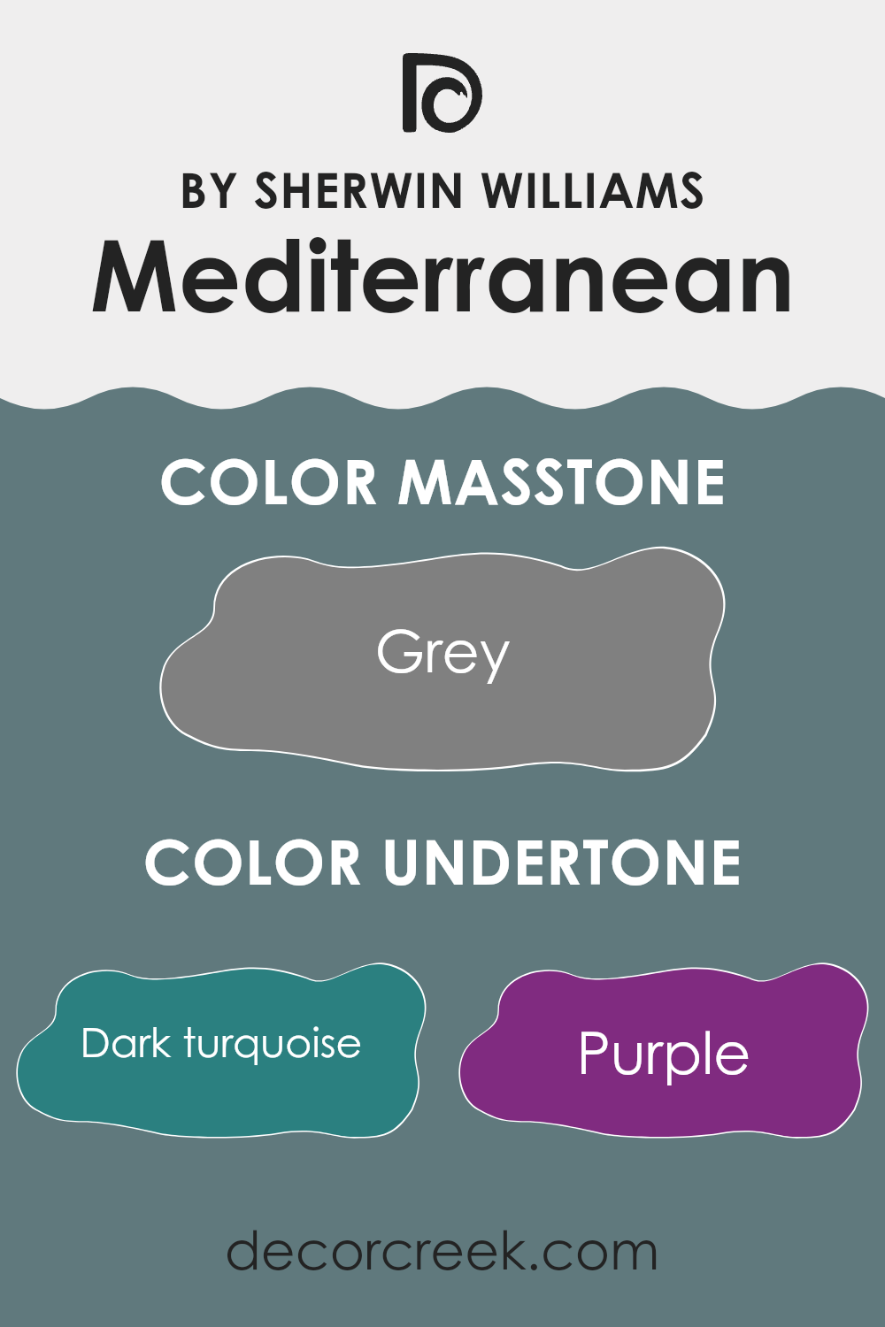
Mediterranean SW 7617 is a vibrant color with a complex blend of undertones that give it a dynamic and layered look. Understanding these undertones can significantly influence how it’s perceived and how it works within your decor.
Undertones are subtle hues that sit beneath the main color and shape how it leans — either warm or cool — while also affecting how it reacts to lighting and pairs with other colors. In Mediterranean SW 7617, undertones like dark turquoise and navy provide a cool edge, making it ideal for rooms that aim for a fresh and calming atmosphere.
When used on interior walls, this color’s undertones can shift depending on lighting and surroundings. In natural light, the blue and turquoise tones tend to stand out more, giving the room a brighter and airier appearance. Under artificial light, however, the deeper navy undertones can emerge, creating a more grounded and cozy feel.
Additional undertones such as purple, lilac, and mint introduce depth and dimension, keeping the color from appearing flat. This makes it highly adaptable for different design styles and furniture combinations.
Whether used in a living room or a bedroom, Mediterranean SW 7617 brings a room to life, interacting beautifully with light and nearby decor. Its layered character makes it a great choice for anyone looking to add both energy and depth to their home.
decorcreek.com
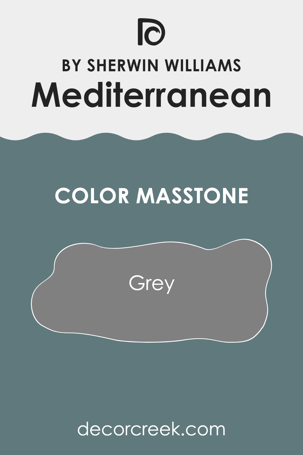
What is the Masstone of the Mediterranean SW 7617 by Sherwin Williams?
Mediterranean SW 7617 by Sherwin Williams has a masstone that leans toward gray, a balanced and adaptable choice for home decor. This particular shade of gray provides a neutral backdrop that works beautifully in different rooms, whether large living areas or small, cozy corners.
Its neutrality allows it to blend smoothly with other colors — pair it with bright, bold tones for contrast, or keep to a palette of other neutrals for a subtle, cohesive look. Gray, as seen in this shade, complements both modern and traditional styles with ease.
It doesn’t overpower rooms but rather enhances surrounding elements like furniture and decor. This makes Mediterranean SW 7617 an excellent choice for walls, offering a clean and calm background that harmonizes effortlessly with other design details. As a result, it helps rooms appear polished and well balanced with minimal effort.
How Does Lighting Affect Mediterranean SW 7617 by Sherwin Williams?
Lighting plays a crucial role in how colors appear in any room. The type of light—whether natural or artificial—can change the way a paint color looks on your walls. Let’s look at Mediterranean by Sherwin Williams and how it varies under different lighting conditions and in rooms with different orientations.
In natural light, the character of Mediterranean shifts depending on the room’s direction. In north-facing rooms, where light is cooler and softer, the color appears more muted and less vivid, with its gray undertones becoming more noticeable.
South-facing rooms, on the other hand, receive warm, bright light for most of the day. This enhances Mediterranean’s lively tones, making it look more cheerful and radiant.
In east-facing rooms, the light is warm in the morning and cooler as the day goes on. Here, Mediterranean appears bright and inviting early in the day, then softens into a more subtle shade by afternoon.
West-facing rooms benefit from warm, golden evening light. In these spaces, Mediterranean glows beautifully in the late afternoon and evening, highlighting its warm undertones and creating a cozy, comforting mood.
Under artificial lighting, its look depends on the type of bulbs used. Warm light brings out Mediterranean’s richness and depth, similar to south or west natural light, while cooler bulbs can make it appear more subdued and gray-toned, like in a north-facing room.
Overall, Mediterranean adapts beautifully to its surroundings — its color shifts gently with the light, giving each room its own distinctive character and mood.
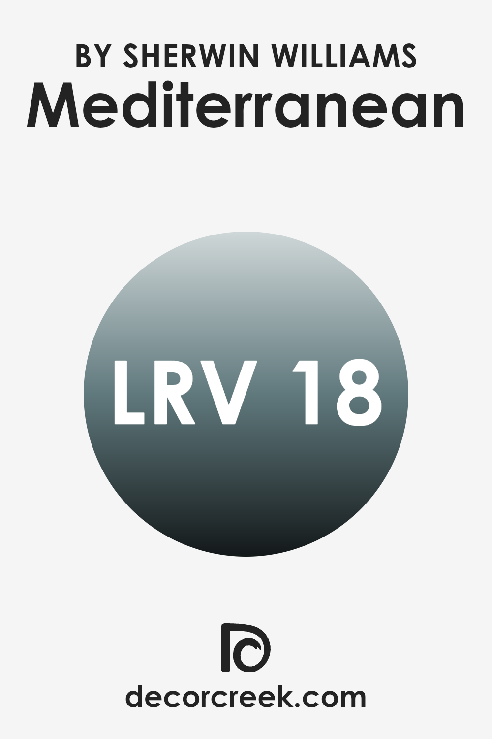
What is the LRV of Mediterranean SW 7617 by Sherwin Williams?
LRV stands for Light Reflectance Value, and it measures how much light a paint color reflects back into a room compared to the light that hits it. This value is shown on a scale where higher numbers mean the color reflects more light and appears lighter, while lower numbers mean it absorbs more light, appearing darker. Understanding LRV is helpful when choosing paint because it gives insight into how bright or deep a color will look based on the lighting in your room.
With an LRV of 17.544, Mediterranean SW 7617 is quite a dark shade. In practice, this means it absorbs a significant amount of light rather than reflecting it. This can make a small room feel more intimate or cozy, depending on your design goal.
In rooms with limited natural light, a low-LRV color like this may make the room appear darker and more enclosed. However, in bright or spacious areas, its deep, rich tone can add visual depth and character, creating a striking and focused atmosphere. It’s important to consider both room size and lighting conditions when using deeper shades such as this one.
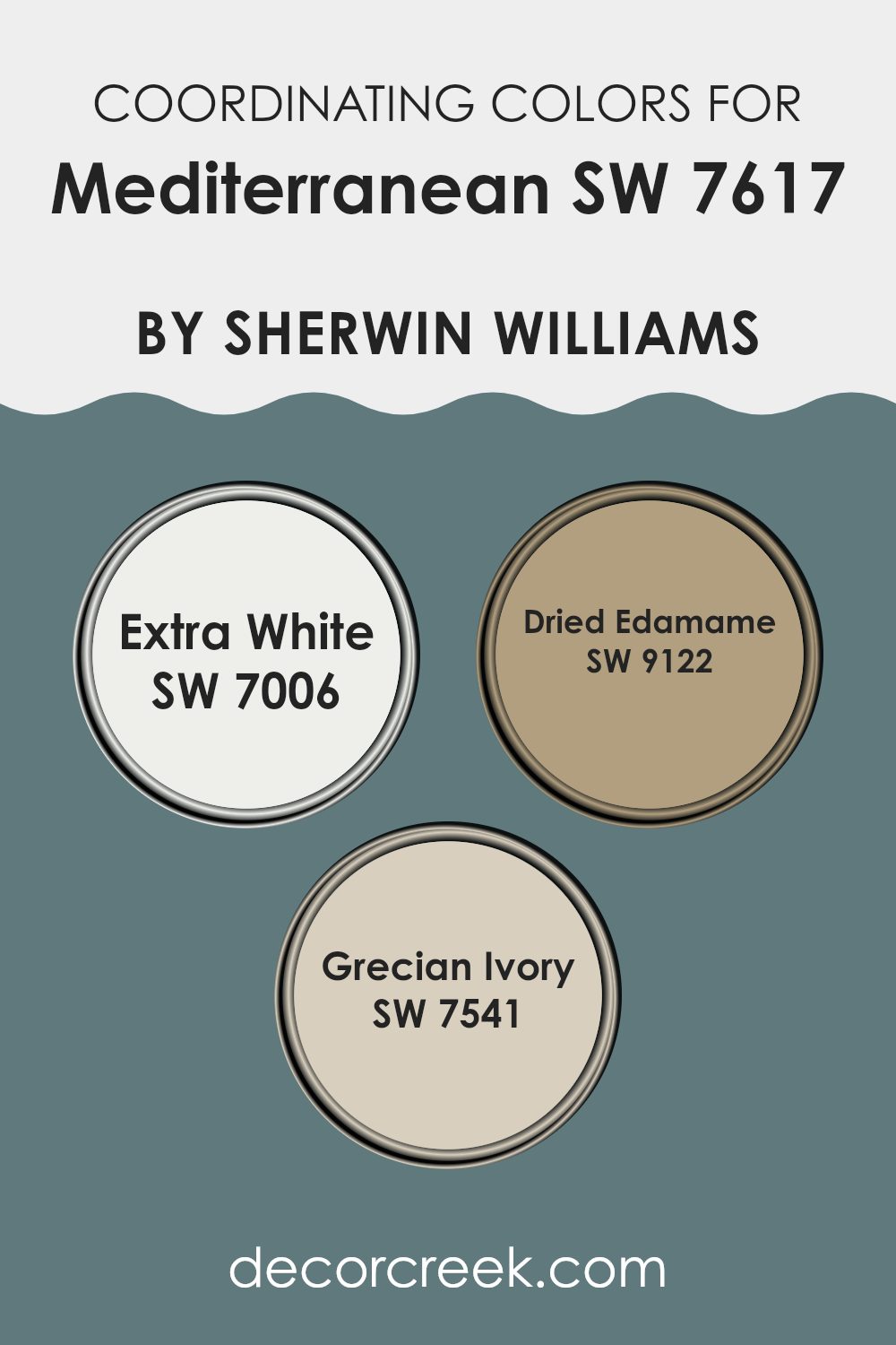
Coordinating Colors of Mediterranean SW 7617 by Sherwin Williams
Coordinating colors are shades that complement a main color, enhancing a room’s overall look while maintaining balance. By choosing the right coordinating colors, you can create a harmonious and visually appealing environment. For Mediterranean by Sherwin Williams, a well-balanced set of coordinating colors includes SW 7006 – Extra White, SW 9122 – Dried Edamame, and SW 7541 – Grecian Ivory.
SW 7006 – Extra White is a bright, clean white that provides a refreshing contrast to deeper tones. It’s perfect for trim, ceilings, and cabinetry, adding light and clarity to any room while balancing Mediterranean’s depth.SW 9122 – Dried Edamame is a muted sage green that introduces an earthy touch, ideal for creating relaxed, nature-inspired rooms. It brings calm and subtle richness, especially when paired with Mediterranean’s vibrant hue.
SW 7541 – Grecian Ivory, a soft, warm beige, offers a gentle complement to bolder shades, making it great for walls in living areas and bedrooms where a softer, more welcoming palette is desired.Together, these colors form a cohesive and adaptable palette, allowing you to create interiors that feel balanced, comfortable, and full of character.
You can see recommended paint colors below:
- SW 7006 Extra White
- SW 9122 Dried Edamame
- SW 7541 Grecian Ivory
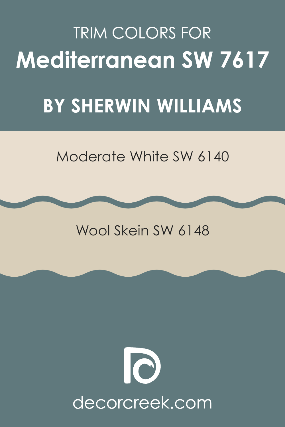
What are the Trim colors of Mediterranean SW 7617 by Sherwin Williams?
Trim colors are the hues chosen for architectural details such as door frames, window trims, moldings, and baseboards. These shades play an important role in defining a room’s overall character by emphasizing its structural accents and adding visual depth.
When working with a vibrant base color like Mediterranean by Sherwin Williams, selecting the right trim colors helps ensure the edges and details complement the main color rather than overpower it.
For Mediterranean, options like SW 6140 – Moderate White and SW 6148 – Wool Skein work beautifully. Moderate White is a soft off-white that provides a clean, fresh contrast, allowing the boldness of Mediterranean to stand out gracefully without competing for attention.
Wool Skein, on the other hand, is a warm neutral with gentle undertones that balance well against Mediterranean’s rich blue tones. It creates a softer frame that tempers the color’s intensity, producing a cohesive and inviting look.Together, these trim shades enhance Mediterranean’s depth and vibrancy while maintaining a polished, harmonious finish throughout the room.
You can see recommended paint colors below:
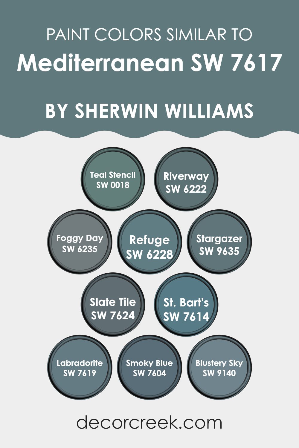
Colors Similar to Mediterranean SW 7617 by Sherwin Williams
Choosing similar colors in decorating is essential for creating a harmonious and cohesive look in any room. Colors that are close to each other on the color wheel blend smoothly, offering a soothing visual flow. This approach is especially effective for achieving a calm and balanced atmosphere, perfect for rooms meant for relaxation or focus. For example, different shades of blue and teal can bring a sense of calm continuity, making them excellent for bedrooms or offices.
Starting with SW 0018 – Teal Stencil, this shade is a deep, lively teal that adds energy and brightness to a room. SW 6222 – Riverway, by contrast, is a darker, more subdued teal that works beautifully as an accent or even a main wall color. SW 6235 – Foggy Day offers a cool, muted gray-blue tone that pairs well with lighter or brighter colors to create balance.
SW 6228 – Refuge brings a deep bluish-gray depth that adds a feeling of comfort and grounding. SW 9635 – Stargazer is a unique dark blue with a touch of green, evoking the mystery of a night sky. SW 7624 – Slate Tile, a rich dark gray, provides excellent contrast and drama.
SW 7614 – St. Bart’s delivers a vivid Caribbean blue, reminiscent of clear tropical waters, bringing a fresh, uplifting vibe. SW 7619 – Labradorite mirrors the gemstone’s blue-green shimmer, creating an elegant and captivating backdrop.
SW 7604 – Smoky Blue introduces a soft, dusty blue perfect for a relaxed, welcoming environment. Finally, SW 9140 – Blustery Sky, with its stormy blue tone, gives a cozy, moody touch that feels grounded yet comforting.
Together, these shades share a visual harmony, offering a connected palette that can beautifully unify any home decor theme.
You can see recommended paint colors below:
- SW 0018 Teal Stencil
- SW 6222 Riverway
- SW 6235 Foggy Day
- SW 6228 Refuge
- SW 9635 Stargazer
- SW 7624 Slate Tile
- SW 7614 St. Bart’s
- SW 7619 Labradorite
- SW 7604 Smoky Blue
- SW 9140 Blustery Sky
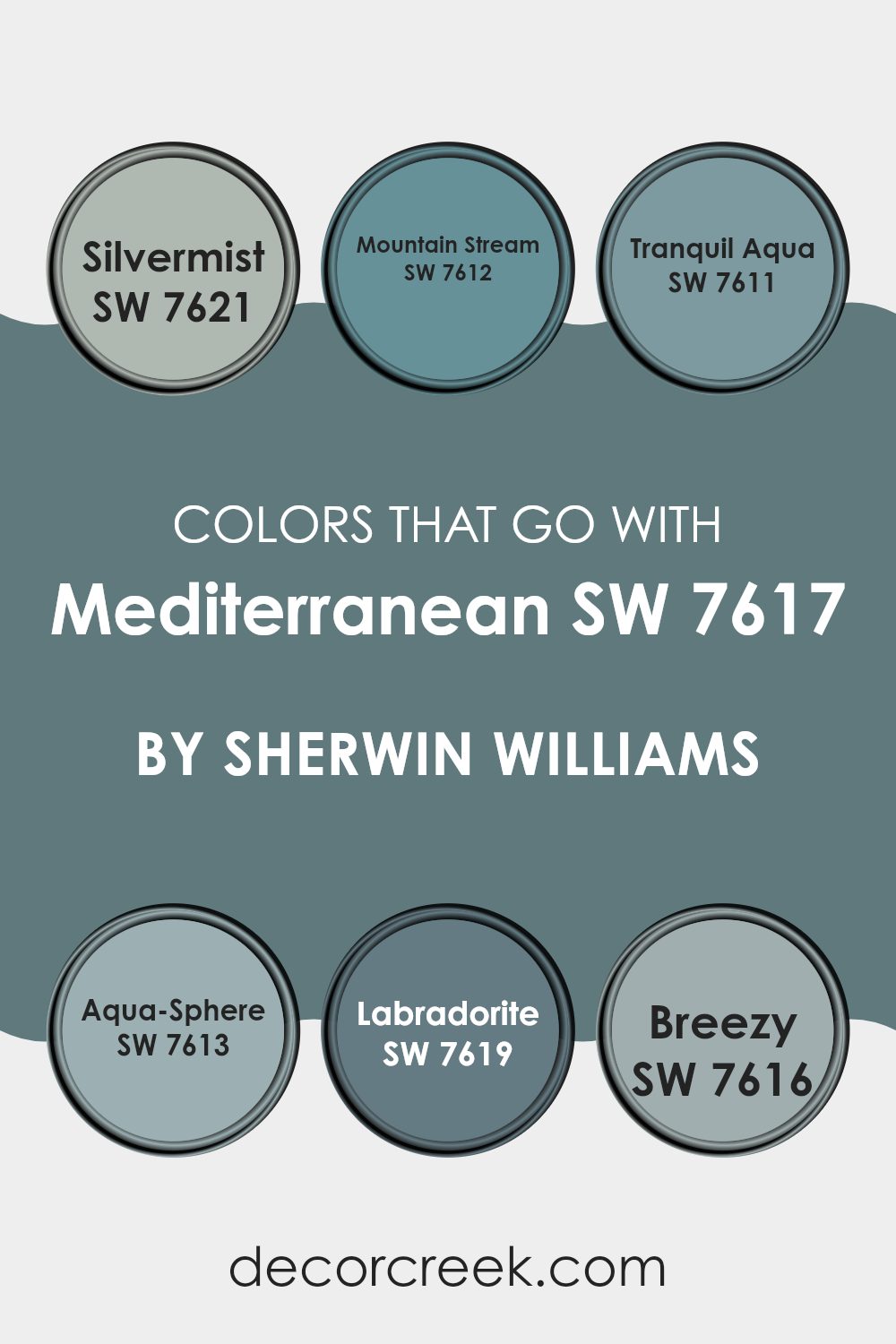
Colors that Go With Mediterranean SW 7617 by Sherwin Williams
When decorating a room, the importance of choosing harmonious colors cannot be overstated, particularly with a base color like Mediterranean SW 7617 by Sherwin Williams. Matching colors properly sets the mood and aesthetic of a room, ensuring that everything from the walls to the decor feels cohesive. Colors that pair well with Mediterranean, such as Silvermist, Mountain Stream, Calm Aqua, Aqua-Sphere, Labradorite, and Breezy, each bring their unique vibe while maintaining a harmonious flow.
Silvermist is a gentle gray with a hint of blue that creates a calming atmosphere, ideal for a peaceful bedroom or a quiet study area. Mountain Stream offers a slightly more vivid shade of blue, giving a splash of brightness without overpowering the senses, perfect for lively living rooms or bathrooms. Calm Aqua lives up to its name by providing a soft, soothing blue-green that works well in rooms for relaxation such as spas or master suites.
Aqua-Sphere brings a deeper blue-green to the table, adding a touch of drama while still aligning with a gentle palette, great for accent walls or furniture pieces. Labradorite is a darker gray-blue that adds a strong, grounding element, suitable for modern kitchens or offices. Breezy is a light, airy blue that reminds one of the sky on a clear day, wonderful for creating a fresh, open feel in any room. Together, these colors support Mediterranean SW 7617 in creating a welcoming, cohesive environment.
You can see recommended paint colors below:
- SW 7621 Silvermist
- SW 7612 Mountain Stream
- SW 7611 Tranquil Aqua
- SW 7613 Aqua-Sphere
- SW 7619 Labradorite
- SW 7616 Breezy
How to Use Mediterranean SW 7617 by Sherwin Williams In Your Home?
Mediterranean SW 7617 by Sherwin Williams is a vibrant blue paint color that can make any room feel bright and welcoming. This shade resembles the clear blue skies of a summer day or the deep blue waters of the sea, which makes it perfect for creating a lively atmosphere in your home.
It’s a great choice for bathrooms and bedrooms, as it gives a clean and fresh look that can help you start your day with a positive mood. In the living room, pairing this blue with soft whites or warm neutral colors can keep the room balanced and inviting.
Mediterranean SW 7617 can also be used on a feature wall to add a splash of color without overpowering the room. If you want to add a bit of fun to your kitchen, consider painting your cabinets or island with this cheerful blue. It’s durable and washable, making it both a practical and stylish choice. This color works well in many styles of homes, adding a fresh, lively touch wherever it’s used.
Mediterranean SW 7617 by Sherwin Williams vs Refuge SW 6228 by Sherwin Williams
Mediterranean SW 7617 is a bright, cheerful blue with lively energy that can refresh any room. It has an uplifting feel, making it ideal for active areas like kitchens or living rooms.
In contrast, Refuge SW 6228 is a deeper, more muted blue. This shade has a calming character, making it perfect for bedrooms or bathrooms where a peaceful atmosphere is desired.
Both colors bring a sense of freshness but in different ways — Mediterranean energizes a room with brightness and vitality, while Refuge offers a soft, relaxing backdrop. The choice between them depends on whether you want a space that feels vibrant and dynamic or calm and restful.
You can see recommended paint color below:
Mediterranean SW 7617 by Sherwin Williams vs Slate Tile SW 7624 by Sherwin Williams
Mediterranean SW 7617 and Slate Tile SW 7624 by Sherwin Williams are both unique hues, yet distinct in their own ways. Mediterranean is a lively blue with a vibrant, cheerful quality that seems to brighten rooms.
It’s perfect for creating a relaxed and inviting atmosphere in areas like kitchens or living rooms. On the other hand, Slate Tile is a deeper, more subdued blue-gray that brings a strong sense of calm and understated grace.
This color works well in areas where a more reserved or professional tone is desired, such as offices or dens. While Mediterranean adds a splash of brightness and energy, Slate Tile offers a more grounded, calming presence, making them suitable for different interior moods and styles.
You can see recommended paint color below:
Mediterranean SW 7617 by Sherwin Williams vs Riverway SW 6222 by Sherwin Williams
The main color Mediterranean and Riverway, both from Sherwin Williams, have unique tones that cater to different aesthetics. Mediterranean is a light, bright blue with an airy feel that mimics the clear skies of a sunny coastal area. It works well in rooms that aim to be cheerful and welcoming.
Riverway, on the other hand, is a deeper, richer blue-green that evokes the calm of deep water. This shade is perfect for creating a cozy, intimate mood in rooms like studies or bedrooms where a more subdued feeling is preferred.
Together, these colors can complement each other beautifully, offering a balance between light and depth — Mediterranean lifting the mood and Riverway adding a grounded, calming presence.
You can see recommended paint color below:
Mediterranean SW 7617 by Sherwin Williams vs Labradorite SW 7619 by Sherwin Williams
Mediterranean SW 7617 by Sherwin Williams is a lively and bright teal color that feels refreshing and dynamic in a room. Labradorite SW 7619, on the other hand, is a deeper gray with a touch of blue. Though both belong to a similar palette, they create very different moods.
Mediterranean adds vibrancy and energy to a room, making it ideal for areas like kitchens or playrooms where a cheerful feel is desired. Labradorite, being darker and more understated, suits rooms that call for a calm yet confident presence, such as offices or bedrooms.
This grayish-blue tone provides a solid foundation, pairing easily with brighter accents or fitting into a range of styles from modern to classic. Both colors bring their own charm — Mediterranean offering a spirited, uplifting mood, while Labradorite delivers a more grounded and tranquil atmosphere.
You can see recommended paint color below:
Mediterranean SW 7617 by Sherwin Williams vs Teal Stencil SW 0018 by Sherwin Williams
Mediterranean and Teal Stencil, both by Sherwin Williams, are vibrant, rich colors, each bringing its own character to a room. Mediterranean is a soft, soothing blue with a grayish undertone that creates a calm, welcoming mood. It’s light enough to make smaller rooms feel more open while maintaining a cozy feel.
Teal Stencil, on the other hand, leans toward a deeper teal that blends the energy of blue with the freshness of green. This shade is bolder and more expressive, making it perfect for accent walls or decorative touches that stand out.
Both colors are excellent choices for adding depth and personality while keeping the overall mood relaxed and inviting. Each offers its own distinct vibe, allowing you to shape a room’s atmosphere from peaceful to lively.
You can see recommended paint color below:
Mediterranean SW 7617 by Sherwin Williams vs Foggy Day SW 6235 by Sherwin Williams
The main color, Mediterranean, and the second color, Foggy Day, both by Sherwin Williams, bring distinct moods to a room. Mediterranean is a lively teal that adds cheerful energy and brightness, making it perfect for creating a focal point or introducing a playful burst of color.
Foggy Day, on the other hand, is a soft, muted gray that provides a subtle, balanced backdrop, ideal for those who prefer a calm and neutral environment. This shade helps create a soothing setting and works well in areas where a gentler touch is desired.
While Mediterranean stands out as a bold, uplifting hue that energizes a room, Foggy Day acts as a grounding color that complements without overpowering. Together, they offer a balanced contrast — Mediterranean for vibrancy and Foggy Day for quiet refinement.
You can see recommended paint color below:
Mediterranean SW 7617 by Sherwin Williams vs Blustery Sky SW 9140 by Sherwin Williams
Mediterranean SW 7617 and Blustery Sky SW 9140 are two distinct paint colors from Sherwin Williams, each bringing its own personality to a room. Mediterranean is a bright, lively blue that evokes the feeling of a sunny day by the sea. It carries a warm and welcoming energy, making it perfect for living rooms or bedrooms where a cheerful and refreshing mood is desired.
Blustery Sky SW 9140, in contrast, is a deeper blue with gentle gray undertones. It creates a calm, relaxed atmosphere that’s ideal for cozy spaces like studies or bedrooms where you want to unwind.
The main difference between these two shades is their brightness and tone. Mediterranean feels lighter and more energetic, while Blustery Sky leans cooler, offering a soothing sense of comfort. The choice between them depends on the ambiance you want to create and how the light interacts with your room.
You can see recommended paint color below:
- SW 9140 Blustery Sky
Mediterranean SW 7617 by Sherwin Williams vs Smoky Blue SW 7604 by Sherwin Williams
Mediterranean SW 7617 and Smoky Blue SW 7604 are both paint colors offered by Sherwin Williams, but they bring very different vibes to a room. Mediterranean is a vibrant teal, which is a mix of blue and green, giving it a lively and energetic feel that can brighten up any area. It has a refreshing quality that mimics the lively energy of seaside towns, making it ideal for creating a cheerful and inviting atmosphere.
On the other hand, Smoky Blue is a much deeper and subdued shade. This color leans more towards a dark navy with gray undertones, providing a more grounded and calming effect. It’s perfect for rooms where you want to foster a sense of focus and stability, such as offices or bedrooms.
In essence, while Mediterranean adds a dash of playfulness and brightness, Smoky Blue offers a quieter, more reserved aesthetic. Both colors have their unique appeal, depending on what mood or style you wish to achieve in your room.
You can see recommended paint color below:
Mediterranean SW 7617 by Sherwin Williams vs St. Bart’s SW 7614 by Sherwin Williams
Mediterranean and St. Bart’s are both paint colors from Sherwin Williams, but they offer different moods through their unique shades. Mediterranean is a deep, rich teal with a vibrant quality, perfect for adding a bold splash of color to any room. This shade pairs beautifully with both light and dark furnishings, making it adaptable for various decorating styles.
St. Bart’s, on the other hand, is a softer, more muted green-blue. It’s less intense than Mediterranean, offering a laid-back and relaxed feel to rooms. This color works wonderfully in areas where a calm and soothing atmosphere is desired, such as bedrooms or bathrooms.
Both shades reflect elements of nature but in different ways — Mediterranean with its deep ocean feel and St. Bart’s with its touch of a gentle sea breeze. Depending on the mood you want to create, either color could be ideal. Whether aiming for bold energy or quiet comfort, these hues provide creative options for home décor.
You can see recommended paint color below:
Mediterranean SW 7617 by Sherwin Williams vs Stargazer SW 9635 by Sherwin Williams
Mediterranean SW 7617 by Sherwin Williams is a vibrant teal color that evokes clear, sunny skies and peaceful seas of its namesake region. It’s a bold choice that adds a lively burst of color to any room, making it feel fresh and inviting. This shade works especially well in living rooms or bathrooms where you want a cheerful, relaxing atmosphere.
Stargazer SW 9635 by Sherwin Williams, on the other hand, is a deep, refined navy blue. It’s more understated than the bright liveliness of Mediterranean, giving rooms a grounded and calm presence.
This shade is perfect for bedrooms or offices where focus and composure are key. It pairs beautifully with neutral tones and provides an elegant backdrop for brighter decor elements to shine. Used together, these colors can create a striking balance — Mediterranean bringing energy and lightness, while Stargazer adds depth and quiet strength.
You can see recommended paint color below:
As I wrap up my thoughts on SW 7617 Mediterranean by Sherwin Williams, I find myself really impressed with this paint color. It’s like a fun day by the sea, with its bright blue that reminds me of the ocean and clear skies. Whether I want to paint a wall in my room or maybe a whole room, this shade adds a splash of joyful color that makes the area lively and inviting.
What’s great about Mediterranean blue is that it doesn’t just work in one type of room; it looks awesome in lots of different places around the house. It could be perfect in a cozy reading nook or bring a cheerful vibe to a kitchen where my family gathers.
Using this color is also pretty easy. It seems to play well with other colors like whites, greys, and even some fun yellows or greens, making it simple for me to add other decor pieces without worrying about clashing colors.
In conclusion, SW 7617 Mediterranean by Sherwin Williams is like a breath of fresh air for any room. It’s a cool, happy color that makes my home feel more welcoming and fun. If anyone is thinking about giving their room a new look, I definitely think they should consider this vibrant blue. It’s like bringing a bit of the beach and sunny days indoors!
Ever wished paint sampling was as easy as sticking a sticker? Guess what? Now it is! Discover Samplize's unique Peel & Stick samples.
Get paint samples

