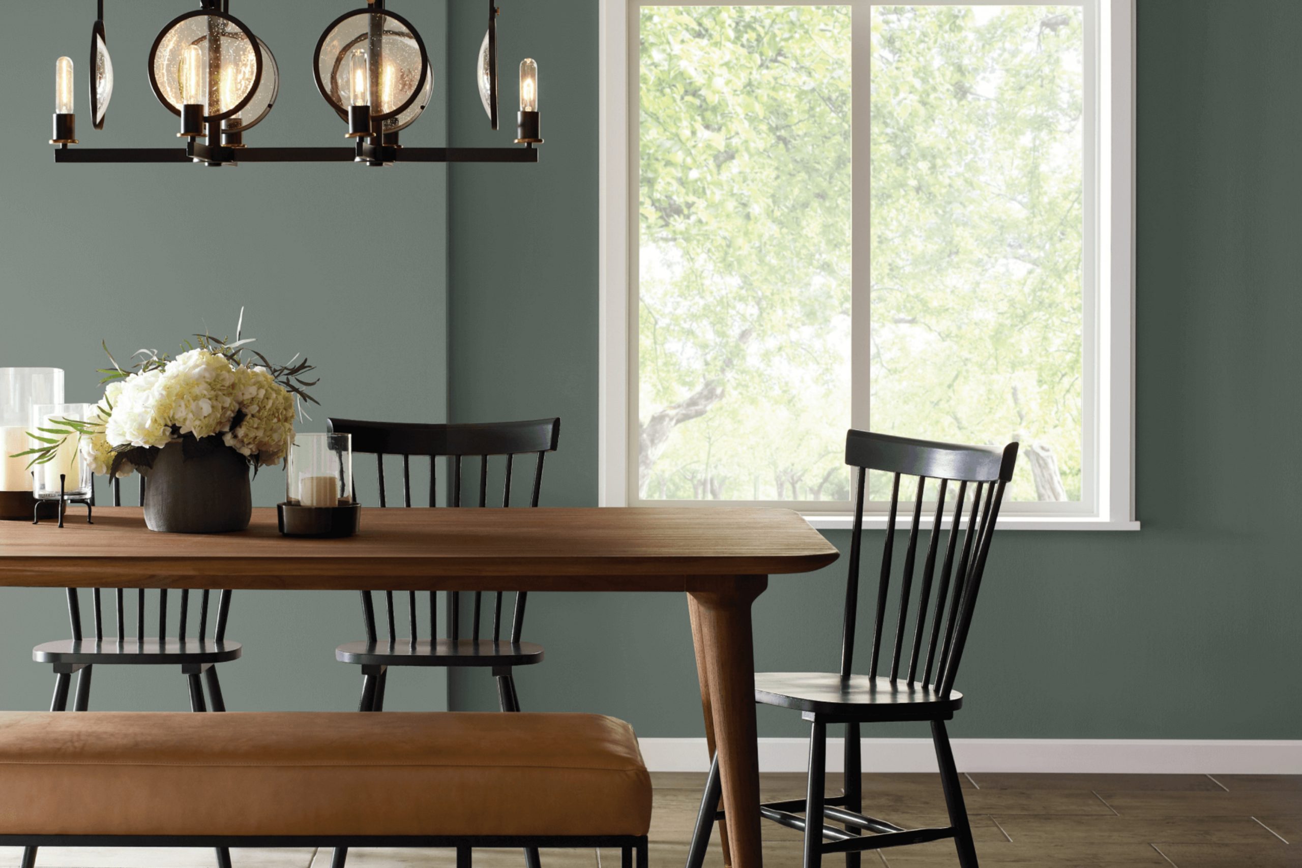
Sherwin Williams’s SW 9654 Taiga is a shade that whispers of serene, untouched forests and natural, earthy tones. As I reflect on my experience with this color, I find it both grounding and refreshing. The hue has a subtle depth that makes it versatile enough for various spaces in your home, whether you’re aiming to create a calming bedroom retreat or a welcoming living room.
I appreciate how this color brings a touch of nature indoors, providing a sense of calm and continuity with the external environment. Its rich yet muted quality allows for easy coordination with different textures and materials, from natural wood to metals and fabrics.
When I used SW 9654 Taiga in my own space, it proved to be a delightful background that enhanced the room decor without overpowering the other elements. If you’re looking for a paint color that offers a peaceful backdrop, promotes relaxation, and has the potential to blend seamlessly with both modern and traditional styles, SW 9654 Taiga might just be the perfect pick for you.
This shade helps you create a cozy, inviting atmosphere wherever you decide to use it.
What Color Is Taiga SW 9654 by Sherwin Williams?
The color Taiga by Sherwin Williams is a deep, rich green with a hint of gray undertone that gives it a natural, earthy vibe. This shade is versatile and brings a sense of calm and freshness to any space, resembling the dense greenery of a forest. It’s particularly effective in creating a cozy, welcoming atmosphere.
Taiga works incredibly well in interior styles that lean towards the rustic, contemporary, or minimalistic. It is an excellent choice for living rooms, libraries, or bedrooms where the goal is to create a relaxing retreat. This color pairs beautifully with natural materials like wood, enhancing its warm tones, or with metals like copper or brass for a more modern look.
In terms of textures, Taiga complements soft, plush fabrics like wool or chenille, which help to soften its boldness while adding a layer of comfort. It also looks stunning against exposed brick or stone, providing a striking contrast that highlights these textures. Furniture items in muted or neutral colors, such as beige or soft browns, also work well with Taiga, allowing it to stand out as a statement backdrop in any room.
Is Taiga SW 9654 by Sherwin Williams Warm or Cool color?
The color TaigaSW 9654 by Sherwin Williams is a versatile shade that can add a fresh look to any home. This color, a muted green, brings a touch of nature indoors, creating a cozy and welcoming atmosphere.
It works well in various rooms, whether you want to paint a whole living room or just an accent wall in a bedroom. The natural tone of Taiga pairs nicely with both dark and light furniture, which makes it easy to integrate into existing decor.
When used in a kitchen, it can complement wooden cabinets or contrast beautifully with modern finishes. In bedrooms, its soothing hue promotes a calm environment, conducive to relaxation and sleep. Moreover, the color is durable and hides smudges well, making it a practical choice for busy areas. Overall, TaigaSW 9654 is a great choice for anyone looking to refresh their home with a new but timeless color.
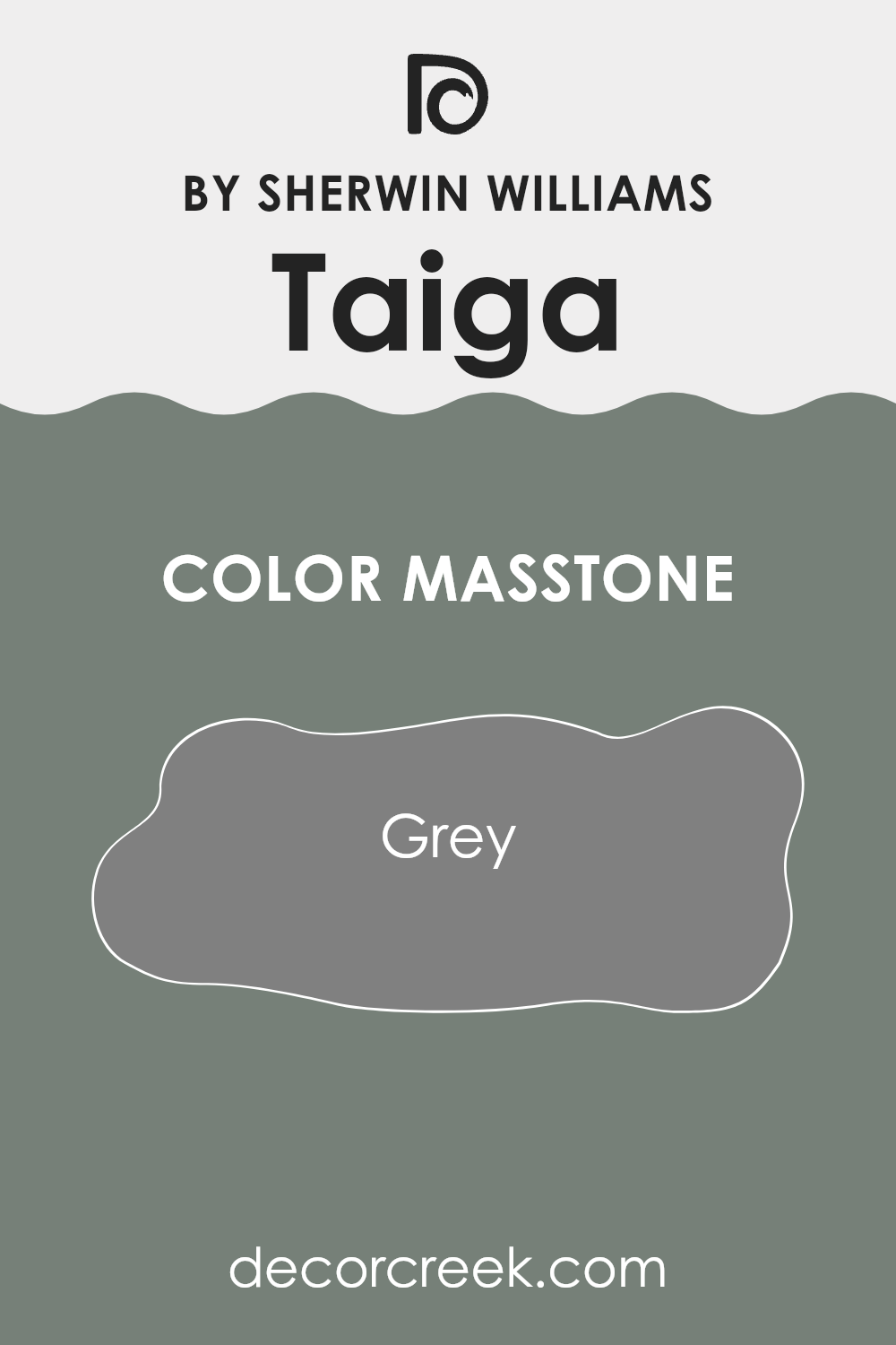
What is the Masstone of the Taiga SW 9654 by Sherwin Williams?
The masstone color of Grey (#808080) in the Taiga paint by Sherwin Williams is a balanced shade that provides a neutral backdrop in homes. This versatile color is easy to work with, making it ideal for both living spaces and bedrooms. The neutrality of grey means it pairs well with almost any other color, from bright tones to softer hues. It can effectively highlight artworks, furniture, or accent pieces without overwhelming them.
In homes, using this shade of grey can calm busy spaces and make rooms appear larger and more open. It doesn’t clash with bolder colors, so homeowners can use it in various design styles, from modern to traditional.
Because it absorbs and reflects light differently depending on the lighting, it can also adapt subtly to changes from daylight to artificial light, maintaining a consistent look throughout the day. Overall, it’s a functional and stylish choice that fits into many interior decorating schemes.
How Does Lighting Affect Taiga SW 9654 by Sherwin Williams?
Lighting plays a crucial role in how colors appear in an environment, greatly influencing their perceived hue, brightness, and saturation. The interaction between light and color can completely alter the visual impact of a space.
Regarding the color SW 9654 by Sherwin Williams, its appearance can vary significantly under different lighting conditions. In artificial light, such as that from LED or fluorescent bulbs, the color might look slightly different depending on the color temperature of the light. Warm lighting tends to bring out a richer and deeper aspect of the color, making it feel more inviting.
In contrast, cooler lighting might make it appear slightly muted, lending a more subdued feel to the space.
In natural light, the appearance of SW 9654 also changes throughout the day and depending on the orientation of the room.
Rooms that face north typically receive less direct sunlight, causing colors to appear more consistent throughout the day but slightly cooler and shadowed. This might make SW 9654 appear more subdued and cooler-toned in north-facing rooms.
South-facing rooms, conversely, get abundant sunlight, which can make colors look brighter and more vivid. SW 9654 in a south-facing room would likely appear lively and bright, enhancing its natural undertones.
In east-facing rooms, the color will be influenced by the warm and soft light of the morning sun, making SW 9654 feel warmer and inviting in the morning, gradually transitioning to a truer color as the day progresses.
West-facing rooms enjoy the evening light, which can cast a warm glow, especially during the golden hour. This lighting can make SW 9654 look exceptionally vibrant and dynamic towards the evening, offering a dramatic shift compared to how it might look during midday.
Thus, when choosing colors like SW 9654 for a space, considering the room’s orientation and the type of lighting used is essential to achieving the desired effect. Each setting brings out a different facet of the color, making it versatile yet unpredictable.

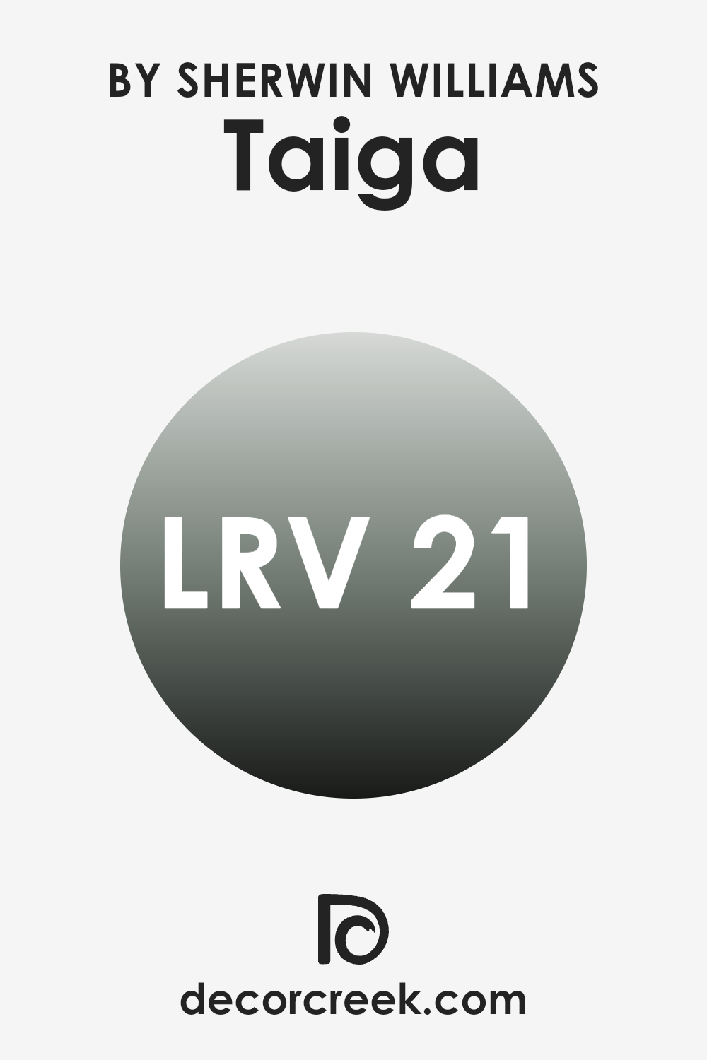
What is the LRV of Taiga SW 9654 by Sherwin Williams?
LRV stands for Light Reflectance Value, which is a measure of the amount of visible light a paint color reflects when it is applied to a wall. This measurement runs on a scale and helps determine how light or dark a color will look once it’s on your walls.
The LRV can greatly influence the atmosphere and feel of a room. For instance, lighter colors with higher LRVs make a space feel more open and airy as they reflect more light. Conversely, darker colors with lower LRVs tend to absorb more light, making a space feel smaller and cozier.
Referring to the specific color with an LRV around 20, it falls into the darker category. It means this shade is on the darker side and will absorb a good amount of light, rather than reflecting it. This can create a more intimate and enclosed feel in a room. Using this paint color in a smaller or less naturally lit room might make the space feel even smaller. However, in a well-lit or larger room, it could add a level of warmth and comfort, enveloping the space with a cozy ambiance without making it feel too confined.
What are the Trim colors of Taiga SW 9654 by Sherwin Williams?
Trim colors play a crucial role in interior and exterior design, serving as accents that highlight and define the architecture of a space or structure. When using a specific shade like Taiga SW 9654 by Sherwin Williams, choosing the right trim color can greatly enhance the overall look by creating a pleasing contrast or cohesive flow. SW 7004 – Snowbound and SW 7029 – Agreeable Gray are excellent choices for trim, blending well with the deep, robust hue of Taiga.
Snowbound SW 7004 is a light, neutral white with subtle undertones that bring a clean, fresh look to any space. It contrasts sharply with darker colors, making it an ideal trim to use with the green tones of Taiga SW 9654, as it highlights the richness of the wall color while giving the room a bright and airy feel.
On the other hand, Agreeable Gray SW 7029 is a soft, warm gray that offers a more subdued contrast. It complements darker shades like Taiga, providing a gentle transition from the darker walls to a lighter trim, enhancing the overall warmth of the room.
You can see recommended paint colors below:

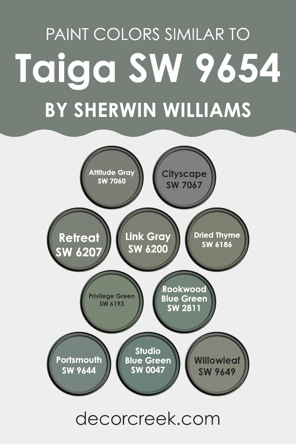
Colors Similar to Taiga SW 9654 by Sherwin Williams
When painting or decorating, choosing similar colors can create a harmonious and pleasing environment. These colors, though distinct, share underlying tones that tie a space together, providing a cohesive look without harsh contrasts. For instance, colors like Attitude Gray and Cityscape fall into this category, where Attitude Gray brings a muted, moody gray, echoing the shadows of an overcast sky, while Cityscape, a deeper shade, evokes the feeling of an urban landscape at dusk.
Retreat and Link Gray, on the other hand, pull in something from the natural world with Retreat being a richer, forest-inspired green and Link Gray, though predominantly gray, hinting at undercurrents of green mirroring a mossy woodland.Continuing with nature-inspired tones, Dried Thyme and Privilege Green offer deeper, herbal hues that resemble dense foliage and privileged greenery of well-tended gardens respectively.
Rookwood Blue Green and Portsmouth float between blue and green, capturing the essence of water meeting land with Rookwood Blue Green reflecting a deeper, historical tone and Portsmouth offering a lighter, almost maritime freshness. In a similar vein, Studio Blue Green and Willowleaf serve as subtle reminders of a painter’s studio washed in oceanic colors and gentle green leaves swaying in a tranquil breeze, providing a gentle nod to both aquatic and terrestrial inspirations. Together, these colors can unify a design theme, subtly shifting in hue to bring visual interest and a sense of calm to any room.
You can see recommended paint colors below:
- SW 7060 Attitude Gray
- SW 7067 Cityscape
- SW 6207 Retreat
- SW 6200 Link Gray
- SW 6186 Dried Thyme
- SW 6193 Privilege Green
- SW 2811 Rookwood Blue Green
- SW 9644 Portsmouth
- SW 0047 Studio Blue Green
- SW 9649 Willowleaf
How to Use Taiga SW 9654 by Sherwin Williams In Your Home?
Taiga SW 9654 by Sherwin Williams is a rich, deep green paint that brings a touch of nature into your home. This shade is perfect for creating a cozy and inviting atmosphere in any room. If you’re looking to add some warmth to your living room, consider painting one accent wall with Taiga. It pairs well with wooden furniture and natural elements like plants, enhancing a rustic or earthy vibe.
In the bedroom, using Taiga can help establish a calm, restful environment. It goes beautifully with creams and light browns, offering a balanced look that’s easy on the eyes. For kitchens or dining areas, this color can add a splash of elegance and warmth, making the space more welcoming for family meals.
Additionally, Taiga is a great choice for exterior use, like on front doors or shutters, to add a unique, stylish touch to your home’s facade. It’s versatile and works well in many different spaces, making it a practical choice for anyone looking to refresh their home’s look.
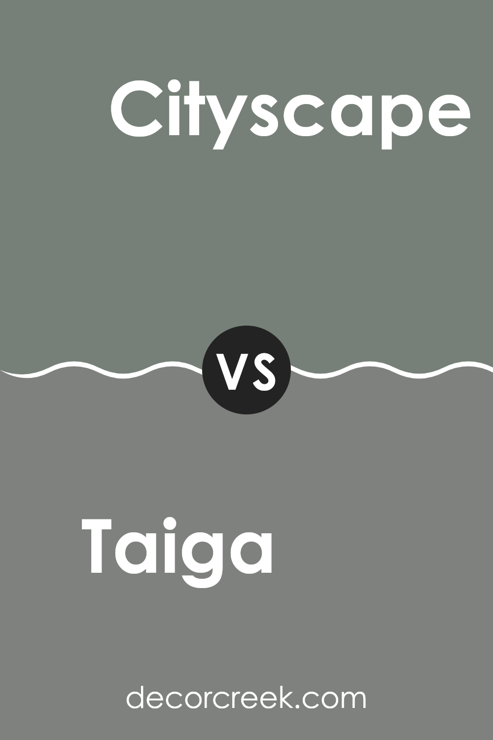
Taiga SW 9654 by Sherwin Williams vs Cityscape SW 7067 by Sherwin Williams
The main color, Taiga, is a deep, forest green that adds a bold and cozy touch to any room. It’s a vibrant shade that brings the freshness of nature indoors.
On the other hand, Cityscape is a cool, muted gray that offers a sleek and modern feel, providing a versatile backdrop for both bright and neutral color schemes. While Taiga injects energy and vivacity into a space, Cityscape serves as a subtle, calming presence.
These two colors could work well together in a home, with Taiga adding pops of color against the neutral, understated tones of Cityscape. Each color has its own distinct appeal, suitable for different areas and moods within a home.
You can see recommended paint color below:
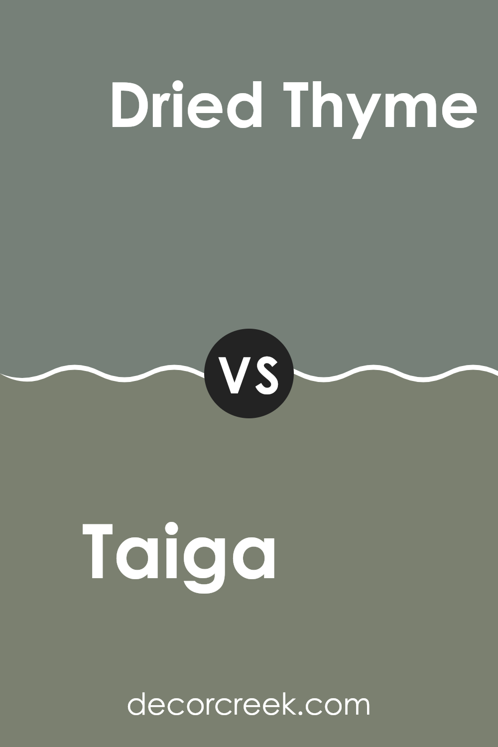
Taiga SW 9654 by Sherwin Williams vs Dried Thyme SW 6186 by Sherwin Williams
The two colors from Sherwin Williams, Taiga and Dried Thyme, have unique tones that differ distinctly. Taiga is a deep green with hints of teal that give it a rich, earthy vibe, making it a bold choice for accent walls or statement furniture.
On the other hand, Dried Thyme is more subdued, featuring a muted green that leans slightly towards gray. This color is versatile and works well in spaces where a calm, neutral background is desired, such as bedrooms or offices.
While Taiga brings a more vivid and energized atmosphere to a room, Dried Thyme offers a softer, more understated look that pairs easily with a variety of decor styles, providing a gentle lift to the surrounding space. These differences make each color suitable for specific design goals and personal preferences.
You can see recommended paint color below:
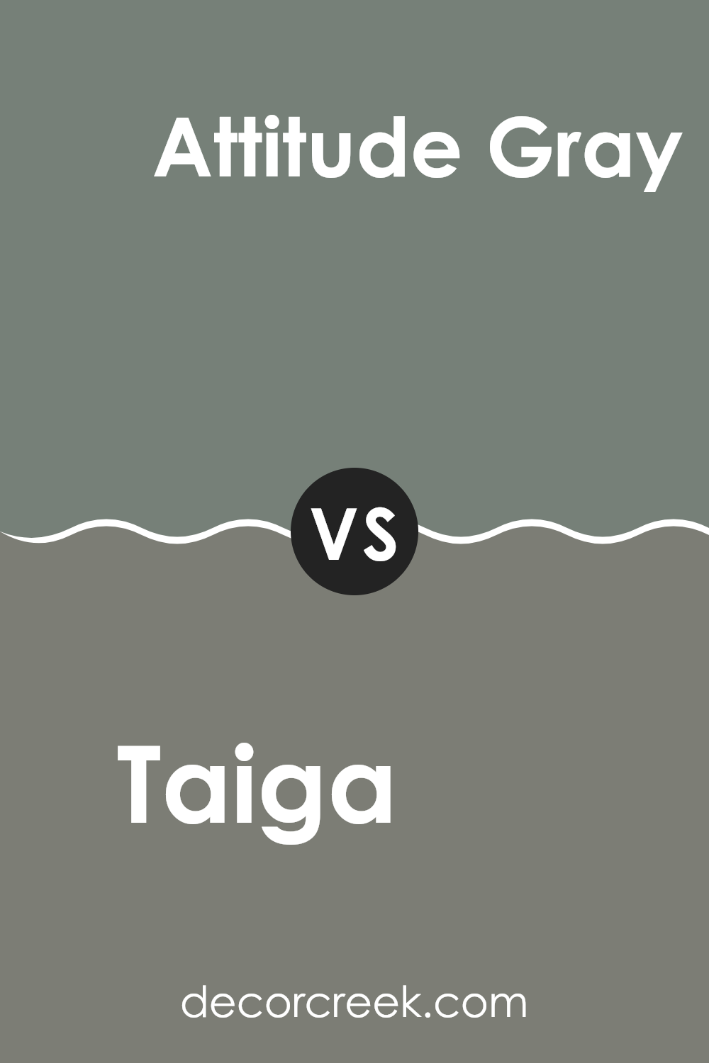
Taiga SW 9654 by Sherwin Williams vs Attitude Gray SW 7060 by Sherwin Williams
Taiga and Attitude Gray by Sherwin Williams are two distinct colors that cater to different design needs. Taiga is a deep green hue, reminiscent of dense forest foliage. This color brings to mind the peacefulness of nature and is perfect for creating a cozy and inviting atmosphere in a room. It works well in spaces aimed at relaxation and calm.
On the other hand, Attitude Gray is a solid, bold gray shade that gives off a serious, grounded feeling. This color is versatile and tends to match well with a variety of decor styles, serving as an excellent backdrop that allows other colors in the room to stand out. It’s particularly effective in modern and minimalist designs, offering a sleek look.
Comparing the two, Taiga offers a touch of the outdoors and is more specific in its appeal, ideal for themes centered around nature. Attitude Gray is more about flexibility, fitting into many spaces easily with its neutral, strong character.
You can see recommended paint color below:
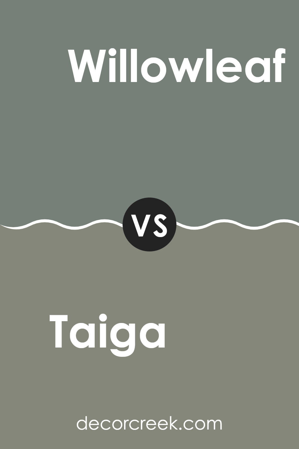
Taiga SW 9654 by Sherwin Williams vs Willowleaf SW 9649 by Sherwin Williams
Taiga and Willowleaf are two distinct colors from Sherwin Williams that offer subtle yet significant differences. Taiga is a darker, cooler shade that tends to lean towards a deep forest green. This color is versatile and works well in areas where you want to establish a cozy, calming atmosphere. It’s excellent for spaces like bedrooms or offices where a touch of nature’s depth can enhance the environment.
On the other hand, Willowleaf is lighter and carries a fresher, more energetic green tone. This color is reminiscent of early spring leaves, bringing a lively and refreshing feel to any room. It’s particularly suitable for kitchens, living rooms, or any space that benefits from a bright and airy vibe.
Both colors can refresh your home, but your choice will depend on the mood you want to create. Taiga is more about depth and richness, while Willowleaf leans towards brightness and vitality.
You can see recommended paint color below:
- SW 9649 Willowleaf
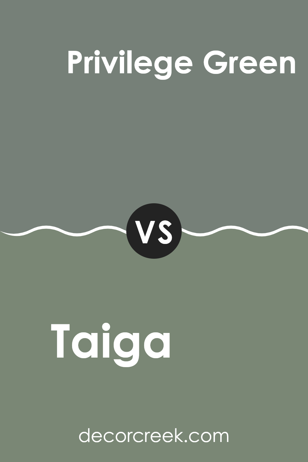
Taiga SW 9654 by Sherwin Williams vs Privilege Green SW 6193 by Sherwin Williams
Taiga and Privilege Green, both by Sherwin Williams, offer distinct green hues that can add character to a space. Taiga is a dark, earthy green with a muddy quality that feels natural and grounding. It’s a color that resembles dense forest foliage and can make a room feel cozy and secure.
On the other hand, Privilege Green is a lighter, more vibrant green. It leans towards a traditional classic green, which can brighten a room and add a fresh, lively touch. Both colors complement wooden accents and natural textiles well, but their usage depends on the desired atmosphere.
Taiga works well in a study or den, providing a muted, subtle backdrop, whereas Privilege Green is great for more active spaces like kitchens or playrooms, where its cheerfulness can invigorate the environment.
You can see recommended paint color below:
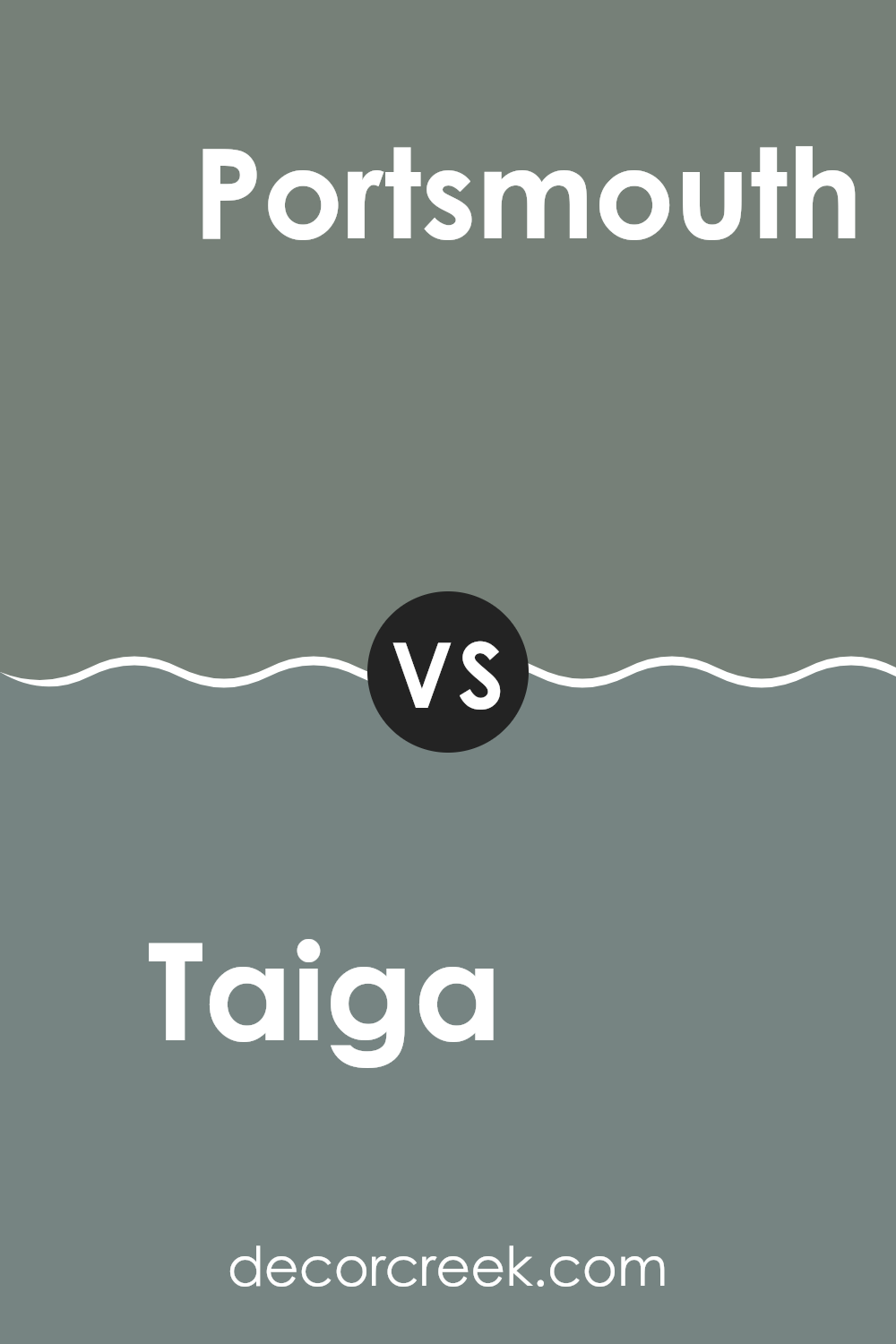
Taiga SW 9654 by Sherwin Williams vs Portsmouth SW 9644 by Sherwin Williams
Taiga and Portsmouth, both by Sherwin Williams, have distinct visual characteristics. Taiga appears as a deep, rich green with a hint of gray, making it moody yet calming. This color is perfect for creating a cozy, inviting atmosphere in spaces like dens or bedrooms.
On the other hand, Portsmouth is lighter and cooler, resembling the gray of foggy coastal mornings. This shade is more understated and neutral, great for areas where you want a softer, lighter feel without overpowering other design elements.
While both colors can be used to add a touch of nature-inspired aesthetic to a room, Taiga leans towards a denser, woodland vibe, whereas Portsmouth offers a more breezy, open seaside quality. Each brings its unique essence, thus altering the mood and perceived spaciousness of any room.
You can see recommended paint color below:
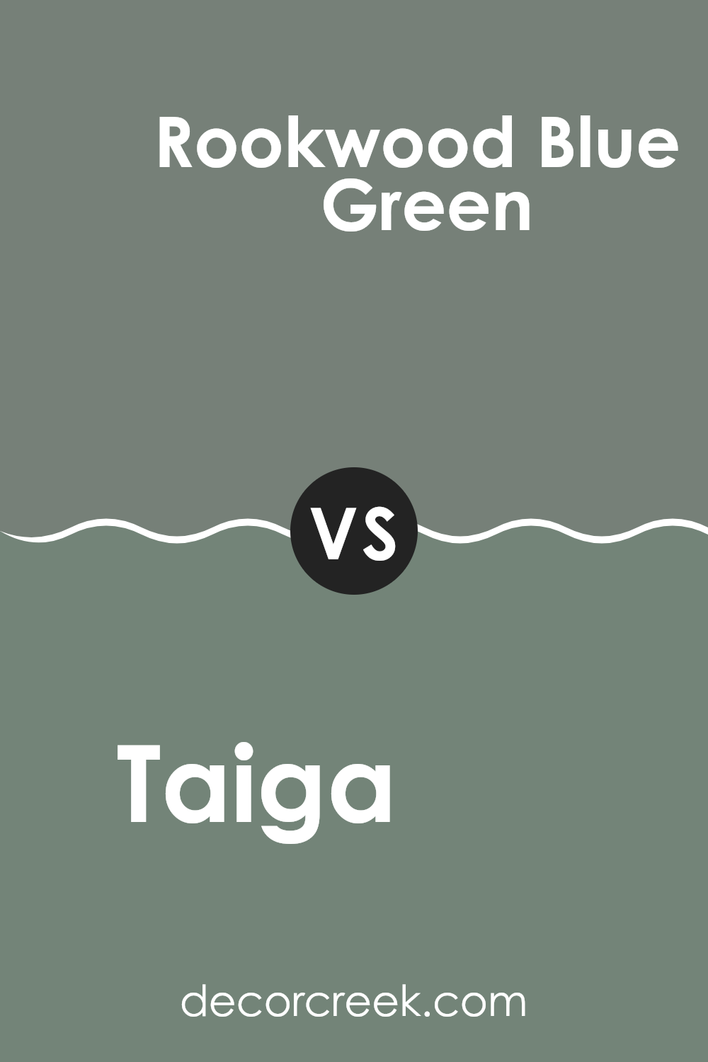
Taiga SW 9654 by Sherwin Williams vs Rookwood Blue Green SW 2811 by Sherwin Williams
Taiga and Rookwood Blue Green, both from Sherwin Williams, offer distinct tones that can freshen up any space. Taiga is a deep green with a hint of grey, making it a subtle yet rich color. It’s ideal for creating a cozy, inviting atmosphere in rooms, blending well with natural materials and neutral tones.
On the other hand, Rookwood Blue Green adds a bit more vibrancy. This color has a unique blend of blue and green with a slightly dusky quality, making it excellent for adding a touch of character to spaces without overwhelming them.
It pairs beautifully with lighter woods and can make white trims really stand out. Both colors work well in various settings, whether you’re looking to paint an accent wall or give a whole room a new look. They’re versatile, easy on the eyes, and can effectively enhance the mood and style of your home.
You can see recommended paint color below:
- SW 2811 Rookwood Blue Green
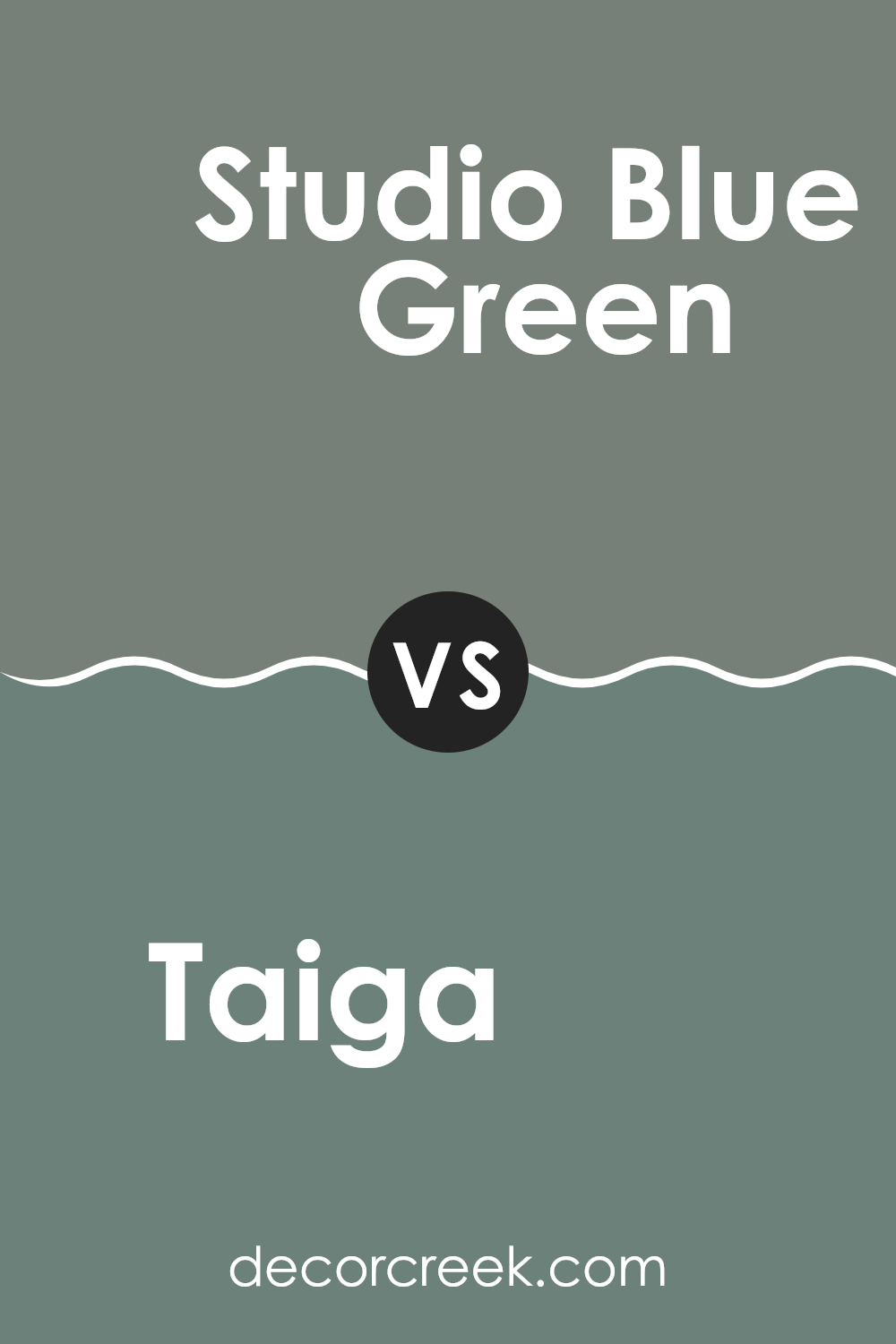
Taiga SW 9654 by Sherwin Williams vs Studio Blue Green SW 0047 by Sherwin Williams
Taiga is a color that brings to mind quiet, lush forest scenes. It’s a deep, gray-green shade that feels natural and grounded. This color works well in spaces where you want a touch of nature without overwhelming the room with brightness.
On the other hand, Studio Blue Green is lighter and has a fresher feel, combining hints of blue and green to create a soothing, yet more vibrant look than Taiga. It’s perfect for bringing a breath of fresh air into a space, making it feel more open and light.
While both colors are inspired by nature, Taiga leans more towards a muted earthiness, and Studio Blue Green offers a clearer, crisper vibe. They could complement each other well in a color scheme, with Taiga acting as a strong base and Studio Blue Green adding lively highlights.
You can see recommended paint color below:
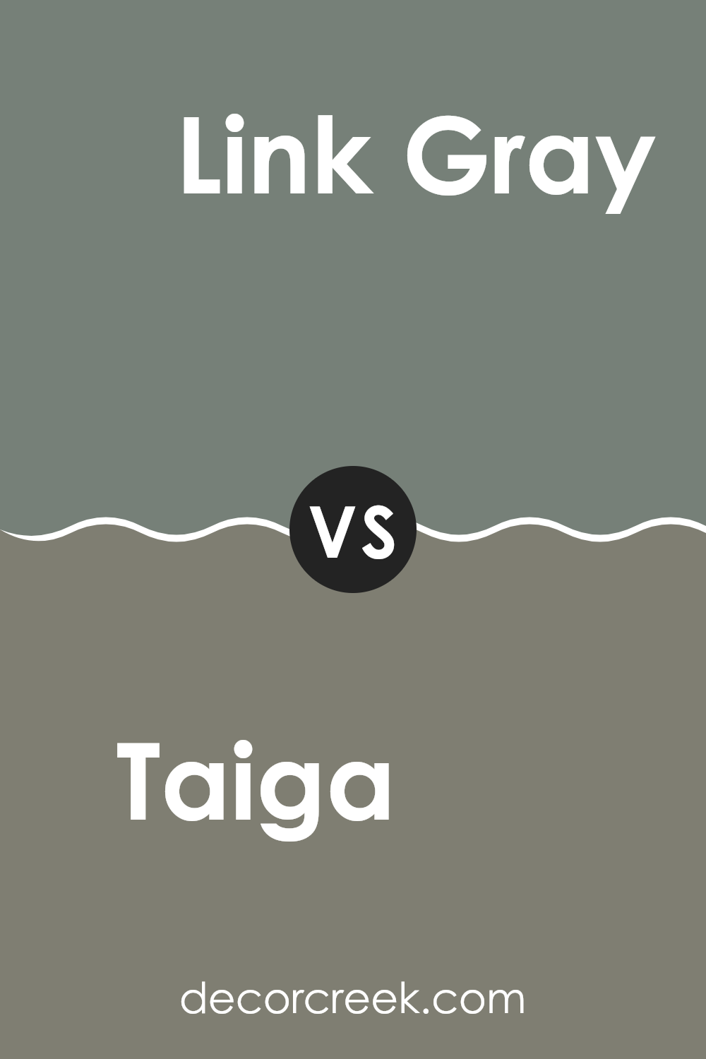
Taiga SW 9654 by Sherwin Williams vs Link Gray SW 6200 by Sherwin Williams
Taiga by Sherwin Williams is a deep green color with a touch of gray, giving it a natural, earthy feel. This color is versatile and works well in spaces where you want to add a sense of nature and calmness. On the other hand, Link Gray is also by Sherwin Williams and is a lighter color compared to Taiga.
It’s primarily gray but has a slightly green undertone, which makes it unique and not just a simple gray. This color is great for creating a clean and subtle background that can easily blend with different decor styles and colors.
When comparing the two, Taiga is much darker and more pronounced, making it ideal for statement walls or rooms that benefit from a cozy, grounding atmosphere. Link Gray, being lighter and more neutral, is perfect for larger areas or rooms that you want to keep bright and airy. Both colors complement each other well, with Taiga bringing depth and Link Gray providing a softer contrast.
You can see recommended paint color below:
- SW 6200 Link Gray
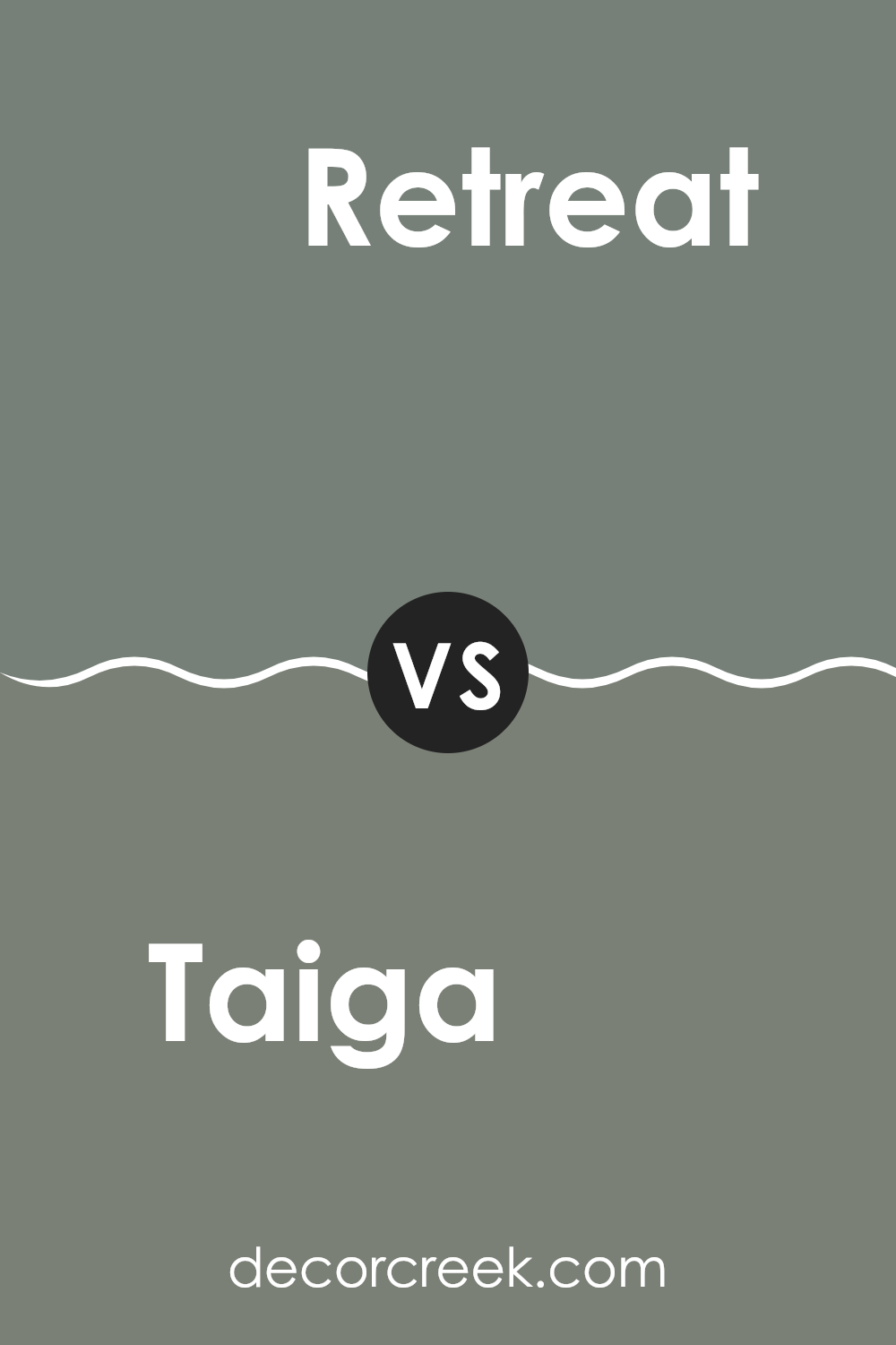
Taiga SW 9654 by Sherwin Williams vs Retreat SW 6207 by Sherwin Williams
Taiga and Retreat, both from Sherwin Williams, are distinctive yet harmoniously blendable colors. Taiga presents as a muted green with gray undertones, reminiscent of leafy shadows in a dense, mist-covered forest. It’s a subtle and soothing hue that brings a touch of nature indoors, making spaces feel fresh and comforting.
On the other hand, Retreat steps slightly darker, embodying a robust, slate-green shade that mimics the dense foliage of a woodland retreat. It’s a cozier green, perfect for creating a more enveloped and cozy atmosphere in a room. While Taiga offers a lightness and openness, Retreat provides depth and warmth, making it ideal for accent walls or rooms seeking a more grounded feel.
When used together, these colors can create a layered visual experience that feels both organic and restful. Their shared green base ensures compatibility, yet their varying depths allow for a dynamic interplay in any space.
You can see recommended paint color below:
In conclusion, SW 9654 Taiga by Sherwin Williams is a paint color that really caught my attention. It reminds me of the woods and gives a calming feeling, like being outside in nature. This color is not too loud or too quiet; it’s just right for making a room feel cozy and inviting. I think it would look great in many different rooms, like a living room, bedroom, or even a study. It has a special shade of green that is warm and lively, making any room feel full of life.
For those who like having a touch of nature inside their home, this color is a perfect choice. It feels like bringing a piece of the forest indoors. Also, it goes well with many other colors and decorations, which is really helpful when you want to mix and match things in your room.
Overall, SW 9654 Taiga can make your room look pretty and feel like a peaceful part of the woods. It’s a color that brings the outside world into your home in a beautiful and simple way. If you’re thinking about changing your room’s color, you might want to consider this special green. It can give your room a fresh new look that feels just like nature.
Ever wished paint sampling was as easy as sticking a sticker? Guess what? Now it is! Discover Samplize's unique Peel & Stick samples.
Get paint samples

