Choosing the right paint color for your home can be a surprisingly tricky decision. Among the many options, Sherwin Williams’ SW 7637 Oyster White is a shade you might be considering. To make an informed choice, it’s important for me to share some insights about this particular color.
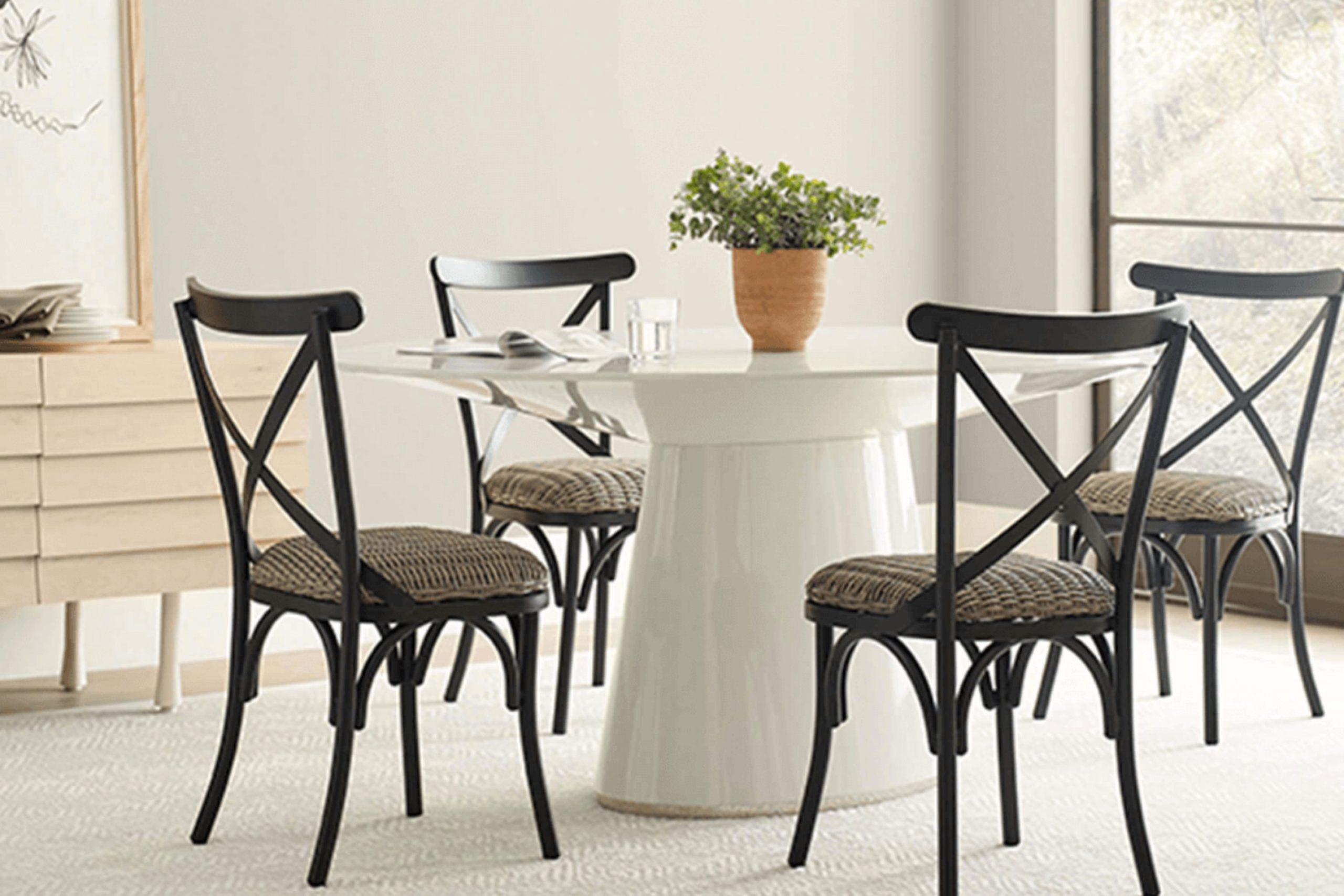
First off, Oyster White is a soft, warm white with undertones that can subtly shift depending on the lighting in your room. Ideally, you would want to see how it looks at different times of the day in your intended room before making a final decision. This hue tends to create a soothing atmosphere, offering a clean and inviting backdrop that complements various decor styles.
Moreover, durability and finish options are also crucial. Sherwin Williams provides a range of finishes, and choosing the right one can impact how Oyster White looks on your walls. A matte finish, for example, might enhance its softness, while a glossier finish could bring a slight vibrancy.
Lastly, consider the color’s adaptability. Oyster White works well in many areas of a home, from living rooms and kitchens to bedrooms and bathrooms. It pairs beautifully with a wide spectrum of colors and materials, making it a reliable choice if you enjoy changing up your decor.
Remember, taking the time to sample this paint in your own environment will ensure you are happy with your choice in any light and alongside your unique furnishings.
Is Oyster White SW 7637 Right for My Home?
Oyster White by Sherwin Williams is a color that holds a special place in my palette. It has a beautifully soft, creamy hue that borders between white and light beige. This subtle balance makes it an adaptable choice, perfect for creating a cozy, inviting atmosphere in a home. I’ve found it particularly effective in achieving a classic, lasting vibe in any room.
In terms of interior styles, Oyster White shines in settings that aim for a warm and welcoming feel. It is perfect for modern farmhouse, traditional, and Scandinavian designs. These styles complement the understated elegance of the color, allowing it to enhance the environment without feeling too intense.
When it comes to pairing materials and textures with Oyster White, I lean towards natural woods, linen, and soft cotton. These materials help to bring out the warmth of the color, making a room feel more inviting. I also like integrating elements like woven rattan or soft wool throws which add a textural contrast that highlights the smooth, creamy nature of Oyster White.
Using this color in my projects, I always feel it brings a fresh, yet classic ambiance, perfect for creating light-filled rooms that feel both open and cozy. Whether it’s the backdrop for a bustling family kitchen or a peaceful bedroom retreat, Oyster White provides a marvelous foundation that enhances the natural beauty of various decor elements.

What are the right undertones of Oyster White SW 7637 ?
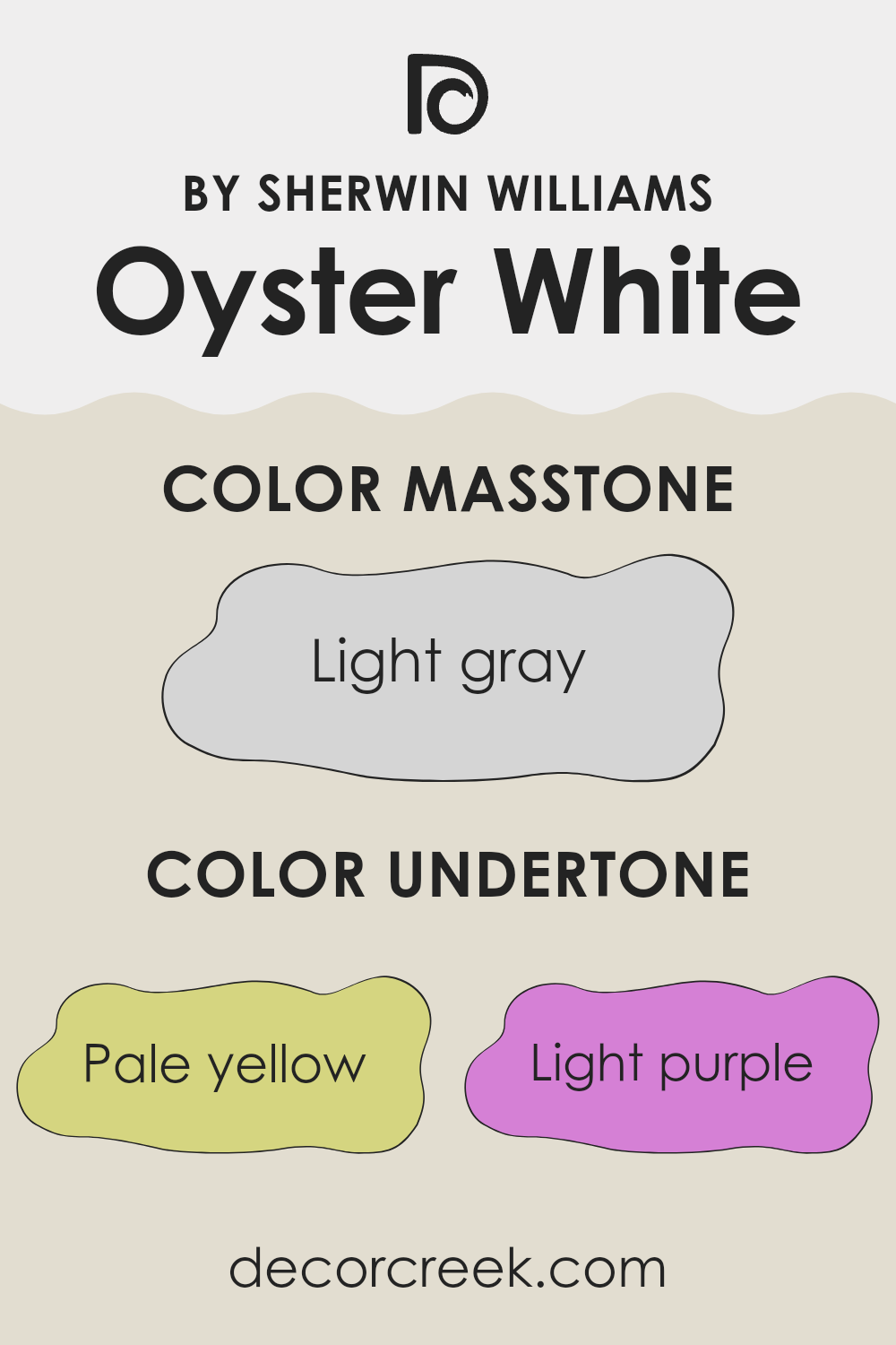
Oyster White is a subtle and adaptable paint color from Sherwin Williams. This shade has a complex mix of undertones that can subtly change its appearance depending on the lighting and surrounding colors. The undertones of this paint include pale yellow, light purple, light blue, pale pink, mint, lilac, and grey. Each undertone can bring out different qualities in the color, making it appear warmer or cooler.
Undertones are underlying hints of color within paint that aren’t always immediately noticeable. They play a crucial role in how we perceive color, affecting the paint’s overall look in different lighting conditions or when paired with other colors. For instance, a color with a yellow undertone will seem warmer and more welcoming, while a blue undertone might give a cooler, calmer feel.
In interior design, Oyster White’s mix of undertones means it can look slightly different in each setting. The pale yellow and pink undertones add a touch of warmth, making rooms feel cozy and inviting. The light blue and mint provide a fresh, clean look, ideal for creating a relaxed atmosphere. The lilac and grey help to neutralize and balance the warmth, ensuring the color doesn’t lean too much towards any one undertone.
When used on interior walls, Oyster White provides a neutral backdrop that is far from plain. Its complexity allows it to adjust and complement various decor styles and color schemes, making it a practical choice for any room. Whether in a room with abundant natural light or in an area with limited sunlight, the shifting influences of its undertones can enhance the room subtly yet effectively.
Best Coordinating Colors to use with Oyster White SW 7637 by Sherwin Williams this year.
Coordinating colors are hues that work harmoniously together to enhance the overall appearance of a room. When selecting coordinating colors, it’s important to choose shades that complement each other without clashing, creating a balanced and aesthetically pleasing environment. For example, Oyster White by Sherwin Williams pairs beautifully with colors that add either a subtle contrast or a dynamic enhancement to its muted, warm tone.
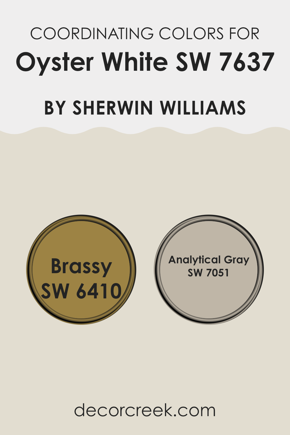
One great coordinating color is SW 6410 – Brassy, which is a vibrant, rich gold tone that injects a touch of warmth and brightness into a room. This color works particularly well with Oyster White as it stands out against the neutral backdrop, providing a striking yet harmonious look.
Another excellent coordinating color is SW 7051 – Analytical Gray. This shade is a soft, adaptable gray that complements the creamy undertones of Oyster White. Analytical Gray offers a subtle contrast that is neither overpowering nor dull, making it perfect for creating a cohesive look in rooms that aim for a calm and inviting atmosphere. Together, these colors offer a range of possibilities for designing a room that feels put-together and homey.
You can see recommended paint colors below:
- SW 6410 Brassy
- SW 7051 Analytical Gray
Trendy Trim Colors of Oyster White SW 7637 by Sherwin Williams to use this year.
Trim colors are crucial in interior design as they outline and define the edges and transitions between walls, ceilings, floors, and doors, effectively highlighting the architectural features of a room. For a base color like Oyster White by Sherwin Williams, choosing the right trim colors can greatly impact the overall look by providing a subtle contrast that complements the main hue.
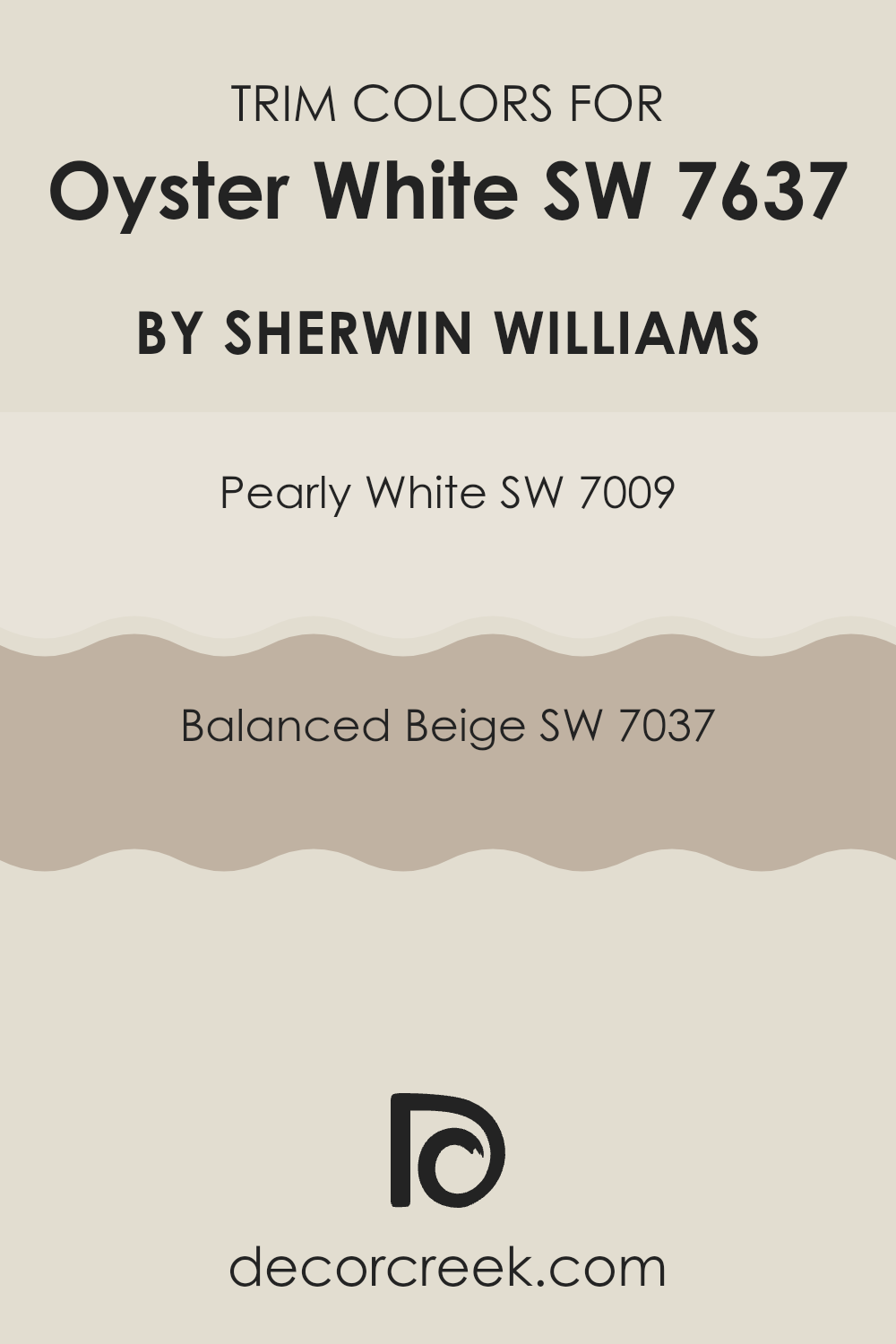
Trim colors such as Pearly White and Balanced Beige are excellent choices for pairing with Oyster White as they offer a smooth transition from walls to trim, emphasizing a clean and harmonious environment.
Pearly White by Sherwin Williams is a soft, muted white with a hint of warmth that can brighten up the trim areas without feeling too intense against the gentle tone of Oyster White. It lends a fresh and airier feel to the room, making it ideal for baseboards and window trims to subtly draw attention without causing a stark contrast.
On the other hand, Balanced Beige is a warm, cozy beige that adds a bit more depth and definition to trim, providing a natural, grounding effect that works well in rooms where a bit of contrast is desirable. This color can be used effectively on door frames and crown moldings, offering a gentle shift from the Oyster White walls that enriches the room’s overall aesthetic.
You can see recommended paint colors below:
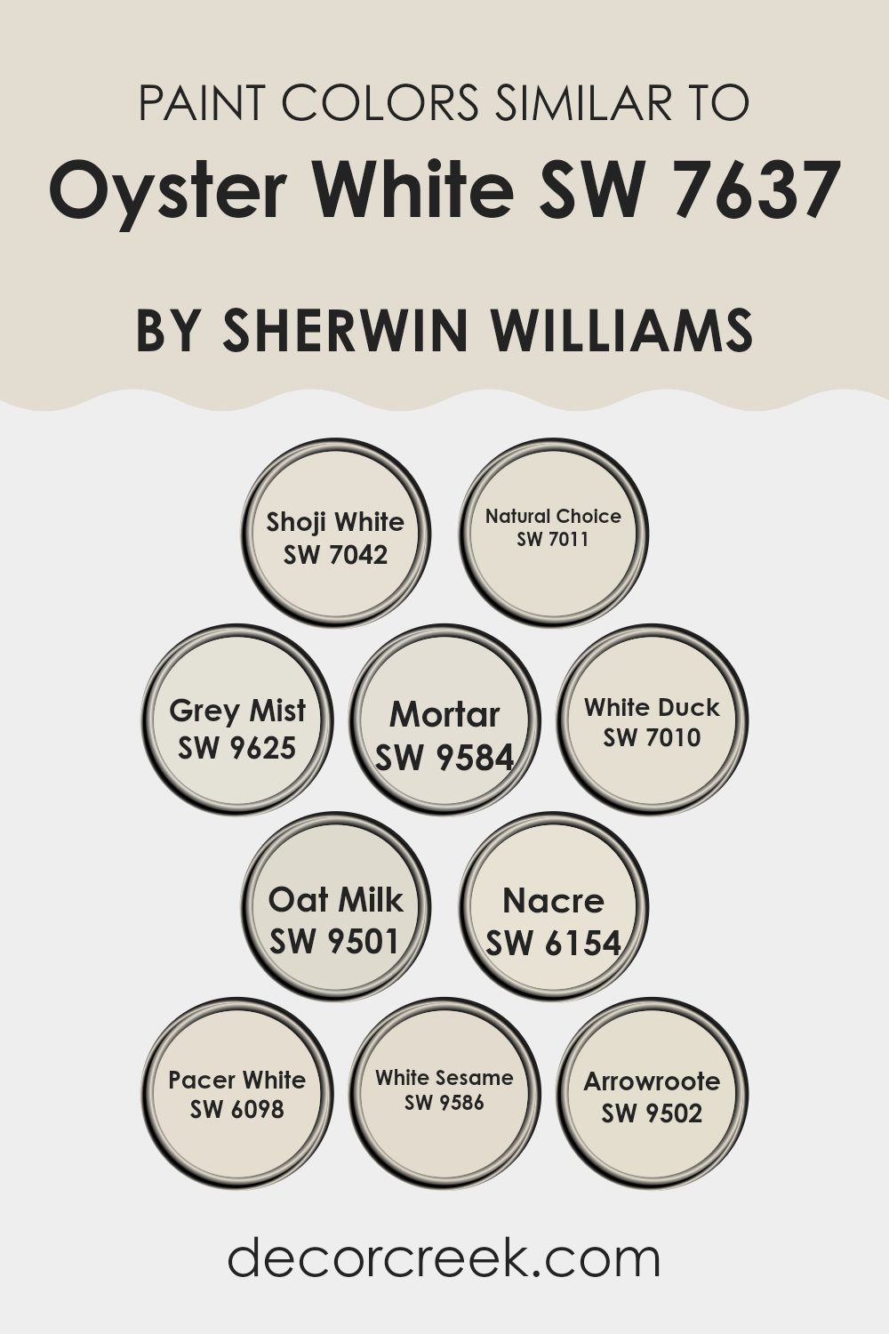
Evergreen Colors Similar to Oyster White SW 7637 by Sherwin Williams
Choosing similar colors for a project is crucial for creating a harmonious and pleasant room. Colors that share a close relationship on the color palette, such as those similar to Oyster White by Sherwin Williams, blend seamlessly, providing a subtle and cohesive look.
When colors like Shoji White or Natural Choice are used, they maintain a light and airy vibe, making the room feel open yet cozy. Shoji White, a soft grey with a warm undertone, is perfect for enhancing a light and natural feel in any setting. Natural Choice, on the other hand, offers a touch more depth, reflecting an organic, earthy aesthetic.
Grey Mist and Mortar are also great options for those looking to keep a neutral base with a hint of elegance. Grey Mist brings a slight crispness to the room, introducing a more defined grey tone that works well in modern settings. Mortar, a bit deeper, adds a strong foundational look without feeling too intense. Similarly, White Duck and Oat Milk offer a balance of warmth and brightness.
White Duck moves towards a beige hue, making rooms feel homely and inviting. Oat Milk softens the atmosphere with a creamy presence, perfect for rooms that aim for a soft and gentle touch. Nacre, Pacer White, White Sesame, and Arrowroote continue this theme of related but distinct tones. Nacre exudes a hint of pearl, ideal for adding a subtle shimmer.
Pacer White leans a little more towards a muted ivory, refined and understated. White Sesame introduces a hint of warmth without detracting from its prevailing neutral character, and Arrowroote rounds it out with a slight hint of yellow underpin, providing an understated yet distinct variation that keeps the overall aesthetic fresh and unified. By selecting colors that are closely aligned yet individually unique, one can achieve a cohesive ambiance that feels intentional and stylistically coherent.
You can see recommended paint colors below:
- SW 7042 Shoji White
- SW 7011 Natural Choice
- SW 9625 Grey Mist
- SW 9584 Mortar
- SW 7010 White Duck
- SW 9501 Oat Milk
- SW 6154 Nacre
- SW 6098 Pacer White
- SW 9586 White Sesame
- SW 9502 Arrowroote
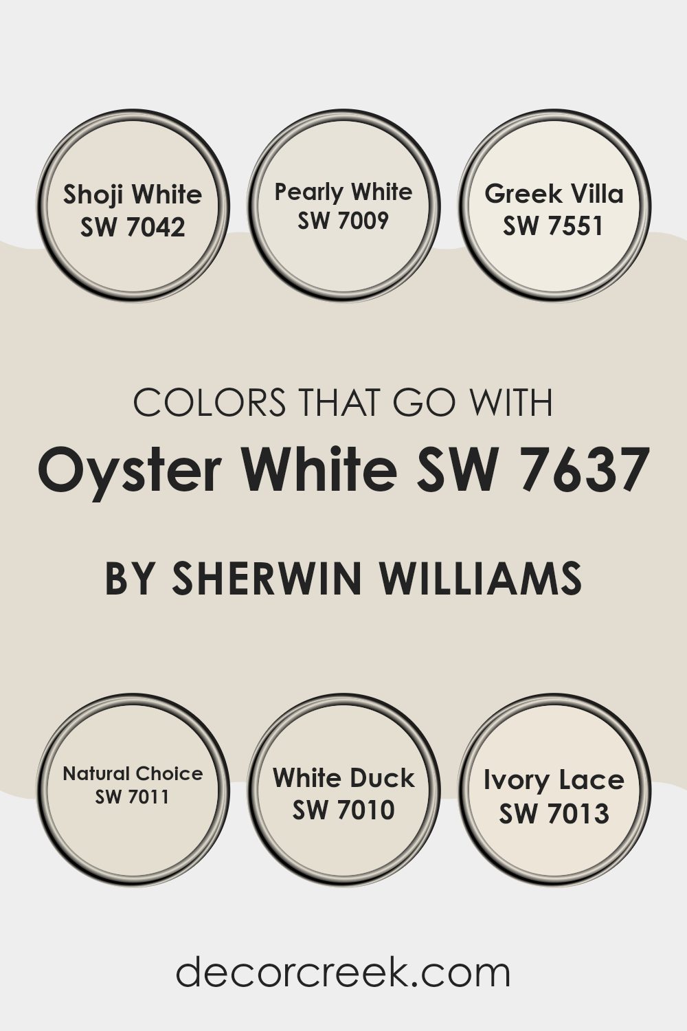
Colors that Go With Oyster White SW 7637 by Sherwin Williams
Choosing the right colors to complement Oyster White SW 7637 by Sherwin Williams is essential for creating a harmonious and appealing look in any room. Oyster White is a subtle shade that serves as a fantastic backdrop, allowing for adaptability when selecting coordinating colors. For instance, Shoji White SW 7042 is a soft, warm white with a hint of gray that helps create a cozy and welcoming atmosphere in rooms. Pearly White SW 7009 offers a slightly more reflective surface, excellent for brightening rooms while maintaining a clean and seamless look.
Other tones like Greek Villa SW 7551 add a touch of warmth to the walls, contributing to a relaxed and friendly environment; it’s a great option when you want a hint of creamy richness without feeling too intense against the gentleness of Oyster White. Natural Choice SW 7011, another complementary tone, leans towards a more earthy off-white, grounding the palette and giving depth to the area.
White Duck SW 7010 provides a distinct, yet subtle variation, adding an understated complexity to the mix. Lastly, Ivory Lace SW 7013 has a delicate and slightly warmer approach, providing a smooth transition between the other shades and Oyster White, ensuring everything blends flawlessly. Together, these colors work seamlessly with Oyster White, offering a range of options that allow one to tailor the ambiance of any room, whether aiming for a bright and airy feel or a cozier, more inviting room.
You can see recommended paint colors below:
- SW 7042 Shoji White
- SW 7009 Pearly White
- SW 7551 Greek Villa
- SW 7011 Natural Choice
- SW 7010 White Duck
- SW 7013 Ivory Lace
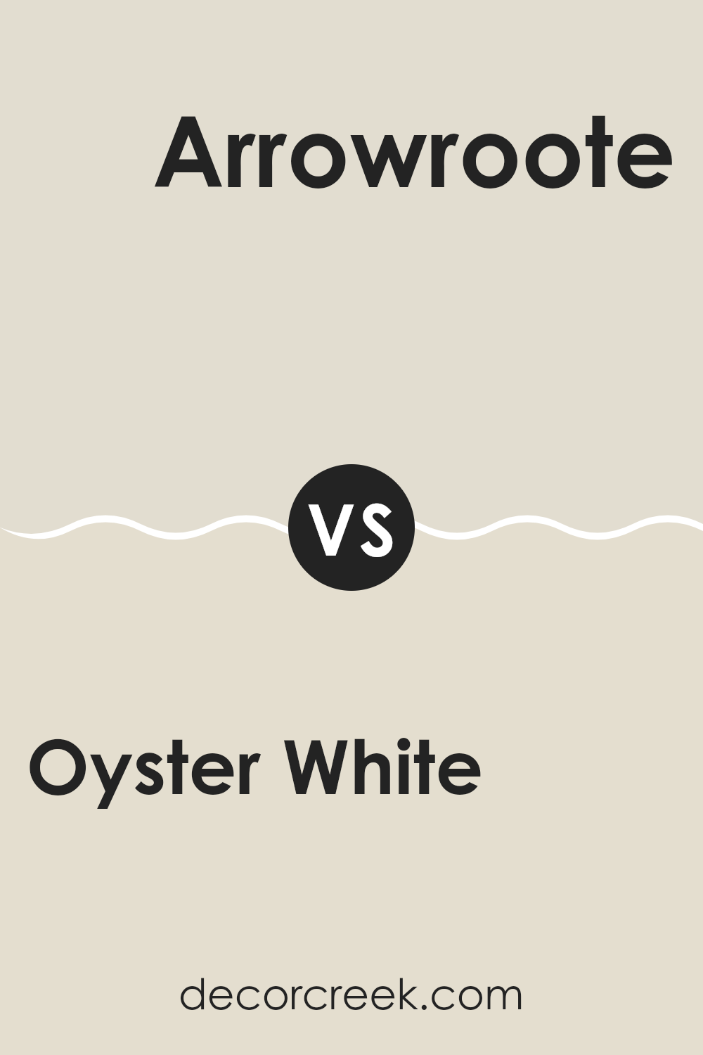
Oyster White SW 7637 by Sherwin Williams vs Arrowroote SW 9502 by Sherwin Williams
Oyster White and Arrowroot are two neutral colors from Sherwin Williams, both preferred for their calm and soothing qualities. Oyster White is a soft, warm neutral with a beige undertone. It creates a cozy and inviting atmosphere in any room, making it ideal for rooms where you want to relax and feel at home.
On the other hand, Arrowroot leans more towards a very light gray or off-white color, offering a slightly cooler tone compared to Oyster White. This color is great for those who appreciate a clean and minimalistic look, as it provides a fresh and light feeling to the environment.
Both colors are adaptable and can work well in various settings, whether you want to paint an entire room or just an accent wall. They pair well with many other colors, allowing for easy decoration and style updates. Arrowroot might be better suited for modern rooms due to its cooler tone, while Oyster White fits beautifully in traditional or warm-themed decor.
You can see recommended paint color below:
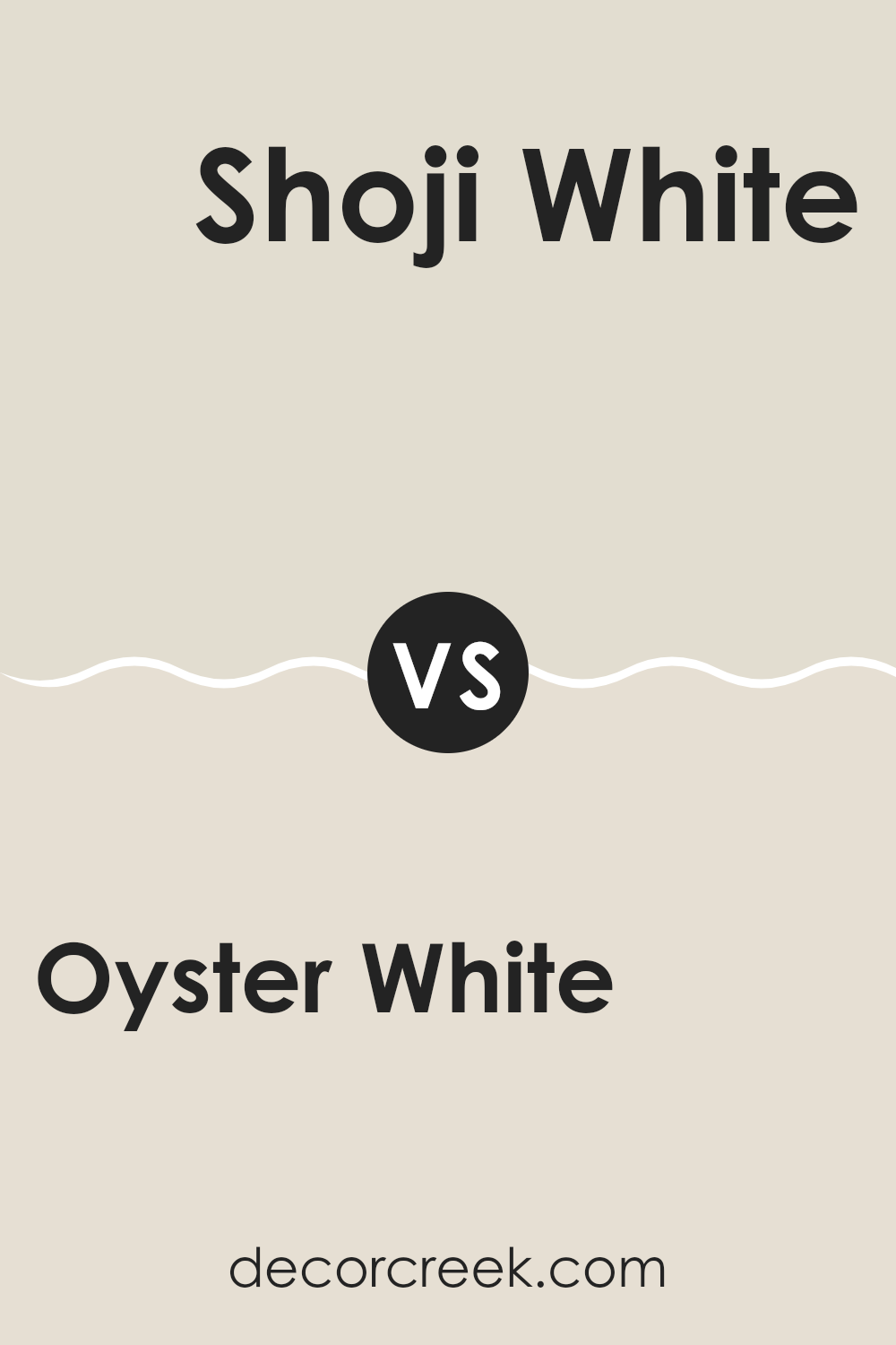
Oyster White SW 7637 by Sherwin Williams vs Shoji White SW 7042 by Sherwin Williams
Oyster White and Shoji White by Sherwin Williams are both popular neutral paint colors, but they have distinct differences in tone and warmth. Oyster White has a slightly cooler tone, giving it a crisp and clean look.
This makes it a great choice for rooms where you want a sharp, fresh feel. On the other hand, Shoji White offers a touch more warmth due to its beige undertones, providing a cozier and more inviting atmosphere.
This makes Shoji White ideal for living areas and bedrooms where a softer environment is preferred. Both colors are adaptable and subtle, working well in various settings and complementing different decor styles, but the choice between them might come down to the specific mood you want to set in your room.
You can see recommended paint color below:
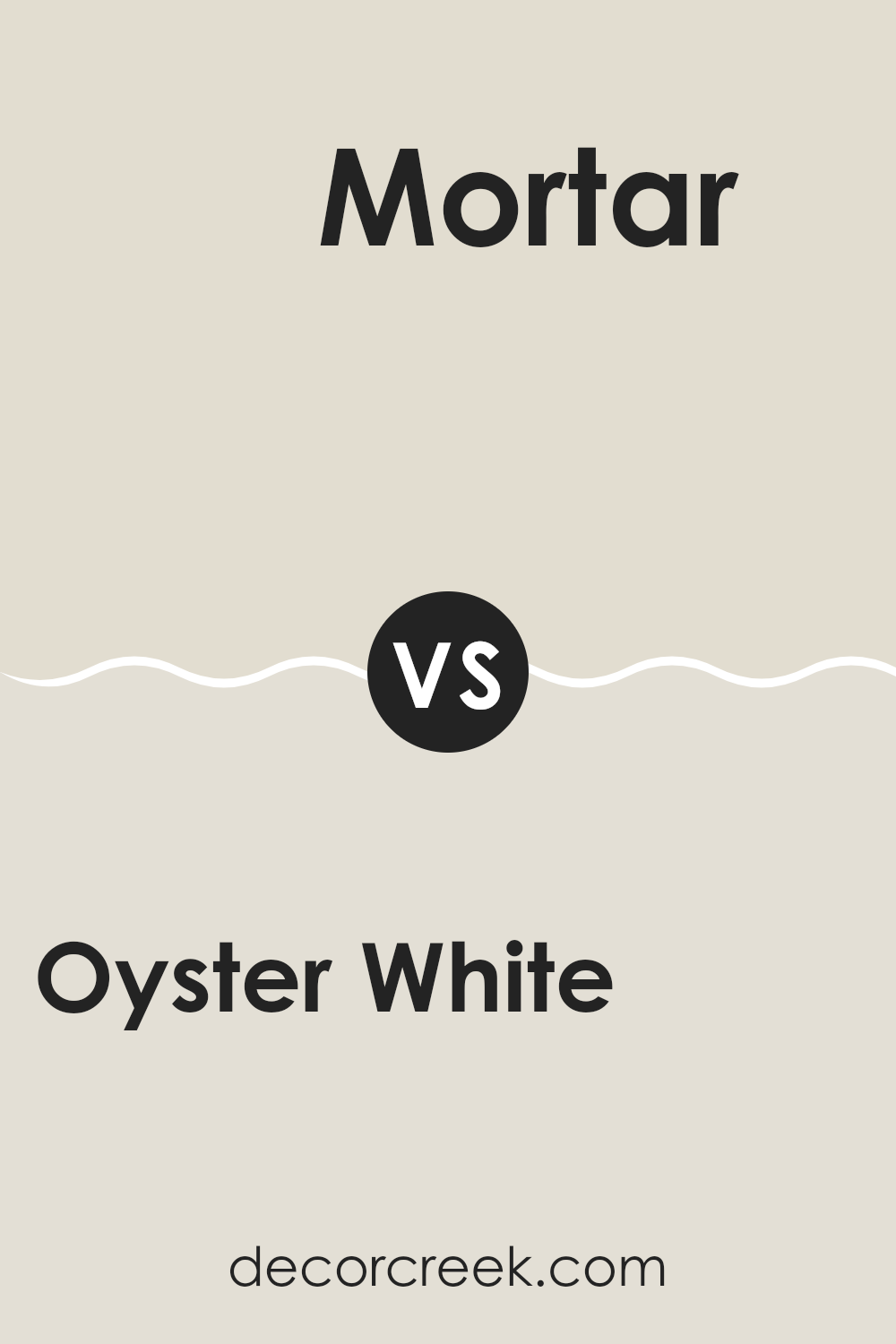
Oyster White SW 7637 by Sherwin Williams vs Mortar SW 9584 by Sherwin Williams
Oyster White and Mortar, both from Sherwin Williams, present a subtle yet distinct contrast in hues. Oyster White is a light, creamy color with a softness that makes it an excellent choice for creating a bright and welcoming atmosphere in any room. It conveys a sense of cleanliness and simplicity, making it ideal for those who prefer a minimalist style.
On the other hand, Mortar is a deeper, gray shade that brings a stronger, more pronounced color to walls or accents. It’s a practical choice if you’re looking to add depth or a focal point in a room without feeling too intense with darker tones. Mortar can work well in areas that benefit from a more defined color presence, such as feature walls or in a room with ample natural light.
Together, these colors can complement each other beautifully, with Oyster White offering a light background that allows the richer tone of Mortar to stand out, adding interest and variety to the decor.
You can see recommended paint color below:
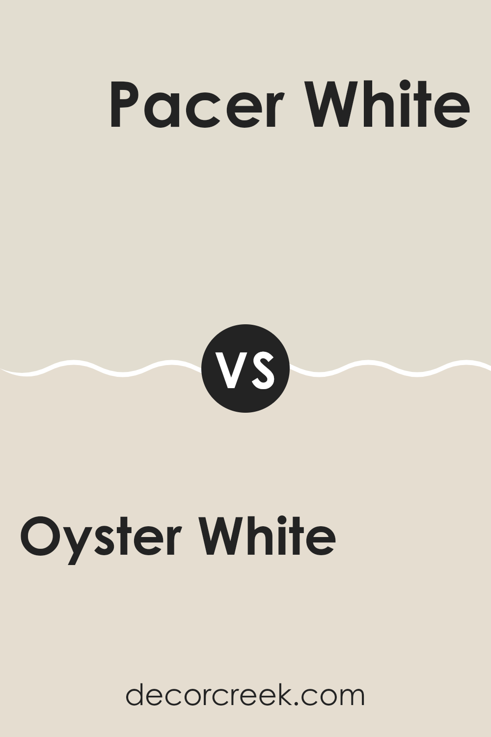
Oyster White SW 7637 by Sherwin Williams vs Pacer White SW 6098 by Sherwin Williams
Oyster White and Pacer White are both neutral paint colors from Sherwin Williams, but they have different tones and vibes. Oyster White leans slightly towards a warm gray, giving a very subtle hint of beige. This makes it adaptable and easy to blend with other colors in your decor. It’s light enough to make small rooms feel bigger and can brighten up areas that don’t get much sunlight.
On the other hand, Pacer White has a more noticeable beige undertone, making it warmer than Oyster White. This quality makes it a great choice for creating a cozy and welcoming atmosphere in rooms. It works especially well in areas with lots of natural light, as the sunlight highlights its warm tones.
Both colors are fairly subdued and won’t overpower your room but will give it a fresh and clean look. Whether you choose Oyster White or Pacer White depends on whether you prefer a cooler or a warmer neutral tone.
You can see recommended paint color below:
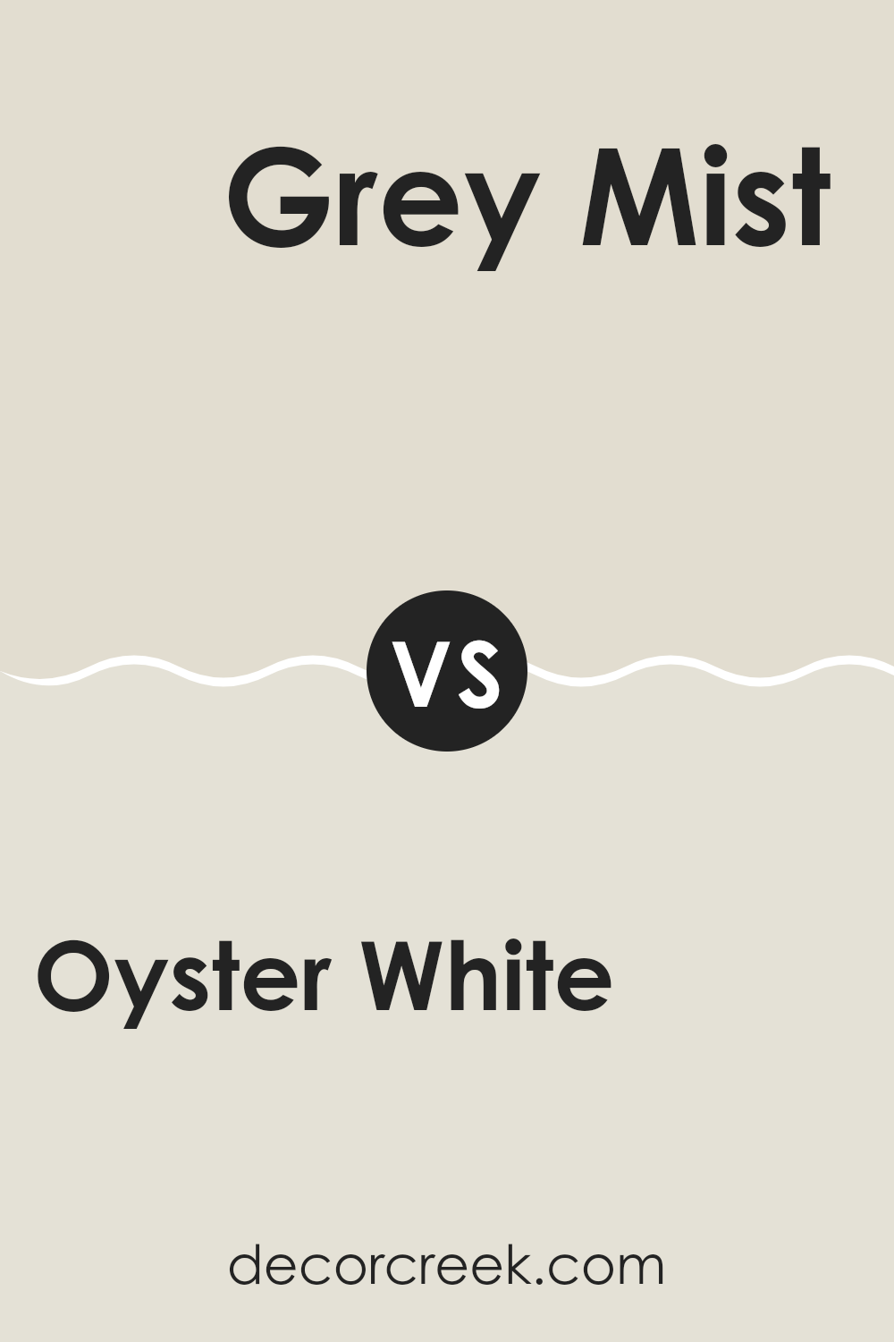
Oyster White SW 7637 by Sherwin Williams vs Grey Mist SW 9625 by Sherwin Williams
Oyster White and Grey Mist, both by Sherwin Williams, present subtle yet distinct tones. Oyster White offers a soft, warm white with beige undertones, creating a cozy and inviting feel to any room. It’s an adaptable shade that easily pairs with various decor styles, making it ideal for living rooms or bedrooms where a gentle, soothing atmosphere is desired.
On the other hand, Grey Mist carries a cooler, more neutral grey tone. This color is lighter, providing a fresh and clean look that can help brighten small rooms or enhance larger areas without feeling too intense. It’s perfect for modern settings or any room that benefits from a minimalist, crisp aesthetic.
When comparing the two, Oyster White leans towards a warmer palette, enhancing rooms with a touch of warmth, while Grey Mist serves as a cooler option that offers a sleek, contemporary vibe. Both colors maintain a subtle presence, allowing for flexibility in decorating with accents and furniture.
You can see recommended paint color below:
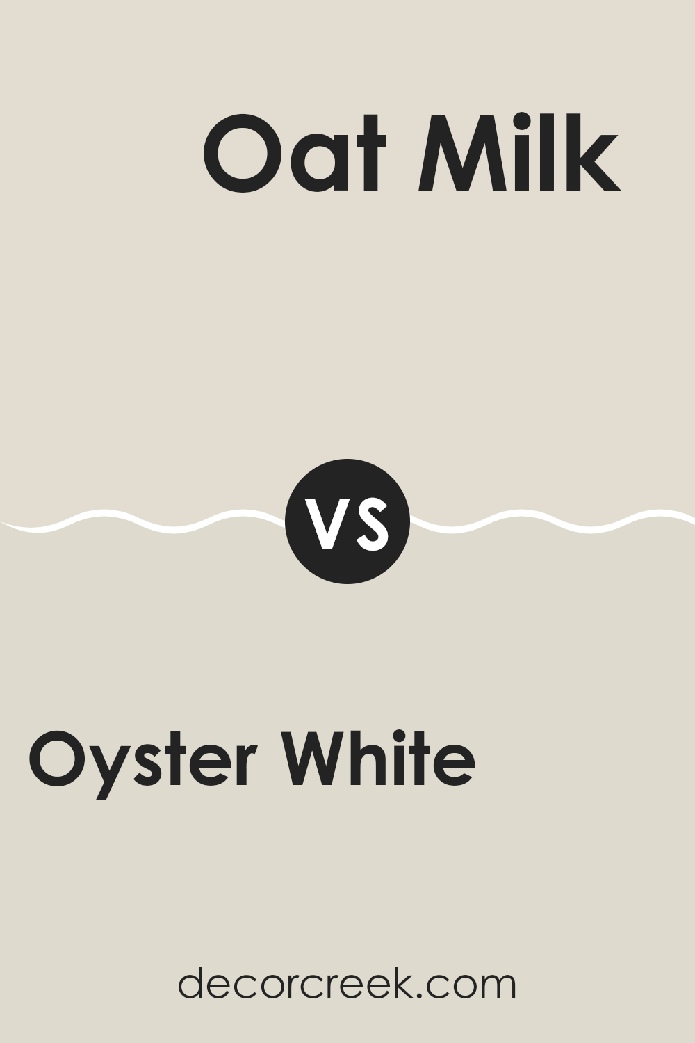
Oyster White SW 7637 by Sherwin Williams vs Oat Milk SW 9501 by Sherwin Williams
Oyster White and Oat Milk are two subtle and warm shades from Sherwin Williams, each bringing its own unique feel to a room. Oyster White has a soft, creamy base that offers a hint of warmth, making it a cozy choice for any room. This color pairs well with vibrant or dark colors, providing a calm backdrop that allows other elements to stand out.
On the other hand, Oat Milk is a bit lighter and has a more muted tone compared to Oyster White. It leans towards a more neutral, beige color that gives a fresh and clean vibe. Oat Milk is ideal for creating a bright and airy room, as it reflects more light, making rooms appear more spacious.
Both colors are adaptable and can be used in various styles of decor, from modern to classic, depending on the accompanying accents and furniture. While Oyster White adds warmth, Oat Milk offers a cleaner, more understated environment.
You can see recommended paint color below:
Oyster White SW 7637 by Sherwin Williams vs White Duck SW 7010 by Sherwin Williams
Oyster White and White Duck by Sherwin Williams are two subtle shades that can lighten up any room. Oyster White is a soft, warm white with a hint of gray. It gives off a cozy feel without being too stark, making it great for living areas and bedrooms where you want a gentle, calming atmosphere.
On the other hand, White Duck is slightly warmer compared to Oyster White. It leans more towards a beige tone, which makes it perfect for rooms where you prefer a more inviting and less clinical white. It works well in rooms with natural materials like wood and stone.
Both colors are quite neutral, but Oyster White can seem a bit cooler, especially in north-facing rooms, while White Duck, with its beige undertones, is excellent for adding warmth. Depending on the lighting and the other colors in your decor, either shade could be a good fit. Choose Oyster White for a modern, minimalistic look or White Duck for a more traditional, cozy vibe.
You can see recommended paint color below:
Oyster White SW 7637 by Sherwin Williams vs White Sesame SW 9586 by Sherwin Williams
Oyster White and White Sesame are two lighter shades offered by Sherwin Williams, both providing subtle nuances that set them apart. Oyster White leans towards a soft, warm gray, offering a cozy and inviting atmosphere that works well in rooms where a touch of warmth is desired without straying too far from a white palette.
On the other hand, White Sesame has a more neutral tone with hints of beige, making it slightly warmer than Oyster White. This color is adaptable, blending well in various settings and complementing a range of decor styles while still maintaining a clean, fresh look.
Both colors have a calming effect and are light enough to make small rooms appear larger and brighter. These qualities make them suitable for living areas, bedrooms, and other rooms where a relaxed and airy atmosphere is preferred. Ultimately, the choice between them depends on the specific undertones and warmth you wish to bring into your room.
You can see recommended paint color below:
Oyster White SW 7637 by Sherwin Williams vs Natural Choice SW 7011 by Sherwin Williams
Oyster White and Natural Choice, both from Sherwin Williams, offer subtle variations in tone that could influence the atmosphere of a room. Oyster White is a soft, warm white with a hint of gray. It’s quite neutral, making it very adaptable for different rooms and pairing easily with various decor styles. It tends to bring a cozy and inviting feel to rooms while still keeping things light and airy.
On the other hand, Natural Choice is also a warm shade but leans more toward a beige or khaki tone. This color is still very neutral but offers a bit more depth compared to Oyster White, which can help in creating a comforting, snug environment. It’s a great option if you’re looking for something slightly richer than a traditional white but still want to maintain a subtle and understated backdrop.
Choosing between them depends on whether you prefer the crisper edge of Oyster White or the warmer, earthier feel of Natural Choice.
You can see recommended paint color below:
Oyster White SW 7637 by Sherwin Williams vs Nacre SW 6154 by Sherwin Williams
Oyster White and Nacre are both colors from Sherwin-Williams that share a subtle, muted vibe, making them popular choices for creating a peaceful and welcoming atmosphere in a home. Oyster White is a soft, warm gray with a slight hint of beige, giving it a cozy feel that’s not too stark. It’s perfect for rooms where you want a hint of color without feeling too intense.
On the other hand, Nacre is slightly lighter and has a touch more beige than Oyster White. This makes Nacre an excellent choice for those looking for a neutral that leans towards a traditional creamy shade. It reflects light beautifully, making rooms appear brighter and more open.
Both colors pair well with a wide range of decor styles and other hues, but Nacre might be preferable in smaller or darker rooms where the goal is to make the room feel larger. Oyster White works well in rooms with plenty of natural light, enhancing the warmth of the room. Choose between them based on the specific feel and brightness you want to achieve in your room.
You can see recommended paint color below:
In wrapping up my thoughts on SW 7637 Oyster White by Sherwin Williams, I’ve found that it’s a fantastic paint color for anyone looking to freshen up their home. Oyster White is like a soft blanket—it’s gentle and light, making rooms feel calm and cozy without making them too bright or bold. This paint color works well in all kinds of rooms, from kitchens to bedrooms, and it matches nicely with lots of different furniture and decorations.
What’s really great about Oyster White is how it can make small rooms seem bigger and more open, which is perfect if you don’t have a lot of room. Plus, it doesn’t get dirty easily, which means less cleaning for busy families.
Using this paint could be a great choice if you’re thinking of changing a room’s look without buying new stuff. Just painting the walls can make everything feel new again. So, if you or your family are thinking about a new color for a room, Oyster White is a wonderful option to consider. It’s soft, clean, and keeps everything looking neat and beautiful.

Ever wished paint sampling was as easy as sticking a sticker? Guess what? Now it is! Discover Samplize's unique Peel & Stick samples.
Get paint samples

