Colors have a profound effect on our living spaces. They evoke emotions, define styles, and create atmospheres. One color that has been gaining traction in interior design is Sunny Side Up 367. This shade, known for its versatile and pleasing aesthetics, offers numerous possibilities for various design scenarios.
This article will delve into Sunny Side Up 367’s features, including its color, undertones, coordinating colors, lighting effects, LRV, trim colors, and compatible colors.

What Color Is Sunny Side Up 367?
BM Sunny Side Up 367 is a soft, creamy yellow color that embodies freshness and optimism. It has a bright yet calming presence that can invigorate any space. Ideal for contemporary and traditional interior styles alike, this shade pairs well with natural materials like wood and stone and complements textures such as linens and silks.
The welcoming hue of Sunny Side Up 367 can also be used in kitchens, living rooms, and bedrooms, creating an inviting ambiance.

Ever wished paint sampling was as easy as sticking a sticker? Guess what? Now it is! Discover Samplize's unique Peel & Stick samples.
Get paint samples

Is It a Warm Or Cool Color?
BM Sunny Side Up 367 falls under the warm color category. Its soft yellow tones infuse spaces with a sense of coziness and comfort. In homes, this warmth translates into a nurturing environment, turning rooms into welcoming retreats.
Being a warm color, it works well with other warm shades and natural materials, enhancing the feeling of relaxation.
Undertones of Sunny Side Up 367
Every color has underlying tones called undertones, which can significantly affect the way we perceive it. BM Sunny Side Up 367 has subtle green undertones that add a unique touch to this creamy yellow color. These undertones provide a slight coolness, balancing the warmth of the yellow, making it more versatile in design.
The green undertones lend a natural and harmonious feel, allowing it to blend effortlessly with other colors and materials.

Coordinating Colors of Sunny Side Up 367
Coordinating colors are those that work well together, creating a balanced and harmonious design. For BM Sunny Side Up 367, the major coordinating colors include:
- HC-139 Salisbury Green
- BM 464 Thornton Sage
Also, the following Benjamin Moore paint colors can be used as coordinating color options with this yellow hue:
- BM 1626 Gentle Gray : A subtle blue that provides contrast and freshness.
- OC-95 Navajo White : A neutral beige, grounding the bright and creamy Sunny Side Up 367.
- BM 304 Shooting Star
Furthermore, three additional coordinating colors are:
- BM 2041-50 Sea Mist Green : A gentle aqua blue, emphasizing the coastal vibes.
- HC-137 Hollingsworth Green : A refined and very light combination of green, gray, and blue.
- BM 2160-70 Sugar Cookie : A light cream that adds a soft touch to the palette.

How Does Lighting Affect Sunny Side Up 367?
Lighting plays a crucial role in determining the appearance of Sunny Side Up 367. In natural light, it appears brighter and more vibrant, reflecting the daylight’s characteristics. In artificial light, its warmth is accentuated, lending a cozy atmosphere. Depending on the room orientation:
- North-Faced Rooms: Appears slightly cooler due to indirect light.
- South-Faced Rooms: The color shines brightly, absorbing the warm light.
- East-Faced Rooms: Exhibits a warm golden hue in the morning light.
- West-Faced Rooms: Shows a softer, more muted appearance in the afternoon.

LRV of Sunny Side Up 367
The Light Reflectance Value (LRV) of a color, in this case, 71, indicates the percentage of light that the color reflects. A higher LRV means the color will make the room appear more spacious and brighter. With Sunny Side Up 367’s LRV of 71, it adds a luminous quality to the walls, enhancing the perception of space.
This particular LRV value ensures that the color can be versatile, working well in both large and small spaces, illuminating them without overwhelming the senses.

Trim Colors of Sunny Side Up 367
Trim colors are used for doors, windows, and molding, providing contrast or complement to the wall color. For Sunny Side Up 367, shades of white work beautifully:
- OC-117 Simply White : A clean and crisp white that enhances the yellow.
- OC-122 Cotton Balls : A softer white, adding subtle sophistication.
- OC-23 Classic Gray , creating a balanced contrast.

Colors Similar to Sunny Side Up 367
Knowing similar colors is essential for alternatives and creating variations in design. Three colors akin to Sunny Side Up 367 are:
- BM City Scape Morning 368 : A soft yellow with a hint of orange, evoking a dawn’s glow.
- BM Copacabana 284 : A tropical yellow, reflecting beachside elegance.
- BM Sunshine of the Bay 347 : A sunny yellow that radiates positivity and energy.

Colors That Go With Sunny Side Up 367
Coordinating a room’s color scheme is vital for a cohesive look. Colors that pair well with Sunny Side Up 367 include:
- BM 534 Crisp Green
- OC-136 Celery Salt
- OC-22 Calm
- BM-2092-30 Boston Brick
- BM 505 Hint of Mint
Each of these colors contributes to a harmonious palette that ensures an inviting and comfortable space, accentuating the beauty of Sunny Side Up 367.

How to Use Sunny Side Up 367 In Your Home?
BM Sunny Side Up 367 is a versatile color that can be utilized in various rooms and styles. Its soft, creamy yellow shade is perfect for traditional, coastal, and contemporary designs. In living spaces, it adds warmth and vitality, while in bedrooms, it can create a calming retreat.
This color also works well in bathrooms and kitchens, providing freshness and energy. Its adaptability extends to exteriors, where it can brighten up façades and lend a welcoming touch.
Sunny Side Up 367 in the Bedroom
The comforting warmth of Sunny Side Up 367 creates a soothing environment in the bedroom. Its soft yellow tone encourages relaxation and peaceful slumbers. Paired with gentle blues or crisp whites, it adds a touch of elegance and serenity, making it an ideal choice for master bedrooms and guest rooms alike.

Sunny Side Up 367 in the Bathroom
In the bathroom, Sunny Side Up 367 can inject a sense of freshness and cleanliness. Its bright yet subtle hue works well with whites and natural materials like wood or stone. This color adds a spa-like quality to the bathroom, making your daily rituals feel like a luxurious treat.

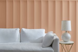
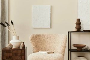
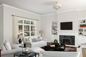
Sunny Side Up 367 in the Living Room
BM Sunny Side Up 367 in the living room brings in a cheerful ambiance, promoting social interaction and comfort. Whether paired with deep greens or soft neutrals, this color can become a charming backdrop for furniture and art. Its warm tones help create a cozy environment that welcomes guests and family alike.

Sunny Side Up 367 for an Exterior
When applied to exteriors, Sunny Side Up 367 acts as a bright welcome, reflecting optimism and warmth. This color works well with traditional and modern architecture, blending effortlessly with natural surroundings. Whether used as a primary color or an accent, it adds a distinctive touch that stands out gracefully.

Sunny Side Up 367 in the Kitchen
In the kitchen, Sunny Side Up 367 adds a touch of zest and energy. It can help stimulate appetite and conversation, making the kitchen a lively hub of the home. Whether on walls or as an accent, this color pairs nicely with wooden countertops and stainless steel appliances, enhancing the culinary experience.

Sunny Side Up 367 for the Kitchen Cabinets
For kitchen cabinets, Sunny Side Up 367 provides a subtle charm without overwhelming the space. It adds a cheerful touch that brightens the cooking area and complements various design styles. Paired with sleek handles or traditional knobs, this color brings a unique blend of modern chic and timeless appeal to the heart of your home.

Comparing Sunny Side Up 367 With Other Colors
Comparing different colors is a vital aspect of interior design and color selection. Every color has its unique characteristics, undertones, and emotional effects. Comparing colors allows us to understand how they interact, complement or contrast with each other. This understanding aids in creating a harmonious and aesthetically pleasing environment.
It also helps in selecting the right shades for specific rooms, lighting conditions, and design themes. Here, we’ll compare Sunny Side Up 367 with six other colors.
Sunny Side Up 367 vs. HC-9 Chestertown Buff
HC-9 Chestertown Buff is a rich, earthy beige with a comforting feel. Compared to the bright and cheerful Sunny Side Up 367, it offers a more subdued and traditional appeal.
While Sunny Side Up 367 invigorates a space, Chestertown Buff provides a grounded, timeless elegance. Both colors are warm but cater to different tastes and styles.

Sunny Side Up 367 vs. HC-2 Beacon Hill Damask
HC-2 Beacon Hill Damask is a soft and elegant green with a touch of gray. In contrast, Sunny Side Up 367’s creamy yellow brings a sunny disposition. Beacon Hill Damask offers a calming presence, while Sunny Side Up 367 injects energy and liveliness.
Together, they can create a balanced and refreshing palette, with the yellow enhancing the subtle sophistication of the green.

Sunny Side Up 367 vs. BM Potters Clay 1221
BM Potters Clay 1221 is an earth-toned orange-brown shade that resonates with nature and warmth. Compared to Sunny Side Up 367, it has a more rustic and organic feel. While Sunny Side Up 367 is lively and bright, Potters Clay 1221 is deep and comforting.
The two can work well together, with the creamy yellow highlighting the rich depth of the brown.

Sunny Side Up 367 vs. OC-12 Muslin
OC-12 Muslin is a neutral beige with a versatile and classic appeal. Unlike Sunny Side Up 367, it’s more subdued and can serve as a perfect backdrop. While Sunny Side Up 367 brings warmth and cheerfulness, Muslin offers an understated elegance.
They can complement each other, with Muslin grounding the vibrant energy of Sunny Side Up 367.

Sunny Side Up 367 vs. OC-108 Pale Moon
OC-108 Pale Moon is a soft off-white with a hint of yellow. It shares a certain brightness with Sunny Side Up 367 but in a more delicate manner. While Sunny Side Up 367 is more expressive, Pale Moon provides a gentle and serene ambiance.
They can blend beautifully in a monochromatic scheme, creating a gradient of brightness and warmth.

Sunny Side Up 367 vs. BM Candlelit Dinner 295
BM Candlelit Dinner 295 is a warm and sophisticated peach-toned beige. In contrast to the fresh and lively Sunny Side Up 367, it evokes a romantic and intimate atmosphere. Both colors exude warmth but with different emotional tones.
Sunny Side Up 367’s optimism pairs nicely with Candlelit Dinner 295’s elegance, creating a welcoming and graceful ambiance.

Conclusion
Sunny Side Up 367 is more than just a color. It’s a design tool that can transform spaces, create moods, and set styles. Its versatility, warmth, and subtleties make it a unique choice for various applications.
Whether you’re looking to invigorate a room with fresh energy or create a tranquil retreat, Sunny Side Up 367 offers endless possibilities, proving that color is indeed a powerful element in the world of design.

Ever wished paint sampling was as easy as sticking a sticker? Guess what? Now it is! Discover Samplize's unique Peel & Stick samples.
Get paint samples