In the world of interior design, colors serve as a language of their own, speaking volumes about the ambiance and character of a space. Among the countless shades and tones available, some stand out for their versatility and timeless elegance. One such color is Sherwin-Williams’ SW 9166 Drift of Mist.
This article will delve deep into the character of this hue, its undertones, coordinating colors, light reflection value (LRV), trim colors, and the colors that best harmonize with it.

What Color Is SW 9166 Drift of Mist?
SW 9166 Drift of Mist is a neutral hue that deftly walks the line between a soft, understated gray and a warm beige. Its gentle demeanor allows it to blend seamlessly into any space, imparting an air of calmness and tranquility.
This shade is perfectly poised between the boldness of darker colors and the crispness of lighter shades, offering unmatched versatility in its applications.
As its name suggests, the color encapsulates the ethereal beauty of a morning mist in its hue. It exudes an essence of serenity, making it an ideal color for spaces intended for relaxation and unwinding. Simultaneously, the subtlety of this shade allows it to function as a chic, contemporary backdrop for more vibrant or contrasting colors.

Is It a Warm Or Cool Color?
SW 9166 Drift of Mist is an inherently warm color. It bears the creamy undertones that are characteristic of beige, which makes it a welcoming and comforting shade. Despite its warmth, however, it has a gentle gray presence that adds a cool, modern dimension to the color.
Undertones of SW 9166 Drift of Mist
The complexity of SW 9166 Drift of Mist is due to its diverse undertones. Here are three primary ones:
- Beige: The warm beige undertone gives the color its comforting warmth and versatility, allowing it to pair well with a variety of color schemes.
- Gray: The subtle gray undertone adds a touch of cool modernity, preventing the color from becoming overly warm or cloying.
- Taupe: There is also a soft taupe undertone that adds a barely-there freshness and vitality to the color. This keeps the color lively and prevents it from appearing flat or dull.
Undertones are secondary colors subtly present within the main color. These play a crucial role in determining how we perceive the primary color. The undertones of color can make it appear warmer or cooler and can also affect how the color appears under different lighting conditions and alongside other colors.

Coordinating Colors of SW 9166 Drift of Mist
SW Drift of Mist harmonizes beautifully with a range of colors. Notable among these are:
- SW 7014 Eider White: This clean, crisp white adds a breath of fresh air to the softer Drift of Mist, creating a serene and modern ambiance.
- SW 9167 Polished Concrete: This mid-tone cool gray complements the warm tones of Drift of Mist, adding depth and contrast.
- SW 9154 Perle Noir: A rich, deep gray, Perle Noir provides a dramatic contrast that brings out the softer, warm tones in Drift of Mist.
- SW 7605 Gale Force: This stormy, cool-toned blue makes the warm tones in Drift of Mist pop, adding a vibrant dimension to the space.
Additionally, similar hues that work well are:
- SW 7042 Shoji White: A soft, warm white that plays up the creamy beige undertones of Drift of Mist.
- SW 9151 Moonmist: A very light, neutral gray with a warm undertone that complements the warmth of Drift of Mist.
- SW 6001 Grayish: A soft gray with a hint of lavender, it adds an elegant touch while harmonizing with the cool undertones of Drift of Mist.
Coordinating colors are colors that naturally look good together. They can be used to create a harmonious color scheme in a room, making the space feel unified and balanced.
Coordinating colors can either be similar to the base color, allowing for a monochromatic scheme, or they can be contrasting, which adds depth and interest to the space.

How Does Lighting Affect SW 9166 Drift of Mist?
Lighting plays a pivotal role in the appearance of any paint color. For SW 9166 Drift of Mist, the gentle gray undertone becomes more apparent under bright, cool lighting, such as fluorescent or LED lights. It lends a modern, chic vibe to the room. On the other hand, in warm, dim lighting like that from incandescent bulbs or the golden hours of the day, the warm beige and pink undertones emerge, creating a cozy and inviting ambiance.
Natural light has the most neutral impact, but it can change throughout the day. Morning light tends to bring out cool tones, mid-day light makes it appear lighter, and the color can seem warmer in the evening light.

LRV of SW 9166 Drift of Mist
The Light Reflectance Value (LRV) of paint color is a measure of how much light the color reflects. SW 9166 Drift of Mist has an LRV of 69. This is relatively high, indicating that the color reflects a significant amount of light. The benefit of such a high LRV is that it can make a room look larger and more open, as it allows light to bounce around the room.
Moreover, a high LRV means that the color does not absorb much light, preventing it from looking too heavy or overwhelming. This is especially useful in spaces with limited natural light, as it helps to keep the room feeling bright and airy.
High LRV colors like Drift of Mist also work well in multi-purpose spaces, as they offer a clean, neutral backdrop that is flexible to varying needs and moods.

LRV – what does it mean? Read This Before Finding Your Perfect Paint Color
Trim Colors of SW 9166 Drift of Mist
Choosing the right trim color is crucial in creating a cohesive and stylish color scheme. Here are three Sherwin-Williams shades that make excellent trim colors for Drift of Mist:
- SW 7006 Extra White: This bright, pure white provides a crisp contrast to the warm, soft tones of Drift of Mist, highlighting architectural details.
- SW 7008 Alabaster: A warm, creamy white that plays up the beige undertones in Drift of Mist, creating a seamless, harmonious look.
- SW 7004 Snowbound: A light, slightly cool white that complements the subtle gray undertones of Drift of Mist, providing a modern, clean edge.
Trim colors are the shades used on trim elements like door and window frames, crown moldings, and baseboards.
The right trim color can highlight these architectural features and add depth and definition to the room. A contrasting trim color can create a striking, modern look, while a coordinating trim color offers a subtle, classic elegance.

Colors Similar to SW 9166 Drift of Mist
When choosing a color scheme, it’s often helpful to consider colors similar to your base color. For Drift of Mist, these include:
- SW 7628 Windfresh White: A soft, warm white that shares the serene, understated quality of Drift of Mist.
- SW 7631 City Loft: A light beige with a touch more warmth than Drift of Mist.
- SW 7021 Simple White: A clean, neutral white with a similar balance of warm and cool tones.
- SW 7647 Crushed Ice: A very light gray that leans into the cool tones found in Drift of Mist.
- SW 7028 Incredible White: A complex, versatile off-white with a similar balance between warmth and modernity.
Knowing similar colors can help in creating a harmonious, monochromatic color scheme. They can be used interchangeably to add depth and interest without deviating from the overall tone of the room.

Colors That Go With SW 9166 Drift of Mist
Pairing Drift of Mist with the right colors can create a variety of moods in a room. We recommend the following colors for various vibes in your home:
- SSW 6221 Moody Blue: Adds a touch of drama and sophistication, contrasting beautifully with Drift of Mist.
- SW 6208 Pewter Green: Creates a natural, organic vibe that grounds the soft tones of Drift of Mist.
- SW 9165 Gossamer Veil: A light gray that harmonizes with the cool undertones of Drift of Mist.
- SW 9130 Evergreen Fog: A muted, earthy green that adds warmth and richness, contrasting subtly with Drift of Mist.
- SW 6204 Sea Salt: A light, muted green with gray undertones, it creates a serene, coastal vibe when paired with Drift of Mist.
- SW 7648 Big Chill: A light, cool gray that plays up the modern, chic aspect of Drift of Mist.
Selecting colors that look good together is crucial in creating a cohesive and balanced room. It allows you to create a certain mood, highlight architectural details, or direct focus on specific areas or pieces of furniture.

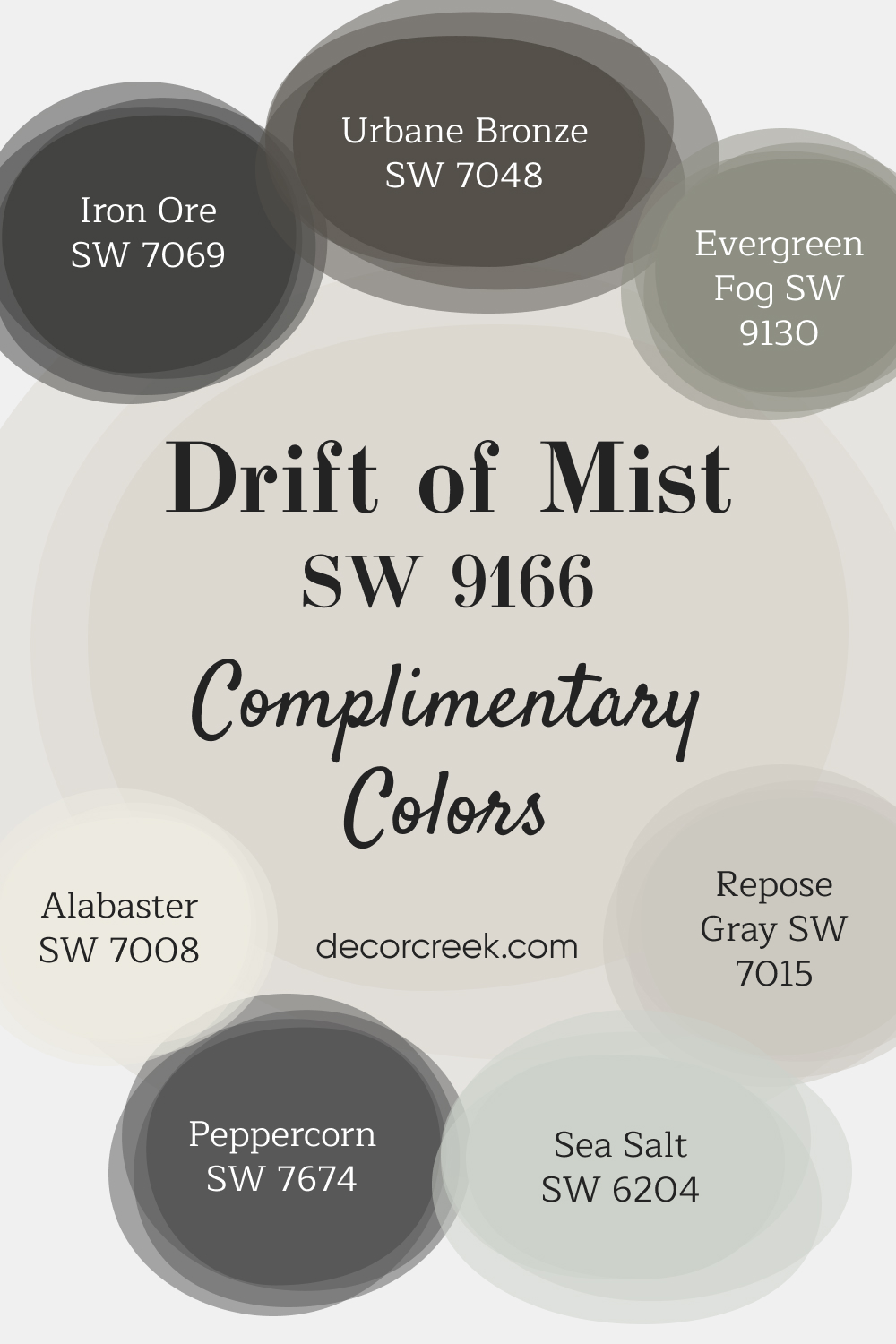
Complimentary Colors for Drift of Mist SW 9166 Paint Color by Sherwin-Williams
Drift of Mist by Sherwin Williams is a light, airy color that pairs beautifully with deeper tones to bring contrast and depth to a space. Urbane Bronze and Peppercorn add richness, while Sea Salt brings a fresh touch of subtle green. For a balanced feel, Repose Gray helps tie the colors together, keeping things neutral yet sophisticated.
Alabaster and Iron Ore complete the palette with soft whites and bold accents, adding brightness and depth. Evergreen Fog introduces an earthy green tone, perfect for creating a natural, grounded atmosphere. These colors work well in both modern and classic spaces, adding a fresh yet timeless touch.
How to Use SW 9166 Drift of Mist In Your Home?
The gentle sophistication of SW 9166 Drift of Mist makes it an incredibly versatile paint color. It can blend seamlessly into a variety of interior design styles, from the minimalism of Scandinavian design, where its cool undertones and high LRV create a spacious, airy feel, to the cozy charm of rustic or farmhouse styles, where its warm beige tones add a welcoming touch. It can also work brilliantly in modern, traditional, or transitional homes, acting as a harmonious backdrop for various furniture styles and décor elements.
How to Use SW 9166 Drift of Mist in the Bedroom?
In the bedroom, Drift of Mist creates an ambiance of serenity and relaxation, perfectly suited to this personal sanctuary. When paired with light, warm-colored woods and cozy textures, it evokes a sense of calm, making it ideal for promoting restful sleep. In a more modern setting, its gray undertones come to the forefront, making it a chic backdrop for metallic accents and sleek, minimalist furniture.
On the other hand, using Drift of Mist as an accent wall behind the bed can create a stunning focal point. Combine it with deeper tones like SW Moody Blue or SW Pewter Green for a stylish contrast that adds depth and intrigue to the room without overwhelming it.

How to Use SW 9166 Drift of Mist in the Bathroom?
Drift of Mist can create a spa-like ambiance in the bathroom, where its soothing qualities are most appreciated. Its high LRV ensures the room remains bright and open, an essential factor in typically smaller spaces like bathrooms. Paired with white or light-colored tiles, it creates a clean, modern look.
On the other hand, pairing Drift of Mist with darker or more vibrant hues can create a stunning contrast. This is particularly effective in larger bathrooms, where bold accents can bring character without feeling too close or overwhelming. A deep blue or rich green tile, for example, can bring out the warm undertones in Drift of Mist, creating a balanced, intriguing palette.

How to Use SW 9166 Drift of Mist in the Living Room?
The living room is a space for relaxation and socialization, and Drift of Mist sets the stage beautifully for both. Its warm, comforting tones create a welcoming atmosphere, while its cool gray undertones keep it looking chic and contemporary. Pair it with warm woods, comfortable upholstery, and a mix of textures to create an inviting, cohesive look.
When used with darker or more vibrant accents, Drift of Mist can provide a perfect canvas that allows these elements to shine. A navy blue sofa, for example, would stand out beautifully against a Drift of Mist backdrop, while richly colored artwork or accessories would pop without clashing.

How to Use SW 9166 Drift of Mist for an Exterior?
The exterior of a house is the first impression it gives, and Drift of Mist is perfect for creating a welcoming, timeless look. It’s particularly effective in settings with lush green landscaping, where its warm undertones harmonize with nature while its high LRV keeps the house looking bright and inviting.
Using Drift of Mist as the main body color for a house allows for a wide range of trim and accent options.
A crisp white like SW Extra White on the trim would create a classic, clean-lined look, while a deeper shade like SW Gale Force on the front door would add an unexpected pop of color. This is the versatility that Drift of Mist offers when it comes to exterior applications.

How to use SW 9166 Drift of Mist for the front door?
Using Drift of Mist SW-9166 for your front door is a fantastic way to add a touch of understated elegance to your home’s exterior. This soft, light gray color has a serene quality, creating a welcoming entrance. Its versatility allows it to blend seamlessly with various exterior paint colors, from traditional whites and creams to more contemporary shades.
To enhance its impact, pair Drift of Mist with contrasting trim colors like deep charcoals or blues for a striking effect. Additionally, accessorize with polished metal door hardware to give a modern twist. This color choice is ideal for those seeking a sophisticated yet subtle statement for their home’s entrance

How to Use SW 9166 Drift of Mist for the Kitchen?
The kitchen, often the heart of the home, calls for a color that creates a warm, welcoming feel while maintaining a clean, modern look. SW 9166 Drift of Mist provides just that. Its warm beige undertones evoke a sense of coziness and hospitality, while its hint of gray delivers a clean, contemporary touch. It’s an ideal choice for open concept kitchens, where its high light reflectance value (LRV) can make the space appear larger and more open.
Moreover, Drift of Mist is incredibly versatile and pairs well with various countertop materials and finishes, whether you have sleek stainless steel appliances, rustic wooden countertops, or glossy marble surfaces. Its neutrality serves as the perfect backdrop, allowing your kitchen décor and hardware to take center stage.

How to Use SW 9166 Drift of Mist for the Kitchen Cabinets?
Using SW Drift of Mist for kitchen cabinets creates an elegantly understated aesthetic. It’s a color that’s fresh and modern without being stark, providing a soft, warm, and inviting feel to the cabinetry. Its high LRV ensures that the cabinets don’t absorb too much light, preventing the kitchen from feeling smaller or more cramped.
Drift of Mist works wonderfully on both upper and lower cabinets, creating a uniform and harmonious look.
However, for a two-toned kitchen, you could consider pairing Drift of Mist upper cabinets with darker lower cabinets, like SW 9167 Polished Concrete or even SW 9154 Perle Noir, for a chic, contemporary contrast.

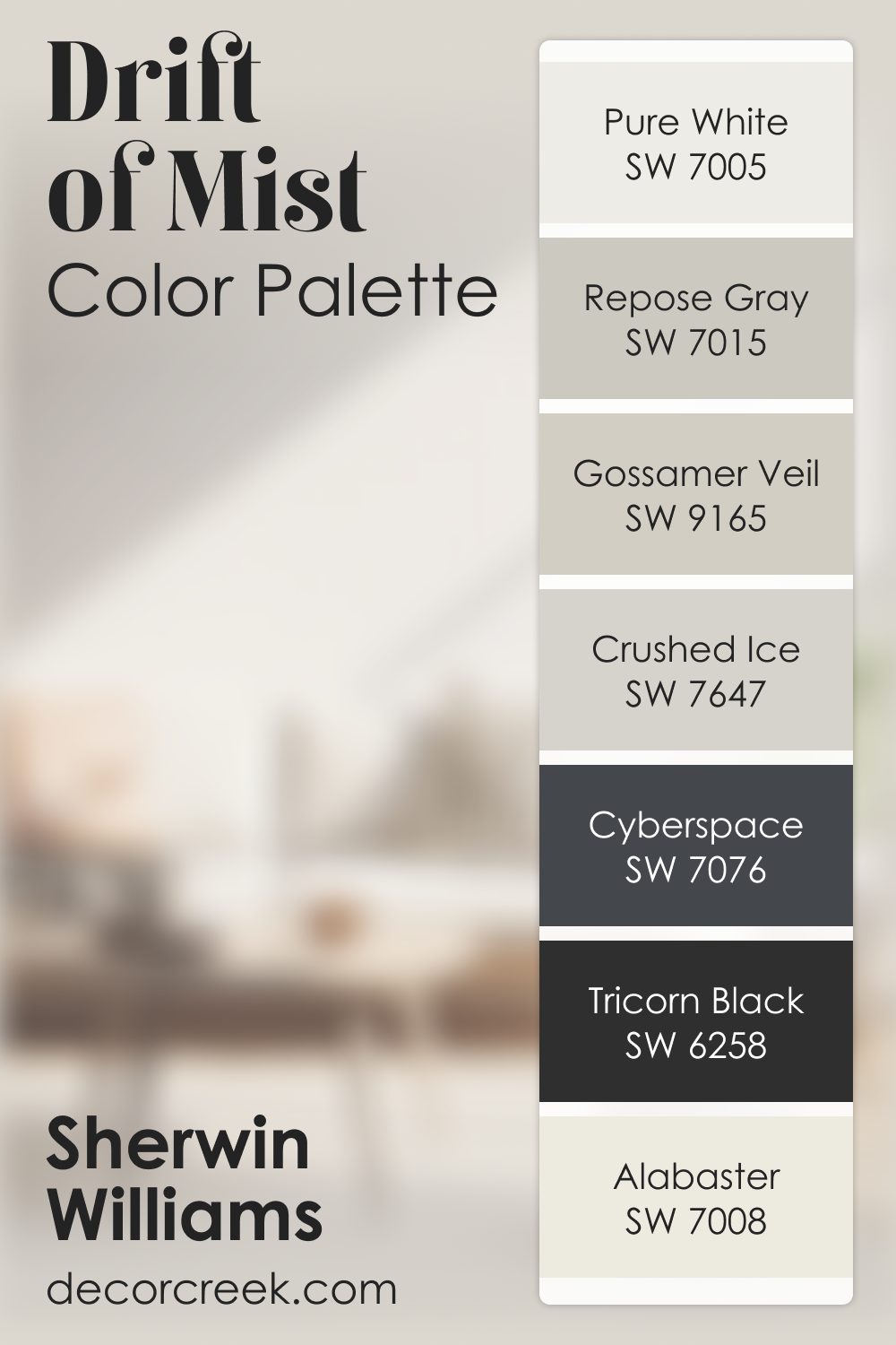
Drift of Mist SW 9166 by Sherwin Williams Color Palette
Drift of Mist always feels light, airy, and quietly soothing. It spreads a gentle brightness through the room that feels effortless and comforting. Alabaster and Pure White enhance this light, while Gossamer Veil and Crushed Ice add soft layers that give the palette depth.
Repose Gray adds a calm mid-tone balance that keeps everything smooth.
When I want to add contrast, Tricorn Black and Cyberspace bring structured depth that makes the palette feel clear and grounded. This combination creates a look that feels peaceful, clean, and softly modern.
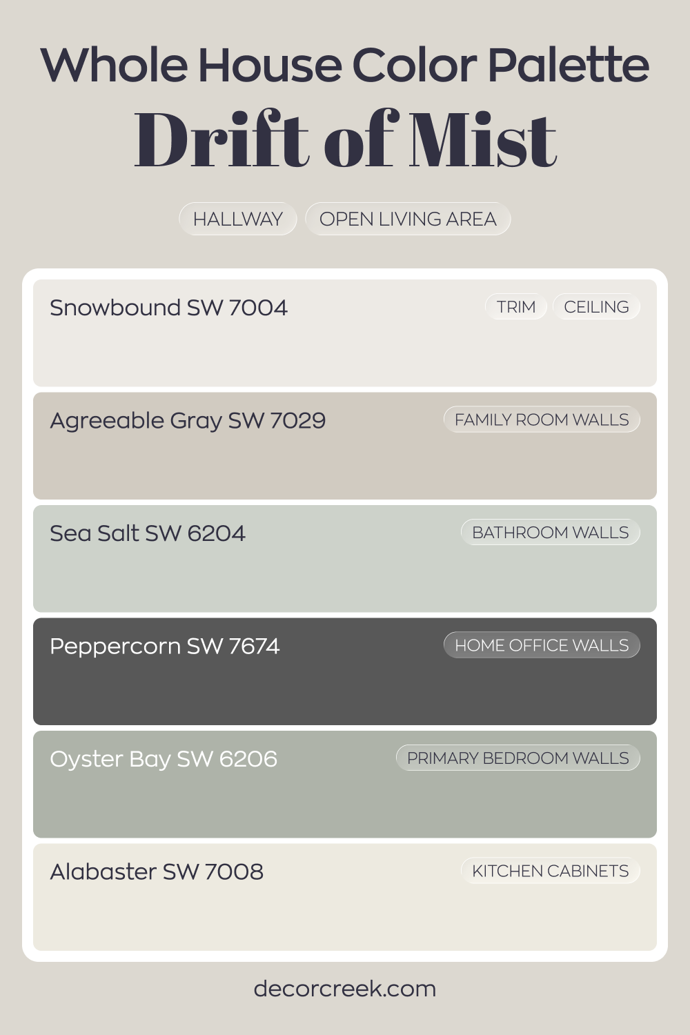
Whole House Paint Color Palette Built Around Drift Of Mist SW 9166
Drift of Mist SW 9166 sets a light, airy tone in the hallway and open living area. Snowbound on trim and ceiling keeps the lines crisp and bright, while Alabaster on kitchen cabinets adds soft warmth. Together, these light neutrals create a clean and welcoming foundation.
Agreeable Gray in the family room adds gentle depth without feeling heavy. Sea Salt in the bathroom and Oyster Bay in the primary bedroom introduce soft green-blue notes that feel fresh and natural.
These colors build a smooth flow from shared areas to private rooms.
Peppercorn in the house office anchors the palette with bold contrast. The result is a layered house where light grays and whites are balanced by grounded, darker accents.
Comparing SW 9166 Drift of Mist With Other Colors
Comparing paint colors is an essential step in selecting the perfect palette for your space. It helps you understand how colors interact with each other, their comparative lightness or darkness, and how they might influence the overall mood of the room. Additionally, comparing colors can highlight the unique undertones present in each shade, helping you to create a harmonious color scheme.
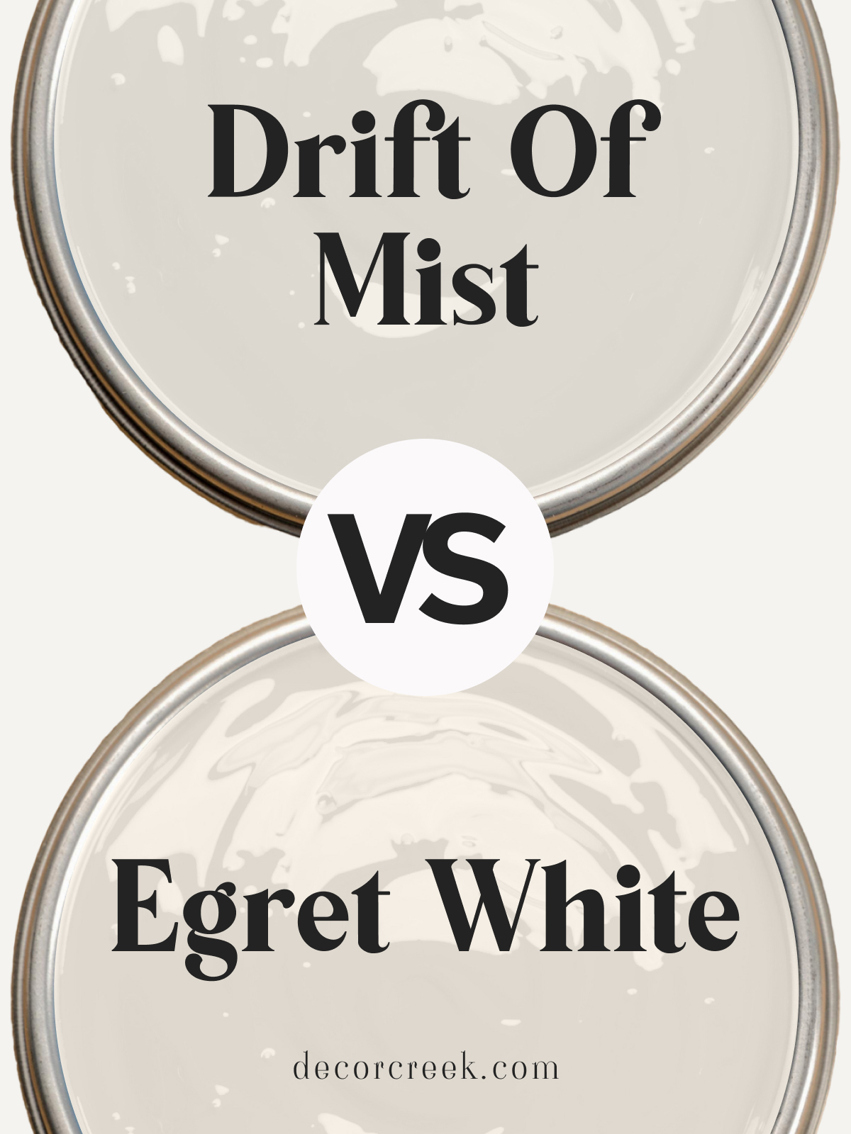
Drift of Mist SW 9166 vs Egret White SW 7570
Drift of Mist SW 9166 and Egret White SW 7570 are two beautiful, versatile neutrals from Sherwin Williams. Drift of Mist is a soft, warm gray with subtle green undertones, adding a serene and grounded feel to spaces. Egret White leans a touch warmer with a faint taupe undertone, giving a cozy, inviting look ideal for brightening up any room.
Choose Drift of Mist if you’re after a balanced, earthy gray that suits modern or minimalistic interiors. Egret White is perfect for creating warmth in living rooms or bedrooms, adding a touch of comfort. Both colors look stunning with white trim and light wood accents for a balanced, welcoming space.
Drift of Mist SW 9166 vs Oyster White SW 7637
Drift of Mist SW 9166 and Oyster White SW 7637 by Sherwin Williams are subtle neutrals with unique qualities. Drift of Mist is a warm, light gray with soft green undertones, creating a calm and fresh feel. Oyster White has a creamy, off-white tone that leans warmer, perfect for adding a cozy, inviting touch to any space.
Drift of Mist is ideal for a modern, minimalist look in living rooms or bedrooms, while Oyster White offers a softer, more traditional feel that works well in kitchens or dining rooms. Both shades pair effortlessly with light wood and white accents, making spaces feel airy and cohesive.
Drift of Mist SW 9166 vs Taupe of the Morning SW 9590
Drift of Mist SW 9166 and Taupe of the Morning SW 9590 by Sherwin Williams bring two different neutral vibes. Drift of Mist is a soft gray with subtle green undertones, adding a grounded, natural feel to spaces. Taupe of the Morning leans toward a light taupe with warm beige undertones, creating a cozy, warm atmosphere.
Choose Drift of Mist for a fresh, balanced look, ideal for modern or open spaces. Taupe of the Morning suits traditional or farmhouse-style rooms where a warmer, more comforting tone is desired. Both shades look lovely with whites and natural wood, giving any room a cozy yet polished finish.
Drift of Mist SW 9166 vs Alabaster SW 7008
Drift of Mist SW 9166 and Alabaster SW 7008 by Sherwin Williams are soft neutrals with different undertones. Drift of Mist is a light gray with subtle green hints, offering a fresh, modern feel. Alabaster is a warm off-white, perfect for adding warmth and a hint of brightness to any room.
Drift of Mist is great for creating a grounded, neutral backdrop in living areas, while Alabaster’s warm tone works well in bedrooms or kitchens, where a cozy feel is desired. Both colors pair beautifully with white trim and soft grays, adding elegance and balance to any decor style.
Baby Fawn OC-15 vs Drift of Mist SW 9166
Baby Fawn OC-15 by Benjamin Moore and Drift of Mist SW 9166 by Sherwin Williams are versatile neutrals with unique qualities. Baby Fawn is a warm beige-gray that adds a cozy, inviting touch to spaces. Drift of Mist is a soft, warm gray with a slight green undertone, perfect for a balanced, modern look.
Baby Fawn works well in traditional or farmhouse-style rooms, adding a touch of warmth. Drift of Mist is ideal for contemporary spaces where a neutral, fresh backdrop is desired. Both colors pair beautifully with white or light wood, creating a cohesive, welcoming space.
Drift of Mist SW 9166 vs Crushed Ice SW 7647
Drift of Mist SW 9166 and Crushed Ice SW 7647 by Sherwin Williams offer soft, adaptable grays for a variety of interiors. Drift of Mist has a warm gray tone with a subtle green undertone, bringing a grounded, serene feel to spaces. Crushed Ice is a cooler, light gray with a hint of warmth, creating a clean, airy look.
Drift of Mist is ideal for cozy spaces like bedrooms or living rooms, where a warmer gray is desired. Crushed Ice works well in modern kitchens or bathrooms for a crisp, minimalist vibe. Both shades pair nicely with whites and light neutrals, creating a balanced, peaceful atmosphere.
Drift of Mist SW 9166 vs Gossamer Veil SW 9165
Drift of Mist SW 9166 and Gossamer Veil SW 9165 by Sherwin Williams are close neutrals with slight differences. Drift of Mist has a warm gray with a faint green undertone, adding a subtle, fresh feel. Gossamer Veil is a tad warmer and slightly darker, with beige undertones that create a cozy, inviting look.
Drift of Mist is ideal for open, airy rooms where a light gray is desired, while Gossamer Veil works beautifully in bedrooms or dining rooms for a touch of warmth. Both colors pair well with white accents and natural wood, creating a harmonious, timeless look.
Drift of Mist SW 9166 vs Eider White SW 7014
Drift of Mist SW 9166 and Eider White SW 7014 by Sherwin Williams offer light, subtle neutrals for modern interiors. Drift of Mist is a warm gray with a hint of green, adding an earthy, fresh touch. Eider White is a cool off-white with a touch of gray, giving spaces a soft, airy feel.
Drift of Mist works well in living rooms or bedrooms, where a natural, grounded tone is desired. Eider White suits minimalist spaces or areas needing a bright, clean look. Both colors complement white and light wood accents, bringing a cohesive, tranquil vibe to any room.
Heron Plume SW 6070 vs Drift of Mist SW 9166
Heron Plume SW 6070 and Drift of Mist SW 9166 by Sherwin Williams are versatile neutrals with unique undertones. Heron Plume is a warm beige-gray that adds softness and a cozy feel. Drift of Mist is a light, warm gray with a subtle green undertone, offering a fresh, grounded look.
Heron Plume is perfect for adding warmth to traditional rooms or farmhouse-inspired spaces.
Drift of Mist suits modern or open layouts, creating a light and natural feel. Both colors work beautifully with whites and light woods, adding elegance and calm to interiors.
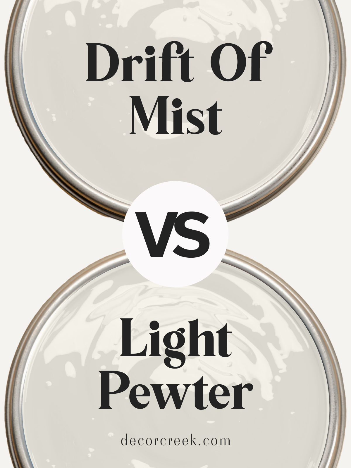
Drift of Mist SW 9166 vs Light Pewter 1464 by Benjamin Moore
Drift of Mist SW 9166 by Sherwin Williams and Light Pewter 1464 by Benjamin Moore are two soft, adaptable grays.
Drift of Mist has a hint of green in its warm gray, adding a grounded, natural feel. Light Pewter is a balanced gray that leans slightly cooler, providing a classic, clean look.
Drift of Mist is ideal for cozy, relaxed spaces, while Light Pewter works well in modern or minimalist settings where a cooler gray is desired. Both colors look stunning with white accents and natural wood tones, bringing a balanced and harmonious feel to any room.
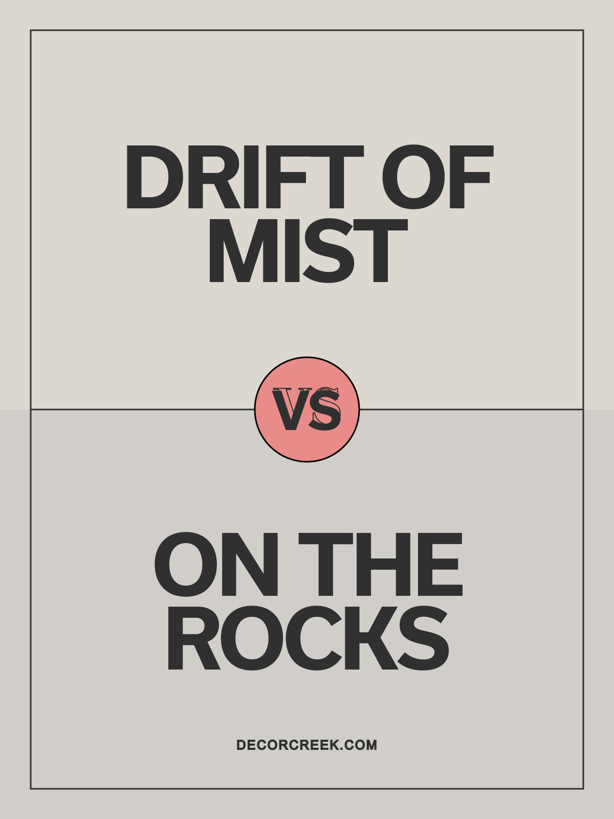
Drift of Mist SW 9166 vs On the Rocks SW 7671
Drift of Mist SW 9166 and On the Rocks SW 7671 by Sherwin Williams are two light grays with distinct qualities. Drift of Mist has a subtle green undertone, offering a soft, natural feel. On the Rocks leans cooler, with a hint of blue that brings a fresh, modern look.
Drift of Mist suits cozy spaces like bedrooms or living rooms, while On the Rocks is perfect for bathrooms or kitchens where a crisp gray is desired. Both colors complement white trim and light neutrals, creating a serene and inviting atmosphere.
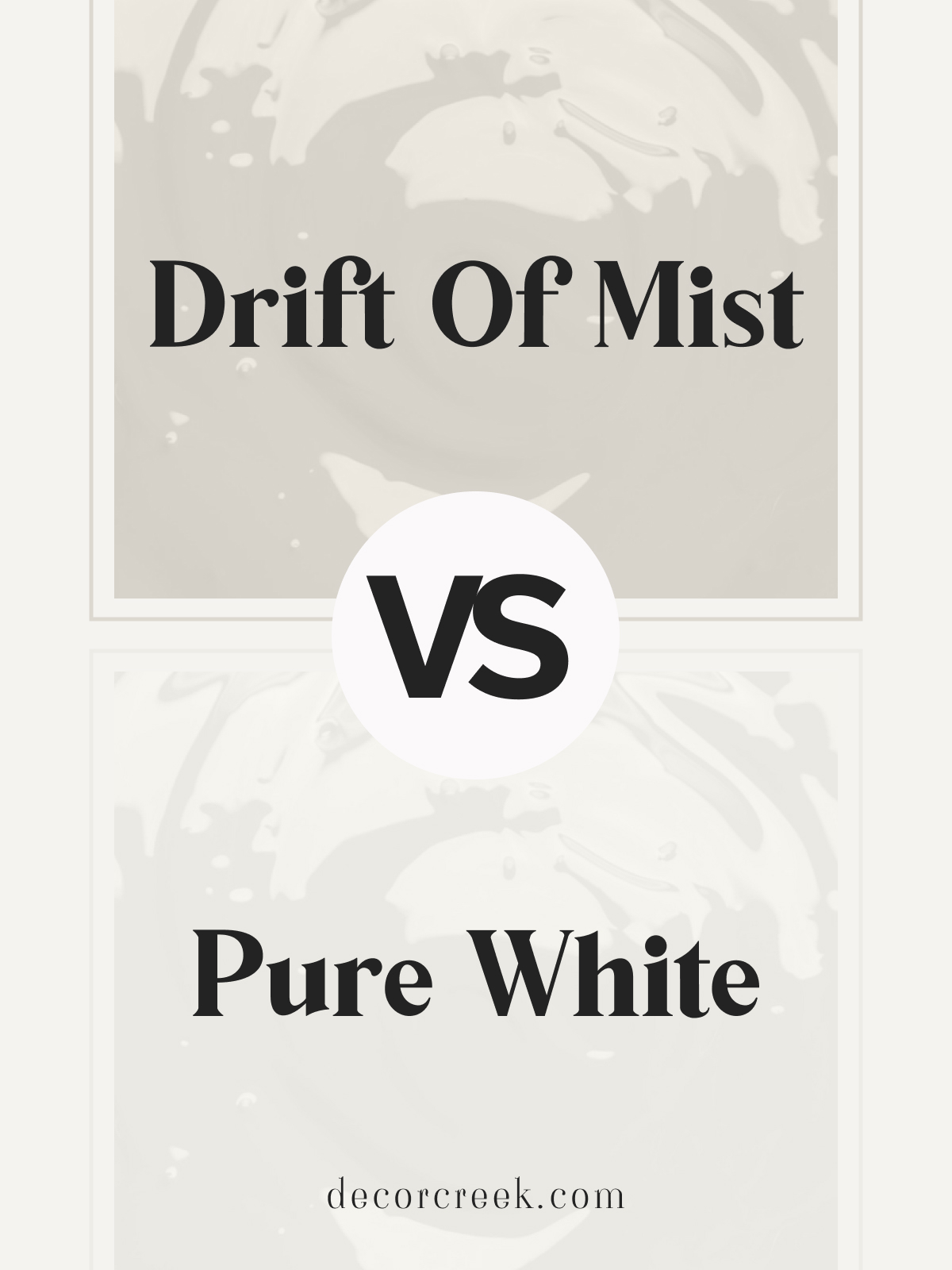
Drift of Mist SW 9166 vs Pure White SW 7005
Drift of Mist SW 9166 and Pure White SW 7005 by Sherwin Williams are two light, neutral tones that work well in various settings. Drift of Mist is a soft gray with a hint of green, providing a grounded, natural feel. Pure White is a clean, crisp white that brightens up spaces with its fresh, minimalist look.
Drift of Mist works well in living rooms or bedrooms, adding a soft touch, while Pure White is ideal for trim, doors, or ceilings, giving a polished finish.
Both shades pair beautifully together, creating a balanced, airy feel in any home.
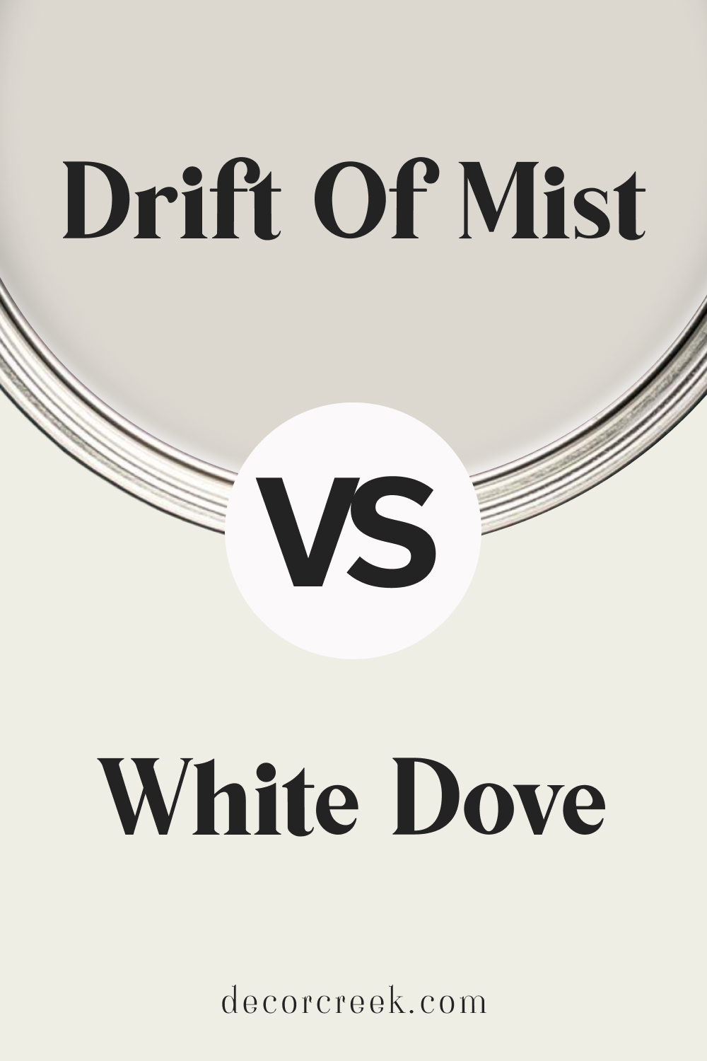
Drift of Mist SW 9166 vs White Dove OC-17 by Benjamin Moore
Drift of Mist SW 9166 and White Dove OC-17 by Benjamin Moore are soft, neutral shades perfect for a serene look. Drift of Mist is a light, warm gray with green undertones, offering a grounded, natural ambiance. White Dove is a warm, creamy white that adds brightness while feeling soft and cozy.
Drift of Mist is ideal for walls in living areas or bedrooms, while White Dove is perfect for trim, ceilings, or cabinets. Together, they create a harmonious, warm aesthetic, complementing each other beautifully for a balanced, elegant space.
SW 9166 Drift of Mist vs. SW Naval
SW Naval is a deep, rich navy that makes a bold and dramatic statement. Compared to the soft, subtle Drift of Mist, it has a much lower LRV, absorbing more light and creating a more intimate, cozy ambiance. However, the two colors contrast beautifully. Using SW Naval as an accent against a Drift of Mist backdrop can add depth and interest to your space.
On the other hand, Drift of Mist is versatile and subtle, making it a suitable color for larger surfaces or rooms where you want to promote a sense of openness and serenity. It’s an excellent choice for creating a calm and tranquil atmosphere, while SW Naval is perfect for creating a dramatic and sophisticated look.

SW 9166 Drift of Mist vs. SW Repose Gray
SW Repose Gray is a light gray with warm undertones, similar in LRV to Drift of Mist. However, Repose Gray leans more towards the cooler side, lacking the beige undertones that give Drift of Mist its warmth.
In a side-by-side comparison, Repose Gray will appear cooler and more modern, while Drift of Mist offers a warmer, more traditional vibe. Both colors are extremely versatile and can be used in a wide range of spaces, but the choice between the two would come down to whether you want a cooler or warmer ambiance in your room.

SW 9166 Drift of Mist vs. SW Urbane Bronze
SW Urbane Bronze is a deep, rich gray with warm undertones. This dark, sophisticated color is dramatically different from the light, airy feel of Drift of Mist. Urbane Bronze absorbs more light, reducing the sense of space, while Drift of Mist reflects light, enhancing the sense of openness.
However, when used together, these colors can create a beautiful contrast. Urbane Bronze could be used for an accent wall, doors, or trim to add depth and sophistication to a room dominated by Drift of Mist.

SW 9166 Drift of Mist vs. SW Stardew
SW Stardew is a light blue-gray with cool undertones, reminiscent of a misty morning sky. Compared to Drift of Mist, Stardew has a distinct coolness and tranquility. While both colors are relatively light and can brighten up a room, Stardew’s cool blue undertones give it a serene, calming vibe, compared to the warmer, more neutral Drift of Mist.
In a room painted with Drift of Mist, accents of Stardew could add a refreshing touch, bringing to mind a coastal or cottage-like feel.

SW 9166 Drift of Mist vs. SW Tricorn Black
SW Tricorn Black is a deep, dark black with a neutral temperature. It’s as far as you can get on the color spectrum from Drift of Mist. While Tricorn Black absorbs light and makes a room feel smaller and more intimate, Drift of Mist reflects light and enhances a sense of spaciousness.
In a design scheme, Tricorn Black can provide striking contrast against a Drift of Mist backdrop, serving as a bold accent color. It could be used for trim, doors, or even a statement wall.

SW 9166 Drift of Mist vs. SW Peppercorn
SW Peppercorn is a dark gray that leans towards the cooler side. It provides a stark contrast to Drift of Mist, with its much lower LRV and cooler temperature. The dramatic Peppercorn can add depth and richness to a room, while Drift of Mist lightens and opens up a space.
Used together, these colors can create a dynamic, balanced look. Peppercorn could serve as a striking accent color in a Drift of Mist-dominated room, adding sophistication and modernity.

Conclusion
SW 9166 Drift of Mist is a unique and versatile color that adapts to a wide range of spaces, moods, and design styles. Its blend of warm and cool undertones, high LRV, and elegant simplicity make it an excellent choice for both interior and exterior use.
Comparisons with other colors highlight its unique qualities and show how it can be part of various beautiful color schemes. Whether used as a neutral backdrop or a standalone color, Drift of Mist embodies a timeless elegance that enhances the beauty of your home.

Ever wished paint sampling was as easy as sticking a sticker? Guess what? Now it is! Discover Samplize's unique Peel & Stick samples.
Get paint samples

Frequently Asked Questions
⭐ What color is SW 9166 Drift of Mist?
SW 9166 Drift of Mist is a subtle, soft color that can best be described as a blend of gray and beige. It leans slightly more towards beige, giving it a warm, inviting feel, but its gray component adds a touch of modernity and elegance.
⭐Is SW 9166 Drift of Mist a warm or cool color?
SW 9166 Drift of Mist is a neutral color, meaning it has a balance of both warm and cool undertones. However, it does lean a bit more towards the warm spectrum due to its beige undertone.
⭐How does lighting affect SW 9166 Drift of Mist?
Lighting can greatly affect the appearance of SW 9166 Drift of Mist. In natural daylight, the color may appear slightly warmer, with more of the beige undertones coming through. In artificial light, depending on the color temperature of the bulb, it can either enhance the warmth or bring out the cooler, gray undertones.
⭐ What colors coordinate well with SW 9166 Drift of Mist?
A variety of colors can coordinate well with SW 9166 Drift of Mist. Some Sherwin Williams colors that pair well include SW 7014 Eider White, SW 9167 Polished Concrete, SW 9154 Perle Noir, and SW 7605 Gale Force.
⭐What is the Light Reflectance Value (LRV) of SW 9166 Drift of Mist?
The LRV of SW 9166 Drift of Mist is 69. This means the color reflects a considerable amount of light and can help to brighten up a space. It also means the color is less likely to show dirt or smudges, making it a practical choice for high-traffic areas.


