As someone slightly obsessed with finding the perfect paint color, my attention was snagged by SW 6601 Tanager from Sherwin Williams. Imagine a shade that whispers of early morning skies lighting up in a cozy, vibrant hue. That’s Tanager for you. This shade is a delightful blend of calm balance and a subtle touch of energy, which can brighten any room without feeling too intense with brightness.
You might wonder why a color can be so significant when redoing a room. Well, the right hue not only complements your decor but also sets the mood for the entire room. In my quest for a color that offers a sense of freshness yet remains soothing, Tanager stood out as a top contender.
Its adaptable tone works wonders whether you’re painting a bustling kitchen or a quiet reading nook.
It has a unique charm that promises to refresh your walls and breathe new life into your home.
Let me walk you through how Tanager can reshape your rooms with its unique appeal, making your home a haven of style and comfort.
What Color Is Tanager SW 6601 by Sherwin Williams?
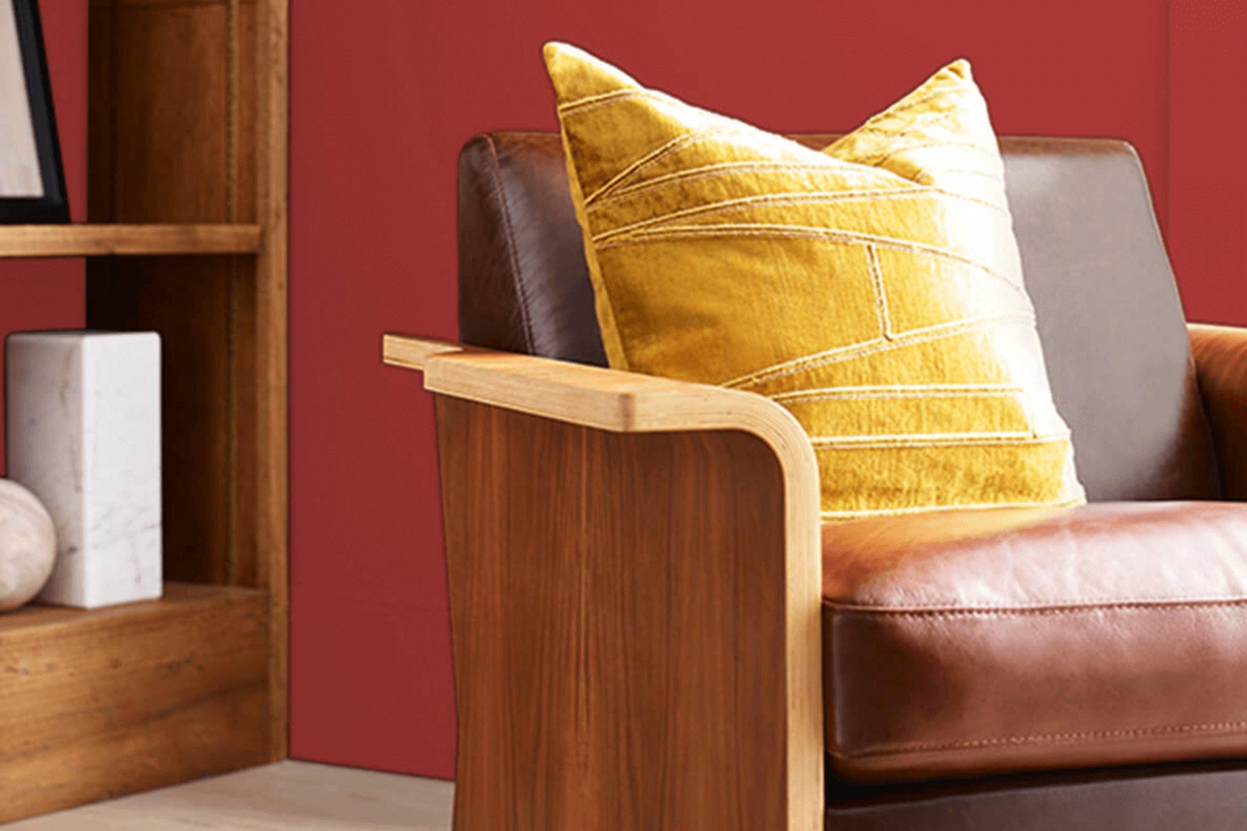
Tanager by Sherwin Williams is a vibrant and lively hue, a perfect mix of red with hints of coral. This color, with its warm and inviting tone, creates a cheerful atmosphere in any room. Due to its energizing nature, Tanager is ideal for areas of the home where activity and interaction occur, such as living rooms, kitchens, and dining areas.
The color works exceptionally well in modern and eclectic interior styles, bringing a pop of brightness that adds personality and zest. It’s also a great choice for a bohemian style, especially when paired with decorative patterns and rich textures.
Tanager combines beautifully with natural materials like light wood, which can help soften its intensity while maintaining a cozy vibe. When paired with metals, such as brushed nickel or copper, Tanager seems even more vibrant, creating a delightful contrast. Textures like linen or cotton in neutral shades balance the brightness of Tanager, ensuring the room feels grounded and not too intense.
In terms of accessories, Tanager coordinates well with ceramics or artwork that incorporate earth tones, helping to distribute the energy of the color throughout the room without overpowering it. This lively shade is perfect for those looking to add a touch of warmth and joy to their living area.

Is Tanager SW 6601 by Sherwin Williams Warm or Cool color?
Tanager SW 6601 by Sherwin Williams is a vibrant, deep red paint color that brings a warm, cozy feel to any room in a home. This shade works well in areas where you want to add a touch of drama or create an inviting atmosphere. It’s especially effective in living rooms, dining areas, or even bedrooms where the rich color can make large rooms feel more intimate and smaller areas feel bold and defined.
Using Tanager in your home can also make decorating fun, as it pairs beautifully with neutral colors like whites and grays, enhancing the overall feel of the room. It also works well with natural wood tones, which can help ground the vibrant red and blend more seamlessly with other elements in the room.
Overall, Tanager is a fantastic choice if you’re looking to add some warmth and energy to your home’s color scheme without feeling too intense. It’s a color that makes a statement but still feels homey and welcoming.
Undertones of Tanager SW 6601 by Sherwin Williams
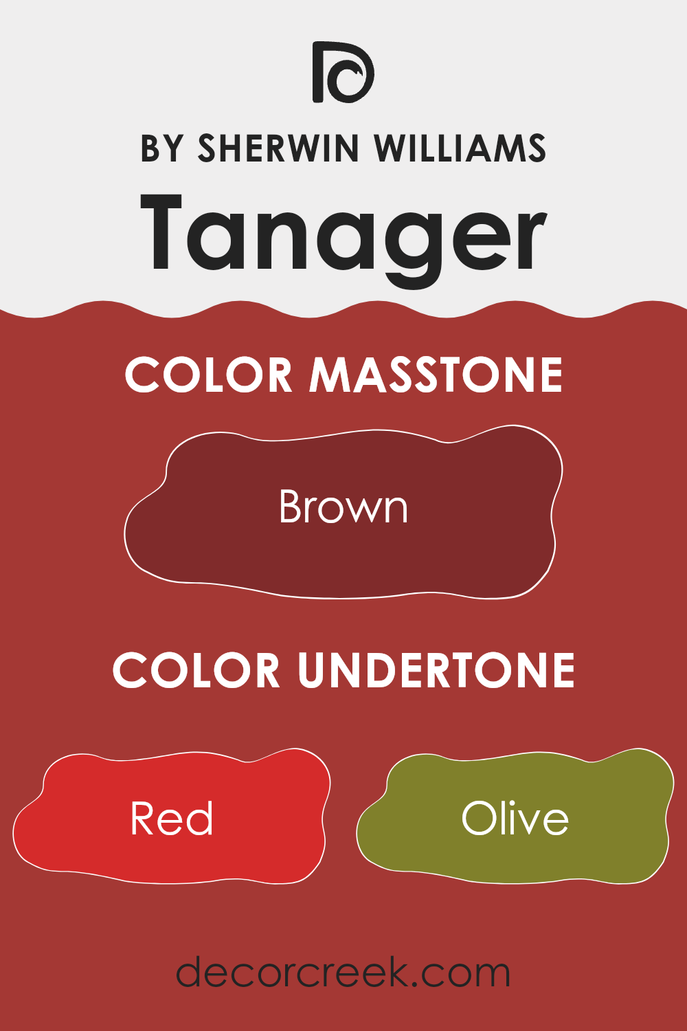
The color Tanager SW 6601 by Sherwin Williams is rich and complex because of its many undertones. Undertones are subtle colors that sit beneath the main shade and can strongly influence the character and mood a color sets. In the case of Tanager SW 6601, the undertones include red, olive, purple, orange, pink, grey, pale pink, dark grey, dark green, navy, and dark turquoise. Each of these shades adds a layer of depth to the primary color.
When a color has multiple undertones like this, it can look different depending on the lighting, the time of day, and even other colors nearby. For example, in bright sunlight, orange and red undertones might make the color appear warmer, while under LED lights, the blue and grey undertones could give it a cooler feel.
On interior walls, these undertones play a significant role in determining the vibe of the room. The presence of red and orange undertones can make a room feel more welcoming and warm, ideal for living rooms or dining areas. The cooler undertones like navy and dark turquoise can create a more formal atmosphere, suitable for an office or study.
Overall, the selection of this paint can influence not just the color but the entire ambiance of a room. It’s important to consider the lighting and other elements in the room to ensure the color behaves as expected. Adjustments in decor and lighting can help accentuate the desired undertones, making the room feel just right.
What is the Masstone of the Tanager SW 6601 by Sherwin Williams?
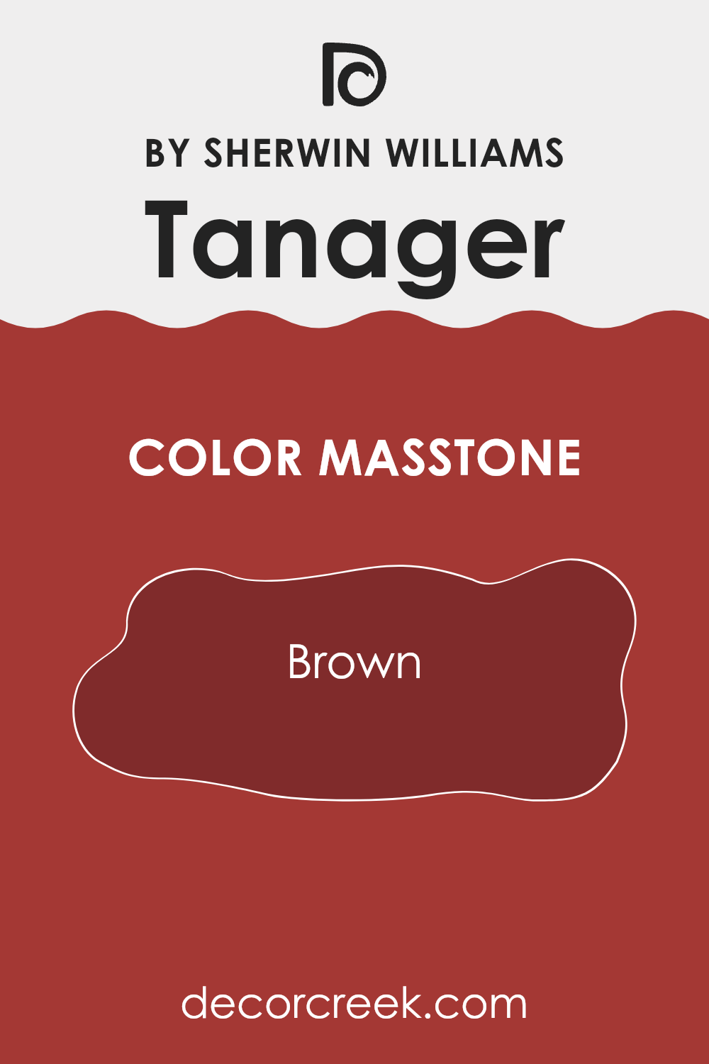
The Tanager color by Sherwin Williams is a type of brown, marked by the color code #802B2B. This warm, earthy tone can make any room in a home feel cozy and welcoming. Since it’s a deeper shade of brown, it works great for creating a sense of comfort, which is ideal for living rooms or bedrooms where you spend a lot of time relaxing.
You can pair this color with lighter colors like cream or beige to balance its depth, making your room feel not too dark but rich and full of warmth. It’s also adaptable enough to match well with a range of furniture styles, from classic wooden pieces to more modern designs.
Additionally, this shade can help hide marks or dirt, which is practical for busy areas like hallways. Overall, its robust color provides a perfect backdrop for both vibrant and muted accents, allowing for a variety of decorating styles.
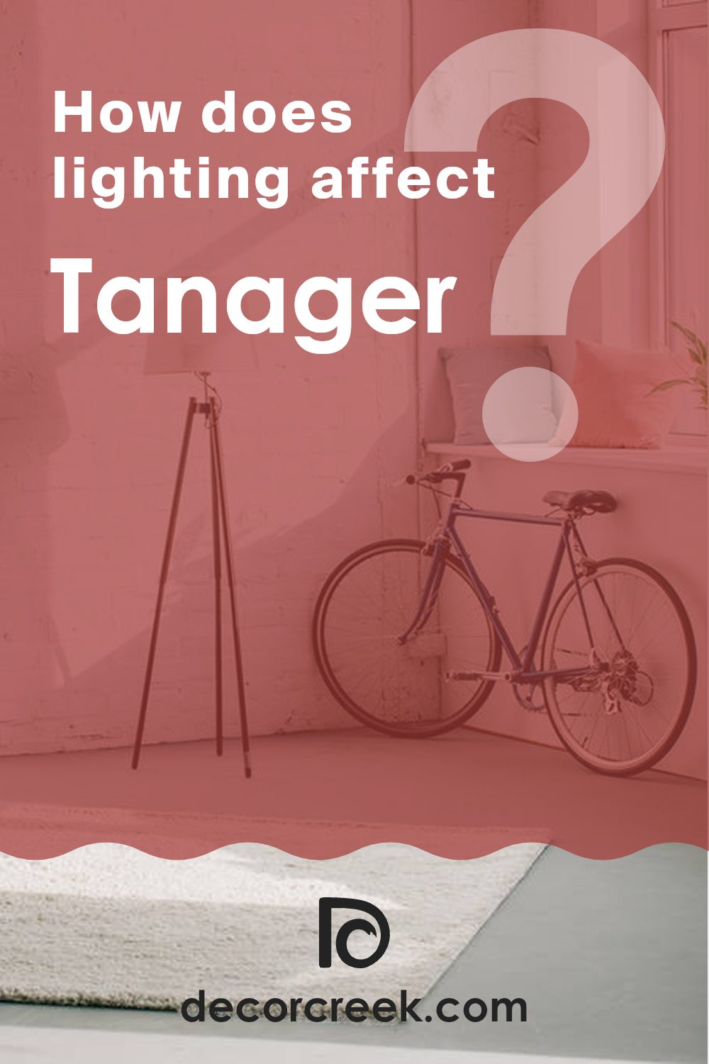
How Does Lighting Affect Tanager SW 6601 by Sherwin Williams?
Lighting plays a crucial role in how we perceive colors. The type and quality of light can greatly change the appearance of a color on walls or on any object. For instance, natural light typically brings out the truest version of a color, while artificial light can add different tones to it.
Take the color Tanager SW 6601 by Sherwin Williams as an example. In natural light, this color appears as a vibrant and intense warm sun. It exudes a bright and cheerful ambiance, making the room feel more open and inviting. However, under artificial lighting, this color can shift slightly depending on the type of bulb used. Warmer bulbs may enhance the color’s intensity, creating a cozier feel, while cooler bulbs might give it a sharper, more formal look.
The direction that a room faces affects how this color appears due to the varying quality and quantity of light it receives throughout the day. In north-facing rooms, light is typically cooler and softer, which means Tanager SW 6601 might look slightly muted and less warm. This can create a calm, subtle feel in the room.
In south-facing rooms, where light is more direct and abundant for the majority of the day, Tanager SW 6601 will look much warmer and more vibrant. The color can make the room feel lively and sunny, which is great for areas where you spend a lot of time during the day.
East-facing rooms receive morning light, which is warm and bright. Here, Tanager SW 6601 will appear lively and welcoming in the morning, fading to a softer tone as the day progresses. Conversely, in west-facing rooms, the color will stay more neutral or muted during the morning and then light up warmly in the late afternoon and evening as the sunlight pours in.
Understanding these effects can help you decide the best room to use this color in based on the type of mood or atmosphere you want to create.
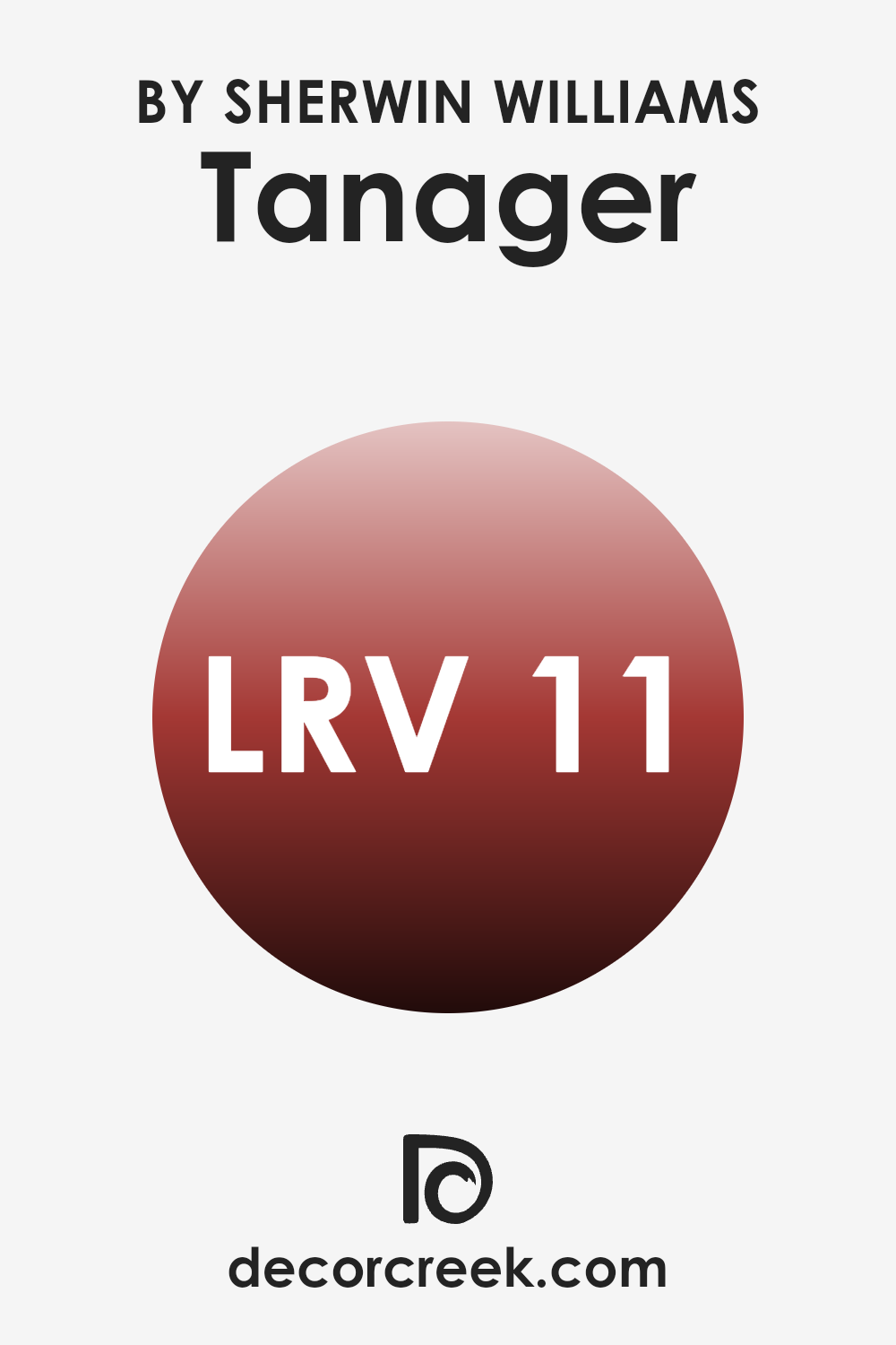
What is the LRV of Tanager SW 6601 by Sherwin Williams?
LRV, or Light Reflectance Value, is a measurement that tells how much light a paint color reflects back into the room as opposed to absorbing it. This value ranges with 0 being a pure black that absorbs all light, and 100, a stark white, reflecting all light.
Colors with a higher LRV make a room feel brighter because they reflect more light. On the other hand, colors with a lower LRV can make an interior feel more closed in because they absorb more light and reflect less.
The LRV for Tanager SW 6601 is 10.977, which means it’s quite a dark shade. When used on walls, this color won’t reflect much light, making rooms appear cozier and somewhat smaller. This makes it a good choice for areas where a more intimate atmosphere is desired, such as bedrooms or movie rooms. However, if you’re painting a small room, you might want to pair it with lighter colors to avoid making the room feel too tight.
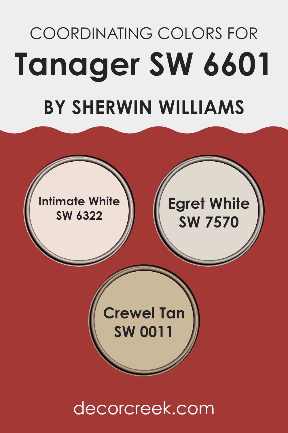
Coordinating Colors of Tanager SW 6601 by Sherwin Williams
Coordinating colors are those that harmonize well with a primary color, enhancing the overall look of a room or design. When selecting coordinating colors, the goal is to achieve a balanced look that is pleasing to the eye, often by using colors that either contrast with or complement the primary shade. For example, Tanager by Sherwin Williams is a vibrant color that can be effectively paired with softer, more neutral shades to create a cohesive and inviting room.
One coordinating color that works well with Tanager is Intimate White (SW 6322), a soft and gentle shade that provides a subtle contrast, making it an excellent choice for trim or ceiling colors in a room predominantly painted with Tanager.
Another good match is Egret White (SW 7570), which is a bit deeper than Intimate White and offers a warm, creamy background that allows more colorful elements to stand out without feeling too intense in the room. Additionally, Crewel Tan (SW 0011) offers a warm, earthy hue that complements the boldness of Tanager by adding depth and warmth to the overall color scheme. These shades together create a balanced and welcoming environment, highlighting the richness of the primary color.
You can see recommended paint colors below:
- SW 6322 Intimate White
- SW 7570 Egret White
- SW 0011 Crewel Tan
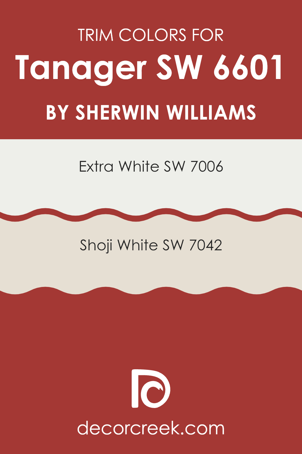
What are the Trim colors of Tanager SW 6601 by Sherwin Williams?
Trim colors, like SW 7006 – Extra White and SW 7042 – Shoji White by Sherwin Williams, play a crucial role in interior decoration by defining and accentuating the architectural features of a room.
These colors create a visual frame that highlights windows, doors, and moldings, making them stand out against the broader wall colors. Choosing the right trim color can complement the main color scheme and add a finished look to any room.
Extra White, with its pure and bright hue, is a great choice for trims when you want to add a crisp edge to rooms painted in richer or darker shades. It ensures that the trim pops, making the room seem cleaner and more defined. On the other hand, Shoji White offers a softer approach with its warm and inviting undertone. This color is ideal for trims when you’re aiming for a cohesive look where the walls and trims blend smoothly, creating a gentle transition without harsh contrasts.
You can see recommended paint colors below:
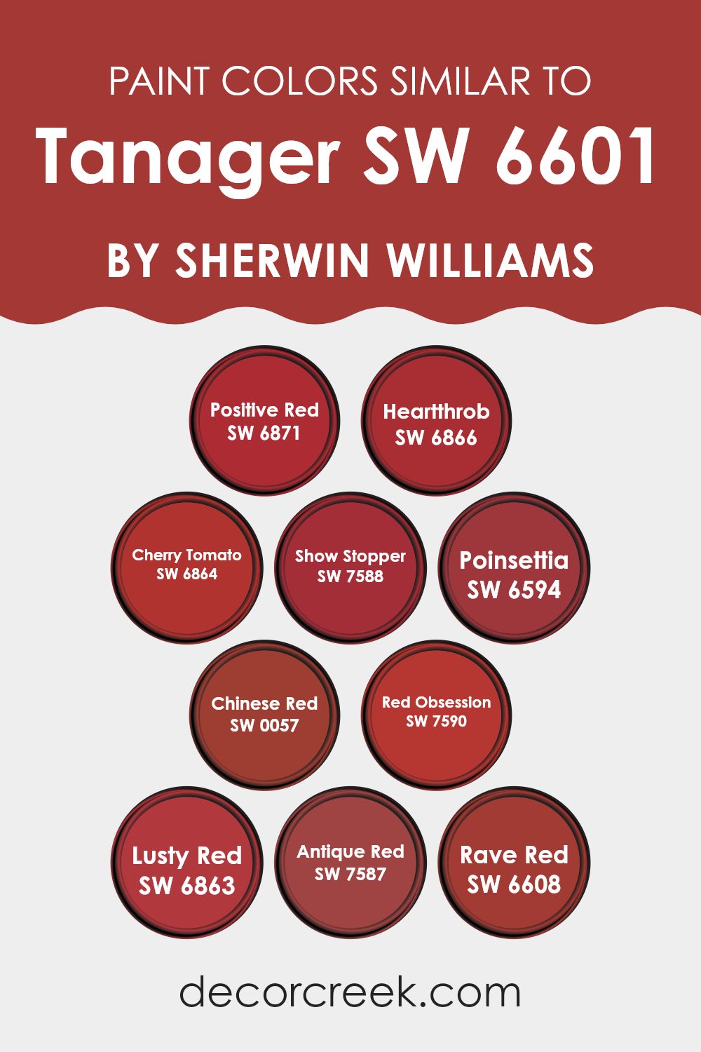
Colors Similar to Tanager SW 6601 by Sherwin Williams
Similar colors play an important role in design and decor by creating a harmonious and balanced visual impact. When colors like SW 6871 Positive Red or SW 6866 Heartthrob are used together, they create a pleasing continuity that isn’t harsh on the eyes, providing a more fluid and cohesive aesthetic.
These colors, ranging from the fiery warmth of SW 6864 Cherry Tomato to the deeper tones of SW 7588 Show Stopper, work together by sharing underlying hues. This similarity allows for a smooth transition from one color to another within the same room, making it easier to achieve a professional and polished look without abrupt contrasts.
For example, SW 6594 Poinsettia offers a lively burst of red that has just the right blend of depth to sit comfortably next to the vibrantly intense SW 0057 Chinese Red. Similarly, SW 7590 Red Obsession and SW 6863 Lusty Red boast richer, more seductive shades that complement the classic elegance of SW 7587 Antique Red. On the brighter side, SW 6608 Rave Red exudes an energetic pop of color that can lift the spirits of any room. The strategic use of these related colors can add visual interest and thematic consistency to a room, making it visually appealing and stylistically coherent.
You can see recommended paint colors below:
- SW 6871 Positive Red
- SW 6866 Heartthrob
- SW 6864 Cherry Tomato
- SW 7588 Show Stopper
- SW 6594 Poinsettia
- SW 0057 Chinese Red
- SW 7590 Red Obsession
- SW 6863 Lusty Red
- SW 7587 Antique Red
- SW 6608 Rave Red
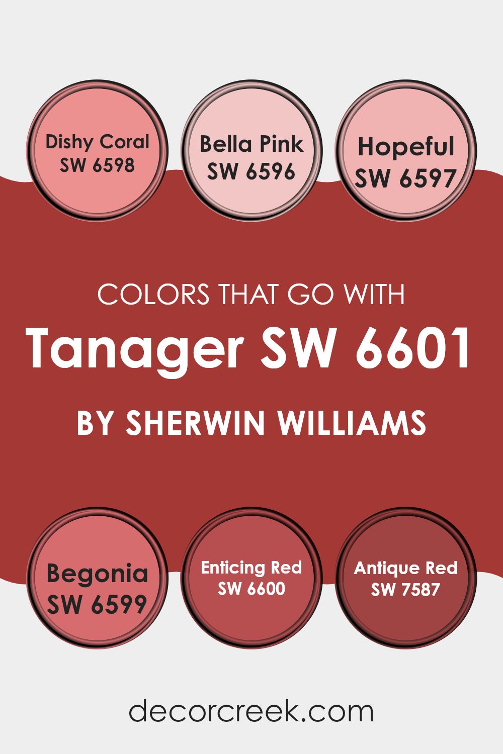
Colors that Go With Tanager SW 6601 by Sherwin Williams
Choosing complementary colors for Tanager SW 6601 by Sherwin Williams is important as it ensures a harmonious and appealing palette. These chosen colors work together to create balance and enhance the overall aesthetic, whether in home decor, fashion, or design projects. By opting for colors that coordinate well with Tanager, you can achieve a cohesive look that ties different elements and rooms together smoothly.
Dishy Coral SW 6598 is a vibrant, friendly shade that brings life into any room, making it feel welcoming and energetic. Bella Pink SW 6596 offers a soft, gentle hue that adds a touch of sweetness and warmth, ideal for creating a cozy atmosphere. Hopeful SW 6597 is a light and airy color that brings a sense of calm and lightness, perfect for more peaceful settings.
Begonia SW 6599 introduces a playful and bright pop of color, fantastic for adding a bit of fun and flair. Enticing Red SW 6600 is a deep, passionate red that provides a strong focal point, adding drama and intensity. Finally, Antique Red SW 7587 has a more subdued, rustic feel that works wonderfully in creating a traditional or vintage look, offering depth and richness. Using these colors alongside Tanager can help achieve various effects and moods, depending on the combination and where they’re applied.
You can see recommended paint colors below:
- SW 6598 Dishy Coral
- SW 6596 Bella Pink
- SW 6597 Hopeful
- SW 6599 Begonia
- SW 6600 Enticing Red
- SW 7587 Antique Red
How to Use Tanager SW 6601 by Sherwin Williams In Your Home?
Tanager SW 6601 by Sherwin Williams is a vibrant, rich red-orange paint color that brings warmth and energy to any room. It’s perfect for creating a cozy, inviting atmosphere in your home. This color works beautifully in living areas or dining rooms where lively conversations and gatherings happen.
When paired with neutral colors like soft whites or light grays, Tanager stands out and becomes a cheerful focal point. You could paint an accent wall to add a splash of color without feeling too intense.
Additionally, Tanager looks wonderful in kitchens, either on walls or on cabinets, to create a welcoming and warm area for cooking and socializing. If you’re adventurous, you might even consider using it in a bedroom with ample natural light to create a pleasant, upbeat vibe. Accessories in complementary colors like teal or mustard can also enhance the overall aesthetic when used alongside Tanager.
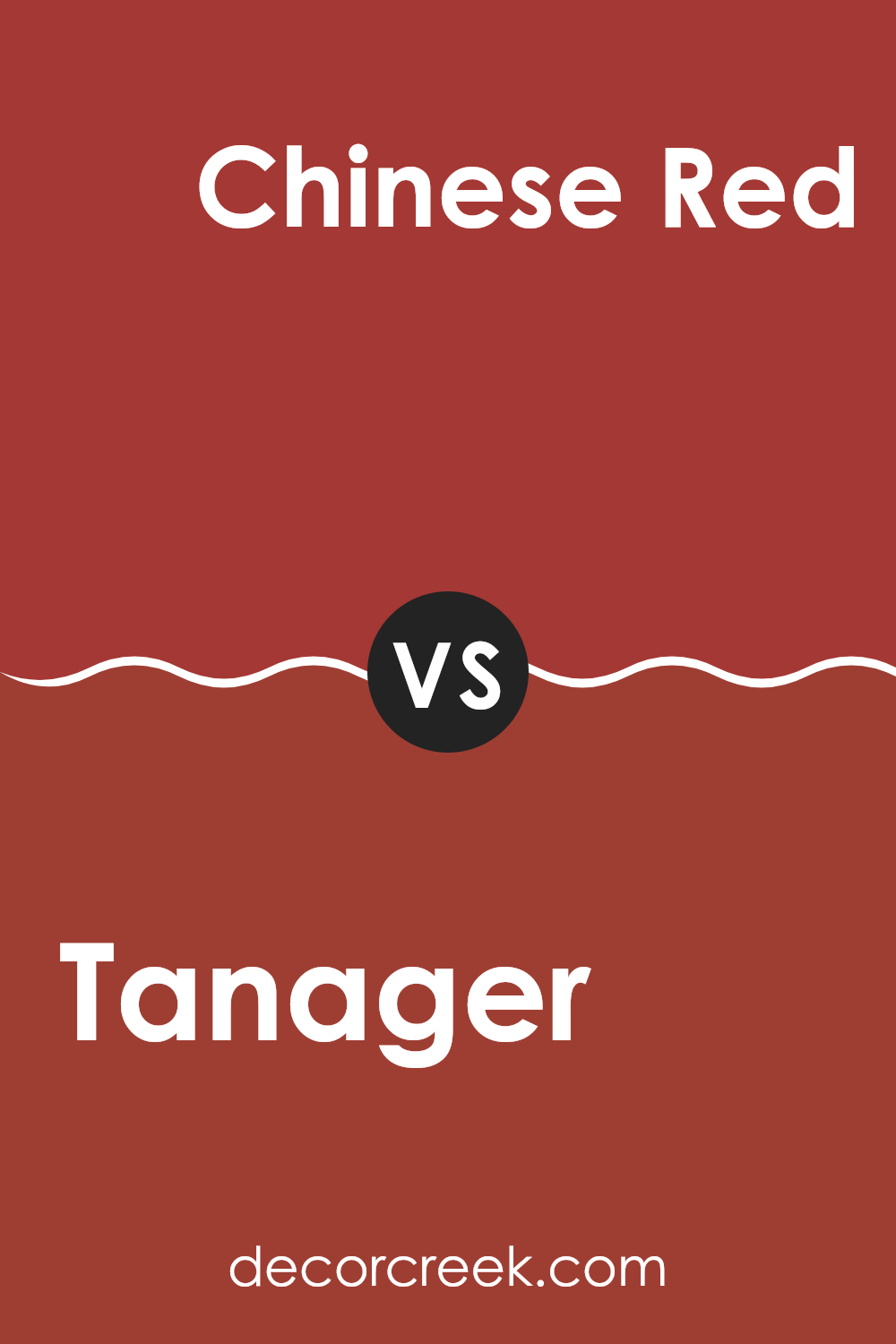
Tanager SW 6601 by Sherwin Williams vs Chinese Red SW 0057 by Sherwin Williams
Tanager and Chinese Red, both from Sherwin Williams, offer distinct and vibrant approaches to red hues in your interior. Tanager is a rich, deep red with a subtle hint of berry, providing a warm and inviting feel.
This makes it an excellent choice for areas where a cozy, comfortable atmosphere is desired, like living rooms or bedrooms. On the other hand, Chinese Red is a bold and bright red that commands attention with its vivid intensity.
It has more of a classic red tone, ideal for creating striking accents or dramatic statements, especially in rooms designed for entertainment or lively gatherings. While Tanager offers warmth and depth, Chinese Red brings energy and excitement, giving decorators flexible options to create different moods and styles within their homes.
You can see recommended paint color below:
- SW 0057 Chinese Red
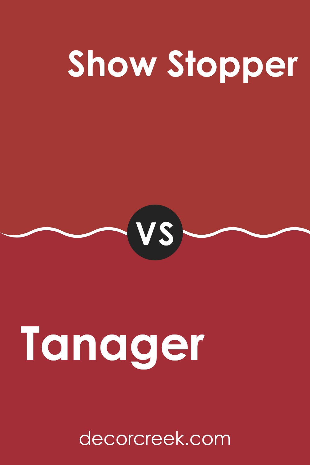
Tanager SW 6601 by Sherwin Williams vs Show Stopper SW 7588 by Sherwin Williams
Tanager and Show Stopper are two distinct paint colors by Sherwin Williams, each providing a unique atmosphere to a room. Tanager is a bright, fresh orange that’s cheerful and warm. This lively hue is great for adding a sense of energy and optimism to rooms like a kitchen or a playroom.
On the other hand, Show Stopper is a rich, deep red color that conveys boldness and drama. It’s perfect for creating a strong statement in areas like dining rooms or entryways, or even as an accent wall in a living room, giving the room a regal and cozy feel.
Both colors are quite striking but serve different purposes based on the mood you want to set. Tanager tends to lighten up a room and give it a sunny vibe, whereas Show Stopper is more about depth and warmth, making it ideal for more formal or intimate settings.
You can see recommended paint color below:
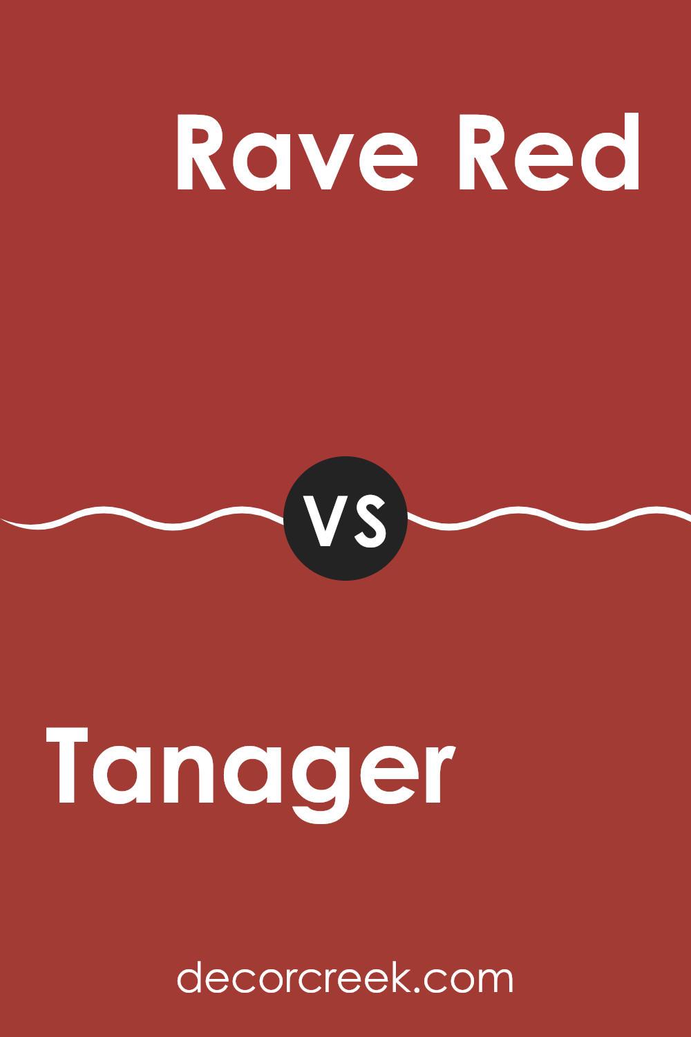
Tanager SW 6601 by Sherwin Williams vs Rave Red SW 6608 by Sherwin Williams
Tanager and Rave Red are both vivid colors from Sherwin Williams, but they have distinctly different energies. Tanager is a bright and cheerful coral hue that leans towards pink.
It feels friendly and inviting, making it a great choice for areas where you want to add a touch of warmth without feeling too intense in the room. On the other hand, Rave Red is a bold, true red color. It’s much more intense and has a strong presence, perfect for making a statement in any area.
While Tanager brings a light and airy feel, Rave Red demands attention and can dominate a room with its vibrancy. Depending on your style and the area you are decorating, both colors offer unique qualities: Tanager for a soft, pleasant vibe and Rave Red for a striking impact.
You can see recommended paint color below:
- SW 6608 Rave Red
Tanager SW 6601 by Sherwin Williams vs Antique Red SW 7587 by Sherwin Williams
The two colors, Tanager and Antique Red by Sherwin Williams, offer distinct tones that can create different moods in a room. Tanager is a vibrant shade with a noticeable depth that can bring energy and liveliness to a room. It has a lively feel that is perfect for rooms where you want to add a touch of personality and brightness, such as a kitchen or a creative workspace.
On the other hand, Antique Red has a richer, deeper red tone that suggests a classic and enduring look. This color can add a sense of warmth and tradition to rooms like dining rooms or libraries. It works well in areas where a more understated, yet impactful atmosphere is desired.
Both colors are great choices depending on the ambiance you want to achieve. Tanager suits a more dynamic and cheerful decor, while Antique Red leans towards a more grounded and cozy environment. They can also complement each other in the same home when used in different rooms to maintain balance and flow.
You can see recommended paint color below:
- SW 7587 Antique Red
Tanager SW 6601 by Sherwin Williams vs Cherry Tomato SW 6864 by Sherwin Williams
Tanager and Cherry Tomato are two vibrant shades offered by Sherwin Williams. Tanager has a deep, berry-like hue that gives off a warm and cozy feeling. It’s a color that can add a rich, inviting quality to any room without being too strong. On the other hand, Cherry Tomato is a bold and bright red that commands attention. It has a playful and energetic vibe, perfect for rooms that need a pop of color to add liveliness.
While Tanager draws you in with its subtle, soothing charm, Cherry Tomato makes a more immediate, lively impression. Tanager suits areas where you want calmness and warmth, like living rooms or bedrooms.
Meanwhile, Cherry Tomato works great in active rooms, like kitchens or dining areas, where its cheerfulness can be fully enjoyed. Both colors are distinct, yet each offers unique possibilities to brighten and add character to your home.
You can see recommended paint color below:
- SW 6864 Cherry Tomato
Tanager SW 6601 by Sherwin Williams vs Poinsettia SW 6594 by Sherwin Williams
Tanager and Poinsettia by Sherwin Williams are two vibrant colors, each with its unique personality. Tanager is a vivid turquoise that is fresh and brings a bright, cheerful feel to any room. It’s the kind of color that really pops and works well in areas where you want to add a lively burst of energy.
On the other hand, Poinsettia is a deep, rich red. It’s bold and has a strong presence, offering warmth and a hint of drama. This color can make a room feel more cozy and inviting, ideal for rooms where you spend a lot of time relaxing or entertaining guests.
When comparing the two, Tanager is cooler and leans towards a refreshing, ocean-like tone, while Poinsettia is warmer, reminiscent of traditional festive themes. Both colors stand out and can create beautiful, memorable environments, but their impact is quite different based on where and how they are used.
You can see recommended paint color below:
Tanager SW 6601 by Sherwin Williams vs Heartthrob SW 6866 by Sherwin Williams
Tanager and Heartthrob, both by Sherwin Williams, showcase distinct hues that can add unique character to any room. Tanager is a deep, vibrant turquoise with a jewel-like quality that makes rooms feel energetic yet warm. It’s a color that catches the eye without feeling too strong, working well in both lively living areas and restful settings like a bedroom.
Heartthrob, on the other hand, is a bold, rich red. This color has a classic appeal that can make a statement in any room. It’s particularly striking when used for accent walls or decor items and pairs beautifully with neutral shades to balance its intensity.
While Tanager brings a touch of lively freshness, Heartthrob offers a pop of passionate color. Both colors stand out in their own right, with Tanager leaning towards a cooler, calming vibe and Heartthrob steering towards a warmer, inviting atmosphere. Choosing between them would depend on the mood you want to set in your room.
You can see recommended paint color below:
Tanager SW 6601 by Sherwin Williams vs Lusty Red SW 6863 by Sherwin Williams
Tanager and Lusty Red are two striking colors from Sherwin Williams, each with its own unique character. Tanager is a soothing blue, gentle and calm, creating a peaceful atmosphere in any room. It’s a flexible shade that works well in bedrooms or living areas where a relaxing vibe is desired.
On the other hand, Lusty Red is a bold, vibrant red that packs a punch. This color adds excitement and energy to any room, making it a great choice for places where you entertain guests or want to make a strong statement.
The contrast between Tanager’s cool, calm blue and Lusty Red’s fiery, dynamic red highlights their distinct visual impacts—Tanager is more subdued and calming, while Lusty Red is attention-grabbing and lively.
You can see recommended paint color below:
- SW 6863 Lusty Red
Tanager SW 6601 by Sherwin Williams vs Positive Red SW 6871 by Sherwin Williams
Tanager SW 6601 and Positive Red SW 6871 are both vibrant shades by Sherwin Williams, but they offer distinct vibes for any room. Tanager is a deep, rich red with a hint of berry undertones, making it cozy and inviting.
It’s perfect for creating a warm, welcoming atmosphere in living rooms or dining areas. On the other hand, Positive Red is a bold and bright red. It’s much more vivid and stands out strongly, making it ideal for accent walls or areas where you want to make a strong impression, like a front door or a statement piece of furniture.
While Tanager offers a subtler, more muted hue for a relaxed feel, Positive Red is all about energy and excitement, catching the eye immediately. Depending on the mood you want to set, either color can add personality and flair to your room.
You can see recommended paint color below:
Tanager SW 6601 by Sherwin Williams vs Red Obsession SW 7590 by Sherwin Williams
Tanager SW 6601 by Sherwin Williams is a bright, cheerful pink with a vibrant hue. It feels light and fresh, making rooms feel lively and fun. If you’re looking to add a pop of color that is both playful and inviting, Tanager is a great choice. This shade works especially well in areas like children’s rooms or creative zones where a dash of energy can inspire joy and creativity.
On the other hand, Red Obsession SW 7590 is a deeper, more intense red. This color has a bold presence that commands attention. It is perfect for making a strong statement in a room, particularly in areas like dining rooms or living rooms where you entertain guests. Red Obsession can create a warm, cozy atmosphere, making any room feel more vibrant and full of life.
Both colors offer unique vibes: Tanager is lighter and livelier, while Red Obsession provides depth and warmth. Depending on the mood you want to set, each color has its merits for different rooms and decorative styles.
You can see recommended paint color below:
- SW 7590 Red Obsession
As I conclude talking about SW 6601 Tanager by Sherwin Williams, I must say I’m quite impressed with this color. It’s a brilliant shade that reminds me of fresh berries or a cheerful bouquet. Paint can really change the feel of a room, and Tanager does just that by adding a pop of joy and warmth.
I found that Tanager is perfect whether you want your living room to feel cozy or you want to make your kitchen more welcoming. It’s not just a color for walls; it can also perk up a piece of furniture or a door, making it a fun part of your home’s look.
For those who worry about getting tired of a bold color, Tanager pairs nicely with softer colors, like whites or light browns, which help balance its brightness. This means it can work well in many different homes and styles, from modern to classic.
If you’re thinking about giving your home a new coat of paint, SW 6601 Tanager is definitely a color to consider. It’s cheerful, warm, and can make any room feel more alive. This color brings out a sweet and joyful atmosphere, making it a great choice for anyone looking to freshen up their room with something delightful and lively.
Ever wished paint sampling was as easy as sticking a sticker? Guess what? Now it is! Discover Samplize's unique Peel & Stick samples.
Get paint samples

