Choosing the right paint color for your home can often feel stressful with so many options available. Today, I want to share some insights on SW 7022 Alpaca by Sherwin Williams, a shade that might just be what you’re looking for your room.
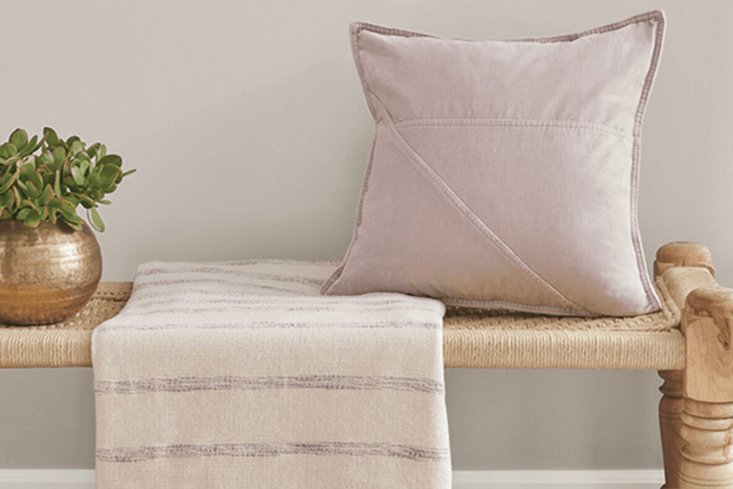
Alpaca is a warm gray that sits between gray and beige, making it a flexible option for any room. Its neutral tone provides a soothing backdrop that works well with a wide range of decor styles, from modern to classic.
Before you make your decision, consider how this color interacts with the lighting in your room. Natural light brings out the warmer tones in Alpaca, whereas artificial lighting might highlight its cooler gray aspects. It’s also useful to think about the mood you want to create. Alpaca works well in rooms where you want to foster a calm and cozy atmosphere. Test a sample on your wall and observe how it changes at different times of the day.
This approach will help you see if Alpaca aligns with your vision for the room.
Is Alpaca SW 7022 Right for My Home?
I love using colors that feel classic and flexible, and Alpaca by Sherwin Williams is one of those hues that always seems just right. It’s a soft, warm gray with a hint of taupe, which makes it cozy and inviting. It’s like the color equivalent of a warm hug from a friend.
I find Alpaca especially charming in rooms that aim for a modern farmhouse look, but it’s also a fantastic choice for transitional and contemporary interiors. Its understated elegance allows it to work beautifully in living rooms, bedrooms, and even kitchens where you want a neutral backdrop that’s far from boring.
When I think about materials that go well with this color, soft plush fabrics like velvet or mohair instantly come to mind. These textures really highlight the coziness of Alpaca. It also pairs wonderfully with natural wood, whether it’s a polished oak floor or rustic pine shelving. Brushed metals, especially in warmer tones like copper or brass, bring out a lovely depth in the color.
Using Alpaca on walls provides a soothing neutral palette that lets your furniture and decor shine. It’s also light enough to keep small rooms looking open and airy, yet warm enough to make large rooms feel more intimate. All in all, it’s a go-to color for me when I want to create a welcoming and stylish room.
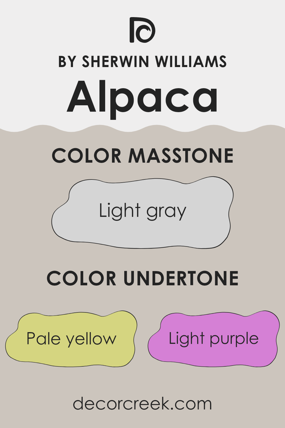
What are the right undertones of Alpaca SW 7022 ?
Alpaca by Sherwin Williams is a flexible color primarily noted for its warm, neutral tone. What makes it special is its variety of subtle undertones. These undertones include pale yellow, light purple, light blue, pale pink, mint, lilac, and grey. Each of these shades gently influences the main color, affecting how it appears under different lighting conditions and when paired with other colors.
Undertones are crucial because they can change how a color looks once applied to walls. They can either help a paint color blend smoothly into the room or stand out, depending on surrounding colors in decor and lighting. For instance, in a room with lots of natural light, the pale yellow and light blue undertones in Alpaca might make the walls look brighter and more airy. In artificial light, the grey and lilac undertones could give the walls a cooler feel.
When Alpaca is used on interior walls, its range of undertones offers a subtle complexity that can complement many decor styles and preferences. The light purple and pale pink undertones add a hint of warmth, making the room feel welcoming, while the mint and light blue can introduce a fresh, calming feel. This makes Alpaca a great choice for living rooms, bedrooms, and even entryways, providing a neutral backdrop that can work well with a wide array of furnishings and accent colors.
decorcreek.com
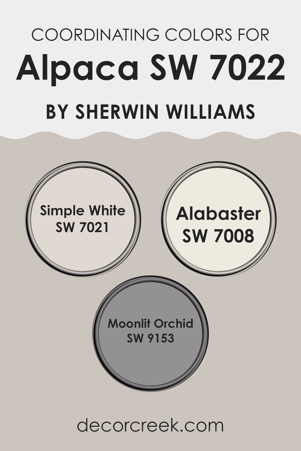
Best Coordinating Colors to use with Alpaca SW 7022 by Sherwin Williams this year.
Coordinating colors are shades that complement or enhance one another when used together in decor or design, creating a harmonious aesthetic. When using a neutral base color like Alpaca from Sherwin Williams, selecting the right coordinating colors is essential to bring balance and character to your room. The chosen coordinating colors for Alpaca include Simple White, Alabaster, and Moonlit Orchid, each offering unique contributions to the overall palette.
Simple White is a clean and bright shade that adds a crisp freshness to any room, working wonderfully to create a sense of openness and light when paired with the deeper tones of Alpaca. Alabaster, on the other hand, is a soft, creamy white with a touch of warmth, perfect for adding a subtle richness and preventing the room from feeling stark.
Moonlit Orchid is a gentle purple with a dusky hue that offers a surprising yet understated pop of color. This shade stands out against the neutrality of Alpaca, providing an elegant contrast that’s neither too intense nor too bold, making it ideal for adding a touch of uniqueness to a room’s decor.
You can see recommended paint colors below:
- SW 7021 Simple White
- SW 7008 Alabaster
- SW 9153 Moonlit Orchid
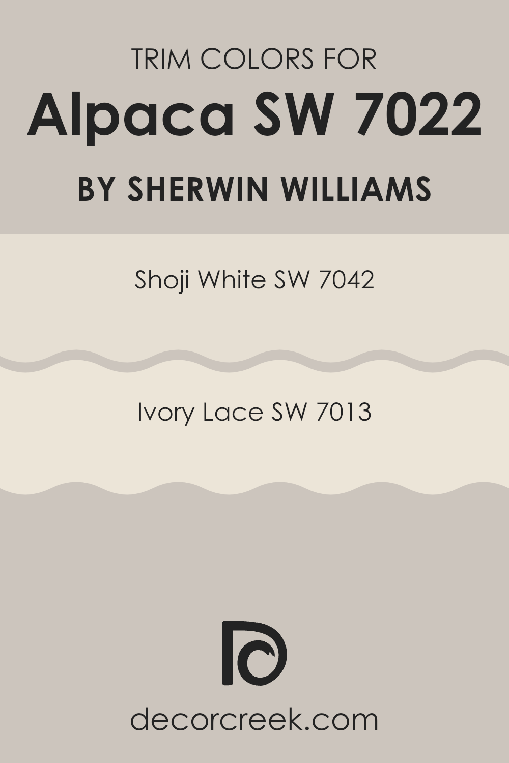
Trendy Trim Colors of Alpaca SW 7022 by Sherwin Williams to use this year.
Trim colors play a crucial role in highlighting and defining the architectural features of a room, setting off the main color on the walls. By using contrasting trim colors, like SW 7042 – Shoji White and SW 7013 – Ivory Lace, alongside the neutral tone of Alpaca by Sherwin Williams, the different elements of a room’s design can be clearly accentuated.
This creates a clean and distinct border that makes wall colors pop, and mouldings, window frames, and doors become more noticeable and appealing.
Shoji White is a soft, muted white that has a subtle warmth to it, making it excellent for use as a trim that gently contrasts darker or more vivid wall colors without feeling too heavy. Ivory Lace, on the other hand, is a creamier, slightly deeper hue than Shoji White, offering a softer contrast that pairs beautifully with gentler wall colors for a harmonious and welcoming atmosphere. Both these colors are wonderful choices to complement Alpaca, ensuring that your room feels cohesive and thoughtfully designed.
You can see recommended paint colors below:
- SW 7042 Shoji White
- SW 7013 Ivory Lace
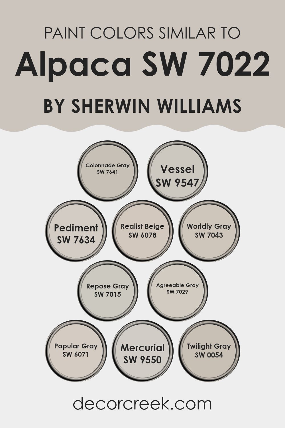
Evergreen Colors Similar to Alpaca SW 7022 by Sherwin Williams
Similar colors play an essential role in creating a harmonious and balanced aesthetic in interior design. Colors similar to Alpaca by Sherwin Williams, such as Colonnade Gray and Vessel, provide subtle variations that can enhance the depth and complexity of a room without feeling too heavy. For instance, Colonnade Gray is a gentle gray with a soft hint of beige, making it flexible and warm, while Vessel offers a slightly more robust tone, adding richness and a hint of refined style.
Meanwhile, shades like Pediment and Realist Beige offer a backdrop that’s both understated and inviting. Pediment is a lighter, almost ethereal gray that reflects a generous amount of light, making rooms appear larger. Realist Beige is a warmer, soothing hue that brings a cozy feel to any room.
Another similar color, Worldly Gray, sits between gray and beige, offering neutrality that works well in many settings. Repose Gray and Agreeable Gray continue this theme, with Repose Gray providing a light, airy feel, perfect for modern aesthetics, and Agreeable Gray offering a slightly deeper tone that works well in rooms that seek a bit more warmth.
Popular Gray and Mercurial expand this palette, with Popular Gray being a flexible option for rooms needing a touch of warmth without the saturation of stronger colors, and Mercurial offering a calm gray with blue undertones that give it a unique character.
Lastly, Twilight Gray stands out with its deeper, more pronounced gray shade, ideal for accent walls or furniture pieces that draw the eye while maintaining the overall cohesive look. These similar shades ensure design flexibility while maintaining a connected and unified color story throughout the room.
You can see recommended paint colors below:
- SW 7641 Colonnade Gray
- SW 9547 Vessel
- SW 7634 Pediment
- SW 6078 Realist Beige
- SW 7043 Worldly Gray
- SW 7015 Repose Gray
- SW 7029 Agreeable Gray
- SW 6071 Popular Gray
- SW 9550 Mercurial
- SW 0054 Twilight Gray
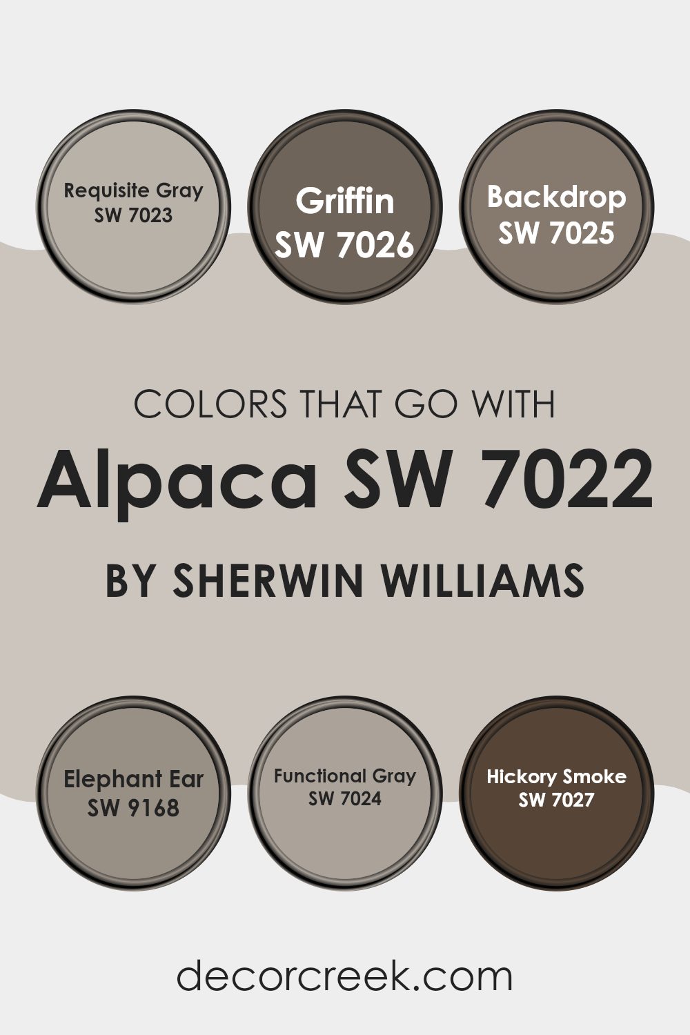
Colors that Go With Alpaca SW 7022 by Sherwin Williams
When decorating with a flexible neutral like Alpaca SW 7022 by Sherwin Williams, choosing the right complementary colors is crucial to creating a harmonious and appealing room. Colors such as Requisite Gray, Griffin, Backdrop, Elephant Ear, Functional Gray, and Hickory Smoke are not just trendy choices; they enhance the beauty of Alpaca by providing depth and contrast that make each room feel well-rounded and cozy. These shades work together to create a cohesive palette that allows for many design styles, from modern to traditional, making it easy to use in any home.
Requisite Gray SW 7023 is a lighter gray that brings a fresh and airy feel into rooms, perfect for balancing the deeper tones of Alpaca. Griffin SW 7026, on the other hand, offers a deeper, bolder gray that provides a strong anchor in a room, adding a sense of grounding. Backdrop SW 7025 is a unique smoky charcoal color that pairs well with the softness of Alpaca, giving a room a chic and unified look.
Elephant Ear SW 9168 is a warm, earthy taupe that adds a soft, natural element to interiors, helping rooms feel welcoming. Functional Gray SW 7024 serves as a middle ground between light and dark, offering flexibility in lighting and furnishing choices. Finally, Hickory Smoke SW 7027 presents a darker, almost steel-like gray that can help create dramatic focal points in larger or well-lit rooms. Together, these colors provide a rich mix of shades that enhance the neutral base of Alpaca, allowing for endless creative expression in home decor.
You can see recommended paint colors below:
- SW 7023 Requisite Gray
- SW 7026 Griffin
- SW 7025 Backdrop
- SW 9168 Elephant Ear
- SW 7024 Functional Gray
- SW 7027 Hickory Smoke
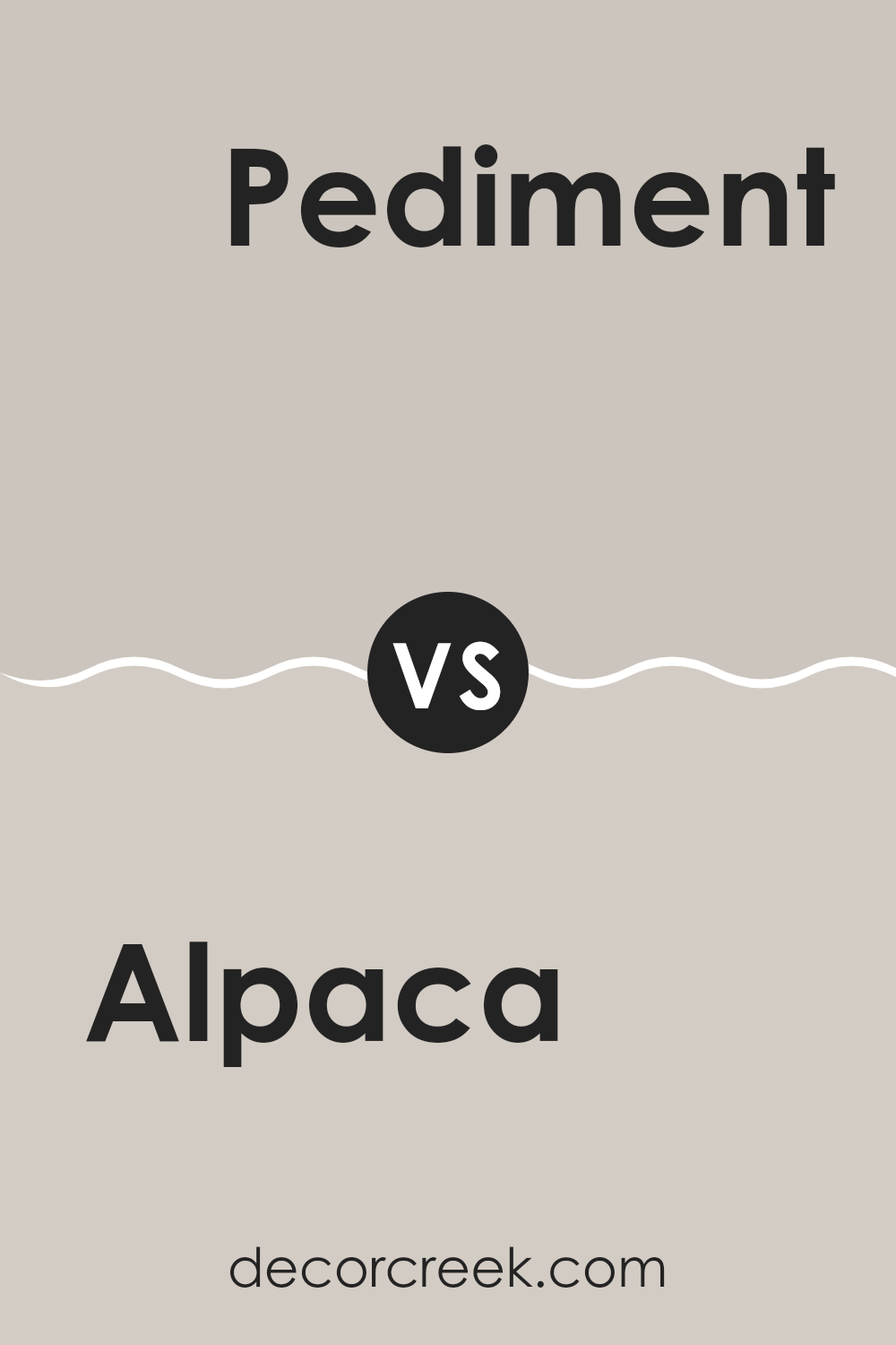
Alpaca SW 7022 by Sherwin Williams vs Pediment SW 7634 by Sherwin Williams
Alpaca SW 7022 and Pediment SW 7634 are both neutral colors from Sherwin Williams, but they have distinct undertones and characteristics that set them apart. Alpaca is a warm gray with a subtle beige hint, giving it a cozy and inviting feel. It blends well in rooms looking for a soft, neutral backdrop that adds warmth without overpowering.
On the other hand, Pediment is cooler and closer to a true gray. This color offers a clean and straightforward look, which can make rooms appear more open and airy. It’s ideal for modern settings or designs where a fresh, minimalistic aesthetic is desired.
Both colors are flexible and can adapt to many decor styles, but Alpaca leans toward a warmer palette, working well with wood tones and rich colors, while Pediment fits better with crisp whites, blues, and metallic accents. Choosing between them depends on the mood and tone you want to set in your room.
You can see recommended paint color below:
- SW 7634 Pediment
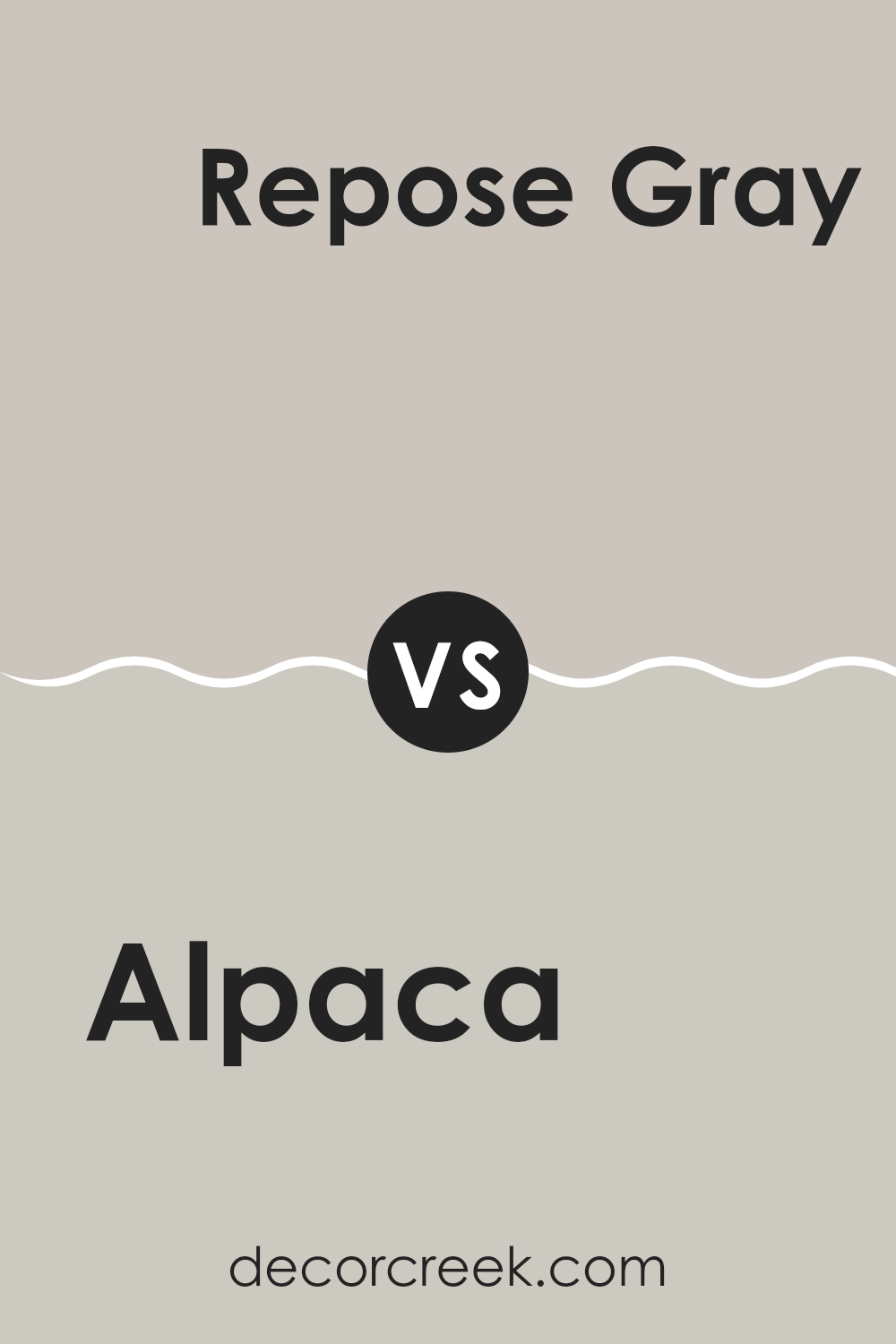
Alpaca SW 7022 by Sherwin Williams vs Repose Gray SW 7015 by Sherwin Williams
Alpaca SW 7022 and Repose Gray SW 7015 by Sherwin Williams are both popular neutral colors, but they have distinct tones that set them apart. Alpaca has a warmer, beige-like quality with subtle hints of green, creating a cozy and inviting atmosphere. It’s a flexible shade that works well in rooms aiming for a soft, welcoming feel, like living rooms or bedrooms.
Repose Gray, on the other hand, is cooler and more balanced between gray and beige, commonly referred to as “greige.” This color tends to give rooms a more crisp, clean look, making it ideal for modern and minimalist decor styles. It’s particularly effective in areas that receive a lot of natural light, as it reflects the light beautifully without appearing too stark.
Overall, while both shades are neutral, Alpaca leans toward a slightly warmer, earthier tone and Repose Gray offers a cleaner, more balanced neutral, suitable for a variety of modern rooms.
You can see recommended paint color below:
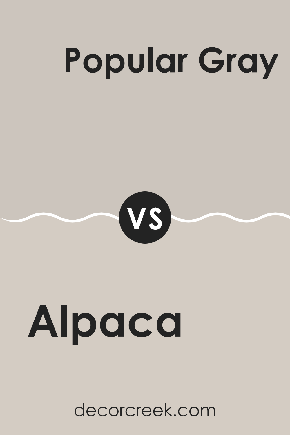
Alpaca SW 7022 by Sherwin Williams vs Popular Gray SW 6071 by Sherwin Williams
Alpaca and Popular Gray, both by Sherwin Williams, exhibit subtle differences in hue and mood, making them flexible for interior design. Alpaca has a warm beige undertone, providing a cozy and inviting atmosphere to any room.
This color pairs nicely with different textures and can soften rooms with its gentle earthiness. On the other hand, Popular Gray leans more toward a classic gray with a hint of warmth, making it adaptable yet distinct. It offers a slightly cooler presence compared to Alpaca, which can be perfect for rooms aiming for a modern but homey feel.
Both colors work well in various lighting conditions, enhancing rooms without dominating them. While Alpaca tends to create a snug, comfortable vibe, Popular Gray offers a cleaner, more contemporary look, giving decorators two appealing yet nuanced options for their projects.
You can see recommended paint color below:
- SW 6071 Popular Gray
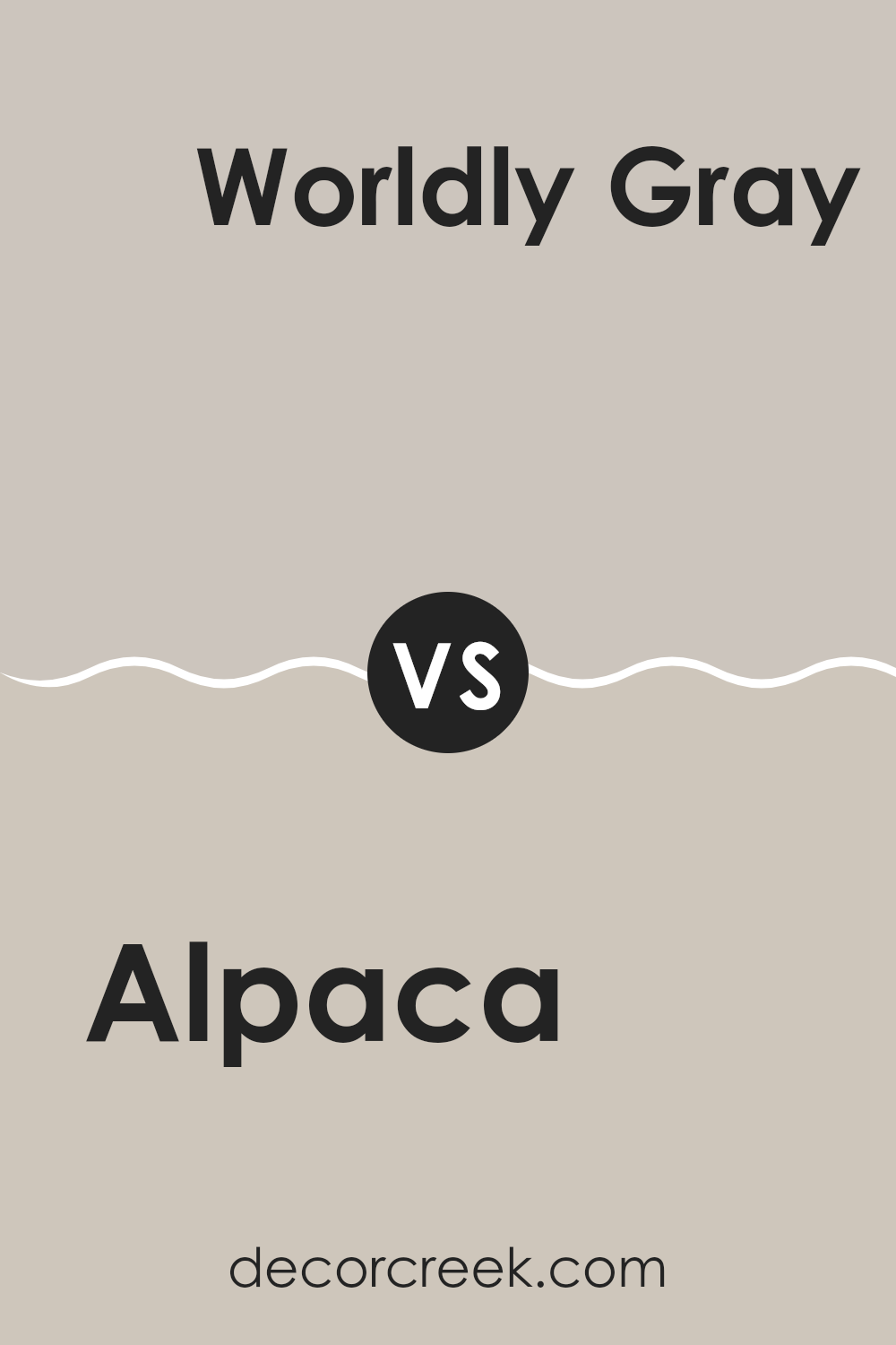
Alpaca SW 7022 by Sherwin Williams vs Worldly Gray SW 7043 by Sherwin Williams
Alpaca and Worldly Gray are both neutral colors by Sherwin Williams, but they have distinct tones that set them apart. Alpaca is a soft, warm gray with a slight taupe undertone, making it cozy and inviting, ideal for rooms where you want a hint of warmth without any starkness.
On the other hand, Worldly Gray tends to look more neutral and balanced, offering a cooler appearance than Alpaca. This cooler tone gives it a more straightforward gray look without leaning too heavily into either warm or cold extremes.
Both colors are flexible for interior rooms, but your choice might depend on the mood you’re trying to achieve. Alpaca works well in rooms that benefit from a softer, warmer atmosphere, while Worldly Gray is excellent where a more neutral, calming background is desired.
You can see recommended paint color below:
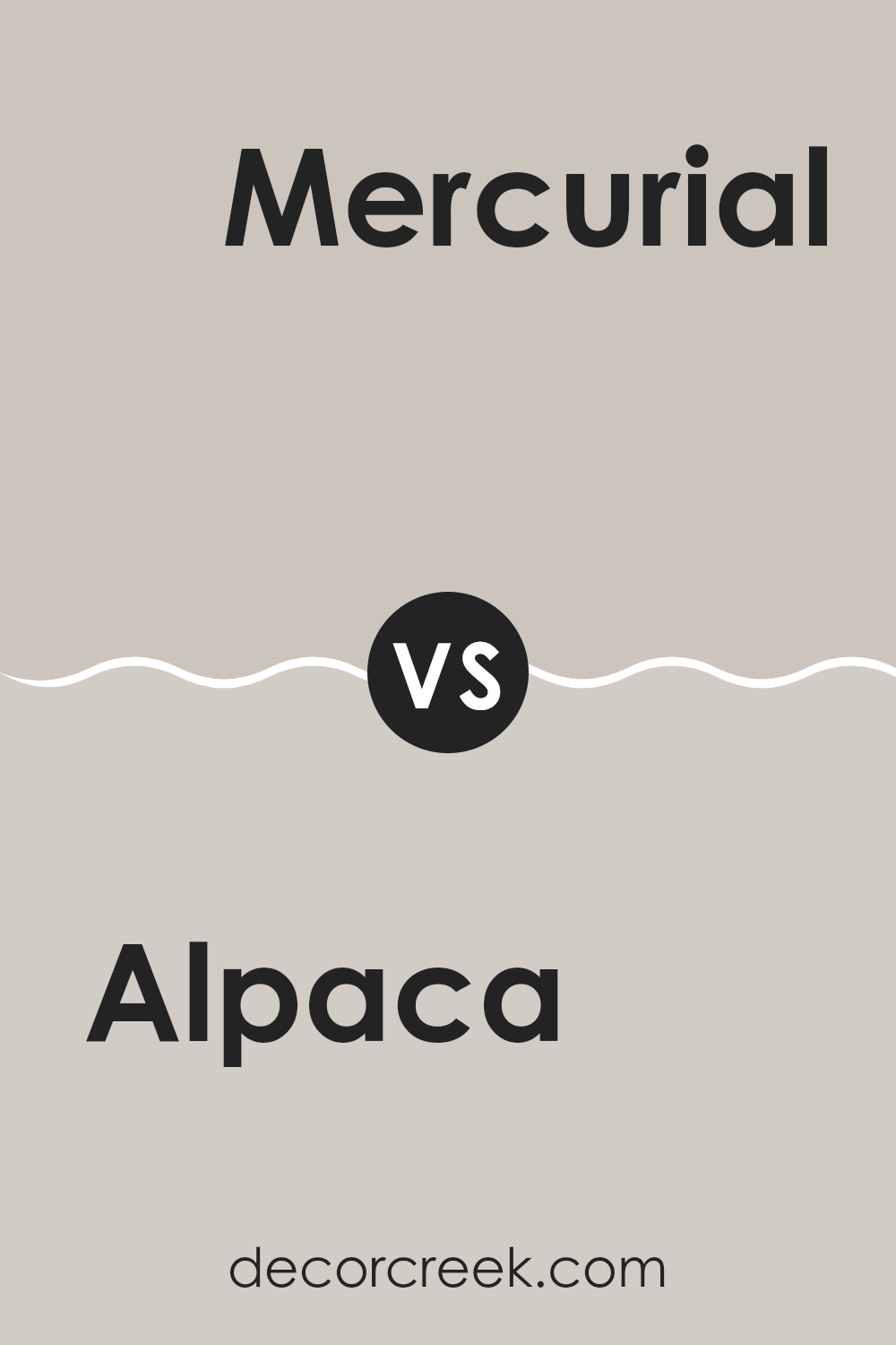
Alpaca SW 7022 by Sherwin Williams vs Mercurial SW 9550 by Sherwin Williams
Alpaca SW 7022 and Mercurial SW 9550 by Sherwin Williams are both unique and attractive colors, each setting a different mood for interior rooms. Alpaca is a warm gray that carries soft, beige undertones, making it a flexible choice for any room. It provides a cozy and inviting atmosphere, being light enough to make small rooms appear larger while offering enough depth to add character to the area.
On the other hand, Mercurial is a dark, moody gray with more pronounced blue undertones. This color tends to create a more dramatic feel, perfect for accent walls or rooms where you want to make a strong statement. It pairs well with bright decor and fixtures, highlighting them against its darker backdrop.
Both colors are great choices depending on what feeling you want to give a room – warmth and light with Alpaca or a stronger, more striking effect with Mercurial.
You can see recommended paint color below:
- SW 9550 Mercurial
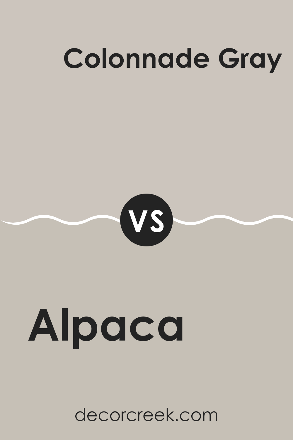
Alpaca SW 7022 by Sherwin Williams vs Colonnade Gray SW 7641 by Sherwin Williams
Alpaca SW 7022 and Colonnade Gray SW 7641, both from Sherwin Williams, offer stylish yet subtle options for painting interior rooms. Alpaca has a warm gray tone that provides a cozy and inviting feel, making it perfect for living rooms or bedrooms.
Its lightness helps to make small rooms appear slightly larger and more open. On the other hand, Colonnade Gray is a bit darker and cooler than Alpaca. This color suits areas that receive plenty of natural light, helping to balance out the brightness with its soothing gray shade.
While both colors provide a neutral base, Alpaca leans toward a beige-gray mix, making it warmer, whereas Colonnade Gray offers a crisp, modern feel due to its cooler undertones. These characteristics make each color ideal for different settings depending on the mood and light in the room.
You can see recommended paint color below:
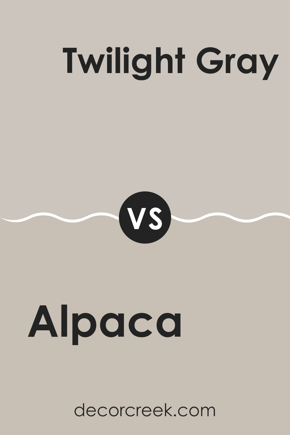
Alpaca SW 7022 by Sherwin Williams vs Twilight Gray SW 0054 by Sherwin Williams
Alpaca is a soft, warm gray with beige undertones, giving it a cozy and inviting appearance. This color is quite flexible, blending well in rooms that aim for a neutral but warm palette. It has the ability to brighten rooms while maintaining a subtle, understated charm.
In contrast, Twilight Gray is a much darker shade that leans more toward a true gray, lacking the noticeable beige hints found in Alpaca. This color provides a stronger statement and can anchor a room with its depth and presence. Twilight Gray is ideal for those who want a bolder, more dramatic look without moving into black or deep blue territories.
Both colors have their unique appeal and can be used effectively in various decor styles. Alpaca is perfect for creating a soft, welcoming room, while Twilight Gray is excellent for adding a touch of drama and refined style. When choosing between the two, consider the amount of natural light in your room and the mood you want to set.
You can see recommended paint color below:
- SW 0054 Twilight Gray
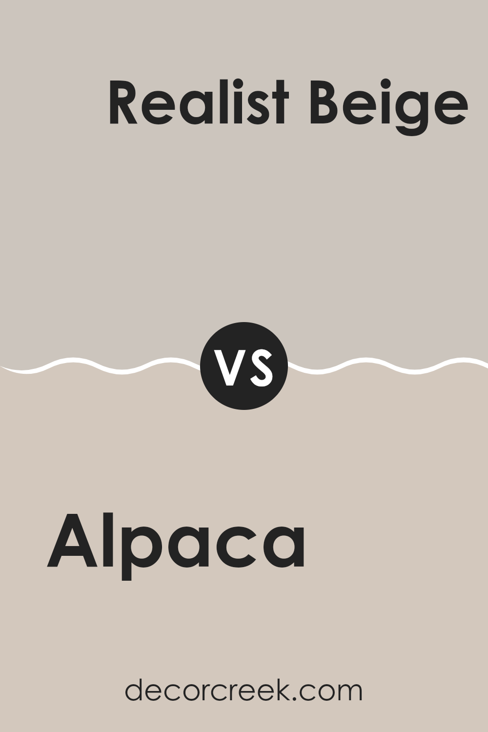
Alpaca SW 7022 by Sherwin Williams vs Realist Beige SW 6078 by Sherwin Williams
Alpaca and Realist Beige are two colors by Sherwin Williams that are quite similar yet hold subtle differences. Alpaca is a soft gray with a warm, earthy undertone that gives it a very cozy and inviting feel. It’s a flexible color that works well in various rooms, adding a gentle touch of warmth while keeping the overall look neutral.
On the other hand, Realist Beige leans more toward a traditional beige shade, having a more pronounced warmth compared to Alpaca. This color is ideal for those who prefer a slightly richer, creamier backdrop that still maintains a neutral palette. Realist Beige offers a sense of comfort and warmth, making it perfect for shared areas like living rooms or hallways.
Both colors are excellent for creating a relaxed and welcoming atmosphere. However, the choice between the two would depend on how much warmth and the specific tone you’re looking to bring into your room.
You can see recommended paint color below:
- SW 6078 Realist Beige
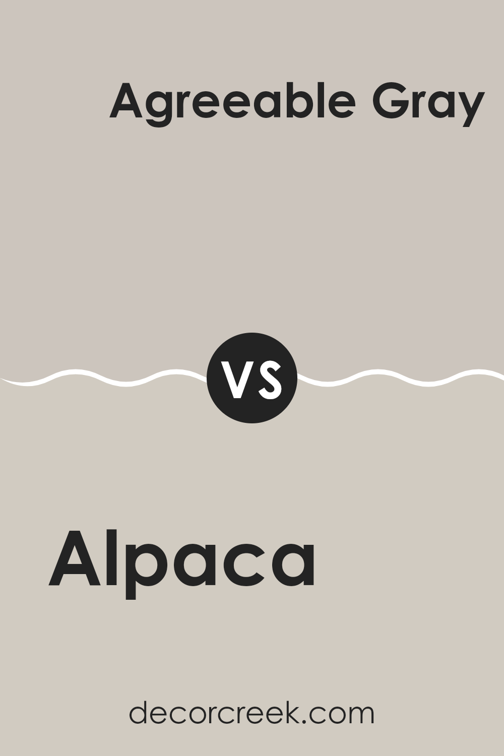
Alpaca SW 7022 by Sherwin Williams vs Agreeable Gray SW 7029 by Sherwin Williams
Alpaca and Agreeable Gray by Sherwin Williams are both popular neutral colors, but they have distinct differences in tone and warmth. Alpaca is a warm gray that leans slightly toward taupe, offering a cozy feel to any room.
It’s a flexible color that pairs well with both soft and bold decor elements. On the other hand, Agreeable Gray is a bit lighter than Alpaca and leans more toward a true neutral gray. This color is known for its ability to blend seamlessly with a wide range of color schemes, making it a favorite for those looking to create a friendly, open atmosphere in their home.
While both shades provide a solid foundation for various design styles, Alpaca offers a hint of warmth, making it ideal for a welcoming room, whereas Agreeable Gray is great for achieving a balanced, classic look.
You can see recommended paint color below:
Alpaca SW 7022 by Sherwin Williams vs Vessel SW 9547 by Sherwin Williams
The main color, Alpaca, and the second color, Vessel, are both from Sherwin Williams but they offer different vibes for room decorating. Alpaca is a soft, warm gray that has a hint of beige, making it a flexible neutral.
It’s a cozy color that works well in many rooms, providing a calming backdrop that blends easily with various decor styles and colors. On the other hand, Vessel is a deep, rich navy blue that adds a bold touch to any room.
It is an ideal choice for creating a striking feature wall or for use in a room that could benefit from a dash of drama. While Alpaca offers a subtle, light presence, Vessel commands attention and can make a strong style statement. Both colors have their unique appeal, depending on what atmosphere you want to achieve in your room.
You can see recommended paint color below:
- SW 9547 Vessel
In wrapping up my thoughts on SW 7022 Alpaca by Sherwin Williams, I have to say that this paint color is a real winner in my book. Alpaca is a warm gray shade that almost hugs the room with its coziness. It has the power to make any room feel welcoming and calm, whether it’s a busy kitchen or a quiet bedroom. What I really like about Alpaca is that it works well with lots of other colors. You can pair it with blues, greens, or even pinks, and it still looks great.
Another thing that stands out about Alpaca is that it changes a bit depending on the light. In bright light, it looks lighter and can even have a soft, creamy feel.
In dimmer light, it deepens and creates a more snug and secure atmosphere. This makes it a good choice for many places in a house, as it can fit in with different settings and styles. Whether you want a room to feel warm and inviting for friends and family, or you need a peaceful spot to read or study, Alpaca could be just the right choice.
Overall, I’m really pleased with how Alpaca by Sherwin Williams brings such a warm and positive vibe to a room. It’s a color that seems to make everyone feel at home, making it an excellent choice for nearly any room.
Ever wished paint sampling was as easy as sticking a sticker? Guess what? Now it is! Discover Samplize's unique Peel & Stick samples.
Get paint samples

