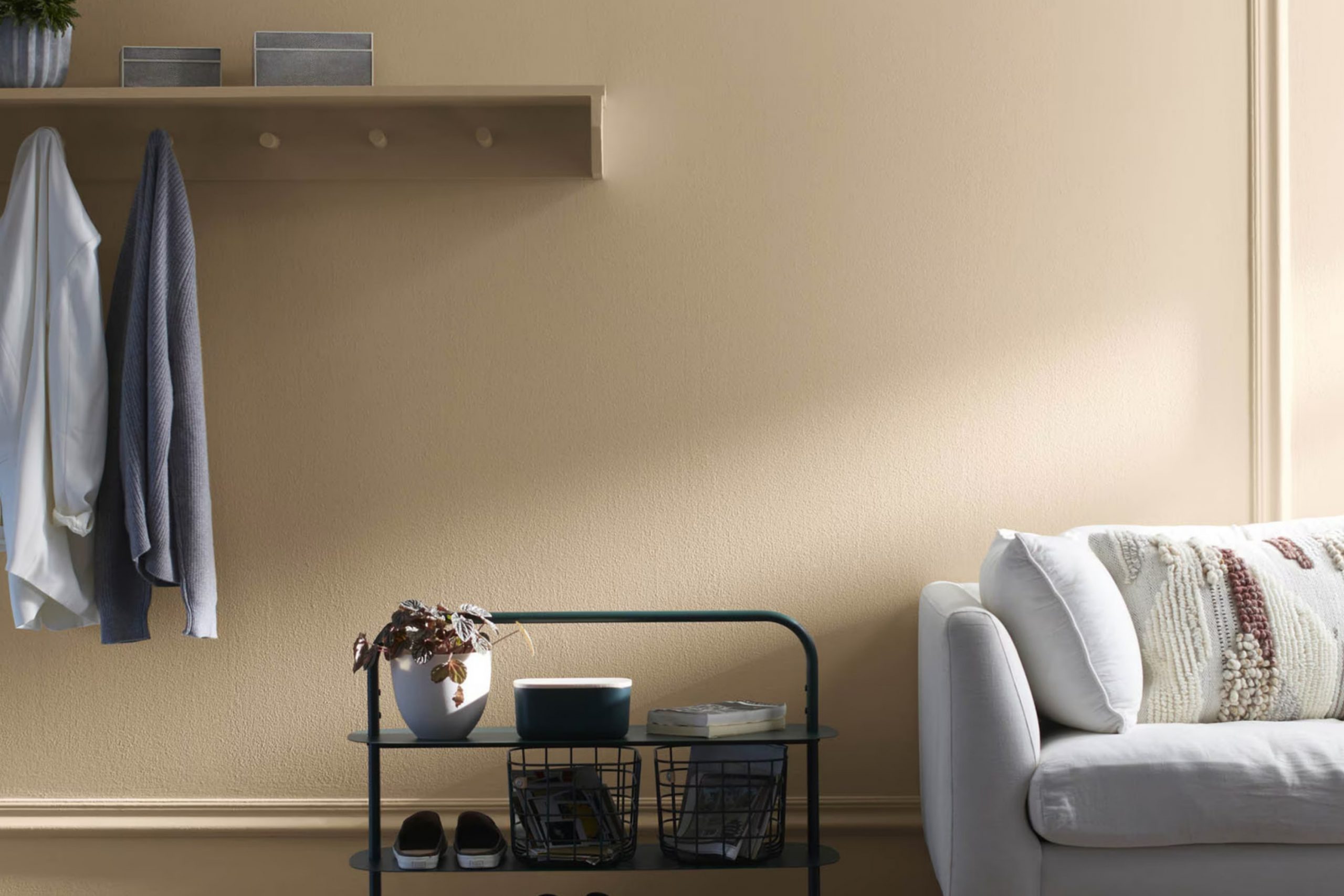
Truffle AF-130 by Benjamin Moore immediately caught my attention. Its warm, inviting hue seemed to whisper elegance and depth without being too intense. There’s something classic about its rich, earthy tones that creates a sense of comfort and refinement. It’s not just a color; it feels like an experience that blends seamlessly into any room.
In my living room, Truffle AF-130 became the perfect canvas for both contemporary and classic furnishings. Its versatility surprised me. The way it complements natural materials like wood or stone is remarkable, bringing out their inherent beauty. With softer lighting, it creates a cozy atmosphere, while in brighter areas, it maintains a refined presence.
Beyond aesthetics, this shade also influenced the mood of my home. Guests often comment on how welcoming and warm the room feels, echoing the peace I sought after hectic days.
Every time I walk in, there’s a renewed sense of calm. I appreciate how this color effortlessly bridges modern trends and traditional styles.
It’s become a staple, proving that sometimes the simplest choices make the most profound impact.
What Color Is Truffle AF-130 by Benjamin Moore?
Truffle AF-130 by Benjamin Moore is a warm, earthy brown with subtle gray undertones. This color brings a sense of coziness and warmth to a room. It’s flexible, working well in both modern and traditional areas due to its neutral nature.
In modern interiors, Truffle can create a grounded backdrop, allowing sleek furniture and minimalistic decor to stand out. When used in traditional areas, it complements wooden elements and classic upholstery, enhancing the overall warmth and inviting feel.
Truffle pairs beautifully with a variety of materials. It looks great next to natural wood, whether light oak or dark walnut, enriching the wood’s natural beauty. It also pairs well with soft textures like chenille or velvet, adding depth and comfort to living areas or bedrooms. For a bit of contrast, consider using it alongside metallic accents like brushed nickel or brass, which can add a touch of modernity.
In terms of complementary colors, soft whites and creams enhance its warmth, while muted greens and blues can provide a pleasing contrast. Adding elements of black or charcoal can create a refined edge, perfect for accent furniture or decor. Truffle AF-130 is a flexible choice for any room that needs a warm, neutral touch.
Is Truffle AF-130 by Benjamin Moore Warm or Cool color?
Truffle AF-130 by Benjamin Moore is a warm, earthy brown that brings a cozy and inviting feel to any room. This color offers a flexible backdrop that works well with both modern and traditional décor. It’s a neutral tone, allowing it to pair effortlessly with a variety of other colors, from lighter neutrals to bold accents.
In living areas, Truffle AF-130 creates a grounded atmosphere, making it perfect for areas where you relax and gather with family. In a dining room, it adds warmth and depth, enhancing the overall dining experience. When used in a bedroom, it provides a calming environment that encourages restfulness.
This shade works well in rooms with natural light, as it enhances the warmth and richness of the color. Overall, Truffle AF-130 by Benjamin Moore is a practical choice for anyone looking to add a touch of warmth and comfort to their home’s interior.
Undertones of Truffle AF-130 by Benjamin Moore
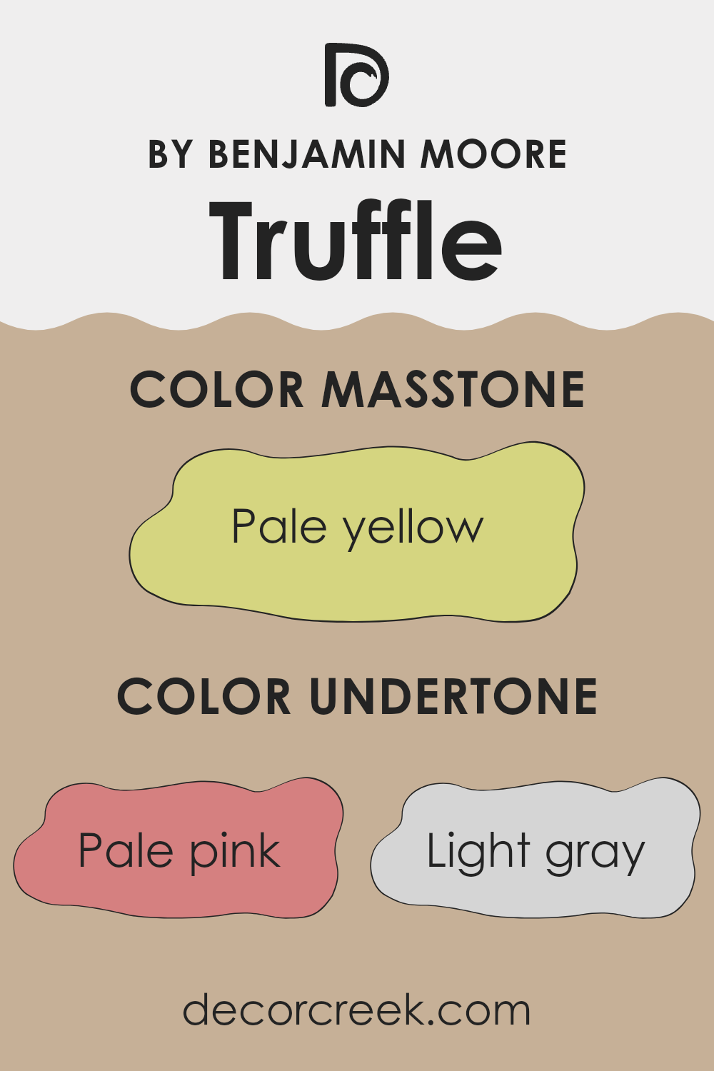
Truffle AF-130 by Benjamin Moore is a color that carries a rich variety of undertones, which influence how it appears on the walls. Undertones are subtle hues beneath the primary color that can change how we perceive that color, depending on lighting and surrounding decor. In Truffle AF-130, you can find undertones of pale pink, light gray, light purple, and other soft shades like mint, light blue, and lilac. These undertones can make the color feel warm or cool, depending on the context and lighting of the room.
When painted on interior walls, Truffle AF-130 can appear quite different throughout the day. In natural sunlight, the pink and purple undertones might be more noticeable, giving the room a warm and inviting feel. Under artificial lighting, the gray and blue undertones can become more dominant, offering a cooler and more subdued appearance.
The mint and olive undertones can lend a fresh touch, while the hints of yellow and orange might emerge, adding a subtle lively vibe. Overall, the undertones in Truffle AF-130 play a crucial role in its versatility and appeal, allowing it to adapt to various environments and styles, making it a flexible choice for interior design.
What is the Masstone of the Truffle AF-130 by Benjamin Moore?
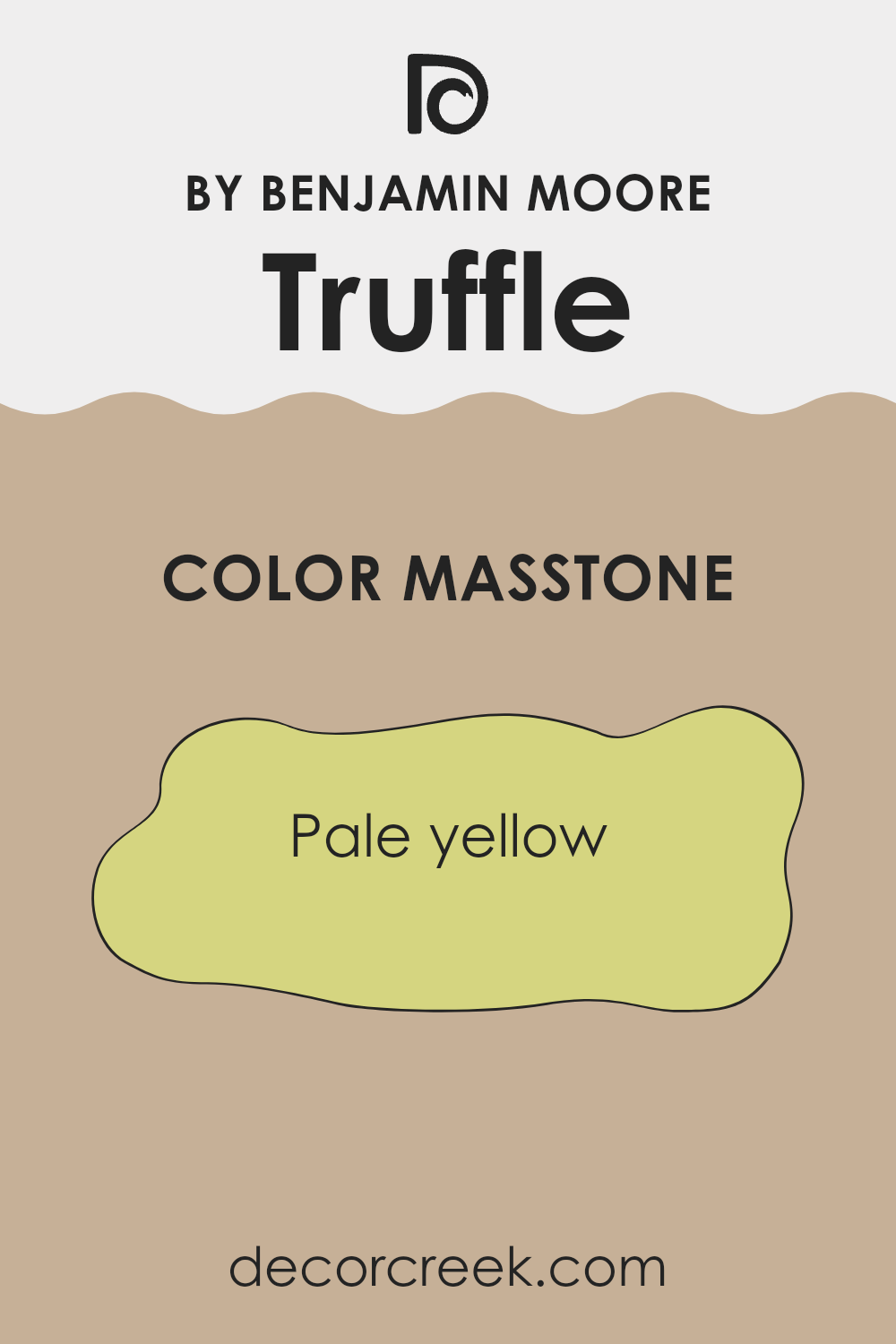
Truffle AF-130 by Benjamin Moore is a pale yellow paint that can brighten up a room effortlessly. Its masstone, or the pure hue you first see, is a soft and gentle yellow (#D5D580) that adds warmth without being too intense. This color works well in homes because it creates a welcoming and cheerful atmosphere.
In living rooms, Truffle provides a cozy feeling, making it comfortable for family gatherings. In kitchens, it can make the room feel fresh and clean, enhancing natural light. Bedrooms painted in this color can feel soothing and comforting, helping to create a peaceful environment for rest.
Using Truffle AF-130 can make smaller rooms appear larger since lighter colors tend to reflect more light, giving an illusion of area. It’s a flexible shade that pairs well with both light and dark furniture, allowing for easy integration into various design styles. Overall, it adds a touch of cheerfulness and warmth to any setting.
How Does Lighting Affect Truffle AF-130 by Benjamin Moore?
Lighting plays an important role in how we perceive colors in our environment. The color “Truffle AF-130” by Benjamin Moore, a rich and muted brown, reacts differently under various lighting conditions, affecting its appearance in different settings within a home.
Under artificial light, such as LED or incandescent bulbs, “Truffle AF-130” will take on subtle variations. Incandescent lighting tends to have a warm glow, which can enhance the brown tones of the color, making it appear cozier and slightly more reddish.
In contrast, LED lights can vary in temperature from warm to cool. A cooler LED light might make the color appear slightly more neutral or even hint at a touch of gray, whereas a warm LED bulb would behave more like incandescent light.In natural light, “Truffle AF-130” will change throughout the day. The direction that a room faces significantly impacts how this color is perceived.
In north-facing rooms, which generally receive cooler and more consistent light, “Truffle AF-130” will look a bit cooler and potentially darker. The color’s richness might come across as a deep taupe with subtle gray undertones.
In south-facing rooms, where there is an abundance of warm sunlight streaming in most of the day, “Truffle AF-130” would appear brighter and slightly warmer. This light can make the brown hues resonate more, giving a rich, comforting feel.
East-facing rooms receive warm light in the morning that becomes cooler as the day progresses. In the morning, “Truffle AF-130” may feel warm and inviting but could take on a more subdued tone in the afternoon and evening.
West-facing rooms experience the opposite, with cooler light in the morning that becomes warmer in the afternoon and early evening. Here, the color might look softer earlier in the day, then intensifies in warmth and depth as sunset approaches.Understanding these effects helps in choosing the right lighting and color combination for any area.
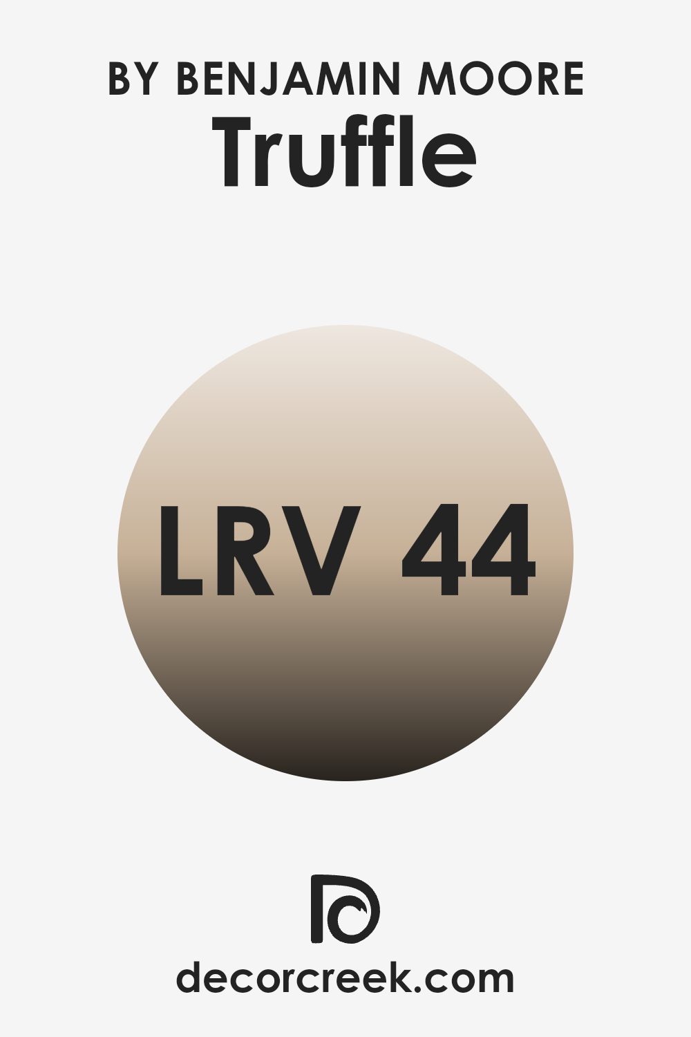
What is the LRV of Truffle AF-130 by Benjamin Moore?
LRV stands for Light Reflectance Value, which is a measure of how much light a color reflects. It is given as a percentage ranging from 0 to 100, with 0 being absolute black (reflecting no light) and 100 being pure white (reflecting all light). Colors with higher LRV values reflect more light and are brighter, making them good for rooms where you want to create an open and airy feel.
On the other hand, colors with lower LRV values absorb more light, which means they can make a room feel cozier and more intimate. LRV helps when choosing paint colors because it gives you an idea of how light or dark a color will appear once it’s on the walls, especially considering how it interacts with natural and artificial light in a room.
For Truffle with an LRV of 44.39, this means it sits in the middle of the LRV scale. It reflects a moderate amount of light, which allows it to bring warmth and depth to a room without making it feel too dark. This color can be flexible and work well in different lighting conditions, maintaining its cozy feel while not overpowering the room with darkness. In daylight, Truffle will show its richness without feeling too heavy, and in the evening, it can add a warm, comfortable atmosphere. It’s a good choice for those who want a balanced look that isn’t too light but still has a welcoming presence in a room.
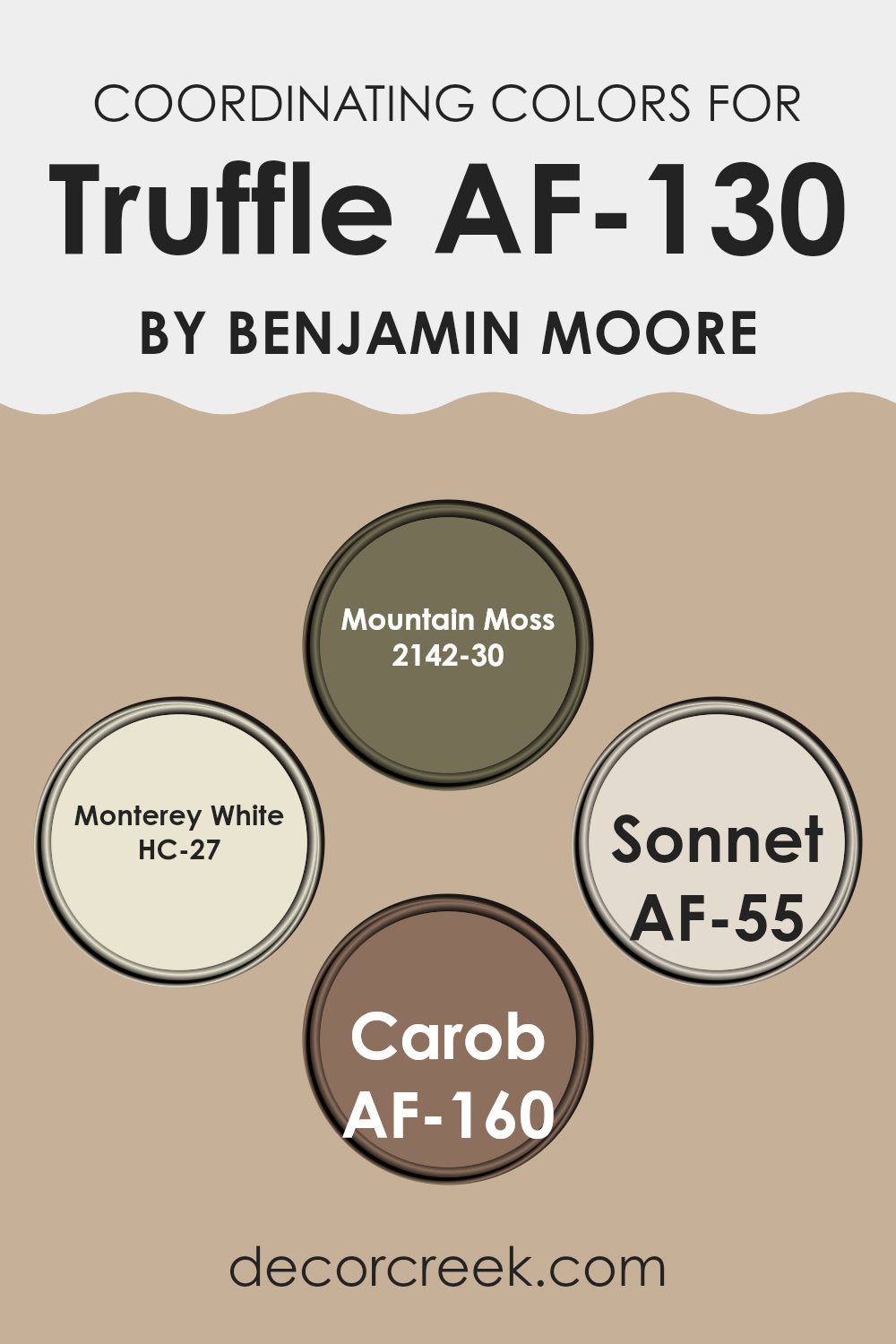
Coordinating Colors of Truffle AF-130 by Benjamin Moore
Coordinating colors are hues that work well together to create a pleasing and harmonious look in a room. When you’re choosing colors to match with Truffle by Benjamin Moore (AF-130), you’ll want shades that complement its warm and earthy tones. Mountain Moss (2142-30) is a rich, natural green that brings a touch of nature indoors, adding freshness and balance when paired with Truffle. Its depth and intensity can create a cozy feel, especially in living rooms or dens.
Monterey White (HC-27) is a flexible, soft white with a hint of warmth, perfect for adding lightness and contrast to darker colors. It’s an excellent choice for trim or ceilings alongside Truffle, helping to brighten the room.
Sonnet (AF-55) is a delicate beige with a rosy undertone that gently enhances the warm tones of Truffle, providing a subtle and calming backdrop. Lastly, Carob (AF-160) is a deep brown that adds a dramatic touch, making it ideal for accents or feature walls to ground the palette. Together, these colors create a balanced environment, each complementing Truffle’s earthy vibe in their unique way. They work as a team to bring out the best in each other.
You can see recommended paint colors below:
- 2142-30 Mountain Moss
- HC-27 Monterey White
- AF-55 Sonnet
- AF-160 Carob
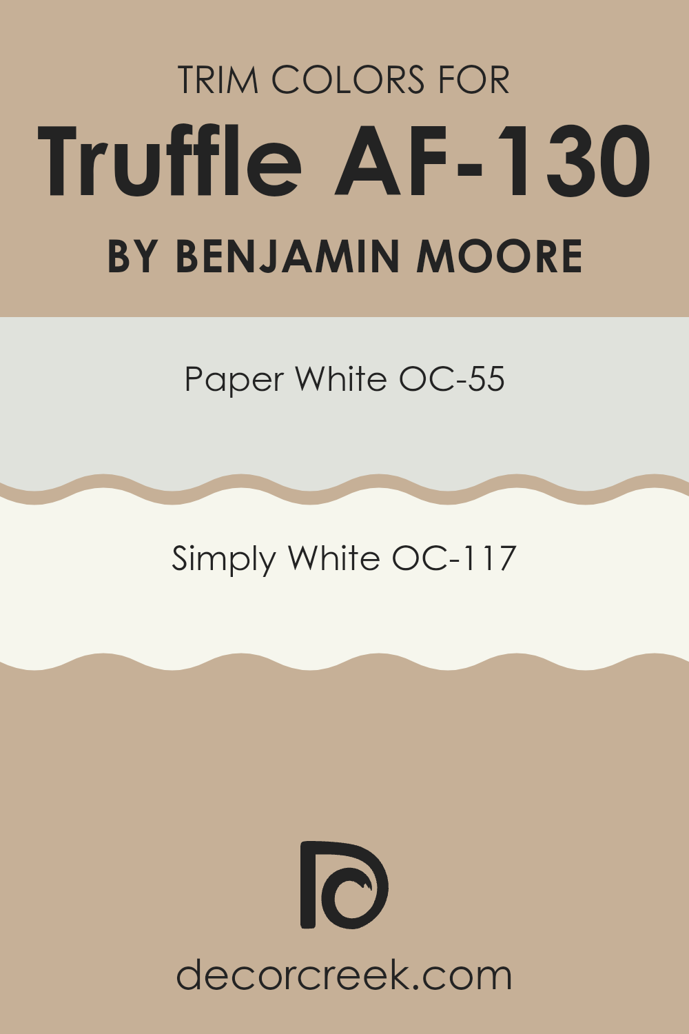
What are the Trim colors of Truffle AF-130 by Benjamin Moore?
Trim colors are used to provide contrast and highlight the different design elements within a room. They are often applied to moldings, doors, and window frames, drawing attention to architectural features and adding depth to a room. For Truffle AF-130 by Benjamin Moore, choosing the right trim colors is crucial. Truffle is a warm, earthy brown that adds a cozy feel to any room. By pairing it with the right trim colors, you can create a balanced and visually appealing environment.
OC-55 Paper White is a subtle and soft white with a hint of gray, which works perfectly as a trim color for rooms painted with Truffle. It provides a gentle contrast, highlighting the warmth of Truffle without overpowering it.
OC-117 Simply White, on the other hand, is a brighter, cleaner white that offers a crisp, fresh look. It works well to bring out the warm undertones in Truffle, enhancing the overall warmth of the room while maintaining a sense of freshness. Both trim colors serve to illuminate the area, enhancing the overall aesthetic by complementing Truffle’s rich tones.
You can see recommended paint colors below:
- OC-55 Paper White
- OC-117 Simply White
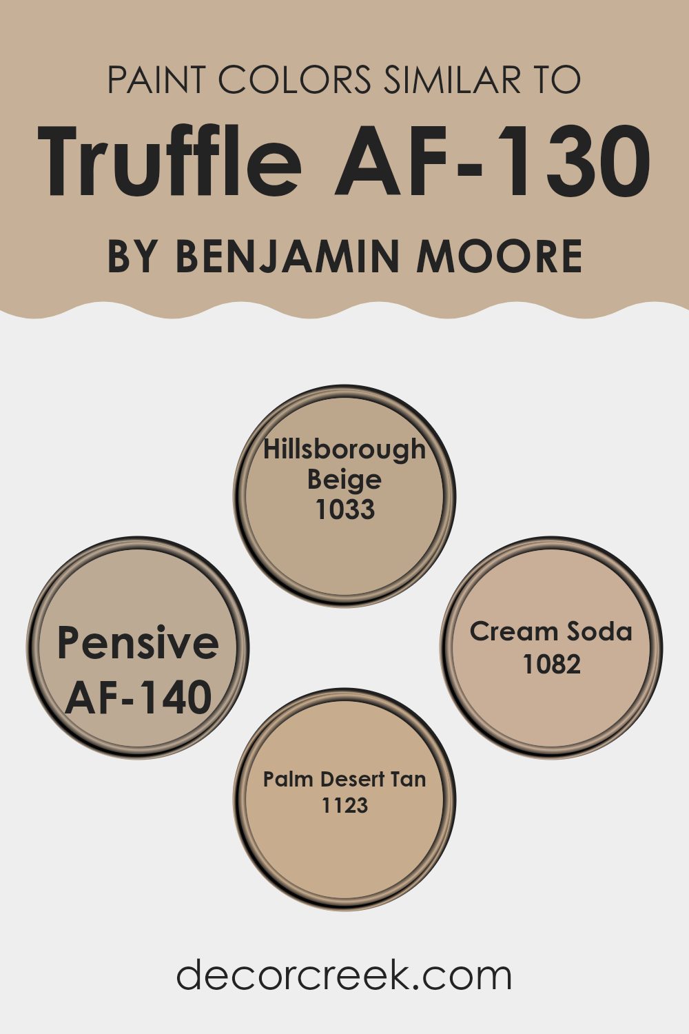
Colors Similar to Truffle AF-130 by Benjamin Moore
Similar colors are important because they complement and balance each other, creating a harmonious look in any room. When colors are close in hue, such as Truffle AF-130 by Benjamin Moore and its similar counterparts, they provide a cohesive feel that can tie a room together. The subtle variations in their tones add depth and interest without overpowering the senses. These colors are particularly useful in creating calming and inviting environments where the natural balance is key.
Hillsborough Beige, for example, brings a soft, warm tone reminiscent of sunlit sands, which can make a room feel cozy and welcoming. Pensive AF-140 offers a gentle and understated gray, perfect for adding a touch of sophistication without being too bold.
Cream Soda 1082 adds a light, creamy hue that brightens a room and brings an air of freshness. Lastly, Palm Desert Tan 1123 introduces a muted, earthy shade, perfect for grounding a room with a sense of stability and warmth. Together, these colors work to create a balanced and inviting palette, making any room a comfortable and pleasant place to be without drawing too much attention to any single element.
You can see recommended paint colors below:
- 1033 Hillsborough Beige
- AF-140 Pensive
- 1082 Cream Soda
- 1123 Palm Desert Tan
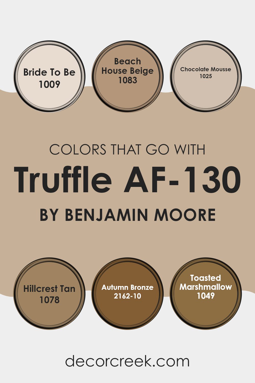
Colors that Go With Truffle AF-130 by Benjamin Moore
When choosing colors to pair with Truffle AF-130 by Benjamin Moore, it’s essential to consider how each shade complements and enhances the main color. Truffle AF-130 is a rich, earthy tone with warm undertones, creating a cozy and inviting atmosphere. Perfectly paired colors can bring out the best in Truffle, balancing its depth with either warm or subtle contrasts.
For instance, 1009 – Bride To Be is a soft, warm white that offers a light, airy contrast against Truffle’s depth, often making areas feel more spacious. 1083 – Beach House Beige provides a bit more warmth and blends seamlessly, offering a neutral backdrop that maintains overall harmony.
Each supporting color brings its own character to the palette. The 1025 – Chocolate Mousse adds continuity with its deeper brown tones, ensuring that the warmth remains consistent throughout the room. Meanwhile, 1078 – Hillcrest Tan softly complements the main shade with its understated, sandy hues.
For a more striking balance, 2162-10 – Autumn Bronze introduces an elegant touch with its vibrant, aged copper color, creating a dynamic pairing. 1049 – Toasted Marshmallow lends a lighter, creamy contrast that lifts the overall look, ensuring the room feels inviting yet bright. Together, these colors build a cohesive and pleasing environment.
You can see recommended paint colors below:
- 1009 Bride To Be
- 1083 Beach House Beige
- 1025 Chocolate Mousse
- 1078 Hillcrest Tan
- 2162-10 Autumn Bronze
- 1049 Toasted Marshmallow
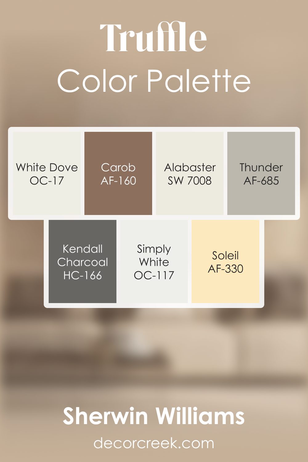
Truffle AF-130 by Benjamin Moore Color Palette
Truffle brings a deep, warm presence that feels rich and inviting, and this palette is designed to support that feeling with balance and harmony. White Dove, Alabaster, and Simply White add a gentle brightness that softens Truffle’s depth and keeps the palette from feeling too heavy.
Thunder and Kendall Charcoal create smooth transitions between mid and dark tones, adding texture and a steady visual flow.
Carob and Soleil bring lively warmth and character, adding touches of earthy richness and subtle energy that pair beautifully with Truffle’s grounded nature. The combination of warm whites, natural browns, and expressive accents creates a palette that feels comforting, full-bodied, and visually satisfying.
It works beautifully in cozy living rooms, grounded kitchens, or bedrooms that aim for a warm and welcoming mood with depth and personality.
How to Use Truffle AF-130 by Benjamin Moore In Your Home?
Truffle AF-130 by Benjamin Moore is a warm, earthy paint color that can bring a cozy feeling to any room. It’s a rich brown shade that’s flexible and stylish, making it suitable for many different areas in a home.
You can use Truffle AF-130 in the living room to create a comfortable and inviting atmosphere, pairing it with soft cream or beige tones for a balanced look. In the kitchen, it can serve as a strong backdrop for lighter cabinets and stainless-steel appliances, adding depth and a touch of rustic charm.
If you want a relaxing bedroom, consider using this color for an accent wall to provide warmth without being too intense. Pair it with softer shades like light gray or soft white on the other walls. This shade also works well in home offices, offering a sense of stability and professionalism that can help you stay focused and productive.
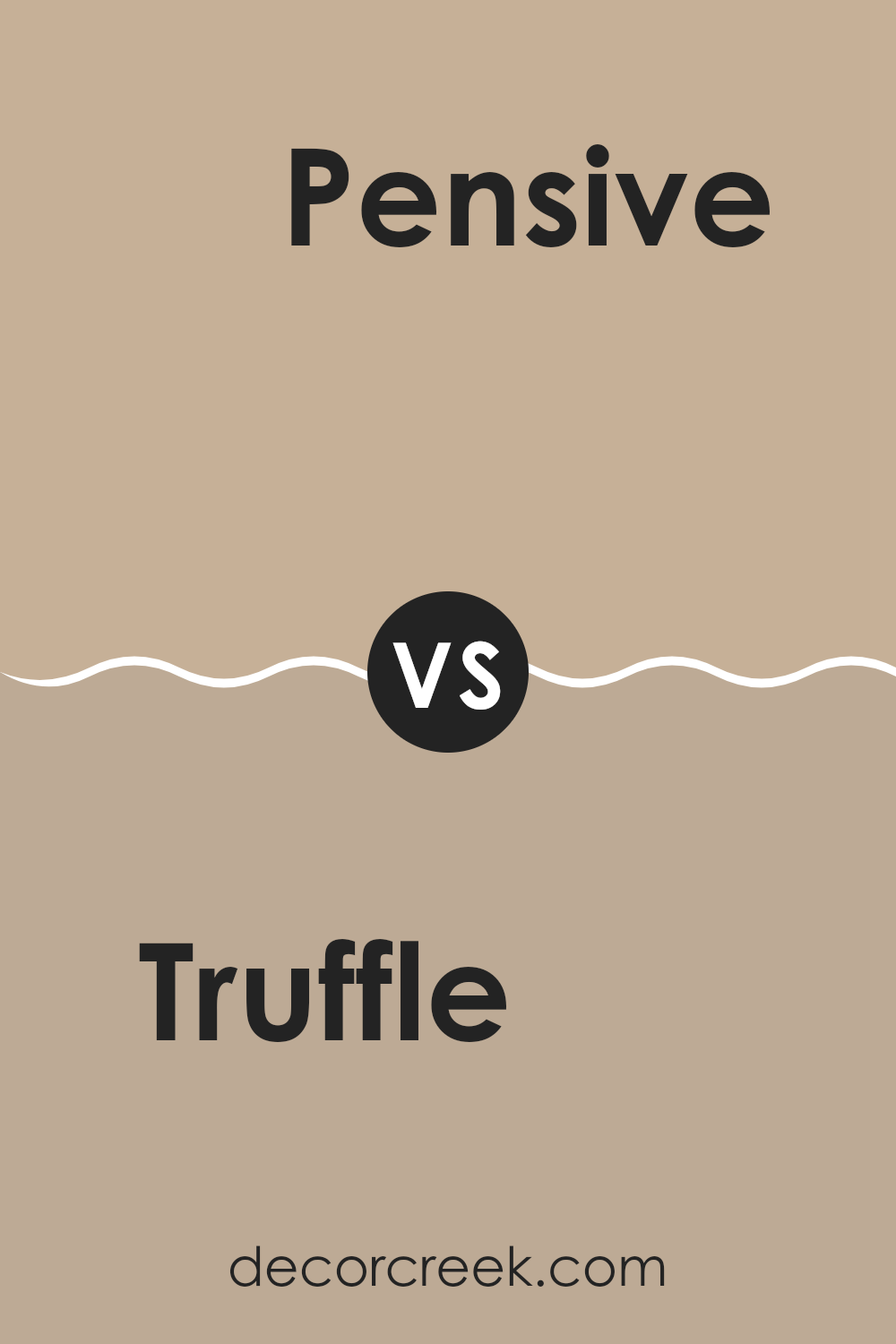
Truffle AF-130 by Benjamin Moore vs Pensive AF-140 by Benjamin Moore
Truffle AF-130 and Pensive AF-140 by Benjamin Moore are both rich, neutral shades that can add warmth and depth to a room. Truffle is a warm, earthy brown with subtle undertones that can create a cozy and inviting atmosphere. It works great as a base color in living rooms or dining areas, where it can add a sense of comfort and relaxation.
Pensive, on the other hand, is a softer, muted gray with hints of brown, making it feel more like a greige. This color is flexible and can blend well with both cool and warm tones, making it suitable for bedrooms or offices where you might want a calming environment.
While Truffle gives a sense of richness and earthiness, Pensive offers a lighter, more airy feel. Together, they can complement each other beautifully, with Truffle adding groundedness and Pensive providing a gentle balance.
You can see recommended paint color below:
- AF-140 Pensive
Truffle AF-130 by Benjamin Moore vs Hillsborough Beige 1033 by Benjamin Moore
Truffle AF-130 by Benjamin Moore is a rich, deep brown with warm undertones. It’s a flexible color that works well as a backdrop, adding depth and coziness to a room. This shade is perfect for creating a sense of warmth in a room without being too intense. It pairs nicely with natural materials like wood and stone, enhancing their textures.
On the other hand, Hillsborough Beige 1033 by Benjamin Moore is a soft, neutral beige that lends a light and airy feel to areas. It’s a gentle color, ideal for brightening up rooms while maintaining a comfortable ambiance. Hillsborough Beige is easy to pair with other colors due to its subtlety, making it a great choice for those who prefer understated elegance.
While both colors are warm, Truffle is darker and more dramatic, whereas Hillsborough Beige offers a lighter and more subtle approach. Each adds a unique character to rooms, depending on the desired mood.
You can see recommended paint color below:
- 1033 Hillsborough Beige
Truffle AF-130 by Benjamin Moore vs Palm Desert Tan 1123 by Benjamin Moore
Truffle AF-130 by Benjamin Moore is a rich, warm color with earthy tones, often described as a dark chocolate or deep taupe. It provides a cozy and inviting atmosphere, making it ideal for living rooms or bedrooms. Truffle can add a touch of depth and warmth to a room.
On the other hand, Palm Desert Tan 1123 by Benjamin Moore is a lighter, sandy color with golden undertones. It brings a bright and airy feel to a room, reminiscent of sunlit desert landscapes. This shade works well in areas where you want to achieve a welcoming and cheerful vibe, like kitchens or hallways.
While Truffle AF-130 is more subdued and grounding, Palm Desert Tan offers a more uplifting and open feel. Both colors have a natural, earthy quality, but they offer different moods. Truffle provides richness and intimacy, while Palm Desert Tan adds lightness and approachability to a room.
You can see recommended paint color below:
- 1123 Palm Desert Tan
Truffle AF-130 by Benjamin Moore vs Cream Soda 1082 by Benjamin Moore
Truffle AF-130 by Benjamin Moore is a warm, earthy brown that brings a cozy vibe to any room. It’s the kind of color that makes a room feel welcoming and grounded. It’s flexible enough to work well in both living rooms and dining areas, offering a sense of comfort and stability.
On the other hand, Cream Soda 1082 by Benjamin Moore is a soft, creamy beige with gentle yellow undertones. It’s lighter and brighter than Truffle but carries the same warmth. Cream Soda can open up a room, making it feel airy and light. It’s a great choice for bedrooms or kitchens where you want a fresh yet warm atmosphere.
Put together, these two colors can complement each other well. Truffle provides depth and richness, while Cream Soda adds a light, refreshing contrast. Combined, they create a balanced and harmonious look in any home setting.
You can see recommended paint color below:
- 1082 Cream Soda
After reading about AF-130 Truffle by Benjamin Moore, I feel like I’ve learned a lot about this color. Truffle is a warm, cozy brown shade that makes rooms feel comfy and inviting. It’s like the comforting color of hot chocolate on a cold day, and it can make a room feel safe and welcoming.
One cool thing about Truffle is that it works well with lots of other colors. Whether it’s paired with bright colors or softer shades, Truffle can help everything look balanced and nice. This makes it a great choice for places like living rooms or bedrooms where you want to feel relaxed and at home.
Another nice feature of Truffle is that it can be used in different ways. You can paint all the walls in a room with it, or just one wall to create a special focal point. It even looks good on furniture or cabinets!Overall, AF-130 Truffle is a simple brown that reminds us of nature and comfort. After reading this, I can see why it would be a good choice for many homes.
It’s not too loud, so it can fit in with lots of different styles, making people feel happy and at ease.
Ever wished paint sampling was as easy as sticking a sticker? Guess what? Now it is! Discover Samplize's unique Peel & Stick samples.
Get paint samples

