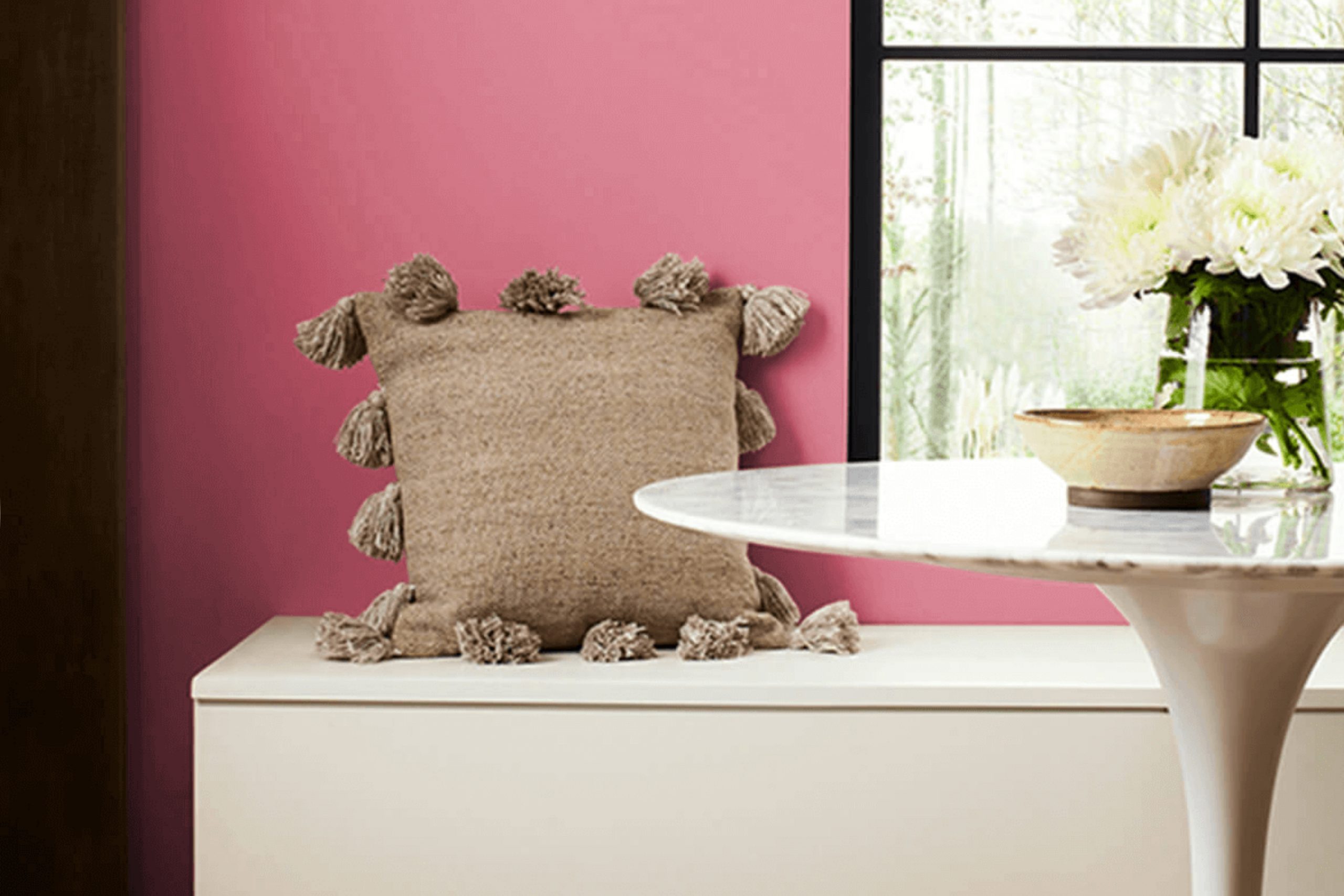
There’s something incredibly soothing about the color SW 6578 Tuberose by Sherwin Williams. It’s like inviting a soft, warm glow into any room. When I first noticed Tuberose, I was struck by how it manages to be both gentle and full of life. There’s a richness to its hue that feels perfect for creating a comfortable and cozy atmosphere.
Picture a soft, creamy rose with a hint of warmth that isn’t too intense. That’s the essence of Tuberose. It feels like a gentle whisper of pink and peach, merging together to form a shade that’s ideal for personal retreats, living rooms, or any room that craves a touch of elegance with warmth. This color isn’t just about looks; it’s about creating a feeling of comfort and calm.
Tuberose has a way of making surroundings feel welcoming. It’s a color that doesn’t shout for attention, yet it leaves a memorable impression, filling areas with an understated charm. Whether paired with neutrals for a calming palette or enriched with darker accents for contrast, it adapts beautifully to various styles.
The simplicity and softness of SW 6578 Tuberose can gently shift any room into a personal haven where relaxation comes effortlessly.
What Color Is Tuberose SW 6578 by Sherwin Williams?
Tuberose by Sherwin Williams is a warm, muted shade with a touch of softness. It sits somewhere between a gentle terracotta and blush, bringing a cozy feeling with a subtle hint of elegance. This color can add warmth to any room, making it feel inviting and comfortable.
Tuberose works beautifully in interior styles like bohemian, rustic, and modern farmhouse. In a bohemian setting, it can complement rich textures and layers, while in a rustic style, it pairs well with natural woods and earthy tones. For a modern farmhouse look, Tuberose adds a touch of color without being too intense for the simple aesthetics.
When it comes to materials, Tuberose goes well with natural fibers like cotton or linen and looks great alongside wood and leather. The warmth of the paint can soften the coolness of concrete or sleek metals, adding balance. Pairing it with textures like woven baskets or wool throws enhances its inviting appeal.
Tuberose can be used on an accent wall or as the main wall color to create a cozy backdrop. Its understated warmth allows it to pair well with whites, creams, and even deeper shades like charcoal or navy, giving plenty of options for a harmonious and comfortable interior.
Is Tuberose SW 6578 by Sherwin Williams Warm or Cool color?
Tuberose SW 6578 by Sherwin Williams is a warm and inviting shade that blends subtle pink and beige tones. In homes, this color can add a soft, welcoming feel to living areas. Its gentle hue makes it flexible, working well in both modern and traditional settings.
Tuberose can make a room feel cozy and comfortable, which is ideal for bedrooms or living areas where you want to relax and spend time with family and friends. This color can also serve as a neutral backdrop, allowing other decorative elements to stand out.
It pairs nicely with natural materials like wood or stone and complements both darker and lighter shades, giving you flexibility in choosing furniture and decor. When used in lighting, this color reflects a soft glow, contributing to a warm atmosphere. Overall, Tuberose SW 6578 is a pleasant choice for anyone looking to create a homey and inviting environment.
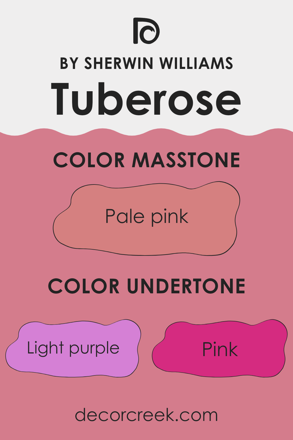
Undertones of Tuberose SW 6578 by Sherwin Williams
Tuberose by Sherwin Williams is a complex and vibrant color that can change based on its undertones and the lighting in a room. The color includes a mix of undertones: light purple, pink, grey, pale yellow, orange, fuchsia, lilac, light gray, purple, mint, red, olive, yellow, violet, light blue, brown, and light green. These undertones can make Tuberose appear different depending on its surroundings.For instance, the pink and fuchsia undertones can add warmth and happiness to a room, making it feel lively and inviting.
The purple and violet elements, on the other hand, add a touch of sophistication and can create a more dramatic effect. The presence of grey undertones helps to tone down the brightness of Tuberose, adding subtlety and balance to the wall color. Yellow and orange elements bring a hint of brightness, making areas feel more vibrant and cheerful.
In terms of interior design, Tuberose can change the mood of a room significantly. In natural daylight, the color might appear brighter and more colorful, while under artificial light, especially if warm bulbs are used, it might lean more towards its red and orange undertones. This flexible nature makes Tuberose a popular choice for areas where a dynamic and changing atmosphere is desired.
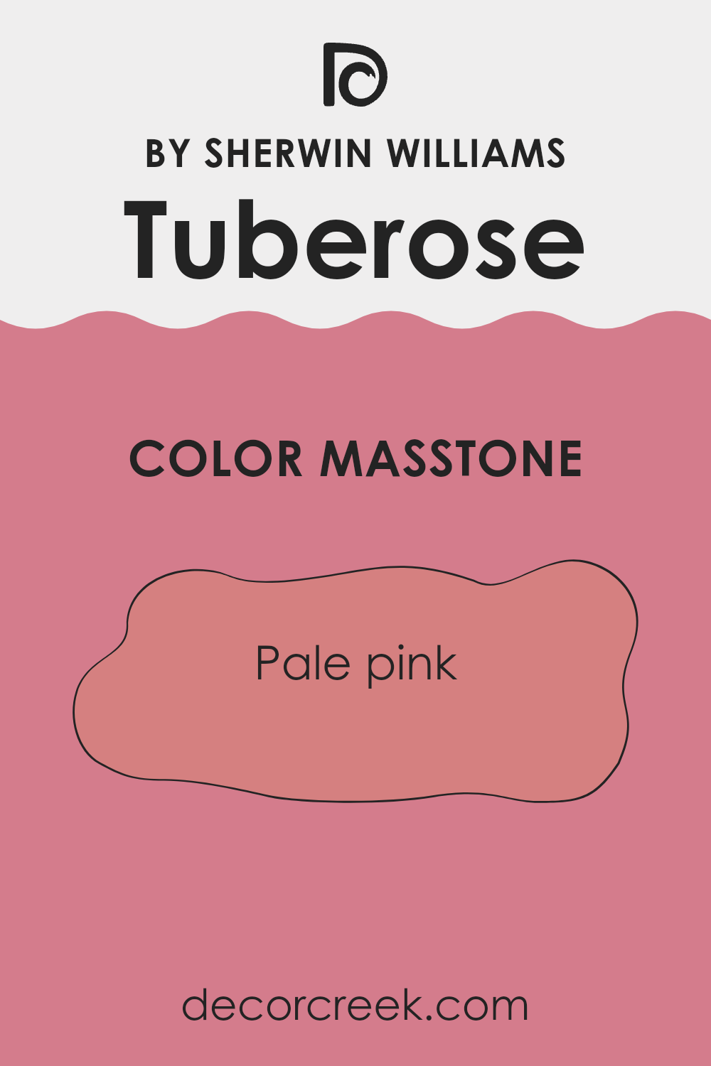
What is the Masstone of the Tuberose SW 6578 by Sherwin Williams?
Tuberose (SW 6578) by Sherwin Williams is a soft, pale pink color with a masstone that leans towards a warm and gentle hue. In homes, this pink can create a calming and welcoming atmosphere. It pairs well with neutral shades like whites and grays, offering a light, airy feel to areas.
This makes it a good choice for bedrooms or living areas where a sense of relaxation is desired. The pale pink of Tuberose can brighten up a room without being too intense, making it suitable for both small and large rooms.
It works well as an accent wall or as the primary color in a room, providing versatility in design. This shade can also complement a variety of furniture styles, from modern to traditional, allowing for creative freedom in home decoration. Its gentle appearance makes it a wonderful backdrop that adds warmth and softness to any room.
How Does Lighting Affect Tuberose SW 6578 by Sherwin Williams?
Lighting plays a significant role in how we perceive colors. Under different lighting conditions, colors can appear differently, which means that a paint color might look one way in the store or under artificial lights but entirely different at home with natural light. The color Tuberose by Sherwin Williams, which is a warm and inviting shade, can show various changes in its appearance under different lighting situations.
In artificial light, such as LED or incandescent bulbs, Tuberose may become warmer. Incandescent lights tend to intensify the warm tones, making the color appear richer, almost more red or rosy. LED lights, depending on their warmth or coolness, might either mute the color slightly or make it seem more vibrant.
In natural light, the time of day and the direction your room faces will also impact how Tuberose appears. In north-facing rooms, where light is usually cooler and softer, Tuberose might appear more muted or subdued. The color may take on a slightly cooler tone because the natural light lacks warmth, which can calm down the pinkness in the paint.
South-facing rooms receive a lot of warm, bright sunlight throughout the day. In these rooms, Tuberose can really shine and appear lively and warm. The abundance of sunlight will enhance the warm tones, making the color look more vibrant and full of life.
In east-facing rooms, the morning light is stronger and cooler. Tuberose could look brighter and more pastel-like in the morning but might seem a bit duller as the day goes on and the light shifts. Conversely, in west-facing rooms, the afternoon light is warmer, so Tuberose will appear more intense and rich later in the day, much like it does in south-facing rooms.
Overall, the direction of light and its quality, whether natural or artificial, can dramatically change the way Tuberose by Sherwin Williams is perceived.
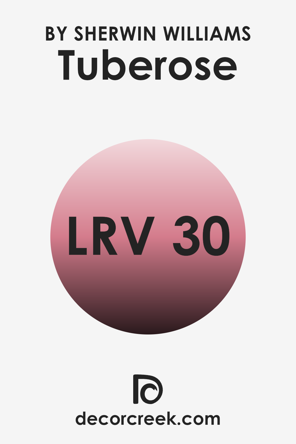
What is the LRV of Tuberose SW 6578 by Sherwin Williams?
LRV, or Light Reflectance Value, is a measurement that tells us how much light a color reflects. It is given on a scale from 0 to 100, where 0 represents absolute black, which reflects no light, and 100 represents pure white, which reflects all light. The LRV of a color can significantly affect how it looks when painted on a wall.
Colors with higher LRV values will reflect more light, making a room feel brighter and more spacious. Conversely, colors with lower LRV values will absorb more light, which can make a room feel cozier but also potentially darker. For the color Tuberose from Sherwin Williams, with an LRV of 30.303, it falls on the lower end of the LRV scale.
This means it will absorb more light than it reflects, giving it a richer, more muted appearance on the walls. In a well-lit room, Tuberose might bring warmth and depth to the room without being too intense. In darker rooms, it might create a snug, intimate atmosphere. It’s crucial to consider the LRV value when selecting colors, as it will influence how light or dark the room feels based on the amount of natural or artificial light present.
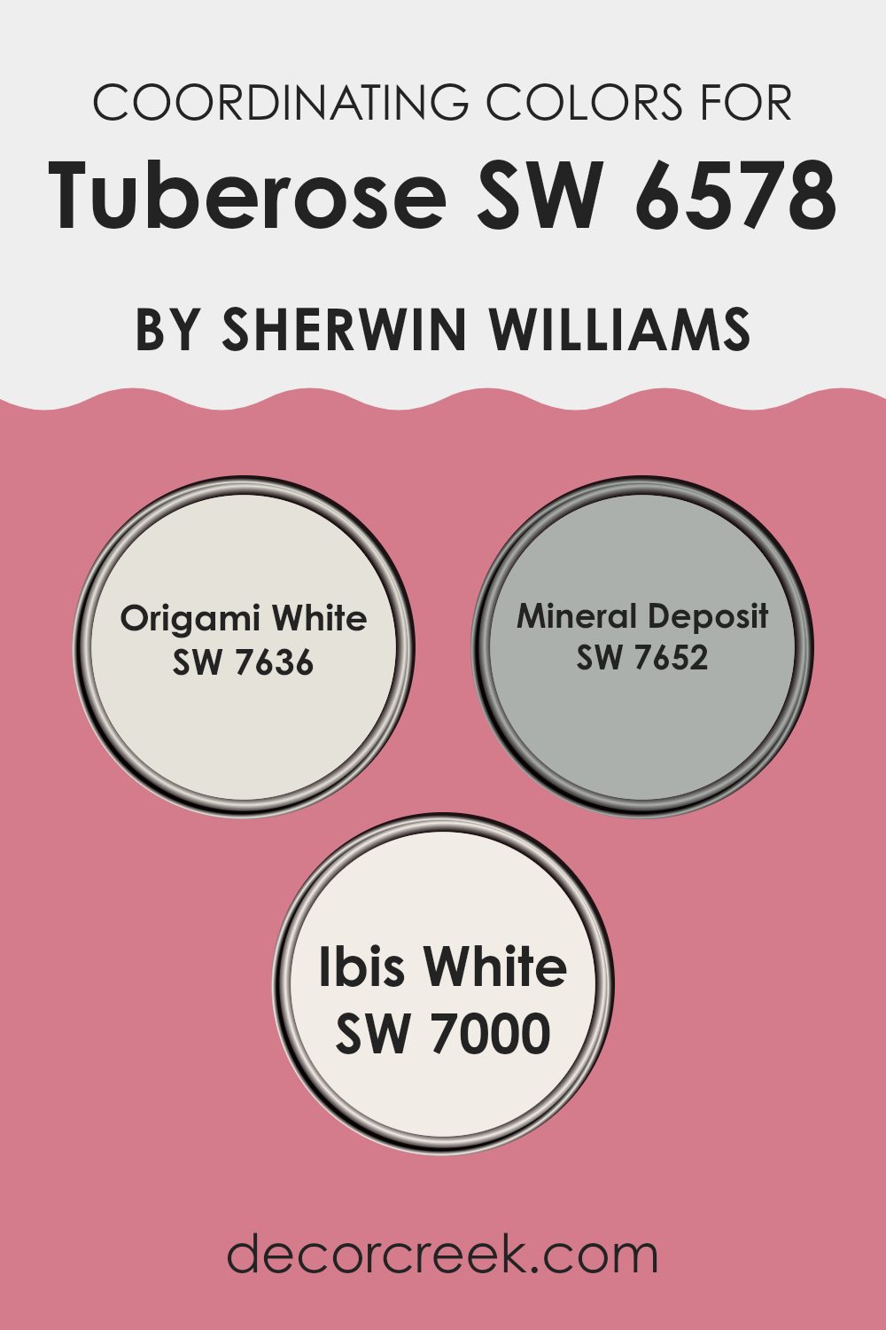
Coordinating Colors of Tuberose SW 6578 by Sherwin Williams
Coordinating colors are hues that complement one another and are often used together to create a visually pleasing color scheme. These colors provide a balanced aesthetic by enhancing the main color’s features, creating harmony in any room. When paired with Tuberose by Sherwin Williams, which is a rich and warm pink, coordinating colors help to soften and highlight its vibrant tones. Using the right coordinating colors can tie a room together and make the main color pop without overpowering it.
Origami White, a flexible and understated off-white, works well as a coordinating color. It adds subtle contrast and refinement without drawing attention away from the main hue. Mineral Deposit, a cool and calming gray with a hint of blue, offers a modern and balanced look that complements the warmth of Tuberose.
It’s perfect for adding depth to the overall color scheme. Ibis White, another soft white, has a slightly creamy undertone that adds warmth, melding seamlessly with Tuberose while keeping the room feeling light and open. Each of these colors plays a role in creating a cohesive look, ensuring that Tuberose remains the star while enhancing its vibrant and inviting nature.
You can see recommended paint colors below:
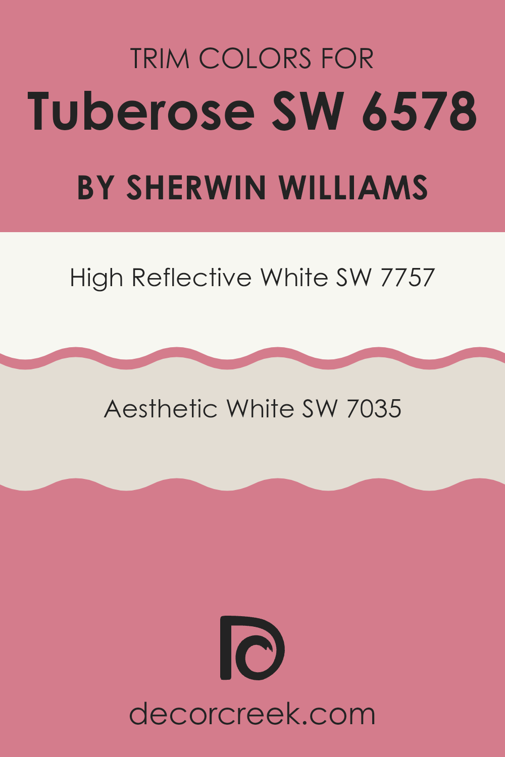
What are the Trim colors of Tuberose SW 6578 by Sherwin Williams?
Trim colors are those used for the edges and moldings in a room, helping define areas and highlight architectural details. For Tuberose SW 6578 by Sherwin Williams, choosing the right trim colors is key to making the walls stand out while maintaining harmony in the design.
High Reflective White SW 7757 is an excellent choice for trim as its bright and crisp nature provides a clean contrast that sharpens and frames the soft, muted pink undertones of Tuberose. Using Aesthetic White SW 7035 adds a gentle, warm touch to the trim, offering a subtle transition rather than stark contrast, which can soften the overall look when dark colors are involved.
High Reflective White SW 7757 is known for its bright, clean appearance, making it a universal choice for trim that pairs well with many color schemes. On the other hand, Aesthetic White SW 7035 offers a softer, creamier look with a hint of warmth that makes a room feel inviting while still offering enough contrast against Tuberose. These hues contribute to the overall ambiance by defining lines and room, balancing the effect of Tuberose’s rich tones, and ensuring the room feels cohesive and finished.
You can see recommended paint colors below:
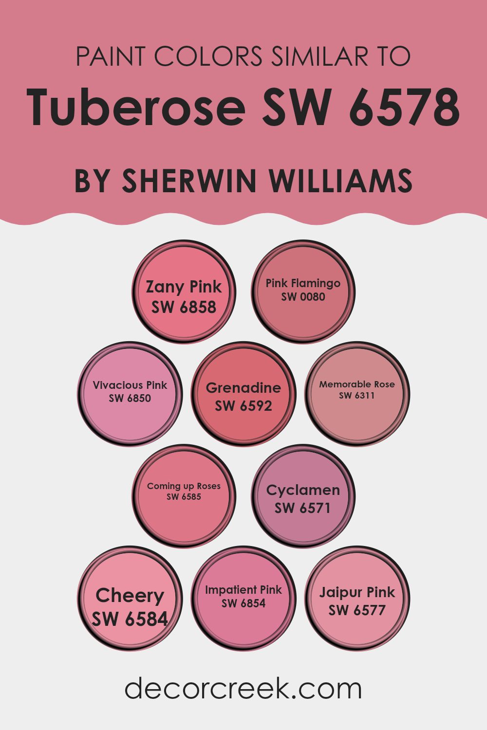
Colors Similar to Tuberose SW 6578 by Sherwin Williams
Similar colors play a crucial role in design and decoration by creating harmony and balance. These colors, often found in adjacent positions on the color wheel, offer a soothing transition from one hue to the next. For instance, colors similar to Tuberose by Sherwin Williams include a range of pinks and reds that make areas feel inviting and cohesive. Tuberose has a soft and warm pink tone that can be perfectly complemented by its neighboring shades.
Zany Pink offers a vibrant and energetic feel, while Pink Flamingo brings a lively and playful vibe. Vivacious Pink has a cheerful brightness, whereas Grenadine delivers a richer, more dramatic depth. Memorable Rose sits between subtlety and flair, perfect for adding a touch of elegance.
Coming up Roses adds a fresh and uplifting dimension, reminiscent of blooming flowers. Cyclamen leans towards a deeper, more subdued pink, offering a calm backdrop. Cheery lives up to its name, adding joy and warmth to any room. Impatient Pink is bold and lively, similar to a striking sunset hue. Finally, Jaipur Pink reflects the beauty and richness of its namesake city, providing a unique blend of warmth and intensity.
Together, these colors work beautifully to enhance interiors, creating an ambiance that feels natural and pleasing.
You can see recommended paint colors below:
- SW 6858 Zany Pink
- SW 0080 Pink Flamingo
- SW 6850 Vivacious Pink
- SW 6592 Grenadine
- SW 6311 Memorable Rose
- SW 6585 Coming up Roses
- SW 6571 Cyclamen
- SW 6584 Cheery
- SW 6854 Impatient Pink
- SW 6577 Jaipur Pink
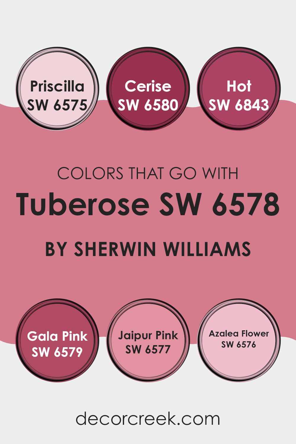
Colors that Go With Tuberose SW 6578 by Sherwin Williams
Choosing colors that complement Tuberose SW 6578 by Sherwin Williams is crucial because they create harmony and balance in a room. Tuberose is a soft, rosy hue that comes to life when paired with colors that either enrich its warmth or offer a subtle contrast. Priscilla SW 6575 shares a gentle, pink tone that blends perfectly with Tuberose, ensuring a smooth and cohesive look. Meanwhile, Cerise SW 6580 offers a bolder, more vibrant pink that energizes the room and adds some lively flair, bringing out the playful side of Tuberose.
For a more striking combination, Hot SW 6843 is a vivid raspberry that provides an eye-catching contrast against Tuberose, creating a dynamic visual interest. Gala Pink SW 6579 is a rich, exuberant pink that adds depth and warmth, enhancing Tuberose’s overall appeal.
On the soft end, Jaipur Pink SW 6577 delivers a delicate touch with its mild, sunset-tinged hue, creating a gentle flow throughout the room. Lastly, Azalea Flower SW 6576 introduces an elegant blush with a refined edge, complementing Tuberose without overpowering it. Together, these colors work to highlight Tuberose’s subtle charm while creating a well-rounded and inviting atmosphere.
You can see recommended paint colors below:
- SW 6575 Priscilla
- SW 6580 Cerise
- SW 6843 Hot
- SW 6579 Gala Pink
- SW 6577 Jaipur Pink
- SW 6576 Azalea Flower
How to Use Tuberose SW 6578 by Sherwin Williams In Your Home?
Tuberose SW 6578 by Sherwin Williams is a warm, rich color that can bring a cozy feel to any home. It’s a soft, pinkish hue that can be perfect for areas where you want to add a touch of comfort and warmth. This color works well in a bedroom, where it can create a welcoming and gentle atmosphere, helping you to relax and feel at ease.
In a living room, Tuberose can pair nicely with neutral furniture or even darker woods, adding a subtle pop without being overpowering. It also complements natural lighting beautifully, adding a soft glow during the day.
If you want to add color to your kitchen, Tuberose can be used on an accent wall to make the room feel lively yet inviting. This color allows other decorative elements to shine while providing a soft and balanced backdrop. Its versatility makes it suitable for different styles and home settings.
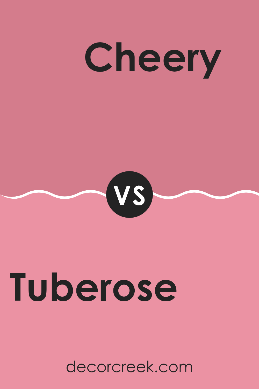
Tuberose SW 6578 by Sherwin Williams vs Cheery SW 6584 by Sherwin Williams
Tuberose SW 6578 by Sherwin Williams is a soft, muted pink color. It has a gentle and comforting vibe, making it suitable for areas where you want a touch of warmth without being too intense. On the other hand, Cheery SW 6584 by Sherwin Williams is a bright and bold pink shade. It is lively and vibrant, bringing energy and a playful spirit to any room.
When comparing these two shades, Tuberose is more understated and calming, ideal for bedrooms or living areas where a relaxed atmosphere is desired. Cheery, with its boldness, can be perfect for areas where you want to make a statement, like an accent wall or a playroom.
While both are shades of pink, their impact and mood differ significantly. Tuberose offers a subtle elegance, while Cheery delivers a fun, upbeat vibe. Both colors bring unique characteristics depending on the kind of energy you want to infuse into your room.
You can see recommended paint color below:
- SW 6584 Cheery
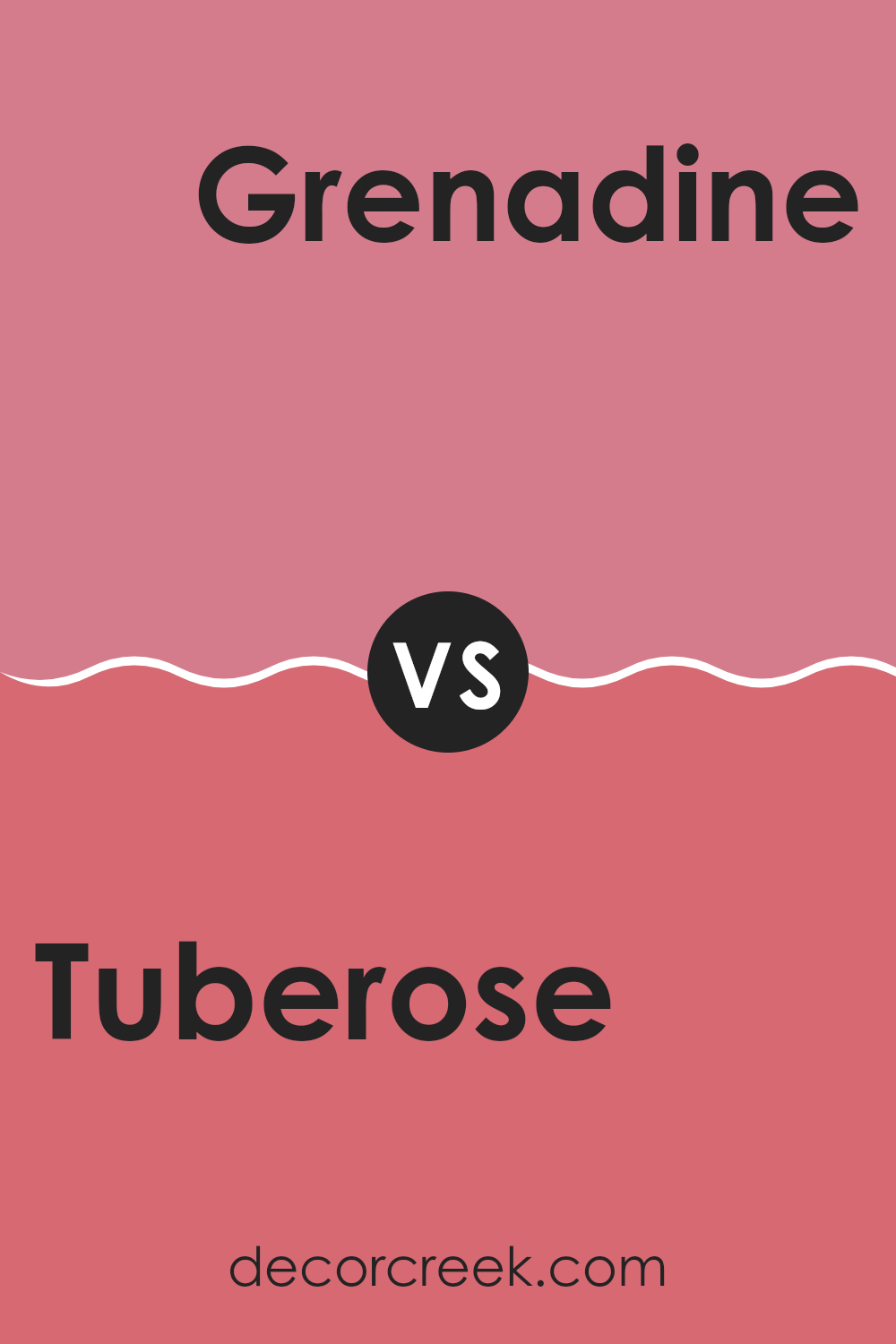
Tuberose SW 6578 by Sherwin Williams vs Grenadine SW 6592 by Sherwin Williams
Tuberose SW 6578 and Grenadine SW 6592 are two vibrant shades from Sherwin Williams, each bringing its own unique charm. Tuberose is a soft, muted pink that creates a delicate, calming atmosphere. It’s perfect for bedrooms or areas where a gentle, soothing environment is desired. Its understated nature allows it to pair well with many other colors, adding a touch of warmth without being overpowering.
On the other hand, Grenadine is a bold, vivacious red. This hue is full of energy and excitement, making it an excellent choice for accent walls or areas where you want to make a statement. Grenadine commands attention and can invigorate a room, making it ideal for living rooms or dining areas where lively conversation and activity happen.
Overall, Tuberose tends to be more subtle and gentle, while Grenadine is vibrant and attention-grabbing. Both colors have their own appeal, depending on the mood you want to create.
You can see recommended paint color below:
Tuberose SW 6578 by Sherwin Williams vs Coming up Roses SW 6585 by Sherwin Williams
Tuberose (SW 6578) and Coming up Roses (SW 6585) by Sherwin Williams are two different shades of pink. Tuberose is a softer, more muted pink, leaning towards a dusty rose feel. It’s gentle and calming, making it suitable for areas where a subtle, comforting vibe is desired.
On the other hand, Coming up Roses is a brighter, more vibrant pink. It has a cheerful and lively presence, perfect for adding energy and warmth to a room. This color can make a standout accent wall or bring life to a smaller room.
While Tuberose is understated and provides a quiet elegance, Coming up Roses is bold and playful, serving as a true attention-grabber. Both colors offer unique characteristics, with Tuberose fitting well in more traditional or relaxed settings and Coming up Roses ideal for modern or lively atmospheres. When choosing between them, consider the mood and energy you wish to create.
You can see recommended paint color below:
- SW 6585 Coming up Roses

Tuberose SW 6578 by Sherwin Williams vs Vivacious Pink SW 6850 by Sherwin Williams
Tuberose by Sherwin Williams is a soft, muted pink with a subtle undertone, making it feel warm and inviting. It’s a gentle color that works well for creating cozy areas in a home, like a bedroom or living room.
On the other hand, Vivacious Pink by Sherwin Williams is a bold, bright pink that stands out with its vibrant and energetic feel. It adds a lively and cheerful touch to any room and might be perfect for a playful area, like a kid’s room or an accent wall.
While Tuberose is more understated and calming, Vivacious Pink is all about making a statement. Choosing between the two depends on the mood you want to create. If you prefer something calm and subtle, go for the first option; if you want excitement and fun, the second option is the way to go.
You can see recommended paint color below:
- SW 6850 Vivacious Pink
Tuberose SW 6578 by Sherwin Williams vs Impatient Pink SW 6854 by Sherwin Williams
Tuberose (SW 6578) and Impatient Pink (SW 6854) are two distinct colors by Sherwin Williams. Tuberose is a warm, soft shade with a touch of peachy pink, giving it a gentle and welcoming vibe. It’s a flexible color that works well in areas where you want to create a cozy yet elegant atmosphere.
On the other hand, Impatient Pink is a bright and vivid pink. It’s lively and energetic, perfect for adding a pop of color to a room. This shade is more playful and bold, making it suitable for accent walls or rooms where you want to make a strong statement.
While Tuberose leans towards being a more muted and subtle color, Impatient Pink is all about making an impact. Choosing between the two depends on whether you’re going for a soothing, warm look or a vibrant and energetic feel.
You can see recommended paint color below:
- SW 6854 Impatient Pink
Tuberose SW 6578 by Sherwin Williams vs Cyclamen SW 6571 by Sherwin Williams
Tuberose SW 6578 and Cyclamen SW 6571 by Sherwin Williams are two beautiful shades of pink, each with its own distinct charm. Tuberose is a soft, warm pink that feels cozy and inviting. It has a gentle undertone that makes it great for creating a welcoming atmosphere in any room.
Cyclamen, on the other hand, is a brighter, more vibrant pink that bursts with energy and life. It’s a bolder choice, perfect for making a statement or adding a playful touch to a room.
While Tuberose works well in living rooms or bedrooms where a calm and relaxing feel is desired, Cyclamen can be used in places where you want to add a pop of color and excitement. These colors can complement each other beautifully, with Tuberose providing a subtle backdrop and Cyclamen offering lively accents.
You can see recommended paint color below:
- SW 6571 Cyclamen
Tuberose SW 6578 by Sherwin Williams vs Zany Pink SW 6858 by Sherwin Williams
Tuberose and Zany Pink are two distinct colors by Sherwin Williams that offer different vibes and uses. Tuberose is a soft and gentle pink with subtle undertones, creating a calming and elegant atmosphere. It’s perfect for areas where you want a touch of color without being too intense.
On the other hand, Zany Pink is a bolder, more vibrant shade. It exudes energy and liveliness, immediately drawing attention. This color can be great for accent walls or creative rooms where you want to inspire activity and excitement.
While Tuberose works well in bedrooms or living areas for a soothing effect, Zany Pink can be used in children’s rooms, play areas, or any room that benefits from a fun and dynamic flair. Together, they can complement each other, with Tuberose grounding the boldness of Zany Pink, creating a balanced and delightful environment.
You can see recommended paint color below:
- SW 6858 Zany Pink
Tuberose SW 6578 by Sherwin Williams vs Pink Flamingo SW 0080 by Sherwin Williams
Tuberose SW 6578 and Pink Flamingo SW 0080, both by Sherwin Williams, offer two distinct shades of pink. Tuberose is a soft and muted pink with a gentle, calming vibe. It has a subtle warmth, making it suitable for areas where you want a relaxed and cozy atmosphere.
In contrast, Pink Flamingo is more vibrant and lively. It’s a bright, cheerful pink that instantly grabs attention and adds energy to a room. While Tuberose can be used for a more understated look, Pink Flamingo is perfect for creating an energetic room that feels fun and uplifting.
Depending on your design goals, you can choose Tuberose for a calm and soothing environment, or Pink Flamingo to bring a bold pop of color and excitement to the decor. Both colors bring their own unique charm to a room, offering different moods and styles.
You can see recommended paint color below:
- SW 0080 Pink Flamingo
Tuberose SW 6578 by Sherwin Williams vs Jaipur Pink SW 6577 by Sherwin Williams
Tuberose and Jaipur Pink are two colors from Sherwin Williams that bring different vibes to a room. Tuberose is a warm hue with a gentle touch of blush, giving a soft and cozy feel. It’s flexible and works well as a primary color, adding warmth without being too intense.
In contrast, Jaipur Pink is bolder and more vibrant. It’s a striking pink that can energize a room, bringing a lively and cheerful atmosphere. This shade is perfect for accent walls or to create a playful aura.
Both colors have a similar undertone, making them compatible for use together. Tuberose offers a more understated look, ideal for creating calm environments. Jaipur Pink, however, stands out and adds flair, making it suitable for areas where you want to make a strong impression. Overall, Tuberose is subtle, while Jaipur Pink is vivid and exciting.
You can see recommended paint color below:
- SW 6577 Jaipur Pink
Tuberose SW 6578 by Sherwin Williams vs Memorable Rose SW 6311 by Sherwin Williams
Tuberose (SW 6578) and Memorable Rose (SW 6311) are two beautiful shades of pink from Sherwin Williams. Tuberose is a softer, more muted pink with a hint of warmth, making it a gentle and calming choice. It’s perfect for creating a cozy and inviting atmosphere in bedrooms or living rooms.
On the other hand, Memorable Rose is a deeper pink that carries more saturation. This makes it a great choice for adding a bold splash of color to a room, offering a sense of energy and enthusiasm. Memorable Rose can be used as an accent wall or in accessories to bring a lively touch to the room.
When comparing the two, Tuberose offers a more subtle and understated look, while Memorable Rose provides a vibrant and dynamic ambiance. Both colors can add charm to different areas of your home depending on the mood you want to create.
You can see recommended paint color below:
- SW 6311 Memorable Rose
Sure, here’s a conclusion written in simple language from the first-person perspective:
In conclusion, SW 6578 Tuberose by Sherwin Williams is a really nice paint color that I think can make any room look great. It’s a kind of color that feels warm and inviting, like getting a hug from someone you really care about. This color seems to work well in almost any room, whether it’s the living room where everyone hangs out, the kitchen where we eat delicious food, or even in a cozy bedroom where we sleep.
One cool thing about Tuberose is how it matches perfectly with different furniture and decorations. You can have bright or neutral decorations, and this color will still look amazing. What’s more, it feels comforting, which can make people feel happy and calm when they see it on the walls.
I also love how it looks in different lighting. During the day, it may look bright and cheerful, and at night it feels warm and cozy. This color really seems to have a special touch, making each part of the day feel just right in your home.
Overall, SW 6578 Tuberose by Sherwin Williams is a paint color that I would definitely recommend if you want something that makes a room feel comfortable and looks good all the time. It’s like a friend on the walls that you enjoy being around.
Ever wished paint sampling was as easy as sticking a sticker? Guess what? Now it is! Discover Samplize's unique Peel & Stick samples.
Get paint samples

