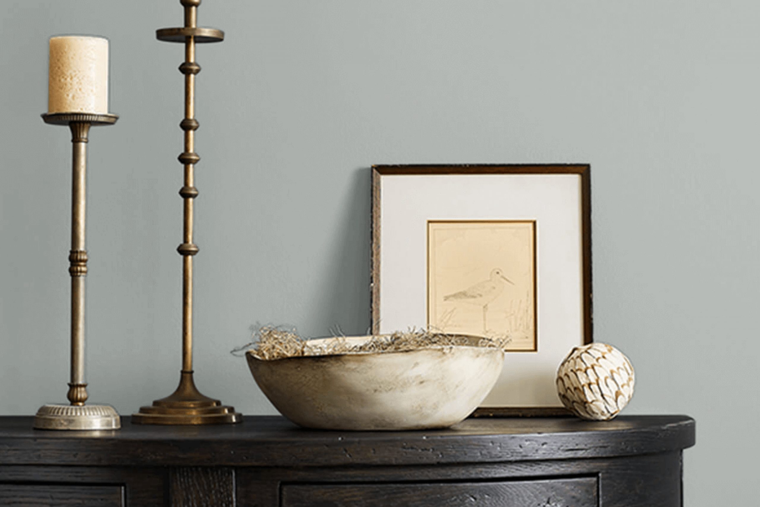
I recently chose SW 7652 Mineral Deposit from Sherwin Williams for a refresh client’s living room, and I want to share my experience with you. Picking the right shade was a bit tricky as I was looking for something neither too bold nor too mute—just the perfect balance that could bring a soothing atmosphere to my cozy space.
Deposit stood out as an adaptable color with its soft, cool gray tones resembling a misty morning sky.This shade turned out to be an excellent choice that complemented the modern yet unpretentious theme of my home. It feels fresh and contemporary, a neutral backdrop that blends effortlessly with varied decor styles and colors.
Amazing pairing it with bright accents in throw pillows or blending with darker furniture pieces, Mineral Deposit maintains its charm without overpowering other elements in the room.
Join me as I share how this color transformed client’s living space.
What Color Is Mineral Deposit SW 7652 by Sherwin Williams?
Mineral Deposit by Sherwin Williams is a soft, light blue-gray shade that brings a fresh and clean vibe to any space. This subtle color is highly versatile and works wonderfully as a neutral base or as an accent shade. Its cool tone makes it a perfect choice for creating a calm and inviting atmosphere in your home.
This color is ideal for various interior styles, especially modern, coastal, and contemporary decors. Its understated elegance fits seamlessly into minimalist settings, where simplicity and color balance are key. In a coastal-themed room, Mineral Deposit evokes the soft hues of the sea and sky, enhancing the airy and light feel that is characteristic of this style.
When it comes to pairing with materials and textures, Mineral Deposit matches beautifully with natural wood, which adds warmth to its cool undertone. It also looks striking against crisp white trims or furniture, providing a fresh contrast. For a more textured approach, combining this color with soft fabrics like linen or wool in similar or complementary shades can create a subtle, layered look that feels cozy and stylish.
Additionally, metallic finishes like brushed silver or chrome can introduce a hint of modern sophistication, making the space feel chic and well-thought-out.
Is Mineral Deposit SW 7652 by Sherwin Williams Warm or Cool color?
Mineral Deposit is a unique color offered by Sherwin Williams that has a calming grey-blue tone. This shade is quite versatile and fits well in many areas of a home, from bedrooms to bathrooms, because it combines the freshness of blue with the neutrality of grey.
Much loved for its soothing effect, it is perfect for creating a calm and welcoming atmosphere. It works wonderfully as a main wall color but can also be used for accent walls or furniture pieces. In spaces that receive a lot of natural light, Mineral Deposit takes on a softer, more muted hue, making rooms feel more spacious and airy.
Conversely, in dimly lit areas, it brings a hint of depth without overpowering the space, maintaining a clean and light feel. Overall, its balance of blue and grey makes it an excellent choice for those looking to refresh their living space without going too bold.
Undertones of Mineral Deposit SW 7652 by Sherwin Williams
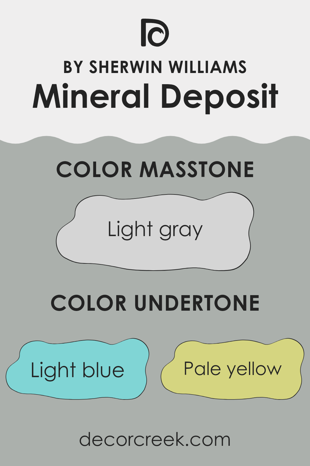
Mineral Deposit is a unique paint color that includes a mix of subtle undertones which greatly influence its appearance under different lighting conditions. The undertones such as light blue, pale yellow, mint, light purple, lilac, pale pink, and grey add a complex depth that can change the perception of the color.
Understanding undertones is crucial when choosing paint because they can significantly alter how a color looks on your walls. For instance, light blue and mint undertones might make the color appear cooler, giving a fresh and clean look. In contrast, undertones like pale yellow and pale pink could warm up the space, making it feel cozy and inviting.
When applied on interior walls, Mineral Deposit’s varied undertones play with the light, shifting throughout the day. In natural light, you might notice the cooler undertones making the walls appear more vibrant and airy. Artificial lighting, particularly warm bulbs, could highlight the yellow or pink undertones, adding warmth to the room.
This dynamic nature allows the color to fit with different styles and themes, adapting subtly to changes in decoration and lighting.In summary, the diverse undertones in Mineral Deposit create a versatile backdrop for any room, influencing the mood and theme through their interplay with light and surrounding colors.
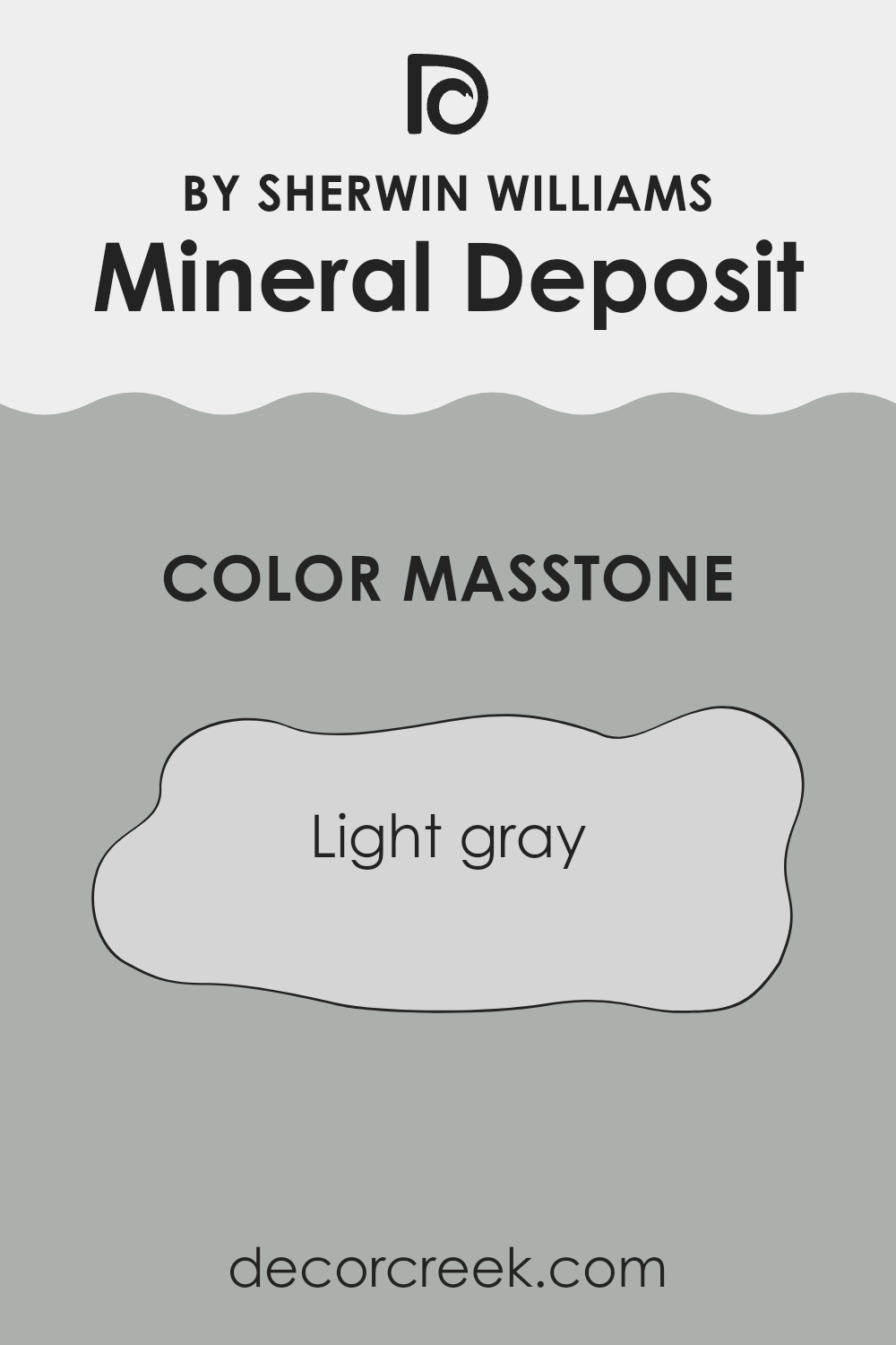
What is the Masstone of the Mineral Deposit SW 7652 by Sherwin Williams?
Mineral Deposit SW 7652 by Sherwin Williams is a light gray color with a masstone that is soft and subtle. This particular shade of gray acts like a neutral backdrop, making it easy to match with a variety of decor styles and colors in a home. Its lightness helps to keep spaces feeling open and airy, which can be especially important in smaller rooms or areas with limited natural light.
Since it’s not a very dark gray, it doesn’t overwhelm the senses, making it a good choice for larger areas like living rooms or open-plan spaces. It provides a gentle contrast when paired with brighter or deeper colors, allowing those accent colors to stand out without clashing.
This light gray can also help to soften sharper design elements, ensuring a smooth visual flow in your home’s design. Overall, Mineral Deposit is a versatile color choice that works well in a variety of home settings.
How Does Lighting Affect Mineral Deposit SW 7652 by Sherwin Williams?
Lighting plays a crucial role in how we perceive colors in different environments. Color can appear vastly different under various light sources. The color Mineral Deposit by Sherwin Williams is an excellent example of how light can influence our perception of color.
In artificial light, colors can shift depending on the type of bulb used. Fluorescent lighting tends to cast a cooler tone, making Mineral Deposit appear more bluish, enhancing its gray undertones. In contrast, incandescent lighting, which emits a warmer glow, can soften the color, highlighting its green undertones and making it warmer and more muted.
Natural light brings out the truest form of any color. However, the direction of natural light entering a room also affects how a color is viewed.
In rooms that face north, natural light can appear cooler and somewhat bluish. This type of light will enhance the cool tones of Mineral Deposit, making its subtle blue and gray aspects more pronounced. The color may resemble a soft, shadowy gray rather than showing any significant warmth.
South-facing rooms receive the most daylight, and the light is warmer and brighter for the majority of the day. In these rooms, Mineral Deposit will retain much of its integrity but may reveal slightly warmer undertones during the brightest hours, softening the overall feel and making the space feel inviting.
In east-facing rooms, the morning light is warm and yellow, giving Mineral Deposit a softer look in the morning, which transitions to a truer color as the light becomes whiter throughout the day. Conversely, west-facing rooms get the evening sunlight, which is warmer. This color, in the afternoon and evening, will therefore appear slightly warmer and more dynamic, potentially highlighting subtle green undertones.
Overall, understanding how lighting affects colors like Mineral Deposit can help in making informed decisions when choosing paint colors for different rooms and lighting conditions.
What is the LRV of Mineral Deposit SW 7652 by Sherwin Williams?
LRV stands for Light Reflectance Value, a metric used to determine how much light a paint color reflects or absorbs when applied to a surface. It’s measured on a scale where lower values indicate that the color absorbs more light, making it appear darker, and higher values mean the color reflects more light, making it appear lighter.
This scale helps in deciding which paint to use based on how bright or dark you want a room to look. It’s particularly useful for understanding how a color will change under different lighting conditions, thus impacting the overall mood and visual size of a space.
For the color with an LRV of 42.629, it sits in the mid-range of the scale, meaning it neither reflects nor absorbs light excessively. As a result, it’s a versatile choice that provides a balanced, moderate brightness. In a well-lit room, this specific value ensures it doesn’t look too bright or washed out, while in a dimmer space, it retains enough light to avoid making the room feel overly dark.
The mid-range LRV makes this color a good candidate for various rooms and settings, striking a comfortable balance between warmth and light.

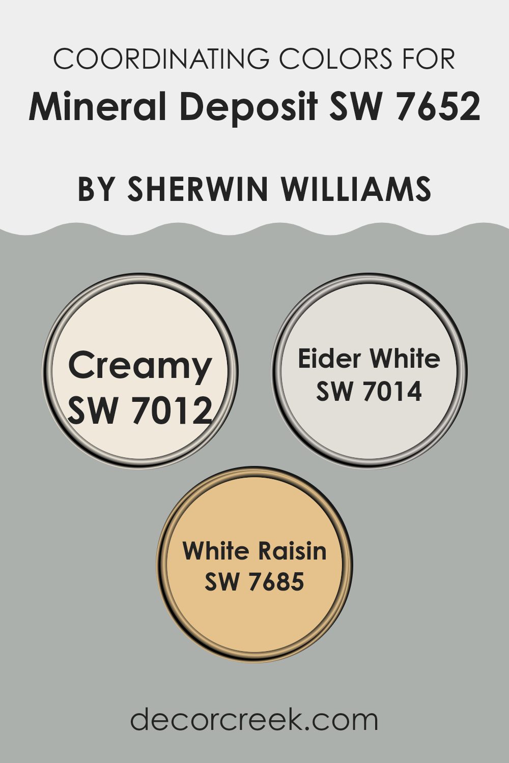
Coordinating Colors of Mineral Deposit SW 7652 by Sherwin Williams
Coordinating colors are shades that complement each other well when used together in a room, creating a harmonious and aesthetically pleasing environment. These are chosen for their ability to enhance the main color, in this case, Mineral Deposit by Sherwin Williams, bringing out its unique tones and making the space feel complete. When you select coordinating colors, you look for hues that balance the atmosphere of the room, adding subtle contrast or reinforcing a calm, cohesive look.
Creamy (SW 7012) is a soft, warm white that adds a gentle brightness to spaces, making them feel inviting and cozy. It pairs well with cooler tones, providing a soothing backdrop that allows other colors to stand out.
Eider White (SW 7014), another muted shade, offers a hint of gray, giving it a modern and fresh look that works well in contemporary settings. This color is particularly effective in balancing out darker or more vibrant colors. White Raisin (SW 7685) is a warm taupe that brings a touch of earthiness and subtle vibrancy, creating a comfortable and grounded atmosphere that complements the cooler, understated elegance of Mineral Deposit. Hence, these coordinating colors work in synergy, balancing and enhancing the visual appeal of any room.
You can see recommended paint colors below:
- SW 7012 Creamy
- SW 7014 Eider White
- SW 7685 White Raisin
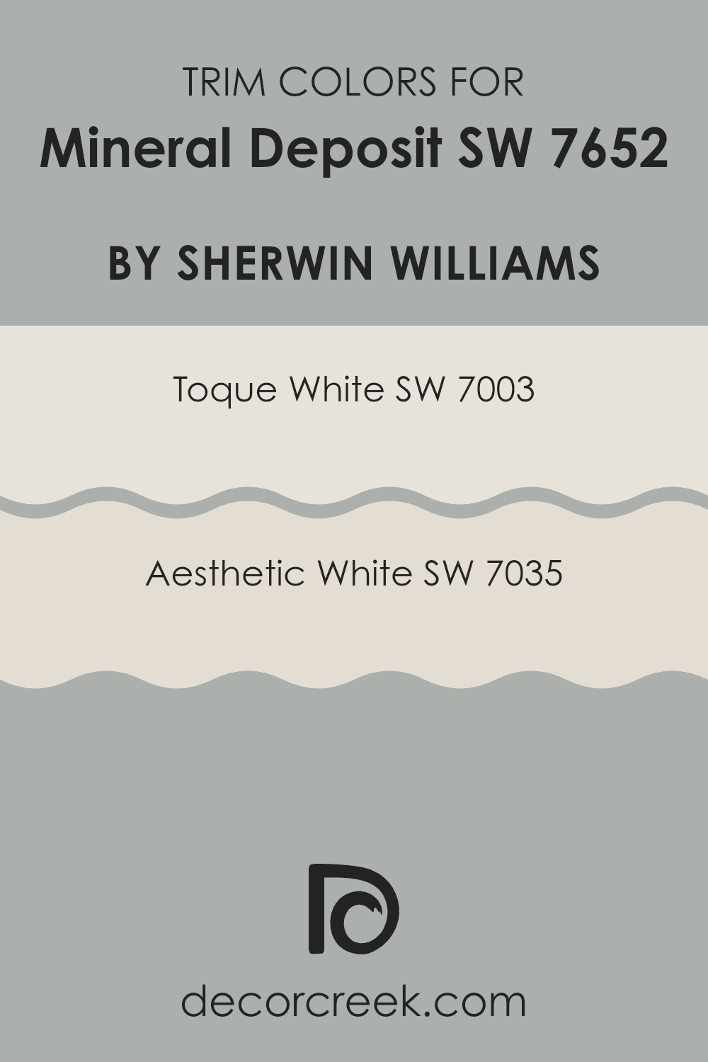
What are the Trim colors of Mineral Deposit SW 7652 by Sherwin Williams?
Trim colors are a crucial element in interior design, as they highlight the architectural features of a room and frame the central colors used on walls or other surfaces. When pairing trim colors with a shade like Mineral Deposit by Sherwin Williams, it’s important to choose colors that complement the main hue without overwhelming it. Opting for trim colors such as Toque White or Aesthetic White can subtly enhance the sophistication of Mineral Deposit, providing a crisp and clean border that allows the wall color to stand out.
Toque White, a soft and neutral white, offers a gentle contrast that helps make the walls appear more vibrant without causing a sharp clash. This color is versatile and works particularly well in spaces that aim to have a light and airy feel.
On the other hand, Aesthetic White has a slightly warmer tone that adds a subtle depth to the space. Its warmth pairs nicely with the cooler undertones of Mineral Deposit, creating a harmonious and welcoming atmosphere. Both colors support the main shade in creating a more polished and cohesive look.
You can see recommended paint colors below:
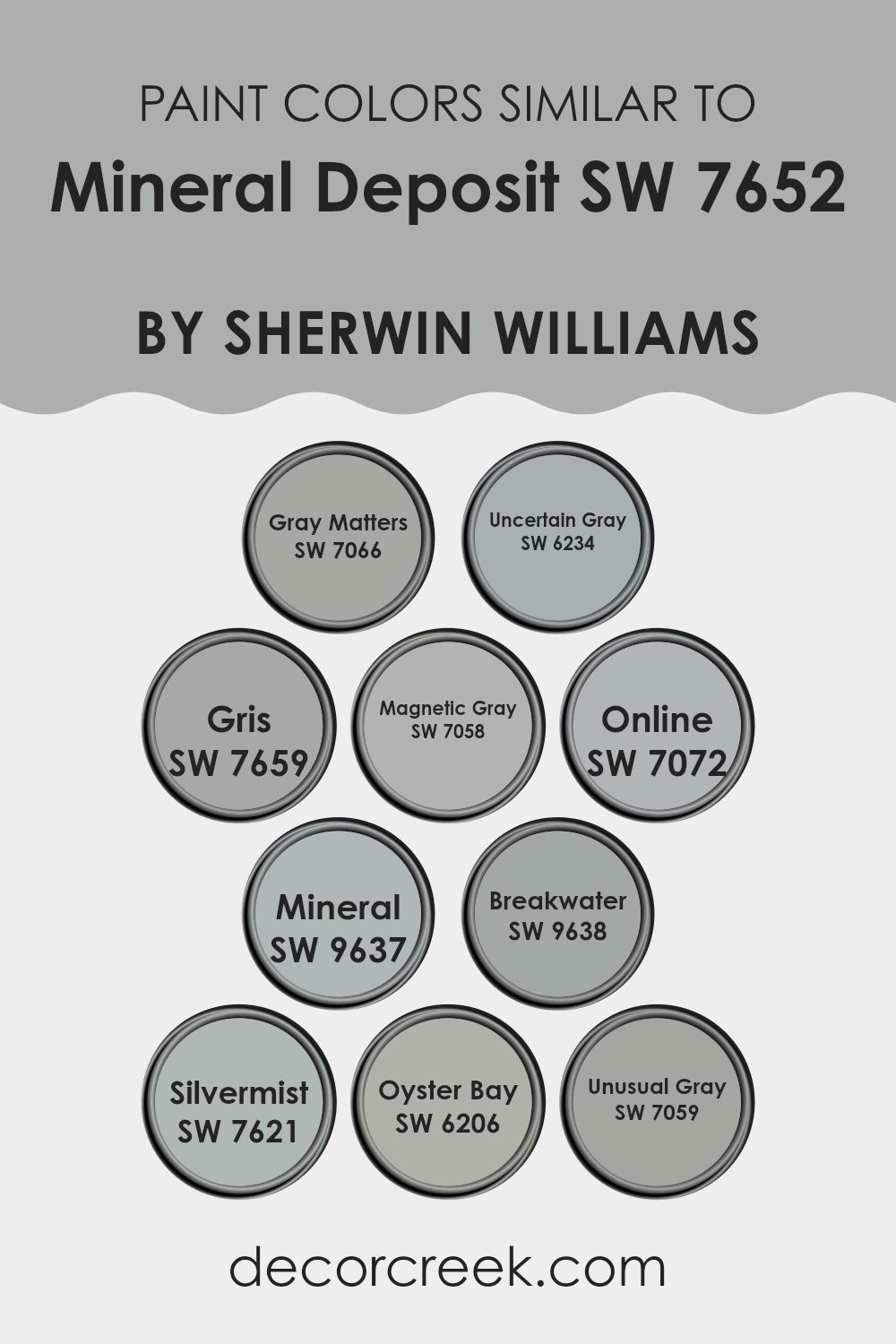
Colors Similar to Mineral Deposit SW 7652 by Sherwin Williams
Choosing similar colors for a design project can greatly influence the overall aesthetic and cohesion of a space. Colors that complement each other, like those in the same color family, help to create a seamless and harmonious atmosphere. For example, shades such as Gray Matters and Uncertain Gray, both offering subtle variations of gray with different undertones, enable designers to maintain a consistent theme while adding a slight contrast to keep the space dynamic.
Colors like Gris and Magnetic Gray lean toward a cooler palette, helping to establish a calm, cohesive feel without sharp contrasts that might disrupt the visual flow. Similarly, the slightly bluer tones in Online and Mineral work well to inject a fresher, mildly vibrant touch into settings primarily dominated by gray tones.
Breakwater and Silvermist both show how a faint dash of blue or green can subtly alter a room’s ambiance without steering too far from the primary palette. Meanwhile, Oyster Bay and Unusual Gray highlight how introducing a green or taupe undertone can warm up a space while still keeping it neutral and easy to match with bolder colors or accents in the interior design. Utilizing shades within the same spectrum ensures that each element in a room feels like part of a thoughtfully crafted ensemble, fostering a cohesive yet visually interesting environment.
You can see recommended paint colors below:
- SW 7066 Gray Matters
- SW 6234 Uncertain Gray
- SW 7659 Gris
- SW 7058 Magnetic Gray
- SW 7072 Online
- SW 9637 Mineral
- SW 9638 Breakwater
- SW 7621 Silvermist
- SW 6206 Oyster Bay
- SW 7059 Unusual Gray
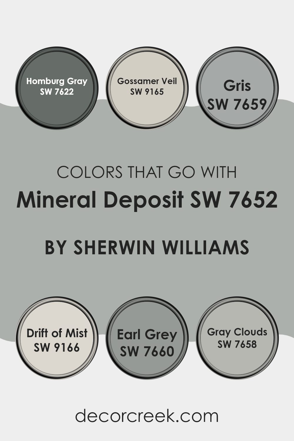
Colors that Go With Mineral Deposit SW 7652 by Sherwin Williams
Choosing the right colors to pair with Mineral Deposit SW 7652 by Sherwin Williams is essential for creating a harmonious and pleasing environment. Harmonizing colors can enhance mood, elevate the aesthetics of a space, and ensure that the room feels cohesive. For example, matching it with colors like Homburg Gray SW 7622, which is a deeper, moody gray, brings depth and gravity to a space, offering a strong base that complements the softer tones of Mineral Deposit.
On the other hand, pairing it with a lighter shade like Gossamer Veil SW 9165, a subtle off-white with a warm base, adds a refreshing lift that can brighten up any area while still aligning with the cooler undertones of Mineral Deposit.
Colors like Gris SW 7659, which is a mid-tone gray with a hint of blue, seamlessly blend with Mineral Deposit’s own cool nuances, creating a smooth visual flow within a room. Drift of Mist SW 9166, a soft, veiled gray, offers a delicate contrast that enhances the space without overwhelming it. If aiming for a slightly more dramatic effect, Earl Grey SW 7660, with its rich, bold tone, introduces an element of drama that still ties in nicely with the airy blue-gray of Mineral Deposit.
Alternatively, Gray Clouds SW 7658 provides a light medium gray that reinforces a balanced and light-hearted backdrop, perfect for areas requiring a gentle touch. Pairing these colors with Mineral Deposit allows for a layered, effective interior design that is both aesthetic and functional.
You can see recommended paint colors below:
- SW 7622 Homburg Gray
- SW 9165 Gossamer Veil
- SW 7659 Gris
- SW 9166 Drift of Mist
- SW 7660 Earl Grey
- SW 7658 Gray Clouds
How to Use Mineral Deposit SW 7652 by Sherwin Williams In Your Home?
Mineral Deposit SW 7652 by Sherwin Williams is a soft gray color with blue undertones that brings a fresh and clean feel to any room. This versatile shade works well in various areas of a home, from living rooms to bedrooms, providing a neutral backdrop that complements a wide range of decor styles and color schemes.
For those looking to freshen up their kitchen, Mineral Deposit can be used on cabinets or walls, giving the space a modern and airy look. In bathrooms, this color helps create a light and inviting environment.
It’s also an excellent choice for painting furniture, such as dressers or bookshelves, adding a subtle touch of color without overpowering the room. Pair it with whites for a crisp contrast or with darker blues for a coordinated look. This paint color is a simple way to update your home while keeping a calm and pleasant atmosphere.
Mineral Deposit SW 7652 by Sherwin Williams vs Silvermist SW 7621 by Sherwin Williams
The main color Mineral Deposit and the second color Silvermist are both soothing tones from Sherwin Williams. Mineral Deposit is a soft gray with a hint of blue, creating a calm, neutral backdrop suited for various spaces.
Its subtle blue influence adds a cool, fresh feel to the environment. On the other hand, Silvermist is a deeper shade that blends blue and gray with a touch of green. This combination gives Silvermist a richer and slightly more vibrant look compared to Mineral Deposit.
The green undertone in Silvermist brings a natural, lively quality to the color, making it an excellent choice for adding a bit of energy to a room without overwhelming it. Both colors work well in spaces that aim for a peaceful atmosphere, but Silvermist offers a bit more depth and warmth because of its green influences.
You can see recommended paint color below:
Mineral Deposit SW 7652 by Sherwin Williams vs Oyster Bay SW 6206 by Sherwin Williams
Mineral Deposit and Oyster Bay are two distinct colors by Sherwin Williams, each bringing its own unique vibe to a space. Mineral Deposit is a soft, muted gray that has a clean and subtle appeal, making it perfect for creating a calm and understated atmosphere. It’s a versatile color that works well in almost any room, providing a neutral backdrop that can support a variety of decor styles.
On the other hand, Oyster Bay is a deeper, greenish-gray shade that offers more personality and a stronger presence. It carries a hint of the ocean with its cool, refreshing tones, which can add a touch of nature-inspired beauty to spaces. Oyster Bay is ideal for those looking to make a bit more of a statement without going too bold.
Both colors are excellent choices for those who prefer neutral yet distinct palettes. They can be used individually to set different moods or combined for a layered, harmonious look.
You can see recommended paint color below:
Mineral Deposit SW 7652 by Sherwin Williams vs Online SW 7072 by Sherwin Williams
Mineral Deposit and Online, both by Sherwin Williams, offer unique tones for diverse decorating needs. Mineral Deposit is a soft, subtle gray with a light blue undertone. This quality makes it an excellent choice for creating a calm, soothing atmosphere in spaces like bedrooms or bathrooms. It easily pairs with a variety of decor styles and colors, maintaining a fresh and airy feel.
On the other hand, Online is a darker gray that edges towards a more steel-like, cool appearance. This color is well-suited for modern and contemporary spaces that aim to project a more striking and bold aesthetic. It’s particularly effective in larger rooms or as an accent wall, where it can make a strong visual impact without overwhelming the space.
Overall, both colors support distinct moods and settings within a home, with Mineral Deposit providing a lighter, breezier vibe and Online delivering a more pronounced, cooler tone.
You can see recommended paint color below:

Mineral Deposit SW 7652 by Sherwin Williams vs Uncertain Gray SW 6234 by Sherwin Williams
Mineral Deposit and Uncertain Gray are two shades from Sherwin Williams that provide subtle variations in a similar color range. Mineral Deposit has a cooler, almost silvery appearance, which gives it a crisp and clean feel. This color is great for spaces where you aim for a light, airy atmosphere. It pairs well with brighter whites and darker grays for a balanced look.
On the other hand, Uncertain Gray leans slightly towards green, offering a unique twist to the typical gray. This shade can make a room feel more grounded and cozy, especially in areas with a lot of natural light. It works nicely with both wood tones and earthy colors, adding a hint of nature to the interior space.
Both colors are versatile and muted, making them easy to integrate into various decor styles without overpowering the space. Whether for a bedroom, living room, or bathroom, these shades have a subtle charm that can enhance the aesthetic of your home.
You can see recommended paint color below:
Mineral Deposit SW 7652 by Sherwin Williams vs Mineral SW 9637 by Sherwin Williams
Mineral Deposit and Mineral, both by Sherwin Williams, are unique shades but share a natural inspiration. Mineral Deposit has a grayish-blue tone, providing a cool and calming feel to spaces, making it perfect for creating a peaceful environment in rooms like bedrooms or bathrooms.
On the other hand, Mineral is darker and leans more towards a true gray. This color is versatile and can be used in various settings, from modern kitchens to living rooms, giving a sleek, contemporary look without feeling too cold. While both colors are neutral, Mineral Deposit offers a hint of color with its blue undertones, which can add a subtle touch of personality.
Mineral is more straightforward, providing a strong foundation for any color scheme. When deciding between the two, consider the mood you want to set and the natural light in your space, as this can influence how these colors appear.
You can see recommended paint color below:
Mineral Deposit SW 7652 by Sherwin Williams vs Unusual Gray SW 7059 by Sherwin Williams
Mineral Deposit and Unusual Gray are two distinct colors from Sherwin Williams. Mineral Deposit has a light blue-gray tone that can make any room feel fresh and inviting. It has the coolness of blue with just enough gray to keep it subtle and versatile. This color is great for spaces that need a calm, fresh look without being too bright.
On the other hand, Unusual Gray leans more towards a true gray. It’s a neutral shade that’s neither too dark nor too light, making it a perfect choice for those looking to create a balanced and modern feel in their space. Unusual Gray can work well in nearly any room, providing a clean backdrop that lets your furniture and decor stand out.
Both colors can refresh a space but in different ways. Mineral Deposit adds a hint of color, while Unusual Gray offers a clean slate. The choice between the two would depend on the atmosphere you want to create.
You can see recommended paint color below:
- SW 7059 Unusual Gray
Mineral Deposit SW 7652 by Sherwin Williams vs Gris SW 7659 by Sherwin Williams
Mineral Deposit and Gris, both by Sherwin Williams, are distinct yet subtle gray shades perfect for a calm and appealing space. Mineral Deposit has a slightly greenish undertone, giving it a cool, fresh feel that reminds one of a breezy, cloudy day.
This shade can make a small room feel bigger and more open. On the other hand, Gris leans toward a true gray with a neutral, balanced tone. It’s closer to what you might picture when you think of plain gray, which means it pairs easily with various decor styles and colors. Both colors are versatile, but Mineral Deposit offers a hint of color with its undertones, which can add a unique touch to spaces.
Gris, being a more straightforward gray, serves as a reliable choice for a sleek, minimalistic look. Choosing between the two depends on whether you prefer a hint of additional coolness or a straightforward, classic gray.
You can see recommended paint color below:
Mineral Deposit SW 7652 by Sherwin Williams vs Gray Matters SW 7066 by Sherwin Williams
Mineral Deposit and Gray Matters are two interesting shades from Sherwin Williams. Mineral Deposit has a subtle, cool undertone that can evoke a sense of calm and cleanliness, ideal for a modern-looking space.
It’s not too dark nor too light, so it works well in various lighting conditions. On the other hand, Gray Matters is a mid-tone gray that leans slightly towards the cooler side but is warmer than Mineral Deposit. This makes Gray Matters a versatile choice for many rooms, adding a touch of neutrality without feeling too cold.
Both colors are great for those looking to achieve a fresh, clean look in their home, but Mineral Deposit might be preferred for a slightly cooler, airy feel, while Gray Matters could be better for those seeking a stronger presence of gray that still maintains a friendly and inviting atmosphere.
You can see recommended paint color below:
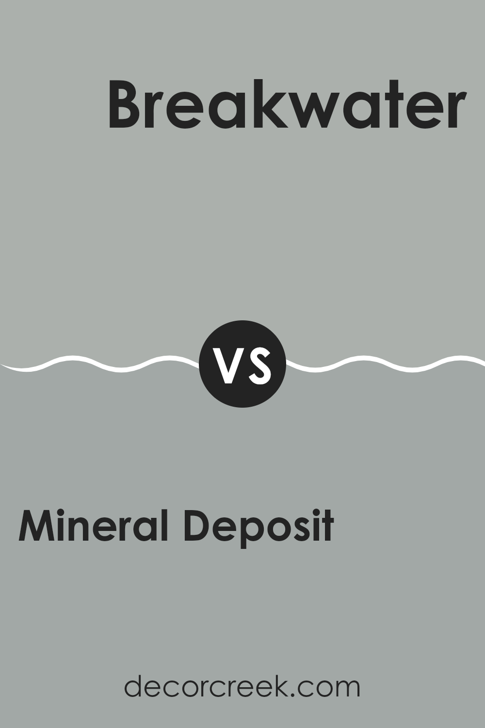
Mineral Deposit SW 7652 by Sherwin Williams vs Breakwater SW 9638 by Sherwin Williams
Mineral Deposit and Breakwater are two interesting shades from Sherwin Williams. Mineral Deposit is a subtle gray that has a soft, almost muted quality, making it a versatile choice for any room looking for a calm and understated look. It pairs well with a variety of decor styles due to its neutral base.
On the other hand, Breakwater is a deeper shade with a slight bluish tone that adds a bit more personality to spaces without overwhelming them. This color is especially great for creating a focal point in a room or for adding depth when used on accent walls.
While both colors provide a peaceful and pleasant backdrop, Mineral Deposit offers a lighter, more relaxed vibe, whereas Breakwater leans towards a more dramatic flair with its richer hue. Depending on the mood you want to set in your space, either could work well; Mineral Deposit for a gentle touch and Breakwater for a bolder statement.
You can see recommended paint color below:
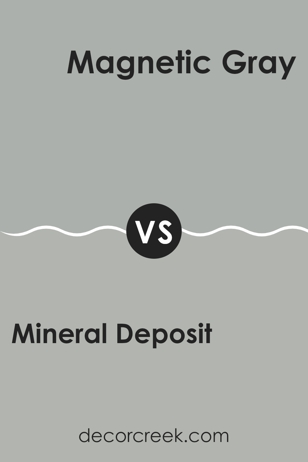
Mineral Deposit SW 7652 by Sherwin Williams vs Magnetic Gray SW 7058 by Sherwin Williams
Mineral Deposit is a subtle shade of gray with a slight hint of blue. It gives a fresh, clean look to any space, making it ideal for creating a calm, relaxing environment. It’s light enough to make small rooms appear more spacious, yet has enough color to add a distinct personality to any area.
Magnetic Gray, on the other hand, is a deeper, warmer gray. This color has a more pronounced presence, bringing a sense of richness and depth to spaces. It works well in areas that benefit from a cozy and inviting atmosphere, such as living rooms or bedrooms.
Both colors are versatile and can complement various decor styles, but Mineral Deposit tends to lend a lighter, airier feel, which could be perfect for kitchens and bathrooms. Magnetic Gray offers a stronger statement and can be an excellent choice for accent walls or furniture pieces for those looking to add a bit of drama. Together, these colors can work well if you want to balance a room with cool and warm tones.
You can see recommended paint color below:
Conclusion
It’s a lovely shade of gray-blue that makes you think of a peaceful day by the sea or a quiet morning sky. The paint is known for its ability to bring a fresh and gentle feel to any room. Whether you’re painting a bedroom, living room, or even the kitchen, this color can add a nice, soothing touch without making the room feel too bright or too dark.
The color is also really flexible, which means it works well with a lot of other colors. You can pair it with whites for a crisp, clean look, or with darker colors for a bit more drama. It’s a good option if someone wants to make their room look nice without using colors that are too bold or shouty.
Overall, Mineral Deposit seems like a great choice if you want to refresh your room without making things too complicated. It’s a gentle, friendly color that can make your house feel more like a home, giving it a calm, pleasant atmosphere where you can relax and feel comfortable.
Whether you’re trying to make a small space look bigger or just adding a touch of new color, this shade could really do the trick!
Ever wished paint sampling was as easy as sticking a sticker? Guess what? Now it is! Discover Samplize's unique Peel & Stick samples.
Get paint samples

