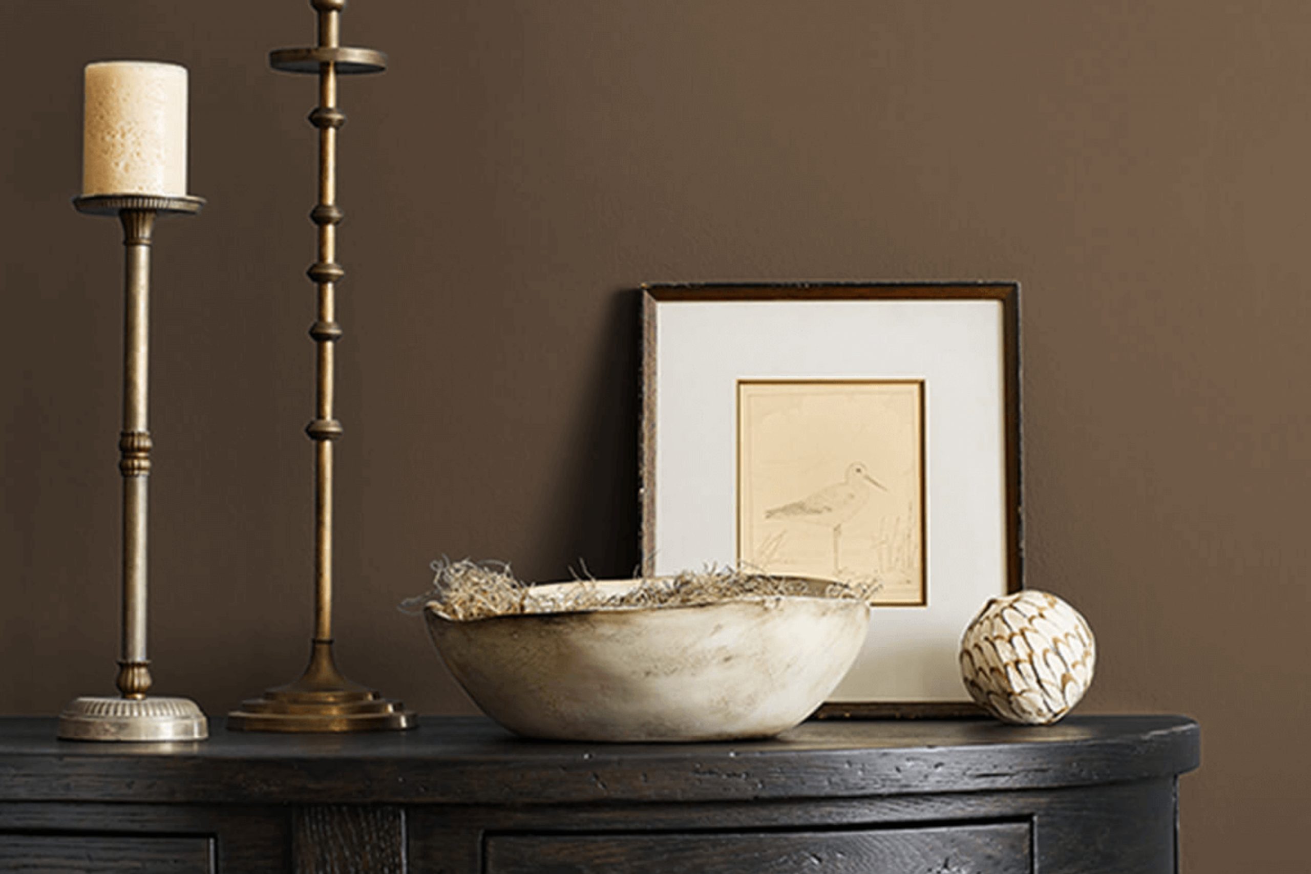
If you’re on the hunt for a paint color that brings both warmth and sophistication to any room, consider SW 7027 Hickory Smoke by Sherwin Williams. Recently, I had the opportunity to use this unique shade in a home renovation project, and I was thoroughly impressed with its versatility.
Hickory Smoke is a deep, smoky gray with subtle brown undertones that give it a cozy yet refined feel. It’s perfect for creating a snug, inviting atmosphere in spaces like living rooms or bedrooms, but it also offers an elegant touch to more formal areas such as dining rooms or home offices.
In my experience, the beauty of Hickory Smoke lies in its ability to complement a wide range of décor styles and elements. Whether your furniture is modern, traditional, or something in between, this color provides a stunning backdrop without overwhelming your senses. It works splendidly with natural materials such as wood and leather, enhancing their richness.
Moreover, this versatile hue adapts well to different lighting conditions, displaying a variety of shades throughout the day from lighter, softer gray to a deeper, more dramatic charcoal as the light changes. Let me guide you through the practical applications and styling tips that make SW 7027 Hickory Smoke a go-to choice for both designers and homeowners alike.
What Color Is Hickory Smoke SW 7027 by Sherwin Williams?
Hickory Smoke by Sherwin Williams is a deep, rich gray with hints of blue that make it a versatile and appealing choice for various interior styles. This color provides a strong foundation that stands out both as an accent or primary wall color. Its depth allows it to bring warmth and coziness into spaces, making it particularly suitable for living areas, bedrooms, and studies.
The hue works exceptionally well in modern and minimalistic designs due to its clean and crisp nature but is also perfectly at home in rustic settings, where it complements natural materials like wood and stone. This makes Hickory Smoke an excellent choice for rooms that feature exposed beams, hardwood floors, or stone accents.
The color’s muted tones create a soothing backdrop that allows textures and materials to stand out—leather, metal, and glass pair beautifully with this shade, enhancing its contemporary feel. Furthermore, Hickory Smoke’s robust quality supports various fabrics such as velvet or wool, adding layers of texture that enrich the room’s overall aesthetic.
Linen curtains or thick woven rugs can soften the strong color, making the space more inviting. Whether you’re looking to create a statement wall or redesign an entire room, Hickory Smoke offers a balanced, versatile shade that supports a blend of both modern amenities and traditional charms.
Is Hickory Smoke SW 7027 by Sherwin Williams Warm or Cool color?
Hickory Smoke by Sherwin Williams is a versatile paint color that brings a unique vibe to any room. This shade of gray has a hint of warmth that makes it perfect for creating a cozy and welcoming atmosphere in homes. It’s not too dark or too light, which means it works wonderfully in various spaces, whether it’s a busy kitchen, a peaceful bedroom, or a lively living room.
When used in smaller spaces, this color can help make the area feel more open and airy. In larger rooms, it serves as a great backdrop for both bold and subtle decorating schemes, allowing other colors in furnishings and decor to stand out.
Hickory Smoke also has the advantage of being neutral, so it matches well with many different color palettes and styles of furniture, making it a practical choice for homeowners. It pairs especially well with natural materials like wood and stone, enhancing their organic beauty. This color is ideal for those looking to create a calm and inviting home environment.
Undertones of Hickory Smoke SW 7027 by Sherwin Williams
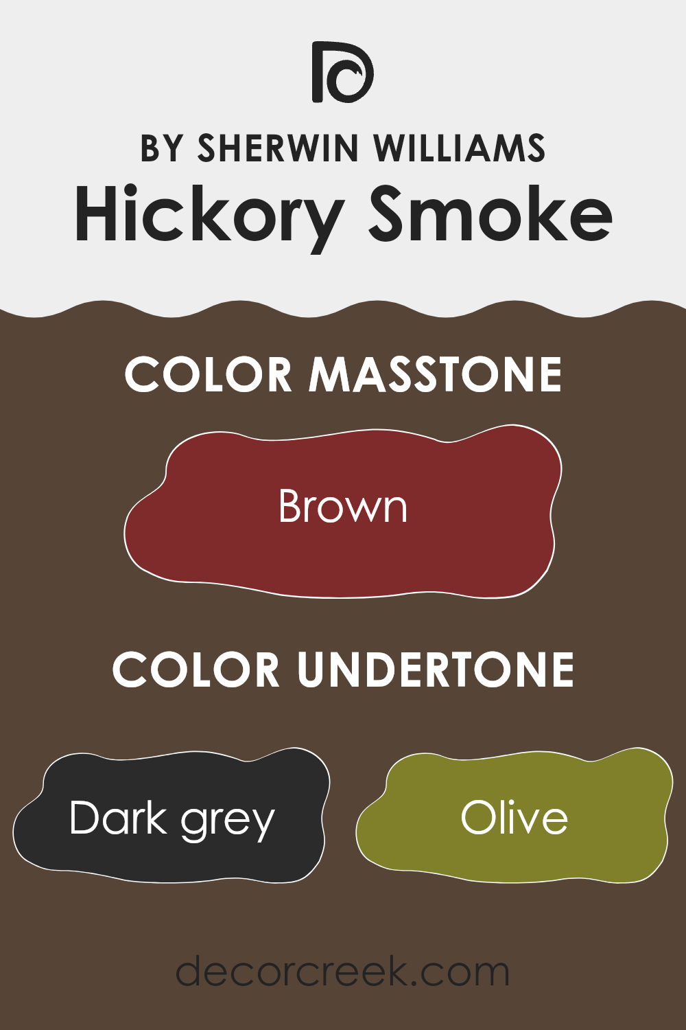
Hickory Smoke is a unique paint color that carries subtle undertones, influencing how it appears under different lighting conditions. The main undertones in Hickory Smoke include dark grey, olive, dark green, purple, navy, grey, dark turquoise, red, orange, pink, and pale pink. These undertones are essentially hints of other colors that can be seen when the primary color is viewed under certain lights or when placed next to other colors. They play a critical role in determining the overall appearance and feel of the paint once applied to walls.
In the context of interior walls, Hickory Smoke’s versatility allows it to adapt subtly to its surroundings. For example, the dark grey and grey undertones provide a grounded, neutral base, making the color look solid and calm, an excellent choice for creating a cozy atmosphere. When combined with natural light or near bright-colored decor, hints of olive and dark green might become more noticeable, adding a touch of nature-inspired vibes.
Other undertones, like purple, navy, and dark turquoise, come into play depending on the lighting and adjacent colors, adding depth and interest to the room. Warmer undertones like red, orange, pink, and pale pink can make the space feel more welcoming and slightly vibrant yet not overwhelming.
Overall, the presence of these undertones in Hickory Smoke means that this color can suit various styles and spaces, adapting to the mood you want to set. The color can look different at various times of the day and in different lighting conditions, making it an excellent choice for those who appreciate a dynamic environment.
What is the Masstone of the Hickory Smoke SW 7027 by Sherwin Williams?
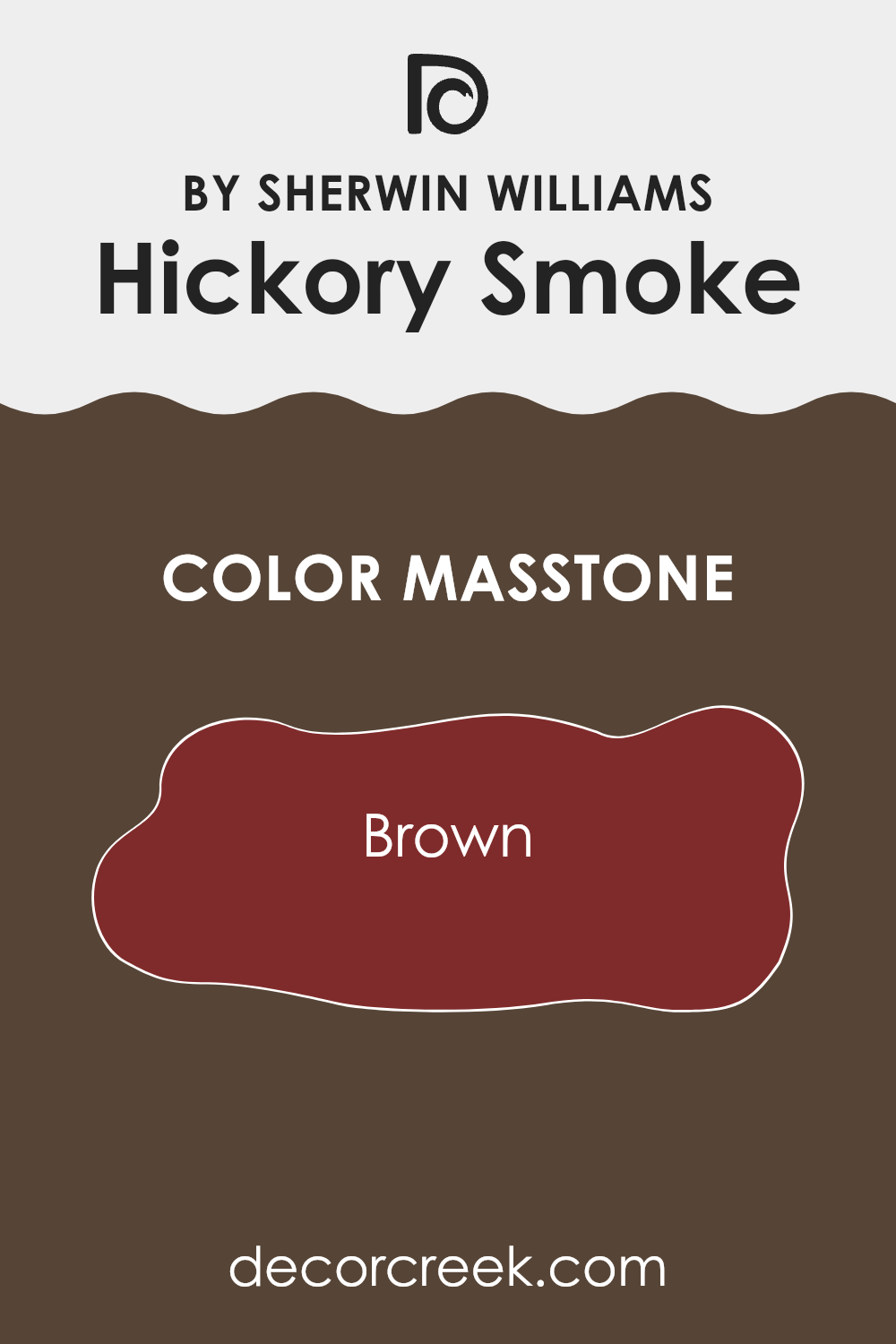
Hickory SmokeSW 7027 by Sherwin Williams has a deep, warm brown masstone (#802B2B). This rich brown shade creates a cozy and welcoming atmosphere in any home. Its earthy, comforting tone pairs well with various colors, enhancing both bright and muted decor.
It works exceptionally well in living spaces where the aim is to create a relaxed, homey feel. In rooms with natural light, the color can appear more vivid, bringing a sense of warmth even during colder months.
This versatile brown also works as an excellent background for furniture and artwork, allowing for diverse stylistic choices, whether you prefer modern or traditional design. For those looking to add warmth and a natural aesthetic to their environment, Hickory Smoke is an optimal choice. Its ability to act both as a grounding neutral and a statement color, depending on the context and pairing, makes it adaptable for multiple spaces in a home.
How Does Lighting Affect Hickory Smoke SW 7027 by Sherwin Williams?
Lighting plays a crucial role in how we perceive colors in an environment. The type and intensity of light can significantly affect the way a color looks on walls or objects. This is particularly important to consider when choosing paint colors for a home or office. When discussing how a specific paint color looks under different lighting conditions, let’s consider Hickory Smoke, a gray shade.
In artificial light, such as that from incandescent bulbs, this color may appear warmer and slightly darker than it does in natural light.
Fluorescent lighting, on the other hand, could make it look more muted and cooler, as these lights typically emit a bluish tone.
Natural light impacts this color differently depending on the direction of the room.
In north-facing rooms, which often receive less direct sunlight, Hickory Smoke might appear cooler and slightly darker, emphasizing its gray qualities without becoming too stark. In south-facing rooms, where light is abundant and warmer for most of the day, this color could look softer and slightly lighter, making the room feel more open and airy.
In east-facing rooms, morning light can make Hickory Smoke look very soft and warm, providing a gentle start to the day. As the light changes, so will the perception of the color, possibly becoming cooler later in the day. In contrast, west-facing rooms receive intense evening light, which can make this color appear bolder and more dynamic during sunset but potentially dim and shadowy in the morning.
Understanding these nuances can help in making informed decisions about paint colors based on the room’s orientation and the type of light it receives most often. Choosing the right shade like Hickory Smoke can make a significant difference in enhancing the atmosphere of a space.
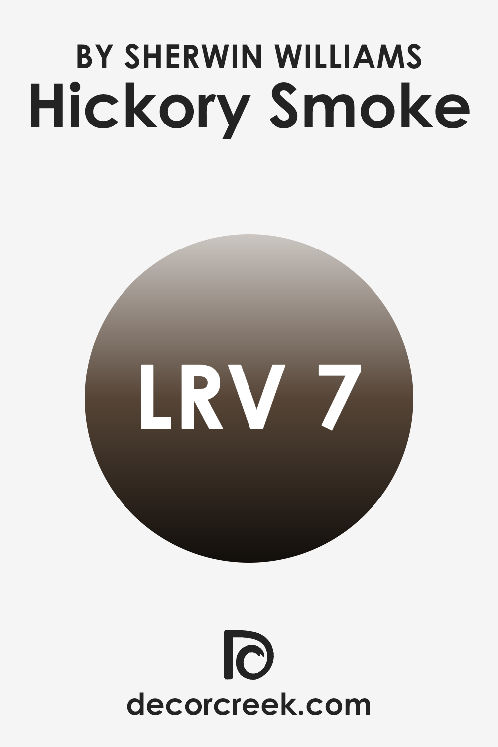
What is the LRV of Hickory Smoke SW 7027 by Sherwin Williams?
LRV stands for Light Reflectance Value, which measures the amount of light a paint color reflects or absorbs when it’s painted on a wall. This value is presented on a scale from 1 to 99, where lower numbers mean the color absorbs more light and appears darker, and higher numbers indicate that the color reflects more light, making it appear lighter.
LRV is especially useful to consider when choosing paint colors because it helps you predict how light or dark a color will look in your space. It affects the atmosphere and mood of a room, as darker colors can make a room feel smaller and more intimate, while lighter colors can make a space feel larger and more airy.
Hickory Smoke with an LRV of 6.56, is a very dark color since it’s near the lower end of the LRV scale. This means it will absorb most of the light, rather than reflecting it. In a practical sense, using this color on walls can dramatically darken a room, especially one that already lacks natural light. However, in well-lit areas or spaces where a feeling of coziness is desired, this dark hue can add depth and drama. Choosing contrasting or lighter colors for trim and furnishings can help balance the darkness of the walls and prevent the room from feeling too closed in.
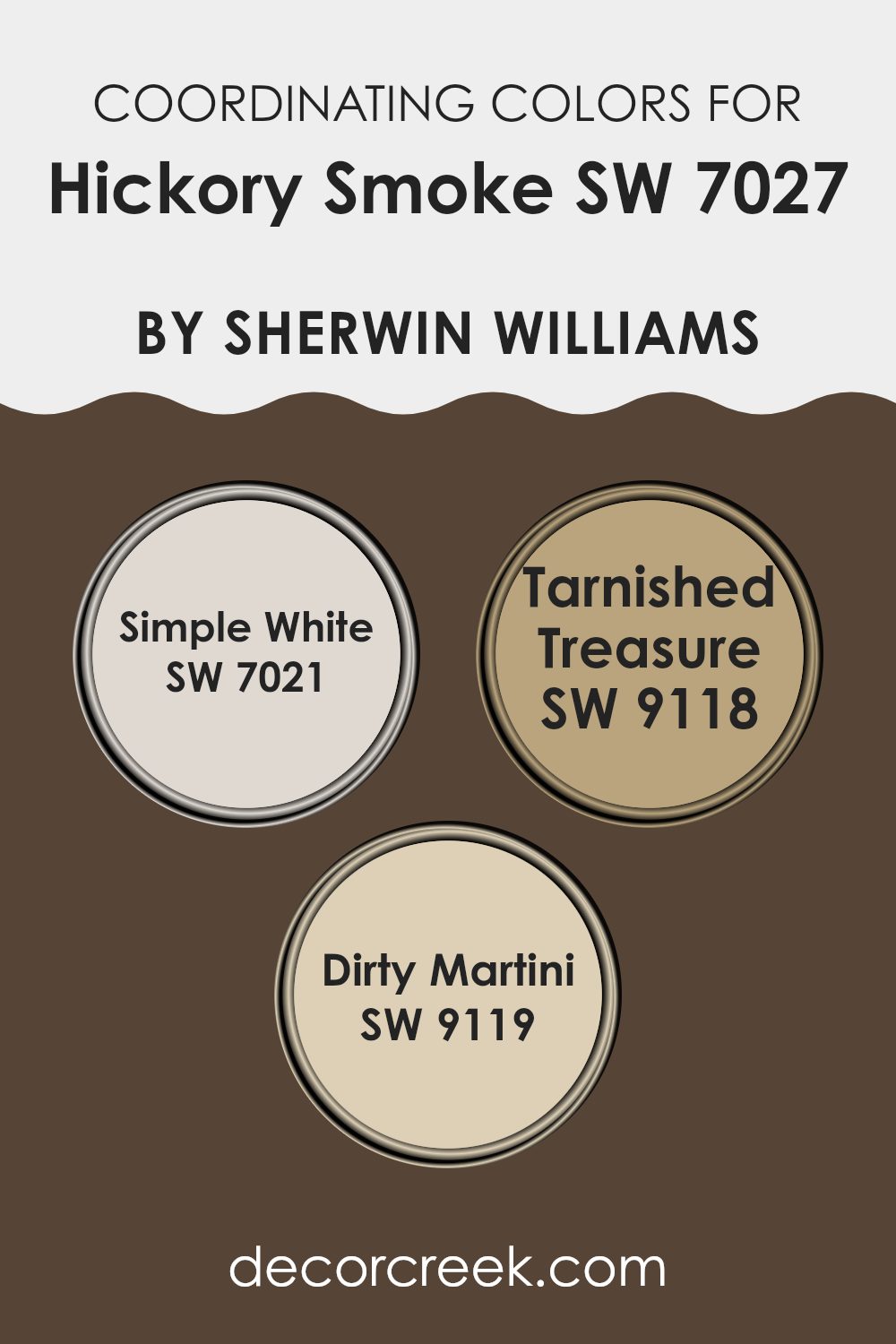
Coordinating Colors of Hickory Smoke SW 7027 by Sherwin Williams
Coordinating colors are auxiliary hues that complement or enhance the main color in a palette, creating a harmonious look. In the case of a paint color like Hickory Smoke from Sherwin Williams, choosing the right coordinating colors involves selecting shades that blend well to produce a balanced and aesthetically pleasing decor.
When matching other colors with a primary shade like Hickory Smoke, it’s important to consider the undertones and the overall vibe you want to achieve in your space. The selected coordinating colors should create a sense of continuity and flow, whether for painting multiple rooms or just adding accents.
Among the coordinating colors for Hickory Smoke is Simple White (SW 7021), a clean and bright shade that offers a sharp contrast, making any space feel fresh and open. It’s ideal for trim or cabinets to create a crisp outline against darker walls. Tarnished Treasure (SW 9118) is a deeper, muted gold tone that can add warmth and a hint of vintage charm without overwhelming the primary color.
This makes it great for creating a cozy, inviting space. Similarly, Dirty Martini (SW 9119) is a unique, olive-green shade that carries a natural, earthy feel, perfect for complementing neutral or bold color schemes while maintaining a grounded, soothing atmosphere. These choices not only support the primary color but also contribute to creating a well-rounded color scheme.
You can see recommended paint colors below:
- SW 7021 Simple White
- SW 9118 Tarnished Treasure
- SW 9119 Dirty Martini
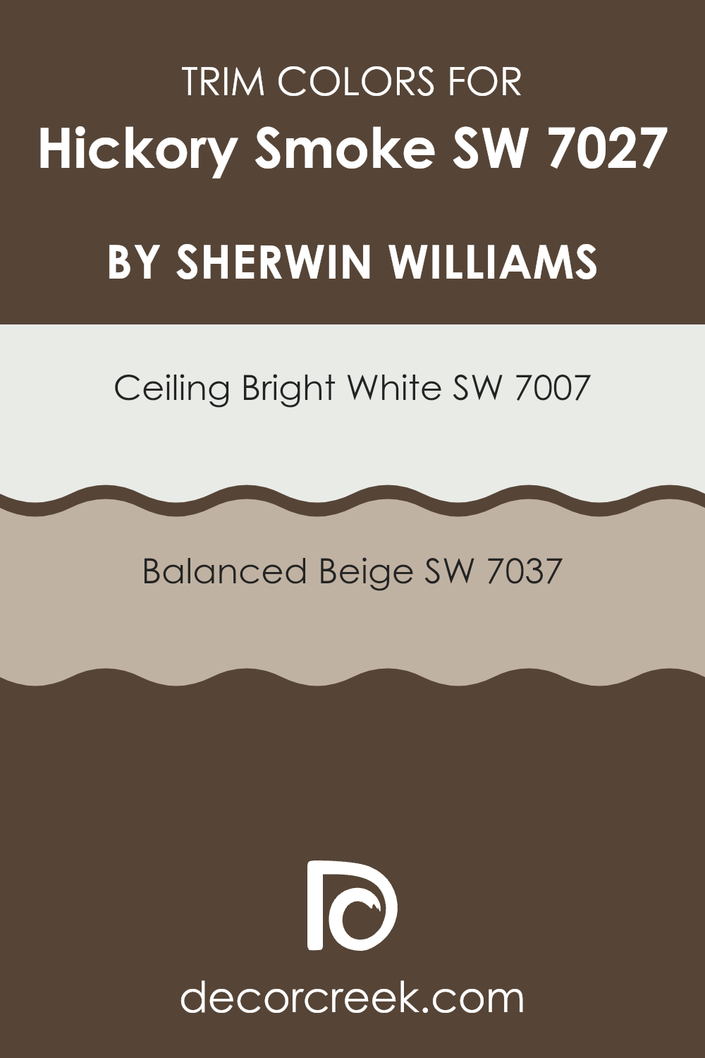
What are the Trim colors of Hickory Smoke SW 7027 by Sherwin Williams?
Trim colors are crucial in interior design as they help to define and accentuate the architectural features of a room. For Hickory Smoke SW 7027 by Sherwin Williams, choosing the right trim colors can enhance the appeal of the walls and bring a cohesive look to the space. SW 7007 Ceiling Bright White and SW 7037 Balanced Beige are excellent choices for trim colors with Hickory Smoke.
Ceiling Bright White is a clean and crisp white that offers a striking contrast, making it perfect for highlighting the sleek tones of Hickory Smoke. On the other hand, Balanced Beige offers a softer, warmer approach that complements Hickory Smoke by adding a subtle depth and warmth to the room’s overall aesthetics.
Using either Ceiling Bright White or Balanced Beige as trim colors can significantly impact the mood and style of a room painted in Hickory Smoke. Ceiling Bright White can give a fresh and airy feel, perfect for spaces that benefit from a bright and open atmosphere.
Balanced Beige, with its understated elegance, works beautifully in areas where a more relaxed and cozy vibe is desired. Both trim options ensure that the walls stand out and the room’s character is enhanced while maintaining harmony in the design.
You can see recommended paint colors below:
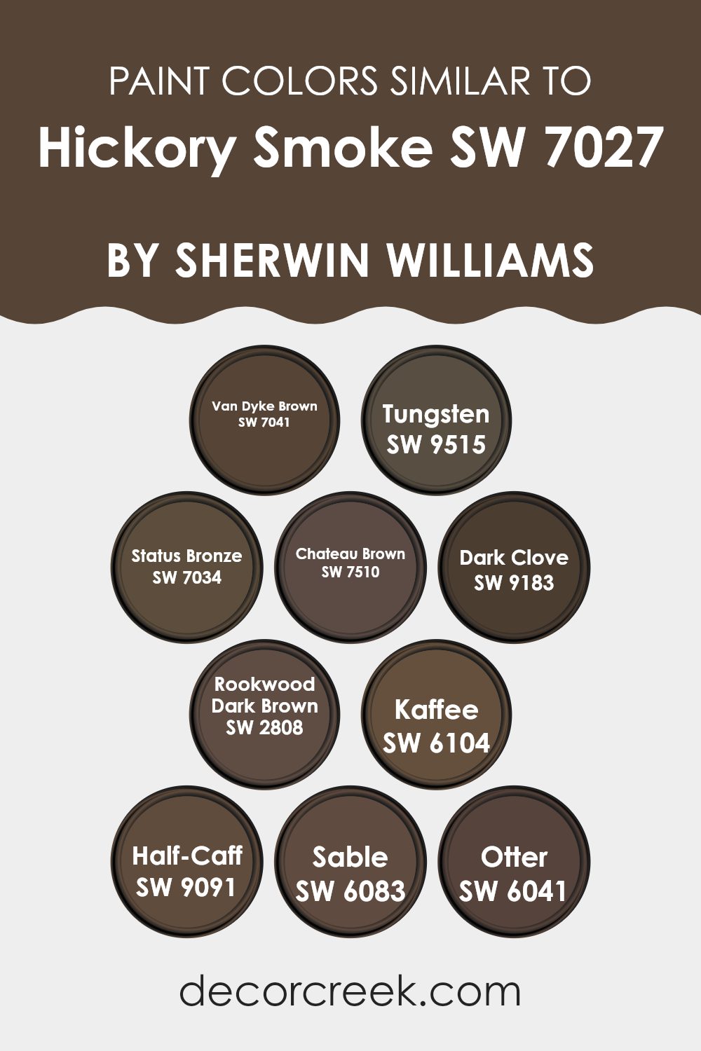
Colors Similar to Hickory Smoke SW 7027 by Sherwin Williams
Similar colors play a crucial role in design by creating a harmonious and cohesive look that is pleasing to the eye. When colors are akin to each other, they help in shaping a space that feels balanced and intentional. By using shades related to Hickory Smoke like Van Dyke Brown or Tungsten, you can achieve a subtle variety while maintaining a consistent theme throughout the area. These hues work well together because they share common undertones that blend seamlessly, making the environment feel well-coordinated without stark contrasts.
Van Dyke Brown is a deep, earthy chocolate that enriches spaces with its warm, grounding presence. Tungsten, on the other hand, offers a slightly grayish cast, providing a softer approach to dark neutrals. Status Bronze is another color in this spectrum, showing off a muted bronze tone that adds a touch of refinement without overpowering a space.
Chateau Brown brings a rich, deep caramel undertone that warms up any area, while Dark Clove offers a nearly black, spicy tone, excellent for accentuating details. Rookwood Dark Brown exudes a strong, dark chocolate vibe ideal for creating depth. Kaffee has a deep, rich coffee color, perfect for adding warmth and intensity. Half-Caff serves up a lighter coffee hue, providing a gentle contrast to more intense shades like Kaffee.
Sable is a deep, warm brown that conveys a sense of comfort and earthiness, whereas Otter mixes a gray-brown tone that works like a neutral, making it extremely versatile for blending with other similar shades. These colors, closely related to Hickory Smoke, help in crafting spaces that are not only visually appealing but also inherently connected, ensuring a smooth visual flow from one area to another.
You can see recommended paint colors below:
- SW 7041 Van Dyke Brown
- SW 9515 Tungsten
- SW 7034 Status Bronze
- SW 7510 Chateau Brown
- SW 9183 Dark Clove
- SW 2808 Rookwood Dark Brown
- SW 6104 Kaffee
- SW 9091 Half-Caff
- SW 6083 Sable
- SW 6041 Otter
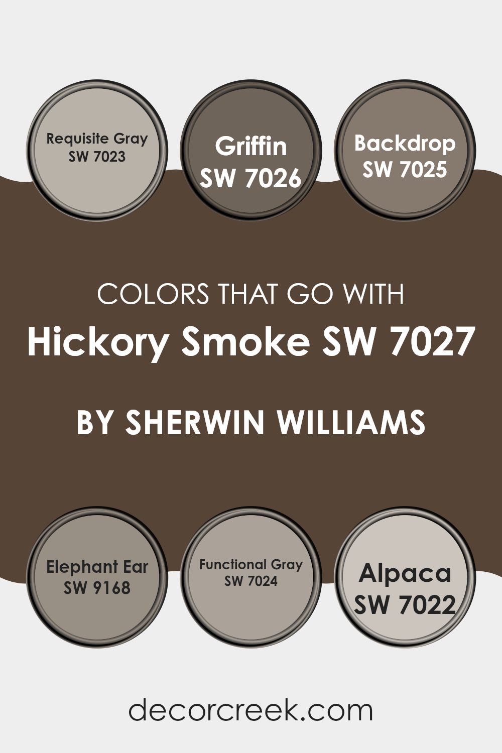
Colors that Go With Hickory Smoke SW 7027 by Sherwin Williams
Choosing the right colors to complement Hickory Smoke SW 7027 by Sherwin Williams is crucial because it helps create a cohesive and appealing space. Hickory Smoke is a versatile gray that serves as a solid foundation for a room’s color scheme, but pairing it with the right shades enhances the aesthetic unity and balance. Colors like Requisite Gray, Griffin, and Backdrop provide subtle variations that can either soften or accentuate the ambiance of a room depending on the chosen shade.
For example, Requisite Gray SW 7023 is a lighter gray that can brighten spaces while maintaining a cool, coordinated look with Hickory Smoke. Griffin SW 7026 is a deeper gray, offering a strong, yet harmonious contrast that can add depth and dimension to interiors. Backdrop SW 7025 is slightly warmer and works well to create a cozy and inviting environment.
Elephant Ear SW 9168 leans toward a brown-gray, providing a rich, earthy quality that complements the cooler tones. Functional Gray SW 7024 offers a mid-tone gray that bridges the gap between light and dark shades, making it ideal for blending different elements of a room.
Lastly, Alpaca SW 7022, with its softer taupe-like appearance, can soften the overall feel of the environment, promoting a subtle yet effective layer of complexity to the design palette. By carefully selecting these compatible colors, you can ensure a room that feels thoughtfully designed and visually integrated.
You can see recommended paint colors below:
- SW 7023 Requisite Gray
- SW 7026 Griffin
- SW 7025 Backdrop
- SW 9168 Elephant Ear
- SW 7024 Functional Gray
- SW 7022 Alpaca
How to Use Hickory Smoke SW 7027 by Sherwin Williams In Your Home?
Hickory Smoke SW 7027 by Sherwin Williams is a versatile gray paint color that can be a great choice for various rooms in your home. It has a warm tone that makes spaces feel cozy and inviting. You can use it in a living room or bedroom to create a relaxed atmosphere, making it ideal for areas where you want to unwind and relax.
In a home office, this color can help maintain a calm and focused environment. Hickory Smoke also works well as a backdrop for art or vibrant decor accents, as its neutrality complements brighter colors and different textures. Consider using it on kitchen cabinets for a fresh, modern look that isn’t too stark.
For a cohesive look throughout your home, you might paint the walls in common areas with this shade, providing a smooth transition from room to room. This color is both practical and stylish, suitable for any space that could use a touch of warmth.
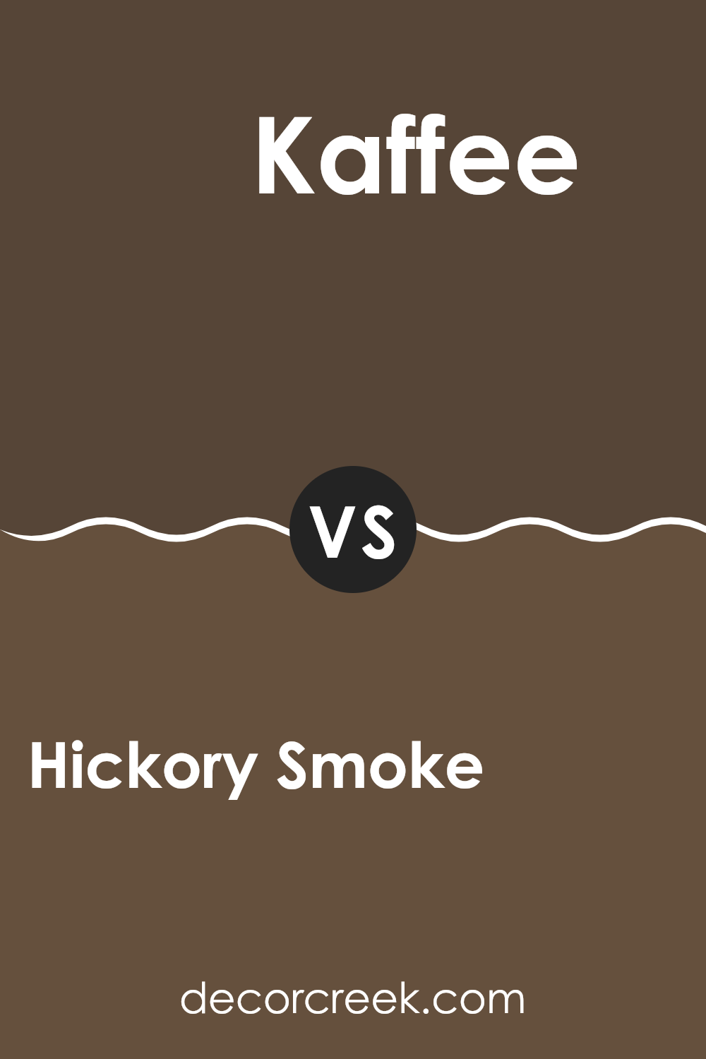
Hickory Smoke SW 7027 by Sherwin Williams vs Kaffee SW 6104 by Sherwin Williams
Hickory Smoke and Kaffee, both colors by Sherwin Williams, serve unique purposes in home decor. Hickory Smoke is a light to medium gray that offers a fresh and clean look to any space. It’s versatile, making it perfect for living rooms, bedrooms, or even kitchens.
It brings a sense of calmness without being too bold. On the other hand, Kaffee is a rich, dark brown that provides a warm and cozy feeling, ideal for creating a comfortable and inviting atmosphere. This color works well in areas like dining rooms or studies where a feeling of warmth is desired.
While Hickory Smoke reflects more light, making a room feel more spacious, Kaffee offers depth and pairs well with lighter colors for a balanced look. Both colors have their charm and suitability depending on the mood and style you want to achieve.
You can see recommended paint color below:
- SW 6104 Kaffee
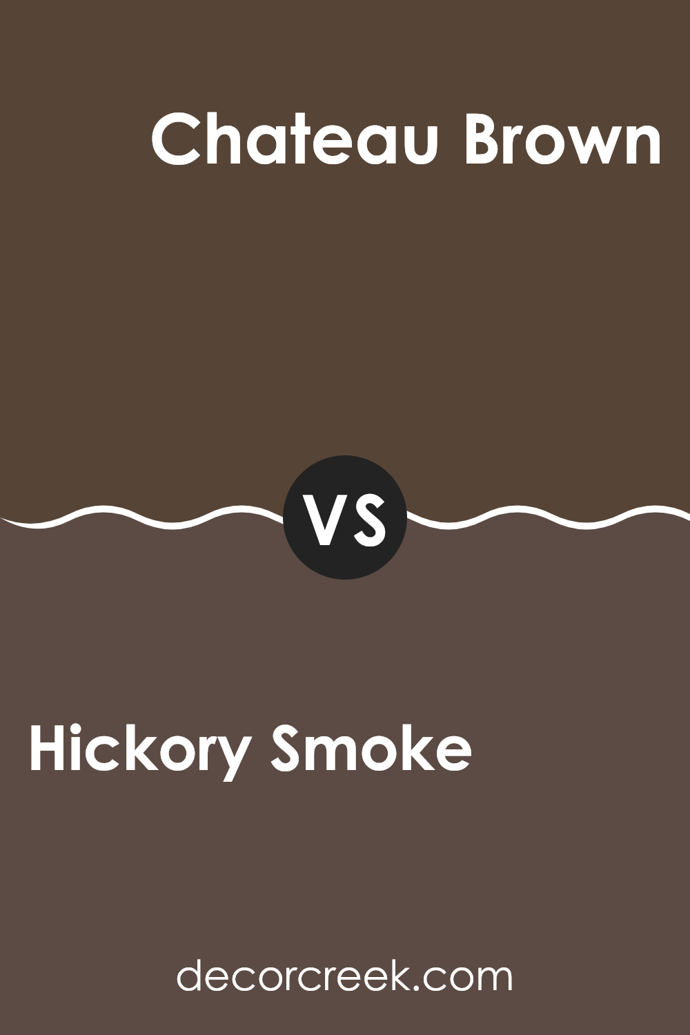
Hickory Smoke SW 7027 by Sherwin Williams vs Chateau Brown SW 7510 by Sherwin Williams
Hickory Smoke and Chateau Brown are both neutral shades from Sherwin Williams, but they have distinct tones that set them apart. Hickory Smoke is a light, soft gray with cool undertones, making it suitable for creating a calm, unobtrusive background in a room. It works well in spaces that aim for a modern and minimalistic look, reflecting natural light beautifully and making rooms appear more spacious.
On the other hand, Chateau Brown is a much warmer and darker shade. It’s a rich brown that offers a cozy, welcoming feel, perfect for settings where a feeling of comfort and warmth is desired. This color is great in living areas or bedrooms where its depth can make large spaces feel more intimate.
When used together, these colors can complement each other by providing a balance between cool and warm tones, adding visual interest and variety to the decor without overwhelming the senses.
You can see recommended paint color below:
Hickory Smoke SW 7027 by Sherwin Williams vs Status Bronze SW 7034 by Sherwin Williams
Hickory Smoke and Status Bronze, both by Sherwin Williams, offer distinct vibes for room decor. Hickory Smoke is a gentle gray that provides a neutral, calming backdrop in any space. It’s light enough to make small rooms appear larger while still adding a touch of color.
On the other hand, Status Bronze is a much warmer color, with its deep, rich brown tones that bring a cozy and inviting atmosphere. This color works well in spaces where you want to encourage relaxation and comfort, like living rooms and bedrooms.
While Hickory Smoke pairs well with brighter colors and modern decor for a crisp, clean look, Status Bronze complements earthy elements and natural materials, enhancing a rustic aesthetic. Depending on your style and the feel you want in a room, either color offers unique possibilities.
You can see recommended paint color below:
Hickory Smoke SW 7027 by Sherwin Williams vs Dark Clove SW 9183 by Sherwin Williams
Hickory Smoke and Dark Clove are two distinct yet harmonious colors from Sherwin Williams. Hickory Smoke is a light, subtle gray with a gentle touch that makes it a perfect neutral backdoor for any living space. It reflects light well, making rooms appear larger and airy.
In contrast, Dark Clove is a much deeper shade, reminiscent of rich, dark chocolate. This color is bold and cozy, providing a sense of warmth and intimacy to spaces like studies or sitting rooms. Together, these colors can work beautifully in a single area.
Hickory Smoke could be used on most walls for a light, open feel, while an accent wall in Dark Clove adds depth and interest, drawing the eye and making the room seem more inviting. Whether used together or separately, both colors offer unique possibilities for decorating and bringing life to various spaces.
You can see recommended paint color below:
Hickory Smoke SW 7027 by Sherwin Williams vs Sable SW 6083 by Sherwin Williams
“Hickory Smoke” and “Sable” by Sherwin Williams are two distinct colors with unique characteristics. “Hickory Smoke” is a gentle gray that has a subtle warmth, making it versatile for various spaces like living rooms or bedrooms. It provides a neutral backdrop that is easy to match with different decor styles and colors, offering a clean and airy feel.
On the other hand, “Sable” is a much darker, richer brown. This color is bold and commands attention, giving any space a feeling of depth and warmth. It works well in areas that benefit from a cozy, inviting atmosphere, such as dens or dining rooms. While “Hickory Smoke” can help brighten a room, “Sable” tends to make a room feel more enclosed and snug.
Both colors are useful in their own right and can create different moods depending on the room they are used in and the accompanying decor. Choosing between them depends on the desired impact and room function.
You can see recommended paint color below:
- SW 6083 Sable
Hickory Smoke SW 7027 by Sherwin Williams vs Tungsten SW 9515 by Sherwin Williams
Hickory Smoke and Tungsten, both by Sherwin Williams, present unique shades suitable for different settings. Hickory Smoke is a warm grey that can make spaces feel cozy and inviting. It’s lighter compared to Tungsten, making it ideal for rooms that you want to feel more open and airy. It works well in living areas and bedrooms where a soft, welcoming atmosphere is desired.
On the other hand, Tungsten is a deeper, steel grey that offers a more striking look. This darker shade is perfect for creating a strong, bold impact in a space. It is often used in modern decor schemes to give rooms a clean, sharp appearance. Tungsten fits well in offices or dens, where a more serious, focused atmosphere might be beneficial.
In summary, while Hickory Smoke provides a gentle, warm background, Tungsten serves as a powerful, defining statement. Choosing between them depends on the mood you wish to set in your space.
You can see recommended paint color below:

Hickory Smoke SW 7027 by Sherwin Williams vs Rookwood Dark Brown SW 2808 by Sherwin Williams
Hickory Smoke and Rookwood Dark Brown, both from Sherwin Williams, offer distinct tones that could suit different decor styles. Hickory Smoke is a soft, warm grey with subtle brown undertones, creating a gentle and welcoming atmosphere in any room.
It’s versatile, easily pairing with brighter colors or serving as a standalone neutral. In contrast, Rookwood Dark Brown is a much deeper, richer color. Its strong brown hue with hints of black provides a bold, grounding effect, making it ideal for accent walls or for creating a cozy, intimate feeling in a space.
While Hickory Smoke reflects more light, making a room feel larger and airier, Rookwood Dark Brown absorbs light, which can make a space feel smaller but snugger. Both colors have their unique appeal depending on the effect you want in your space.
You can see recommended paint color below:
- SW 2808 Rookwood Dark Brown
Hickory Smoke SW 7027 by Sherwin Williams vs Half-Caff SW 9091 by Sherwin Williams
The two colors, Hickory Smoke and Half-Caff from Sherwin Williams, offer distinct tones that can significantly influence the atmosphere of a room. Hickory Smoke is a deep, rich gray that brings a strong sense of calm and steadiness to a space. It’s like the color of storm clouds, which makes it perfect for creating a grounded and solid feeling in a room.
On the other hand, Half-Caff is a much lighter brown with a warm undertone that resembles a milky coffee. This color is great for adding a cozy and welcoming vibe, making a space feel more relaxed and homey.
When deciding between these two, consider the mood you want to achieve. Hickory Smoke works well in a modern or minimalist decor style, adding depth and a touch of drama. Half-Caff, being lighter and warmer, is ideal for casual, comfortable settings like living rooms or bedrooms where you want to feel at ease.
You can see recommended paint color below:
- SW 9091 Half-Caff
Hickory Smoke SW 7027 by Sherwin Williams vs Otter SW 6041 by Sherwin Williams
Hickory Smoke and Otter by Sherwin Williams are both neutral shades, but they offer different vibes for your space. Hickory Smoke is a lighter grey that has a soft and gentle feel, making it a great option for creating a relaxed environment. It reflects light well, which can make smaller rooms feel larger and more open.
On the other hand, Otter is a darker, brownish-grey color. This shade is cozier and can bring a sense of comfort and warmth to a space. It works best in larger rooms or areas with plenty of natural light, as its darker tone could make a small room feel cramped.
Both colors are versatile and can pair with a wide range of decor styles, but your choice might depend on the mood you want to set and the size of the room you are painting. Ultimately, Hickory Smoke offers a brighter feel, while Otter adds a touch of warmth and depth.
You can see recommended paint color below:
- SW 6041 Otter
Hickory Smoke SW 7027 by Sherwin Williams vs Van Dyke Brown SW 7041 by Sherwin Williams
Hickory Smoke and Van Dyke Brown are two distinct colors from Sherwin Williams, each offering its unique shade. Hickory Smoke presents as a soft, light gray that has a calming and neutral quality, making it versatile for various spaces within a home, like living rooms or bedrooms. It provides a clean, understated backdrop that can complement brighter colors or stand alone for a minimalist aesthetic.
On the other hand, Van Dyke Brown is a much deeper, chocolate brown that offers a warm and cozy feel. It’s excellent for creating a sense of intimacy in a space, making it ideal for areas like studies or dining rooms. This color can help in making large rooms feel more inviting and snug.
Both colors serve different purposes based on the mood and style one wants to achieve in their space. While Hickory Smoke brings a light and airy feel, Van Dyke Brown grounds a room with its richness and depth.
You can see recommended paint color below:

In conclusion, SW 7027 Hickory Smoke by Sherwin Williams is a paint color that can make any room in your house look great. It’s a kind of gray that reminds you of the smoothness of pebbles or the quiet of an early morning fog. I found that whether you use it in a big room like the living room or a small space like a bathroom, it adds a special touch without making things feel too flashy.
It’s soft enough to work well with other colors, which means you can play around with different decorations or furniture without worrying about them clashing. For anyone thinking about changing up a room, Hickory Smoke is a fantastic choice because it seems to fit in nicely just about anywhere.
It’s not too dark or too light, just perfectly in the middle, making it a cozy backdrop for everyday living. Whether you’re painting your room for the first time or giving it a new look, Hickory Smoke offers a subtle yet striking change that can make your home feel new again.
Ever wished paint sampling was as easy as sticking a sticker? Guess what? Now it is! Discover Samplize's unique Peel & Stick samples.
Get paint samples

