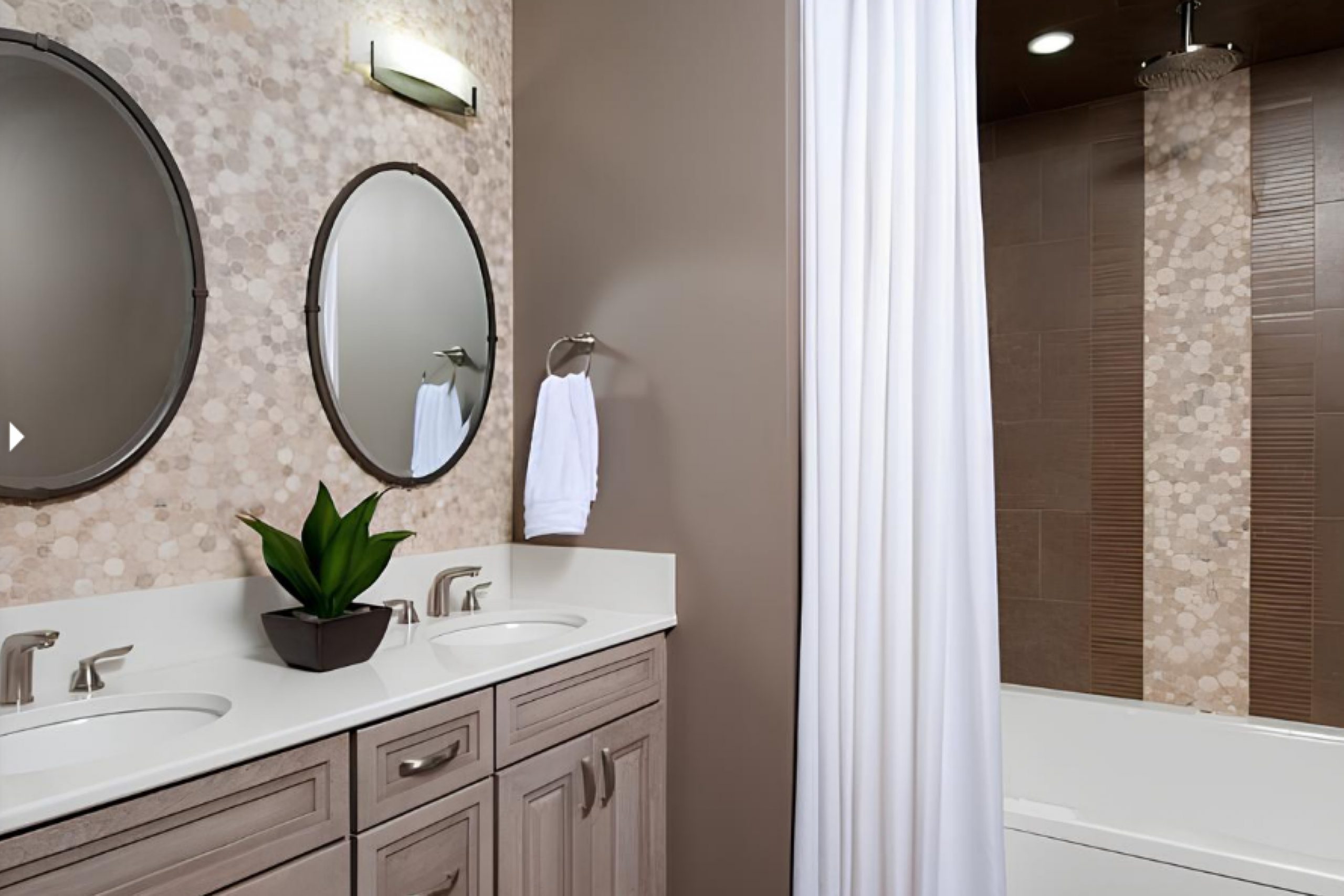
As I was checking different shades for client’s living room, I stumbled upon SW 6074 Spalding Gray by Sherwin Williams. It’s a unique color that somehow balances between the warmth of a cozy fireplace and the solemnity of autumnal gray skies.
The color carries a subtle complexity that makes it quite versatile for various spaces. It’s not just a typical gray; it has a touch of earthiness that brings a comforting and grounding feeling to a room. I found that this particular shade works beautifully with both natural light and well-placed indoor lighting, adapting its mood from soft and inviting during the day to rich and intimate by night.
Whether you’re looking to repaint a bedroom, a study, or even a kitchen, Spalding Gray has a timeless appeal that complements different styles and furnishings.
Thinking of how this color would transform my living space was truly exciting, as it promised to offer both a fresh backdrop and a tranquil atmosphere.
What Color Is Spalding Gray SW 6074 by Sherwin Williams?
Spalding Gray by Sherwin Williams is a rich, warm gray that has the versatility to serve as either a harmonious background hue or an impactful feature color in a room. With undertones that balance between taupe and charcoal, it invites a cozy yet stylish atmosphere into any space.
This color is particularly effective in interior styles that lean towards the modern, such as minimalist, Scandinavian, and contemporary, due to its clean and understated quality. However, its inherent warmth also makes it suitable for more traditional and rustic settings, providing a soothing neutrality against which other elements can stand out.
When considering materials and textures to pair with Spalding Gray, think about natural wood, which complements its earthy undertones, enhancing the overall warmth of the room. Leather furniture and accents also work well, adding a touch of luxury without overwhelming the space. For textiles, consider soft, plush fabrics like wool or velvet in lighter shades to create a subtle contrast that highlights the depth of the gray.
Metallic finishes, particularly in brushed nickel or stainless steel, can offer a slight shimmer that nicely offsets the matte finish of the wall color, bringing a clean, modern edge to the design. This gray can handle a variety of textures and materials, making it a go-to choice for creating a layered, inviting interior.
Is Spalding Gray SW 6074 by Sherwin Williams Warm or Cool color?
Spalding Gray by Sherwin Williams is a unique shade of gray that brings a comforting atmosphere to any room. With its warm undertones, this color is versatile and can fit almost any space, whether it’s a bedroom, living room, or kitchen.
It pairs well with both bright colors and other neutrals, making it easy to incorporate into various design styles. This shade is especially good for spaces that need a touch of coziness without darkening the room too much. It reflects light nicely, which can help make a small space appear larger and more open.
Additionally, this color is known for its ability to hide imperfections on walls, making it a practical choice for busy areas in the home. Overall, Spalding Gray offers a simple yet effective way to make your living spaces feel warm and inviting.
Undertones of Spalding Gray SW 6074 by Sherwin Williams
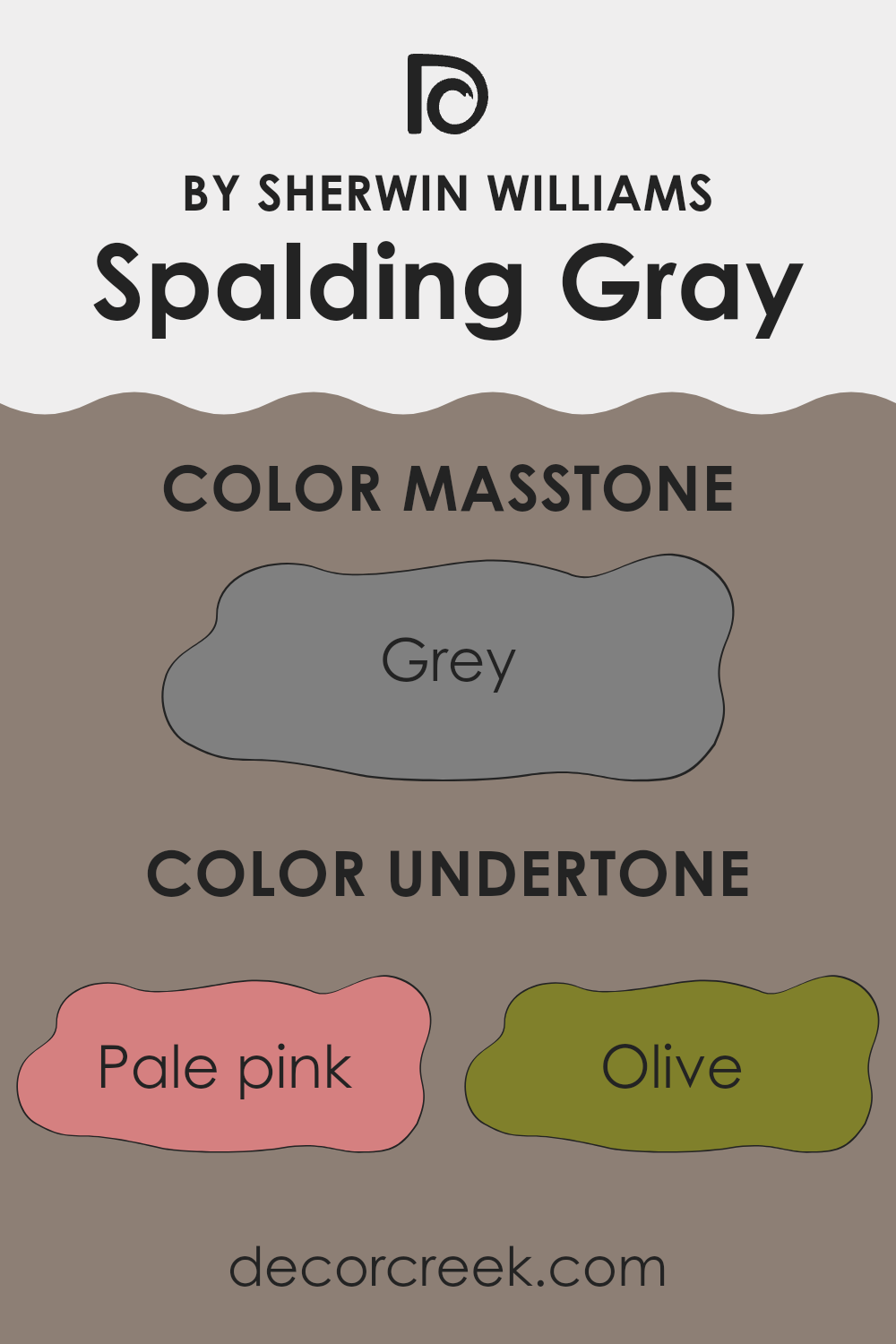
The color Spalding Gray by Sherwin Williams is a complex shade that draws unique characteristics from its various undertones. Undertones are subtle hints of color that can dramatically influence how a primary color looks under different lighting conditions. For example, a gray paint like this one can seem cooler or warmer depending on its primary undertones.
When applied to interior walls, the undertones of Spalding Gray have a notable impact. Under natural light, the presence of undertones like pale pink or lilac can make the paint appear softer and subtly more inviting. On the other hand, undertones such as olive or brown give the gray a more grounded, earthy feel, which can make a room seem cozier.
In spaces with less natural light, the darker undertones like dark green or navy might become more pronounced, making the walls look more profound and richer. This quality can be beneficial in creating a more focused or intimate space. Conversely, in a brightly lit room with lots of sunlight, lighter undertones such as mint or pale yellow could become noticeable, making the wall color appear lighter and more vibrant.
Understanding the effects of these undertones in Spalding Gray can help in choosing decor and additional colors for a room to either complement or contrast with the walls, depending on the desired effect. The rich palette of undertones in this gray adds a subtle complexity, making it a versatile choice for various interior styles and settings.
What is the Masstone of the Spalding Gray SW 6074 by Sherwin Williams?
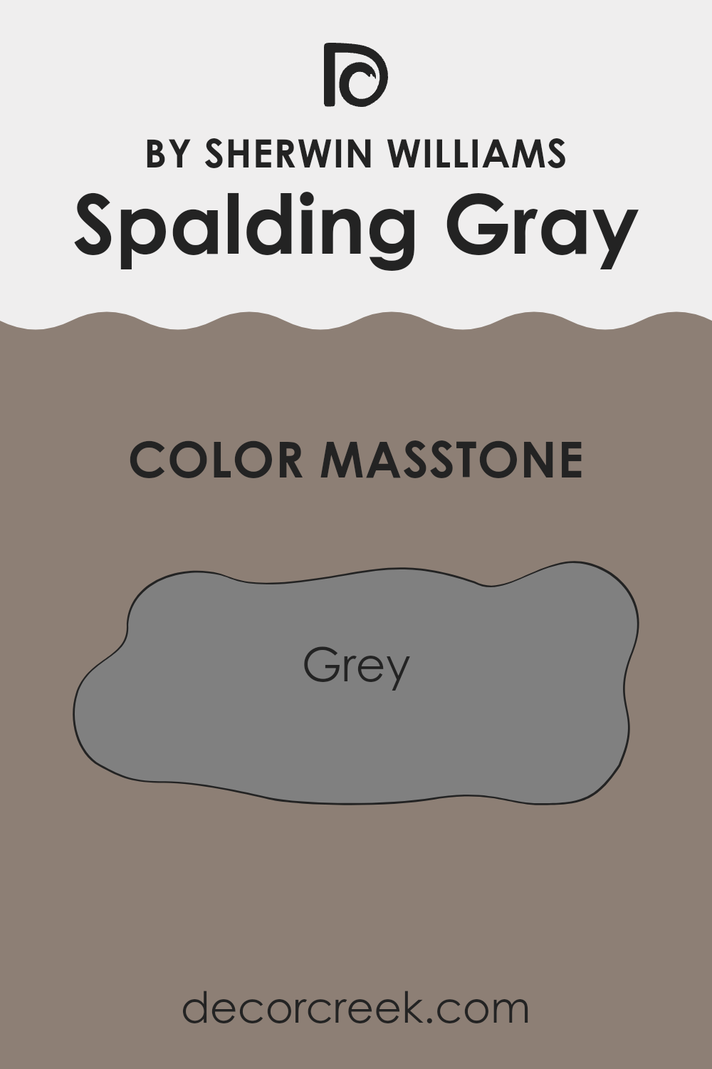
Sherwin Williams’ paint color, referred to as Spalding Gray, carries the code SW 6074. Its masstone, or the pure color before it’s lightened or darkened, is a true grey similar to the hex code #808080.
This shade of grey offers a neutral and versatile palette that easily complements a wide range of decor styles and other colors. In homes, this particular grey works well because it serves as a stable backdrop. It doesn’t clash with other colors, making it a practical choice for walls in living rooms, bedrooms, or even kitchens.
Since it’s such a balanced shade, it helps other colors in the room stand out. Whether you’re pairing it with bold colors or sticking to a monochrome scheme, Spalding Gray can adapt easily, making your decorating process much simpler. This grey is ideal for those looking to achieve a modern, clean look in their space without making the room feel cold or unwelcoming.
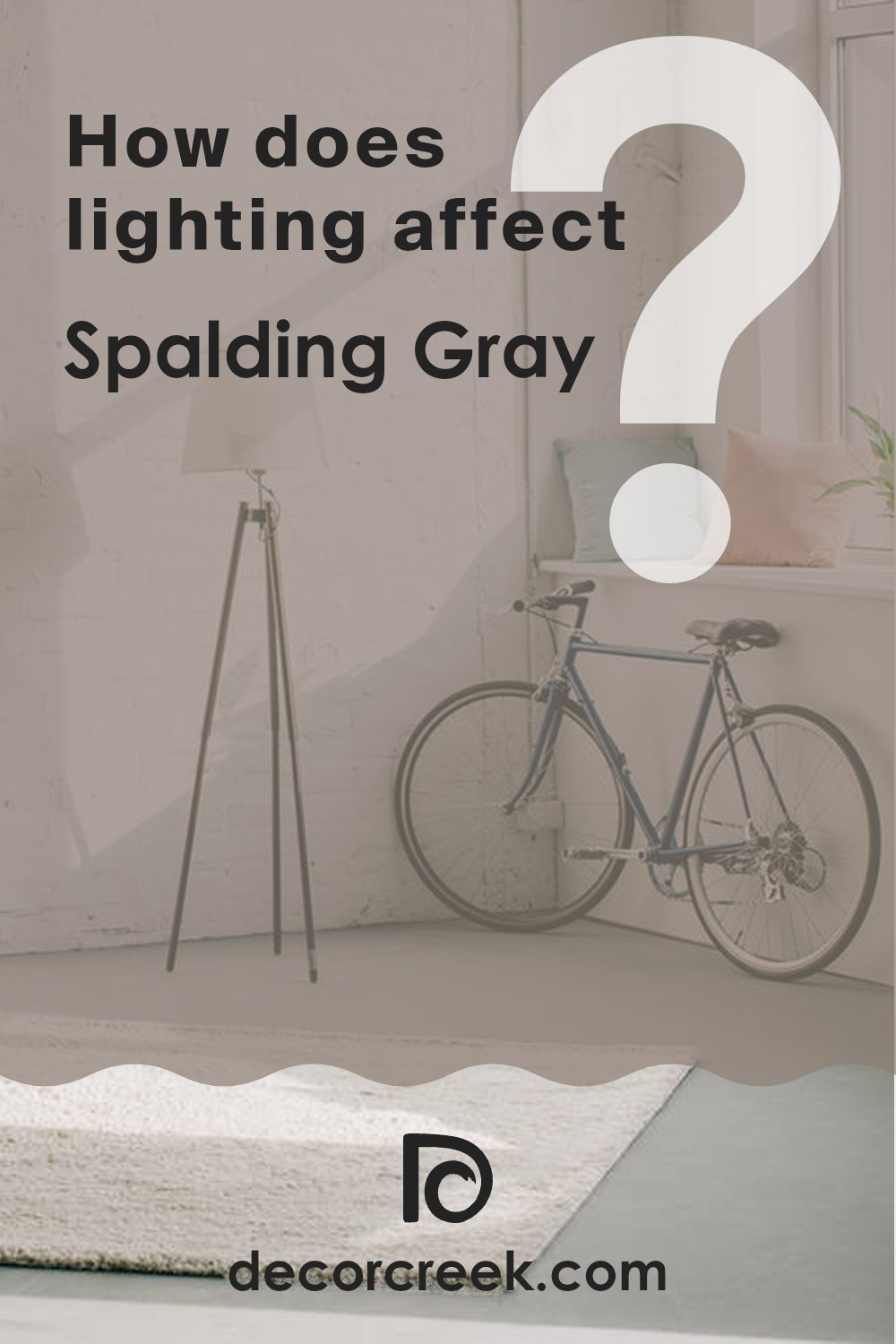
How Does Lighting Affect Spalding Gray SW 6074 by Sherwin Williams?
Lighting plays a crucial role in how we perceive colors in our environment. The type of light—whether natural or artificial—and even the direction a room faces can dramatically alter how a color looks.
Taking the color Spalding Gray as an example, this shade can appear differently under various lighting conditions.
In artificial light, such as that from LED or incandescent bulbs, Spalding Gray tends to show its richness and can look slightly darker.
This can make a room feel cozy and enclosed, which might be perfect for living areas or bedrooms where you want a sense of comfort.
In natural light, the appearance of Spalding Gray can change depending on the time of the day and the weather conditions.
Natural light typically makes this color look softer and more dynamic, revealing subtle undertones that might not be apparent under artificial lighting.
The direction a room faces also impacts how Spalding Gray looks:
- 1. North-Faced Rooms: These rooms get less direct sunlight, which can make Spalding Gray appear cooler and more shadowed. It’s a good choice for creating a calm, quiet feel in spaces like home offices or study rooms.
- 2. South-Faced Rooms: With more direct and warm sunlight, Spalding Gray warms up and becomes more vibrant in these rooms. It can make living spaces and kitchens feel welcoming and lively.
- 3. East-Faced Rooms: These rooms enjoy bright morning light. Spalding Gray will look brightest in the morning, creating a refreshing atmosphere. As the day progresses, it will gradually take on a softer appearance.
- 4. West-Faced Rooms: Evening light can play beautifully off Spalding Gray, making it look extremely dynamic and rich in the late afternoon and evening. This can be particularly striking in dining rooms or spaces used mainly in the evening.
Understanding these aspects can help you decide where to apply this versatile gray shade to achieve the desired effect in your home.
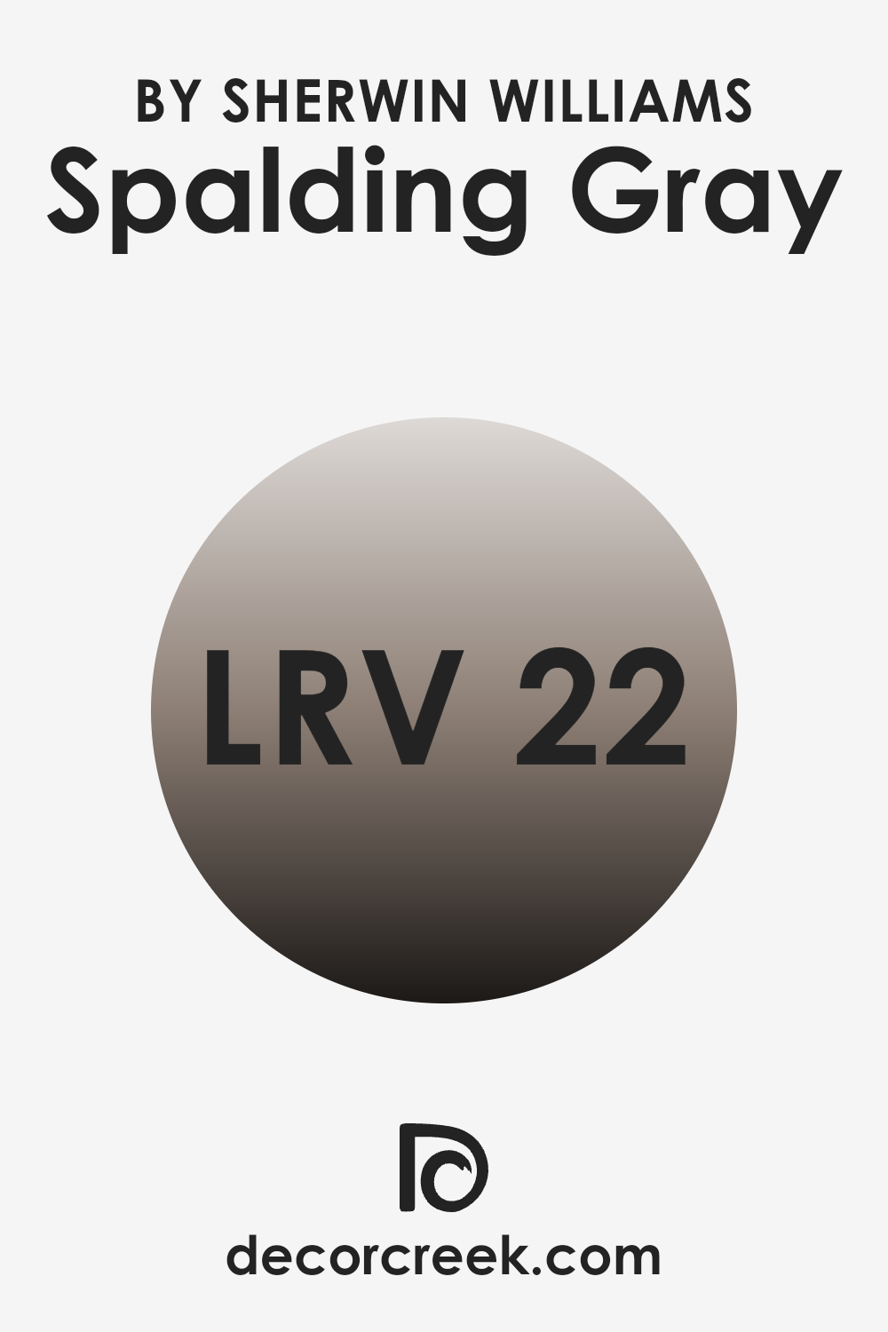
What is the LRV of Spalding Gray SW 6074 by Sherwin Williams?
Light Reflectance Value (LRV) measures how much light a color reflects and how much it absorbs. Think of it like this: if a paint color has a high LRV, it reflects more light, brightening up a room. On the other hand, a low LRV means it absorbs more light, which can make a space look cosier but slightly darker.
This value helps people decide how a color might make a room feel smaller or larger and how many light fixtures they might need. The LRV of Spalding Gray, which is 22.122, indicates that it’s on the darker side, absorbing more light than it reflects. When applied to walls, this color might make a room feel more enclosed and intimate.
This is great for creating a cozy atmosphere in spaces like living rooms or bedrooms where a sense of closeness is desirable. However, it might not be the best choice for a smaller room or one that doesn’t get much natural light unless you’re aiming for a very subdued, cozy effect.
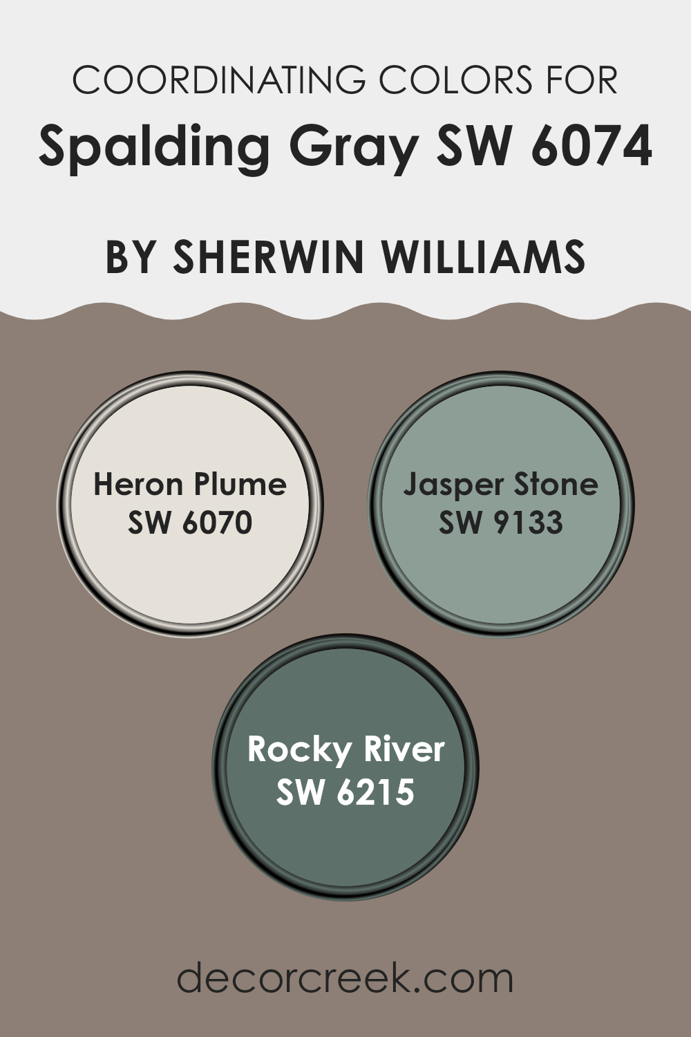
Coordinating Colors of Spalding Gray SW 6074 by Sherwin Williams
Coordinating colors work by complementing each other to enhance the overall aesthetic of a space, making it more visually appealing. Spalding Gray SW 6074 by Sherwin Williams pairs nicely with colors like Heron Plume, Jasper Stone, and Rocky River, each selected to enhance the other’s beauty and create a harmonious atmosphere.
When used together, these shades facilitate a smooth visual flow from one area to another, fostering a cohesive look throughout the room or home. Heron Plume SW 6070 is a light, almost ethereal shade that brings a fresh brightness to spaces, functioning as a subtle background or a clean accent.
Jasper Stone SW 9133, on the other hand, offers a deep, muted green, providing a touch of nature-inspired calm that can ground or balance lighter tones. Finally, Rocky River SW 6215 introduces a robust, darker hue that recollects the depth of natural waterways, perfect for creating focal points or adding depth to a palette. Together, these colors support and enhance the medium tone of Spalding Gray, ensuring design choices feel connected and purposefully styled.
You can see recommended paint colors below:
- SW 6070 Heron Plume
- SW 9133 Jasper Stone
- SW 6215 Rocky River
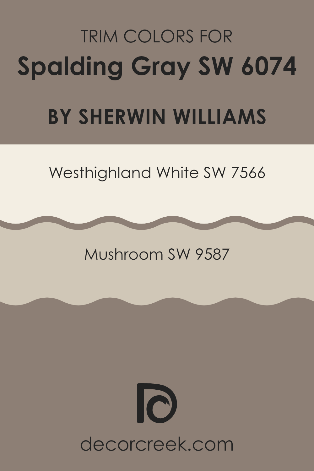
What are the Trim colors of Spalding Gray SW 6074 by Sherwin Williams?
Trim colors are used to highlight and define the edges of rooms, like the frames around doors, windows, and along the baseboards. Choosing the right trim color can significantly impact the appearance and feel of a space.
For a color like Spalding Gray by Sherwin Williams, selecting contrasting yet complementary trim colors can enhance its visual appeal. Westhighland White and Mushroom are two trim colors that work beautifully with this shade of gray. Westhighland White is a bright, crisp white that provides a striking contrast to the deeper tones of Spalding Gray, making the gray pop without overpowering it.
This makes it ideal for creating a clean and fresh look around window frames and door edges. On the other hand, Mushroom offers a warm, earthy tone that adds a subtle, welcoming feel when used as a trim color. It blends nicely with Spalding Gray, ensuring a soft transition from the walls to the trim, suitable for a cozy and inviting atmosphere.
You can see recommended paint colors below:
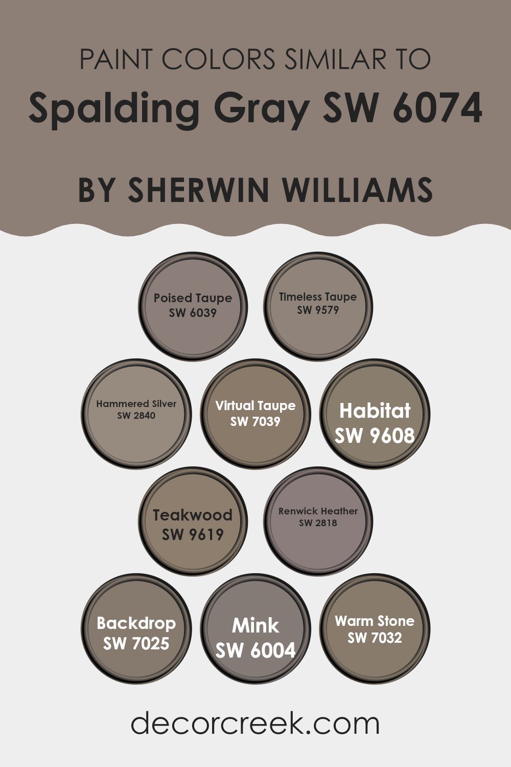
Colors Similar to Spalding Gray SW 6074 by Sherwin Williams
Choosing colors that are similar can greatly enhance the cohesiveness and overall aesthetic of a room. When colors like Poised Taupe, Timeless Taupe, and Hammered Silver are used together, they create a harmonious look that is pleasing to the eye.
These shades are all variations of gray or taupe, providing a subtle yet distinct difference that adds depth to the design without overwhelming the senses. Using similar colors such as Virtual Taupe and Habitat can unify a space, making it appear larger and more open, as the colors flow seamlessly from one to another.
For example, Paint color Timeless Taupe has a slightly warmer undertone, making it perfect for creating a cozy atmosphere. Hammered Silver offers a slight metallic hint, reflecting light and adding a touch of luxury in a subtle way.
Virtual Taupe, on the other hand, leans more towards a deeper, richer hue, which can anchor lighter tones in the same palette. Similarly, shades like Teakwood and Renwick Heather bring in a touch of earthiness with their deeper, richer brown tones, blending beautifully with the cooler grays.
Mink and Warm Stone further add to this collection with their dusky nuances, offering perfect background shades that can help bolder accents pop. Each of these colors supports and complements one another, making it easy to design a space that feels interconnected and thoughtfully put together.
You can see recommended paint colors below:
- SW 6039 Poised Taupe
- SW 9579 Timeless Taupe
- SW 2840 Hammered Silver
- SW 7039 Virtual Taupe
- SW 9608 Habitat
- SW 9619 Teakwood
- SW 2818 Renwick Heather
- SW 7025 Backdrop
- SW 6004 Mink
- SW 7032 Warm Stone
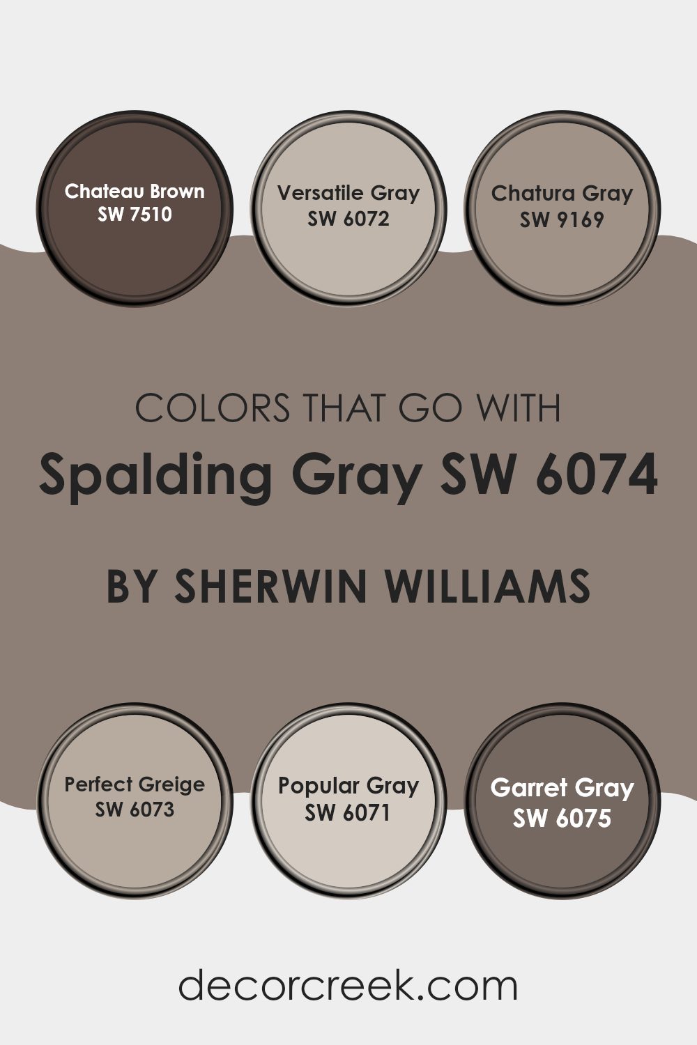
Colors that Go With Spalding Gray SW 6074 by Sherwin Williams
Choosing colors that complement Spalding Gray SW 6074 by Sherwin Williams is essential because it helps create a harmonious and balanced look in your space. Spalding Gray is a versatile shade that serves as a fantastic neutral base, allowing other colors to stand out while maintaining a cohesive atmosphere.
When paired with the right colors, like Chateau Brown SW 7510 or Versatile Gray SW 6072, it can enhance the aesthetics of any room, making it feel more put-together and welcoming.
For instance, Chateau Brown offers a warm, deep brown that adds a cozy, grounding effect, balancing the cool tones of Spalding Gray, while Versatile Gray is a lighter gray that supports Spalding Gray without overwhelming it, ensuring the room feels airy and open.
Moreover, including colors like Chatura Gray SW 9169, Perfect Greige SW 6073, Popular Gray SW 6071, or Garret Gray SW 6075, adjust the mood and style of the space, further proving the importance of a well-thought color palette.
Chatura Gray provides a deeper, moodier gray that can add drama or a focal point in contrast to Spalding Gray.
Perfect Greige mixes gray with beige, offering warmth that’s ideal for spaces seeking a neutral yet inviting vibe. Popular Gray is a light, soft gray that keeps spaces looking bright and spacious, and Garret Gray offers a darker gray that can be used for accents, providing depth and interest.
Together, these colors work with Spalding Gray to achieve beautiful, complementary color schemes that make home decor strikingly appealing.
You can see recommended paint colors below:
- SW 7510 Chateau Brown
- SW 6072 Versatile Gray
- SW 9169 Chatura Gray
- SW 6073 Perfect Greige
- SW 6071 Popular Gray
- SW 6075 Garret Gray
How to Use Spalding Gray SW 6074 by Sherwin Williams In Your Home?
Spalding Gray SW 6074 by Sherwin Williams is a warm and neutral gray paint color that gives a cozy feel to any room. It is a flexible color that works beautifully in various spaces, whether you want to paint a living room, bedroom, or kitchen. This gray tone is unique because it has a touch of brown, making it warmer than typical gray colors, which often lean towards blue or green.
One way to use Spalding Gray in your home is on living room or bedroom walls. It sets a relaxed and inviting atmosphere, perfect for spaces where you unwind and relax. Pair it with white trim and ceilings to really make the walls stand out and give the room a clean, finished look.
For those who like adding a bit of interest, Spalding Gray can also be used on kitchen cabinets or as an accent wall. It pairs well with natural wood, metallic finishes, and rich textile colors like navy or burgundy, giving you lots of decorating freedom.
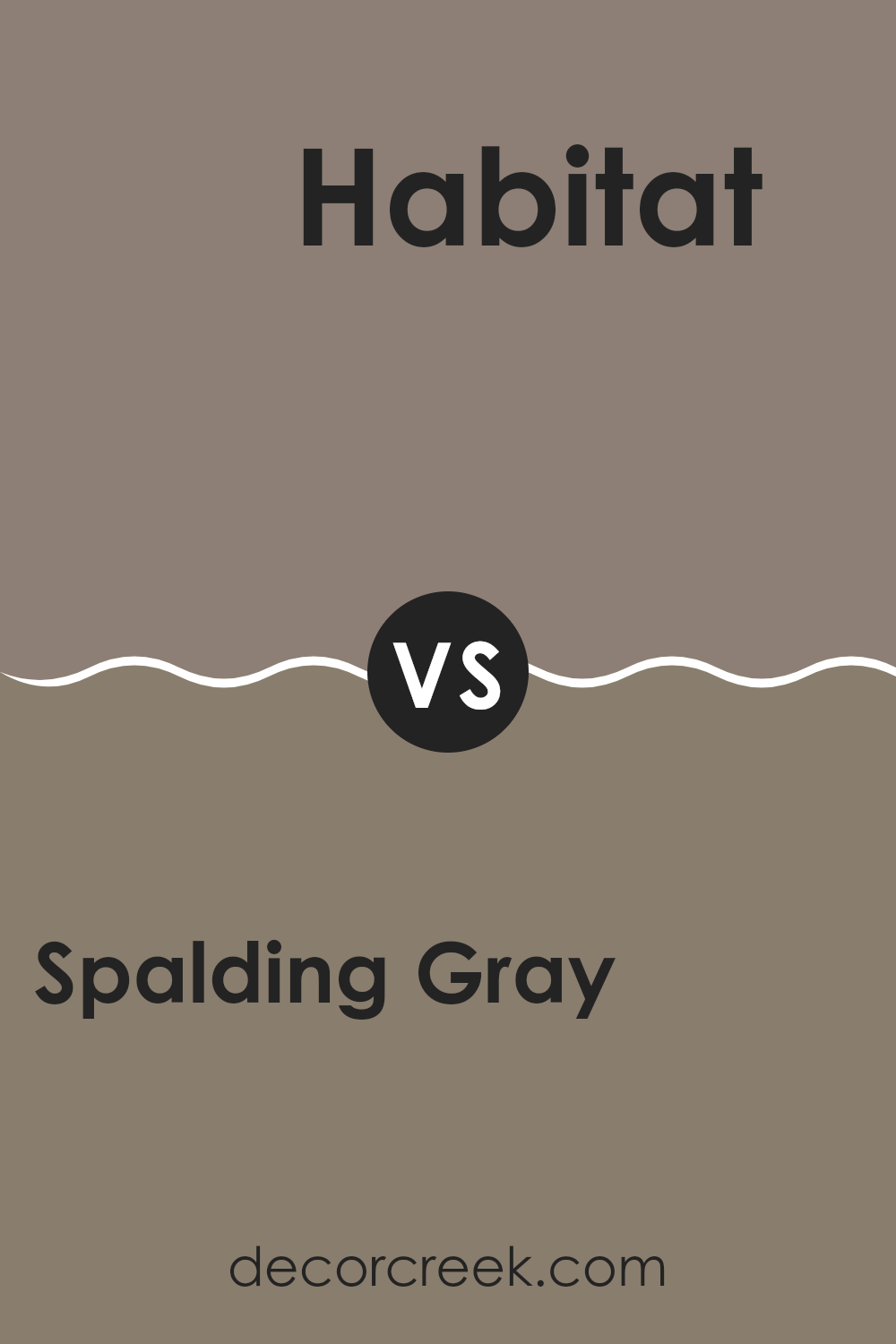
Spalding Gray SW 6074 by Sherwin Williams vs Habitat SW 9608 by Sherwin Williams
Spalding Gray and Habitat, both by Sherwin Williams, offer distinct vibes for any room. Spalding Gray is a medium dark gray with cool undertones, which gives it a crisp, modern feel. It works well in spaces that aim for a contemporary look without feeling too industrial.
On the other hand, Habitat is a darker, earthy brown with a warm, welcoming presence. This color tends to make rooms feel cozy and inviting, perfect for settings where you want to relax or gather with friends and family.
While Spalding Gray pairs nicely with sleek, modern decor, Habitat is ideal for complementing natural elements like wood or stone. Both colors provide a strong backdrop but serve different tastes and styles in interior design.
You can see recommended paint color below:
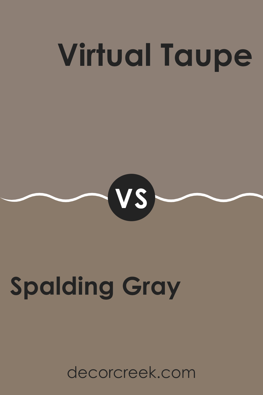
Spalding Gray SW 6074 by Sherwin Williams vs Virtual Taupe SW 7039 by Sherwin Williams
Spalding Gray and Virtual Taupe are two colors from Sherwin Williams that offer subtle yet distinct tones for home decor. Spalding Gray is a gentle gray with a hint of warmth, making it ideal for creating a cozy, inviting atmosphere without becoming too bold or overpowering.
On the other hand, Virtual Taupe is a deeper, richer color that blends beige and gray. This color provides a stronger presence and can make a room feel more grounded and secure.
While both colors are versatile and can work in various settings, Spalding Gray is better suited for those looking for a light, airy feel. In contrast, Virtual Taupe is ideal for adding depth and warmth, making it perfect for larger spaces or accent walls. Both colors offer beautiful backdrops for a range of furniture styles and decorations.
You can see recommended paint color below:
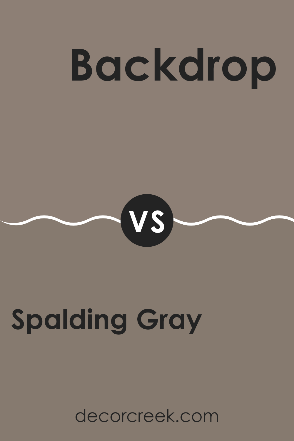
Spalding Gray SW 6074 by Sherwin Williams vs Backdrop SW 7025 by Sherwin Williams
The main color, Spalding Gray, is a mid-tone gray with warm undertones, making it a cozy and inviting choice for any room. It’s versatile enough to work in various spaces, whether it’s a living area or a bedroom, giving a subtle yet distinct presence without overpowering the space.
On the other hand, Backdrop is a slightly darker shade of gray. It has a more neutral base, which means it doesn’t lean too warm or cool. This quality makes Backdrop an excellent option for those looking to create a more balanced and neutral atmosphere in their spaces. It’s great for areas where you want the color to make a subtle statement without causing too much distraction.
Both colors work well together or alone and can be matched with various decor styles and other colors. Spalding Gray is perhaps better for those looking for a hint of warmth, while Backdrop suits a more straightforward, neutral look.
You can see recommended paint color below:
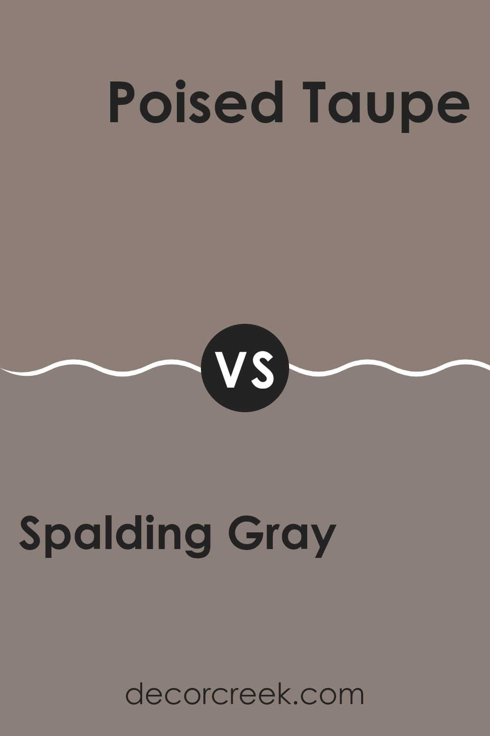
Spalding Gray SW 6074 by Sherwin Williams vs Poised Taupe SW 6039 by Sherwin Williams
Spalding Gray and Poised Taupe, both from Sherwin Williams, present subtle yet distinct differences in their tones. Spalding Gray has a deep, almost charcoal gray that provides a strong and grounding presence. This color is excellent for creating a solid, cozy feel in a space, making it less imposing than a true black.
On the other hand, Poised Taupe leans more towards a warm gray with brown undertones, offering a very welcoming and comfortable feel. This hue is versatile and acts as a perfect neutral backdrop that complements various colors and decor styles, from modern to traditional.
While both colors are somewhat muted and understated, Spalding Gray tends to make a bolder statement, whereas Poised Taupe brings a lightness and warmth to spaces that may not get a lot of natural sunlight. Each color works well in different settings, depending on the ambiance you want to achieve.
You can see recommended paint color below:
- SW 6039 Poised Taupe
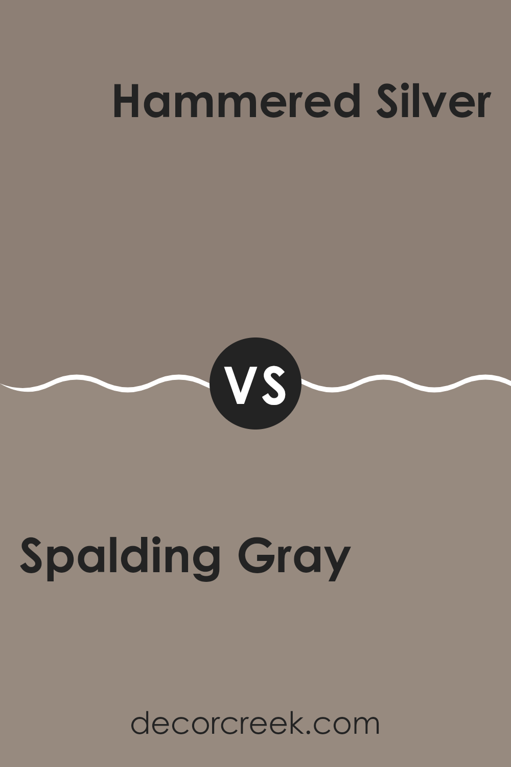
Spalding Gray SW 6074 by Sherwin Williams vs Hammered Silver SW 2840 by Sherwin Williams
The two colors, Spalding Gray and Hammered Silver, both by Sherwin Williams, present unique tones that could complement various design styles. Spalding Gray is a deep, warm gray that gives a cozy and comforting feel to spaces. It pairs well with soft whites and can be a great choice for living rooms and bedrooms where a calm atmosphere is desired.
On the other hand, Hammered Silver is a cooler, metallic-like gray that has a more modern and bold look. It reflects light differently, giving it a slight shimmer that can make small spaces seem larger and more open. This color is perfect for adding a modern twist to kitchens or bathrooms, or even as an accent wall in a more minimalist setting.
Both colors offer distinct vibes: Spalding Gray with its warm, inviting nature, and Hammered Silver with its cooler, more striking presence. Depending on the mood you want to create and the other elements in your room, either color could be an excellent choice.
You can see recommended paint color below:
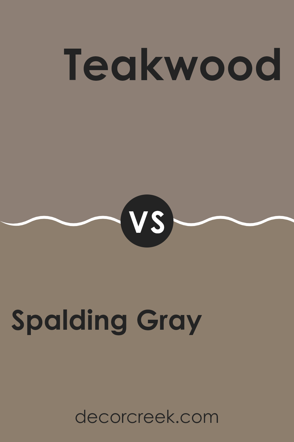
Spalding Gray SW 6074 by Sherwin Williams vs Teakwood SW 9619 by Sherwin Williams
Spalding Gray and Teakwood are two distinct colors offered by Sherwin Williams, each setting a unique tone for interior spaces. Spalding Gray is a neutral gray shade that offers a subtle, understated look suitable for various settings, whether it’s a living room or an office.
It provides a clean and quiet backdrop that pairs well with a wide range of décor styles, from modern to traditional. In contrast, Teakwood is a richer, deeper color, resembling the dark, warm brown of teak wood. This shade is perfect for creating a cozy, inviting atmosphere, making it ideal for areas where comfort is key, like bedrooms or dens.
While Spalding Gray can help to make a space feel more open and airy, Teakwood tends to add warmth and a sense of intimacy to a room. Depending on the ambiance you want to achieve, each color has its advantages, from the cool neutrality of Spalding Gray to the warm richness of Teakwood.
You can see recommended paint color below:
Spalding Gray SW 6074 by Sherwin Williams vs Renwick Heather SW 2818 by Sherwin Williams
Spalding Gray and Renwick Heather, both by Sherwin Williams, are quite distinct shades that serve different aesthetic purposes. Spalding Gray is a deep, muted gray that has a strong presence and can anchor a room with its solid, grounding effect.
It’s an ideal background color that can make other colors placed against it, like bright whites or bold hues, pop significantly. On the other hand, Renwick Heather is a richer, darker tone that leans towards a brown-gray. It offers a warm and cozy feel, making it perfect for intimate spaces or for adding depth to a larger area.
While Spalding Gray is more neutral and versatile, Renwick Heather provides a touch of warmth, making it suitable for creating a welcoming atmosphere. Both colors could work well in various settings but their impact and the mood they create are uniquely different.
You can see recommended paint color below:
- SW 2818 Renwick Heather
Spalding Gray SW 6074 by Sherwin Williams vs Mink SW 6004 by Sherwin Williams
Spalding Gray and Mink, both by Sherwin Williams, present two unique shades that serve different decorating needs. Spalding Gray leans towards a soft, warm gray with subtle brown undertones, giving it a cozy and inviting feel. This color works well in spaces where comfort and simplicity are key. It’s particularly suitable for living rooms or bedrooms where a gentle, soothing vibe is desired.
On the other hand, Mink showcases a darker, richer tone that borders on the deeper, cooler side of the gray spectrum. It has subtle purple undertones that add a hint of depth and richness, making it an excellent choice for creating a more striking and defined look. Mink is ideal for accent walls or areas that require a bit more drama and presence.
Both colors offer versatility and appeal, yet cater to different aesthetic tastes and room functions. While Spalding Gray provides a lighter, heartwarming touch, Mink steps in as a bolder, more intense option.
You can see recommended paint color below:
- SW 6004 Mink

Spalding Gray SW 6074 by Sherwin Williams vs Warm Stone SW 7032 by Sherwin Williams
Spalding Gray by Sherwin Williams is a deep, charcoal gray with a hint of warmth. This color is versatile and works well in many areas of a home, providing a solid, grounding effect. Its richness makes it a popular choice for living spaces and bedrooms, where a cozy and inviting atmosphere is desired.
In contrast, Warm Stone by Sherwin Williams is a lighter, earthy beige with gray undertones. This hue is softer and more neutral, making it ideal for creating a calm and welcoming environment. It’s a great option for larger areas, as it can make spaces feel more open and airy while still adding a touch of warmth.
Both colors are suitable for a variety of décor styles, from modern to traditional, but they serve different purposes. Spalding Gray adds drama and depth, while Warm Stone is excellent for unifying spaces with a gentle, soothing feel. Depending on your room’s needs and lighting, each color offers its own unique benefits.
You can see recommended paint color below:
Spalding Gray SW 6074 by Sherwin Williams vs Timeless Taupe SW 9579 by Sherwin Williams
Spalding Gray and Timeless Taupe, both from Sherwin Williams, offer distinctive yet complementary tones for interior spaces. Spalding Gray has a deeper, almost slate-like quality that adds a grounded, strong presence to rooms. This shade is great for someone looking to make a subtle, stylish statement, especially suitable for living areas or bedrooms as it provides a solid, neutral backdrop.
On the other hand, Timeless Taupe brings a lighter, warmer hue that appears more inviting and cozy. This color works well in almost any room, providing a versatile base that pairs easily with various decor styles and colors. It has a softness that makes spaces feel more open and airy, which is great for smaller rooms or areas with less natural light.
When looking at both colors side by side, Spalding Gray offers a bolder choice, while Timeless Taupe leans towards a softer, more adaptable approach. Both colors can create a beautiful, modern look in a home, depending on what mood or style you are aiming for.
You can see recommended paint color below:
Conclusion
After talking about SW 6074 Spalding Gray by Sherwin Williams, I’d like to share my thoughts on this paint color. Spalding Gray is a really interesting shade of gray. It isn’t too dark or too light, which makes it just right for adding a cozy feel to any room. Whether it’s used in a living room, bedroom, or even a kitchen, it brings a calm and comfortable vibe that makes you feel at home.
I found that this color does a great job of making white trims and furniture pop, giving a nice, clean look to the room. It also works well with different kinds of lights, looking a bit different in the morning light compared to the evening, which keeps things fun and fresh.
Overall, using Spalding Gray can give any place a fresh, neat look without making it too bright or flashy. It’s easy to understand why this color is liked by many: it’s simple, neat, and really stylish in its own quiet way.
It’s a safe choice when you aren’t sure what color to pick but want to make sure the room looks great.
Ever wished paint sampling was as easy as sticking a sticker? Guess what? Now it is! Discover Samplize's unique Peel & Stick samples.
Get paint samples

