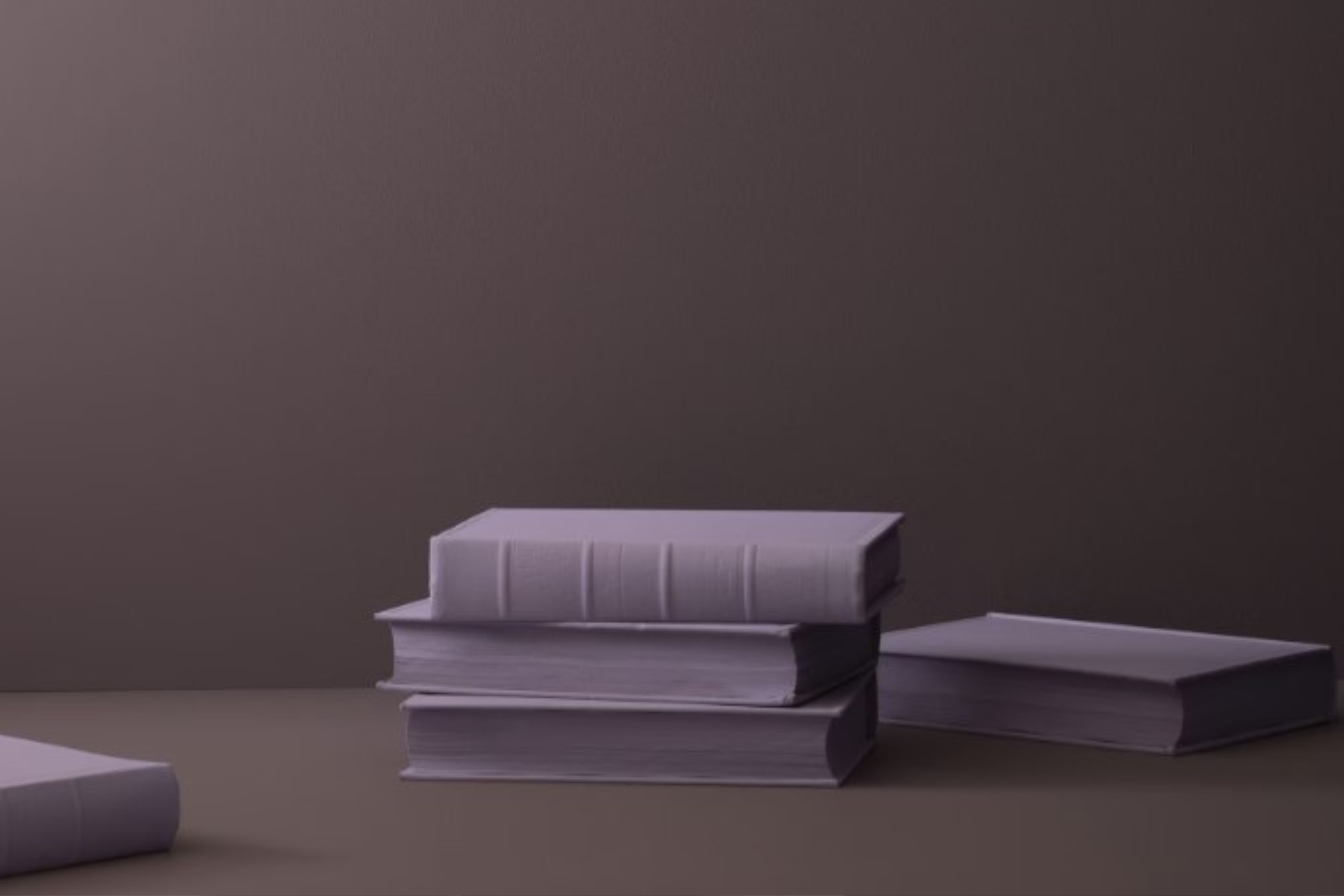
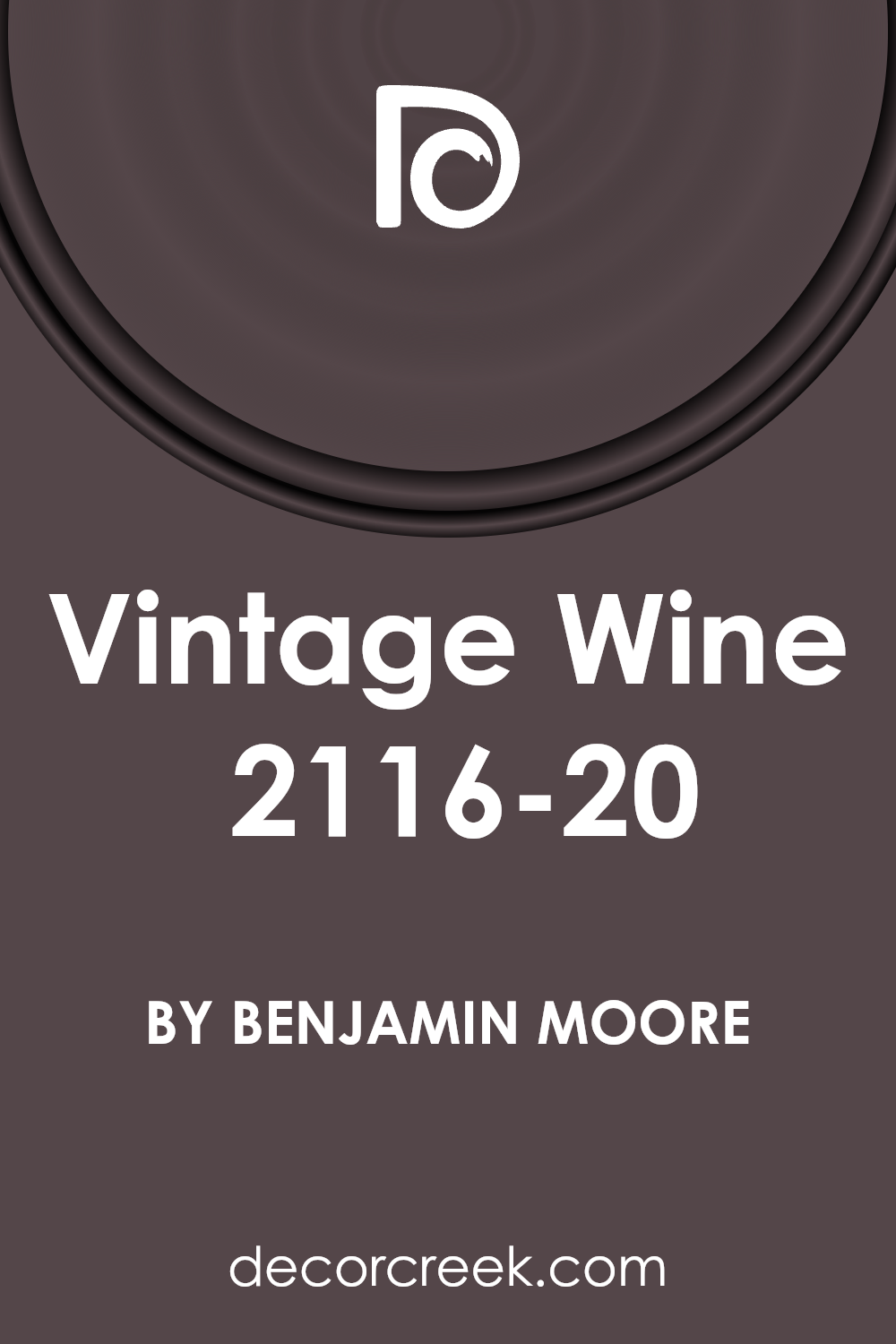
Welcome to a look at the luxurious and rich color, 2116-20 Vintage Wine by Benjamin Moore. This unique shade has become a favorite for those wanting to add a touch of sophistication and depth to their spaces.
With its deep, reddish-purple hues, Vintage Wine brings warmth and elegance into any room, making it feel cozy yet refined. This color isn’t just a paint; it’s an experience, offering a classic vibe that’s both bold and inviting. Ideal for accent walls, cozy nooks, or even an office, it sets the mood perfectly, combining the best of both worlds: modern flair with timeless beauty.
Whether you’re updating your living space, giving your bedroom a makeover, or just looking for that perfect shade to complete your décor, Vintage Wine stands out as a stellar choice.
Its versatility extends to various design styles, from contemporary to traditional, fitting seamlessly into any aesthetic. Let’s explore how 2116-20 Vintage Wine by Benjamin Moore can transform your space into a haven of style and comfort, adding that special touch that makes your home truly yours.
What Color Is Vintage Wine 2116-20 by Benjamin Moore?
Vintage Wine by Benjamin Moore is a luxurious, deep red hue with tones that suggest sophistication and warmth. This rich shade brings to mind the velvety depth of a well-aged wine, offering a sense of coziness and opulence to any space. Its unique color can add a dramatic flair to a room, making it a perfect choice for those looking to create a statement.
This deep red works exceptionally well in a variety of interior styles, particularly in classic, traditional settings where its elegance can shine. It is equally at home in modern or contemporary environments, where it adds a touch of warmth and complexity.
Vintage Wine is a versatile color that can transform a space into a cozy retreat or a bold, dramatic interior, depending on how it is used.
When it comes to pairing with materials and textures, Vintage Wine excels alongside dark woods, adding to the rich, luxurious feel of a space. It also looks stunning when combined with metal finishes like brass or gold, which enhance its warm undertones. For textures, consider soft, plush fabrics like velvet or silk to complement its depth and create an inviting, comfortable atmosphere.
Leathers, whether in dark or light shades, also work well with this color, adding a touch of sophistication and elegance.
Ever wished paint sampling was as easy as sticking a sticker? Guess what? Now it is! Discover Samplize's unique Peel & Stick samples.
Get paint samples

Is Vintage Wine 2116-20 by Benjamin Moore Warm or Cool color?
Vintage Wine 2116-20 by Benjamin Moore is a rich, deep burgundy color that adds a sophisticated touch to any home. This unique shade creates a cozy and inviting atmosphere in any room it’s used in. It’s perfect for people looking to add a bit of warmth and depth to their living spaces.
The color works well in both traditional and modern settings, making it a versatile choice for homeowners.
When applied to walls, Vintage Wine gives the space a luxurious feel. It pairs beautifully with neutral tones like whites and beiges, allowing the room to have a balanced look. This color can also make a bold statement when combined with vibrant hues such as mustard yellow or teal, adding an exciting contrast to your home decor.
Furthermore, Vintage Wine’s richness helps to create an intimate setting, making it ideal for dining rooms or bedrooms where you want to foster a sense of closeness and comfort. Its ability to transform a space with its elegance and depth makes it a popular choice for those looking to add character to their homes.
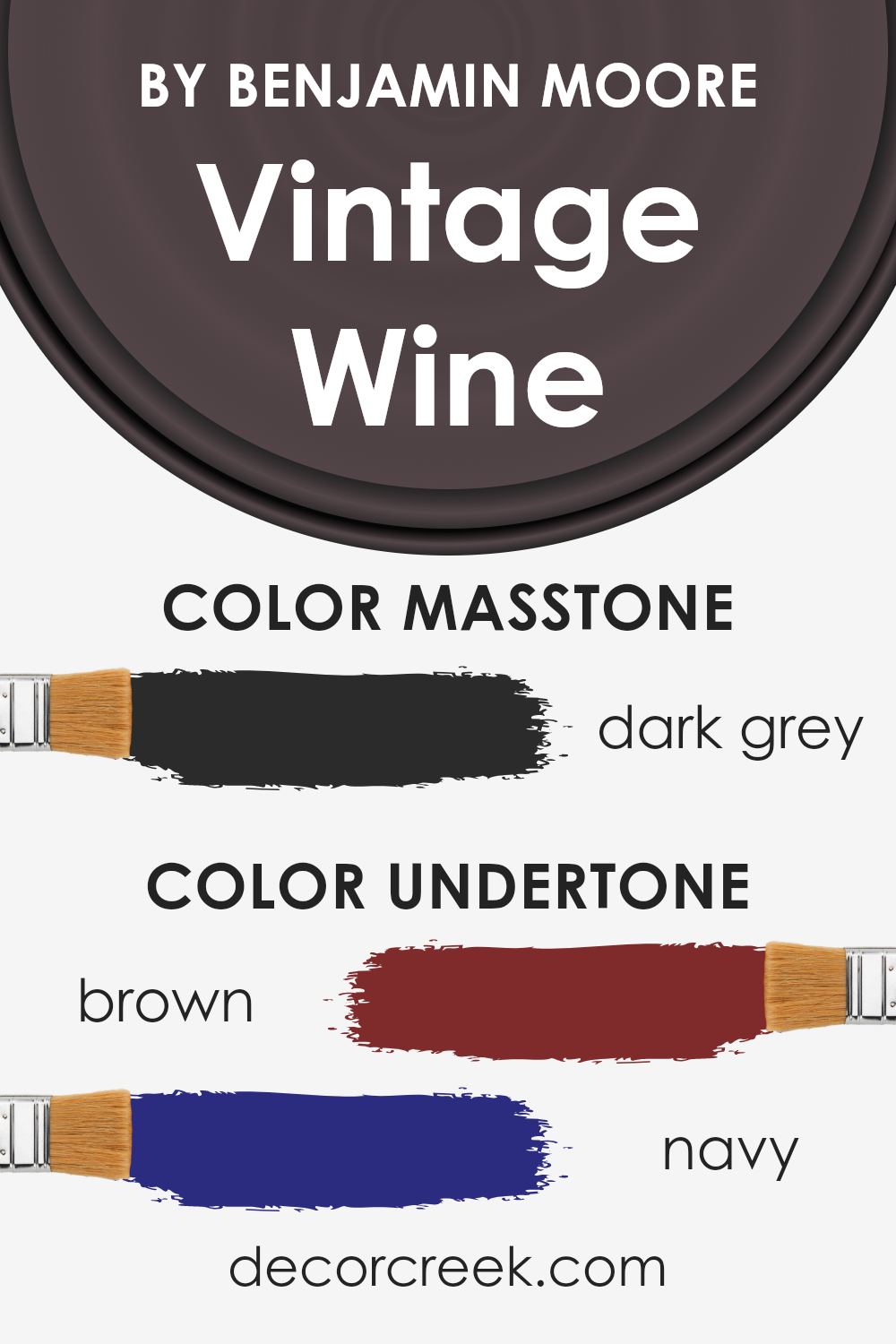
Undertones of Vintage Wine 2116-20 by Benjamin Moore
Vintage Wine, by Benjamin Moore, is a sophisticated color that carries unique undertones of brown and navy. These undertones play a crucial role in how we perceive the color. Brown brings warmth and a sense of comfort, making spaces feel cozy and welcoming.
On the other hand, the navy adds depth and a hint of mystery, giving the color an elegant edge. Together, these undertones make Vintage Wine versatile and dynamic, capable of creating different looks and feels depending on the lighting and surrounding colors.
When applied to interior walls, the effect of these undertones becomes even more pronounced. In natural daylight, the brown undertone of Vintage Wine might stand out, highlighting the warmth of the color and making a room feel more inviting. As the day shifts to night and the lighting changes, the navy undertone might become more apparent, adding a sense of sophistication and depth to the space.
This chameleon-like quality means that Vintage Wine can complement a wide range of décor styles and color palettes, from more traditional looks to modern aesthetics. It’s this ability to adapt and change that makes Vintage Wine a popular choice for those looking to add a rich, complex color to their interiors.
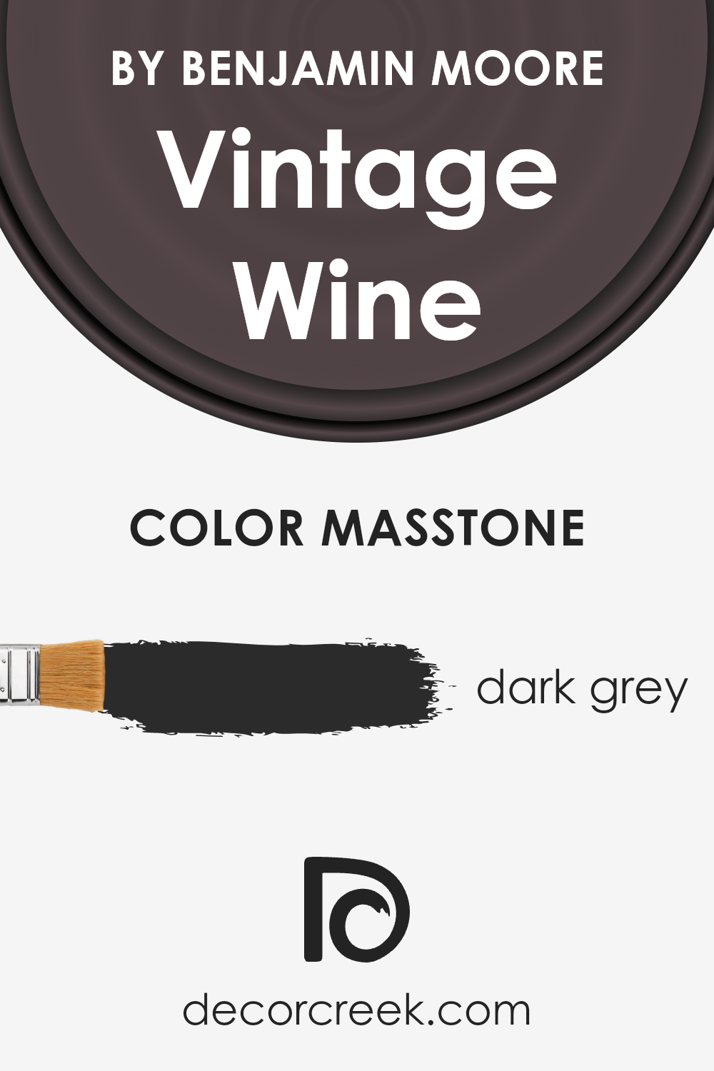
What is the Masstone of the Vintage Wine 2116-20 by Benjamin Moore?
Vintage Wine 2116-20 by Benjamin Moore has a masstone that appears as dark grey (#2B2B2B). This unique base color influences how the paint interacts with different lighting conditions and design elements in homes. With its dark grey base, this color brings a sense of sophistication and depth to spaces. It can make large rooms feel cozier and more inviting while adding drama and focus to smaller areas.
Its versatility means it pairs well with both bold accents and neutral palettes, allowing for a range of design styles from modern to traditional.
In well-lit rooms, the dark grey undertones of Vintage Wine can appear softer, blending seamlessly with natural light to create a warm and welcoming environment. In spaces with less natural light, it can provide a strong, grounding effect, making it an excellent choice for accent walls or statement furniture. This color’s deep base helps hide marks and smudges, making it a practical choice for busy homes.
Its unique blend of sophistication and practicality makes it a favored choice for homeowners looking to add a touch of elegance to their interiors.
How Does Lighting Affect Vintage Wine 2116-20 by Benjamin Moore?
When we talk about how lighting affects colors, it’s like discussing how the sun and light bulbs change how we see color in our world. Lighting plays a crucial role in how colors appear in any given space.
Take the color Vintage Wine by Benjamin Moore as an example; this rich, deep hue can look dramatically different depending on the light it’s exposed to.
- In artificial light, such as the glow from light bulbs, Vintage Wine can appear warmer or cooler depending on the type of bulb. LED lights that mimic daylight can make this color look more vibrant, enhancing its depth. In contrast, warmer bulbs may soften the color, adding a cozy and inviting feel to the room.
- In natural light, this color unfolds in different shades throughout the day. Morning light in an east-facing room brings out the brightness in Vintage Wine, making it appear more lively. As the day progresses and the sun moves, the color can shift to have a softer, more muted look, especially in north-facing rooms where light is cooler and more consistent but lacks the intensity of direct sunlight.
- South-facing rooms bask this color in warm, bright light all day, showcasing the richness of Vintage Wine. The hue becomes deeply saturated, creating a bold and elegant atmosphere. This warm light accentuates the color’s depth, pulling out hidden undertones.
- In west-facing rooms, the situation flips. During the morning, the color might appear more subdued under indirect light. But as the sun sets, Vintage Wine is bathed in a reddish, warm glow, turning the color into a dynamic backdrop that catches the eye.
Each orientation and light source reveals a new side of Vintage Wine, proving that lighting isn’t just about how bright or dark a room is. It’s about how it can transform a color, influencing the mood and feeling of a space.
Whether under the sun’s natural journey from dawn till dusk or illuminated by man-made lights, the appearance of colors like Vintage Wine can shift, bringing walls to life in unique and surprising ways.
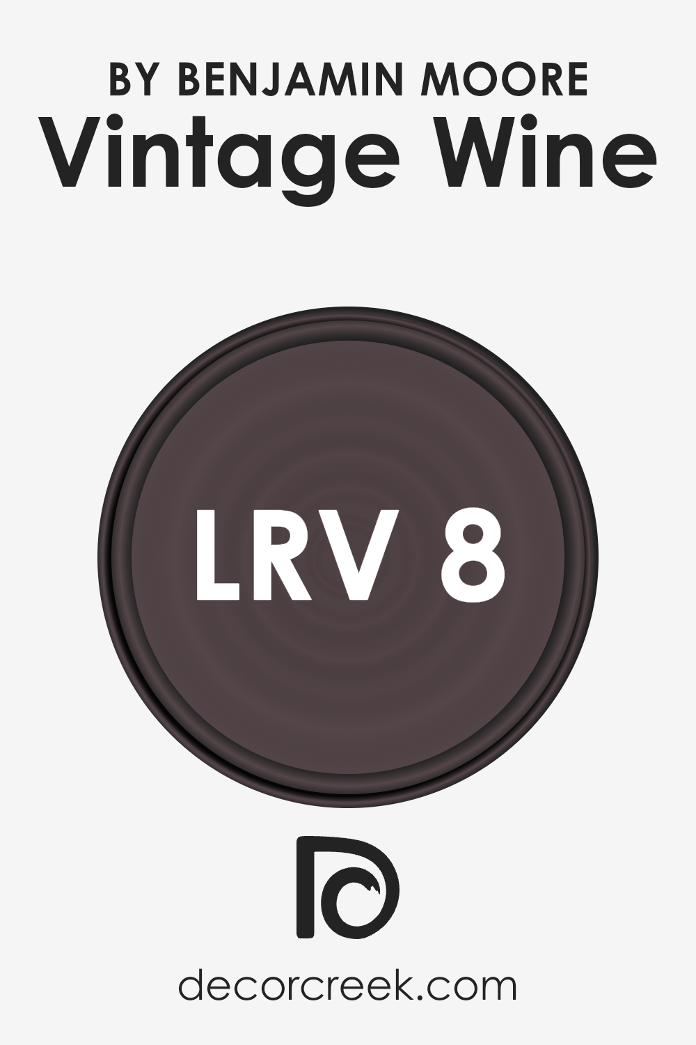
What is the LRV of Vintage Wine 2116-20 by Benjamin Moore?
LRV, short for Light Reflectance Value, measures the amount of light a paint color reflects back into a room, compared to pure white, which is given a value of 100, reflecting all light, and pure black, having an LRV of 0, absorbing all light. This scale helps in choosing paint colors by understanding how light or dark a color will appear once applied to the walls.
The higher the LRV, the lighter the color appears, making a room feel more open and airy. Conversely, a lower LRV means the color absorbs more light, often resulting in a cozier, more intimate feel but can also make a small space appear smaller.
With an LRV of 8.2, this specific color is quite dark, meaning it will absorb a significant amount of light rather than reflecting it. In practical terms, using this color on walls can profoundly impact a room’s ambiance, contributing to a richer, more enveloping atmosphere.
It is particularly effective in larger, well-lit spaces where the depth of the color can be appreciated without making the room feel cramped.
However, in smaller or poorly lit spaces, its use should be balanced with lighter colors or finishes to avoid a potential feeling of confinement. This LRV value suggests the color is on the darker end of the spectrum, ideal for creating strong accent walls or for use in rooms aiming for a dramatic, cozy feel.
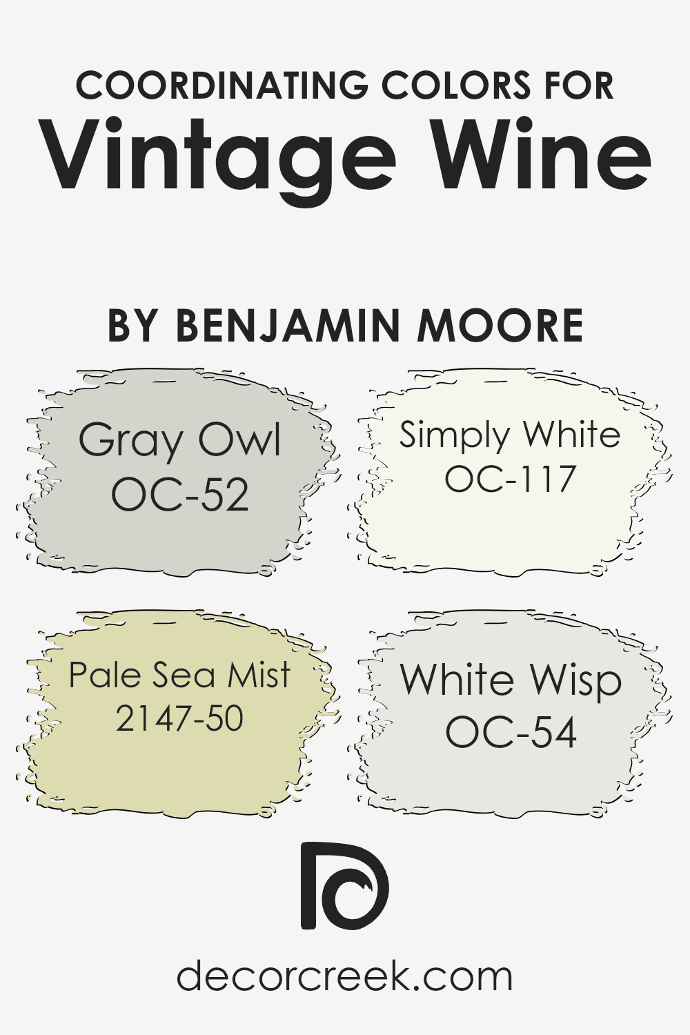
Coordinating Colors of Vintage Wine 2116-20 by Benjamin Moore
Coordinating colors are essentially hues that harmonize well with a primary color, enhancing the overall aesthetic of a space without overwhelming it. When it comes to a rich and luxurious shade like Vintage Wine by Benjamin Moore, choosing the right coordinating colors can beautifully elevate the depth and sophistication of the paint. These selected colors are designed to complement Vintage Wine, creating a balanced and cohesive look.
Gray Owl OC-52 is a soft, versatile gray that brings a calm and serene atmosphere to any room, making it a perfect backdrop for the deeper hues of Vintage Wine.
It’s like a gentle whisper against the bold statement of Vintage Wine, ensuring the space feels open and airy. Pale Sea Mist 2147-50, on the other hand, introduces a subtle hint of color, with its light green undertone offering a fresh and soothing vibe that pairs nicely with the richness of Vintage Wine. Simply White OC-117 is the quintessential clean and crisp white, providing a fresh contrast that highlights Vintage Wine’s deep tones, ensuring the space feels vibrant and lively.
Lastly, White Wisp OC-54 is a slightly off-white with a hint of a cool undertone, softening the overall feel of the space while enhancing the sophistication of the Vintage Wine color, creating a sophisticated and harmonious color scheme.
You can see recommended paint colors below:
- OC-52 Gray Owl
- 2147-50 Pale Sea Mist
- OC-117 Simply White
- OC-54 White Wisp
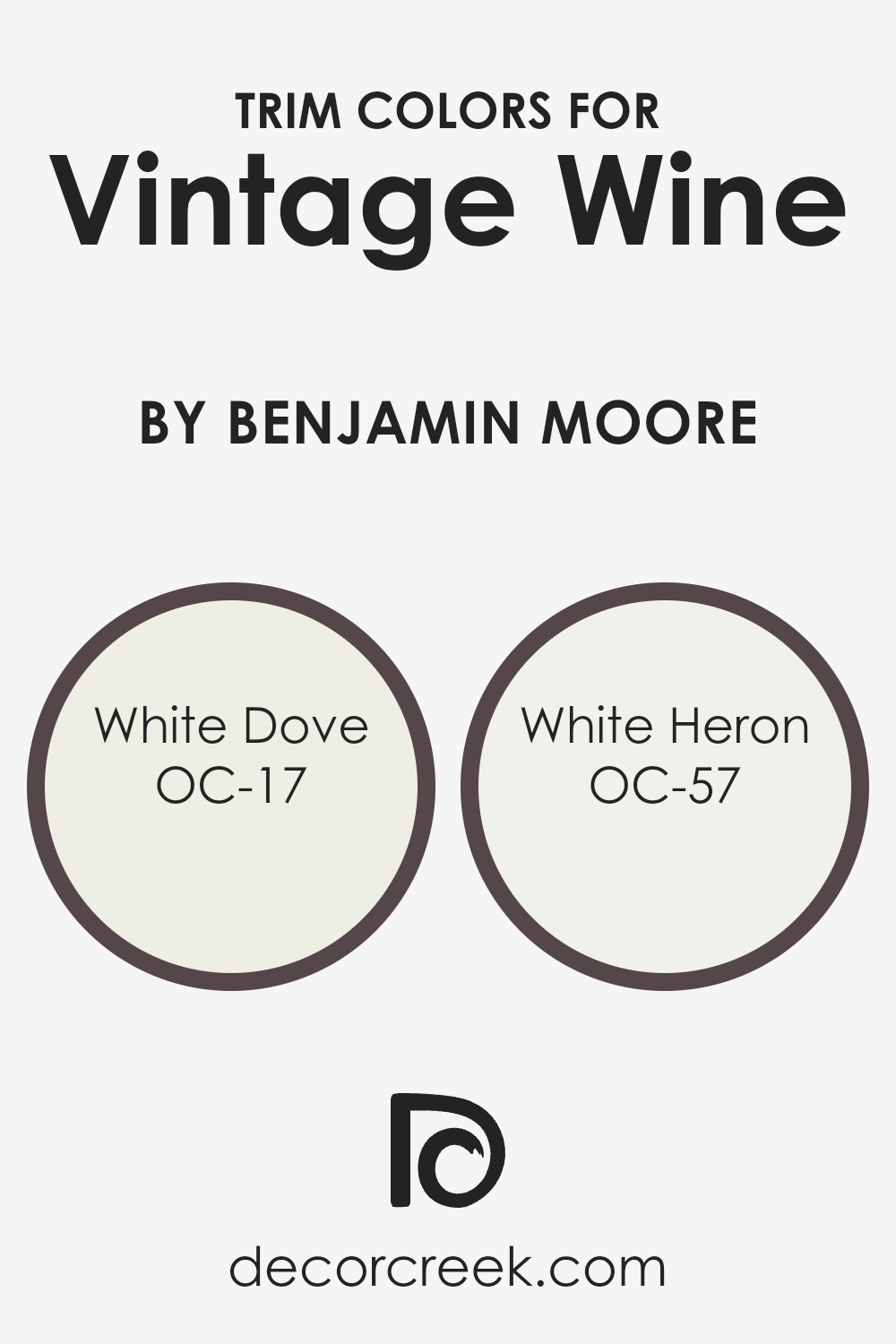
What are the Trim colors of Vintage Wine 2116-20 by Benjamin Moore?
Trim colors are the hues used for painting the trim of a room, which includes elements such as door frames, window trims, skirtings, moldings, and sometimes the ceiling. They play a crucial role in defining the architectural details of a space and in enhancing the overall aesthetic of the wall color they complement.
For instance, when paired with a deep, rich color like Benjamin Moore’s Vintage Wine, trim colors like OC-17 White Dove and OC-57 White Heron can significantly elevate the room’s ambiance by providing a crisp, clean contrast that highlights the sophistication of the wall color.
This contrast not only draws attention to the room’s architectural features but also creates a visually pleasing harmony that can make the space feel more cohesive and balanced.
OC-17 White Dove is a timeless, warm white with a soft undertone that makes it incredibly versatile for any space. It pairs beautifully with deeper, saturated colors, offering a soothing brightness that can make a room feel more open and airy. Similarly, OC-57 White Heron is a slightly cooler, crisp white that brings a fresh, contemporary feel to a room.
When used as trim colors with Vintage Wine, both White Dove and White Heron add a layer of sophistication and cleanliness, framing the walls in a way that perfectly complements the richness of the wine color. These whites act as a visual palette cleanser, providing a beautiful balance that enhances the depth and elegance of the main color.
You can see recommended paint colors below:
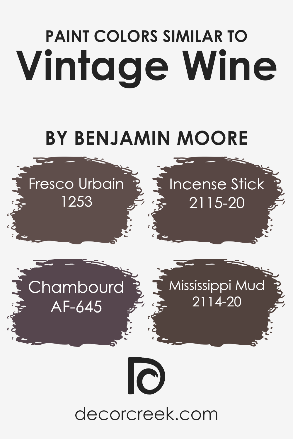
Colors Similar to Vintage Wine 2116-20 by Benjamin Moore
The significance of similar colors in design cannot be overstated, particularly when we explore shades akin to Vintage Wine by Benjamin Moore. These colors, with their subtle differences, work together to create a harmonious and sophisticated palette that can bring warmth and depth to any space.
By utilizing colors like Fresco Urbain, Chambord, Incense Stick, and Mississippi Mud, designers can craft an environment that feels both cohesive and rich in texture. These similar shades allow for seamless transitions between spaces, making each area feel connected while still maintaining its unique character.
Fresco Urbain is a soft, muted hue that whispers elegance into any room, providing a serene backdrop that complements bolder accents. Chambord, on the other hand, is a deeper, more intense color that brings a sense of luxury and drama without overwhelming the senses.
Then, there’s Incense Stick, a warm, engaging shade that draws people in, creating an inviting atmosphere.
Lastly, Mississippi Mud offers a grounded, earthy quality, perfect for spaces aiming for a natural, understated look. Together, these colors form a palette that balances both the tranquil and the dramatic, making them ideal for anyone looking to infuse their space with the rich, complex beauty similar to that of Vintage Wine.
You can see recommended paint colors below:
- 1253 Fresco Urbain
- AF-645 Chambourd
- 2115-20 Incense Stick
- 2114-20 Mississippi Mud
How to Use Vintage Wine 2116-20 by Benjamin Moore In Your Home?
Vintage Wine 2115-20 by Benjamin Moore is a rich, deep burgundy paint that adds a touch of elegance and warmth to any space. It’s perfect for those looking to add a sophisticated splash of color to their home. Imagine transforming a dining room into a cozy yet luxurious space for dinner parties, or giving a bedroom a cozy, inviting atmosphere.
This color works well as an accent wall, creating a stunning backdrop for artwork, mirrors, or an upholstered headboard. It can also be used for painting furniture, like a bookcase or a cabinet, to create a statement piece that draws the eye. Additionally, Vintage Wine pairs beautifully with light neutrals, gold accents, and warm wood tones, allowing for a range of styling options from traditional to contemporary.
Whether you’re updating a small corner of your home or a whole room, this color brings a rich, soothing vibe that makes any space more welcoming.
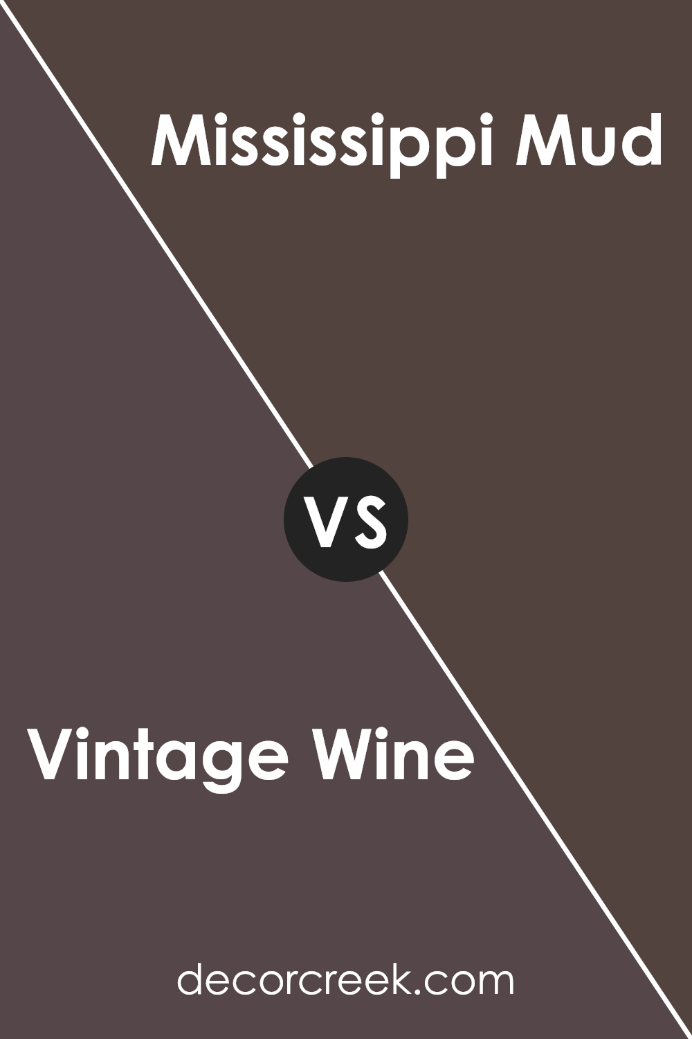
Vintage Wine 2116-20 by Benjamin Moore vs Mississippi Mud 2114-20 by Benjamin Moore
Let’s talk about two unique colors: Vintage Wine and Mississippi Mud, from Benjamin Moore. Vintage Wine is a rich color, blending deep reds with hints of purple, creating a cozy and inviting atmosphere in any space. It’s like the luxurious shade you see in a fine glass of wine that feels sophisticated and warm. On the other hand, Mississippi Mud is a solid and earthy brown, reminiscent of the banks of its namesake river.
This color brings a grounded, natural feel to a room, making it feel secure and comfortable. While both shades are deep and intense, Vintage Wine leans towards a more elegant and vibrant vibe, whereas Mississippi Mud offers a more understated and serene look.
Each color has its unique charm, with Vintage Wine suited for creating a statement space and Mississippi Mud perfect for crafting a calm and collected ambiance.
You can see recommended paint color below:
- 2114-20 Mississippi Mud
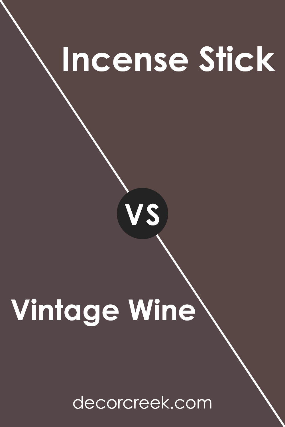
Vintage Wine 2116-20 by Benjamin Moore vs Incense Stick 2115-20 by Benjamin Moore
Vintage Wine and Incense Stick, both by Benjamin Moore, are distinct colors with their unique appeal. Vintage Wine is a rich, deep hue that mirrors the luxurious feel of a fine wine.
It’s a warm color, leaning towards a sophisticated burgundy that can make spaces feel cozy yet elegant. On the other hand, Incense Stick is a robust, dark gray with brown undertones, evoking a sense of grounding and stability. It’s less about warmth and more about creating a strong, neutral backdrop that can complement a wide range of colors. While Vintage Wine adds a touch of drama and luxury, Incense Stick offers versatility and a down-to-earth vibe, making it easier to match with various decor styles and colors.
Both colors bring their own unique personality to a space, the choice between them depends on the desired mood and aesthetic.
You can see recommended paint color below:
- 2115-20 Incense Stick
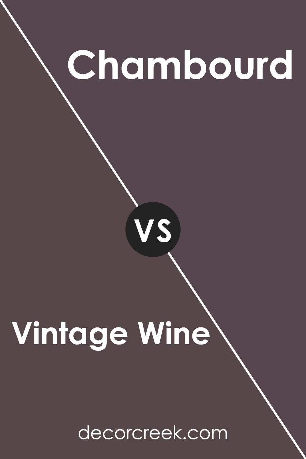
Vintage Wine 2116-20 by Benjamin Moore vs Chambourd AF-645 by Benjamin Moore
Vintage Wine by Benjamin Moore is a rich, deep hue with tones of burgundy and a subtle hint of brown, giving it a warm, cozy feeling. It’s the kind of color that feels luxurious and sophisticated, perfect for creating an elegant and inviting atmosphere in any room.
On the other hand, Chambourd by Benjamin Moore is also a deep color, but it leans more towards a dark, muted purple. It has a quiet elegance and a more understated vibe compared to Vintage Wine. While both colors are dark and can make a statement in a space, Vintage Wine tends to feel warmer due to its reddish undertones, whereas Chambourd, with its cooler purple base, brings a serene and somewhat mysterious quality to interiors.
The choice between them depends on whether you want the warmth and richness of a reddish hue or the calm and depth of a purplish shade.
You can see recommended paint color below:
- AF-645 Chambourd
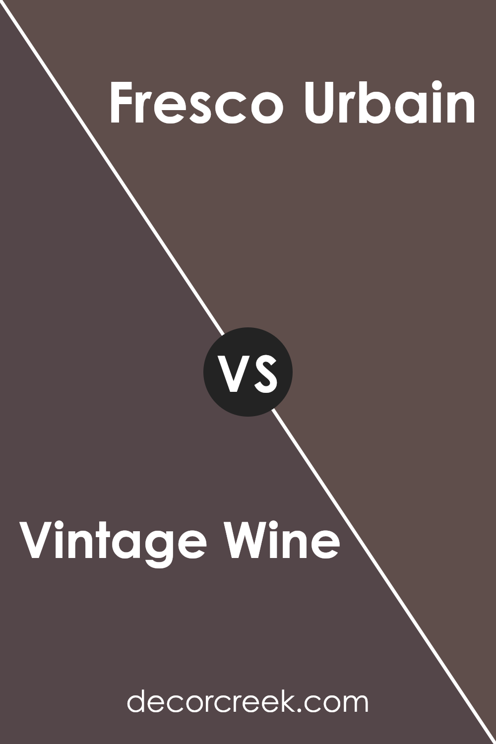
Vintage Wine 2116-20 by Benjamin Moore vs Fresco Urbain 1253 by Benjamin Moore
Vintage Wine 2116-20 by Benjamin Moore is a rich and sophisticated color. It has a deep, berry-like hue that brings warmth and elegance to any space. Think of it as that cozy, inviting shade perfect for creating a statement wall or adding depth to a room. Its beauty lies in its ability to pair well with both vibrant tones and neutral palettes, making it a versatile choice for home decor.
On the other hand, Fresco Urbain 1253 by Benjamin Moore takes on a lighter, more subdued approach. This color is reminiscent of a soft, light gray with hints of beige, offering a calm and serene vibe.
It’s ideal for those looking to create a peaceful and airy atmosphere in their space. Fresco Urbain serves as a fantastic backdrop to almost any decor style, from modern minimalist to rustic charm.
In comparison, Vintage Wine adds drama and character, while Fresco Urbain provides a clean, tranquil canvas. Both colors have their unique appeal, catering to different aesthetic preferences and room functionalities.
You can see recommended paint color below:
- 1253 Fresco Urbain
Conclusion
Vintage Wine 2116-20 by Benjamin Moore presents a luxurious and sophisticated option for those looking to add a touch of elegance to their interiors. Its deep, rich hue resembles the classic shade of well-aged wine, offering a cozy yet refined atmosphere to any room.
This color suits various spaces, from living rooms to bedrooms, adding warmth and depth with its enchanting presence.
Its versatile nature also means it pairs beautifully with a wide range of décor styles, from traditional to modern, making it a popular choice for those wanting to add a statement wall or refresh their space with a bold, stylish look.
Moreover, Vintage Wine 2116-20 has the unique ability to transform spaces into more inviting and intimate areas. Its understated opulence acts as a stunning backdrop for art, furniture, and textiles, allowing other colors to pop while providing a solid foundation that anchors the room.
Homeowners and designers alike appreciate how this color effortlessly balances between creating a dramatic statement and maintaining a cozy atmosphere, making it an excellent choice for anyone looking to update their home with a timeless, chic shade.
Ever wished paint sampling was as easy as sticking a sticker? Guess what? Now it is! Discover Samplize's unique Peel & Stick samples.
Get paint samples
