Whether you’re looking to amp up the coziness factor in your living space or wanting to give a bedroom a calmer, more welcoming feel, Warm Winter could be the perfect pick.
It’s part of Sherwin Williams’s collection that focuses on warmth and comfort, making any space feel more inviting instantly. I find that it plays well with natural light, giving off a subtle warmth that changes throughout the day, which keeps your room feeling fresh and lively.
Plus, it’s versatile—it pairs nicely with a wide range of décor and furniture styles, whether you’re into modern minimalism or rustic charm.
Choosing the right paint color can radically affect the mood and style of your space, and Warm Winter offers that gentle nudge towards a more comforting and appealing atmosphere without overpowering.
Great choice if you’re aiming for a change that feels like a warm welcome every time you step into the room!
What Color Is Warm Winter SW 9506 by Sherwin Williams?
The color Warm Winter by Sherwin Williams is a soft and cozy shade that beautifully captures the comfort of a winter day spent inside. This color has a creamy beige undertone that brings a warm and inviting atmosphere to any room. It’s not too dark or too light, making it a versatile choice for various spaces.
Warm Winter works wonderfully in interior styles that prioritize comfort and a homely feel, such as rustic, modern farmhouse, and traditional decor.
Its subtle warmth pairs perfectly with natural materials like wood, enhancing the grain and texture, and soft textiles like wool or linen, which add to the cozy vibe of the space.
In terms of pairing with other materials, Warm Winter sits beautifully against crisp white trim or darker earth tones, creating a balanced and cozy space. It’s great for living rooms or bedrooms where the goal is to create a snug, welcoming retreat.
Textures like knitted throws, plush rugs, or soft velvet can be paired to add depth and interest, making the space even more inviting. Additionally, this color works smoothly alongside metallic touches like brass or copper, which add a hint of rustic elegance without overpowering the gentle nature of the hue.

Is Warm Winter SW 9506 by Sherwin Williams Warm or Cool color?
Warm Winter by Sherwin Williams is a cozy, inviting color that can make any room in a home feel more welcoming. This shade is a neutral, creamy beige with a soft warmth to it, making it incredibly versatile for use in various decorating styles.
Whether it’s applied in a busy family kitchen, a calming bedroom, or a living room, it pairs well with various furnishings and accent colors, from bold and bright to soft and subtle.
The color has a gentle brightness that can help make smaller spaces appear larger and more open, while in larger rooms, it offers a subtle backdrop that enhances other decor elements. Additionally, Warm Winter is excellent for creating a cohesive look in open-plan areas, helping to tie different spaces together without overwhelming them with color.
By choosing Warm Winter, homeowners can achieve a fresh and updated look without making drastic changes. Its timeless appeal ensures that the color will not quickly go out of style, making it a sound choice for long-term satisfaction.
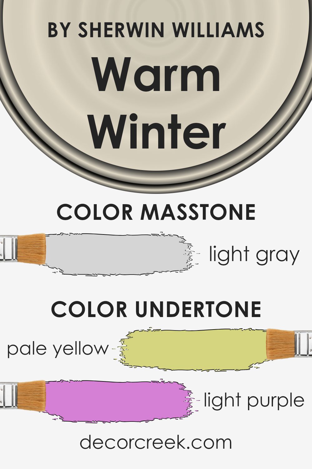
Undertones of Warm Winter SW 9506 by Sherwin Williams
Warm Winter is a unique neutral shade that subtly incorporates a variety of undertones including pale yellow, light purple, light blue, pale pink, mint, lilac, and grey. These undertones play a significant role in how the color appears under different lighting conditions and can influence the atmosphere of a room.
Undertones are the hints of color that are present within a main color but might not be immediately noticeable. They can affect the overall feeling of the color. For instance, a grey with a lilac undertone might feel cooler, while grey with a yellow undertone might appear warmer.
In the case of Warm Winter, the mix of warm and cool undertones makes it exceptionally adaptable to various interior styles and lighting. The pale yellow and pale pink undertones bring a subtle warmth, making the room feel cozy and inviting. On the other hand, the mint and light blue introduce a fresh, airy feel, perfect for creating a relaxed atmosphere.
Light purple and lilac add a hint of sophistication without overwhelming the senses, providing a gentle nudge towards a more refined aesthetic. The presence of a grey undertone helps in balancing the warmth and coolness, ensuring that the color remains neutral and versatile.
When used on interior walls, Warm Winter provides a backdrop that can complement a wide range of decor elements. Depending on the room’s natural and artificial lighting, as well as the colors of furniture and decorations, the undertones in Warm Winter will subtly shift, presenting a dynamic yet harmonious appearance. This makes it an excellent choice for anyone looking to enhance their living space without committing to a strongly tinted color.
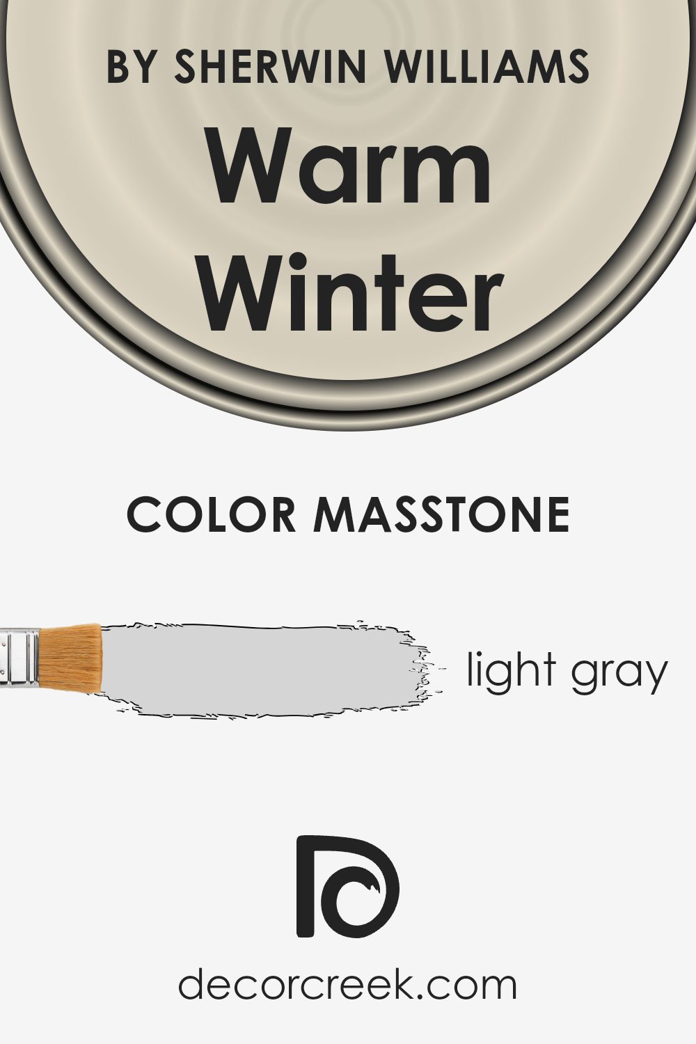
What is the Masstone of the Warm Winter SW 9506 by Sherwin Williams?
Warm Winter (SW 9506) by Sherwin Williams has a masstone of light gray, coded as #D5D5D5. This light gray shade offers a simple and clean look, making it a versatile choice for home interiors. Because it’s so neutral, it pairs well with almost any color scheme, serving as an excellent backdrop or base for decorating with bolder hues or soft pastels.
In spaces that receive less natural light, this light gray helps to reflect artificial light beautifully, giving rooms a brighter appearance even on cloudy days. In larger rooms, the light gray can help maintain a light, airy feel, preventing the space from feeling too vast or empty.
Lastly, using this shade can help conceal minor wall imperfections, as lighter colors are less likely to highlight bumps and small cracks compared to darker tones. Overall, Warm Winter is a practical color choice for creating a fresh and inviting home environment.
How Does Lighting Affect Warm Winter SW 9506 by Sherwin Williams?
Lighting plays a crucial role in how colors appear in a space, impacting the mood and aesthetics of a room. Color perception changes under different types of light due to how light affects the wavelengths reflected by colors. For instance, Warm Winter SW 9506 by Sherwin Williams, a soothing gray tone, can present various nuances depending on the lighting conditions.
In artificial light, which often varies in color temperature, Warm Winter might appear differently. In cool LED or fluorescent light, this color could lean towards a slightly cooler, crisper gray, emphasizing its blue or green undertones. In contrast, warm incandescent lighting would make it look cozier and softer, highlighting its potential beige or yellow undertones.
In natural light, Warm Winter’s true color is more likely to show, but this still varies depending on the room’s orientation:
1. North-facing rooms- These rooms get less direct sunlight, often casting a cooler, bluish light throughout the day. Here, Warm Winter may seem more muted and shadowy, with its cooler undertones slightly more pronounced, giving the room a calm feel.
2.South-facing rooms – These benefit from plentiful, warm sunlight all day, which can make Warm Winter appear warmer and more vibrant. The paint might seem lighter and more welcoming, with its subtle warm undertones shining through.
3.East-facing rooms – Morning light is warm and bright but turns cooler as the day progresses. In the morning, Warm Winter will look softer and brighter, but by the afternoon, it might shift to a truer, balanced gray as the natural light diminishes.
4.West-facing rooms – Evening light in these rooms is warm and golden, likely bringing out the cozy, inviting aspects of Warm Winter. During sunset, expect this color to glow warmly, creating a comforting ambiance.
Understanding how Warm Winter behaves under different lighting conditions can help you decide where to use it effectively within a home, ensuring that this versatile gray enhances the space as intended.

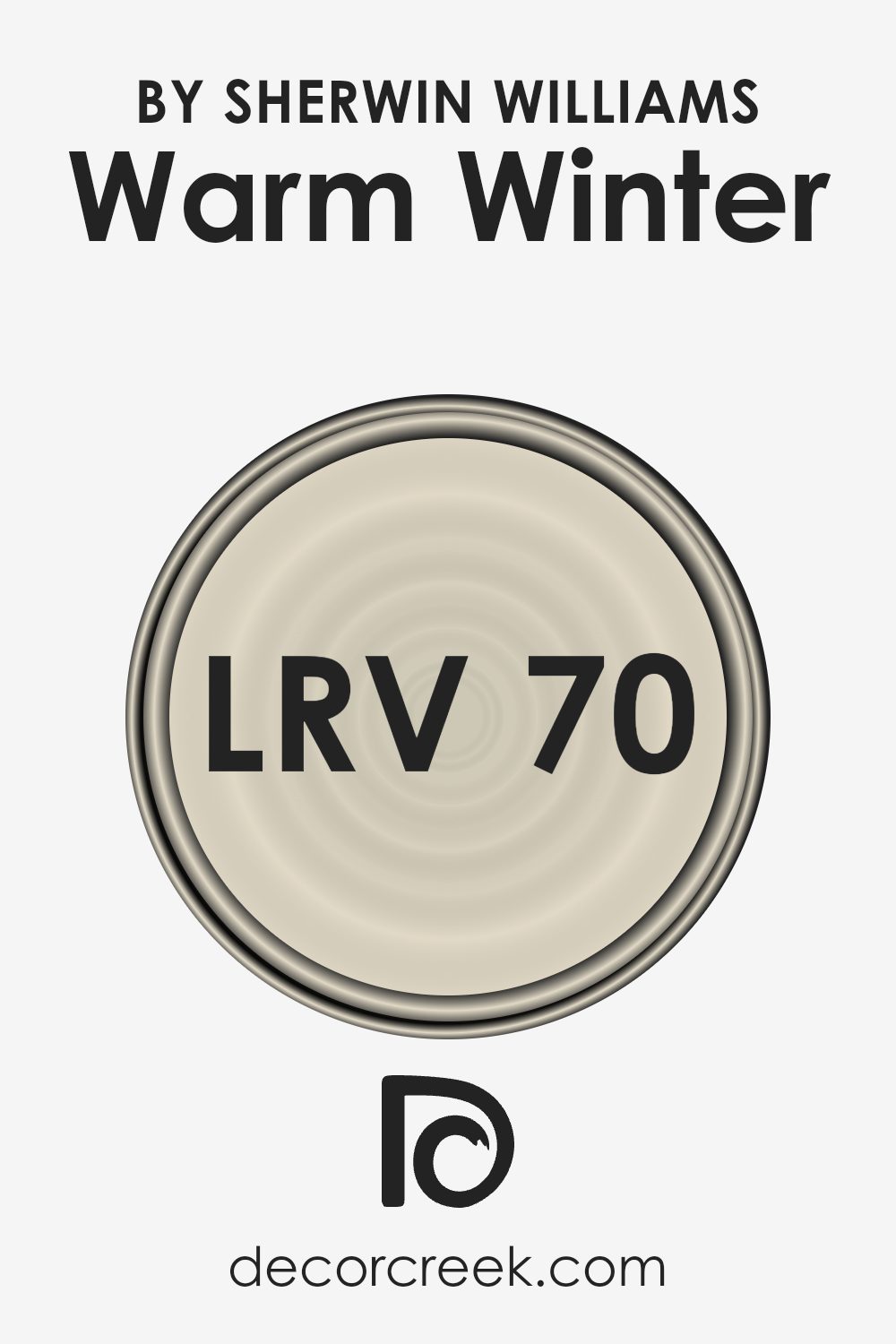
What is the LRV of Warm Winter SW 9506 by Sherwin Williams?
LRV stands for Light Reflectance Value, and it is a measure used to indicate the percentage of light a paint color reflects when it is applied to a wall or surface. This scale measures from no reflection (black, absorbing all light) to total reflection (white, reflecting all visible light).
Colors with higher LRV reflect more light, making rooms appear brighter and larger, while colors with lower LRV absorb more light, which can make spaces feel smaller and cozier.
With an LRV of about seventy, the color Warm Winter falls into the category of colors that reflect a good amount of light without being overwhelming. This makes it a versatile choice for a variety of spaces, helping to brighten them considerably without the starkness that often comes with much lighter shades.
It’s particularly useful in dimmer rooms or those that are naturally less endowed with sunlight, as it will help make the space feel more open and airy.
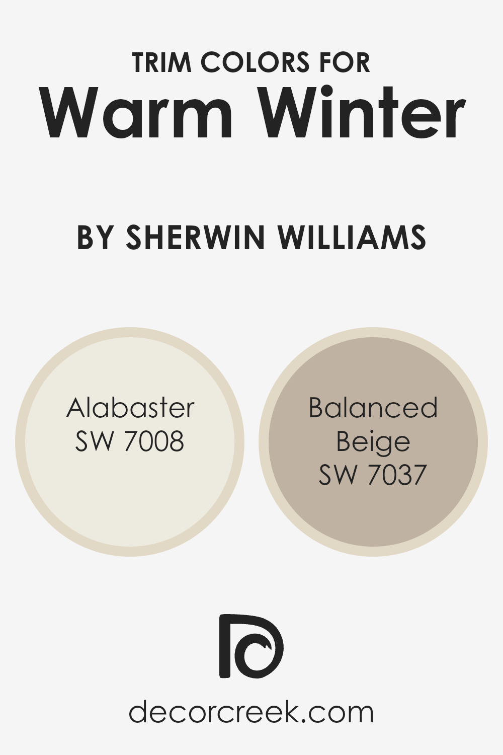
What are the Trim colors of Warm Winter SW 9506 by Sherwin Williams?
Trim colors are essential in defining the look of a room, and using the right shades can greatly complement the main wall color. For a color like Warm Winter from Sherwin Williams, which is a deep and rich hue, selecting neutral trim colors ensures that the walls stand out without overwhelming the space.
Alabaster and Balanced Beige are two trim colors that harmonize beautifully with Warm Winter, enhancing the overall aesthetic while keeping the atmosphere warm and welcoming.
Alabaster is a light, creamy white with a hint of warmth that pairs perfectly with the depth of Warm Winter, offering a crisp but soft boundary that makes the wall color pop. On the other hand, Balanced Beige is a warm, mid-tone beige that adds a subtle contrast and depth when used as a trim, ensuring that the space feels grounded and cohesive.
Both colors support the rich tone of Warm Winter by providing a gentle backdrop that highlights the wall color without competing for attention.
You can see recommended paint colors below:
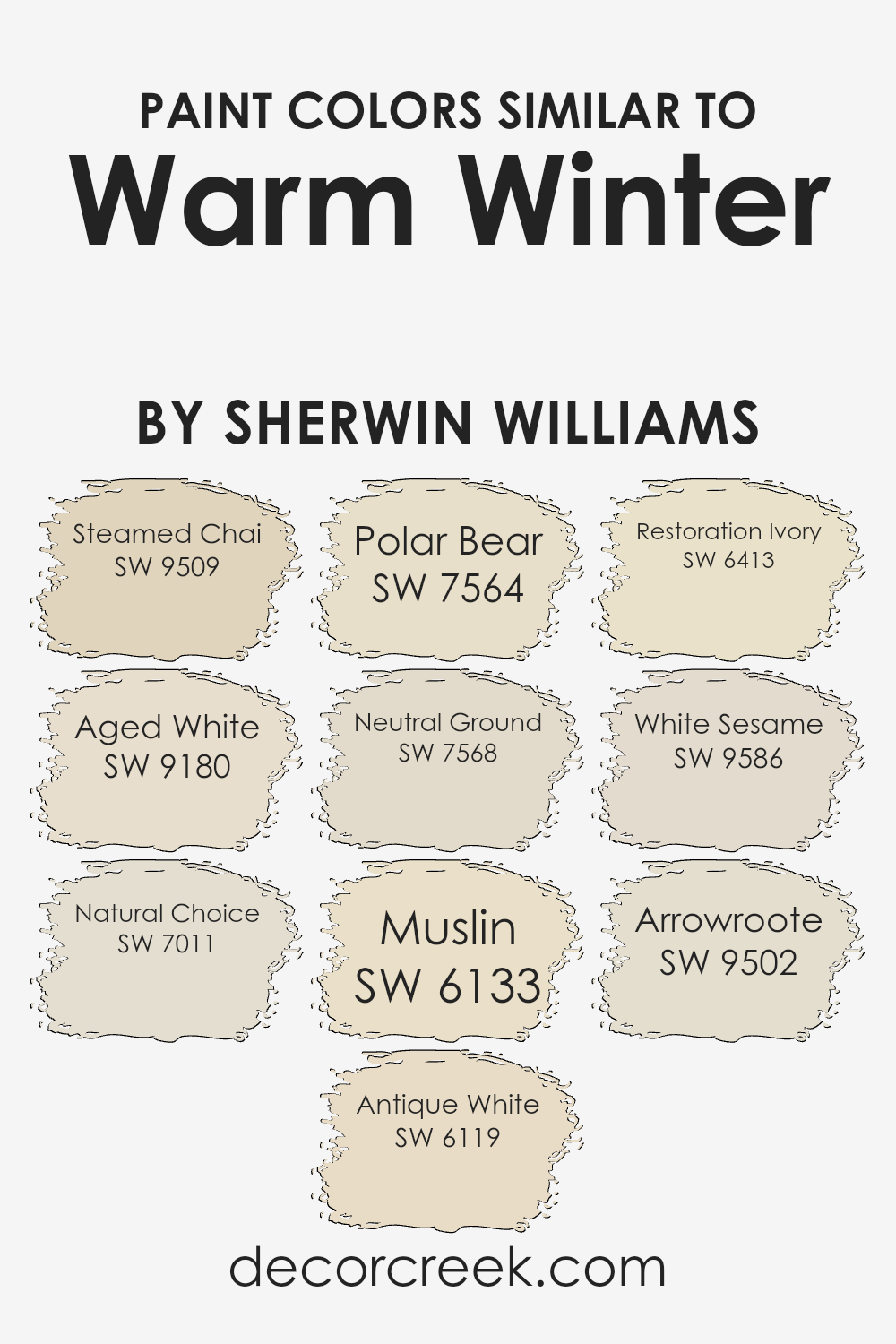
Colors Similar to Warm Winter SW 9506 by Sherwin Williams
When decorating a home, maintaining a visually appealing and cohesive color scheme is crucial, and using similar colors can play a significant role in achieving this harmony. Similar colors, such as those related to Warm Winter by Sherwin Williams, share common undertones or are adjacent on the color wheel, which helps create a smooth, seamless look throughout a space.
These colors blend well together, allowing for a gentle transition from one hue to another, which prevents harsh contrasts and keeps the eyes moving comfortably through the room. Additionally, using similar shades can enhance the sense of space, making rooms feel larger and more open.
For example, Steamed Chai is a warm and inviting hue that brings a cozy glow to walls, similar to the muted, creamy feel of Aged White. Natural Choice presents itself as a gentle beige, making it ideal for spaces that require a soft background, much like Antique White which offers a slightly deeper beige tone.
Polar Bear is a crisp, clean white that reflects light beautifully, akin to Neutral Ground which exudes a calm and neutral vibe. Muslin captures a charmingly subtle creaminess, echoed in the soft and light Restoration Ivory.
White Sesame serves as another neutral, providing a slightly grayish tone, while Arrowroote offers a subdued, pale version of sandy hues.
These colors, by being in close spectrum, ensure that no element feels out of place, allowing for a design that is both aesthetic and functional.
You can see recommended paint colors below:
- SW 9509 Steamed Chai
- SW 9180 Aged White
- SW 7011 Natural Choice
- SW 6119 Antique White
- SW 7564 Polar Bear
- SW 7568 Neutral Ground
- SW 6133 Muslin
- SW 6413 Restoration Ivory
- SW 9586 White Sesame
- SW 9502 Arrowroote
How to Use Warm Winter SW 9506 by Sherwin Williams In Your Home?
Warm Winter by Sherwin Williams is a soothing beige shade that brings a sense of warmth and comfort to any room. It’s a versatile paint color that works well in various parts of the home, from living rooms to bedrooms, creating a cozy backdrop for both relaxation and family time. When applied in spaces with natural light, this color feels soft and welcoming, enhancing the room’s overall appeal.
Homeowners can use Warm Winter in smaller rooms to make them appear larger, as its light hue helps to reflect light. It’s also a great choice for a hallway or entryway, providing a neutral canvas that complements various decor styles and colors.
For those looking to update their kitchen or bathroom, Warm Winter pairs beautifully with white trim and cabinetry, giving a clean and fresh look.
Additionally, applying this color in a textured finish can add an extra layer of warmth and interest, making your home feel more personalized and inviting. This color is an easy choice for anyone looking to create a cozy atmosphere in their living spaces.
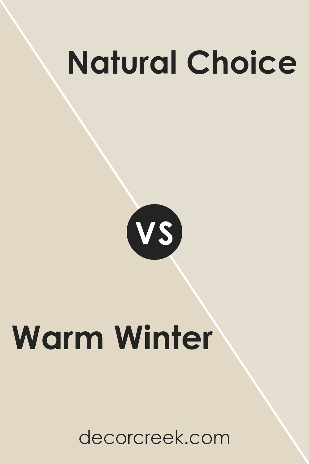
Warm Winter SW 9506 by Sherwin Williams vs Natural Choice SW 7011 by Sherwin Williams
Warm Winter and Natural Choice are two distinct shades from Sherwin Williams that offer different vibes for interior spaces. Warm Winter is a rich, deep hue that suggests coziness and warmth, making it ideal for living rooms or bedrooms where a comforting atmosphere is desired. Its deeper tone can make a space feel more intimate and welcoming.
On the other hand, Natural Choice is a much lighter color which could be described as soft and neutral. This shade is incredibly versatile and works well in any room, providing a clean and open feel. It is particularly effective in smaller spaces or areas with less natural light, as it helps to brighten the room without overwhelming it with color.
With their unique characteristics, Warm Winter brings a sense of warmth and coziness, whereas Natural Choice offers a clean and neutral backdrop. Both colors can enhance the aesthetic of a home, depending on the desired atmosphere and room functionality.
You can see recommended paint color below:
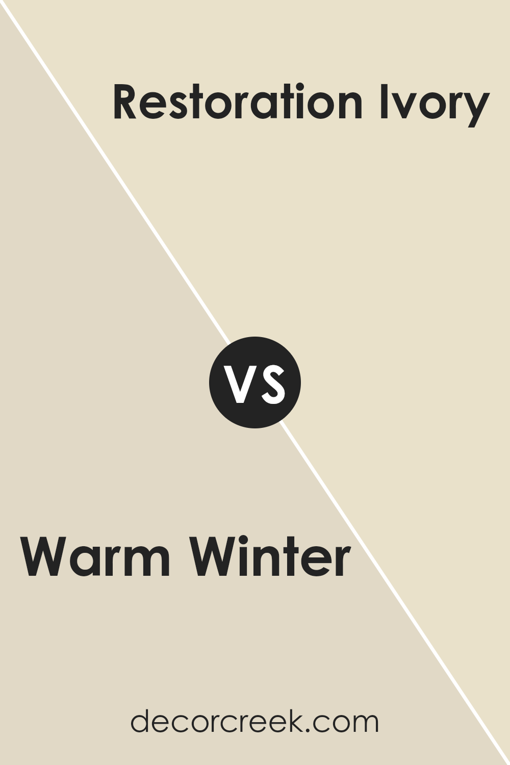
Warm Winter SW 9506 by Sherwin Williams vs Restoration Ivory SW 6413 by Sherwin Williams
The main color, “Warm Winter,” is a cozy, neutral beige. It has a light golden undertone that gives off a welcoming and cozy feel, perfect for making any space feel homely and relaxed. This shade works beautifully in areas where you want to add a touch of warmth without overwhelming the space with deeper or darker colors.
On the other hand, “Restoration Ivory” is a softer shade with an ivory base that leans towards a creamy white. It’s lighter than “Warm Winter” and works well in spaces that aim to feel brighter and more open. Its understated tone doesn’t pull attention, making it ideal for backgrounds or for pairing with bolder colors.
Both colors are versatile and can compliment various decor styles, but they set different moods. “Warm Winter” brings warmth and coziness, making it perfect for living areas or bedrooms, while “Restoration Ivory” offers a clean and fresh appearance, ideal for kitchens, bathrooms, or smaller spaces that you want to appear larger.
You can see recommended paint color below:
- SW 6413 Restoration Ivory
Warm Winter SW 9506 by Sherwin Williams vs Polar Bear SW 7564 by Sherwin Williams
Warm Winter and Polar Bear by Sherwin Williams are two distinctive shades that cater to different aesthetic vibes. Warm Winter is a deep, rich cream with a cozy feel, providing a comfortable and inviting atmosphere. It is perfect for spaces where you want a sense of warmth, akin to being wrapped in a soft blanket on a chilly day.
On the other hand, Polar Bear is a crisp, clean white that reflects more light, making it excellent for creating a brighter, more open feeling in a room. This color works well in areas where you want to simulate a fresh, airy environment—think of the freshness of a cool, clear day.
While Warm Winter adds a touch of warmth to a space, Polar Bear offers a more neutral backdrop, making it extremely versatile for any setting. Together, these colors can be used to balance each other or stand alone to set a specific mood in different rooms.
You can see recommended paint color below:
- SW 7564 Polar Bear
Warm Winter SW 9506 by Sherwin Williams vs Arrowroote SW 9502 by Sherwin Williams
Warm Winter and Arrowroot, both from Sherwin Williams, present subtle yet distinct differences that can affect the ambiance of a room. Warm Winter is a rich taupe with a touch of beige, making it a cozy and welcoming neutral that pairs well with a variety of colors and designs. It tends to warm up a space, lending a soft, comforting vibe where used, perfect for living areas or bedrooms where you want to feel relaxed.
On the other hand, Arrowroot is lighter and has more of a muted ivory tone. This color is excellent for spaces you want to appear brighter and more open. Its light reflectance works well in smaller or darker rooms to make them look more spacious.
Arrowroot suits areas that aim for a fresh, clean look, like kitchens and bathrooms.
Together, both colors offer lovely options for those wanting neutral, versatile backdrops with different undertones and brightness levels. Where Warm Winter adds warmth, Arrowroot offers lightnes.
You can see recommended paint color below:
- SW 9502 Arrowroote
Warm Winter SW 9506 by Sherwin Williams vs Muslin SW 6133 by Sherwin Williams
Warm Winter and Muslin are two inviting paint colors from Sherwin Williams that can create different moods in a room. Warm Winter is a deep, rich gray with a cozy, welcoming tone. It’s perfect for spaces where you want a little more drama or a strong presence, such as living rooms or bedrooms.
In contrast, Muslin is a soft, creamy beige that feels light and airy. This color works well in any space to create a calm, open feel, making it great for smaller rooms or areas with a lot of natural light.
Both colors offer versatility, but Warm Winter adds depth and a sense of warmth, while Muslin provides a neutral backdrop that can brighten up a space.
Whether you choose one over the other depends on the atmosphere you’re looking to achieve.
You can see recommended paint color below:
- SW 6133 Muslin

Warm Winter SW 9506 by Sherwin Williams vs Antique White SW 6119 by Sherwin Williams
Warm Winter and Antique White are two distinct shades offered by Sherwin Williams, each bringing its own unique vibe. Warm Winter is a darker, more muted color resembling the earthy tones found in nature during the colder months.
It projects a sense of warmth and coziness, making it ideal for spaces where you want to feel relaxed and comfortable.
On the other hand, Antique White is a lighter, creamy color that has a soft and inviting appearance. It is very versatile, perfect for creating a bright and airy feel in a room. This color can make small spaces appear bigger and is fantastic for areas like kitchens and living rooms where you want a clean, welcoming atmosphere.
Together, these colors could work well in a home where you want to balance cozy attributes with light, expansive feelings. Antique White could lighten up a room, while Warm Winter could be used as an accent to add depth and a touch of nature.
You can see recommended paint color below:
Warm Winter SW 9506 by Sherwin Williams vs White Sesame SW 9586 by Sherwin Williams
Warm Winter by Sherwin Williams is a cozy and inviting hue, reminiscent of the soft warmth of a winter fire or the rich tones of seasonal spices. It creates a pleasant, comforting atmosphere in any room, particularly suitable for living areas or bedrooms where you might seek relaxation and warmth. This color tends to make spaces feel more intimate and close-knit.
On the other hand, White Sesame by Sherwin Williams is a light, neutral shade that leans towards a soft beige rather than a stark white. It provides a clean and airy feel, making it ideal for opening up smaller or darker spaces.
White Sesame is versatile, working well in various settings, from modern kitchens to cozy living rooms, adding a gentle, calming effect without being too cold.
Together, these colors can complement each other beautifully. Warm Winter can serve as a striking accent wall or feature color, while White Sesame could be used for the remaining walls to balance the warmth and maintain lightness in the room.
You can see recommended paint color below:
- SW 9586 White Sesame
Warm Winter SW 9506 by Sherwin Williams vs Neutral Ground SW 7568 by Sherwin Williams
Warm Winter and Neutral Ground are two distinct colors by Sherwin Williams, each offering a unique ambiance to a space. Warm Winter has a comforting brown tone with a hint of red, creating a cozy and inviting feel. It’s perfect for spaces where you want a touch of warmth and hospitality, like living rooms or dining areas.
On the other hand, Neutral Ground stands out as a soft beige, offering a versatile backdrop for any room. Its lightness brings brightness to spaces and can make small rooms appear larger.
Because of its neutrality, it pairs well with almost any color, providing a clean and calm look that works especially well in bedrooms and offices.
Both colors suit various decorating styles and can complement a wide range of furnishings. While Warm Winter adds a dash of warmth suitable for a welcoming, homely feel, Neutral Ground serves as a subtle foundation, allowing other elements in the room to shine. Each has its own character, making them great choices depending on the desired effect in a home.
You can see recommended paint color below:
Warm Winter SW 9506 by Sherwin Williams vs Steamed Chai SW 9509 by Sherwin Williams
Warm Winter and Steamed Chai are both paint colors offered by Sherwin Williams. Warm Winter is a rich, creamy white with a cozy feel to it, making it perfect for spaces where you want a touch of warmth without overwhelming brightness. It works well in living rooms and bedrooms to create a soft and welcoming atmosphere.
On the other hand, Steamed Chai is a bit darker, presenting a beige tone that resembles a light, milky coffee. This color is ideal for areas where you want to add a bit more depth while still keeping the space light and airy. Both colors are quite neutral and can easily match various decor styles.
They complement each other well, with Warm Winter offering a lighter backdrop and Steamed Chai providing a gentle contrast as an accent wall or for trim.
You can see recommended paint color below:
Warm Winter SW 9506 by Sherwin Williams vs Aged White SW 9180 by Sherwin Williams
Warm Winter and Aged White are two colors that bring distinct atmospheres to any space. Warm Winter is a rich, deep taupe that adds a cozy and welcoming feel. It’s perfect for creating a snug environment in living areas and bedrooms where comfort is key.
On the other hand, Aged White offers a softer, slightly off-white hue that brings a gentle, calming presence. It’s great for spaces where you want to relax, like bathrooms or kitchens, as it provides a clean and airy look.
The difference between these two colors lies in their ability to set the mood. Warm Winter, with its deeper, warmer tone, tends to make rooms feel more enclosed and intimate. Aged White, being lighter, tends to open up spaces and make them feel more expansive.
Depending on what you’re looking for in a room—whether it’s warmth and coziness or a breezy, open feel—choosing between these two can greatly affect the ambiance.
You can see recommended paint color below:
Conclusion
Wrapping up my thoughts on SW 9506 Warm Winter by Sherwin Williams, I must say, I’m very impressed! This color is like a big, cozy hug. It’s soft and gentle, just like when you’re all wrapped up in a warm blanket on a snowy day. It’s amazing how a simple paint color can make a room feel like a safe, warm spot, perfect for reading books or playing games on a cold day.
What’s also great about Warm Winter is how friendly it feels. It’s not one of those colors that screams for attention, but it definitely makes you feel welcome when you step into a room painted with it. And the best part?
It’s such a calm shade that it goes really well with lots of other colors. You can add blues, greens, or even yellows, and they will all look nice together.
So, if you or your friends are thinking about giving a room a new look, Warm Winter is a fantastic choice. It’s not just a color; it’s like adding a little bit of winter’s best part (think hot chocolate and cozy fires) right into your home.
Your room will look lovely, and it will make everyone who comes in feel nice and warm.

Ever wished paint sampling was as easy as sticking a sticker? Guess what? Now it is! Discover Samplize's unique Peel & Stick samples.
Get paint samples

