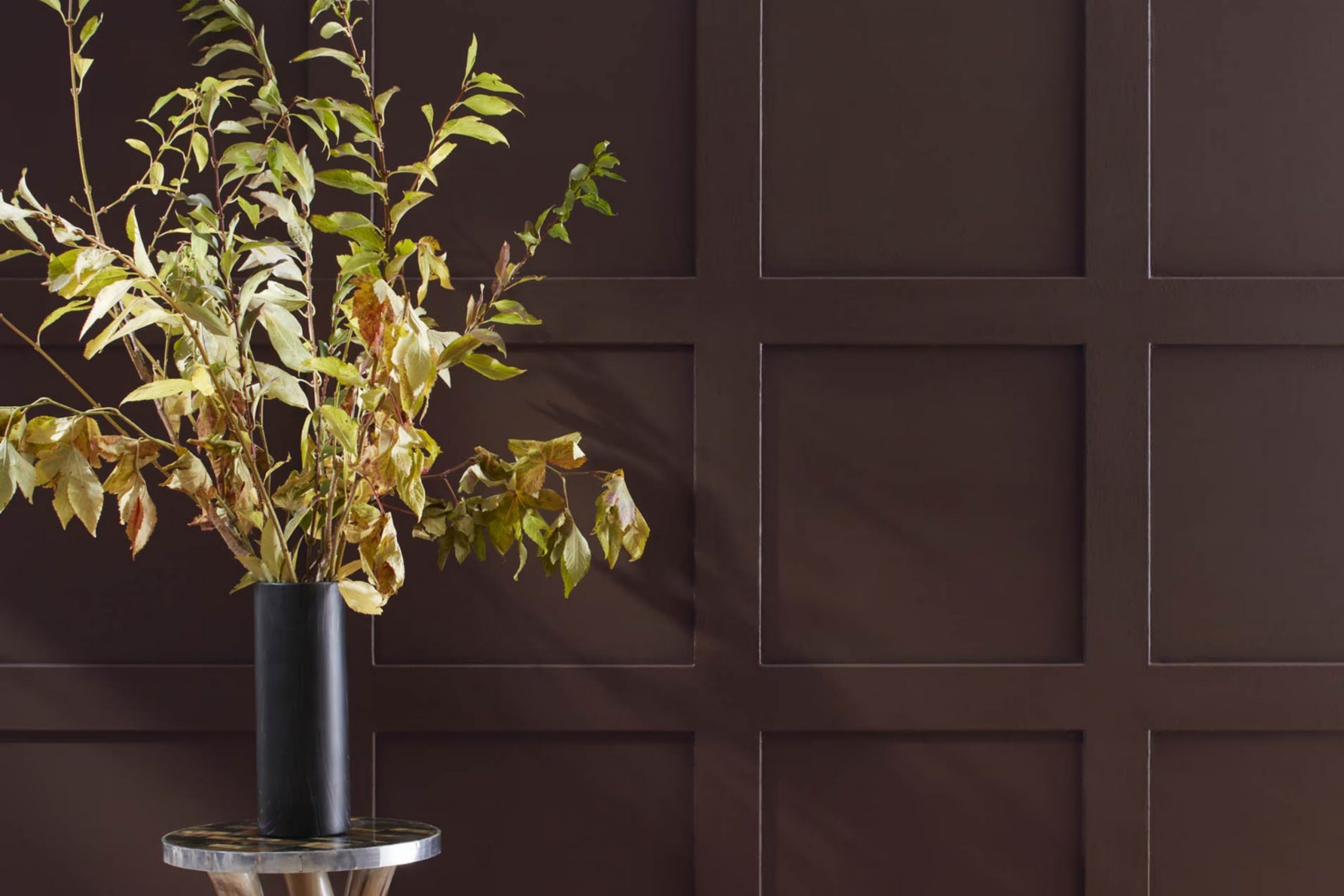
I recently chose AF-180 Wenge by Benjamin Moore for a room makeover and it has completely changed the atmosphere of the area. If you’re considering a new shade for your walls, let me tell you why Wenge is a choice worth considering. It’s not just a dark brown; it has this refined quality that makes everything in the room, from furniture to artwork, stand out in a very subtle yet graceful way.
Using Wenge might seem a bit bold at first because it’s deeper and richer than your typical neutral. However, it pairs wonderfully with a wide array of colors and decor styles. Whether your room is filled with light and airy fabrics or more vibrant, colorful accents, Wenge provides a backdrop that enhances without overpowering.
I found out about Benjamin Moore’s color by looking for something that could add both warmth and elegance. Wenge hit all the right notes for me, offering an atmosphere that’s both cozy and stylish.
If you’re gearing up for a change and want a color that offers both character and flexibility, AF-180 Wenge could be the perfect pick for you.
What Color Is Wenge AF-180 by Benjamin Moore?
The color Wenge AF-180 by Benjamin Moore is a deep, dark brown that closely resembles the rich hue of the wenge wood found in Central Africa. This color is adaptable and emits a strong sense of warmth and earthiness, making it ideal for creating a cozy and inviting atmosphere in any room.
Wenge AF-180 works exceptionally well in traditional interiors where its depth can enhance the classic elegance of wood furnishings and detailed trim. It’s also a superb choice for modern and minimalist styles, providing a striking contrast when paired with lighter colors and streamlined furniture. In rustic settings, this color complements natural stone and aged metals, adding to the overall rugged feel.
When it comes to materials, Wenge AF-180 pairs beautifully with natural textures such as leather, linen, and rough-hewn wood, which help to soften its intensity and add visual interest. Metals, particularly brushed nickel or aged brass, also work well with this hue, providing a touch of shimmer against the darker backdrop.
In rooms intended for relaxation like living areas or bedrooms, combining this color with plush fabrics can create a cozy, restful environment. Overall, Wenge AF-180 is a dynamic and adaptable color that can help to warm up an interior while adding a touch of drama and natural beauty.
Is Wenge AF-180 by Benjamin Moore Warm or Cool color?
Wenge AF-180 by Benjamin Moore is a deep, chocolate brown shade that adds a cozy and inviting vibe to any room. This rich color is perfect for making large areas feel more intimate and smaller rooms look more elegant. It works exceptionally well in places where you want to promote comfort and warmth, like living rooms or bedrooms.
The color pairs beautifully with lighter tones, such as creams and light grays, which helps to create a balanced look. It is also adaptable enough to complement various styles of decor, from traditional to more contemporary settings.
Wenge AF-180 can act as a neutral backdrop or as an accent wall to highlight specific areas of your home. Its ability to absorb light makes it a good choice for areas that receive a lot of natural sunlight, preventing the area from feeling too bright while keeping a cozy atmosphere.
Undertones of Wenge AF-180 by Benjamin Moore
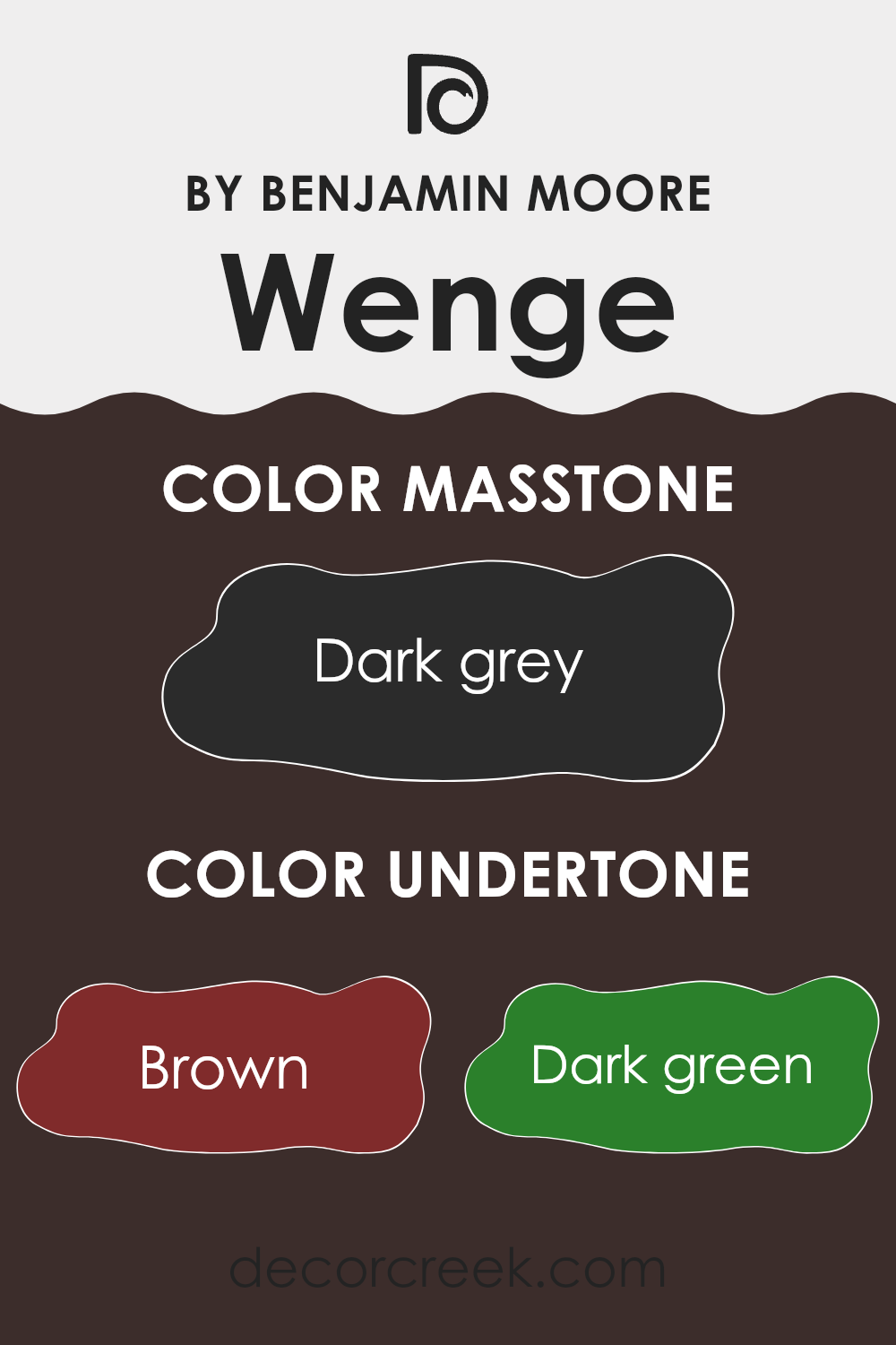
Wenge AF-180, a color by Benjamin Moore, has a range of undertones that significantly influence its appearance and how it feels in a room. Undertones are subtle colors that emerge under different lighting conditions and can change the main color’s perception. For Wenge AF-180, these undertones include brown, dark green, navy, olive, purple, dark turquoise, and grey.
Each of these undertones plays a role in how Wenge AF-180 is viewed. Brown adds a touch of warmth, making the color feel cozy and welcoming. Dark green and olive impart a natural feel, which can help a room feel grounded and connected to the outdoors.
Navy and dark turquoise contribute a cooler and slightly more vibrant edge, perfect for adding depth. Purple introduces a hint of richness, enhancing the overall elegant feel of the color. Lastly, grey helps to balance the color, making it more adaptable and easier to integrate into various decor styles.
When applied to interior walls, Wenge AF-180 offers a dynamic experience due to its complex undertones. In natural light, it might look warmer and more inviting, while artificial lighting brings out its cooler, deeper shades.
This flexibility makes it an excellent choice for living rooms or bedrooms, where the interplay of shades and lights can create a fresh yet cozy atmosphere. Understanding the impact of these undertones can help in choosing decor and accents to either complement or contrast with the walls, depending on the desired effect.
What is the Masstone of the Wenge AF-180 by Benjamin Moore?
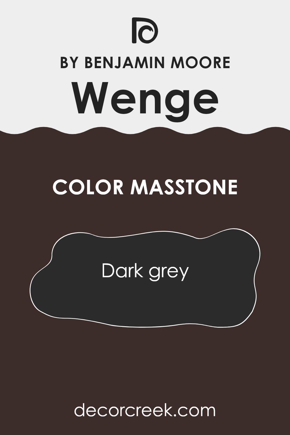
Wenge AF-180 by Benjamin Moore is a dark grey color with a deep, rich tone. This shade is adaptable and works well in many areas of a home. One of its key traits is its ability to create a solid and grounding atmosphere, making it a great choice for rooms where you want to feel settled and secure, like bedrooms or home offices.
Due to its dark nature, it pairs well with brighter tones and materials, such as white trim or light wood furniture, which can help to balance the darkness and prevent rooms from feeling too heavy.
Additionally, being a neutral color, Wenge AF-180 can serve as a backdrop for various decor styles, from modern to traditional, allowing personal tastes to stand out. In areas with ample natural light, this color can appear more subdued, while in lower light, it can add a dramatic flair, making it flexible to different lighting scenarios in homes.
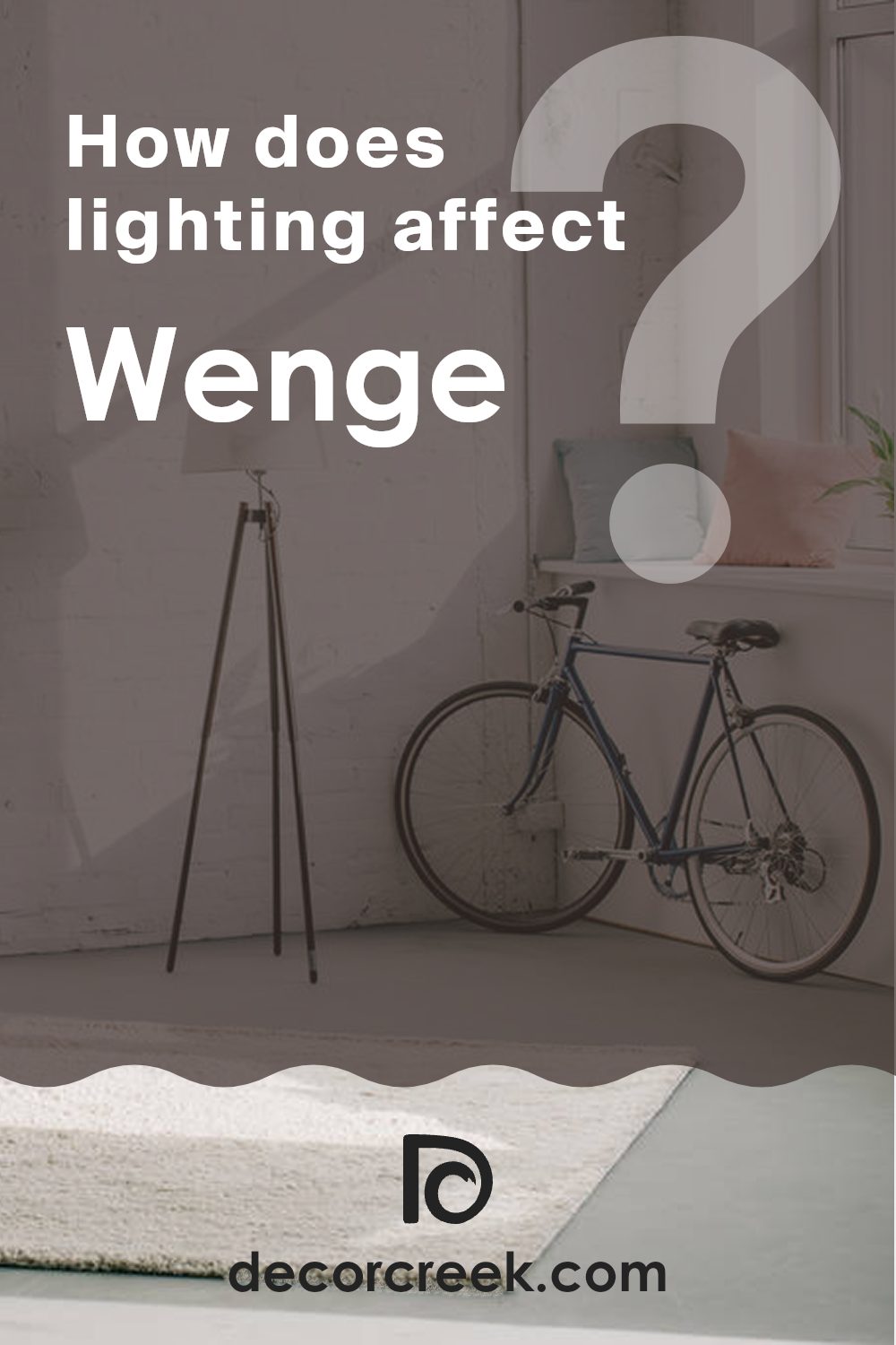
How Does Lighting Affect Wenge AF-180 by Benjamin Moore?
Lighting plays a crucial role in how colors appear in a room. Different types of light can change how a color looks, sometimes significantly. Wenge AF-180 by Benjamin Moore is a deep, dark brown that can appear differently depending on the lighting conditions.
In artificial light, the richness of Wenge AF-180 becomes more pronounced. Incandescent or warm LED lights will highlight the brown tones, making the color appear cozier and more inviting. In cooler artificial light, such as that from fluorescent bulbs, the color might seem slightly sharper and less warm, bringing out any subtle undertones.
In natural light, the appearance of Wenge AF-180 can change throughout the day. Morning light, which is generally softer and lighter, can make this dark shade look more like a muted brown. As the sun moves and the intensity of the natural light increases, the true depth and darkness of the color come to life.
The direction your room faces also impacts how Wenge AF-180 looks:
- North-facing rooms: These rooms typically get less direct sunlight, making them cooler in tone. Here, Wenge AF-180 might appear more as a true dark brown, maintaining its depth without becoming too intense.
- South-facing rooms: These rooms receive a lot of sunlight, which can warm up the color. In a south-facing room, Wenge AF-180 might reveal subtle reddish or chocolate undertones, creating a warm and appealing mood.
- East-facing rooms: With sunlight in the morning, Wenge AF-180 will lighten up a bit but will return to its darker, denser brown as the day progresses and the light fades.
- West-facing rooms: Evening light, which tends to be golden, will warm up this color significantly. In the afternoons and evenings, the color will look its richest and deepest in these rooms.
Understanding how lighting affects Wenge AF-180 can help you use this color effectively in your decorating, ensuring that it always looks its best regardless of the room’s direction or the type of light it receives.
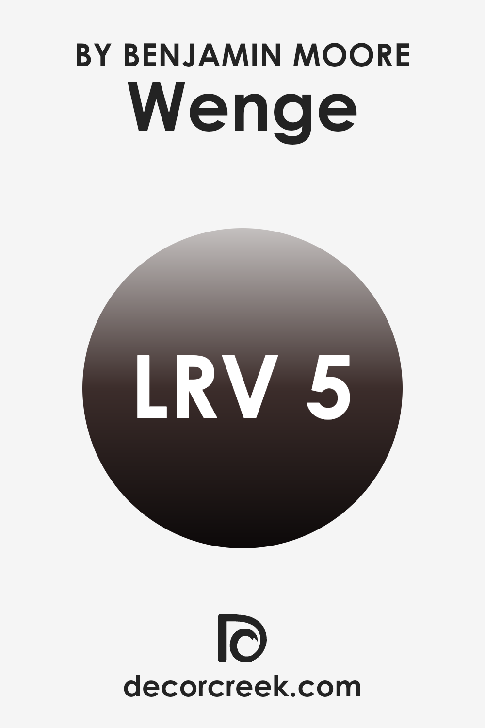
What is the LRV of Wenge AF-180 by Benjamin Moore?
LRV stands for Light Reflectance Value, which is a measure of the amount of visible and usable light that a color reflects or absorbs when it’s applied to a surface. This value is given on a scale where higher values indicate that the color reflects more light, making it appear lighter, and lower values mean the color absorbs more light, appearing darker.
LRV is particularly important when choosing paint colors for a room because it can greatly influence the mood and visual comfort. Brighter areas generally need less artificial lighting, whereas darker colors might require additional lighting to prevent the room from feeling too dim.
The LRV of Wenge AF-180, which is 4.79, tells us that it is a very dark color. When used on walls, this color will absorb most of the light instead of reflecting it, making the room appear more intimate and cozier but possibly smaller as well.
This can be ideal for creating a dramatic or cozy feel in a room, depending on the purpose and the amount of natural light available. However, if the area is already limited in natural light or is smaller in size, such a low LRV could make it feel even smaller and darker. Adequate lighting and thoughtful decor choices would be essential to balance the deep tone of this color and prevent the area from feeling too closed in.
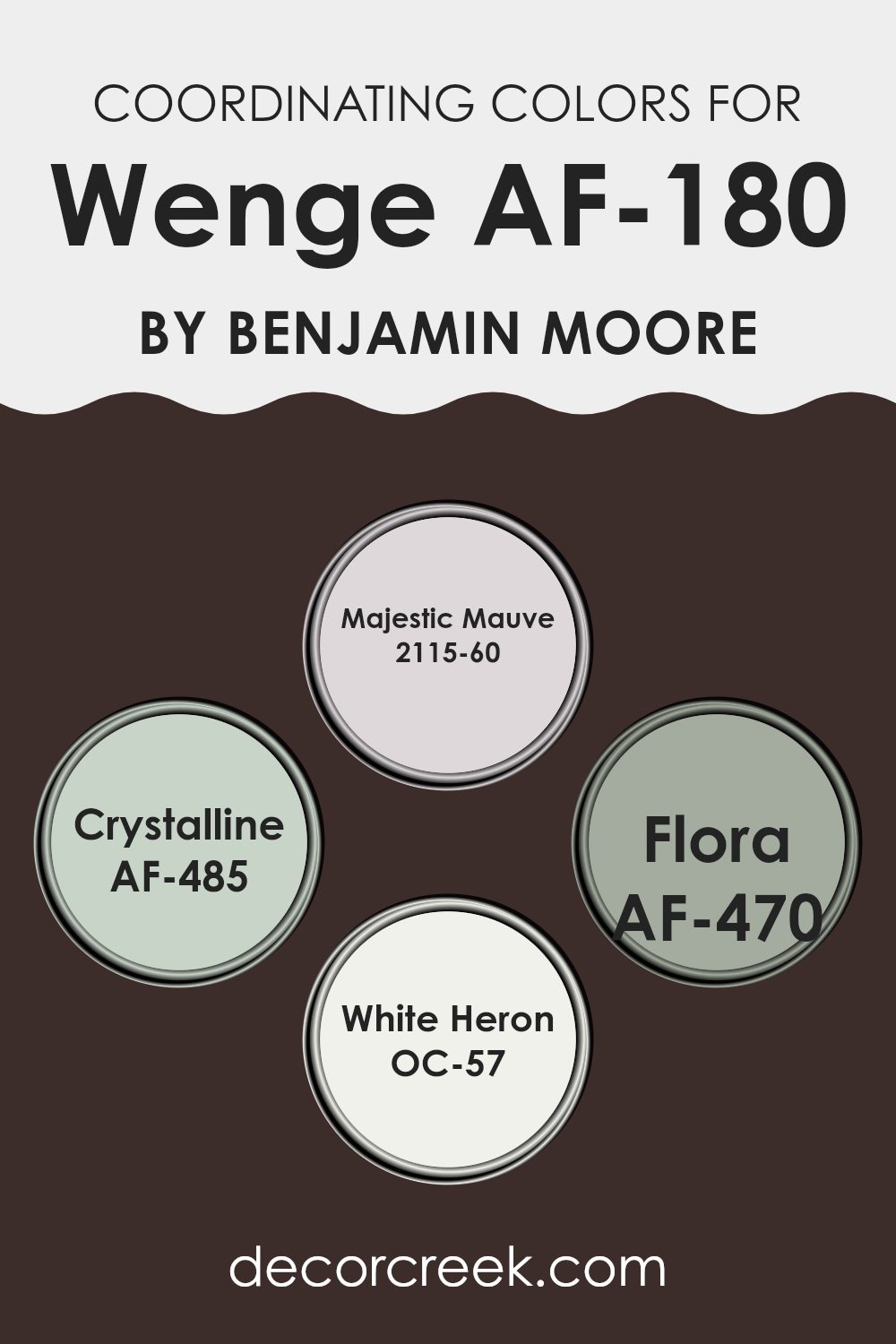
Coordinating Colors of Wenge AF-180 by Benjamin Moore
Coordinating colors are thoughtfully selected shades that complement or enhance each other when used together in a design scheme. Choosing coordinating colors, such as the ones Benjamin Moore has paired with Wenge AF-180, greatly simplifies decorating decisions, ensuring that all the colors in a room work in harmony.
The color Majestic Mauve 2115-60 is a soft and subtle lavender hue that provides a gentle contrast to darker tones, making it perfect for creating a calm and balanced mood. Crystalline AF-485, on the other hand, offers a refreshing aqua that brings a light and airy touch to interiors, pairing beautifully with the deeper, richer tones of Wenge AF-180.
Flora AF-470 is a lush, leafy green that adds vibrancy and a touch of nature to any room, making it an exceptional choice for adding a lively pop of color. Lastly, White Heron OC-57 is a crisp, clean white that acts as an adaptable backdrop, allowing other colors to stand out while providing a sense of freshness and clarity to the palette. Together, these colors complement Wenge AF-180 by bringing balance, contrast, and unity to the decor.
You can see recommended paint colors below:
- 2115-60 Majestic Mauve
- AF-485 Crystalline
- AF-470 Flora
- OC-57 White Heron
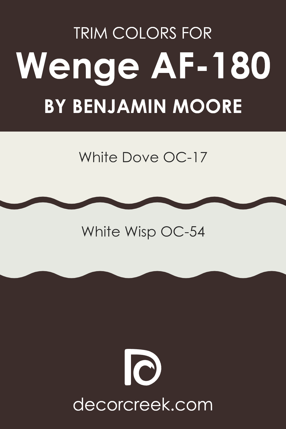
What are the Trim colors of Wenge AF-180 by Benjamin Moore?
Trim colors are specific shades used primarily for painting architectural details such as door frames, window trims, and skirtings, distinguishing them from the main wall colors. For a dark, rich hue like Wenge AF-180 by Benjamin Moore, selecting the right trim color is essential as it helps to break the monotony and highlight the architectural features, ensuring that the room’s color scheme has a balanced visual appeal.
White Dove OC-17 and White Wisp OC-54 are two trim colors that pair beautifully with Wenge AF-180. White Dove is a warm, creamy white that offers a soft contrast against deeper shades, lending a cozy and inviting feel to any room.
On the other hand, White Wisp is a very light gray with a subtle hint of blue, providing a modern and fresh look when used as a trim, giving the darker tones a crisp outline. Both colors are adaptable and work well to highlight and define areas when paired with the deep shades of Wenge AF-180.
You can see recommended paint colors below:
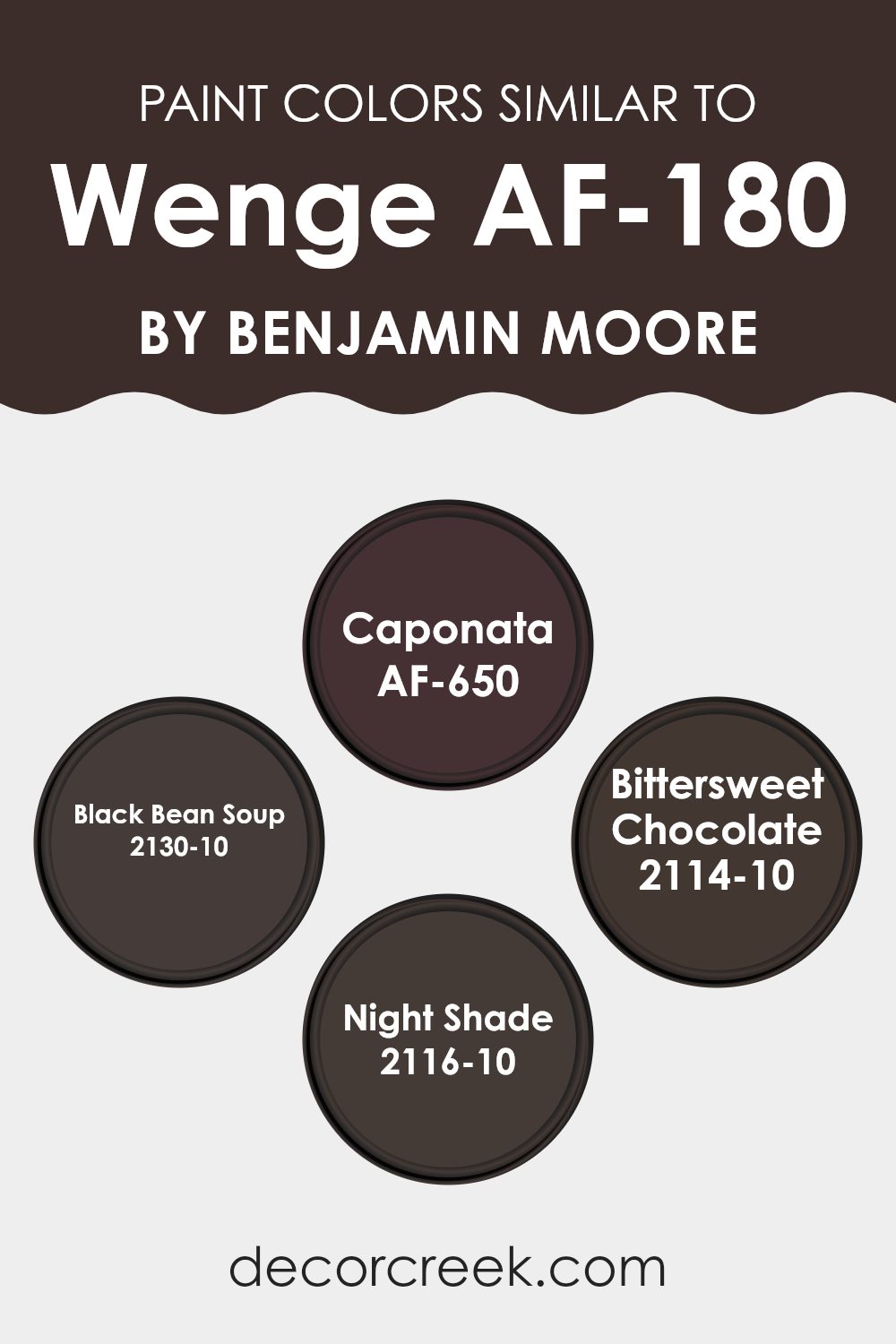
Colors Similar to Wenge AF-180 by Benjamin Moore
Choosing similar colors for a design project ensures a cohesive and harmonious aesthetic, which can enhance the mood and overall visual appeal of a room. These tones, all akin to Benjamin Moore’s Wenge, are balanced yet distinct enough to create depth and interest in your interior.
When used together, these colors create a visually comfortable setting, allowing them to blend easily with furniture and decor. Their close relation in hue helps achieve a unified look without sharp contrasts, ensuring the overall effect remains pleasing to the eye.
AF-650 Caponata is a deep, rich aubergine that evokes a sense of depth and warmth. Its eggplant-like tone works well in intimate rooms, adding a touch of drama without becoming too intense. On the other hand, 2130-10 Black Bean Soup is a dark charcoal with a hint of brown, a perfect backdrop for highlighting other decor elements thanks to its neutral yet strong character.
2114-10 Bittersweet Chocolate is just as tempting as it sounds, offering a cozy, dark chocolate shade that’s both inviting and elegant, ideal for creating refined yet grounded character in a room. Lastly, 2116-10 Night Shade is a mysterious dark gray with a hint of blue, adaptable for use in various rooms needing a subtle hint of color while maintaining a confident presence. Together, these shades provide a palette that’s rich and layered, yet consistently comforting and polished.
You can see recommended paint colors below:
- AF-650 Caponata
- 2130-10 Black Bean Soup
- 2114-10 Bittersweet Chocolate
- 2116-10 Night Shade
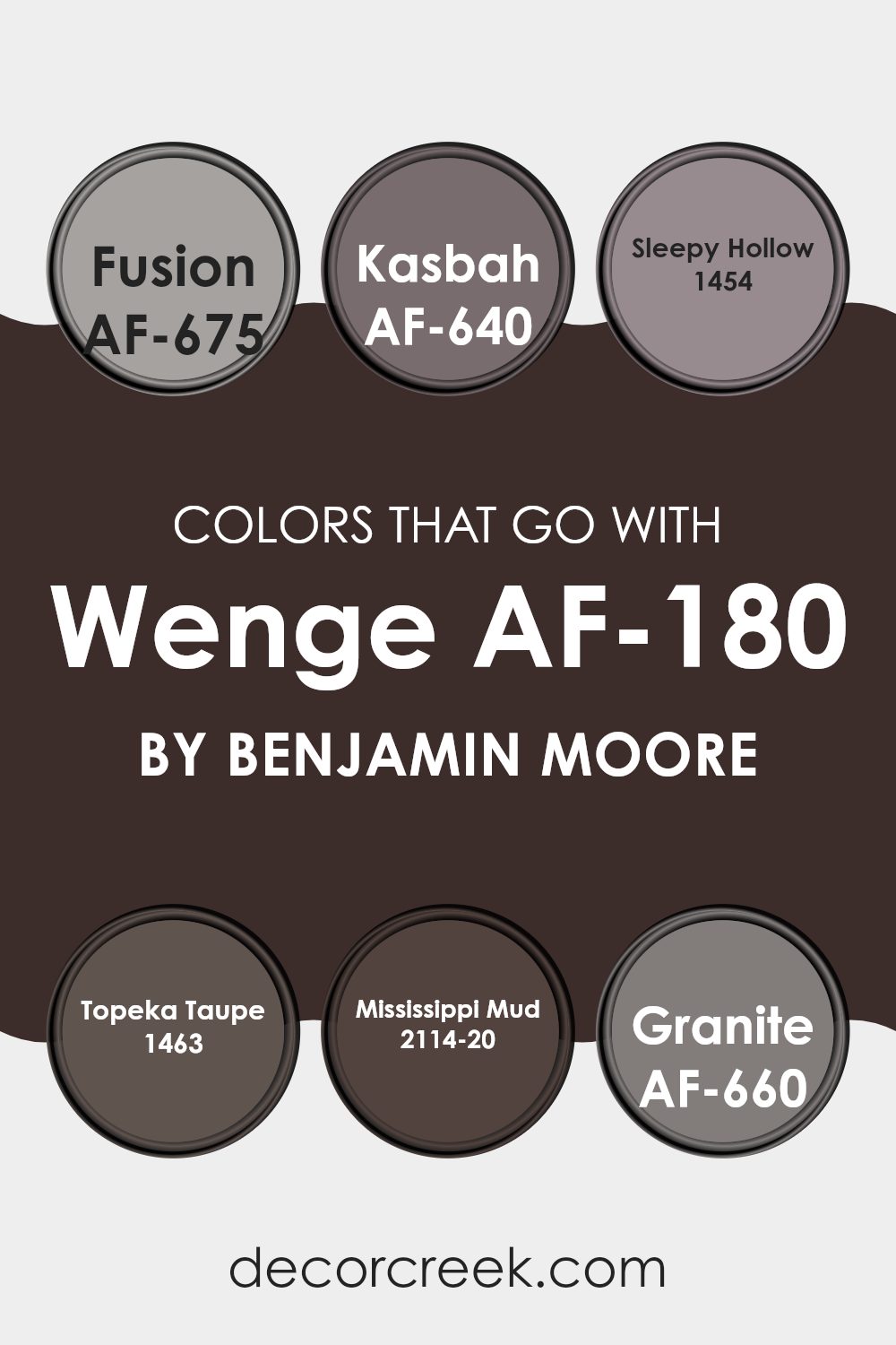
Colors that Go With Wenge AF-180 by Benjamin Moore
When selecting colors that pair well with Wenge AF-180 by Benjamin Moore, it’s important to consider how these hues complement one another, creating a cohesive and visually appealing interior. Each coordinating color, like AF-675 Fusion or AF-640 Kasbah, adds its own unique character to the setting, enhancing the deep and rich tones of Wenge AF-180. These combinations are key to achieving a balanced and refined look.
AF-675 Fusion is a gray with a hint of warmth, working beautifully in rooms that need a subtle contrast against the darker Wenge AF-180. AF-640 Kasbah is a deeper, spicier tone that enhances the richness of Wenge without becoming too strong. Meanwhile, 1454 Sleepy Hollow is a light blue that introduces a refreshing, airy quality to balance the depth of Wenge AF-180, ideal for creating a calm and relaxed mood.
Close in tone, 1463 Topeka Taupe is a gentle brown that provides an earthy foundation and pairs easily with darker hues. Adding depth and comfort, 2114-20 Mississippi Mud is a richer, more pronounced shade that blends smoothly with Wenge to create a warm, inviting feel.
Lastly, AF-660 Granite, a solid, stone-like gray, serves as a strong bridge between the bold Wenge and lighter accents, completing the palette with harmony. Together, these shades align beautifully with Wenge AF-180, enhancing the overall character and balance of any interior.
You can see recommended paint colors below:
- AF-675 Fusion
- AF-640 Kasbah
- 1454 Sleepy Hollow
- 1463 Topeka Taupe
- 2114-20 Mississippi Mud
- AF-660 Granite
How to Use Wenge AF-180 by Benjamin Moore In Your Home?
Wenge AF-180 by Benjamin Moore is a rich, deep brown paint color that adds a strong presence to any room. It’s perfect for creating a cozy and inviting mood. When you want to make a statement, consider using Wenge AF-180 in your living room or dining area. It works well on accent walls, providing a dramatic backdrop for artwork or lighter furnishings.
In a bedroom, this color can promote a restful feeling, making it ideal for walls behind a bed. For smaller areas, such as a powder room or an entryway, Wenge AF-180 can add depth and interest. Pairing it with bright whites on trim or ceilings can help balance its depth.
Additionally, it pairs beautifully with various textures, like metallic accents or wooden elements, which highlight its natural, earthy qualities. Lastly, this shade can be used on exterior details like front doors or shutters, giving your home a strong, inviting character.
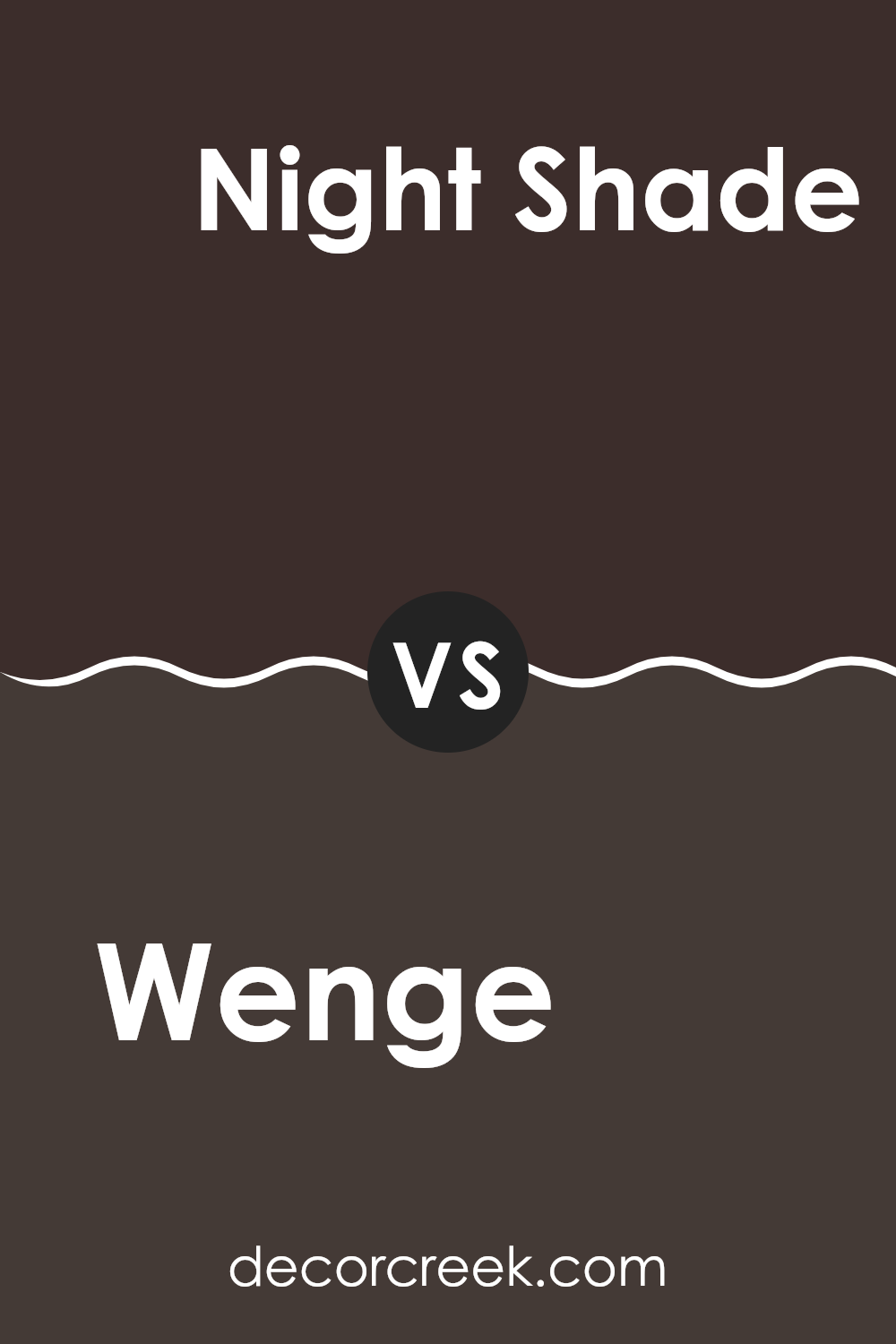
Wenge AF-180 by Benjamin Moore vs Night Shade 2116-10 by Benjamin Moore
Wenge AF-180 and Night Shade 2116-10, both from Benjamin Moore, offer distinct shades suited for different moods and settings. Wenge AF-180 is a deep brown color with a warming presence, making it ideal for creating a cozy and inviting atmosphere. It resembles the dark wood after which it’s named, and its rich hue works beautifully in interiors where you want to introduce grounded, earthy tones.
In contrast, Night Shade 2116-10 is a bold, near-black shade with blue undertones. This color is perfect for adding drama or emphasizing architectural details within a room. It’s a powerful hue that makes a statement on an accent wall or when used for exterior trims.
While both shades are dark, Wenge AF-180 conveys warmth, whereas Night Shade 2116-10 offers depth and boldness. The choice between them depends on whether you prefer a softer, nature-inspired feel or a striking, deep tone that captures attention.
You can see recommended paint color below:
- 2116-10 Night Shade
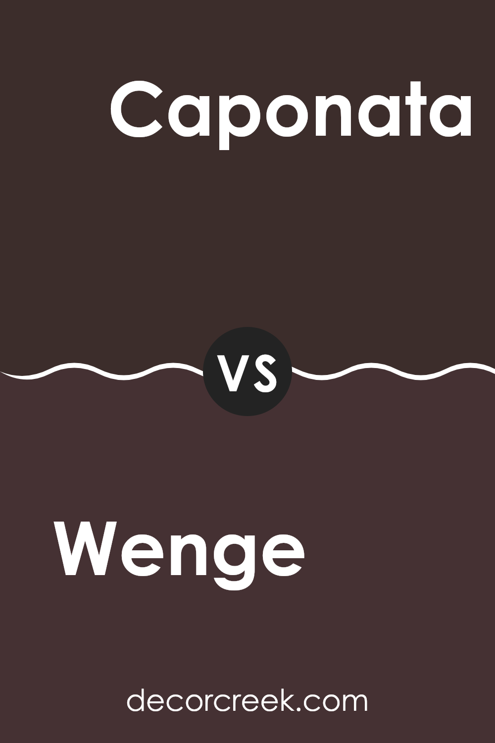
Wenge AF-180 by Benjamin Moore vs Caponata AF-650 by Benjamin Moore
The main color, Wenge, is a deep, dark brown that’s almost black, giving a strong and confident impression. It pairs beautifully with brighter tones or can be used in interiors aiming for a cozy, grounding mood. In contrast, Caponata is a rich, deep aubergine shade that leans toward a muted purple. This color adds warmth and character to a room, offering a touch of color without becoming too intense.
Wenge is often favored in areas requiring a more formal or refined appearance, such as libraries or offices, due to its dark and polished tone. Caponata, meanwhile, works wonderfully in living areas or bedrooms, where its softer purple undertones create a welcoming and comfortable atmosphere.
Both colors, though distinct, can strongly influence the mood of a room depending on how they’re applied and what other shades accompany them. Used together, they create a harmonious contrast that balances deep richness with gentle color.
You can see recommended paint color below:
- AF-650 Caponata
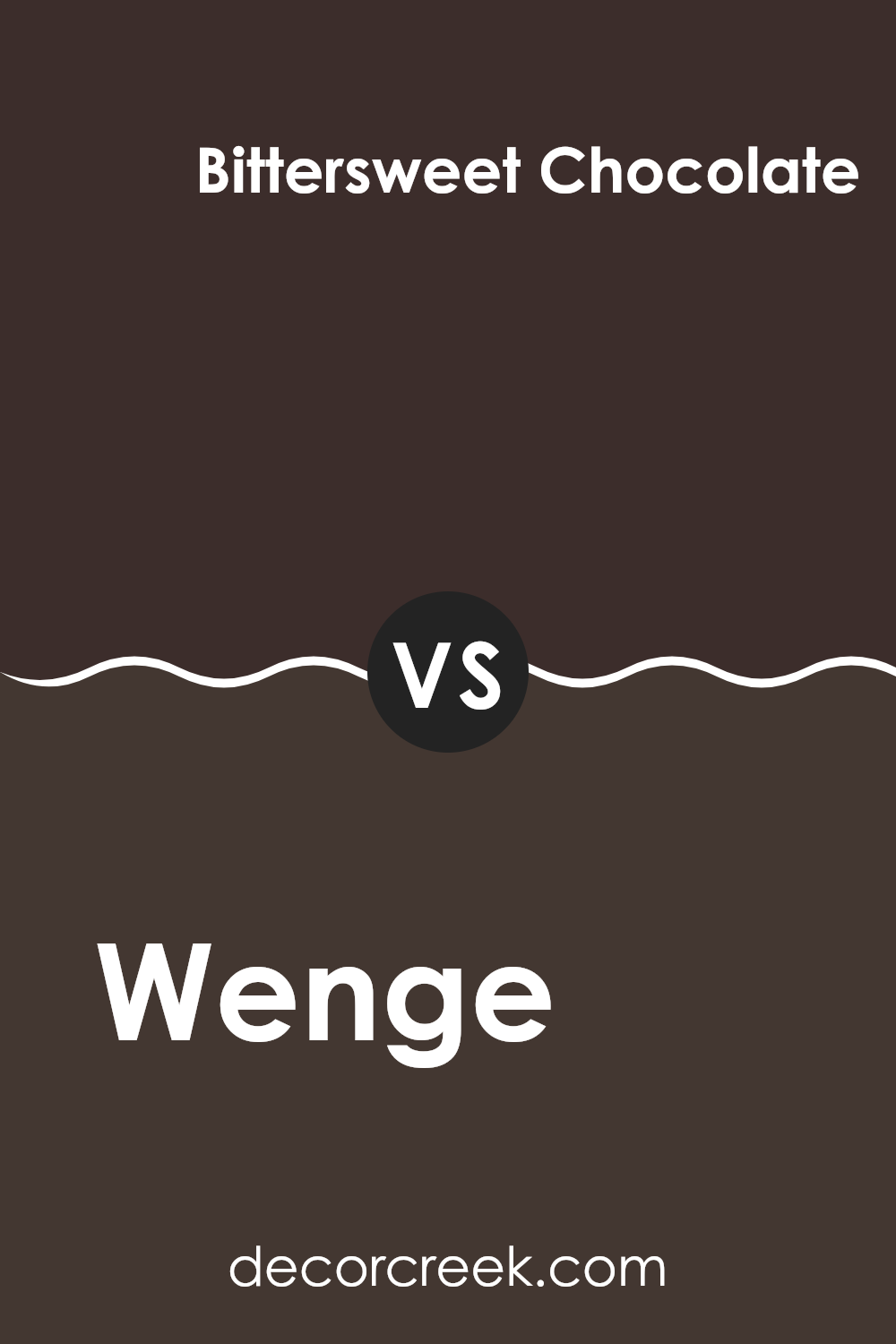
Wenge AF-180 by Benjamin Moore vs Bittersweet Chocolate 2114-10 by Benjamin Moore
The color Wenge AF-180 is a deep brown shade that gives a rich, earthy character to any room. This hue is almost black, making it ideal for creating a strong, striking statement. It works beautifully on an accent wall or furniture pieces to bring depth and substance to a room’s décor.
In contrast, Bittersweet Chocolate 2114-10 is another dark brown, but with warmer undertones. This shade is slightly lighter than Wenge AF-180, offering a cozier brown that feels welcoming and comforting. It’s perfect for rooms where you want warmth without going too deep in tone.
Both colors are excellent for adding elegance and comfort to your home. The choice between them depends on how dark you want the look to be and the undertones you prefer. Wenge AF-180 leans toward a cooler, near-black tone, while Bittersweet Chocolate brings a touch more warmth and adaptability, making it easier to pair with various lighting and décor styles.
You can see recommended paint color below:
- 2114-10 Bittersweet Chocolate
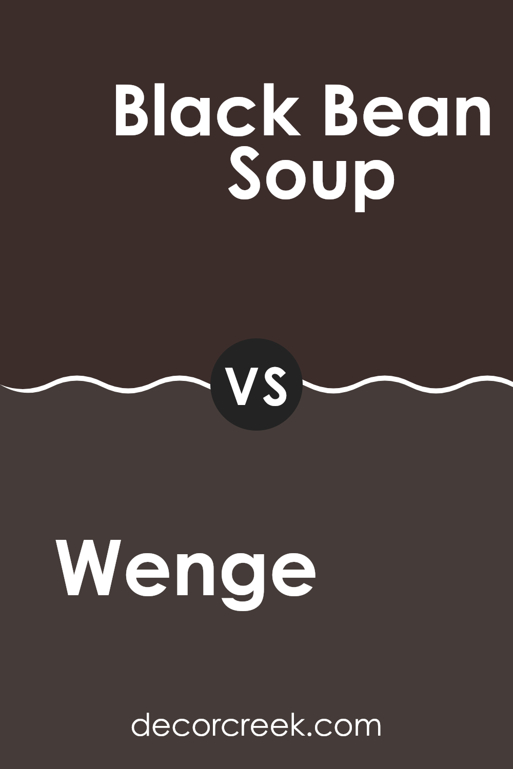
Wenge AF-180 by Benjamin Moore vs Black Bean Soup 2130-10 by Benjamin Moore
Wenge AF-180 and Black Bean Soup 2130-10, both by Benjamin Moore, are two dark shades that offer distinct vibes for a room. Wenge AF-180 is a deep brown, almost black, that hints at a chocolate richness. This warm tone can make areas feel cozy and inviting despite its darkness. It works well in rooms that benefit from a subdued yet welcoming atmosphere, like living rooms or bedrooms.
On the other hand, Black Bean Soup 2130-10 is a darker, more intense color. As the name suggests, it’s a black that leans slightly towards brown, but it’s closer to a true black than Wenge AF-180. This shade is perfect for creating a bold statement, making it a great choice for accent walls or for furniture pieces that you want to stand out.
Both colors are adaptable and can pair well with a range of decor styles, though Wenge AF-180’s warmth lends itself better to rustic and classic themes, while Black Bean Soup’s depth fits modern and minimalistic looks seamlessly.
You can see recommended paint color below:
- 2130-10 Black Bean Soup
After reading and studying AF-180 Wenge by Benjamin Moore, I have learned a lot about this unique color. First, Wenge is not just any ordinary brown; it is a deep, rich brown that almost looks like the color of dark chocolate. This makes it special because it adds a cozy and warm feeling to any room. The name ‘Wenge’ comes from a type of wood that is very dark and is often used to make luxury furniture.
Benjamin Moore has managed to capture this elegant wood’s essence in their paint. When used on walls, AF-180 Wenge can make a big room feel more inviting and a small one feel snug and safe. It pairs well with lighter tones, like creams and light grays, which help to highlight its depth and warmth.
One of the best things about AF-180 Wenge is that it’s not just for walls. It can be used for cabinets, doors, or even a piece of furniture you want to highlight. This color flexibility means you can use it in different ways, depending on what you like or what your room needs.
In conclusion, AF-180 Wenge by Benjamin Moore is a smart choice if you’re looking to warm up your home with a color that is cozy, inviting, and stylish. Whether it’s a splash of color on furniture or an all-over wall shade, it can make a significant impact in making your home feel just right.
Ever wished paint sampling was as easy as sticking a sticker? Guess what? Now it is! Discover Samplize's unique Peel & Stick samples.
Get paint samples

