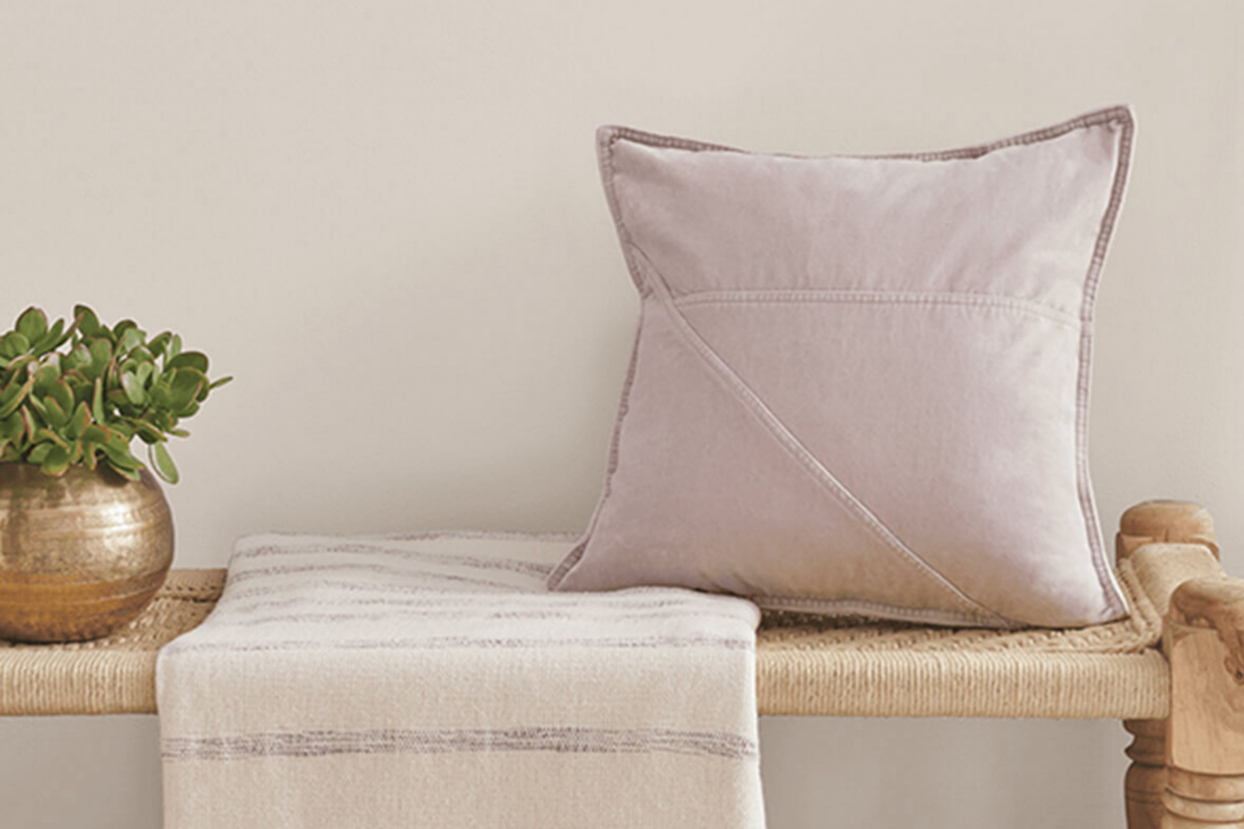
When I think about the perfect shade of gray, SW 9576 Whirlwind by Sherwin Williams often comes to mind. It’s a color that doesn’t overwhelm, yet it has enough presence to make a statement. Whirlwind is the kind of gray that adapts well to different settings, whether in a cozy living room or a modern kitchen.
It has a soft, almost neutral tone that provides a sense of calm and balance. What I love most is how it complements various styles and décor. You can pair it with bright colors to make them pop, or let it mingle with other neutrals for a subtle and cohesive look.
The versatility is one of its strongest features. Whenever I paint a room with Whirlwind, it feels refreshed and inviting. The shade has an ability to reflect light in a way that changes the ambiance throughout the day, giving each room a unique character.
Overall, SW 9576 Whirlwind is a choice I never regret, and it always seems to enhance the spaces it touches.
What Color Is Whirlwind SW 9576 by Sherwin Williams?
Whirlwind by Sherwin Williams is a versatile and neutral color with a soft, muted gray tone. It has subtle undertones that can sometimes appear slightly blue, making it a perfect choice for spaces that need a touch of calm and freshness. Its understated nature allows it to blend seamlessly into various interior styles while providing a calming backdrop.
Whirlwind works beautifully in modern and minimalist interiors, where its clean look complements sleek lines and simple designs. It also fits well in Scandinavian-style spaces, adding to their light, airy feeling. Traditional interiors can benefit from its neutral tone, which can balance richer colors and ornate furnishings.
Pairing Whirlwind with the right materials and textures enhances its appeal. It goes well with natural woods, like oak or walnut, which add warmth and depth to the space. Metal accents in silver or chrome can bring a contemporary touch, while woven textiles such as cotton or linen add a cozy, relaxed vibe.
Stone surfaces like marble or granite also harmonize beautifully with Whirlwind, contributing to a more sophisticated and cohesive look. The color’s flexibility ensures it adapts well to different decor elements, making it a favorite for those seeking a balanced and inviting atmosphere.
Is Whirlwind SW 9576 by Sherwin Williams Warm or Cool color?
Whirlwind SW 9576 by Sherwin Williams is a versatile color choice for homes. It is a soft gray with subtle undertones that beautifully complement various styles and settings. In living spaces, Whirlwind can create a calm and inviting atmosphere.
Its neutral tone blends well with a variety of furniture colors, from earth tones to bright accents. In the kitchen, the color works well with both modern and traditional cabinetry, providing a clean and fresh backdrop.
Bedrooms painted in Whirlwind can feel cozy and comfortable, pairing easily with different bedding colors and textures. It’s also a great choice for hallways and entryways, as it provides a seamless transition between rooms. In bathrooms, this shade offers a soothing vibe that enhances relaxation. Whether used on its own or combined with other colors, Whirlwind can help create a harmonious look throughout the home, making it a popular and practical choice for many homeowners.
Undertones of Whirlwind SW 9576 by Sherwin Williams
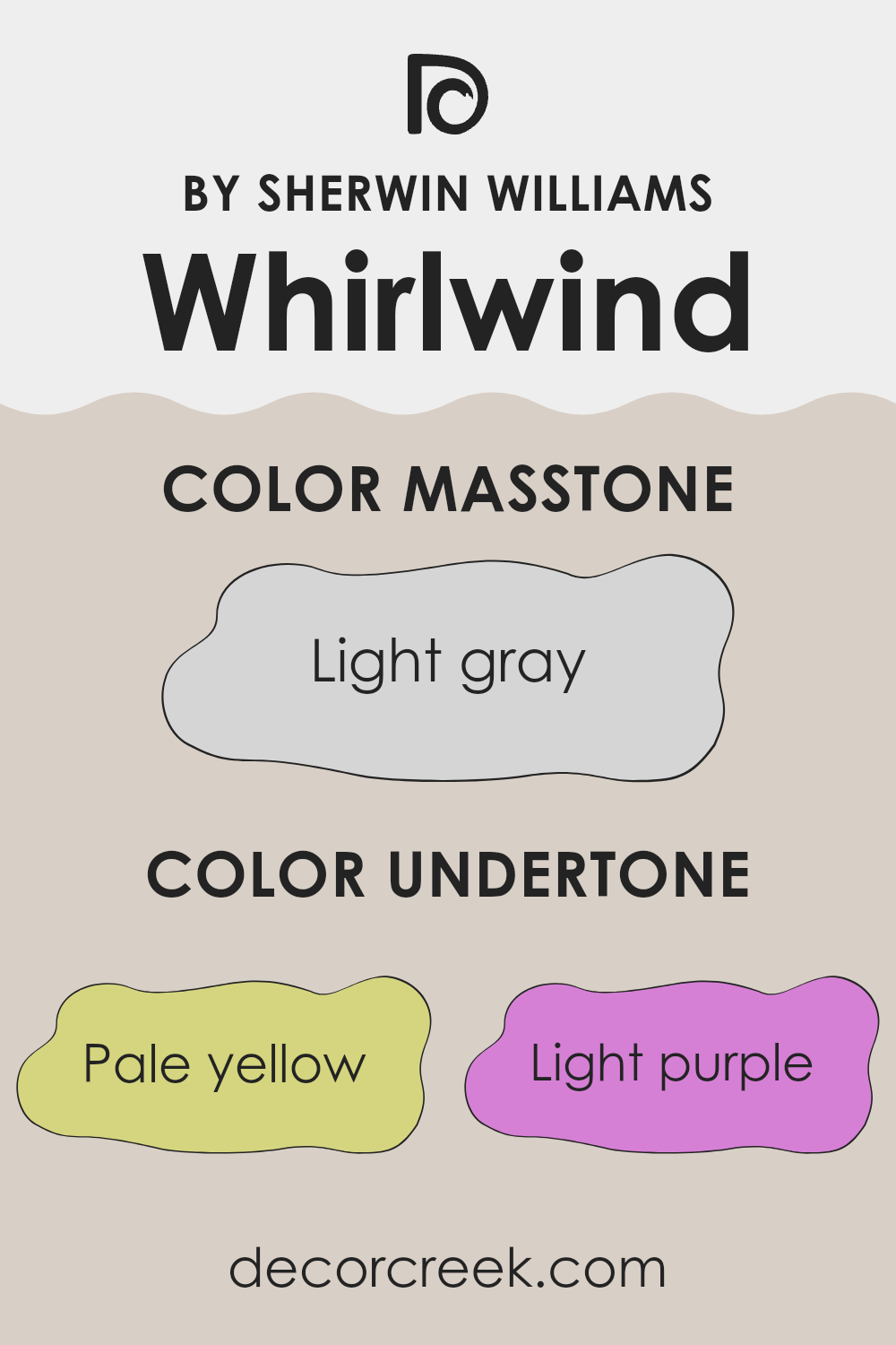
Whirlwind SW 9576 by Sherwin Williams is a complex color with multiple undertones that affect its appearance on interior walls. The undertones include pale yellow, light purple, light blue, pale pink, mint, lilac, and grey. Each of these undertones can subtly change how we perceive the main color and can influence the mood of a room.
Undertones are secondary hues that are mixed into a paint color. They may not be immediately obvious but can subtly affect how the main color appears under different lighting conditions. For example, pale yellow and mint undertones in Whirlwind can give the color a slightly warmer feel, making rooms feel cozier and more inviting.
On the other hand, undertones like light blue and lilac can introduce a cooler feel, adding a sense of calm or spaciousness to a room. Grey and pale pink undertones might lend a balanced, neutral quality to the paint, allowing the color to adapt well to various design styles and furnishings.
Depending on the light, these undertones can come forward or recede, meaning that Whirlwind can look slightly different at different times of the day, offering flexibility in home design.
This ability to subtly shift gives the color depth and complexity, making it versatile for various settings.
What is the Masstone of the Whirlwind SW 9576 by Sherwin Williams?
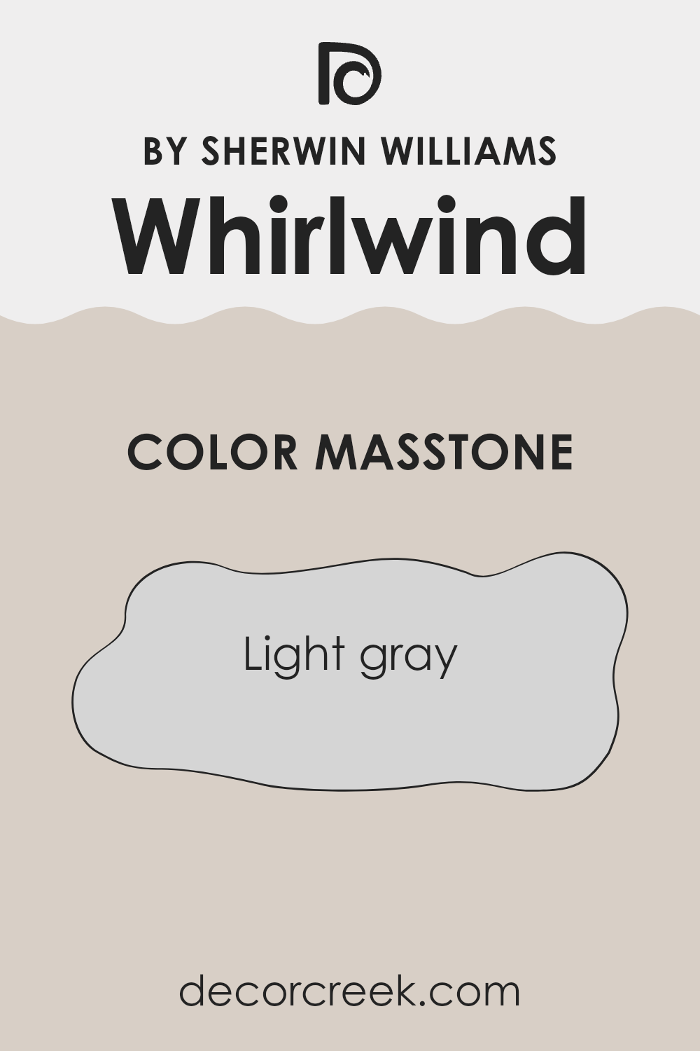
WhirlwindSW 9576 by Sherwin Williams is a light gray color with a masstone of #D5D5D5. This gentle gray is versatile and works well in many home settings. Its lightness makes rooms feel more spacious and open, which is great for smaller spaces.
It reflects light nicely, adding brightness to a room without being too stark or cold like some pure whites. This balanced hue works as a neutral backdrop, allowing other colors in the room to stand out, whether it’s colorful furniture, artwork, or decorations.
In living rooms and bedrooms, this color can create a calming atmosphere. It pairs well with both cool and warm tones, making it easy to coordinate with various design styles, from modern to traditional. Additionally, WhirlwindSW 9576 can help make a space feel fresh and updated without being overwhelming. It’s a soft choice that adds a touch of elegance and serenity to any area in the home.
How Does Lighting Affect Whirlwind SW 9576 by Sherwin Williams?
Lighting plays a significant role in how we perceive colors. The color Whirlwind SW 9576 by Sherwin Williams, a soft gray with blue undertones, can look quite different depending on the type of light in a room.
In natural light, Whirlwind appears closer to its true shade. However, the direction a room faces impacts how much natural light it receives and ultimately affects the appearance of the color. In north-facing rooms, which get less direct sunlight, Whirlwind can look cooler and a bit darker. The blue undertones may become more noticeable, giving the room a more muted look.
In south-facing rooms, there’s usually an abundance of warm, direct sunlight throughout the day. This can make Whirlwind appear slightly warmer and brighter. The color may seem more neutral, with the gray tones being more balanced and the blue undertones less prominent.
East-facing rooms get bright light in the morning, which is more yellow and fresh. As a result, Whirlwind can look bright and more vibrant in the morning hours, while in the afternoon, as the light fades, the color will look a bit more subdued and cooler.
West-facing rooms receive the warm, golden light of the late afternoon which can make Whirlwind appear warmer and possibly richer. During the morning, when the room is mostly shadowed, the color may look cooler or even slightly dingy.
Artificial lighting also affects how Whirlwind looks. Warm bulbs, like incandescent or LED lights with warm tones, will make Whirlwind look cozier, adding a touch of warmth that reduces the blue undertone effect. On the other hand, cool white or fluorescent lighting can enhance the cooler tones, making the color seem starker and more blue.
Understanding these differences can help you choose the right lighting and room placement to achieve your desired look with Whirlwind SW 9576.
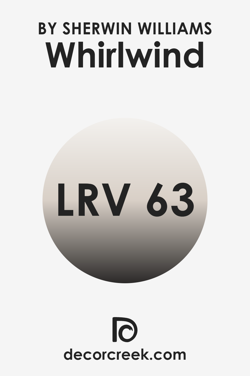
What is the LRV of Whirlwind SW 9576 by Sherwin Williams?
LRV, or Light Reflectance Value, measures how much light a paint color reflects. It’s a scale from 0 to 100, where 0 means the color absorbs all the light (pure black), and 100 means it reflects all the light (pure white). When you paint a room, colors with higher LRV will make the space feel brighter and more open, as they bounce more light around the room. Conversely, colors with a lower LRV tend to absorb more light, making the room feel cozier and smaller.
For Whirlwind, with its LRV of 63.408, it means it’s a fairly light color that reflects a good amount of light. This LRV is high enough to brighten up a space and make it feel airy, but it’s not so high that it will feel stark or overly bright.
Whirlwind is balanced, offering both warmth and lightness, making it versatile for various settings. It’ll work well in rooms that get a lot of natural light, reflecting illumination nicely throughout the space, and even rooms with limited light will benefit from its ability to enhance brightness.
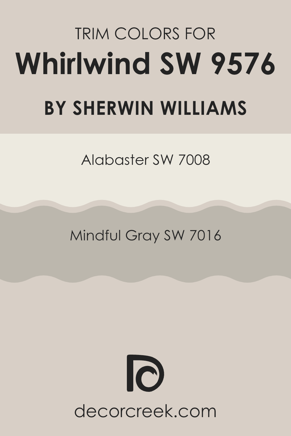
What are the Trim colors of Whirlwind SW 9576 by Sherwin Williams?
Trim colors are the colors used on the molding and baseboards of a room, serving as a defining element that frames walls and highlights architectural features. They add contrast and dimension, enhancing the overall appearance of a space. When choosing the right trim colors for Whirlwind (SW 9576) by Sherwin-Williams, Alabaster (SW 7008) and Mindful Gray (SW 7016) can play a crucial role in emphasizing this soft gray’s versatile and calming quality.
These trim colors offer differing effects: Alabaster provides a classic, clean white contrast, making Whirlwind appear more distinct, while Mindful Gray adds a subtle, understated harmony that complements the gray without making it feel too sharp.
Alabaster (SW 7008) is a warm, creamy white that exudes a gentle brightness without feeling stark or clinical. It lends a touch of warmth and softness, making it a great choice for trim as it can brighten the edges of the rooms painted in Whirlwind.
Meanwhile, Mindful Gray (SW 7016) is a light, muted gray that provides a balanced and calm effect. It offers a seamless look when used with Whirlwind, creating an elegant monochromatic palette that’s soothing and sophisticated. Both colors serve to enhance the main wall color without overpowering it, each bringing out different aspects of Whirlwind’s character.
You can see recommended paint colors below:
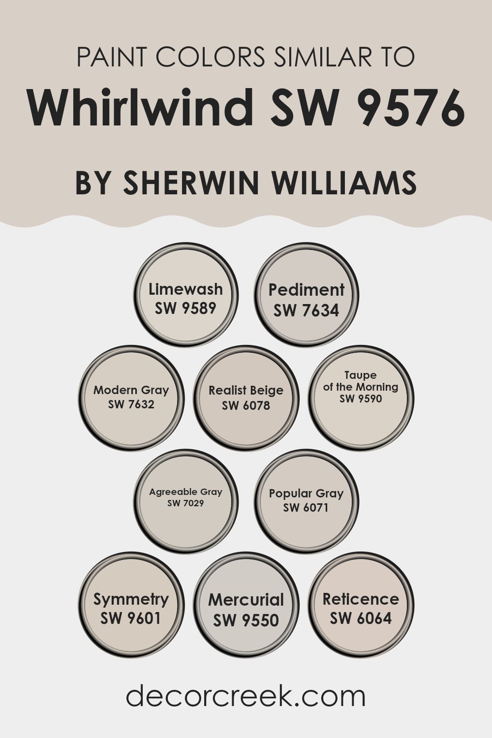
Colors Similar to Whirlwind SW 9576 by Sherwin Williams
Similar colors play an essential role in design by creating harmony and a cohesive look. These colors, like Whirlwind SW 9576 by Sherwin Williams, provide subtle differences that give depth to a space while maintaining balance. Limewash SW 9589, a light, creamy hue, offers a soft touch, ideal for spaces needing a gentle, airy feel.
Pediment SW 7634 presents a warm beige tone, perfect for adding coziness without overwhelming the senses. Modern Gray SW 7632, with its light and neutral shade, provides a fresh backdrop that pairs well with any decor style.
Realist Beige SW 6078 and Taupe of the Morning SW 9590 both offer warm undertones, with Realist Beige leaning slightly earthier and Taupe of the Morning offering a sense of morning calmness. Agreeable Gray SW 7029 is a versatile neutral that blends warmth and coolness, making it a favorite for creating welcoming environments.
Popular Gray SW 6071 is an understated gray offering a gentle warmth, adding subtle elegance. Symmetry SW 9601 gives off a delicate balance with its muted tone, while Mercurial SW 9550 offers a slightly darker, moodier hue. Reticence SW 6064 completes the palette with its subdued, gentle gray, perfect for creating intimate spaces. Together, these colors form a palette that is gentle yet impactful.
You can see recommended paint colors below:
- SW 9589 Limewash
- SW 7634 Pediment
- SW 7632 Modern Gray
- SW 6078 Realist Beige
- SW 9590 Taupe of the Morning
- SW 7029 Agreeable Gray
- SW 6071 Popular Gray
- SW 9601 Symmetry
- SW 9550 Mercurial
- SW 6064 Reticence
How to Use Whirlwind SW 9576 by Sherwin Williams In Your Home?
Whirlwind, also known as SW 9576 by Sherwin Williams, is a versatile paint color that can be a great choice for anyone looking to refresh their home. This soft, neutral shade offers a perfect balance between gray and beige, making it adaptable for various rooms and styles.
It can look great in living rooms, creating a cozy and inviting atmosphere without overwhelming the space. In bedrooms, Whirlwind can provide a calming backdrop that promotes relaxation and rest. It’s also ideal for kitchens and bathrooms, where it can serve as a clean backdrop for colorful accents or sleek, modern fixtures.
Whirlwind pairs nicely with both warm and cool tones, allowing for creative combinations with furniture, textiles, and art. Whether your style is modern, traditional, or somewhere in between, Whirlwind’s subtle charm can enhance your home’s décor, making it a sensible choice for many different interior design projects.
Whirlwind SW 9576 by Sherwin Williams vs Reticence SW 6064 by Sherwin Williams
Whirlwind SW 9576 is a soft, airy neutral that leans towards a light gray with subtle undertones, making it versatile and adaptable in various settings. It can brighten up a space without overwhelming it, pairing well with both cool and warm accents.
On the other hand, Reticence SW 6064 is a warm, muted greige with a hint of beige. It creates a cozy and inviting atmosphere, making it a good choice for living rooms and bedrooms. This color works well with earthy tones and can add a sense of warmth to a room.
While Whirlwind brings an airy feel, Reticence offers warmth and coziness. Together, they can create a balanced and harmonious environment, with Whirlwind as a backdrop to highlight the comforting tones of Reticence. Whether used in combination or separately, these colors provide different moods with their subtle nuances.
You can see recommended paint color below:
- SW 6064 Reticence
Whirlwind SW 9576 by Sherwin Williams vs Mercurial SW 9550 by Sherwin Williams
Whirlwind SW 9576 and Mercurial SW 9550 by Sherwin Williams are two distinct shades of gray, each with its own unique feel. Whirlwind is a soft, light gray that has a warm touch, making it a great choice for creating a cozy and inviting atmosphere. It’s versatile and pairs well with both warm and cool palettes, making it easy to fit into a variety of settings.
On the other hand, Mercurial is a medium-dark gray with deeper tones, giving it a more dramatic and grounded presence. This color can add depth and sophistication to a room, making it ideal for accent walls or spaces where a bolder look is desired.
While Whirlwind is perfect for those who prefer a light and airy feel, Mercurial suits those who want a richer and more striking appearance. Both colors are excellent choices depending on the mood and style you want to achieve in your home.
You can see recommended paint color below:
Whirlwind SW 9576 by Sherwin Williams vs Pediment SW 7634 by Sherwin Williams
Whirlwind (SW 9576) and Pediment (SW 7634) by Sherwin Williams are two versatile shades that bring unique qualities to a space.
Whirlwind is a soft, cool gray with subtle blue undertones. It creates a calm, modern atmosphere, making it a popular choice for minimalist or contemporary rooms. This color can brighten a space without being overpowering, reflecting a lot of natural light.
On the other hand, Pediment is a warm, light greige with slight beige undertones. It adds warmth and coziness to any room, making it suitable for traditional or rustic styles. Pediment works well in living rooms or kitchens where a welcoming feel is desired.
When choosing between them, consider the room’s lighting and the atmosphere you want to create. Whirlwind suits spaces needing a crisp, clean look, while Pediment is perfect for adding warmth and coziness. Both are adaptable, neutral choices that pair well with various design elements.
You can see recommended paint color below:
Whirlwind SW 9576 by Sherwin Williams vs Realist Beige SW 6078 by Sherwin Williams
Whirlwind SW 9576 and Realist Beige SW 6078 are both neutral shades by Sherwin Williams that offer versatility in home design. Whirlwind is a light gray with subtle cool undertones, making it suitable for modern and minimalist spaces. Its gentle hue can make spaces feel open and airy.
On the other hand, Realist Beige has warm undertones, providing a cozy and inviting atmosphere. It is a soft beige that pairs well with traditional and classic décor styles, bringing warmth to a room.
While Whirlwind creates a clean, fresh look, ideal for contemporary settings, Realist Beige adds warmth and depth, perfect for creating comfortable and welcoming spaces. Both colors are versatile, but each brings a different feeling to the room—Whirlwind with its freshness, and Realist Beige with its warmth. They can be used throughout any home to achieve different moods depending on personal style preferences.
You can see recommended paint color below:
Whirlwind SW 9576 by Sherwin Williams vs Popular Gray SW 6071 by Sherwin Williams
Whirlwind SW 9576 is a soft and airy light gray with a cool undertone, creating a sense of openness and calm in a room. It works well in spaces where you want to achieve a light and fresh feel, making the area appear more spacious without feeling cold. It pairs beautifully with both cool and warm colors, providing a versatile backdrop for any room design.
On the other hand, Popular Gray SW 6071 is a warm, taupey gray. This shade brings a cozy and inviting atmosphere to a space due to its warm undertones. It’s a bit darker than Whirlwind and tends to offer a more grounded and traditional feel to a room. Popular Gray is great for providing a subtle, neutral backdrop that doesn’t overpower your décor.
Both colors are excellent choices for a neutral palette, but Whirlwind is ideal for rooms where you want lightness, while Popular Gray suits settings where warmth is desired.
You can see recommended paint color below:
Whirlwind SW 9576 by Sherwin Williams vs Limewash SW 9589 by Sherwin Williams
Whirlwind SW 9576 by Sherwin Williams is a soft, muted gray with cool undertones. It’s a versatile color that provides a calming backdrop without being too stark or cold. Perfect for modern and minimalist spaces, Whirlwind offers a subtle elegance that blends well with various decor styles without overpowering the room.
On the other hand, Limewash SW 9589 by Sherwin Williams is a gentle, earthy hue with a hint of creaminess. It has an organic feel, bringing warmth to a space, which can make rooms feel more inviting and cozy. Limewash works beautifully in rustic or traditional settings, adding a touch of freshness and light.
When comparing the two, Whirlwind’s coolness contrasts with Limewash’s warmth, making them suitable for different moods and settings. Whirlwind is ideal for a clean, airy look, while Limewash provides a welcoming, homey feel. Both colors offer unique atmospheres to any room they adorn.
You can see recommended paint color below:
Whirlwind SW 9576 by Sherwin Williams vs Agreeable Gray SW 7029 by Sherwin Williams
Whirlwind SW 9576 by Sherwin Williams is a soft, light gray color that adds a sense of calm and openness to a room. It gives a fresh, breezy feeling, reminiscent of a foggy morning. Whirlwind works well in spaces where you want a clean, airy atmosphere.
On the other hand, Agreeable Gray SW 7029 is a warm, beige-gray (or “greige”) that’s famously adaptable. It’s a popular choice because it complements a wide range of decor styles and color palettes. Its warm undertones give rooms a cozy and inviting feel, making them comfortable to be in.
While Whirlwind is cooler and evokes a crisp setting, Agreeable Gray feels warmer and more soothing. Whirlwind suits modern, minimalist spaces, while Agreeable Gray is fantastic for traditional or transitional spaces where a touch of warmth is desired. Both are versatile, but they offer different moods: Whirlwind is fresh and airy, whereas Agreeable Gray is welcoming and homely.
You can see recommended paint color below:
Whirlwind SW 9576 by Sherwin Williams vs Symmetry SW 9601 by Sherwin Williams
Whirlwind SW 9576 and Symmetry SW 9601 are both soft, neutral colors by Sherwin Williams that offer different vibes for a space. Whirlwind is a gentle, muted shade with a hint of gray, making it versatile and easy to pair with other colors.
It feels calm and relaxing, perfect for creating a soothing environment. On the other hand, Symmetry SW 9601 is a soft color with a slight green undertone, giving it a fresh and balanced appearance. It evokes a sense of natural harmony, bringing a subtle touch of nature indoors.
When comparing the two, Whirlwind leans more towards a cool and modern feel while Symmetry offers a warmer and more organic atmosphere. Both are great choices for adding a neutral backdrop, but Symmetry might offer a bit more warmth due to its greenish undertone, whereas Whirlwind is more straightforward in its neutral, grayish appeal.
You can see recommended paint color below:
Whirlwind SW 9576 by Sherwin Williams vs Modern Gray SW 7632 by Sherwin Williams
Whirlwind SW 9576 by Sherwin Williams is a soft, muted gray that brings a gentle, calming look to any space. It’s a versatile color with a hint of warmth, making it suitable for both contemporary and traditional settings. Whirlwind pairs well with both light and dark colors, creating a neutral background that doesn’t overshadow other design elements.
On the other hand, Modern Gray SW 7632 by Sherwin Williams is a warmer gray with beige undertones. This greige color offers a balance between gray and beige, providing a cozy and inviting feel.
Modern Gray works well in spaces where a warmer, more inviting atmosphere is desired. It pairs beautifully with browns, creams, and other warm tones, complementing wood finishes and earthy decor. While both colors are part of the gray family, Whirlwind leans cooler, creating a serene environment, whereas Modern Gray adds a touch of warmth, making spaces feel inviting and cozy.
You can see recommended paint color below:
Whirlwind SW 9576 by Sherwin Williams vs Taupe of the Morning SW 9590 by Sherwin Williams
Whirlwind SW 9576 and Taupe of the Morning SW 9590 by Sherwin Williams are two soft, neutral colors that can add a gentle touch to any space. Whirlwind is a light gray with a hint of warmth, making it versatile for various rooms and styles.
It’s subtle, providing a clean backdrop without being too stark or cold. On the other hand, Taupe of the Morning is a soft taupe with a blend of brown and gray tones, giving it a slightly warmer and cozy feel compared to Whirlwind.
This color can create a welcoming atmosphere, especially in living rooms or bedrooms. Both colors work well together and can be paired with whites, other neutrals, or even soft blues and greens. They are excellent choices for those who prefer a calm and neutral color palette in their home.
You can see recommended paint color below:
What I like most is how Whirlwind works well with many other colors and styles. This makes it a favorite for both new looks and matching with things you already have. Imagine it in your living room, making everything look fresh and new, or in a bedroom, helping you feel relaxed when you’re getting ready to sleep.
Choosing a paint color can sometimes feel like a big task, but with Whirlwind, it’s like having a friend that fits in easily and makes everything look a bit nicer. I get the feeling that it’s one of those colors that won’t go out of style quickly but will make people feel good for a long time to come.
It’s simple, flexible, and brings a feeling of calm to any place you choose to use it.

Ever wished paint sampling was as easy as sticking a sticker? Guess what? Now it is! Discover Samplize's unique Peel & Stick samples.
Get paint samples

