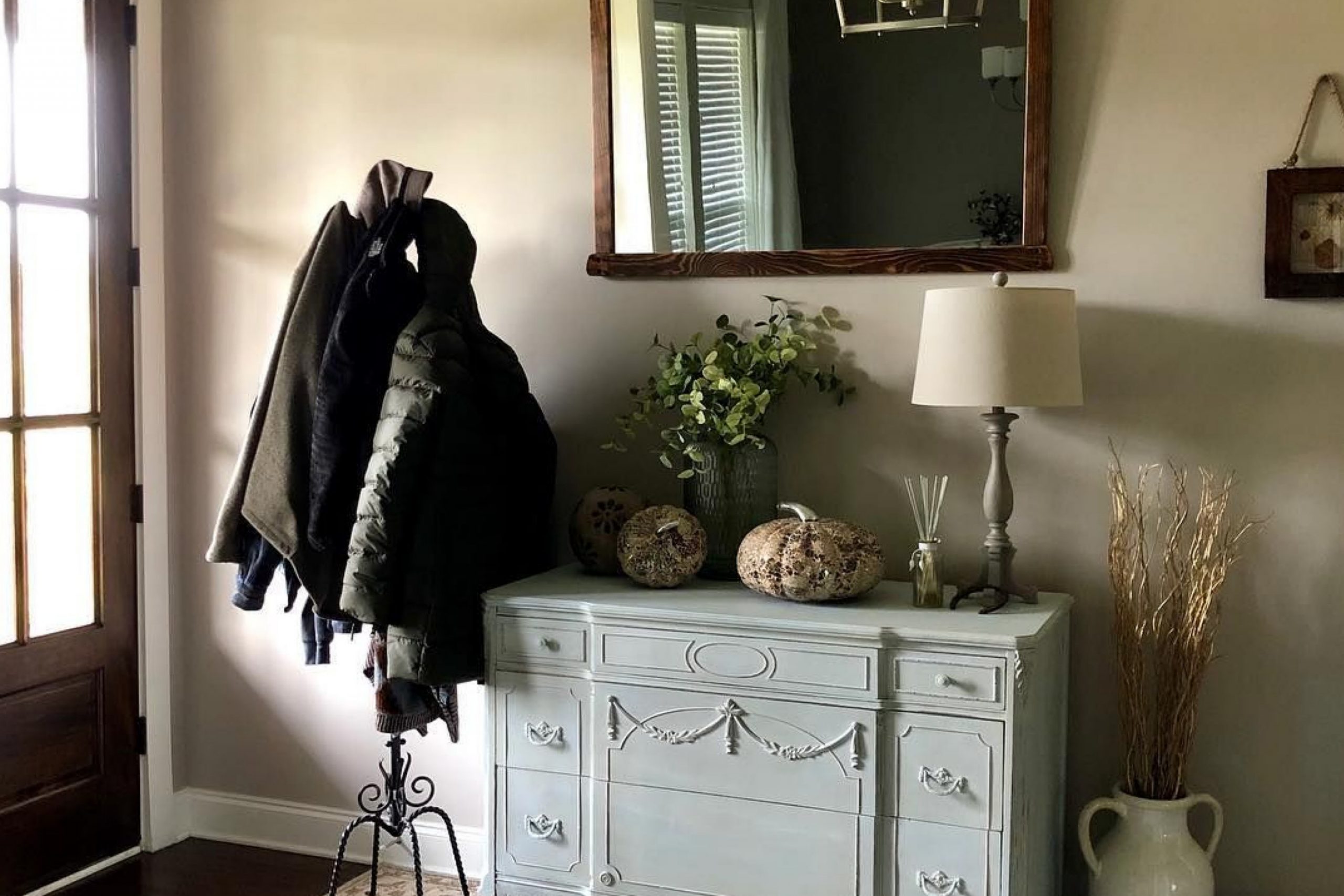
SW 7634 Pediment by Sherwin Williams immediately caught my attention with its subtle charm. This soft, warm neutral has a way of making any space feel both inviting and elegant.
Its gentle gray undertones provide versatility, allowing it to blend seamlessly with a variety of color palettes. Whether you’re updating your living room or refreshing your bedroom, Pediment offers a serene backdrop that enhances the overall atmosphere.
I was impressed by how Pediment manages to be both calming and sophisticated. It doesn’t overpower or dominate a room, yet it adds depth and interest, making it a perfect choice for those who appreciate understated beauty. Paired with whites, it creates a crisp, clean look; combined with darker shades, it adds contrast and warmth.
What really stands out is its adaptability. In different lighting, Pediment transforms, revealing different nuances without losing its essential character. It feels cozy in the evening, reflecting the soft glow of lamps, and bright during the day, bouncing natural light around the room.
Overall, SW 7634 Pediment offers a timeless appeal that works well in various spaces, from modern to traditional interiors. It’s a color that speaks to those who value elegance and comfort in their home environment.
What Color Is Pediment SW 7634 by Sherwin Williams?
Pediment SW 7634 by Sherwin Williams is a soft, warm gray with a hint of beige, making it a versatile neutral shade. This color exudes a calm and inviting atmosphere, making it perfect for creating cozy and comfortable spaces.
Pediment works well in various interior styles, particularly modern, contemporary, and transitional designs. It serves as a subtle backdrop that allows furniture and décor to stand out without overpowering the room.
This color pairs beautifully with both warm and cool tones. It complements natural materials such as wood, leather, and stone, enhancing the organic feel of the space. Textures like linen, cotton, and wool bring out the warmth of Pediment, adding depth and dimension to the room. In terms of color combinations, it looks lovely alongside whites, soft blues, and muted greens for a soothing palette.
For a modern touch, pair this shade with sleek metallic accents like brushed nickel or matte black fixtures. Pediment also supports bolder color accents, such as deep navy or rich burgundy, for added interest.
Its understated presence allows for creativity in design, making it a favorite among homeowners and designers who appreciate a versatile, cozy aesthetic.
Is Pediment SW 7634 by Sherwin Williams Warm or Cool color?
Pediment SW 7634 by Sherwin Williams is a warm, versatile neutral paint color that brings a cozy and inviting atmosphere to a home. Its subtle blend of gray and beige makes it a popular choice for homeowners looking to create a calm and comfortable environment.
This color works well in various spaces, from living rooms to bedrooms, due to its ability to complement both traditional and modern decor styles.
Pediment has an earthy undertone that pairs nicely with natural materials and textures, such as wood and stone, enhancing the warmth of a room. It reflects light softly, making spaces look brighter and more open without being overwhelming.
Additionally, Pediment provides a neutral backdrop that allows bold colors in furniture, art, or accents to stand out, adding personality to a room. It harmonizes with both cool and warm tones, making it an adaptable option for any home interior that seeks a balanced and cozy feel.
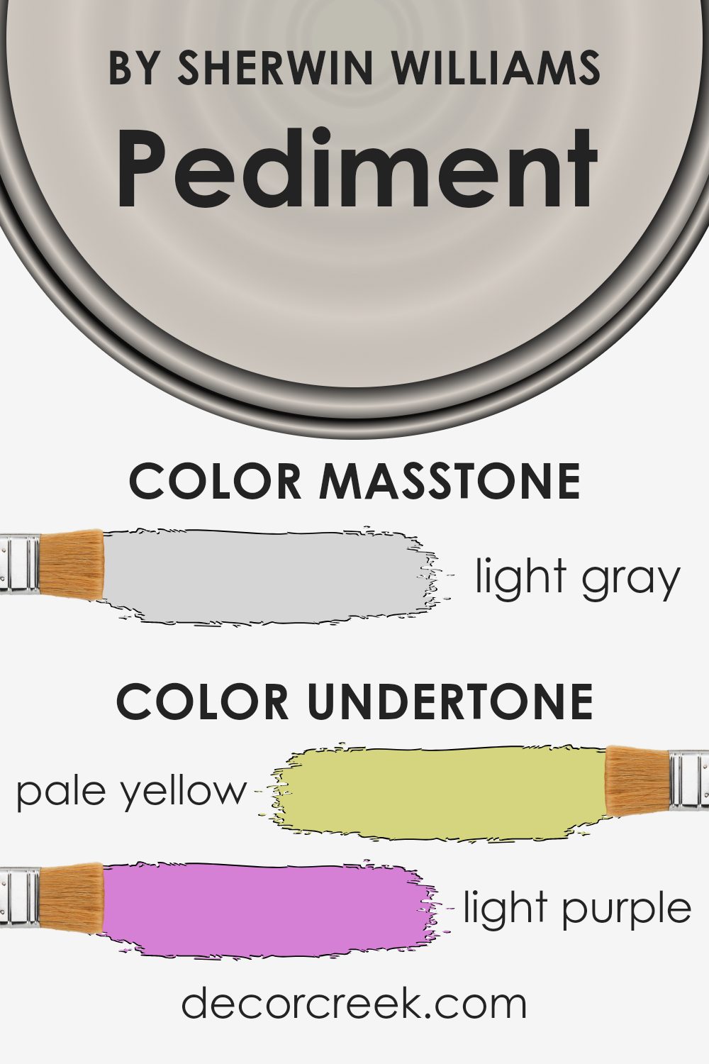
Undertones of Pediment SW 7634 by Sherwin Williams
Pediment by Sherwin Williams is a paint color with subtle and complex undertones. These include shades of pale yellow, light purple, light blue, pale pink, mint, lilac, and grey. These undertones influence how the color appears in different lighting conditions and next to other colors.
When used on interior walls, Pediment can create a soothing and balanced atmosphere. The pale yellow undertones add warmth, making rooms feel more inviting and cozy. In contrast, the cool hints of light blue and mint provide a refreshing and airy quality.
The light purple and lilac give the color a slight elegance, adding depth without overwhelming the room. The pale pink undertone lends a gentle softness, creating a pleasant ambiance. Finally, the grey undertone acts as a neutral base, making it versatile and easy to pair with different furniture and decor.
Lighting plays a crucial role in how we perceive these undertones. In natural light, Pediment might appear warmer, thanks to the pale yellow and pink undertones. Under artificial, cool lighting, the color may seem more subdued, highlighting the grey and purple aspects.
This versatility makes it a popular choice for living spaces, bedrooms, and kitchens.
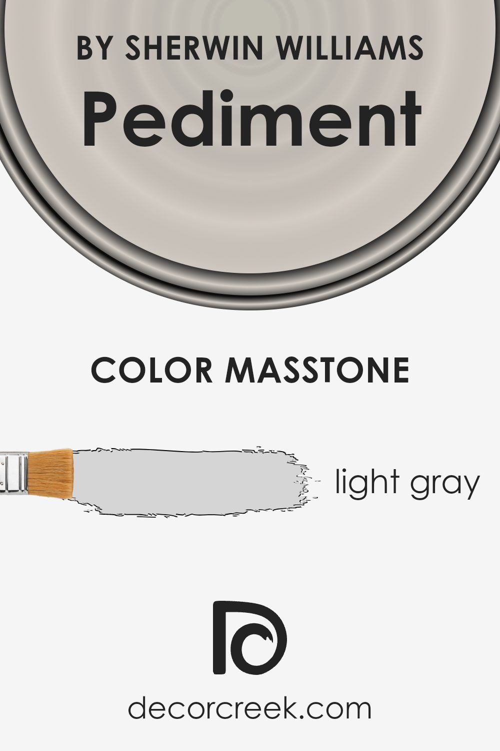
What is the Masstone of the Pediment SW 7634 by Sherwin Williams?
Pediment SW 7634 by Sherwin Williams is a light gray color, similar to the shade of #D5D5D5. This versatile hue works well in various home settings because it is neutral and understated.
Its soft quality allows it to blend easily with different color schemes, making it an excellent choice for walls, ceilings, or trim. In rooms with lots of natural light, Pediment appears airy and bright, enhancing the sense of openness. Conversely, in spaces with less light, it maintains its calm and soothing presence without appearing too dark.
This consistency helps create a balanced atmosphere throughout a home. It pairs well with both warm and cool accents, allowing homeowners the flexibility to change decor without needing to repaint. Additionally, Pediment’s simplicity makes it suitable for various styles, from modern to traditional, ensuring it fits well with different furniture designs and accessories.
How Does Lighting Affect Pediment SW 7634 by Sherwin Williams?
Lighting plays a crucial role in how we perceive colors. Different light sources can make colors appear lighter, darker, or even different altogether. The color Pediment (SW 7634) by Sherwin Williams is a soft, warm gray that can change its appearance depending on the lighting.
In natural light, Pediment may look different at various times of the day. In a north-facing room, which typically receives cooler, indirect sunlight, Pediment can appear more muted and cooler. Because north-facing rooms lack direct sunlight, colors can seem a little bit shadowed, enhancing the gray tones in Pediment.
In a south-facing room, the light is warmer and more direct throughout the day. Pediment can look brighter and its warm undertones can become more pronounced, giving the room a cozy feel. The consistent light in these rooms makes colors appear more vibrant.
East-facing rooms get bright, direct sunlight in the morning and then become cooler and shadowed as the day progresses. In the morning light, Pediment might look warmer and brighter, but as the day goes on, it can take on a cooler tone as the natural light lessens.
In west-facing rooms, the light is dimmer in the morning but becomes orange and rich in the late afternoon and evening. Pediment may look a bit dull in the morning, but it will warm up significantly later in the day, which highlights its warm gray properties.
Under artificial lighting, the color can also change. In rooms with incandescent bulbs, which cast a warm light, Pediment may look warmer. Fluorescent lighting, on the other hand, can make it appear cooler. LEDs vary widely, so depending on the type, Pediment can either warm up or cool down.
Thus, when selecting this color, it’s important to consider the type of lighting and the room’s orientation to achieve the desired effect.
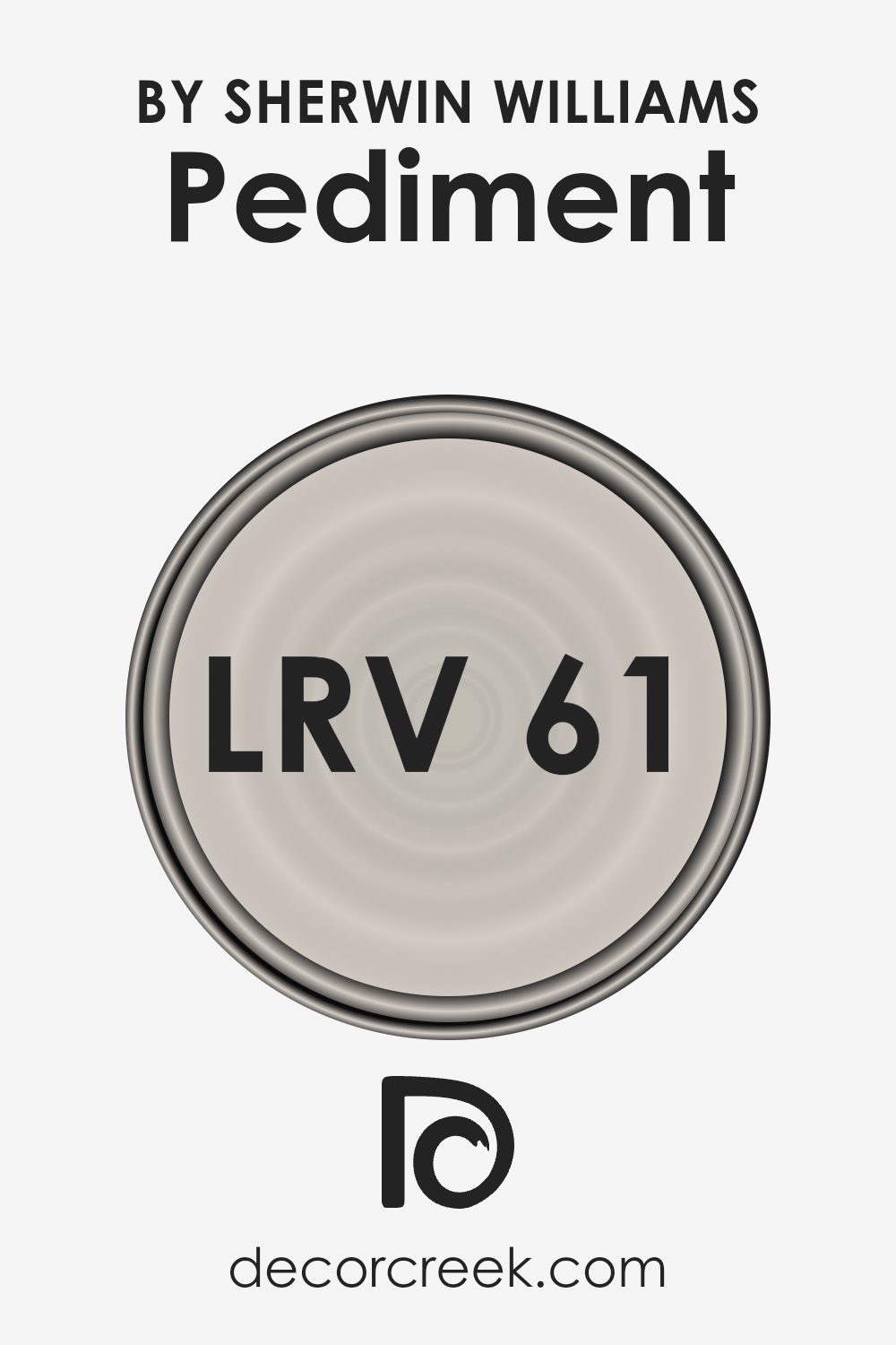
What is the LRV of Pediment SW 7634 by Sherwin Williams?
LRV, which stands for Light Reflectance Value, is a number that indicates how much light a color reflects. The values range from 0 to 100, with 0 indicating a pure black that does not reflect any light and 100 indicating a pure white that reflects all light.
Essentially, LRV helps us understand how light or dark a color will appear once it is on the wall. Colors with higher LRV values will reflect more light, making them appear brighter and helping to make rooms feel more open and spacious. In contrast, colors with lower LRV values absorb more light and make spaces feel cozier and more contained.
For the color Pediment by Sherwin Williams, which has an LRV of 61.181, this means it is quite good at reflecting light. It’s a mid-range value, making Pediment a versatile choice for many spaces.
With an LRV over 60, Pediment reflects a decent amount of light without being too overpowering or overly bright. This makes it suitable for rooms where you want to maintain a sense of lightness and space, but still want a hint of color.
It can help to brighten up a room, especially if the space has limited natural light, without making the walls feel too stark or clinical. In essence, Pediment strikes a nice balance, providing a soft, welcoming background that complements various styles and decors.
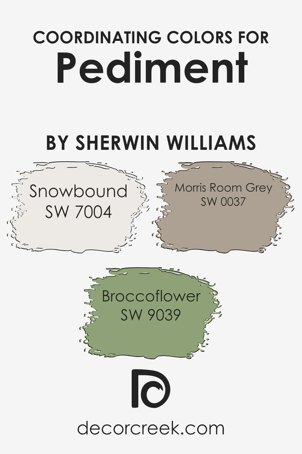
Coordinating Colors of Pediment SW 7634 by Sherwin Williams
Coordinating colors are hues that complement one another when used together, creating a harmonious color scheme in any space. When choosing coordinating colors, it’s important to select shades that either contrast or match well with the main color to enhance the overall look. For Pediment SW 7634 by Sherwin Williams, a soft, warm neutral, there are several colors that work beautifully in tandem.
SW 7004 Snowbound offers a crisp, clean white that brings a sense of brightness and freshness, making it a perfect backdrop or trim color. The gentle contrast between Pediment and Snowbound helps to define spaces while maintaining an airy feel.
In addition, SW 9039 Broccoflower introduces a lively touch of nature with its fresh, green hue. This color adds vitality and a hint of playfulness without overwhelming the subtlety of Pediment. Meanwhile, SW 0037 Morris Room Grey offers a timeless, muted grey that grounds the palette with a sense of balance and neutrality.
These colors, when used together, create a cohesive design that feels both inviting and stylish, as they complement and enhance the soft warmth of Pediment. Whether you use them on walls, accents, or furniture, these colors bring a unified, pleasing look to any space.
You can see recommended paint colors below:
- SW 7004 Snowbound
- SW 9039 Broccoflower
- SW 0037 Morris Room Grey
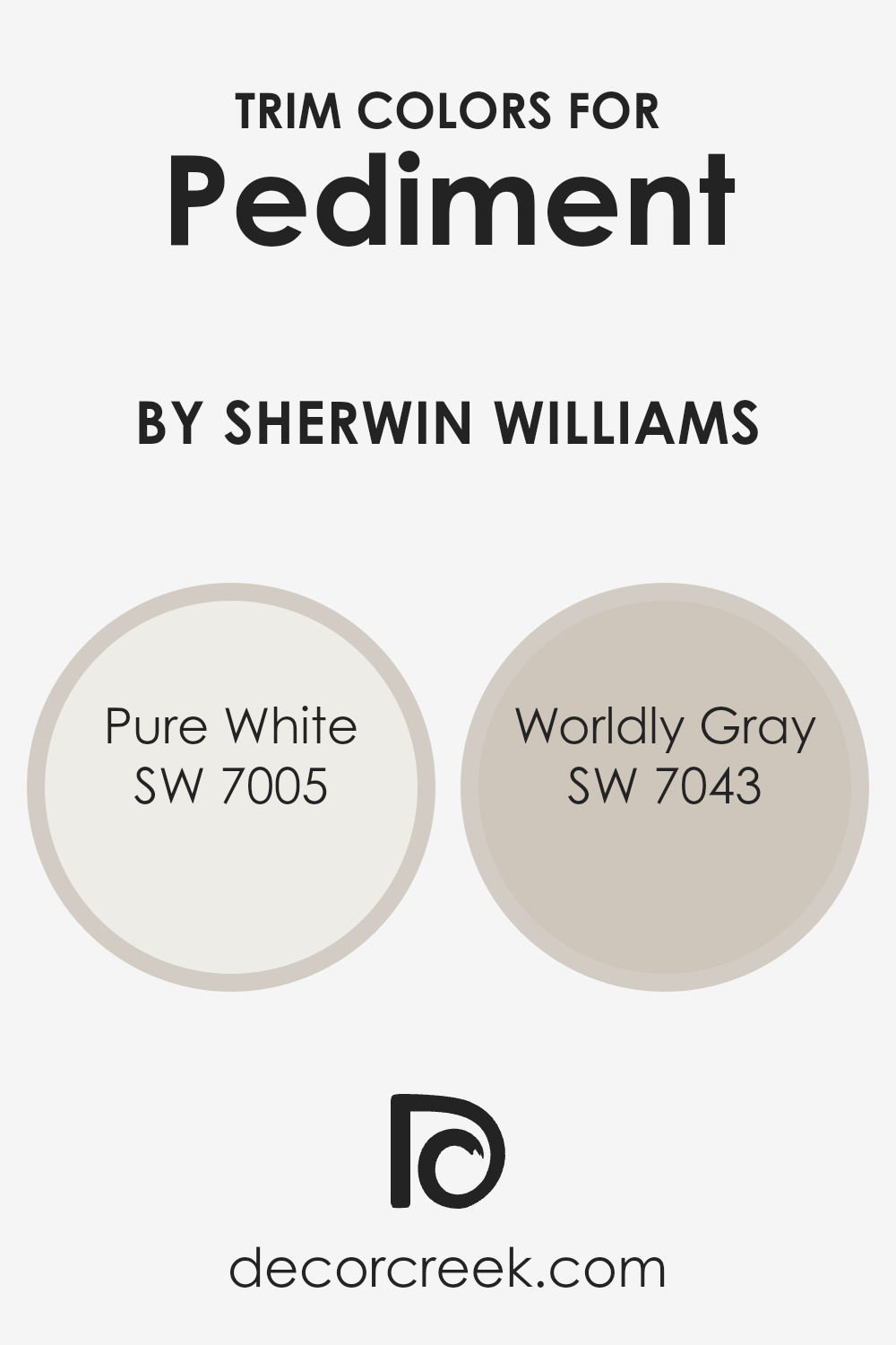
What are the Trim colors of Pediment SW 7634 by Sherwin Williams?
Trim colors play a key role in enhancing and defining the look of a room, especially when using colors like Pediment SW 7634 by Sherwin Williams. Trim colors help provide contrast and accents that can highlight architectural details and create visually appealing separations between walls and ceilings or doors and windows.
Using trim colors like SW 7005 Pure White and SW 7043 Worldly Gray adds a fresh and clean finish to the edges and frames of a space painted in Pediment. Pure White is a crisp and bright white that gives a neat and classic touch, making spaces feel open and inviting. Worldly Gray is a warm and versatile gray that complements numerous color schemes with its subtle, comforting tone.
This combination provides a gentle contrast that enhances the understated elegance of Pediment, accentuating its soft, taupe-beige hue.
Using appropriate trim colors like Pure White and Worldly Gray can dramatically influence how the main wall color is perceived. Pure White’s bright and immaculate shade offers a sharp perimeter that draws the eye, underscoring the gentle warmth of Pediment while keeping the overall look fresh.
On the other hand, Worldly Gray adds depth with its understated and subtle hue, pairing seamlessly with Pediment without overpowering it. Choosing the right trim color is important to ensure that Pediment isn’t lost but instead stands out. Pediment’s pleasant and neutral tone benefits from the added dimension and contrast provided by these trim colors, enhancing the room’s overall visual appeal and ensuring a harmonious and well-defined appearance.
You can see recommended paint colors below:
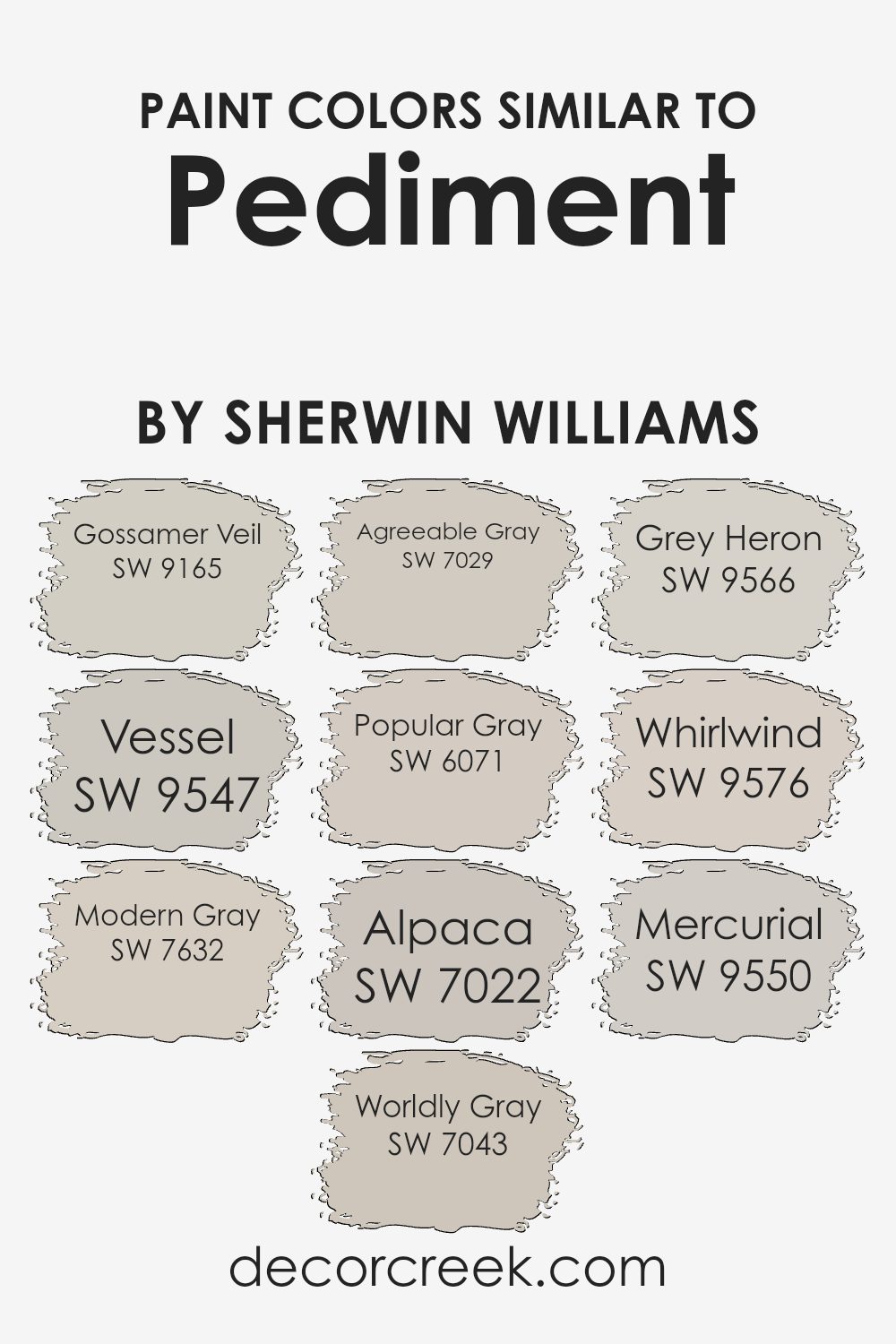
Colors Similar to Pediment SW 7634 by Sherwin Williams
Using colors that are similar to Pediment can create a harmonious and balanced environment. Colors like SW 9165 Gossamer Veil and SW 9547 Vessel offer a soft and light backdrop, making spaces feel open and airy.
SW 7632 Modern Gray and SW 7043 Worldly Gray add just the right touch of warmth without overpowering, which helps in creating a cozy yet refined atmosphere at home. SW 7029 Agreeable Gray is another great option, bringing a welcoming and friendly vibe that makes it a popular choice for many living areas.
Moving to SW 6071 Popular Gray, you’ll find it fits well in areas where you want a gentle and approachable light gray hue. The tone of SW 7022 Alpaca brings in more of an earthy touch, delivering an understated yet appealing detail. SW 9566 Grey Heron provides a deep and rich tone, perfect for adding depth to a room or providing contrast to lighter shades.
If you’re after a touch of motion and depth, SW 9576 Whirlwind offers a dynamic, soothing gray that’s perfect for modern lifestyles. Finally, SW 9550 Mercurial presents a sleek and stylish gray choice that gives a space a subtle yet polished look. Using these similar shades can ensure a flow between spaces that feels cohesive and inviting.
You can see recommended paint colors below:
- SW 9165 Gossamer Veil
- SW 9547 Vessel
- SW 7632 Modern Gray
- SW 7043 Worldly Gray
- SW 7029 Agreeable Gray
- SW 6071 Popular Gray
- SW 7022 Alpaca
- SW 9566 Grey Heron
- SW 9576 Whirlwind
- SW 9550 Mercurial
Colors that Go With Pediment SW 7634 by Sherwin Williams
Colors that go with Pediment SW 7634 by Sherwin Williams play a significant role in creating a cohesive and harmonious space. Pediment is a soft, neutral beige with a touch of gray, which makes it versatile for various design styles. Pairing it with Westhighland White SW 7566, which is a creamy, warm white, can add warmth and softness to the overall look.
Alabaster SW 7008, another warmer white, provides an inviting and airy feel. On the Rocks SW 7671, a light gray, complements Pediment by adding depth without overpowering it. Pure White SW 7005, with its crisp, clean tone, offers a fresh contrast that can brighten a room.
Egret White SW 7570, a cool off-white with slight gray undertones, provides a subtle contrast to Pediment while maintaining an overall muted palette. Crushed Ice SW 7647, a cool gray, creates a modern touch that pairs well with the neutral tones of Pediment. By choosing these complementary colors, you create a balanced and visually appealing space.
They work together to enhance the softness of Pediment, while adding interest and dimension to your interiors. This thoughtful coordination leads to a cohesive environment where each color supports and balances the others.
You can see recommended paint colors below:
- SW 7566 Westhighland White
- SW 7008 Alabaster
- SW 7671 On the Rocks
- SW 7005 Pure White
- SW 7570 Egret White
- SW 7647 Crushed Ice

How to Use Pediment SW 7634 by Sherwin Williams In Your Home?
Pediment by Sherwin Williams is a warm, soft gray paint color with subtle beige undertones. It’s versatile and can be used in various spaces in your home. In the living room, it creates a cozy and inviting atmosphere, complementing both modern and traditional furniture.
In the bedroom, Pediment offers a calming backdrop that pairs well with neutral or pastel bedding for a relaxing vibe. It’s also an excellent choice for the kitchen if you want a neutral tone that allows other elements like cabinets and countertops to stand out. Pediment’s understated elegance makes it suitable for open floor plans, ensuring a seamless transition between different areas.
Additionally, it works well in spaces with plenty of natural light, where it can bring out its warm tones. Choosing Pediment for trims or moldings can add a subtle contrast against lighter or darker walls, bringing depth to any room.
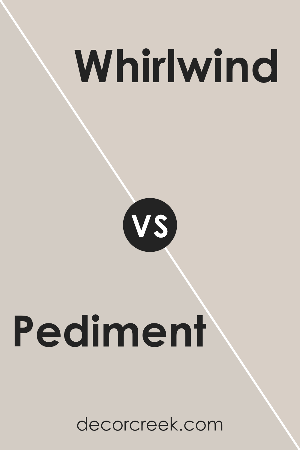
Pediment SW 7634 by Sherwin Williams vs Whirlwind SW 9576 by Sherwin Williams
Pediment SW 7634 and Whirlwind SW 9576 by Sherwin Williams are two distinct colors that bring different moods to a space. Pediment is a soft, warm neutral with a subtle hint of gray, making it versatile for a range of settings. It can create a cozy and inviting atmosphere without overwhelming the room.
On the other hand, Whirlwind is a cool, light gray with blue undertones. It offers a fresh and airy feel, perfect for creating a calm and relaxed environment.
While both colors are understated and suitable for a minimalist look, Pediment leans more toward warmth, ideal for spaces where you want to add a touch of comfort. Whirlwind, with its coolness, is great for places where a sense of openness and light is desired. Both can work well as base colors, allowing other elements in the room to stand out.
You can see recommended paint color below:
- SW 9576 Whirlwind
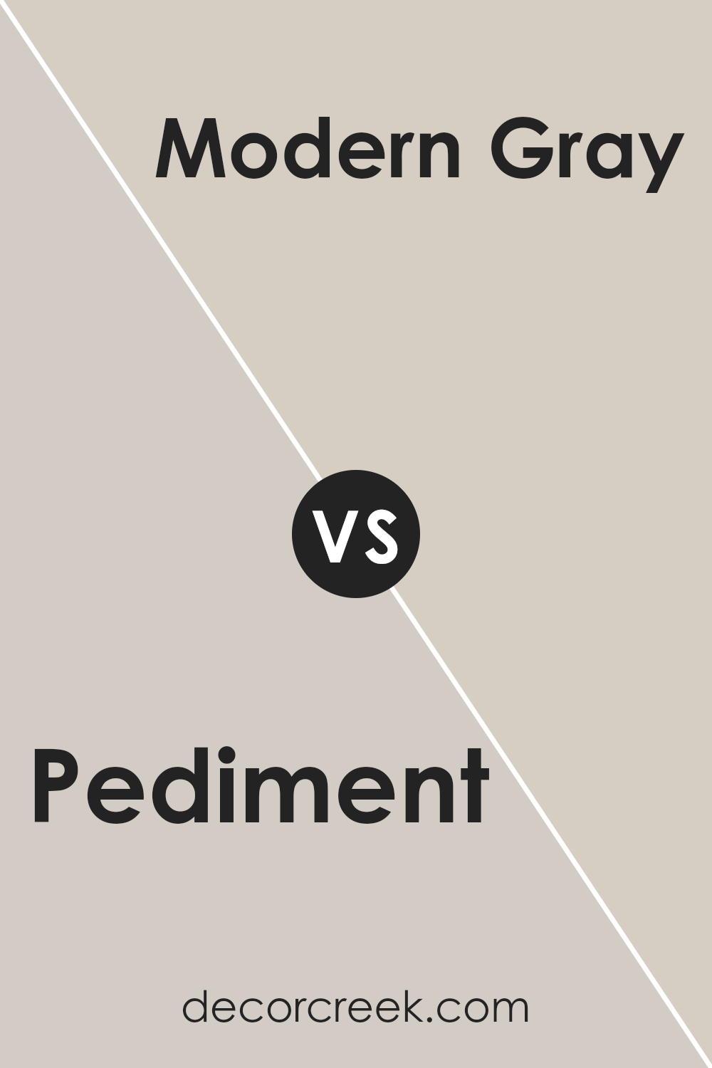
Pediment SW 7634 by Sherwin Williams vs Modern Gray SW 7632 by Sherwin Williams
Pediment SW 7634 and Modern Gray SW 7632 are both soft, neutral tones from Sherwin Williams, but they each have unique characteristics. Pediment SW 7634 is a light, warm gray with beige undertones, which can give a room a cozy, welcoming feel. It’s versatile and can complement a variety of styles and decors.
On the other hand, Modern Gray SW 7632 is slightly darker and has a more consistent gray appearance. Though it remains a neutral color, it doesn’t lean as much towards beige, offering a more straightforward and clean backdrop. This makes it suitable for modern or minimalist spaces where a simple, unobtrusive color is desired.
Both colors are excellent choices for creating a calm and inviting atmosphere. Choosing between them will depend on whether you prefer the warmer, beige-influenced tone of Pediment or the more muted gray of Modern Gray.
You can see recommended paint color below:
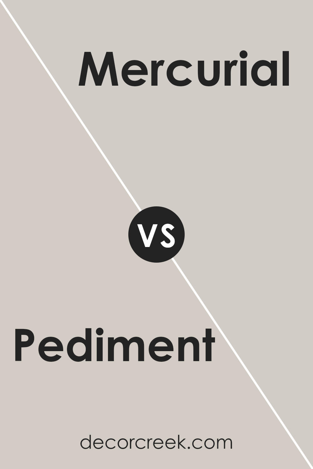
Pediment SW 7634 by Sherwin Williams vs Mercurial SW 9550 by Sherwin Williams
Pediment (SW 7634) and Mercurial (SW 9550) by Sherwin Williams offer two distinct color experiences. Pediment is a subtle, soft off-white with a hint of warmth. It provides a gentle backdrop that can make spaces feel open and airy. Its understated nature makes it a useful choice for rooms where you want a light, calming atmosphere without overwhelming the other elements.
On the other hand, Mercurial is a darker, cooler color, often described as a deep, moody gray with blue undertones. It brings a sense of depth and can make a room feel cozy and intimate. This color can be ideal for spaces where you want to create an inviting ambiance or add drama.
Both colors are versatile and can complement various design styles. While Pediment excels in creating a clean, bright space, Mercurial gives a room a more refined and rich feel.
You can see recommended paint color below:
- SW 9550 Mercurial
Pediment SW 7634 by Sherwin Williams vs Agreeable Gray SW 7029 by Sherwin Williams
Pediment SW 7634 and Agreeable Gray SW 7029, both by Sherwin Williams, are versatile neutral paint colors. Pediment SW 7634 is a light, warm gray with a soft beige undertone. It often provides a cozy and inviting feel, making it suitable for spaces where warmth is desired without too much darkness.
Agreeable Gray SW 7029, on the other hand, is a warm gray that leans a bit more towards beige. It’s a popular choice for its ability to blend with various styles and colors. This shade brightens rooms without being overpowering.
While Pediment is slightly lighter and can create a delicate backdrop, Agreeable Gray is more universally favored for larger areas due to its broader neutral appeal. Both colors offer flexibility for pairing with a range of accents, but their slight differences can impact the overall mood of a space.
You can see recommended paint color below:
Pediment SW 7634 by Sherwin Williams vs Popular Gray SW 6071 by Sherwin Williams
Pediment SW 7634 and Popular Gray SW 6071 by Sherwin Williams are both versatile neutral colors, but they have distinct characteristics. Pediment is a soft, off-white shade with subtle gray undertones. It has a light, airy feel that can brighten a space without being too stark or cold. It’s a great choice for creating a calm and inviting atmosphere, making rooms feel larger and more open.
On the other hand, Popular Gray is a warmer, more grounded color. It leans more towards a taupe or greige, with a balance of gray and beige tones. This gives it a cozy and welcoming vibe, perfect for living areas or bedrooms where you want a bit more warmth and depth.
While both colors are neutral and can complement many palettes, Pediment is better for a breezy, open look, whereas Popular Gray adds a touch of warmth and richness.
You can see recommended paint color below:
Pediment SW 7634 by Sherwin Williams vs Worldly Gray SW 7043 by Sherwin Williams
Pediment SW 7634 and Worldly Gray SW 7043 by Sherwin Williams are both popular neutral colors, but they have distinct differences. Pediment is a light, soft off-white with a hint of warmth. It often works well in spaces where you want a clean look without feeling too stark or cold. The color offers a gentle backdrop that complements a wide range of decor styles.
On the other hand, Worldly Gray is a medium-gray tone with subtle taupe undertones. It is slightly darker than Pediment and brings a sense of coziness to rooms. This color is versatile and pairs well with both warm and cool accents, making it a good option for living areas or bedrooms where you want a bit more depth than a standard gray.
While Pediment provides an airy and open feel, Worldly Gray adds a touch of warmth and sophistication without being overwhelming. Both colors can enhance different atmospheres based on your design goals.
You can see recommended paint color below:
Pediment SW 7634 by Sherwin Williams vs Gossamer Veil SW 9165 by Sherwin Williams
Pediment (SW 7634) and Gossamer Veil (SW 9165) are two popular neutral colors by Sherwin Williams. Pediment is a soft, light gray with a hint of warmth that makes it versatile for different spaces. It’s light enough to make rooms feel airy without being stark. Gossamer Veil, on the other hand, is slightly darker, providing a gentle greige tone that balances gray and beige. This makes it slightly warmer than Pediment, adding a cozy touch to spaces.
Both colors are neutral and can fit into various design styles, but Pediment might be better for areas where you want more light and openness, whereas Gossamer Veil can offer more depth and warmth.
They pair well with bolder accents, with Pediment offering a blank slate and Gossamer Veil giving a bit more substance. Both are excellent choices depending on the mood and style you want for your room.
You can see recommended paint color below:
Pediment SW 7634 by Sherwin Williams vs Alpaca SW 7022 by Sherwin Williams
Pediment SW 7634 and Alpaca SW 7022 are two popular paint colors by Sherwin Williams that have some differences.
Pediment is a soft, light gray with warm undertones. It often looks like a mix of gray and beige, making it a versatile choice for different spaces. It can create a calming, neutral backdrop that pairs well with a variety of decor styles and can effectively brighten a room without being too stark.
Alpaca, on the other hand, is a warm greige that leans slightly more toward beige than gray. It has subtle taupe undertones, giving it a cozy and inviting feel. It can add warmth and depth to a room while still maintaining a neutral palette.
In summary, both colors are excellent for creating neutral spaces, with Pediment offering a lighter, airier feel and Alpaca providing a warmer, cozier atmosphere. Both are easy to pair with other colors and furnishings.
You can see recommended paint color below:
Pediment SW 7634 by Sherwin Williams vs Grey Heron SW 9566 by Sherwin Williams
Pediment (SW 7634) by Sherwin Williams is a soft, warm white with subtle undertones of beige, making it a versatile choice for interiors. It creates a welcoming and cozy atmosphere, suitable for both traditional and modern spaces. On the other hand, Grey Heron (SW 9566) is a light gray with cool undertones, giving it a crisp and refreshing feel. This color works well in creating a calm and understated environment.
While both colors belong to the neutral family, Pediment leans towards warmth, whereas Grey Heron has a cooler essence. Pediment pairs beautifully with earth tones and other warm shades, enhancing its snug quality. In contrast, Grey Heron complements blues, greens, and other cool hues, accentuating its clean and airy nature.
In summary, Pediment adds warmth and coziness, making spaces feel inviting. Grey Heron offers a cool, crisp backdrop, perfect for a fresh and relaxed setting.
You can see recommended paint color below:
- SW 9566 Grey Heron
Pediment SW 7634 by Sherwin Williams vs Vessel SW 9547 by Sherwin Williams
Pediment SW 7634 by Sherwin Williams is a soft, warm off-white that brings a sense of calm and understated elegance to a space. It works well as a neutral backdrop, complementing a variety of design styles and color schemes without overwhelming them. Its subtle warmth makes it inviting and versatile.
On the other hand, Vessel SW 9547 by Sherwin Williams is a rich, earthy brown. This color adds depth and coziness to a room, making it feel more intimate. Vessel can be a statement color, offering a grounded and natural feel, ideal for accent walls or highlighting certain architectural features.
When comparing the two, Pediment offers a light, airy vibe, suitable for spaces seeking openness, while Vessel provides warmth and solidity, perfect for creating a more enclosed, welcoming environment. Used together, they can balance each other nicely, with Pediment lightening the space and Vessel adding contrast.
You can see recommended paint color below:
Conclusion
After learning all about SW 7634 Pediment by Sherwin Williams, I feel like I understand what makes this paint color special. Pediment is a soft, gentle gray with a hint of warmth. It’s like a cozy blanket for your walls. It can make a room feel calm and inviting, which is great if you want a place where you can relax and feel at ease.
What’s fun is that it doesn’t clash with other colors. You could match it with bright red pillows, a green plant, or even some sunny yellow accents, and it would still look nice. That makes it perfect for almost any room, whether it’s your bedroom, the living room, or even a study area.
Another neat thing about Pediment is how it changes depending on the lighting in the room. If the room is bright and sunny, Pediment might look lighter, almost as if it’s smiling back at you. In dimmer light, it might look a bit richer, giving the room a comfy feel.
Overall, SW 7634 Pediment is like a quiet helper. It doesn’t shout for attention, but it makes everything around it look even better. If I were picking a color to make my room feel cozier and more welcoming, this would definitely be a top choice!
Ever wished paint sampling was as easy as sticking a sticker? Guess what? Now it is! Discover Samplize's unique Peel & Stick samples.
Get paint samples

