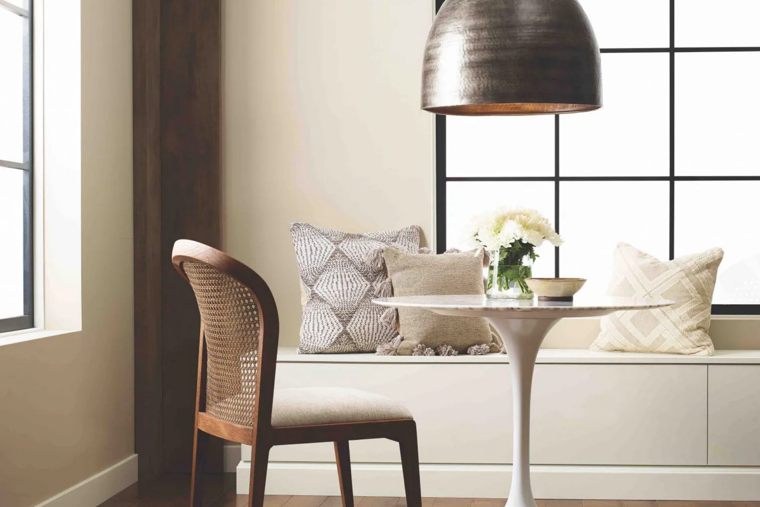
This color strikes the perfect balance between warmth and neutrality, making it a versatile choice for any space. It offers a touch more warmth than a classic white, giving it a cozy and inviting feel.
I’ve used White Sesame in a few of my projects, and it never fails to impress. Its soft undertone provides a gentle backdrop, allowing furniture and decor to stand out without overwhelming the senses.
This shade works well in living rooms, bedrooms, and even kitchens, where a subtle touch of color is desired without straying too far from the simplicity of white.
Aside from its visual appeal, White Sesame is highly adaptable. It pairs beautifully with a wide range of colors and materials.
Whether you have bold, vibrant accents or prefer muted, earthy tones, this color complements them all gracefully. If you’re seeking a paint shade that is both comforting and versatile, SW 9586 White Sesame could be the perfect choice for your next project.
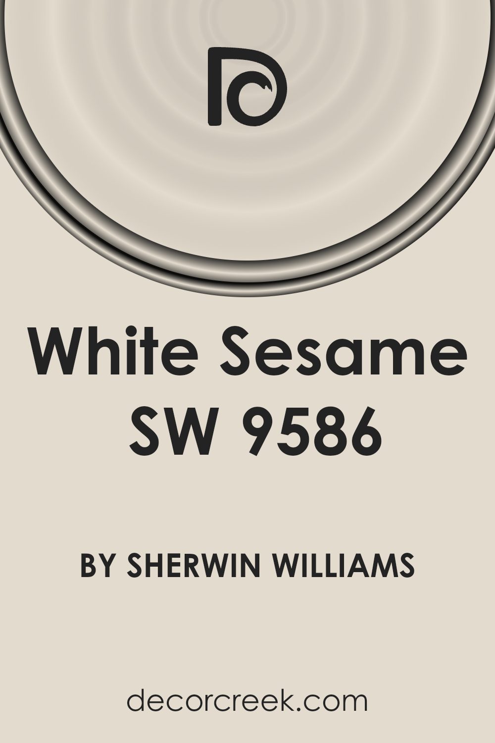
What Color Is White Sesame SW 9586 by Sherwin Williams?
White Sesame by Sherwin Williams is a soft, neutral color with a gentle warmth. It has an inviting tone that can brighten a room without being too stark or cold like pure white. This shade is versatile and works well with various interior styles. It fits perfectly in modern and minimalist spaces, where its light touch can enhance clean lines and simplicity.
White Sesame can also complement traditional and transitional designs, adding a touch of freshness that blends well with classic elements.
In terms of materials, this color works beautifully with natural woods, like oak or walnut, which add warmth and richness. Metal accents, whether polished chrome or brushed brass, can add a sleek, modern touch to a room painted in White Sesame.
The color also pairs nicely with soft fabrics such as cotton and linen, bringing comfort and coziness to living spaces.
Textures like woven baskets, plush area rugs, or smooth ceramics can enhance the inviting feel of a room with walls painted in White Sesame. It’s an easygoing shade that forms a harmonious backdrop for various decorative elements, making it a great choice for living rooms, bedrooms, or any interior space needing a gentle, welcoming atmosphere.
Is White Sesame SW 9586 by Sherwin Williams Warm or Cool color?
White Sesame SW 9586 by Sherwin Williams is a warm, neutral shade that adds a subtle yet inviting feel to any room. This color is versatile, making it a great choice for both modern and traditional homes. It pairs well with a variety of other colors, allowing homeowners to mix and match with furniture and decor.
The warm undertone of White Sesame gives spaces a cozy atmosphere, making it ideal for living rooms, bedrooms, or kitchens where comfort is key.
Moreover, it works well with natural light, enhancing its warmth and making spaces feel brighter and more open. Because of its neutral tone, White Sesame can easily complement wood finishes or metallic accents around the house. Whether on walls or in accents, this paint helps create a balanced and harmonious environment that feels welcoming and relaxed.
It’s an excellent choice for those looking to maintain a light, neutral palette throughout their home.
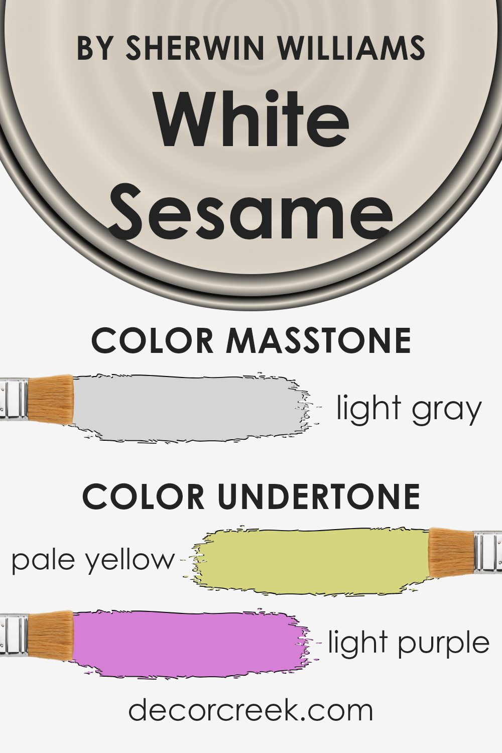
Undertones of White Sesame SW 9586 by Sherwin Williams
White Sesame by Sherwin Williams is a subtle and complex color enhanced by its varied undertones. These undertones, including pale yellow, light purple, light blue, pale pink, mint, lilac, and grey, each play a role in how we perceive the color.
Undertones can alter the primary appearance of a color, influencing its warmth or coolness, and they often become more prominent depending on lighting conditions or surrounding décor.
For White Sesame, the pale yellow adds a hint of warmth, making it comforting and inviting, which can brighten a room softly. Light purple and lilac undertones introduce a mild touch of elegance, offering a more sophisticated feel without being overpowering.
The light blue and mint provide a refreshing and calm aspect, which infuses the color with a sense of openness. Meanwhile, the grey undertone contributes to a more neutral, balanced, and grounded appearance.
When used on interior walls, White Sesame’s undertones can impact the atmosphere significantly. In a well-lit room, the warmth from the pale yellow, coupled with hints of mint and light blue, can create a soothing, airy space. In dimmer conditions, the grey and lilac undertones might come to the forefront, providing a more cozy and intimate feel, perfect for a relaxing environment.
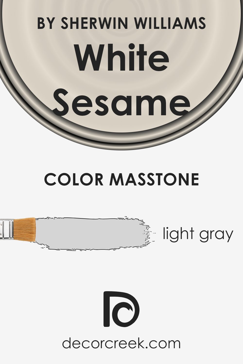
What is the Masstone of the White Sesame SW 9586 by Sherwin Williams?
White Sesame by Sherwin Williams, with its light gray masstone (#D5D5D5), is a versatile paint color that works well in various home settings. Its soft tone makes it an excellent choice for creating a calm and inviting space. The light gray color reflects natural light beautifully, making rooms feel more spacious and open. This makes it an ideal choice for smaller rooms or areas lacking natural light.
White Sesame pairs well with both warm and cool color palettes, allowing homeowners to easily match it with different furniture, decor, and accent colors.
In living rooms, it provides a neutral backdrop that highlights artwork and furnishings without overwhelming the space. In kitchens and bathrooms, it offers a clean and modern look, contributing to a fresh and bright atmosphere.
Overall, the subtle elegance of this light gray shade brings balance and harmony to homes, making it a popular choice for those looking for a neutral yet stylish color.
How Does Lighting Affect White Sesame SW 9586 by Sherwin Williams?
Lighting plays a crucial role in how we perceive colors. The appearance of a color can change dramatically under different lighting conditions. This can be particularly true for paint colors in rooms with varying exposures to natural and artificial light. Let’s explore how White Sesame SW 9586 by Sherwin Williams behaves in these different lighting scenarios.
Under artificial light, especially if it’s warm or yellow-toned, White Sesame may take on a cozier, creamier appearance. Fluorescent lights, which tend to be cooler, might bring out cooler tones in the paint, making it seem slightly grayer or less warm.
It’s important to test the paint under the artificial lighting you use most often to see how the color truly looks in your space.
In natural light, White Sesame will look different depending on the direction the room faces. In north-facing rooms, which tend to have cooler, bluer light, White Sesame might appear more muted or cooler. This can make the space feel a bit softer and more subdued.
On the other hand, south-facing rooms receive warm, bright light throughout the day, which can enhance any warm undertones in White Sesame, making it appear sunnier and more inviting.
East-facing rooms get most of their light in the morning, and this light is generally soft and warm. Here, White Sesame might seem bright and warm in the early hours but can become more neutral as the day progresses and the light lessens.
West-facing rooms catch the warm, red-orange light of the late afternoon sun, which can intensify any warm undertones in White Sesame, giving the space a cozy, golden glow as the day winds down.
Choosing a color like White Sesame involves considering how light in your room will interact with it throughout the day. Always remember to observe the paint sample both during the day and at night under your specific lighting conditions to ensure it’s the right fit for your space.

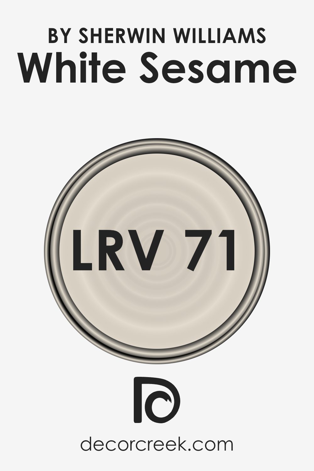
What is the LRV of White Sesame SW 9586 by Sherwin Williams?
Light Reflectance Value (LRV) is a measurement used to determine how much light a color reflects. On a scale of 0 to 100, pure black has an LRV of 0 because it absorbs all light, while pure white has an LRV of 100 because it reflects all light.
This measurement is important in the world of interior design because it helps predict how a color will behave in different lighting conditions. A higher LRV means the color will reflect more light, making spaces feel brighter and more open.
On the other hand, a lower LRV indicates that a color will absorb more light, making a room feel cozier and sometimes smaller.
White Sesame by Sherwin Williams has an LRV of 71.277, positioning it in the lighter range.
This means it’s quite good at reflecting light, which can make a room appear more spacious and airy. In spaces with lots of natural sunlight, this color can help maximize the brightness in the room, contributing to a cheerful and energized atmosphere.
In darker rooms, it can help to lighten the space, although the absence of adequate light could cause it to appear slightly duller than in brighter conditions. Overall, its high LRV makes it a versatile choice for creating an open and inviting environment.
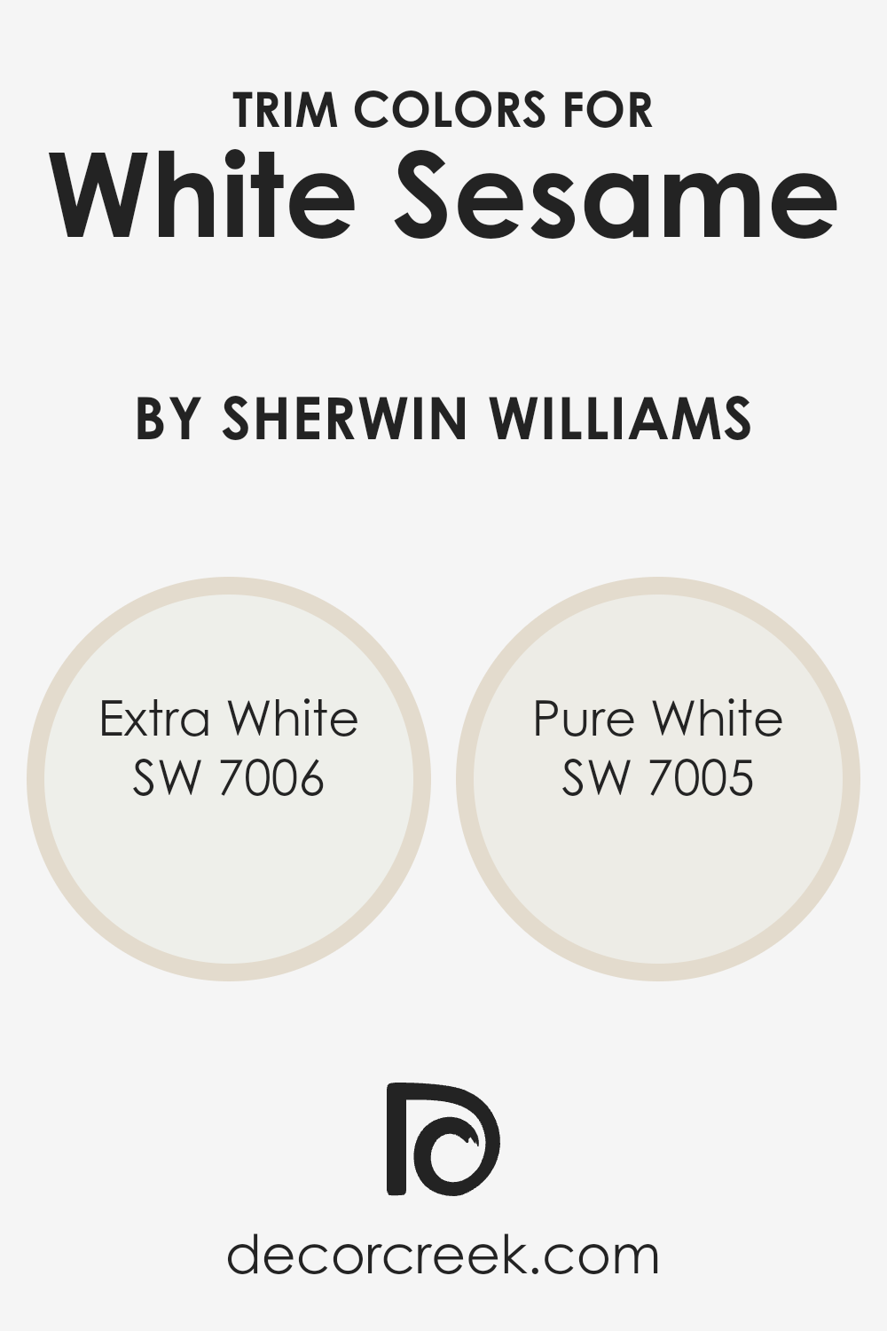
What are the Trim colors of White Sesame SW 9586 by Sherwin Williams?
Trim colors are a crucial aspect of interior design because they frame your walls and highlight architectural details. For White Sesame by Sherwin Williams, choosing the right trim color can enhance its natural elegance.
Trim colors like Extra White and Pure White add a crisp, clean border that makes the main wall color stand out even more. These whites work well to define spaces and create a pleasing contrast without overwhelming the subtle tones of White Sesame.
A well-chosen trim can give a polished look, tying together different elements in a room seamlessly.
Extra White by Sherwin Williams is a bright, true white that adds a refreshing touch to any room.
It’s a versatile choice that offers a sharp and modern finish. On the other hand, Pure White offers a softer white that brings warmth and balance. Its subtle nuances make it an inviting choice that complements the gentle tones of White Sesame. Both of these trim colors help create a cohesive and welcoming atmosphere, enhancing the overall aesthetic of your living space.
You can see recommended paint colors below:
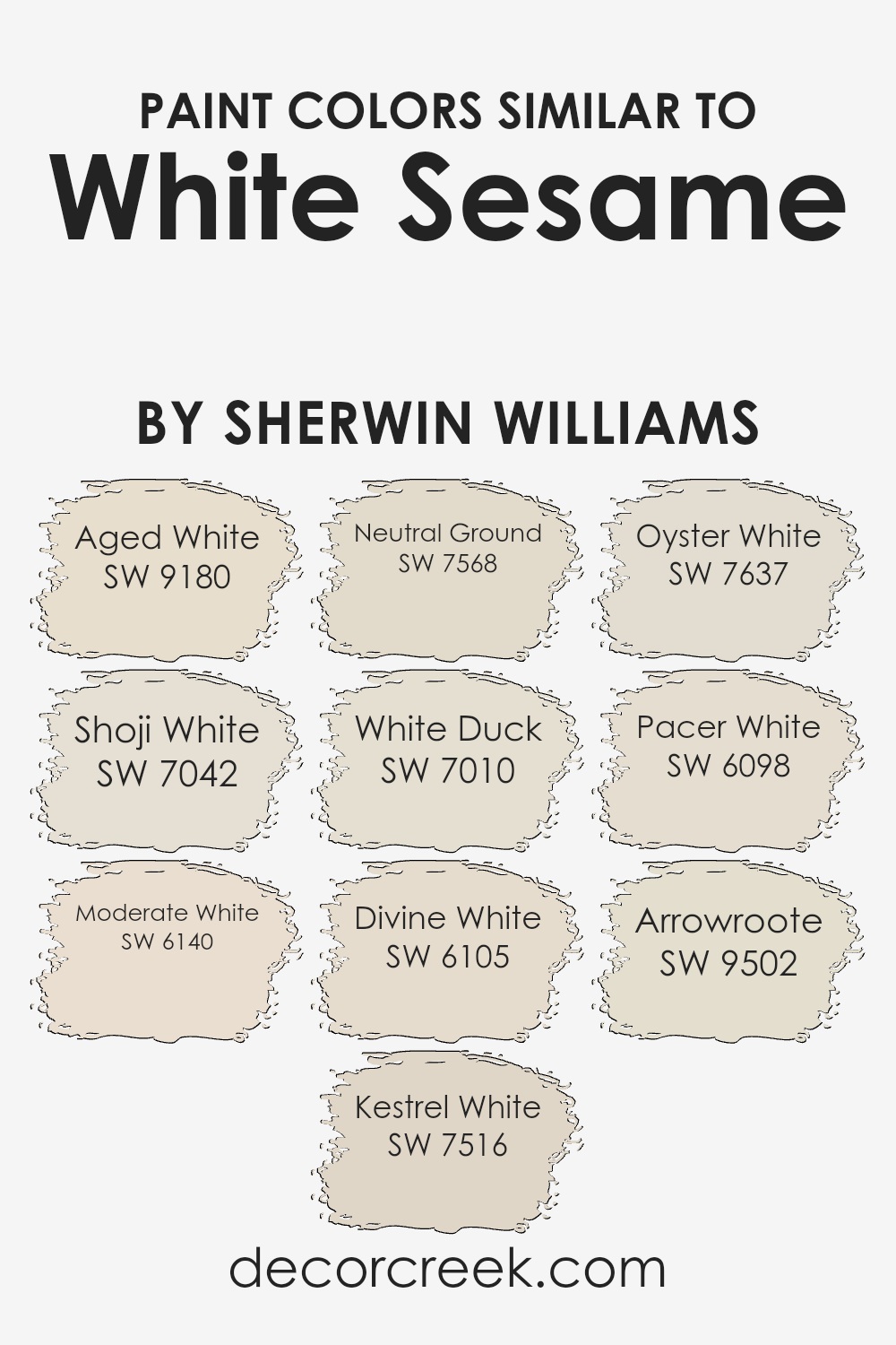
Colors Similar to White Sesame SW 9586 by Sherwin Williams
Similar colors are important in design because they create harmony and balance. When working with a base color like White Sesame by Sherwin Williams, using similar shades can make a space feel cohesive and inviting. Colors like SW 9180 – Aged White offer a soft, warm undertone that complements White Sesame beautifully, adding depth without overwhelming the room.
SW 7042 – Shoji White brings a touch of cool grace, providing a subtle contrast that keeps the palette fresh. Meanwhile, SW 6140 – Moderate White combines warmth and airiness for a gentle, inviting atmosphere.
Each color in this range has its own unique charm. SW 7516 – Kestrel White adds a whisper of warmth, making spaces feel comfortable and cozy, while SW 7568 – Neutral Ground provides a subtle, earthy tone that grounds the overall look.
SW 7010 – White Duck introduces a creamy, soft hue that is perfect for creating a relaxed vibe.
SW 6105 – Divine White has a touch more richness, ideal for adding a hint of luxury. SW 7637 – Oyster White offers a slight grey undertone, perfect for modern settings, whereas SW 6098 – Pacer White is a warm, inviting shade that brightens any room. Finally, SW 9502 – Arrowroot delivers a creamy texture, rounding out the palette with elegance and charm.
You can see recommended paint colors below:
- SW 9180 Aged White
- SW 7042 Shoji White
- SW 6140 Moderate White
- SW 7516 Kestrel White
- SW 7568 Neutral Ground
- SW 7010 White Duck
- SW 6105 Divine White
- SW 7637 Oyster White
- SW 6098 Pacer White
- SW 9502 Arrowroote
How to Use White Sesame SW 9586 by Sherwin Williams In Your Home?
White Sesame SW 9586 by Sherwin Williams is a soft, neutral paint color that works well in many spaces. It’s a light shade that can make rooms feel bright and open without being stark or cold. People can use White Sesame in living rooms for a calm and inviting atmosphere.
It’s also an excellent choice for bedrooms where a restful environment is desired. In kitchens, this color pairs nicely with both modern and traditional design elements, allowing for a clean and fresh look.
Bathrooms painted in White Sesame can feel more spacious and peaceful. You can even use it as a backdrop for colorful artwork or furniture, as it won’t compete for attention. This versatile shade blends well with various accent colors, whether they are bold or muted.
Overall, White Sesame SW 9586 is a flexible option that helps create a harmonious feeling in any home setting.
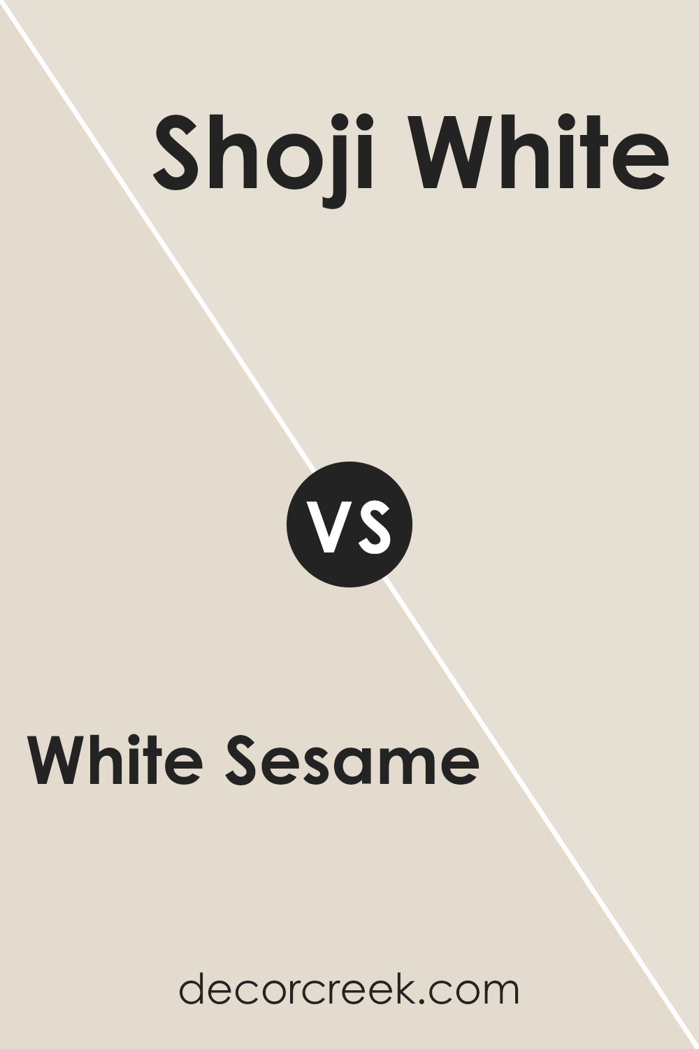
White Sesame SW 9586 by Sherwin Williams vs Shoji White SW 7042 by Sherwin Williams
White Sesame SW 9586 and Shoji White SW 7042 by Sherwin Williams are both light, neutral colors, but they have distinct undertones. White Sesame is a soft, warm white with a hint of beige. It provides a subtle warmth, making it a versatile choice for a cozy and inviting atmosphere. It’s ideal for spaces where you want a touch of warmth without adding too much color.
Shoji White, on the other hand, is a creamy off-white with slightly more gray undertones. It’s a bit cooler compared to White Sesame and can create a more classic, understated look. Shoji White works well in spaces that aim for a neutral backdrop with a cooler, soft vibe.
Both colors are great for different settings. White Sesame adds warmth, while Shoji White offers a subtle, sophisticated feel. Your choice will rely on whether you prefer a warmer or cooler undertone in your space.
You can see recommended paint color below:
White Sesame SW 9586 by Sherwin Williams vs Oyster White SW 7637 by Sherwin Williams
White Sesame SW 9586 and Oyster White SW 7637 are two popular neutral shades from Sherwin Williams that offer different vibes for a space. White Sesame is a soft, creamy off-white with subtle warmth, making it a versatile choice for almost any room. It pairs beautifully with both warm and cool colors and can create a cozy yet bright environment.
On the other hand, Oyster White has slightly cooler undertones compared to White Sesame. It’s a muted off-white with hints of gray, giving it a more subdued and relaxed feel. This makes Oyster White a great option for those who want a neutral backdrop with just a touch of color depth.
Both colors are excellent for creating a light and airy atmosphere. White Sesame might be perfect for spaces where you want a bit more warmth, while Oyster White could be the choice for areas where a cooler, more understated tone is desired.
You can see recommended paint color below:
White Sesame SW 9586 by Sherwin Williams vs Neutral Ground SW 7568 by Sherwin Williams
White Sesame and Neutral Ground are two warm, inviting colors from Sherwin Williams. White Sesame SW 9586 is a soft off-white with warm undertones. It provides a cozy, gentle look and can brighten a space without feeling stark. It’s versatile, making it suitable for walls, trim, or even ceilings to create a seamless look.
Neutral Ground SW 7568 is a bit darker, with beige and taupe undertones, lending a richer, earthy warmth. It’s perfect for adding depth to a room while still maintaining a light and airy feeling. This color works well in living rooms or bedrooms, offering a comfortable, relaxed vibe.
When compared, White Sesame is a bit brighter and perfect for spaces needing more light, whereas Neutral Ground provides a stronger presence with its subtle depth. Both colors are great for creating a warm, inviting atmosphere, but they offer different levels of brightness and warmth.
You can see recommended paint color below:
White Sesame SW 9586 by Sherwin Williams vs Arrowroote SW 9502 by Sherwin Williams
White Sesame SW 9586 by Sherwin Williams is a soft, neutral white that brings a sense of brightness and openness to a room. It reflects light well, making spaces feel larger and more airy. On the other hand, Arrowroot SW 9502 is a warm, beige color with subtle undertones that provide a cozy and inviting atmosphere.
When comparing the two, White Sesame is more about creating a clean and fresh look, while Arrowroot offers warmth and comfort, making it ideal for rooms where you want to feel relaxed and at ease. White Sesame might suit modern, minimalist spaces, where you want to highlight decoration and furniture with clean contrast.
Arrowroot, with its warm hue, works well in traditional or rustic settings, adding a touch of earthiness. Both colors are versatile, but they set a different mood in a room, depending on whether you prefer a crisp or a warm background.
You can see recommended paint color below:
- SW 9502 Arrowroote
White Sesame SW 9586 by Sherwin Williams vs White Duck SW 7010 by Sherwin Williams
White Sesame SW 9586 by Sherwin Williams and White Duck SW 7010 are two charming off-white colors that fit into a wide range of styles. White Sesame is a warm off-white with subtle beige undertones, providing a soft and inviting look. It works well in spaces where you want a hint of warmth without straying into deep beige territory.
On the other hand, White Duck is also a warm neutral but leans slightly grayer compared to White Sesame. This makes White Duck a versatile choice for both modern and traditional spaces, as it pairs well with cool and warm tones.
When choosing between these two, consider the lighting in your room. White Sesame might appear cozier in a room with lots of natural light, while White Duck can provide a balanced look in spaces with mixed lighting. Both are excellent for creating a calming and neutral backdrop.
You can see recommended paint color below:
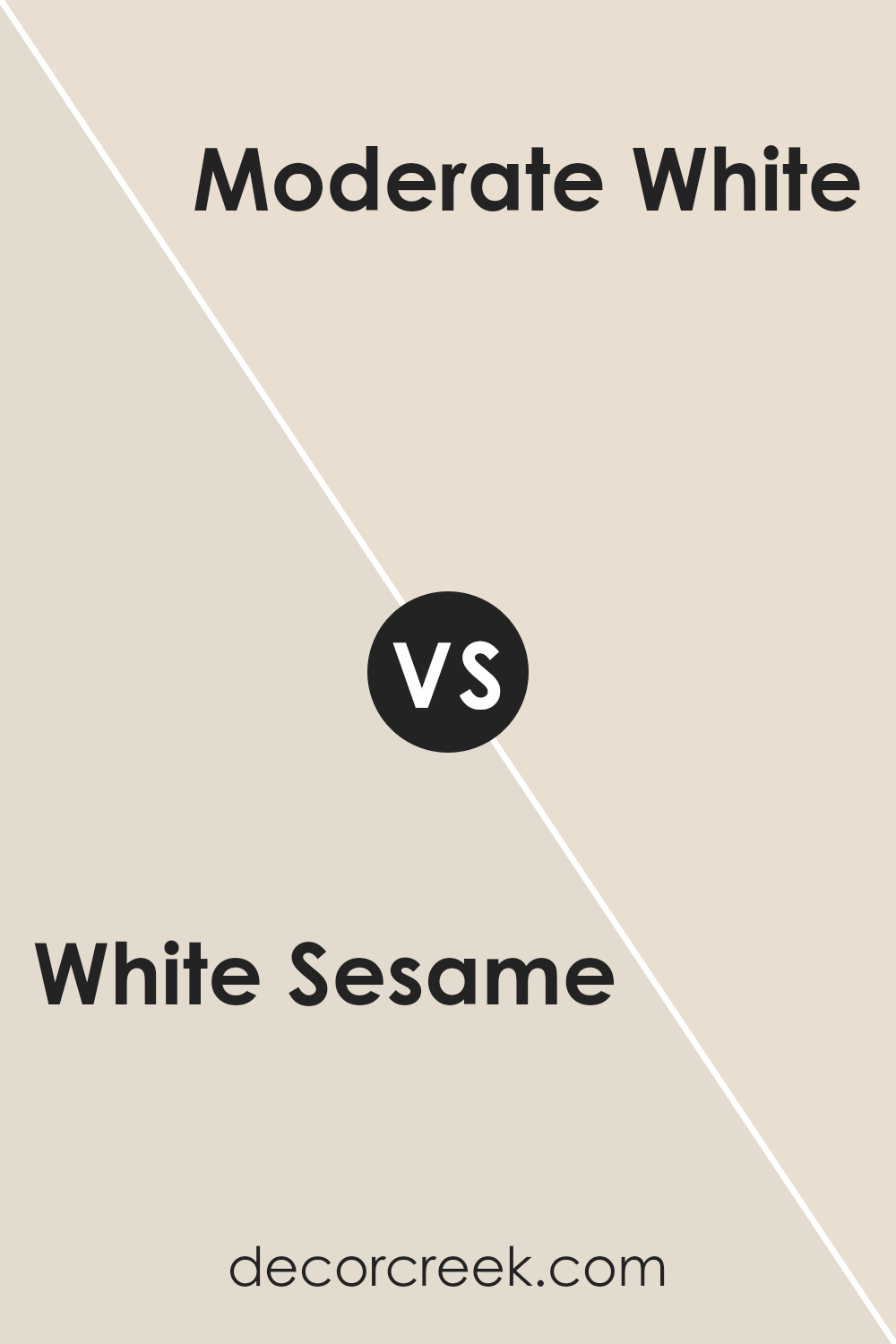
White Sesame SW 9586 by Sherwin Williams vs Moderate White SW 6140 by Sherwin Williams
White Sesame SW 9586 and Moderate White SW 6140 are both neutral colors from Sherwin Williams, but they each have unique characteristics. White Sesame is a lighter, soft off-white that can brighten up a space, providing a clean, airy feel. It works well in spaces where you want a fresh and light atmosphere.
Moderate White, on the other hand, is a warmer, creamier white with a hint of beige. It adds a cozy and inviting vibe to rooms, making them feel comfortable and homey.
White Sesame is excellent for spaces where you want to let natural light bounce off the walls, while Moderate White can add warmth to areas lacking natural sunlight.
When put side by side, White Sesame might feel more modern and crisp, whereas Moderate White offers a more traditional and warm look. Both colors are versatile and can be paired with various accent shades to suit different styles.
You can see recommended paint color below:
- SW 6140 Moderate White
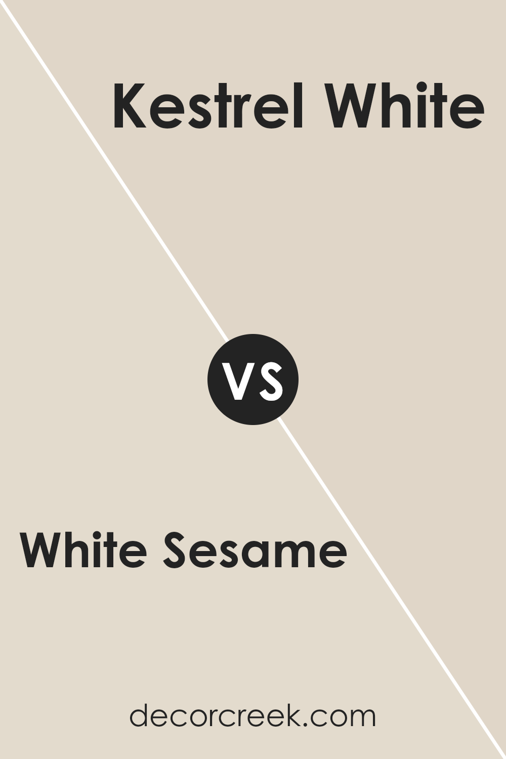
White Sesame SW 9586 by Sherwin Williams vs Kestrel White SW 7516 by Sherwin Williams
White Sesame SW 9586 by Sherwin Williams is a soft, warm off-white with a hint of beige. It gives spaces a bright and cozy feel, making it versatile for many rooms in your home. It pairs well with both bold and neutral accents, offering a clean backdrop that enhances other colors.
Kestrel White SW 7516, also by Sherwin Williams, is a bit warmer compared to White Sesame. It has earthy undertones that bring a touch of warmth and comfort. This color works well in traditional or rustic settings and is great for adding an inviting touch to living spaces.
While both are light and neutral, White Sesame leans more towards a true off-white, creating an airy atmosphere, whereas Kestrel White provides a richer, warmer setting. Each color has its unique charm, with White Sesame lending itself to a more modern aesthetic and Kestrel White offering a cozy, homely vibe.
You can see recommended paint color below:
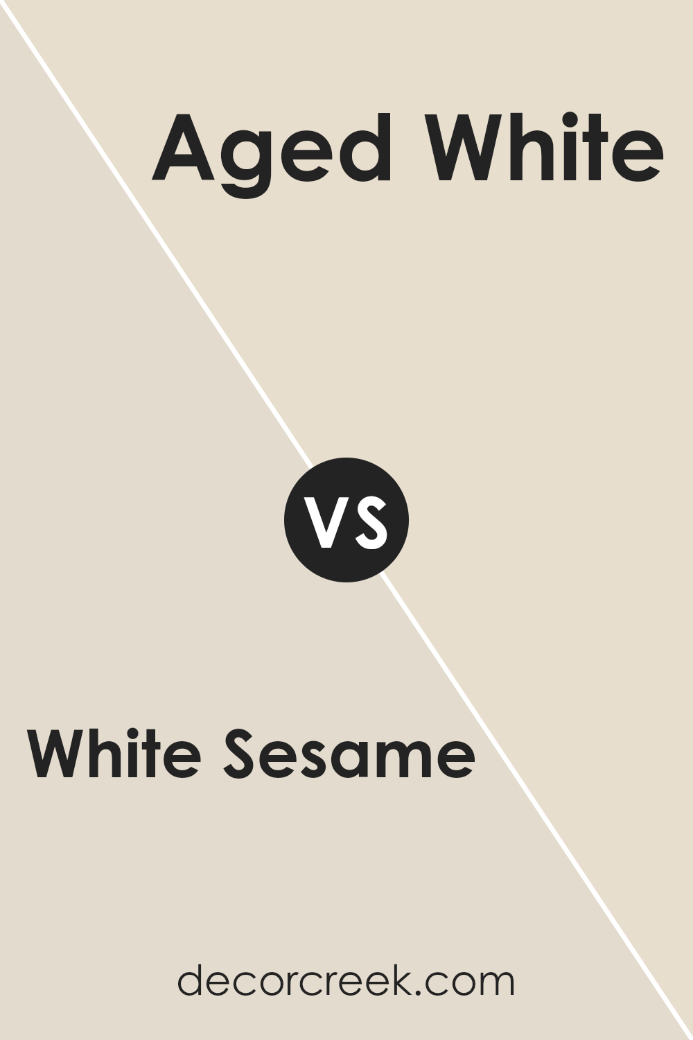
White Sesame SW 9586 by Sherwin Williams vs Aged White SW 9180 by Sherwin Williams
White Sesame SW 9586 and Aged White SW 9180, both by Sherwin Williams, are warm neutrals with subtle differences. White Sesame is a light, airy color with a soft, creamy tone. It brings a sense of openness and brightness to spaces. It’s versatile and pairs well with both cool and warm accents.
On the other hand, Aged White SW 9180 carries a more muted and slightly yellow undertone. This gives it a more vintage or classic feel compared to the fresher vibe of White Sesame. Aged White can create a cozy and inviting atmosphere, often complementing traditional or rustic decor.
When choosing between the two, consider the mood you want to create. White Sesame works well in spaces where you need light enhancement, while Aged White can add warmth and character. Both colors are great for creating a neutral base in any room.
You can see recommended paint color below:
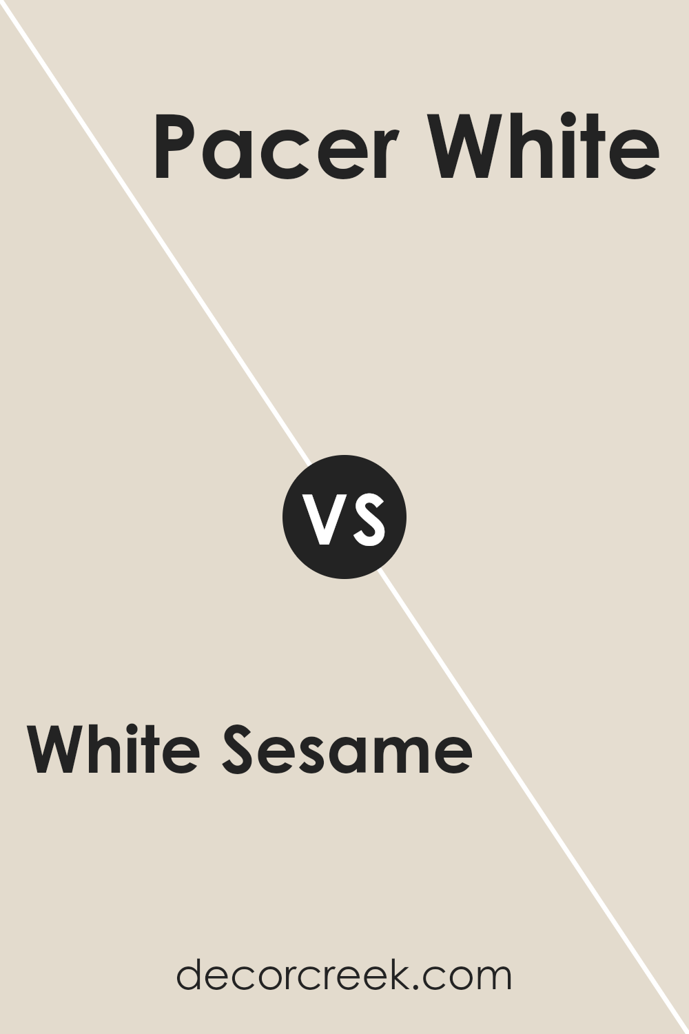
White Sesame SW 9586 by Sherwin Williams vs Pacer White SW 6098 by Sherwin Williams
White Sesame (SW 9586) and Pacer White (SW 6098) by Sherwin Williams are both soft, versatile neutrals that work well in various spaces. White Sesame is a warm off-white with subtle beige undertones, making it cozy and inviting. It provides a clean backdrop without feeling too stark, ideal for living rooms or bedrooms where warmth and comfort are desired.
On the other hand, Pacer White is slightly darker with a touch more depth. It leans toward the beige side but still maintains its neutral quality. This makes it a great choice for areas where a bit more color is needed without overwhelming the space, such as hallways or open-plan areas.
While both colors are neutral and flexible, White Sesame is lighter and brighter, ideal for small spaces to create an airy feel. In contrast, Pacer White offers a richer tone that can add comfort and coziness to larger rooms. Both can complement a wide range of accent colors and furniture styles.
You can see recommended paint color below:
- SW 6098 Pacer White
White Sesame SW 9586 by Sherwin Williams vs Divine White SW 6105 by Sherwin Williams
White Sesame (SW 9586) and Divine White (SW 6105) are two paint colors by Sherwin Williams that offer different visual effects in a room. White Sesame is a soft, light beige with an almost creamy undertone. It is calming and works well in rooms where you want a relaxed feel. It’s a versatile color and pairs well with a variety of other shades, including both warm and cool tones.
On the other hand, Divine White is a warmer beige that has a bit more depth and richness to it compared to White Sesame. It can bring a cozy, inviting atmosphere to a space. This color is excellent for areas where you want a more intimate setting, like bedrooms or living rooms.
Both colors are neutral, making them great for backgrounds and allowing other colors in the room to stand out. Whether you choose White Sesame or Divine White depends on whether you prefer a lighter or slightly warmer tone for your space.
You can see recommended paint color below:
Conclusion
After learning about SW 9586 White Sesame by Sherwin Williams, I can confidently say that this paint color is a wonderful choice for anyone looking to freshen up a room. White Sesame, a soft off-white shade, has an amazing ability to fit well with both modern and traditional styles.
It’s like a gentle hug that works well in any room, such as a living room, kitchen, or bedroom.
One of the things I like most about White Sesame is how it reflects light. When the sun shines through the windows, it looks warm and inviting, making the room feel cozy and welcoming. It also pairs nicely with many other colors.
Whether you want bright furniture or something darker, White Sesame acts as a perfect background.
Another great thing about White Sesame is how it makes a room feel more open and cheerful without being too bright or too dull. It’s just right. So, if someone is looking to paint a room and can’t decide on a color, White Sesame might be the perfect pick. It’s a shade that can make any area feel nicer and more comfortable.
Overall, White Sesame is a fantastic color choice that can bring smiles to anyone who steps into the painted room.

Ever wished paint sampling was as easy as sticking a sticker? Guess what? Now it is! Discover Samplize's unique Peel & Stick samples.
Get paint samples

