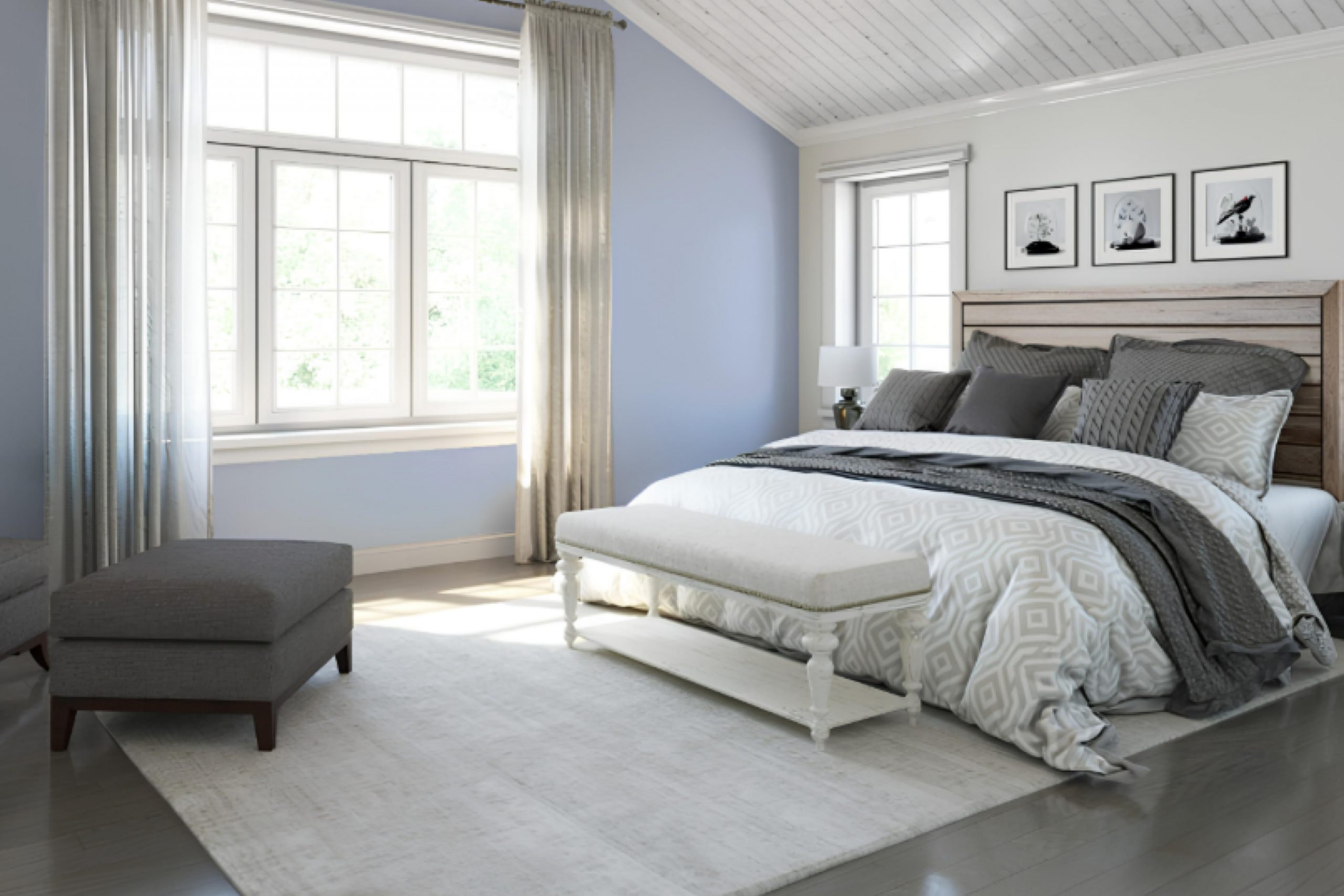
Choosing the right paint color for your space can be a bit overwhelming with all the options out there. But if you’re looking for a unique shade that stands out without overpowering, SW 9066 Agapanthus by Sherwin Williams might be just what you need. This shade caught my eye during my last redecoration project, and I was hunting for something that could add both elegance and a modern twist to my living room.
Agapanthus is not your average blue. It has a depth that adds character, creating a serene atmosphere that’s perfect for spaces where you want to relax and unwind. Its versatility also surprised me; it pairs beautifully with a broad range of decor styles and colors, from bright whites to rich woods.
Whether you’re painting a whole room or just an accent wall, Agapanthus provides a beautiful backdrop that elevates the overall aesthetic of any room. Moreover, the way it changes with the light throughout the day adds an almost interactive element to the environment, keeping the space feeling fresh and dynamic.
If you’re thinking about refreshing your walls, considering Agapanthus might be the way to go for something both beautiful and distinctive.
What Color Is Agapanthus SW 9066 by Sherwin Williams?
AgapanthusSW 9066 by Sherwin Williams is a soft, delicate blue shade that evokes the feeling of a clear sky on a sunny day. This gentle color has a calming effect, making it perfect for creating a relaxing atmosphere in any room. It holds a light, airy quality that pairs exceptionally well with minimalist and Scandinavian interior styles, where simplicity and functionality are key.
This specific shade of blue can also beautifully complement coastal decor, enhancing spaces with a fresh, breezy vibe reminiscent of the seaside. It works wonders in rooms that aim for a clean, fresh look with an open and airy feel.
When it comes to pairing materials, AgapanthusSW 9066 goes hand in hand with natural wood tones, from light beech to richer walnuts, adding warmth to the coolness of the blue. Textures such as linen, cotton, and wool in neutral colors also match well, maintaining a soft and cozy atmosphere. For a bit of contrast, materials like glass or metal in sleek designs can introduce a modern twist while keeping the overall aesthetic light and inviting.
This shade is versatile enough to be used in a variety of spaces, including bedrooms, bathrooms, and kitchens, where its soothing qualities can be fully appreciated.
Is Agapanthus SW 9066 by Sherwin Williams Warm or Cool color?
Agapanthus SW 9066 by Sherwin Williams is a beautiful shade that can greatly influence the look and feel of a home. It’s a deep, striking blue with a hint of vibrant energy that adds a vivid pop to any space. This color works really well in areas that benefit from a splash of brightness, such as living rooms or bedrooms, bringing a fresh and lively atmosphere.
Its rich tone contrasts well with neutral colors like white, grey, or beige, making it a fantastic choice for adding depth to a color scheme. You can use it on a feature wall to create a focal point or on smaller elements like doors or cabinets for a subtle yet impactful effect.
Moreover, Agapanthus SW 9066 does wonders in well-lit spaces, as natural light enhances its dynamic hues. This color also pairs beautifully with natural wood or metallic finishes, allowing you a range of decorating options from modern to rustic. It adapts easily, fitting a variety of decorating styles and tastes.
Undertones of Agapanthus SW 9066 by Sherwin Williams
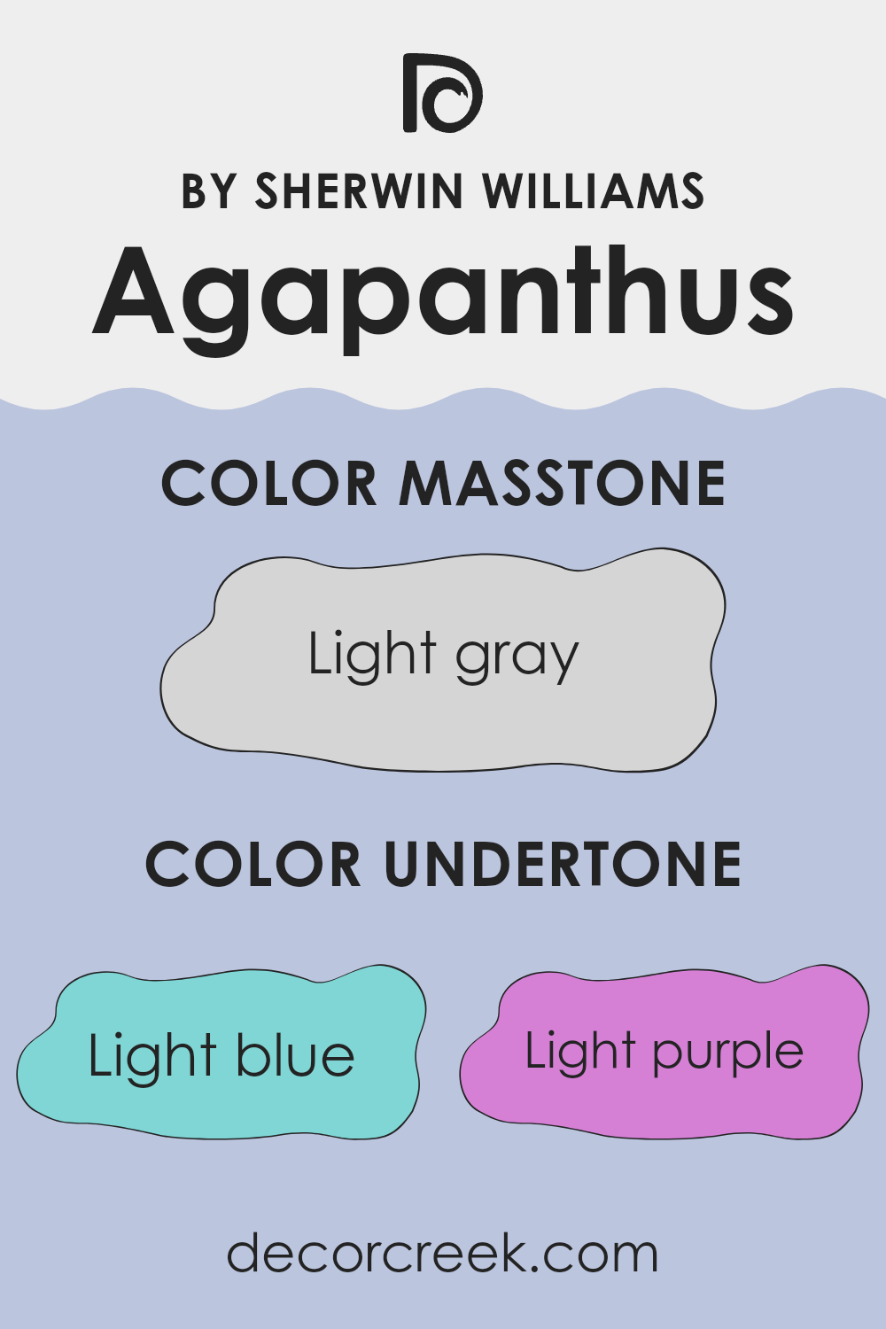
Agapanthus SW 9066 by Sherwin Williams is a complex color that beautifully incorporates a variety of undertones, which subtly influences its overall appearance. This color has undertones of light blue, light purple, lilac, pale yellow, mint, pale pink, and grey. Undertones are secondary colors that are mixed into the main hue, adding depth and complexity. They play a crucial role in how a color is perceived and can dramatically affect the mood and style of a room.
For instance, light blue and mint undertones give Agapanthus a cool and calm feel, making it ideal for a relaxing space like a bedroom or bathroom. In contrast, touches of pale yellow and pale pink add a hint of warmth, which can make a living room or dining area feel more welcoming and cozy.
On the other hand, lilac and light purple bring a subtle vibrancy that enhances creativity, perfect for an office or study area.
When applied to interior walls, the grey undertone in Agapanthus helps balance the brighter colors, ensuring that the paint doesn’t overwhelm the space. This means the color can adapt well to different lighting conditions, looking consistently beautiful whether in natural daylight or under artificial lighting.
This adaptability makes Agapanthus a versatile choice for any room, complementing various decor styles and personal tastes while subtly shaping the atmosphere of the space.
The unique combination of undertones ensures that the walls will have a dynamic yet harmonious look, bringing a fresh and lively character to any home.
What is the Masstone of the Agapanthus SW 9066 by Sherwin Williams?
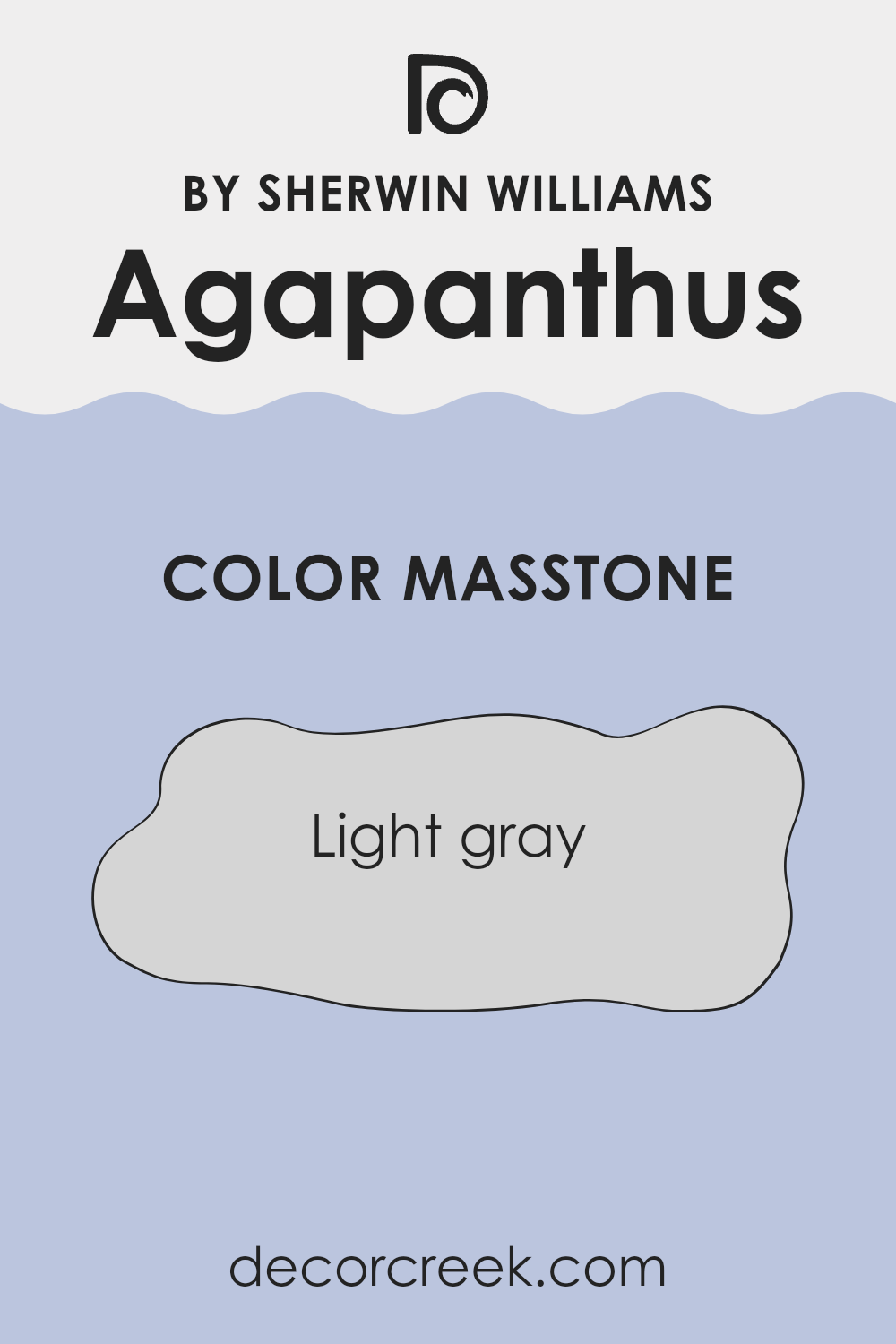
Agapanthus SW 9066 by Sherwin Williams is a light gray color, which has a masstone of #D5D5D5. This shade is quite neutral and versatile, making it an ideal choice for various styles and spaces within homes. Because it’s light gray, it has a clean and fresh look that can help rooms appear more spacious and brighter. This color is especially effective in small spaces or rooms with limited natural light.
Using light gray on walls can also provide a subtle background that allows other colors in the room, like furniture and decor, to stand out. It’s a practical color that complements most other colors, adding to its widespread appeal.
Whether in a modern, minimalist living room or a cozy, traditional bedroom, this light gray creates a flexible foundation for any decorating style, maintaining a neat and coherent look throughout the home. Its simplicity makes it easy to pair with bolder colors or to keep everything muted and understated.
How Does Lighting Affect Agapanthus SW 9066 by Sherwin Williams?
Lighting has a major impact on how we perceive colors, and the way a color appears can significantly change under different lighting conditions. Each type of light, whether it’s natural daylight or artificial light, has its own temperature and qualities, influencing how colors look in a room.
For instance, the color Agapanthus by Sherwin Williams, typically described as a light blue with a slight lavender undertone, can look quite different depending on the lighting. Under artificial light, such as incandescent bulbs that emit a warmer, yellowish glow, this color might appear softer and slightly muted. It can take on a more cozy and comforting feel, ideal for living spaces where you want a touch of calm.
In natural daylight, which is cooler compared to most artificial lighting, Agapanthus might look brighter and more vibrant. This is because daylight generally provides a more balanced spectrum of light, allowing the true colors to show up more vividly.
The orientation of rooms also affects how this color is perceived:
- North-facing rooms – These rooms often get less direct sunlight, which can make colors appear slightly darker and cooler. Here, Agapanthus might seem more subdued, emphasizing its lavender undertones.
- South-facing rooms – These rooms are filled with abundant light for most of the day, which can make colors look more intense and true to their swatch. In such rooms, Agapanthus will likely appear true to its original shade, keeping its lively and bright character.
- East-facing rooms – Receiving the morning sun, these rooms have light that makes colors look sharp and bright in the mornings, but cooler in the afternoon. Agapanthus will look very lively in the morning but might lose some of its vibrancy later in the day.
- West-facing rooms – These get the evening sun, which means the color might look dull in the morning but gain a warmer, more glowing appearance in the late afternoon and evening.
Understanding how different types of light affect colors can help in selecting the right paint color for a particular room, ensuring that you achieve the mood and effect you desire in each space.
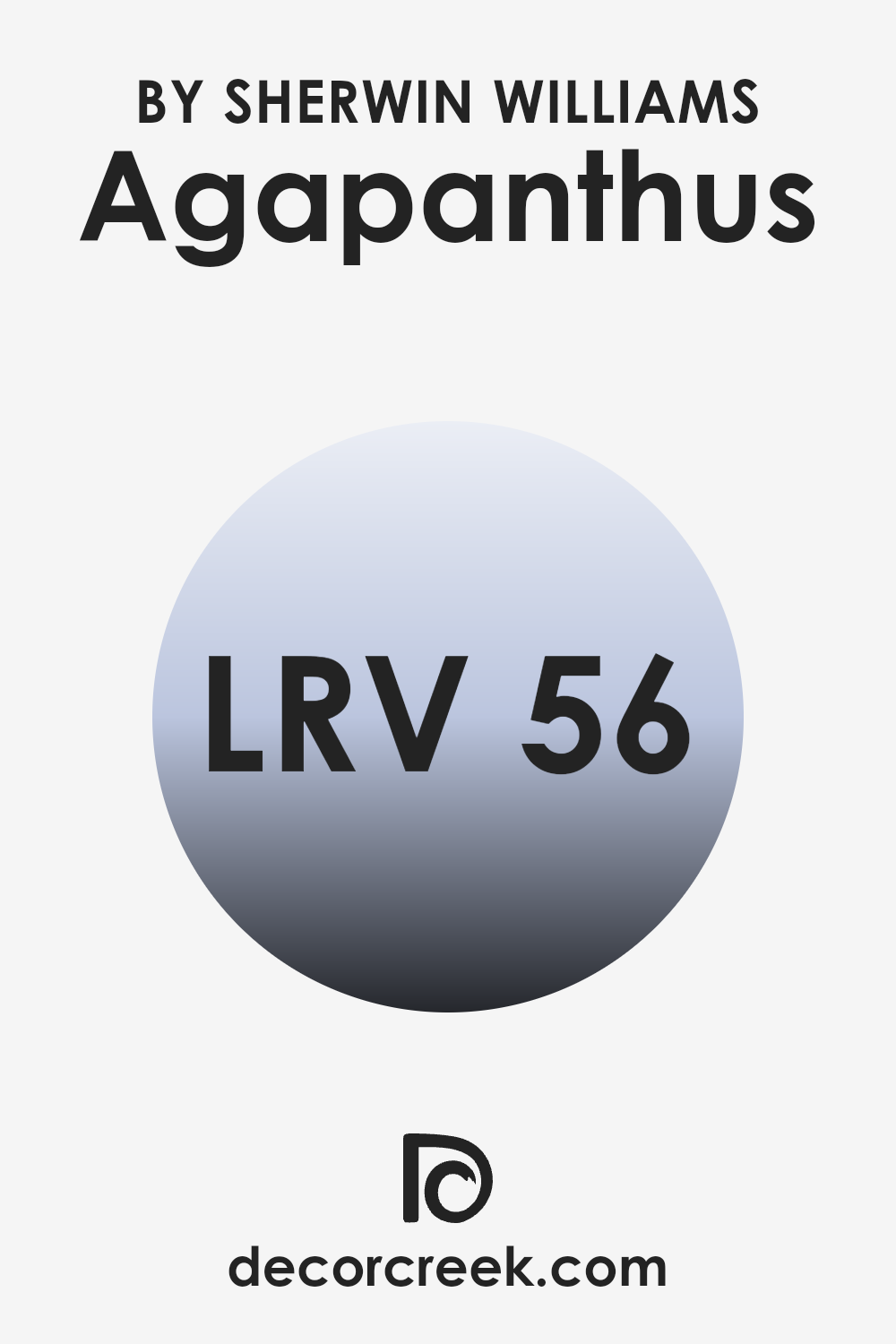
What is the LRV of Agapanthus SW 9066 by Sherwin Williams?
LRV stands for Light Reflectance Value, which measures the percentage of light a paint color reflects back into a room. It plays a crucial role in understanding how light or dark a color will appear once applied to walls. Generally, colors with higher LRVs reflect more light, making a room feel brighter and more open. Conversely, colors with lower LRVs absorb more light, which can make a space feel cozier but smaller.
The LRV of Agapanthus by Sherwin Williams is 55.621, which positions it in the mid-range category. This means it neither reflects light excessively nor absorbs it heavily. As a result, Agapanthus is versatile enough to be used in various lighting conditions without overwhelming the space.
In rooms with ample natural light, the color will look vibrant, while in dimly lit areas, it will appear more subdued. This moderate LRV makes it a practical choice for many homes, providing a balanced backdrop that complements different styles and furnishings.
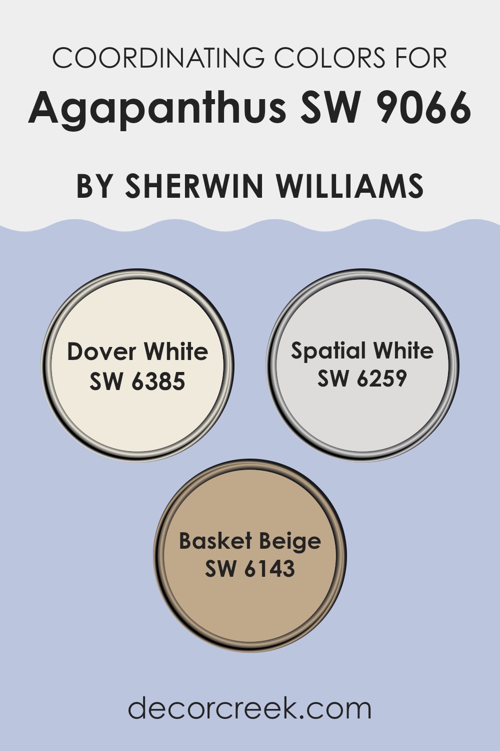
Coordinating Colors of Agapanthus SW 9066 by Sherwin Williams
Coordinating colors are complementary shades that pair well with a primary color, enhancing the overall look of a space without overpowering the main hue. In the case of Agapanthus by Sherwin Williams, coordinating colors include Dover White, Spatial White, and Basket Beige. These colors support Agapanthus by providing a balanced, harmonious palette that can be applied across various elements of a room to create a cohesive design.
Dover White is a warm, creamy white that has an inviting quality, making it ideal for trim and woodwork because it subtly contrasts with deeper or more saturated tones. Its softness allows it to blend smoothly with other shades, promoting a cohesive aesthetic.
Spatial White offers a cooler, slightly grayish tint, which makes it great for creating a light, airy feel in spaces. It’s perfect for walls in rooms where you want to foster a bright and open atmosphere. Lastly, Basket Beige is a gentle beige shade with a touch of earthiness that provides a soothing neutral backdrop. It pairs nicely with darker blues and is capable of warming up a space without detracting from the design’s focal colors. These coordinating colors together facilitate a visually appealing environment when used alongside Agapanthus.
You can see recommended paint colors below:
- SW 6385 Dover White
- SW 6259 Spatial White
- SW 6143 Basket Beige
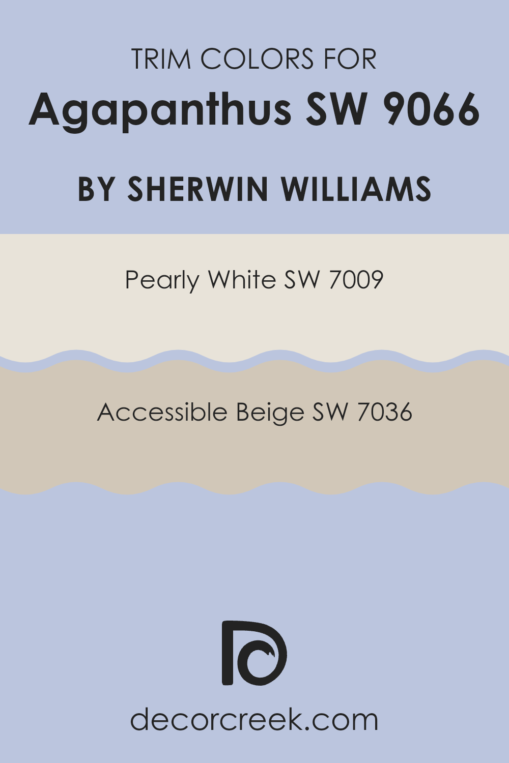
What are the Trim colors of Agapanthus SW 9066 by Sherwin Williams?
Trim colors are essentially the accent colors used on architectural elements such as door frames, moldings, and baseboards. Specifically, when used with Agapanthus SW 9066 from Sherwin Williams, the right trim color can either subtly complement or provide a pleasant contrast, highlighting the beautiful blue shade of Agapanthus.
Choosing a trim color like Pearly White SW 7009 or Accessible Beige SW 7036 can help define the edges and shape of the room, making the wall color stand out more prominently. This decision greatly impacts the final look and feel of any space, ensuring that all design elements are cohesive and visually pleasing.
Pearly White SW 7009 is a soft, off-white color that brings a light and airy feel to any room. When paired with Agapanthus SW 9066, it offers a subtle contrast that accentuates the depth of the blue without overwhelming it, contributing to a fresh and soothing ambiance. On the other hand, Accessible Beige SW 7036 is a warm tone that provides a stronger contrast against the cool blue, offering a grounding effect. The use of Accessible Beige as a trim can help in creating a more defined and inviting space, balancing out the cool tones of Agapanthus beautifully.
You can see recommended paint colors below:
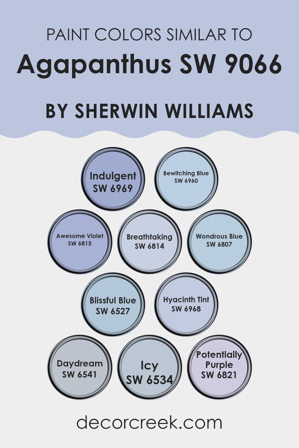
Colors Similar to Agapanthus SW 9066 by Sherwin Williams
Similar colors play a crucial role in creating a cohesive and harmonious look in design. Choosing shades like Indulgent, Bewitching Blue, Awesome Violet, and others related to Agapanthus can help ensure that different elements in a space work well together without clashing. These colors share a common intensity and undertone, which allows them to blend seamlessly. For instance, when used on walls, textiles, or furniture, they can help create a fluid and unified atmosphere that is visually pleasing.
Indulgent is a deep, luxurious blue that adds depth to any space. Bewitching Blue is a vibrant, eye-catching shade that gives a lively splash of color. Awesome Violet has a mystical quality, providing a subtle hint of purple. Breathtaking is lighter, offering a soft lace-like touch to interiors. Wondrous Blue is fresh and brings an airy, light feel to rooms.
Blissful Blue gives a calm and gentle blue tone that’s easy on the eyes. Hyacinth Tint offers a pale, soothing option for a gentle look. Daydream is slightly whimsical, perfect for sparking creativity. Icy presents a cool and crisp presence, perfect for a modern twist. Lastly, Potentially Purple provides a playful energy, without being too overpowering. These similar shades help in making design decisions that create a smooth visual flow and a pleasant aesthetic experience.
You can see recommended paint colors below:
- SW 6969 Indulgent
- SW 6960 Bewitching Blue
- SW 6815 Awesome Violet
- SW 6814 Breathtaking
- SW 6807 Wondrous Blue
- SW 6527 Blissful Blue
- SW 6968 Hyacinth Tint
- SW 6541 Daydream
- SW 6534 Icy
- SW 6821 Potentially Purple
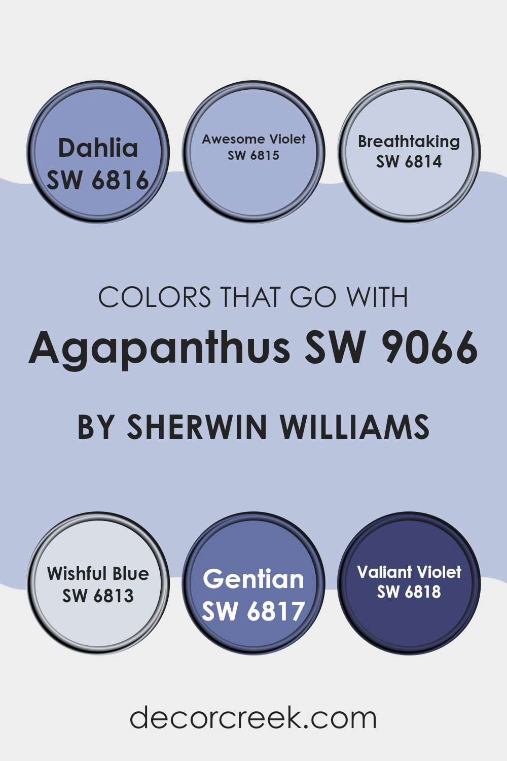
Colors that Go With Agapanthus SW 9066 by Sherwin Williams
Choosing the right colors to pair with Agapanthus SW 9066 by Sherwin-Williams is crucial for creating a harmonious and visually appealing space. When colors complement each other well, they enhance the overall mood and style of a room, and also help in achieving a cohesive look. Colors like Dahlia, Awesome Violet, Breathtaking, Wishful Blue, Gentian, and Valiant Violet are perfect matches with Agapanthus, each adding its unique touch while still maintaining a balanced palette.
Dahlia SW 6816 is a deep, rich purple that adds a dramatic flair to the surroundings, making it great for accent walls or decor that needs to stand out. Awesome Violet SW 6815, slightly lighter, provides a cheerful burst of color, which works well in living areas or bedrooms wanting a touch of brightness.
Breathtaking SW 6814 is a soft lilac, ideal for creating a gentle and inviting environment, perfect for spaces intended for relaxation or intimate gatherings. Wishful Blue SW 6813 offers a sky-blue hue that brings a fresh and airy feel, ideal for bathrooms or smaller spaces to give the illusion of expansiveness. Gentian SW 6817 falls into a vibrant blue category that energizes a space, suitable for an office or a study area where focus and energy are needed.
Lastly, Valiant Violet SW 6818 offers a bold violet that is both striking and cozy, excellent for creating focal points through furniture or drapery in a room. In using these colors together with Agapanthus, one can achieve a dynamic yet harmonious look that brings spaces to life with color interactions that are delightful to the eye.
You can see recommended paint colors below:
- SW 6816 Dahlia
- SW 6815 Awesome Violet
- SW 6814 Breathtaking
- SW 6813 Wishful Blue
- SW 6817 Gentian
- SW 6818 Valiant Violet
How to Use Agapanthus SW 9066 by Sherwin Williams In Your Home?
Agapanthus SW 9066 is a unique shade of blue paint offered by Sherwin Williams. It brings a fresh and modern feel to any room, ideal for those looking to add a touch of color that isn’t too overwhelming.
This shade can really make your space feel calm and refreshing. It’s perfect for a bedroom where you want to create a peaceful environment for relaxation or even in a bathroom for a clean and airy feel. Because of its versatility, Agapanthus can also be used in the kitchen or living areas.
Pair it with lighter colors like whites and creams for a bright and open vibe, or go for bold contrasts with dark woods or blacks for a striking look. For those wanting a change without going too drastic, using this paint on just one accent wall can be enough to give your home a fresh update. This paint is easy to work with and can provide a simple yet effective way to refresh your living space.
Agapanthus SW 9066 by Sherwin Williams vs Breathtaking SW 6814 by Sherwin Williams
The color Agapanthus is a soft shade of violet with a hint of gray. It’s gentle on the eyes and versatile, working well in bedrooms or calming areas like lounges because it creates a peaceful environment.
On the other hand, Breathtaking is a light, airy blue that feels fresh and clean. It’s a perfect choice for bathrooms or kitchens because it adds a sense of brightness and can make small spaces appear larger.
When comparing these two, Agapanthus offers a subtle, calm feeling best for placid settings, whereas Breathtaking provides a clear, lively look that really opens up a room. Both colors are beautiful, but your choice would depend on what mood or style you’re looking to achieve in your space.
You can see recommended paint color below:
Agapanthus SW 9066 by Sherwin Williams vs Potentially Purple SW 6821 by Sherwin Williams
Agapanthus SW 9066 by Sherwin Williams is a subtle and soft blue color that has a calming effect, perfect for creating a peaceful atmosphere in any room. It’s versatile and can be used in a variety of spaces from bedrooms to bathrooms, providing a light and airy feel.
On the other hand, Potentially Purple SW 6821 by Sherwin Williams is a bolder shade, striking a balance between a true purple and a gentle lilac. This color is ideal for those looking to add a touch of cheerfulness and creativity to their environment. It works well in spaces aimed at sparking imagination, like a child’s room or an artistic space.
When comparing these two, Agapanthus leans towards a more subtle, neutral backdrop, while Potentially Purple adds a distinctive pop of color that demands more attention. Both colors offer unique vibes and can be used to set very different moods in a room depending on what you’re aiming for.
You can see recommended paint color below:
- SW 6821 Potentially Purple
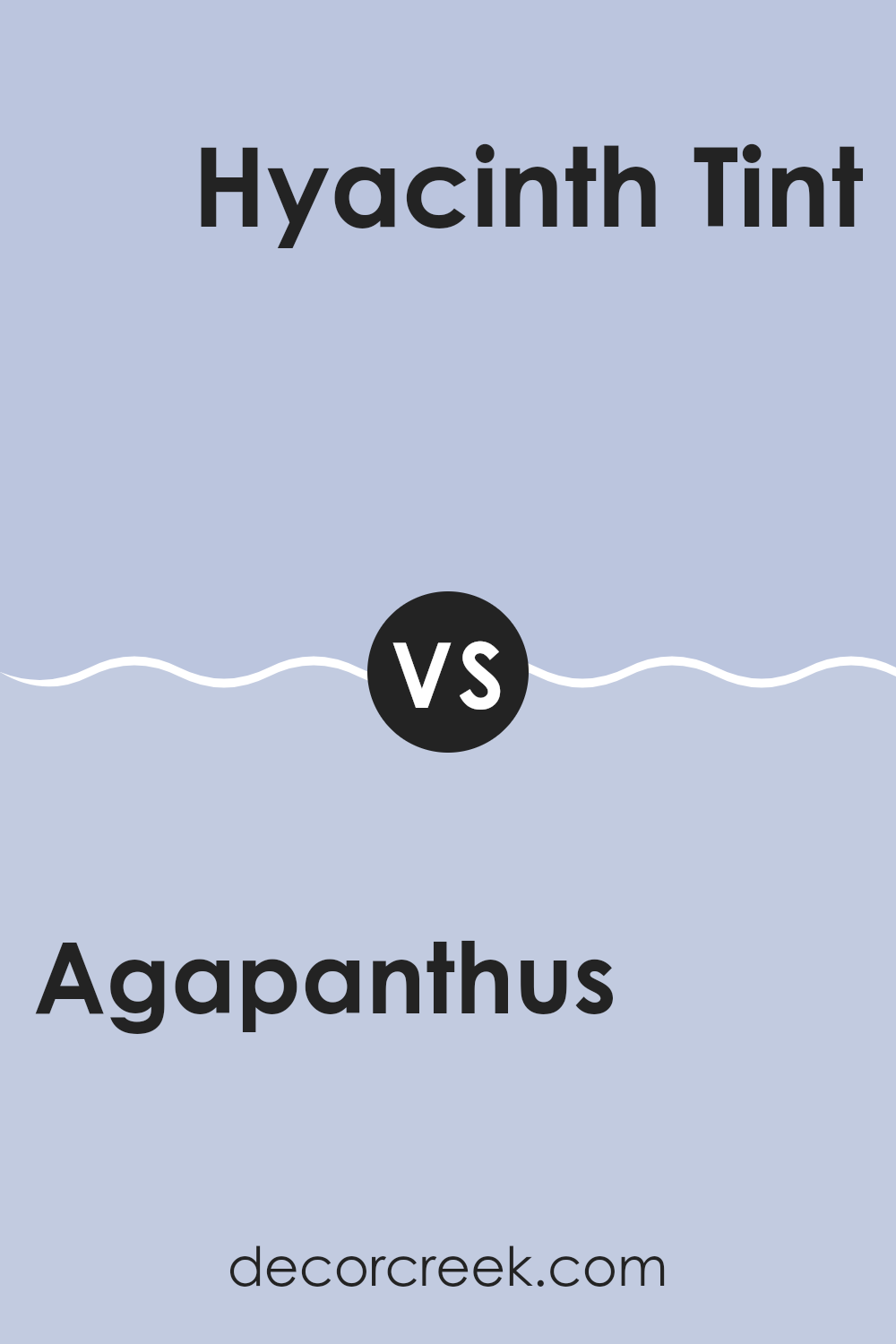
Agapanthus SW 9066 by Sherwin Williams vs Hyacinth Tint SW 6968 by Sherwin Williams
Agapanthus SW 9066 and Hyacinth Tint SW 6968 are both cool tones from Sherwin Williams. Agapanthus is a deep, blue-purple shade that brings a strong sense of calm and stability to a space. It’s a color that adds depth and can work well in a room that needs a touch of elegance without being too bold.
On the other hand, Hyacinth Tint is a lighter, airier shade, leaning more towards a soft lavender. It’s much brighter and brings a fresh, cheerful vibe to a room. It can make small spaces appear bigger and is great for bedrooms or bathrooms where you want a relaxing atmosphere.
Both colors can complement each other, with Agapanthus providing a darker contrast to the light and breezy Hyacinth Tint. Whether used together or separately, both shades offer unique possibilities for creating welcoming spaces in a home.
You can see recommended paint color below:
- SW 6968 Hyacinth Tint
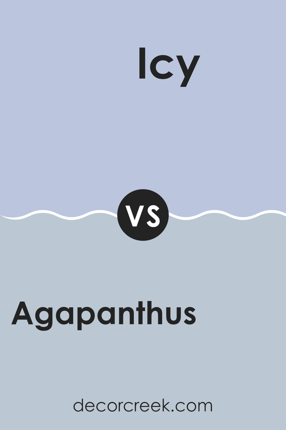
Agapanthus SW 9066 by Sherwin Williams vs Icy SW 6534 by Sherwin Williams
Agapanthus and Icy are two distinct paint colors by Sherwin Williams. Agapanthus is a deep, rich blue that gives off a sense of calmness and steadiness, making it ideal for spaces where a strong but calming presence is desired, such as bedrooms or offices. It has a darker tone that adds depth and character to walls, pairing well with crisp whites or soft grays for a balanced look.
On the other hand, Icy is a much lighter blue with a soothing, airy quality that can make small rooms feel larger and more open. This color works well in bathrooms or kitchens where a fresh, clean look is appealing. It’s bright enough to revive a space while still maintaining a gentle, refreshing vibe.
Pairing Icy with darker blues like Agapanthus could create a pleasing contrast that highlights the unique qualities of each color.
Both Agapanthus and Icy offer distinct atmospheres and can be used creatively in various home decorating projects to achieve different effects.
You can see recommended paint color below:
Agapanthus SW 9066 by Sherwin Williams vs Wondrous Blue SW 6807 by Sherwin Williams
The main color, Agapanthus, is a gentle blue with a touch of grey, creating a calm and soothing effect. It’s a versatile shade that works well in many spaces, adding a subtle depth without being too bold. This color can make small rooms appear bigger and is great for achieving a relaxed atmosphere.
On the other hand, Wondrous Blue is a brighter and more vibrant shade. It leans more towards a playful and cheerful tone, making it a fantastic choice for areas where you want to add a pop of color and energy. This hue can liven up a space and is particularly suitable for places like bathrooms or kids’ rooms, where a fun and dynamic ambience is desired.
In comparison, while both colors are blues, Agapanthus offers a muted, more neutral look, whereas Wondrous Blue brings a more lively and stimulating vibe. Choosing between them depends on whether you prefer a backdrop that supports tranquility or one that injects excitement.
You can see recommended paint color below:
- SW 6807 Wondrous Blue

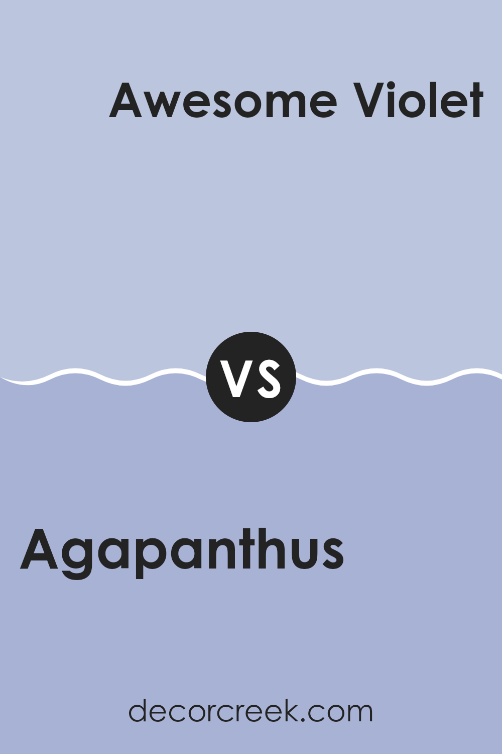
Agapanthus SW 9066 by Sherwin Williams vs Awesome Violet SW 6815 by Sherwin Williams
Agapanthus SW 9066 and Awesome Violet SW 6815 are both unique colors, but they present different vibes. Agapanthus is a deep, dusky blue that resembles a late evening sky, offering a calm and soothing effect that’s perfect for a space where relaxation is key, like a bedroom or a cozy reading nook. It has a subtle richness to it that makes it versatile for pairing with both light and dark furnishings.
On the other hand, Awesome Violet SW 6815 is a bolder, brighter shade. It’s a vibrant purple that stands out and brings a lively energy to any space. This color is great for areas where you want to add a pop of brightness, like a playroom or an accent wall in a creative space.
Both colors can significantly alter the mood of a room, with Agapanthus bringing in a cooler, more subdued atmosphere, and Awesome Violet adding a splash of cheer and excitement.
You can see recommended paint color below:
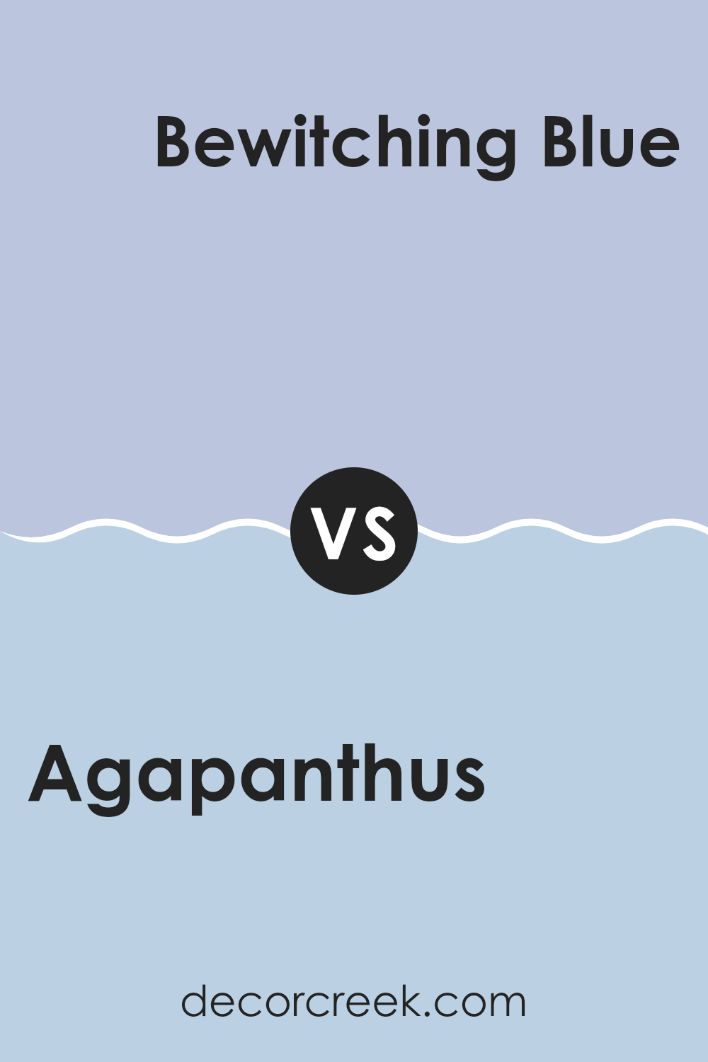
Agapanthus SW 9066 by Sherwin Williams vs Bewitching Blue SW 6960 by Sherwin Williams
Agapanthus SW 9066 and Bewitching Blue SW 6960 are both blue shades offered by Sherwin Williams, but they present different vibes due to their unique tones. Agapanthus leans more towards a soft, muted gray-blue, giving it a subtle and calm feel, perfect for creating a gentle and relaxing atmosphere in any room. It’s ideal for spaces where you want a hint of color without overwhelming the senses.
On the other hand, Bewitching Blue is a much deeper and vibrant blue. This color is bold and stands out more, bringing a strong and lively feel to spaces. It can be a great choice for areas where you want to make a statement or add some drama, like in a dining room or an accent wall.
Overall, while both colors share a basic blue foundation, Agapanthus offers a lighter, airier feel, and Bewitching Blue is more intense and vivid. Your choice between them would depend on the effect you want to achieve in your decorating space.
You can see recommended paint color below:
- SW 6960 Bewitching Blue
Agapanthus SW 9066 by Sherwin Williams vs Daydream SW 6541 by Sherwin Williams
Agapanthus SW 9066 by Sherwin Williams is a deep, vibrant blue that adds a strong, lively touch to any space. It is bold and can make a statement when used in a room, providing a striking backdrop that stands out. This color can work well in areas like living rooms or dining areas where you want to create a sense of energy and vibrancy.
On the other hand, Daydream SW 6541 by Sherwin Williams is a much lighter and softer blue. It has a gentle, airy feel to it, making it perfect for bedrooms or bathrooms where a calm and soothing atmosphere is desired. It is subtle enough to be used as a neutral backdrop but still adds a touch of color to keep the space interesting.
Each color serves a different purpose depending on the mood you want to set in a room. Agapanthus, with its richer tone, suits a bold, dramatic look, while Daydream is ideal for creating a light, peaceful environment.
You can see recommended paint color below:
Agapanthus SW 9066 by Sherwin Williams vs Indulgent SW 6969 by Sherwin Williams
The main color, Agapanthus, is a soft and gentle shade of blue with a subtle hint of gray that gives it a calming effect. This color is versatile as it can easily fit into any room, providing a light and airy feel that soothes the atmosphere. It’s a perfect choice for bedrooms or bathrooms where a peaceful vibe is desired.
On the other hand, Indulgent is a deep and rich mauve that adds a sense of cozy and warm elegance to spaces. It’s stronger and more pronounced than Agapanthus, making it well-suited for areas or accent walls where you want to make a statement or add depth. While Agapanthus feels more breezy and light-hearted, Indulgent offers a bolder and more intimate ambiance.
Together, these colors can work beautifully in a complementary scheme, where the lightness of Agapanthus balances the depth of Indulgent, creating a harmonious and appealing visual contrast.
You can see recommended paint color below:
- SW 6969 Indulgent

Agapanthus SW 9066 by Sherwin Williams vs Blissful Blue SW 6527 by Sherwin Williams
Agapanthus SW 9066 and Blissful Blue SW 6527, both by Sherwin Williams, have their own unique appeals as shades of blue. Agapanthus is a deeper, more muted blue that recalls the depth of a twilight sky. It’s ideal for creating a cozy, calming atmosphere in a room, perfectly suited for spaces meant for relaxation or focus, like a bedroom or a study.
In contrast, Blissful Blue is a lighter, airier shade that brings to mind a clear, sunny sky. It has a fresher, more energetic feel, making it a great choice for livelier areas such as a kitchen, bathroom, or a child’s room. The cheerful vibe of this color can make a small space seem more open and inviting.
Overall, both colors offer beautiful shades of blue, but their different tones can set a distinct mood in a space, from calm and grounded to cheerful and uplifting.
You can see recommended paint color below:
- SW 6527 Blissful Blue
Conclusion
This blue isn’t just like any other blue; it has a touch of mystery to it, which can help create a feeling of calmness in a room. Whether you use it on one wall as a special spot or paint the whole room, it brings a fresh look that’s very pleasing to the eye.
Since it works well with many other colors, it’s easy to use in different rooms with different styles, from a kid’s playroom to a family living room. Plus, it’s a great choice for furniture or smaller things like shelves to add a fun splash of color.
So, if you’re thinking of changing up a room and want something new, SW 9066 Agapanthus by Sherwin Williams is a great option. It could really make your room look cool and inviting, like a beautiful evening sky that you never get tired of looking at.
Ever wished paint sampling was as easy as sticking a sticker? Guess what? Now it is! Discover Samplize's unique Peel & Stick samples.
Get paint samples

