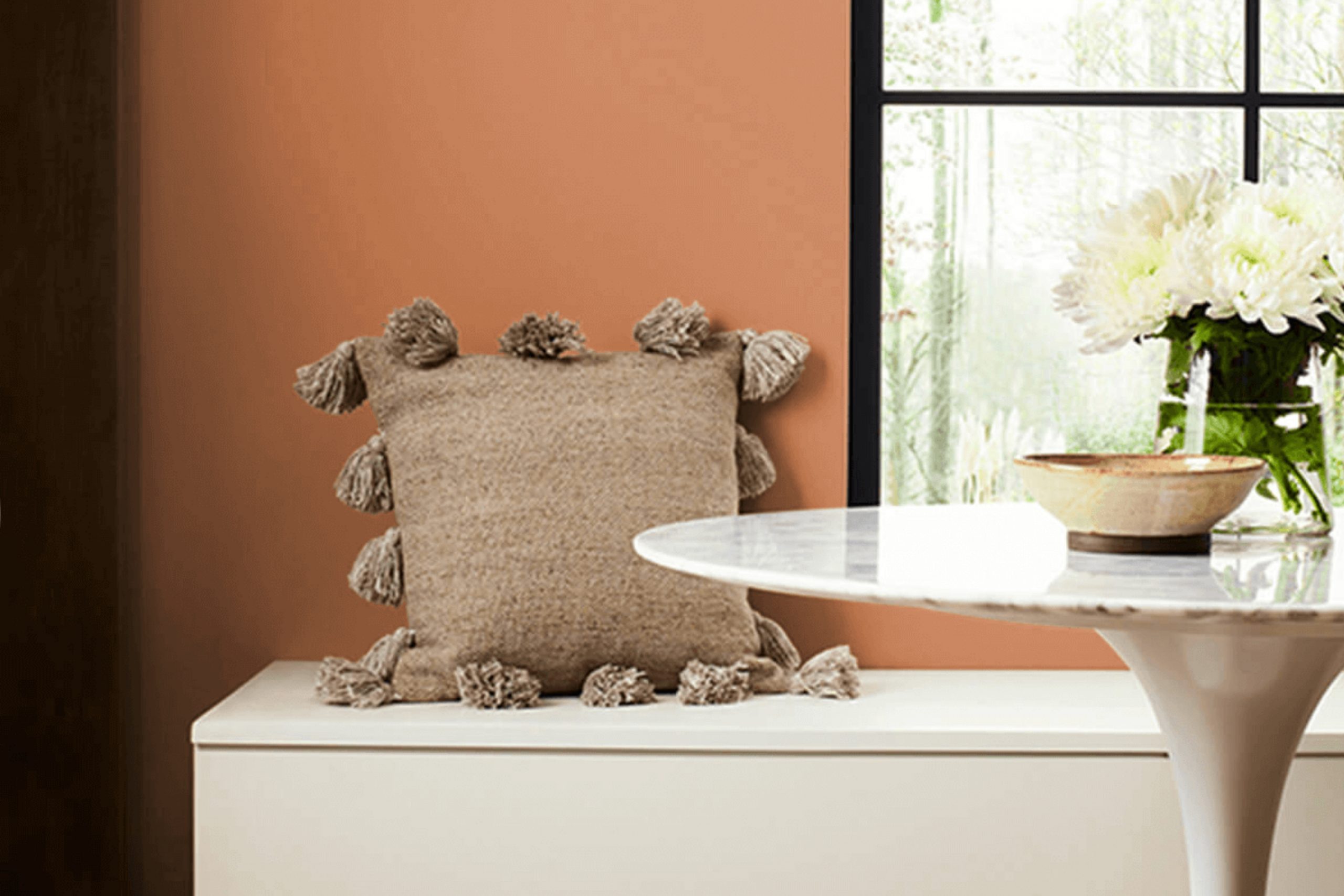
When I think of color that feels both warm and refined, SW 6354 Armagnac by Sherwin Williams often comes to mind. This hue brings a sense of cozy elegance reminiscent of a glass of rich, amber-toned Armagnac. It combines deep, earthy tones that can make any room feel inviting yet polished.
Using Armagnac in a room can effortlessly create a feeling of warmth and comfort. It’s perfect for living rooms where you want to foster a welcoming environment for guests, or in a study where you seek inspiration yet desire calm. The color works well not just as a main wall color but also as an accent, providing depth without overpowering the room.
Pairing Armagnac with complementary shades can enhance its appeal. Soft neutrals or light grays accentuate its richness, while darker colors can add contrast for a more dramatic effect. Using this color in areas with natural light can highlight its warm undertones, evolving throughout the day and adding a dynamic touch.
Overall, SW 6354 Armagnac offers a flexible choice when you want to add a touch of warmth and class to your home. Its ability to blend seamlessly with various palettes makes it a dependable option for any design project.
What Color Is Armagnac SW 6354 by Sherwin Williams?
Armagnac by Sherwin Williams is a warm, earthy terracotta hue that brings to mind rich leather and sun-baked clay. This color exudes a cozy and inviting feel, making it perfect for creating a welcoming atmosphere in any room. Armagnac works beautifully in rustic and traditional interior styles, where its warmth can enhance the natural charm of wooden furniture and exposed beams. It also fits well in bohemian areas, bringing an element of global-inspired warmth that complements eclectic decor.
Pair Armagnac with materials like weathered wood, leather, and woven textiles to create a harmonious and layered look. This color goes beautifully with natural textures, such as rattan, jute, and wool, which add depth and interest to a room. For balance, consider using lighter, neutral shades like cream or beige for accents, which will allow Armagnac to stand out without overpowering the room.
In contemporary settings, Armagnac can be used sparingly as an accent wall or in decorative pieces to add warmth to minimalist areas. It harmonizes well with deeper blues or olive greens, offering a striking yet balanced contrast. Whether in living rooms, dining areas, or cozy reading nooks, Armagnac brings a touch of warmth and comfort into any interior.
Is Armagnac SW 6354 by Sherwin Williams Warm or Cool color?
Armagnac SW 6354 by Sherwin Williams is a warm, earthy color that brings a cozy feeling to any room. It’s a medium shade of brown with hints of red, which creates a welcoming and comfortable environment in homes. This color can work well in living rooms or dining areas, where it helps to bring a sense of warmth and cohesion.
Armagnac pairs nicely with neutral tones like beige, cream, or soft gray, creating a balanced and harmonious look. It can also be combined with rich greens or blues for a more vibrant contrast. When used in a room, Armagnac provides a grounded and stable atmosphere, making areas feel more intimate and inviting.
Lighting can enhance its richness, so rooms with natural light will show off its full depth. Whether it’s used on walls, as an accent color, or within furnishings, Armagnac SW 6354 creates comforting areas that feel lasting and welcoming.
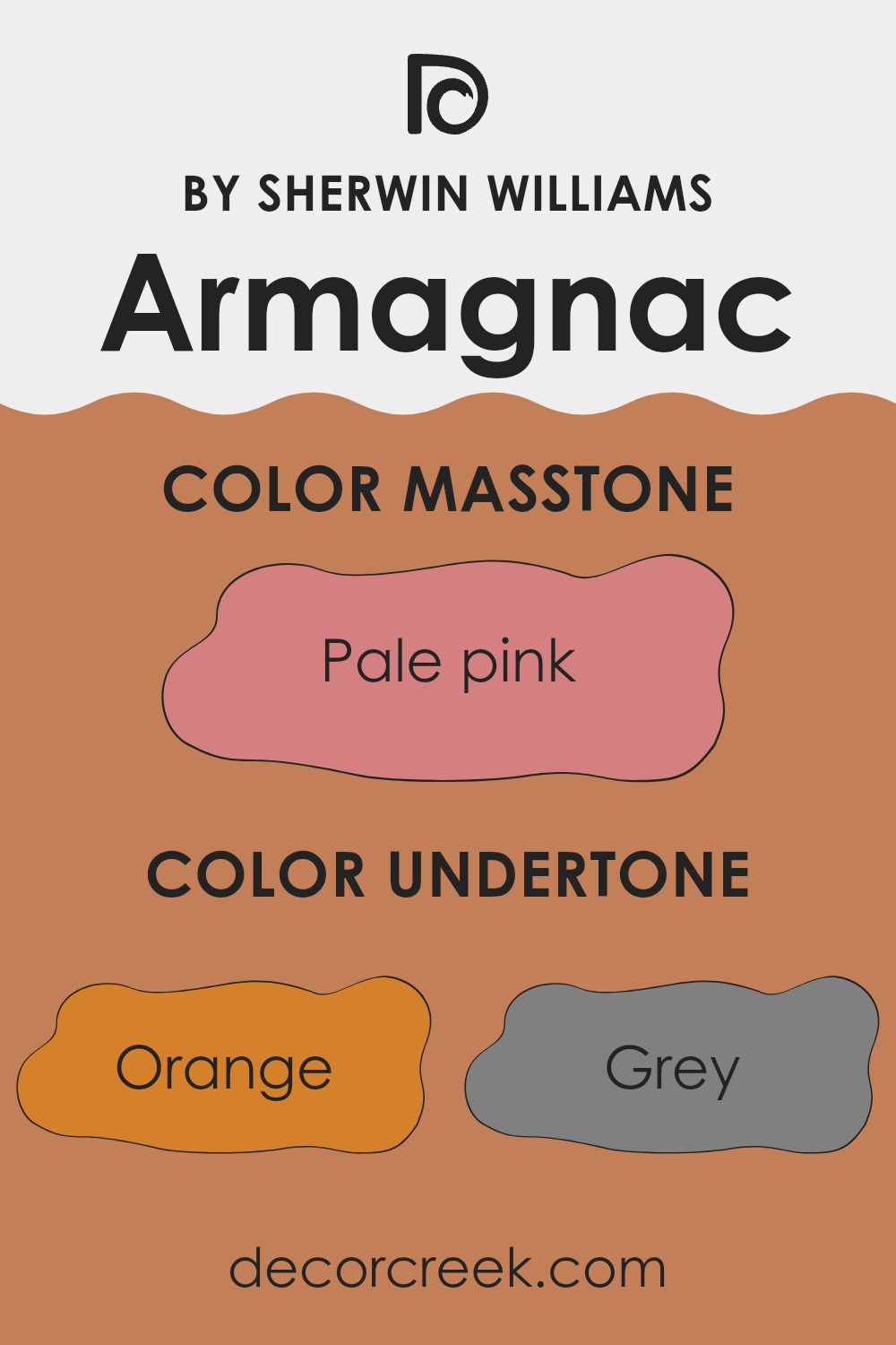
Undertones of Armagnac SW 6354 by Sherwin Williams
Armagnac by Sherwin Williams is a warm, earthy color that has a mix of undertones influencing how it appears in different settings. The primary undertones include orange, brown, and hints of red, which give the color a warm and rich appearance. These undertones can make a room feel cozy and inviting, especially in areas where you want to create a sense of warmth and comfort.
The presence of gray undertones adds a subtle balancing effect, toning down the brighter warmth of orange and red. This makes the color flexible, as it can work well in rooms with natural light or artificial lighting. It helps the color appear more grounded and neutral, allowing it to fit into various design schemes without overpowering the room.
Undertones like olive and yellow give the color a slight earthy feel, which can complement natural materials like wood or stone. Light undertones such as pale yellow and mint can also give the color a softer appearance, making it suitable for bedrooms or living areas where you want a relaxing atmosphere.
Overall, the combination of these undertones makes the color adaptable to different environments, adding depth and interest to interior walls while ensuring a warm and welcoming ambiance.
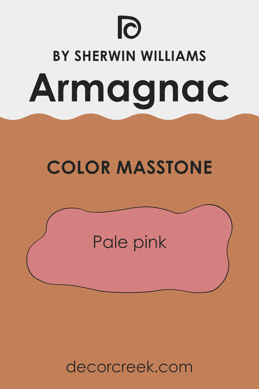
What is the Masstone of the Armagnac SW 6354 by Sherwin Williams?
Armagnac SW 6354 by Sherwin-Williams is a warm, pale pink color (#D58080) that can add a soft and inviting touch to any home. This gentle pink hue works well in a variety of settings, offering a cozy and welcoming ambiance to rooms.
It is a flexible color that can be used in both traditional and modern interiors, providing a touch of warmth and refinement without being too intense. In living rooms or bedrooms, this pale pink can create a calming and comforting environment, ideal for relaxation.
It can be paired with neutral tones like whites and beiges for a balanced look or combined with darker colors for a striking contrast. In kitchens or dining areas, this shade can add a hint of playfulness while still maintaining a chic appearance. Its subtle nature ensures that it complements a wide range of colors and materials, making it an excellent choice for home decor.
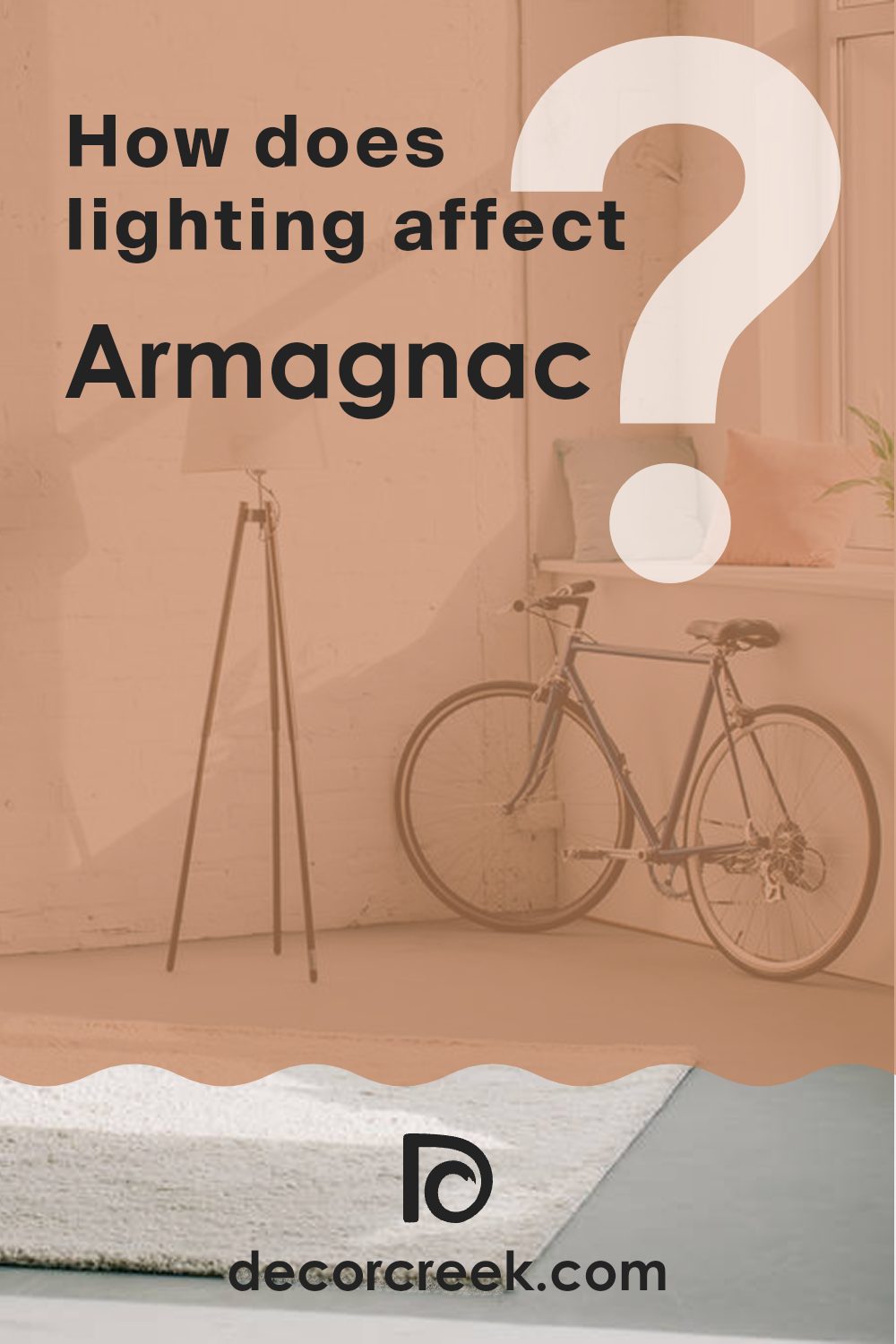
How Does Lighting Affect Armagnac SW 6354 by Sherwin Williams?
Lighting plays a crucial role in how we perceive colors. The color Armagnac (SW 6354) by Sherwin Williams can look quite different under various lighting conditions. Generally, natural light shows colors more accurately, while artificial lighting can alter them.
In natural light, the direction and amount of sunlight can drastically change how Armagnac appears. In north-facing rooms, which get fewer direct sun rays, Armagnac may appear cooler and slightly muted. This means the color could take on more of a soft, dusty tone since northern light is consistent but lacks warmth.
In south-facing rooms, which receive the most direct sunlight throughout the day, Armagnac will appear warm and vibrant. The ample sunlight enhances its red and orange undertones, making it look rich and inviting. A south-facing room’s brightness will make Armagnac feel lively and full.
East-facing rooms get warm, bright sunlight in the morning, which might make Armagnac seem more vibrant and glowing early in the day. However, as the day progresses and direct sunlight lessens, the color might appear more subdued and cooler.
West-facing rooms receive warm, golden light in the afternoon and evening. Armagnac will appear deeper and warmer as sunset approaches, giving the room a cozy, comforting feel during later hours.
Under artificial lighting, such as LEDs or incandescent lights, the color of Armagnac can change as well. Incandescent bulbs, which emit a warm light, will highlight the warm tones in Armagnac, making it feel rich and welcoming. LED lights can vary depending on their color temperature. Cool white LEDs might make it look less vibrant, whereas warm white LEDs will enhance its red tones.
Overall, Armagnac has flexible characteristics that can shift based on the lighting and direction of the room, offering different moods and intensities depending on these factors.
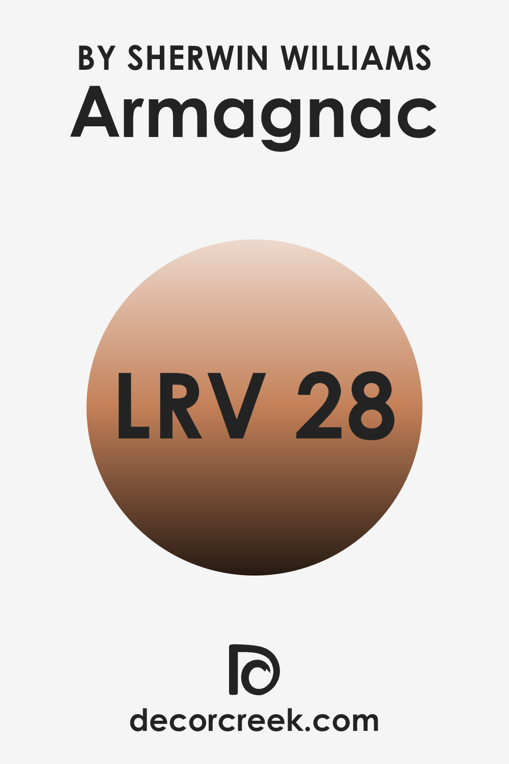
What is the LRV of Armagnac SW 6354 by Sherwin Williams?
Light Reflectance Value (LRV) is a measure used to describe the percentage of light a color reflects. It is a scale that ranges from 0, which means the color absorbs all light and reflects none (black), to 100, which means the color reflects all light (white). LRV is important in selecting paint colors because it affects how bright or dark a room will feel.
A higher LRV means a color will reflect more light and make a room feel brighter, while a lower LRV means the color absorbs more light, making a room feel darker and cozier. For the color Armagnac, which has an LRV of 27.814, it will absorb more light than it reflects.
This means it will appear darker on the walls and can create a warm and intimate atmosphere. Because its LRV is on the lower end of the scale, Armagnac is likely to make a room feel smaller and more enclosed. This color could be a good choice for rooms where you want to create a comforting or cozy environment, but it might not be the best choice for small areas unless you are specifically looking to achieve a certain mood.
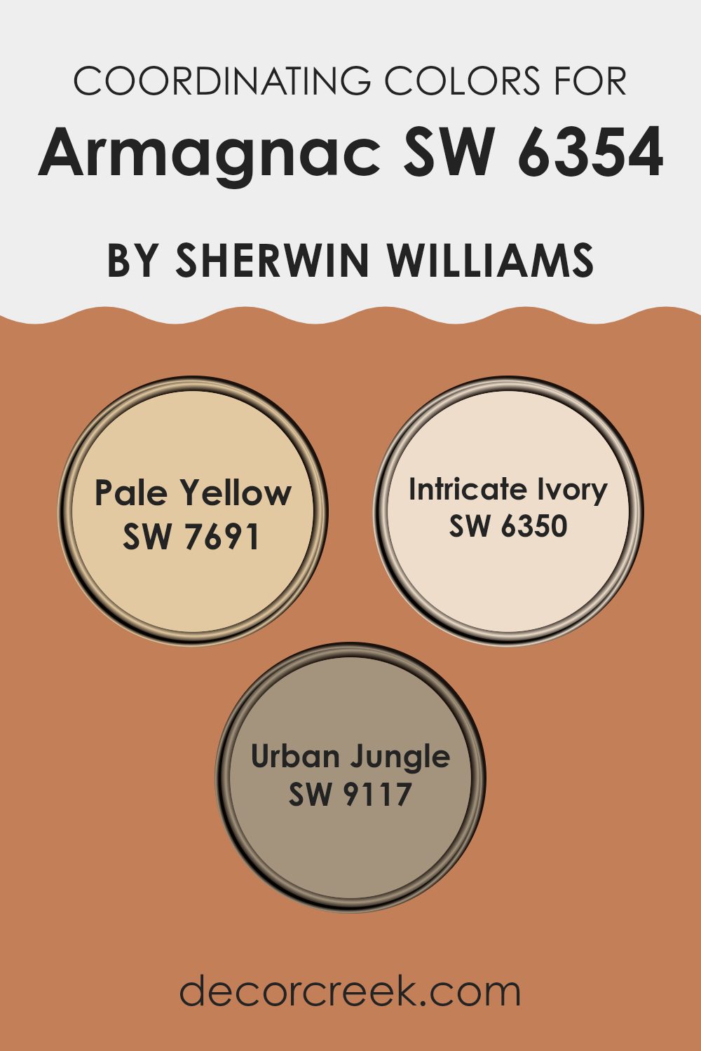
Coordinating Colors of Armagnac SW 6354 by Sherwin Williams
Coordinating colors are hues that complement each other and create a harmonious look when used together. They can enhance the aesthetic of a room by working alongside the main color to add depth and variety. One example of coordinating colors is the combination of Pale Yellow, Intricate Ivory, and Urban Jungle, which beautifully complement the rich, earthy tones of Armagnac by Sherwin Williams.
When these colors are used together, they create a balanced and inviting area, each playing a unique role in the overall design. Pale Yellow is a light, cheerful hue that adds a touch of warmth and brightness. It naturally pairs well with Armagnac’s orange undertones, offering a sunny contrast without overpowering the room.
Intricate Ivory serves as a soft, neutral backdrop that balances the richer shades, providing a gentle, creamy touch that soothes the eyes. On the other hand, Urban Jungle brings in a hint of sophistication with its deep, mossy green tone, adding depth and a natural touch to the palette. Together, these colors create a cohesive and inviting atmosphere, each enhancing the other while maintaining their unique qualities.
You can see recommended paint colors below:
- SW 7691 Pale Yellow
- SW 6350 Intricate Ivory
- SW 9117 Urban Jungle
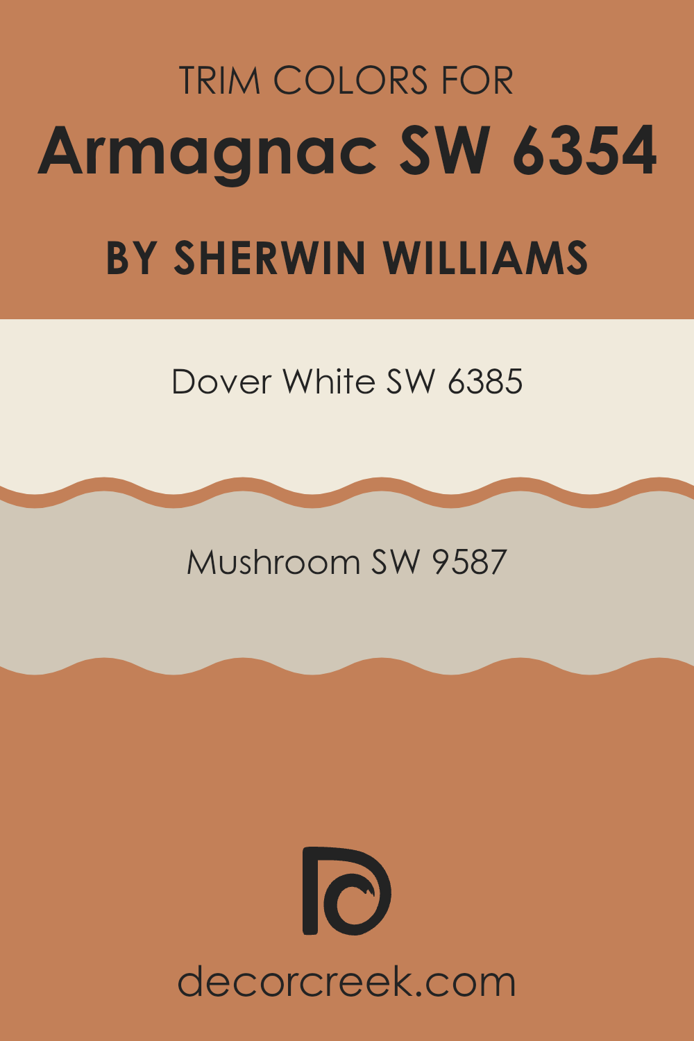
What are the Trim colors of Armagnac SW 6354 by Sherwin Williams?
Trim colors are the shades used to highlight and define the edges of walls, ceilings, doors, and windows in a room. They are important because they not only frame these structural features but also create visual interest and contrast with the primary wall color, enhancing the overall design. When Armagnac by Sherwin Williams is used as the primary wall color, choosing the right trim colors can make the room feel balanced and harmonious.
The choice of trim can either blend seamlessly or provide a striking contrast, altering the mood of the room. Using trim effectively can tie the design together, ensuring the area feels cohesive and inviting. For instance, Dover White, a soft and warm off-white, serves as a gentle contrast to Armagnac, offering a classic and clean edge to windows and ceilings.
Its creamy undertone enhances the warmth of Armagnac, making the area feel cozy. On the other hand, Mushroom, a taupe-like neutral with beige and gray undertones, offers a subtle yet defined contrast. It pairs well with Armagnac, offering a refined touch that can modernize and ground the room. Together, these trim colors can frame a room beautifully, working with Armagnac to enhance the overall aesthetic.
You can see recommended paint colors below:
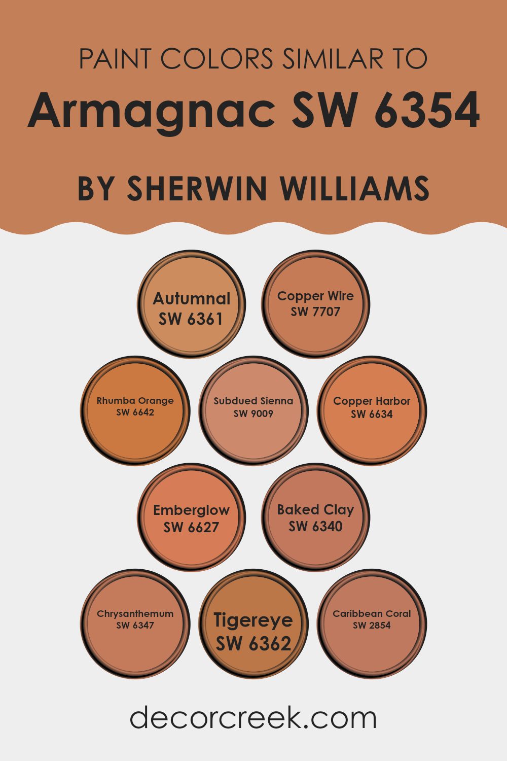
Colors Similar to Armagnac SW 6354 by Sherwin Williams
Similar colors are essential in design and decoration because they help create harmony and cohesion within a room. When colors are close to each other on the color wheel, like the shades related to Armagnac by Sherwin Williams, they blend effortlessly and provide a balanced look. These colors can enhance a room’s atmosphere by offering warmth and comfort.
Autumnal is a rich, earthy hue that brings to mind the vibrant tones of fall leaves. Copper Wire has an inviting, rustic appeal that adds depth to any room. Rhumba Orange exudes a lively energy, reminiscent of a bright sunset. Subdued Sienna, with its muted, elegant tone, gives a sense of warmth and familiarity.
Copper Harbor is a deep, robust shade that evokes the feeling of a cozy autumn evening. Emberglow, with its soft, fiery tones, adds a touch of brightness and cheer. Baked Clay feels grounded and natural, perfect for creating an earthy vibe. Chrysanthemum has a blooming, fresh orange tone that can make areas feel lively and inviting. Tigereye is a bold, golden hue that adds vibrancy and energy without overpowering a room.
Lastly, Caribbean Coral offers a gentle, pinkish hue that feels both warm and refreshing. Together, these colors can create a cohesive and inviting environment.
You can see recommended paint colors below:
- SW 6361 Autumnal
- SW 7707 Copper Wire
- SW 6642 Rhumba Orange
- SW 9009 Subdued Sienna
- SW 6634 Copper Harbor
- SW 6627 Emberglow
- SW 6340 Baked Clay
- SW 6347 Chrysanthemum
- SW 6362 Tigereye
- SW 2854 Caribbean Coral
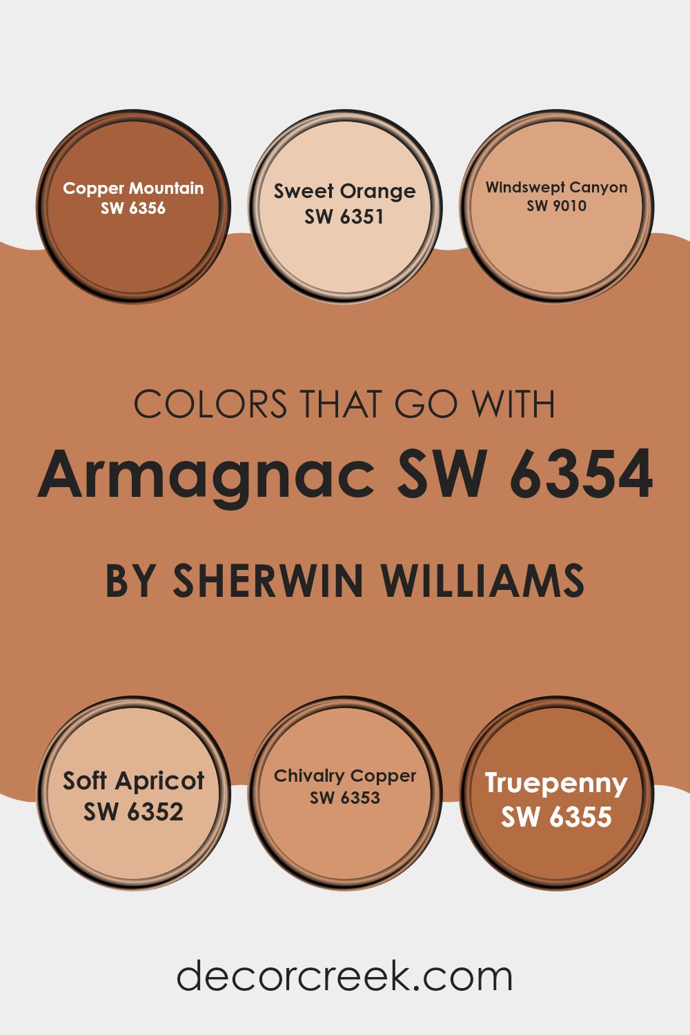
Colors that Go With Armagnac SW 6354 by Sherwin Williams
When choosing colors to pair with Armagnac SW 6354 by Sherwin Williams, it’s important to consider hues that harmonize well and create the right atmosphere for your room. Armagnac is a warm, rich shade that benefits from complementary colors to enhance its depth and beauty. For instance, SW 6356 – Copper Mountain adds a slightly metallic touch that brings out the earthen charm of Armagnac.
SW 6351 – Sweet Orange, with its vivid and lively undertone, injects energy and works beautifully in areas that need a playful boost. Likewise, SW 9010 – Windswept Canyon, a muted, sandy color, provides balance by offering a subtle contrast that grounds the overall palette. Further adding to this palette, SW 6352 – Soft Apricot introduces a gentle, peachy softness that lightens the mood and adds a welcoming warmth.
Meanwhile, SW 6353 – Chivalry Copper offers a deeper coppery hue that highlights Armagnac’s luxurious feel, giving a sense of richness. Lastly, SW 6355 – Truepenny, with its rustic, reddish-brown tone, captures a natural, earthy quality that underscores the other colors.
Together, these shades work to develop a lively yet cozy environment, each bringing out different facets of Armagnac’s character in varied yet complementary ways.
You can see recommended paint colors below:
- SW 6356 Copper Mountain
- SW 6351 Sweet Orange
- SW 9010 Windswept Canyon
- SW 6352 Soft Apricot
- SW 6353 Chivalry Copper
- SW 6355 Truepenny
How to Use Armagnac SW 6354 by Sherwin Williams In Your Home?
Armagnac SW 6354 by Sherwin Williams is a rich, warm color that can bring a cozy feel to any home. This deep, earthy hue works well in living rooms or dining areas, creating a welcoming and snug atmosphere. When paired with neutral colors like beige or cream, Armagnac can make a room feel balanced and inviting. If you want a bolder look, combine it with deep greens or navy blues for a dramatic touch.
In the bedroom, Armagnac can create a warm and intimate mood, perfect for relaxation. Consider using this color on an accent wall or through home accessories like cushions and throws. In the kitchen, it can add warmth to cabinets or a backsplash and pairs nicely with wooden elements and stainless steel.
Overall, Armagnac SW 6354 brings warmth to any area, making areas feel more inviting and intimate without being too intense.
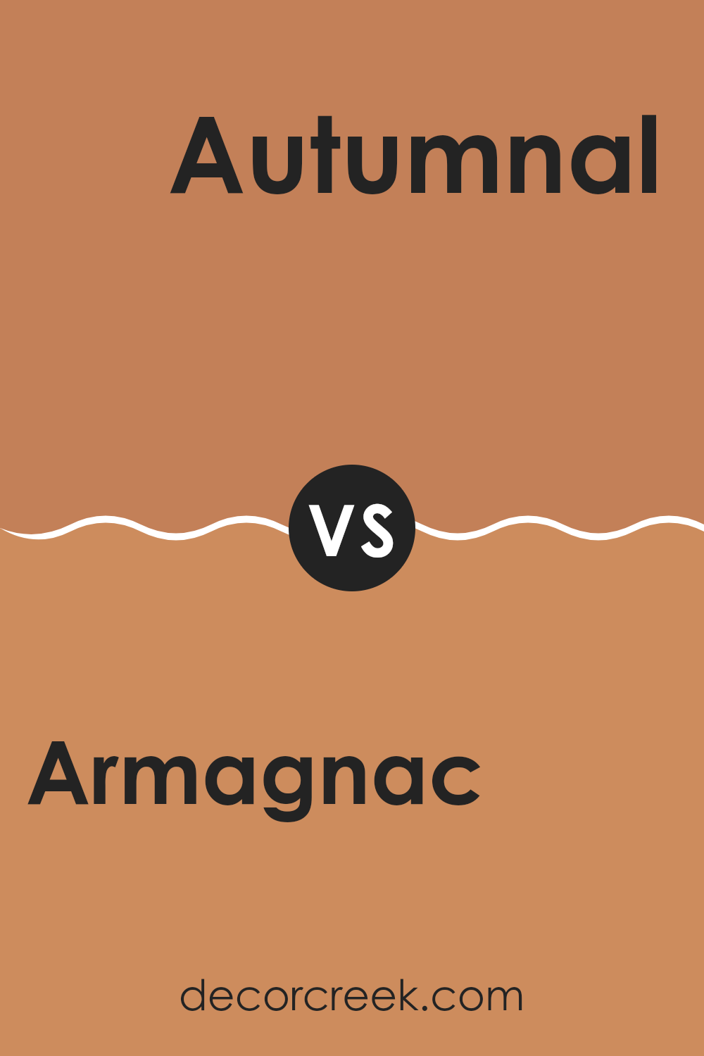
Armagnac SW 6354 by Sherwin Williams vs Autumnal SW 6361 by Sherwin Williams
Armagnac SW 6354 by Sherwin Williams is a rich, warm color that resembles the deep, earthy hue of a well-aged brandy. It has a reddish-brown tone that can make a room feel cozy and inviting. This color works well in areas where you want a warm and comfortable atmosphere, like living rooms or dining areas.
On the other hand, Autumnal SW 6361 is a lighter, more golden hue that brings to mind the colors of fall leaves. It has a softer, sunnier feel compared to Armagnac, making it suitable for areas that need a bit of warmth and light without being too dark. This color is great for kitchens or hallways where you want a cheerful and welcoming vibe.
Together, these colors can create a harmonious and warm setting, with Armagnac providing depth and Autumnal offering a light, uplifting touch.
You can see recommended paint color below:
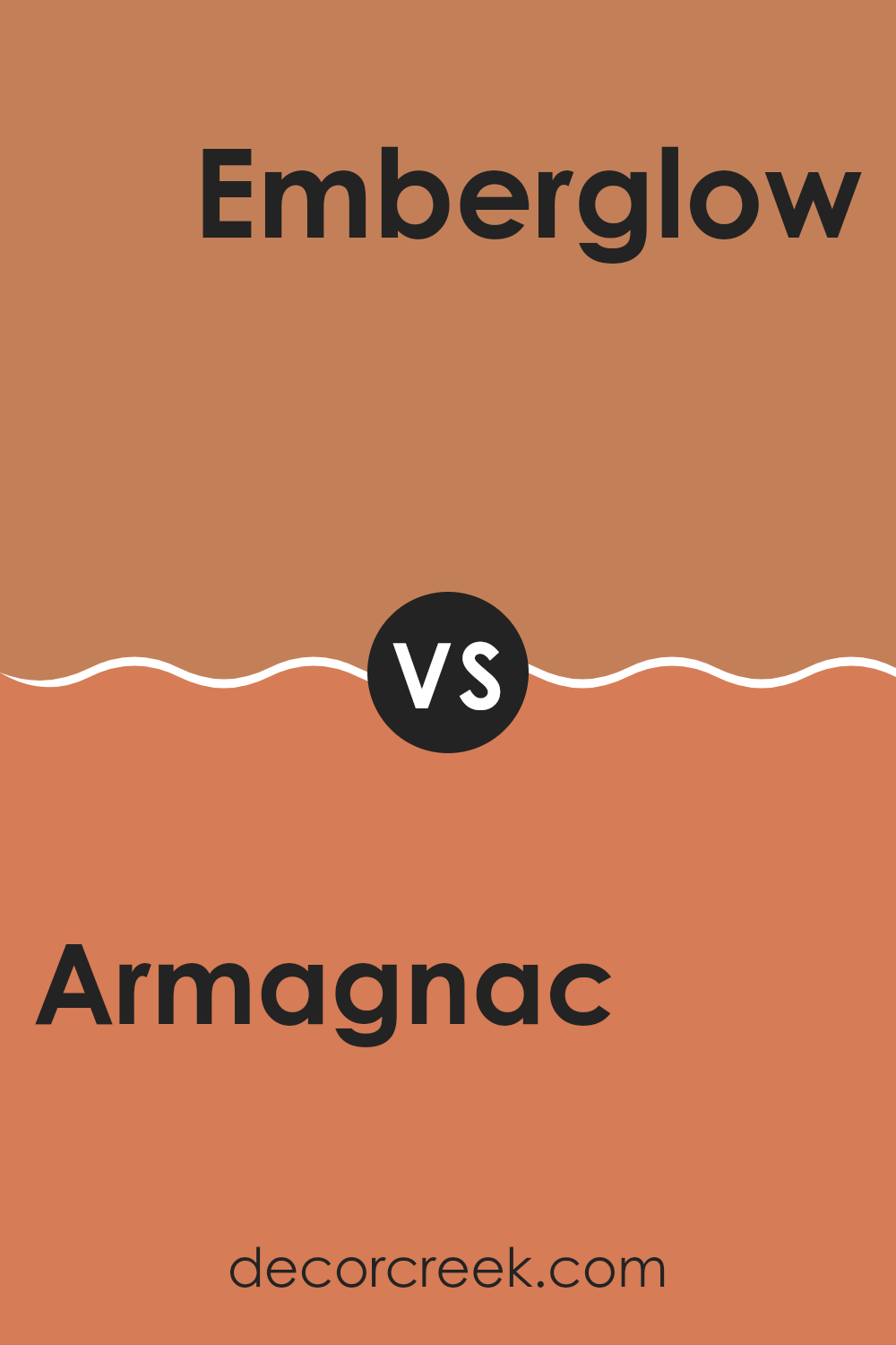
Armagnac SW 6354 by Sherwin Williams vs Emberglow SW 6627 by Sherwin Williams
Armagnac SW 6354 and Emberglow SW 6627 are two warm and inviting colors from Sherwin Williams that offer different vibes. Armagnac is a rich, warm brown with a slight orange undertone, reminiscent of aged leather or autumn leaves.
It’s a cozy, comforting hue that can make a room feel grounded and secure. On the other hand, Emberglow is a bright, bold orange-red that exudes energy and enthusiasm. It adds a pop of lively color to any room and can create a cheerful and vibrant atmosphere.
While Armagnac is more muted and subtle, perfect for those who prefer a calm and cozy area, Emberglow is ideal for those looking to make a bold statement. Both colors can add warmth, but the choice between them depends on whether you want a calm, earthy setting or a dynamic, energetic environment.
You can see recommended paint color below:
- SW 6627 Emberglow
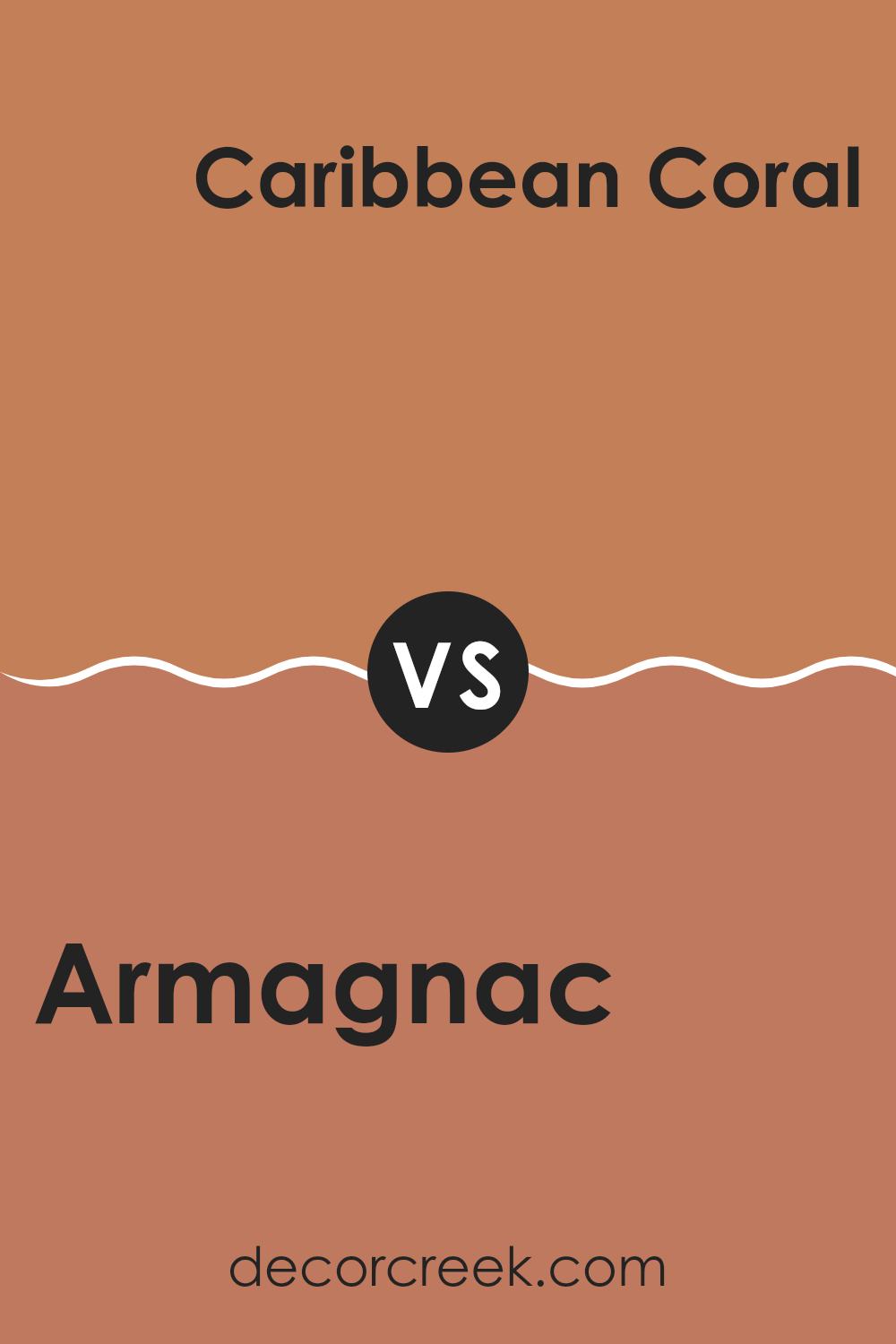
Armagnac SW 6354 by Sherwin Williams vs Caribbean Coral SW 2854 by Sherwin Williams
Armagnac SW 6354 and Caribbean Coral SW 2854 by Sherwin Williams are two distinct colors. Armagnac is a warm, earthy shade with hints of rust. It gives off a cozy and inviting vibe, reminiscent of autumn leaves or a rich leather chair. This color works well in areas where you want to create a comforting and grounded atmosphere.
On the other hand, Caribbean Coral is a vibrant, coral hue with pink and orange undertones. It’s bright and lively, bringing a cheerful and energetic feel to any room. This color is great for making a bold statement or adding a pop of color to a room.
While Armagnac is more subdued and neutral, Caribbean Coral stands out with its eye-catching brightness. Choosing between them depends on the mood you want to set: calm and warm with Armagnac, or lively and spirited with Caribbean Coral.
You can see recommended paint color below:
- SW 2854 Caribbean Coral
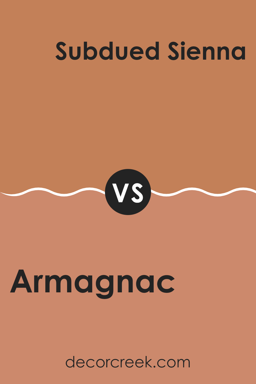
Armagnac SW 6354 by Sherwin Williams vs Subdued Sienna SW 9009 by Sherwin Williams
Armagnac SW 6354 and Subdued Sienna SW 9009 by Sherwin Williams are two warm, earthy tones, but they have distinct characteristics. Armagnac is a rich, warm brown with a hint of orange, reminiscent of aged leather or the color of cognac. It exudes warmth and can make a room feel cozy and inviting. Its depth adds a touch of elegance and can ground a room effectively.
In contrast, Subdued Sienna is a softer, muted brown with lighter undertones. It leans more towards a clay-like, natural brown, offering a more relaxed and subtle vibe. This color brings a sense of calm and works well as a neutral backdrop.
Together, these colors can create a harmonious palette. Armagnac can serve as an accent or feature wall, while Subdued Sienna can be used on surrounding walls to create a balanced and warm environment.
You can see recommended paint color below:
- SW 9009 Subdued Sienna
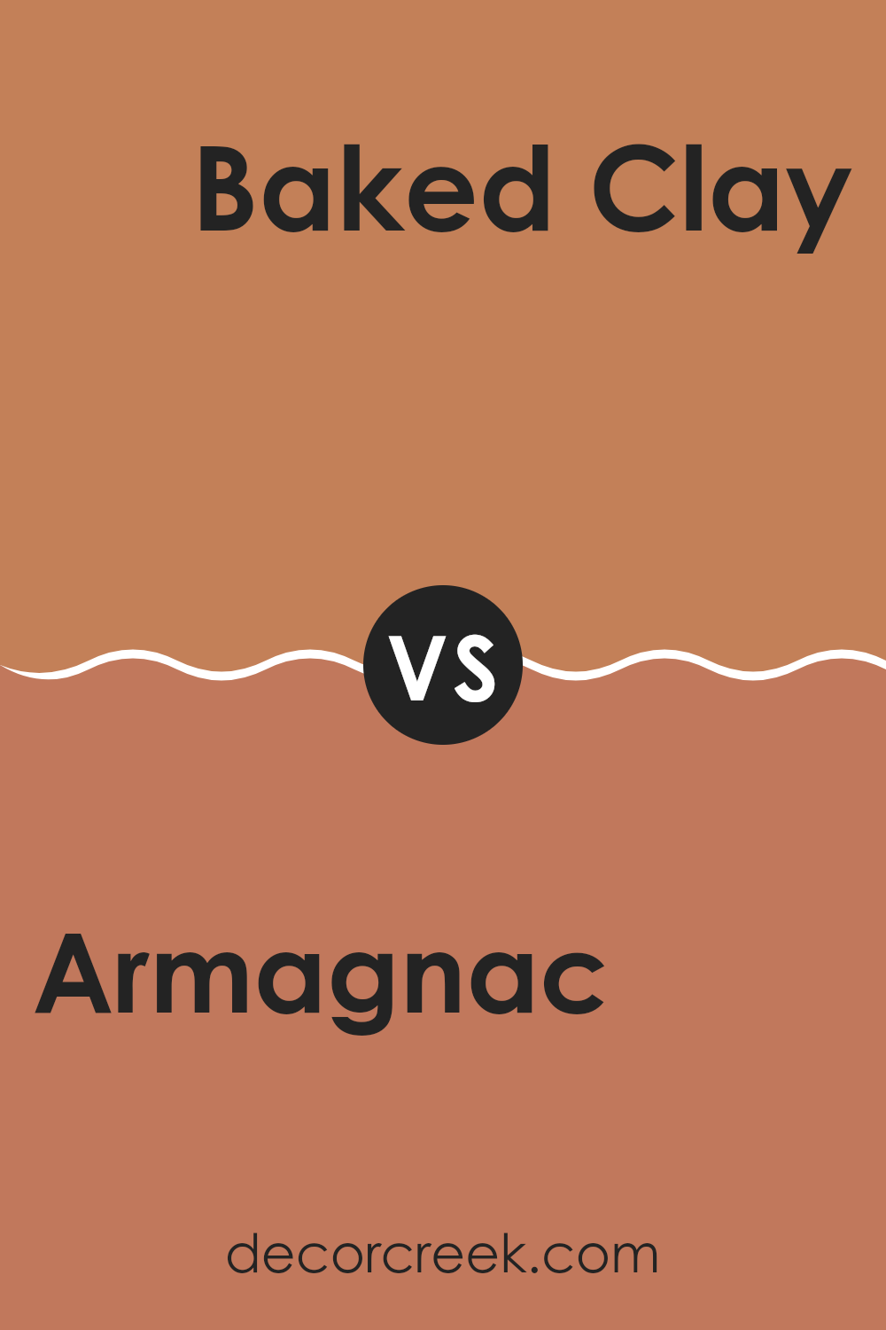
Armagnac SW 6354 by Sherwin Williams vs Baked Clay SW 6340 by Sherwin Williams
Armagnac SW 6354 and Baked Clay SW 6340 are both warm, earthy tones by Sherwin Williams. Armagnac is a rich, dark terracotta with hints of red, creating a cozy and inviting mood. It has a brownish undertone that helps anchor a room and can work well in living areas or dining zones for a touch of warmth.
On the other hand, Baked Clay is a lighter, more muted version of terracotta. It leans slightly more toward orange than red, providing a softer, sun-baked look. This makes Baked Clay feel more airy and open, suitable for areas where you want a gentle hint of color without overpowering the room.
When compared, Armagnac feels more intense and bold, while Baked Clay is subtle and laid-back. Choosing between them depends on whether you want a strong, grounding color or a lighter, more relaxed ambiance in your room.
You can see recommended paint color below:
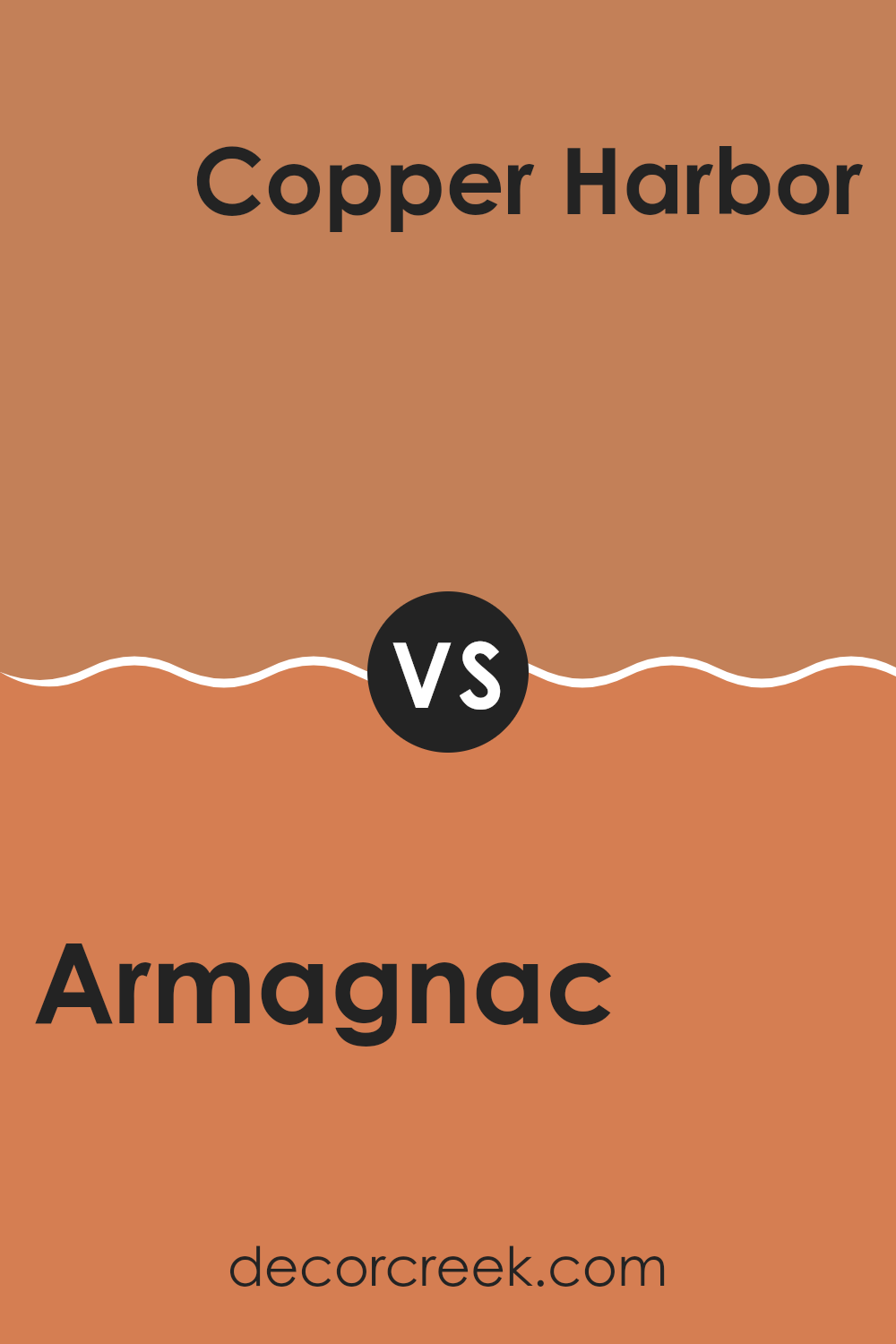
Armagnac SW 6354 by Sherwin Williams vs Copper Harbor SW 6634 by Sherwin Williams
Armagnac SW 6354 and Copper Harbor SW 6634 are two warm colors by Sherwin Williams that bring different vibes to a room. Armagnac is a rich, brownish-orange with earthy undertones. It feels inviting and cozy, making it a great choice for a living room or a room where you want to feel comfortable and close.
On the other hand, Copper Harbor is a vibrant orange with more brightness. It brings energy and enthusiasm to a room, ideal for areas where you want to encourage activity and conversation, like a dining room or a creative workspace.
While both colors have a warm undertone, Armagnac leans more toward a muted, refined brown, giving it a slightly more traditional and calming feel. Copper Harbor, with its bright and cheerful hue, can make a room feel lively and dynamic. Both colors can add character, but the choice depends on whether you want a room to feel soothing or invigorating.
You can see recommended paint color below:
- SW 6634 Copper Harbor
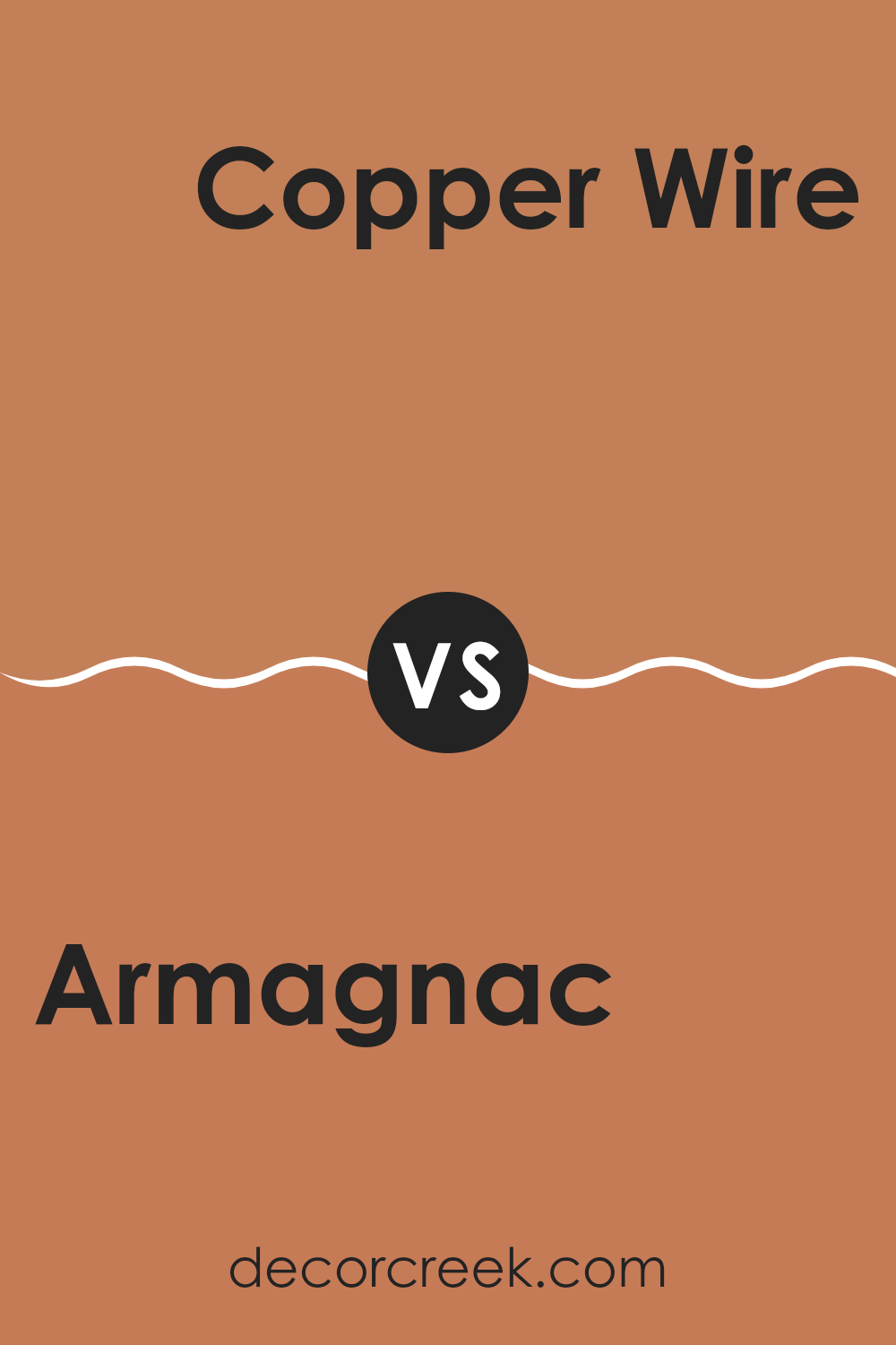
Armagnac SW 6354 by Sherwin Williams vs Copper Wire SW 7707 by Sherwin Williams
Armagnac SW 6354 by Sherwin Williams is a rich, warm color that brings a sense of coziness and comfort to a room. It’s a deep, reddish-brown shade often associated with autumn leaves or a glass of warm brandy. It works well as a dominant color in a room, offering a strong presence without overpowering other elements.
On the other hand, Copper Wire SW 7707 is slightly brighter and more metallic in its appearance, with a hint of orange that gives it a lively, energetic feel. This color can add a touch of vibrancy and brightness to any room, making it feel more dynamic and inviting.
When compared, Armagnac provides a more grounded and cozy atmosphere, ideal for areas meant for relaxation, like living rooms or libraries. Copper Wire introduces a bit more energy and flair, suitable for accent walls or decor that aims to make a statement. Together, these colors can complement each other well, balancing warmth with a touch of liveliness.
You can see recommended paint color below:
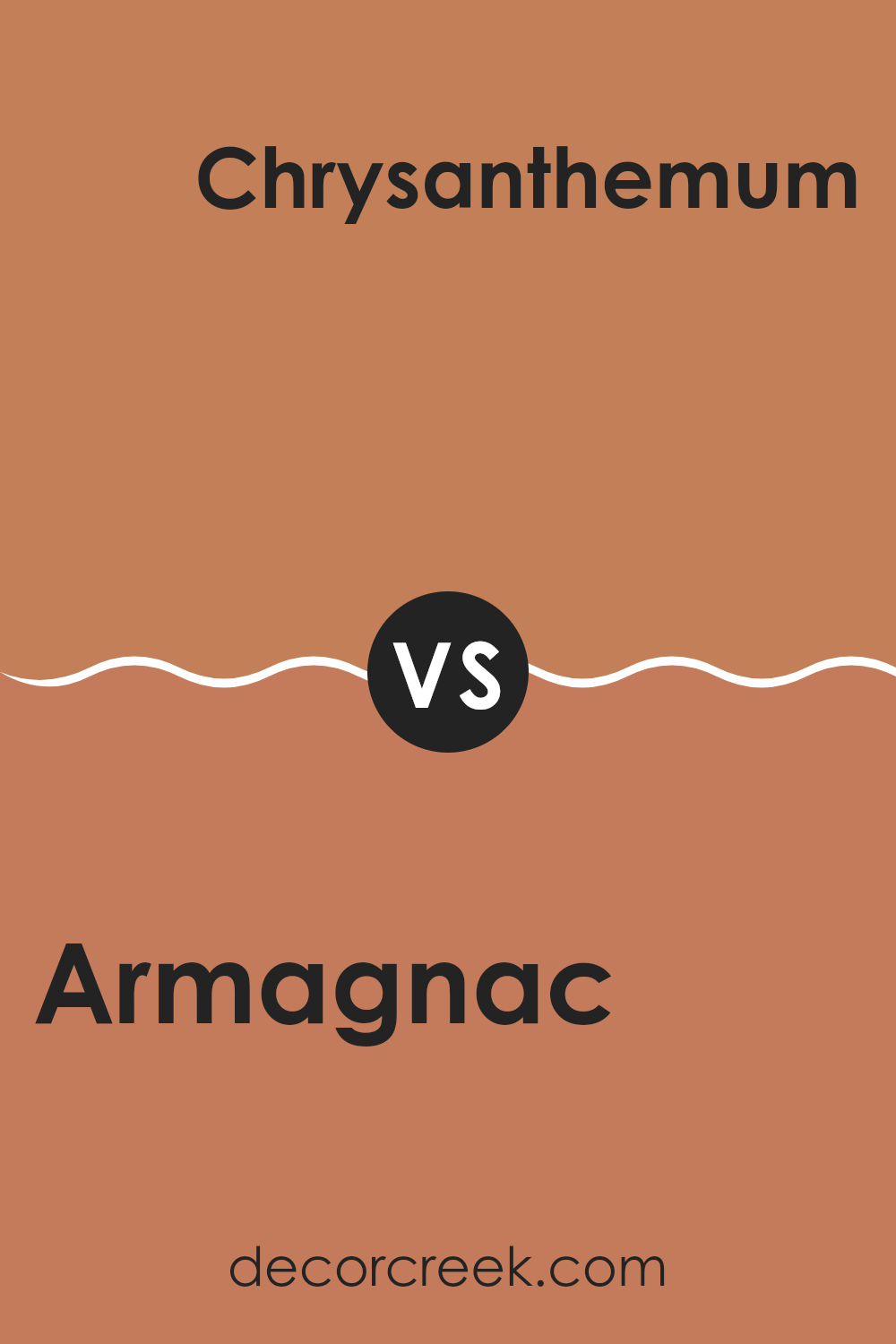
Armagnac SW 6354 by Sherwin Williams vs Chrysanthemum SW 6347 by Sherwin Williams
Armagnac SW 6354 and Chrysanthemum SW 6347 by Sherwin Williams are both warm, rich colors, but they have distinct differences. Armagnac is a deep, earthy orange-brown shade that gives a cozy and inviting feel to any room.
It’s a flexible color that works well in living rooms or dining areas where you want to create a comfortable atmosphere. On the other hand, Chrysanthemum is a more vibrant and lively orange, with a hint of red that makes it stand out.
It can be used as an accent color to bring energy and cheerfulness to a room. While Armagnac feels warm and grounded, Chrysanthemum is bright and lively. Both colors can complement each other when used thoughtfully, with Armagnac providing a solid base and Chrysanthemum adding a touch of brightness and excitement. Choosing between them depends on whether you want a calm, earthy background or a more energetic pop.
You can see recommended paint color below:
- SW 6347 Chrysanthemum
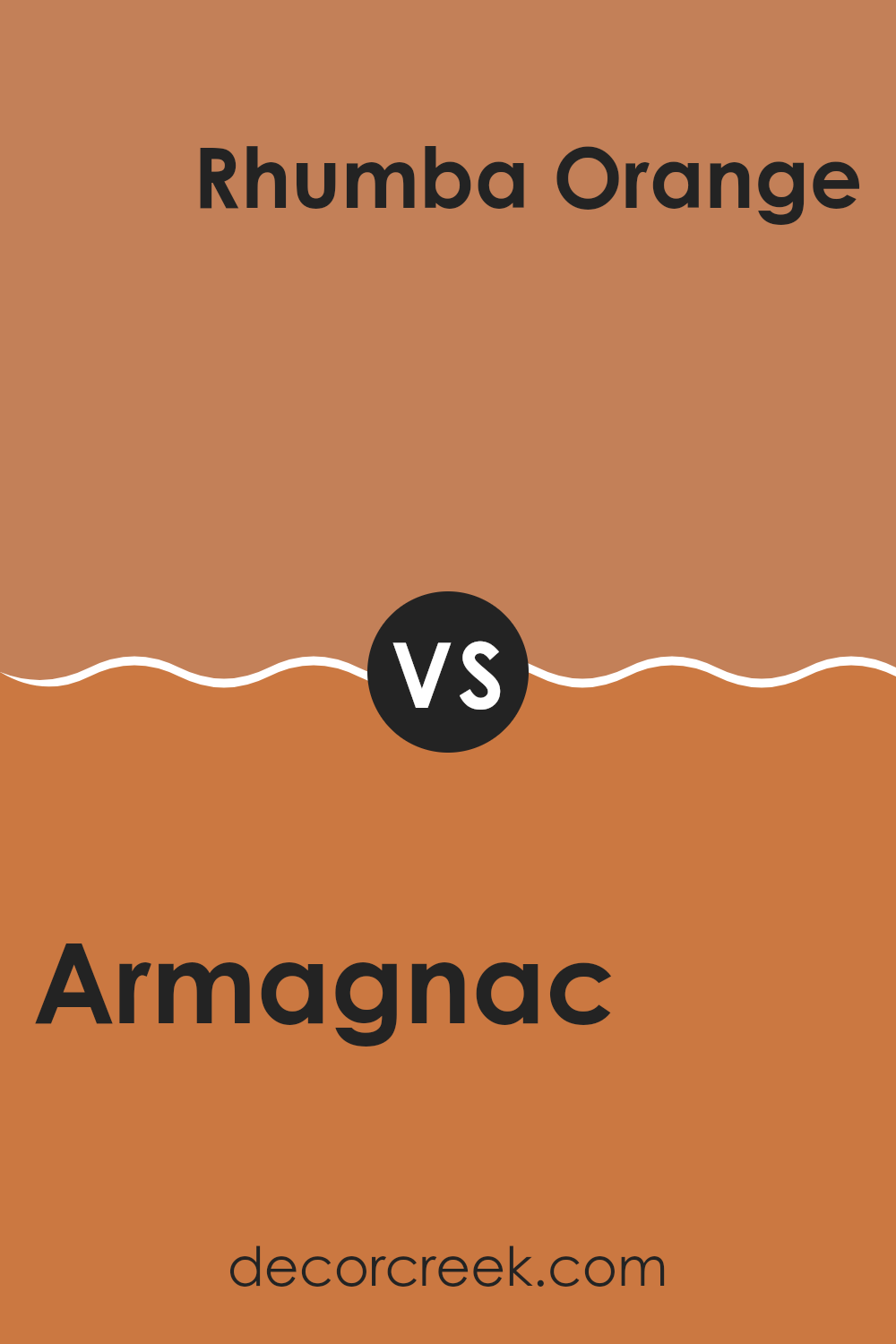
Armagnac SW 6354 by Sherwin Williams vs Rhumba Orange SW 6642 by Sherwin Williams
Armagnac SW 6354 by Sherwin Williams is a rich, warm color that exudes a sense of coziness and comfort. It’s a deep, mellow shade with brown undertones, making it ideal for creating an inviting atmosphere in living rooms or dining areas.
On the other hand, Rhumba Orange SW 6642 is vibrant and energetic. This shade is lively, with bright orange tones that can invigorate and uplift a room. While Armagnac is soothing and grounding, Rhumba Orange makes a bold statement, perfect for anyone who wants to add a pop of color to a room.
When combined, these colors create a balanced palette that is both warm and eye-catching. Armagnac provides a solid, comforting backdrop, while Rhumba Orange can be used in accent pieces to add excitement and brightness to a room. Together, they offer a blend of warmth and vibrancy.
You can see recommended paint color below:
- SW 6642 Rhumba Orange
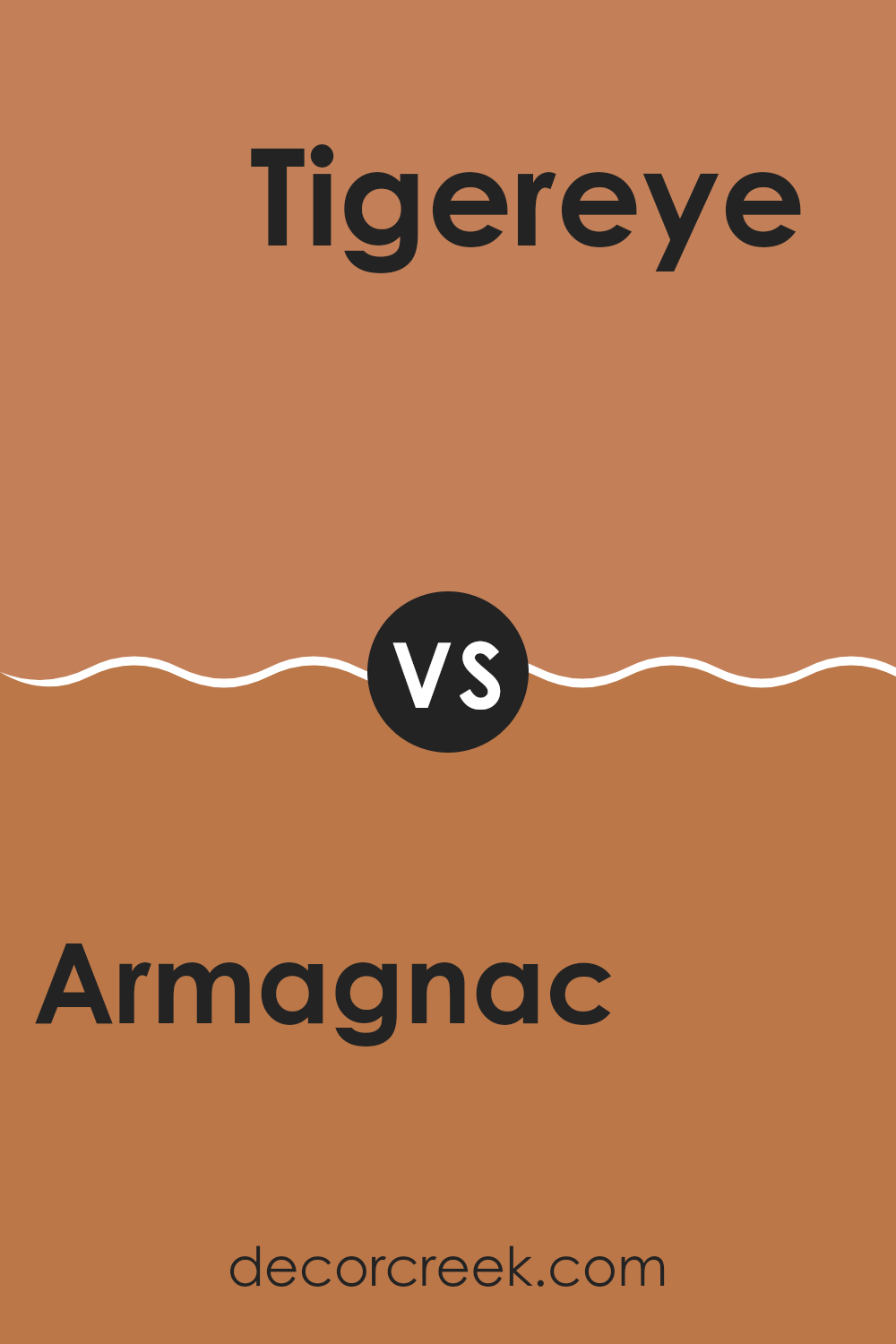
Armagnac SW 6354 by Sherwin Williams vs Tigereye SW 6362 by Sherwin Williams
Armagnac SW 6354 by Sherwin Williams is a warm, earthy hue with a hint of orange and brown, reminiscent of the color of aged brandy. It radiates coziness and comfort, making it a perfect choice for creating inviting areas. It’s ideal for living rooms or dining areas where you want to foster a warm and welcoming atmosphere.
In contrast, Tigereye SW 6362 by Sherwin Williams is a bolder, richer color that leans more heavily into deep orange and golden undertones. It has a vibrant energy that can add warmth and dynamic character to a room. Tigereye is perfect for accent walls or areas where you want to make a striking impression.
While Armagnac is softer and more subdued, suited for larger areas, Tigereye is about making a statement, adding a lively touch. Both colors bring warmth, but they do so in different intensities and are suited for different applications based on the mood you wish to create.
You can see recommended paint color below:
- SW 6362 Tigereye
After reading about SW 6354 Armagnac by Sherwin Williams, I feel I’ve learned about a really neat color. It’s a warm brown shade, almost like the color of caramel or warm cocoa, which can make any room feel cozy and inviting. Imagine sitting in a living room painted this color on a chilly day — it might feel just like being wrapped in a warm blanket!
This color seems great for people who like their homes to feel welcoming and comfortable. It’s not too bright or too dark, so it doesn’t feel like it would be too intense to look at every day. Instead, it gives off a gentle and inviting vibe. People might like to use it in living rooms or dining areas where everyone gathers together, because it could really make these places feel like home.
I also think this color could mix well with other colors like whites or creams, adding a nice contrast without being too bold or shocking. In sum, Armagnac seems like a color that would make any room feel warm and friendly.
Anyone who likes warm and cozy areas might find this color to be a perfect fit for their home.
Ever wished paint sampling was as easy as sticking a sticker? Guess what? Now it is! Discover Samplize's unique Peel & Stick samples.
Get paint samples

