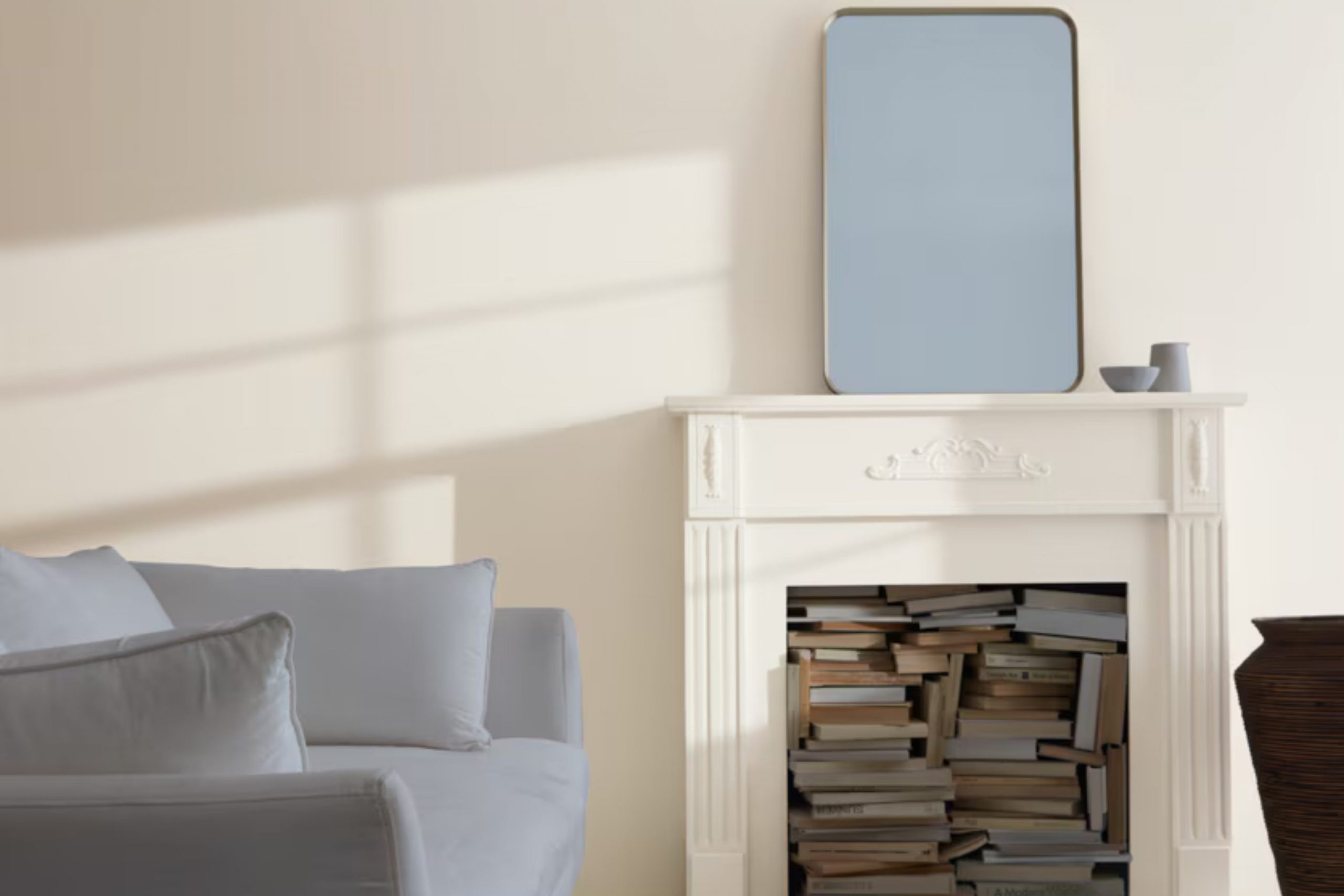
If you’re thinking about giving your room a fresh look with a calming shade of paint, you might want to consider Benjamin Moore’s 858 Athena. It’s a color that gently blends into many styles and enhances the aesthetic value of any room without feeling too intense. In my experience, Athena acts like a breath of fresh air for a room, setting a light and airy tone that brings out the best in everything around it, from furniture to art pieces.
It’s not just another gray – it has a unique blend that warms up a room while keeping it bright and open. I’ve noticed that it works particularly well in areas that get a lot of natural light, reflecting and amplifying it in a way that enhances the overall ambiance.
Whether you’re updating your living room, bedroom, or even your kitchen, Athena has a flexible charm that adapts beautifully across various settings and complements different decor styles smoothly.
It’s a color that quietly renews a room, ensuring an enduring elegance that you’ll appreciate more each day.
What Color Is Athena 858 by Benjamin Moore?
Athena 858 by Benjamin Moore is a soft and flexible neutral color with a delightful balance of gray and beige. This subtle hue, often referred to as “greige,” serves as a perfect backdrop in many interiors, offering a clean and soothing presence without feeling too strong. Athena 858 adjusts easily to different lighting conditions, reflecting a warm ambiance in natural light while maintaining its inviting tone under artificial lighting.
This color works exceptionally well in contemporary, minimalist, and Scandinavian-style interiors due to its understated elegance and ability to blend smoothly with various decor styles.
Athena 858 pairs beautifully with a wide range of materials and textures. In rooms with wood elements, such as hardwood floors or wooden furniture, it highlights the natural beauty of the wood, enhancing its warmth. When combined with metal accents in lighting fixtures or furniture, Athena 858 creates a pleasing contrast that feels modern and grounded.
Textiles also work well with this color. Soft linens or plush velvets in muted or pastel tones can add a layer of richness while maintaining the airy and light feeling that Athena 858 naturally brings. Its flexibility makes it an excellent choice for living rooms, bedrooms, and kitchens, where it promotes a welcoming and cozy atmosphere.
Is Athena 858 by Benjamin Moore Warm or Cool color?
Athena 858 by Benjamin Moore is a gentle gray paint that brings a clean and airy feeling to any room. This color is great for homes because it’s very flexible and works well in many different rooms.
It’s a popular choice because it acts as a neutral backdrop, meaning it can match with various furniture styles and other colors. For example, in a living room, Athena 858 pairs well with both bright cushions and dark frames, making the room look welcoming and open.
In a bedroom, this color helps to create a calm and restful environment, ideal for relaxing after a long day. Many people also use Athena 858 in kitchens and bathrooms for a crisp, clean look. It reflects light nicely, which can make smaller rooms appear larger. Overall, Athena 858 by Benjamin Moore is a straightforward choice for homeowners looking for a flexible color that adds a light and open quality to their home.
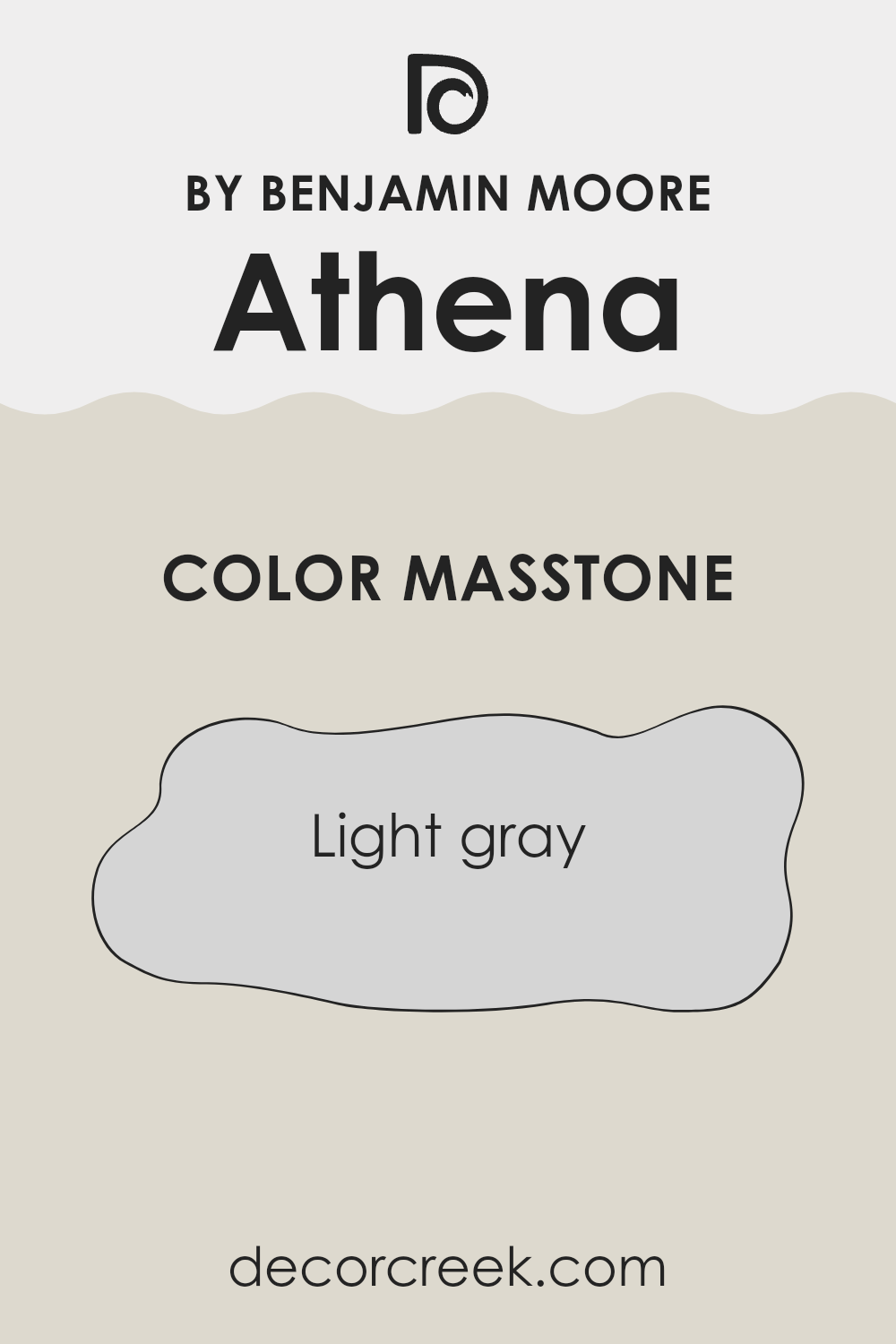
What is the Masstone of the Athena 858 by Benjamin Moore?
Athena 858 by Benjamin Moore is recognized for its masstone of light gray, coded as #D5D5D5. This shade is quite flexible and blends smoothly into various home settings, promoting a sense of calm and cleanliness.
The neutrality of light gray makes it easy to combine with other colors, whether you’re looking to pair it with bright accents or keep a more muted palette. It doesn’t overpower rooms but rather complements whatever décor or style is present.
This color is especially useful in smaller rooms or areas with limited natural light, as its light-reflective quality can make rooms appear larger and more open. Many homeowners appreciate how it provides a subtle background, perfect for showcasing art, furniture, or decorative pieces without causing a clash. In terms of maintenance, lighter grays like Athena 858 hide small imperfections well and are forgiving with minor stains or smudges, which makes it a practical choice for busy households.
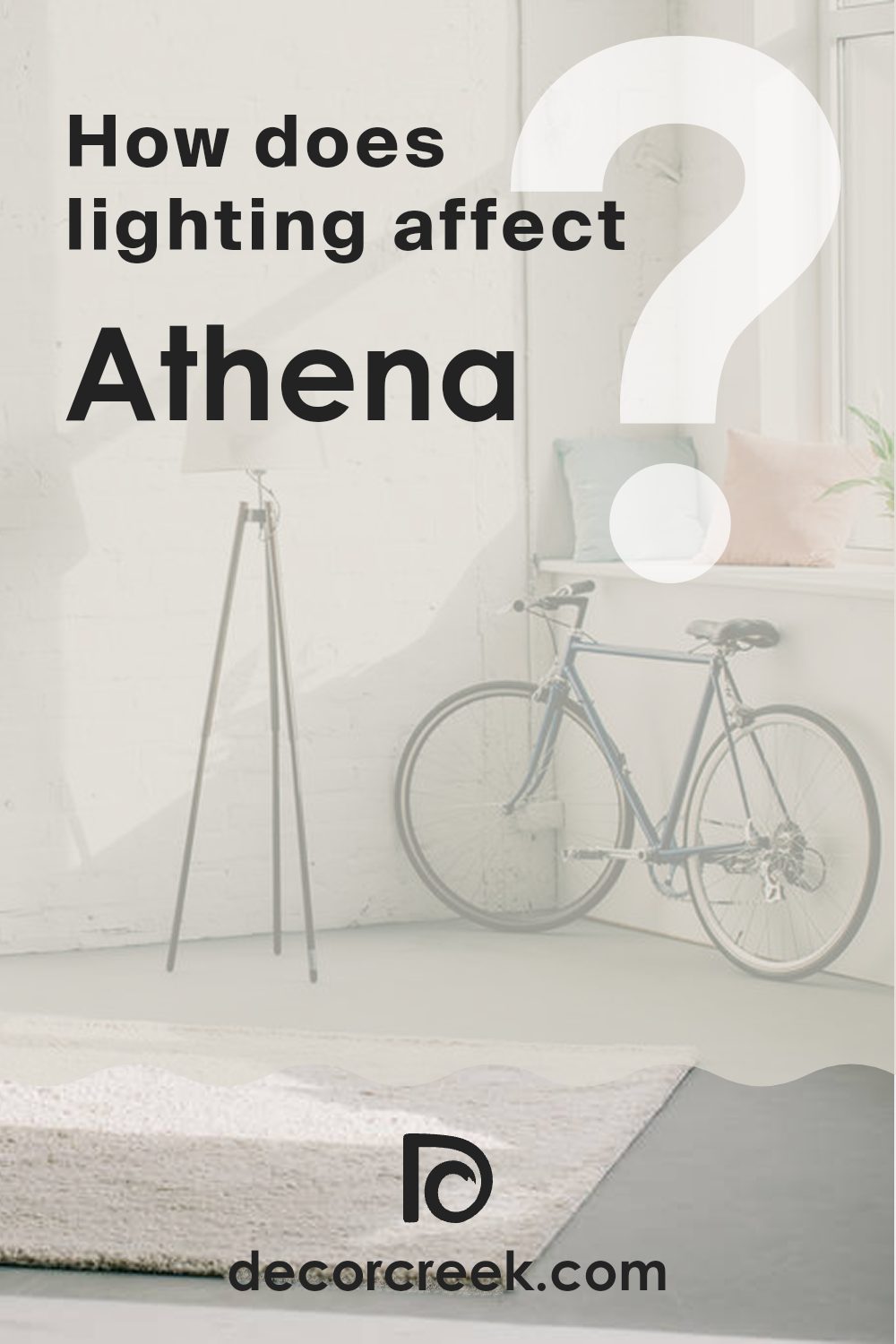
How Does Lighting Affect Athena 858 by Benjamin Moore?
Lighting plays a crucial role in how we perceive colors in our surroundings. Depending on whether a color is exposed to artificial light or natural sunlight, its appearance can change significantly. Since colors often absorb and reflect light differently, their hue, saturation, and brightness may appear different under various lighting conditions.
Consider the color Athena by Benjamin Moore, a soft, delicate gray with a hint of warmth. In artificial light, such as that from LEDs or incandescent bulbs, this color tends to look warmer, enhancing its beige undertones. This makes the room feel cozier, especially in settings with warm-toned lighting. In contrast, under fluorescent lights, which are cooler, Athena might lean more toward its gray aspects, giving it a crisp, clean appearance.
In natural light, the appearance of Athena again changes based on the direction of the room’s windows. Rooms facing north receive less direct sunlight, which can make colors look slightly duller or cooler. Here, Athena might appear more as a true soft gray, providing a calm and gentle backdrop. South-facing rooms, however, get plenty of sunlight, making the color warmer and more vibrant throughout the day, enhancing its beige undertones.
East-facing rooms see the most change in Athena’s appearance as the sun rises. During the morning when the light is warm and soft, the color can appear particularly inviting and warm. As the day progresses and the natural light becomes less intense, the color might return to a more neutral, balanced gray. Conversely, in west-facing rooms, the color will change as the sun sets. The decreasing natural light can make Athena look warmer and more inviting toward the evening.
In summary, the way Athena by Benjamin Moore looks in a room can vary greatly depending on the type of light—whether it’s the warm glow of a lamp or the varying intensity of natural sunlight—and the room’s orientation.
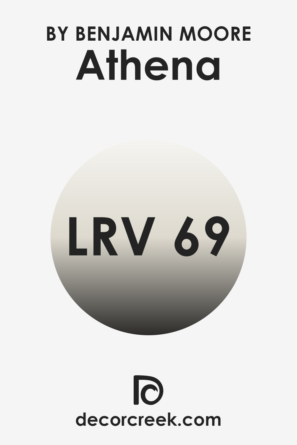
What is the LRV of Athena 858 by Benjamin Moore?
LRV, or Light Reflectance Value, is a measure that tells you how much light a color reflects and how much it absorbs. Think of it this way: if a color has a high LRV, it means it reflects more light, making the room feel brighter and more open.
If a color has a lower LRV, it absorbs more light, giving the room a cozier and sometimes smaller feel. This value is crucial when choosing paint colors because it helps you understand how the color will look in your specific room lighting.
The color Athena by Benjamin Moore has an LRV of 68.64, which is relatively high. This means it is a light color that will reflect a good amount of light back into the room. In rooms with less natural light or smaller areas, using a color like Athena can make the room appear larger and more airy.
Conversely, in very brightly lit rooms, this color will help maintain a light and welcoming atmosphere without becoming too stark or too intense. This makes Athena a flexible choice that can adjust well to various lighting situations, enhancing the way a room feels.
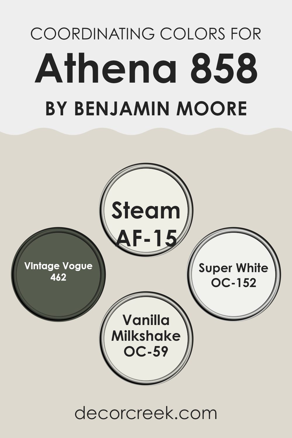
Coordinating Colors of Athena 858 by Benjamin Moore
Coordinating colors are chosen to complement or balance each other in visual harmony when used together in room decor or design projects. They might not always be similar in shade, but their interaction produces an aesthetically pleasant effect, making rooms look more put-together and visually appealing.
For room designs, usage of coordinating colors like the AF-15 – Steam, 462 – Vintage Vogue, OC-152 – Super White, and OC-59 – Vanilla Milkshake can greatly enhance the overall ambiance of the area.
Starting with AF-15 – Steam, this is a soft and muted gray that offers a subtle backdrop that works well in various decor styles, allowing other colors in the palette to stand out. Next, 462 – Vintage Vogue is a deep and rich green with a hint of gray, providing a striking contrast that can act as a focal point or an elegant background. OC-152 – Super White is a crisp and clean white, perfect for creating a fresh and open feeling in any room, making it appear brighter and larger.
Lastly, OC-59 – Vanilla Milkshake has a warm and creamy tone that introduces a smooth, comforting presence, ideal for creating a cozy and inviting atmosphere. Together, these colors bring a balanced and harmonious look to any interior design project.
You can see recommended paint colors below:
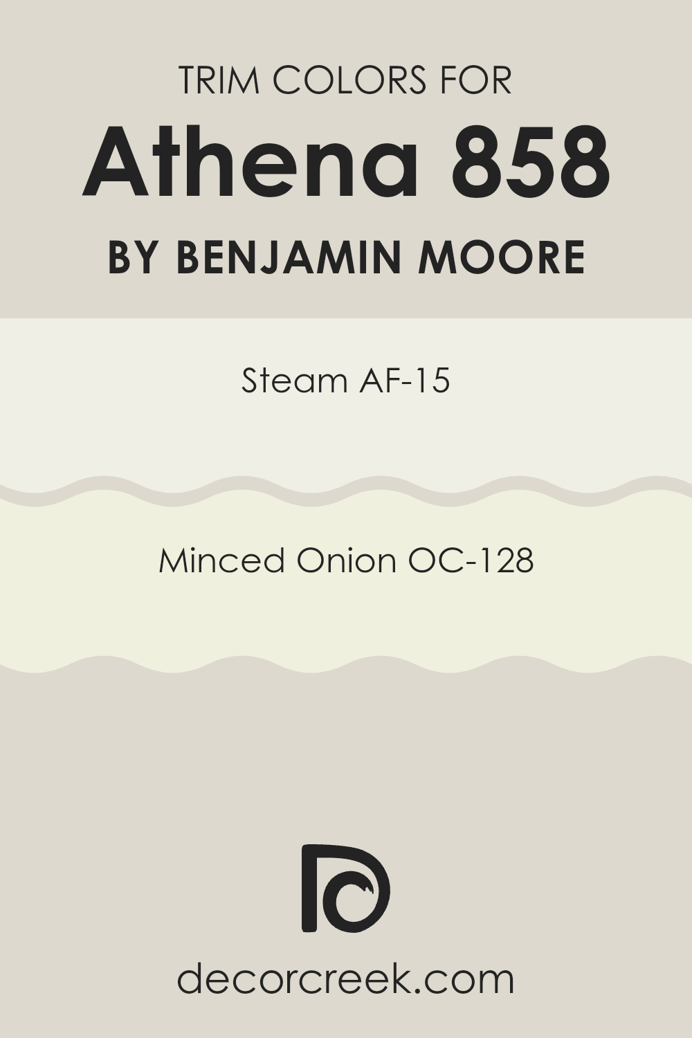
What are the Trim colors of Athena 858 by Benjamin Moore?
Trim colors refer to the shades used to highlight the architectural details of a room, such as the moldings, door frames, and window sills. They are essential in interior design because they help define and accentuate the different elements of a room, bringing a coherent and finished look.
Particularly, using colors like AF-15 – Steam and OC-128 – Minced Onion by Benjamin Moore as trim colors can subtly enhance the aesthetic while complementing a variety of wall colors and decor styles.
AF-15 – Steam is a near-neutral white that has a clean and clear look without being stark, making it a flexible choice for trims. It helps in creating a smooth flow from wall to trim, giving the room a continuous and open feel. On the other hand, OC-128 – Minced Onion is a soft, muted beige with a hint of warmth. This color adds a gentle contrast against both light and dark wall colors, enriching the overall ambiance of rooms without feeling too intense in the design scheme.
You can see recommended paint colors below:
- AF-15 Steam
- OC-128 Minced Onion
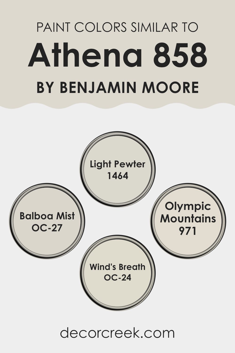
Colors Similar to Athena 858 by Benjamin Moore
Choosing similar colors when decorating a room is key to creating a cohesive and harmonious look. Colors like Light Pewter, Balboa Mist, Olympic Mountains, and Wind’s Breath are closely related hues that provide a subtle variation without clashing, allowing for a smooth visual transition from room to room. When colors are similar in tone and shade, they naturally complement each other, making it easier to design a room that feels unified and thoughtfully put together.
Light Pewter is a warm, gray-toned color that offers a welcoming vibe to any room. Its flexibility makes it a favorite for common areas and bedrooms alike. Balboa Mist stands slightly lighter, giving off a gentle and airy feeling that brightens rooms beautifully. Olympic Mountains has a bit deeper tone, bringing a cozy warmth that works well in rooms meant for relaxation.
Lastly, Wind’s Breath is a delicate off-white with a whisper of gray, ideal for creating a light and open feel in smaller or darker rooms. Together, these colors form a palette that can move smoothly throughout the home, setting a tone that is both cohesive and inviting.
You can see recommended paint colors below:
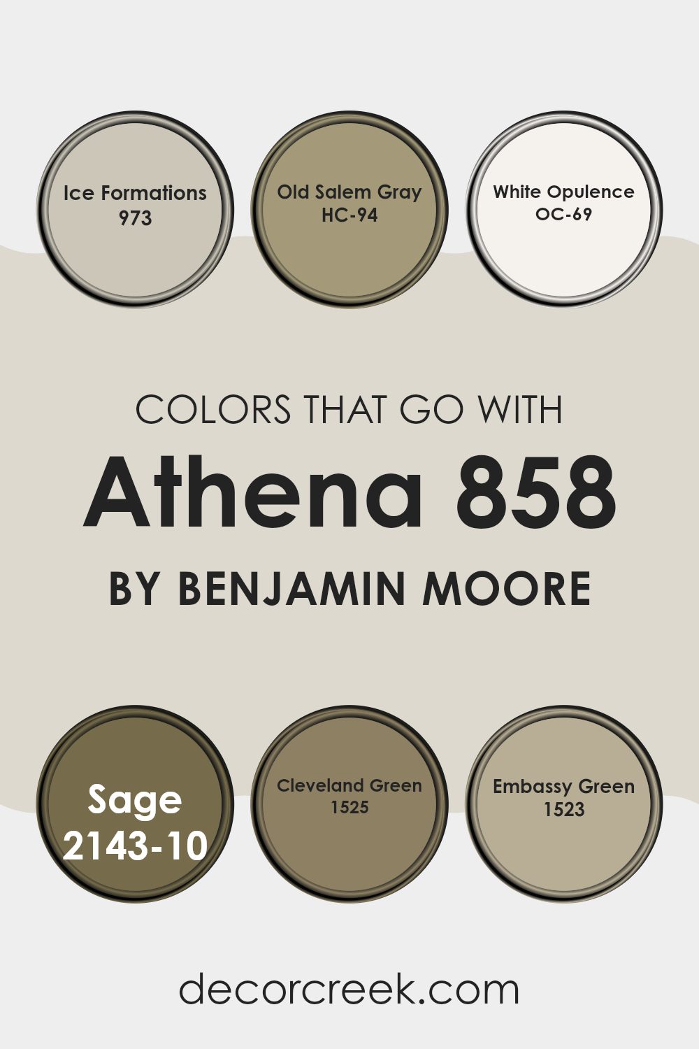
Colors that Go With Athena 858 by Benjamin Moore
Colors that coordinate with Athena 858 by Benjamin Moore play an essential role in creating a harmonious look in your home. Choosing the right colors can complement Athena 858, a neutral shade, ensuring that your room feels well balanced and visually appealing. These colors act like a team, each bringing its own unique character while still working together smoothly.
973 – Ice Formations is a subtle, light gray that gives a fresh and airy feeling to any room. It pairs beautifully with the soft tone of Athena 858, providing a calm backdrop that isn’t too strong. HC-94 – Old Salem Gray is a deeper gray that adds a bit of depth to rooms, making it a perfect contrast for areas using Athena 858. OC-69 – White Opulence is a bright, clean white that offers a crisp contrast to Athena 858, making the room appear more open and light filled.
On the greener side, 2143-10 – Sage presents a gentle green hue that brings a natural, earthy vibe into interiors, complementing wooden features and natural fibers well. 1525 – Cleveland Green and 1523 – Embassy Green are both rich, dynamic greens but with different undertones, balancing Athena 858’s neutrality with a stroke of nature inspired liveliness. Together, these colors create an inviting and cohesive look, allowing individual elements to stand out beautifully.
You can see recommended paint colors below:
- 973 Ice Formations
- HC-94 Old Salem Gray
- OC-69 White Opulence
- 2143-10 Sage
- 1525 Cleveland Green
- 1523 Embassy Green
How to Use Athena 858 by Benjamin Moore In Your Home?
Athena 858 by Benjamin Moore is a soft, neutral color that can give any room in your home a fresh and airy feel. This gentle gray shade is very flexible, making it a great choice for living rooms, bedrooms, kitchens, and bathrooms.
It matches well with a wide range of other colors and decor styles, from modern to rustic. You could paint your walls with Athena 858 to create a light backdrop that makes your furniture and art pieces stand out. It’s also an ideal color for cabinets or as an accent wall if you don’t want to repaint an entire room.
Additionally, Athena 858 has a calming quality, which can make your room feel more relaxing. Whether you’re updating a single room or giving your whole house a new look, this color can help you achieve a clean and coherent aesthetic without feeling too intense.
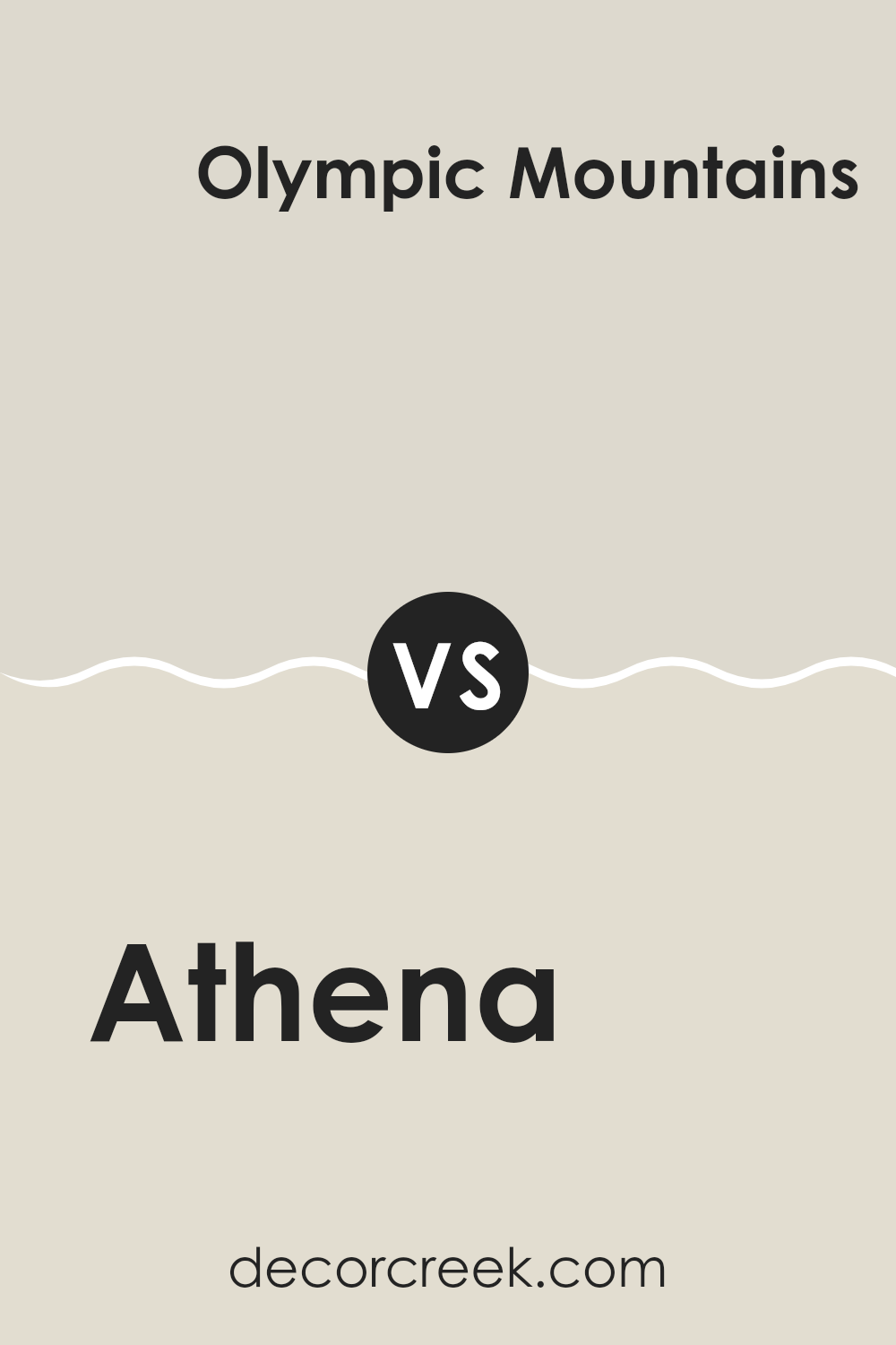
Athena 858 by Benjamin Moore vs Olympic Mountains 971 by Benjamin Moore
Athena 858 and Olympic Mountains 971 by Benjamin Moore are both neutral colors, but they have different tones that set them apart. Athena 858 is a soft, light gray with a warm undertone, making it a cozy choice for any room wanting a gentle, inviting feel. It’s a flexible color that pairs well with a wide range of decor styles, from modern to classic, due to its subtle warmth.
On the other hand, Olympic Mountains 971 is a deeper beige with a hint of gray, giving it a more grounded, earthy look. This color is excellent for rooms where you want to create a more defined, cozy atmosphere without going too dark. It’s particularly appealing in areas like living rooms or bedrooms where a soothing backdrop is desired.
Both colors offer a neutral palette that allows for flexibility in decorating, with Athena 858 being lighter and Olympic Mountains 971 providing a slightly richer, more muted hue. Each creates a different mood, yet they maintain a minimalistic and fresh appearance.
You can see recommended paint color below:
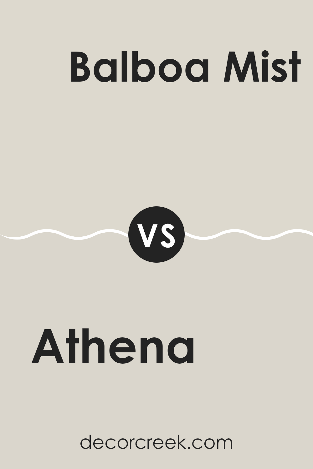
Athena 858 by Benjamin Moore vs Balboa Mist OC-27 by Benjamin Moore
Athena 858 and Balboa Mist OC-27 by Benjamin Moore are both neutral colors, but they each give off a slightly different vibe. Athena 858 is a warmer, beige color that feels cozy and inviting. It’s great for creating a welcoming atmosphere in rooms like living rooms or bedrooms.
On the other hand, Balboa Mist OC-27 leans more toward a light gray, offering a cooler and more modern look. It’s a flexible color that works well in many rooms, adding a touch of freshness without overpowering the room.
Both colors are light enough to make small rooms appear larger and are excellent for pairing with a wide range of decor styles. Whether you choose Athena 858 for its warm, soothing presence or Balboa Mist OC-27 for its crisp and contemporary feel, both colors provide a subtle and clean backdrop for your home.
You can see recommended paint color below:
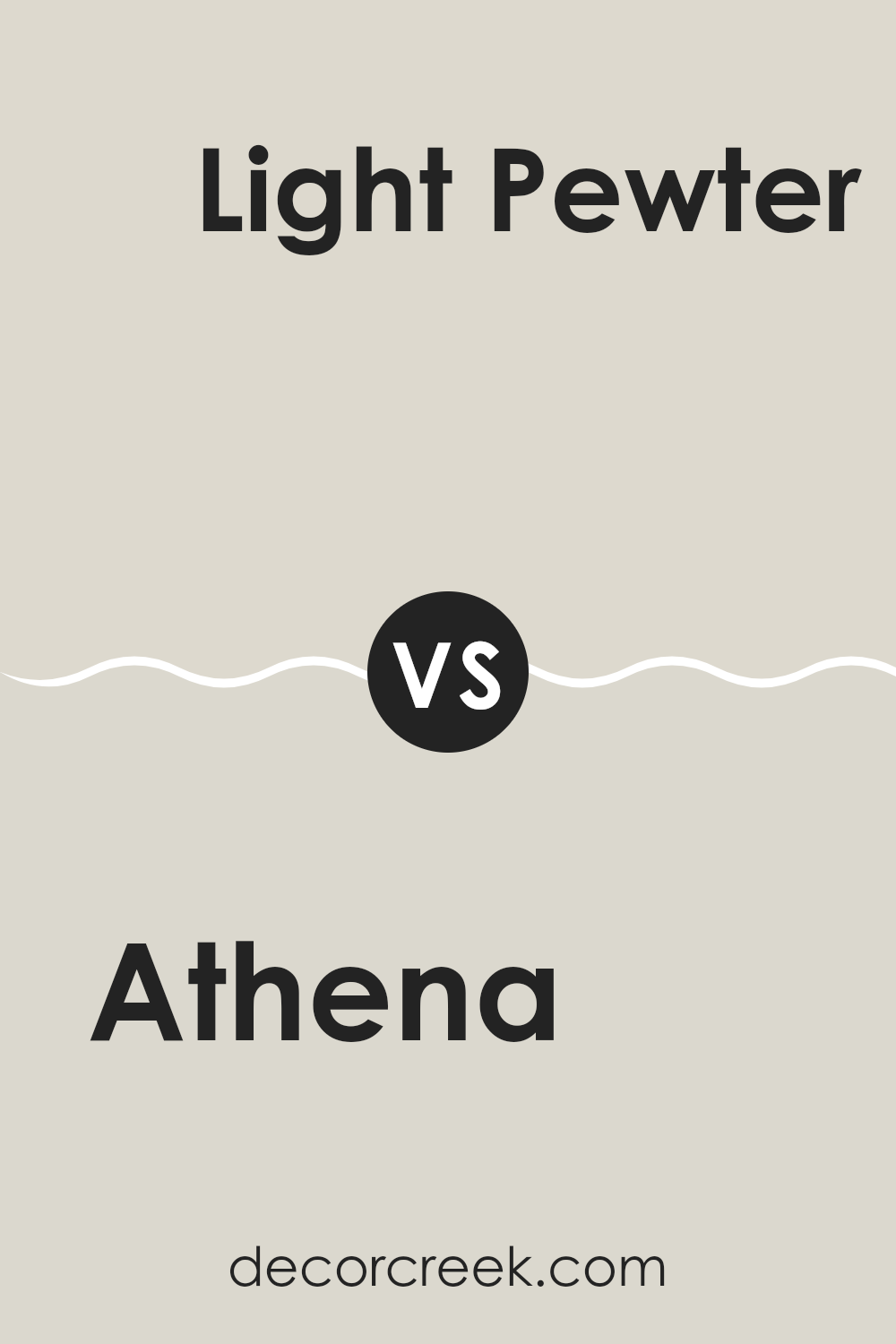
Athena 858 by Benjamin Moore vs Light Pewter 1464 by Benjamin Moore
Athena 858 and Light Pewter 1464, both by Benjamin Moore, are subtle, neutral shades that can create a calm environment in any room. Athena 858 is a lighter, almost off-white color with a soft, warm undertone that gives it a cozy feel, making it perfect for any room that needs a touch of brightness.
In contrast, Light Pewter 1464 is a mid-tone gray that offers a slightly cooler presence compared to Athena. This shade is ideal for those looking for a straightforward gray that isn’t too dark or too light, providing a balanced backdrop that works well in a variety of decorating styles.
Both colors are flexible and work beautifully in rooms that get lots of natural light or in rooms that need a subtle lift from lighter tones. While Athena brightens up rooms more obviously due to its lighter tone, Light Pewter offers a more grounded feel. Choosing between them depends on the mood you want to set and the other colors and materials you plan to use in your room.
You can see recommended paint color below:
Athena 858 by Benjamin Moore vs Wind’s Breath OC-24 by Benjamin Moore
Athena 858 by Benjamin Moore is a soft, neutral gray with a warm undertone that makes it very welcoming and cozy. It’s flexible enough to be used in any room, complementing various decor styles and colors. This color works well in areas where you want a modern but still inviting atmosphere.
Wind’s Breath OC-24, also by Benjamin Moore, is another neutral but leans more toward an off-white with subtle beige undertones. This makes it a great choice for creating a bright and airy feel in a room. While equally flexible, Wind’s Breath is lighter than Athena 858, lending a slightly more open and fresh look.
Both colors manage to keep interiors looking clean and tidy. Athena 858, being the darker of the two, might be better suited for larger rooms or furniture pieces, while Wind’s Breath is perfect for smaller rooms or walls that need to appear more expansive. These colors can even be paired together to provide a delicate contrast and complete the aesthetic of a given area.
You can see recommended paint color below:
After reading about 858 Athena by Benjamin Moore, I’ve learned that this paint color is like a gentle hug for your room. It’s a soft gray that isn’t too dark or too light, which makes it just perfect for making any room feel cozy and inviting. I was surprised to see how different it can look based on the light in the room; it can appear more gray when it’s cloudy outside and more beige when the sun is shining. This makes Athena a really good choice for any room in the house, whether it’s where you sleep, play, or even eat.
Using Athena could make choosing decorations easier because it goes well with so many other colors. Whether you like bright colors like reds and blues or softer shades like pastel pinks and greens, everything seems to work. Also, it’s smooth like a soft blanket, making any room feel like a calm and happy place.
Thinking about this color, it feels like painting with Athena could be a really fun way to make your home feel more like “you.” It’s like having a crayon that works well with all your other crayons to draw one big, beautiful picture. That’s why I think choosing 858 Athena by Benjamin Moore could be a great idea if you want to make your home look pretty and feel comfy.
Ever wished paint sampling was as easy as sticking a sticker? Guess what? Now it is! Discover Samplize's unique Peel & Stick samples.
Get paint samples

