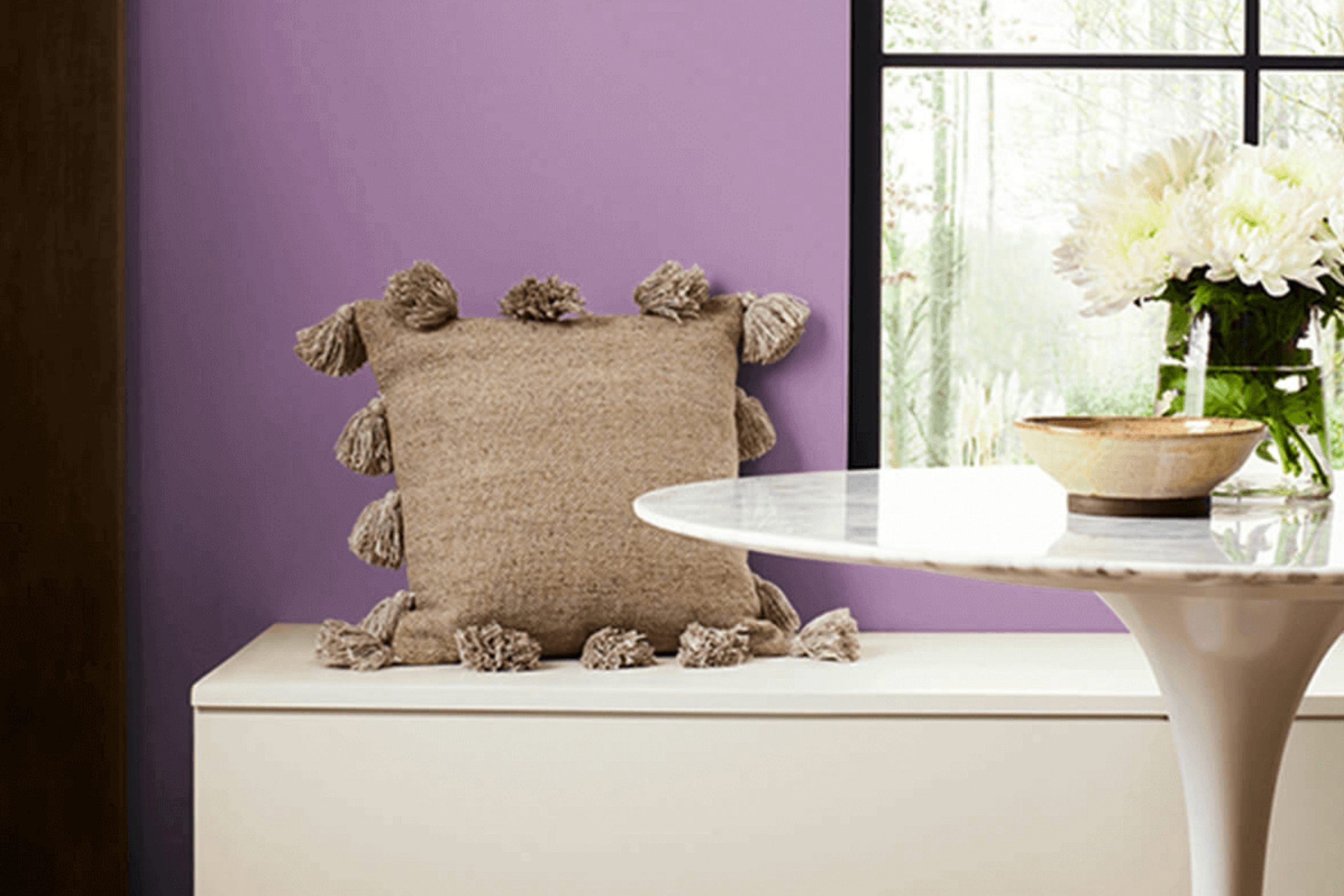
I recently stumbled upon SW 6837 Baroness by Sherwin Williams, and I must say, it’s a unique shade of paint that deserves attention. It’s not just any ordinary color; its rich, deep tone brings a sense of sophistication and elegance to any room. As you consider refreshing your room, you might want to consider how this hue can redefine the aesthetics of your interiors.
SW 6837 Baroness is a rich, bold shade — perfect for a statement wall or for bringing depth to the whole room. If you’re thinking about giving your home or office a makeover, this color offers a refreshing alternative to the more typical choices. It pairs well with a wide range of decor styles, from modern to traditional, making it a practical option for most design projects.
Moreover, the durability and quality of Sherwin Williams paints mean that applying Baroness to your walls is not only an aesthetic choice but a practical one as well. It’s a paint that stands up to everyday wear and tear while keeping its beautiful color, ensuring that your room looks great for years to come.
In summary, SW 6837 Baroness by Sherwin Williams is more than just a paint color; it’s a way to enhance the character and warmth of any room. Whether you want to make a bold statement or add a touch of elegance, Baroness is a shade that can completely change the feel of your room
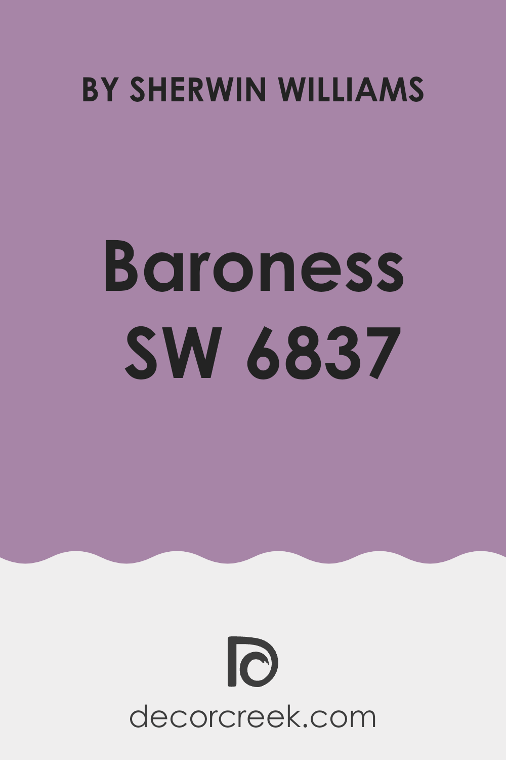
What Color Is Baroness SW 6837 by Sherwin Williams?
The color Baroness by Sherwin Williams is a rich and vibrant shade of purple with deep blue undertones. This color exudes a sense of luxury and creativity, making it a bold choice for interior parts of the home. It’s especially striking when used as an accent wall or within a room that features strong design elements.
Baroness pairs beautifully with a variety of materials and textures. It looks stunning against sleek, glossy finishes like lacquered furniture and also complements softer, matte textures like velvet or wool. The depth of its hue brings out the richness in natural wood and can also create a striking contrast with metallic accents in shades of gold or brass.
This color works wonderfully in modern and contemporary interiors, as well as in bohemian and eclectic decor styles, where its intensity can be balanced by lighter or more neutral tones. In a modern setting, you might consider using it with clean lines and minimalist designs to let the color itself be the showpiece. Alternatively, in a more eclectic room, pairing it with patterned fabrics and a variety of textures can create a warm, inviting, and visually interesting room.
Baroness is a bold, lively choice that brings both warmth and depth — perfect for adding a bit of drama and personality to any room.
Is Baroness SW 6837 by Sherwin Williams Warm or Cool color?
BaronessSW 6837 is a paint color by Sherwin Williams that offers a deep, rich purple hue. This particular shade can bring a touch of drama and quiet luxury to a room, all while keeping the look balanced and easy to live with. It works well in both small parts of the home, like a bathroom or an accent wall, to add a pop of color, as well as in larger rooms such as living rooms or bedrooms where it can create a cozy, inviting atmosphere.
The color pairs nicely with neutrals such as white, gray, or beige, allowing it to stand out and become the focal point of a room. Alternatively, it can be matched with metallic tones like gold or silver for a more glamorous look. Since it’s a darker color, lighting plays a crucial role when using BaronessSW 6837.
With good lighting, the purple can look vibrant and rich, while in dimmer settings, it can provide a calming, more muted effect. Overall, this shade gives you plenty of options for decorating and helps bring a fresh, pulled-together look to any part of the home
Undertones of Baroness SW 6837 by Sherwin Williams
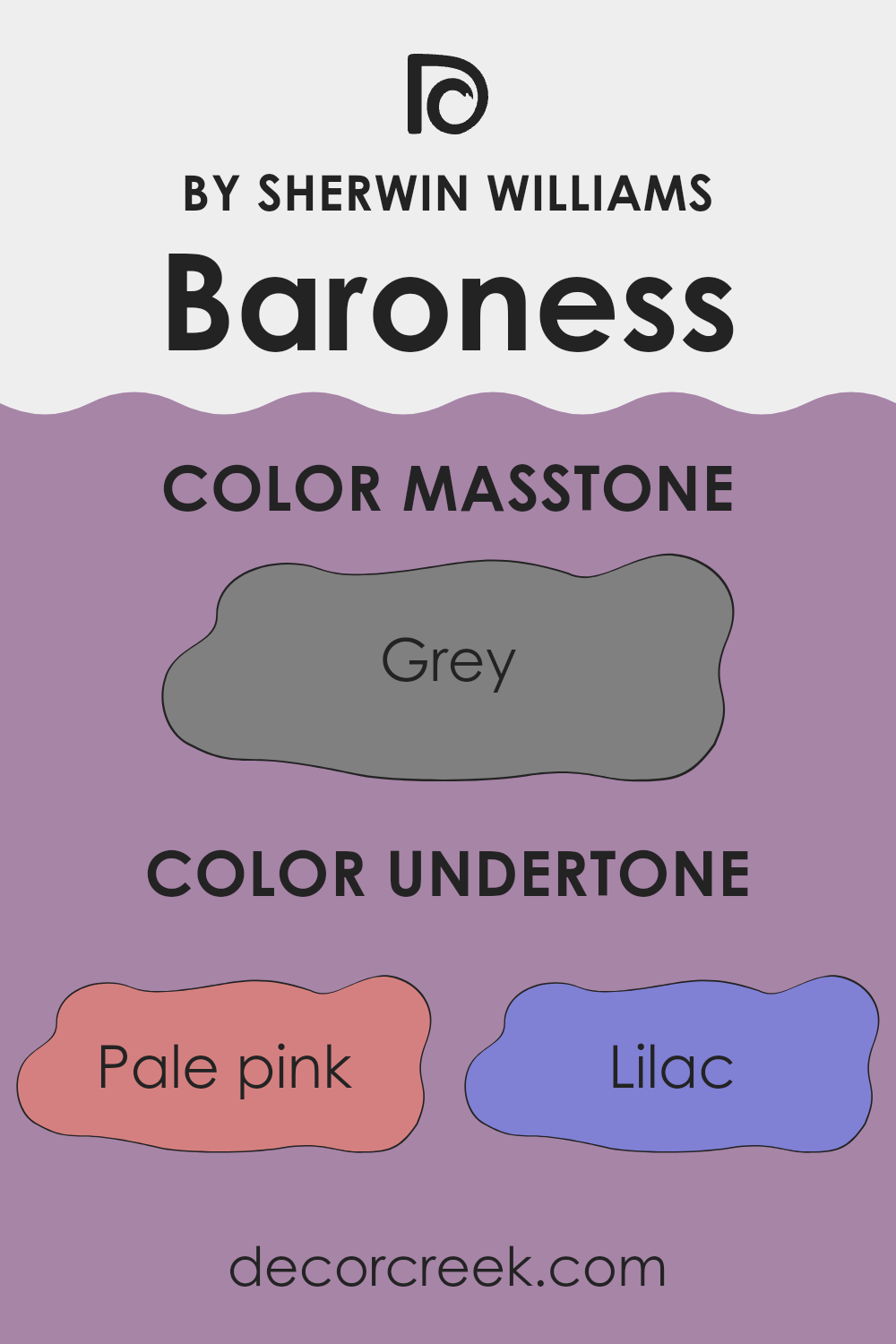
Baroness by Sherwin Williams is a complex color with a rich palette of undertones that significantly influence how it appears under different lighting conditions and when placed next to other colors. Undertones are subtle colors that lie beneath the surface of the main color and can enhance the base color in various ways. For instance, undertones like pale pink, lilac, and light purple lend a soft and gentle effect, making the color appear more soothing and less stark.
When used on interior walls, the undertones in Baroness allow it to adapt beautifully with different decor styles and color schemes. The influence of lighter undertones like mint and light blue can make a room feel fresh and airy, while darker undertones like purple and navy add depth and richness, making the room feel more cozy and grounded.
In practical terms, the variety of undertones means that Baroness can react differently in sunlight versus artificial light. Under natural light, the lighter undertones might become more pronounced, giving the paint a vibrant and lively look. In contrast, in dimmer, indoor light, darker undertones might stand out, making the walls look more subdued and warm.
This versatility makes Baroness a functional choice for many rooms, adapting to changes in both lighting and surrounding colors. This adaptability is crucial for homeowners who want a color that can evolve with their changing tastes and decorations without needing frequent repainting.
What is the Masstone of the Baroness SW 6837 by Sherwin Williams?
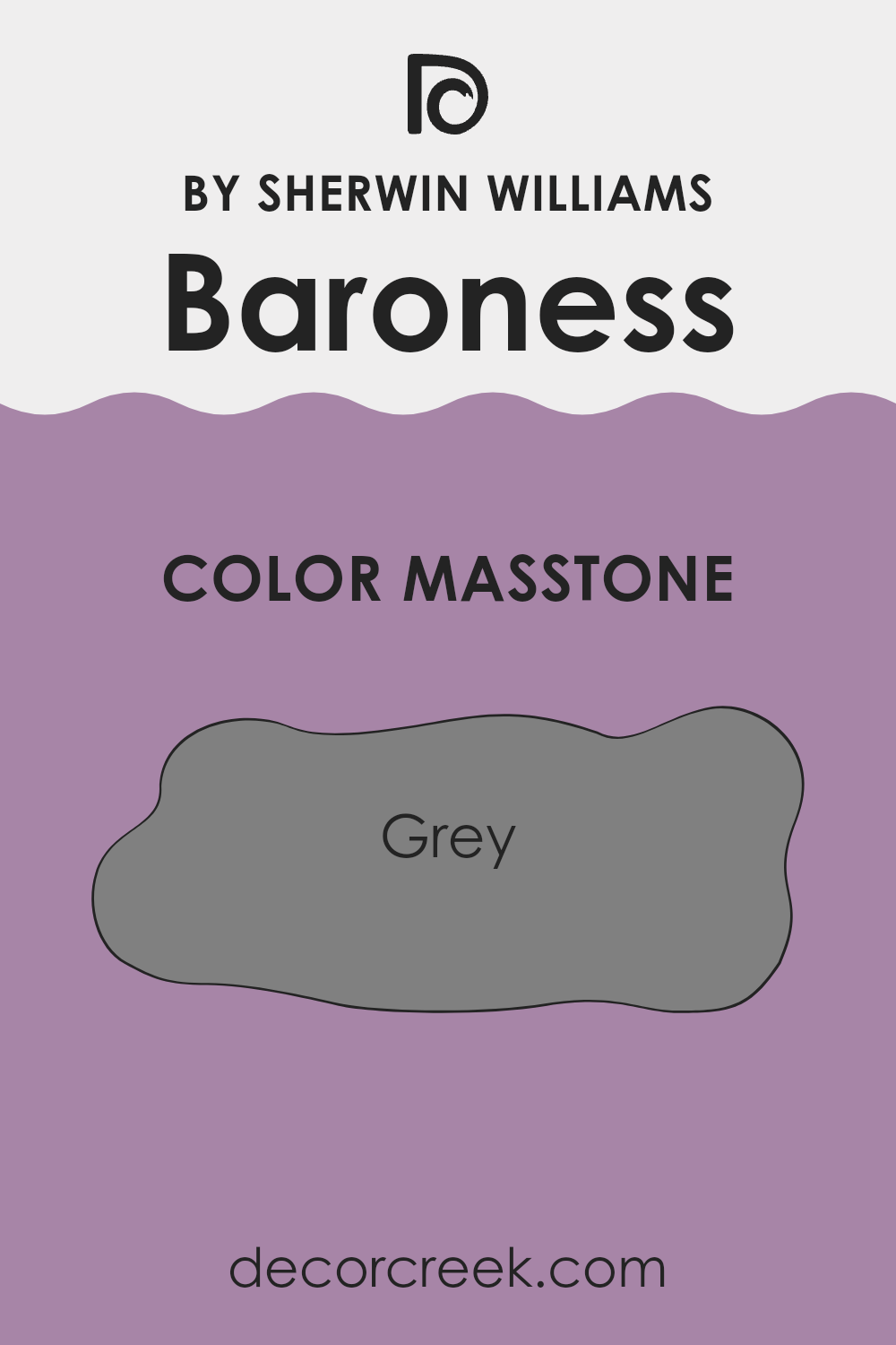
BaronessSW 6837 by Sherwin Williams has a masstone of grey, similar to the standard grey color (#808080). This neutral shade is very adaptable, making it a great choice for home interiors. Because it doesn’t lean too heavily towards either a very dark or very light shade, it provides a balanced backdrop that can complement a wide range of decor styles and colors.
Whether you’re pairing it with bold colors, soft pastels, or other neutrals, this grey helps create a pleasant, pulled-together look that still feels calm and balanced.. It’s particularly effective in areas where you want to maintain a calm and understated atmosphere, such as bedrooms and living rooms.
The versatility of this grey also means it can be suitable for various rooms, from kitchens to bathrooms, depending on the lighting and accessories used. This makes it a practical color choice for those looking to create a room that feels both welcoming and stylish.
How Does Lighting Affect Baroness SW 6837 by Sherwin Williams?
Lighting plays a crucial role in how colors appear in different environments. Depending on whether natural or artificial light is used, a color can look dramatically different. Artificial light, such as LED or fluorescent bulbs, can alter the way a color is perceived, often making it seem brighter or duller depending on the light’s intensity and color temperature. Natural light, on the other hand, provides a pure illumination that can reveal the true depth and vibrancy of a color.
For example, a specific shade like Baroness by Sherwin Williams, which is a rich and warm hue, will appear differently under various lighting conditions. In natural light, this color might look warm and inviting, highlighting its depth and complexity. Whether the light is direct or diffused will also affect its appearance, making it either more intense or gently vibrant.
In a room facing north, Baroness will likely appear cooler and more muted because north-facing rooms get less direct sunlight. The inherently cooler and softer light can make warm colors seem subdued. In contrast, in a south-facing room, where sunlight is abundant throughout the day, this color will appear warmer and more vivid, enhancing its richness.
East-facing rooms receive a lot of light in the morning, so this color will look bright and cheerful in the morning but could turn softer and shadowed as the day progresses. West-facing rooms, meanwhile, have the opposite effect; the color might appear duller in the morning but will be bathed in a warm, golden glow by the afternoon and evening.
Understanding these effects can help in making informed decisions when choosing paint colors for different rooms, ensuring that the color behaves as desired throughout the day under varying lighting conditions.
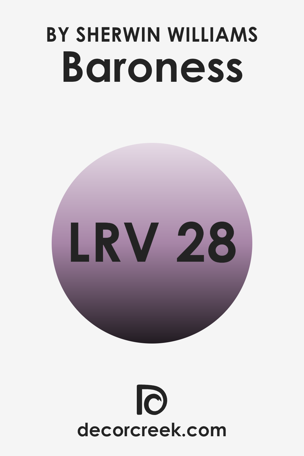
What is the LRV of Baroness SW 6837 by Sherwin Williams?
Light Reflectance Value (LRV) measures the amount of light a paint color reflects or absorbs. This scale runs from a low of 1 to a high of 99, with higher values indicating that the color reflects more light. This makes LRV a pivotal factor when choosing paint colors, especially in terms of setting the mood and feel of a room. Darker colors with lower LRV scores absorb more light, making them ideal for a cozy, intimate ambiance, while lighter colors reflect more light, which can make a room feel larger and more open.
With an LRV of 27.741, the color in question is on the darker side, meaning it has a tendency to absorb more light than it reflects. This characteristic influences the color’s appearance on walls, particularly in rooms with varied lighting conditions.
In well-lit areas, the subtle underlying hues might be noticeable, enhancing the color’s depth and complexity. In dimmer parts of the home, however, the color may appear even darker and could make the room feel smaller or more enclosed. Choosing the right lighting fixtures and placing them strategically can help mitigate this effect, allowing the color to appear more lively and true to its hue.
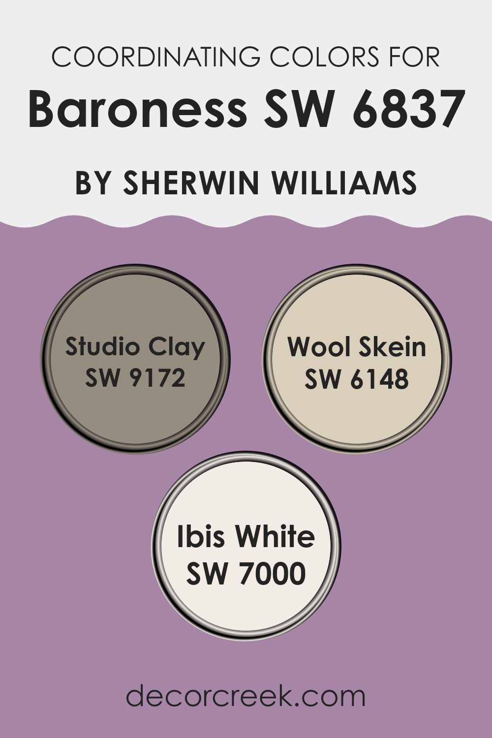
Coordinating Colors of Baroness SW 6837 by Sherwin Williams
Coordinating colors are chosen to complement a primary paint color, working together to create a harmonious color scheme in a room. When colors work well together, they create balance and make the whole room look more put-together — without feeling too strong or distracting. An effective coordination involves using shades that balance the intensity and warmth or coolness of the main color, allowing for a pleasing visual flow in the decor.
For example, Studio Clay (SW 9172) is a rich, warm gray that offers a grounding effect; it works well with bolder colors by providing a subdued contrast. Wool Skein (SW 6148) is another excellent coordinating color, with its soft, subtle beige tone that adds a light and airy feel to parts of the home, reflecting light beautifully.
Lastly, Ibis White (SW 7000) is a bright and clean white, ideal for bringing a fresh and open feel to any room. Each of these colors supports a coordinated look that enhances the primary color without competing for attention, making them ideal choices for creating a cohesive interior color scheme.
You can see recommended paint colors below:
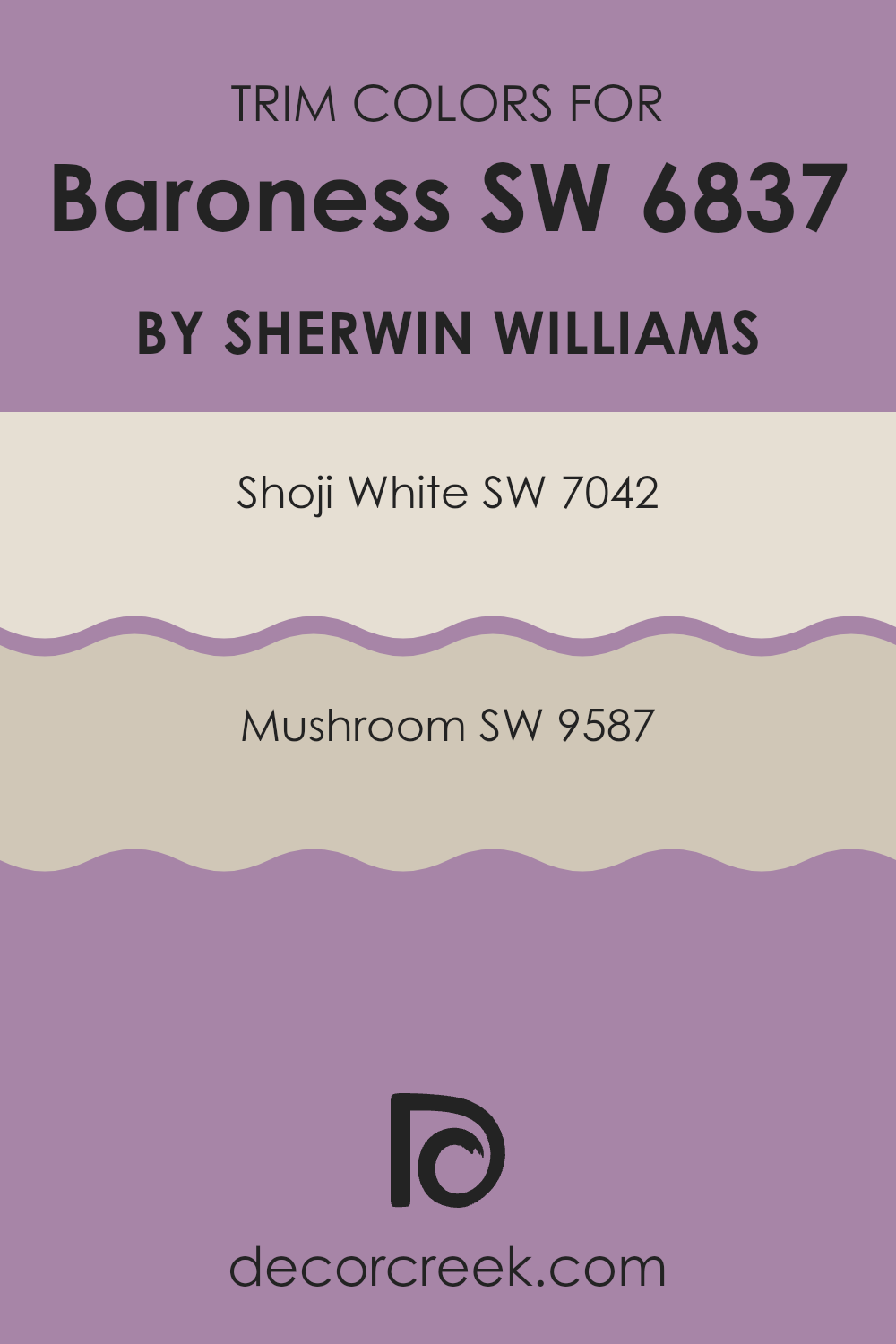
What are the Trim colors of Baroness SW 6837 by Sherwin Williams?
Trim colors, like SW 7042 (Shoji White) and SW 9587 (Mushroom), play a crucial role in framing and accentuating the main colors on walls, such as BaronessSW 6837. These trim colors provide a visual contrast or complement that enhances the overall aesthetic of a room.
Choosing the right trim color can highlight architectural features, create depth, and provide a finished look to any interior.
Trim colors help in defining transitions between different materials or surfaces, making them more visually appealing and polished.
Shoji White by Sherwin Williams is a clean and neutral white tone that can effectively highlight the deep tones of BaronessSW 6837 by providing a crisp border that makes the wall color pop more vividly. Mushroom by Sherwin Williams, on the other hand, is a warm, earthy color that adds a subtle and cozy feel to the room.
It pairs well with richer colors, softening the overall appearance and adding a layer of warmth to the interior, making it feel more inviting and homely.
Both of these colors work well as trim, offering different effects that can either sharpen or soften the visual impact of the main wall color.
You can see recommended paint colors below:
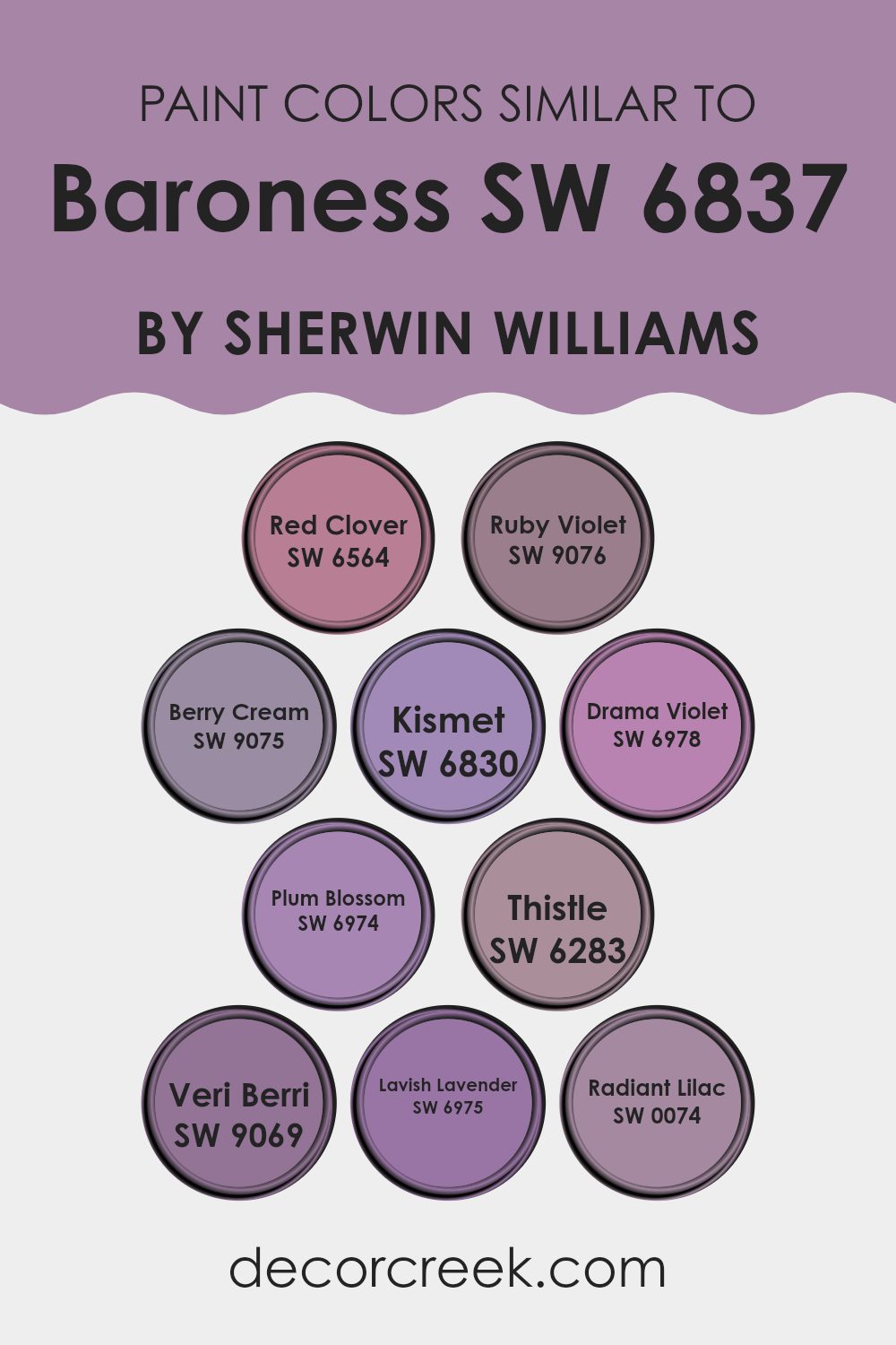
Colors Similar to Baroness SW 6837 by Sherwin Williams
Similar colors play a crucial role in interior design, as they help to create a harmonious and pleasing atmosphere within a interior. These similar hues allow for subtle variations in color that enrich the visual experience without causing a stark contrast, which can disrupt the flow of a room. By using colors that are akin to each other, one can achieve a cohesive look that still offers variety and depth, making parts of the home feel thoughtfully put together and aesthetically balanced.
For instance, Red Clover is a bold yet warm hue that adds a hint of adventurous spirit, while Ruby Violet introduces a deeper, more subdued tone that retains that warmth. Berry Cream softens the palette with its lighter, more soothing presence, and Kismet brings a playful brightness to the mix.
Drama Violet and Plum Blossom lean towards a more intense expression with their rich saturation, pulling in a touch of elegance. Thistle, on the other hand, provides a gentle, muted option that blends seamlessly with these bolder choices.
Veri Berri, akin to Thistle, offers depth with its understated vibe. Completing this palette, Lavish Lavender and Radiant Lilac present a lively yet tender lavender tone that rounds out the selection, ensuring there’s a color to enhance and complement every type of decor while maintaining a unified look.
You can see recommended paint colors below:
- SW 6564 Red Clover
- SW 9076 Ruby Violet
- SW 9075 Berry Cream
- SW 6830 Kismet
- SW 6978 Drama Violet
- SW 6974 Plum Blossom
- SW 6283 Thistle
- SW 9069 Veri Berri
- SW 6975 Lavish Lavender
- SW 0074 Radiant Lilac
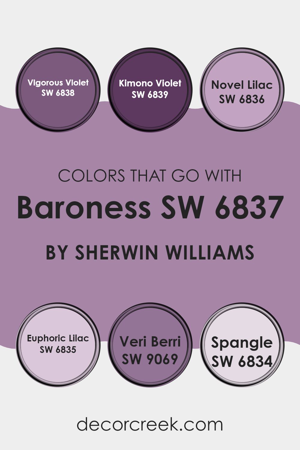
Colors that Go With Baroness SW 6837 by Sherwin Williams
Choosing the right colors to complement Baroness SW 6837 by Sherwin Williams is crucial in creating a harmonious and visually appealing interior. Colors that coordinate well can enhance the atmosphere of a room, making it feel more cohesive and intentional.
For example, pairing Baroness with colors like Vigorous Violet or Kimono Violet allows for a dynamic yet unified look, as these shades share similar violet tones. On the other hand, using lighter colors like Novel Lilac and Euphoric Lilac can soften the overall look, adding gentle contrast that brightens the interior while keeping it calm and balanced
Using colors like Veri Berri and Spangle offers additional versatility. Veri Berri has a deep, rich berry shade that adds a touch of drama and warmth, ideal for accentuating key features or for use in cozy, intimate parts of the home. Spangle, a light, sparkling lilac, introduces a fresh, lively vibe that can make parts of the home feel more open and airy.
When these colors are used together with Baroness, they create a pleasing spectrum from bold and deep to light and refreshing, ensuring any decor feels complete and well-thought-out. This approach to selecting complementary colors not only enhances the aesthetic value but also reflects personal style and preference, making the interior truly unique.
You can see recommended paint colors below:
- SW 6838 Vigorous Violet
- SW 6839 Kimono Violet
- SW 6836 Novel Lilac
- SW 6835 Euphoric Lilac
- SW 9069 Veri Berri
- SW 6834 Spangle
How to Use Baroness SW 6837 by Sherwin Williams In Your Home?
Baroness SW 6837 by Sherwin Williams is a rich and vibrant shade of purple that can bring warmth and character to any interior. This color works well when used in bedrooms or living areas, providing a pleasant and inviting atmosphere. For those looking to experiment with color, Baroness can be an ideal accent wall, pairing well with neutral shades like whites or soft grays, enhancing the overall appeal of a room without overpowering it.
In home offices, a touch of Baroness can help stimulate creativity and add a personal touch. If you prefer a more reserved look but still want a hint of color, try using Baroness on smaller details like trim or door frames. It brings in color gently, without taking over the room.
When decorating, you can complement this shade with decor items in gold or silver to add a little luxury, or use wooden furniture to create a grounded, earthy feel. This versatility makes Baroness a great choice for anyone looking to refresh their home.
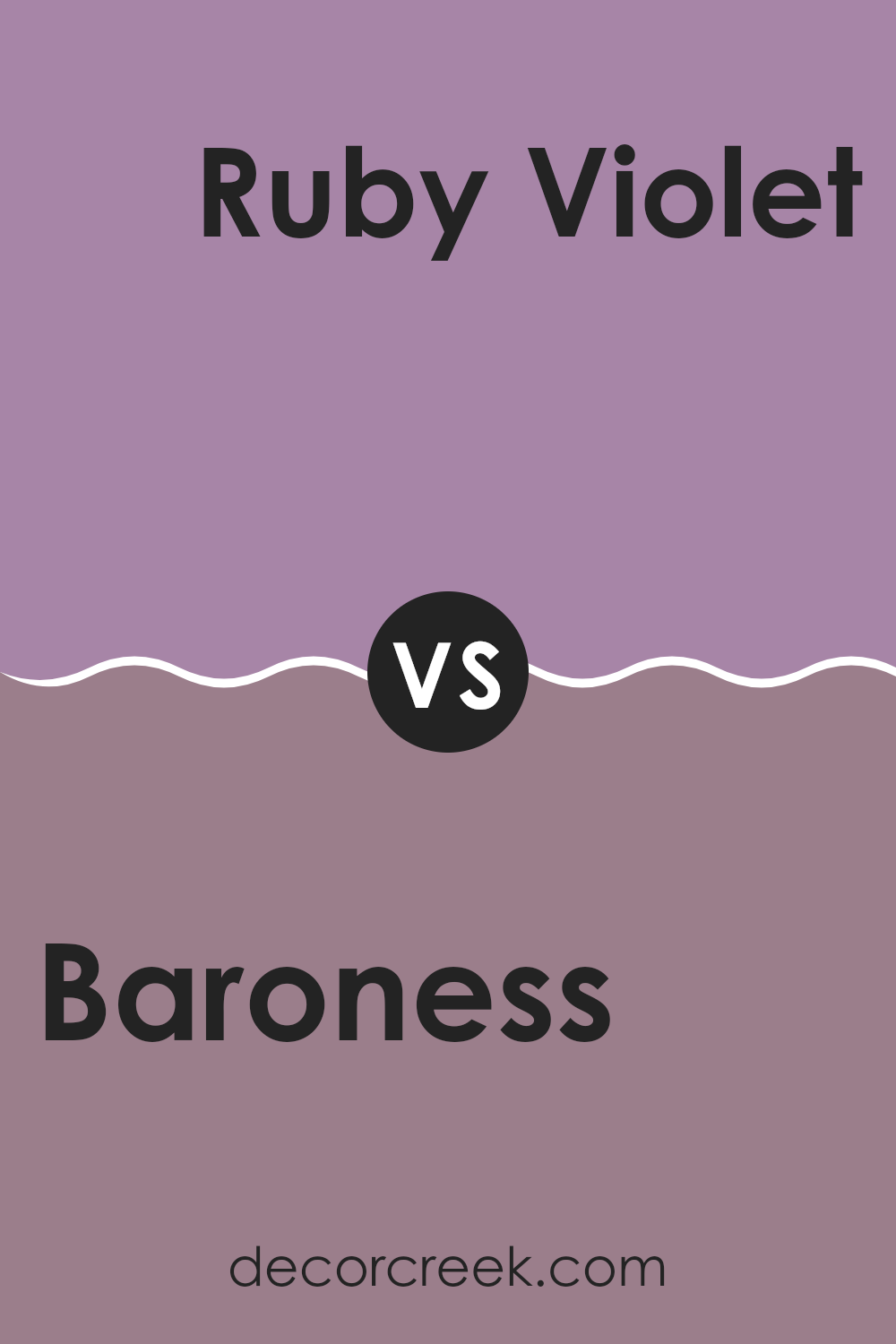
Baroness SW 6837 by Sherwin Williams vs Ruby Violet SW 9076 by Sherwin Williams
The two colors, Baroness and Ruby Violet, offer distinct hues that can significantly influence the mood and style of any interior. Baroness is a soft, muted purple with blue undertones, providing a subtle and gentle look. It’s perfect for creating a calm and cozy environment in areas like bedrooms or living rooms.
In contrast, Ruby Violet is a bolder, deeper purple with red undertones, which makes it more vibrant and impactful. This color works well when you want to add a splash of energy and personality to a interior, making it ideal for accent walls or decorative elements.
While Baroness emits a gentle, soothing vibe, Ruby Violet offers a dynamic and lively feel. The choice between them depends on what kind of atmosphere you want to create in your room.
You can see recommended paint color below:
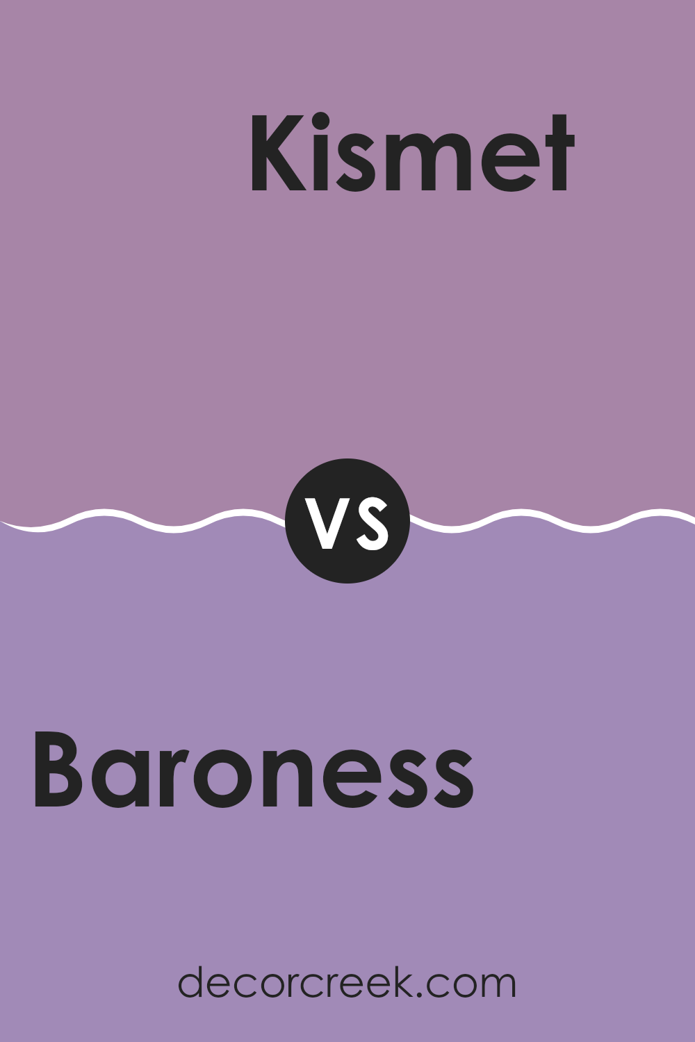
Baroness SW 6837 by Sherwin Williams vs Kismet SW 6830 by Sherwin Williams
Baroness is a vibrant shade of pink with a lively character, perfect for adding a pop of boldness to any interior. It has a youthful energy that can brighten rooms and create a playful atmosphere.
On the other hand, Kismet is a deep teal color that leans a bit more towards sophistication, offering a calming balance to interiors. It’s a darker, richer hue compared to Baroness, and it often brings a sense of depth and focus to an area.
When you’re deciding between these two colors, think about the mood you want to set. Baroness is great for sparking energy and fun, while Kismet is better for creating a grounded, peaceful setting. Each color stands out in its own way and can significantly affect the feel of a room.
You can see recommended paint color below:
- SW 6830 Kismet
Baroness SW 6837 by Sherwin Williams vs Drama Violet SW 6978 by Sherwin Williams
Baroness and Drama Violet are two striking paint colors from Sherwin Williams that each carry a unique visual punch. Baroness is a muted purple with subtle gray undertones, giving it a soft and subtle presence that works well in spots that aim for a calm and soothing atmosphere. This color fits easily into bedrooms or living areas, especially when you want a soft, quiet touch of elegance.
On the other hand, Drama Violet is a much bolder and deeper shade of purple. This color makes a strong statement and is perfect for areas where you want to make an impact, like an accent wall or a creative part of the home. It’s richer and more intense, bringing energy and depth into a room.
While both colors share a purple base, the lightness of Baroness offers a whisper of color, contrasting with the lively shout of Drama Violet. Choosing between them depends on the mood you want to set: calming and gentle with Baroness or bold and vibrant with Drama Violet.
You can see recommended paint color below:
- SW 6978 Drama Violet
Baroness SW 6837 by Sherwin Williams vs Thistle SW 6283 by Sherwin Williams
Baroness and Thistle by Sherwin Williams are two distinct colors with their unique appeal. Baroness has a deep, vibrant green tone that brings a sense of vitality and freshness to a part of the home. It’s a bold color, perfect for making a statement in a room, especially when used on accent walls or for highlighting key pieces of furniture.
On the other hand, Thistle is a softer, more subtle purple with gray undertones. This color is gentler and lends itself well to creating a calming atmosphere in a room. It works great for bedrooms or bathrooms where a peaceful, soothing vibe is desired.
While both colors add a beautiful touch to interiors, Baroness tends to draw more attention due to its rich hue. Thistle, in contrast, blends more seamlessly into the background, making it ideal for those preferring a more muted color scheme. Together, they can complement each other nicely if used thoughtfully within the same color palette.
You can see recommended paint color below:
- SW 6283 Thistle
Baroness SW 6837 by Sherwin Williams vs Red Clover SW 6564 by Sherwin Williams
Baroness is a light, delicate purple that brings a soft and airy feel into any part of the home. Its subtle lavender tones offer a gentle backdrop, perfect for creating a calm and inviting atmosphere. This color works well in bedrooms, living rooms, or nurseries — it brings a clean, simple feel that stays soft and easy on the eyes.
In contrast, Red Clover is a vibrant, deep pink with a touch of red. This color is bolder and more energetic, making a statement wherever it’s used. Ideal for accent walls, creative spots, or any area that benefits from a pop of color, Red Clover can add life and personality to a room. It pairs well with neutral colors to balance its intensity and can be used to inject fun and enthusiasm into a part of the home.
Together, these colors offer a range of possibilities, allowing for both calm subtlety and vibrant energy in different parts of a home.
You can see recommended paint color below:
Baroness SW 6837 by Sherwin Williams vs Veri Berri SW 9069 by Sherwin Williams
Baroness and Veri Berri are two distinct colors by Sherwin Williams. Baroness is a subtle and gentle pink with a calm presence, making it a great choice for creating a soft and welcoming atmosphere. It pairs well with neutral tones, providing a touch of warmth without being overly bold.
On the other hand, Veri Berri is a deeper, more vibrant shade. It has a richer, berry-like hue that stands out and adds energy to a part of the home. This color is perfect for making a statement, whether you’re painting an accent wall or decorating a whole room.
While Baroness is more understated and blends seamlessly into quiet design schemes, Veri Berri is bolder and can be the centerpiece of a room’s decor. They both offer unique vibes and can be used effectively depending on the mood and style you’re aiming for in your part of the home.
You can see recommended paint color below:
- SW 9069 Veri Berri
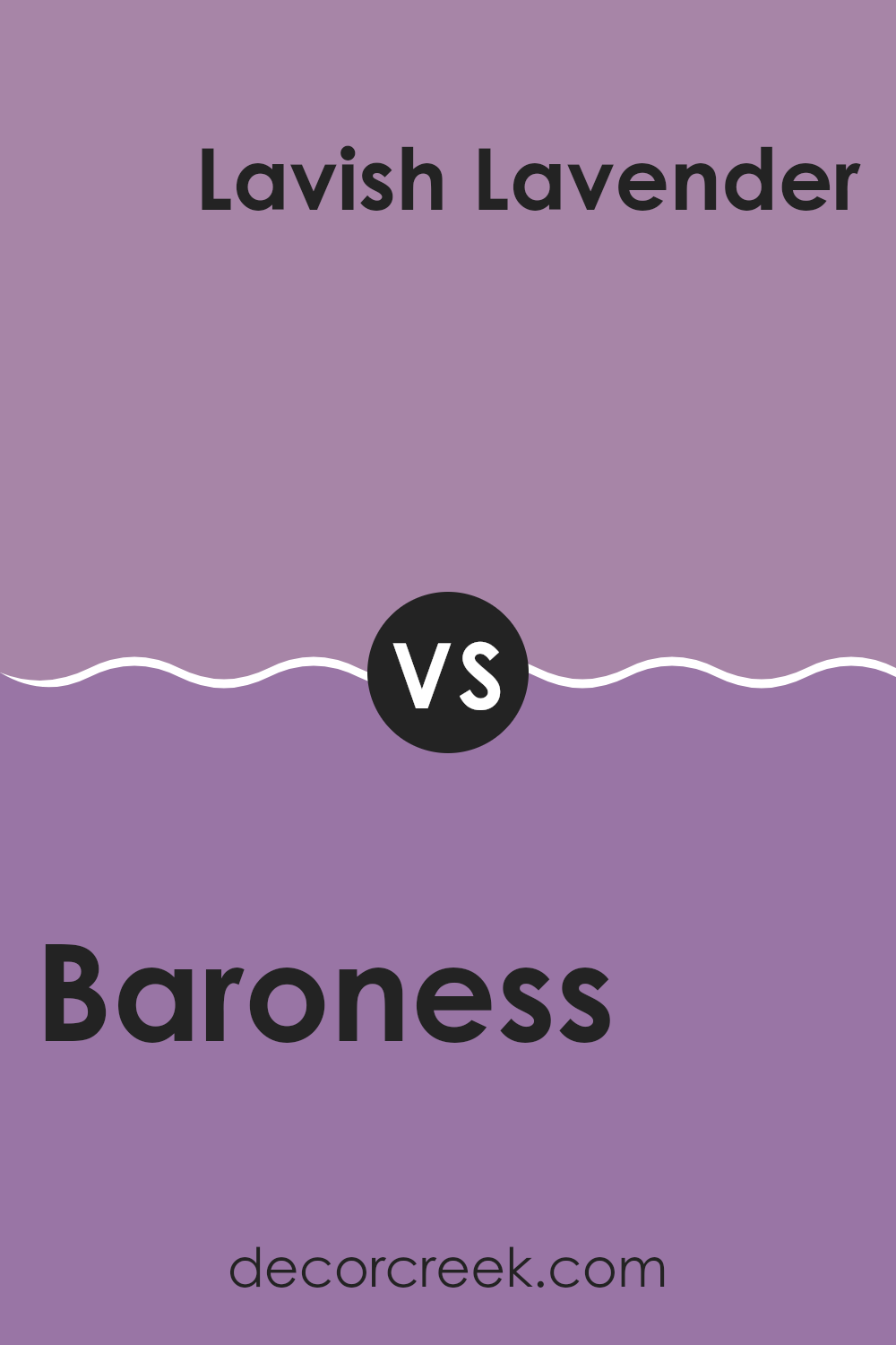
Baroness SW 6837 by Sherwin Williams vs Lavish Lavender SW 6975 by Sherwin Williams
Baroness and Lavish Lavender by Sherwin Williams are both eye-catching colors, but they offer distinctly different vibes for room decor. Baroness is a deep, bold purple hue that adds a strong presence to any part of the home. It is vibrant and can make a significant impact, especially when used on an accent wall or in a room with plenty of natural light.
In contrast, Lavish Lavender is a softer, more gentle purple with a hint of blue, giving it a cooler tone. This color is perfect for creating a calming and welcoming atmosphere, ideal for bedrooms or bathrooms where a soothing effect is desired.
While Baroness draws more attention, Lavish Lavender is subtler, blending easily with lighter colors and decor. Both colors pair nicely with a range of styles, but the best choice depends on the mood and feeling you want to create in the room.
You can see recommended paint color below:
- SW 6975 Lavish Lavender
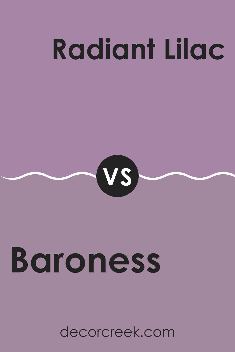
Baroness SW 6837 by Sherwin Williams vs Radiant Lilac SW 0074 by Sherwin Williams
Baroness and Radiant Lilac, both by Sherwin Williams, offer distinct shades of purple, each with its unique appeal. Baroness sports a deeper, more subdued purple that can add a sense of richness and warmth to any part of the home. It is ideal for a cozy environment or to add a touch of elegance to a room without being too bold.
On the other hand, Radiant Lilac has a brighter, more vibrant tone. It is lighter and tends to bring a fresher, more energetic feel to interiors. This color works well in areas that aim to be cheerful and inviting, such as a child’s bedroom or a creative part of the home.
While both colors share a purple base, Baroness leans towards a darker, moodier hue, and Radiant Lilac offers a more lively and luminous vibe. Choosing between them depends on the atmosphere you want to achieve and how the color interacts with the light and furnishings in your room.
You can see recommended paint color below:
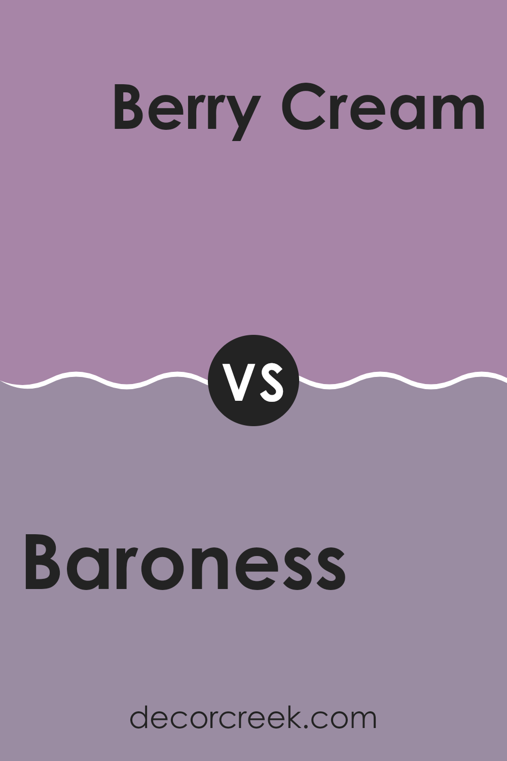
Baroness SW 6837 by Sherwin Williams vs Berry Cream SW 9075 by Sherwin Williams
Baroness and Berry Cream, both Sherwin Williams paints, offer unique shades that cater to different tastes in decor. Baroness is a bold, deep pink that can add a lot of character and warmth to a room. It’s perfect for making a strong statement in areas like living rooms or dining areas.
On the other hand, Berry Cream is much softer, leaning towards a muted pink with hints of peach. This color is subtler and tends to bring a gentle, cozy feel to rooms, making it ideal for bedrooms or spots where you want a calming atmosphere.
While both colors share a pink base, Baroness packs a punch with its richer hue, whereas Berry Cream offers a softer and more understated vibe. Thus, choosing between them depends on the mood you’re aiming to set in your room.
You can see recommended paint color below:
- SW 9075 Berry Cream
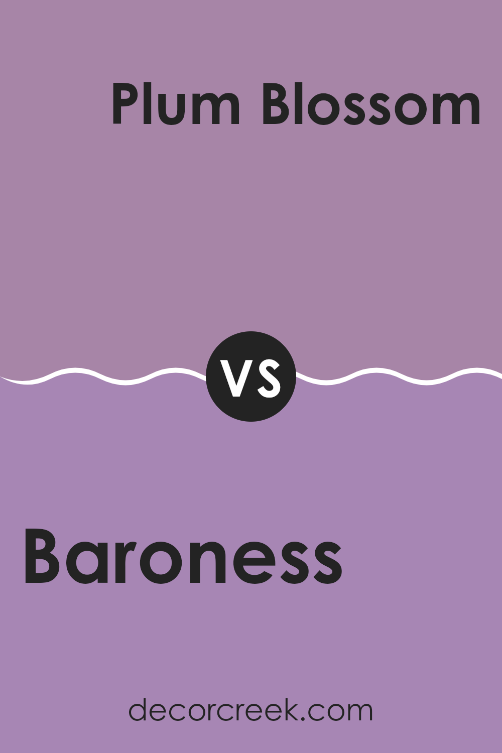
Baroness SW 6837 by Sherwin Williams vs Plum Blossom SW 6974 by Sherwin Williams
Baroness and Plum Blossom by Sherwin Williams are two distinct shades that serve different decorative purposes. Baroness is a soft, light purple with gray undertones, giving it a muted and subtle appearance. This color works well in areas where you want a gentle, calming feel — it adds just enough softness without making the room feel too heavy. It’s a great choice for bedrooms or living rooms where a lighter touch of color is desired.
On the other hand, Plum Blossom is a vibrant, deep purple that adds a bold pop of color to any room. It has a more dramatic presence compared to Baroness and is ideal for creating a focal point in a room, whether on an accent wall or through decorative accessories. This shade would work well in spots that benefit from a bit of drama and energy, like dining areas or creative spots.
Both colors reflect different moods and can significantly alter the feel of a room. While Baroness is understated and soft, Plum Blossom is lively and striking.
You can see recommended paint color below:
- SW 6974 Plum Blossom
In conclusion, the paint color SW 6837 Baroness by Sherwin Williams is truly special. As I shared my thoughts on this color, I realized just how warm and welcoming it can make a room feel. The color is a bit like a cozy blanket; it has a soft, gentle quality that can make any room feel more inviting. This makes it perfect for places where you want to relax and feel at home, like the living room or bedroom.
Baroness isn’t just another ordinary shade; it carries a sense of elegance and calmness. When I used it to paint a room, I noticed how it added a lovely touch without being too bright or too dull. It’s like the perfect middle ground, making it a good choice for anyone who wants to refresh their room without making it too loud or too subtle.
Overall, using SW 6837 Baroness in your home can help set the mood for calm and relaxing moments. Whether you’re painting a whole room or just an accent wall, this color won’t disappoint. It blends well with different decorations and furniture, making it easy to work with. If you’re thinking about giving your room a new look, I’d say Baroness is a color worth considering!
Ever wished paint sampling was as easy as sticking a sticker? Guess what? Now it is! Discover Samplize's unique Peel & Stick samples.
Get paint samples

