Pink paint can feel like a big step. Some people think it’s only for kids or too sweet for grown-up rooms. But that’s not true. The right pink brings in light, warmth, and a cozy mood that other colors just can’t do the same way. I’ve worked with so many shades of pink over the years—from soft, light ones to deep, dusty tones—and each one has a way of making a room feel more special.
Whether you want your bedroom to feel gentle, your living room to feel inviting, or your hallway to feel cheerful, there’s a pink that fits.
Sherwin Williams has some of my favorites, and I’ve used these in real homes where people live real lives. Let me show you the best ones I keep coming back to.
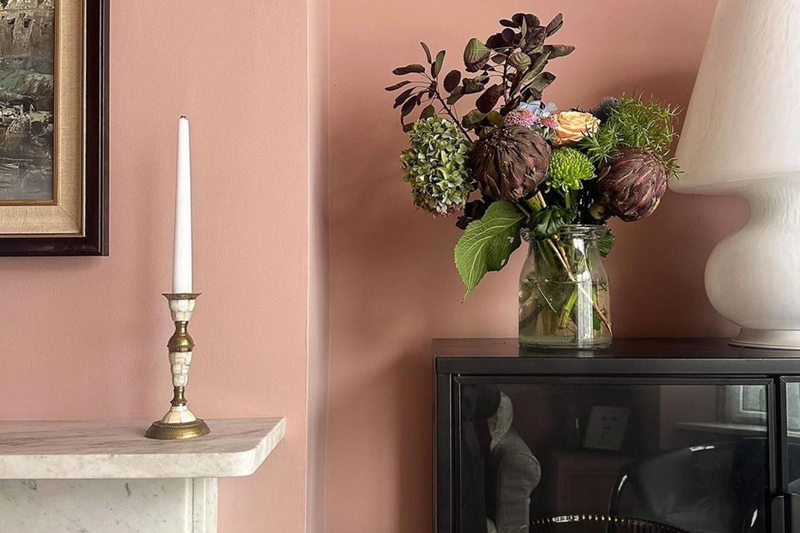
The Dusty Pinks That Always Feel Just Right
Dusty pinks are the ones I turn to when I want a room to feel quiet but not boring. These colors hold a little more brown or gray in them, which keeps them from feeling too bright or loud. They remind me of a faded flower or old velvet. They’re great for grown-up bedrooms, dining rooms, or even offices.
I use them when I want a wall to feel warm but not too loud. These pinks are strong enough to stand alone, but they also look great next to creams, taupes, or soft whites.
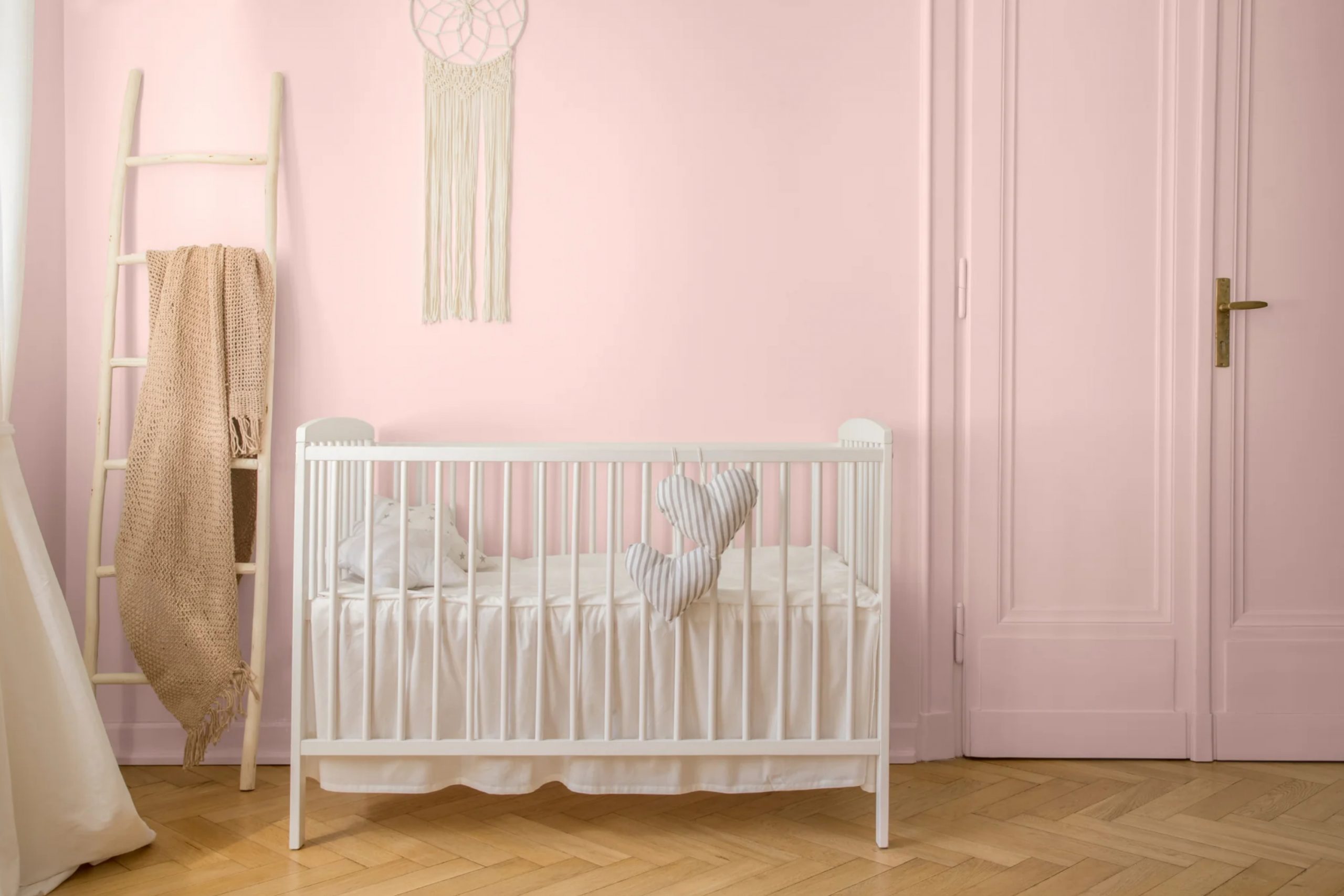
The Best Light Pinks for Soft, Sweet Rooms
Light pinks are where people usually start. These colors feel fresh and soft, and they work beautifully in bedrooms, nurseries, and even bathrooms. I like to use them in rooms where you want a little glow without going full color. Light pink walls reflect the sun in the nicest way.
They don’t shout, but they never feel flat. Some of them have a tiny bit of peach, while others lean more rosy. There’s a soft pink out there for every kind of home.
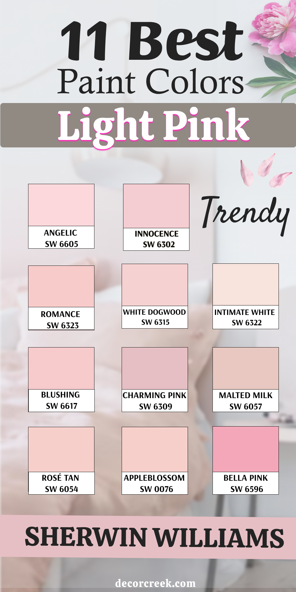
11 Light Pink Paint Colors by Sherwin Williams
Angelic (SW 6605)
Angelic makes everything feel gentle. This pink has a quiet glow that works so well in small rooms or kids’ bedrooms. Angelic isn’t too light to notice, but it also never feels loud. I’ve used it in bathrooms with white tile and in bedrooms with cream bedding. It gives just the right kind of warmth. Angelic looks best with soft whites and brushed gold fixtures.
The key rule of this color: keep the lighting warm to make the pink feel even sweeter.
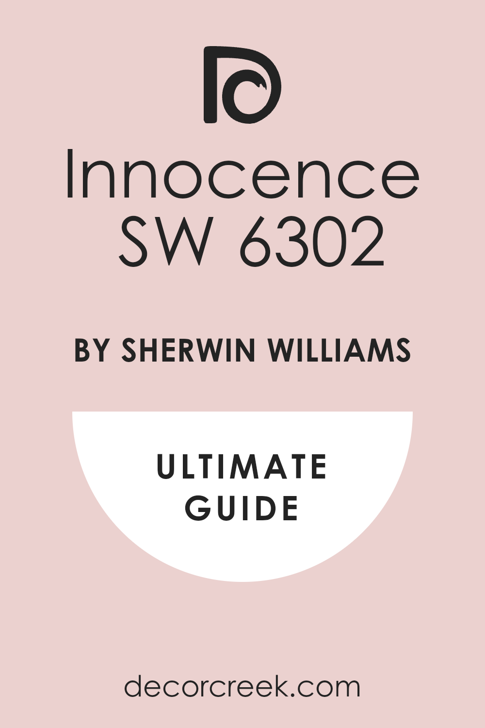
Innocence (SW 6302)
Innocence brings a clean, rosy feel that’s perfect for soft rooms. It’s a little brighter than some light pinks but still gentle on the eyes. I’ve used Innocence in girl’s rooms and guest rooms, and people always notice how kind it feels. It pairs well with light woods and soft gray furniture. In daylight, it shows more pink; in dim light, it looks almost creamy.
The key rule of this color: don’t mix it with bold tones—keep everything soft.
🎨 Check out the complete guide to this color right HERE 👈
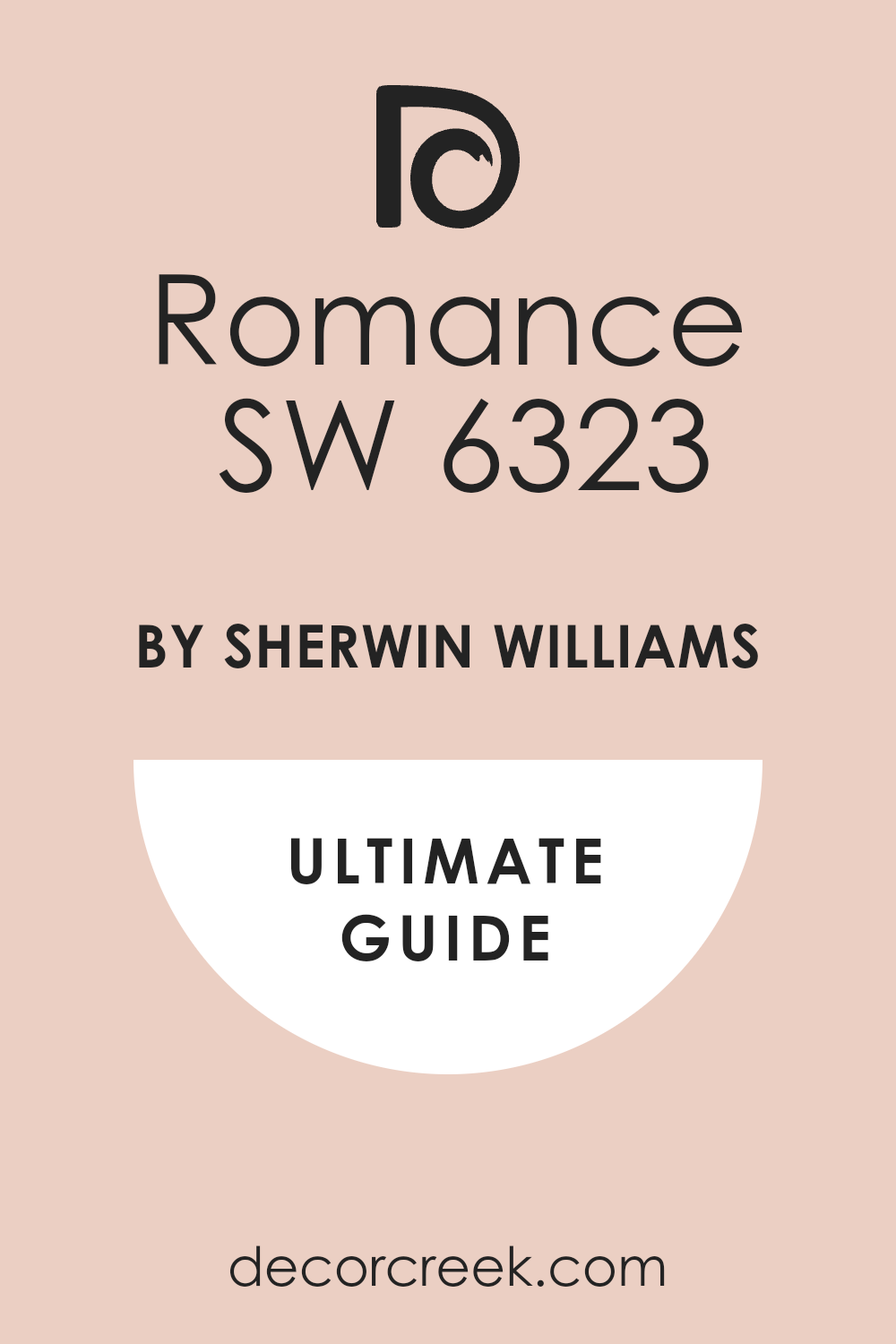
Romance (SW 6323)
Romance brings a warm and pretty tone without feeling sugary. It has a peachy side that makes it great for sunny rooms. I’ve used Romance in nurseries and small offices, and it always makes the room feel sweeter. This color sits well next to ivory or tan. It works best with natural textures like rattan or soft linens.
The key rule of this color: let it shine with neutral bedding and simple wall art.
🎨 Check out the complete guide to this color right HERE 👈
White Dogwood (SW 6315)
White Dogwood is barely pink—but that’s what makes it so special. It’s soft and has a creamy feel that looks good in any light. I’ve used it in living rooms where people wanted something calm without going all white. It pairs well with beige, light wood, and clean whites. White Dogwood helps a room feel open while still warm.
The key rule of this color: it’s great with layered textures like knits, baskets, or soft cotton.
Intimate White (SW 6322)
Intimate White is a warm, faded pink with a soft finish. It has a tiny bit of peach in it, which gives it a friendly feel. I’ve used this one in bedrooms and even laundry rooms—it makes everything feel cleaner. It pairs beautifully with warm whites and soft greens. It’s great in homes that get a lot of sun.
The key rule of this color: use it with soft lighting to keep it looking fresh.
🎨 Check out the complete guide to this color right HERE 👈
Blushing (SW 6617)
Blushing gives a fun, pretty glow to any room. It’s light but still very much pink. I’ve used Blushing in kids’ rooms, powder baths, and even entryways where I wanted a happy start to the house. This one pairs nicely with warm brass or soft white trim. Blushing adds energy without feeling too strong.
The key rule of this color: match it with neutral furniture to keep it balanced.
Charming Pink (SW 6309)
Charming Pink brings a soft, classic feel. It’s a little deeper than some light pinks, but still gentle. I’ve used this one in dining rooms and bedrooms where people wanted something a bit more grown-up. It looks great with dark wood floors or crisp white trim. Charming Pink feels rich but not too fancy.
The key rule of this color: pair it with soft lights and simple bedding to keep things cozy.
🎨 Check out the complete guide to this color right HERE 👈
Malted Milk (SW 6057)
Malted Milk has a warm, creamy tone with a hint of blush. It’s not a strong pink, but there’s just enough there to give the room a soft look. I like this one in hallways and bathrooms where you want light but also warmth. It works well with tan, ivory, and soft greens.
The key rule of this color: layer in natural wood to bring out its warmth.
🎨 Check out the complete guide to this color right HERE 👈
Rosé Tan (SW 6054)
Rosé Tan brings a grown-up, dusty feel to a room. It’s more muted than a true pink, which makes it great for shared rooms. I’ve used it in living rooms and even offices—it always feels warm and calm. This one pairs well with dark browns and soft creams. It has a bit of old charm to it.
The key rule of this color: add darker accents for contrast and comfort.
Appleblossom (SW 0076)
Appleblossom has an old-fashioned sweetness to it. This pink is light but has enough depth to feel cozy. I love using it in guest rooms and dressing areas. It pairs well with antique whites, soft blues, and floral fabrics. Appleblossom feels warm without being too much.
The key rule of this color: it shines best with classic furniture and cozy touches.
Bella Pink (SW 6596)
Bella Pink is bright, fun, and brings so much light to a room. It’s a cheerful pink that still feels soft. I’ve used it in playrooms and powder baths, and it always lifts the mood. It goes nicely with clean whites and pops of gold. Bella Pink brings a little bit of fun without going too bold.
The key rule of this color: keep the patterns simple so the color stands out.
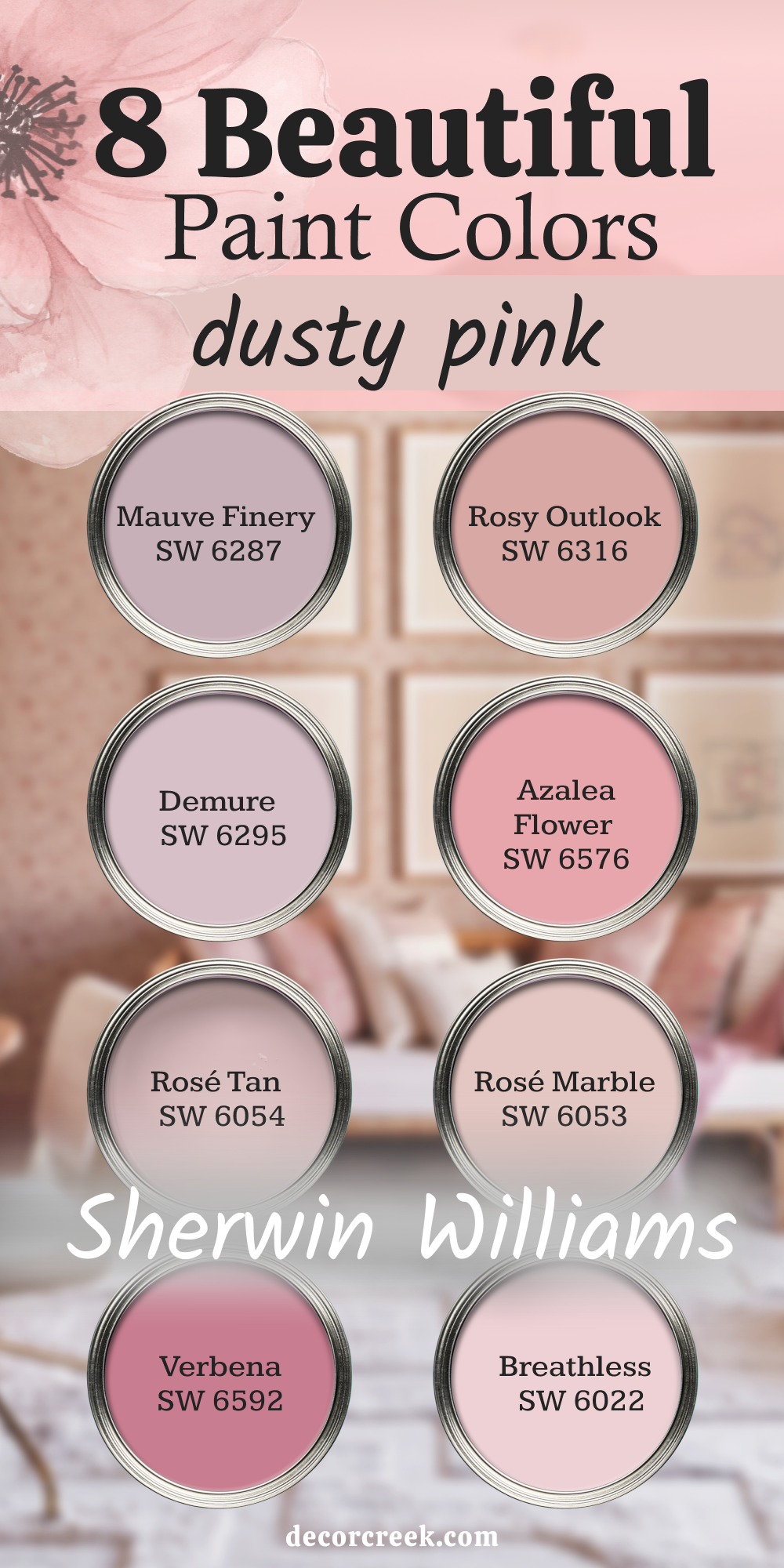
8 Dusty Pink Paints by Sherwin Williams
Mauve Finery (SW 6287)
Mauve Finery has a rich, dusky pink tone that feels cozy and deep. It’s perfect for bedrooms where you want warmth and depth without going too dark. I’ve used it with brass lighting and velvet accents, and it always looks inviting. Mauve Finery works well in rooms with low light too. It pairs best with off-whites and soft taupes.
The key rule of this color: keep the textures soft so the color feels warmer.
Rosy Outlook (SW 6316)
Rosy Outlook gives a dusty, gentle pink that feels grown-up and calm. It’s great for living rooms or bedrooms that need a touch of color without being bright. I’ve used it with black metal beds and linen curtains—it gives just the right balance. Rosy Outlook looks great with cream, tan, and faded florals.
The key rule of this color : add light wood or rattan to make it feel cozier.
Demure (SW 6295)
Demure feels quiet and soft, with a touch of gray in the pink. It’s perfect for a master bedroom or office that needs to feel restful. I’ve used it behind a white headboard, and it made the whole room feel warmer. Demure looks great with aged metals and soft beige.
The key rule of this color: pair it with dimmable lights to keep it feeling soft at night.
Azalea Flower (SW 6576)
Azalea Flower is bold for a dusty pink. It has a punch of color but still feels soft enough for bedrooms. I like this one in smaller rooms that need energy. It pairs beautifully with crisp white trim and floral textiles. Azalea Flower works well in warm, sunny homes.
The key rule of this color: keep other colors simple so the pink stands out.
Rosé Tan (SW 6054)
Rosé Tan brings dusty warmth with a touch of charm. I’ve used it in living rooms, and it always gives a cozy feel. It’s one of those colors that works with old and new furniture alike. Rosé Tan pairs nicely with brass and cream.
The key rule of this color: mix in dark woods to give it depth.
Rosé Marble (SW 6053)
Rosé Marble is soft, dusty, and has just the right amount of warmth. It’s lighter than Rosé Tan but just as comforting. I’ve used this in entryways and quiet bedrooms. It looks great with beige, white, and soft blush tones. Rosé Marble has a gentle touch that makes any room feel friendly.
The key rule of this color: use layers of white for a clean, cozy look.
Verbena (SW 6592)
Verbena is a deeper, rosy mauve that brings energy and style. It works well in bedrooms where you want a strong color that still feels soft. I’ve paired it with dark woods and golden lights—it always looks rich. Verbena needs clean lines and simple furniture.
The key rule of this color: keep it grounded with soft bedding and minimal clutter.
Breathless (SW 6022)
Breathless is a light mauve with a dusty finish. It’s soft enough for most rooms but still adds a little color. I love using this one in offices or small bedrooms where you want a quiet touch. It looks great with whites and soft browns. Breathless is perfect for a room you want to feel safe in.
The key rule of this color: mix it with soft lighting and a warm throw.
🎨 Check out the complete guide to this color right HERE 👈
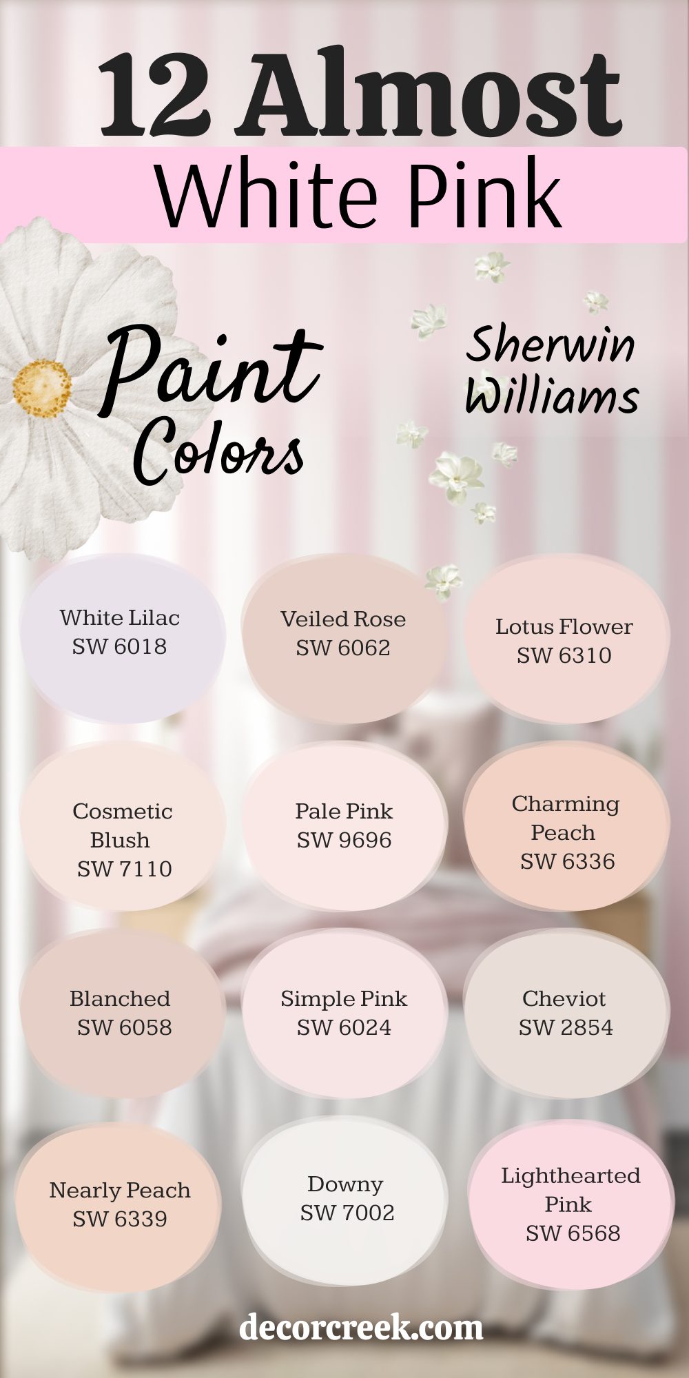
12 Almost White Pink Paint by Sherwin Williams
White Lilac (SW 6018)
White Lilac gives just a touch of pink in a soft, pale base. It feels clean but not cold. I’ve used this in bathrooms and quiet bedrooms, where people wanted a hint of warmth without full color. White Lilac works great with whites and faded grays. It feels like a gentle hug.
The key rule of this color: mix in natural light to help the pink peek through.
Veiled Rose (SW 6062)
Veiled Rose has a soft tan-pink look that leans warm and gentle. It’s a great choice for walls that need more life than beige but not a bold color. I’ve used this in nurseries and guest rooms—it always feels friendly. Veiled Rose pairs well with cream and warm wood.
The key rule of this color: keep it cozy with layered textures.
Lotus Flower (SW 6310)
Lotus Flower is a sweet whisper of pink with a creamy undertone. I like this one for ceilings or closets too—it brings light without shouting. Lotus Flower looks beautiful in soft lighting and matches well with off-white trim. It adds warmth to even cool-toned rooms.
The key rule of this color: it works best in rooms with soft finishes.
Cosmetic Blush (SW 7110)
Cosmetic Blush reminds me of the lightest makeup powder—soft, airy, and just pink enough. It’s a great backdrop for rooms with gold or copper accents. I’ve used it in vanity areas and bedrooms. This color adds charm without being sugary.
The key rule of this color: keep your bedding light and neutral to let the blush shine.
Pale Pink (SW 9696)
Pale Pink has a clean, barely-there feel. It’s great for walls that need a hint of pink but mostly want to feel open. I’ve used Pale Pink in small rooms to help them feel bigger but still warm. It goes with everything from brass to wicker.
The key rule of this color: match it with soft lighting for a glow effect.
🎨 Check out the complete guide to this color right HERE 👈
Charming Peach (SW 6336)
Charming Peach brings a gentle warmth that reads almost pink in low light. It’s not too orange or too sweet—just right in the middle. I love it in sunrooms and bedrooms with light-colored curtains. It pairs well with linen and pale wood.
The key rule of this color: try it on all four walls for full warmth.
Blanched (SW 6058)
Blanched is a soft neutral with a whisper of pink. It gives off a powdery finish that feels cozy and clean. I’ve used it in bedrooms where white felt too cold. Blanched makes the room feel a little softer. It works well with creams, pale pinks, and faded florals.
The key rule of this color: mix with pale woods to keep it feeling grounded.
Simple Pink (SW 6024)
Simple Pink is easy on the eyes and adds quiet charm. It’s one of those shades that looks almost white in sunlight but gives off a pink glow in shadows. I’ve used it in bedrooms and walk-in closets. It works best with silver or nickel accents.
The key rule of this color: use soft curtains to help reflect its gentle tone.
Cheviot (SW 2854)
Cheviot is an aged white with a dusty pink base. It’s not a clear pink, but it gives the warmth of pink in a quiet way. I love this for older homes and traditional-style bedrooms. It pairs well with antique wood and soft patterns.
The key rule of this color: layer in cozy textures for a vintage feel.
Nearly Peach (SW 6339)
Nearly Peach sits between pink and beige—it feels soft and sun-warmed. I’ve used it in south-facing rooms where it picks up the light just right. It blends well with soft whites and warm metals. This color works beautifully for full-wall coverage.
The key rule of this color: mix with woven textures and cotton linens.
Downy (SW 7002)
Downy is a super soft white with just a breath of pink. It’s one of those “did you paint?” colors—subtle, but still noticeable. I love using it on trim for a very gentle contrast. Downy pairs well with creams and soft gray-greens.
The key rule of this color: it’s best in natural light to show its warmth.
🎨 Check out the complete guide to this color right HERE 👈

Lighthearted Pink (SW 6568)
Lighthearted Pink feels fresh, airy, and just barely tinted. It brings sweetness without looking too young. I’ve used this one in guest rooms and soft sitting areas.
It’s beautiful with pale gray or cool whites.
The key rule of this color: don’t overcomplicate—let the color do the talking.
What I’ve Learned Using These Pinks in Real Homes
Pink paints are more powerful than people think. They can make a room feel softer, happier, and more cared for. I’ve seen people who were unsure about pink fall in love with their room once the paint dried. What matters most is picking the right kind of pink—light for glow, dusty for warmth, or almost-white for peace.
I’ve used these colors in so many homes, and every time they bring something special. If you want your room to feel more welcoming, pink is a good place to start.
Just keep the rest of the room simple and let the pink do its job. That little bit of color goes a long way.
