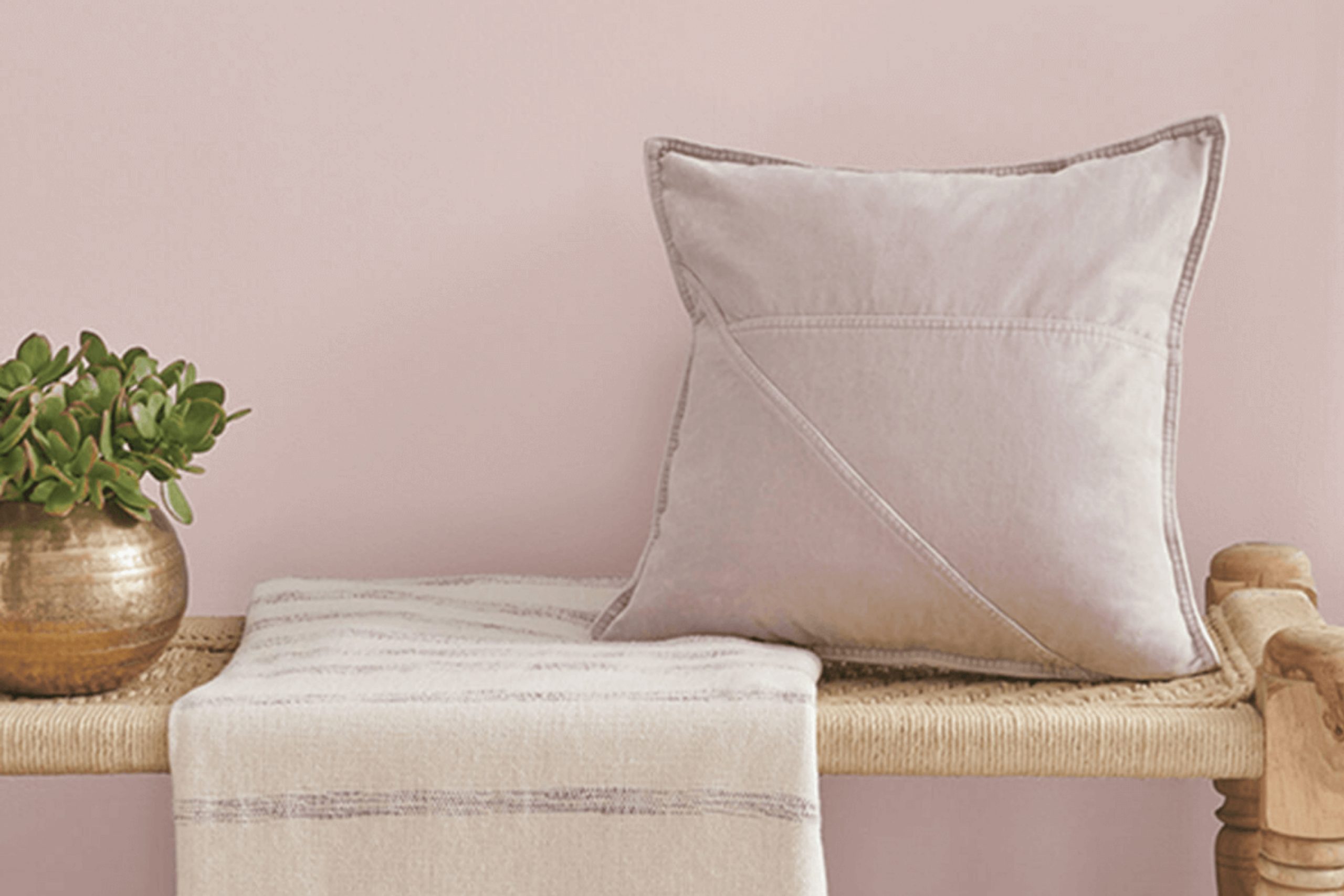
When you first come across SW 6022 Breathless by Sherwin Williams, you might be struck by its subtle charm. This delicate shade of pink carries a whisper of elegance that can gently infuse warmth and grace into any room. It’s a color that quietly draws attention without feeling too intense.
Imagine a shade that is versatile enough to complement a variety of styles, from modern minimalism to more traditional settings. Breathless offers an inviting touch that feels both fresh and lasting. Its soft pink hue works beautifully as a backdrop, allowing other design elements to stand out while adding a hint of cheerfulness and serenity.
You might notice how the gentle tone of Breathless can brighten up a room, making it feel more open and airy. It is perfect for creating a calming atmosphere, whether you are repainting a bedroom, living room, or even a cozy reading nook. The way this shade interacts with natural light can make your room feel more inviting and peaceful throughout the day.
Choosing a color like Breathless is not just about looks; it’s also about how a room makes you feel. It can refresh an everyday room into a sanctuary of comfort and style, where you can relax and unwind. The beauty of Breathless lies in its ability to be both gentle in its softness and meaningful in its charm.
What Color Is Breathless SW 6022 by Sherwin Williams?
Breathless by Sherwin Williams, known as SW 6022, is a gentle and airy color that brings a soft touch to any room. It is a muted blush with hints of pink and beige, creating a warm and inviting atmosphere. This color works beautifully in rooms that aim to feel cozy and welcoming. Breathless is perfect for interior styles like modern farmhouse, shabby chic, or vintage, as it adds a touch of warmth without feeling too strong.
This soft hue works well with natural materials and textures. Pairing it with light woods, like oak or maple, can enhance its warmth and create a harmonious look. Breathless also pairs nicely with white or cream accents, allowing for a clean and fresh appearance. Soft textures, such as linen or cotton fabrics, complement the color, adding a relaxed and comfortable vibe to the room.
In a living room, Breathless can be used on the walls to create a soft backdrop, while in a bedroom, it can contribute to a restful and soothing environment. Accessories in muted metallics, like brushed gold or copper, can add a touch of elegance without clashing with the color’s delicate nature. Overall, Breathless is a flexible choice for creating inviting and gentle rooms.
Is Breathless SW 6022 by Sherwin Williams Warm or Cool color?
Breathless SW 6022 by Sherwin Williams is a calming, soft lavender shade that can bring a gentle touch to any room in a home. This pale, muted color pairs well with neutrals, offering a subtle pop of color without feeling too strong. Because of its lightness, Breathless works beautifully in bedrooms or living rooms, creating a peaceful and airy atmosphere.
The versatility of this color allows it to complement various styles, from modern to traditional. It looks particularly lovely with white trim or accents, which helps highlight its delicate undertones. Whether applied to walls or used as an accent, Breathless offers a sense of warmth and charm.
Its ability to reflect light can make a room feel larger and more welcoming, which is ideal for smaller rooms. Overall, Breathless SW 6022 is a wonderful choice for those looking to add a gentle touch of color while maintaining a calm and cozy environment.
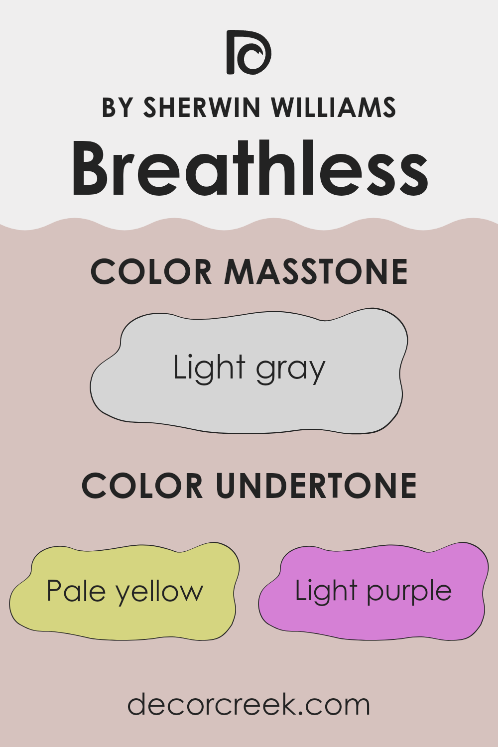
Undertones of Breathless SW 6022 by Sherwin Williams
Breathless by Sherwin Williams is an intriguing paint color with a unique blend of undertones. These include pale yellow, light purple, light blue, pale pink, mint, lilac, and grey. Undertones are subtle hints of color that can modify the main color’s appearance, influencing both its warmth and coolness.
In the case of Breathless, the pale yellow undertone adds a touch of warmth, which can make a room feel cozy and inviting. Light purple and lilac add a gentle, soft vibe, contributing to a relaxed environment.
The light blue and mint undertones introduce a refreshing feel, adding a sense of calm and coolness. Pale pink provides a touch of subtle elegance, while the grey undertone offers a neutral balance, keeping the color grounded without feeling too bold.
When applied to interior walls, these undertones can profoundly alter the atmosphere of a room. For example, the cool undertones might make a room feel airy and spacious, while warm undertones can create a sense of cozy comfort.
Breathless is a versatile color that reflects different nuances depending on the lighting and surrounding decor, making it a unique choice for various settings, from living rooms to bedrooms, enhancing the overall aesthetic without dominating the room.
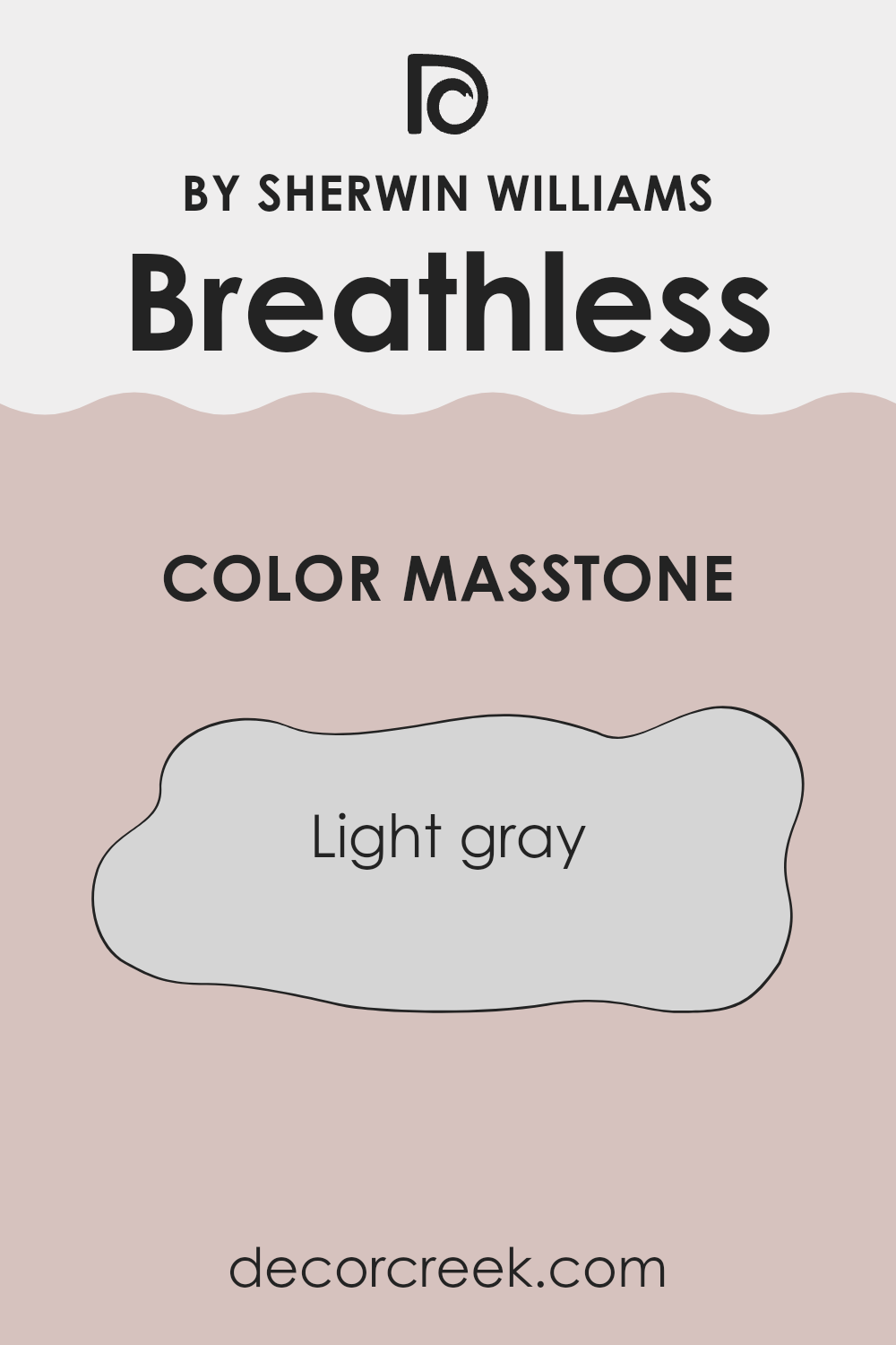
What is the Masstone of the Breathless SW 6022 by Sherwin Williams?
Breathless SW 6022 by Sherwin Williams is a light gray color, with a masstone of #D5D5D5. This soft, neutral shade works well in homes because it blends seamlessly with many other colors and styles. Its light tone helps to make rooms feel larger and more open. Because it lacks strong undertones, it can pair nicely with both warm and cool colors, allowing flexibility when choosing furnishings and accents.
In living rooms, this shade can create a calm and airy atmosphere, while in bedrooms, it promotes relaxation without being overpowering. Kitchens painted in this light gray can feel modern and clean, especially when compared with brighter accents like colorful backsplashes or stainless steel appliances.
The understated nature of Breathless SW 6022 means it won’t overshadow other design elements in a room. Its simplicity and lightness make it a versatile choice for anyone looking to refresh their home without making a bold statement.
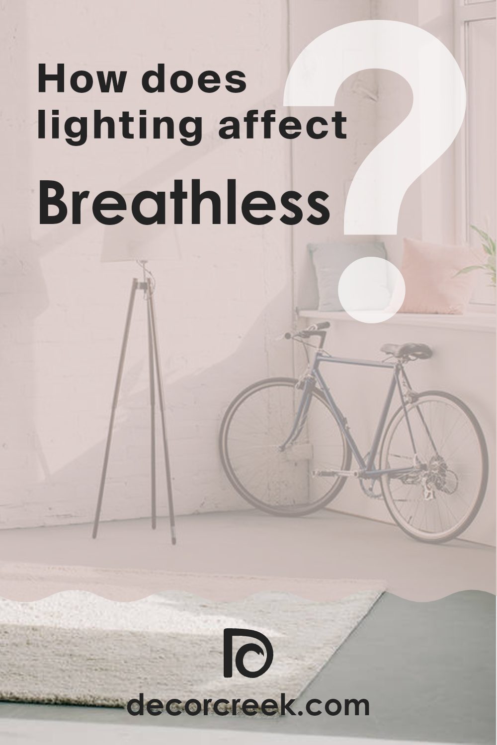
How Does Lighting Affect Breathless SW 6022 by Sherwin Williams?
Lighting plays a crucial role in how we perceive colors. The color Breathless SW 6022 by Sherwin Williams can look quite different depending on the type of lighting in a room. This color is a soft, muted blush with hints of warmth, and its appearance can change dramatically based on whether it is viewed under natural or artificial lighting.
In natural light, Breathless can appear fresh and more intense. The quality of natural light varies throughout the day, which influences how a color looks. In a north-facing room, which receives cool and indirect light, Breathless may appear more subdued and slightly grayer. The cool light tends to mute the warm undertones, making the color feel softer and less vibrant.
In a south-facing room, which benefits from bright and warm light throughout the day, Breathless will appear warmer and more lively. The abundant sunlight enhances the color’s warm tones, making the room feel cozy and inviting.
East-facing rooms get bright, warm morning light and cooler, dimmer light in the afternoon. In this setting, Breathless may look warm and inviting in the morning but might take on a cooler, softer tone as the day progresses.
West-facing rooms get subdued light in the morning and intense, warm light in the afternoon. In the morning, Breathless will appear softer and cooler, while in the afternoon, it will reflect more warmth and richness.
Under artificial lighting, the type of bulb affects the color’s appearance. Warm incandescent or LED lights will highlight the blush tones in Breathless, enriching its soft warmth. On the other hand, cool fluorescent lighting might dull the warmth, giving the color a slightly cooler cast.
Understanding how light influences color can help in making informed choices about where and how to use certain paint colors, such as Breathless SW 6022, in your home.
What is the LRV of Breathless SW 6022 by Sherwin Williams?
LRV, or Light Reflectance Value, is a measure of how much light a color reflects, expressed on a scale from 0 to 100. A value of 0 means the color absorbs all light and appears completely black, while 100 means it reflects all light and appears perfectly white.
For interior design and painting, LRV helps determine how light or dark a color will appear in a given room and how it will interact with natural and artificial light. More reflective colors (with higher LRV) will make a room feel brighter and more open, while colors with lower LRV will make a room feel cozier and more intimate by absorbing more light.
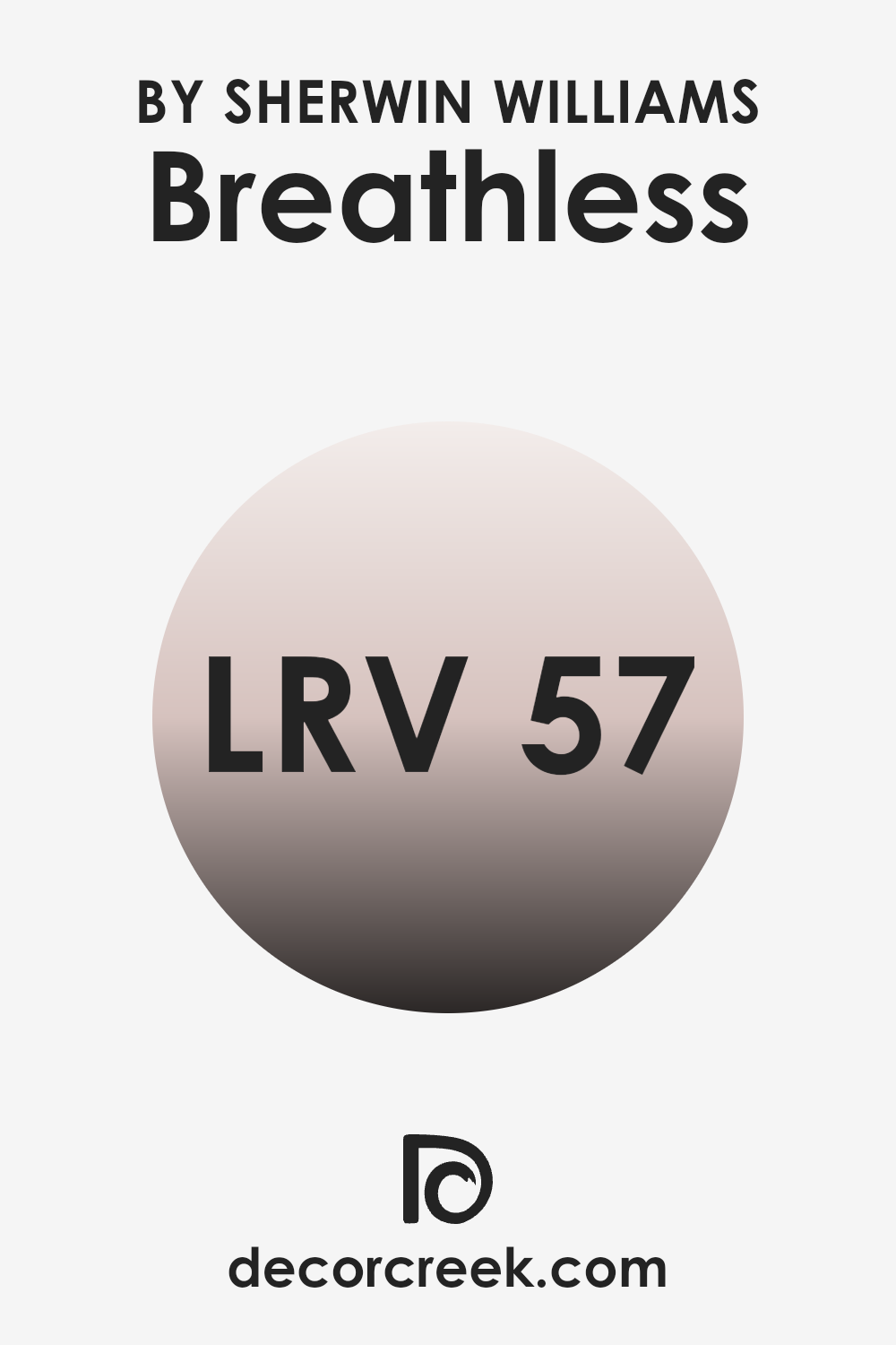
For Breathless (SW 6022) by Sherwin Williams, which has an LRV of 56.692, this value places it in the mid-range of reflectance. This means the color will reflect a moderate amount of light, making rooms feel neither too bright nor too dark, but just right for creating a balanced look.
In rooms with good lighting, this color can make the room feel airy without being too bright. Conversely, in rooms with less light, it can add a gentle warmth without making the room feel too dim or closed in. This balanced light reflectance makes it a flexible choice for different areas of a home.
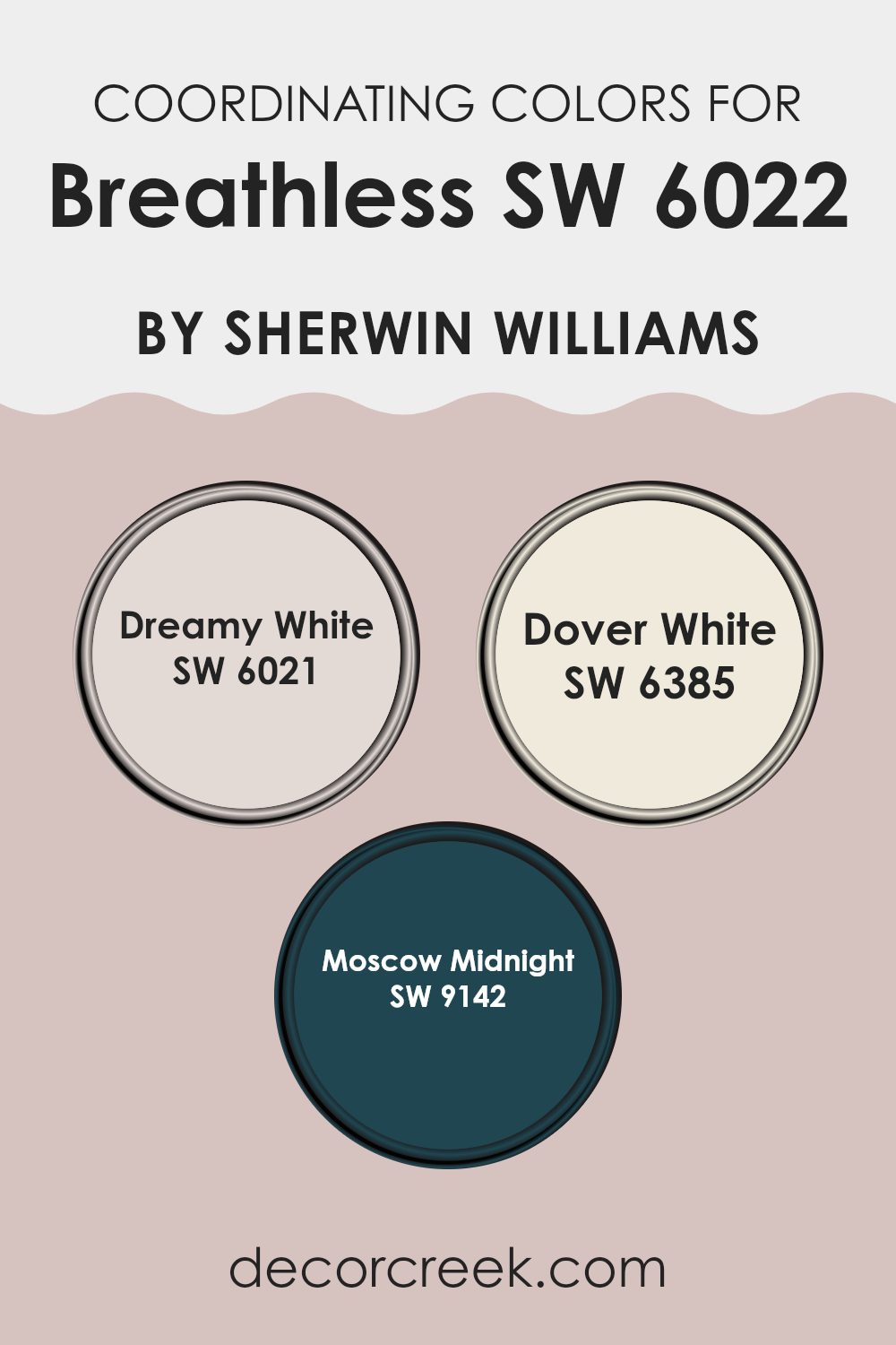
Coordinating Colors of Breathless SW 6022 by Sherwin Williams
Coordinating colors are hues that complement each other well, creating a balanced and harmonious look in a room. They work together by sharing similar undertones or contrasts that enhance the main shade. When using Breathless by Sherwin Williams as a base color, its soft and muted tones are best paired with colors that either highlight its delicate hue or provide a striking contrast. Coordinating colors are essential in creating a cohesive feel, as they tie different elements of a room together seamlessly.
Dreamy White, for instance, is a subtle and airy shade that gives off a light and gentle ambiance, perfect for creating a calm atmosphere when paired with Breathless. Dover White provides a warm and welcoming glow, adding a sense of comfort and approachability to any room.
moscow Midnight, on the other hand, offers a bold and deep contrast, creating a dramatic effect that enhances the lightness of Breathless. Using these coordinating colors thoughtfully brings out the character in each shade and ensures that a room feels unified and inviting without the need for drastic changes or strong contrasts.
You can see recommended paint colors below:
- SW 6021 Dreamy White
- SW 6385 Dover White
- SW 9142 Moscow Midnight
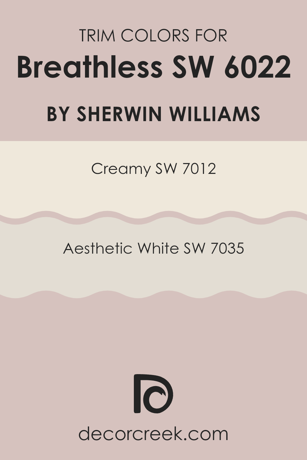
What are the Trim colors of Breathless SW 6022 by Sherwin Williams?
Trim colors refer to the paint colors specifically chosen for the parts of a room like baseboards, door frames, and window sills. These colors are typically picked to highlight or complement the main wall colors. In the case of Sherwin Williams’ Breathless SW 6022, a soft and delicate hue, choosing the right trim colors is important because they can enhance the overall appearance and feel of the room.
Trim colors work by either contrasting with or complementing the wall color, adding definition and depth to the room. When paired with Breathless, selecting a trim color like SW 7012 Creamy can create a warm and welcoming appearance, whereas using SW 7035 Aesthetic White can bring a brighter and crisper look.
SW 7012 Creamy is a warm off-white with a touch of softness, reminiscent of a light vanilla hue. This color can add warmth and coziness to a room, making it feel inviting and comfortable. On the other hand, SW 7035 Aesthetic White is a soft, muted off-white with just a hint of gray, which can offer a more subtle and neutral backdrop. It’s a flexible color that provides a classic finish without feeling too strong. Using these trim colors in combination with Breathless SW 6022 can enhance the room’s overall atmosphere by providing balance and harmony.
You can see recommended paint colors below:
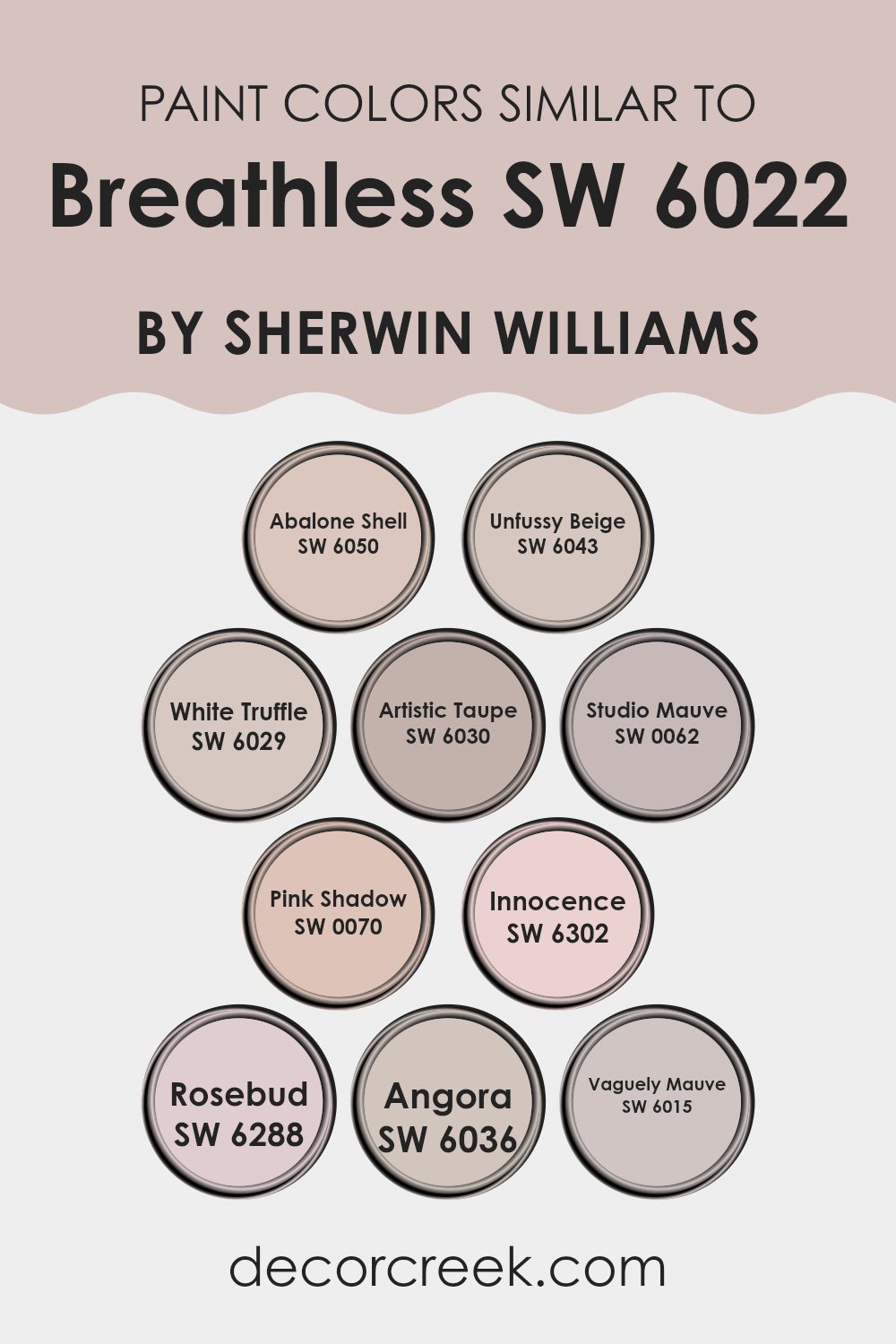
Colors Similar to Breathless SW 6022 by Sherwin Williams
Similar colors play a crucial role in creating harmonious and visually appealing rooms. They help to establish a connected and fluid atmosphere, making a room feel balanced and pleasant. Colors similar to Sherwin Williams’ Breathless, like SW 6050 Abalone Shell, offer a soft, warm tone that adds comfort to interiors.
SW 6043 Unfussy Beige provides a neutral backdrop that complements a variety of furnishings and accessories. SW 6029 White Truffle stands out with its gentle, creamy infusion, allowing for subtle elegance. Artistic Taupe, known as SW 6030, combines these soft undertones with a hint of grey, bringing an understated richness that’s easy to appreciate.
Studio Mauve, or SW 0062, introduces a whisper of purple, lending a touch of character without feeling too bold. SW 0070 Pink Shadow offers a delicate blush, adding a gentle, romantic feel. SW 6302 Innocence provides a soft, playful pink that brightens a room tenderly.
Rosebud, SW 6288, delivers a touch of freshness with its light, rosy tone. Angora, labeled as SW 6036, is a light beige with a cozy appeal. Lastly, Vaguely Mauve, SW 6015, incorporates a nuanced mauve, offering depth and interest. Each of these colors harmonizes well with Breathless, enabling creativity while maintaining a cohesive palette.
You can see recommended paint colors below:
- SW 6050 Abalone Shell
- SW 6043 Unfussy Beige
- SW 6029 White Truffle
- SW 6030 Artistic Taupe
- SW 0062 Studio Mauve
- SW 0070 Pink Shadow
- SW 6302 Innocence
- SW 6288 Rosebud
- SW 6036 Angora
- SW 6015 Vaguely Mauve
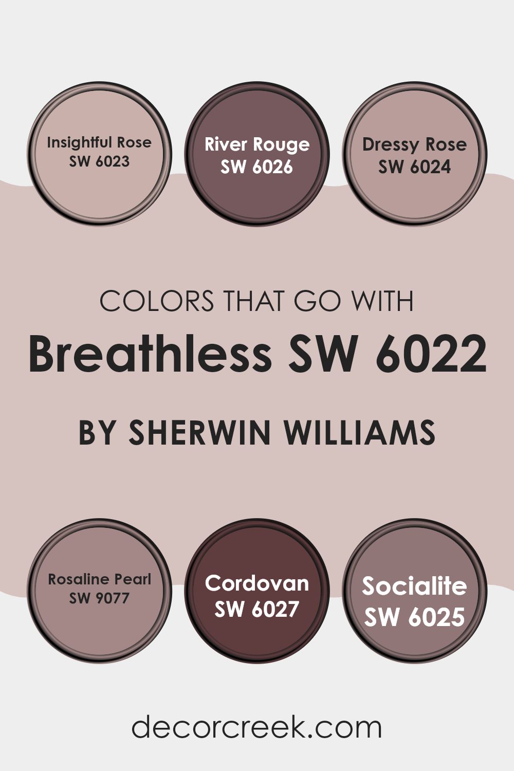
Colors that Go With Breathless SW 6022 by Sherwin Williams
Colors that complement Breathless SW 6022 by Sherwin Williams are essential because they enhance and balance the soft, muted tone of the light pink hue. Using coordinating colors creates a harmonious atmosphere, making rooms feel inviting and cohesive.
When paired with Breathless, these colors allow the room to maintain a sense of warmth and subtle elegance without overpowering it. Insightful Rose SW 6023 adds a slightly deeper pink shade, lending a more profound touch that enriches the overall palette. River Rouge SW 6026 brings in a richer, earthy red tone that grounds the room and offers contrast.
Dressy Rose SW 6024 is a versatile color with a soft, rosy tint, which adds charm and complements the gentle nature of Breathless. Rosaline Pearl SW 9077 introduces a shimmering neutral tone that brings brightness and light to the palette, perfect for adding a touch of glamour.
Cordovan SW 6027, with its deep reddish-brown shade, adds depth and sophistication, creating an anchor for the lighter, softer colors. Finally, Socialite SW 6025 offers a dusty pink hue that perfectly aligns with the peaceful vibe of Breathless. Together, these colors create a well-rounded and visually appealing environment, making any room feel complete and polished.
You can see recommended paint colors below:
- SW 6023 Insightful Rose
- SW 6026 River Rouge
- SW 6024 Dressy Rose
- SW 9077 Rosaline Pearl
- SW 6027 Cordovan
- SW 6025 Socialite
How to Use Breathless SW 6022 by Sherwin Williams In Your Home?
Breathless SW 6022 by Sherwin Williams is a soft, subtle color that brings a sense of calm to any room. It’s a pale gray with just a hint of blue, making it flexible for various areas in the home. You can use Breathless on the walls of a bedroom to create a soothing and restful environment.
Pair it with white or light-colored furniture for a clean, airy feel. In the living room, this gentle shade can act as a neutral backdrop, allowing colorful accents like throw pillows or artwork to stand out.
It’s also a great choice for bathrooms, where its light tone can enhance natural light and make the room feel fresh and open. For a harmonious look, consider combining it with other soft grays or blues. Breathless SW 6022 is perfect for those who want a peaceful atmosphere without being too bold or intense.
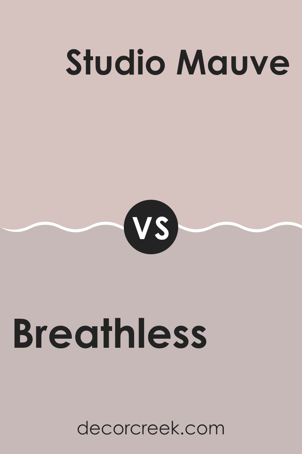
Breathless SW 6022 by Sherwin Williams vs Studio Mauve SW 0062 by Sherwin Williams
Breathless SW 6022 by Sherwin Williams is a soft, muted pink. It has a gentle, calming presence that can make a room feel cozy and welcoming. It works well in rooms meant for relaxation, like bedrooms or living areas.
In contrast, Studio Mauve SW 0062 is a deeper, more intense mauve. It has a richer tone that adds depth and drama to a room. While it’s still a soft color, it carries more weight than Breathless and can be used to make a statement in a room.
Both colors have pink undertones, but Breathless is lighter and more subdued, whereas Studio Mauve is bolder and more pronounced. When paired together, Breathless can provide a gentle backdrop, while Studio Mauve can be used as an accent to add interest and contrast, giving a room a harmonious but dynamic feel.
You can see recommended paint color below:
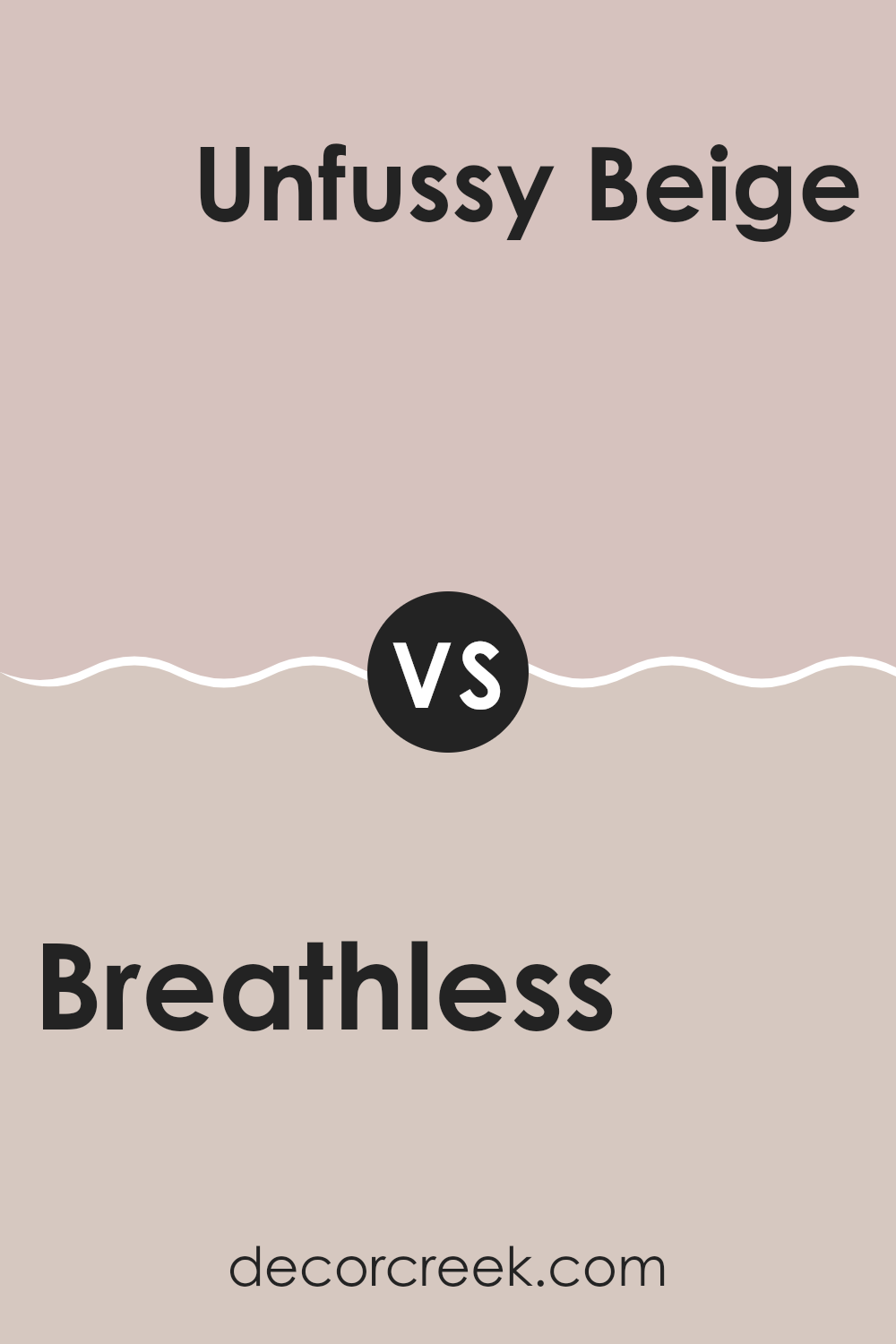
Breathless SW 6022 by Sherwin Williams vs Unfussy Beige SW 6043 by Sherwin Williams
Breathless SW 6022 by Sherwin Williams is a soft, muted pink with a gentle, almost powdery feel. It adds a touch of warmth and subtle grace to any room, creating a cozy and inviting atmosphere. This color is perfect for rooms where you want a hint of color without feeling too strong.
On the other hand, Unfussy Beige SW 6043 is a warm, neutral beige that provides a versatile backdrop for various styles. It works well in both traditional and modern settings. While Breathless brings a rosy touch, Unfussy Beige offers simplicity and ease of coordination with other colors and decor.
When comparing the two, Breathless introduces a touch of blush, adding a bit of personality, while Unfussy Beige stands out for its classic, flexible nature. Both colors are understated yet effective, serving different purposes depending on the mood and look you aim to create in your room.
You can see recommended paint color below:
Breathless SW 6022 by Sherwin Williams vs Vaguely Mauve SW 6015 by Sherwin Williams
Breathless SW 6022 and Vaguely Mauve SW 6015 by Sherwin Williams are both soft shades with distinct personalities. Breathless is a gentle, muted pink with a warm undertone, creating a cozy and inviting atmosphere. It’s flexible and works well in bedrooms or living rooms where a calm mood is desired.
On the other hand, Vaguely Mauve has a slightly cooler tone, leaning towards a light purple or lavender shade. This makes it a good choice for rooms where you want a hint of color without being overpowering. It pairs nicely with both neutrals and bolder colors.
While both colors share a calm quality, Breathless leans more towards warmth, creating an intimate room, whereas Vaguely Mauve offers a touch of softness with a hint of cool elegance. Both are excellent choices for creating a subtle, yet distinct look in a room.
You can see recommended paint color below:
- SW 6015 Vaguely Mauve
Breathless SW 6022 by Sherwin Williams vs Angora SW 6036 by Sherwin Williams
Breathless SW 6022 by Sherwin Williams and Angora SW 6036 by Sherwin Williams are two lovely paint colors that offer different vibes. Breathless is a soft, muted pinkish hue that can bring a gentle, calming feel to a room.
It’s subtle and doesn’t feel too bold, making it a great choice for creating a soothing environment. On the other hand, Angora is a warm, beige-toned color with hints of taupe. It brings a cozy and welcoming atmosphere to rooms. While Breathless leans towards cooler undertones, Angora has a warmer feel, which can make a room feel comforting.
Both colors are versatile and can be used in various settings, such as bedrooms or living rooms. However, choosing between them depends on whether you prefer a gentle, cool pink tone or a warm, neutral beige. Both provide a beautiful backdrop for different types of décor, offering distinct but appealing aesthetics.
You can see recommended paint color below:
- SW 6036 Angora
Breathless SW 6022 by Sherwin Williams vs Pink Shadow SW 0070 by Sherwin Williams
Breathless SW 6022 by Sherwin Williams is a soft, muted pink with a hint of gray, giving it a subtle and calming look. It’s a flexible shade that works well in a variety of rooms, adding a touch of warmth without feeling too bold. Breathless feels quiet and gentle, making it suitable for living rooms, bedrooms, or any area where you want to create a relaxed atmosphere.
On the other hand, Pink Shadow SW 0070 is a more vibrant and cheerful pink. It has a brighter tone compared to Breathless, bringing more energy and playfulness to a room. Pink Shadow can bring a lively touch to children’s rooms, creative rooms, or anywhere you want an infusion of fun and enthusiasm.
While Breathless is more neutral and understated, Pink Shadow is bold and lively. Choosing between them depends on whether you want a quiet backdrop or a burst of energy in your room.
You can see recommended paint color below:
Breathless SW 6022 by Sherwin Williams vs White Truffle SW 6029 by Sherwin Williams
Breathless SW 6022 and White Truffle SW 6029 are two refined colors by Sherwin Williams. Breathless is a soft, muted lavender with a hint of gray, giving it a calm and gentle feel. It works well in bedrooms and living rooms where a soothing atmosphere is desired. On the other hand, White Truffle is a warm, creamy beige with subtle pink undertones.
This color adds a cozy and welcoming vibe, making it ideal for family rooms or kitchens. When comparing them, Breathless adds a touch of subtle color without being overpowering, while White Truffle offers warmth and a touch of elegance.
Breathless pairs nicely with cool-toned accents and minimalist decor, whereas White Truffle complements wood tones and traditional furnishings. Together, they can create a balanced palette that blends coolness with warmth, making them versatile choices for those looking to pair soft colors in their home.
You can see recommended paint color below:
- SW 6029 White Truffle
Breathless SW 6022 by Sherwin Williams vs Rosebud SW 6288 by Sherwin Williams
Breathless SW 6022 by Sherwin Williams is a soft, muted pink with a hint of gray. It has a calming, gentle vibe, making it ideal for creating a peaceful room. The color is subtle and doesn’t feel too strong, but adds a touch of warmth and comfort.
On the other hand, Rosebud SW 6288 is a brighter, more vibrant pink. It has more energy and presence compared to Breathless. Rosebud is lively and can serve as an accent or statement color in a room, perfect for adding a pop of color or creating a cheerful atmosphere.
Both colors are shades of pink but serve different purposes. Breathless suits rooms where a soothing and understated pink is desired. Rosebud works best where a bold and energetic feel is needed. Together, they can complement each other, with Breathless offering balance to the brightness of Rosebud.
You can see recommended paint color below:
- SW 6288 Rosebud
Breathless SW 6022 by Sherwin Williams vs Abalone Shell SW 6050 by Sherwin Williams
Breathless SW 6022 by Sherwin Williams is a delicate hue with a light, muted pinkish undertone. It’s soft and soothing, creating a gentle atmosphere perfect for rooms where relaxation is key. Abalone Shell SW 6050 offers a warmer, beige-pink blend.
It has a slightly earthy feel, giving rooms a cozy and inviting ambiance. When comparing the two, Breathless is more pastel and airy, bringing a touch of coolness due to its subtle pink shade. In contrast, Abalone Shell feels more grounded, with its warmer tones adding depth.
Both are adaptable and can be used in various rooms, but the choice depends on the mood you wish to create. Breathless is great for airy, refreshing rooms, while Abalone Shell provides warmth and a comfortable, homely vibe. Each color can complement different styles, from modern to traditional, based on the other decor elements in the room.
You can see recommended paint color below:
Breathless SW 6022 by Sherwin Williams vs Artistic Taupe SW 6030 by Sherwin Williams
Breathless SW 6022 by Sherwin Williams is a soft, muted color that can be described as a gentle pinkish hue. It’s subtle and understated, lending a warm and cozy feel to a room. Its muted tones make it a versatile choice for creating a calm and inviting atmosphere.
On the other hand, Artistic Taupe SW 6030 is a deeper, richer color. It leans more towards a taupe or greige, which is a mix of gray and beige. This shade brings a bit more depth and weight to a room, making it feel grounded and stable. Artistic Taupe is an excellent choice for those who want a neutral that still has character.
When comparing the two, Breathless offers a lighter, more delicate touch, suitable for rooms where you want a light and airy ambiance. Artistic Taupe, meanwhile, provides a cozy and snug feel, ideal for rooms where a more classic neutral is desired.
You can see recommended paint color below:
- SW 6030 Artistic Taupe
Breathless SW 6022 by Sherwin Williams vs Innocence SW 6302 by Sherwin Williams
Breathless SW 6022 and Innocence SW 6302 are two pastel shades from Sherwin Williams. Breathless is a soft, muted lavender with a hint of gray, giving it a cool undertone. It’s a calming and subtle color, perfect for adding a gentle touch to a room without feeling too bold.
In contrast, Innocence is a light pink, leaning more towards a warm, cheerful tone. This color feels fresh and inviting, adding a sense of warmth and brightness. When comparing these two colors, Breathless can create a more relaxed, neutral atmosphere, suitable for rooms like bedrooms or living rooms where a peaceful setting is desired.
Innocence, on the other hand, is brighter and more energetic, making it a good choice for rooms where you want to evoke happiness or playfulness, like a child’s room or a creative area. Both colors are adaptable, but their distinct undertones make them unique choices for different moods and settings.
You can see recommended paint color below:
After exploring the essence of SW 6022 Breathless by Sherwin Williams, I’ve realized this color is like a gentle hug for your walls. It’s a soft and warm shade, sort of like a blush or a light pink, that makes any room feel cozy and inviting. It brings a calm feeling that would be perfect for a bedroom or a living room where you want to relax.
Imagine this color as the friendly face of your home. It doesn’t scream for attention but instead makes everything around it feel pleasant and peaceful. You could pair it with other soft colors, like a light gray or a creamy white, to make the whole room feel balanced and nice.
People often like to use SW 6022 Breathless because it works well in many different settings. Whether it is used in a modern, traditional, or cozy style home, it fits in nicely without causing too much fuss.
Overall, this color is a great choice if you want something gentle and welcoming. It’s like adding a touch of magic that quietly changes how a room feels, making it more comfortable and warm without shouting for attention. I think it’s a wonderful option to make any home feel more special and friendly.
Ever wished paint sampling was as easy as sticking a sticker? Guess what? Now it is! Discover Samplize's unique Peel & Stick samples.
Get paint samples

