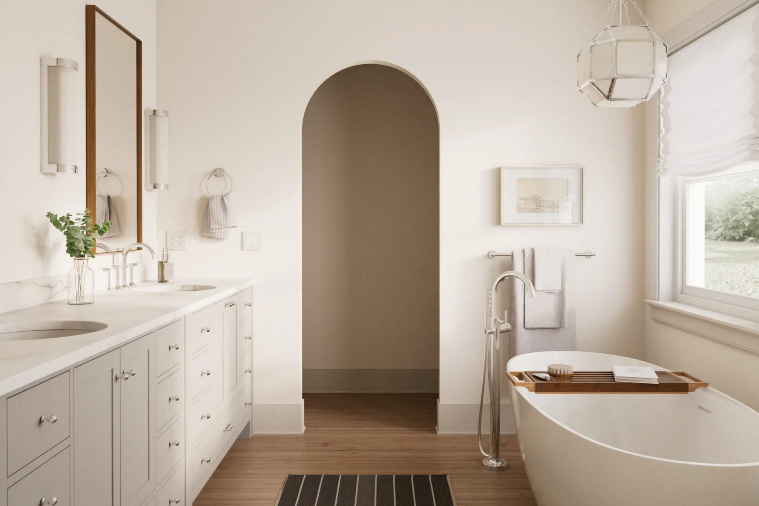
When you first glance at SW 9696 Pale Pink by Sherwin Williams, you might be surprised at how this soft hue subtly transforms a space. Often, finding the perfect shade of pink can be a tall task, as some tones may feel too overpowering for your taste, while others might lack the warmth you desire for your cozy retreat.
However, SW 9696 Pale Pink strikes a lovely balance. It’s gentle, inviting, and exudes a certain softness that can soften the edges of a hectic day, making it ideal for spaces where comfort and calm are priorities.
Whether you’re thinking about updating a bedroom, bathroom, or even a nook needing a touch of whimsy and warmth, SW 9696 Pale Pink offers a versatile palette that works well in various lighting situations and complements a wide range of decor styles.
If you have been on the lookout for a pink that provides subtle sophistication without overwhelming the senses, this shade could very well be the answer to creating that serene spot in your home.
Let’s delve into the charm and usability of SW 9696 Pale Pink, examining how it performs in different settings and what makes it a go-to choice for a fresh, modern look.
What Color Is Pale Pink SW 9696 by Sherwin Williams?
Pale Pink by Sherwin Williams is a delicate and subtle color that brings a gentle warmth to any space. This soft shade of pink has a soothing presence, making it a perfect choice for creating a cozy and inviting atmosphere. It’s light enough to be used as a neutral, yet it has just enough color to add a touch of personality.
This shade works wonderfully in a variety of interior styles. It’s a great fit for modern minimalism where its understated tone can balance out bolder elements. In shabby chic settings, Pale Pink adds a vintage charm, complementing distressed furniture and floral motifs.
It’s also ideal for a Scandinavian look, where clean lines and light colors dominate, providing a subtle contrast to natural wood finishes.
When it comes to pairing materials and textures, Pale Pink goes beautifully with soft, tactile fabrics like linen or cotton.
It helps create an airy feel when matched with light woods, while pairing it with white creates a fresh and clean look. Metallic finishes, like brass or copper, add a touch of glamour to this color, making it more dynamic without overwhelming its softness.
In rooms where comfort is key, such as bedrooms or living spaces, Pale Pink works wonderfully to establish a relaxing and welcoming vibe.
Is Pale Pink SW 9696 by Sherwin Williams Warm or Cool color?
Pale Pink by Sherwin Williams is a gentle and soft color that brings a warm and inviting feel to any room. This shade of pink is subtle enough to act as a neutral, which makes it very versatile for decorating.
It’s perfect for creating a cozy atmosphere in spaces like bedrooms and living rooms. Because it’s not too bright or overpowering, it pairs well with a wide range of other colors, from soft whites and grays to more vibrant hues.
This makes it a fantastic choice for anyone looking to add a touch of warmth without overwhelming the space. It’s especially good in rooms that get a lot of sunlight, as the natural light brings out the depth and richness of the color. All in all, Pale Pink adds a soft, welcoming touch to any home, making spaces feel more comfortable and aesthetically pleasing.
Undertones of Pale Pink SW 9696 by Sherwin Williams
Pale Pink SW 9696 by Sherwin Williams is a subtle and versatile shade that carries a variety of undertones, making it an interesting choice for interior decorations. The undertones of a color are secondary colors that subtly influence the main hue. For Pale Pink, these undertones include pale yellow, light purple, light blue, mint, lilac, and grey.
The way we perceive the color can be greatly affected by these undertones. For instance, the pale yellow undertone can give the paint a warmer feel, making a room seem more inviting and cozy. On the other hand, the light purple and lilac undertones can add a slight hint of sophistication, which might not be initially noticeable but gives the room a refined look.
The light blue and mint undertones contribute to a feeling of freshness and can make a space appear more airy and spacious. These cooler tones help balance the warmth of pale yellow, creating a well-rounded and pleasant ambiance.
Lastly, the grey undertone is crucial as it helps ground the color, preventing it from being too overpowering or sweet. This makes Pale Pink a more neutral choice, suitable for various decorating styles and easily paired with different color schemes.
In summary, the blend of undertones in Pale Pink allows it to adapt to different lighting and pair with a wide range of decor elements, making it a practical choice for those looking to refresh their interior walls without committing to a bold or overpowering color.
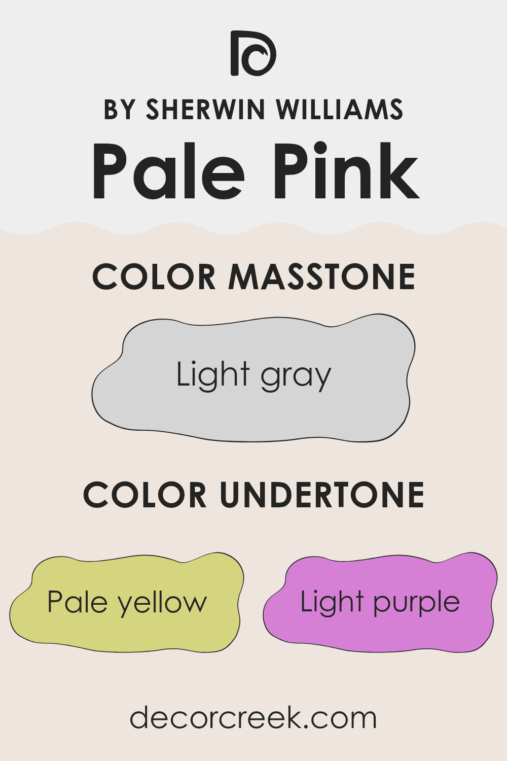
What is the Masstone of the Pale Pink SW 9696 by Sherwin Williams?
Pale Pink SW 9696 by Sherwin Williams appears light gray, a tone that makes it highly versatile for use in interior decorating. This masstone provides a gentle backdrop that doesn’t overpower room elements, creating a calm aura in a space.
Due to its light grayish shade, it pairs well with a broad spectrum of colors, from bold and bright hues to more subdued tones, making it easy to work with when adding personal touches through furniture and decor. Its neutral nature helps in reflecting natural light, brightening up spaces which is particularly useful in smaller or darker rooms.
This color works seamlessly in various parts of the home, from living areas to bedrooms, offering a consistent look that helps connect different spaces aesthetically. It’s also ideal for those looking to create a minimalist look or as a base for displaying artwork, as it subtly complements without distracting.

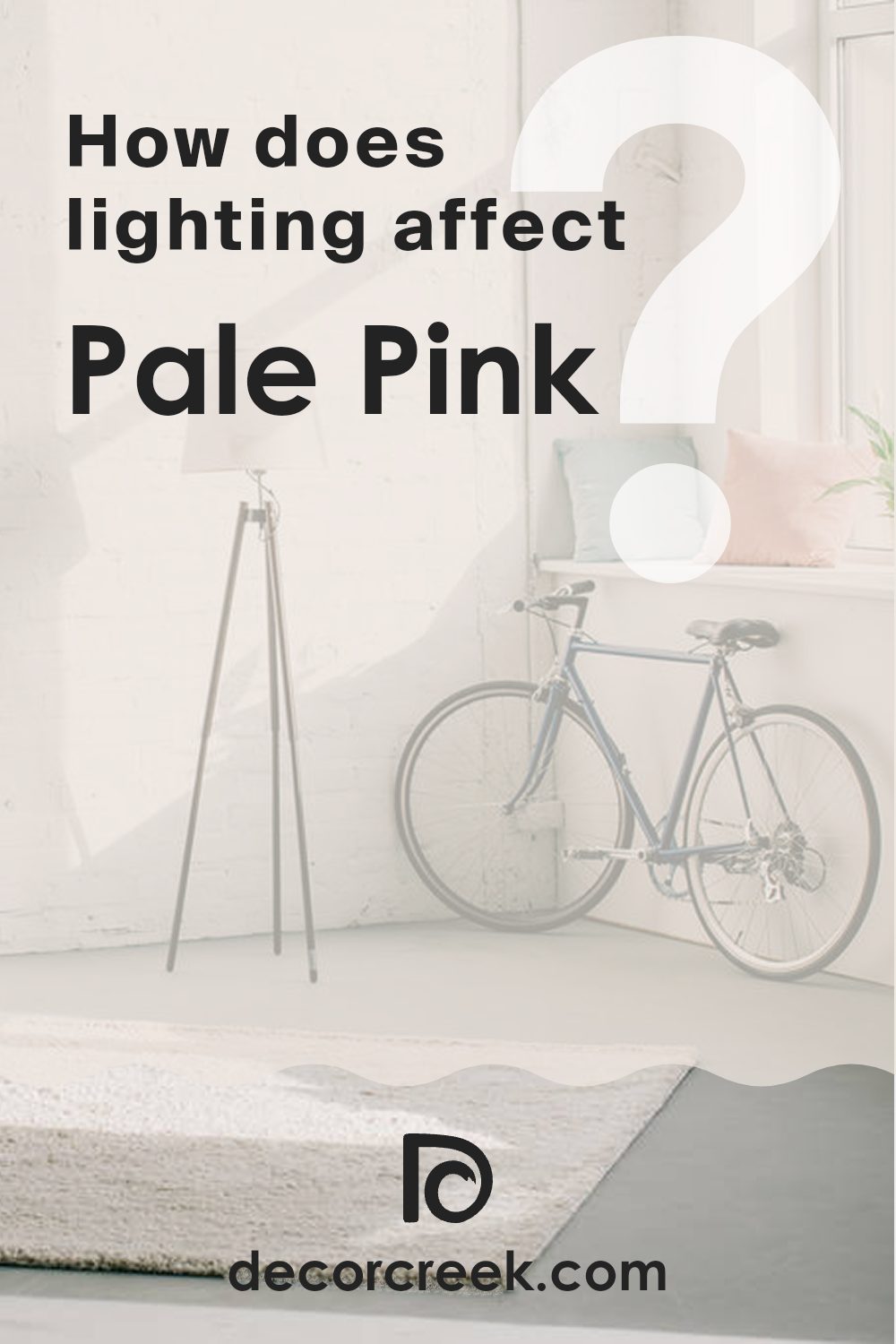
How Does Lighting Affect Pale Pink SW 9696 by Sherwin Williams?
Lighting plays a crucial role in how we perceive the color of objects, including the paint on our walls. Depending on whether a color is viewed under natural or artificial light, its appearance can noticeably change. Different types of light have varying impacts on how colors look.
Let’s take a pale pink shade as an example. In natural light, this light pink tends to look soft and subtle. Natural light, especially around midday, provides a bright, clear illumination that can make this pale pink appear almost luminous and very true to its swatch color. The softness of pale pink under natural sunlight makes it ideal for spaces meant to feel gentle and airy.
Under artificial light, such as LED or fluorescent lights, the same pale pink might look slightly different. Some artificial lights can cast a yellow hue, which can warm up the color, making it appear creamier or even slightly orange. In cooler artificial light, the pink might appear more washed out.
The direction of the room also affects how pale pink appears:
1. North-faced rooms: These rooms get less direct sunlight, which might make the pale pink appear more muted and slightly cooler in tone.
2. South-faced rooms: These rooms enjoy ample sunlight for most of the day, which can make the pale pink look bright and vibrant, enhancing its warm undertones.
3. East-faced rooms: These rooms get plenty of sunlight in the morning. Here, the pale pink will start the day looking vibrant and warm, fading to a softer, cooler shade as the day progresses.
4. West-faced rooms: These rooms get strong sunlight in the late afternoon to evening, making the pale pink glow warmly during sunset hours but appear less vibrant in the morning light.
Understanding these differences can help you decide where to use certain colors depending on the mood and effect you want to achieve in each room.
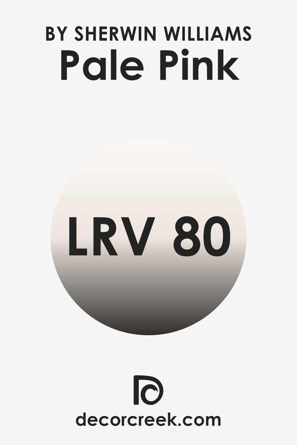
What is the LRV of Pale Pink SW 9696 by Sherwin Williams?
Light Reflectance Value (LRV) is a measure that tells us how much light a color reflects and how much it absorbs. Typically, LRV is used by architects and interior designers to choose colors that will work best in a certain space based on how bright or dark the area is.
A higher LRV means that the color reflects more light, making it appear lighter and usually making the space feel larger and more open. Conversely, colors with a lower LRV can make a room feel cozier but smaller because they absorb more light.
In the case of the color with an LRV of 79.784, it is quite high, meaning that it reflects a lot of light. This particular shade, being a pale pink, will give off a light, airy feel when painted on walls. In rooms that get a lot of sunlight, using this color could help keep the space looking bright and welcoming without being overwhelming.
Similarly, in less naturally lit areas, the high LRV can help compensate by making the most out of the available light, enhancing visibility and keeping the space feeling vibrant.
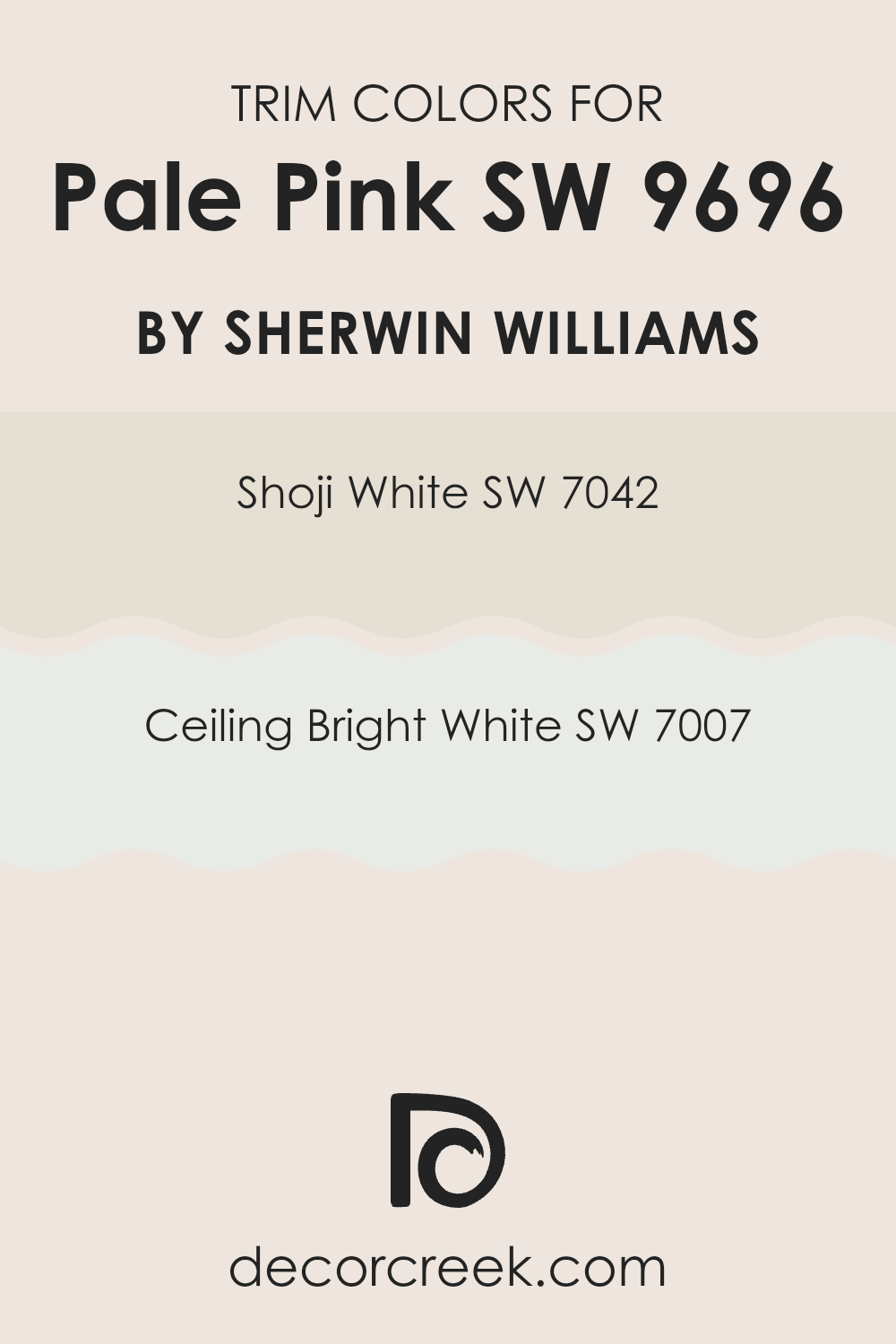
What are the Trim colors of Pale Pink SW 9696 by Sherwin Williams?
Trim colors are specifically chosen to complement or contrast the main color on a wall to highlight architectural details or frame areas distinctively. In the case of using a subtle shade like Pale Pink by Sherwin Williams, selecting appropriate trim colors can greatly enhance the aesthetic appeal and balance of the space.
Shoji White and Ceiling Bright White are excellent choices for trim as they provide a clean, crisp boundary that defines the lighter, softer tones of Pale Pink beautifully, ensuring that the walls don’t appear washed out and the room maintains a fresh and coherent look.
Shoji White (SW 7042) by Sherwin Williams is a warm, soft white with subtle gray undertones. It offers a gentle contrast to Pale Pink, making it an ideal choice for a trim color that promotes a seamless yet distinct transition between the wall and the trim areas. On the other hand, Ceiling Bright White (SW 7007) is a purer, more radiant white that provides a sharper contrast to Pale Pink. This color is especially useful for trims when aiming to bring a brighter highlight around ceilings or upper borders, enhancing the overall lightness of the room and making it appear more spacious and clean.
You can see recommended paint colors below:
Colors Similar to Pale Pink SW 9696 by Sherwin Williams
Similar colors are essential in design for creating a cohesive and harmonious look. Choosing shades like Pale Pink and its counterparts ensures that all elements in a space blend seamlessly. Colors of similar tones can subtly distinguish different surfaces or features without overwhelming the eye, making them a great choice for those wanting a gentle yet unified aesthetic.
Shades such as Toque White, a light, airy color that whispers of fresh beginnings, and Zurich White, which has a slightly warmer tone, suggesting comfort and light, are perfect companions. Marshmallow and Downy offer a soft touch, their slight creamy hues bringing a sense of calmness.
Crystalline and Pinkish provide a hint of color, lending a playful yet gentle vibe to the environment. Futon introduces a more grounded feeling with its subtle beige tint, while Porcelain offers a clean and classic look with its very light, almost imperceptible blue undertone. Nice White and Ibis White round out the palette by providing a refreshing clarity, making any space feel more open and inviting. These colors work together to support a theme without competition, leading to a pleasing aesthetic that feels intentional and thoughtfully curated.
You can see recommended paint colors below:
- SW 7003 Toque White
- SW 7626 Zurich White
- SW 7001 Marshmallow
- SW 7002 Downy
- SW 9691 Crystalline
- SW 7112 Pinkish
- SW 7101 Futon
- SW 0053 Porcelain
- SW 6063 Nice White
- SW 7000 Ibis White
How to Use Pale Pink SW 9696 by Sherwin Williams In Your Home?
Pale Pink SW 9696 by Sherwin Williams is a soft, gentle pink that brings a fresh and inviting atmosphere to any room. This color is perfect for creating a cozy and warm feeling in spaces like bedrooms or living rooms.
You can use it on all walls for a subtle, soothing effect or just one wall for a splash of gentle color. It pairs beautifully with whites and grays for a modern, clean look, or with darker greens and blues for a nice contrast.
Pale Pink is also great for a kid’s room, offering a cheerful tone that’s not too bold or overwhelming. For those who prefer minimalistic style, you can use it to paint furniture or accent pieces, giving your space a touch of color without overwhelming it. This shade is easy to work with and blends well with many different styles and textures, making it a versatile choice. Whether you want a peaceful spot in your home or just a hint of color, Pale Pink can help you achieve that perfect balance.
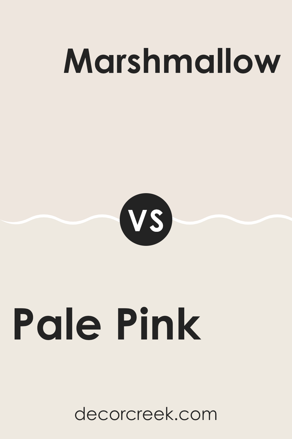
Pale Pink SW 9696 by Sherwin Williams vs Marshmallow SW 7001 by Sherwin Williams
Pale Pink SW 9696 by Sherwin Williams is a gentle shade, whereas Marshmallow SW 7001 is a softer, more muted white. Pale Pink adds a subtle touch of warmth, making it a cozy choice for spaces aiming for a soft, welcoming feel.
On the other hand, Marshmallow leans towards a clean, crisp look that can brighten a room and make it appear larger. This white shade can serve as a versatile backdrop, allowing other colors in the décor to stand out.
In contrast, the quiet charm of Pale Pink offers a hint of color that works well in a nursery or for creating a relaxing bedroom environment. Both colors are light and airy in their own ways, providing unique yet harmonious options for interior spaces depending on the desired atmosphere and aesthetic.
You can see recommended paint color below:
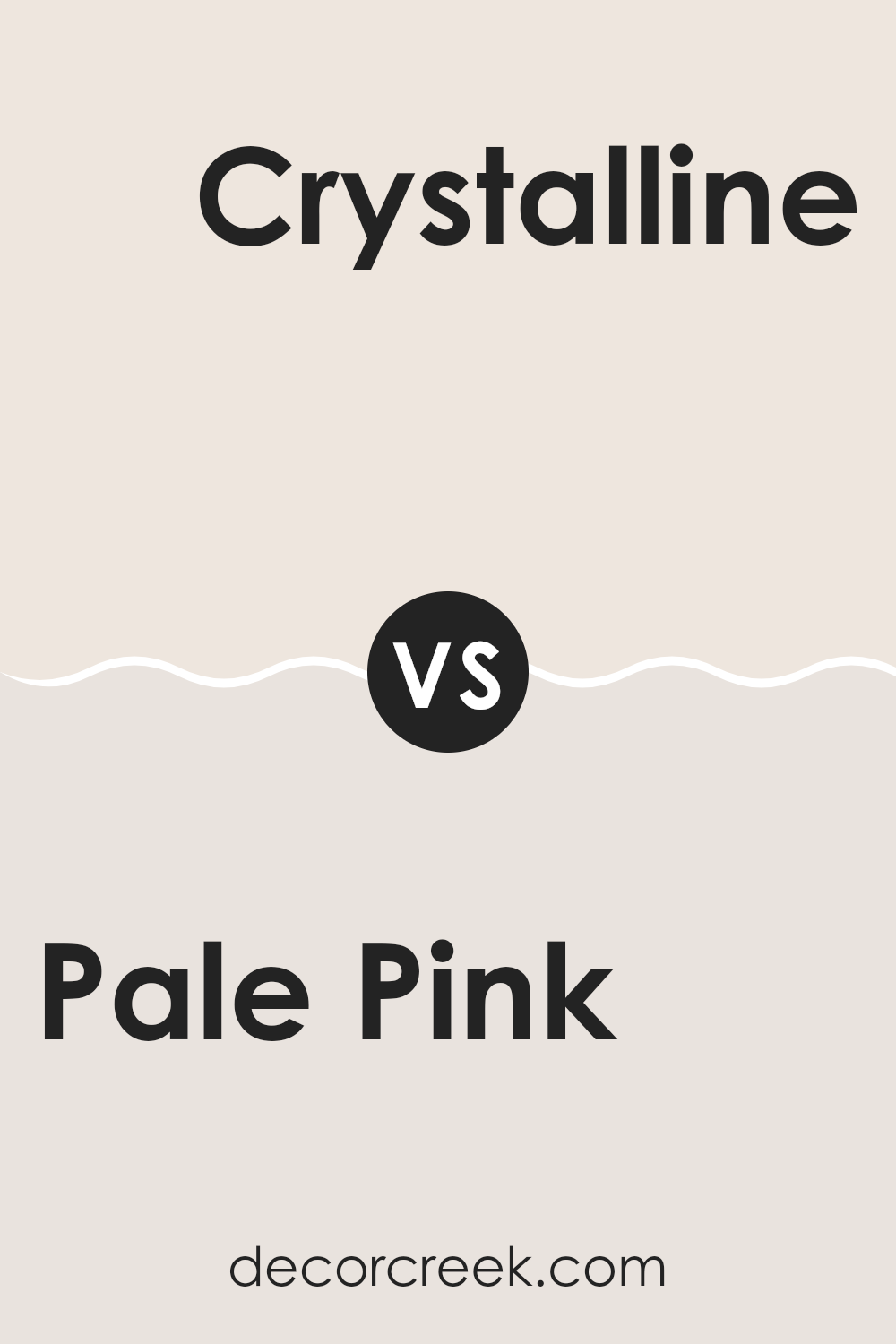
Pale Pink SW 9696 by Sherwin Williams vs Crystalline SW 9691 by Sherwin Williams
Pale Pink and Crystalline are two colors from Sherwin Williams that both offer a soft, light feel but in subtly different ways. Pale Pink is exactly what you’d expect; it’s a gentle, blush pink that feels warm and inviting. It’s perfect for creating a cozy, soothing atmosphere in any room.
On the other hand, Crystalline leans towards a pale, mint green with a fresh and airy vibe. This color provides a calm and clean look, making it great for spaces where you want a hint of color without overwhelming the senses.
While both colors are light and delicate, Pale Pink adds warmth due to its pink hue, whereas Crystalline gives a cooler touch because of its green undertones. Each color would work well in a space that gets plenty of natural light, enhancing their subtle tones beautifully.
You can see recommended paint color below:
- SW 9691 Crystalline
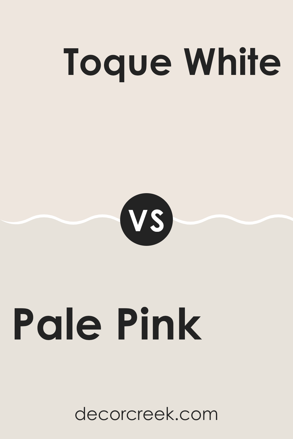
Pale Pink SW 9696 by Sherwin Williams vs Toque White SW 7003 by Sherwin Williams
Pale Pink and Toque White are two distinct colors from Sherwin Williams that serve unique purposes in home decor. Pale Pink is a gentle, soft pink that can warm up a space and add a hint of coziness without being too bold.
It’s perfect for creating a nurturing and inviting atmosphere in rooms such as bedrooms or lounges. On the other hand, Toque White is a neutral off-white with a slight gray undertone, making it an excellent choice for those who prefer a cleaner, more understated look.
It pairs well with almost any color and works great in areas where you want to keep things light and airy, such as kitchens and bathrooms. Both colors offer a fresh, approachable vibe and can complement each other well when used in the same color scheme.
You can see recommended paint color below:
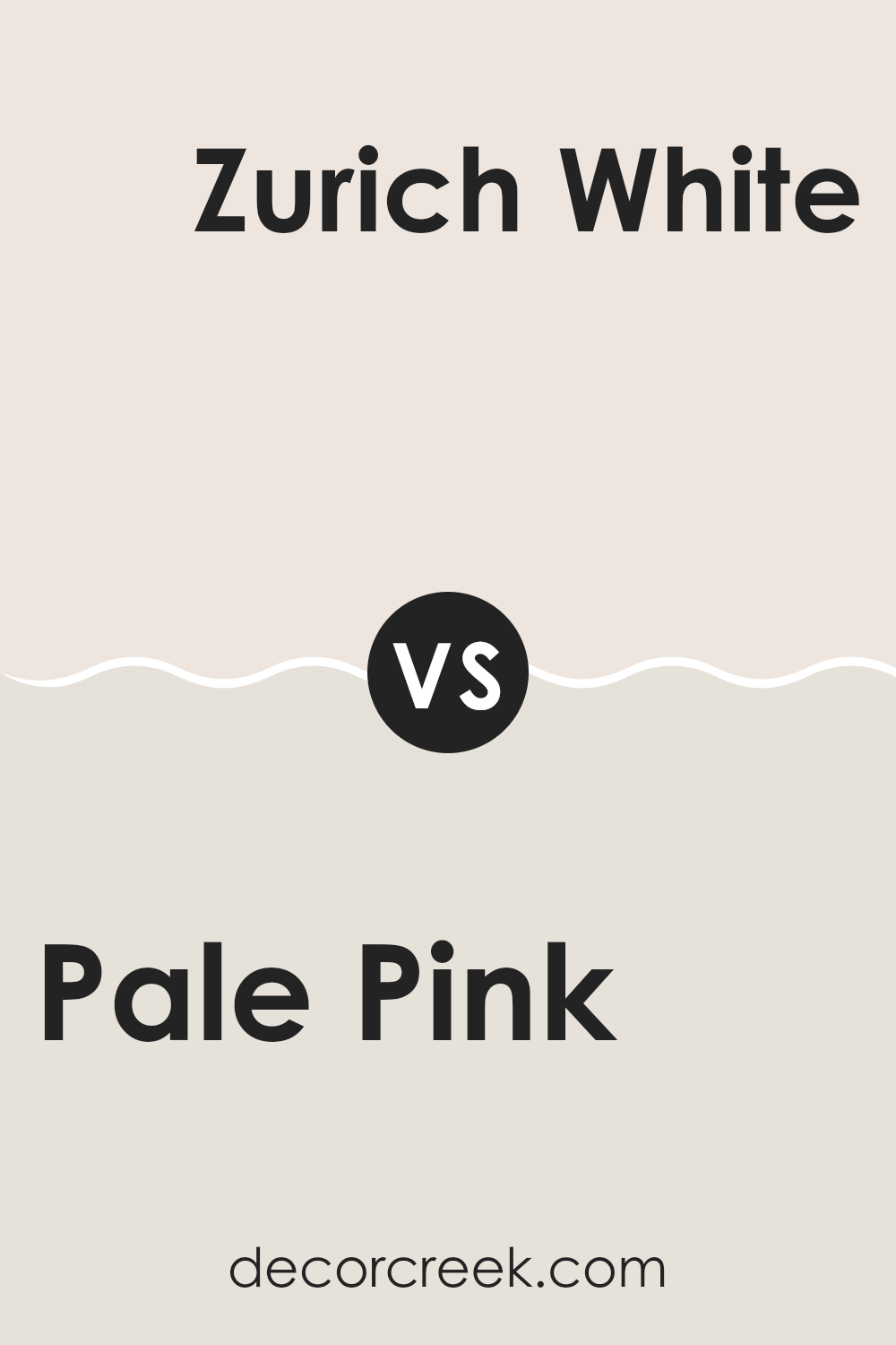
Pale Pink SW 9696 by Sherwin Williams vs Zurich White SW 7626 by Sherwin Williams
When comparing Pale Pink and Zurich White by Sherwin Williams, you will notice a gentle yet distinct contrast between the two colors. Pale Pink is a soft, delicate shade with a subtle warmth, making it comforting and inviting.
It’s very light in tone, which pairs beautifully in spaces aiming for a calm, cozy atmosphere. On the other hand, Zurich White stands out as a clean and neutral white with a hint of gray. This color is particularly versatile and serves as a perfect backdrop for different decor styles and colors, adding a fresh and clean look to any room.
While Pale Pink adds a touch of gentle warmth, Zurich White offers a crisp clarity that can make a space feel more open and airy. Together, these colors can complement each other well in a space that aims for a balanced, light, and airy feel, with touches of warmth sprinkled throughout.
You can see recommended paint color below:
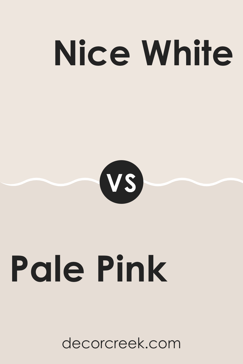
Pale Pink SW 9696 by Sherwin Williams vs Nice White SW 6063 by Sherwin Williams
Pale Pink and Nice White, both by Sherwin Williams, are subtle, distinct colors that offer different vibes for a space. Pale Pink is a soft, gentle color that feels warm and inviting, perfect for creating a cozy, nurturing atmosphere in rooms like bedrooms or bathrooms.
It has just enough pink to add a touch of warmth without being overwhelming. On the other hand, Nice White leans towards a neutral, clean palette, offering a more versatile backdrop that can easily be paired with any other color.
It gives rooms a fresh, open feel, making it ideal for spaces you want to appear larger and brighter. Comparing the two, Pale Pink brings a gentle warmth, ideal for personal spaces, while Nice White offers a crisp, clear foundation, great for both living areas and workspaces. Both colors reflect light well, making them practical choices in smaller or darker rooms.
You can see recommended paint color below:
Pale Pink SW 9696 by Sherwin Williams vs Futon SW 7101 by Sherwin Williams
Pale Pink and Futon, both from Sherwin Williams, offer unique visual appeals suitable for different areas of a house. Pale Pink is a soft, gentle color with a touch of warmth, making it perfect for creating a cozy and inviting atmosphere in spaces like bedrooms or nurseries. Its subtle hue blends well with other soft colors and natural materials.
On the other hand, Futon is a much darker shade, leaning towards a deep beige with gray undertones. It’s an excellent choice for areas that require a neutral but impactful background, such as living rooms or home offices. While it provides a strong foundation for various decor styles, it also adds a certain depth to the room without overwhelming it with color.
When used together, these colors can balance each other beautifully—Pale Pink adds a hint of softness to the solidity of Futon, making them a great combination for a harmonious color scheme.
You can see recommended paint color below:
Pale Pink SW 9696 by Sherwin Williams vs Ibis White SW 7000 by Sherwin Williams
Pale Pink and Ibis White are two colors from Sherwin Williams that offer distinct vibes. Pale Pink is a gentle, soft color with a warm undertone that brings a cozy, soothing feel to any space. It’s perfect for rooms where you want a touch of subtle color without overwhelming the space.
On the other hand, Ibis White is a clean and pure white that provides a bright and airy feel. It’s great for making small spaces appear larger and brighter. While Pale Pink adds a hint of color, Ibis White serves as a versatile backdrop, able to pair with virtually any color for a crisp, fresh look.
These two colors, though different, can complement each other beautifully in a room, with Ibis White on the majority of walls and Pale Pink as an accent, enhancing the overall aesthetic with its mild, warm tone.
You can see recommended paint color below:
Pale Pink SW 9696 by Sherwin Williams vs Pinkish SW 7112 by Sherwin Williams
Pale Pink and Pinkish by Sherwin Williams are two distinct shades that each bring their own unique feel to spaces. Pale Pink is a very subtle, almost neutral color that offers a hint of warmth without being overpowering. It’s perfect for those who want a touch of pink without making a bold statement. Since it’s so light, it can help make small rooms appear brighter and more spacious.
Pinkish, however, carries a bit more depth than Pale Pink. This shade is still gentle but has a stronger pink tone, making it a good choice if you’re looking to add a bit more color to a room. It stands out a little more and can be a focal point in a design scheme, especially when used on accent walls or in decorative touches.
Both colors are versatile and can work in a variety of settings, such as living rooms, bedrooms, and nurseries. The choice between them would depend on how much you want the pink to show in your space.
You can see recommended paint color below:
- SW 7112 Pinkish

Pale Pink SW 9696 by Sherwin Williams vs Porcelain SW 0053 by Sherwin Williams
Pale Pink SW 9696 by Sherwin Williams is a soft, warm pink that exudes a gentle and welcoming feel. It is perfect for creating a cozy atmosphere in spaces like bedrooms or nurseries. Its subtle tone ensures that it isn’t overwhelming, making it easy to pair with contrasting or complementary colors.
On the other hand, Porcelain SW 0053 by Sherwin Williams is a light, nearly white color with a hint of blue-gray. This color has a clean and airy quality, making it ideal for bathrooms, kitchens, or any space you want to feel fresh and tidy. Its lightness gives a sense of openness and can make small rooms appear larger.
Both colors have their unique appeal, with Pale Pink providing warmth and tenderness, and Porcelain offering a sense of freshness and space. When choosing between them, consider the mood you want to set and the functional aspects of the room.
You can see recommended paint color below:
Pale Pink SW 9696 by Sherwin Williams vs Downy SW 7002 by Sherwin Williams
Pale Pink and Downy, both from Sherwin Williams, differ in their visual impact and mood setting. Pale Pink is a gentle, soft shade of pink that offers a light and airy feel. It’s subtle and creates a soothing atmosphere in a space, making it perfect for bedrooms or quiet areas.
On the other hand, Downy is a light gray color that leans towards a cool palette. It’s versatile and understated, delivering a clean and modern look that works well in various settings, from kitchens to living rooms.
While Pale Pink adds a touch of warmth and softness, making spaces feel more inviting, Downy provides a neutral backdrop that pairs well with stronger colors and can give a space a more open and calm feeling. In summary, Pale Pink is great for adding a delicate, nurturing touch, while Downy serves as a strong foundation for bolder designs or decor. Both colors offer unique advantages depending on your decorative goals.
You can see recommended paint color below:
This paint color is not just any pink; it’s soft, gentle, and really pretty. It reminds me of a calm sunrise or a blooming flower in springtime. Whether you’re thinking about freshening up a room or adding a splash of color to a little corner, this pale pink shade can definitely work wonders. It gives a room a cozy, warm feeling without being too bright or in-your-face.
This color also matches well with lots of other shades. You can pair it with cool blues, grays, and even some bolder colors like green. So, if you’re looking to make a room in your house feel like a comfy and happy place, SW 9696 Pale Pink might be the perfect choice. Plus, it seems like a color that both kids and adults can like.
All in all, if you’re thinking about picking a new color for a room, SW 9696 Pale Pink is worth considering. It’s pretty, peaceful, and can make any room feel welcoming.

Ever wished paint sampling was as easy as sticking a sticker? Guess what? Now it is! Discover Samplize's unique Peel & Stick samples.
Get paint samples

