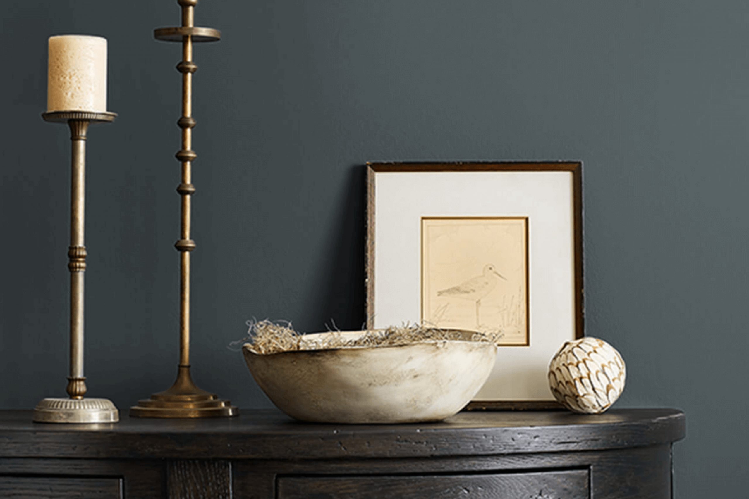
I just have to tell you about a color that’s been getting a lot of love lately—SW 9645 Big Dipper by Sherwin Williams.
It’s this beautiful deep blue that feels rich and cozy, but it doesn’t make a room feel boxed in like some dark colors can. One of my clients recently used it in a home office, and wow—it gave the room such a polished, classy vibe without feeling heavy or gloomy.
If you’re thinking about adding a darker color somewhere but you’re a little nervous, Big Dipper might be the perfect one to try. It’s bold but still feels welcoming.
Many of us struggle with selecting the right paint color because it’s such a significant commitment—once the walls are painted, we’re living with that color. But I found that taking a risk with SW 9645 Big Dipper was well worth it. The color works wonderfully in living areas and bedrooms alike, providing a backdrop that both soothes and enhances my decor.
For anyone considering a new wall color, I’d recommend considering how a deeper hue like SW 9645 Big Dipper can affect your room’s overall mood. It’s not just a change of color; it’s a way of adding a new layer of personality and charm to your living space.
What Color Is Big Dipper SW 9645 by Sherwin Williams?
Big Dipper by Sherwin Williams is a rich, deep blue color that adds a striking touch to any space. It has cool undertones that make it a perfect choice for creating a calm and cozy atmosphere. This hue can make small spaces appear larger and give rooms an artistic edge.
Big Dipper works exceptionally well in contemporary and minimalist interior designs because of its boldness and simplicity. It also fits seamlessly into nautical and coastal themes, pairing beautifully with crisp whites and sandy neutrals. In modern farmhouses or urban lofts, this color can serve as an accent wall, bringing depth and focus to the room.
This deep blue shade pairs well with natural materials such as light woods, which balance its intensity. Metals like brushed nickel or chrome also work well with this color, adding a sleek, modern touch. For textures, consider incorporating velvet or silk fabrics in lighter colors to create a smooth contrast that allows Big Dipper to stand out. Additionally, adding elements like glass or glossy finishes can enhance the depth of the color, creating a dynamic and visually interesting space.
In summary, Big Dipper is versatile for various styles and pairs effectively with different materials and textures, offering a striking yet balanced look in interior design.

Is Big Dipper SW 9645 by Sherwin Williams Warm or Cool color?
Big Dipper SW 9645 by Sherwin Williams is a color that brings a unique charm to any space in your home. It’s a dark, rich shade that could be described as resembling a deep ocean or a starry night sky. This makes it ideal for creating a cozy and inviting atmosphere in rooms like the living room or bedroom. It pairs extremely well with brighter colors, allowing accessories and furnishings to stand out vibrantly.
When used in small spaces, such as a powder room or an accent wall, Big Dipper can make these areas feel more intimate and personalized. However, if you’re considering painting a larger room entirely in this color, it might be a good idea to balance it out with lighter colors in furniture or curtains to keep the space from feeling too closed in.
Additionally, this shade works very well in a home office setting where it can add a touch of professionalism and depth without being distracting. It’s a versatile color that can fit a variety of décor styles, from modern to rustic, depending on how you style the rest of the room.
Undertones of Big Dipper SW 9645 by Sherwin Williams
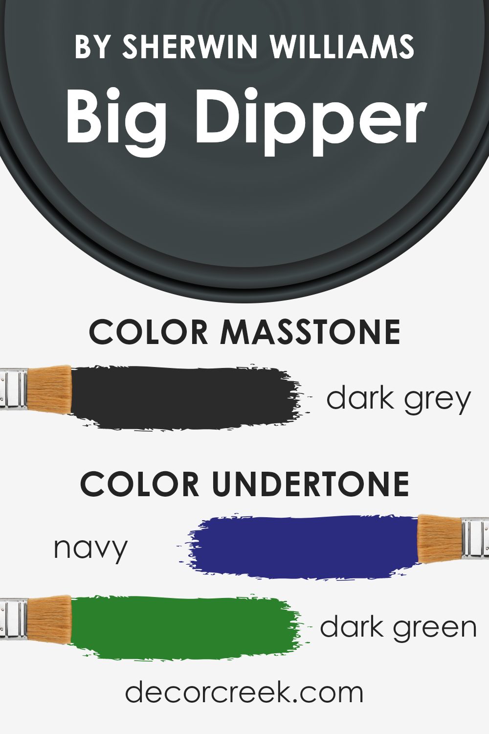
Big Dipper by Sherwin Williams is a unique paint color with a complex blend of undertones. In general, undertones are subtle colors that influence the main hue and can change how we perceive a color based on lighting and surrounding elements. For Big Dipper, these undertones include navy, dark green, brown, dark turquoise, purple, olive, and grey.
When we talk about undertones like navy and dark green, they add a cool depth to the color, making it look different in natural light compared to artificial light. The brown and olive undertones bring a warmer feel, creating a nice balance with the cooler tones. This mix makes Big Dipper a versatile choice for different spaces and styles.
In interior design, these undertones play a critical role. On interior walls, Big Dipper can look more navy or green depending on the lighting and what other colors are nearby, like furniture or decorations. This means the color can appear slightly different in each room, adding a dynamic quality to the home. The grey undertone helps to stabilize the color, ensuring it doesn’t overwhelm a space but instead adds a pleasant, subtle backdrop.
Overall, the complexity of Big Dipper’s undertones makes it a flexible choice for those looking to add a bit of depth and interest to their living space without overwhelming it with color.
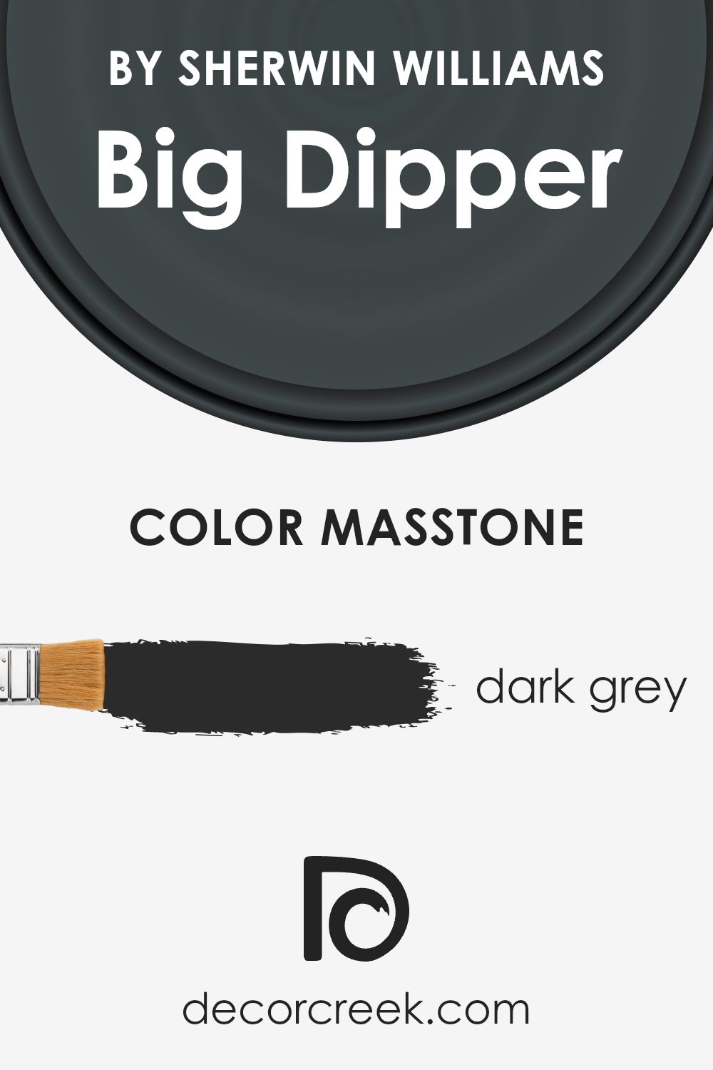
What is the Masstone of the Big Dipper SW 9645 by Sherwin Williams?
Big Dipper SW 9645 by Sherwin Williams, which has a masstone of dark grey (#2B2B2B), is a versatile color that can dramatically impact the feel and look of any room. Being a deep, rich grey, it has a powerful presence without overwhelming a space. This shade is perfect for creating a strong but subtle background that complements various decor styles, from modern to traditional.
In common areas like living rooms, it adds depth and anchors the space, making it ideal for highlighting artwork or furniture. In bedrooms, this color can help in creating a cozy, restful environment.
Additionally, dark grey is practical because it doesn’t show marks and smudges as easily as lighter colors, making it a good choice for high-traffic areas or homes with young children or pets. Its neutral tone also means it can blend well with many other colors, which allows for flexibility in changing decor accents over time without needing a complete repaint.
How Does Lighting Affect Big Dipper SW 9645 by Sherwin Williams?
Lighting plays a crucial role in how we perceive colors. The color and intensity of light can greatly influence how a paint color appears in a room. The interaction between light and color is essential to consider when choosing a paint shade for any space.
For instance, Big Dipper from Sherwin Williams, a deep, rich blue, can look significantly different under various lighting conditions. In natural light, this color reveals its true characteristics best during the daytime, showing off its depth and vibrancy.
Sunlight tends to bring out the brightness and vitality of colors, making Big Dipper appear lively and more dynamic. In a room with artificial lighting, the type of bulbs used can impact the color’s appearance. Warm bulbs may soften the blue, giving it a cozier and more muted feel, while cool LEDs could accentuate its bold, deep tones, making it seem sharper and more pronounced.
The orientation of the room also affects how Big Dipper will be viewed:
1. North-facing rooms: In these rooms, light is cooler and bluer, which can enhance the intensity of Big Dipper but might make the space feel a bit darker because the lighting does not bring out the warmth in colors.
2. South-facing rooms: These rooms benefit from plentiful, warm light for most of the day, which can make this shade of blue feel brighter and more vibrant. The color might seem more inviting and striking as the natural light changes from morning to evening.
3. East-faced rooms: Morning light in these rooms is warm and yellow, making Big Dipper look softer and slightly muted in the mornings while returning to a more true and deeper blue as the natural light fades.
4. West-faced rooms: Evening light, which tends to be warmer, will also make this color warmer and more inviting toward the end of the day, while it might appear less vivid in the morning light.
Understanding these dynamics can help in making informed decisions about where to use specific colors based on the lighting conditions they will most often be subjected to. The interaction between Big Dipper and light highlights the complexity and versatility of using deep colors in interior design.

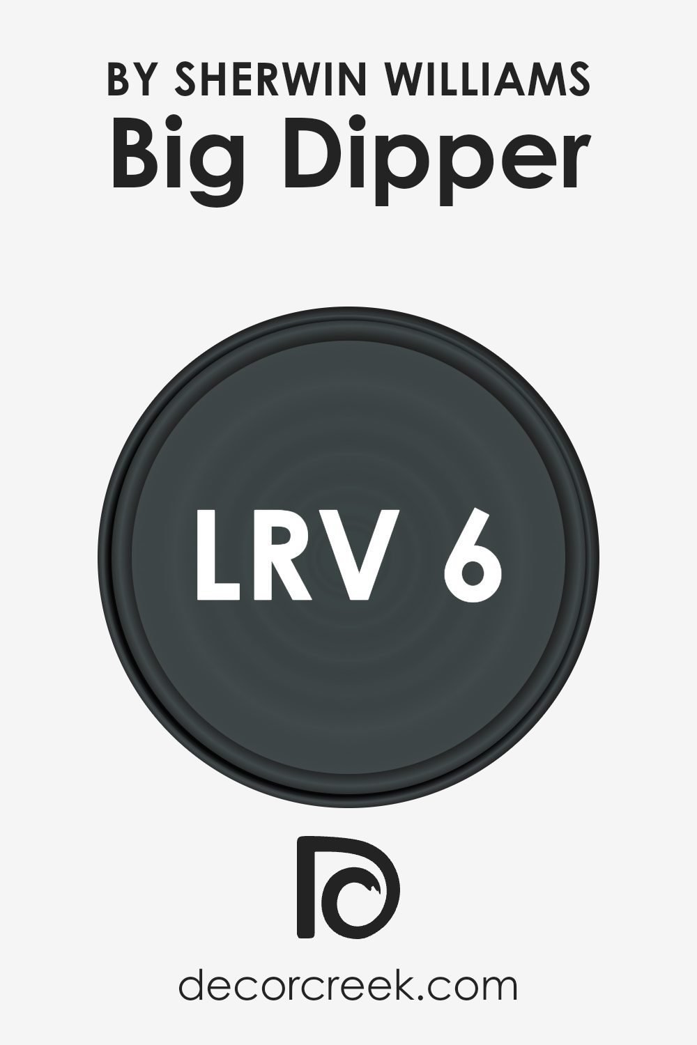
What is the LRV of Big Dipper SW 9645 by Sherwin Williams?
LRV stands for Light Reflectance Value, which is a measurement used to indicate the amount of visible and usable light that a color reflects or absorbs. This value ranges from 1 to 99, where lower values mean the color absorbs more light and appears darker, while higher values indicate that the color reflects more light and appears lighter.
Understanding LRV can be especially useful when choosing paint colors for your home because it helps predict how light or dark a color will look on the walls in various lighting conditions. Colors with low LRV can make a room feel cozier and more intimate, while higher LRV colors can make a space feel more open and airy.
Big Dipper has an LRV of 6.397, placing it on the lower end of the scale. This means it’s a darker color that absorbs more light than it reflects. In practical terms, when used on walls, this color can give the space a more enclosed and cozy feel, reducing the perception of size and space.
Because of its low LRV, it’s best used in rooms where a darker, more enveloping feel is desired or where there is ample lighting to balance the darkness of the walls. Remember, the actual appearance can still be influenced significantly by the room’s lighting and surrounding colors.
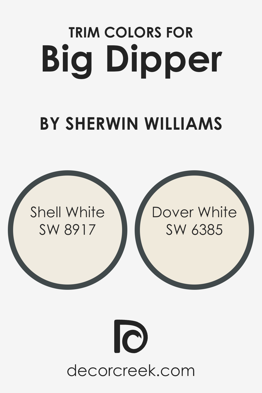
What are the Trim colors of Big Dipper SW 9645 by Sherwin Williams?
Trim colors play a significant role in defining the aesthetics of any room, acting as a visual frame that highlights the main colors used on walls and ceilings. When paired with a color like Big Dipper by Sherwin Williams, trim colors can provide a clean and fresh contrast that emphasizes the deeper tones of the primary wall color.
For example, Shell White and Dover White are excellent choices for trims because they offer subtle distinctions that complement without overpowering the main hue. The choice of the right trim color enhances the overall look, bringing together a cohesive style that enhances the visual appeal.
Shell White, with its warm undertones, offers a gentle softness that can soften the boldness of more intense shades, making it an ideal counterpart for creating a welcoming and balanced environment.
Dover White, on the other hand, leans slightly towards a creamy finish, providing a hint of warmth to spaces and making it perfect for settings that aim for a cozy yet vibrant atmosphere. Both colors are versatile enough to blend harmoniously with a variety of palettes, ensuring that the overall decorating scheme presents a polished and attractive finish.
You can see recommended paint colors below:
Colors Similar to Big Dipper SW 9645 by Sherwin Williams
Similar colors are important as they help create a harmonious and visually pleasant environment. By using shades and tints that are closely related on the color wheel, you can achieve a cohesive look that is also soothing to the eye.
This approach is particularly useful in interior design, where the goal is often to produce a space that feels unified and thoughtfully curated. For instance, when working with a deep navy hue, incorporating other dark, saturated colors can enhance the visual depth and maintain a consistent mood across the space.
Take, for example, Gale Force, which is a strong, stormy gray-blue, it sets a dramatic yet composed atmosphere. Iron Ore offers a slightly softer approach with its charcoal gray tone, adding a gentle contrast. Mount Etna brings a deep, smoky blue-green into the mix, enriching the palette with its earthy qualities. Sea Mariner and Tarragon introduce lighter, sea-inspired blues and subdued greens, which provide a refreshing lift to any dark-themed palette.
Cyberspace echoes the depth of dark nights with its intense dark blue-gray shade, while Sea Serpent, a dark teal, intertwines blue and green for a mysterious oceanic vibe.
Greenblack takes a bold step into the shadows with its nearly black, green-tinged depth, whereas Rookwood Shutter Green presents a historic green that evokes a sense of sturdiness and timelessness. Rock Bottom closes the circle with its grounding dark gray, nearly mirroring the depth and intensity of Iron Ore. Together, these colors can be used to set a tone that is both dramatic and consistent, making them excellent for creating themed spaces with a strong visual identity.
You can see recommended paint colors below:
- SW 7605 Gale Force
- SW 7069 Iron Ore
- SW 7625 Mount Etna
- SW 9640 Sea Mariner
- SW 9660 Tarragon
- SW 7076 Cyberspace
- SW 7615 Sea Serpent
- SW 6994 Greenblack
- SW 2809 Rookwood Shutter Green
- SW 7062 Rock Bottom
How to Use Big Dipper SW 9645 by Sherwin Williams In Your Home?
Big Dipper SW 9645 by Sherwin Williams is a deep, rich blue paint that can add a touch of drama and elegance to any room. It’s perfect for creating an accent wall in a living room or dining area, drawing attention and making the space feel cozier. This shade is versatile enough to be paired with softer hues for a balanced look, or with bright whites for a bold contrast that makes the color pop even more.
Because of its calming qualities, Big Dipper is also great for bedrooms. Painting all the walls in this color can turn your bedroom into a peaceful retreat where you can relax after a busy day. Pair it with light-colored curtains and bedding to keep the room feeling light and airy.
In addition, it works well in a bathroom for a stylish touch. Use it on cabinet doors or an accent wall paired with brushed nickel or chrome fixtures to create a modern vibe that feels crisp and fresh. This color can really make a statement and give your home a unique look.
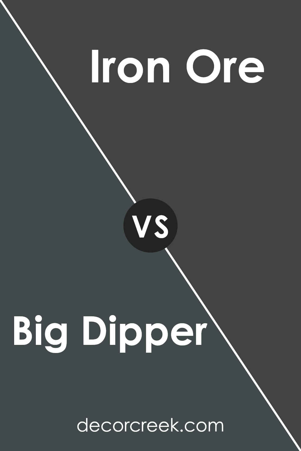
Big Dipper SW 9645 by Sherwin Williams vs Iron Ore SW 7069 by Sherwin Williams
Big Dipper and Iron Ore, both by Sherwin Williams, are distinct shades that cater to different aesthetic preferences. Big Dipper is a dark blue color that leans towards a deep teal, offering a rich backdrop that suits spaces meant for relaxation and focus. Its vividness adds character and depth, making it ideal for accent walls or statement pieces in a room.
On the other hand, Iron Ore is a very dark gray, almost black, that brings a strong, bold feel to spaces. It’s perfect for creating a dramatic and modern atmosphere, useful in both interior and exterior applications. This color can serve as a grounding element, pairing well with brighter colors to create contrast or with other neutrals for a more subdued palette.
Together, these colors provide options for creating diverse environments: Big Dipper injects a sense of calm energy, while Iron Ore offers sturdy and impactful design statements.
You can see recommended paint color below:
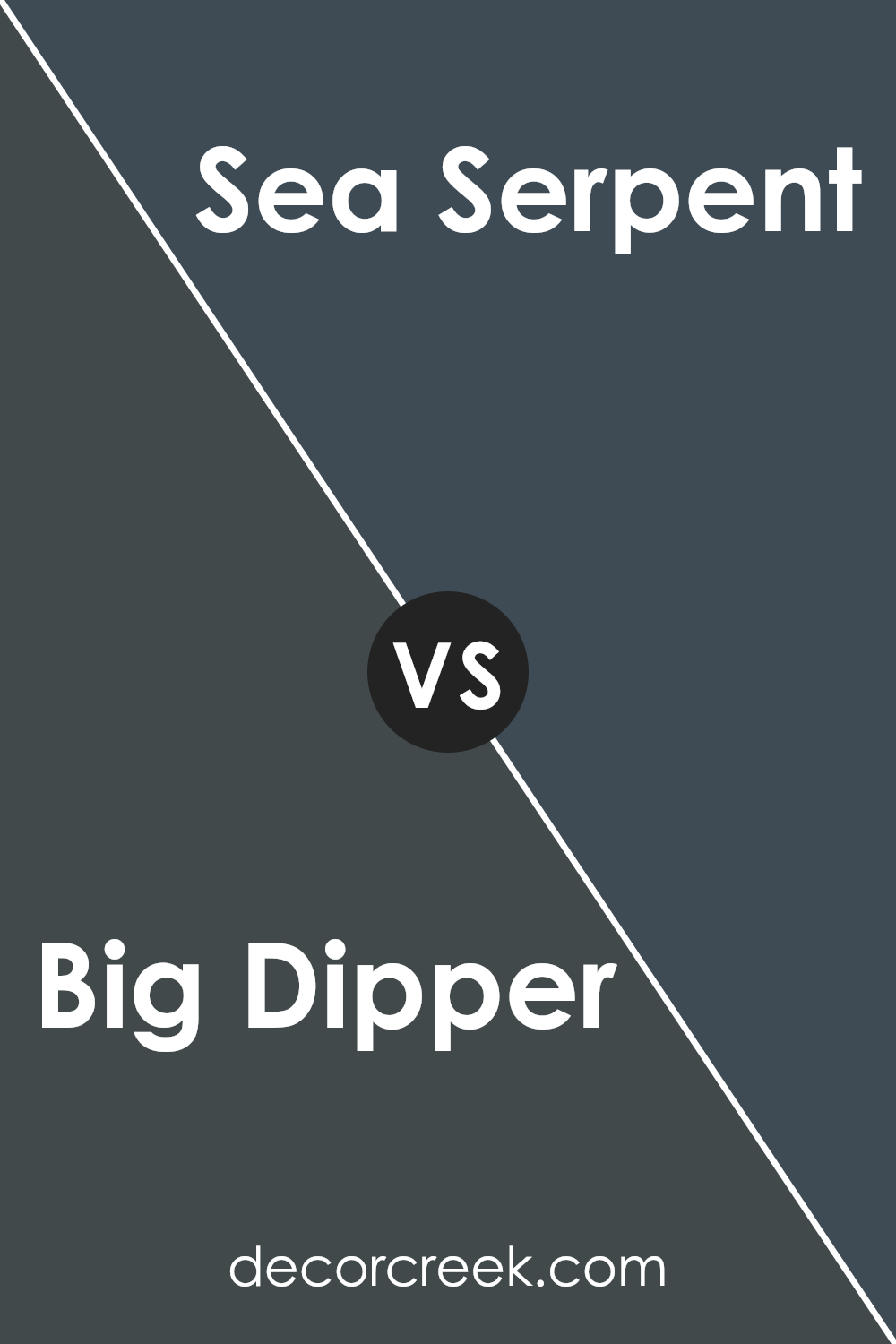
Big Dipper SW 9645 by Sherwin Williams vs Sea Serpent SW 7615 by Sherwin Williams
Big Dipper and Sea Serpent are two distinct colors by Sherwin Williams. Big Dipper leans towards a deep, rich navy blue. It gives off a strong, bold vibe and works well in spaces meant to convey confidence and strength.
On the other hand, Sea Serpent is darker, closer to charcoal with a hint of blue. This color is very grounding and can make a room feel cozy and secure. Though both shades are dark, Big Dipper reflects more light, making it the slightly brighter option of the two.
In contrast, Sea Serpent could be seen as more reserved due to its deeper, more muted tone. Both colors can be used effectively to create stylish and inviting environments but their impacts and the moods they set can be quite different depending on how and where they are used.
You can see recommended paint color below:
Big Dipper SW 9645 by Sherwin Williams vs Mount Etna SW 7625 by Sherwin Williams
Big Dipper and Mount Etna, both by Sherwin Williams, present interesting shades with unique characteristics. Big Dipper is a deep, dark blue that resembles the night sky, making any space feel cozy and inviting.
It’s a great choice for creating a calm, focused atmosphere in rooms like studies or bedrooms. On the other hand, Mount Etna is a rich, deep charcoal with a hint of green. This color is versatile enough to be used in various spaces, adding a touch of elegance without being too overwhelming.
It works particularly well in living areas or as an accent wall, giving a room a grounded feeling. Combining these colors in a home can add depth and interest, with Big Dipper providing a cool contrast to the warmer undertones of Mount Etna. Their intensity in shades ensures any décor pops against these backdrops, making them ideal for modern homes looking for a strong visual impact.
You can see recommended paint color below:
Big Dipper SW 9645 by Sherwin Williams vs Rock Bottom SW 7062 by Sherwin Williams
Big Dipper and Rock Bottom by Sherwin Williams are two distinct colors, each with its own unique appeal. Big Dipper is a dark blue shade, akin to a nighttime sky, offering a bold and cozy feeling that can make spaces like bedrooms and living rooms feel more grounded and secure.
On the other hand, Rock Bottom is a deep charcoal gray, almost black, that provides a strong and striking backdrop, suitable for modern and minimalistic interiors. It adds drama and depth to environments, making it a popular choice for accent walls or furniture pieces.
Both colors work well in spaces that aim for a moodier, more enveloping atmosphere, but while Big Dipper leans towards a cooler tone, Rock Bottom offers a warmer essence, despite its darkness. These colors can also complement each other well in decor, especially when aiming for a sophisticated palette.
You can see recommended paint color below:
Big Dipper SW 9645 by Sherwin Williams vs Sea Mariner SW 9640 by Sherwin Williams
Big Dipper and Sea Mariner, both from Sherwin Williams, are distinct in their appearance and the ambiance they create. Big Dipper is a deep, dark blue that often resembles the night sky. It’s perfect for creating a strong, bold look in a space. This color can make smaller rooms feel more intimate and larger spaces more grounded.
Sea Mariner, on the other hand, is a bright, cheerful blue. It has a vibrant, energetic feel to it, making it a great choice for areas where you want to add a splash of freshness and vitality. Its lighter tone can help open up a space and is excellent for a more casual, relaxed environment.
While both colors share a blue base, their impact and ideal uses are quite different. Big Dipper works well in sophisticated settings or where a touch of drama is desired, whereas Sea Mariner is better suited for lively, dynamic areas. Choosing between them depends on the mood and function you want for your room.
You can see recommended paint color below:
Big Dipper SW 9645 by Sherwin Williams vs Rookwood Shutter Green SW 2809 by Sherwin Williams
Big Dipper and Rookwood Shutter Green, both from Sherwin Williams, offer unique aesthetic choices for different spaces. Big Dipper is a deep, almost mystical navy blue. It’s perfect for creating a strong, noticeable backdrop in a room, great for accent walls or furniture. This color exudes a bold yet inviting vibe, making it suitable for spaces like living rooms or studies where you spend a lot of time.
On the other hand, Rookwood Shutter Green has an earthy, deep green tone that reminds one of dense foliage or traditional green shutters on a brick house. It pairs well with natural elements and wood finishes, lending a grounded, cozy feel to any space.
This color can effectively highlight areas that benefit from a touch of nature, such as kitchens or entryways. While both colors stand out, they cater to different moods and themes, Big Dipper leaning more towards a dramatic flair, and Rookwood Shutter Green toward a calm, nature-inspired environment.
You can see recommended paint color below:
- SW 2809 Rookwood Shutter Green
Big Dipper SW 9645 by Sherwin Williams vs Gale Force SW 7605 by Sherwin Williams
Big Dipper and Gale Force, both by Sherwin Williams, offer distinct visual experiences for any space. Big Dipper is a deep, muted blue with a grayish tone, providing a sense of calm and subtlety to rooms.
It works well in spaces where you want a muted yet present color that doesn’t overpower the surroundings. On the other hand, Gale Force is a much darker and more intense shade of blue with a more pronounced green undertone, giving it a stronger, more dramatic presence.
This color is great for making a bold statement and can add depth and intrigue to an area. While Big Dipper is more understated and versatile, Gale Force stands out and can define a space more distinctly. Both colors can be used effectively for different purposes depending on the atmosphere you want to achieve.
You can see recommended paint color below:

Big Dipper SW 9645 by Sherwin Williams vs Tarragon SW 9660 by Sherwin Williams
**Big Dipper** and **Tarragon** are two distinct colors from Sherwin Williams. Big Dipper is a dark and deep blue shade, almost like a night sky, offering a feeling of coziness and strength to any room. This shade can make small spaces feel more intimate or give large rooms a more anchored, solid feel.
On the other hand, Tarragon is a soft sage green that gives off a fresh and natural vibe, making it perfect for creating a calm and peaceful atmosphere. It reflects a lot of light, making it a great choice for making spaces feel airier and more open.
Both colors have their unique charm and can be used effectively in different parts of the home. While Big Dipper works well in spaces designed for relaxation and focus, like bedrooms or offices, Tarragon is ideal for areas where you want to feel refreshed and connected to nature, such as kitchens or living rooms. The choice between these colors would largely depend on what kind of mood or style you aim to achieve in your space.
You can see recommended paint color below:
- SW 9660 Tarragon
Big Dipper SW 9645 by Sherwin Williams vs Greenblack SW 6994 by Sherwin Williams
Big Dipper and Greenblack by Sherwin Williams are two distinct colors. Big Dipper is a deep, dark blue that has a strong presence and can create a moody yet calming atmosphere in any room. Its dark tone pairs well with lighter shades and can be used to add depth and emphasis to spaces.
On the other hand, Greenblack is even darker and leans more towards a very dark green that appears almost black in certain lighting. This color is perfect for making bold statements and works well in areas that benefit from a dramatic, cozy feel.
Comparing the two, both colors are great for adding character and mood to a space. Big Dipper, being a deep blue, reflects a more traditional color choice for creating a stylish, comforting space. In contrast, Greenblack’s blend of black with hints of green adds uniqueness, offering a fresh take on traditional deep tones. Both are versatile but cater to different aesthetic preferences and design needs.
You can see recommended paint color below:
Big Dipper SW 9645 by Sherwin Williams vs Cyberspace SW 7076 by Sherwin Williams
Big Dipper by Sherwin Williams is a stunning deep blue color that carries a vibrant and energetic tone. It grabs your attention and could really make a space lively and dynamic. On the other hand, Cyberspace is also a dark color, but it leans more towards a charcoal gray with hints of blue. This makes it more muted compared to Big Dipper, giving off a stronger sense of calm and subtlety.
While both colors are dark, Big Dipper has an intensity that could potentially energize a room and make it feel full of life. Cyberspace, however, is cooler and more understated, making it ideal for creating a more relaxed and quiet atmosphere.
This could be great for areas where you need a less vivid atmosphere, like a bedroom or study. In terms of matching with other colors, Big Dipper, being a true blue, pairs well with bright whites or lighter blues for a refreshing look. Cyberspace, due to its gray undertones, works nicely with softer colors like pale pink or even silver accents, offering a sleek and modern look.
You can see recommended paint color below:
Writing from my experience, I think SW 9645 Big Dipper by Sherwin Williams is a fantastic choice if you’re looking for a new paint color. This color stands out because it’s deep and rich, almost like the night sky, making any room feel cozy and inviting. It’s perfect for someone who wants to make their room feel like a safe and snug place to hang out or relax.
I’ve noticed that it goes really well with different kinds of lights. During the day, it’s subtle and blends nicely with natural sunlight. At night, it pairs well with lamps or overhead lights, giving a comforting vibe.
Using this color in a bedroom or a reading nook would be a brilliant idea because it creates a warm, protective feeling, almost like being wrapped in a soft blanket. For anyone thinking of giving their room a new look, using SW 9645 Big Dipper could be a great choice. It’s got a calm yet strong color that isn’t too harsh on the eyes and can make your furniture or decor pop really well. It also seems like it could hide small marks or scuffs, which is great for rooms that get a lot of use.
In conclusion, I’m really happy with how SW 9645 Big Dipper by Sherwin Williams turned out in my space. It made the room look stylish and cozy, which is exactly what I wanted. I think if you choose this color, you’ll be quite happy with how it makes your room look and feel.

Ever wished paint sampling was as easy as sticking a sticker? Guess what? Now it is! Discover Samplize's unique Peel & Stick samples.
Get paint samples

