Color holds an inexplicable power to shape our environment, moods, and perceptions.
Among the myriad of colors available to interior designers, Alpine Trail 622 has managed to distinguish itself. This article delves deep into its essence, the emotions it evokes, and the multitude of ways it can be utilized to breathe life into spaces.
What Color Is Alpine Trail 622?
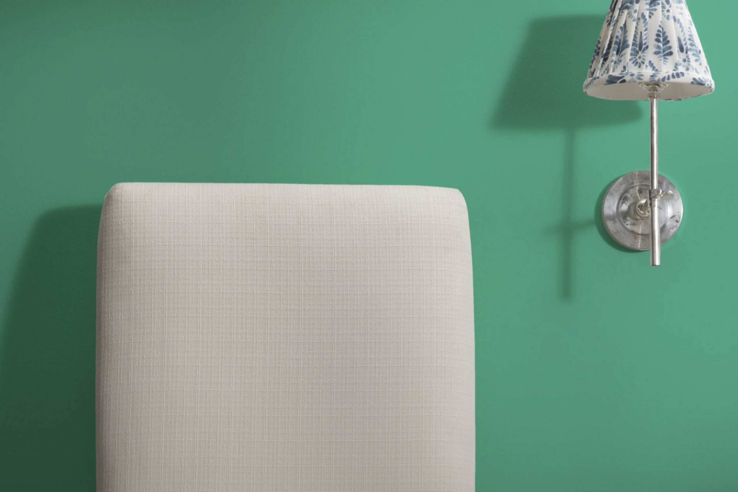
Alpine Trail 622 evokes the deep serenity of a shaded forest path. Its rich hue is reminiscent of earthy green blended with muted grays. It’s a neutral color with a twist, exuding a calm and organic feel. This versatile shade seamlessly fits into rustic, Scandinavian, and contemporary interiors.
When paired with wooden furniture, soft textiles, or matte finishes, it creates a harmonious atmosphere, infusing spaces with a sense of nature.
Ever wished paint sampling was as easy as sticking a sticker? Guess what? Now it is! Discover Samplize's unique Peel & Stick samples.
Get paint samples

Is It a Warm Or Cool Color?
At its core, Alpine Trail 622 leans more towards the cool spectrum. Cool colors, such as blues and greens, are associated with calmness, tranquility, and spaciousness. Its cool nature allows Alpine Trail 622 to impart a serene ambiance, making spaces feel more expansive and airy.
This characteristic is especially beneficial in homes where homeowners seek a calm oasis amidst bustling urban settings.
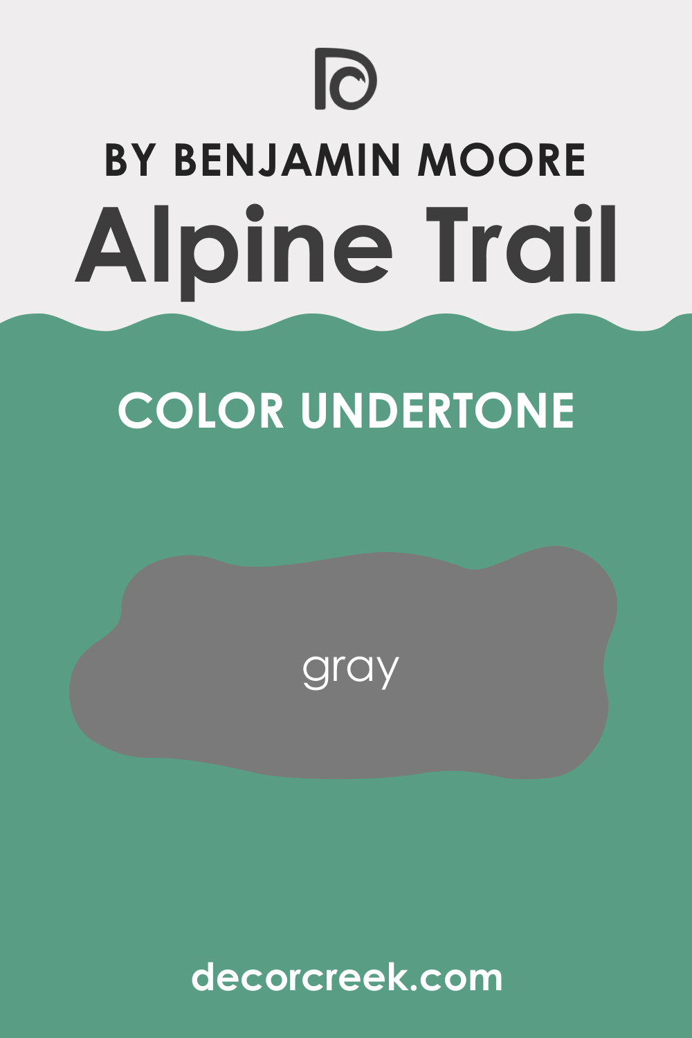
Undertones of Alpine Trail 622
Understanding undertones is essential, as they subtly influence the main color and can dramatically change its appearance in different settings. Alpine Trail 622, upon close examination, reveals subtle gray undertones. These undertones add depth and complexity to the color.
On interior walls, these undertones can make the shade appear more muted, especially in dimly lit spaces, adding to its versatility.
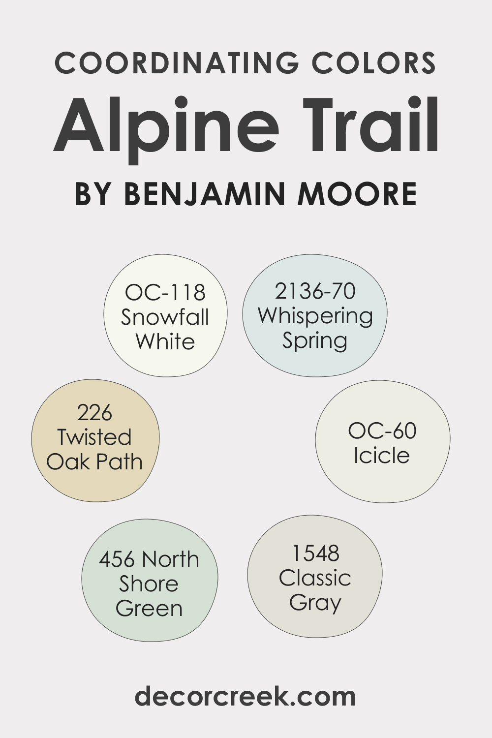
Coordinating Colors of Alpine Trail 622
Coordinating colors are hues that complement and enhance the main color’s appeal. For Alpine Trail 622, its coordinating colors include:
- OC-118 Snowfall White: A pristine, pure white.
- OC-60 Icicle: A delicate, almost translucent shade of white.
- BM 226 Twisted Oak Path: A muted beige with a hint of taupe.
Additionally, similar coordinating colors might be BM 2136-70 Whispering Spring, BM 456 North Shore Green, and BM 1548 Classic Gray.
How Does Lighting Affect Alpine Trail 622?
Lighting plays a pivotal role in how we perceive colors. Alpine Trail 622, under artificial light, takes on a slightly muted hue, emphasizing its gray undertones. In contrast, natural light accentuates its earthy-green essence. In north-facing rooms, where the light is cooler, the color tends to appear more subdued.
In south-faced rooms, with warmer sunlight, it’s more vibrant. East-facing rooms bring out its green essence during sunrise, whereas west-facing rooms give it a balanced appearance during sunset.
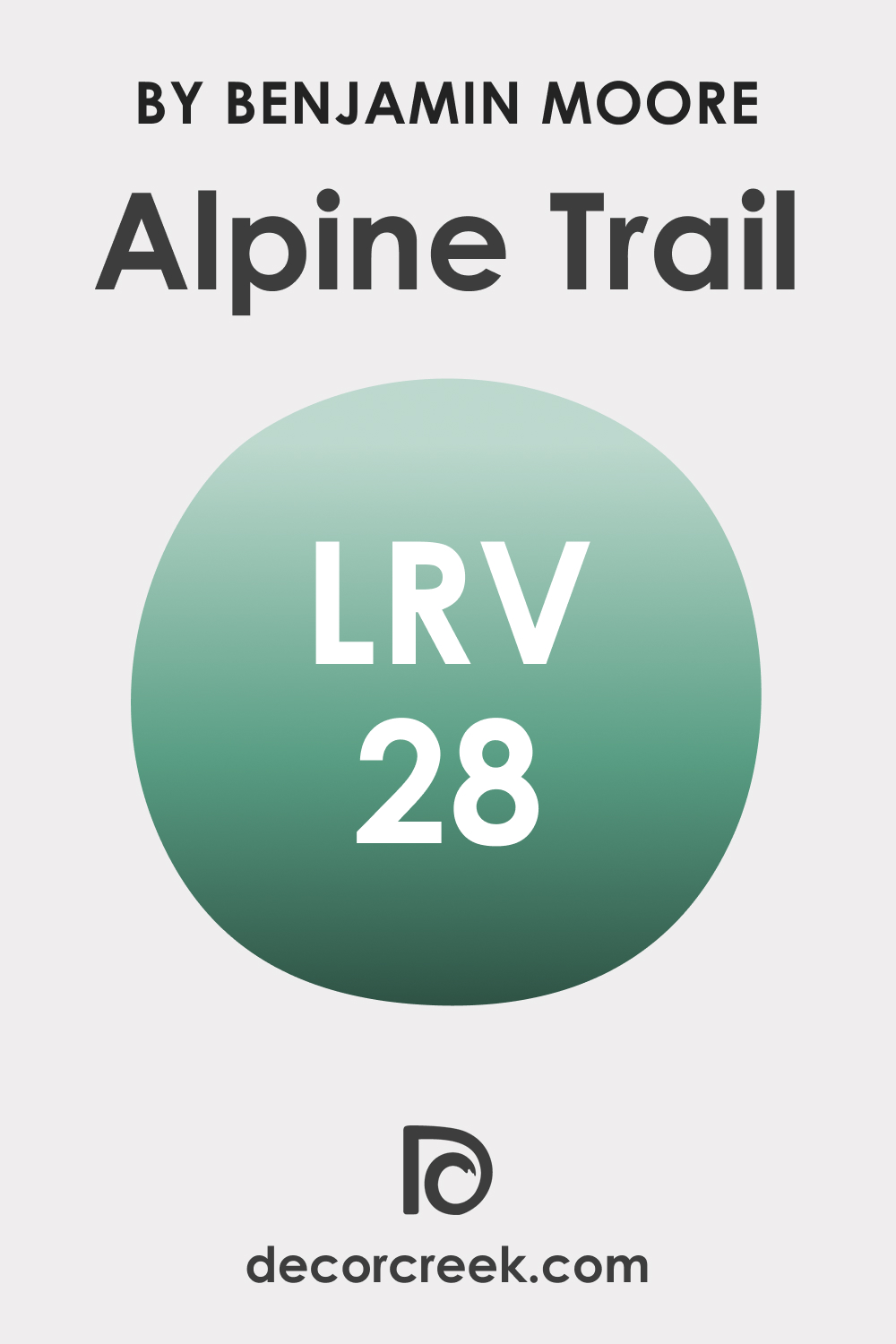
LRV of Alpine Trail 622
Light Reflectance Value (LRV) denotes how much light a color reflects. With an LRV of 28, Alpine Trail 622 falls into the medium-dark spectrum. This means it absorbs more light, making spaces feel cozier. Its relatively low LRV lends depth and character to spaces, making it an excellent choice for accent walls or intimate spaces.
LRV – what does it mean? Read This Before Finding Your Perfect Paint Color
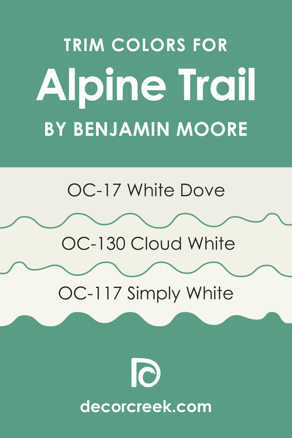
Trim Colors of Alpine Trail 622
Trim colors, often used for baseboards, moldings, and door frames, provide contrast and frame a room. For Alpine Trail 622, soft shades of white from the same brand work wonders. Consider OC-17 White Dove, OC-130 Cloud White, and OC-117 Simply White to create crisp boundaries and make Alpine Trail 622 pop.
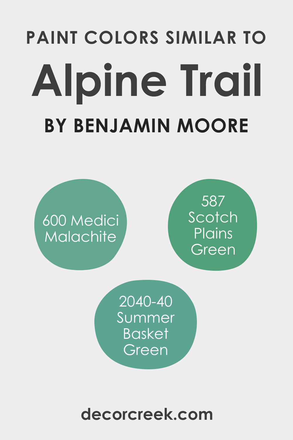
Colors Similar to Alpine Trail 622
Knowing similar colors enriches our palette choices. Though Alpine Trail 622 is unique, shades like BM 2040-40 Summer Basket Green, BM 600 Medici Malachite, and BM 587 Scotch Plains Green bear resemblance.
- BM 2040-40 Summer Basket Green: A vibrant green with a touch of summer freshness.
- BM 600 Medici Malachite: A deep, luxurious green with blue undertones.
- BM 587 Scotch Plains Green: A muted green with earthy brown undertones.
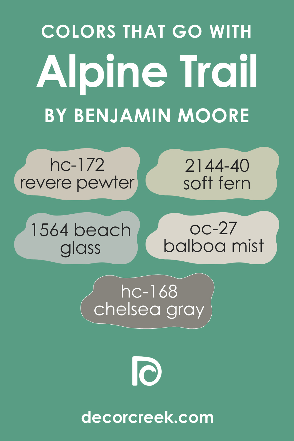
Colors That Go With Alpine Trail 622
Pairing harmonious colors elevates a room’s aesthetic. Benjamin Moore offers a plethora of shades that complement Alpine Trail 622. Consider pairing it with the following colors:
- HC-172 Revere Pewter
- BM 2144-40 Soft Fern
- BM 1564 Beach Glass
- OC-27 Balboa Mist
- HC-168 Chelsea Gray.
These shades, ranging from soft grays to muted greens, enhance the natural essence of Alpine Trail 622, making interiors feel cohesive and thoughtfully designed.
How to Use Alpine Trail 622 In Your Home?
Alpine Trail 622 is a versatile hue that can beautifully grace a multitude of rooms. Its serene, earthy undertones make it a prime choice for bedrooms, living areas, and even exteriors, infusing them with a touch of nature. It fits seamlessly into rustic settings, imbuing them with warmth, but it also complements contemporary and minimalist designs, acting as a subtle backdrop.
Scandinavian and bohemian interiors, which often derive inspiration from nature, can also benefit from this shade’s organic vibe.
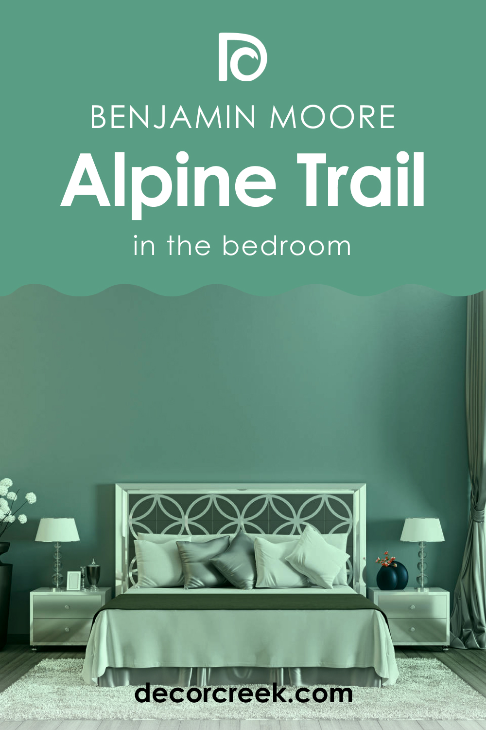
Alpine Trail 622 in the Bedroom
In the realm of bedrooms, Alpine Trail 622 acts as a soothing lullaby. Its calming green-gray undertones promote relaxation, ideal for a space meant for rest. Paired with soft linens, wooden furniture, and muted lighting, it creates an oasis of tranquility, aiding in a peaceful night’s sleep.
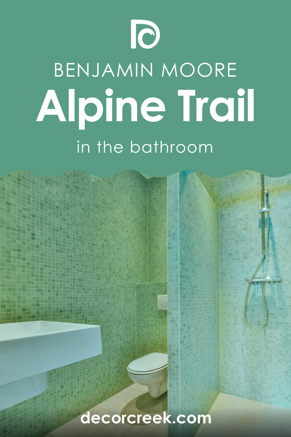
Alpine Trail 622 in the Bathroom
In bathrooms, Alpine Trail 622 can evoke the freshness of a forest after rain. Coupled with white tiles, marble counters, and sleek chrome fixtures, it lends a spa-like quality. For a bolder touch, pair with deep blues or greens in accessories or linens to intensify its organic character.
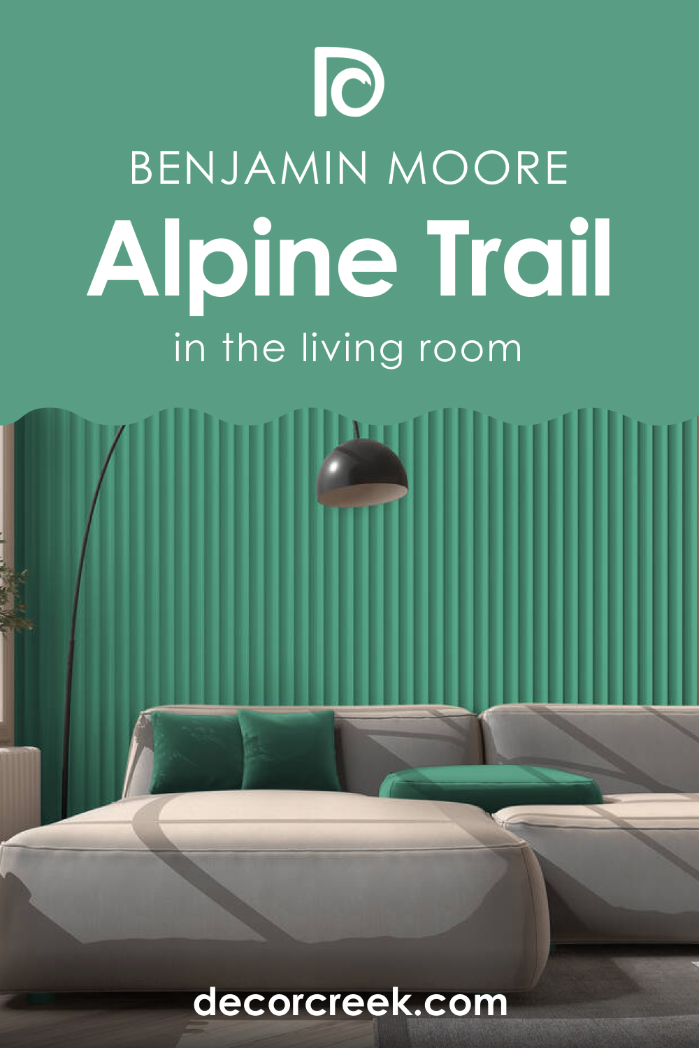
Alpine Trail 622 in the Living Room
The living room, often a hub of activity, can benefit from the grounding nature of Alpine Trail 622. It serves as a neutral yet characterful backdrop for varied furnishings. Whether combined with rustic wooden tables, modern art, or plush velvet sofas, this shade sets a tone of sophisticated comfort.
Alpine Trail 622 for an Exterior
For exteriors, Alpine Trail 622 can embody the essence of a modern woodland retreat. Its muted tone works well with natural stone, dark wooden trims, or metal accents. It’s especially captivating on homes surrounded by greenery, as it creates a harmonious flow between man-made structures and nature.

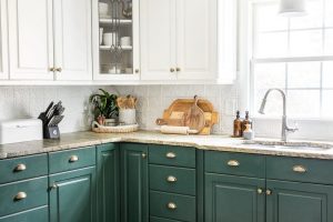
Alpine Trail 622 in the Kitchen
Kitchens, often termed the heart of a home, can don a warm, inviting aura with Alpine Trail 622. It pairs effortlessly with stainless steel appliances and wooden countertops. Introduce plants or open shelving with earthenware to underscore its earthy nature, making the space feel both contemporary and cozy.

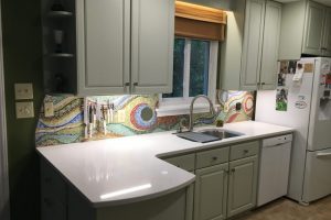
Alpine Trail 622 on the Kitchen Cabinets
For those seeking a unique touch in their kitchens, painting cabinets with Alpine Trail 622 can be transformative. Against a backdrop of lighter walls, these cabinets stand out, offering depth and character.
Complete the look with gold or brass handles to add a touch of luxe, creating a kitchen that’s both stylish and timeless.

Comparing Alpine Trail 622 With Other Colors
In the world of interior design, colors can either make or break a space. Comparing different hues is essential to ascertain which color best suits a particular setting, mood, or theme. Each shade, even if slightly varied, can evoke different emotions and create varied aesthetics.
By juxtaposing Alpine Trail 622 against other colors, we not only understand its unique properties but also how it might harmonize or contrast within diverse color palettes. Such comparisons can guide designers and homeowners in making informed decisions tailored to their vision.
Alpine Trail 622 vs. BM 617 Lido Green
Lido Green, with its brighter and more vibrant tone, contrasts the muted calmness of Alpine Trail 622. While Alpine Trail exudes an earthy serenity, Lido Green feels more tropical and lively, reminiscent of coastal settings and summer getaways.
Alpine Trail 622 vs. BM 619 Copper Patina
Copper Patina is a unique blend of green with subtle blue undertones, creating a hint of aged metal. Alpine Trail 622, with its more grounded earthiness, feels warmer in comparison. Copper Patina, however, brings in a touch of antiquity and historical depth.
Alpine Trail 622 vs. BM 620 Key Largo Green
Key Largo Green is a refreshing shade, mirroring the clear waters of tropical beaches. It’s brighter and feels more aquatic than Alpine Trail 622. While Alpine Trail 622 anchors a room with its depth, Key Largo invigorates and revitalizes spaces.
Alpine Trail 622 vs. BM 621 Eucalyptus
Eucalyptus is closer to nature’s greens, resembling the lush foliage of eucalyptus trees. It’s a tad brighter than Alpine Trail 622 but still retains some earthiness. Both colors inspire tranquility, but Eucalyptus leans more towards fresh mornings and dewy forests.
Alpine Trail 622 vs. BM 623 Deep Sea
Deep Sea, true to its name, plunges into the depths of marine blues. This profound blue contrasts sharply with the green-gray of Alpine Trail 622. While Alpine Trail 622 provides a serene woodland feel, Deep Sea transports one to the mysterious, deep oceanic realms.
Alpine Trail 622 vs. BM 618 Robin’s Nest
Robin’s Nest is a harmonious blend of blue and green, capturing the essence of early spring and new beginnings. Lighter and more ethereal than Alpine Trail 622, it whispers of clear skies and budding leaves, providing a softer touch to interiors.
Conclusion
Alpine Trail 622, with its distinctive shade, stands out in its own right, offering a canvas of muted natural beauty. Comparing it with other hues reveals its versatility and depth. Whether one is seeking an earthy ambiance or juxtaposing it against more vibrant shades for contrast, understanding its unique properties and how it interacts with other colors is paramount.
It’s a testament to the richness of colors and the infinite possibilities they present in breathing life, emotion, and character into our spaces.

Ever wished paint sampling was as easy as sticking a sticker? Guess what? Now it is! Discover Samplize's unique Peel & Stick samples.
Get paint samples