If you’re looking for a unique and beautiful paint color for your next home project, let me tell you about SW 7578 Borscht by Sherwin Williams. This color has quickly become a favorite of mine for its deep, vibrant hue that truly stands out. It’s not just another red; Borscht has a richness that pulls in elements of burgundy and deep purple, making it perfectly balanced between warm and cool tones.
Using Borscht in your home can add a sense of elegance and boldness to any interior. Whether you’re thinking about refreshing your living room, dining area, or even a bedroom, this color provides a striking backdrop that enhances everything around it. It works wonderfully with both modern and traditional decors, giving you a lot of flexibility in choosing furnishings and accessories.
So, if you are planning to give a room a makeover or simply want to introduce a powerful splash of color, SW 7578 Borscht is definitely worth considering.
It’s not just paint; it’s a way to make your living areas feel alive and truly dynamic. With Borscht, you’re sure to create an environment that gets noticed and feels instantly more inviting.
What Color Is Borscht SW 7578 by Sherwin Williams?
The Sherwin Williams color Borscht SW 7578 is a rich and deep reddish-purple, reminiscent of the hearty Eastern European soup that shares its name. This vibrant shade brings a bold and cozy warmth to any interior, making it a stand-out choice for those looking to add a touch of drama and personality to their interiors.
Borscht SW 7578 works exceptionally well in a variety of interior styles, particularly in bohemian and eclectic decors where its intensity can be balanced with contrasting colors and patterns. It also fits beautifully in more traditional settings, where it can create a striking focal point or an elegant backdrop.
When it comes to pairing materials and textures with this dynamic hue, natural wood with a rich finish complements its depth, enhancing the warmth of the room. Textiles like velvet or silk in muted colors provide a luxurious feel, while metallic accents in gold or brass can add a hint of glamour.
For a contemporary twist, pairing it with concrete or minimalistic furniture pieces can create an interesting visual contrast, allowing the color to really pop. Borscht SW 7578 is flexible in its ability to coexist with both soft and rough textures, making it a practical choice for a decorative statement.

Is Borscht SW 7578 by Sherwin Williams Warm or Cool color?
Borscht (SW 7578) by Sherwin Williams is a unique paint color that can make a bold statement in any home. This shade has a deep, rich tone that resembles the color of beetroot, making it a standout choice for those who want to add a splash of intensity to their interior.
Using Borscht in a room can really set the mood, creating a cozy and warm environment. It pairs well with neutral colors like whites and greys, which helps to balance its richness. This makes it a great choice for accent walls in living rooms or dining areas, bringing warmth and depth to social areas.
Additionally, in rooms with plenty of natural light, Borscht can appear vibrant and lively, while in areas with less light, it provides a more subdued and intimate feel. Overall, Borscht is perfect for homeowners looking to add a bit of drama and color to their interior without overpowering it.
Undertones of Borscht SW 7578 by Sherwin Williams
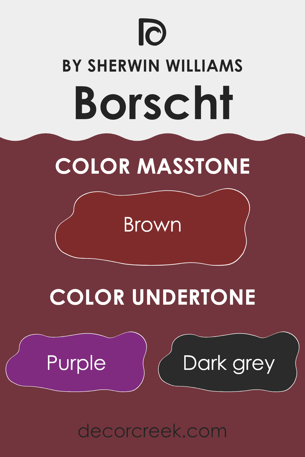
Borscht, a color by Sherwin Williams, is a complex hue that can be influenced by various undertones, such as purple, dark grey, olive, navy, grey, red, dark green, pink, dark turquoise, orange, and pale pink. Undertones are subtle colors that sit beneath the surface of a color and can greatly alter its appearance under different lighting conditions or when paired with other colors.
For example, if Borscht is used on interior walls, the presence of purple undertones might give the room a cooler feel, creating a sense of calm and quiet. The red undertones could make the color look warmer and more inviting, potentially energizing the interior. On the other hand, grey undertones can tone down the intensity of the color, making it more muted and easier to coordinate with a variety of decor styles.
The complexity of Borscht’s undertones means it can look dramatically different depending on the room’s lighting and surrounding elements. Natural light might enhance its red or purple undertones, while artificial light could bring out the greys or olives, affecting the overall mood and feel of the room.
Thus, when choosing Borscht for interior walls, consider the main undertones and how they might interact with the lighting and furnishings. This awareness helps in achieving the desired effect and making the most out of this unique color.
What is the Masstone of the Borscht SW 7578 by Sherwin Williams?
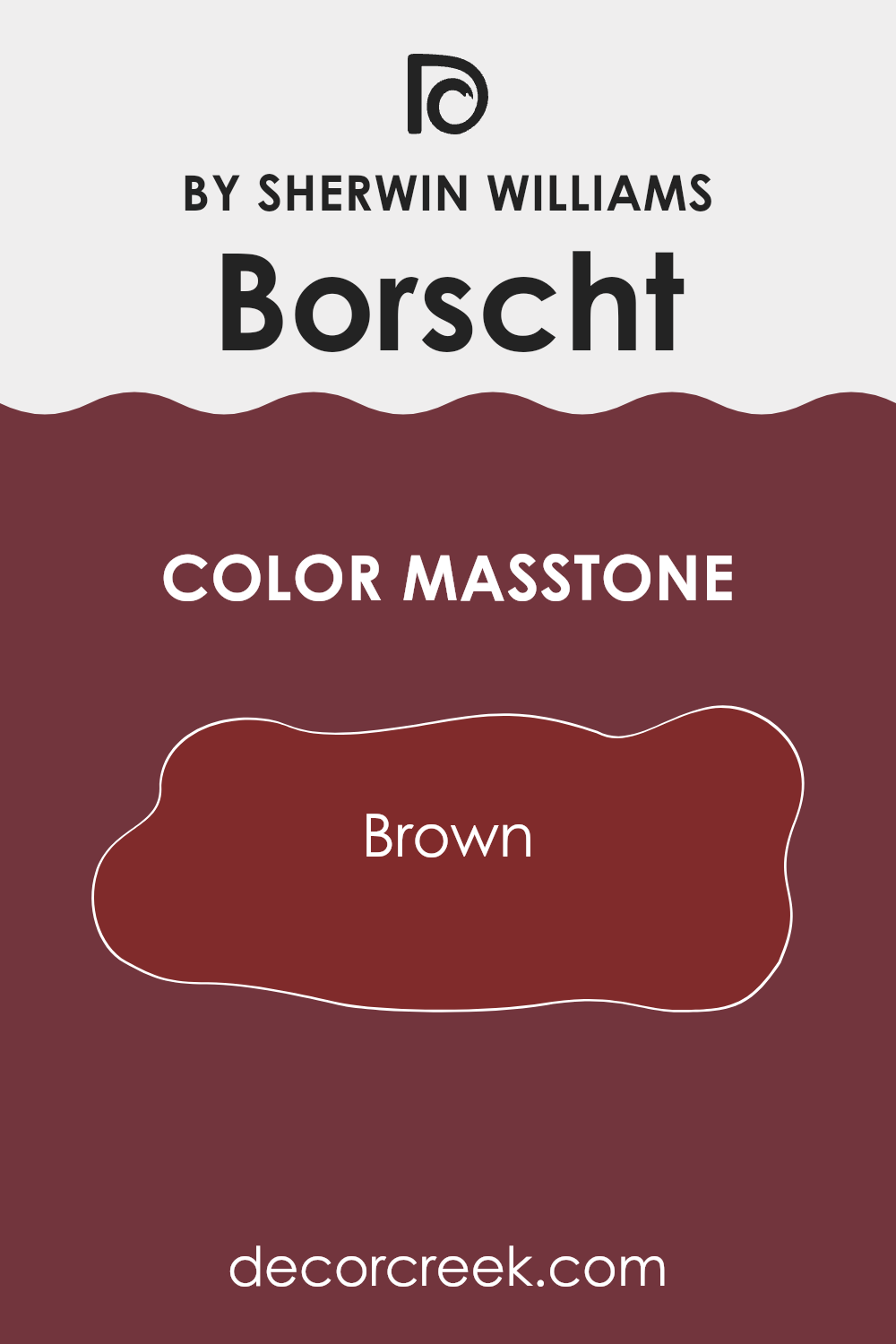
Borscht SW 7578 by Sherwin Williams has a rich brown masstone, specifically similar to the shade Brown (#802B2B). This deep, earthy tone brings a sense of warmth and coziness to any room.
When used in home interiors, this color is particularly effective for creating a welcoming atmosphere. It’s perfect for areas where comfort is key, such as living rooms, dining areas, or bedrooms.
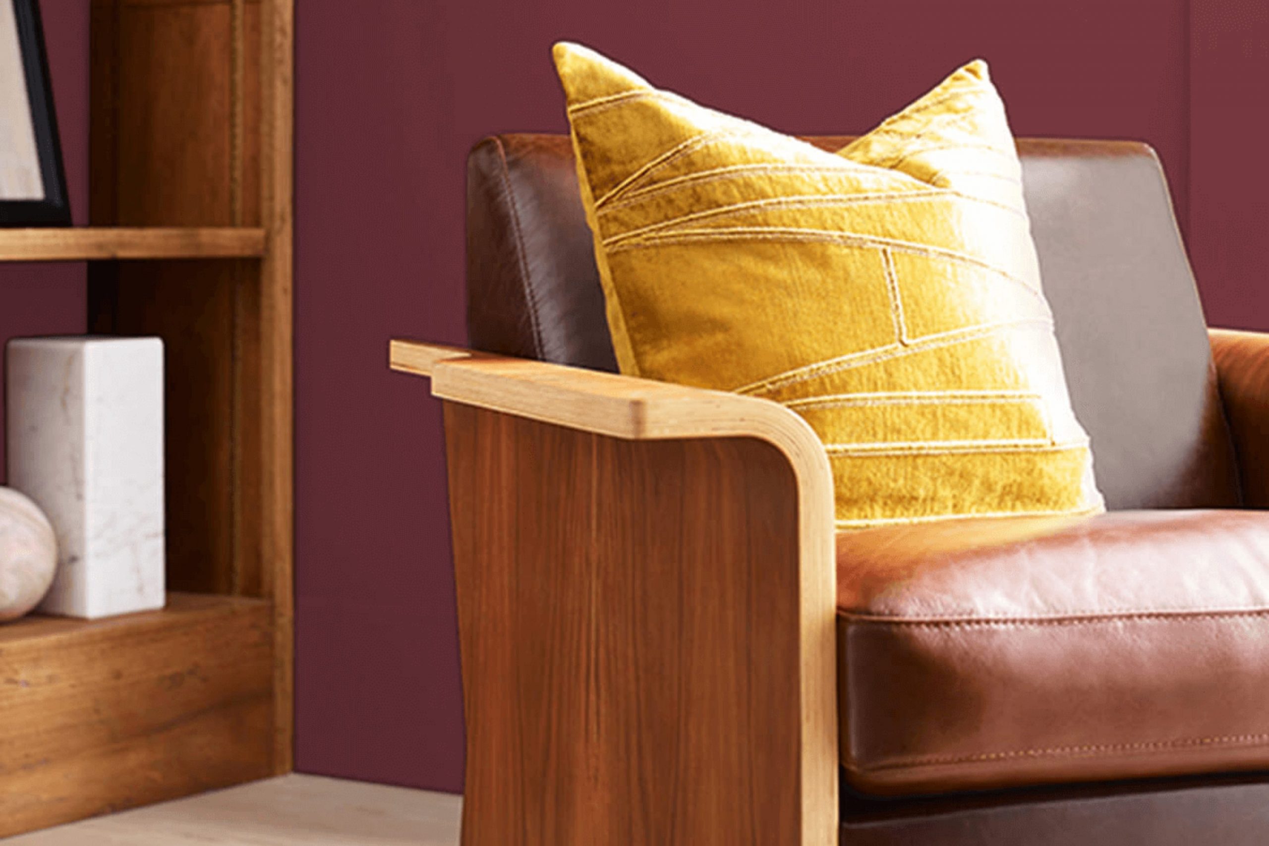
Brown tones like this also have a grounding effect, making them great for balancing out brighter or lighter colors in an interior. Whether on a feature wall or throughout a room, this shade adds a solid, comforting presence that makes the area feel more secure and enclosed. It’s also flexible, working well with natural materials like wood and leather, enhancing their natural beauty. Overall, this color helps make a home feel more inviting and settled.
How Does Lighting Affect Borscht SW 7578 by Sherwin Williams?
Lighting significantly influences how we perceive colors. Different types of light can make the same color look quite different. A hue might seem vibrant and intense under certain lighting conditions, yet dull under others.
Taking the color Borscht by Sherwin Williams as an example, its appearance can vary depending on whether it’s viewed in natural or artificial light. In artificial light, the warm, reddish tones present in Borscht may appear richer and deeper, creating a cozy and inviting atmosphere. Under fluorescent lighting, the same color could look slightly flatter due to the bluish tone of the light which may reduce its warmth.
In the context of natural light, the impact varies based on the direction the room faces. In north-facing rooms, which receive less direct sunlight and tend to have cooler light, the Borscht color can seem a bit subdued and less vibrant, taking on a more muted tone. Rooms that face south, however, receive abundant light for most of the day. Here, Borscht will look most true to its original hue, showing off its warm depth nicely as the ample light highlights its richness.
East-facing rooms get sunlight in the morning, which is generally soft and warm. In these rooms, the Borscht color would look bright and cheerful in the morning, then shift to gentler tones as the day progresses. Conversely, west-facing rooms receive evening light, which can cast redder, warmer glows.
This sort of light highlights the color even more, making it appear very vivid and dynamic particularly towards the end of the day. Understanding how light quality changes a color like Borscht can help in making informed choices about where to use specific colors in home or office settings to match the mood or atmosphere you want to create.
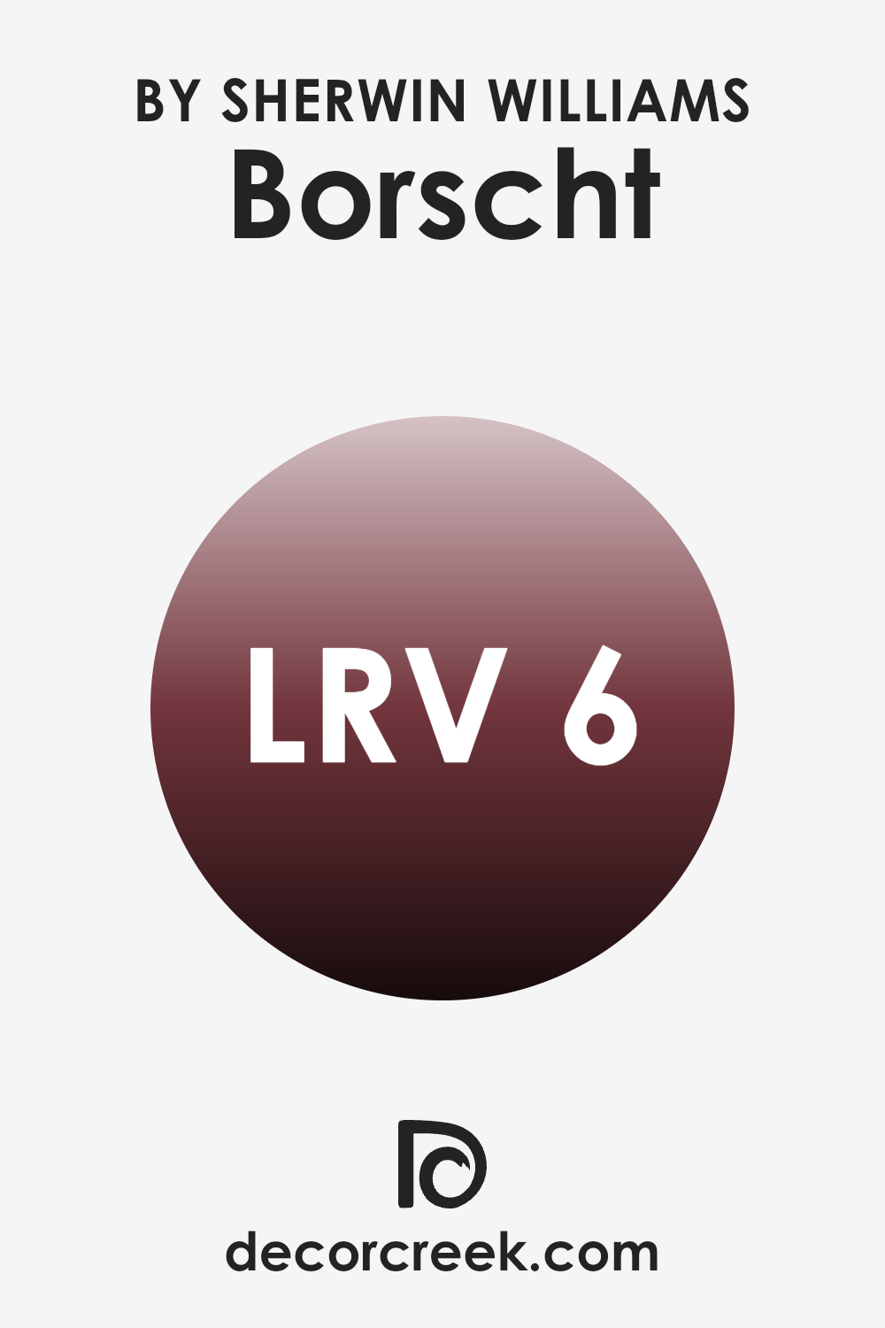
What is the LRV of Borscht SW 7578 by Sherwin Williams?
Light Reflectance Value (LRV) is a measure used to indicate the amount of visible and usable light that a color reflects or absorbs. LRV runs on a scale where pure black has a value close to 0 because it absorbs most of the light, and pure white has a value close to 100 because it reflects most of the light.
This rating is especially useful when choosing paint colors for a room as it helps determine how light or dark a color will look on the walls. Higher LRV colors can make a room feel brighter because they reflect more light, while lower LRV colors can make a room feel cozier but darker since they absorb more light.
With an LRV of 6.418, the color Borscht is quite dark, meaning it absorbs much more light than it reflects. This darkness can create a bold and dramatic effect in an interior, particularly in well-lit areas or spacious rooms to prevent the color from making the room feel smaller or more closed in.
In smaller or poorly lit rooms, however, using a color with such a low LRV might make the interior feel even smaller and darker. Therefore, if one is considering this color for a room, pairing it with brighter colors or accents, as well as good lighting, can help balance out the visual heaviness of this deep hue.
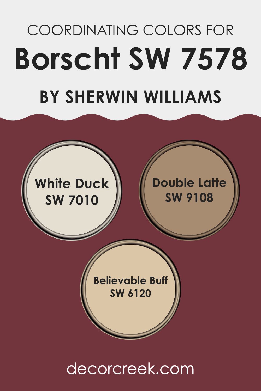
Coordinating Colors of Borscht SW 7578 by Sherwin Williams
Coordinating colors are chosen to complement a main color, enhancing the overall look of a room or design. In the context of interior decorating, coordinating colors can give depth, contrast, and visual interest to your interior. When using a specific color like Sherwin Williams’s Borscht, finding the right coordinating colors is key to creating a harmonious look. Colors such as White Duck, Double Latte, and Believable Buff are perfect examples of hues that work well with Borscht to create a cohesive palette.
White Duck is a soft, creamy color that offers a subtle contrast, brightening interiors without overpowering the rich tones of Borscht. It’s ideal for trim or cabinetry in a kitchen or bathroom where Borscht is used on the walls, providing a clean and inviting look. Double Latte, on the other hand, is a warm, deeper shade that echoes the underlying tones in Borscht, ideal for creating a cozy atmosphere in living areas or bedrooms.
It complements the more intense hue of Borscht by grounding the interior with its earthy, comforting presence. Finally, Believable Buff has a gentle, neutral appeal that works well in areas that receive lots of natural light, enhancing the vibrancy of Borscht while maintaining a soft transition between colors. This trio of coordinating colors supports the main shade without clashing, allowing for an interior that feels balanced and beautifully put together.
You can see recommended paint colors below:
- SW 7010 White Duck
- SW 9108 Double Latte
- SW 6120 Believable Buff
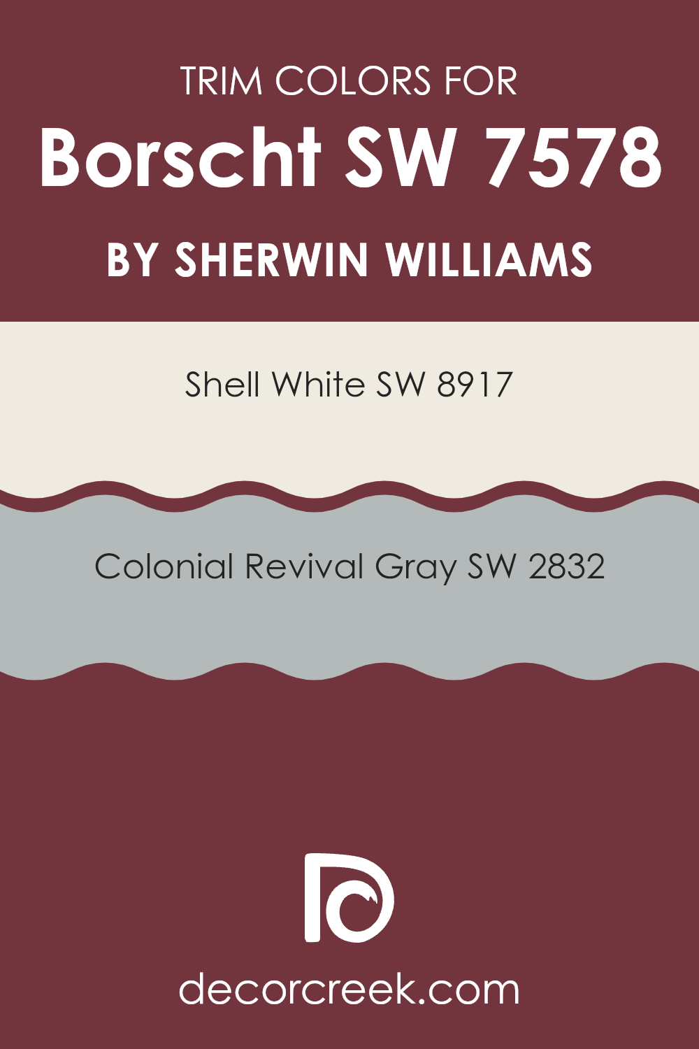
What are the Trim colors of Borscht SW 7578 by Sherwin Williams?
Trim colors, like SW 8917 – Shell White and SW 2832 – Colonial Revival Gray, are essential for adding contrast and detail to the main color on walls, in this case, Borscht SW 7578 by Sherwin Williams. These colors are typically used for baseboards, moldings, and door frames to outline and define areas, making the main wall color pop and giving the room a more finished look.
Using SW 8917 – Shell White can make the deep tones of Borscht more pronounced, creating a clean, classic boundary that enhances the overall appearance. Meanwhile, SW 2832 – Colonial Revival Gray offers a slightly more subtle contrast, blending harmoniously while still providing definition and depth to the interior.
SW 8917 – Shell White is a light and airy white shade that brings a fresh and clear look to any room. It has the quality of reflecting light, which can make smaller areas appear larger and more open. On the other hand, SW 2832 – Colonial Revival Gray is a mid-tone gray that gives a calm and grounding effect. This color can be used effectively to provide a gentle but noticeable contrast against brighter or darker wall colors, achieving a balanced and cohesive look in any interior setting.
You can see recommended paint colors below:
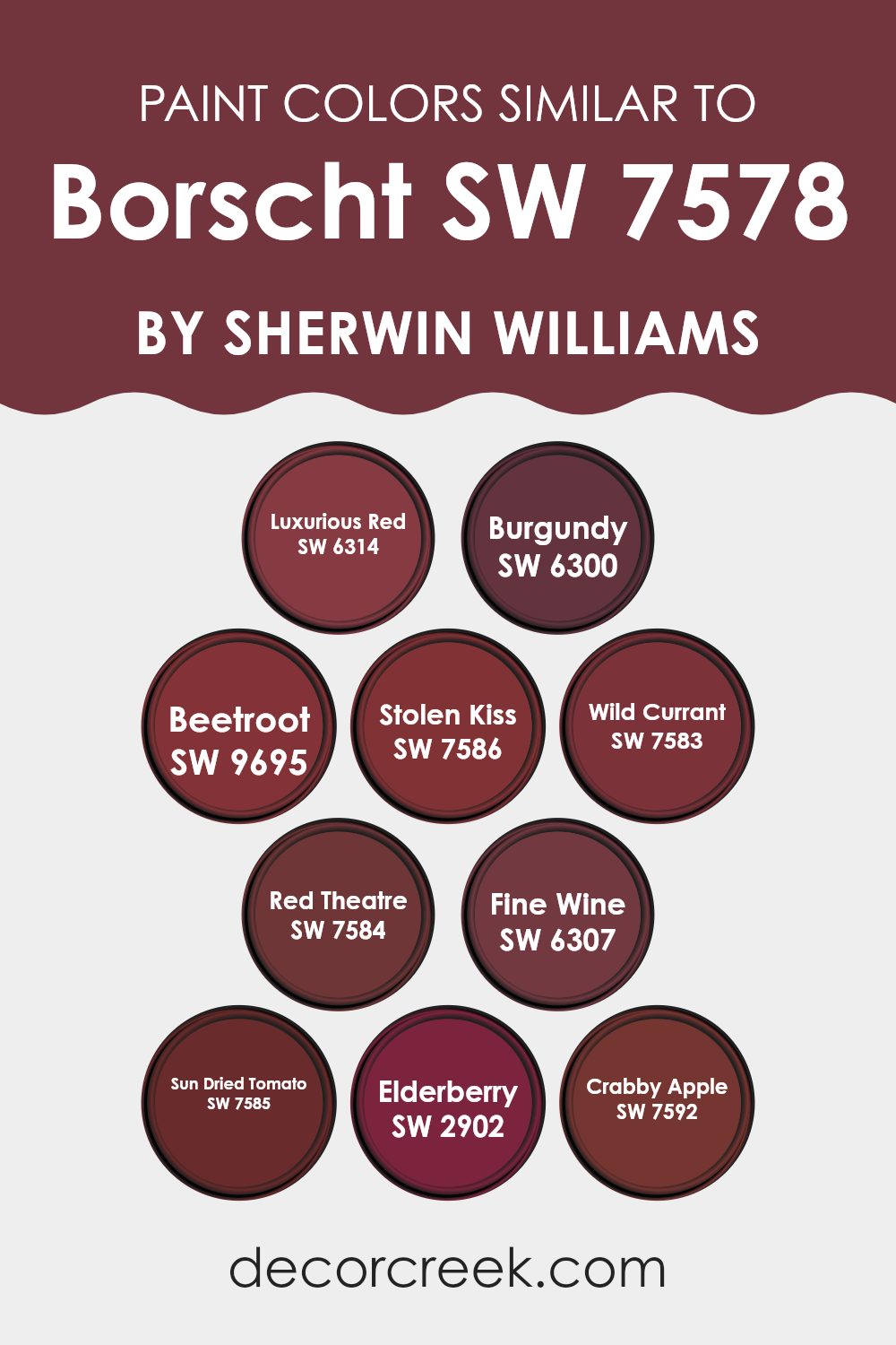
Colors Similar to Borscht SW 7578 by Sherwin Williams
Selecting similar colors around the primary shade you are interested in, such as Borscht by Sherwin Williams, brings visual coherence and enhances the overall look of an interior by creating a subtle variation that is pleasing to the eye. Such similarity in hues helps in shaping a mood or setting a tone through gentle shifts in color.
For example, Luxurious Red is a vibrant, deep shade that brings richness and warmth, perfect for energizing a room’s atmosphere. Burgundy, on the other hand, offers a more reserved, wine-like hue that pairs beautifully with darker furniture and fixtures, providing a classic, understated elegance.
Beetroot shares a hearty, grounded quality similar to its namesake, ideal for adding depth and interest to dining or kitchen areas. Stolen Kiss has a soft, almost blushed red that can brighten a smaller area or add a touch of romance to a bedroom setting.
Wild Currant and Red Theatre are bold enough to make any area stand out, with Wild Currant showing a darker undertone and Red Theatre giving a dramatic flair. Fine Wine and Sun Dried Tomato serve as muted, earthy reds, great for creating a cozy, inviting atmosphere.
Finally, Elderberry and Crabby Apple, with their deep, rich tones, are perfect for accent walls or to add contrast in a light-colored room, providing visual balance and interest. Each of these colors, belonging to a similar palette, ensures the interior remains harmonious while still allowing for personal creativity and expression.
You can see recommended paint colors below:
- SW 6314 Luxurious Red
- SW 6300 Burgundy
- SW 9695 Beetroot
- SW 7586 Stolen Kiss
- SW 7583 Wild Currant
- SW 7584 Red Theatre
- SW 6307 Fine Wine
- SW 7585 Sun Dried Tomato
- SW 2902 Elderberry
- SW 7592 Crabby Apple
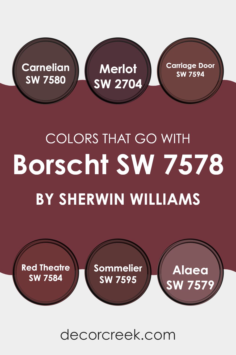
Colors that Go With Borscht SW 7578 by Sherwin Williams
Choosing the right colors to pair with Borscht SW 7578 from Sherwin Williams is essential because they create a cohesive look that can enhance the visual appeal of any interior. Carefully selected colors can create harmony when used together in decor, providing a balanced and appealing environment. For instance, matching Borscht SW 7578 with complementary colors shapes the mood and perception of the interior, allowing for a personalized touch that can make areas more inviting and visually interesting.
Carnelian SW 7578 offers a rich, deep hue similar to a precious stone. This deep red brings a boldness that pairs beautifully with the strong tone of Borscht SW 7578, ideal for making a statement in any room. Merlot SW 2704 is like a fine wine, with its lush, berry-red tone that offers a softer option that still aligns with the warmth of Borscht SW 7578.
Carriage Door SW 7594 steps in as a darker, almost brownish red, providing a grounding effect that balances brighter tones. Red Theatre SW 7584 has a vibrant personality that stands out next to Borscht, great for an accent wall or for decorative elements. Sommelier SW 7595, reminiscent of dark red grapes, adds a rich feel with its depth and intensity. Lastly, Alaea SW 7579 pulls from earthy red clays, giving a natural and strong complement to Borscht SW 7578. Together, these colors work together to provide a rich palette that can make any decorating project feel cohesive and thoughtfully designed.
You can see recommended paint colors below:
- SW 7580 Carnelian
- SW 2704 Merlot
- SW 7594 Carriage Door
- SW 7584 Red Theatre
- SW 7595 Sommelier
- SW 7579 Alaea
How to Use Borscht SW 7578 by Sherwin Williams In Your Home?
Borscht SW 7578 by Sherwin Williams is a vibrant and deep red paint that can add a bold touch to any room in your home. This rich color works especially well in dining rooms or kitchens where it can create a warm and inviting atmosphere. Borscht can also pair well with neutral tones like whites or creams, making it flexible for many styles and interiors.
If you’re looking to add a touch of energy and personality to your living area, using Borscht on an accent wall can be a great choice. This will draw attention without overpowering the room. For a balanced look, consider combining it with softer colors in your furnishings or decor items.
Borscht can also be used on furniture or smaller items like picture frames to refresh them with a splash of color. Whether on a wall or as a decorative accent, Borscht SW 7578 brings warmth and life wherever it’s applied, making it a practical choice for those looking to update their home environment.
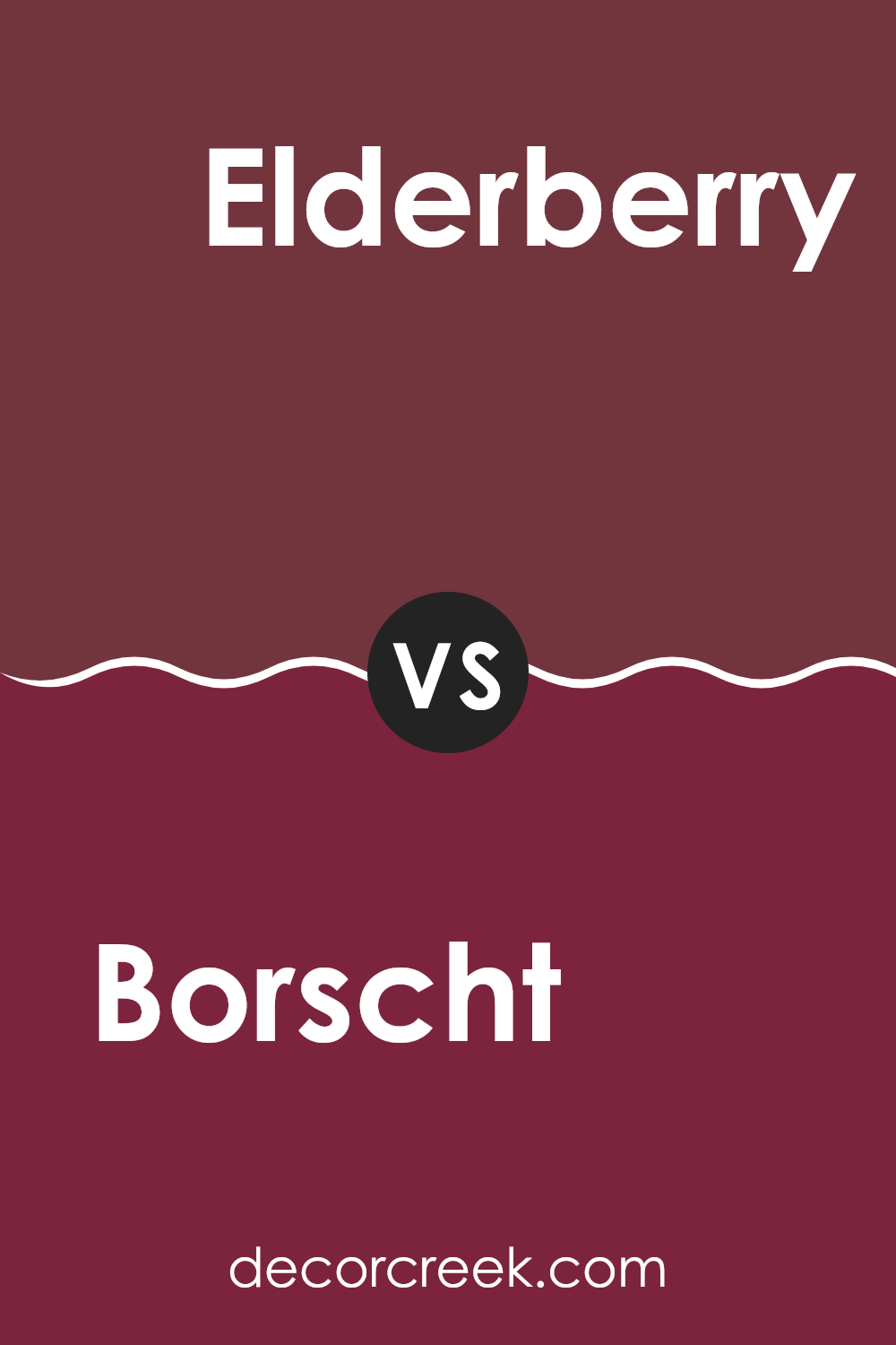
Borscht SW 7578 by Sherwin Williams vs Elderberry SW 2902 by Sherwin Williams
The main color, Borscht, is a deep, rich purple with a warm undertone, providing a bold and inviting feel to any interior. It’s the kind of color that makes a statement whether used on an accent wall or throughout a room.
On the other hand, Elderberry is also a shade of purple but leans more towards a darker, almost black tone. This color is more subtle and muted compared to Borscht, giving off a cozy and intimate vibe, perfect for creating a snug and comfortable environment in areas like bedrooms or studies.
Both colors are striking in their own right, but while Borscht pulls more attention with its vividness, Elderberry offers a grounding, understated look. Using them together could provide a nice contrast, with Borscht adding pops of energy against the calming backdrop of Elderberry.
You can see recommended paint color below:
- SW 2902 Elderberry
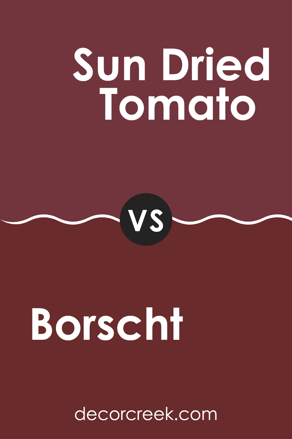
Borscht SW 7578 by Sherwin Williams vs Sun Dried Tomato SW 7585 by Sherwin Williams
Borscht SW 7578 and Sun Dried Tomato SW 7585 are both rich, deep colors by Sherwin Williams, but they highlight unique vibes and tones. Borscht is a deep purple hue, resembling the color of beet soup, which gives it a warm and cozy feel, perfect for creating a striking yet inviting interior.
On the other hand, Sun Dried Tomato has a strong, reddish-brown tone, similar to the rich color of sun-dried tomatoes. This color is earthy and warm, making it excellent for adding a touch of warmth to any room. Both colors are bold and can serve as strong statement colors in an interior.
While Borscht leans towards a cool undertone, Sun Dried Tomato offers a warmer palette, making each ideal for different decorative themes and personal tastes. Whether you’re looking for something more traditionally warm or a color with a cooler, unique twist, either of these choices could fit the bill.
You can see recommended paint color below:
- SW 7585 Sun Dried Tomato
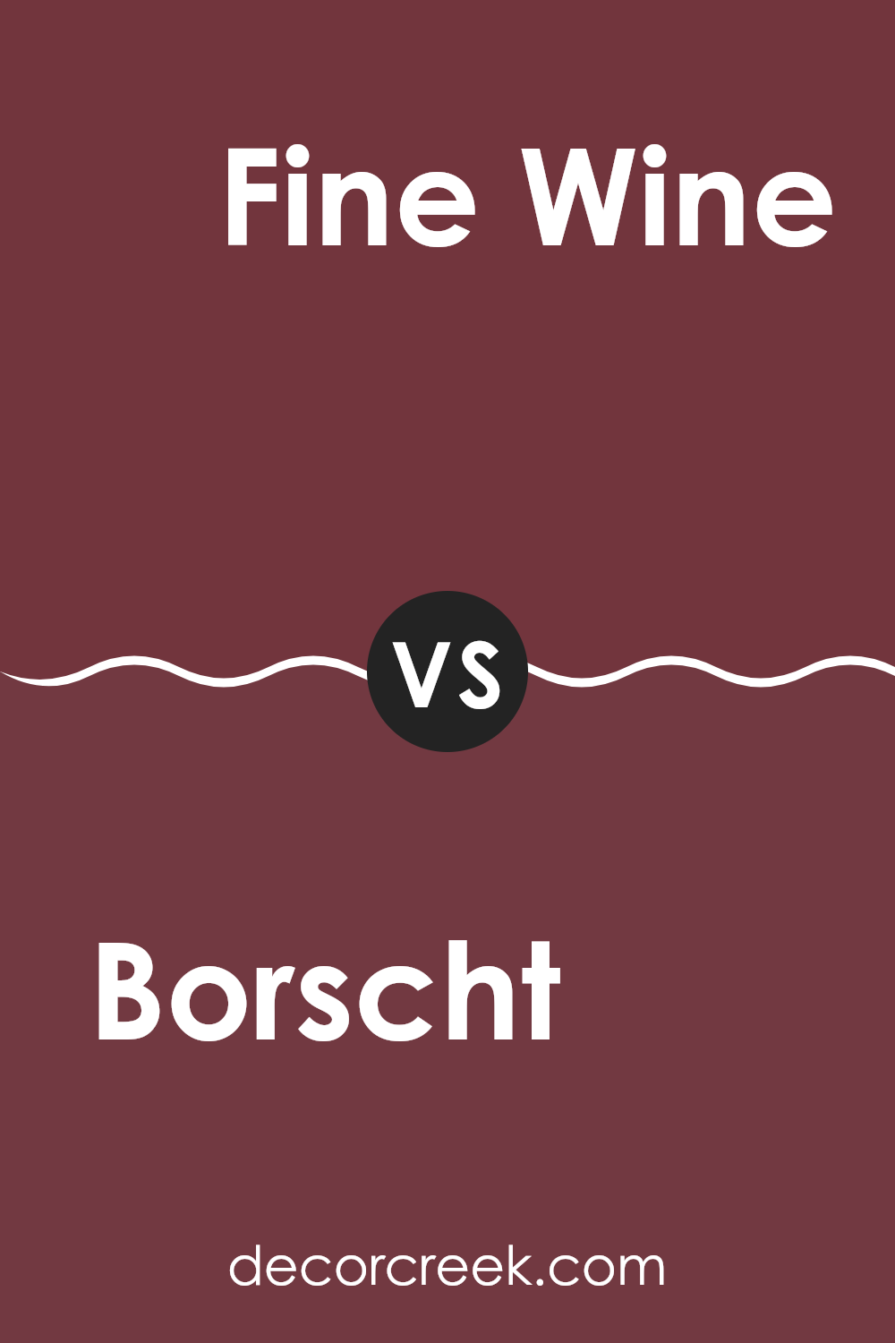
Borscht SW 7578 by Sherwin Williams vs Fine Wine SW 6307 by Sherwin Williams
Borscht SW 7578 and Fine Wine SW 6307, both by Sherwin Williams, are two distinct shades of red, each with its own unique character. Borscht is a deeper, muted tone that leans towards a burgundy, giving it a warm and cozy feel.
It’s perfect for areas where you want to create a rich and welcoming atmosphere without overpowering the senses. In contrast, Fine Wine is a brighter and more vibrant red. It has a clear, bold presence that can add a lively burst of energy to any room.
This shade works well when you want to make a strong statement or add a focal point to your decor. Both colors are flexible and can complement various styles and preferences, depending on the desired effect in an interior.
You can see recommended paint color below:
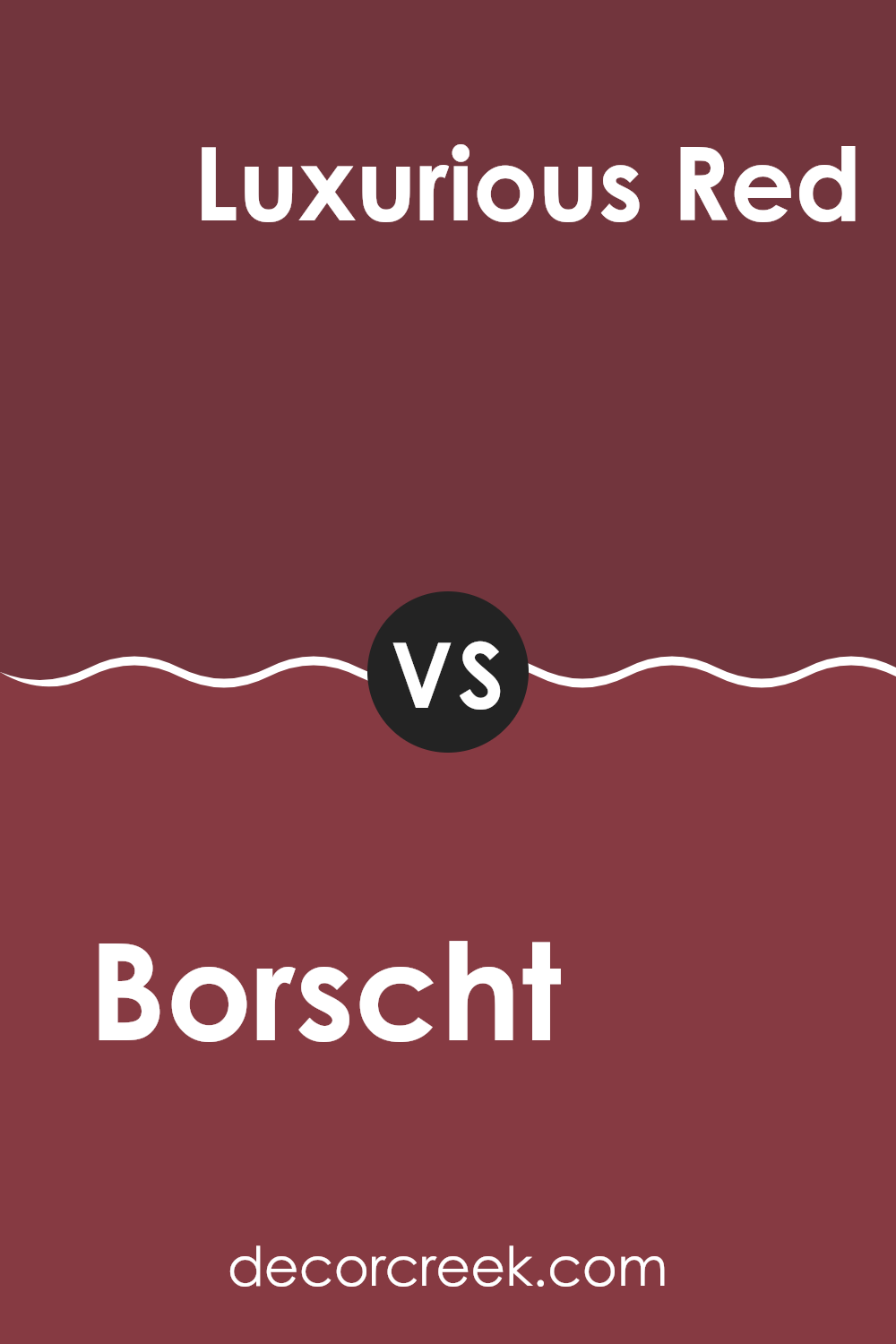
Borscht SW 7578 by Sherwin Williams vs Luxurious Red SW 6314 by Sherwin Williams
Comparing Borscht and Luxurious Red from Sherwin Williams, the first thing you notice is their vibe. Borscht is a dark, almost mysterious red, with deep purple undertones. It gives off a cozy, warm feeling, making it great for areas where you want a sense of calm and coziness. Luxurious Red, on the other hand, is a brighter, more vibrant red. It’s striking and energetic, perfect for areas where you want to make a bold statement or add a splash of energy.
Considering their application in a home, Borscht works well in bedrooms or living rooms, where its richer, darker tone helps create a relaxing atmosphere. Luxurious Red fits better in high-activity areas like dining rooms or kitchens, where its brightness can encourage lively conversations and interactions.
Each color has its unique charm and fits different moods and settings, highlighting how a shade of red can vary significantly in effect and mood.
You can see recommended paint color below:
- SW 6314 Luxurious Red
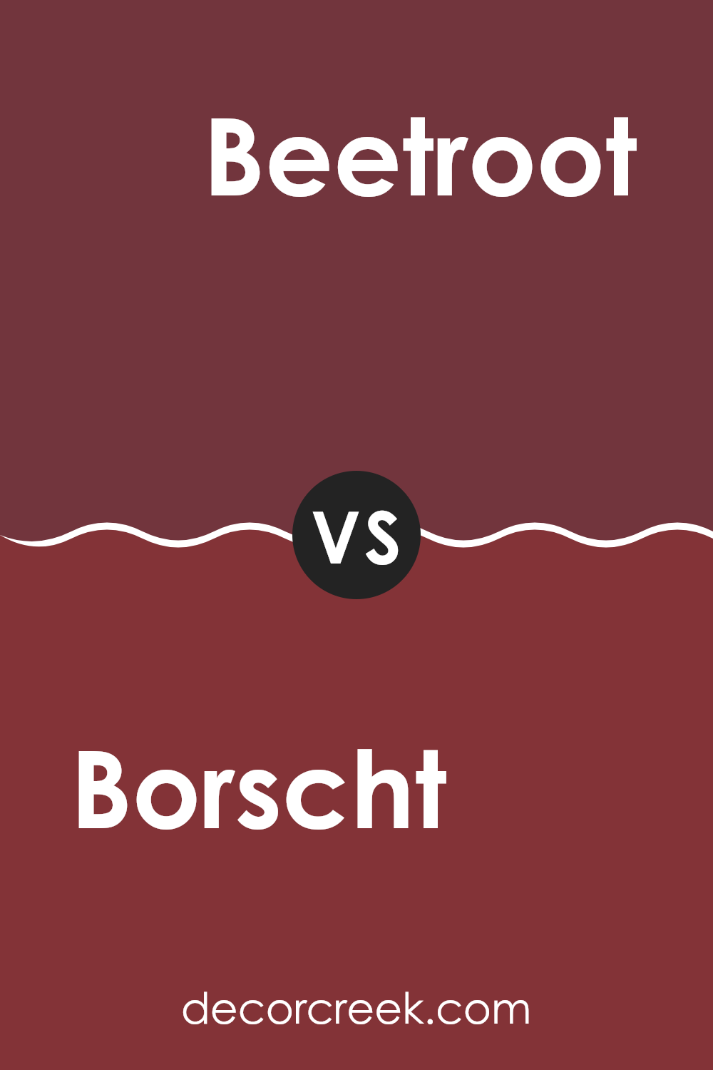
Borscht SW 7578 by Sherwin Williams vs Beetroot SW 9695 by Sherwin Williams
Borscht and Beetroot, both by Sherwin Williams, are variations of deep red. Borscht is a darker shade, reminiscent of the hearty soup it’s named after. It has a rich, burgundy tone that brings warmth and depth to an interior. It’s perfect for creating a cozy, inviting atmosphere in places like living rooms or dining areas.
Beetroot, on the other hand, is lighter and brighter, closer to the actual color of beet juice. This shade has more vibrance and can energize a room more than Borscht. It’s a great choice if you want to add a pop of color without overpowering the interior with something too dark.
While both colors share a red base, Borscht leans more towards a muted, shadowy feel, making it more suitable for traditional décor. Beetroot offers a fresher look that can fit well in modern settings. Both are flexible but serve different aesthetic purposes depending on the mood you want to set in your room.
You can see recommended paint color below:
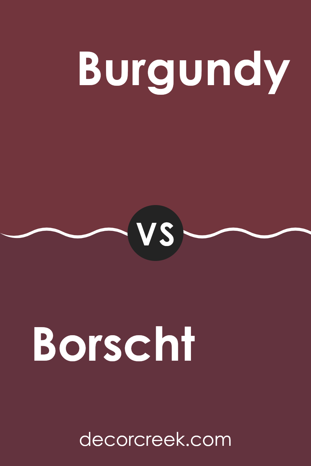
Borscht SW 7578 by Sherwin Williams vs Burgundy SW 6300 by Sherwin Williams
Borscht SW 7578 and Burgundy SW 6300 are two distinct shades from Sherwin Williams that both draw inspiration from rich, deep red tones. Borscht has a noticeably cooler undertone, leaning slightly towards purple, which gives it a fresher, crisper look. This makes it quite flexible for interiors that aim for a vibrant yet not overpowering atmosphere.
On the other hand, Burgundy is warmer and darker, closely resembling the traditional wine color from which it takes its name. It offers a more classic feel, creating a cozy and inviting environment. This color works well in areas where you want to establish a more formal or relaxed mood.
When deciding between the two, consider the mood you want to create. Borscht’s cooler touch might be better suited for a modern setting, while Burgundy’s richer depth fits beautifully in traditional or refined interiors. Both colors offer unique looks but suit different tastes and design goals.
You can see recommended paint color below:
- SW 6300 Burgundy
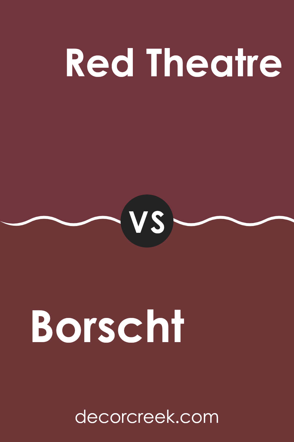
Borscht SW 7578 by Sherwin Williams vs Red Theatre SW 7584 by Sherwin Williams
Borscht SW 7578 and Red Theatre SW 7584, both by Sherwin Williams, offer distinct shades of red, each creating a unique mood and impact in interiors. Borscht is a deeper, muted red with a hint of purple, giving it a rich and cozy feel. This color works well in intimate settings like dining rooms or small sitting areas, where its subtle, warm tones can make the interior feel welcoming and snug.
On the other hand, Red Theatre is a bold, vibrant red that stands out. This shade is brighter, leaning towards a classic red, which makes it ideal for lively areas where you want to bring energy and enthusiasm. It’s perfect for an accent wall in a living room or in a creative interior like a studio which benefits from a stimulating and dynamic color.
When choosing between the two, consider the mood you want to set. Borscht SW 7578 creates a softer, more understated tone, while Red Theatre SW 7584 is all about making a strong, lively statement.
You can see recommended paint color below:
- SW 7584 Red Theatre
Borscht SW 7578 by Sherwin Williams vs Wild Currant SW 7583 by Sherwin Williams
Borscht SW 7578 and Wild Currant SW 7583, both by Sherwin Williams, are unique shades that fit well in many interiors. Borscht is a deeper purple with a rich, velvety texture that feels warm and welcoming.
It’s perfect for creating a cozy and inviting atmosphere in a room. On the other hand, Wild Currant has a slightly redder tone that gives it a vibrant and energetic feel. This color can add a splash of brightness to any area, making it feel lively and active.
Both colors are great for someone looking to add personality to their interior, but the choice between a soothing, deeper hue and an energizing, brighter one depends on the desired mood and setting. Mixing these colors in design can create a pleasing contrast that visually engages and enlivens an interior.
You can see recommended paint color below:
- SW 7583 Wild Currant
Borscht SW 7578 by Sherwin Williams vs Crabby Apple SW 7592 by Sherwin Williams
Borscht SW 7578 and Crabby Apple SW 7592 are both rich hues offered by Sherwin Williams, but they present quite distinct color experiences. Borscht is a deep, warm red with a cozy, inviting quality that can make interiors feel more intimate and welcoming. This color is great for creating a strong statement on a feature wall or used in smaller doses to add dashes of warmth throughout a room.
On the other hand, Crabby Apple is a darker, more subdued shade of red, leaning towards a burgundy. It offers an air of elegance and a sense of depth, making it ideal for areas where a more refined, understated look is desired. It works well in areas like dining rooms or studies, where its darker tone can help create a feeling of groundedness.
Both colors are flexible and can strongly affect the mood and style of a room. Whether you choose the brighter, more vibrant Borscht or the richer, darker Crabby Apple depends on the atmosphere you want to create.
You can see recommended paint color below:
Borscht SW 7578 by Sherwin Williams vs Stolen Kiss SW 7586 by Sherwin Williams
The main color, Borscht, is a rich, deep burgundy with a strong presence of red that adds warmth and a hint of elegance to any interior. It’s a color that can make a room feel cozy yet bold because of its deep wine-like tone.
In contrast, Stolen Kiss is a brighter and lighter red, offering a more vibrant feel that can energize a room. It’s similar to the hue of a ripe cherry and stands out more vividly against neutral tones. While Borscht leans towards a darker, more muted mood, Stolen Kiss provides a lively splash of color.
Both colors can create unique moods in an interior, with Borscht being ideal for a refined, intimate setting, and Stolen Kiss fitting in areas meant for lively, cheerful interactions. They pair well with soft lighting and can be complemented with varied textures to enhance their impact in a room.
You can see recommended paint color below:
After reading all about SW 7578 Borscht by Sherwin Williams, I’ve learned a lot about this unique color. Borscht is not just any red; it has a special depth that reminds me of a rich cranberry sauce or the cozy feeling of sitting by a warm fire. This color is great because it’s strong but still makes a room feel welcoming.
For anyone thinking of painting their room, Borscht offers a lovely burst of color that isn’t too loud or bold. It works really well in a living room or a dining area because it adds a lot of warmth and charm without making the room feel smaller or darker. Plus, it pairs wonderfully with soft creams, dark grays, or even a crisp white, which means it’s easy to find decorations and furniture to go with it.
Sherwin Williams did a great job with Borscht because it’s a paint color that can make a home feel more cheerful and cozy. Whether someone wants to paint an entire room or just one wall, Borscht can make any place feel more special and inviting.
I’m really glad I found out about this color, and I can’t wait to see how it looks in different rooms and homes!
Ever wished paint sampling was as easy as sticking a sticker? Guess what? Now it is! Discover Samplize's unique Peel & Stick samples.
Get paint samples

