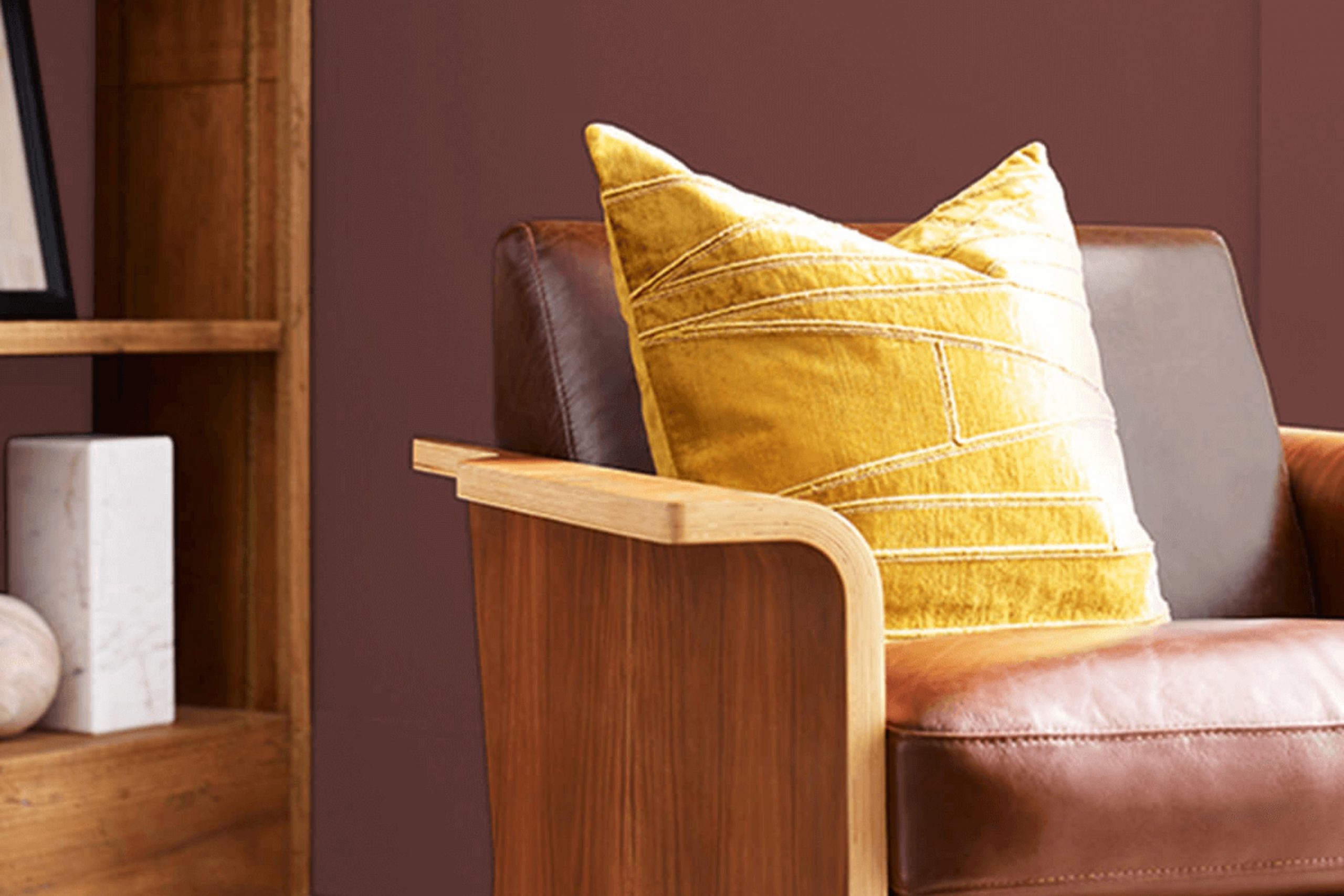
When you’re looking for a paint color that brings a sense of warmth and tradition to your home, SW 7594 Carriage Door by Sherwin Williams is a charming choice. As you imagine refreshing your front door, garage, or even interior cabinets, this rich shade plays an adaptable role in enhancing the feeling of home.
You might be wondering, what makes Carriage Door so special? It’s not just another brown. This color has a deep, woodsy essence that pairs beautifully with various architectural styles, from classic to modern. Whether you’re aiming to boost curb appeal before putting your house on the market or simply want to give your living area a cozy update, this paint offers a reliable solution.
Carriage Door’s earthy tone works well with natural light and complements both bright and muted accents around your home. I find it especially appealing because it manages to stand out without feeling too strong. In my experience using this shade, I appreciated how it brought a grounded, inviting look to the areas I painted.
If you’re considering a new project, SW 7594 Carriage Door might be the perfect color to tie everything together.
What Color Is Carriage Door SW 7594 by Sherwin Williams?
Carriage Door by Sherwin Williams is a warm, deep brown hue that radiates a cozy, welcoming vibe. It stands out with its earthy tones, making it a perfect choice for those looking to create a homey and inviting atmosphere in their living areas. This color is highly adaptable and pairs beautifully with a range of materials, enhancing both modern and traditional interiors.
For interior styles, Carriage Door shines in rustic settings where its rich, brown shade complements natural elements like wood and stone. It’s equally at home in more classical or colonial decors, adding depth and warmth to the design. This color works particularly well with textures such as leather, linen, and chunky knits, adding layers of interest and comfort to any room.
Materials like aged wood furniture or dark metals like wrought iron will match perfectly with Carriage Door. These combinations can amplify the earthy, robust feel of the color, making areas feel more grounded and secure. Additionally, pairing it with softer shades like creamy whites or soft beiges can create a pleasant contrast, allowing Carriage Door to stand out as a focal point in the room. This color is ideal for walls in a study, dining area, or living room, where its calming presence and character can be fully appreciated.
Is Carriage Door SW 7594 by Sherwin Williams Warm or Cool color?
Carriage Door by Sherwin Williams is a warm and inviting shade that can significantly enhance the look and feel of a home. This paint color has a deep, rich hue, making it perfect for creating a cozy and welcoming atmosphere in various areas.
It works especially well on exterior doors and trim, providing a classic look that appeals to many homeowners. Additionally, it can be a great choice for accent walls in living rooms or dining areas, adding depth and interest to the interior design.
The adaptability of Carriage Door allows it to blend well with natural materials like wood and stone, making it a popular choice for homes with a rustic or traditional architectural style. Its ability to pair well with both light and dark colors offers numerous decorating possibilities, helping to create a cohesive and stylish environment. This color not only enhances the aesthetic appeal of a home but can also potentially increase its marketability.
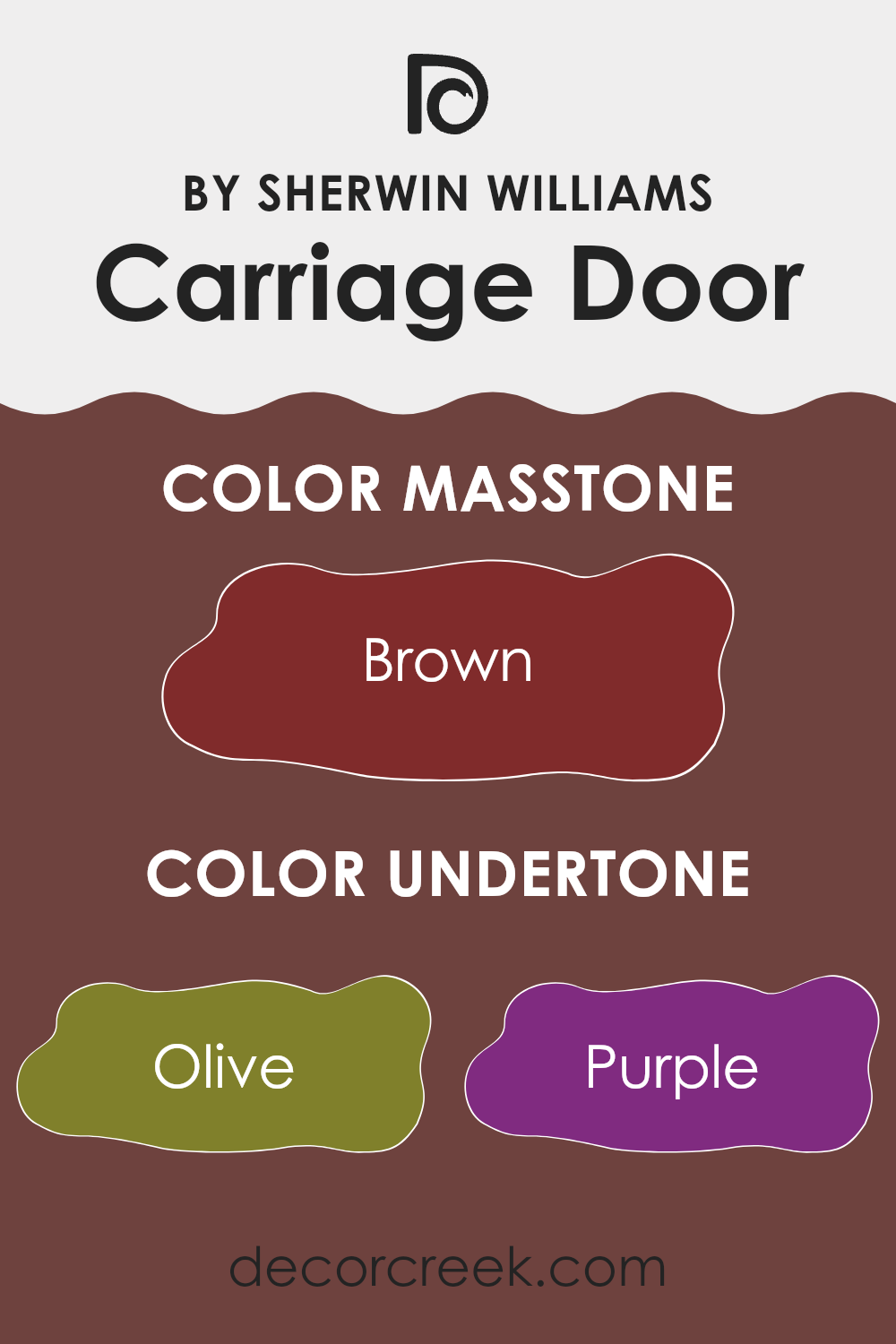
Undertones of Carriage Door SW 7594 by Sherwin Williams
Carriage Door by Sherwin Williams is a complex paint color with a rich blend of undertones that can subtly influence the overall look and feel of an area. Understanding these undertones is key to maximizing the impact of the color in any room. The undertones of a color are secondary shades that underlie the primary color and can become more visible under different lighting conditions or when paired with other colors. For Carriage Door, these undertones include a variety of hues like olive, purple, dark grey, grey, dark green, navy, red, dark turquoise, orange, pink, and pale pink.
In interior design, the undertones of a paint color can greatly affect how the color appears once applied to the walls and how it interacts with other elements in the room like furniture, flooring, and natural light. If a room has a lot of natural light, for instance, orange and red undertones might make the color appear warmer, while navy or dark grey might give it a cooler feel in artificial light.
When using Carriage Door on interior walls, the diverse undertones create a dynamic yet harmonious look that can complement a variety of decor styles and preferences. Olive and dark green undertones can bring a touch of nature and freshness, making it ideal for living rooms or studies. The presence of grey and dark grey provides a neutral base that ensures the color maintains some stability, avoiding the feeling of being too vibrant or overpowering.
Overall, this intriguing mix of undertones allows Carriage Door to adapt to different environments and design aesthetics, making it an adaptable choice for those looking to refresh their interiors.
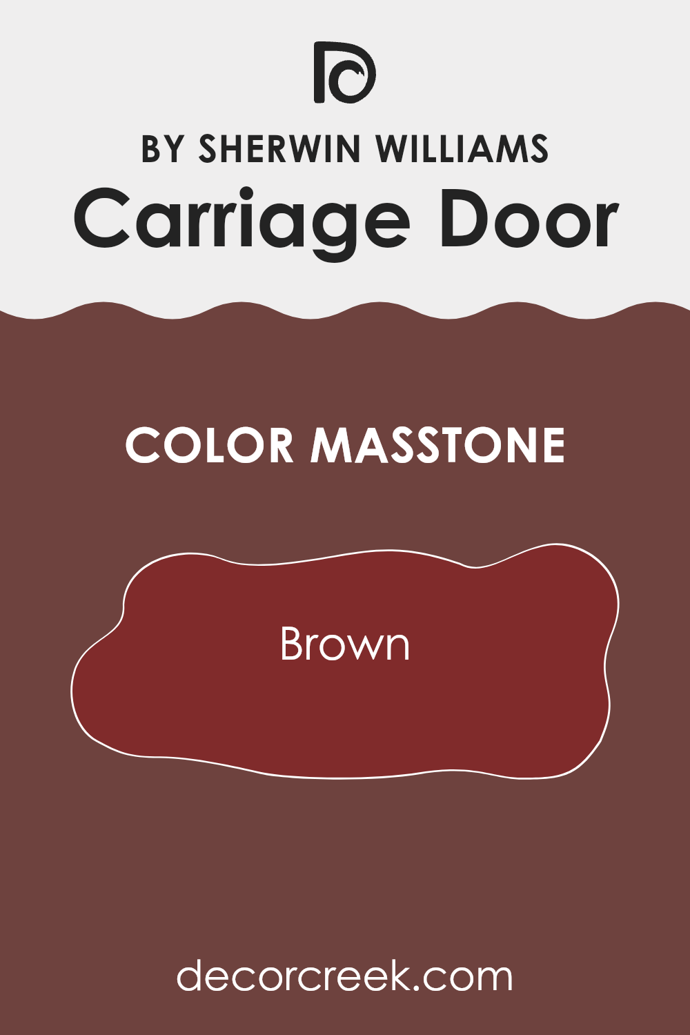
What is the Masstone of the Carriage Door SW 7594 by Sherwin Williams?
Carriage Door SW 7594 by Sherwin Williams is a rich brown color with the specific masstone of Brown (#802B2B). This deep, warm brown shade brings a cozy and inviting feel to any room in the home. When used on walls, it can make large areas feel more intimate and smaller rooms feel snug and welcoming. This color works especially well in living areas and bedrooms where a calm and comfortable atmosphere is desired.
In terms of style, Carriage Door fits beautifully with rustic and traditional decors, complementing wood furniture and natural textiles like wool or linen. It’s also quite adaptable, pairing well with lighter colors like creams and beiges to create a balanced look, or with bold colors like teal or mustard for a more dynamic effect.
When used on exterior elements like front doors or shutters, it provides a classic look that enhances curb appeal. This color is a great choice for anyone looking to add warmth and a touch of nature to their living areas.
How Does Lighting Affect Carriage Door SW 7594 by Sherwin Williams?
Lighting plays a crucial role in how we perceive colors. The same color can appear different under various lighting conditions. Here’s how light impacts colors and specifically, how Carriage Door (SW 7594) by Sherwin Williams might appear under different lighting scenarios.
Artificial Light: Under artificial lighting, colors often show richer and warmer tones depending on the type of bulb used. For Carriage Door, a color with deep, warm undertones, typical warm indoor lighting can enhance its cozy, inviting quality. This makes it an excellent choice for living areas or any room where you want a welcoming atmosphere.
Natural Light: In natural light, colors appear in their truest form since sunlight provides the full spectrum of light. Carriage Door will generally look vibrant and lively under natural light. The actual effect depends on the amount of daylight entering the room and the time of the day.
North-Faced Rooms: North-facing rooms receive less direct sunlight, often casting a cooler, softer light that could make Carriage Door appear slightly more muted and shadowed. It tends to bring out the darker tones in the paint.
South-Faced Rooms: Rooms that face south get plenty of light throughout the day. This exposure tends to amplify the warmth and depth of Carriage Door, making the area seem warmer and more dynamic.
East-Faced Rooms: East-facing rooms enjoy bright light in the morning, which can make Carriage Door look particularly vibrant in the early hours. As the day progresses, the intensity of the light decreases, subtly shifting the perception of the color to a softer tone.
West-Faced Rooms: West-facing rooms receive the strongest sunlight in the late afternoon, which can dramatically affect the appearance of Carriage Door. During sunset, this color can appear exceptionally warm and rich, enhancing the cozy ambiance.
Overall, the effect of lighting on Carriage Door can dramatically shift your room’s mood, from calm and reserved in reduced light to warm and lively in full, bright light.
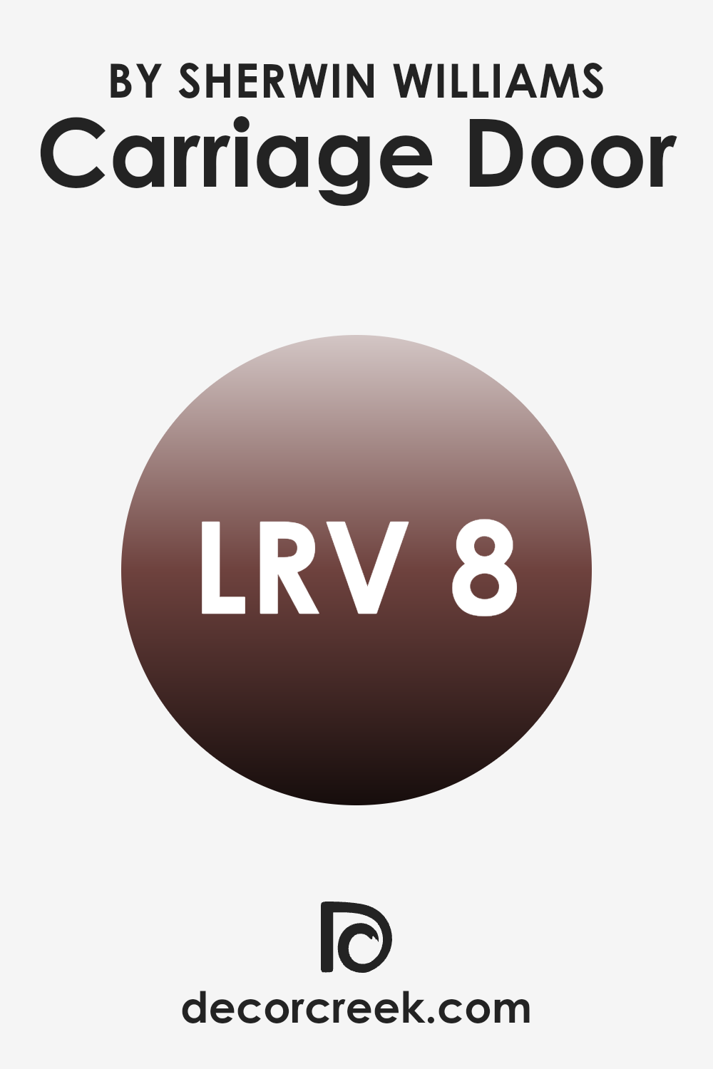
What is the LRV of Carriage Door SW 7594 by Sherwin Williams?
LRV stands for Light Reflectance Value, which is a measure of how much light a paint color reflects back into a room, as opposed to absorbing it. An LRV is given on a scale from 0 to 100, where a lower value indicates a darker color, which absorbs more light, and a higher value indicates a lighter color, reflecting more light.
Understanding LRV can be crucial when choosing paint colors, particularly in how it will affect the atmosphere of a room. A color with a low LRV can make an area feel cozier and can create a strong statement with a deep hue, while a color with a high LRV will make a room feel brighter and more open.
With an LRV of 7.503, Carriage Door is quite dark, meaning it absorbs a lot of light and reflects only a small amount. In interior areas, using a color like this will mean that it has a stronger presence on the walls, adding depth and a marked character to a room. However, it also means that for well-lit or energetic rooms, additional lighting might be necessary to compensate for its light-absorbing qualities. This particular shade is well-suited for larger rooms or any area where a feeling of intimacy and grounding is desired. In smaller rooms, use it thoughtfully, as it could potentially make the area appear smaller and darker.
decorcreek.com
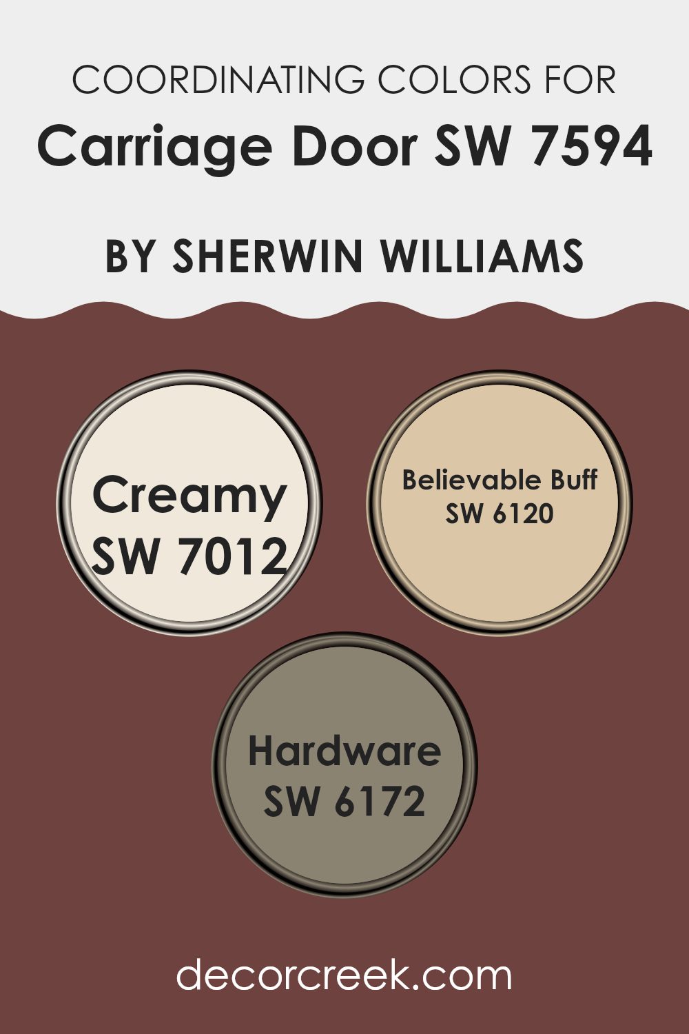
Coordinating Colors of Carriage Door SW 7594 by Sherwin Williams
Coordinating colors are selected to complement the primary paint choice, creating a cohesive and visually appealing scheme for interior or exterior areas. For Carriage Door by Sherwin Williams, a rich and warm brown hue, several coordinating colors work synergistically to enhance its earthy tone. These coordinating colors include Creamy, Believable Buff, and Hardware, each bringing its unique charm to the palette.
Creamy is a soft, buttery color that brings a gentle brightness to rooms, making areas feel more open and inviting. It pairs beautifully with the deeper shades of Carriage Door, providing a lovely contrast that highlights architectural details and moldings. Believable Buff, another coordinating shade, offers a warm, welcoming neutral with a hint of yellow undertone that adds a subtle warmth, which works well in rooms that aim for a cozy and comforting atmosphere.
Lastly, Hardware is a darker gray that mirrors the sturdiness and austerity of metal fixtures, grounding the lighter tones of Creamy and Believable Buff, and enhancing the depth and refinement of the overall color theme. Together, these colors create a balanced and harmonious look that can fit any decorative style.
You can see recommended paint colors below:
- SW 7012 Creamy
- SW 6120 Believable Buff
- SW 6172 Hardware
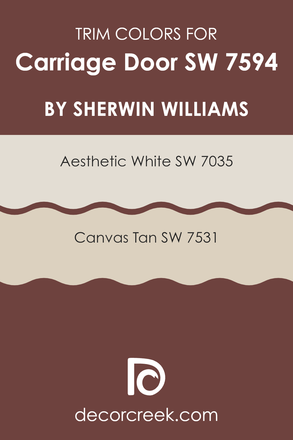
What are the Trim colors of Carriage Door SW 7594 by Sherwin Williams?
Trim colors play an important role in enhancing the appearance and character of a home’s exterior or interior paint scheme. Specifically, when paired with a rich shade such as Carriage Door by Sherwin Williams, selecting the right trim color can accentuate the main color and help define architectural details.
Using colors like SW 7035 – Aesthetic White and SW 7531 – Canvas Tan as trim can provide a subtle contrast that highlights the unique features of the building while maintaining a harmonious overall look.
SW 7035 – Aesthetic White is a soft white with a hint of warmth that makes it ideal for use as a trim color. It can help soften the stronger tones of Carriage Door, providing a gentle transition between different areas of color. On the other hand, SW 7531 – Canvas Tan is a muted beige that offers a slightly bolder contrast, yet still remains neutral enough to support the main color without feeling too strong. This shade works well to draw attention to the trim, giving it a distinct, yet understated, visual line that can make the primary color stand out more effectively.
You can see recommended paint colors below:
Colors Similar to Carriage Door SW 7594 by Sherwin Williams
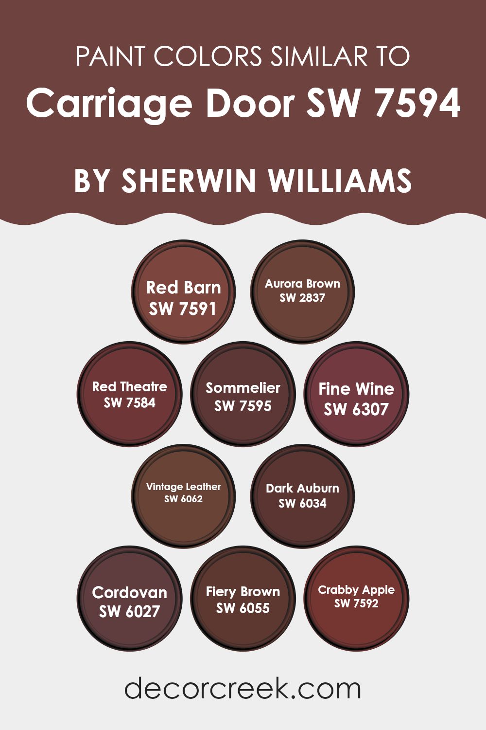
When decorating an area, using similar colors can create a harmonious and visually appealing environment. Colors that are alike in hue and shade complement each other well, allowing for a cohesive look without stark contrasts. For instance, Red Barn is a deep, warm red that exudes a rustic charm, perfectly enriching areas that crave a touch of the countryside. Aurora Brown offers a softer perspective with its muted brown tone, making it ideal for creating a cozy, welcoming atmosphere.
When incorporating colors like Red Theatre, a bold, dramatic hue is brought into play, lending a refined flair to an otherwise subdued palette. Sommelier, with its rich burgundy essence, provides an elegant feel, perfect for a formal room or a study. Fine Wine serves as a slightly lighter version of Sommelier, offering a similar elegance with a touch of added softness.
Vintage Leather is a dark, creamy brown that works well in areas where an understated, yet profound presence is desired. Dark Auburn introduces a deeper brown with hints of red, making it a strong but not too intense choice. Cordovan’s reddish-brown shade is reminiscent of fine leather, fitting beautifully in luxurious settings. Fiery Brown lives up to its name by adding a strong, vibrant energy to the room, while Crabby Apple rounds out the selection with its unique mix of brown and deep red, ideal for bringing warmth and character to any area.
You can see recommended paint colors below:
- SW 7591 Red Barn
- SW 2837 Aurora Brown
- SW 7584 Red Theatre
- SW 7595 Sommelier
- SW 6307 Fine Wine
- SW 6062 Vintage Leather
- SW 6034 Dark Auburn
- SW 6027 Cordovan
- SW 6055 Fiery Brown
- SW 7592 Crabby Apple
Colors that Go With Carriage Door SW 7594 by Sherwin Williams
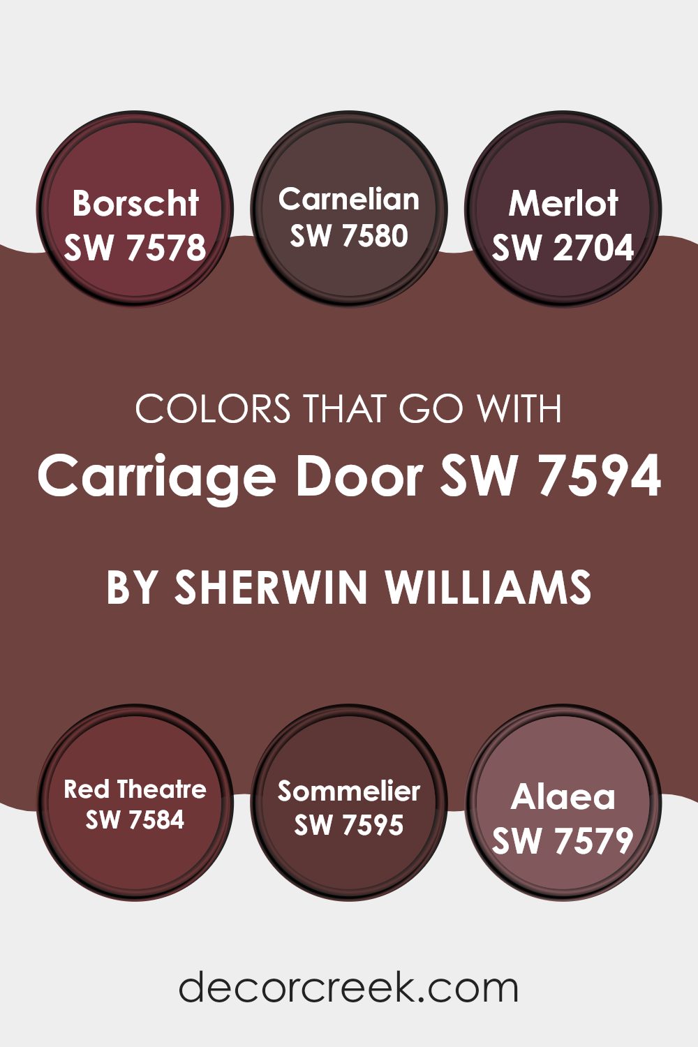
Choosing the right complementary colors for Carriage Door SW 7594 by Sherwin-Williams is essential because it ensures that the environment you are creating is visually appealing and harmoniously balanced. When colors complement each other well, they create an area that feels cohesive and aesthetically pleasing. For example, combining SW 7594 with shades like Borscht, Carnelian, or Sommelier adds depth and interest to the room, making it more inviting and pleasant for everyone who enters.
Borscht SW 7578 is a deep, berry red that adds a luxurious and warm touch, making it a great accent for more neutral or subdued base colors like Carriage Door. Carnelian SW 7580, on the other hand, has a vibrant, earthy orange hue that can inject energy and freshness into an area, contrasting beautifully with more somber tones.
Merlot SW 2704 brings a rich, wine-red shade that pairs well with darker colors, providing a sense of elegance and warmth. Red Theatre SW 7584 is a bold, dramatic red that makes a strong statement and can be used to highlight key areas of a room. Sommelier SW 7595 is a refined wine hue that offers a subtle and polished aesthetic, perfect for creating a cozy and mature environment. Lastly, Alaea SW 7579, with its unique blend of earthy red tones, can enrich the palette further, seamlessly tying together natural elements with more refined tones. All these colors when used with Carriage Door help achieve a harmonious and welcoming area.
You can see recommended paint colors below:
- SW 7578 Borscht
- SW 7580 Carnelian
- SW 2704 Merlot
- SW 7584 Red Theatre
- SW 7595 Sommelier
- SW 7579 Alaea
How to Use Carriage Door SW 7594 by Sherwin Williams In Your Home?
Carriage Door by Sherwin Williams is a rich and warm paint color that offers a cozy feeling to any area in your home. It is adaptable, making it great for many areas including living rooms, dining areas, or entryways. The beautiful shade resembles the classic look of old carriage doors, adding a touch of rustic charm.
This color works well when used to paint a feature wall or for cabinetry and doors, lending an elegant yet understated vibe. It coordinates nicely with softer, lighter colors like creams or light greys, which can help to balance out its depth.
For those looking to enhance their home’s aesthetic without making massive changes, using Carriage Door as an accent color can instantly warm up the area. Additionally, it complements natural wood elements, so consider using it in a room with wooden floors or furniture to create a cohesive and inviting look.
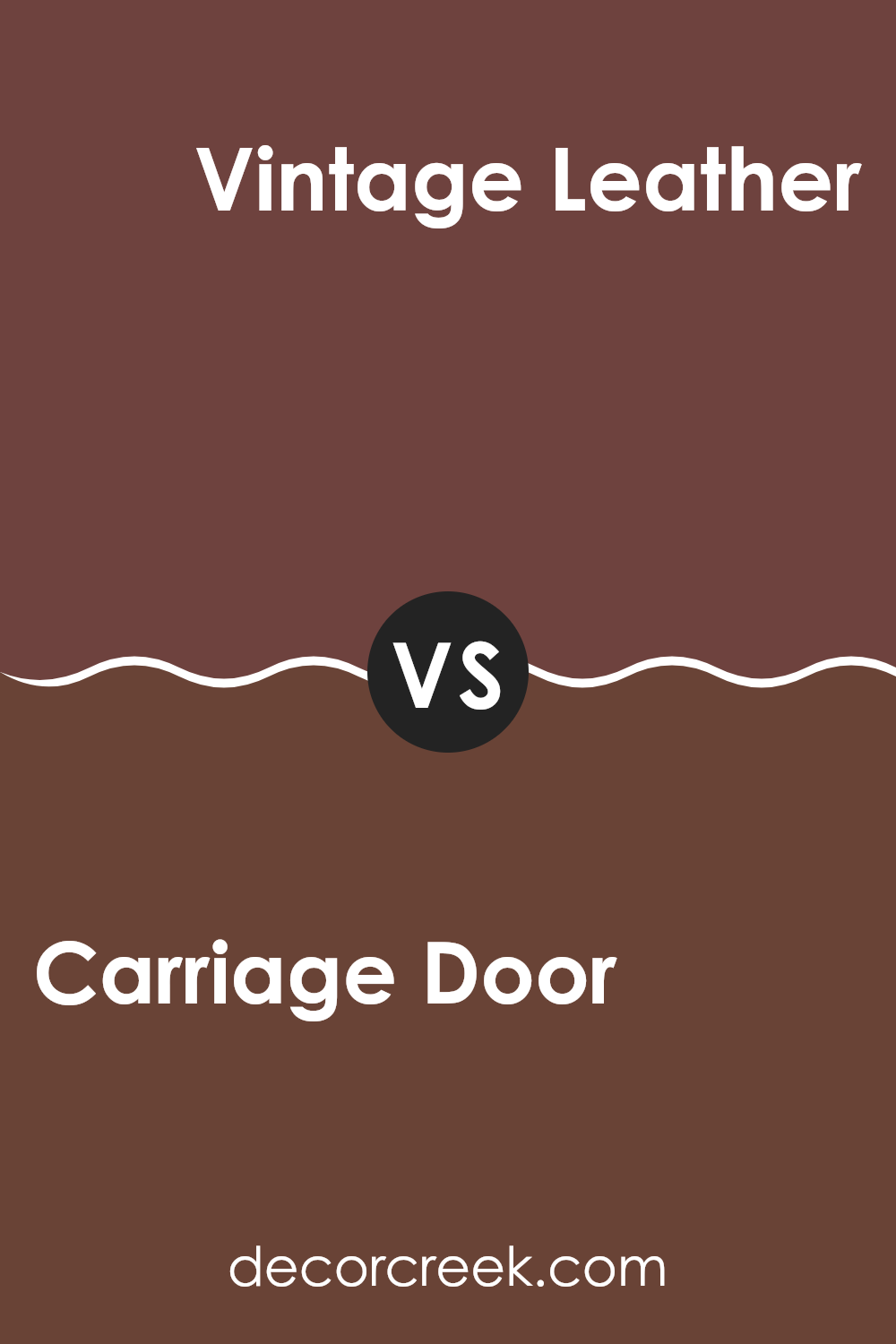
Carriage Door SW 7594 by Sherwin Williams vs Vintage Leather SW 6062 by Sherwin Williams
Carriage Door and Vintage Leather are two unique shades from Sherwin Williams. Carriage Door is a deep, rich brown that conjures up images of sturdy, old-fashioned carriage doors. It has a confident, strong presence, making it ideal for creating a bold statement in areas like living rooms or on exterior trim.
Vintage Leather, on the other hand, is a slightly softer brown, reminiscent of well-worn leather. This color feels warmer and more inviting, suitable for cozy areas where comfort is key. It pairs beautifully with cream or beige for a balanced, homely vibe.
While both colors share a brown base, Carriage Door leans toward a darker, more intense hue, whereas Vintage Leather offers a gentler, more approachable feel. Each color could serve well in different settings depending on the atmosphere you want to create. Whether looking for drama or warmth, either color brings its own unique flair to your area.
You can see recommended paint color below:
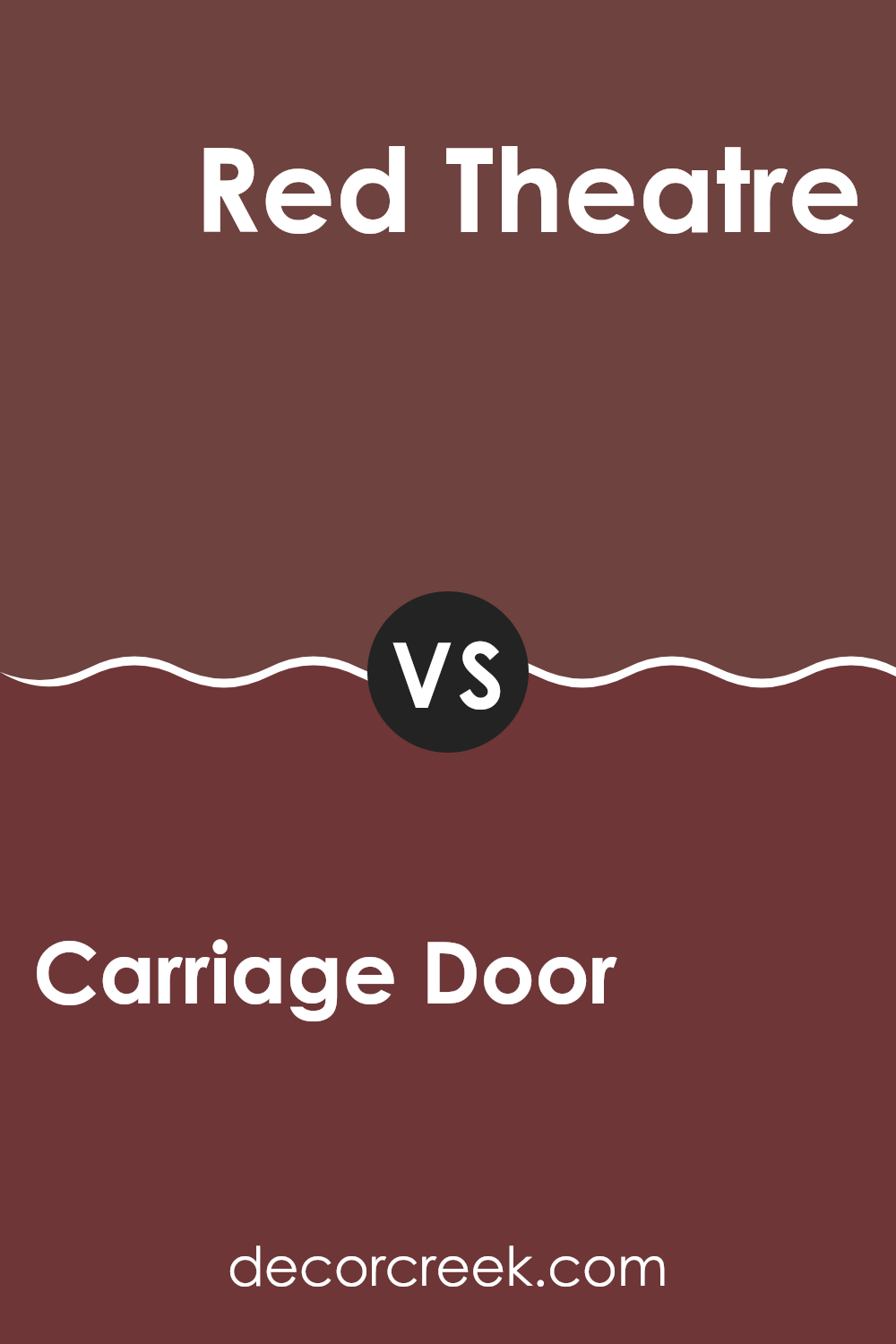
Carriage Door SW 7594 by Sherwin Williams vs Red Theatre SW 7584 by Sherwin Williams
Carriage Door and Red Theatre, both by Sherwin Williams, offer distinct vibes for any area. Carriage Door is a deep, rich brown with warm undertones, making it a cozy choice for areas where you want to foster a sense of comfort and classic elegance. It works well in living rooms or dining areas, bringing a grounded, homey feel.
On the other hand, Red Theatre is a vibrant, bold red. It’s a color full of energy and drama, perfect for areas where you want to make a statement or add a burst of vitality. This color could be ideal for an accent wall, a creative area, or even a dining area where you host lively dinners.
Both colors are strong in their own right but serve very different purposes. Carriage Door offers warmth and grounding, while Red Theatre injects excitement and passion. Depending on the mood you want to set, either could be a great choice.
You can see recommended paint color below:
- SW 7584 Red Theatre
Carriage Door SW 7594 by Sherwin Williams vs Fine Wine SW 6307 by Sherwin Williams
Carriage Door and Fine Wine are two distinct colors from Sherwin Williams. Carriage Door is a deep, warm brown with a reddish undertone, resembling the color of a classic wooden carriage door.
It’s an adaptable color that brings a cozy and welcoming feel to any area. On the other hand, Fine Wine is a rich, bold maroon that mimics the color of a full-bodied red wine. This color adds a touch of drama and luxury, making it perfect for accent walls or to add depth to a room.
While both colors have a warmth to them, Carriage Door is more subdued and can work well as a neutral base in many color schemes. Fine Wine, with its vibrant depth, tends to stand out more and works best as a statement or focal point in decor. Both provide warmth and can create an inviting atmosphere, but their impact and usage can vary greatly depending on the area and accompanying colors and decor.
You can see recommended paint color below:
Carriage Door SW 7594 by Sherwin Williams vs Dark Auburn SW 6034 by Sherwin Williams
Carriage Door and Dark Auburn are both rich, deep colors by Sherwin Williams, but they bring different vibes to an area. Carriage Door is a warm brown with a comforting, earthy quality. It resembles the classic color often found on traditional carriage house doors, making it perfect for creating a welcoming and grounded atmosphere.
On the other hand, Dark Auburn is a darker, more intense shade, leaning toward a deep red-brown. It has a bolder, more dramatic feel, suitable for creating an impactful and cozy environment. It can lend a room a luxurious feel without being too strong.
Both colors work well in a variety of areas. Carriage Door is adaptable enough for living areas and exterior uses, while Dark Auburn, with its richer hue, is ideal for accent walls or rooms where you want a strong presence. When choosing between the two, consider the mood you want to set: Carriage Door is softer and more neutral, while Dark Auburn is striking and assertive.
You can see recommended paint color below:
Carriage Door SW 7594 by Sherwin Williams vs Red Barn SW 7591 by Sherwin Williams
Carriage Door and Red Barn by Sherwin Williams are two rich, warm shades that can add character and warmth to an area. Carriage Door is a deep, muted brown with a woody feel, perfect for creating a cozy and inviting atmosphere. It pairs well with natural textures and elements, bringing a sense of comfort and earthiness to interiors.
On the other hand, Red Barn is a vibrant, deep red color that resembles the classic shade often seen on traditional barns. This color is bolder and can make a strong statement when used in a room. It works well as an accent color, adding a pop of energy and warmth.
Both colors are great choices for a rustic or traditional style home, offering a touch of rustic charm whether used on walls or accent features. While Carriage Door leans toward a neutral, subtle backdrop, Red Barn stands out more and can be a focal point in a design.
You can see recommended paint color below:
Carriage Door SW 7594 by Sherwin Williams vs Sommelier SW 7595 by Sherwin Williams
Carriage Door and Sommelier, both by Sherwin Williams, are two shades that complement each other nicely, yet offer distinct tones for different moods and settings. Carriage Door is a rich, deep brown with a welcoming warmth to it. This color is perfect for creating a cozy and comfortable ambiance, ideally suited for living rooms or bedrooms where relaxation is key.
In contrast, Sommelier is slightly darker with a reddish undertone that adds a bit of elegance without being too strong. It works well in areas that aim to make a statement, whether that be a dining room or a refined entryway. This shade can add depth and a sense of drama to an area, particularly when used on accent walls or for furniture pieces.
Together, these colors can create a delightful balance: Carriage Door providing the foundation of warmth and comfort, and Sommelier offering a touch of depth and drama. When used in the same area, they can complement each other beautifully, creating a rich, inviting atmosphere.
You can see recommended paint color below:
- SW 7595 Sommelier
Carriage Door SW 7594 by Sherwin Williams vs Crabby Apple SW 7592 by Sherwin Williams
“Carriage Door” and “Crabby Apple” are two colors from Sherwin Williams that offer unique yet harmonious options for home décor. Carriage Door is a deep, rich brown with a subtle reddish undertone, making it warm and welcoming. It works well in areas that aim to have a cozy, inviting feel and pairs nicely with natural elements and textures, like wood and stone.
On the other hand, “Crabby Apple” is a darker, more intense shade. This color is a deep red with brown undertones, providing a strong presence in any room. It’s ideal for those wanting to make a bold statement or highlight a specific area. Crabby Apple pairs well with dark woods and can also be beautifully contrasted with lighter, neutral colors to balance its intensity.
Together, these colors can create a rich, earthy palette that is adaptable for many settings, from traditional to more modern themes. They both offer depth and warmth but in distinctly different ways – Carriage Door more subtle, and Crabby Apple more striking.
You can see recommended paint color below:
Carriage Door SW 7594 by Sherwin Williams vs Fiery Brown SW 6055 by Sherwin Williams
Carriage Door and Fiery Brown, both by Sherwin Williams, are warm, welcoming shades, but they bring their own unique qualities to an area. Carriage Door is a deep, rich brown that suggests the color of seasoned wood and has a classic and enduring feel. It’s perfect for creating a cozy and inviting atmosphere, ideal for common areas or accent walls where a hint of formality is desired.
On the other hand, Fiery Brown has a much warmer, almost reddish undertone, resembling the glowing embers of a fire. This makes it an excellent choice for energizing an area and making it feel warmer. It’s especially suitable for lively areas like a family room or kitchen where its vibrant tone can make the room feel more inviting.
Comparing these two, Carriage Door offers more of a traditional, subdued elegance, while Fiery Brown provides a punchier, more dynamic visual impact. Both are excellent for creating a homey vibe, but their different tones can suggest varying moods and themes, depending on what you’re aiming for in your decorating project.
You can see recommended paint color below:
- SW 6055 Fiery Brown
Carriage Door SW 7594 by Sherwin Williams vs Cordovan SW 6027 by Sherwin Williams
Carriage Door and Cordovan are two rich hues from Sherwin Williams, each bringing its unique warmth to an area. Carriage Door is a deep, muted shade of brown with a hint of red, giving it an earthy, welcoming feel.
It’s great for creating a cozy atmosphere in areas like living rooms or libraries. On the other hand, Cordovan stands out with its darker, burgundy-like tone that leans significantly toward a more pronounced red.
This color is more dramatic and could be perfect for accent walls or rooms where you want to make a strong visual statement. Both colors are excellent choices for areas where you want depth and warmth, yet they cater to different moods and preferences. Carriage Door is more subtle and adaptable, while Cordovan commands attention with its bolder, deeper red.
You can see recommended paint color below:
- SW 6027 Cordovan
Carriage Door SW 7594 by Sherwin Williams vs Aurora Brown SW 2837 by Sherwin Williams
Carriage Door and Aurora Brown, both by Sherwin Williams, are warm, inviting colors, yet they offer distinct tones that could change the feel of an area. Carriage Door is a deep, reddish-brown that resembles the varnished wood that might be found on a classic carriage house. This color is rich and quite welcoming, making it ideal for areas like living rooms or libraries where a cozy atmosphere is desired.
On the other hand, Aurora Brown is a darker, chocolate brown which provides a stronger, more grounded feeling. It’s less red than Carriage Door and leans toward a more traditional, earthy tone. This makes it perfect for areas where you want to foster a sense of comfort and stability, like in bedrooms or dining rooms.
Both colors are adaptable and work well in various lighting conditions, but the choice between them would hinge on the specific ambiance you’re looking to create. Carriage Door, with its warmer undertones, tends to add a bit of character and warmth, while Aurora Brown offers a solid, understated elegance.
You can see recommended paint color below:
- SW 2837 Aurora Brown
After reading about SW 7594 Carriage Door by Sherwin Williams, I’ve learned a lot about this unique paint color. This shade seems perfect for people who enjoy a cozy and warm feeling in their rooms. It reminds me of a rich, deep brown with hints of red, just like the beautiful big doors on old carriages. Imagine bringing a piece of history right into your home and combining it with modern styles!
This color is great because it makes a strong statement without being too loud. It can work really well in a living room, giving everyone a welcoming, comfy feeling when they sit down to relax or chat. I also think it would look lovely in a bedroom, making it a cozy spot, nearly like a nest, to curl up in at the end of the day.
Besides just talking about the beauty of the color, the article also gave tips on which other colors can go nicely with Carriage Door. It seems that light creamy colors or soft, subtle blues could be perfect partners. This helps in creating a soothing environment, maybe like being in a safe, peaceful place away from the noisy outside world.
So, if you or anyone you know is thinking of repainting and wants something that looks rich yet calm, Carriage Door might be the way to go. It’s not just a paint color; it feels like it brings a touch of history and warmth right inside your house.
Ever wished paint sampling was as easy as sticking a sticker? Guess what? Now it is! Discover Samplize's unique Peel & Stick samples.
Get paint samples

