SW 9638 Breakwater by Sherwin Williams immediately draws attention with its unique blend of tones. This color reminds me of the ocean’s serene yet powerful presence. It has a soothing quality while also providing depth and richness that make it stand out. I find that Breakwater works beautifully in various spaces, offering a calming effect and inviting atmosphere.
When using this shade in a room, it creates a comforting environment, almost like bringing a piece of nature indoors. It feels refreshing and grounded, perfect for those who appreciate a balance between modern and classic styles. The versatility of Breakwater allows it to pair well with both warm and cool accents, making it a choice that easily adapts to different design preferences.
I appreciate how Breakwater complements various materials and textures, from natural wood to crisp whites. It’s a color that doesn’t overpower but rather enhances the overall aesthetic of a space.
Whether aiming for a relaxed coastal vibe or a sophisticated urban setting, Breakwater serves as a reliable foundation that elevates the room’s overall harmony.
What Color Is Breakwater SW 9638 by Sherwin Williams?
Breakwater by Sherwin Williams is a gentle, muted blue-green that brings a calming vibe to any room. Its cool tones make it versatile, suited for various design styles like coastal, contemporary, and Scandinavian. This color works well in spaces meant for relaxation, such as bedrooms, bathrooms, and living rooms. It creates a peaceful atmosphere while adding a hint of color without overpowering the space.
When it comes to materials and textures, Breakwater pairs beautifully with natural elements. Consider using it alongside light wood tones for furniture or flooring to enhance its soothing effect. White or cream accents can add brightness and contrast, making the color pop while maintaining a clean look. Soft textiles like linen or cotton in neutral shades can complement the gentle hue, adding an inviting touch.
For a modern feel, you can pair Breakwater with metal finishes such as brushed nickel or chrome. This combination adds a sleekness without clashing with the color’s soft nature. Breakwater also works well with woven baskets or rattan furniture, promoting a laid-back, earthy aesthetic.
Overall, its subtlety makes it a wonderful choice for creating a cozy, inviting home environment.
Is Breakwater SW 9638 by Sherwin Williams Warm or Cool color?
Breakwater SW 9638 by Sherwin Williams is a soft, calming greenish-gray shade that can create a soothing atmosphere in any room. Its muted tone makes it versatile and adaptable to different styles and spaces. In living rooms, this color can help create a welcoming and relaxing environment, making it a great backdrop for both modern and traditional furniture.
When used in a bedroom, Breakwater SW 9638 can offer a peaceful setting that encourages rest and relaxation.
Because it is a neutral color, it works well with a variety of other colors. You can pair it with whites and creams for a fresh, clean look or use it alongside darker accents for added depth. It also does well with natural elements like wood and stone, enhancing the organic feel of a space. Overall, Breakwater SW 9638 is an excellent choice for those wanting a subtle yet stylish color for their home.
Undertones of Breakwater SW 9638 by Sherwin Williams
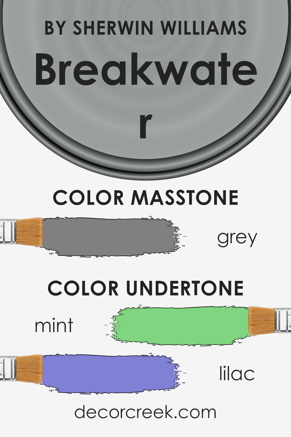
Breakwater SW 9638 by Sherwin Williams is a unique color with many undertones that influence how it looks on walls. Undertones are the subtle traces of color that appear when light hits the main color. They can change the perception of the color depending on lighting and surroundings.
The undertones in Breakwater include mint, lilac, light blue, pale pink, pale yellow, light purple, light gray, dark turquoise, light turquoise, blue, olive, purple, light green, violet, orange, pink, yellow, fuchsia, dark green, navy, dark blue, brown, red, and dark gray. Each of these undertones adds a different hint to the main color. For instance, the mint and light green undertones can give the room a fresh and airy feel, while the lilac and light purple might add a gentle, soothing touch.
On interior walls, these undertones can create a dynamic and versatile atmosphere. A room painted with Breakwater might appear more vibrant or muted depending on the time of day and the type of lighting. Natural light might bring out the green and blue undertones, while artificial lighting could highlight the warmer tones like yellow, orange, or pale pink.
This makes Breakwater a flexible choice for various settings, allowing it to adapt and complement different styles and accents in a room.
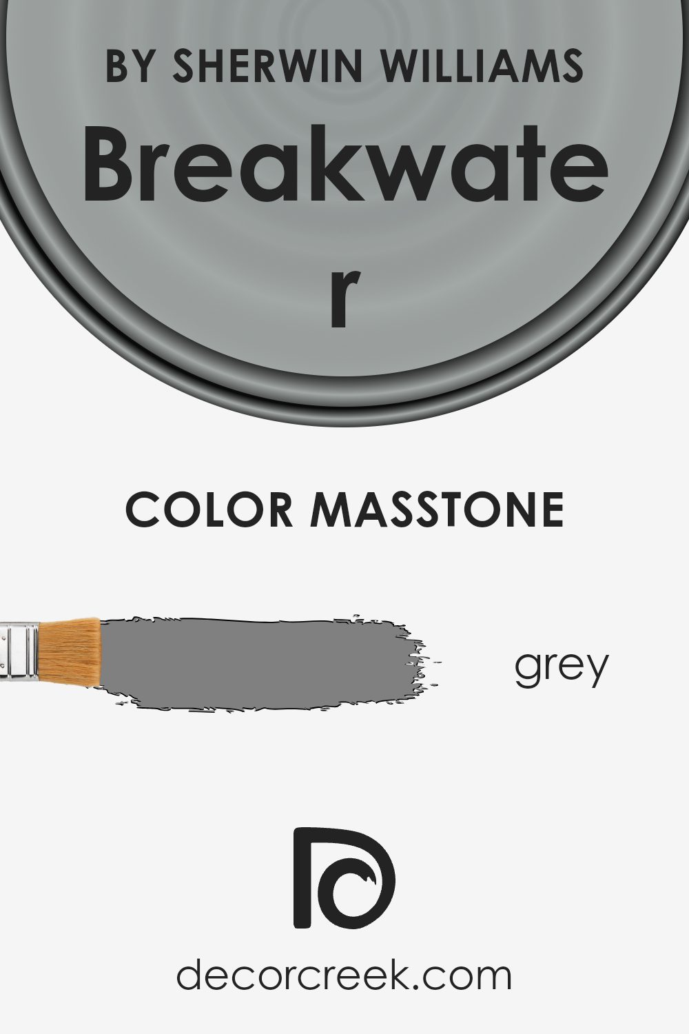
What is the Masstone of the Breakwater SW 9638 by Sherwin Williams?
BreakwaterSW 9638 by Sherwin Williams is a versatile grey that can work well in various home settings. The masstone of this color is a standard grey (#808080), which makes it a neutral choice for many rooms.
This shade of grey is balanced, neither too warm nor too cool, which means it can blend well with different furniture and decor styles. In living rooms, it provides a stable backdrop that allows colorful pieces like cushions or artwork to stand out. In bedrooms, it offers a calm environment that can be relaxing for sleep.
Because it’s a middle-of-the-road grey, it doesn’t overpower a space or clash with other colors. Hallways and entryways painted in this shade can seem welcoming and flow seamlessly into adjacent rooms. Overall, Breakwater’s grey is simple and adaptive, making it an excellent choice for homeowners seeking a subtle, dependable color for their walls.
How Does Lighting Affect Breakwater SW 9638 by Sherwin Williams?
Lighting plays a significant role in how we perceive colors. It can change the way a paint color looks throughout the day or under different types of lighting. The color “Breakwater” (SW 9638) by Sherwin-Williams is no exception. It is essential to understand how this color interacts with light to ensure it achieves the desired effect in various settings.
Under natural light, colors generally appear truer to their perceived hue. In the case of Breakwater, it will appear more muted or subdued with natural lighting. When the sun is at its peak, typically around midday, Breakwater will show its most accurate version.
However, artificial lighting can significantly affect how this color appears. Warm, yellow-toned artificial lights can make Breakwater appear slightly warmer, while cool, blue-toned lights might make it feel cooler or less vibrant.
The orientation of a room also affects how colors are perceived:
- North-facing rooms: These rooms get less direct sunlight and tend to have a cooler, softer light. Breakwater in a north-facing room may appear grayer or more subdued, which can create a calming effect.
- South-facing rooms: These rooms receive a lot of direct sunlight, especially in the afternoon, which is often warmer in tone. Breakwater in a south-facing room might appear brighter and more lively, showing the color’s full richness.
- East-facing rooms: Morning light in these rooms is usually soft and warm, making Breakwater look warmer at the start of the day. As the day progresses, the color can seem more muted.
- West-facing rooms: These experience warmer, orangey light in the late afternoon. Breakwater might look warmer and more vibrant in the evenings.
Overall, the interaction of Breakwater with different types and directions of light highlights the importance of considering lighting when choosing paint colors for your home.

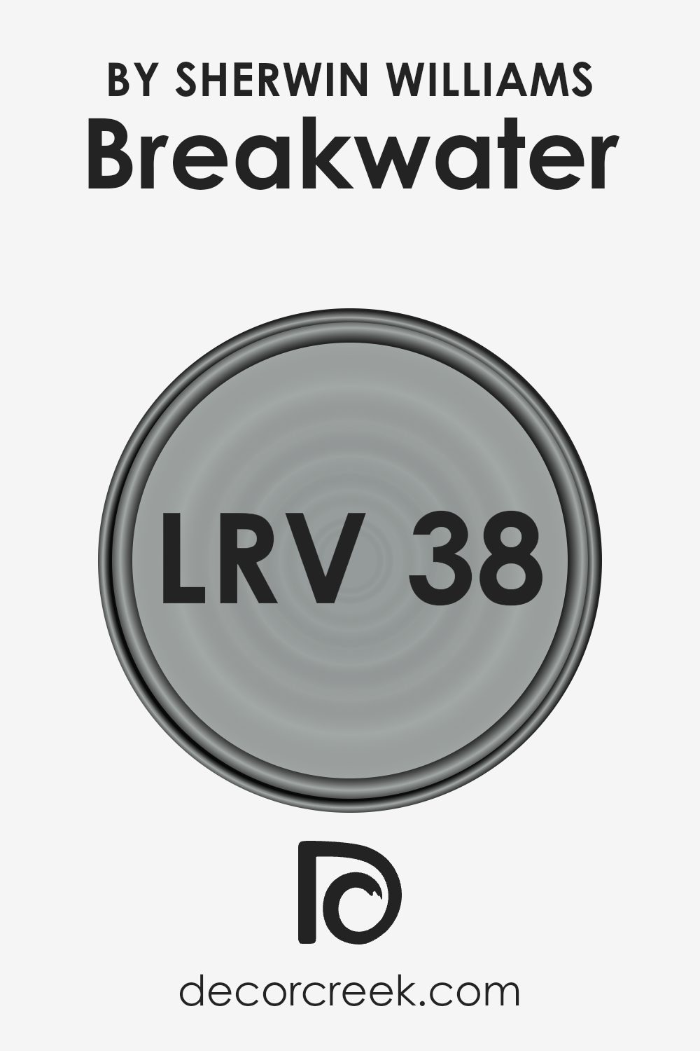
What is the LRV of Breakwater SW 9638 by Sherwin Williams?
LRV stands for Light Reflectance Value, which is a measurement used in the paint industry to gauge how much light a color reflects or absorbs. LRV is expressed as a percentage, where 0% represents absolute black, absorbing all light, and 100% represents pure white, reflecting all light. Colors with higher LRV values tend to make spaces feel brighter and more open because they reflect more light.
Conversely, colors with lower LRV values absorb more light, making a space feel cozier or darker. Understanding the LRV of a paint color can help you predict how it will look in a room, depending on the natural and artificial light available.
In the case of Breakwater by Sherwin Williams, which has an LRV of 38.306, this color is on the lower end of the spectrum. This means that it will absorb more light than it reflects. Breakwater may create a more intimate and warm atmosphere in your space, especially if the room doesn’t get a lot of natural light. Its LRV suggests that it will not make a space feel too bright or washed out.
Instead, it will provide a solid, medium tone that can add depth to your walls while maintaining enough brightness to prevent the room from feeling too enclosed.
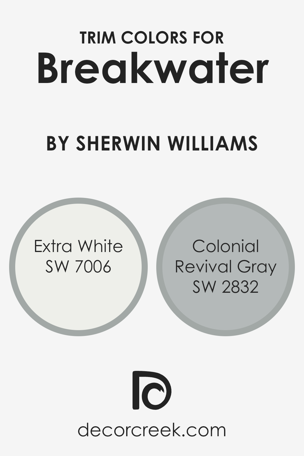
What are the Trim colors of Breakwater SW 9638 by Sherwin Williams?
Trim colors are an essential aspect of home design as they help define the architectural details of a space, providing contrast and highlighting key features. In the case of Breakwater by Sherwin-Williams (SW 9638), the right trim colors can enhance its soft, muted look. SW 7006 Extra White is a crisp and clean color that gives a bright, fresh edge to the design, adding a classic and timeless quality. Its purity allows for a clear contrast with the main wall color, making the overall space appear more defined and lively.
On the other hand, SW 2832 Colonial Revival Gray brings in an element of warmth and harmony. This warm gray complements the Breakwater color by adding a slightly more traditional and grounded touch, enhancing the cozy and welcoming feeling of the room.
When used as trim, it adds depth without overwhelming the color palette, creating a balanced and inviting environment. By selecting these trim colors, a homeowner can effectively highlight the gentle characteristics of Breakwater while adding both brightness and warmth to the home.
You can see recommended paint colors below:
- SW 7006 Extra White
- SW 2832 Colonial Revival Gray
Colors Similar to Breakwater SW 9638 by Sherwin Williams
Similar colors are essential in design and decorating because they allow for seamless transitions and a cohesive look. By using colors that are close in tone, like the shades similar to Breakwater by Sherwin Williams, you create a harmonious environment that feels balanced and comfortable.
These colors are versatile, working well together to complement a space without overwhelming it. For instance, SW 7066 Gray Matters is a neutral gray with a touch of warmth, which can provide depth to a space without making it feel cold. Similarly, SW 7073 Network Gray has a slightly deeper hue, adding richness and character while maintaining a calm base.
Colors like SW 6255 Morning Fog offer a gentle, soft gray with subtle blue undertones, perfect for adding a light, airy feel. SW 6234 Uncertain Gray carries a neutral vibe with its balanced mix of warm and cool tones. Meanwhile, SW 7659 Gris stands out with its medium intensity, ideal for adding a bit of drama without being overpowering. SW 7650 Ellie Gray has a refined nature, making it suitable for almost any room.
SW 7652 Mineral Deposit’s cool tones can add an earthy yet modern touch, while SW 7059 Unusual Gray has a warm undertone, ensuring coziness. Lastly, SW 9643 Eventide and SW 9558 Castlegate offer darker shades that can anchor a room, adding depth and interest. Together, these similar hues enhance a room’s harmony and flow.
You can see recommended paint colors below:
- SW 7066 Gray Matters
- SW 7073 Network Gray
- SW 6255 Morning Fog
- SW 6234 Uncertain Gray
- SW 7659 Gris
- SW 7650 Ellie Gray
- SW 7652 Mineral Deposit
- SW 7059 Unusual Gray
- SW 9643 Eventide
- SW 9558 Castlegate
How to Use Breakwater SW 9638 by Sherwin Williams In Your Home?
Breakwater SW 9638 by Sherwin Williams is a calming and versatile paint color, perfect for various spaces in your home. This soft, muted blue-green shade brings a sense of peace and relaxation to any room. It’s an excellent choice for a bedroom or bathroom, creating a soothing atmosphere to unwind.
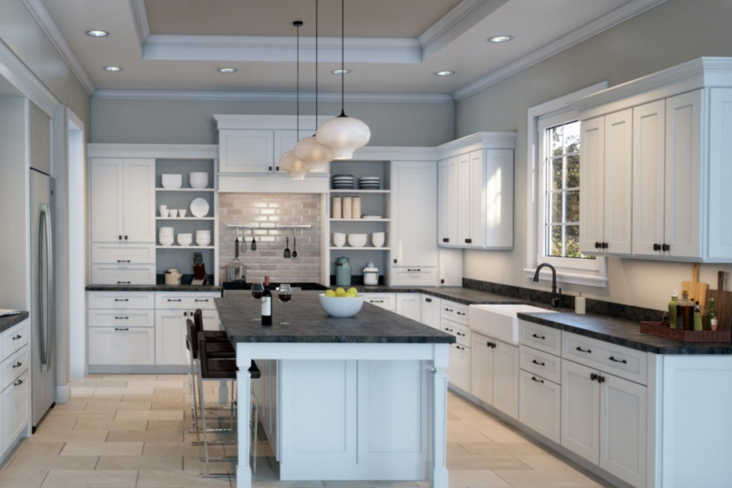
In a living room, Breakwater can serve as a gentle backdrop, allowing furniture and decor to stand out without being too overpowering. Pair it with light or neutral furniture for a fresh, airy feel, or use darker accents to add contrast and depth. In the kitchen, Breakwater can complement white cabinetry and natural wood textures, offering a fresh and welcoming vibe.
This color works well with coastal or cottage-style decor but can also fit into modern or traditional themes. With its calming undertone, Breakwater SW 9638 helps create a peaceful and inviting environment in any space.
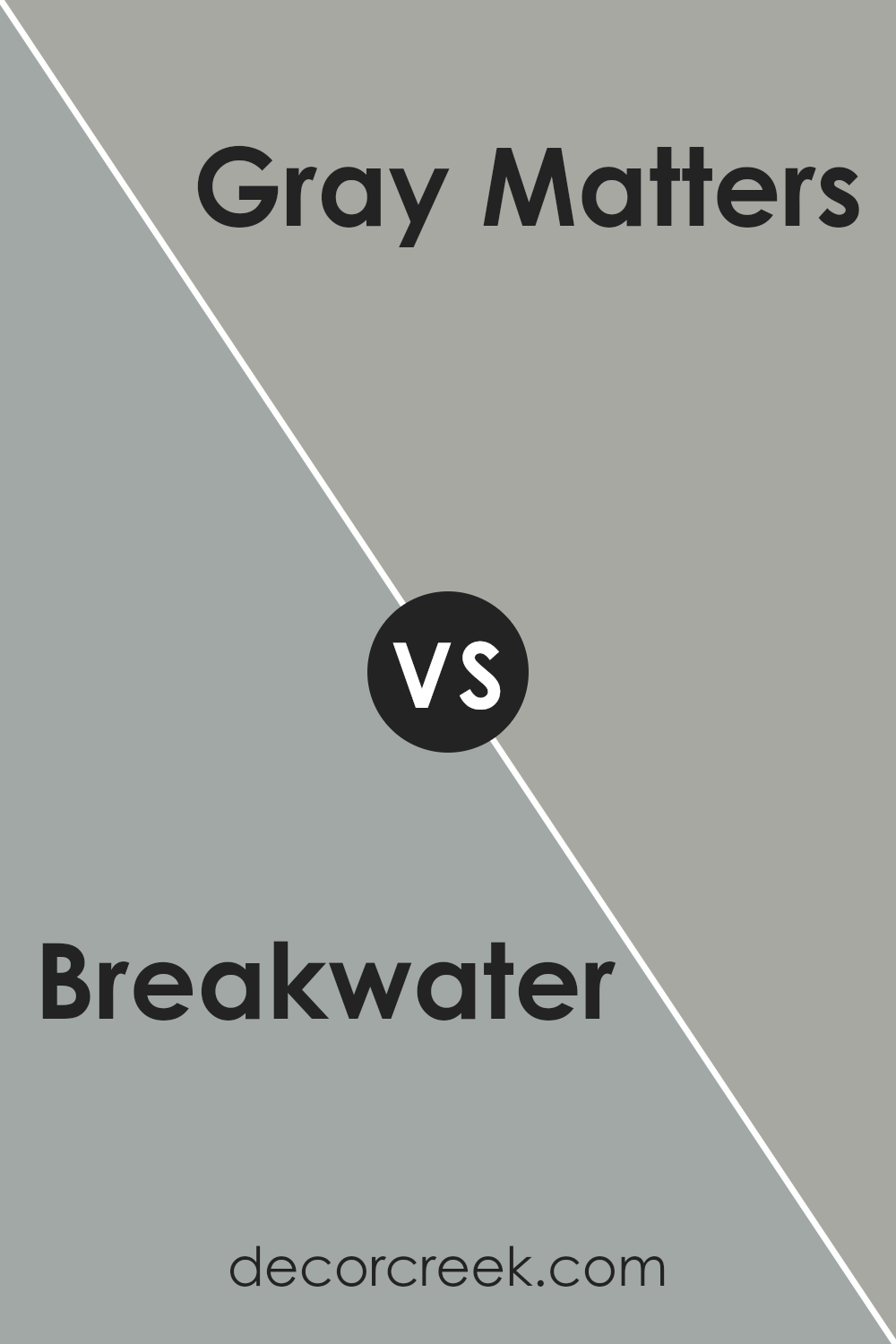
Breakwater SW 9638 by Sherwin Williams vs Gray Matters SW 7066 by Sherwin Williams
Breakwater SW 9638 by Sherwin Williams is a soft, muted green that brings a calm and natural feel to a room. It’s perfect for creating a peaceful atmosphere, as it reflects the soothing elements of nature. On the other hand, Gray Matters SW 7066 by Sherwin Williams is a cool gray with a more modern and neutral vibe. It’s versatile and works well in contemporary settings, offering a clean and crisp background.
While Breakwater adds warmth with its subtle green undertone, Gray Matters offers a more industrial and sleek look, making it ideal for urban and minimalistic spaces.
Both colors can complement each other beautifully; Breakwater can be used to add a touch of color and warmth to a space dominated by Gray Matters. This combination allows for a balanced environment, blending the soft comforts of nature with the sophisticated simplicity of gray.
You can see recommended paint color below:
Breakwater SW 9638 by Sherwin Williams vs Mineral Deposit SW 7652 by Sherwin Williams
Breakwater SW 9638 and Mineral Deposit SW 7652 by Sherwin Williams are two distinct colors with unique characteristics. Breakwater is a soft blue-green, reminiscent of a calm sea or a cloudy sky, providing a soothing and comfortable ambiance.
It is ideal for spaces where relaxation is desired, like bedrooms or bathrooms. On the other hand, Mineral Deposit is a muted gray with a hint of blue, offering a more neutral and balanced feel. This makes it versatile and suitable for various rooms, as it creates a subtle backdrop that can complement many styles and other colors.
While Breakwater leans more towards a natural and gentle look, Mineral Deposit has a more modern and understated appeal. Both colors are understated yet impactful in their own ways, helping to set the mood of a room in subtle, distinct fashions.
You can see recommended paint color below:
- SW 7652 Mineral Deposit

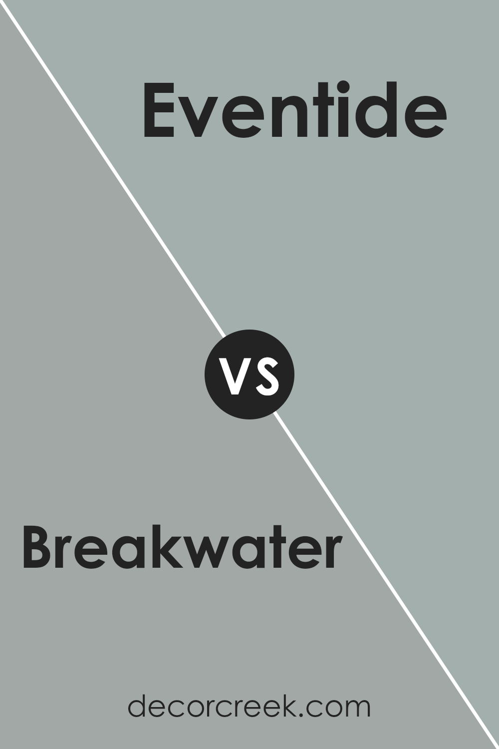
Breakwater SW 9638 by Sherwin Williams vs Eventide SW 9643 by Sherwin Williams
Breakwater SW 9638 by Sherwin Williams is a soothing blue-green color, reminiscent of calm coastal waters. It provides a gentle and refreshing feel, perfect for spaces where you want a relaxed atmosphere. On the other hand, Eventide SW 9643 is a deeper and more muted shade of gray-blue. It has an understated elegance, offering a cooler and more subdued touch compared to Breakwater.
When comparing the two, Breakwater brings more color to a room, making it feel brighter and slightly more vibrant. In contrast, Eventide leans towards a richer, more sophisticated tone, giving rooms a sense of calm and quiet.
While Breakwater is ideal for creating a light and airy environment, Eventide works well in spaces where you seek a subtle yet refined look. Both colors can be used to create a peaceful atmosphere, but Breakwater will energize it slightly more than Eventide.
You can see recommended paint color below:
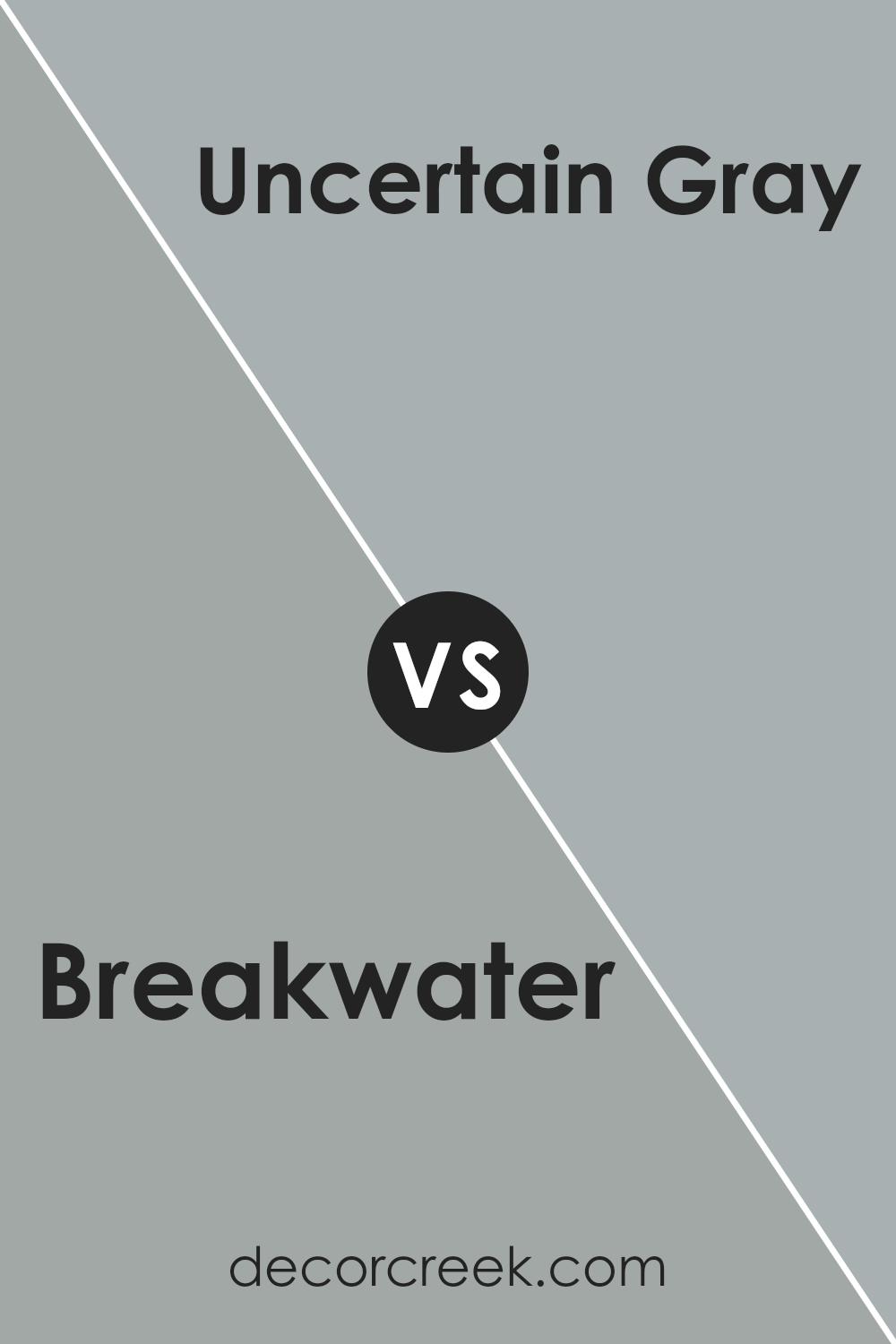
Breakwater SW 9638 by Sherwin Williams vs Uncertain Gray SW 6234 by Sherwin Williams
Breakwater SW 9638 and Uncertain Gray SW 6234 are two colors from Sherwin Williams that offer distinct vibes. Breakwater is a soft, muted blue-green that creates a peaceful, calming atmosphere. It brings the freshness of coastal landscapes into a space, making it ideal for areas where relaxation is key, like bedrooms or bathrooms.
On the other hand, Uncertain Gray is a cooler gray with subtle blue undertones. It has a modern and sleek feel, making it suitable for contemporary settings. This color works well in living rooms or offices, providing a neutral backdrop while still adding depth.
When compared, Breakwater leans more towards a natural, earthy feel with its greenish tones, while Uncertain Gray offers a more urban and understated presence. Both colors have a gentle presence, but Breakwater adds a touch of color, whereas Uncertain Gray remains firmly in the neutral camp.
You can see recommended paint color below:
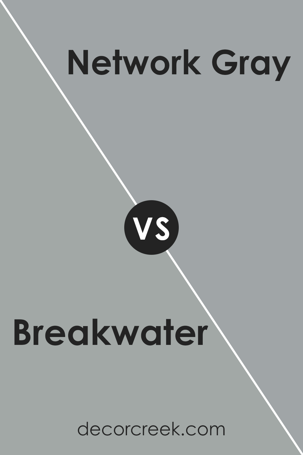
Breakwater SW 9638 by Sherwin Williams vs Network Gray SW 7073 by Sherwin Williams
Breakwater (SW 9638) and Network Gray (SW 7073) are two versatile paint colors by Sherwin Williams. Breakwater is a muted, pale shade that combines elements of blue and green, giving it a soft, coastal feel. It evokes a sense of calm and can make a space feel airy and open.
On the other hand, Network Gray is a medium-dark gray with a cool undertone. It is more neutral and sophisticated, bringing depth to a room without being overwhelming. While Breakwater is ideal for spaces where a light and refreshing atmosphere is desired, Network Gray suits rooms where a more grounded and modern look is preferred.
Both colors complement a variety of design styles, with Breakwater working well in beach-themed or relaxed settings, and Network Gray fitting in industrial or contemporary spaces. Together, they can be coupled to create dynamic contrasts in home design.
You can see recommended paint color below:
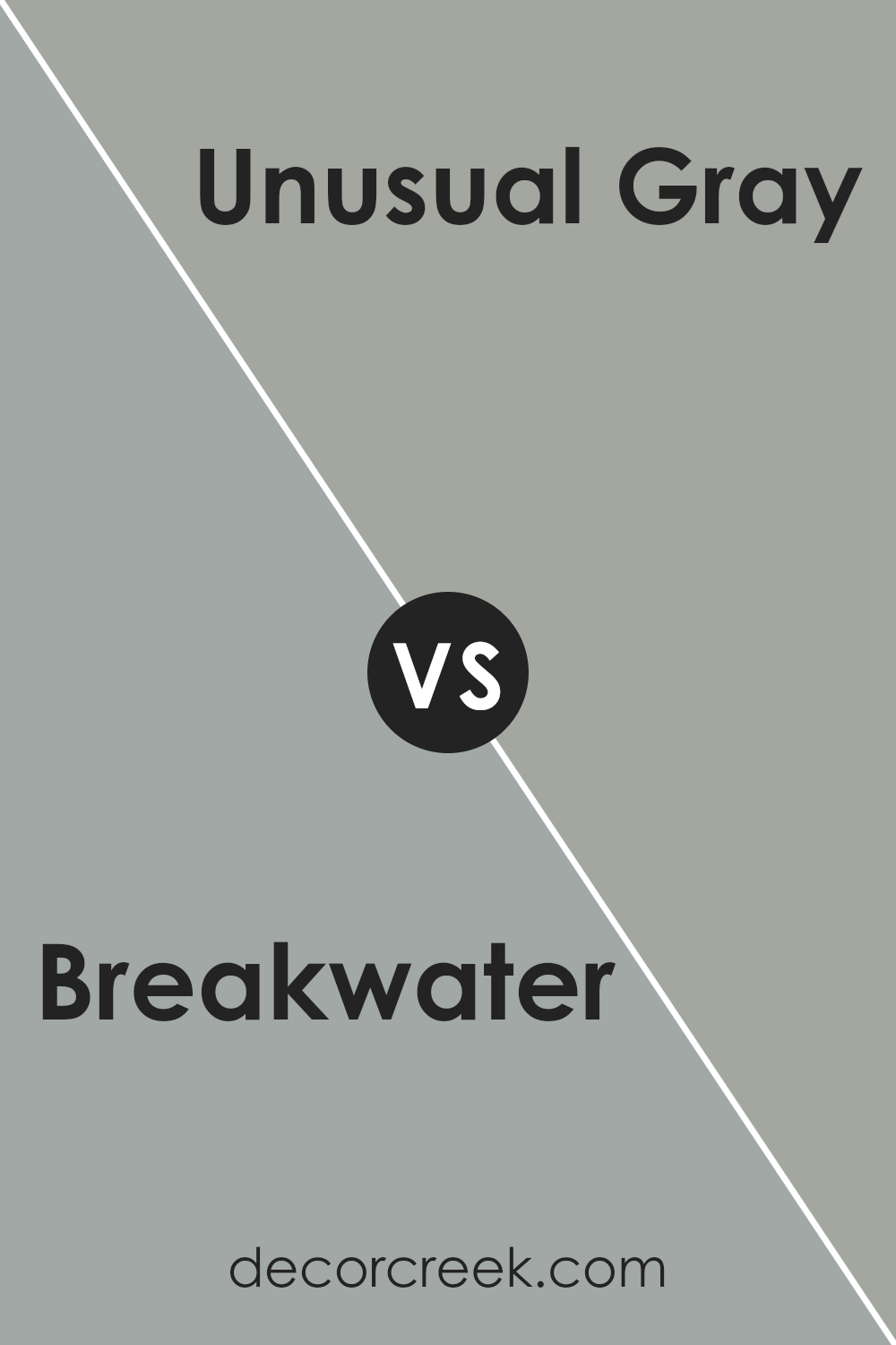
Breakwater SW 9638 by Sherwin Williams vs Unusual Gray SW 7059 by Sherwin Williams
Breakwater SW 9638 and Unusual Gray SW 7059 are both colors from Sherwin Williams, but they give off different vibes. Breakwater is a soft, muted green with a hint of gray, making it a calming choice with a natural, earthy feel. It can blend well with nature-inspired decor, creating a peaceful atmosphere.
On the other hand, Unusual Gray is a warmer, grayer shade with subtle undertones of green. It serves as a versatile neutral, providing a cozy and welcoming look. While Breakwater leans more towards the natural, understated green, Unusual Gray offers a bit more warmth and flexibility, fitting well with various color schemes. Together, these colors can complement each other, or they can stand alone as subtle backdrops in different spaces.
Whether you seek a more serene or a slightly warmer ambiance, both choices allow for creating a soothing environment with ease.
You can see recommended paint color below:
- SW 7059 Unusual Gray
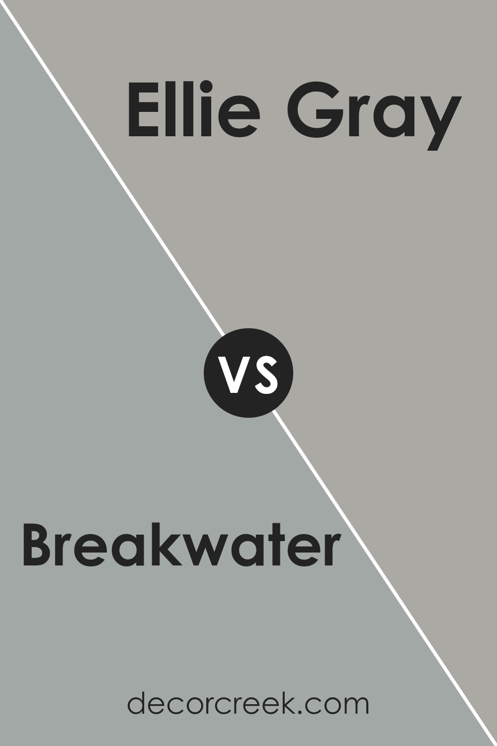
Breakwater SW 9638 by Sherwin Williams vs Ellie Gray SW 7650 by Sherwin Williams
Breakwater (SW 9638) by Sherwin Williams is a soft, muted green with a hint of gray. It’s a calming and relaxing color, perfect for spaces where you want a touch of nature and freshness. It works well in living rooms, bedrooms, or bathrooms to provide a soothing atmosphere. It’s neither too dark nor too light, making it versatile and easy to pair with other colors.
Ellie Gray (SW 7650), on the other hand, is a mid-tone gray that has a cool, sophisticated feel. This color is more neutral compared to Breakwater and is perfect for creating a modern and sleek look. Ellie Gray can be used in almost any room to bring a sense of elegance and clean lines.
While Breakwater brings a bit of color with its green undertones, Ellie Gray offers a more understated and classic appearance. Both colors are versatile but offer different vibes for your spaces.
You can see recommended paint color below:
- SW 7650 Ellie Gray
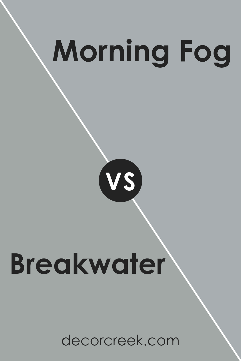
Breakwater SW 9638 by Sherwin Williams vs Morning Fog SW 6255 by Sherwin Williams
Breakwater SW 9638 and Morning Fog SW 6255 are two distinct colors by Sherwin Williams. Breakwater is a soft, muted green that feels natural and calming, perfect for creating a relaxing environment.
It reminds you of gentle ocean waves or a misty morning by the sea. On the other hand, Morning Fog is a subtle gray with a hint of blue, evoking an overcast sky. It’s versatile and works well as a neutral backdrop that complements many other colors.
While Breakwater brings an earthy, organic vibe, Morning Fog offers a cooler, more modern feel. Both colors are suitable for a variety of spaces, but the choice between them can set a different mood. Breakwater can add warmth and nature-inspired charm, while Morning Fog provides a sleek and refined look. Choosing between them depends on whether you prefer a touch of nature or a clean, understated aesthetic.
You can see recommended paint color below:
Breakwater SW 9638 by Sherwin Williams vs Castlegate SW 9558 by Sherwin Williams
Breakwater SW 9638 and Castlegate SW 9558 by Sherwin Williams are two distinct colors that offer unique vibes and can complement different spaces. Breakwater is a soft, muted green that brings a calming and relaxing atmosphere. It works well in spaces where you want a gentle touch of nature, such as bedrooms or living rooms. Its subtle undertones make it versatile and easy to pair with other colors.
On the other hand, Castlegate is a deeper, more intense shade of green-gray. It has a moody and sophisticated feel, suitable for creating a dramatic and cozy environment.
This color is perfect for accent walls, dining rooms, or study areas where you want to invoke a sense of depth and warmth. While Breakwater provides a light, airy feel, Castlegate offers richness and depth. Both colors can be used to set the tone in different parts of a home, depending on the desired mood.
You can see recommended paint color below:

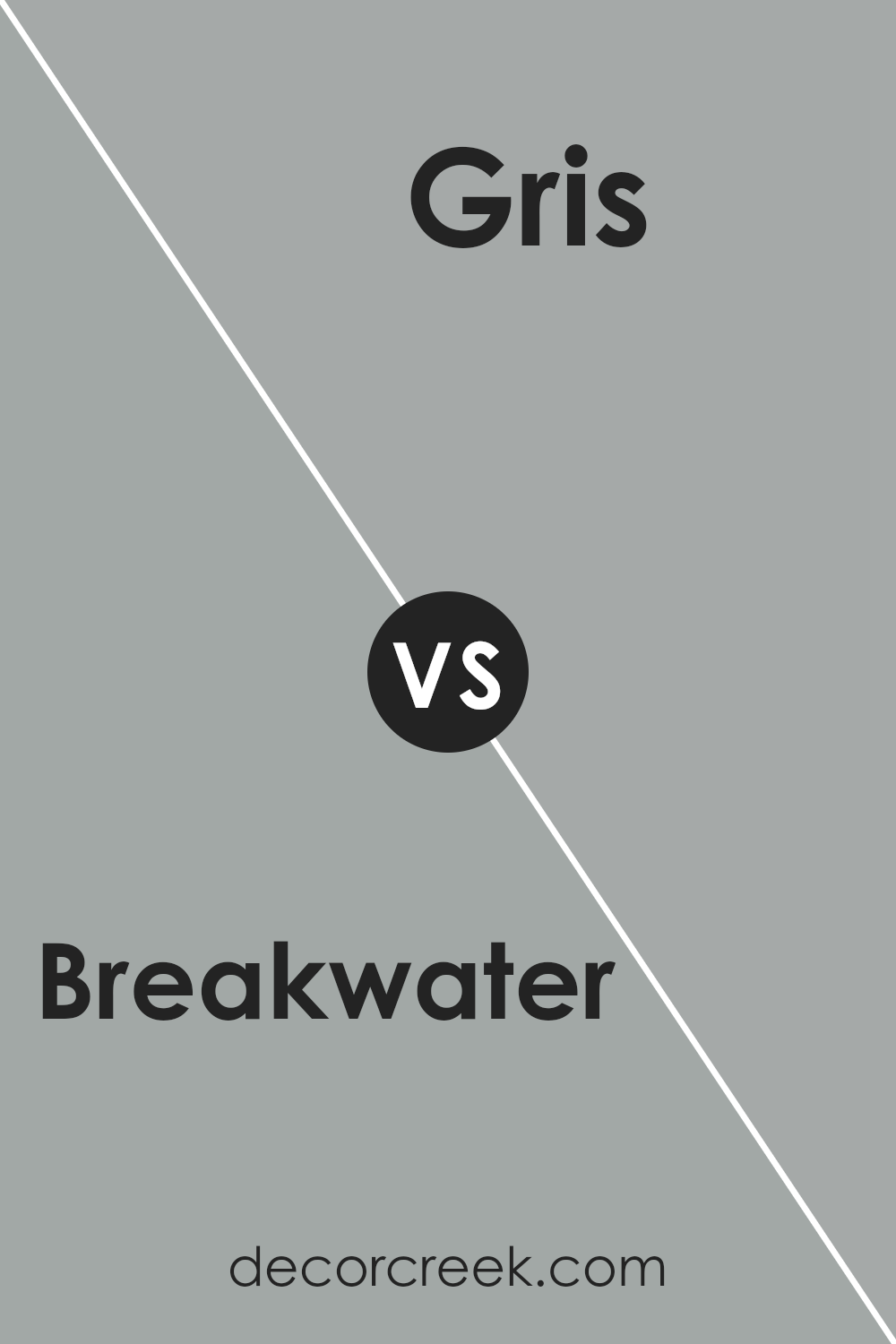
Breakwater SW 9638 by Sherwin Williams vs Gris SW 7659 by Sherwin Williams
Breakwater SW 9638 and Gris SW 7659 by Sherwin Williams are two distinct shades of gray, each with its own personality. Breakwater is a softer, more muted gray with subtle green undertones, giving it a calming effect. It’s reminiscent of a misty morning by the sea, adding a gentle and relaxed feel to a room.
In contrast, Gris is a cooler, more straightforward gray without any noticeable undertones. It’s a classic and versatile color, suitable for creating a sleek and modern look. Gris offers a clean and simple aesthetic, making it a popular choice for those seeking a minimalist style.
While Breakwater brings warmth and a touch of softness, Gris offers a crisp and clear look. Both colors can work well in various spaces, but the choice between them depends on the mood and atmosphere you want to create. Breakwater softens a space, while Gris gives it a sharper, more defined edge.
You can see recommended paint color below:
Conclusion
In wrapping up my thoughts on SW 9638 Breakwater by Sherwin Williams, I want to share why I believe this color is so special. Imagine a color that feels like looking at the ocean on a slightly cloudy day—it isn’t too bright or too dark. Breakwater is just like that, balancing between a light blue and a soft gray.
When I think about using Breakwater, I imagine how it can make a room feel calm and cozy. This isn’t just any paint; it gives walls a pleasant feel, like a gentle hug for your eyes. Whether you’re putting it on your bedroom walls or in the living room, it can make each spot in your home feel inviting and warm.
I like that Breakwater goes well with lots of other colors too. You can match it with whites for a crisp look or pair it with deeper colors to make them pop. It’s like a friend that gets along with everyone.
So, if you want your home to feel nice and welcoming without being too flashy or loud, Breakwater might be the perfect pick. It’s a color that brings a peaceful feeling and helps create a place everyone would love to be in.
Ever wished paint sampling was as easy as sticking a sticker? Guess what? Now it is! Discover Samplize's unique Peel & Stick samples.
Get paint samples

