When I first saw SW 6234 Uncertain Gray by Sherwin-Williams, I was surprised by how much character it had. It might look like a simple gray at first, but there’s a soft blue in it that makes it feel deeper and more interesting. It works well on walls, furniture, or accents—bringing a clean, modern look without being too bold.
In my experience, Uncertain Gray is perfect for those who appreciate a calming and neutral environment.
It seamlessly fits into a variety of design styles, from minimalist to traditional, offering a versatile backdrop for your home decor. Pairing it with crisp whites will enhance its cool tone, while warmer hues can bring out its snug side.
I found that this color thrives in natural light, changing slightly as the sun moves across the sky. This ever-so-slight shift in shade keeps it interesting but never overwhelming.
If you’re looking for a color that brings balance and a hint of elegance to your home without shouting for attention, Uncertain Gray might just be the perfect choice. It’s a color that fits in effortlessly, yet always makes an impact.
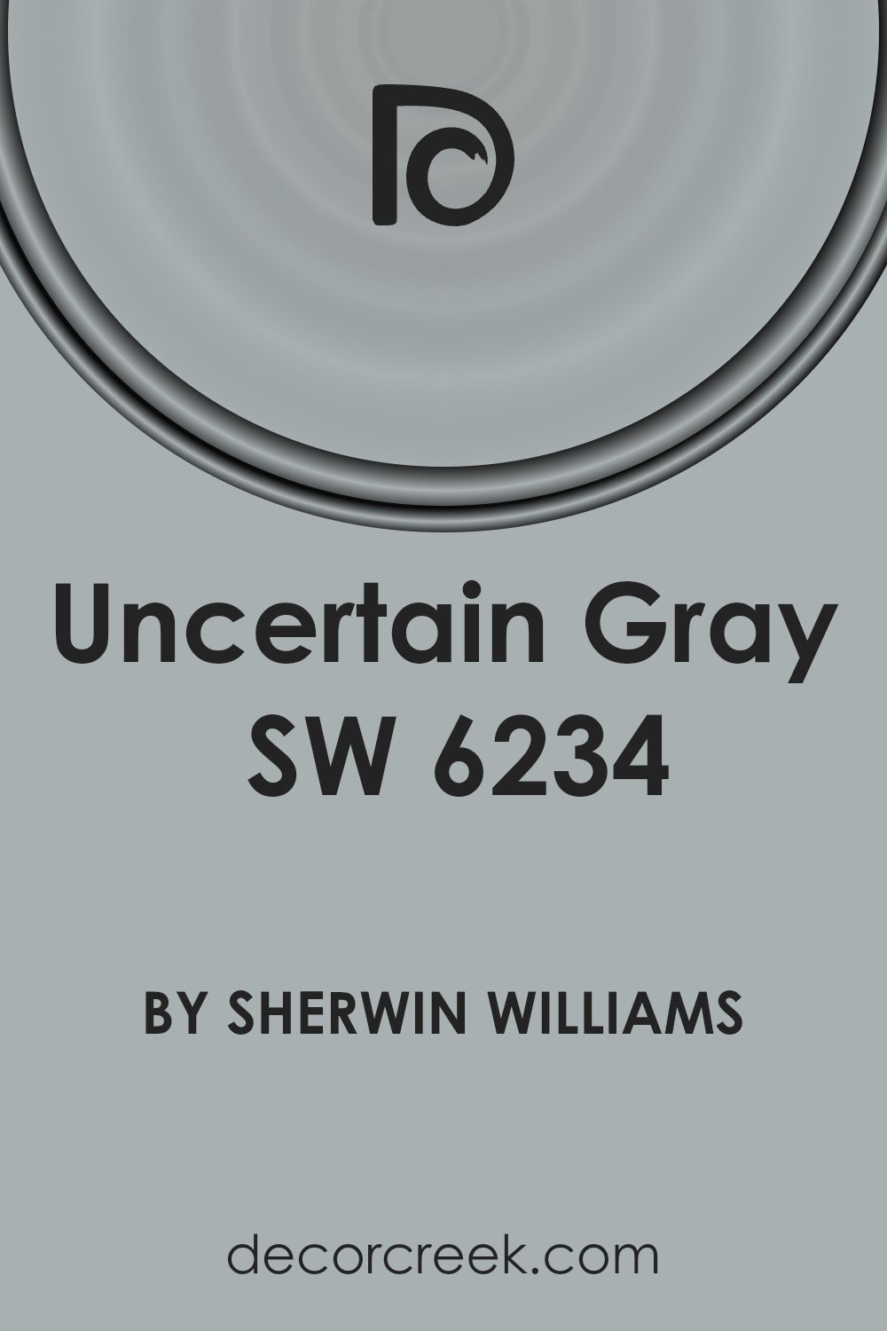
What Color Is Uncertain Gray SW 6234 by Sherwin Williams?
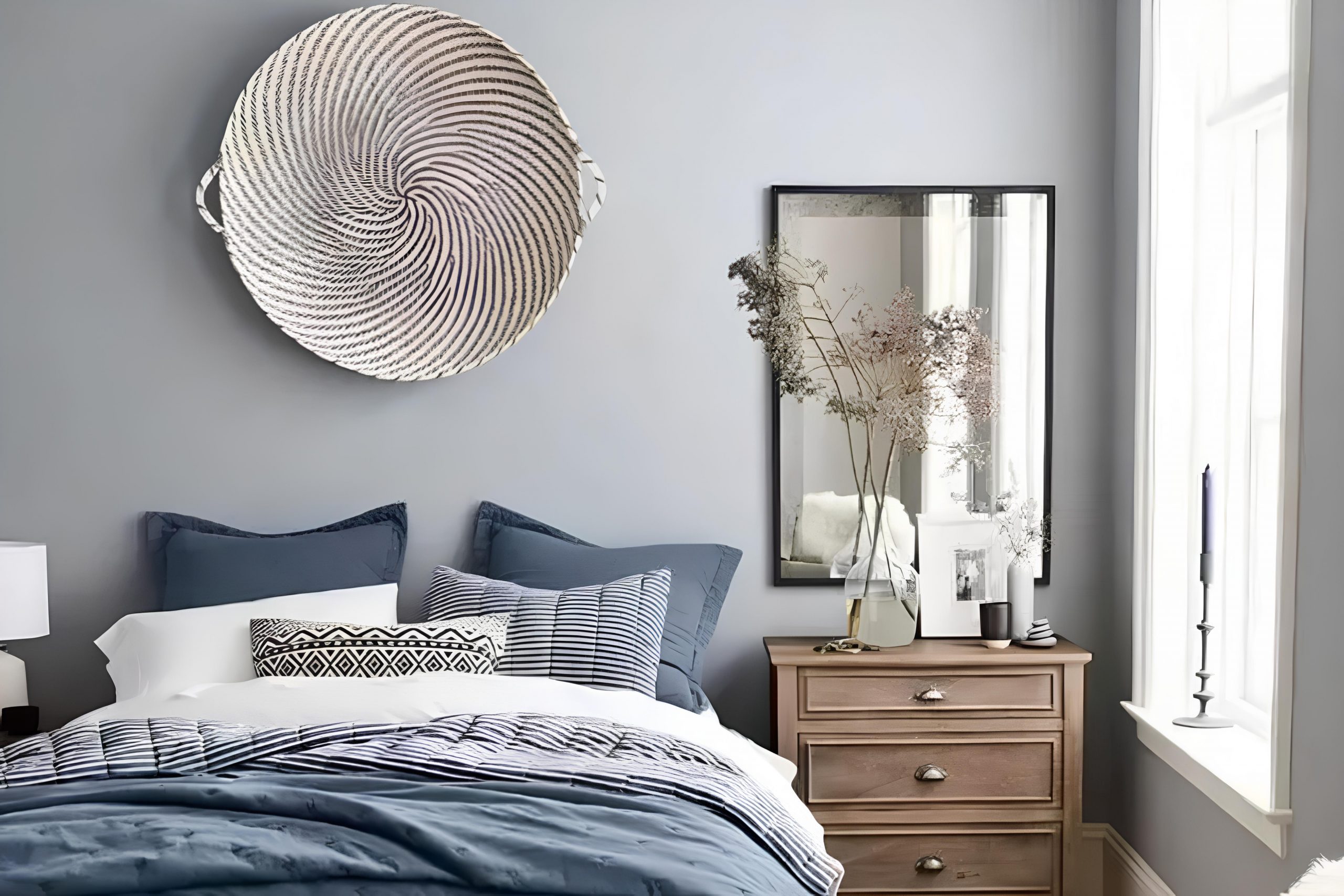
Uncertain Gray by Sherwin-Williams is a versatile and neutral color that sits comfortably between a soft gray and a muted blue. This color works well in any room of the house due to its subtle and calming nature. With its understated hue, it can create a quiet and peaceful atmosphere, especially suitable for bedrooms, living rooms, and home offices. Uncertain Gray pairs beautifully with both contemporary and traditional interior styles.
In modern interiors, it can emphasize clean lines and simplicity, while in more classic settings, it offers an updated twist on traditional color palettes. This gray shade compliments a variety of materials and textures.
It looks stunning alongside natural wood tones, whether light oak or deep mahogany, adding depth and interest to the space. It also pairs well with both matte and glossy finishes, allowing flexibility in design choices.
For a calming contrast, consider pairing Uncertain Gray with crisp white trims or cabinetry, which can highlight its soft undertones.
Textiles such as plush rugs, linen upholstery, or cotton drapes enhance its warm feel, providing an inviting touch to any room. Additionally, metallic elements like brushed nickel or antique brass can be added for a touch of elegance.
Is Uncertain Gray SW 6234 by Sherwin Williams Warm or Cool color?
Uncertain Gray (SW 6234) by Sherwin Williams is a versatile paint color that can change the look and feel of a room. It is a light gray with subtle blue undertones, which makes it a popular choice for many homes. This shade can brighten up a space without being too overwhelming, making it ideal for living rooms, bedrooms, or kitchens.
Its subtle nature means it pairs well with both bold and neutral colors, providing a good backdrop for colorful artwork or furnishings. However, Uncertain Gray is sensitive to lighting. In natural sunlight, it might appear slightly cooler, while under artificial light, it can take on a warmer tone.
This ability to adapt makes it a flexible option for various styles, whether modern or traditional. If you’re looking for a neutral color that still has personality, Uncertain Gray offers a gentle and inviting atmosphere in any room.
Undertones of Uncertain Gray SW 6234 by Sherwin Williams
Uncertain Gray, by Sherwin Williams, is a complex color that shifts depending on light and surroundings. It has various undertones that can influence its appearance. The base of gray (#D5D5D5 and #808080) gives the color a neutral framework, but the other undertones bring it to life in unexpected ways.
The light lilac (#8080D5) and light purple (#D580D5) undertones add a subtle hint of color, which can make the gray appear slightly purple in certain lighting. Mint (#80D580) and light turquoise (#2BD580) undertones might give the gray a fresher, greener appearance, particularly in bright spaces.
The pale yellow (#D5D580) undertone can warm the gray tone in sunny rooms, while the pale pink (#D58080) adds a touch of warmth in softer lighting.
When placed on interior walls, this gray will change throughout the day. In morning light, the color may seem cooler, leaning into its blue (#2B80D5) and turquoise (#2BD5D5 and #2B8080) undertones, creating a calm but refreshing vibe.
As the light shifts, warmer tones may appear, offering hints of yellow or pink, thus altering the room’s mood. This adaptability makes the paint versatile, changing with light sources and room setup.
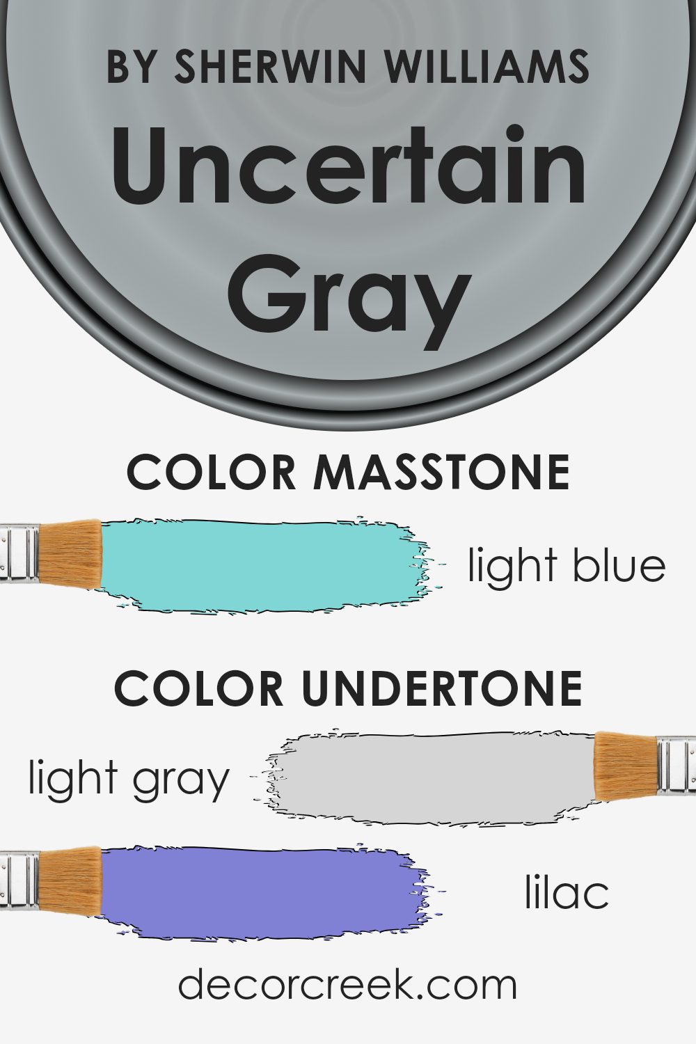
What is the Masstone of the Uncertain Gray SW 6234 by Sherwin Williams?
Uncertain Gray (SW 6234) by Sherwin Williams is an interesting color choice for homes. Its masstone, a light blue (#80D5D5), gives it a unique quality. This subtle blue undertone brings a soft and calming effect to a space, making it feel airy and open.
In home settings, this color can be very versatile. It works well in rooms where a relaxed atmosphere is desired, like bedrooms or living rooms. The light blue hint can remind people of clear skies or calm waters, adding a peaceful vibe to the room.
Additionally, it pairs nicely with other colors, such as whites, soft grays, or even pastel shades, providing flexibility in design. The overall feel is one of coolness and cleanliness, which can be refreshing and comforting in any home environment. This makes Uncertain Gray a great option for those looking to create a soothing space.
How Does Lighting Affect Uncertain Gray SW 6234 by Sherwin Williams?
Lighting plays a crucial role in how we perceive colors. Different lighting conditions can change how a color looks. Natural light changes throughout the day, affecting the appearance of colors. Artificial light, depending on its type, can also alter the way a color appears.
Uncertain Gray by Sherwin Williams is a versatile paint color that can change slightly depending on the light it’s in. In natural light, you might notice more of its subtle gray tones. Under warm artificial lighting, it could take on a slightly warmer look, possibly reflecting some of the light’s warmth.
In a north-facing room, which tends to receive cooler and less intense natural light, Uncertain Gray might appear a bit cooler and possibly even slightly blue. The gray could look a bit muted here due to the lack of strong natural light.
In a south-facing room, where the light is more direct and warm, the color can appear slightly warmer and more vibrant. The stronger light can enhance the depth of the gray, making it appear richer.
In east-facing rooms, the morning light is usually warm and bright, which can make the gray look warm and welcoming. However, as the sun moves away, the light becomes cooler, and the gray may look more subdued in the afternoon.
West-facing rooms receive the most light in the late afternoon and evening. In these spaces, Uncertain Gray might appear warmer and more lively during the peak sunlight hours. In contrast, earlier in the day, when the room is less directly lit, the color might seem more muted.
Overall, Uncertain Gray is sensitive to lighting conditions and can change subtly based on its environment. It’s important to test the color in various lights to understand how it will truly look in any specific space.
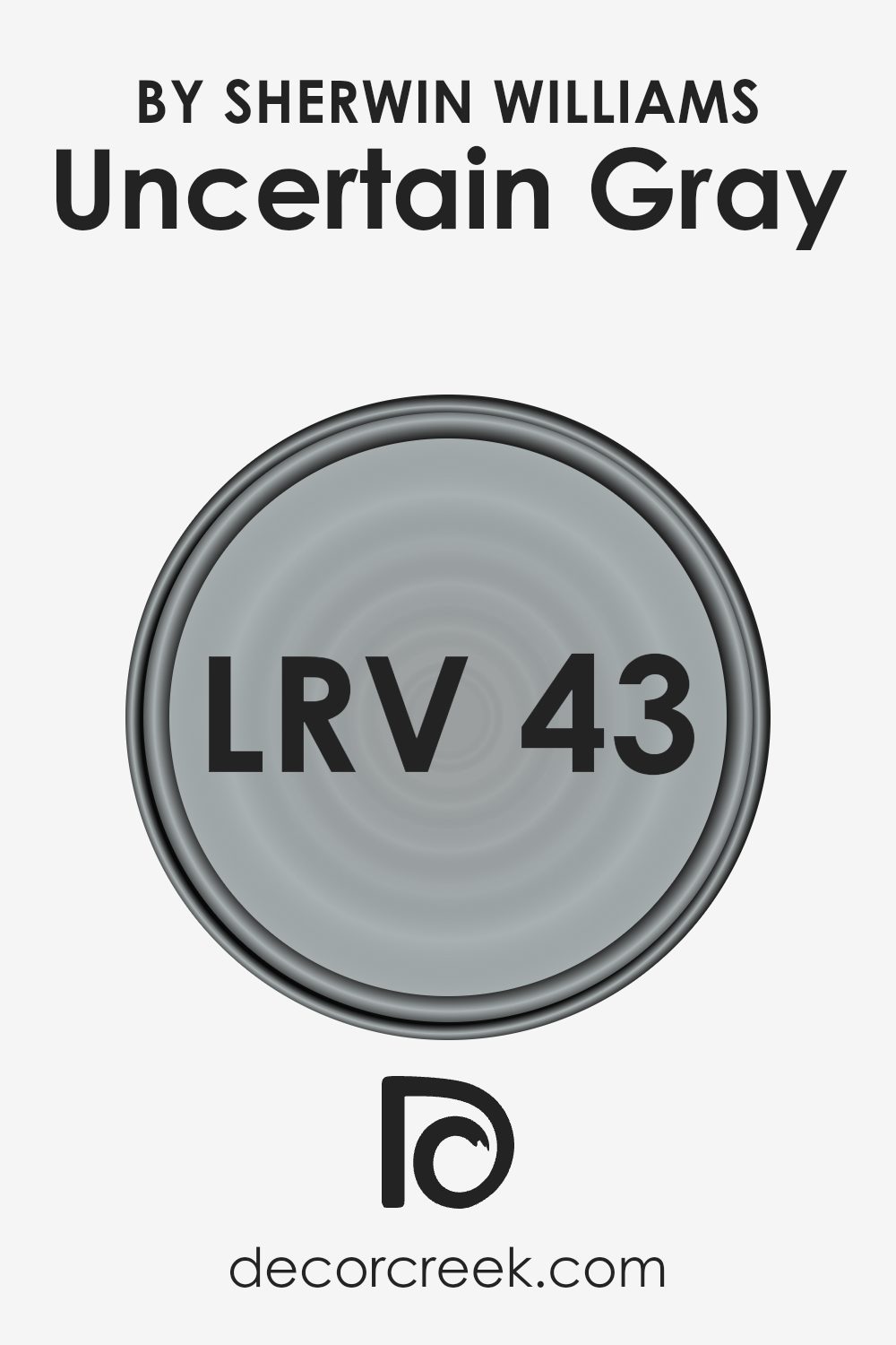
What is the LRV of Uncertain Gray SW 6234 by Sherwin Williams?
Light Reflectance Value, or LRV, is a measurement used in interior design and painting to determine how much light a color reflects. It’s represented by a number ranging from 0 to 100, where 0 means absolute black, absorbing all light, and 100 indicates pure white, reflecting all light.
When you look at how a color behaves in a room, LRV helps predict how light or dark the color will appear. Colors with higher LRV will reflect more light and tend to make rooms feel brighter and larger. Conversely, those with lower LRV absorb more light, making spaces feel cozier and sometimes smaller.
Uncertain Gray has an LRV of 42, meaning it sits around the middle of the scale. This indicates that it neither excessively absorbs nor reflects light. In a room, this soft gray strikes a balance by offering enough light reflection to ensure the room doesn’t feel too dark but not so much that it loses its cozy ambiance. It’s versatile for various lighting conditions: in bright rooms, it can appear lighter, and in dimly lit spaces, it might present as darker and richer.
The LRV of 42 means it’s practical and flexible, working well in different rooms and lighting conditions without overwhelming the space.
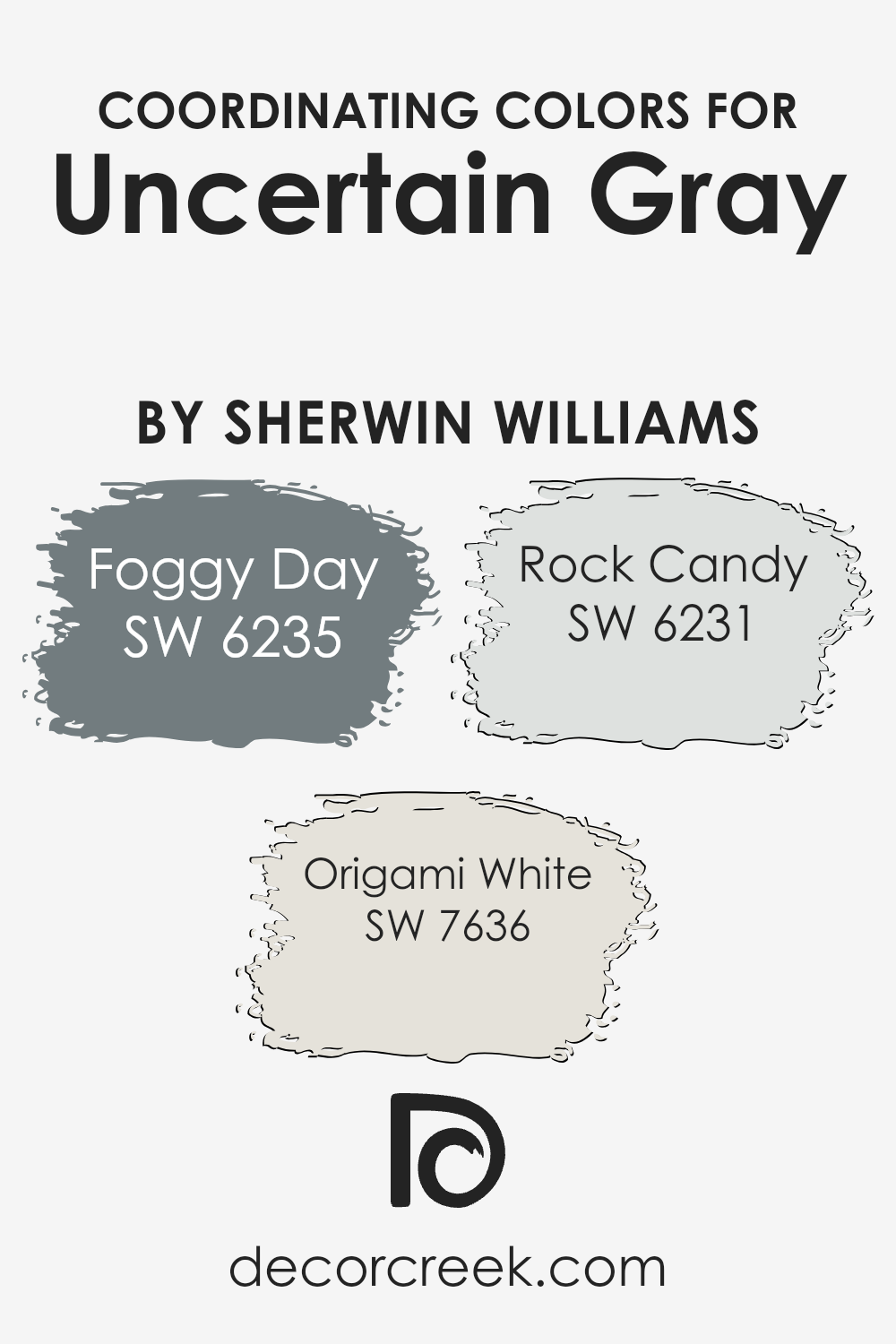
Coordinating Colors of Uncertain Gray SW 6234 by Sherwin Williams
Coordinating colors are hues that complement each other and work well together in design. They create a harmonious look by balancing out different shades within a space. When you combine colors like Uncertain Gray with others, it’s important to choose those that enhance each other’s qualities.
For example, pairing Uncertain Gray with SW 6235 – Foggy Day, SW 7636 – Origami White, and SW 6231 – Rock Candy can create a visually pleasing environment. These colors don’t clash; instead, they enhance the overall feel of the space, resulting in an inviting and cohesive atmosphere.
Foggy Day is a soft blue-gray, which adds a cool, calming touch that can accentuate the subtle blue undertone in Uncertain Gray. Origami White, with its warm undertone and creamy appearance, provides a gentle contrast, adding a touch of brightness and warmth, making it ideal for balancing cooler hues.
Rock Candy, being a very light and airy gray with a hint of blue, rounds out the palette by offering a fresh and light element. This combination creates a versatile and balanced color scheme, perfect for any room seeking a calm and cohesive design.
You can see recommended paint colors below:
- SW 6235 Foggy Day
- SW 7636 Origami White
- SW 6231 Rock Candy
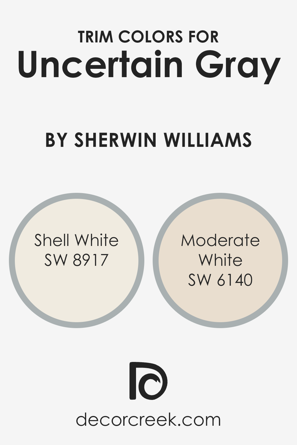
What are the Trim colors of Uncertain Gray SW 6234 by Sherwin Williams?
Trim colors are essential in interior design because they enhance and define the main wall color by providing contrast or harmony. When used with Uncertain Gray SW 6234 by Sherwin Williams, trim colors such as Shell White and Moderate White help to highlight the gray’s subtle tones.
Shell White SW 8917 is a soft, warm off-white that maintains a gentle brightness, perfect for adding a touch of warmth without overpowering the main color. Moderate White SW 6140 brings a slightly deeper neutral tone, complementing the gray and adding a sophisticated touch that brings out the depth of the wall color.
Choosing the right trim color can make a room look more cohesive and can accentuate architectural details. With Shell White, you get a trim that softly contrasts with Uncertain Gray, resulting in a cozy and welcoming atmosphere.
On the other hand, Moderate White offers a slightly bolder approach to detailing that works beautifully with the gray, maintaining a clean and polished aesthetic. This balance of colors is crucial in defining the character of a space, ensuring that every element works together seamlessly.
The right trim highlights the uniqueness of Uncertain Gray, making a room look put-together and complete.
You can see recommended paint colors below:
- SW 8917 Shell White
- SW 6140 Moderate White
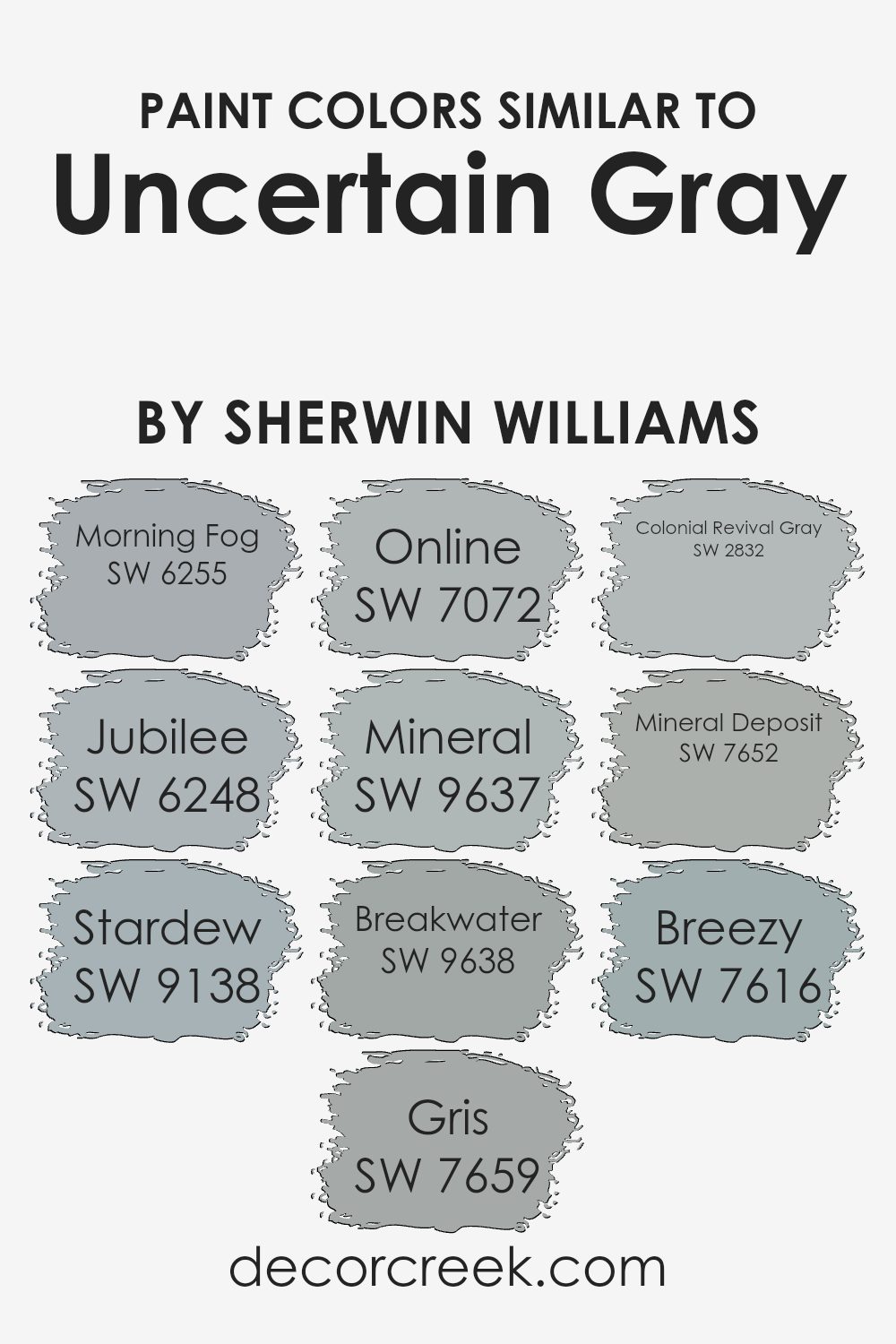
Colors Similar to Uncertain Gray SW 6234 by Sherwin Williams
Similar colors play a crucial role in design by creating a sense of harmony and cohesion. They offer subtle variations that can enhance the mood of a space without overwhelming it. For example, SW 6255 – Morning Fog is a soft, muted blue-gray that provides a calming atmosphere, while SW 6248 – Jubilee offers a darker, more pronounced gray with a hint of blue, making it a versatile choice for accent walls.
Stardew, SW 9138, brings a gentle touch of blue to its gray base, giving it a refreshing feel that pairs well with natural light. Gris, labeled as SW 7659, has a slightly warmer undertone, making it a comforting backdrop for various decorative elements.
Online, SW 7072, offers a cool, contemporary gray that’s perfect for modern spaces. Similarly, SW 9637 – Mineral has a darker tone with depth and richness, suitable for creating an intimate setting. Breakwater, SW 9638, presents a balance of gray and blue undertones, ideal for spaces seeking a touch of calmness.
SW 2832 – Colonial Revival Gray is a timeless gray with hints of traditional elegance, while SW 7652 – Mineral Deposit provides a versatile option with its balanced mix of gray and a soft blue undertone.
Finally, SW 7616 – Breezy is a color that introduces an airy, light feel, perfect for open spaces. Using these similar colors helps create a layered, cohesive look without the risk of clashing tones.
You can see recommended paint colors below:
- SW 6255 Morning Fog
- SW 6248 Jubilee
- SW 9138 Stardew
- SW 7659 Gris
- SW 7072 Online
- SW 9637 Mineral
- SW 9638 Breakwater
- SW 2832 Colonial Revival Gray
- SW 7652 Mineral Deposit
- SW 7616 Breezy
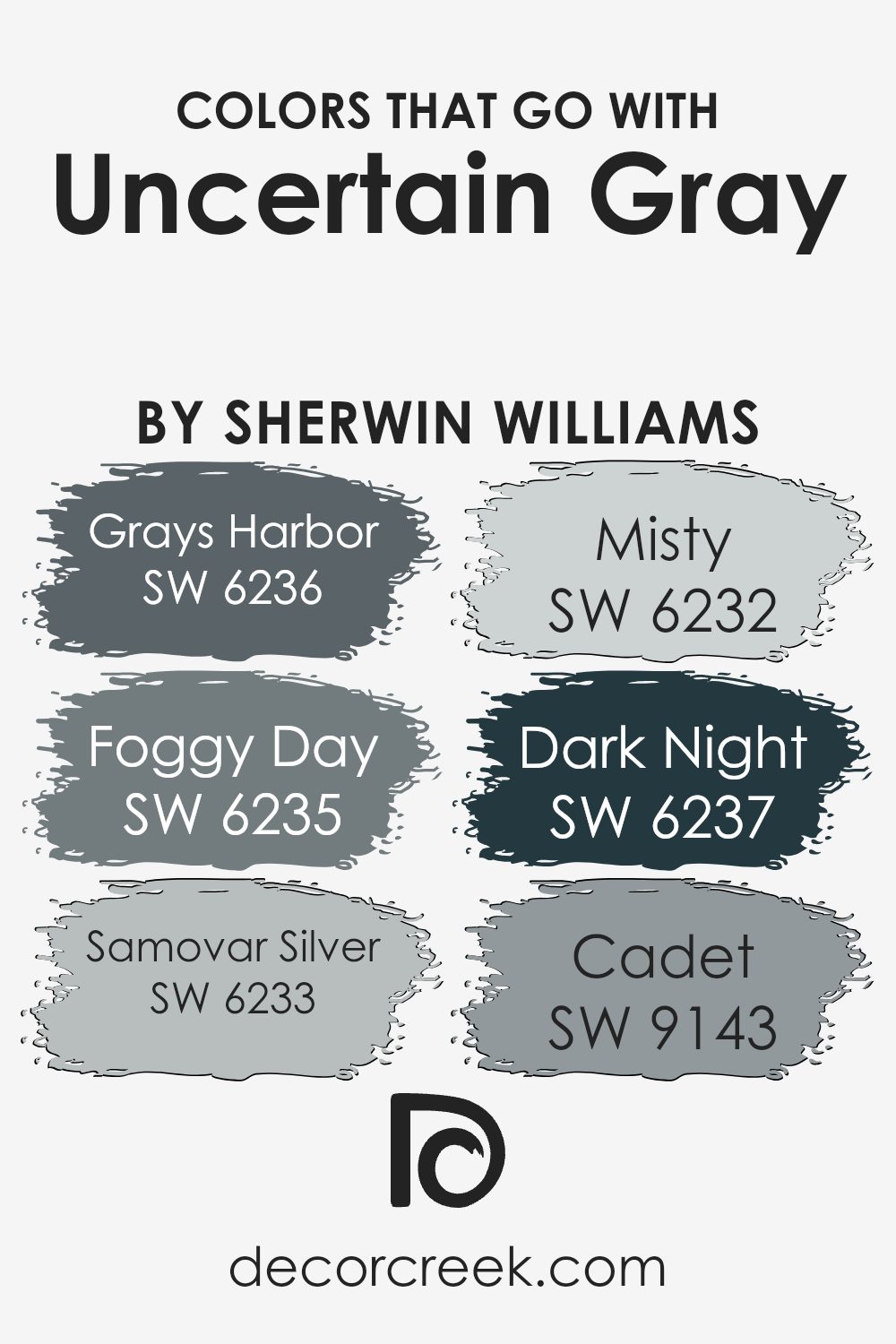
Colors that Go With Uncertain Gray SW 6234 by Sherwin Williams
Uncertain Gray SW 6234 by Sherwin Williams is a versatile shade that works well with a variety of colors to create a cohesive and balanced space. It’s important to choose the right colors that match Uncertain Gray because they enhance its subtle tones and make the entire palette more visually appealing.
One such color is SW 6236 – Grays Harbor, a deep, cool blue-gray that adds depth and makes for a bold accent. SW 6235 – Foggy Day is another great choice; it’s a soft, muted gray-blue that complements the calm nature of Uncertain Gray while adding a bit of warmth.
Another color that pairs beautifully is SW 6233 – Samovar Silver, a light and airy silver-gray that enhances the lightness in Uncertain Gray without overwhelming it. SW 6232 – Misty offers a fresh, delicate touch with its soft blue undertones, making the space feel open and inviting.
For accents or feature walls, SW 6237 – Dark Night, a rich, deep navy, creates a strong contrast that highlights the lighter shades.
Finally, SW 9143 – Cadet, a muted blue, provides a peaceful background that ties the whole color scheme together smoothly. Combining these colors with Uncertain Gray helps create a harmonious and visually pleasing environment.
You can see recommended paint colors below:
- SW 6236 Grays Harbor
- SW 6235 Foggy Day
- SW 6233 Samovar Silver
- SW 6232 Misty
- SW 6237 Dark Night
- SW 9143 Cadet
How to Use Uncertain Gray SW 6234 by Sherwin Williams In Your Home?
Uncertain Gray by Sherwin Williams is a versatile paint color that adds a touch of calm and neutrality to a home. This soft gray has a balanced tone that can fit well with various styles and settings. It works beautifully in living rooms, bedrooms, or even bathrooms. The gentle hue provides a subtle backdrop that doesn’t overpower a space, making it easy to match with different colors and furnishings.
In a living room, Uncertain Gray can pair nicely with white trim and colorful decor, creating a cozy and welcoming atmosphere. In a bedroom, it can be teamed with soft pastels or deeper shades for a restful retreat.
For kitchens or bathrooms, the gray color can complement stainless steel, white cabinets, or natural wood finishes, providing a modern yet timeless look. Overall, Uncertain Gray is a dependable choice for anyone looking to refresh their home with a neutral, calming paint color.
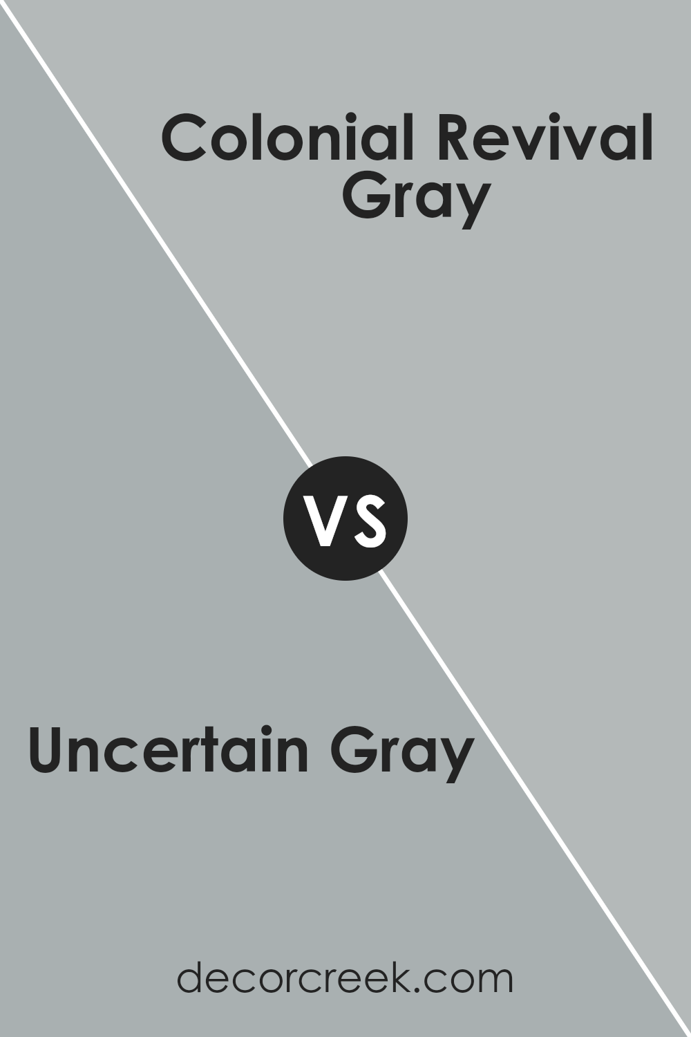
Uncertain Gray SW 6234 by Sherwin Williams vs Colonial Revival Gray SW 2832 by Sherwin Williams
Uncertain Gray SW 6234 by Sherwin Williams is a versatile and soft gray with subtle green undertones. It works well in spaces where a calm and balanced atmosphere is desired. The color feels modern and clean yet warm enough to avoid feeling sterile. It pairs nicely with both warm and cool colors, making it a popular choice for living areas and bedrooms.
Colonial Revival Gray SW 2832, on the other hand, is a deeper, more traditional gray. It has blue undertones, giving it a classic and timeless feel. This color is often used for exterior projects or in rooms where a historic or elegant look is desired. It’s bolder than Uncertain Gray, offering a more dramatic and sophisticated appearance.
Both colors are beautiful, but the choice between them would depend on whether you prefer a softer, more contemporary look or a richer, more traditional feel.
You can see recommended paint color below:
- SW 2832 Colonial Revival Gray
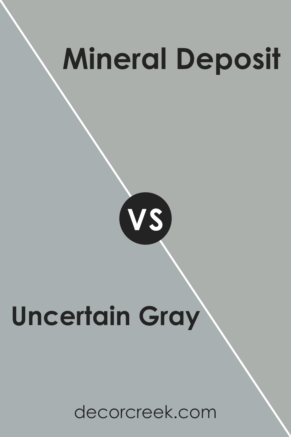
Uncertain Gray SW 6234 by Sherwin Williams vs Mineral Deposit SW 7652 by Sherwin Williams
Uncertain Gray (SW 6234) and Mineral Deposit (SW 7652) by Sherwin Williams are both shades of gray, but they have different undertones and feelings. Uncertain Gray is a mid-tone gray with a hint of blue, giving it a cool and modern feel. It can appear soft and calming, especially in spaces with good natural light.
On the other hand, Mineral Deposit is also a gray but with more of a green undertone. This gives it a warm, earthy vibe that adds subtle color depth without being overwhelming.
While Uncertain Gray works well in modern and minimalist spaces, offering a neutral backdrop, Mineral Deposit can add a touch of warmth and character, making it suitable for those who want a dash of subtle color with their neutral palette. Both are versatile, but their differing undertones can lead to distinct atmospheres in a room.
You can see recommended paint color below:
- SW 7652 Mineral Deposit
Uncertain Gray SW 6234 by Sherwin Williams vs Online SW 7072 by Sherwin Williams
Uncertain Gray SW 6234 and Online SW 7072 by Sherwin Williams are two different shades of gray, each bringing a unique feel to a space. Uncertain Gray is a soft, warm gray with subtle undertones that can appear slightly green or brown in certain lighting. This makes it a versatile choice for creating a cozy and inviting atmosphere in a room.
In contrast, Online is a cooler gray with blue undertones. It tends to look more modern and crisp, making it a great choice for spaces where you want a clean and contemporary look. The cooler tone of Online can make a room feel more spacious and refreshing.
Both colors are neutral and can work well with a variety of other colors, but they create different moods. Uncertain Gray is softer and warmer, while Online is cooler and more modern. Your choice will depend on the vibe you wish to create in your space.
You can see recommended paint color below:
Uncertain Gray SW 6234 by Sherwin Williams vs Breezy SW 7616 by Sherwin Williams
Uncertain Gray SW 6234 and Breezy SW 7616 by Sherwin Williams are both cool colors, but they offer different moods. Uncertain Gray is a soft, muted shade with a hint of blue undertones. It is versatile and can create a calm and neutral backdrop for a room. Its subtle hue works well with a variety of other colors, making it a popular choice for modern and minimalist designs.
On the other hand, Breezy is a light, airy blue that brings a gentle, refreshing vibe to spaces. It has more of a noticeable blue tint compared to Uncertain Gray, which can add a cheerful and clean atmosphere to any room. Breezy is perfect for spaces where you want to introduce a bit of color but still maintain a sense of openness and airiness.
Both colors are versatile but cater to slightly different tastes. Uncertain Gray leans more neutral, while Breezy adds a splash of cool color.
You can see recommended paint color below:
- SW 7616 Breezy
Uncertain Gray SW 6234 by Sherwin Williams vs Stardew SW 9138 by Sherwin Williams
Uncertain Gray (SW 6234) and Stardew (SW 9138) by Sherwin Williams are both muted colors, but they offer different vibes for a space. Uncertain Gray is a balanced, neutral gray with subtle undertones that can appear slightly cool or warm, depending on the lighting. It’s a versatile shade suitable for almost any room, fostering a calm and understated backdrop.
Stardew, on the other hand, leans more toward a blue-gray with a hint of green, giving it a soft, dusty appearance. It has a gentle, soothing quality that makes it perfect for creating a cozy and inviting atmosphere.
While Uncertain Gray is more traditional and can blend into various styles, Stardew adds a touch of character and warmth due to its blue tones.
Choosing between the two depends on the mood and look you want for your space. Uncertain Gray maintains a neutral, timeless presence, while Stardew offers a bit more color and a sense of comfort.
You can see recommended paint color below:
Uncertain Gray SW 6234 by Sherwin Williams vs Jubilee SW 6248 by Sherwin Williams
Uncertain Gray SW 6234 and Jubilee SW 6248 are both neutral colors by Sherwin Williams, but they have distinct differences.
Uncertain Gray is a versatile gray that leans slightly warm, making it a great backdrop in many settings. Its subtle warmth means it can work well with both cool and warm color schemes, adding a gentle coziness to spaces. It is understated, which makes it a practical choice for areas where you want a soft, neutral look.
On the other hand, Jubilee SW 6248 is more of a cool gray with a hint of blue. This touch of blue gives Jubilee a crisp and fresh feel, making it suitable for modern spaces or where you want a slightly cooler look. It pairs nicely with whites and other cool tones, adding a refreshing effect.
In summary, while both colors are grays, Uncertain Gray brings warmth and Jubilee offers a cooler, slightly blue-tinged alternative.
You can see recommended paint color below:
Uncertain Gray SW 6234 by Sherwin Williams vs Breakwater SW 9638 by Sherwin Williams
Uncertain Gray SW 6234 and Breakwater SW 9638, both by Sherwin Williams, are gentle, neutral shades that can add a subtle depth to any space, but they each have unique qualities. Uncertain Gray is a balanced mix of gray with a hint of warmth, offering a cozy feel.
It suits both modern and classic styles, making it a versatile choice for walls or accent pieces. Breakwater, on the other hand, presents a cooler tone with a slight blue undertone. This gives it a fresh and airy vibe, perfect for creating a calm atmosphere in living rooms or bedrooms.
Uncertain Gray is a touch warmer, lending itself to spaces that need a little inviting warmth. In contrast, Breakwater’s coolness is ideal for places where a refreshing and breezy ambiance is desired. Both colors can seamlessly fit into various design schemes, allowing for creative combinations and stylistic harmony.
You can see recommended paint color below:
- SW 9638 Breakwater
Uncertain Gray SW 6234 by Sherwin Williams vs Gris SW 7659 by Sherwin Williams
Uncertain Gray SW 6234 and Gris SW 7659, both by Sherwin Williams, are soft and versatile colors, but they offer different vibes. Uncertain Gray has a cool undertone with hints of green, making it feel more earthy and muted. This gives spaces a grounded and calming feel, ideal for creating a relaxed atmosphere.
On the other hand, Gris SW 7659 is slightly darker and has a cooler, bluish undertone. It can lend a more modern and sleek look to a room, often making it feel more stylish. The gray is more straightforward, which can add a touch of elegance without being overpowering.
When choosing between these colors, consider the mood you want to set. Uncertain Gray works well in spaces where you want warmth and coziness, while Gris is great for areas where you prefer a more crisp and clean look. Both colors complement different styles and can be paired with various accents.
You can see recommended paint color below:
Uncertain Gray SW 6234 by Sherwin Williams vs Morning Fog SW 6255 by Sherwin Williams
Uncertain Gray SW 6234 and Morning Fog SW 6255 by Sherwin Williams are two muted gray shades with subtle differences. Uncertain Gray is a versatile gray with a slight green undertone, making it adaptable to various lighting conditions.
It provides a neutral backdrop that can complement both warm and cool color schemes in home décor. On the other hand, Morning Fog is a bit cooler and has a blue undertone, giving it a slightly fresher appearance.
This color is well-suited for rooms where you want to create a calm and airy feel. While Uncertain Gray works well in spaces where you want to maintain flexibility in accent colors, Morning Fog adds a bit more character with its cooler hue. Both colors are subtle and understated, each bringing its own mood to a room, with Uncertain Gray being slightly warmer and Morning Fog offering a cooler, misty appearance.
You can see recommended paint color below:
Uncertain Gray SW 6234 by Sherwin Williams vs Mineral SW 9637 by Sherwin Williams
Uncertain Gray (SW 6234) and Mineral (SW 9637) by Sherwin Williams are both soft, versatile colors, but they differ in tone and use. Uncertain Gray is a medium-toned gray with subtle blue undertones. It offers a cool, neutral backdrop that can balance well with both warm and cool accents, making it versatile for various settings like living rooms or bedrooms.
On the other hand, Mineral is a softer, lighter color that leans more towards earthy, natural tones. It generally appears warmer and softer than Uncertain Gray, providing a cozy feel. This color works well in spaces where a light, calming atmosphere is desired, such as a kitchen or a bathroom.
While both are neutral, the choice between them depends on the mood you want to create. Uncertain Gray suits those looking for a modern, understated look, whereas Mineral is better for those preferring warmth and subtle coziness.
You can see recommended paint color below:
Conclusion
After talking all about SW 6234 Uncertain Gray by Sherwin Williams, I’ve realized just how special this paint color is. It’s not just a simple gray; it’s a gray with a hint of magic. When I see this color on the walls, I feel like things around me get calm and peaceful. It’s kind of like on a cloudy day when everything is soft and nice.
What’s really cool about Uncertain Gray is how it changes based on where you use it. In the morning light, it can look a bit bluish, but later in the day, it can appear warmer and cozier. It’s like it has its own mood swings, but in a good way!
This color is super friendly because it works well with lots of other colors. Whether I want to pair it with bright colors for a lively look or with more gentle colors for quiet times, Uncertain Gray is always ready. It’s as if it wants to be everybody’s friend.
So, by putting Uncertain Gray on the walls, I feel like I’m inviting a gentle and happy feeling into a room. It’s perfect for when I want things to be calm and cozy around me, making every room a nice place to be. I’m really glad I learned about this special color!
Ever wished paint sampling was as easy as sticking a sticker? Guess what? Now it is! Discover Samplize's unique Peel & Stick samples.
Get paint samples

