Sherwin-Williams paints offer a vast selection of color options, with shades and tones to complement every taste and style. The company’s range caters to the varied needs of the customer, from an individual looking to spruce up a single room to a large corporation seeking the perfect shade for a massive commercial project.
One shade in the palette that has captured the attention of decorators and designers alike is SW 7659 Gris.
This article will delve into the color SW 7659 Gris, its characteristics, how it behaves in different light conditions, and the ways it can be combined with other colors for a visually appealing outcome.

What Color Is SW 7659 Gris?
SW 7659 Gris is a sophisticated gray color that carries an air of elegance and poise. Neither too harsh nor too soft, Gris walks a fine line between neutrality and character. It has a unique ability to adapt to its surroundings, making it a truly versatile color choice.
There’s something universally appealing about this shade of gray; it possesses an inherent sophistication, yet at the same time, it is highly approachable and welcoming.
Gris, as its French name suggests, is a middle-of-the-road gray, not too dark and not too light. This enables it to maintain a strong presence without overpowering a room. The hue is almost chameleon-like in nature, subtly reflecting the colors around it and adding a layer of complexity that is not often found in other shades of gray.
Its intriguing versatility is one of the main reasons why SW 7659 Gris has grown in popularity among homeowners and professional designers alike.

Ever wished paint sampling was as easy as sticking a sticker? Guess what? Now it is! Discover Samplize's unique Peel & Stick samples.
Get paint samples

Is It a Warm Or Cool Color?
SW 7659 Gris belongs to the cool color family. Cool colors are often perceived as calming, relaxing, and somewhat soothing, making them ideal choices for bedrooms, bathrooms, and other spaces where a peaceful atmosphere is desired.
However, the relative neutrality of Gris allows it to be used successfully in a wide variety of settings, even those typically suited to warm colors.
Undertones of SW 7659 Gris
Undertones are subtle hues underlying the primary color. They have a significant impact on the way a color appears, especially in different lighting conditions. Here are three undertones of SW 7659 Gris:
- Blue Undertone: One of the most noticeable undertones of Gris is a gentle hint of blue. This subtle undertone amplifies the cool nature of the color, adding depth and interest to the gray.
- Green Undertone: The green undertone of Gris gives it a certain freshness. This hint of green helps the color blend well with natural elements and enhances its calming properties.
- Purple Undertone: The purple undertone in SW 7659 Gris offers a touch of sophistication. This undertone can add a luxurious feel to the color, especially when used in more formal or elegant settings.
Each of these undertones can emerge or recede depending on the colors and materials used in the space, as well as the lighting conditions. Understanding a color’s undertones is crucial in creating a cohesive color palette and avoiding clashes.

Coordinating Colors of SW 7659 Gris
Coordinating colors are colors that harmonize with each other, creating a pleasing and balanced visual appearance. Choosing coordinating colors is essential to create a unified aesthetic in space. Here are some coordinating colors for SW 7659 Gris:
- SW 7014 Eider White : This is a gorgeous off-white color that has a slight hint of gray. Its understated elegance pairs beautifully with the cool sophistication of Gris, adding light and brightness to the mix.
- SW 7056 Reserved White : Reserved White is a neutral off-white that complements Gris’s cool undertones, providing a clean and calm backdrop that allows Gris to shine.
- SW 6743 Mint Condition : This is a refreshing and invigorating color that injects energy into a space. When paired with Gris, it creates a vibrant, contrasting look that is still pleasing to the eye.
Additional coordinating colors that could complement SW 7659 Gris include:
- SW 6232 Misty : This color is a subdued, grayish blue that aligns beautifully with Gris’s cool undertones, creating a serene and tranquil color scheme.
- SW 7616 Breezy : A light and airy shade of blue, Breezy brings a refreshing contrast to Gris, adding a splash of color without overwhelming the neutrality of Gris.
- SW 7673 Pewter Cast : This is a deeper gray that can be used to provide depth and contrast when used with Gris, enhancing its cool elegance.

How Does Lighting Affect SW 7659 Gris?
Lighting plays a significant role in how we perceive color, and SW 7659 Gris is no exception. In natural light, Gris can appear as a true, neutral gray. Its blue, green, and purple undertones may come to the fore, giving the color a dynamic and engaging quality. This color’s true versatility shines through in the way it changes with different light conditions.
In artificial light, Gris can take on a slightly warmer tone. The intensity and type of artificial light can significantly impact how Gris appears. For instance, under incandescent lighting, Gris may lean toward a warmer gray, while fluorescent lighting could bring out its blue undertones.
Finally, it’s important to remember that other factors can influence the perception of color, including the orientation of the room, the time of day, and the surrounding colors and materials. Always test a swatch of paint in the actual space, under different light conditions, to get an accurate sense of how it will look.

LRV of SW 7659 Gris
LRV, or Light Reflectance Value, is a measure of how much light a color reflects and, conversely, how much it absorbs. It is rated on a scale from 0 (absolute black, absorbing all light) to 100 (pure white, reflecting all light). SW 7659 Gris has an LRV of 39, placing it in the middle range of the scale.
This means that Gris is a relatively balanced color in terms of light absorption and reflection. It is neither too dark nor too light. This LRV gives it a degree of flexibility that can be very useful in a range of different settings. It can add depth and contrast to a room without making it feel smaller or darker, unlike colors with a lower LRV.
Also, an LRV of 39 means that Gris can work well in rooms with varying levels of natural light. In a bright room, Gris will appear lighter and may exhibit its cooler undertones more prominently. Conversely, in a room with less natural light, Gris may seem darker and more subdued.
The LRV also helps determine the perceived warmth or coolness of a color. Despite being in the cooler spectrum, Gris’s mid-range LRV helps it maintain a balanced feel, avoiding the starkness that some lighter cool colors can impart.

LRV – what does it mean? Read This Before Finding Your Perfect Paint Color
Trim Colors of SW 7659 Gris
Trim colors are used on the trim and moldings of a room, including window and door frames, skirting boards, and crown molding. Choosing the right trim color can enhance the overall aesthetics of a room, adding depth, contrast, and a finishing touch.
Given its cool nature, SW 7659 Gris pairs well with shades of white for the trim. These could include:
- SW 7005 Pure White : This is a crisp, clean white that can provide a beautiful contrast to Gris, making the gray pop while maintaining a balanced and harmonious look.
- SW 7008 Alabaster : This is a slightly warmer off-white that can soften the coolness of Gris and add a touch of warmth to the space.
- SW 7011 Natural Choice : This off-white has a neutral undertone that beautifully complements Gris, providing a subtle contrast that is pleasing to the eye.

Colors Similar to SW 7659 Gris
Identifying colors similar to Gris can be helpful in a number of ways. It can aid in creating a cohesive color scheme, provide alternatives if Gris is not available, or offer options for those who like Gris but want something slightly different. Colors similar to SW 7659 Gris include:
- Network Gray (SW 7073) , a slightly darker and more intense gray.
- Uncertain Gray (SW 6234) , a soft, pale gray with a hint of blue.
- Morning Fog (SW 6255) , a muted gray with strong blue undertones.
Knowing similar colors allows you to make informed decisions about your color scheme. It can help you identify a color palette that works harmoniously together, whether you’re looking to create a monochromatic look, a contrasting scheme, or a color gradient.

Colors That Go With SW 7659 Gris
Choosing colors that work well with SW 7659 Gris can create a well-rounded and appealing color palette. Consider these colors:
- SW Foggy Day : This subtle shade of blue can enhance the cool undertones of Gris and create a peaceful, calming space.
- SW Drift of Mist : This off-white color can provide a soft contrast to Gris, adding brightness and lightness to a room.
- SW Almond Roca : This warm, almond shade can offer a striking contrast to Gris, adding warmth and energy to the space.
- SW Jogging Path : This neutral beige-gray color can complement Gris beautifully, creating a seamless, sophisticated palette.
- SW Mineral Gray : This deeper shade of gray can provide depth and intensity, enhancing the elegance of Gris.
Understanding how different colors interact with each other, how they affect the mood and feel of a space, and how they can either contrast with or complement each other is essential to creating a beautiful, cohesive color scheme.
With its versatility, SW 7659 Gris provides a fantastic base to start from, opening up a world of color possibilities.

How to Use SW 7659 Gris In Your Home?
Given its neutrality and versatility, SW 7659 Gris can be used in various rooms in your home and fits many interior design styles. It can seamlessly integrate into contemporary, traditional, minimalist, or Scandinavian-style homes due to its cool and calming undertones.
Gris’s inherent adaptability makes it an excellent choice for main living areas, providing a timeless backdrop that can adapt to changing trends and personal tastes.
How to Use SW 7659 Gris in the Bedroom?
In the bedroom, SW Gris can create a serene and tranquil environment, perfect for relaxation. The color’s cool undertones can help evoke feelings of calm and peace, which are essential for restful sleep.
You could consider pairing SW Gris with crisp whites or softer hues like lavender or pale blue for the bedding and curtains to create a harmonious and soothing color scheme.
Additionally, using SW Gris in the bedroom can add an element of sophistication. Complement it with rich, deep colors like burgundy or navy in your decor items for a luxurious feel. Metallic accents, in gold or silver, can also pair well with Gris, adding a touch of glamour to the space.

How to Use SW 7659 Gris in the Bathroom?
Bathrooms, often seen as spaces of rejuvenation, can greatly benefit from the cool and calming influence of SW 7659 Gris. The color lends itself beautifully to creating a spa-like environment, which can be enhanced by adding elements of white and glass for a clean, bright finish.
For a more modern and bold look, pair SW Gris with black or deep navy in your bathroom fixtures or tile work. This creates a stunning contrast, making the cool gray pop while adding a touch of sophistication. Metallic accents, particularly in brushed nickel or chrome, would complement this palette well.

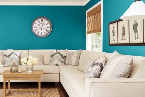
How to Use SW 7659 Gris in the Living Room?
In the living room, SW 7659 Gris can serve as a neutral backdrop that allows your furniture and decor to shine. Its versatility means it can handle bold, vibrant colors in artwork or throw pillows, as well as more subdued, neutral tones in furniture and rugs.
For a more monochromatic look, pair Gris with other shades of gray. This can create a visually interesting and cohesive space without being too overwhelming.
Add pops of color in your accessories to break the monotony and bring in some warmth.

How to Use SW 7659 Gris for an Exterior?
SW 7659 Gris can also be an excellent choice for exterior house paint. Its neutrality helps it blend well with the outdoor environment, and its cool undertones can give your home a crisp, clean appearance. The color pairs well with white or off-white trim, providing a classic and timeless look.
However, if you wish to create a more striking exterior, consider pairing Gris with darker colors for the trim or shutters. A navy blue or forest green can provide a beautiful contrast to Gris, making your home stand out.

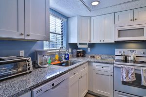
How to Use SW 7659 Gris for the Kitchen?
SW Gris in the kitchen can provide a balanced and soothing ambiance. As a neutral, it works well with various cabinet, countertop, and backsplash options.
You can pair it with white or off-white for a clean and fresh look or go with darker tones for a more dramatic effect.
For a pop of color, consider pairing SW Gris with a vibrant color on your kitchen island or in your backsplash. The neutrality of Gris allows for such bold choices without the fear of overpowering the space.

How to Use SW 7659 Gris for the Kitchen Cabinets?
Painting your kitchen cabinets Gris can give your kitchen a contemporary and chic look. The color adds an air of sophistication and is a great way to update your kitchen without resorting to a complete remodel.
Gris cabinets pair well with white or light-colored countertops and walls, creating a stunning contrast.
For the hardware, consider gold or brass for a hint of glamour, or go with black or silver for a more modern look.

Comparing SW 7659 Gris With Other Colors
Comparing colors can provide a better understanding of their undertones, depth, and how they may interact with other colors in a space. By comparing Gris with other colors, we can further explore its versatility and potential applications.
SW 7659 Gris vs. SW 0036 Buckram Binding
SW Buckram Binding is a darker, more earthy gray with warm undertones. Compared to Gris, it can bring a more rustic feel to a room. Gris, with its cooler undertones and lighter tone, feels more modern and airy.

SW 7659 Gris vs. SW 6725 Pickle
SW Pickle is a medium to dark green with cool undertones. Against Gris, it can bring an element of nature and energy into the room. Gris, on the other hand, provides a neutral, calming backdrop that allows colors like Pickle to stand out.

SW 7659 Gris vs. SW 6426 Basque Green
SW Basque Green , a muted, medium to dark green color, offers an earthy and natural palette when combined with Gris. The contrast between the coolness of Gris and the warmth of Basque Green creates a visually intriguing and welcoming space.
Gris provides a cool and neutral foundation, while Basque Green adds depth and richness, resulting in a color scheme that feels grounded and harmonious. This combination is ideal for creating an environment that is both dramatic and inviting.

SW 7659 Gris vs. SW 6244 Naval
SW Naval is a deep, rich navy blue that is almost black. When comparing SW 7659 Gris with SW Naval, the contrast is striking. SW Gris, with its light and cool undertones, acts as a calming and neutral backdrop, allowing Naval to shine as a bold and dramatic accent color.
The two colors create a captivating visual effect, with Gris providing balance and Naval adding depth and sophistication to any space.

SW 7659 Gris vs. SW 2864 Stratford Blue
SW Stratford Blue , a muted medium-toned blue, presents a different coolness compared to Gris. The pairing of these colors creates a serene and tranquil ambiance, perfect for spaces intended for relaxation and reflection. Gris’s light and cool undertones blend harmoniously with Stratford Blue, allowing the room to exude refreshing and calming energy.

SW 7659 Gris vs. SW 6540 Starry Night
SW Starry Night , a deep, dark blue that leans towards black, offers a distinct contrast to the light and cool Gris. While SW Gris provides a soothing and neutral base, SW Starry Night creates mystery and intrigue.
Combining these colors creates a dynamic and sophisticated atmosphere, where Gris acts as a calming influence, and SW Starry Night adds depth and drama, resulting in a visually stunning and balanced color scheme.

Conclusion
SW 7659 Gris is a versatile and elegant color that can bring calm and sophistication to any space. Whether used in a bedroom for its soothing effect, in a living room for its ability to provide a neutral backdrop, or in the kitchen for a touch of modern chic, Gris can truly transform a room.
Its comparison with other colors reveals its adaptability and potential to either take center stage or act as a supporting player in various color palettes.
Undoubtedly, SW 7659 Gris is a fantastic choice for those looking to refresh their homes with a color that combines timeless appeal with modern elegance.

Ever wished paint sampling was as easy as sticking a sticker? Guess what? Now it is! Discover Samplize's unique Peel & Stick samples.
Get paint samples
Frequently Asked Questions
⭐Is SW 7659 Gris suitable for small rooms or spaces with limited natural light?
Yes, SW 7659 Gris is an excellent choice for small rooms or spaces with limited natural light. Its light and cool undertones help create an illusion of space and brightness, making the room feel more open and airy.
⭐Can SW 7659 Gris be used in both modern and traditional interior design styles?
Absolutely! SW 7659 Gris is a versatile color that can adapt to various design styles. It pairs well with both modern and traditional elements, allowing you to create a cohesive and timeless look in your space.
⭐Does SW 7659 Gris work well with bold accent colors?
Yes, SW 7659 Gris can provide a neutral backdrop that allows bold accent colors to shine. Its versatility allows for vibrant pops of color without overwhelming the space, creating a balanced and visually appealing atmosphere.
⭐Can SW 7659 Gris be used on both interior walls and exterior surfaces?
Absolutely! SW 7659 Gris is a great choice for both interior and exterior surfaces. Its neutral and sophisticated tone can provide a timeless and elegant look to any space, whether inside or outside your home.
⭐Is SW 7659 Gris a good color choice for a calming and peaceful bedroom?
Yes, SW 7659 Gris is an excellent color choice for a calming and peaceful bedroom. Its cool undertones create a serene atmosphere that promotes relaxation and restful sleep, making it an ideal color for the bedroom.