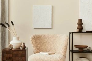
In the ever-evolving palette of home design, there lies a color that seamlessly bridges the gap between the boldness of stark neutrals and the softness of understated hues: SW 7066 Gray Matters by Sherwin Williams. This particular shade is a testament to the elegance and versatility that gray can bring to interiors and exteriors alike.
As a nuanced color, Gray Matters stands out for its balanced undertones, which lend themselves to creating a serene and inviting atmosphere in any space.
Crafted by the reputable Sherwin Williams, this color reflects the brand’s commitment to providing high-quality paint that designers, homeowners, and professionals alike have come to rely on.
Gray Matters is not just another gray in the vast spectrum of shades; it’s a meticulously designed color that resonates with modern and traditional styling, making it a go-to choice for those looking to imbue their spaces with a sense of sophistication and tranquility.
Whether it’s being used to refresh walls, accentuate architectural features, or serve as a backdrop for vibrant decor, SW 7066 Gray Matters offers a timeless aesthetic. Its ability to adapt to different lighting conditions and complement a wide range of color palettes makes it a universally appealing choice.
The elegance of Gray Matters by Sherwin Williams lies in its simplicity and depth, offering a canvas that ignites the imagination and transforms any room into a haven of style and comfort.

What Color Is Gray Matters SW 7066 by Sherwin Williams?
Gray Matters by Sherwin Williams is a profoundly versatile shade that marries the cool essence of silver with the depth of slate. This color exudes a subtle confidence, making it perfect for creating serene and sophisticated spaces.
Unlike stark grays, Gray Matters has a unique blend that warms slightly under natural light, offering an inviting ambiance without overwhelming a room with darkness. Its unparalleled adaptability allows it to serve as a neutral backdrop, supporting a wide range of color palettes and design aesthetics.
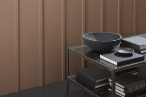
In terms of interior styles, Gray Matters shines in modern and minimalist environments where its sleek undertone complements clean lines and contemporary furnishings. However, its inherent warmth also makes it a fitting choice for industrial designs, where it pairs seamlessly with exposed brick, metal fixtures, and reclaimed wood, adding a touch of refinement to the rawness of these materials.
This color also finds its place in coastal and Scandinavian themes, where its lightness and versatility harmonize with soft textiles, natural woods, and airy layouts to evoke a sense of calm and spaciousness.
Materials and textures that pair well with Gray Matters include polished marble for a touch of luxury, brushed metals to accentuate its modern edge, and natural fibers like linen and wool to bring out its softer side. Whether used as an all-encompassing tone for walls or as an accent in furniture and décor, Gray Matters bridges the gap between functionality and style, making it a timeless choice for any interior.
Ever wished paint sampling was as easy as sticking a sticker? Guess what? Now it is! Discover Samplize's unique Peel & Stick samples.
Get paint samples

Is Gray Matters SW 7066 by Sherwin Williams Warm or Cool color?
Gray Matters by Sherwin Williams is a versatile and sophisticated shade that brings a balance of warmth and coolness into any space. This particular hue captures the essence of a calm, serene environment while remaining effortlessly modern and chic.
Its unique character lies in its ability to blend seamlessly with a variety of decor styles, from contemporary minimalism to cozy traditional. The neutrality of Gray Matters makes it an ideal backdrop for both bold accents and muted tones, allowing homeowners to experiment with different textures and colors without the fear of overwhelming the space.
In homes, this color works magic by creating an illusion of expanded space, making it a perfect choice for smaller rooms or areas with limited natural light. It reflects and scatters light delicately, ensuring that spaces feel brighter and more inviting.
For larger, open-concept areas, Gray Matters helps delineate different zones without the need for physical dividers, promoting a sense of continuity and flow throughout the home. This adaptability makes it not just a paint color but a transformative design tool, capable of elevating the aesthetic and mood of any interior.
Undertones of Gray Matters SW 7066 by Sherwin Williams
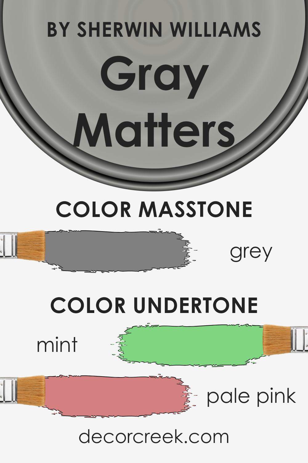
Gray Matters by Sherwin Williams is a captivating hue that, at first glance, presents itself as a straightforward mid-tone gray. However, its complexity is revealed through the subtle undertones it harbors — mint and pale pink. These undertones significantly influence the color’s perception and application, especially when used on interior walls.
The presence of a mint undertone infuses Gray Matters with a fresh, almost airy quality, bringing a sense of calm and renewal to spaces. This whisper of green can make the color appear cooler and more vibrant in well-lit areas, enhancing the feeling of spaciousness in a room.
On the other hand, the pale pink undertone adds a touch of warmth, ensuring that the color maintains a welcoming and comfortable vibe even in less illuminated spaces. This balance between cool and warm allows Gray Matters to adapt beautifully across various lighting conditions, showing a chameleon-like ability to shift moodily.
When applied to interior walls, these undertones play a crucial role in the color’s interaction with furnishings and decor. The mint undertone complements natural elements and materials, such as wood and plants, enhancing the connection to nature within the space.
Simultaneously, the pale pink undertone offers a soft contrast to modern, sleek furniture and metallic finishes, adding a layer of sophistication.
Overall, the undertones of Gray Matters make it a versatile choice for interior walls, capable of creating atmospheres that range from serene and inviting to dynamic and elegant, depending on the room’s lighting and decor. These subtleties enrich the color, making it more than just a simple shade of gray.
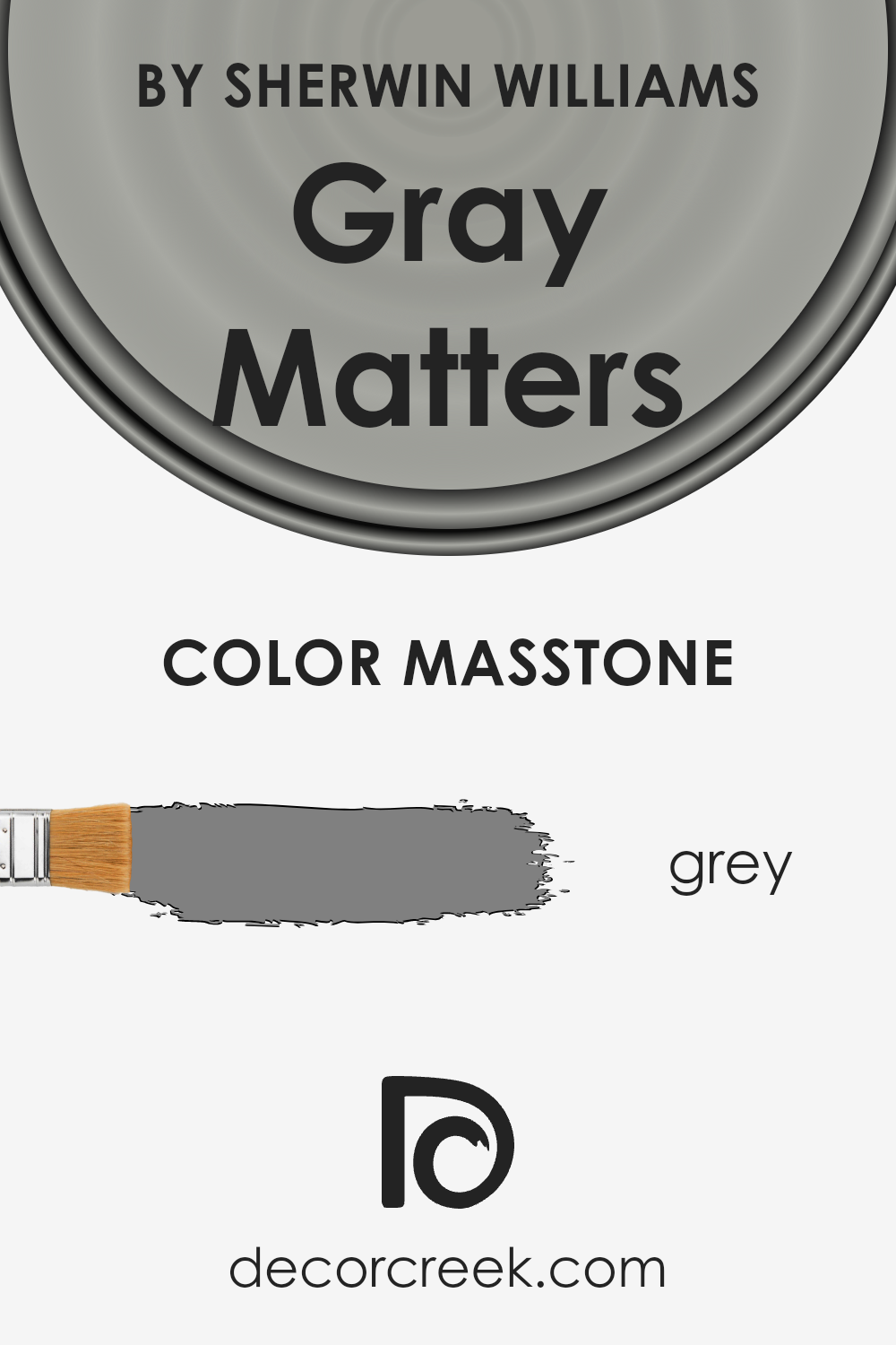
What is the Masstone of the Gray Matters SW 7066 by Sherwin Williams?
The masstone of Gray Matters, represented by the color Grey (#808080), serves as a foundational element that significantly influences its application within homes. This particular shade of grey embodies a balance of warmth and coolness, making it a versatile choice for various interior design schemes.
The neutrality of the grey masstone ensures that it can seamlessly blend with a multitude of other colors, from vibrant hues to other neutrals, allowing for a wide range of decorating styles, from minimalist and modern to cozy and traditional.
Its ability to reflect light varies depending on the lighting conditions, which means it can appear slightly different at various times of the day, adding a dynamic quality to the space.
This adaptability makes it an excellent choice for main living areas, bedrooms, or even home offices, where the backdrop of this comforting grey can enhance furnishings and art, creating a harmonious and welcoming atmosphere. The understated yet impactful nature of this grey enables it to create spaces that are both sophisticated and inviting.
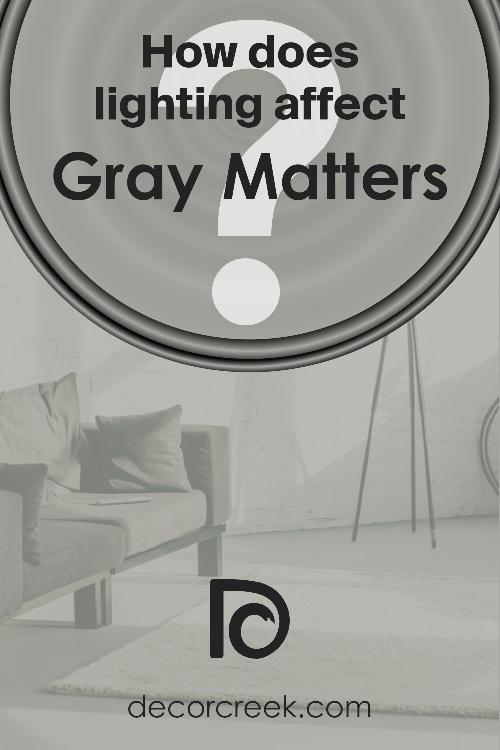
How Does Lighting Affect Gray Matters SW 7066 by Sherwin Williams?
Lighting plays a pivotal role in how colors are perceived, influencing both their intensity and hue. The interaction between light and color can transform a room’s atmosphere, making the selection of paint like the versatile Gray Matters critical in interior design. This nuanced shade can exhibit a spectrum of tones depending on the lighting conditions, thus understanding its behavior under various light sources is essential.
Under artificial light, the characteristics of Gray Matters shift significantly based on the type of bulb used. LED or fluorescent lighting can bring out cooler tones in the color, making it appear sharper and more modern. In contrast, incandescent lighting casts a warmer glow, softening the color to a more subdued, cozy gray.
This duality makes it a flexible choice for spaces that serve multiple purposes.
Natural light brings its own dynamic to Gray Matters, dramatically affecting its appearance throughout the day. In a north-facing room, light tends to be cooler and more consistent, which can make this color lean towards its cooler, bluer undertones, presenting a serene and tranquil vibe.
South-facing rooms, flooded with warmer, brighter light for most of the day, can make the color warmer and more inviting, enhancing the comfort of the space.
East-facing rooms receive bright morning light, which can make Gray Matters appear softer and slightly warmer in the mornings, transitioning to cooler tones as the day progresses.
Conversely, west-facing rooms will see the opposite effect; the color may start cooler in the morning and warm up towards the evening as the sun sets, offering a warmer, welcoming feel by dusk.
These transformations highlight the chameleonic nature of Gray Matters, making it a sophisticated choice for those who wish to achieve balance and elegance in their spaces. Its adaptability across different lighting conditions ensures it can complement various room orientations, harmonizing with the changing light to create a dynamic, yet consistently inviting environment.
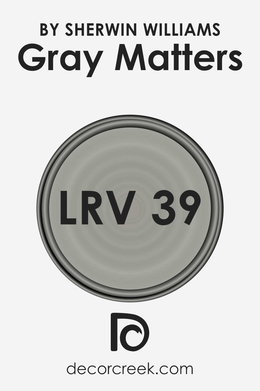
What is the LRV of Gray Matters SW 7066 by Sherwin Williams?
LRV, or Light Reflectance Value, is a scale that measures the percentage of light a paint color reflects back into a room from 0 (absolute black, absorbing all light) to 100 (pure white, reflecting all light). This measurement is crucial in design and color selection as it influences how light or dark a color appears under various lighting conditions.
Essentially, LRV affects the perceived brightness of a color, impacting the atmosphere and mood of a space. Colors with a higher LRV make a room feel more open and airy as they reflect more light, while those with a lower LRV can make a space feel more intimate and cozy by absorbing light.
In the case of the paint color with an LRV of 38.665, it falls into the medium range on the LRV scale. This suggests that it is a moderately light-reflective color, not too bright and not overly dark. Such a value indicates that while it will add a certain depth and sophistication to a room, it won’t darken the space significantly nor will it brighten it intensely.
Its ability to reflect a moderate amount of light can be particularly advantageous in spaces where a balance between coziness and luminosity is desired. The specific shade, being on the cooler side, may also influence how it reacts to natural and artificial lighting, potentially appearing somewhat different under various lighting conditions, emphasizing the importance of considering LRV in color selection to achieve the desired effect in a space.
LRV – what does it mean? Read This Before Finding Your Perfect Paint Color
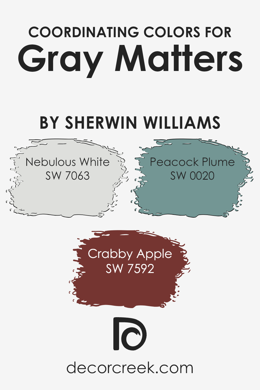
Coordinating Colors of Gray Matters SW 7066 by Sherwin Williams
Coordinating colors are those that complement each other well when used together in a space, creating a harmonious and balanced visual appeal. They can either contrast or blend with the primary color, enhancing the overall aesthetic of a room without overwhelming it.
For Gray Matters by Sherwin Williams, a sophisticated and versatile shade of gray, there are specific coordinating colors chosen to showcase its understated elegance while allowing for a variety of design motifs and moods. These coordinating colors have been thoughtfully selected to work seamlessly with Gray Matters, ensuring a cohesive look.
Nebulous White offers a soft and airy complement to the more grounded Gray Matters, providing a subtle contrast that brightens spaces with its light and almost ethereal quality. It’s perfect for creating a sense of openness and serenity.
Crabby Apple, on the other hand, brings warmth and a touch of earthiness to the palette, adding depth and richness with its red tones. This color can infuse a room with energy and vibrancy, making it an excellent choice for areas that benefit from a cozy atmosphere.
Peacock Plume rounds out the selection with its bold and lively character, a teal that bridges the gap between blue and green, injecting a splash of sophisticated color that’s both invigorating and calming. It serves as a vibrant contrast to Gray Matters, ensuring that the color scheme remains dynamic and engaging.
Together, these coordinating colors offer a range of possibilities, allowing for creative expression and the achievement of a desired mood or style when paired with Gray Matters.
You can see recommended paint colors below:
- SW 7063 Nebulous White
- SW 7592 Crabby Apple
- SW 0020 Peacock Plume
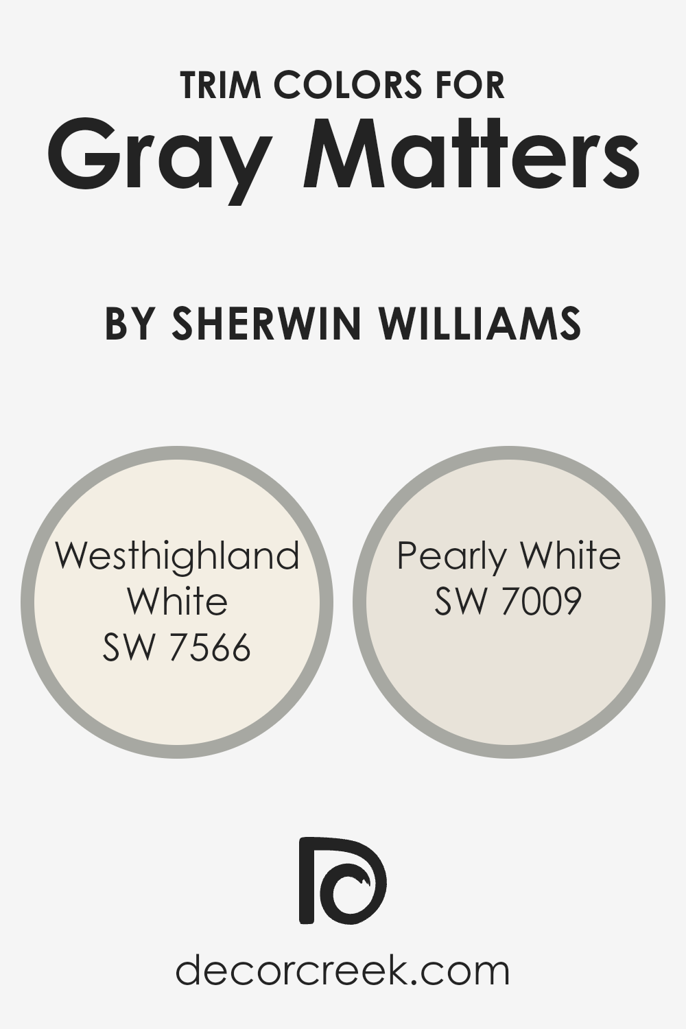
What are the Trim colors of Gray Matters SW 7066 by Sherwin Williams?
Trim colors play a crucial role in defining and accentuating the aesthetic appeal of a space, working in harmony with the wall colors to create a cohesive look. When paired with a sophisticated hue like Gray Matters by Sherwin Williams, selecting the right trim color becomes instrumental in elevating the overall design.
Trim colors, such as Westhighland White and Pearly White by Sherwin Williams, are specifically chosen for their ability to complement Gray Matters, providing a subtle contrast that highlights architectural details and frames the room’s features. These colors ensure that the gray walls stand out, adding depth and dimension to the space while maintaining a seamless flow throughout.
Westhighland White is a warm and inviting shade of white with a soft touch that brings a cozy brightness to the room, making it a perfect candidate for trim when looking to soften the impressive nature of Gray Matters. It adds a layer of calm and comfort without overpowering the primary color, ensuring a harmonious balance.
On the other hand, Pearly White has a serene and subtle elegance, offering a slightly cooler tone that enhances the modernity of Gray Matters. Its understated sophistication makes it an ideal choice for trim, contributing to a clean and refined aesthetic that complements contemporary and traditional designs alike.
Together, these trim colors enrich the ambiance, affording a polished look that elevates the aesthetic value of the space.
You can see recommended paint colors below:
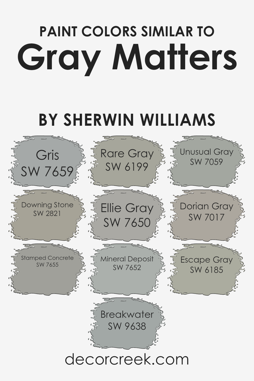
Colors Similar to Gray Matters SW 7066 by Sherwin Williams
In the world of interior design, the significance of selecting harmonious hues cannot be overstated, especially when working within the spectrum of grays. Similar colors to Gray Matters by Sherwin Williams, such as Gris, Downing Stone, and Stamped Concrete, play a pivotal role in creating a cohesive and serene ambiance.
These shades, while distinct, share a common foundation that allows them to interplay beautifully within a space, fostering a subtle yet dynamic visual experience. By incorporating these similar colors, designers can achieve a harmonious balance that enhances the aesthetic continuity of a room, ensuring that no single element feels out of place.
Gris offers a soft, understated elegance that mirrors the tranquility of a morning mist, providing a soothing backdrop for both contemporary and traditional settings. Downing Stone, with its earthy undertones, brings warmth and a sense of grounding to interiors, making it ideal for creating inviting spaces.
Stamped Concrete, on the other hand, lends a more industrial edge, reminiscent of urban loft living, yet remains versatile enough to complement a variety of decor styles. Each of these colors, along with others like Breakwater, Rare Gray, and Ellie Gray, contributes to a palette that allows for creative expression and individuality, while maintaining a cohesive and unified look.
This approach ensures that each color, though capable of standing alone, works in concert with others to embody an atmosphere of refined sophistication and harmony.
You can see recommended paint colors below:
- SW 7659 Gris
- SW 2821 Downing Stone
- SW 7655 Stamped Concrete
- SW 9638 Breakwater
- SW 6199 Rare Gray
- SW 7650 Ellie Gray
- SW 7652 Mineral Deposit
- SW 7059 Unusual Gray
- SW 7017 Dorian Gray
- SW 6185 Escape Gray
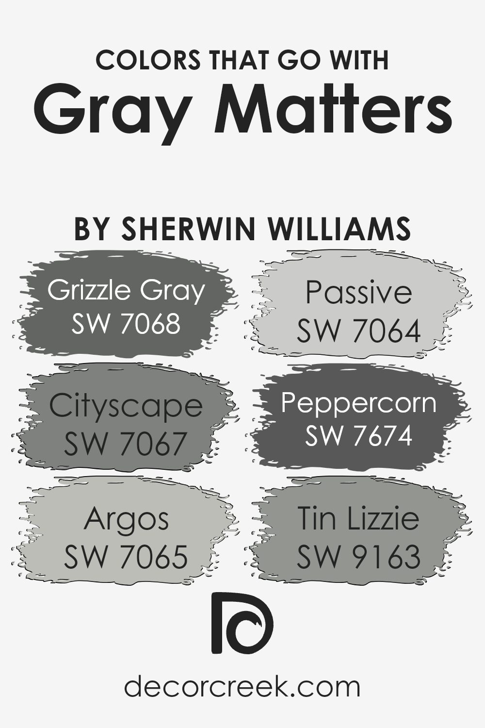
Colors that Go With Gray Matters SW 7066 by Sherwin Williams
Choosing the right colors to go with Gray Matters SW 7066 by Sherwin Williams is crucial because it can significantly impact the ambiance and style of any space. These complementary colors are key in creating a cohesive, visually appealing palette that enhances the gray’s versatility.
Gray Matters, a balanced and adaptable gray, sets a tranquil and sophisticated foundation, making it essential to select accompanying colors that reflect and elevate its inherent qualities.
Grizzle Gray SW 7068 presents a deeper, almost charcoal hue, offering a striking contrast that draws out the quiet strength of Gray Matters.
This pairing is ideal for creating depth and definition in a space. Cityscape SW 7067, with its urban-inspired tone, blends effortlessly with Gray Matters, promoting a seamless transition between colors for a subtle yet refined effect.
- Argos SW 7065 introduces a lighter, airier feel with its soft, silvery undertones, ensuring that spaces feel open and well-lit.
- Passive SW 7064, another gentle gray, works harmoniously alongside Gray Matters to cultivate a serene and inviting environment, perfect for rooms seeking a touch of calm.
- Peppercorn SW 7674, bold and almost black, adds drama and sophistication, offering a robust accent that can anchor and define a space when used judiciously.
- Lastly, Tin Lizzie SW 9163, with its unique blend of gray and blue, brings a cool, refreshing nuance, making it an excellent choice for adding a layer of complexity and intrigue to the palette.
Together, these colors complement Gray Matters in a way that can accommodate a range of styles, from the sleek and modern to the cozy and traditional, demonstrating the importance of a well-considered palette.
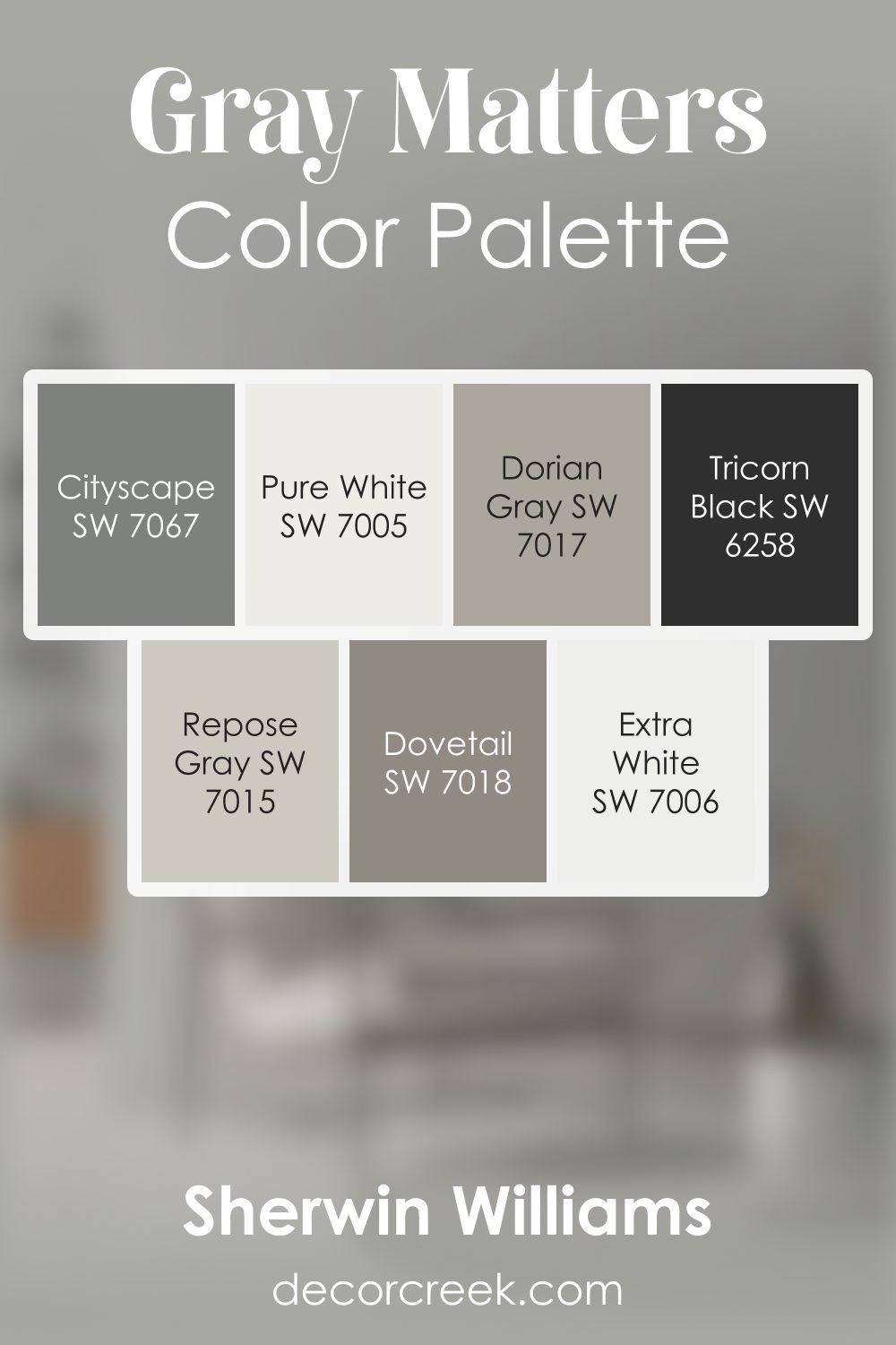
Gray Matters SW 7066 by Sherwin Williams Color Palette
Gray Matters brings a quiet modern confidence, and this palette is designed to help the shade feel complete and visually rich. Extra White and Pure White brighten its cool body, adding a gentle lift that feels clean and refreshing.
Repose Gray and Dorian Gray bridge the palette with soft transitions, giving the entire combination a smooth rhythm that feels easy to live with. Dovetail and Cityscape add grounding warmth and dimension, helping Gray Matters feel fuller and more expressive without adding heaviness.
Tricorn Black creates a bold finishing note, adding structure and clarity that keep the palette balanced. Together, these colors create a calm, steady, and welcoming harmony—perfect for interiors that aim for a gentle modern mood with a hint of depth and thoughtful contrast.
How to Use Gray Matters SW 7066 by Sherwin Williams In Your Home?
Gray Matters by Sherwin Williams is a versatile and sophisticated paint color that offers a modern and fresh look for any home interior. Its subtle, cool undertones make it an excellent choice for creating a serene and refined atmosphere. This nuanced shade balances perfectly between light and dark, making it ideal for various applications across your living spaces.
You can use it in bedrooms to foster a calm and restful environment, or apply it in living areas and kitchens to achieve a chic, contemporary vibe. Its adaptability also allows for creative pairings with both bold and muted color palettes, making it perfect for accent walls, cabinets, or even ceilings.
The elegance of Gray Matters complements wood finishes, metallic accents, and a broad spectrum of fabric hues, enabling it to harmonize with different interior styles from minimalist to eclectic. Incorporating this color can effortlessly refresh your home, adding a touch of sophistication and timeless appeal.
Gray Matters SW 7066 by Sherwin Williams vs Downing Stone SW 2821 by Sherwin Williams
Gray Matters and Downing Stone, both from Sherwin Williams, embody subtlety and sophistication in their own unique ways. Gray Matters presents itself as a mid-tone gray, carrying a balanced blend of cool and warm undertones. This quality allows it to adapt seamlessly within a variety of spaces and lighting conditions, making it a versatile choice for modern and transitional interiors.
On the other hand, Downing Stone veers into a slightly warmer territory, with a deeper, taupe-infused hue. This color exudes an earthy warmth, inviting a sense of calm and grounding into spaces.
When juxtaposed, Gray Matters offers a cooler, neutral backdrop that can make spaces appear more expansive, while Downing Stone brings in depth and coziness, perfect for creating intimate, serene environments.
Both colors offer elegance and flexibility, yet their distinct undertones and depth lead them to serve different moods and aesthetic purposes within interior spaces.
You can see recommended paint color below:
- SW 2821 Downing Stone
Gray Matters SW 7066 by Sherwin Williams vs Gris SW 7659 by Sherwin Williams
Gray Matters and Gris, both from Sherwin Williams, are nuanced shades that offer distinct vibes for any space. Gray Matters is a balanced, mid-tone gray that leans slightly cooler, providing a serene and sophisticated backdrop.
It’s versatile, fitting seamlessly into both modern and traditional decor. Its ability to act as a neutral backdrop or a statement color depending on the context adds to its charm.
On the other hand, Gris is a softer, warmer gray that bridges the gap between gray and taupe. Its warmth makes it inviting, perfect for creating cozy, intimate spaces. It pairs beautifully with a wide range of colors, from soft pastels to rich, dark hues, making it exceptionally versatile in home decor.
While both colors share a gray base, Gray Matters presents a cooler, more neutral canvas, whereas Gris offers warmth and a touch of earthiness. The choice between them hinges on the desired atmosphere: cool and collected with Gray Matters or warm and inviting with Gris.
You can see recommended paint color below:
Gray Matters SW 7066 by Sherwin Williams vs Ellie Gray SW 7650 by Sherwin Williams
Gray Matters and Ellie Gray are two distinctive shades offered by Sherwin Williams, each presenting a unique ambiance for interiors. Gray Matters is a balanced, mid-tone gray that exudes a subtle coolness, making it a versatile choice for a variety of spaces. Its neutrality supports a wide range of decorating styles, from modern to traditional.
On the other hand, Ellie Gray stands out with a deeper, more pronounced gray tone that offers a hint of warmth in comparison to Gray Matters. This warmth introduces a cozy, inviting atmosphere, making it ideal for living areas or bedrooms seeking a serene backdrop.
Though both colors share a gray base, Ellie Gray’s richer hue provides a stronger presence on walls, potentially making rooms feel more enclosed yet sophisticated. In contrast, Gray Matters’ lighter touch adds spaciousness and a crisp, clean look, enhancing natural light in a room.
Choosing between them depends on the desired aesthetic effect: airy and open with Gray Matters, or cozy and grounded with Ellie Gray.
You can see recommended paint color below:
- SW 7650 Ellie Gray
Gray Matters SW 7066 by Sherwin Williams vs Escape Gray SW 6185 by Sherwin Williams
Gray Matters and Escape Gray, both from Sherwin Williams, offer subtly distinct tones that cater to different aesthetic preferences and design needs. Gray Matters presents as a mid-tone gray with cool undertones, making it a versatile choice for contemporary spaces.
Its neutral base allows it to blend seamlessly with a variety of decor styles, from modern to traditional, providing a calming yet sophisticated backdrop. On the other hand, Escape Gray leans towards a softer, warmer hue.
This color exudes a more natural, earthy vibe, making it ideal for creating cozy, inviting spaces. Its warmth brings a gentle, relaxing ambiance to any room, perfect for areas where comfort and tranquility are desired.
While both colors maintain the simplicity and flexibility associated with grays, Gray Matters offers a cooler, crisper feel, whereas Escape Gray brings warmth and a sense of natural elegance to interiors.
You can see recommended paint color below:
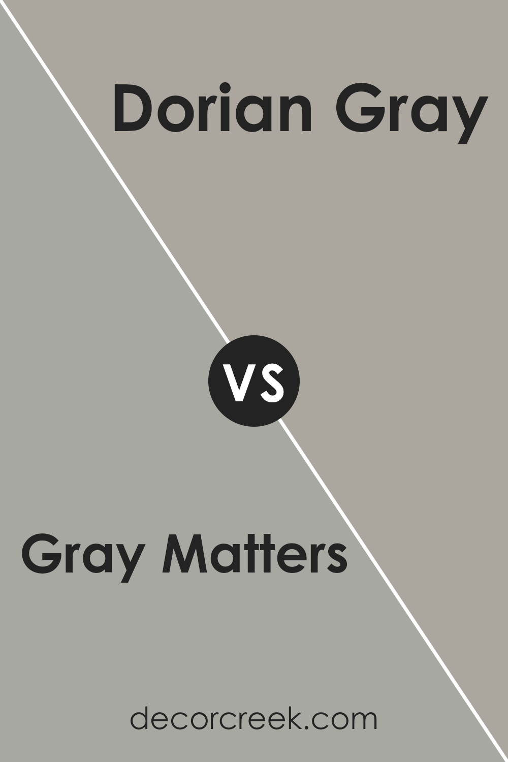
Gray Matters SW 7066 by Sherwin Williams vs Dorian Gray SW 7017 by Sherwin Williams
Gray Matters and Dorian Gray, both from Sherwin Williams, offer subtle yet distinct differences in their appeal. Gray Matters presents a slightly cooler tone, embodying a serene and understated elegance. Its lighter hue exudes a sense of calmness, making it an ideal choice for spaces aiming to achieve a peaceful and airy atmosphere.
On the other hand, Dorian Gray settles on a warmer spectrum. This color has a deeper, richer tone that provides a sense of sophistication and depth to spaces. Its warmth makes it exceptionally inviting, perfect for creating a cozy and comfortable ambiance in any room.
While both colors maintain a versatile nature, adaptable to various decor styles, Gray Matters leans towards a more modern and minimalistic aesthetic, whereas Dorian Gray favors traditional settings, offering a hint of classic charm.
Each color, with its unique character, can dramatically influence the mood and style of a space, highlighting the importance of choosing the right gray for your interior design goals.
You can see recommended paint color below:
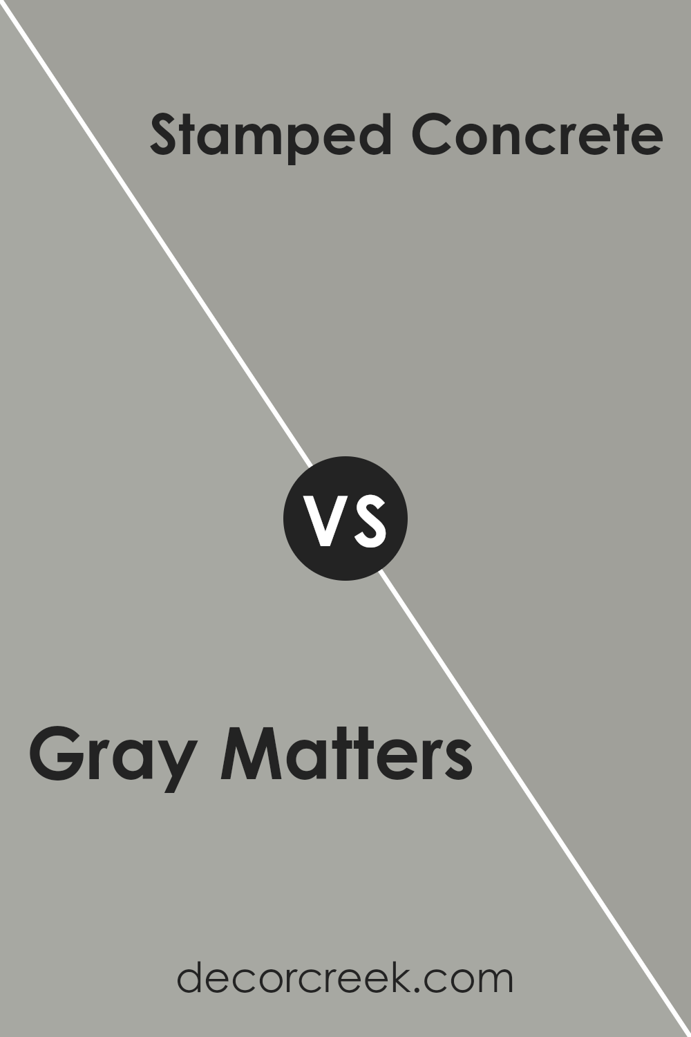
Gray Matters SW 7066 by Sherwin Williams vs Stamped Concrete SW 7655 by Sherwin Williams
Gray Matters and Stamped Concrete, both by Sherwin Williams, offer subtle yet distinct vibes for interior spaces. Gray Matters presents a mid-tone gray with a cool undertone that brings a sense of calm and sophistication.
It’s versatile, fitting in seamlessly in modern and traditional settings alike. This color can illuminate a room while still providing a cozy, understated elegance.
On the other hand, Stamped Concrete delivers a deeper, warmer gray that echoes the hue of its namesake. This color provides a strong foundation for any room, suggesting stability and strength. It’s particularly well-suited for creating a focal point or anchoring a space with its more pronounced presence.
While both colors share a gray base, Gray Matters leans towards a lighter, airier feel conducive to softening spaces and broadening smaller rooms. Stamped Concrete, with its richer tone, offers depth and warmth, making it ideal for adding character and grounding larger areas.
Deciding between them hinges on the desired atmospheric effect and the room’s function, with each guaranteeing a stylish, contemporary backdrop.
You can see recommended paint color below:
- SW 7655 Stamped Concrete
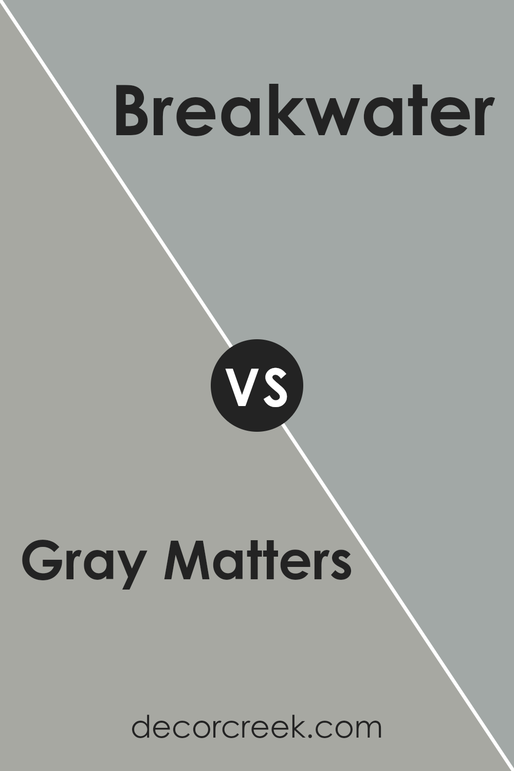
Gray Matters SW 7066 by Sherwin Williams vs Breakwater SW 9638 by Sherwin Williams
Gray Matters is a versatile, mid-tone gray with a cool undertone, offering a balanced, neutral backdrop for a wide range of settings. Its ability to marry with various decor styles makes it a popular choice for those seeking a sophisticated, yet unfussy, color scheme.
On the other hand, Breakwater presents a softer approach, with a lighter and airier feel that evokes a sense of tranquility akin to a serene coastal landscape. Breakwater leans towards a cooler palette, reminiscent of the clear sky on a crisp morning, making it ideal for creating a breezy and refreshing ambiance.
While both colors share a cool undertone, Gray Matters stands out as the more assertive and grounded option, providing depth and stability to spaces. In contrast, Breakwater offers a lighter touch, illuminating rooms with its gentle, calming presence.
Together, they represent the diverse spectrum of cool tones, each bringing its unique character to the table – Gray Matters anchoring spaces with its solid demeanor, and Breakwater lifting them with its airy lightness.
You can see recommended paint color below:
- SW 9638 Breakwater
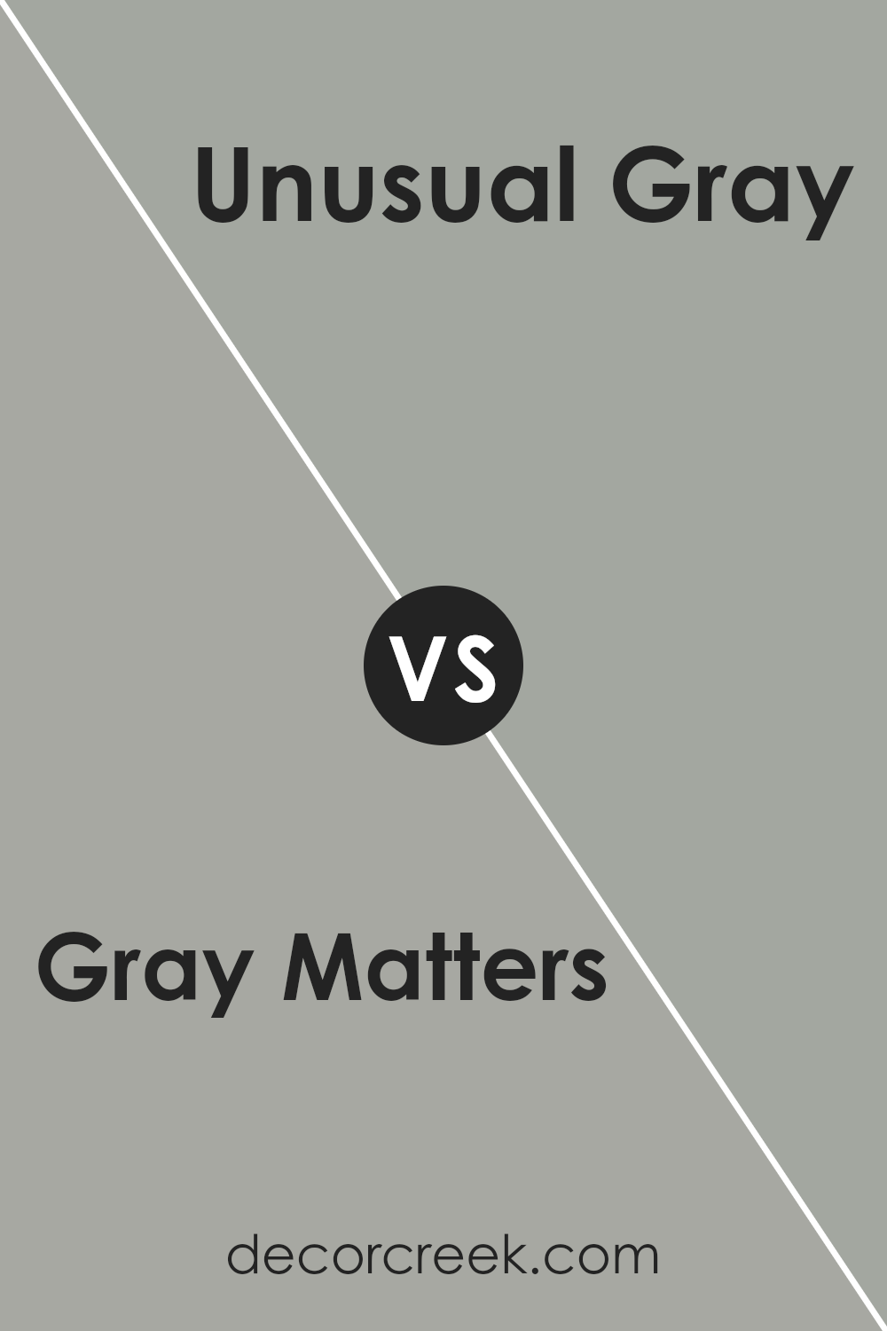
Gray Matters SW 7066 by Sherwin Williams vs Unusual Gray SW 7059 by Sherwin Williams
Gray Matters and Unusual Gray are two intriguing hues from Sherwin Williams that offer unique takes on the versatile and sophisticated gray palette. Gray Matters presents as a mid-tone gray with a cool undertone, making it a versatile choice that can lend a serene and refined atmosphere to a space.
It has a certain depth that anchors a room, providing a strong foundation for both bold and muted accents. On the other hand, Unusual Gray brings a softer approach with green undertones, adding a subtle layer of complexity and warmth.
This hue softly bridges the gap between neutral warmth and cool sophistication, making it ideal for spaces where a hint of color and uniqueness is desired without overwhelming the senses.
Both colors maintain the classic elegance of gray while offering distinct vibes – Gray Matters skews towards a cooler, more neutral base, whereas Unusual Gray introduces a gentle hint of color that can enliven a space with its understated charm.
You can see recommended paint color below:
- SW 7059 Unusual Gray
Gray Matters SW 7066 by Sherwin Williams vs Mineral Deposit SW 7652 by Sherwin Williams
Gray Matters and Mineral Deposit, both from Sherwin Williams, serve as exquisite examples of how nuanced differences in hue and brightness can distinctly affect the ambiance of a space. Gray Matters presents itself as a deep, rich gray that brings an air of sophistication and gravity to interiors.
It’s the kind of color that commands attention while also providing a serene backdrop, making it versatile for both modern and traditional settings. On the other hand, Mineral Deposit offers a lighter, airier feel with its cooler, almost silvery-gray tones.
This color tends to illuminate spaces, reflecting more light and creating a sense of openness and tranquility. It’s an excellent choice for areas where a calm, refreshing vibe is desired. Despite their shared gray base, Gray Matters brings depth and drama, while Mineral Deposit leans towards a lighter, more serene palette, showcasing the diverse spectrum and effects achievable with gray.
You can see recommended paint color below:
- SW 7652 Mineral Deposit
Gray Matters SW 7066 by Sherwin Williams vs Rare Gray SW 6199 by Sherwin Williams
Gray Matters and Rare Gray, both from Sherwin Williams, are sophisticated hues, each offering a unique ambiance. Gray Matters presents a medium shade that leans towards a cool, neutral gray, providing a tranquil and versatile backdrop suitable for a variety of spaces.
Its cool undertone makes it ideal for achieving a serene, contemporary look, as it pairs beautifully with a wide range of colors, from bright whites to deep blacks.
Rare Gray, on the other hand, introduces a warmer, more complex undertone to the palette. This color strikes a balance between gray and green, giving it a distinctive character that can add depth and warmth to interiors.
It works exceptionally well in spaces that seek a hint of earthiness while maintaining a polished, modern edge.
While both colors share the foundational gray, their divergent undertones—cool for Gray Matters and warm, with a hint of green for Rare Gray—provide distinct atmospheric effects, making each suitable for creating different moods and styles within interior spaces.
You can see recommended paint color below:
- SW 6199 Rare Gray
Conclusion
Gray Matters by Sherwin Williams stands as a versatile and sophisticated color choice for homeowners and designers alike. Its muted yet compelling shade acts as a perfect backdrop, offering a subtle elegance that can enhance the aesthetic appeal of any space.
his particular gray hue manages to strike a unique balance, making it adaptable to a variety of decor styles – from modern minimalism to cozy traditional. Its ability to complement a wide range of colors adds to its appeal, allowing for creative freedom in design schemes.
Moreover, Gray Matters has proven its worth beyond just visual appeal by contributing to the ambience of a space. Its calming properties provide a tranquil environment, perfect for rooms meant for relaxation or focused workspaces.
As a color rooted in balance and versatility, it has received praise for its capacity to elevate interiors without overwhelming them. Its popularity among both professionals and DIY enthusiasts is a testament to its timeless charm and functionality within the diverse world of interior design.
Ever wished paint sampling was as easy as sticking a sticker? Guess what? Now it is! Discover Samplize's unique Peel & Stick samples.
Get paint samples