Dive into the captivating world of colors with Sherwin Williams’ stunning shade, SW 7073 Network Gray. This versatile and modern hue stands out as a quintessential example of elegance and subtlety in design.
Perfectly balancing a cool undertone with the sophistication of gray, Network Gray serves as a canvas for creativity in any space.
Its adaptability makes it an ideal choice for various applications, whether you’re aiming to achieve a serene office atmosphere, a calming bedroom, or a welcoming living area.
Network Gray’s charm lies in its ability to blend seamlessly with different decor styles and color palettes. From minimalistic and contemporary settings to more traditional and cozy environments, it elevates the aesthetic appeal without overwhelming the senses.
This color encourages light to dance across the room, enhancing the perception of space and offering a sense of tranquility that is hard to find in more saturated colors.
For those seeking to create a statement or simply wanting a backdrop that complements an array of textures and finishes, SW 7073 Network Gray by Sherwin Williams is a compelling selection. Its popularity among interior designers and homeowners alike is a testament to its timeless nature and its ability to transform any space into a chic, stylish, and cohesive area.
As we delve deeper into the characteristics that make Network Gray a distinguished choice, it becomes clear why it continues to capture the hearts of many.

What Color Is Network Gray SW 7073 by Sherwin Williams?
Network Gray by Sherwin Williams is a unique and versatile shade that strikes a harmonious balance between cool and warm tones, making it a perfect candidate for a wide range of interior design styles.
This color has a muted elegance that allows it to serve as a sophisticated backdrop to spaces aiming for a modern, contemporary, or even minimalist aesthetic. Its depth adds character to walls without overwhelming the senses, making it an ideal choice for creating a serene and inviting atmosphere.
When considering interior styles, Network Gray shines in settings that emphasize clean lines and simplicity. It works exceptionally well in Scandinavian-inspired spaces, where the emphasis on light and natural elements can be complemented by this color’s subtle warmth.
Additionally, in industrial and urban loft designs, Network Gray pairs beautifully with exposed brick, metal accents, and raw wood textures, enhancing the edgy yet cozy feel typical of these spaces.
For materials and textures, Network Gray complements a wide array, enhancing the visual interest of the room. It pairs perfectly with natural wood, from light oak to rich walnut, bringing out the depth and beauty of the wood grain.
Leather, both in light and dark shades, alongside this color, creates a luxurious and timeless look. Metallic finishes, like brushed nickel or matte black, stand out against Network Gray, offering a modern twist to the space. Lastly, woven fabrics and plush textiles in neutral or muted tones can add layers of comfort and warmth, making any room feel more welcoming.
Ever wished paint sampling was as easy as sticking a sticker? Guess what? Now it is! Discover Samplize's unique Peel & Stick samples.
Get paint samples

Is Network Gray SW 7073 by Sherwin Williams Warm or Cool color?
Network Gray by Sherwin Williams is a sophisticated hue that perfectly treads the line between modern elegance and timeless charm. Its versatility lies in its complexity; at first glance, it appears as a cool, neutral gray, but upon closer inspection, one may notice subtle undertones that add depth and warmth, making it a surprisingly adaptable choice for home interiors.
This shade harmoniously blends with various decor styles, from minimalist and contemporary to rustic and traditional, ensuring it complements rather than competes with existing furnishings and color schemes.
Its neutrality is its strength, serving as a serene backdrop that can either calm a brightly lit room or add a sense of coziness to a dimly lit space. As natural light shifts throughout the day, Network Gray morphs in hue, revealing new dimensions and enriching the ambiance of the home.
Whether used for accent walls, enveloping all walls of a room, or as a base for contrast with bold statement pieces, this color proves both grounding and uplifting. Its subtle elegance encourages creativity in decor without overwhelming the senses, making it a favorite for homeowners aiming to achieve a balanced, inviting, and stylish environment.
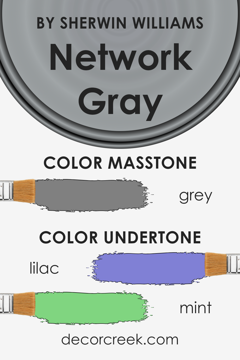
Undertones of Network Gray SW 7073 by Sherwin Williams
Network Gray is a captivating color with a versatility that stems from its complex undertones. Among these undertones, Lilac and Mint play pivotal roles in shaping its unique appeal, blending to create a nuanced shade that transcends the simplicity of gray.
Lilac, with its soft, almost ethereal quality, infuses Network Gray with a subtle hint of warmth and sophistication. This gentle purple hue brings an air of refinement and depth, allowing the color to adapt and shift under different lighting conditions.
The Lilac undertone means that in spaces with abundant natural light, the walls can exude a soft warmth, making rooms feel welcoming and serene.
Mint undertones introduce a fresh, vibrant twist to the color. This cooler, greenish aspect adds a breath of freshness, creating a balanced composition that is both grounding and uplifting. In dimly lit rooms, the Mint undertone can help to invigorate the space, making it feel more spacious and alive.
It’s this hint of freshness that makes Network Gray particularly effective for interior walls, offering a dynamic backdrop that complements a wide range of decor styles.
Together, these undertones affect the way we perceive Network Gray, making it more than a simple gray. They allow the color to interact with both the lighting and furnishings in a room, enabling it to exhibit a chameleon-like quality.
As the natural light changes throughout the day, so too does the mood of the room, thanks to these subtle undertones. This adaptability makes Network Gray an exceptional choice for those seeking a sophisticated yet flexible color for their interior walls, capable of bringing warmth, depth, and vitality into any space.
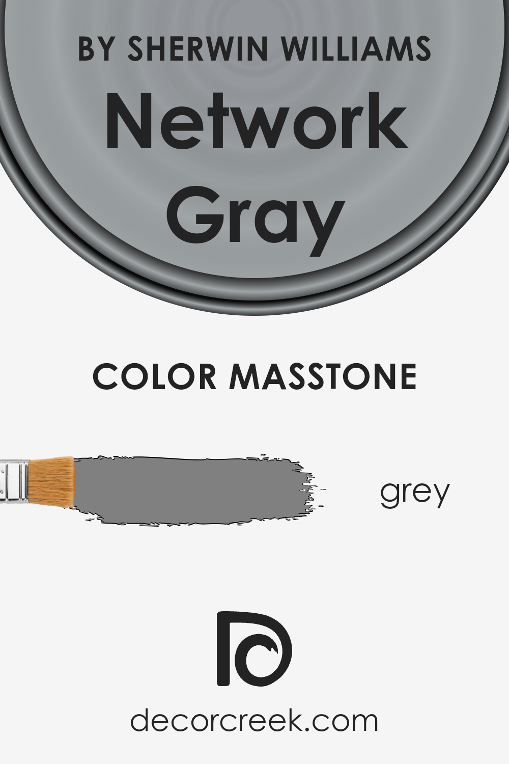
What is the Masstone of the Network Gray SW 7073 by Sherwin Williams?
Network Gray SW 7073 by Sherwin Williams, with its masstone mirroring the mid-tone shade of grey (#808080), offers a versatile and balanced palette for home interiors. This specific shade of gray stands as a perfect intermediary between black and white, providing a neutral base that can either warm up or cool down a space depending on the lighting and surrounding colors.
Its inherent neutrality means it can effortlessly adapt to various décor styles, from modern minimalism to cozy rustic. This particular gray doesn’t overpower, making it ideal for rooms of any size, as it can make small spaces feel more expansive and large rooms feel more intimate and gathered.
Furthermore, its adaptability extends to color pairings; it can serve as a calming backdrop to vibrant accents or harmonize with other neutrals for a sophisticated, monochromatic scheme. Network Gray’s balanced masstone ensures it can create a serene and inviting atmosphere, enhancing the sense of home.
How Does Lighting Affect Network Gray SW 7073 by Sherwin Williams?
Lighting plays a pivotal role in the perception of colors, significantly affecting their appearance and the atmosphere they create within a space. The quality, direction, and intensity of light can alter how we perceive color, making it a critical aspect to consider in interior design or when choosing paint colors.
A notable example to explore these effects is by looking at a specific color, such as a sophisticated gray tone.
In artificial light, colors can appear warmer or cooler depending on the type of bulb used. Incandescent lighting brings out warmer tones, making a gray color appear more inviting and less stark. LED or fluorescent lighting, which can be cooler, may highlight the cooler undertones in the gray, giving it a more austere or crisp appearance.
The impact of artificial lighting becomes especially pronounced during evenings or in spaces without natural sunlight, emphasizing the importance of testing colors under the specific lighting conditions where they will be used.
Natural light, with its changing intensity and angle throughout the day, also dramatically influences how colors are viewed. In north-facing rooms, which receive less direct sunlight, colors can appear cooler and more subdued. A sophisticated gray might seem more profound and richer in such light, enhancing a room’s cozy feel.
South-facing rooms, basked in warm, bright sunlight for most of the day, can make the same gray feel lighter and airier, potentially highlighting any underlying warm tones.
East and west-facing rooms experience the changing light more acutely, with mornings (east) and afternoons (west) bringing in intense sunlight that can make colors look drastically different.
In the morning, a crisp, even light can make the gray appear fresh and vibrant. In contrast, the late afternoon light in a west-facing room might cast a warm glow, softening the color.
Understanding the interaction between light and color is essential for making informed decisions about paint choices. It’s not just about the color itself but about the quality of the light it’s exposed in, making experimentation in different lighting conditions a key step in the selection process.

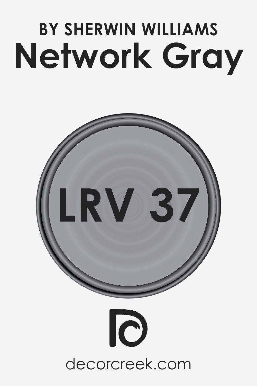
What is the LRV of Network Gray SW 7073 by Sherwin Williams?
Light Reflectance Value (LRV) measures the percentage of light a paint color reflects back into a room, on a scale from 0% (absolute black, absorbing all light) to 100% (pure white, reflecting all light). LRV plays a crucial role in how colors appear once applied to walls, impacting the atmosphere and spatial perception of a room.
A high LRV means the color reflects more light, making spaces appear larger and more open, while a low LRV means the color absorbs more light, creating a cozier, more intimate feel. The choice of LRV can significantly affect visual comfort, energy consumption (as it can influence the amount of artificial lighting needed), and even the mood of a space.
For a color with an LRV of 37.267, like the mentioned shade, it sits in the middle of the scale, which means it’s neither too light nor too dark. This particular value suggests that it has a moderate ability to reflect light, making it a versatile option for a variety of spaces.
In rooms with ample natural light, this LRV will help the color maintain its true hue without being overwhelmingly bright, preserving a sense of warmth and depth. In contrast, in spaces with limited light sources, it might appear darker, emphasizing its depth and adding to the ambiance of the space.
Therefore, understanding the LRV of this specific color is key to predicting how it will transform and define the character of a room, impacting both its aesthetic and functional qualities.
LRV – what does it mean? Read This Before Finding Your Perfect Paint Color
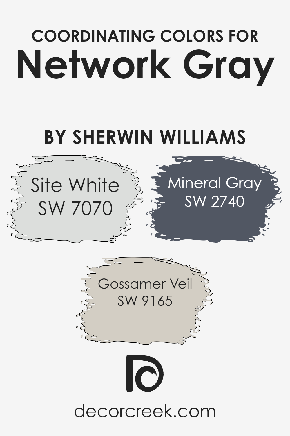
Coordinating Colors of Network Gray SW 7073 by Sherwin Williams
Coordinating colors play an essential role in design by creating visually harmonious spaces. They are colors that complement each other and work well together, enhancing the overall aesthetic of a room. The art of coordinating colors involves using a color palette that pairs well with a base color, in this case, Network Gray by Sherwin Williams.
The chosen coordinating colors for Network Gray not only complement it but also help in creating a cohesive look that can elevate the design of any space. These colors have been carefully selected to ensure that they enhance the sophisticated and versatile tone of Network Gray, making it suitable for a variety of design styles and preferences.
The first coordinating color, Site White, offers a clean and crisp backdrop that allows Network Gray to stand out. Its understated elegance provides a calm and inviting atmosphere, making it an excellent choice for creating a serene and balanced space.
Gossamer Veil, another coordinating color, is a soft and airy hue that brings a subtle warmth to the palette, offering a gentle contrast to the more pronounced shade of Network Gray. It works wonderfully to soften the overall look and add a touch of coziness.
Lastly, Mineral Gray adds depth and dimension to the combination, its earthy undertones complementing Network Gray’s cooler hue. This color enriches the palette, providing a grounded contrast that enhances the sophistication and complexity of the design.
Together, these coordinating colors create a harmonious and appealing color scheme that amplifies the beauty of Network Gray, making it an ideal choice for those looking to achieve a refined and well-balanced aesthetic in their space.
You can see recommended paint colors below:
- SW 7070 Site White
- SW 9165 Gossamer Veil
- SW 2740 Mineral Gray
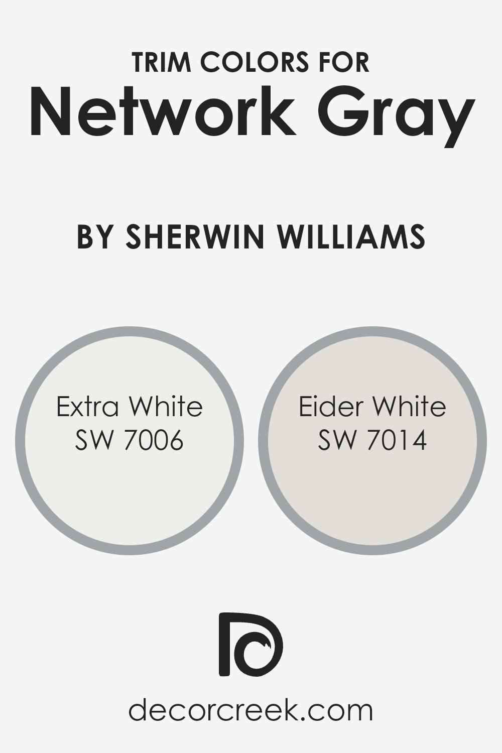
What are the Trim colors of Network Gray SW 7073 by Sherwin Williams?
Trim colors, often selected for their complimentary or contrasting qualities to a primary wall color, play an essential role in defining the character and feel of a space. When paired with a sophisticated shade such as Network Gray by Sherwin Williams, the right trim color can accentuate architectural details, create depth, and enhance the overall aesthetic of a room.
The choice of trim color can significantly impact the perception of the main color, highlighting its undertones and contributing to a cohesive design scheme.
Extra White (SW 7006) is a crisp, clean white that acts as a fresh counterpart to the cool, understated elegance of Network Gray, bringing a vivid sharpness to edges and corners that can make the walls appear more pronounced.
Eider White (SW 7014), on the other hand, offers a softer approach with its warm, grayish undertones, blending seamlessly with Network Gray to provide a smooth, sophisticated transition between wall and trim.
Both colors, by their design, enhance the versatility of Network Gray, making it suitable for various lighting conditions and spaces, from minimalistic modern to cozy traditional settings.
You can see recommended paint colors below:
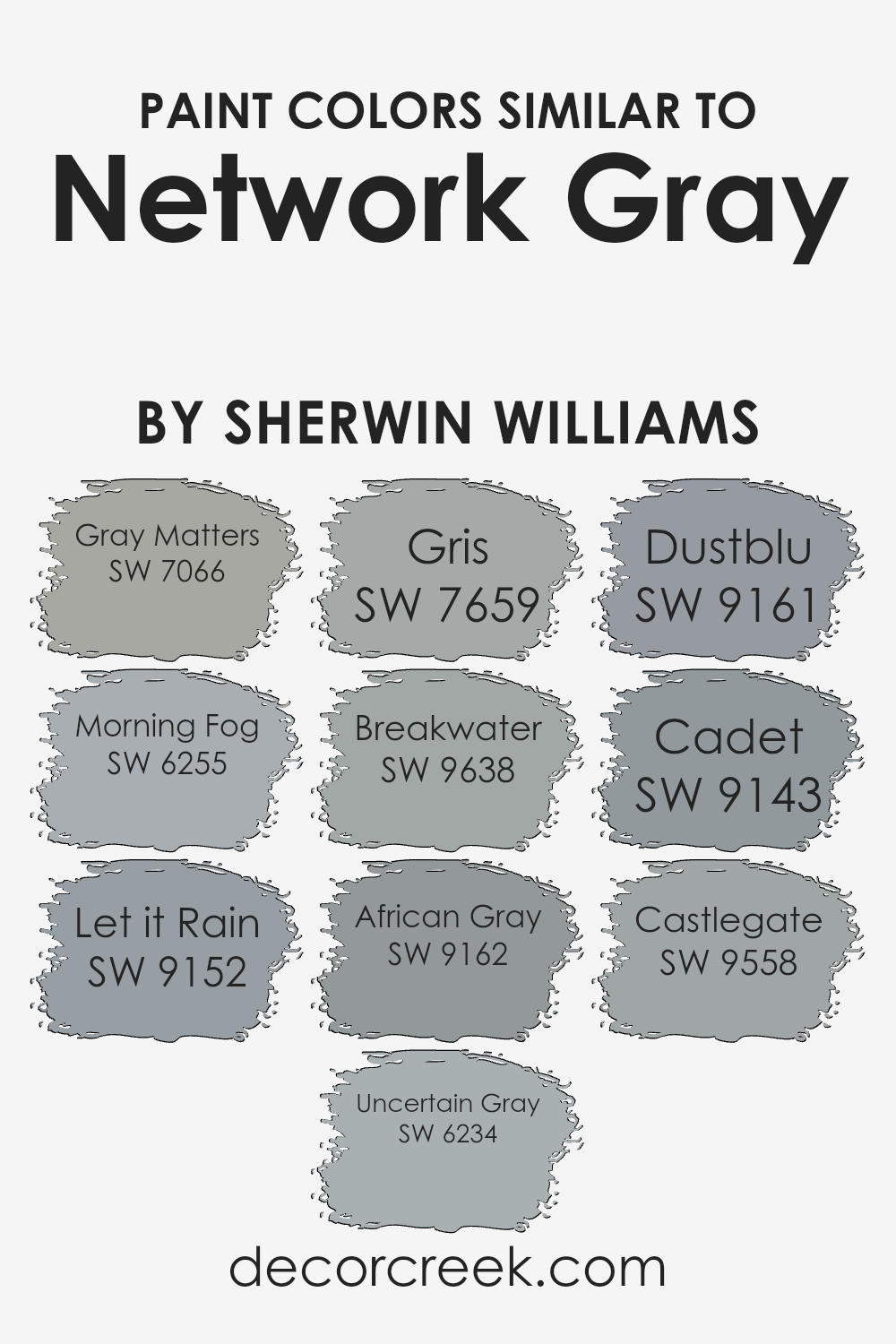
Colors Similar to Network Gray SW 7073 by Sherwin Williams
Similar colors play an integral role in design, offering subtlety and coherence that can elevate the aesthetic of any space. Colors similar to Network Gray by Sherwin Williams, such as Gray Matters and Morning Fog, possess a cool neutrality, making them versatile for various applications.
These shades ensure a serene and consistent theme, acting as a perfect backdrop for bold accents or as standalone sophistication. Let it Rain and Uncertain Gray further emphasize the importance of these close relatives in the palette, providing slight variations that can highlight different architectural features or moods within a room.
The beauty of these colors lies in their ability to work harmoniously together or with other hues, creating depth and interest.
Moreover, colors like Gris and Breakwater add layers to a design theme by introducing a range of nuances from the same color family, ensuring a cohesive but dynamic visual experience. African Gray and Dustblu offer subtle hints of warmth or coolness, allowing for flexible design narratives that can adapt to changing tastes or functionalities of a space.
Similarly, Cadet and Castlegate beautifully encapsulate the essence of similar colors, acting as bridges within the design, seamlessly connecting various elements. Each of these colors, while unique, shares a common foundation with Network Gray, making them indispensable in achieving a polished and unified look.
You can see recommended paint colors below:
- SW 7066 Gray Matters
- SW 6255 Morning Fog
- SW 9152 Let it Rain
- SW 6234 Uncertain Gray
- SW 7659 Gris
- SW 9638 Breakwater
- SW 9162 African Gray
- SW 9161 Dustblu
- SW 9143 Cadet
- SW 9558 Castlegate
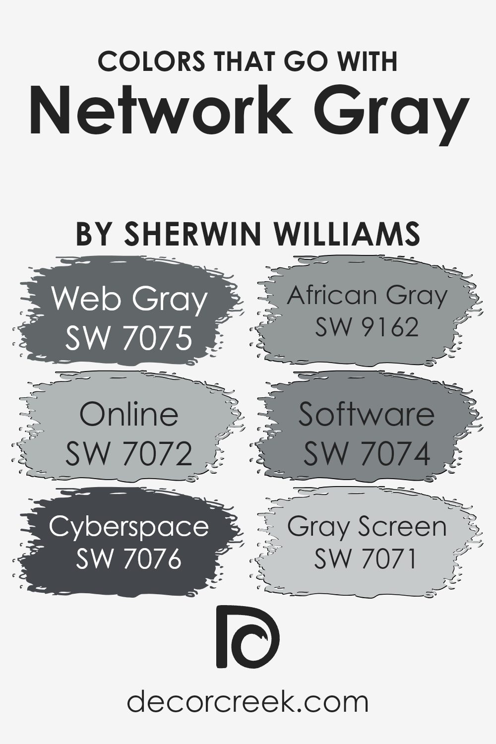
Colors that Go With Network Gray SW 7073 by Sherwin Williams
Selecting the right colors to complement Network Gray SW 7073 by Sherwin Williams is essential for creating harmonious and visually appealing spaces. These companion colors are not just randomly chosen; they are meticulously selected to enhance the beauty and vibe of Network Gray, ensuring that the space feels cohesive and thoughtfully designed. When these colors are paired with Network Gray, they work together to create a seamless flow from one area to another, adding depth and character to the overall design.
- Web Gray SW 7075 offers a deeper, more intense contrast to Network Gray, providing a solid grounding effect in any space. It’s like the shadow to Network Gray’s light, adding a subtle sophistication.
- Online SW 7072 is slightly lighter, bringing a breezy and open feel to rooms, making spaces feel more expansive and airy.
- Cyberspace SW 7076 takes it up a notch with its darker tone, offering a bold statement that remains in harmony with Network Gray’s understated elegance.
- African Gray SW 9162 adds a touch of warmth, its earthy tones inviting a natural, comforting vibe into the mix.
- Software SW 7074, with its soft, muted quality, bridges the gap between the cooler and warmer tones, ensuring a balanced palette.
- Lastly, Gray Screen SW 7071 introduces a light, almost ethereal quality to the space, offering a fresh and uplifting counterpoint to Network Gray.
Together, these shades create a versatile and nuanced palette that can adapt to various design preferences, making any space feel cohesive, balanced, and beautifully blended.
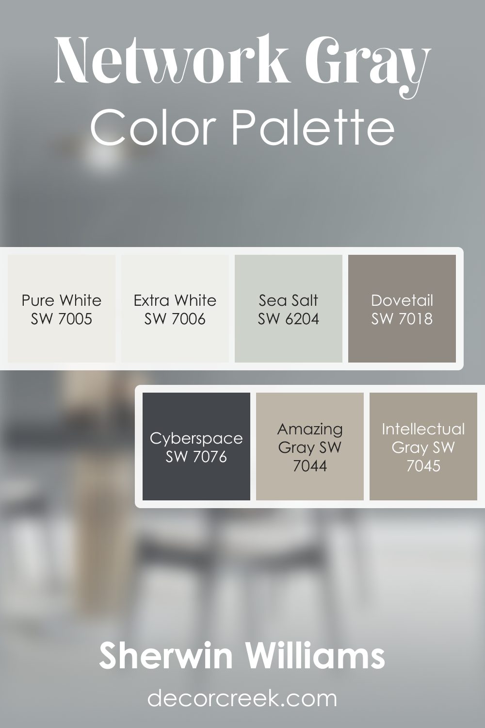
Network Gray SW 7073 by Sherwin Williams Color Palette
Network Gray brings a calming coolness supported by a thoughtful blend of warm and deep tones. Amazing Gray and Intellectual Gray add layers of soft warmth that pair smoothly with this subtle hue. Extra White and Pure White lift the palette with a crisp, fresh note.
Cyberspace brings powerful contrast that highlights architecture or decor. Dovetail adds gentle depth, creating easy transitions across rooms.
Sea Salt introduces a soft, airy green-gray touch that complements the cooler tones. Together, this palette feels clean, relaxed, and beautifully balanced.
How to Use Network Gray SW 7073 by Sherwin Williams In Your Home?
Network Gray, a sophisticated and versatile paint color from Sherwin Williams, offers a unique balance between cool and warm tones, making it an ideal choice for various spaces within a home. Under different lighting, it can appear more as a deep, cool gray, or shift towards a warmer, more inviting tone, providing an excellent backdrop for both modern and traditional décor.
This adaptability allows it to seamlessly integrate into any room, whether it’s creating a serene and calming atmosphere in bedrooms or a polished, understated elegance in living areas and kitchens. Its neutrality supports a wide range of color palettes, from bold and vibrant accessories to soft, muted tones, making it a perfect base for showcasing personal style and taste.
Furthermore, Network Gray can enhance architectural details, making it suitable for accent walls, trim, or even cabinetry, offering a cohesive and refined aesthetic throughout the home. Its understated sophistication ensures that spaces feel both expansive and cozy, making Network Gray a smart choice for anyone looking to refresh their home with a touch of elegance.
Network Gray SW 7073 by Sherwin Williams vs Morning Fog SW 6255 by Sherwin Williams
Network Gray and Morning Fog by Sherwin Williams are two nuanced hues that gracefully occupy the realm of grays, each offering a distinct mood to interior spaces. Network Gray presents as a deeper, more pronounced gray, embodying strength and sophistication.
Its deeper tone provides a strong foundation, making it an excellent choice for accent walls or to imbue a room with a sense of grounding. On the other hand, Morning Fog exudes a softer, more ethereal quality.
This lighter gray whispers serenity and calm, making spaces feel open and airy. It captures the gentle essence of early morning skies, providing a subtle backdrop that enhances without overwhelming.
While Network Gray lends itself to bold statements and depth, Morning Fog offers gentleness and an expansive feel. Together, these colors can create a harmonious balance, allowing for dynamic and complementary interior designs that cater to both boldness and tranquility.
You can see recommended paint color below:
Network Gray SW 7073 by Sherwin Williams vs Let it Rain SW 9152 by Sherwin Williams
Network Gray and Let it Rain, both from Sherwin Williams, showcase unique yet harmonious color personalities perfect for contemporary spaces. Network Gray stands out with its versatile and balanced gray tone, offering a solid foundation that pairs effortlessly with a wide range of decor styles.
Its neutrality is its strength, providing a serene backdrop that is sophisticated yet understated. On the other hand, Let it Rain introduces a softer, more nuanced approach to spaces. This color merges blue and gray tones to create a tranquil, soothing ambiance reminiscent of a gentle rainfall or a misty morning sky.
It brings a breath of fresh air into any room, promoting relaxation and calm. Together, these colors could complement each other beautifully in a design scheme, with Network Gray offering a stable base for the airier, more reflective qualities of Let it Rain, allowing for a space that feels both grounded and expansive.
You can see recommended paint color below:
- SW 9152 Let it Rain
Network Gray SW 7073 by Sherwin Williams vs Gray Matters SW 7066 by Sherwin Williams
Network Gray and Gray Matters, both from Sherwin Williams, present an interesting comparison in the realm of neutral grays. Network Gray sits on the darker side, offering a deep, almost slate-like tone that adds a robust depth to spaces.
This makes it ideal for creating an atmosphere of sophistication and strength, particularly suitable for modern living areas or bedrooms seeking a statement wall. On the other hand, Gray Matters leans towards a lighter, softer gray that embodies a more versatile approach to interior design.
It carries a hint of warmth that makes it exceptionally adaptable, easily fitting into various decor styles without overwhelming the space. This color can illuminate rooms, reflecting natural light beautifully, thus enhancing the sense of airiness and openness.
When choosing between the two, consider the mood you wish to create: Network Gray for dramatic depth and Gray Matters for subtle elegance.
You can see recommended paint color below:
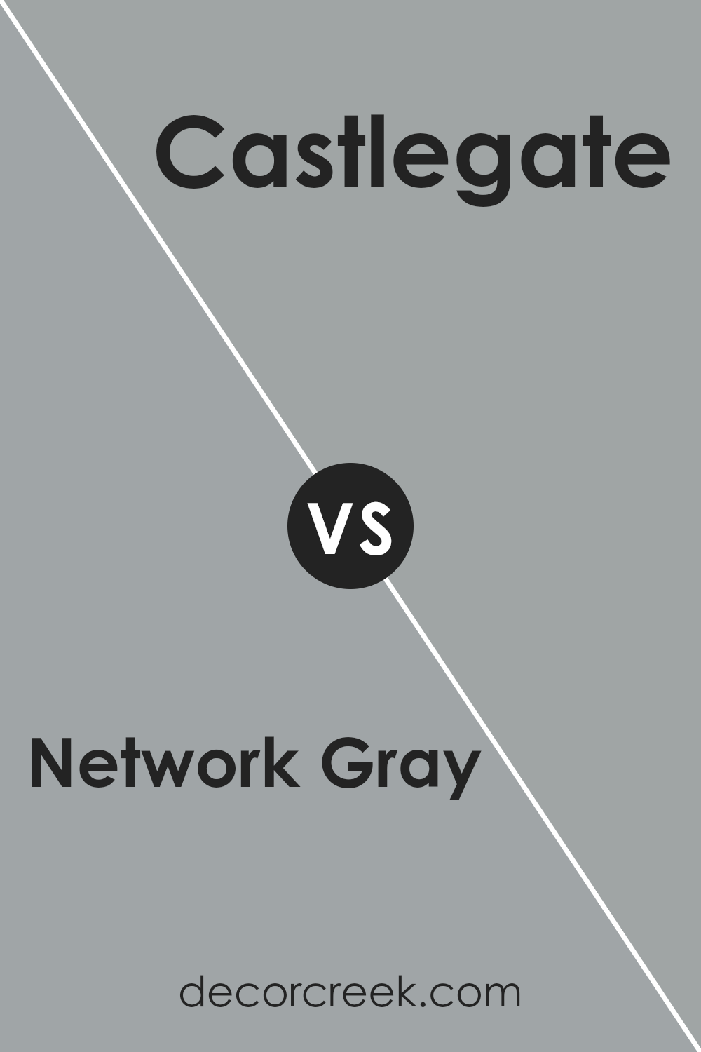
Network Gray SW 7073 by Sherwin Williams vs Castlegate SW 9558 by Sherwin Williams
Comparing Network Gray and Castlegate, both by Sherwin Williams, offers an intriguing exploration of nuanced tones ideal for various design contexts. Network Gray is a sophisticated, deep gray that provides a versatile backdrop for contemporary to traditional spaces.
It has an almost chameleon-like quality, adapting to different lighting conditions with a cool undertone that maintains a crisp, modern aesthetic.
Castlegate, on the other hand, steps into a warmer territory. It brings a rich, earthy dimension to walls, embodying a sense of warmth and inviting comfort. This color leans towards a more traditional look but is flexible enough to bridge into modern decor when paired with the right elements.
The primary difference lies in their undertones and the warmth they exude; Network Gray is cooler and sharper, making spaces feel more open and serene, while Castlegate offers a cozy embrace, perfect for creating a welcoming environment.
Together, they could complement each other in a space that aims for balance between sleek modernity and rustic warmth.
You can see recommended paint color below:
- SW 9558 Castlegate
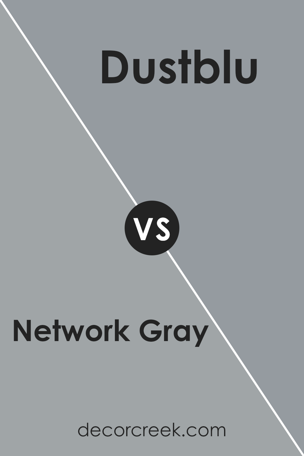
Network Gray SW 7073 by Sherwin Williams vs Dustblu SW 9161 by Sherwin Williams
Network Gray and Dustblu, both from Sherwin Williams, present a fascinating palette with their distinct tones. Network Gray serves as a robust, versatile shade that leans towards a mid-tone gray, exuding a sense of calm and understated elegance. Its neutrality makes it a perfect backdrop for both vibrant and subdued color schemes, adapting seamlessly to various décor styles.
On the other hand, Dustblu introduces a softer, more whimsical feel. This color, while still maintaining a subtle neutrality, hints at a light, airy blue, reminiscent of a serene sky or a gentle touch of morning mist. Its lightness offers a refreshing contrast to the more grounded, deeper tone of Network Gray.
Together, these colors balance each other beautifully – the solidity of Network Gray provides a firm foundation, while the ethereal quality of Dustblu adds a layer of tranquility and open-air lightness to the space.
You can see recommended paint color below:
- SW 9161 Dustblu
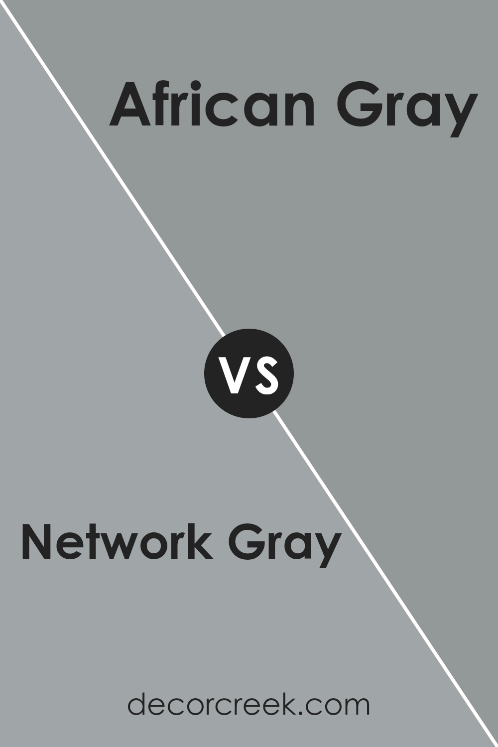
Network Gray SW 7073 by Sherwin Williams vs African Gray SW 9162 by Sherwin Williams
Network Gray and African Gray, both from Sherwin Williams, offer unique shades that cater to distinct preferences for interior spaces. Network Gray delves into a cooler, more understated realm of grays, presenting a versatile option that easily complements contemporary and traditional decors.
Its slightly blue undertone lends a serene and calming effect, making it ideal for bedrooms and living spaces that aim for a peaceful ambiance. On the other hand, African Gray shifts towards a warmer spectrum.
This color harbors a subtle taupe-like quality, imbuing environments with a cozy and inviting feel. It’s particularly well-suited for areas where a soft, nurturing atmosphere is desired, such as family rooms or dining areas.
While both colors maintain the neutrality and flexibility gray is known for, Network Gray leans towards a sleek, modern aesthetic, whereas African Gray offers a touch of warmth, creating a more homely and relaxed space.
You can see recommended paint color below:
- SW 9162 African Gray
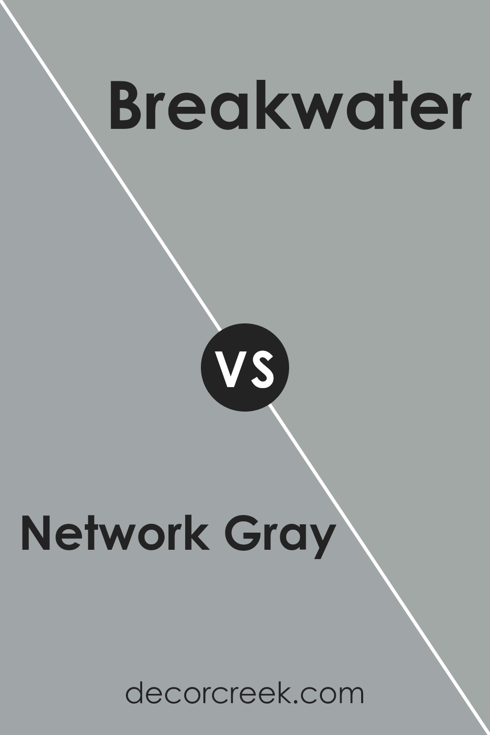
Network Gray SW 7073 by Sherwin Williams vs Breakwater SW 9638 by Sherwin Williams
Network Gray and Breakwater, both by Sherwin Williams, embody distinct nuances that set them apart in the realm of interior and exterior design. Network Gray, a deep, versatile shade, leans towards a cooler, more neutral palette.
Its ability to anchor a space with sophistication makes it a preferred choice for those seeking a timeless backdrop that complements a wide range of decor styles and colors. On the other hand, Breakwater presents a lighter, airy feel with its subtle blue undertones, evoking a sense of calm and relaxation.
This color is perfect for creating a serene ambiance, ideal for bedrooms, bathrooms, or any space where tranquility is desired. While Network Gray offers a solid, grounding effect, Breakwater lends an uplifting and refreshing touch, making each suitable for different aesthetic goals and atmospheres.
Together, they illustrate the dynamic spectrum of Sherwin Williams’ offerings, catering to diverse design preferences.
You can see recommended paint color below:
- SW 9638 Breakwater
Network Gray SW 7073 by Sherwin Williams vs Uncertain Gray SW 6234 by Sherwin Williams
Network Gray and Uncertain Gray by Sherwin Williams are two nuanced shades that offer subtle distinctions in mood and tone for various spaces. Network Gray is a deeper, more pronounced hue, carrying a robust and grounding energy.
It leans towards a more definitive statement in a room, providing a strong anchor or focal point. This shade works well in spaces that benefit from a sense of strength and stability, such as living rooms or offices.
On the other hand, Uncertain Gray presents a lighter, more ethereal quality. Its name aptly reflects its more ambiguous nature, offering a soft, versatile backdrop that can adapt to a wide range of decor styles. This color is ideal for creating a serene and calming atmosphere, perfect for bedrooms, bathrooms, or any area meant for relaxation.
While both colors share a foundation in the gray family, Network Gray speaks to boldness and certainty, whereas Uncertain Gray converses in whispers of tranquility and adaptability, making each unique in their right.
You can see recommended paint color below:
- SW 6234 Uncertain Gray
Network Gray SW 7073 by Sherwin Williams vs Cadet SW 9143 by Sherwin Williams
Network Gray and Cadet, both from Sherwin Williams, embody distinct moods, reflecting their unique hues. Network Gray presents as a versatile, medium-dark gray with a slightly cool undertone, making it a stellar choice for a sophisticated, modern feel.
Its adaptability allows it to blend seamlessly with various decor styles, serving as a robust background that can make colors pop or offer a calm, cohesive look.
On the other hand, Cadet steps into the room with a deeper, more defined presence. This color veers towards a muted, bluish-gray tone, imbuing spaces with a sense of serenity and depth. It resonates with those seeking a tranquil ambiance, reminiscent of a misty morning sky.
While its saturation is deeper than Network Gray, it maintains a calming effect, perfect for creating a retreat-like atmosphere in bedrooms or bathrooms.
Comparatively, while both shades can anchor a room beautifully, Network Gray leans towards a neutral, flexible palette, whereas Cadet invites a more profound, contemplative mood, making each color suitable for different aesthetic and emotional impacts in interior spaces.
You can see recommended paint color below:
- SW 9143 Cadet
Network Gray SW 7073 by Sherwin Williams vs Gris SW 7659 by Sherwin Williams
Network Gray and Gris, both from Sherwin Williams, offer subtle nuances in their approach to gray, evoking distinctive atmospheres within a space. Network Gray presents as a deeper, more pronounced hue, bearing a solid, almost anchoring quality.
Its depth suggests a sophistication that makes it ideal for creating a statement in areas that demand a touch of seriousness or elegance. On the other hand, Gris embodies a lighter, more ethereal quality. This shade of gray leans towards a softer, more neutral palette, making it suitable for spaces requiring a serene and calming ambiance.
Its versatility allows it to blend seamlessly with a wide range of decor, from contemporary to traditional. While both colors share the inherent neutrality of gray, Network Gray offers a bolder stance, perfect for accent walls or substantial furniture pieces, whereas Gris provides a gentle backdrop, enhancing the overall light and airiness of a room.
Together, they showcase the versatile range of gray, each adapting to various aesthetic and mood requirements within interior spaces.
You can see recommended paint color below:
Conclusion
Network Gray by Sherwin Williams is a versatile and contemporary choice for those looking to infuse their spaces with a chic, modern aesthetic. Its balanced undertone makes it a perfect fit for various interior themes, from minimalist to eclectic, ensuring that it complements a wide range of decor styles and color palettes.
Its ability to adapt to both bright and muted lighting conditions also enhances its appeal, making it an ideal selection for any room in need of a sophisticated yet understated backdrop.
Furthermore, its popularity among homeowners and interior designers alike is a testament to its timeless elegance and flexibility. Network Gray offers a neutral canvas that encourages creativity, allowing for bold furniture pieces and artwork to stand out, while also providing a calming and serene environment.
As a color that bridges the gap between formality and comfort, it is a smart choice for those aiming to strike a balance in their living spaces, proving its enduring value in the realm of interior design.

Ever wished paint sampling was as easy as sticking a sticker? Guess what? Now it is! Discover Samplize's unique Peel & Stick samples.
Get paint samples