Imagine a color that is both comforting and sophisticated, something that fits perfectly in any room. SW 2845 Bunglehouse Gray by Sherwin Williams offers just that. It’s a hue that effortlessly combines timeless elegance with a cozy warmth. When you incorporate this shade into your space, it creates a gentle backdrop that seems to make everything else come to life. Whether you’re drawn to traditional styles or more modern aesthetics, Bunglehouse Gray has the versatility to adapt and enhance your decor.
There’s a certain charm about this color. It’s reminiscent of historic estates and classic architecture, yet it feels right at home in a contemporary setting. The subtle undertones play well with both natural and artificial light, changing gently throughout the day, adding depth to your walls without overshadowing them.
Choosing Bunglehouse Gray means opting for a color that isn’t just on trend but is truly timeless. It provides a sense of calm and reliability, making it a great choice for living rooms, bedrooms, or any area where you want to feel relaxed and grounded.
That’s what makes Bunglehouse Gray so appealing — it’s not just about painting a wall; it’s about creating a space that feels inviting and beautifully put together.
What Color Is Bunglehouse Gray SW 2845 by Sherwin Williams?
Bunglehouse Gray by Sherwin Williams is a medium-toned, historic shade that sits comfortably between warm gray and taupe. It exudes a cozy, inviting feel that can adapt to many interior styles. This color works exceptionally well in traditional and Craftsman-style homes, where its rich, earthy undertones complement natural materials.
In a traditional setting, Bunglehouse Gray pairs nicely with dark woods and classic styling. Its warm tones enhance the grain in oak or walnut furniture, making it a good choice for dining rooms and libraries. Meanwhile, its versatility means it can also suit the clean lines and simple forms in a more minimalist interior, balancing out sleek surfaces with its subtle warmth.
For textures, this color shines alongside soft fabrics like linen and wool, adding depth to textiles on couches or curtains. It also pairs beautifully with matte metal finishes, such as brushed nickel or wrought iron, providing a gentle contrast that highlights both.
In the kitchen, consider pairing it with natural stone or marble countertops for a harmonious look. In each space, this hue helps create a grounded, comfortable atmosphere that feels timeless and appealing without overwhelming the senses.

Is Bunglehouse Gray SW 2845 by Sherwin Williams Warm or Cool color?
Bunglehouse Gray (SW 2845) by Sherwin Williams is a versatile paint color often chosen for its neutral, earthy tone. It is a warm, muted gray with hints of beige, making it a great choice for creating a cozy atmosphere in any home.
In living rooms and bedrooms, it adds a soft, comfortable feel that makes spaces feel inviting and relaxed. Because it is a neutral tone, it pairs well with a wide range of other colors, from bold and bright accents to more subtle and natural palettes.
The color is also well-suited for use in kitchens and bathrooms, where its calming effect can create a pleasant and soothing environment. Despite its subtlety, Bunglehouse Gray doesn’t feel flat; instead, it brings depth and character to walls, enhancing the overall look of a room.
Its versatility means it can be matched with various styles, from traditional to modern, making it a popular choice for homeowners looking to update their spaces.
Undertones of Bunglehouse Gray SW 2845 by Sherwin Williams
Bunglehouse Gray by Sherwin Williams is a color with complex undertones that make it interesting when used on interior walls. This paint isn’t just a regular gray; it contains hints of several colors. Undertones can greatly influence how a color appears under different lighting conditions and in combination with other colors in a room.
Bunglehouse Gray has subtle notes of pale pink, mint, olive, pale yellow, lilac, orange, and many more, which means it can look different depending on the surrounding colors and lighting.
For example, in natural daylight or warm lighting, the warmer undertones like pale pink, orange, and yellow might come out more, making the gray feel cozier and more inviting. In cooler lighting, the undertones like lilac, light purple, and blue might be more noticeable, giving the gray a more sophisticated feel.
When you put Bunglehouse Gray on your walls, you may notice it appearing warmer or cooler at different times of the day. It can add a dynamic quality to your space, making it more interesting visually. Additionally, the presence of green, turquoise, and blue undertones can help to blend the color seamlessly with nature-inspired themes, bringing a touch of the outdoors inside.

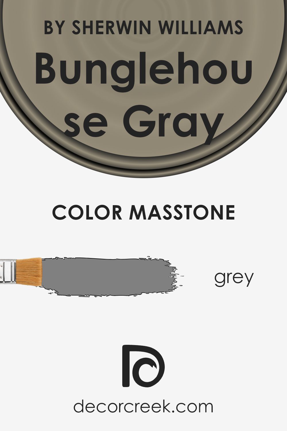
What is the Masstone of the Bunglehouse Gray SW 2845 by Sherwin Williams?
Bunglehouse Gray (SW 2845) by Sherwin Williams is a versatile paint color that features a medium gray tone. The masstone of this color is a standard gray (#808080), which gives it a neutral and balanced appearance. Because of this neutrality, Bunglehouse Gray can complement a wide range of other colors in a home, making it a good choice for different types of decor.
In homes, this shade of gray can serve as an elegant backdrop. It’s neither too warm nor too cool, which allows it to work well in various lighting conditions. With this hue, you can create a calming and grounded atmosphere in living rooms, bedrooms, or kitchens.
Bunglehouse Gray is also known for its ability to highlight architectural features. When paired with white trim, it provides a crisp contrast that draws attention to details. This makes it appealing for creating clean, classic looks without overwhelming a space.
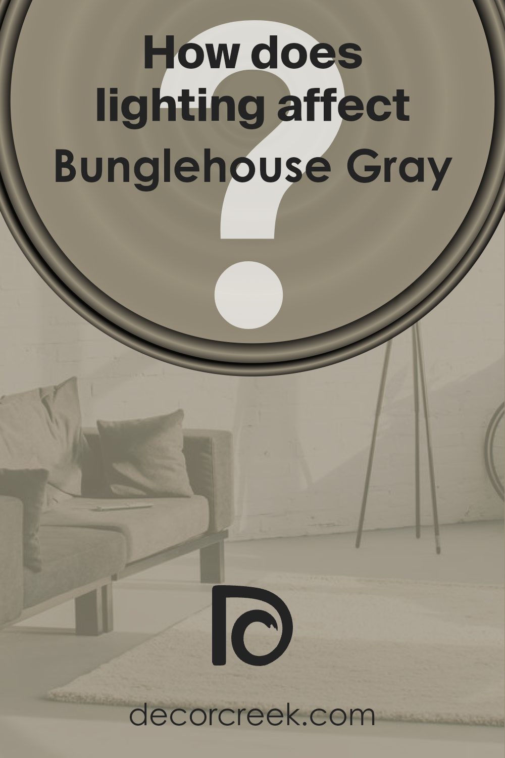
How Does Lighting Affect Bunglehouse Gray SW 2845 by Sherwin Williams?
Lighting can greatly impact how we perceive colors in a room. The type and direction of light can make the same paint color look different at various times of the day. For example, Bunglehouse Gray SW 2845 by Sherwin Williams may appear differently depending on the lighting conditions.
In natural light, colors will typically look cooler and more muted. If a room is north-facing, it will receive less direct sunlight, often giving the gray a cooler and slightly bluer cast. This is because northern light tends to be softer and more diffused. Bunglehouse Gray might feel a bit darker and more subdued in these spaces.
In contrast, a south-facing room receives more consistent and direct sunlight throughout the day. This can warm up the appearance of Bunglehouse Gray, making it seem more vibrant and sometimes bringing out warmer undertones in the color. You’ll notice the room is brighter, and the gray can take on a cozy feel.
East-facing rooms get bright light in the morning and cooler light as the day progresses. In the mornings, Bunglehouse Gray will show its true gray color mixed with the warmth of the rising sun. As the sun moves, the gray might again show a cooler tone as less direct light fills the room.
West-facing rooms, on the other hand, have softer light in the morning and a warmer, more intense light in the late afternoon or evening. As the sun sets, these rooms will become enveloped in a golden light that enhances any warm undertones in Bunglehouse Gray, giving the gray a richer feel.
Under artificial light, the type of bulb used can alter the appearance too. Incandescent bulbs give off a warm, yellowish hue that can reinforce warm tones in the color. Fluorescent lights, which often emit a cooler light, might make the gray appear starker or even a bit more clinical. LED lights vary, so their impact depends on their specific tone, whether warm or cool.
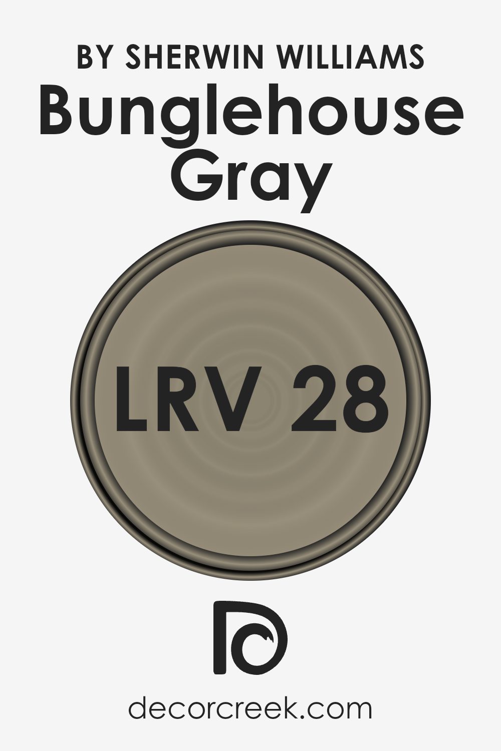
What is the LRV of Bunglehouse Gray SW 2845 by Sherwin Williams?
LRV stands for Light Reflectance Value, which is a measure of how much light a color reflects. It is expressed as a number between 0 and 100, where 0 means the color absorbs all light and reflects none (like a true black), and 100 means the color reflects all light (like a bright white). This value helps in understanding how light or dark a paint color may appear in a room.
A color with a lower LRV will absorb more light and appear darker, which can make a space feel cozy or intimate. Conversely, a color with a higher LRV will reflect more light and can make a room feel brighter and more open.
For Bunglehouse Gray, which has an LRV of 27.649, this means the color is relatively dark, as it reflects a moderate amount of light. It will absorb more light than it reflects, making it appear deeper and more subdued on the walls.
This can be an excellent choice for creating a warm and inviting atmosphere in a room. The lower LRV means it won’t brighten a space significantly, but it can add a sense of depth and richness to your décor. If you’re using this color in a space with limited natural light, it’s important to consider additional light sources to ensure the room doesn’t become too dark.
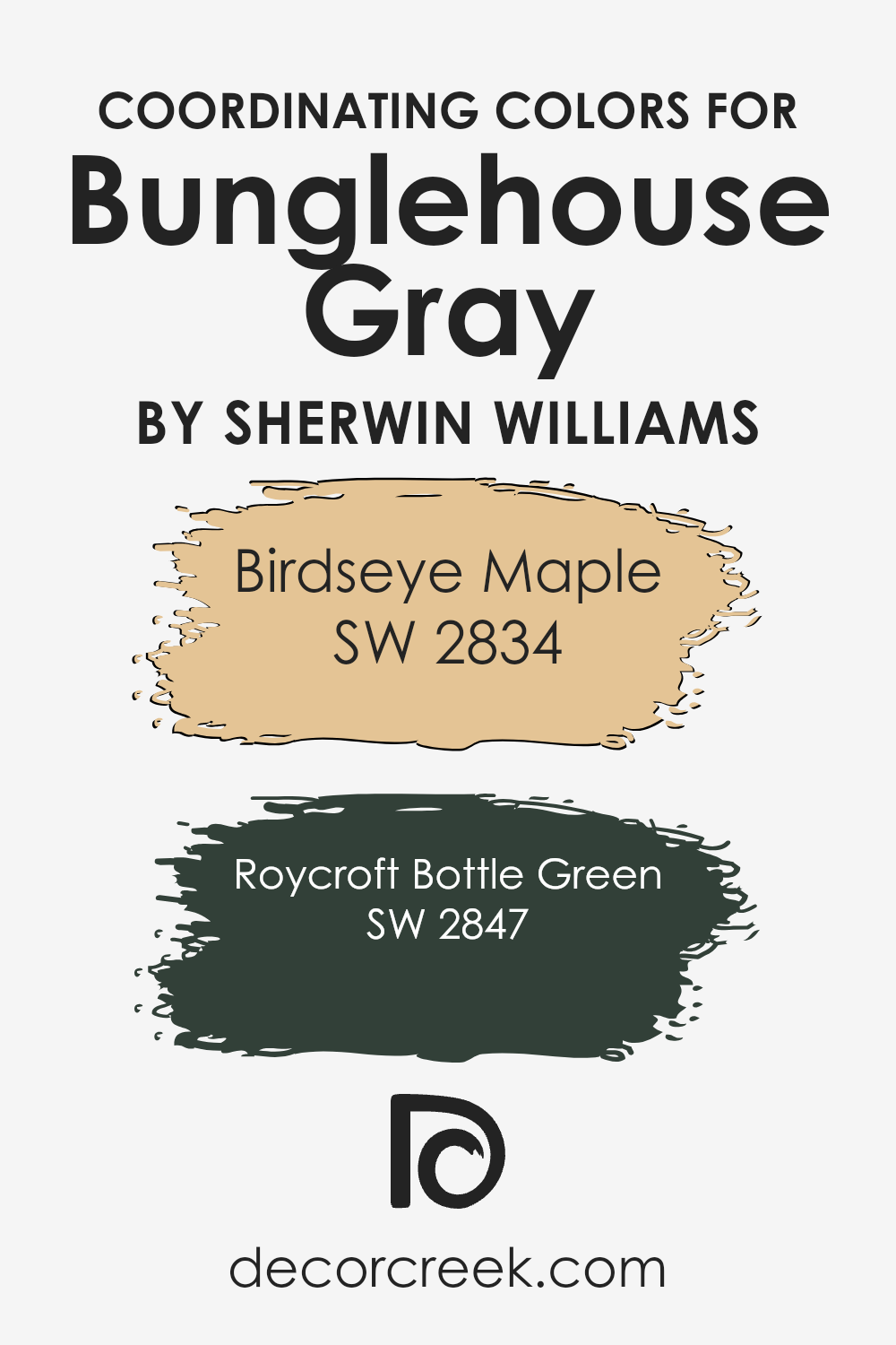
Coordinating Colors of Bunglehouse Gray SW 2845 by Sherwin Williams
Coordinating colors are hues that complement each other and create a harmonious look when used together in a design. They work by enhancing the mood or theme of a room and ensuring that the colors do not clash but rather blend smoothly. Bunglehouse Gray by Sherwin Williams is one such versatile shade that pairs beautifully with other colors to create a balanced atmosphere. For example, Birdseye Maple is a warm, soft color that adds a touch of comfort and coziness.
Its undertones provide a sense of friendliness that can warm up any space when paired with gray. Meanwhile, Roycroft Bottle Green introduces a deep, rich element that can add depth and a touch of nature.
This green brings a sophisticated tone without being overwhelming and compliments the subtlety of the gray. When combined, these colors harmonize to create an inviting and balanced look, providing a comforting backdrop for any setting. Together, they blend naturally, allowing each color to stand out while still maintaining cohesion.
It’s this balance that makes them an ideal choice for a variety of spaces, from traditional to modern designs. Using these coordinating colors helps create a cohesive aesthetic that feels complete and intentional.
You can see recommended paint colors below:
- SW 2834 Birdseye Maple
- SW 2847 Roycroft Bottle Green
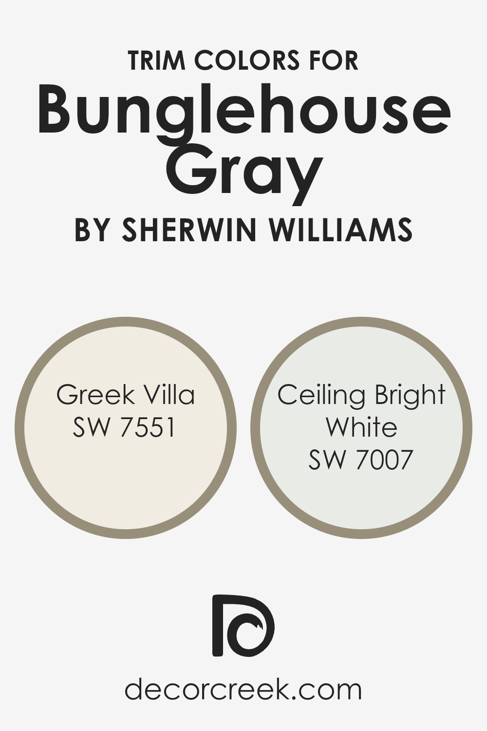
What are the Trim colors of Bunglehouse Gray SW 2845 by Sherwin Williams?
Trim colors are the finishing touches that frame and highlight a room, making the main wall color stand out. When using Bunglehouse Gray by Sherwin Williams, a timeless and versatile gray, selecting the right trim colors is important because they can enhance the overall look and feel of the area. Trim colors provide contrast, helping emphasize features like doors, windows, and baseboards.
To complement Bunglehouse Gray, a warm and inviting palette works best, and both Greek Villa and Ceiling Bright White by Sherwin Williams serve this function well. Choosing appropriate trim colors not only enhances the primary color but also ties together various elements within the space, creating a cohesive look.
Greek Villa is a creamy off-white that offers a subtle warmth. This makes it an ideal partner for Bunglehouse Gray, as it provides a gentle contrast while maintaining a welcoming atmosphere. Ceiling Bright White, on the other hand, is a clean, crisp white. It delivers a sharp, modern edge that amplifies the depth of Bunglehouse Gray, making architectural features pop while ensuring the overall look stays fresh and airy.
Both of these whites bring out different qualities of the primary gray, ensuring a visually pleasing environment without overwhelming it. The interaction between these shades enhances the home’s aesthetic, showcasing its design elements harmoniously.
You can see recommended paint colors below:
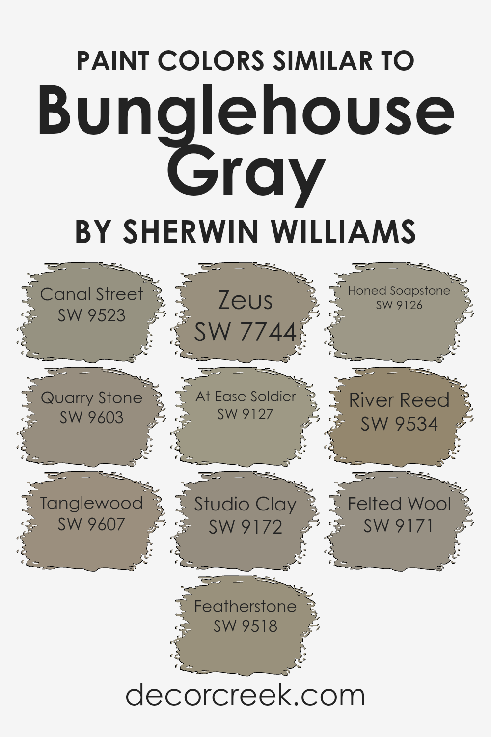
Colors Similar to Bunglehouse Gray SW 2845 by Sherwin Williams
In the world of design, similar colors play a crucial role in creating harmony and balance. When you have a base color like Bunglehouse Gray, complementing it with tones that share subtle similarities can add depth and subtlety to a space. Colors such as SW 9523 Canal Street offer a warm, sandy tone that pairs well with the earthiness of Bunglehouse Gray, while SW 9603 Quarry Stone adds a slightly cooler touch with its muted, stony feel. SW 9607 Tanglewood brings in a rich, woodsy brown that complements the gray’s neutrality.
Other colors like SW 9518 Featherstone provide a soft, airy almond hue that lightens the palette, and SW 7744 Zeus offers a deeper, dramatic charcoal that can add contrast. SW 9127 At Ease Soldier introduces a subdued olive green, adding a hint of freshness, while SW 9172 Studio Clay lends a soft, brownish taupe for more warmth.
If you’re looking for a steely blue-gray, SW 9126 Honed Soapstone can blend well, while SW 9534 River Reed offers a greenish nuance for a touch of nature. Finally, SW 9171 Felted Wool, with its cozy, warm undertone, rounds out the palette, ensuring each color complements Bunglehouse Gray in a cohesive and pleasing way.
You can see recommended paint colors below:
- SW 9523 Canal Street
- SW 9603 Quarry Stone
- SW 9607 Tanglewood
- SW 9518 Featherstone
- SW 7744 Zeus
- SW 9127 At Ease Soldier
- SW 9172 Studio Clay
- SW 9126 Honed Soapstone
- SW 9534 River Reed
- SW 9171 Felted Wool
How to Use Bunglehouse Gray SW 2845 by Sherwin Williams In Your Home?
Bunglehouse Gray SW 2845 by Sherwin-Williams is a warm, neutral gray with an earthy undertone, making it a great choice for any room in your home. This color works well in living rooms, bedrooms, and kitchens, providing a cozy and inviting atmosphere. With its subtle warmth, Bunglehouse Gray pairs beautifully with wooden furniture and natural textiles, enhancing their textures and tones.
In living rooms, use Bunglehouse Gray on the walls to create a backdrop that complements both modern and traditional decor. Add pops of color through throw pillows or artwork to keep the room vibrant. In bedrooms, this shade offers a soothing environment, ideal for relaxing after a long day. Pair it with white or cream-colored bedding for a clean and fresh look.
For kitchens, consider using Bunglehouse Gray on cabinets or as an accent wall, enhancing your space without overpowering it. Its versatility and balance make it easy to incorporate into different styles of home decor.
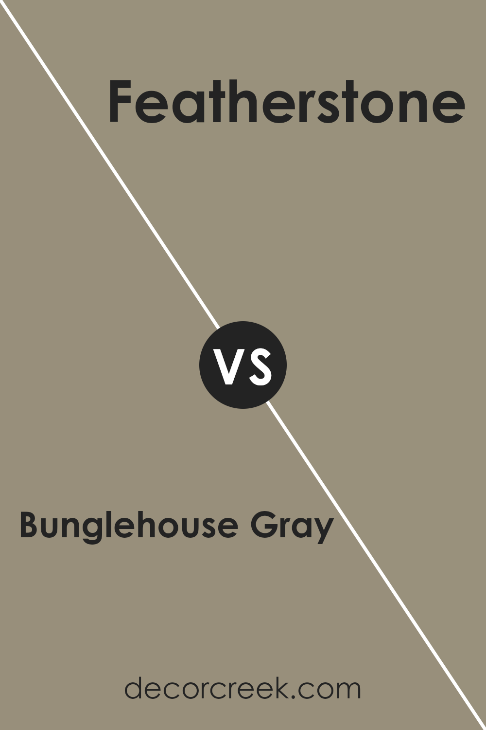
Bunglehouse Gray SW 2845 by Sherwin Williams vs Featherstone SW 9518 by Sherwin Williams
Bunglehouse Gray (SW 2845) and Featherstone (SW 9518) by Sherwin Williams are two distinct shades that offer different vibes. Bunglehouse Gray is a muted, earthy tone that combines elements of both gray and brown, making it a versatile and warm choice. It works well in cozy spaces and provides a stable backdrop for various decor styles.
On the other hand, Featherstone is a soft, light gray with slight beige undertones, giving it a more airy and light-hearted feel. It is perfect for spaces where you want to feel open and bright without the starkness that can come with pure white.
While both colors are in the gray family, Bunglehouse Gray gives a more grounded and warm atmosphere, whereas Featherstone adds a touch of lightness and openness. Depending on the ambiance you’re aiming for, either color could be a great choice for your space.
You can see recommended paint color below:
Bunglehouse Gray SW 2845 by Sherwin Williams vs Studio Clay SW 9172 by Sherwin Williams
Bunglehouse Gray and Studio Clay are two interesting colors from Sherwin Williams. Bunglehouse Gray is a muted, earthy gray with a touch of warmth, making it cozy and versatile for various spaces. It’s great for creating a calm and welcoming atmosphere. On the other hand, Studio Clay is a rich color with more warmth and depth. It leans towards a clay or taupe shade that adds an element of natural earthiness to a room.
Both colors work well as neutral backdrops, but Bunglehouse Gray is softer, while Studio Clay has more intensity. Bunglehouse Gray can enhance spaces with a softer, more timeless appearance, while Studio Clay can add boldness or warmth, depending on the pairing.
Both colors are adaptable and can fit into different styles, whether traditional or modern, but the choice between them largely depends on whether you prefer a lighter or more pronounced earthy tone.
You can see recommended paint color below:
- SW 9172 Studio Clay
Bunglehouse Gray SW 2845 by Sherwin Williams vs Tanglewood SW 9607 by Sherwin Williams
Bunglehouse Gray SW 2845 and Tanglewood SW 9607 are two interesting yet distinct colors by Sherwin Williams. Bunglehouse Gray is a muted, medium-toned gray with subtle green undertones. It gives off a calm and grounded feel, lending an air of stability to a room. This makes it a great neutral choice for spaces where you want a bit of color without it being overwhelming.
On the other hand, Tanglewood SW 9607 is richer and warmer. It is a deep, earthy green that adds a cozy and inviting atmosphere. This color works well in creating a welcoming environment, making it perfect for living rooms or study areas where warmth and comfort are essential.
When comparing the two, Bunglehouse Gray is more subtle and versatile, while Tanglewood makes a bolder statement with its warmth. They cater to different styles but can complement each other well if used together in a coordinated way.
You can see recommended paint color below:

Bunglehouse Gray SW 2845 by Sherwin Williams vs River Reed SW 9534 by Sherwin Williams
Bunglehouse Gray SW 2845 by Sherwin Williams is a warm, muted gray with a hint of brown. It carries an earthy tone that makes it feel cozy and inviting, fitting well in both traditional and modern spaces. It works nicely with wood accents and can create a grounded, homey atmosphere in any room.
River Reed SW 9534, on the other hand, is a soft, earthy green. It is more vibrant compared to Bunglehouse Gray but still maintains a natural, subdued quality. River Reed brings a refreshing touch, reminiscent of nature and greenery. It pairs well with neutral colors and can add a subtle pop of color without being overwhelming.
When comparing the two colors, Bunglehouse Gray feels more neutral and understated, creating a calm and stable environment, while River Reed offers a bit more liveliness with its green hue. Both can be used in various settings, depending on whether you prefer a more muted or slightly colorful feel.
You can see recommended paint color below:
- SW 9534 River Reed
Bunglehouse Gray SW 2845 by Sherwin Williams vs Zeus SW 7744 by Sherwin Williams
Bunglehouse Gray SW 2845 is a soft, muted gray with subtle warmth, making it a versatile neutral option. It blends well in both traditional and modern spaces, offering a cozy and welcoming vibe without overpowering the room. This shade is perfect for creating a calm atmosphere and works well with a variety of other colors, especially whites and creams.
On the other hand, Zeus SW 7744 is a dark, rich color with a strong presence. It’s a deep brown with a hint of green, giving it an earthy and grounded feel. Zeus can add drama and depth to a space, making it ideal for feature walls or accent pieces. While it’s bold, it can be balanced with lighter tones to prevent a room from feeling too heavy.
When paired, Bunglehouse Gray provides a soft contrast to the intensity of Zeus, offering a balanced and interesting color scheme.
You can see recommended paint color below:
- SW 7744 Zeus
Bunglehouse Gray SW 2845 by Sherwin Williams vs Quarry Stone SW 9603 by Sherwin Williams
Bunglehouse Gray is a warm, neutral gray with subtle beige undertones, giving it a cozy and inviting feel. This color works well in traditional and modern spaces, offering a versatile backdrop that complements a wide range of furnishings and decor styles. Its muted tone makes it ideal for living rooms, bedrooms, or any area where you want a calm and relaxing atmosphere.
On the other hand, Quarry Stone is a darker, more robust gray with a hint of depth and richness. It has a sophisticated vibe without being overpowering. This color suits areas where you want to create a more intimate and dramatic mood, such as dining rooms or accent walls.
While both colors share a gray base, Bunglehouse Gray is lighter and warmer, making it more versatile, whereas Quarry Stone offers a bolder, more pronounced statement with its darker tone.
You can see recommended paint color below:
Bunglehouse Gray SW 2845 by Sherwin Williams vs Honed Soapstone SW 9126 by Sherwin Williams
Bunglehouse Gray (SW 2845) and Honed Soapstone (SW 9126) are two distinct colors by Sherwin Williams, each bringing its own character to a space. Bunglehouse Gray is a warm, earthy gray with undertones of brown, which creates a cozy and inviting atmosphere. It’s a versatile color that works well in both traditional and modern settings, providing a comfortable backdrop without being overpowering.
On the other hand, Honed Soapstone is a cooler gray with subtle blue undertones. This color tends to feel more modern and sleek, offering a calm and refreshing feel to a room. It’s great for spaces where a contemporary look is desired.
When compared, Bunglehouse Gray is more rustic and warm, making spaces feel snug and familiar, while Honed Soapstone offers a cooler, more polished feel. Depending on the mood you want to create, you can choose between the warmth of Bunglehouse Gray or the cool, modern touch of Honed Soapstone.
You can see recommended paint color below:
- SW 9126 Honed Soapstone
Bunglehouse Gray SW 2845 by Sherwin Williams vs Canal Street SW 9523 by Sherwin Williams
Bunglehouse Gray (SW 2845) and Canal Street (SW 9523) are both distinct colors from Sherwin Williams, offering different moods and feels.
Bunglehouse Gray is a warm and muted gray, with hints of earthy undertones. It has a classic and timeless appeal, making it suitable for traditional homes or spaces that aim for a cozy and inviting atmosphere. This color can work well on walls, creating a backdrop that complements wood details and warmer accents.
On the other hand, Canal Street is a soft, neutral shade that leans more towards beige than gray. It exudes a light and airy feeling, making spaces feel brighter and more open. It pairs well with modern decor and can be used to create a fresh yet relaxed environment.
Comparing the two, Bunglehouse Gray is deeper and more grounded, while Canal Street is lighter and more versatile for different interior styles. Both colors are excellent choices, depending on the desired mood and style of the space.
You can see recommended paint color below:
Bunglehouse Gray SW 2845 by Sherwin Williams vs Felted Wool SW 9171 by Sherwin Williams
Bunglehouse Gray (SW 2845) and Felted Wool (SW 9171) are two shades by Sherwin Williams that offer distinct feels. Bunglehouse Gray is a warm, earthy color with a hint of green, providing a natural, welcoming vibe. It’s versatile and works well in traditional or historical settings. This color can bring a cozy and grounded feel to a space.
On the other hand, Felted Wool is a soft, warm gray with a slight brown undertone. It is a bit darker than Bunglehouse Gray and provides a smooth, neutral background. Felted Wool can create a calming environment, making it a good choice for modern and minimalist spaces.
Both colors are similar, with warm undertones, but Bunglehouse Gray leans more toward green, while Felted Wool stays closer to a soft, brownish-gray. They can pair well together for a layered, cohesive look in interiors.
You can see recommended paint color below:
- SW 9171 Felted Wool
Bunglehouse Gray SW 2845 by Sherwin Williams vs At Ease Soldier SW 9127 by Sherwin Williams
Bunglehouse Gray (SW 2845) and At Ease Soldier (SW 9127) by Sherwin Williams are both versatile colors, but they offer different vibes. Bunglehouse Gray is a muted, historical gray with a subtle green undertone. It gives a cozy, timeless feel that’s perfect for traditional spaces. It works well in living rooms or bedrooms, adding a touch of warmth while remaining neutral.
On the other hand, At Ease Soldier is a soft, muted green. It’s a more laid-back, calming color, making it a great choice for spaces where you want a relaxing atmosphere. It’s ideal for bathrooms or nurseries, where a serene and peaceful environment is desired.
While Bunglehouse Gray is a bit more conservative and classic, At Ease Soldier brings in a hint of nature and freshness. Both colors pair well with warm beiges and off-whites, allowing them to blend seamlessly with various design styles.
You can see recommended paint color below:
- SW 9127 At Ease Soldier
In conclusion, having learned about SW 2845 Bunglehouse Gray by Sherwin Williams, I can say it’s a pretty cool paint color! It’s a mix of gray with a bit of warmth, making it feel cozy and nice. You could think of it a bit like a rainy day when you get to stay inside with a good book or a fun game. This color isn’t too dark or too light, so it’s kind of like a nice hug for the walls. It can make a room feel welcoming without being too loud or too dull.
I imagine painting a room with Bunglehouse Gray would mean having a place that feels calming but not sleepy. It’s perfect for those who like simple and clean looks. Whether it’s in the living room where you hang out with family or in your bedroom where you relax, this color seems to fit right in. It can also match with lots of other colors, so you can have fun picking out other things, like pillows or curtains, to go with it.
Overall, Bunglehouse Gray is a neat choice for anyone who wants a color that’s easy to like and makes a room feel nice and cozy.
Ever wished paint sampling was as easy as sticking a sticker? Guess what? Now it is! Discover Samplize's unique Peel & Stick samples.
Get paint samples

