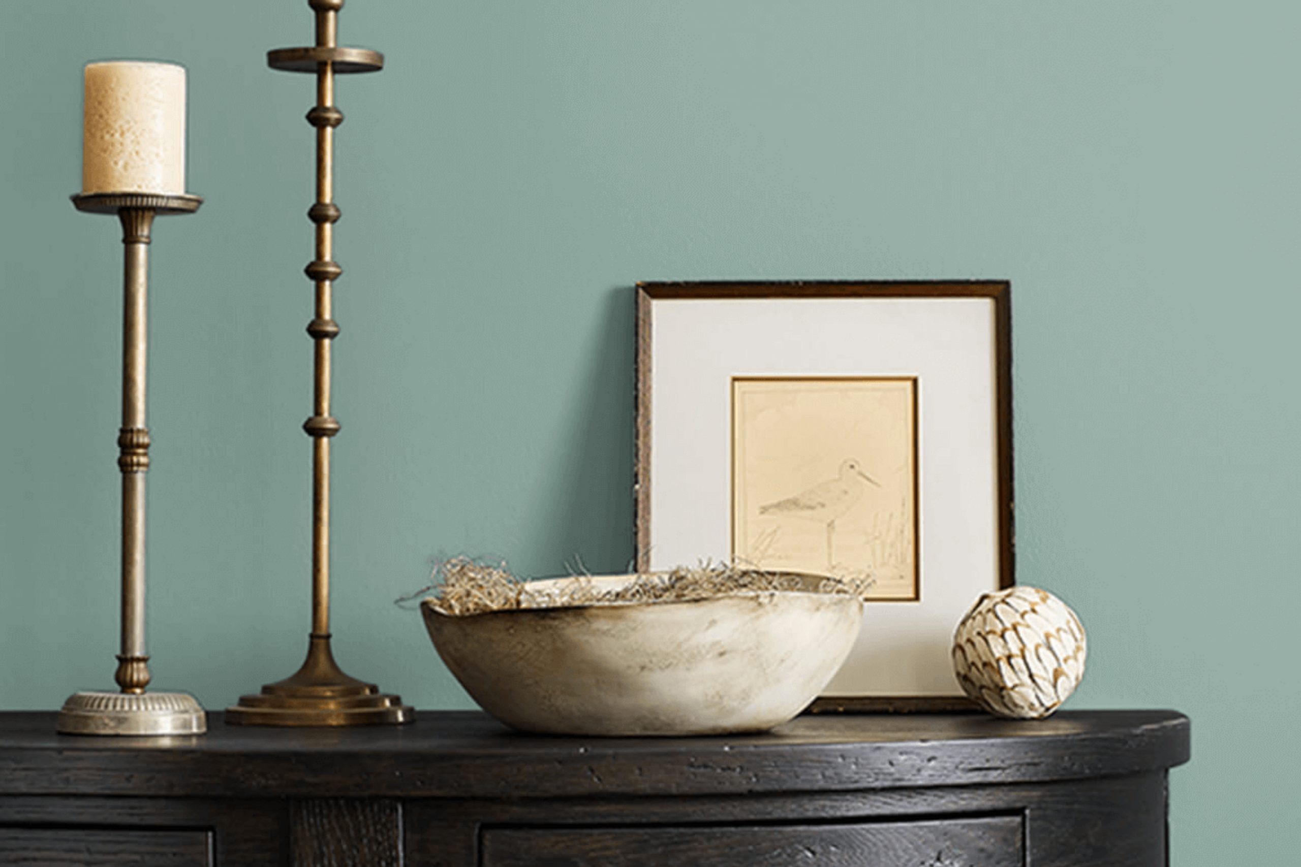
When you first come across SW 0017 Calico by Sherwin Williams, it’s like finding a hidden gem among a sea of colors. This shade is unique and soothing, bringing a sense of warmth and comfort to any room. Its soft, muted tones create a welcoming atmosphere that makes you feel instantly at home. Calico is not loud or intense; it’s a color that invites you to sit back and relax.
Envision yourself surrounded by its gentle hue, and you’ll notice how it complements a wide range of styles, from modern to rustic. The versatility of Calico makes it perfect for any room, whether you’re looking to refresh your living room, bedroom, or even a cozy reading nook. Its earthy undertones harmonize well with natural materials like wood and stone, enhancing their textures and making your surroundings feel more grounded.
Choosing Calico might feel like a breath of fresh air, a return to something simple and honest. You appreciate how its classic appeal persists through changing trends. Imagine accenting it with plants or bright decor to add a pop of life.
It’s a color that doesn’t just paint your walls; it enhances the overall mood, helping create a haven you’ll love to come back to every day.
What Color Is Calico SW 0017 by Sherwin Williams?
Calico by Sherwin Williams is a warm, earthy neutral with undertones of beige and taupe. It offers a cozy and inviting feel, making it suitable for various interior styles. This color works exceptionally well in traditional and rustic settings, providing a grounded backdrop that enhances natural elements and cozy furnishings. It’s also a great choice for contemporary areas that aim for a relaxed and welcoming atmosphere.
In terms of materials, Calico pairs beautifully with natural woods, such as oak or walnut, enhancing their rich textures. It complements stone surfaces like marble or granite, offering a soft contrast to their smooth and polished look. Textiles in linen, cotton, and wool blend seamlessly with this color, adding layers of comfort and warmth to a room.
Additionally, Calico works well with metallic accents like brushed brass or copper, which can introduce a touch of elegance and warmth. For a more modern touch, pair it with black metal fixtures or charcoal grays. These combinations bring out the depth of the color without overpowering it, allowing it to maintain its adaptable and inviting presence. Overall, Calico by Sherwin Williams provides a harmonious foundation for crafting rooms that feel both comfortable and stylish.
Is Calico SW 0017 by Sherwin Williams Warm or Cool color?
Calico SW 0017 by Sherwin Williams adds a warm and inviting touch to any home. This color is a light, neutral beige with soft, creamy undertones that make rooms feel cozy and welcoming. Because of its neutral nature, Calico is adaptable and works well in various settings, from living rooms to bedrooms and even kitchens.
It pairs beautifully with both bold colors and other neutrals, offering flexibility in decorating choices. When used in a living room, Calico creates a comfortable atmosphere that encourages relaxation and social interaction. In a bedroom, it provides a soothing backdrop conducive to rest and relaxation.
This color can also make smaller rooms feel bigger and more open due to its light tone. Calico’s compatibility with different design styles, from traditional to modern, makes it a popular choice among homeowners looking for a color that blends effortlessly with their existing decor and style preferences.
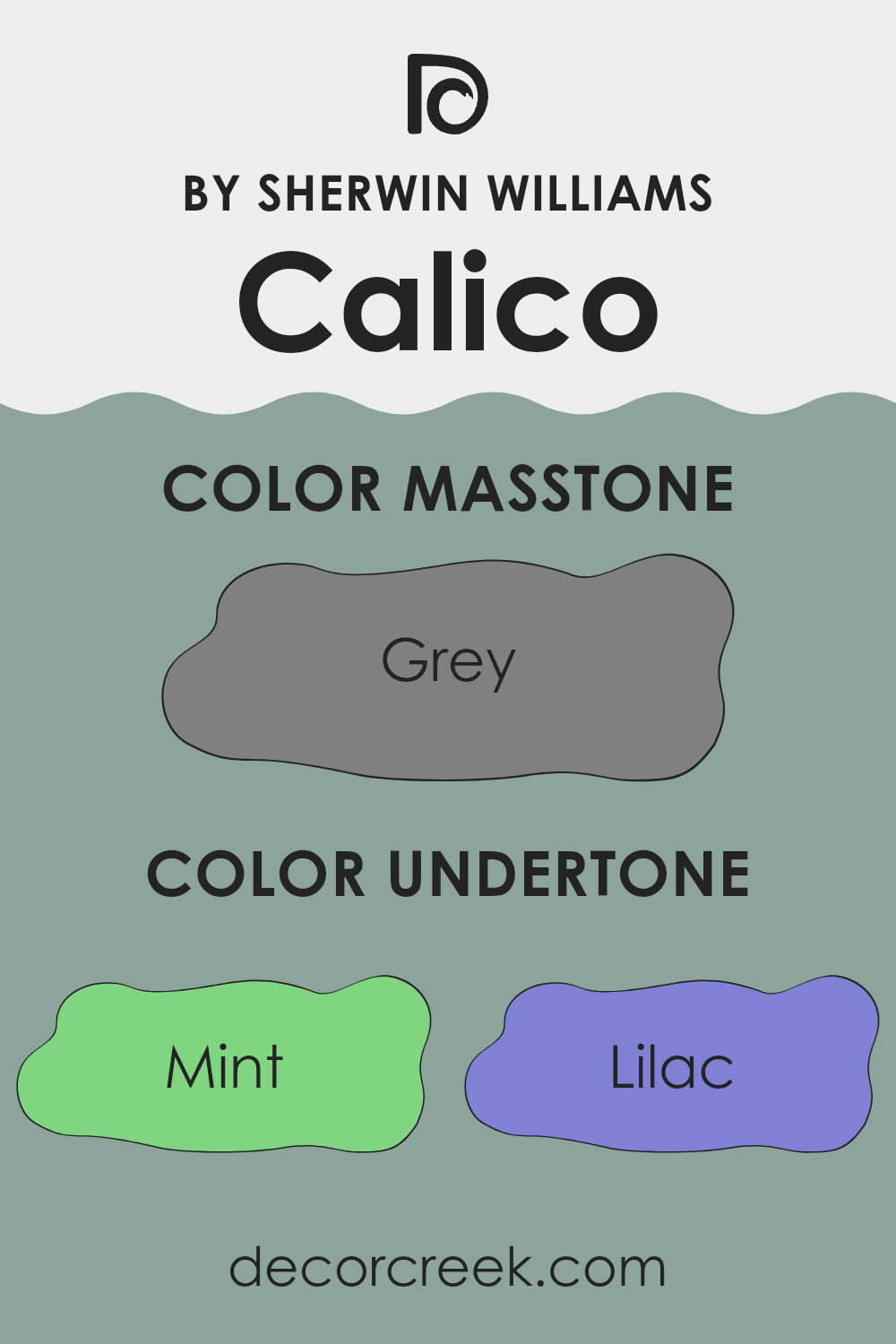
Undertones of Calico SW 0017 by Sherwin Williams
Calico SW 0017 by Sherwin Williams is a rich color with a variety of undertones that influence how we perceive it. Colors often have subtle hints of others mixed in, called undertones, which can change their appearance in different lighting and settings. For example, a paint might look more blue, green, or purple depending on its undertones and surrounding colors.
Calico SW 0017 includes a complex mix of undertones like mint, lilac, light blue, pale pink, and more, making it an intriguing color for interior walls. These undertones mean it can appear warm or cool, depending on the light and colors around it.
If this color is placed in a room with lots of natural light, its undertones like pale yellow or light green might stand out, creating a more vibrant look. In contrast, in dim light or with darker furnishings, its darker undertones like navy or brown might be more noticeable, giving a deeper, cozier feeling.
Using Calico SW 0017 on walls can create a dynamic setting that changes throughout the day. Furniture and decor in contrasting or complementary colors can also alter its appearance, as it may reflect those tones and shift accordingly. This makes it a flexible choice for anyone looking to add variety and interest to a room.
Using Calico SW 0017 on walls can create a dynamic setting that changes throughout the day. Furniture and decor in contrasting or complementary colors can also alter its appearance, as it may reflect those tones and shift accordingly. This makes it a flexible choice for anyone looking to add variety and interest to a room.
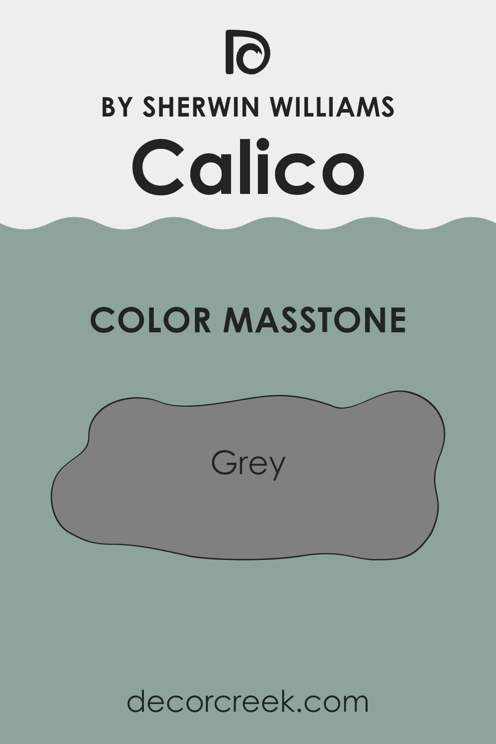
What is the Masstone of the Calico SW 0017 by Sherwin Williams?
Calico SW 0017 by Sherwin Williams is a flexible gray color with a masstone that closely resembles a balanced medium gray (#808080). This tone makes it an excellent choice for homes because it is neutral and can blend well with various styles and color schemes.
Its balanced nature means it does not lean too warm or too cool, providing a steady backdrop that complements both contemporary and traditional settings. In living areas, this gray can create a cozy and calm mood without drawing too much attention or feeling too strong against the other design elements.
It pairs well with bold accent colors and works seamlessly with natural materials like wood and stone. In smaller rooms, it can make the area feel more open and airy, as light plays gently across its surface. Whether used in a bedroom, living room, or kitchen, this gray is both practical and stylish, adding a touch of elegance without being flashy.
How Does Lighting Affect Calico SW 0017 by Sherwin Williams?
Lighting plays a crucial role in how we perceive color. The type of light—whether artificial or natural—can change how a color looks in a room. For example, Sherwin Williams’ Calico (SW 0017) is a soft, earthy hue that can shift in appearance based on the lighting conditions.
In natural light, the time of day and the room’s orientation significantly affect how a color appears. In a north-facing room, Calico might look cooler and slightly muted because north light is consistent but indirect and tends to be on the cooler side. This subtle change can make the color appear less vibrant and more subdued.
In contrast, a south-facing room enjoys the most direct sunlight throughout the day, resulting in warmer, more intense light. Calico can appear warmer and more enhanced in this context, showing more of its rich undertones. The sunlight’s strength during the day also helps bring out the depth in the color, making it feel inviting and lively.
An east-facing room receives bright, cool light in the morning and warmer, softer light later in the day. In the morning, Calico may appear crisper and brighter, while the afternoon light adds warmth, making the color feel cozier.
A west-facing room experiences the opposite effect, with warmer light in the afternoon and cooler light in the morning. In the afternoon, Calico can look more saturated and vivid, while in the morning, it might seem a bit more muted and gentle.
Artificial lighting also influences how the color looks. Yellow or warm light bulbs can make Calico appear warmer and more vibrant, while cool, white lights might make the color seem cooler and more subdued. Therefore, it’s essential to consider both natural and artificial lighting when choosing paint colors for a room to achieve the desired effect.

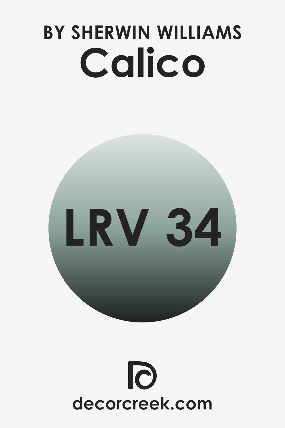
What is the LRV of Calico SW 0017 by Sherwin Williams?
Light Reflectance Value, or LRV, measures the amount of light a paint color reflects. It is a scale that goes from 0 to 100, where 0 is pure black, absorbing all light, and 100 is pure white, reflecting all light. When selecting a paint color, LRV is an essential factor because it helps determine how bright or dark a color will appear in a particular room.
Rooms with plenty of natural or artificial light can make darker colors feel more inviting and airy. In contrast, in dimly-lit rooms, darker colors might make the room feel smaller or more closed in. With an LRV of 34.492, Calico by Sherwin Williams is considered a medium-dark paint color.
This value means that Calico reflects a moderate amount of light, enough to add depth to a room without making it overly dark. In a well-lit room, Calico can create a cozy, warm atmosphere, offering a balance between brightness and richness. However, in rooms with limited light, this shade might appear slightly darker, emphasizing its depth and character.
This makes Calico a flexible choice, suitable for a range of different lighting situations, but it is crucial to consider the room’s lighting to achieve the desired effect.
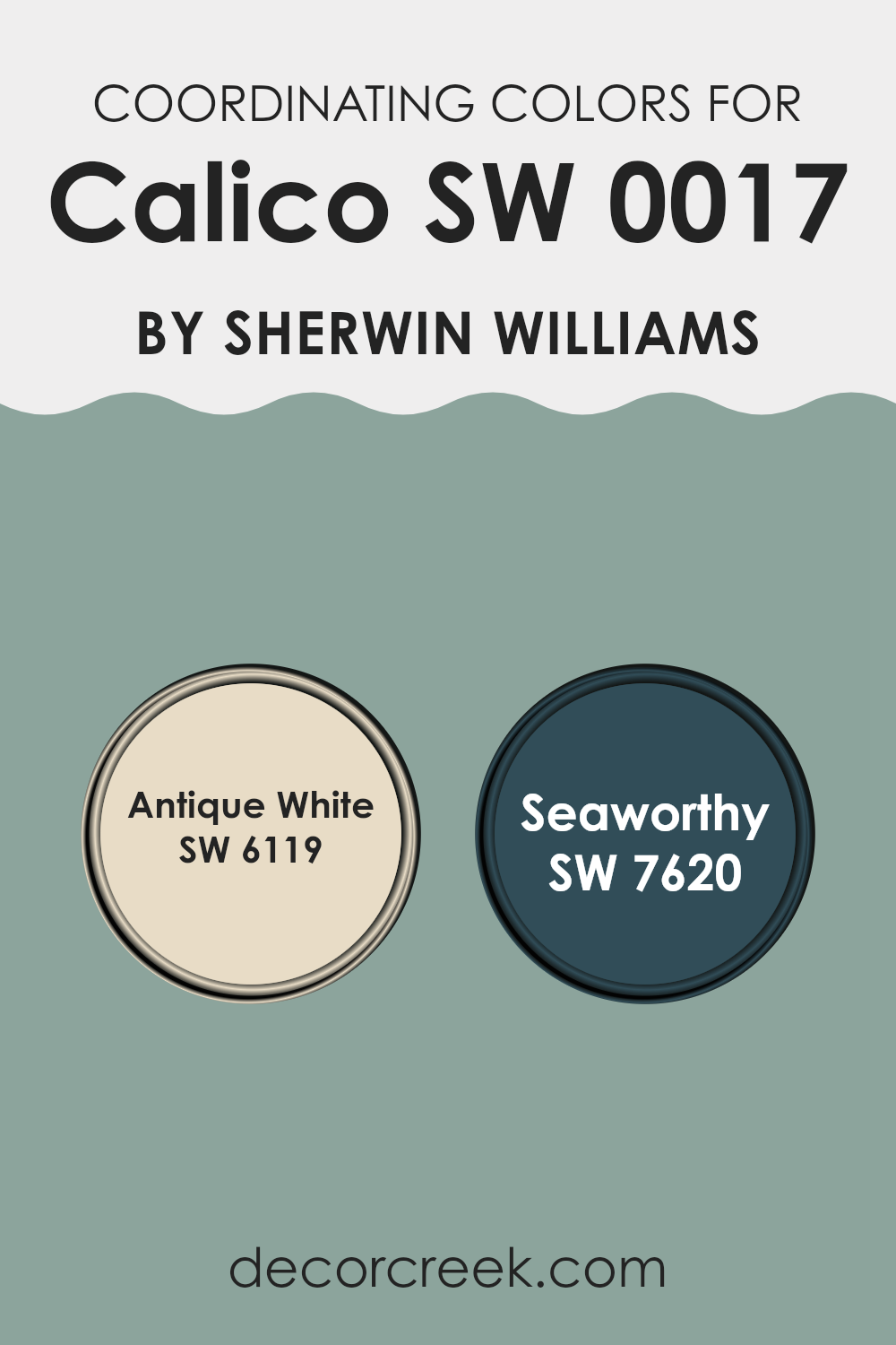
Coordinating Colors of Calico SW 0017 by Sherwin Williams
Coordinating colors are hues that work well together, creating a harmonious look in a room. Achieving a balanced and visually pleasing environment is often the goal when selecting such colors. For instance, Calico by Sherwin Williams is a warm, adaptable hue that serves as a neutral base or accent.
To complement it, you can use SW 6119 Antique White, a soft, creamy color. Antique White brings a sense of warmth and coziness, creating an inviting atmosphere. Meanwhile, SW 7620 Seaworthy is a deep, rich blue that adds depth and a touch of elegance to the palette.
Together, these colors provide a pleasing balance of warmth and coolness. Antique White pairs perfectly with Calico, offering a seamless transition between walls and other elements in your room. Seaworthy, in contrast, introduces a bold yet refined touch to the room, making features stand out while still maintaining harmony.
When used thoughtfully, these coordinating colors can bring out the best in each other, creating a room that feels cohesive and welcoming. Whether you’re painting an entire room or adding accents, understanding the interplay between these tones is key to making your design vision come to life.
You can see recommended paint colors below:
- SW 6119 Antique White
- SW 7620 Seaworthy
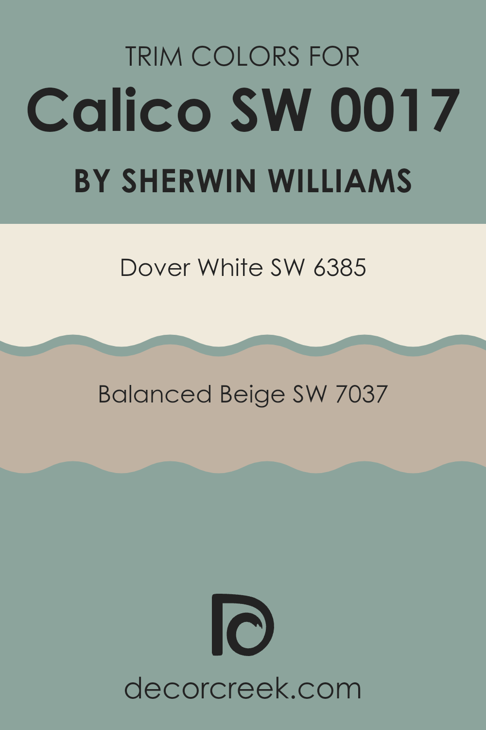
What are the Trim colors of Calico SW 0017 by Sherwin Williams?
Trim colors are an important element in interior design as they serve to frame and highlight the main wall colors, creating a cohesive look. For Calico SW 0017 by Sherwin Williams, using trim colors like SW 6385 – Dover White and SW 7037 – Balanced Beige can make a significant impact on a room’s overall appearance. Dover White is a light, creamy white that provides a warm and inviting atmosphere.
It works well as a trim color because it brings softness and brightness to a room without being too stark or cold. Balanced Beige, on the other hand, is a warm neutral that complements many different palettes. As a trim, it adds depth and richness to a room, providing subtle contrast without overpowering the main wall color.
Using the right trim colors enhances the harmony and character of a room. When paired with Calico, Dover White can highlight the warm hues and patterns, giving a fresh and airy feel. It works particularly well in rooms where you want a clean, yet cozy vibe.
Balanced Beige, meanwhile, offers a slightly deeper tone that grounds the area, balancing out lighter wall colors and adding a touch of sophistication. By choosing these specific trim colors, you can create a pleasing contrast and highlight architectural details, helping to define the edges of your rooms and making the overall design feel well-considered and polished.
You can see recommended paint colors below:
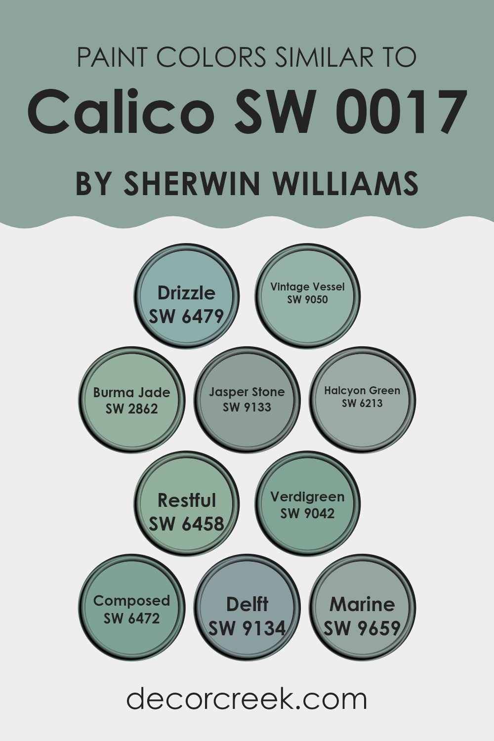
Colors Similar to Calico SW 0017 by Sherwin Williams
Similar colors hold a special place in design because they create harmony and balance. When you use colors that are close to each other on the color wheel, like those related to Calico by Sherwin Williams, they complement one another effortlessly.
This harmonious blend can make a room feel cozy and unified. For example, SW 6479 – Drizzle is a gentle blue-green that brings a touch of calmness, making it perfect for areas that need a bit of peace. SW 9050 – Vintage Vessel, on the other hand, offers a muted teal tone that can add depth without feeling too strong.
Meanwhile, SW 2862 – Burma Jade provides a soft, earthy green that can create a soothing natural feel, while SW 9133 – Jasper Stone delivers a subdued, neutral hue, perfect for grounding a room. SW 6213 – Halcyon Green is a beautiful blend of blue and green that adds a hint of calm and elegance. SW 6458 – Restful is aptly named, offering a delicate green that relaxes the senses. If you’re looking for a slightly more vibrant option, SW 9042 – Verdigreen is refreshing and lively.
SW 6472 – Composed leans more towards a quiet green, ideal for a peaceful atmosphere. SW 9134 – Delft offers a darker, rich hue that can add sophistication, while SW 9659 – Marine brings an oceanic, deep blue that can evoke a sense of calmness. These colors together or individually can enhance any room, bringing a sense of cohesion and peace.
You can see recommended paint colors below:
- SW 6479 Drizzle
- SW 9050 Vintage Vessel
- SW 2862 Burma Jade
- SW 9133 Jasper Stone
- SW 6213 Halcyon Green
- SW 6458 Restful
- SW 9042 Verdigreen
- SW 6472 Composed
- SW 9134 Delft
- SW 9659 Marine
How to Use Calico SW 0017 by Sherwin Williams In Your Home?
Calico SW 0017 by Sherwin Williams is a warm, earthy color that can add a cozy feel to any room. It’s a soft, neutral shade that works well in different rooms, whether you’re painting a living area, bedroom, or kitchen. This color blends beautifully with other earthy tones, like browns and greens, and adds a warm touch when paired with whites and creams.
In the living room, Calico can make the area feel inviting and comfortable, perfect for family gatherings. In a bedroom, it creates a calming atmosphere that promotes relaxation. Kitchens painted in Calico can look charming and homely, especially when combined with wooden cabinets or rustic decor.
This adaptable color can also be used in accent pieces like throw pillows, rugs, or curtains. It’s a great choice if you want a shade that’s subtle yet adds warmth and depth to your home.
Calico SW 0017 by Sherwin Williams vs Vintage Vessel SW 9050 by Sherwin Williams
Calico SW 0017 and Vintage Vessel SW 9050 by Sherwin Williams are two distinct paint colors. Calico SW 0017 is a warm, earthy hue that blends yellow, brown, and subtle orange tones, creating a cozy and inviting atmosphere. It’s reminiscent of sunlit clay or autumn leaves, perfect for adding warmth to any room.
On the other hand, Vintage Vessel SW 9050 is a soft, muted green with a hint of blue. It has a cool, calming feel and is reminiscent of a gentle sea breeze or the calmness of nature. This color is ideal for promoting relaxation and adding a sense of freshness to a room.
When comparing the two, Calico is a great choice for those looking to create a warm, rustic vibe. In contrast, Vintage Vessel offers a soothing, natural look, perfect for rooms where a cool and calming effect is desired. Both colors bring unique qualities, catering to different tastes and moods.
You can see recommended paint color below:
- SW 9050 Vintage Vessel
Calico SW 0017 by Sherwin Williams vs Verdigreen SW 9042 by Sherwin Williams
Calico SW 0017 and Verdigreen SW 9042 are two distinct colors by Sherwin Williams that bring contrasting vibes to a room. Calico is a warm, soft beige that feels inviting and cozy, making it ideal for rooms where you want to create a sense of comfort and ease. Its neutral nature allows it to blend seamlessly with various decor styles and colors.
On the other hand, Verdigreen stands out with its fresh, green tone that injects a lively and refreshing energy into a room. This color is perfect for adding a touch of nature and rejuvenation. It works well in rooms where you want to introduce a bit of brightness and vitality.
While Calico offers a calm, understated backdrop that lets other elements shine, Verdigreen adds a splash of color that can serve as a focal point. Both colors have their unique charm and can be used to create different atmospheres in your home.
You can see recommended paint color below:
- SW 9042 Verdigreen
Calico SW 0017 by Sherwin Williams vs Jasper Stone SW 9133 by Sherwin Williams
Calico and Jasper Stone are two distinct colors by Sherwin Williams that serve different design purposes. Calico SW 0017 is a warm, creamy beige that can add a cozy and inviting feel to a room. It has subtle yellow undertones, making it a flexible choice for living areas, bedrooms, or anywhere you want warmth and comfort.
On the other hand, Jasper Stone SW 9133 is a cool, muted greenish-gray. This color brings a touch of nature indoors, making it an excellent choice for creating calming areas. Its subtle green tone can remind one of stones or natural landscapes, providing a peaceful backdrop.
Overall, Calico is perfect for a welcoming, warm ambiance, while Jasper Stone offers a more relaxed, earthy mood. Both colors can complement a range of furnishings and decor styles, but each gives a unique feeling to the rooms they enhance.
You can see recommended paint color below:
- SW 9133 Jasper Stone
Calico SW 0017 by Sherwin Williams vs Marine SW 9659 by Sherwin Williams
Calico SW 0017 is a warm, beige color with a hint of yellow. It gives a cozy and inviting feel, making it ideal for living rooms or bedrooms where you want a soft, comforting atmosphere. This color works well with wood tones and creates a classic, lasting look.
On the other hand, Marine SW 9659 is a deep, rich blue. It brings a bold and dramatic touch to any room. Marine has a calming effect that’s great for creating a peaceful environment. This color can be used to add a statement to a room, especially when paired with white or lighter shades. It’s perfect for areas like bathrooms or accent walls where you want to add depth.
While Calico exudes warmth and tradition, Marine offers a cool and striking contrast. These colors can be used together for a balanced look, or separately to fulfill different design goals in a home.
You can see recommended paint color below:
Calico SW 0017 by Sherwin Williams vs Restful SW 6458 by Sherwin Williams
Calico SW 0017 by Sherwin Williams is a warm, earthy hue that brings a sense of coziness and comfort to a room. It’s a flexible shade that works well in living areas or bedrooms, adding warmth and a touch of traditional charm.
On the other hand, Restful SW 6458 by Sherwin Williams is a soft green that evokes a sense of calm and relaxation. It’s perfect for creating a peaceful environment in areas like bathrooms or bedrooms. This pleasant green gives a natural feel, reminiscent of fresh leaves or a tranquil garden.
While Calico is more about warmth and a homey feel, Restful leans towards coolness and freshness. Both colors can enhance the mood of a room but in different ways. Calico is best for rooms where warmth is desired, whereas Restful suits areas where a calming mood is preferred.
You can see recommended paint color below:
Calico SW 0017 by Sherwin Williams vs Halcyon Green SW 6213 by Sherwin Williams
Calico SW 0017 by Sherwin Williams is a warm, muted beige color that exudes comfort and a sense of coziness. It’s a classic, neutral shade with a subtle, earthy undertone, making it adaptable for various rooms. It pairs well with both traditional and modern designs, creating a welcoming environment.
On the other hand, Halcyon Green SW 6213 offers a cool, calming mix of blue and green tones. This soft, gentle color brings a refreshing vibe to any room. It works well in rooms where you wish to introduce a touch of nature or a beach-like vibe. Halcyon Green’s soothing nature can create an open, airy feel.
When comparing the two, Calico is more grounded and enveloping, while Halcyon Green brings a breath of fresh air and lightness. They can complement each other well; Calico adds warmth, and Halcyon Green brings calmness, making them a balanced pair for any home.
You can see recommended paint color below:
Calico SW 0017 by Sherwin Williams vs Delft SW 9134 by Sherwin Williams
Calico SW 0017 by Sherwin Williams is a warm, earthy color that exudes a sense of comfort and approachability. It has a strong resemblance to the rich hues of clay or terracotta, making it perfect for creating a cozy and inviting mood in any room. Its adaptability means it pairs well with both neutral and bold colors, adding depth and character to your home.
On the other hand, Delft SW 9134 is a cool, muted blue-green shade reminiscent of calm water or a peaceful sky. Delft brings a refreshing touch to interiors and works well in rooms where a soothing environment is desired. It can serve as a beautiful backdrop or an accent, complementing natural materials and creating a balanced, relaxed room.
Both colors have their unique charm: Calico’s warmth contrasts with Delft’s coolness. When used thoughtfully, they can create harmony and interest in a room.
You can see recommended paint color below:
Calico SW 0017 by Sherwin Williams vs Drizzle SW 6479 by Sherwin Williams
Calico by Sherwin Williams is a warm, earthy color that resembles the light tan or beige found in natural fibers. It’s cozy and comforting, making rooms feel welcoming and grounded. This color works well in living areas or any room where a warm, inviting atmosphere is desired.
Drizzle, also by Sherwin Williams, is a soft, muted blue-gray that evokes a calm, refreshing feeling. It’s reminiscent of a gentle rain, which adds a sense of coolness and relaxation to a room. Drizzle pairs beautifully with whites and other soft colors, creating a soothing environment.
When comparing the two, Calico offers warmth, making it a great choice for rooms seeking comfort. Drizzle, on the other hand, provides a cool and refreshing touch, ideal for areas needing a peaceful, calming mood. Both colors work well with a variety of palettes, but they introduce different feelings—one warm and inviting, the other cool and soothing.
You can see recommended paint color below:
- SW 6479 Drizzle
Calico SW 0017 by Sherwin Williams vs Composed SW 6472 by Sherwin Williams
Calico SW 0017 and Composed SW 6472 by Sherwin Williams are two distinct colors that offer different vibes for any room. Calico is a warm, earthy tone that resembles a soft beige with a hint of yellow. It creates a cozy, welcoming mood that’s perfect for living rooms or bedrooms.
On the other hand, Composed is a cool, soft blue-green. This color brings a calming effect, ideal for areas where you want to feel relaxed, like bathrooms or meditation rooms. While Calico offers warmth and inviting comfort, Composed brings a soothing, fresh touch.
Both colors can be used to complement various design styles, but their effect on a room will be quite different. Calico’s warmth blends well with earthy tones and natural materials, while Composed pairs nicely with whites, greys, and other cool colors. Choosing between them depends on whether you want warmth and coziness or coolness and calm.
You can see recommended paint color below:
Calico SW 0017 by Sherwin Williams vs Burma Jade SW 2862 by Sherwin Williams
Calico by Sherwin Williams is a warm, creamy beige that brings a sense of coziness and comfort to a room. It’s an adaptable color that pairs well with various other shades, making it a popular choice for living rooms and bedrooms. Calico offers a neutral backdrop that can complement both classic and modern decor styles.
On the other hand, Burma Jade by Sherwin Williams is a cool green with hints of blue, reminiscent of natural jade stones. It adds a touch of freshness and vibrancy to any room. Burma Jade is ideal for adding an accent or creating a statement wall, offering a refreshing contrast to neutral colors like Calico.
While Calico is all about warmth and neutrality, Burma Jade introduces a splash of color and energy. When used together, these colors can create a balanced and harmonious environment, with Calico providing warmth and Burma Jade adding a lively touch.
You can see recommended paint color below:
- SW 2862 Burma Jade
After spending time with SW 0017 Calico by Sherwin Williams, I feel like I’ve found a cozy and comfortable friend in the world of colors. Calico is a warm brown shade that reminds me of a snug blanket on a chilly day, making any room feel welcoming and filled with warmth.
Picture this color as a hug from your favorite teddy bear. It’s perfect for living rooms where you gather with family, or a bedroom where you wind down for the night. Calico brings a sense of comfort, like sipping hot cocoa in front of a fireplace.
I noticed that Calico works really well with other colors. Pair it with soft blues or creamy whites, and you’ll have a look that feels natural and easy on the eyes. It’s like matching a favorite pair of jeans with different tops—they all work together nicely!
In thinking about how Calico fits into a home, it’s clear this color helps create a friendly environment. Whether on the walls, as an accent like a cushion or a cozy rug, Calico shines through. It’s a reliable hue that turns a house into a home where everyone feels welcome.
So, if you’re looking for a color that offers a big warm hug every time you walk into a room, SW 0017 Calico is a lovely choice. It’s like adding a touch of cozy magic to your life!

Ever wished paint sampling was as easy as sticking a sticker? Guess what? Now it is! Discover Samplize's unique Peel & Stick samples.
Get paint samples

