This sophisticated paint shade embodies the soothing qualities of a maritime escape, making it a perfect choice for those looking to infuse their living spaces with a sense of calm and tranquility. The unique color draws inspiration from the depths of the ocean, offering a subtle blend of blue and green hues that mirror the captivating beauty of the sea.
Its versatility allows it to seamlessly adapt to various decors, enhancing the aesthetic appeal of any room. SW 9659 Marine is more than just a paint color; it’s a design element that brings the essence of the outdoors into your home.
Whether you aim to create a serene retreat in your bedroom or a fresh, lively atmosphere in your living area, this shade provides a solid foundation for a range of decorative styles.
The color’s adaptability also extends to lighting, where it can shift in hue and intensity based on the natural and artificial light it receives, offering an ever-evolving backdrop to your daily life.Choosing SW 9659 Marine by Sherwin Williams means opting for a timeless yet contemporary color that promises to transform your home into a tranquil haven.
It’s an invitation to bring the harmonious and invigorating spirit of the sea into your living environment, creating a space that’s both relaxing and inspiring.

What Color Is Marine SW 9659 by Sherwin Williams?
The color Marine by Sherwin Williams is a deep, striking hue that effortlessly captures the essence of the ocean’s vast expanse. This vibrant shade balances between a rich blue and a subtle hint of green, reminiscent of the serene waters found in a secluded marine sanctuary.
Its depth and saturation make it a bold choice for interior spaces, offering a statement of confidence and sophistication.
This distinctive color works exceptionally well in a variety of interior styles, particularly in modern and coastal designs. In modern settings, Marine adds a dramatic flair, serving as a focal point when applied on accent walls or furniture pieces.
Its cool undertones complement minimalist aesthetics, providing a splash of color that energizes the space without overwhelming it.
In coastal-themed interiors, Marine evokes the natural beauty of the sea, creating a calming and welcoming atmosphere. Pairing this color with natural materials and textures enhances its organic quality.
Light woods, such as oak or maple, provide a warm contrast, while natural fibers like linen and jute add depth and interest through tactile variation. Metallic finishes, especially in brushed nickel or chrome, introduce a contemporary edge, offering a sleek counterbalance to the color’s intrinsic richness.
Together, these elements form a cohesive palette that celebrates Marine’s versatility and beauty, making it a truly exceptional choice for creating spaces that are both elegant and invigorating.
Ever wished paint sampling was as easy as sticking a sticker? Guess what? Now it is! Discover Samplize's unique Peel & Stick samples.
Get paint samples

Is Marine SW 9659 by Sherwin Williams Warm or Cool color?
MarineSW 9659 from Sherwin Williams embodies a versatile and serene hue that can significantly impact a home’s interior. This particular shade captures the essence of the ocean’s depths, combining both tranquility and depth in its blue-green palette.
Its calming effect makes it an ideal choice for creating a relaxing atmosphere in bedrooms, bathrooms, or any space meant for unwinding.
The color works harmoniously with natural light, shifting subtly throughout the day to reflect a dynamic yet serene environment. In addition to its aesthetic appeal, this shade can also visually expand a space, making it feel more open and airy—a perfect illusion for smaller rooms.
When paired with neutral tones, it adds a splash of color that energizes without overwhelming, making it versatile for various design styles from modern to coastal.
This unique balance of qualities allows it to foster a comforting and invigorating space, enhancing the way homes feel and function.
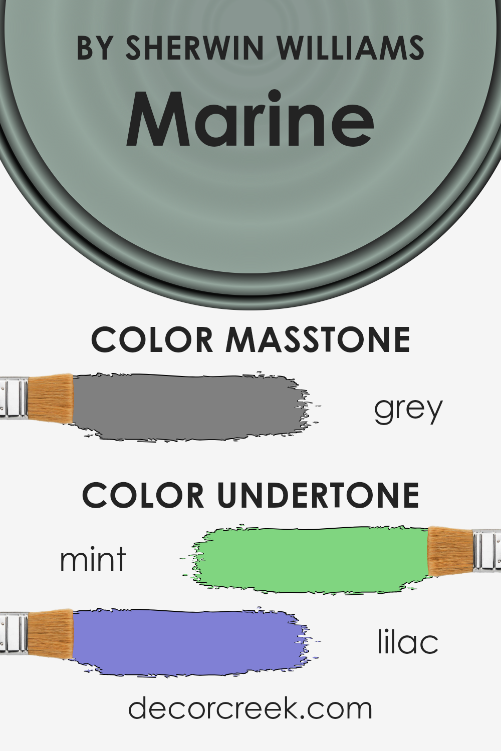
Undertones of Marine SW 9659 by Sherwin Williams
Marine, by Sherwin Williams, is a captivating color that embodies depth and tranquility. This hue, though primarily seen as a bold statement, carries subtle undertones that significantly influence its overall appearance and perception.
The mint (#80D580) and lilac (#8080D5) undertones embedded within this shade add layers of complexity, making it a versatile choice for interior design.
Undertones play a crucial role in the way colors are perceived. They can alter a color’s warmth, coolness, and even its ability to complement other shades within a space. These subtle hues, often unnoticed at first glance, can shift dramatically under different lighting conditions.
Mint, with its fresh and invigorating essence, imparts a sense of renewal and vibrancy to Marine. In contrast, the lilac undertone, which gently whispers of serenity and elegance, imbues the color with a soft, inviting warmth.
When applied to interior walls, the intricate dance between Marine’s bold presence and its delicate undertones creates an environment that is both dynamic and harmonious. In well-lit areas, the mint undertone can make a room feel more spacious and alive, reflecting light in a way that energizes the space.
Conversely, in dimmer settings, the lilac undertone can prevail, crafting a cozy, tranquil refuge that invites relaxation and contemplation.
This duality makes Marine an exceptional choice for those seeking to balance boldness with subtlety in their living spaces, allowing the walls to act as a canvas that reflects different moods and nuances throughout the day.
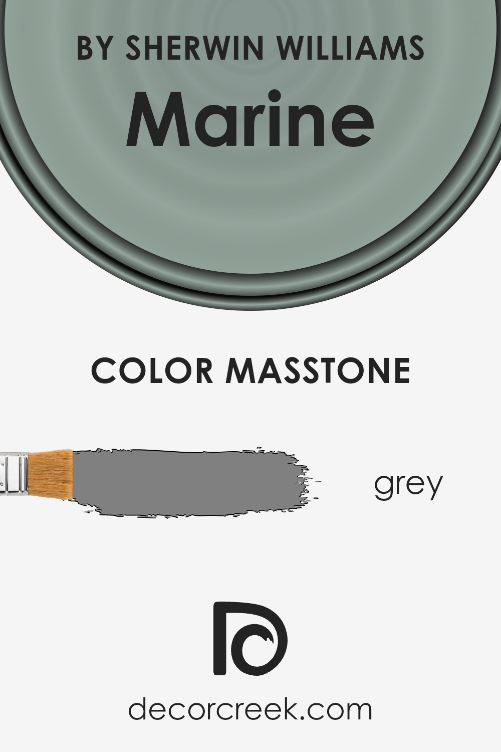
What is the Masstone of the Marine SW 9659 by Sherwin Williams?
Sherwin Williams’ color MarineSW 9659 possesses a masstone that intriguingly mirrors the hue of grey, specifically reflected by the hexadecimal code #808080.
This nuanced shade stands out for its remarkable versatility and balanced neutrality, enabling it to harmoniously blend into a plethora of home environments and design aesthetics.
The grey masstone fosters a sophisticated, timeless ambiance that can effortlessly complement both contemporary and traditional spaces.
Its unique ability to act as either a subtle background or a statement color allows homeowners to use it in a variety of applications – from serene, expansive walls that provide a calming effect to accent pieces that draw attention without overwhelming.
This color naturally invites light into the room, making spaces appear larger and more open, while also providing an excellent backdrop against which colors can pop or muted tones can soothe.
Its adaptability makes it an ideal choice for those looking to achieve an elegant yet understated look in their home, proving that this grey shade is anything but ordinary.
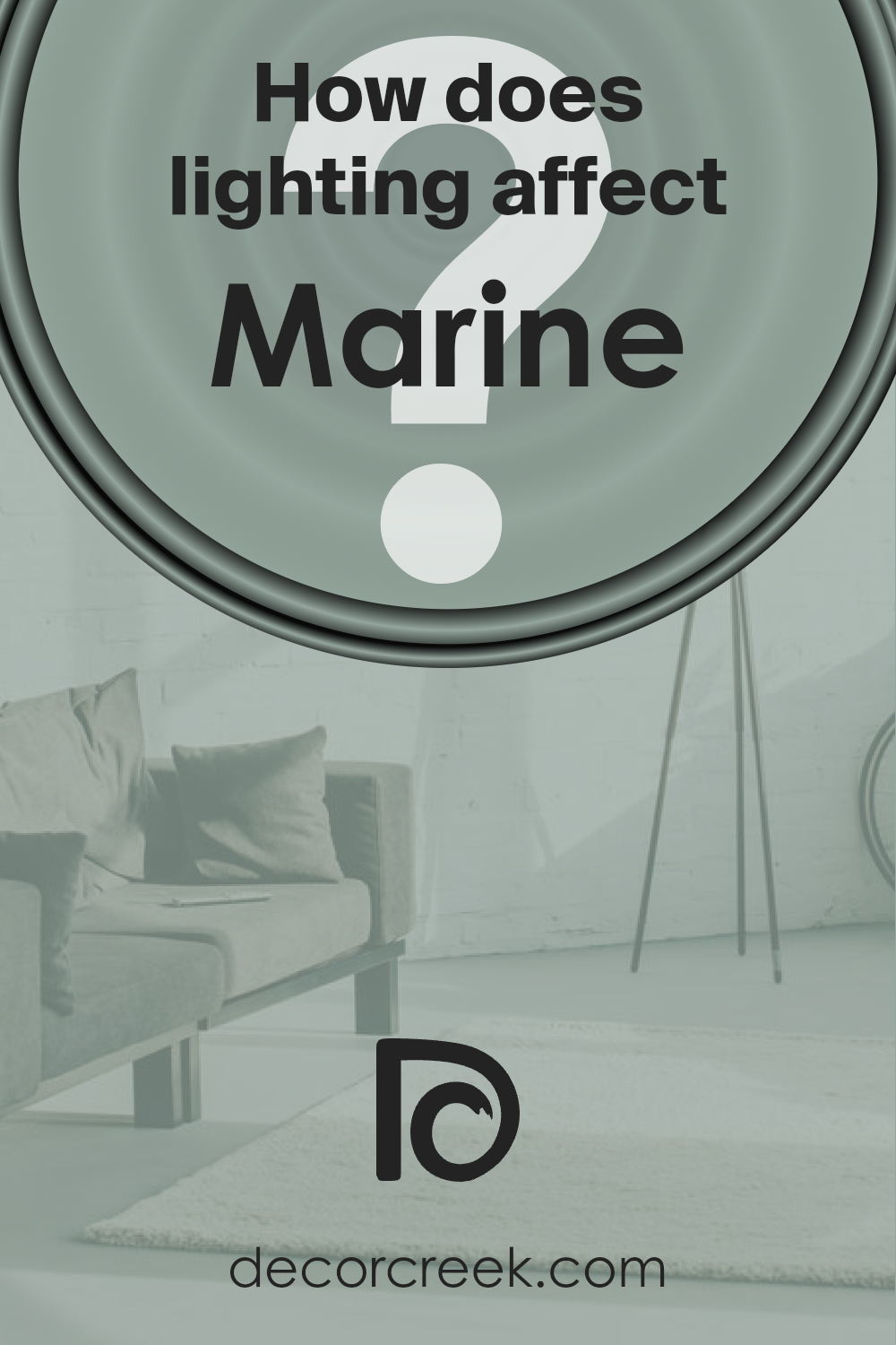
How Does Lighting Affect Marine SW 9659 by Sherwin Williams?
Lighting plays a quintessential role in how we perceive colors, making it a critical aspect of interior design and daily life. Different light sources can drastically alter the appearance of a color, affecting its hue, saturation, and brightness.
This phenomenon is not just a matter of artificial versus natural light; the direction of light also significantly impacts how a color is perceived in a space.
Take, for instance, a color like a deep, serene blue. Under artificial light, such as LED or incandescent bulbs, the color can appear warmer or cooler depending on the light’s temperature.
Warm light might bring out a more muted, cozy aspect of the blue, making it ideal for living spaces where a sense of calm and relaxation is desired. In contrast, cool light can enhance the blue’s vibrancy, making it more crisp and lively, which might be preferred in workspaces or bathrooms.
In natural light, this serene blue’s appearance can vary significantly throughout the day and depending on the room’s orientation. North-facing rooms receive less direct sunlight, causing the blue to appear more consistent but slightly cooler and more subtle, which can enhance its calming effect.
South-facing rooms, bathed in abundant direct sunlight, can make the blue feel warmer and more inviting, perfect for social spaces like kitchens and dining rooms.
East-facing rooms enjoy the warm, gentle light of the morning sun, which can make the blue look soft and vibrant in the morning, gradually transitioning to a cooler tone as the day progresses.
Conversely, west-facing rooms receive the intense, warm light of the setting sun, which can make the blue appear much warmer and more dynamic in the late afternoon and evening.
Understanding how lighting affects color is crucial for choosing the right paint for a space. A versatile color like this deep blue can adapt uniquely to different lighting conditions, making it an excellent choice for various applications across an interior, demonstrating both the complexity and beauty of color perception.
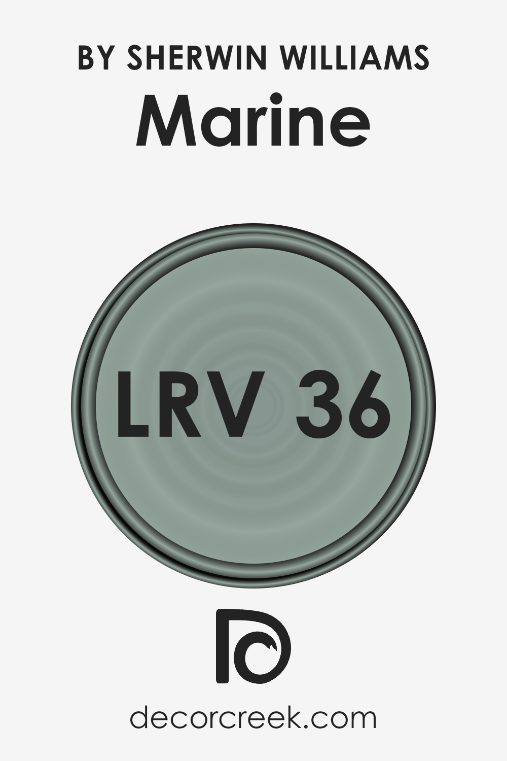
What is the LRV of Marine SW 9659 by Sherwin Williams?
LRV, which stands for Light Reflectance Value, is a critical measure used in the paint and interior design industries to evaluate how much light a paint color reflects back into the environment, on a scale from 0 to 100. A score of 0 indicates that the color absorbs all light, making it a true black, while a score of 100 reflects all the light, representing a true white.
This value is essential because it helps in determining how light or dark a color will appear once applied to walls. It influences not just the aesthetics but also the ambience of a space, affecting how colors are perceived under different lighting conditions.
For instance, rooms with a higher LRV paint will tend to be brighter and feel more spacious, reflecting more natural and artificial light, whereas lower LRV colors create a cozier and more intimate atmosphere.
The specific LRV of 35.959 for a marine-inspired color indicates a mid-range ability to reflect light. This suggests that the color is neither too dark nor too light, providing a balanced and versatile backdrop suitable for various design styles and spaces.
In rooms with ample natural light, this LRV will help the color to appear slightly lighter and more vibrant, enhancing the room’s overall bright and airy feel without being overwhelming.
Conversely, in spaces with limited natural light, the same LRV could invoke a more subdued and serene ambiance, accentuating the color’s depth and richness. The particular LRV is crucial in achieving the desired effect on the walls, making it a balanced choice for both well-lit and dimly lit environments.
LRV – what does it mean? Read This Before Finding Your Perfect Paint Color
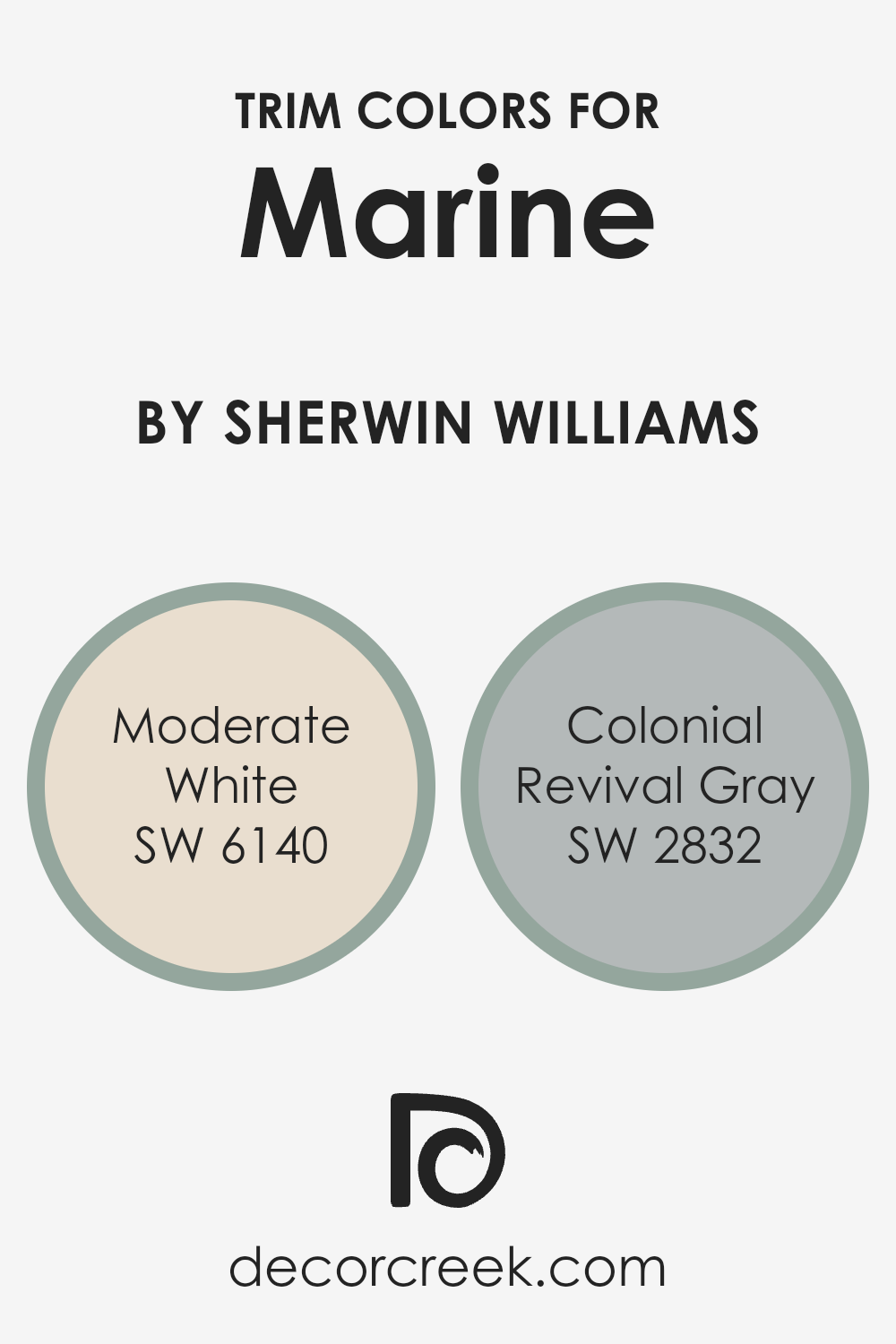
What are the Trim colors of Marine SW 9659 by Sherwin Williams?
Trim colors are integral components of a home’s exterior and interior design, serving to accentuate and complement the main color palette. In the context of Marine SW 9659 by Sherwin-Williams, a sophisticated and deep hue, the choice of trim colors plays a pivotal role in enhancing the visual appeal and providing a cohesive look.
Properly selected trim colors can highlight the architectural details, frame views, and create a polished finish that elevates the overall aesthetic.
The role of a trim color is not just to contrast or blend with the primary color but to also bring balance, depth, and definition to the spaces, making the choice of colors critically important for achieving the desired outcome.
Moderate White SW 6140 is a soft, warm white with subtle undertones that can beautifully complement Marine SW 9659 by offering a gentle contrast that is soothing to the eye, thus enabling the deeper tones of the marine shade to stand out without overwhelming the senses.
This color has the versatility to bridge traditional and contemporary styles, adding a touch of elegance and light to any space.
On the other hand, Colonial Revival Gray SW 2832 introduces a timeless, neutral gray that harmonizes with the marine hue, grounding the color scheme and lending an air of sophistication and tranquility.
This particular shade of gray works well to subtly underscore the richness of the marine, making it an excellent choice for creating a serene and inviting atmosphere.
Together, these trim colors work in harmony with Marine SW 9659 to enhance the architectural beauty and create a compelling, visually cohesive environment.
You can see recommended paint colors below:
- SW 6140 Moderate White
- SW 2832 Colonial Revival Gray
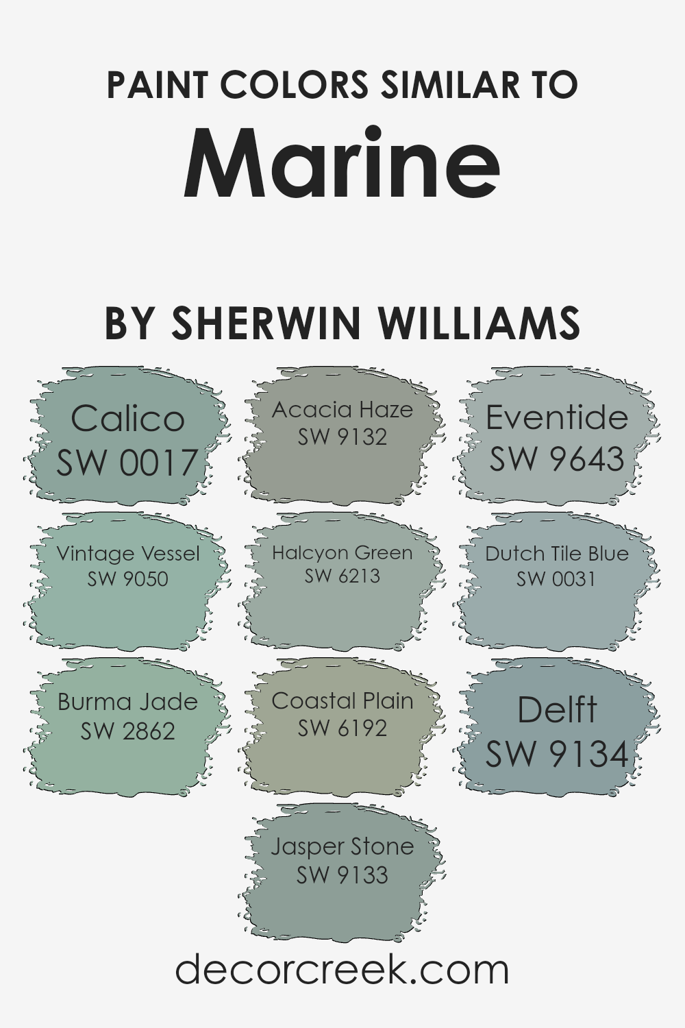
Colors Similar to Marine SW 9659 by Sherwin Williams
The palette comprising similar colors to Marine by Sherwin Williams, such as Calico, Vintage Vessel, and Burma Jade, orchestrates a harmonious visual experience by employing shades that share an underlying cohesive tone.
These colors, which range from the comforting earthiness of Jasper Stone to the serene depths of Acacia Haze, evoke a sense of natural elegance and refined tranquility.
By drawing inspiration from the natural world, colors like Halcyon Green and Coastal Plain introduce a soft, subtle vitality to spaces, creating environments that feel both invigorating and peaceful, ideal for spaces aiming for a balance between stimulation and relaxation.
Diving deeper into the cooler end of the spectrum, Eventide, Dutch Tile Blue, and Delft exemplify how similar colors can be used to craft a narrative within a space, guiding the emotional and visual flow from room to room.
These colors, particularly when used with thoughtfulness and intention, can command the mood of a space, making it feel more cohesive and intentionally designed.
Whether aiming for a backdrop that complements the bold vibrancy of life or seeking a quiet nook of solace and reflection, the careful selection of similar hues, inspired by the Marine palette, plays a crucial role in achieving the desired ambiance.
You can see recommended paint colors below:
- SW 0017 Calico
- SW 9050 Vintage Vessel
- SW 2862 Burma Jade
- SW 9133 Jasper Stone
- SW 9132 Acacia Haze
- SW 6213 Halcyon Green
- SW 6192 Coastal Plain
- SW 9643 Eventide
- SW 0031 Dutch Tile Blue
- SW 9134 Delft
How to Use Marine SW 9659 by Sherwin Williams In Your Home?
Marine SW 9659 is a captivating paint color offered by Sherwin Williams that carries the essence of the sea into any living space. This unique shade encapsulates the deep, serene blue found in the heart of the ocean, making it an excellent choice for bringing a sense of calm and sophistication into your home.
Suitable for a variety of applications, Marine can transform an ordinary room into a tranquil oasis.
It works exceptionally well in bathrooms, where it complements white fixtures and natural light, creating a spa-like atmosphere. In bedrooms, its soothing tones can aid in relaxation and sleep.
Living rooms and kitchens also benefit from Marine’s versatility, as it pairs beautifully with both modern and traditional decors, accentuating details like woodwork and metallic finishes.
For an accent wall, Marine adds a dramatic focal point, while in smaller applications, such as a piece of furniture or cabinetry, it introduces a refreshing pop of color that revitalizes the room.
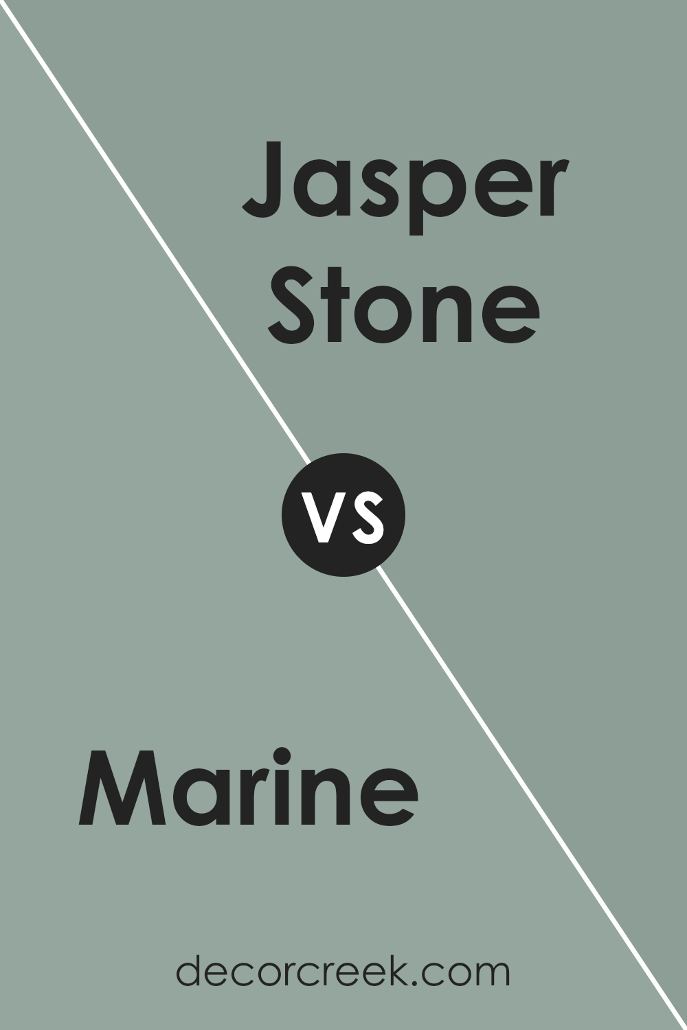
Marine SW 9659 by Sherwin Williams vs Jasper Stone SW 9133 by Sherwin Williams
Marine and Jasper Stone , both by Sherwin Williams, present unique atmospheric qualities to any space. Marine, a deep, vibrant shade reminiscent of the ocean at dusk, has a dynamic and bold character.
Its intensity and depth can create an enveloping feel in a room, ideal for statement walls or accent pieces. This hue brings a sense of serenity mixed with sophistication, drawing inspiration from the natural elegance of the sea.
On the other hand, Jasper Stone offers a more grounded approach with its earthy, warm undertone. This color, inspired by the natural mineral, delivers a comforting and organic ambiance.
It’s a versatile shade that can complement a wide range of decor styles, from rustic to contemporary. Jasper Stone works well in spaces intended for relaxation and rejuvenation, providing a soft backdrop that enhances natural light and adds a subtle touch of nature.
While Marine thrusts an air of dramatic flair and depth, Jasper Stone leans towards a calming, nurturing environment, making both colors valuable for different reasons and settings.
You can see recommended paint color below:
- SW 9133 Jasper Stone
Marine SW 9659 by Sherwin Williams vs Vintage Vessel SW 9050 by Sherwin Williams
Marine SW 9659 and Vintage Vessel SW 9050 , both by Sherwin Williams, present a captivating dichotomy in the realm of color selection, each invoking distinct moods and atmospheres. Marine, as its namesake suggests, is a vibrant, deep shade reminiscent of the ocean depths, providing a bold and energetic presence.
This hue exudes confidence and is perfect for spaces seeking a dynamic focus or an element of dramatic flair. On the other hand, Vintage Vessel offers a softer, more grounded approach.
This color is a muted green with gray undertones, hinting at timeless elegance and a connection to nature. It suggests tranquility and a serene, calming ambiance, ideal for areas where relaxation and contemplation are desired.
While both colors showcase Sherwin Williams’ commitment to providing a wide spectrum of high-quality paint options, the choice between Marine and Vintage Vessel ultimately depends on the intended emotional impact and stylistic direction of the space.
You can see recommended paint color below:
- SW 9050 Vintage Vessel
Marine SW 9659 by Sherwin Williams vs Calico SW 0017 by Sherwin Williams
Marine and Calico , both from Sherwin Williams, present a striking contrast that can evoke a sense of harmony and balance when used wisely in design. Marine is a deep, vibrant hue reminiscent of the vast and mysterious ocean.
It carries with it a sense of depth and sophistication, offering a bold statement wherever applied.
This color typically suits spaces aiming for a dramatic flair or needing a strong focal point. On the other hand, Calico is a much softer, more neutral shade that leans toward the warmer side of the color spectrum.
It evokes a sense of calmness, cleanliness, and simplicity, making it a versatile choice for creating serene and inviting environments.
Calico can serve as a subtle background, allowing other colors, like the assertive Marine, to stand out.
Together, they can form a visually appealing palette, combining Marine’s boldness with Calico’s soft warmth to create spaces that are both captivating and comfortable.
You can see recommended paint color below:
- SW 0017 Calico
Marine SW 9659 by Sherwin Williams vs Eventide SW 9643 by Sherwin Williams
Marine SW 9659 and Eventide SW 9643 , both by Sherwin Williams, present a nuanced exploration of blue hues, imbuing spaces with distinct moods and character. Marine SW 9659 dives deep into the blue spectrum, offering a rich, bold, and inviting tone that resembles the depths of the ocean.
Its intensity and depth make it a perfect choice for creating dramatic, sophisticated spaces or accent walls, aiming to add a touch of elegance and profundity.
On the other hand, Eventide SW 9643 leans towards a softer, lighter blue with a calm and serene aura. It captures the gentle transition of the sky at dusk, offering a peaceful and tranquil vibe.
This color is ideal for creating a soothing ambiance, suitable for bedrooms or bathrooms where relaxation is a priority.
While both colors celebrate the versatility and emotional range of blues, Marine boasts a vibrant depth that commands attention, contrasting with Eventide’s gentle whisper of calmness and light.
The choice between them hinges on the desired atmosphere, with Marine asserting a bolder statement and Eventide fostering a soothing retreat.
You can see recommended paint color below:
- SW 9643 Eventide
Marine SW 9659 by Sherwin Williams vs Coastal Plain SW 6192 by Sherwin Williams
Marine SW 9659 and Coastal Plain SW 6192 , both from Sherwin Williams, present a nuanced juxtaposition of depth and serenity within their respective color spaces.
Marine is a vivid, deep hue that seems to encapsulate the essence of the ocean’s depth, offering a rich and immersive experience. Its intensity and darkness can create a focal point in a room, commanding attention while fostering a sense of sophistication and mystery.
On the other hand, Coastal Plain leans towards the softer, more muted side of the green spectrum. It embodies the calm and refreshing qualities of a seaside landscape, providing a grounding and tranquil backdrop that promotes relaxation.
This color, lighter in tone, is versatile and works well in spaces aiming for a breezy and open atmosphere.
While both colors draw inspiration from nature, specifically the aquatic environment, they serve markedly different purposes in interior design. Marine, with its bold and enveloping character, is ideal for creating dramatic and cozy spaces.
Coastal Plain, conversely, is suited for those seeking to instill a sense of peace and airy lightness into their decor.
Together, these colors could be used to create a dynamic and balanced environment, with Marine offering depth and focus, and Coastal Plain ensuring the space remains open and serene.
You can see recommended paint color below:
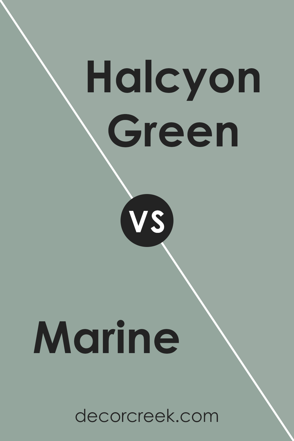
Marine SW 9659 by Sherwin Williams vs Halcyon Green SW 6213 by Sherwin Williams
Marine SW 9659 by Sherwin Williams and Halcyon Green SW 6213 , also by Sherwin Williams, present a captivating contrast within the same spectrum of cool tones. Marine, a rich, profound hue, tends towards a deep, almost navy blue that mimics the endless depths of the ocean.
It embodies a classic elegance and a modern depth, making it versatile for spaces that aim to be both impactful and timeless. On the other hand, Halcyon Green lives in the softer, more serene end of the spectrum.
Its name evokes a calm and peaceful aura, mirroring the soothing nature of a tranquil sea. Halcyon Green blends green and subtle blue undertones, resulting in a refreshing and rejuvenating color that can lighten and expand a space.
While Marine offers drama and sophistication, Halcyon Green brings a breath of fresh air, promoting a light, airy, and peaceful ambiance. Together, these colors can create a dynamic and balanced environment, each enhancing the other’s distinct qualities.
You can see recommended paint color below:
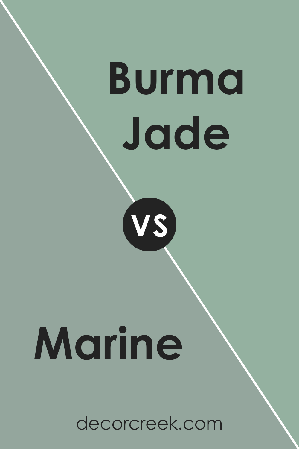
Marine SW 9659 by Sherwin Williams vs Burma Jade SW 2862 by Sherwin Williams
Marine SW 9659 and Burma Jade SW 2862 , both by Sherwin Williams, exhibit distinctive personalities, subtly varying in their influence on space and mood. Marine delves into a deeper, richer spectrum, embodying a profound, almost oceanic allure that suggests a stately, classic ambiance.
Its intensity and depth offer an enveloping warmth, reminiscent of the serene depths of the sea, making it ideal for creating focal points or adding a touch of sophistication to any area.
On the other hand, Burma Jade presents a lighter, more verdant tone, capturing the essence of natural beauty and vibrancy. It leans towards a refreshing and rejuvenative feel, evoking the lushness of exotic landscapes.
This color is perfect for spaces intended to stimulate relaxation and rejuvenation, bringing a bright and airy feel that complements well with natural light and open spaces.
While both hues stem from nature’s palette, Marine’s dark, enveloping warmth contrasts with Burma Jade’s lively, rejuvenating essence, offering diverse options for creating ambiance and style in interior environments.
You can see recommended paint color below:
- SW 2862 Burma Jade
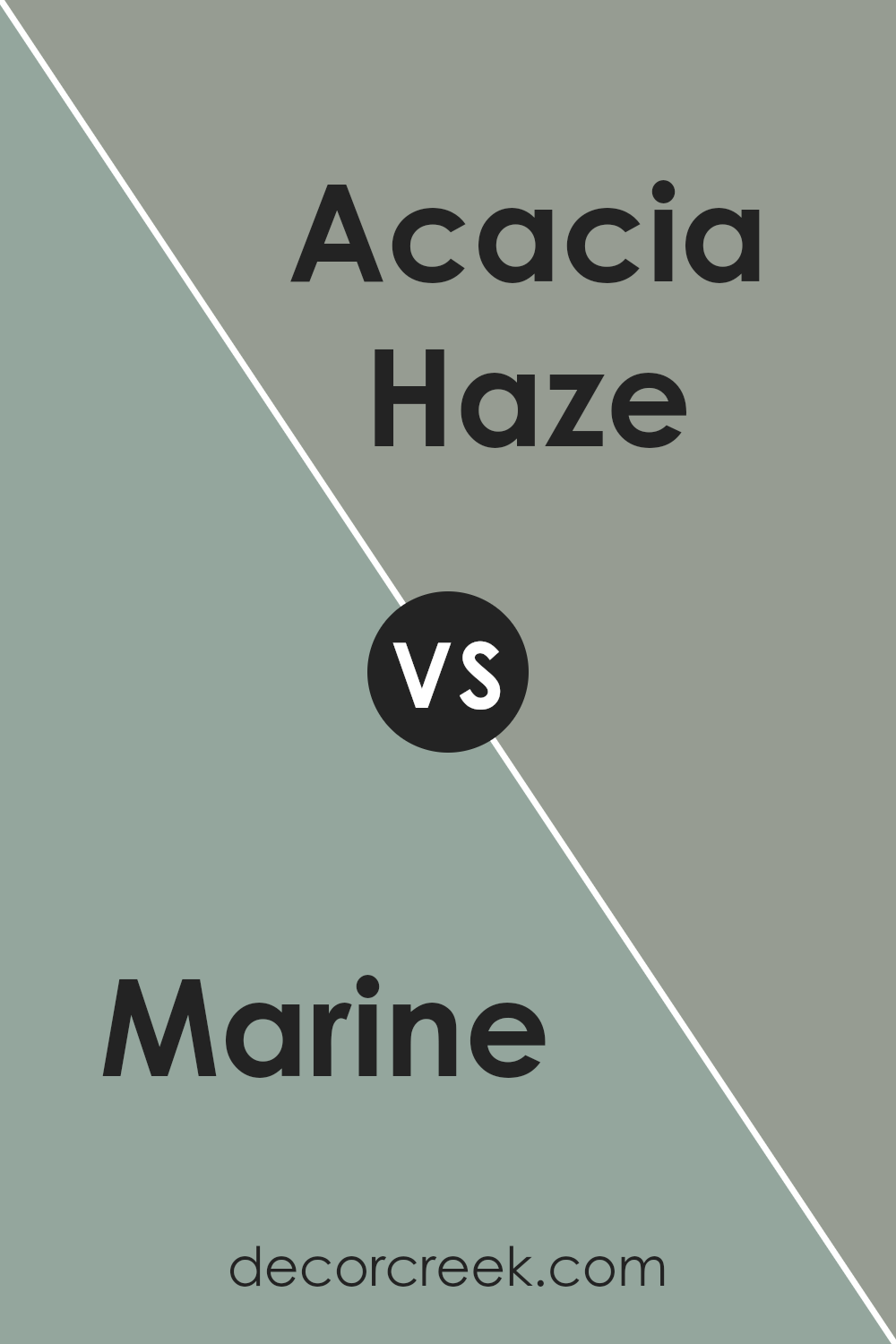
Marine SW 9659 by Sherwin Williams vs Acacia Haze SW 9132 by Sherwin Williams
Marine (SW 9659) and Acacia Haze (SW 9132) by Sherwin Williams are two distinct colors, each offering a unique vibe and aesthetic.
Marine is a rich, deep teal that leans towards the cooler end of the spectrum, embodying the depth and mystery of the sea. Its vibrant hue is both bold and calming, making it an ideal choice for creating focal points or adding a splash of color in spaces.
On the other hand, Acacia Haze resides in a more subdued territory. This color is a soft, sage-like green with gray undertones, providing a tranquil and serene feel.
Acacia Haze serves as a versatile backdrop for various decor styles, promoting a sense of harmony and natural elegance. It’s less about making a bold statement and more about creating a subtle, cohesive look.
While both colors draw inspiration from nature, Marine offers a daring splash of color reminiscent of oceanic depths, whereas Acacia Haze brings an understated sophistication with its earthy, muted tones.
Choosing between them depends on the desired mood and atmosphere; Marine for a dynamic, energizing space, and Acacia Haze for a calming, refined environment.
You can see recommended paint color below:
- SW 9132 Acacia Haze
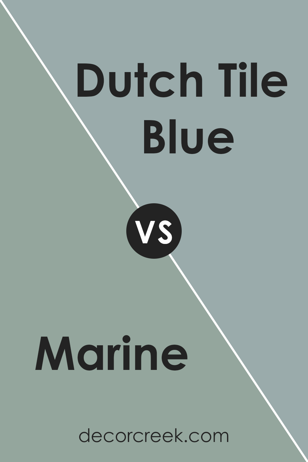
Marine SW 9659 by Sherwin Williams vs Dutch Tile Blue SW 0031 by Sherwin Williams
Marine and Dutch Tile Blue , both by Sherwin Williams, offer unique tones that cater to different aesthetic preferences and moods. Marine, as its name suggests, evokes the depths of the ocean. It’s a rich, saturated color with a profound sense of calm and mystery. T
his hue is bold and can anchor a space with its depth, creating a focal point or a striking backdrop.
On the other hand, Dutch Tile Blue possesses a serene, light-hearted quality. Inspiring visions of traditional Delftware, it has a softer, more reflective character. This pale, soothing shade brings a sense of tranquility and openness, making it ideal for creating a relaxed atmosphere.
Its lightness can visually enlarge a space, offering a breath of fresh air to any setting.
When comparing the two, Marine brings depth and intensity, ideal for making a statement, while Dutch Tile Blue offers a gentler touch, perfect for a calming, light-infused room. Each color has its charm, suiting different spaces and moods – from the bold and dramatic allure of Marine to the quiet and comforting embrace of Dutch Tile Blue.
You can see recommended paint color below:
- SW 0031 Dutch Tile Blue
Marine SW 9659 by Sherwin Williams vs Delft SW 9134 by Sherwin Williams
Marine and Delft , both by Sherwin Williams, evoke distinct moods and visual aesthetics through their unique color personalities. Marine is a deep, vibrant shade that leans towards a rich navy, embodying a classic and timeless elegance.
Its deep blue hue is reminiscent of the open ocean, offering a sense of calm and serenity, yet with an undercurrent of strength and confidence. This color is perfect for creating a bold statement in spaces, providing a backdrop that is both sophisticated and striking.
In contrast, Delft occupies a softer, lighter space on the color spectrum. It draws inspiration from the historic Dutch pottery, embodying a serene and soothing shade of blue with subtle gray undertones.
This color exudes tranquility and a soft elegance, making it ideal for creating a peaceful and airy atmosphere in any room. Its versatility allows it to blend seamlessly with a variety of decor styles, from traditional to contemporary.
Together, Marine and Delft offer a versatile palette that can cater to different aesthetic preferences and design needs, embodying the spectrum of blue with their distinct tones and moods.
You can see recommended paint color below:
- SW 9134 Delft
Conclusion
Marine SW 9659 by Sherwin Williams stands out as a testament to the versatility and depth a single color can bring into any space. Upon closer examination, this particular shade distinguishes itself through its ability to seamlessly blend with a variety of decor themes, spanning from the nautical to the contemporary.
Its rich undertone encapsulates the tranquil essence of the sea, making it an ideal choice for homeowners seeking to create a serene and inviting ambiance. Moreover, its adaptability in pairing well with both bold and subtle color schemes underscores its utility as a universal choice for designers.
In reviewing the practical applications of Marine SW 9659, it’s clear that this color transcends mere aesthetic appeal. Its durability and the quality of the paint formula ensure long-lasting vibrancy and coverage, making it a smart investment for both residential and commercial spaces.
The color’s psychological effects, promoting calmness and concentration, further elevate its status from just another shade to an essential element in creating mindful and productive environments.
Ultimately, Marine SW 9659 by Sherwin Williams exemplifies how a thoughtful choice in color can profoundly enhance the character and functionality of a space.
Ever wished paint sampling was as easy as sticking a sticker? Guess what? Now it is! Discover Samplize's unique Peel & Stick samples.
Get paint samples