In the world of interior design, the magic lies in the smallest of details. The power of color cannot be overstated; it holds the capacity to transform any space, creating a sense of style, comfort, and warmth.
Today, we delve into one unique color from Sherwin-Williams’ extensive palette – SW 6472 Composed.
What Color Is SW 6472 Composed?
SW 6472 Composed paint color is a serene, soothing shade of green. Its deep yet calm hues, reminiscent of a tranquil forest, evoke a sense of connection to nature, fostering an environment of relaxation and tranquility.
Residing somewhere between a fresh, minty green and a deep, seafoam tone, SW Composed showcases a compelling depth that enables it to stand out yet blend harmoniously in a wide range of settings. It brings forth a meditative atmosphere, encouraging introspection and calm.
Ever wished paint sampling was as easy as sticking a sticker? Guess what? Now it is! Discover Samplize's unique Peel & Stick samples.
Get paint samples

Is It a Warm or Cool Color?
SW 6472 Composed is classified as a cool color. Cool colors are those that lean towards the blue, green, and violet end of the spectrum. They evoke a sense of calm and serenity, providing the perfect backdrop for spaces designed for relaxation or contemplation.
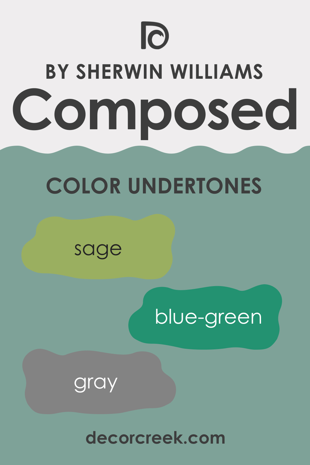
Undertones of SW 6472 Composed
Understanding undertones is pivotal when choosing colors for a space, as they subtly influence the overall appearance of the color and how it interacts with other elements in the room. For SW 6472 Composed, the undertones can be identified as:
- Blue-Green: This undertone contributes to the soothing aura of SW Composed, lending a sense of depth and richness.
- Gray: The gray undertone adds a subtle muted effect, softening the green and preventing it from becoming overpoweringly vibrant.
- Sage: Sage undertones enhance the organic and natural feel, promoting a sense of tranquility and peace.
Undertones affect the way we perceive colors. While the primary color may appear green, the undertones influence how the green is experienced, whether it leans more towards blue or has a more earthy feel
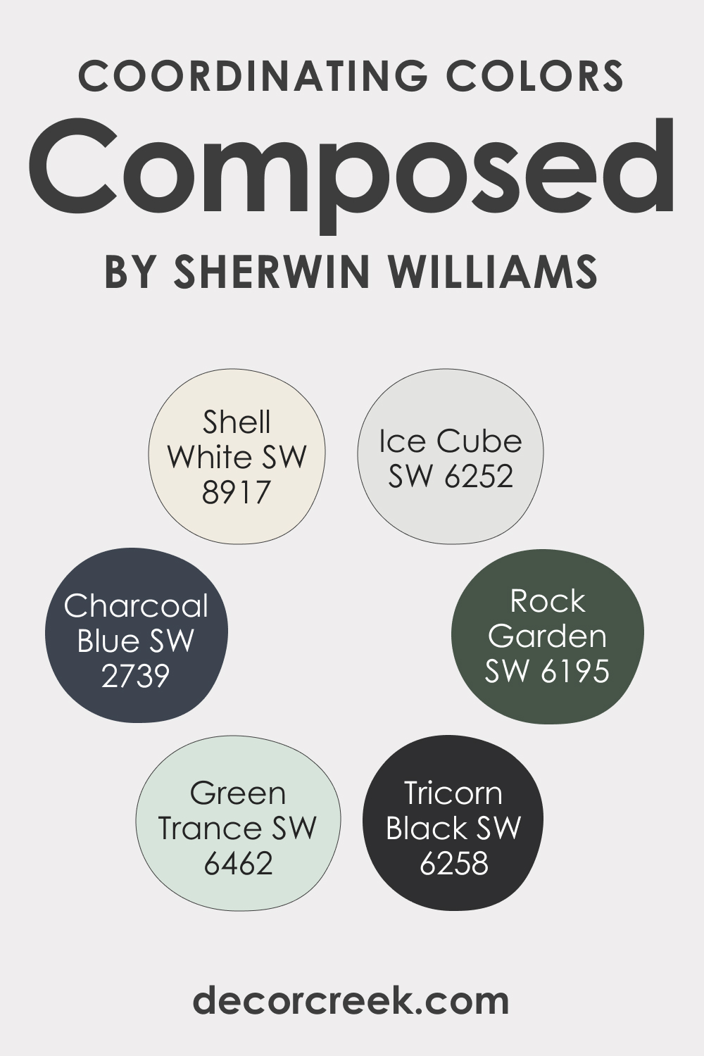
Coordinating Colors of SW 6472 Composed
Complementing SW 6472 Composed paint color with coordinating colors can help enhance its aesthetic appeal and create a harmonious ambiance. Coordinating colors are those that, when paired together, create a visually balanced and cohesive look.
- SW 6462 Green Trance : A lighter, brighter green, Green Trance complements SW Composed by adding vibrancy and energy.
- SW 8917 Shell White : This neutral white serves as a clean contrast to SW Composed, letting its richness stand out without overpowering it.
- SW 2739 Charcoal Blue : A deep, cool blue, SW Charcoal Blue pairs well with SW Composed, adding depth and sophistication.
Other colors that could similarly enhance SW 6472 Composed include:
- SW 6195 Rock Garden : A deeper, earthier green, Rock Garden echoes the natural undertones of SW Composed.
- SW 6252 Ice Cube : A very light, cool gray, Ice Cube offers a soothing, airy contrast to SW Composed.
- SW 6258 Tricorn Black : For a dramatic contrast, Tricorn Black provides a bold, powerful juxtaposition to the tranquility of SW Composed.
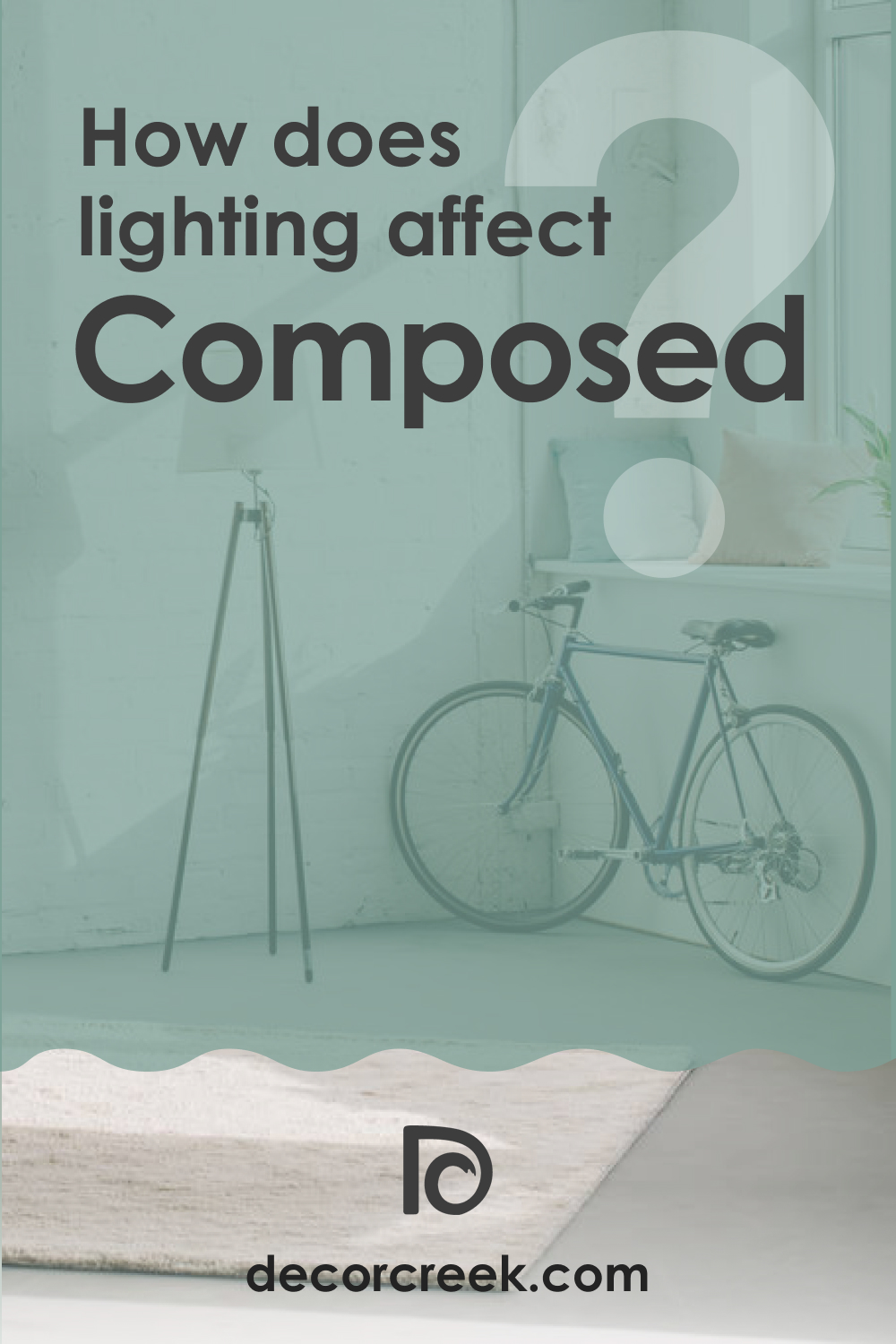
How Does Lighting Affect SW 6472 Composed?
Lighting plays a crucial role in how we perceive color. With SW 6472 Composed, different types of lighting can subtly alter the color’s appearance. Natural daylight will bring out the blue-green undertones of SW Composed, highlighting its vibrant, organic character. On the other hand, artificial lighting, particularly warmer tones, can emphasize the gray undertones, making the color appear more subdued and tranquil.
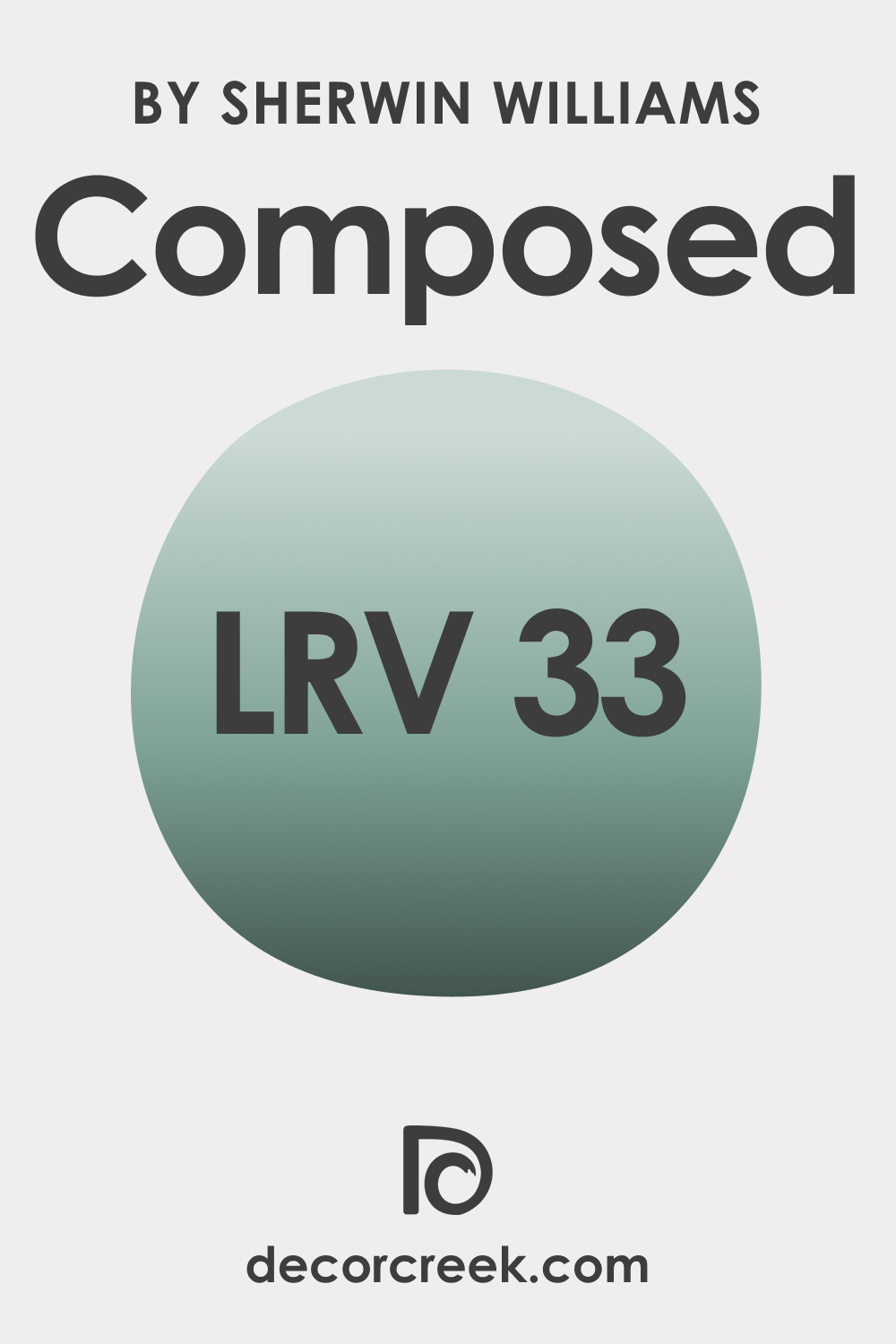
LRV of SW 6472 Composed
The Light Reflectance Value (LRV) of color is a measurement of how much light it reflects. With an LRV of 33, SW 6472 Composed paint color is a mid-toned color. It’s neither too dark nor too light, striking a balance that allows it to stand out without overwhelming a space. This mid-range LRV makes SW Composed versatile and able to adapt to various lighting situations and decorative schemes.
Because SW Composed has a medium LRV, it can help balance spaces with excessive natural light, keeping the room from feeling overly bright or washed out. Conversely, in spaces with less natural light, it’s capable of adding a sense of depth without making the room feel smaller or closed in.
LRV – what does it mean? Read This Before Finding Your Perfect Paint Color
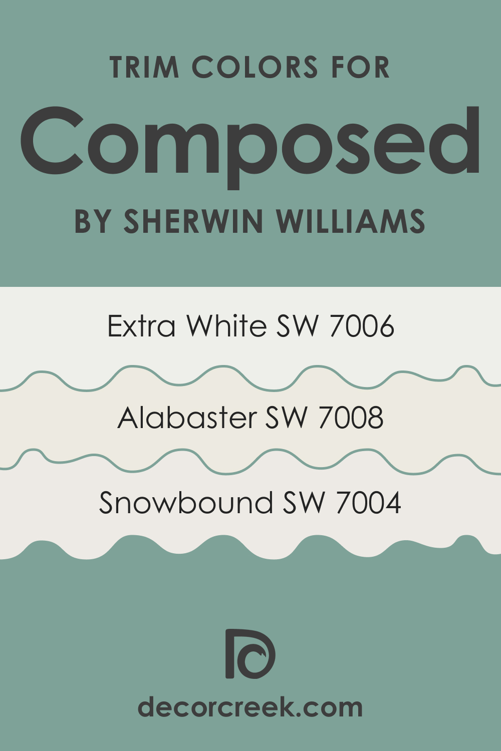
Trim Colors of SW 6472 Composed
Trim colors are those used on the trimmings of a room, such as window frames, moldings, and doors. These colors work in conjunction with the main wall color to create a contrast that enhances architectural features. For SW 6472 Composed, consider these shades of white from Sherwin-Williams:
- SW 7008 Alabaster : A warm and natural white, Alabaster softens the cool undertones of SW Composed.
- SW 7004 Snowbound : This cooler white sharpens SW Composed’s green hue, enhancing its freshness.
- SW 7006 Extra White : As a clean, pure white, Extra White offers a striking contrast to SW Composed, making it pop.
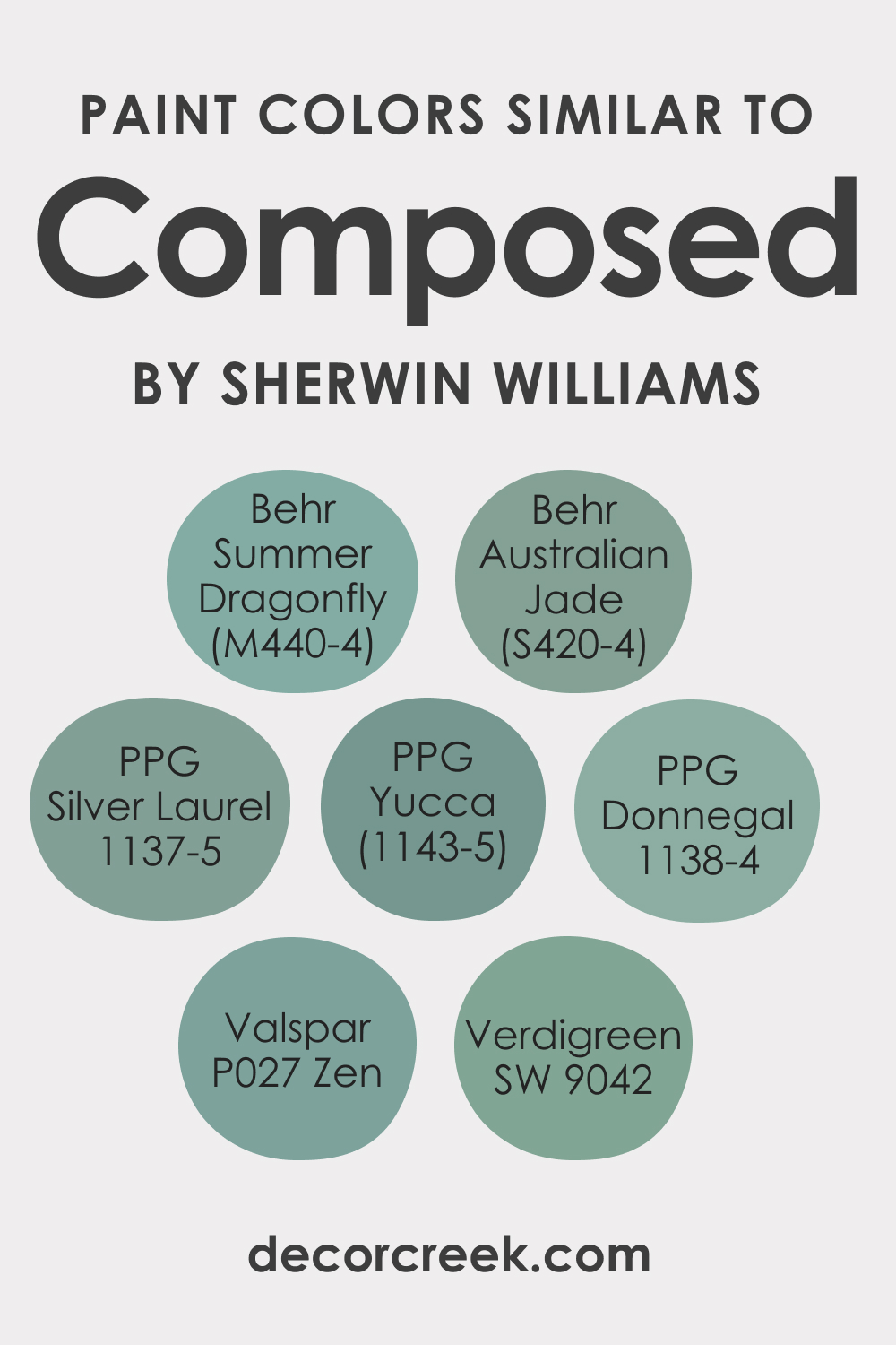
Colors Similar to SW 6472 Composed
Several colors in the Sherwin-Williams palette echo the tranquil, organic vibes of SW Composed:
- Verdigreen (SW 9042)
- Valspar Zen (P027)
- PPG Silver Laurel (PPG1137-5)
- PPG Donnegal (PPG1138-4)
- PPG Yucca (PPG1143-5)
- Behr Australian Jade (S420-4)
- Behr Summer Dragonfly (M440-4)
You can use them in case you are not satisfied with how SW Composed reads in your space.
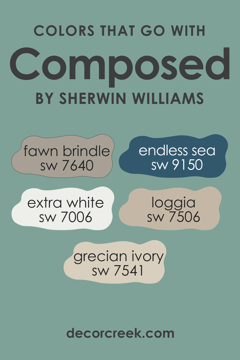
Colors That Go With SW 6472 Composed
To create a harmonious palette, consider these colors that pair well with SW Composed:
- SW 7006 Extra White : For a crisp contrast that makes SW Composed stand out.
- SW 7541 Grecian Ivory : A soft, warm beige that complements SW Composed’s cool undertones.
- SW 7640 Fawn Brindle : A muted gray-brown, Fawn Brindle adds a natural, earthy element to balance SW Composed.
- SW 9150 Endless Sea : This deep, sophisticated blue enhances the serenity of SW Composed.
- SW 7506 Loggia : A warm, neutral beige, Loggia softens and grounds the cool vibrancy of SW Composed.
- SW 9023 Ditzy Daffodil : For a bold contrast, this bright, cheerful yellow brings out the freshness of SW Composed.
These colors will contribute to a visually harmonious and balanced environment in your living space. When colors complement each other well, like here, they create a space that’s pleasing to the eye and fosters a positive, comfortable atmosphere.
How to Use SW 6472 Composed In Your Home?
SW Composed’s tranquility makes it a versatile color, suitable for various rooms and interior design styles. Its soothing undertones allow it to shine in spaces designed for relaxation and reflection, such as bedrooms and reading nooks. Furthermore, its natural feel lends itself well to styles that emphasize organic elements, like Scandinavian, coastal, or rustic designs.
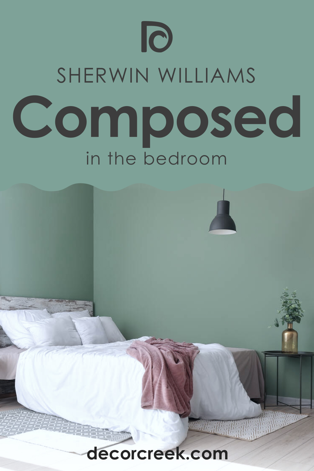
How to Use SW 6472 Composed in the Bedroom?
In the bedroom, SW 6472 Composed creates a calming atmosphere conducive to rest and relaxation. Painting the walls with this tranquil green immediately imbues the room with peaceful energy. Complement it with crisp white linens and light wood tones for a fresh, airy look. Add pops of deeper blues or earthy browns through decor items for added depth and contrast.
Alternatively, use this color on a feature wall behind the bed. This immediately draws the eye, and when contrasted with lighter walls around, it enhances the peaceful and restful atmosphere of the room. Pair it with soft white or gray accessories to complete the serene look.
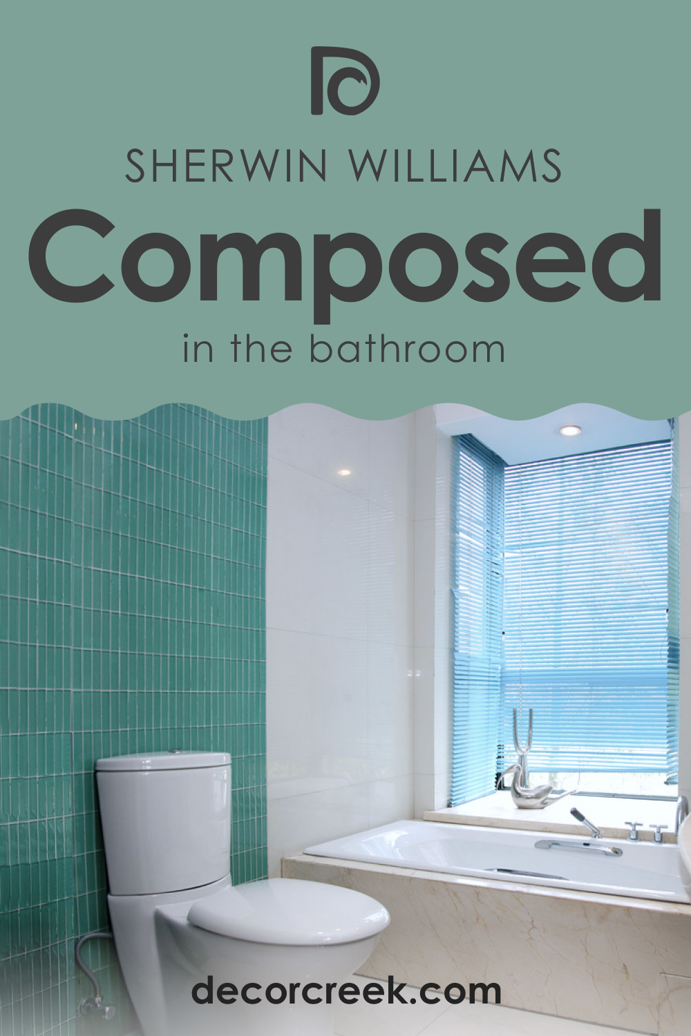
How to Use SW 6472 Composed in the Bathroom?
Bathrooms are an excellent place to use SW Composed. Its tranquil, natural vibes echo the refreshing energy of water, creating a spa-like ambiance. Pair it with white or light gray tiles and natural wood accents for a fresh, calming space.
Or, consider using SW Composed on bathroom cabinetry. Paired with white or light walls, this creates a stylish, contemporary look that remains calming and welcoming. Accessorize with brushed metal hardware and lush green plants for a refined, organic aesthetic.
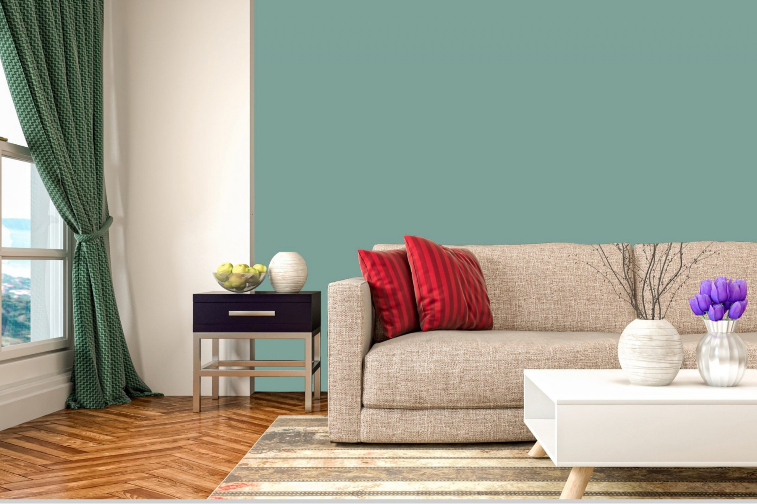
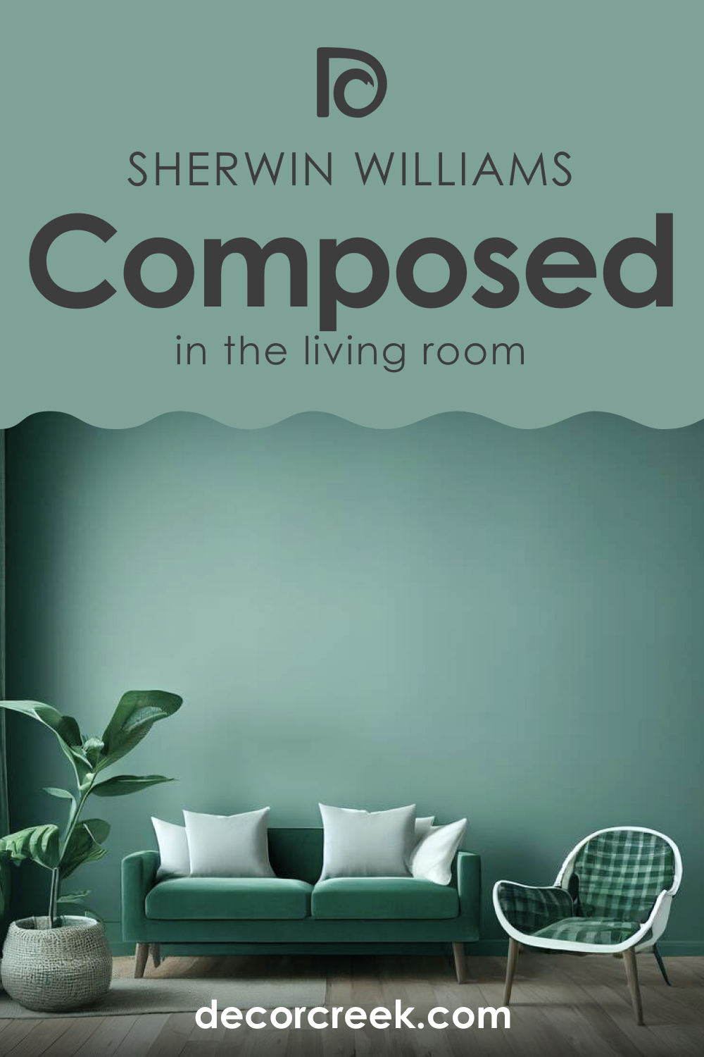
How to Use SW 6472 Composed in the Living Room?
SW Composed can give a living room a relaxing yet sophisticated feel. Its tranquil energy promotes relaxation and conversation, while its depth adds a touch of elegance. Pair it with white trim and neutral furnishings for a classic look, or go bold with vibrant pops of contrasting colors in accessories and artwork.
Alternatively, use SW Composed on a feature wall or on built-in bookcases or shelving. This allows the calming color to stand out without overpowering the room. Complement it with lighter walls and a mix of textured neutrals in your furniture and decor to create a well-rounded, welcoming space.
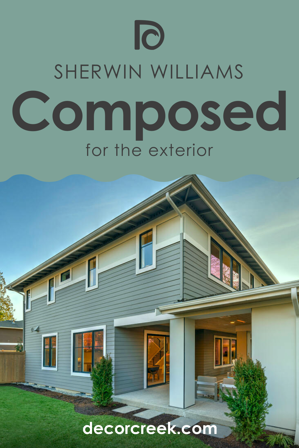
How to Use SW 6472 Composed for an Exterior?
For an exterior, SW Composed can create a striking, stately look. Its depth and richness stand out against a landscape, while its natural tones keep it from looking out of place. Pair it with crisp white trim for a classic, timeless appeal.
Alternatively, for a more contemporary, coastal feel, use SW Composed as a front door color against a white or light gray exterior. The pop of color is welcoming and stylish, setting the tone for the rest of your home.
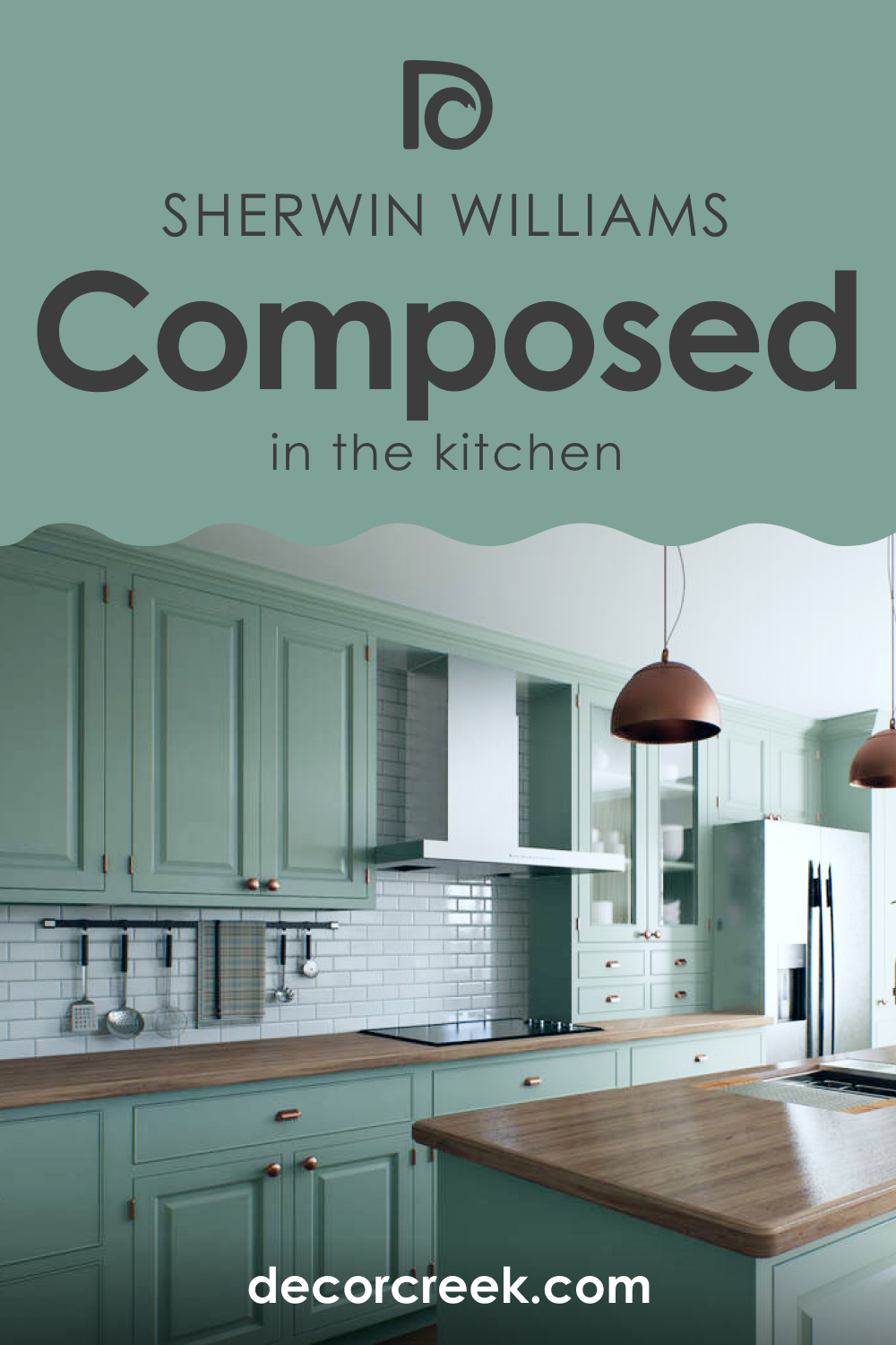
How to Use SW 6472 Composed for the Kitchen?
In the kitchen, SW Composed can create a refreshing, invigorating ambiance. Consider using it on the walls, balanced by white cabinetry and light countertops for a clean, fresh feel. Or, go bold and use it on lower cabinetry or a kitchen island, paired with lighter upper cabinets and walls for a stylish, contemporary look.
Comparing SW 6472 Composed With Other Colors
Here you can read how SW Composed looks compared to other colors by Sherwin-Williams. This will help you better see its uniqueness and realize how colors from the same brand vary.
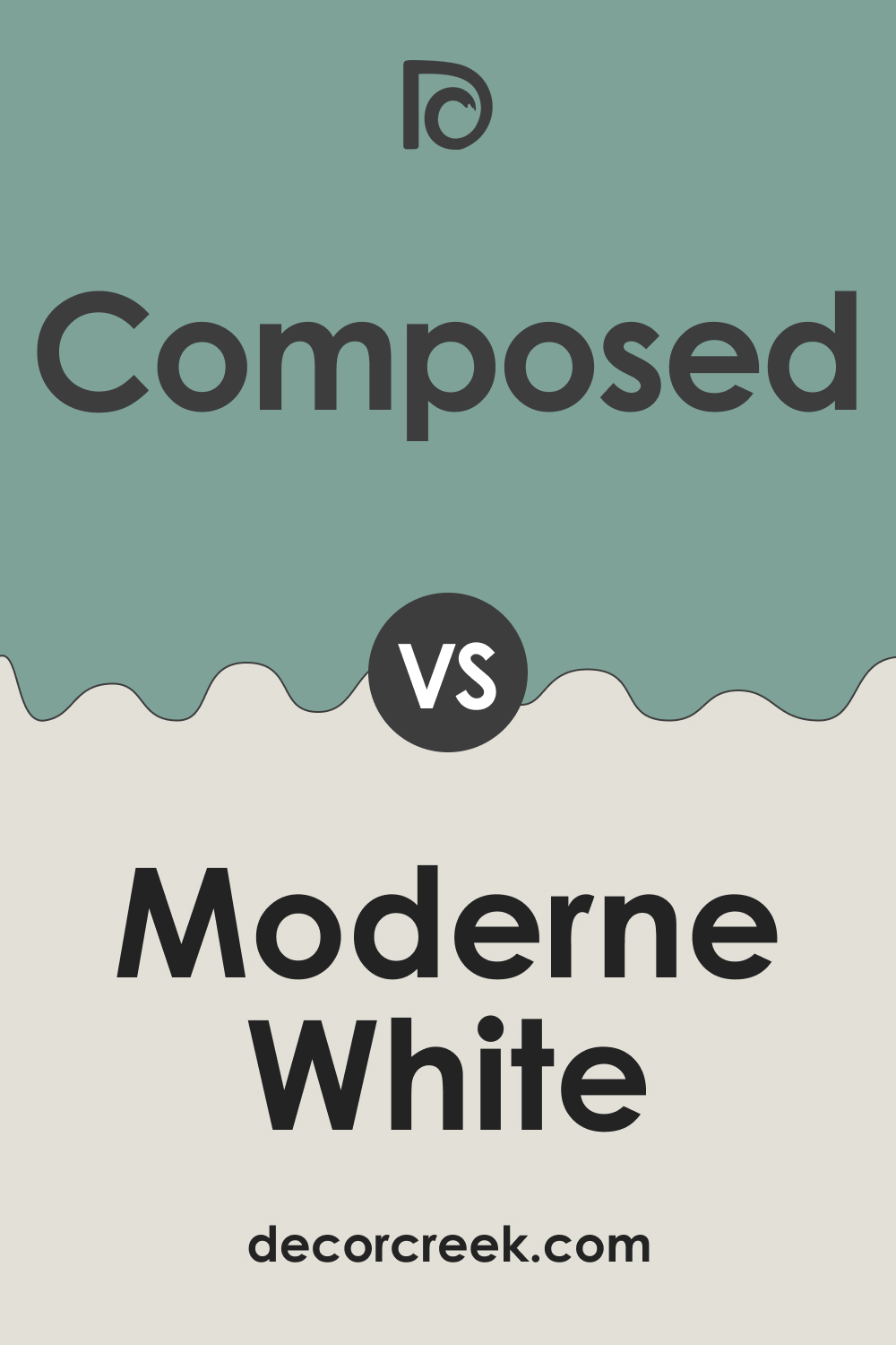
SW 6472 Composed vs. SW 6168 Moderne White
SW Moderne White is a warm, off-white color with a touch of beige undertone. When compared to SW Composed, it brings out a softer side, drawing attention to SW Composed’s deeper, earthy characteristics. This gentle contrast between the two colors works well, as SW Moderne White serves as a neutral backdrop, allowing the richness of Composed to stand out truly.
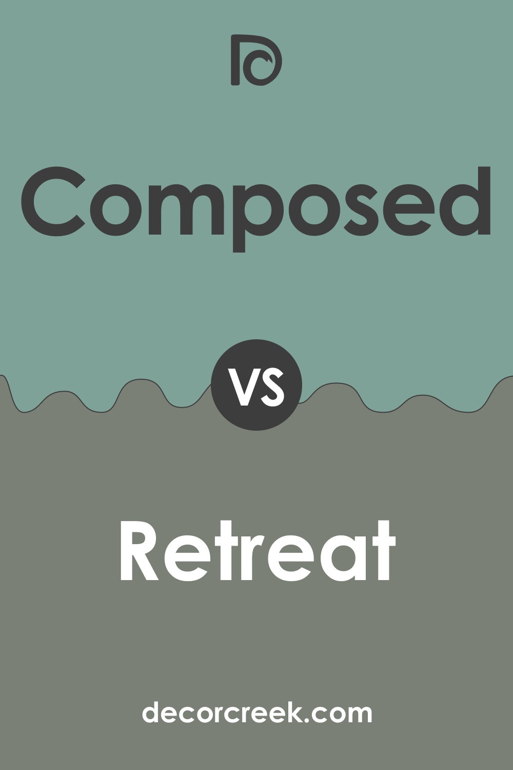
SW 6472 Composed vs. SW 6207 Retreat
SW Retreat is a dark , smoky green that leans toward gray, offering a more intense and moody atmosphere than SW Composed. Against SW Retreat, SW Composed’s cooler, more muted green undertones become more evident, creating a contrast that’s both harmonious and striking. The duo results in a rich, earthy palette that is relaxing yet sophisticated.
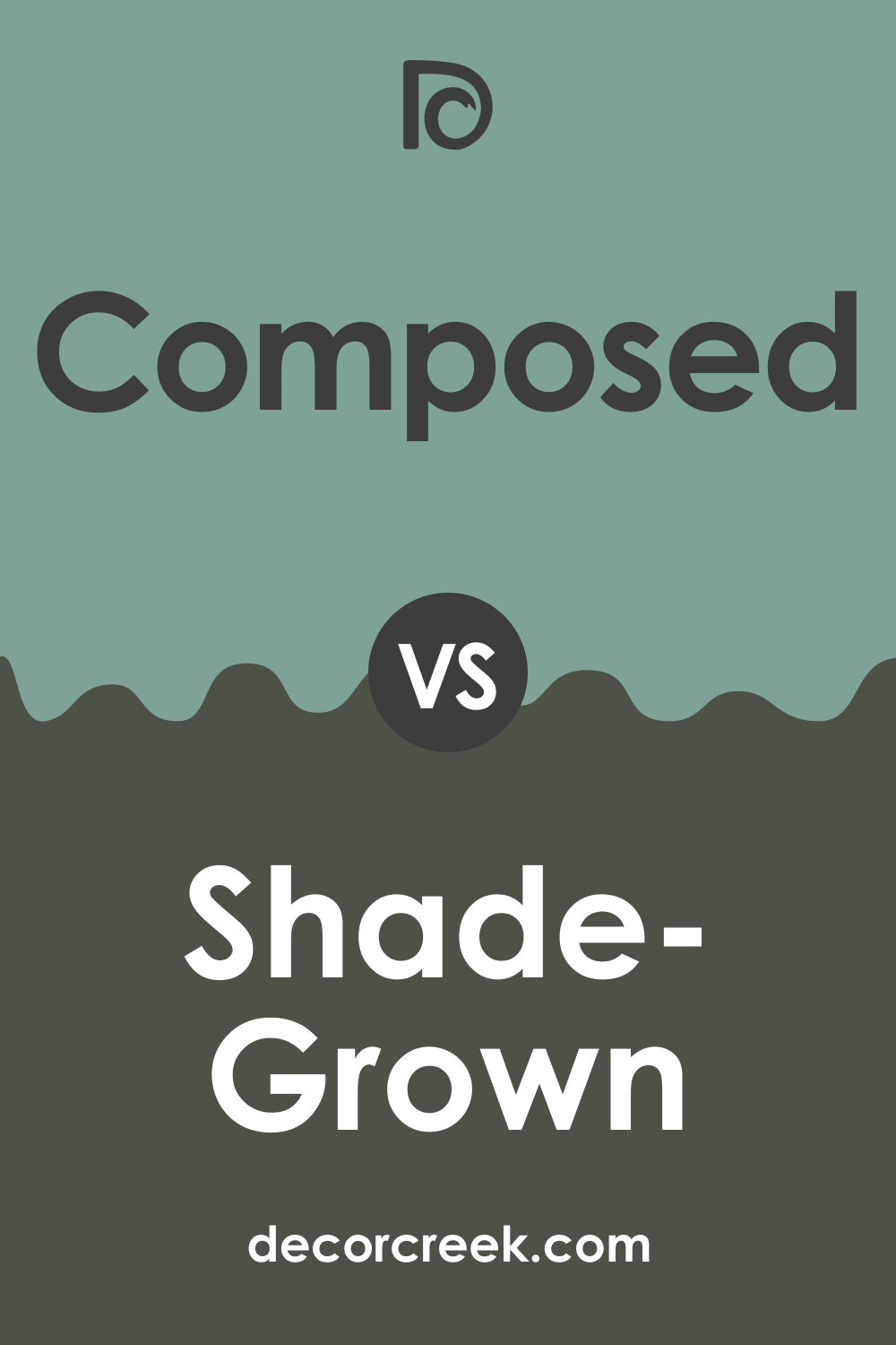
SW 6472 Composed vs. SW 6188 Shade Grown
SW Shade Grown is a deep, rich brown with undertones of green. When paired with SW Composed, the latter’s gray-green hue shines, offering a refreshing counterbalance to SW Shade Grown’s darker intensity. This pairing evokes the feeling of a lush forest, combining the depth of the earth with the freshness of foliage.
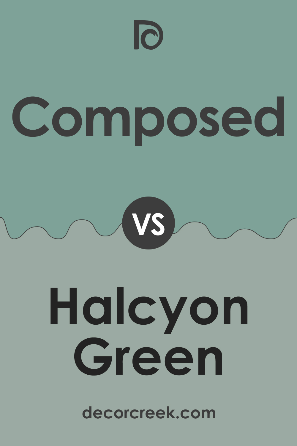
SW 6472 Composed vs. SW 6213 Halcyon Green
SW Halcyon Green is a lighter , softer green that leans towards gray. Compared to SW Composed, it presents a softer, subtler approach to bringing the tranquility of nature indoors. Together, they offer a gradient of cool, calming greens, with SW Composed providing depth and SW Halcyon Green adding a touch of lightness.
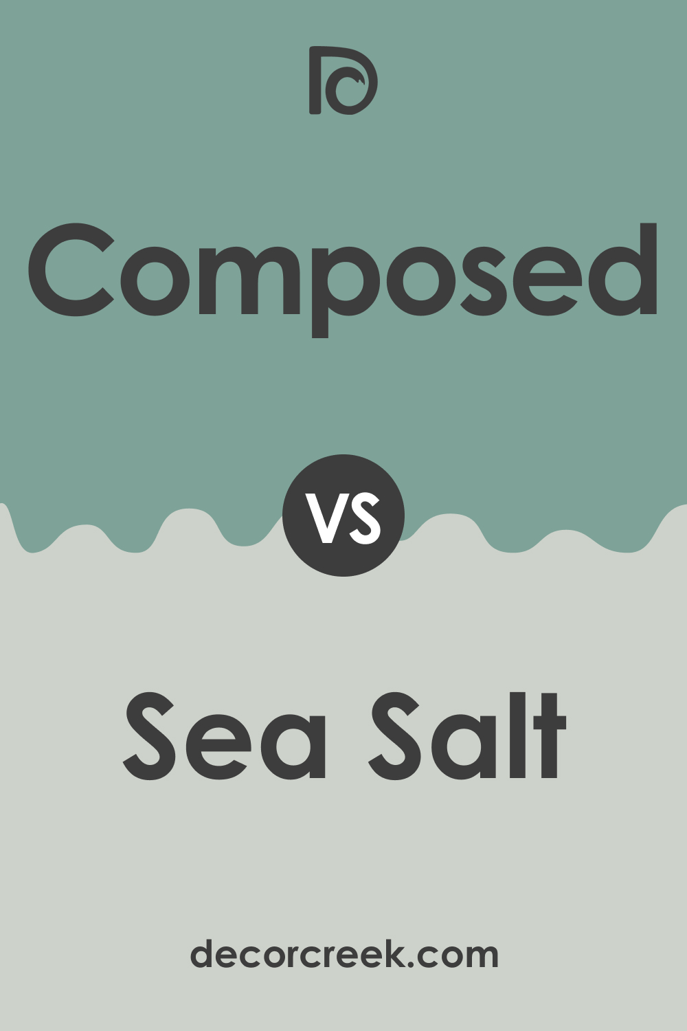
SW 6472 Composed vs. SW 6204 Sea Salt
SW Sea Salt is a light, airy green with a touch of blue. Next to SW Composed, it emphasizes the latter’s gray undertones, while SW Composed draws out Sea Salt’s greenish tint. This pairing creates a refreshing, coastal-inspired palette, combining the depth of the sea with the serenity of the shore.
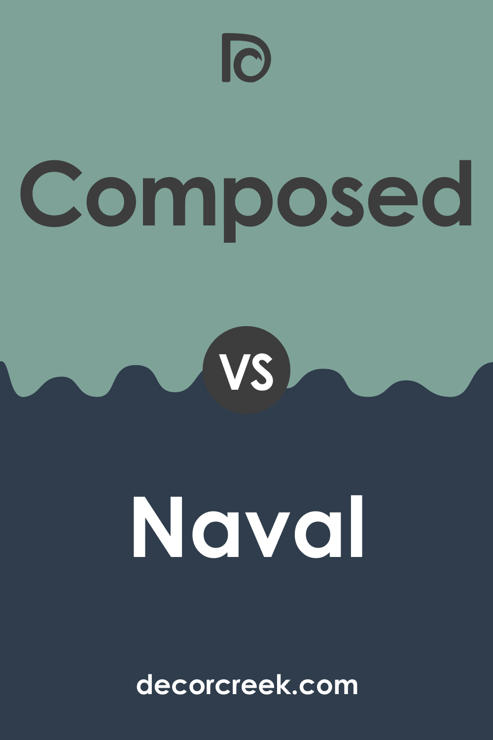
SW 6472 Composed vs. SW 6244 Naval
SW Naval is a rich , confident shade of navy blue. In comparison, SW Composed’s earthy green undertones are highlighted, creating a dynamic interplay between the grounded tranquility of green and the timeless sophistication of navy. This contrasting duo offers an intriguing palette for anyone seeking a space that’s both serene and bold.
Conclusion
In conclusion, SW 6472 Composed is a tranquil, rich green color that brings a natural, calming vibe to any space. Its versatility allows it to shine in various rooms and styles, and its depth adds a touch of sophistication. Whether used as a wall color, an accent, or on cabinetry, SW Composed is sure to create a serene, stylish ambiance in your home.
Ever wished paint sampling was as easy as sticking a sticker? Guess what? Now it is! Discover Samplize's unique Peel & Stick samples.
Get paint samples
Frequently Asked Questions
⭐What types of rooms are suitable for SW 6472 Composed?
SW 6472 Composed is a versatile color that can be used in various rooms. Its tranquil, natural feel makes it a good fit for spaces designed for relaxation and reflection, such as bedrooms, living rooms, and reading nooks. However, it's also a fantastic choice for kitchen and bathroom areas due to its refreshing, invigorating undertone.
⭐What colors coordinate well with SW 6472 Composed?
SW Composed pairs well with a range of colors. For a crisp, contrasting look, consider SW 7006 Extra White. Other harmonious pairings include warm beiges like SW 7541 Grecian Ivory, deep blues like SW 9150 Endless Sea, and even vibrant yellows like SW 9023 Ditzy Daffodil.
⭐How does lighting affect the color of SW 6472 Composed?
The appearance of SW 6472 Composed can change slightly under different lighting conditions. In natural light, the green hue stands out, giving the color a vibrant, earthy character. Under artificial lighting, particularly warmer tones, the gray undertones can become more pronounced, resulting in a more subdued, tranquil look.
⭐What are some suitable trim colors for SW 6472 Composed?
Consider using shades of white for trim with Composed. SW 7008 Alabaster, a warm, natural white, softens the cool undertones of Composed, while SW 7006 Extra White, a clean, pure white, offers a striking contrast to make Composed pop.
⭐Can I use SW 6472 Composed for my home's exterior?
Yes, SW Composed can be used for exteriors to create a striking, stately look. Its depth and richness stand out against a landscape, while its natural tones keep it from looking out of place. Pair it with crisp white trim for a classic appeal, or use it as a front door color for a welcoming touch.


