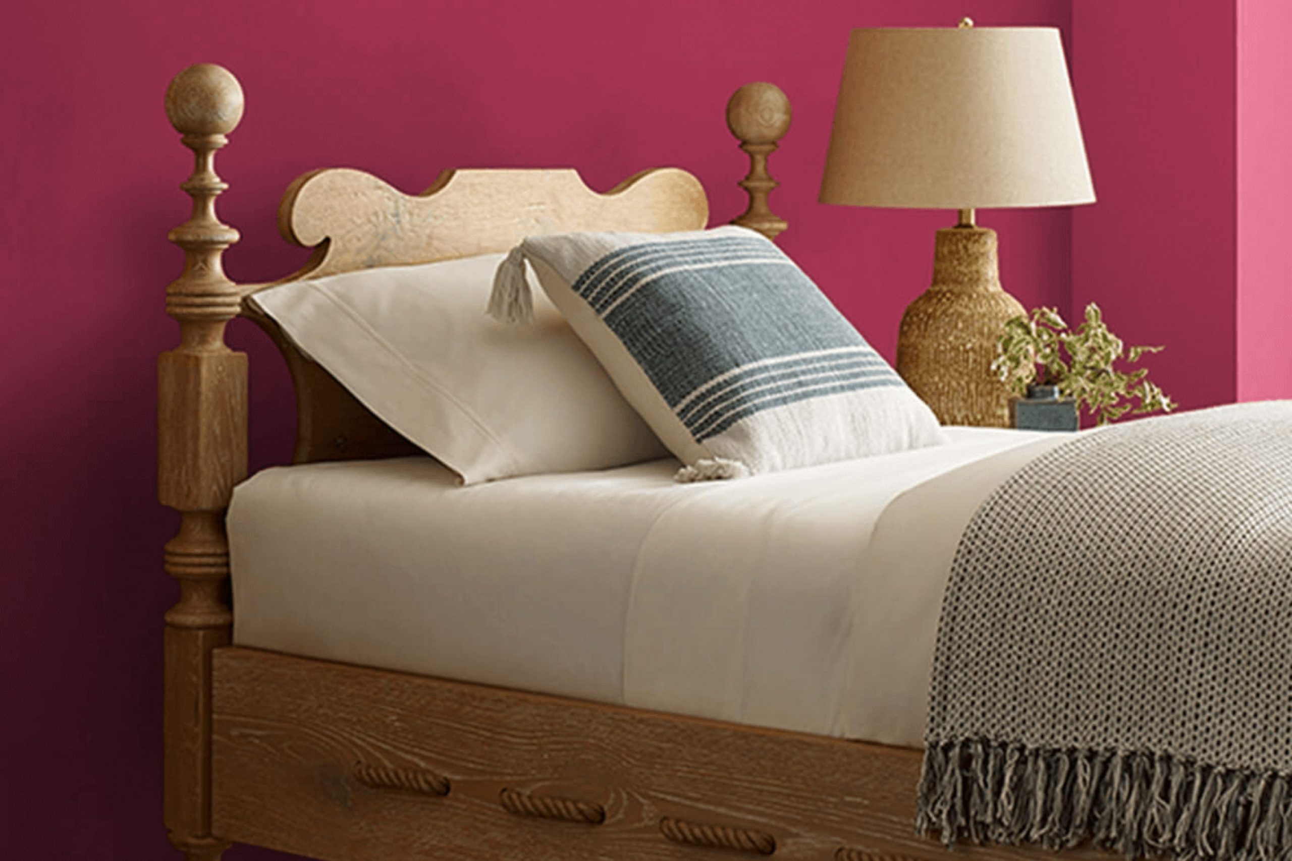
When I first came across SW 6580 Cerise by Sherwin Williams, I was intrigued by its vibrant and bold hue. This shade of pink isn’t just any pink; it has a depth that adds a spirited punch to any room. It’s the kind of color that can make a bold statement or add a playful touch to a room, depending on how you decide to use it.
Cerise can work well in a variety of settings – from a chic, modern living room to a cozy, inviting bedroom. It especially stands out when used as an accent wall, or when paired with neutral tones that allow its brightness to stand out. Furthermore, this color isn’t just about looks; it can also influence the mood and feel of a room.
In my experience, Cerise brings a sense of joy and energy, which can feel uplifting.
For anyone who enjoys a touch of boldness and personality in their rooms, SW 6580 Cerise is a great choice.
Its unique charm can help you show your style and make your home a reflection of your vibrant personality.
What Color Is Cerise SW 6580 by Sherwin Williams?
The color Cerise by Sherwin Williams is a deep, vibrant shade of red with a slight pink undertone that gives it a rich and lively feel. This bold color can add a strong pop of energy and warmth to any room. Ideal for creating a statement, it works well as an accent wall or for highlighting decorative trim and furniture pieces.
This dynamic shade pairs very well with different materials and textures. Consider combining it with glossy finishes like glass or lacquered surfaces to highlight its vibrancy. Additionally, natural materials such as dark wood or leather add a grounding effect, while metallic accents in gold or brass can bring a touch of luxury.
Cerise is highly flexible and can adapt to many interior styles. It is especially striking in modern and contemporary settings due to its bold nature. However, it can also fit well in eclectic and bohemian rooms when mixed with textured fabrics and global-inspired decor. In a more traditional setting, pairing Cerise with muted tones and classic furniture can create a warm, inviting atmosphere. This color choice can create a memorable living room, a vibrant dining area, or even a cozy reading nook, depending on how it’s applied and what it’s paired with.
decorcreek.com
Is Cerise SW 6580 by Sherwin Williams Warm or Cool color?
Cerise SW 6580 by Sherwin Williams is a vibrant pink shade that adds a cheerful and lively touch to any room. This color is perfect for rooms where you want to create a sense of excitement and energy, such as playrooms or creative work areas.
Since it’s quite bright, using it on just one accent wall can be enough to make a bold statement without feeling too strong in the room. If paired with neutrals or soft whites, Cerise can make a room feel more open and airy, while still keeping that pop of color.
This shade works well in homes where you want to add personality and fun, especially in areas that might otherwise be overlooked. It’s also great for kids’ rooms or dining areas where the family gathers. Overall, using Cerise in your home can make the place feel more welcoming and lively.
Undertones of Cerise SW 6580 by Sherwin Williams
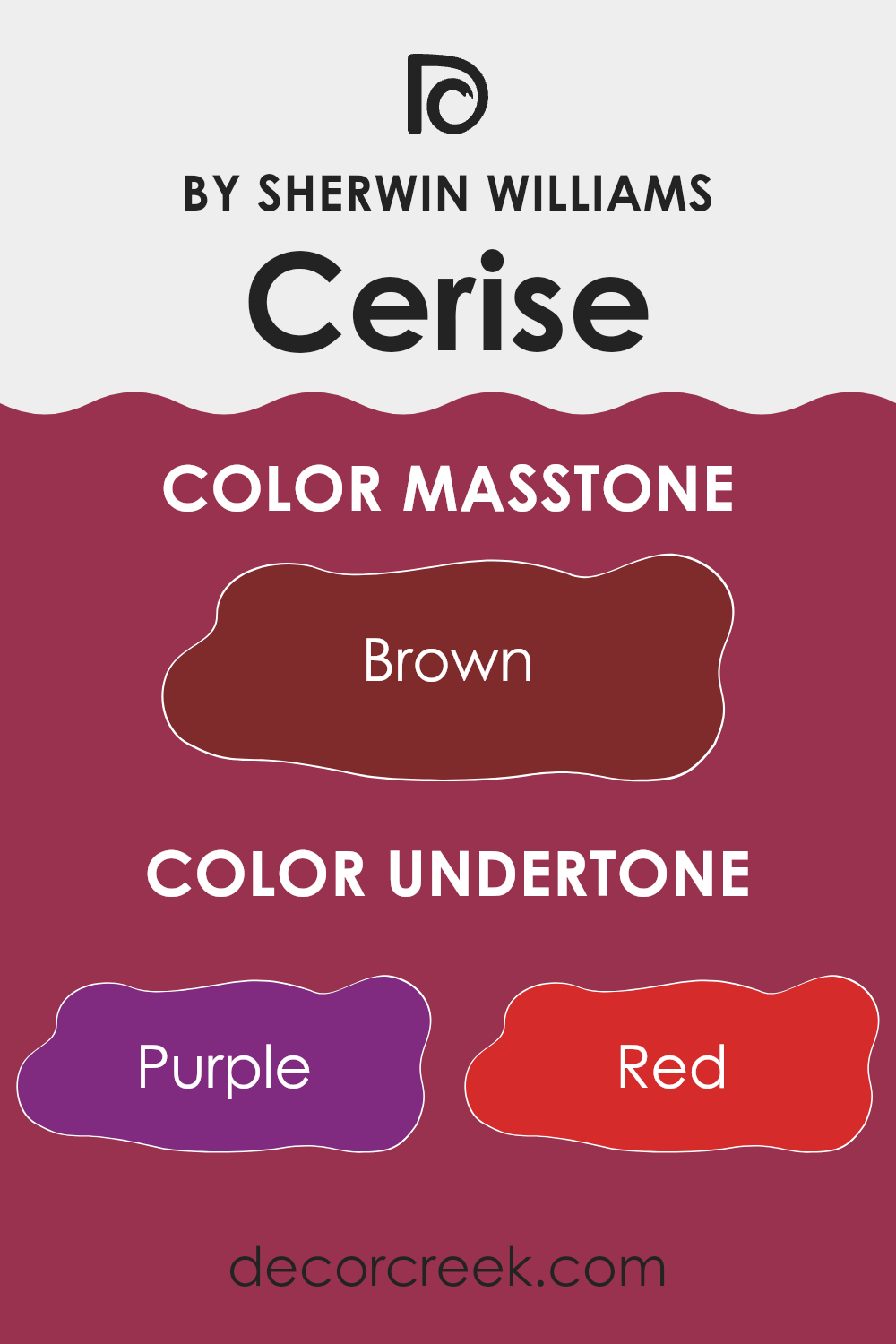
The color Cerise SW 6580 has a rich blend of undertones that include shades like purple, red, pink, and more. These undertones play an important role in how the color is seen and can strongly affect the atmosphere it creates when used in interior design.
Undertones are subtle colors that sit beneath the main color. They can change how we see the main color, especially under different lighting conditions. For instance, a color might appear more red or blue depending on its undertones and the kind of light it is exposed to.
With Cerise SW 6580, the variety of undertones makes it a flexible color choice for interior walls. The purple and pink undertones add a sense of warmth, making a room feel welcoming. These undertones are especially noticeable in well-lit areas where they give the walls a vibrant and lively look.
Conversely, the darker undertones like dark grey and navy can add depth to the color, giving it a more grounded feel. These darker tones become more noticeable in areas with less light, resulting in a richer and more mature look.
Using Cerise SW 6580 on interior walls can therefore offer a wide range of effects, from warm and inviting to deep and refined, depending on the lighting and the specific undertones that stand out. This can help create a room that feels both unique and true to personal style preferences.
decorcreek.com
What is the Masstone of the Cerise SW 6580 by Sherwin Williams?
Cerise SW 6580 by Sherwin Williams has a masstone of Brown (#802B2B), a rich, warm shade that brings a cozy and inviting atmosphere to any room. This particular hue is excellent for those who want to add a touch of warmth to their living areas without feeling too strong with very bright or bold colors.
In homes, this brown shade works well in living rooms, dining areas, or even bedrooms, providing a comfortable backdrop that complements different styles of furniture and decor. Whether paired with light, creamy fabrics or darker, rustic woods, it helps to create a balanced, welcoming environment.
Moreover, the neutrality of brown makes it easy to match with other colors, allowing for flexibility in decorating and updating over time without needing to repaint entirely. This makes it a practical choice for homeowners looking for both style and long-lasting appeal in their color selections.
decorcreek.com
How Does Lighting Affect Cerise SW 6580 by Sherwin Williams?
Lighting plays a crucial role in how we perceive colors in our surroundings. Different light sources can significantly change the appearance of a color on walls, furniture, and other objects. The color Cerise by Sherwin Williams is a vivid, deep pink that can look quite different depending on the lighting conditions.
In artificial light, the intensity and type of bulb can affect how Cerise appears. For example, LED lights that mimic daylight can make this color appear bright and vibrant, while warmer-toned bulbs might make it look slightly more muted and richer. This happens because artificial lights can highlight different undertones in the paint.
In natural light, Cerise also changes throughout the day. The quality of natural light varies depending on the time of day, weather, and the room’s orientation. In a north-facing room, natural light is typically cooler and more even throughout the day. This cooler light can make Cerise appear a bit softer and less intense. North-facing light won’t bring out the warmest tones in the color, but it keeps a steady look.
South-facing rooms get a lot of sunlight, which is warmer and brighter. In these rooms, Cerise can look very lively and vivid, as the strong light can make the color stand out more clearly. The warmth of the southern light brings out the richness of this shade.
East-facing rooms receive the most light in the morning when the sun rises. This means Cerise will look brightest and most true to color early in the day but may appear softer and cooler as the day goes on and the natural light fades.
West-facing rooms have the opposite effect, with the strongest light in the late afternoon and evening. Cerise in a west-facing room will look softer in the morning and become brighter and warmer in the evening. This makes it a great choice for rooms used later in the day.
Understanding how lighting affects colors like Cerise can help you decide which rooms are best suited for this color and how to use lighting well to highlight its beauty.
What is the LRV of Cerise SW 6580 by Sherwin Williams?
LRV stands for Light Reflectance Value, which measures the amount of light a paint color reflects or absorbs when applied to a surface. It is expressed as a percentage and helps determine how light or dark a color will appear once it’s on your wall.
High LRV values indicate that a color reflects more light, making rooms appear brighter and larger. Conversely, a lower LRV means the color absorbs more light, which can make a room feel cozier but smaller and darker.
With an LRV of 9.648, the color in question is on the darker end of the scale. This means it will absorb more light than it reflects, which could make a small room feel even smaller and more enclosed. However, this could be a great advantage in a larger or very bright room where a sense of comfort is desired. The deep, rich tone will add a layer of warmth and character, making it an excellent choice for creating an inviting atmosphere in larger rooms.

decorcreek.com
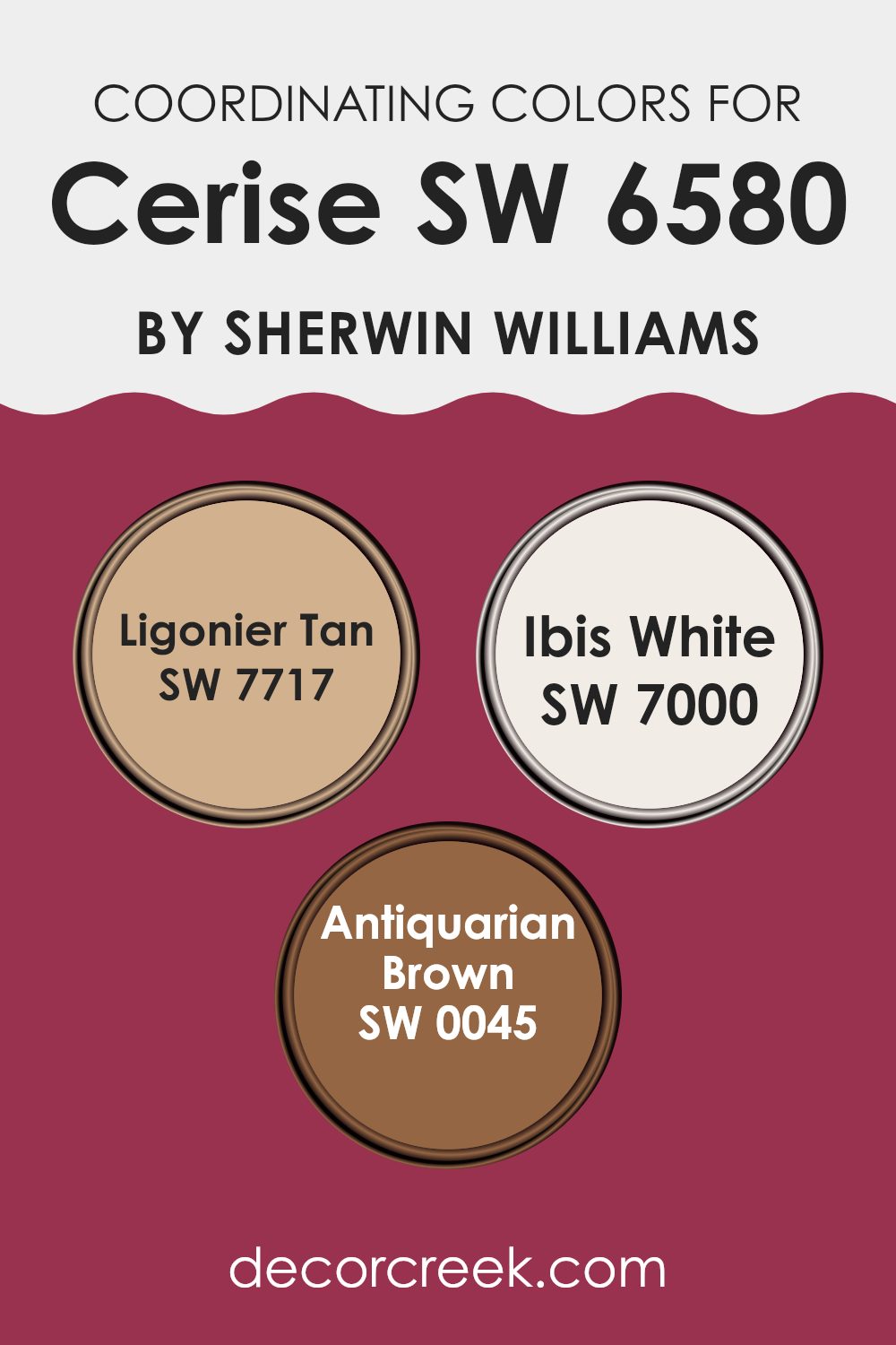
Coordinating Colors of Cerise SW 6580 by Sherwin Williams
Coordinating colors are selected to harmonize with a main color to improve the overall look of a room. They make sure the color scheme flows smoothly, without strong contrasts that might clash, creating a pleasing balance. For instance, Cerise by Sherwin Williams, a bright and bold pink, can be beautifully complemented by a selection of coordinating colors that work well with its vibrant tone.
Ligonier Tan is a warm, sandy color that provides a soft contrast to the vivid punch of pink, offering a grounded, earthy feel that can help soften the intensity of a brighter shade. Ibis White is a clean, crisp white with a subtle hint of warmth, making it an excellent choice for trim or ceilings, as it provides a fresh and airy lift to the richer tones.
Antiquarian Brown, a deep, rich chocolate hue, adds a sense of depth and richness, acting as a perfect grounding element that can help anchor bold colors like pink without feeling too strong in the room. These colors together create a harmonious and inviting environment by balancing warmth and depth with the energy of Cerise.
You can see recommended paint colors below:
- SW 7717 Ligonier Tan
- SW 7000 Ibis White
- SW 0045 Antiquarian Brown
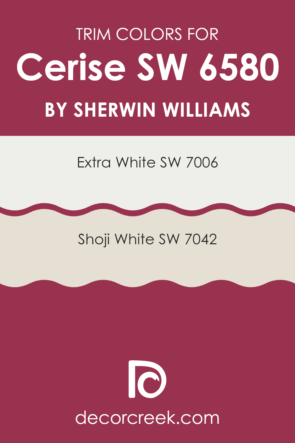
What are the Trim colors of Cerise SW 6580 by Sherwin Williams?
Trim colors, such as SW 7006 – Extra White and SW 7042 – Shoji White from Sherwin Williams, play an important role in improving the visual appeal and defining the design elements of a room.
When paired with a vibrant wall color like Cerise SW 6580, trim colors help in creating a clean and clear boundary that highlights the architecture of the room. The right trim color adds contrast that can make wall colors stand out, balancing the room’s look and making features like doors, windows, and moldings more noticeable.
Extra White SW 7006 is a pure, bright white that brings a crisp look to any room. It acts as a strong contrast to richer, more colorful walls, providing a fresh feel that can brighten darker rooms. On the other hand, Shoji White SW 7042 offers a softer, warmer white with undertones that hint at beige, adding a gentle warmth to the rooms and creating a smooth transition between more saturated colors. This makes Shoji White an ideal choice for those looking to soften a bold color like Cerise without feeling too strong.
You can see recommended paint colors below:
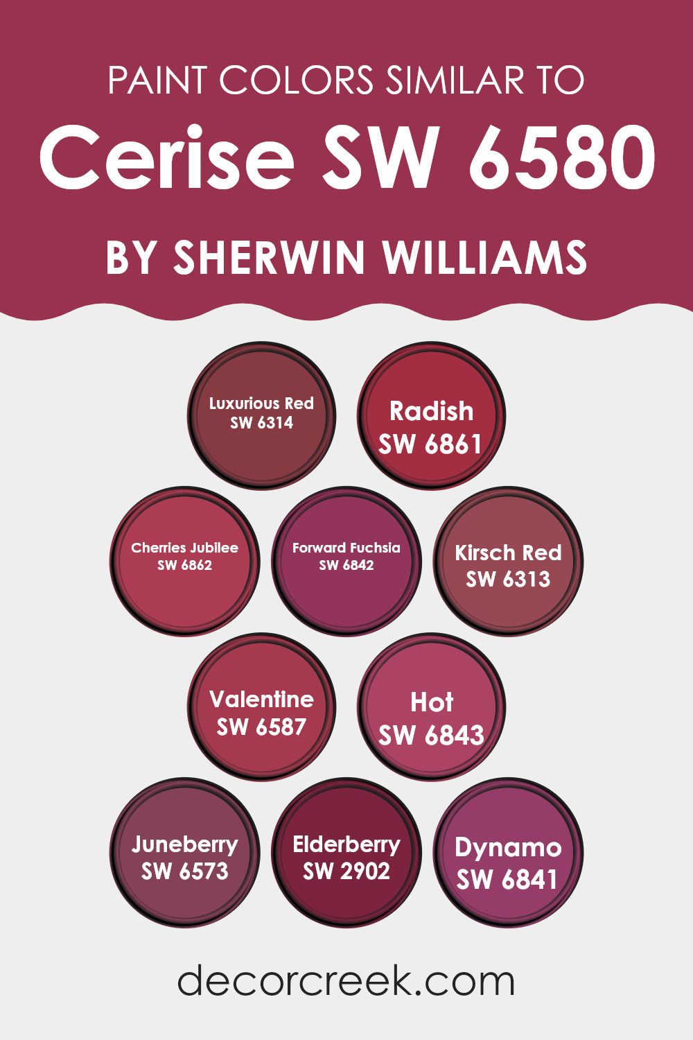
Colors Similar to Cerise SW 6580 by Sherwin Williams
Similar colors play an important role in creating a harmonious and visually pleasing look, especially in interior design and house painting. Colors that share a common hue or intensity, like those similar to Cerise SW 6580 by Sherwin Williams, work together to create a certain mood or atmosphere without creating a harsh contrast. These colors are helpful for designing rooms that feel cohesive and well planned.
Luxurious Red SW 6314 has a rich, deep tone that feels warm and inviting. Radish SW 6861 offers a brighter, more energetic red, giving a lively pop to any room. Cherries Jubilee SW 6862 brings a dark, rich red that adds a touch of drama and elegance. Forward Fuchsia SW 6842 stands out with its bold, vibrant pink, making it perfect for a fun, lively look.
Kirsch Red SW 6313 is a deep, muted red that works well in traditional or formal rooms. Valentine SW 6587 offers a classic red that is very flexible for different styling choices. Hot SW 6843 is a striking, intense hue that can create focal points in a room. Juneberry SW 6573 has a soft berry tone, offering elegance and warmth.
Elderberry SW 2902 leans into a more calm, understated burgundy that pairs beautifully with rich furnishings. Lastly, Dynamo SW 6841 is a lively pink that adds a burst of energy into any room. These colors, all close to Cerise SW 6580, give many options for creating rooms that range from bright and cheerful to deep and rich, each adding its own character to the design palette.
You can see recommended paint colors below:
- SW 6314 Luxurious Red
- SW 6861 Radish
- SW 6862 Cherries Jubilee
- SW 6842 Forward Fuchsia
- SW 6313 Kirsch Red
- SW 6587 Valentine
- SW 6843 Hot
- SW 6573 Juneberry
- SW 2902 Elderberry
- SW 6841 Dynamo
Colors that Go With Cerise SW 6580 by Sherwin Williams
Cerise SW 6580 by Sherwin Williams is a vibrant, bold shade that can greatly improve the look of any room when paired with the right colors. The selection of complementary colors is important because it can improve the feel of a room, add visual interest, and create balance. Choosing the right colors to pair with Cerise can create smooth blends or lively contrasts depending on the effect you want.
For a warm and energetic vibe, SW 6578 – Tuberose brings a lively coral pink tone that nicely balances the intensity of Cerise. It’s a cheerful color that can brighten rooms. Similarly, SW 6575 – Priscilla offers a lighter, bubblegum pink that softens the boldness of Cerise with its playful and gentle hue.
On the vivid side, SW 6843 – Hot introduces a strong, fire-engine red that adds drama and passion to any combination, making it perfect for creating a bold focal point. SW 6579 – Gala Pink provides a charming medium pink, balancing bright and soft tones, ideal for a slightly calmer yet appealing touch.
For those who prefer a softer look, SW 6577 – Jaipur Pink has a dusky pink shade that pairs well with the deeper tones of Cerise, giving a more grounded and calming feel. Lastly, SW 6576 – Azalea Flower offers a fresh, floral pink that feels like spring blooms, adding a light and cheerful note when used with Cerise.
These complementary colors give flexibility in design, offering many options for creating a room that feels coordinated and well planned while keeping a strong sense of personal style. Whether aiming for a lively burst of color or a softer palette, these choices help create a visually pleasing environment.
You can see recommended paint colors below:
- SW 6578 Tuberose
- SW 6575 Priscilla
- SW 6843 Hot
- SW 6579 Gala Pink
- SW 6577 Jaipur Pink
- SW 6576 Azalea Flower

How to Use Cerise SW 6580 by Sherwin Williams In Your Home?
Cerise SW 6580 by Sherwin Williams is a vibrant, deep pink-red paint color that can add a bold and cheerful touch to any room in your home. It’s perfect for creating a focal point, whether you paint an entire wall or use it for accent pieces or a feature wall. Because of its striking hue, Cerise works well in areas like the living room or dining room where you gather with guests and want to make a strong visual impression.
In bedrooms, using Cerise for an accent wall behind the bed can make the room lively and warm. For a more subtle effect, consider using it for trim, doors, or furniture. This color pairs nicely with neutral shades like grays, whites, and blacks to balance its intensity.
Despite its boldness, Cerise can also fit into creative areas like a home office or a craft room, boosting energy and inspiring creativity. Just a touch of this lively color can brighten a room and give it a fresh, modern look.
Cerise SW 6580 by Sherwin Williams vs Hot SW 6843 by Sherwin Williams
Cerise SW 6580 by Sherwin Williams and Hot SW 6843 by Sherwin Williams are both vibrant shades, yet they have distinct vibes. Cerise SW 6580 has a rich, bold pink tone with a hint of raspberry.
It’s a great choice if you want a color that feels lively yet has a bit of depth. On the other hand, Hot SW 6843 is a true attention-grabber with its bright, fiery red hue.
This color is perfect for making a strong statement in a room because it’s very vivid and can quickly brighten any area. While both colors are great for adding a splash of energy, Cerise offers a slightly cooler, berry-like option compared to the strong warmth of Hot.
You can see recommended paint color below:
- SW 6843 Hot

Cerise SW 6580 by Sherwin Williams vs Radish SW 6861 by Sherwin Williams
The color Cerise SW 6580 by Sherwin Williams is a deep, rich cherry pink that adds a vibrant and playful touch to a room. It’s warm and inviting, making it a great choice for areas where you want to add a splash of energy and cheerfulness.
On the other hand, Radish SW 6861, also by Sherwin Williams, is a bold and bright pink with a strong hint of red. This color is more intense and striking compared to Cerise.
Radish stands out more and is perfect for rooms or accents where you want to make a real statement. Both colors are lively and can add personality to a room, but Radish offers a sharper, more commanding presence, whereas Cerise is slightly more subtle and cozy.
You can see recommended paint color below:
Cerise SW 6580 by Sherwin Williams vs Valentine SW 6587 by Sherwin Williams
Cerise SW 6580 and Valentine SW 6587 by Sherwin Williams are both vibrant and bold colors, but they have clear differences. Cerise is a deep, pinkish-red hue that resembles the bright color of cherry blossoms.
It stands out with energy and is perfect for adding a cheerful and inviting feel to a room. On the other hand, Valentine is a softer, more muted shade of red. It leans slightly towards a pink tone, offering a warmer, cozier feel that’s ideal for creating a comfortable and welcoming room.
Both colors are great for making a statement, but Cerise may suit those looking to add a more lively and dynamic touch, while Valentine works better for a gentler, warm feel.
You can see recommended paint color below:

Cerise SW 6580 by Sherwin Williams vs Kirsch Red SW 6313 by Sherwin Williams
Cerise SW 6580 from Sherwin Williams is a vibrant, deep pink shade that brings a lively and energetic vibe. It’s a color that stands out in any room, adding a fun and playful feel. This shade can add a splash of brightness, ideal for making a statement wall or highlighting smaller decor elements.
On the other hand, Kirsch Red SW 6313, also by Sherwin Williams, presents a darker, more muted red. This color offers a sense of warmth and coziness, making it perfect for rooms where you want to feel relaxed and comfortable. Kirsch Red is more subtle compared to Cerise, and it works well in areas like living rooms or bedrooms where a calming effect is desired.
Both colors are bold in their own ways, yet they suit different moods and settings within a home. While Cerise adds a burst of cheerfulness, Kirsch Red provides a soft, welcoming feel.
You can see recommended paint color below:
- SW 6313 Kirsch Red
Cerise SW 6580 by Sherwin Williams vs Cherries Jubilee SW 6862 by Sherwin Williams
Cerise SW 6580 and Cherries Jubilee SW 6862, both by Sherwin Williams, offer unique shades of red with distinct vibes. Cerise SW 6580 is a deep, rich pink-red, similar to the color of cherry fruit.
It has a warm feel, perfect for adding a cozy yet lively touch to a room. It’s suited for areas where you want a pop of color without feeling too strong.
On the other hand, Cherries Jubilee SW 6862 is a deeper, darker red. This color brings a bolder and more intense feel. It’s ideal for creating a strong statement in a room, especially for bold accent walls or decorative elements. Overall, if you’re looking for a softer, pinkish hue, go with Cerise. If you prefer a richer, more striking red, Cherries Jubilee is the better choice.
You can see recommended paint color below:
Cerise SW 6580 by Sherwin Williams vs Luxurious Red SW 6314 by Sherwin Williams
Cerise SW 6580 by Sherwin Williams is a vibrant, pinkish-red hue that brings a lively pop of color wherever it’s applied. It leans more towards a bold pink rather than a deep red, giving it a playful and slightly youthful feel. This makes it a great choice for areas or items that could benefit from a burst of energy and cheerfulness.
On the other hand, Luxurious Red SW 6314 by Sherwin Williams is a deeper, more traditional red. This hue gives a classic red warmth, making it ideal for rooms that aim to feel cozy and inviting. It’s less bright than Cerise, creating a more grounded and mature atmosphere.
When comparing both, Cerise is punchier and more fun, while Luxurious Red offers a classic look with its richer depth. Depending on the room or object, Cerise can add a touch of playfulness, whereas Luxurious Red gives a more formal or traditional feel.
You can see recommended paint color below:
- SW 6314 Luxurious Red
Cerise SW 6580 by Sherwin Williams vs Dynamo SW 6841 by Sherwin Williams
Cerise SW 6580 by Sherwin Williams is a rich, deep pink that carries a sense of playfulness and warmth. This color has a vibrant hue that can energize a room and make it feel inviting and fun. It’s a great choice for rooms where creativity and activity are key, like living rooms, kids’ play areas, or dining rooms.
On the other hand, Dynamo SW 6841, also by Sherwin Williams, is a bold, lively magenta. This color is more intense and has a cooler undertone compared to Cerise. Dynamo brings a daring and spirited feel to any setting, making it ideal for accent walls or decor elements that catch the eye right away.
Overall, while both colors are in the pink family, Cerise leans towards a redder, warmer tone, creating a cozy and cheerful atmosphere. Dynamo, with its strong magenta tone, offers a more dramatic and energetic effect, perfect for creating focal points in a room.
You can see recommended paint color below:
- SW 6841 Dynamo
Cerise SW 6580 by Sherwin Williams vs Juneberry SW 6573 by Sherwin Williams
Cerise SW 6580 and Juneberry SW 6573, both by Sherwin Williams, are similar yet distinct colors that can bring their unique flair to any room. Cerise is a vibrant, deep pink with a hint of raspberry. This color is bold and can liven up a room by adding a pop of cheerful intensity.
It’s perfect for an accent wall or to add color to smaller decorations. On the other hand, Juneberry is a darker, richer shade. It leans towards a reddish-purple hue, similar to a ripe berry. This makes it great for rooms that need a touch of drama without feeling too strong.
While both colors share a warm base, Cerise brings brightness and energy, whereas Juneberry offers depth and a touch of mystery. Each pairs well with neutral shades, but their different tones serve different design needs. Cerise energizes, while Juneberry adds a deeper charm.
You can see recommended paint color below:
- SW 6573 Juneberry
Cerise SW 6580 by Sherwin Williams vs Forward Fuchsia SW 6842 by Sherwin Williams
Cerise SW 6580 and Forward Fuchsia SW 6842 are both vibrant colors from Sherwin Williams but have distinct vibes. Cerise is a deep, bold pink with a hint of raspberry. This color is warm and inviting, making it perfect for rooms where you want a cozy yet lively atmosphere. It’s a flexible shade that can add a playful touch to any room without feeling too strong.
On the other hand, Forward Fuchsia is a more intense and vivid pink. It leans closer to a true fuchsia, with a bright tone that stands out clearly in any room. This color is great for creating a strong, energetic feel, ideal for accent walls or areas where you want to make a statement.
In summary, while both colors are shades of pink, Cerise offers a softer, more grounded look, whereas Forward Fuchsia is all about boldness and vibrancy. Your choice between them depends on how much you want the color to stand out in your room.
You can see recommended paint color below:
Cerise SW 6580 by Sherwin Williams vs Elderberry SW 2902 by Sherwin Williams
Both Cerise and Elderberry by Sherwin Williams are vivid, inviting colors, but they have distinct personalities. Cerise is a deep, rich pink with a lively tone that draws attention and adds a playful, energetic touch to rooms. It works well in areas like living rooms or bedrooms where a sense of warmth and joy is desired.
Elderberry, on the other hand, is a dark, berry-like purple that brings a sense of depth and mood. It creates a more dramatic feel and is perfect for creating focal points in a room, such as an accent wall or a cozy corner.
While Cerise has the brightness of a cheerful pink, Elderberry gives a more calm and intimate feel due to its darker, purplish tones. Both colors can create beautiful interiors, but the choice between them depends on the atmosphere you want to create in your room.
You can see recommended paint color below:
- SW 2902 Elderberry
In wrapping up, my thoughts on SW 6580 Cerise by Sherwin Williams are really positive. This paint color is like a bright cherry, bringing a lot of fun and liveliness to any room. It’s a bold step away from usual colors, making rooms cheerful and full of life. Just like how a bright crayon makes a drawing stand out, this color does the same for walls. It’s not just for one specific room either; you can use it in living rooms, bedrooms, or even kitchens, and they will all look great.
After trying it in different lighting, I noticed it changes slightly but keeps its beautiful bright feel throughout the day. I also found that pairing it with light colors like white or pale gray helps it stand out even more, making the room feel fresh and inviting.
If you’re thinking about updating a room or just want to add some fun color, I would recommend considering SW 6580 Cerise. It’s easy to see how this shade can make people smile and make any room feel more special.
If you’re ready for a change, this color could be just what you need to bring a sense of joy into your home.

decorcreek.com
Ever wished paint sampling was as easy as sticking a sticker? Guess what? Now it is! Discover Samplize's unique Peel & Stick samples.
Get paint samples

