If you’re keen on adding a cozy, vibrant touch to your space, SW 6862 Cherries Jubilee by Sherwin Williams might just be the perfect choice. Picking a paint color can often feel overwhelming with so many options out there.
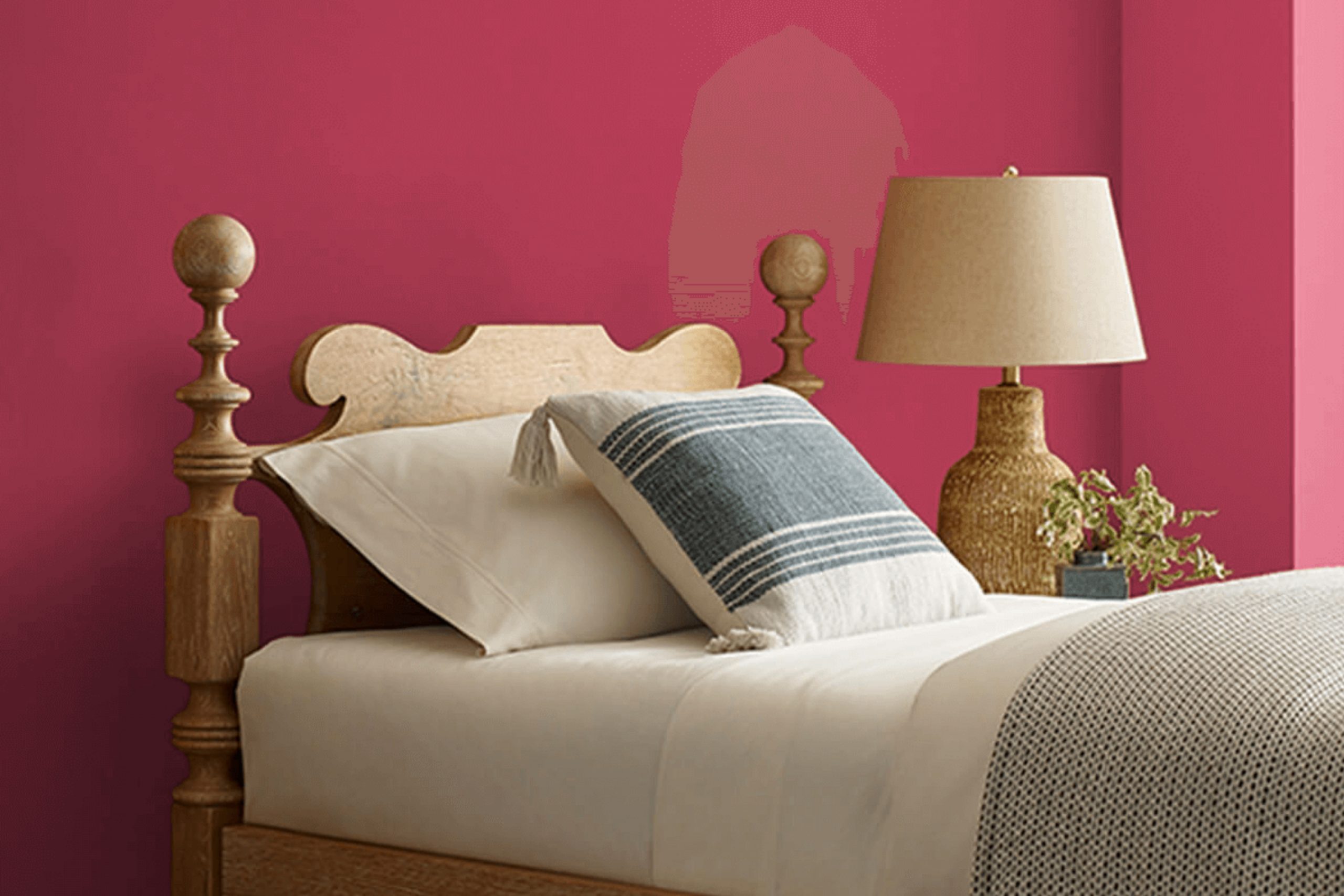
But if you’re drawn to rich, deep reds, you’ll find something quite special about Cherries Jubilee. This shade isn’t just another red; its robust and full-bodied hue brings a unique warmth to walls that can truly invigorate any room. Ideal for creating a compelling focal point, it pairs exceptionally well with soft lighting, enhancing the color’s depth to produce a downright inviting atmosphere.
Whether you’re considering a new feel for your living room or a welcoming vibe in your entryway, Cherries Jubilee has the potential to transform a space into a place where memories are made.
So, let’s explore together how this color can work in various settings and possibly provide the charm and warmth your home needs.
What Color Is Cherries Jubilee SW 6862 by Sherwin Williams?
Cherries Jubilee is a vibrant, deep red paint color that exudes warmth and energy. It finds its name reminiscent of the rich, sweet dessert, and the color perfectly captures that bold and inviting feel. This lively hue can inject personality and a sense of drama into any space, making it an excellent choice for accent walls or decorative accessories.
In terms of interior styles, Cherries Jubilee pairs beautifully with vintage and traditional decors, offering a classic look that never goes out of style. It can also create an enticing contrast in modern and contemporary spaces, where its deep red tone adds a pop of color against neutral backgrounds like whites, grays, and blacks.
When it comes to materials, this warm red works wonderfully with dark woods, adding a luxurious feel to furniture pieces or hardwood floors. It also complements rich textures like velvet or silk, enhancing the visual impact of upholstery or drapes. For a more rustic or industrial edge, combining it with exposed brick or metal finishes can lead to stunning results.
Cherries Jubilee is a versatile paint color that brings life and character to any room, matching well with various materials and enhancing different interior styles with its intense, welcoming vibe.

Is Cherries Jubilee SW 6862 by Sherwin Williams Warm or Cool color?
Cherries Jubilee by Sherwin Williams is a vibrant and bold cherry red paint color that brings a lively splash of energy to any room. This shade can make a strong statement when used on an accent wall or throughout a smaller space like a powder room or dining area. The deep, red tones of this color can create a cozy and inviting atmosphere, which is great for areas where you want to encourage conversation and warmth.
In a home, using Cherries Jubilee can add a touch of fun and excitement. It pairs well with neutral shades like white or gray, which help balance its intensity.
This color works especially well in spaces with good lighting, either natural or artificial, as the light brings out the richness of the red. For decorating, it complements wood furniture and can also look stunning with metallic accents in gold or brass, giving a stylish look to any interior design.
Undertones of Cherries Jubilee SW 6862 by Sherwin Williams
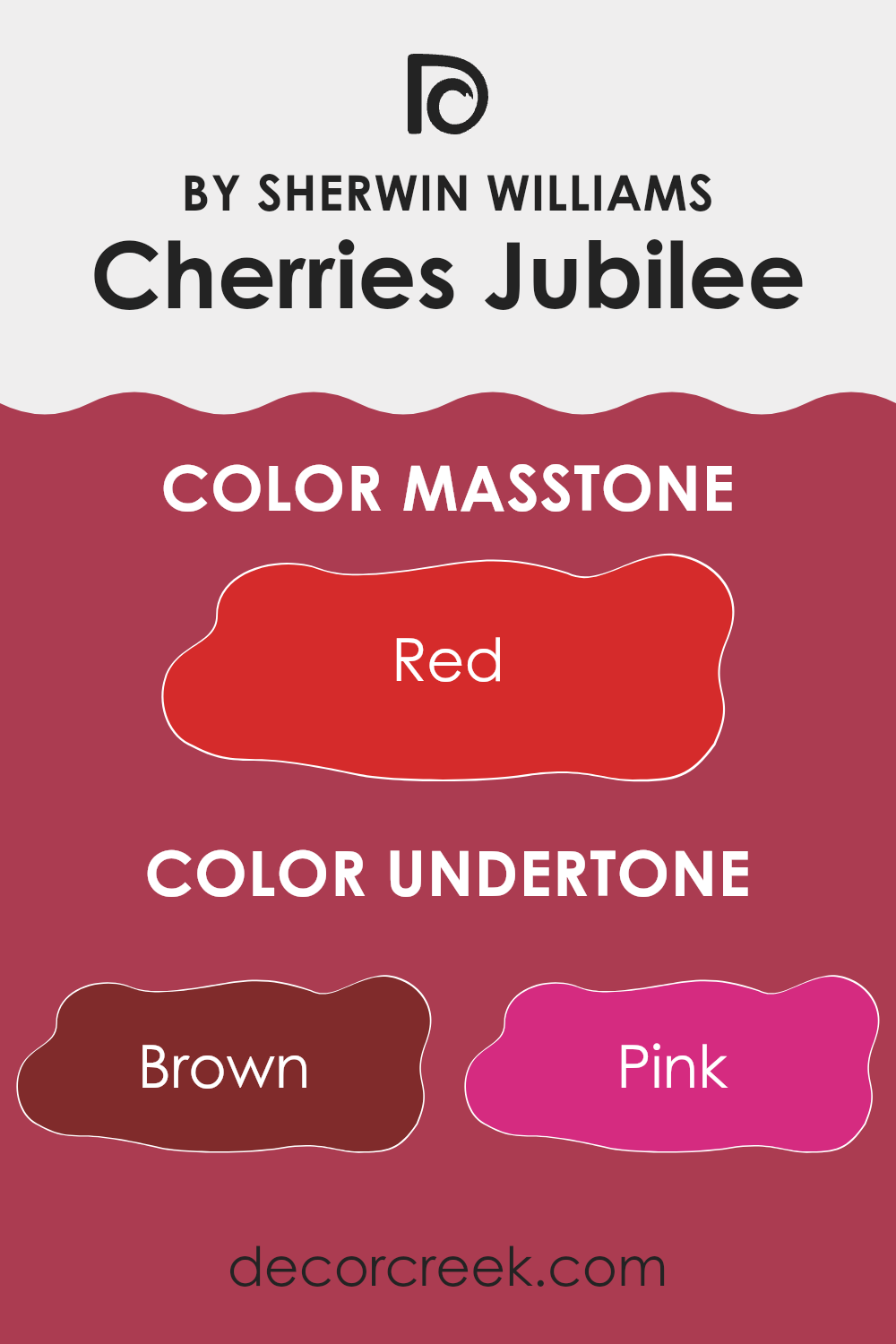
Cherries Jubilee is a vibrant color that can significantly impact the feel of a room depending on its undertones. Undertones are subtle colors that influence the main hue, affecting how it looks in different lighting and surroundings. For Cherries Jubilee, the undertones include shades of brown, pink, purple, orange, olive, pale pink, and grey. These undertones can either warm up or cool down the primary color, depending on which is more dominant.
For instance, the brown and orange undertones add warmth, making the space feel cozy and welcoming. These undertones are perfect for living rooms or dining areas where a snug atmosphere is desirable. Pink and pale pink bring a soft, friendly touch that can make small spaces like bedrooms feel more open and less intense.
On the other hand, the purple and olive undertones introduce a subtle depth that can give the paint a more complex look, enriching the character of formal spaces or offices. Grey undertones help balance the vibrancy of Cherries Jubilee, making it more versatile and easier to match with different décor styles and colors. When used on interior walls, these undertones interact with both natural and artificial light, changing the wall color’s appearance throughout the day. Rooms with plenty of sunlight might highlight the orange or pink undertones, while artificial or dim lighting may bring out the cooler grey or purple tones.
This makes Cherries Jubilee a dynamic choice for walls, as it can offer multiple shades and feelings within the same space. Understanding these undertones can help in selecting complementary colors for furniture and accessories, thus creating a more coordinated interior.
What is the Masstone of the Cherries Jubilee SW 6862 by Sherwin Williams?
Cherries Jubilee #6862 is a vibrant shade of red, showcasing a deep and bold tone similar to that of red cherries. This color has a powerful presence owing to its masstone, which draws immediate attention in any space it inhabits. When used in homes, Cherries Jubilee brings a burst of energy and warmth to the room. It’s particularly effective for creating a focal point, whether on an accent wall or through decorative accessories.
However, because of its intensity, it’s important to use this color thoughtfully to avoid overwhelming a space. It pairs well with neutral shades like white, grey, or beige, which help to balance its vibrancy.
In larger rooms, this shade can make the space feel more inviting and cozy, while in smaller spaces, it should be used sparingly to prevent the room from feeling cramped. Perfect for dining areas or living rooms, Cherries Jubilee can stimulate conversation and add a touch of joy to gatherings.
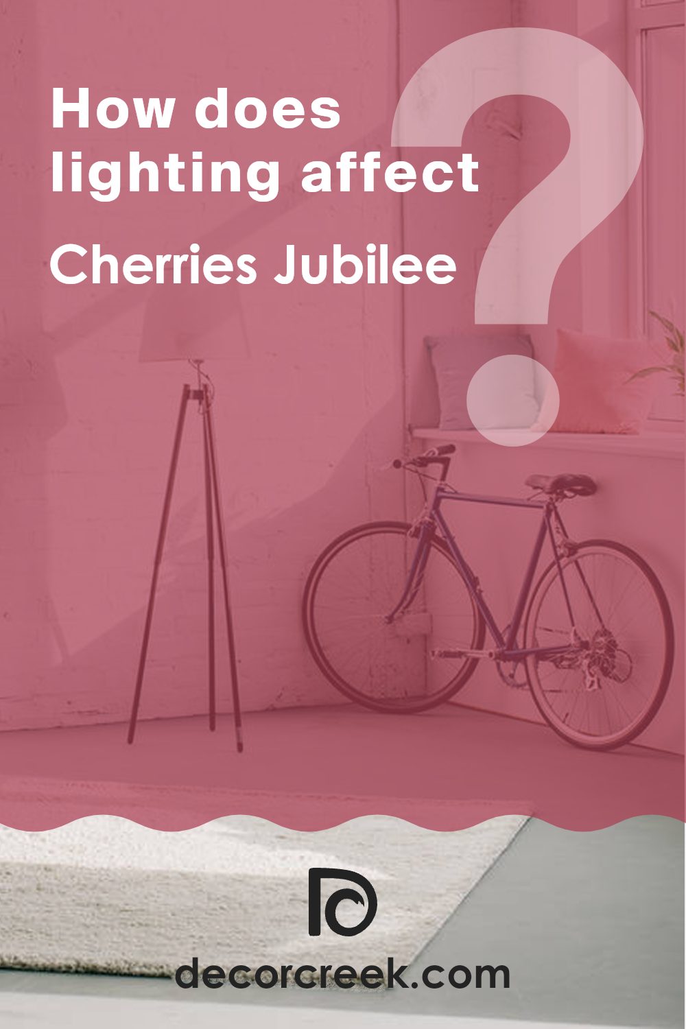
How Does Lighting Affect Cherries Jubilee SW 6862 by Sherwin Williams?
Lighting significantly influences how we perceive colors, as different types of light can change the way a color looks. When choosing a paint color like Cherries Jubilee, a deep, rich red, it’s essential to consider the lighting in the room where it will be used.
Artificial Light: In rooms lit by artificial sources like bulbs, Cherries Jubilee tends to appear warmer and more vibrant. Incandescent lighting, which gives off a yellowish glow, can enhance the red tones, making the color feel cozy and inviting. Fluorescent lighting, on the other hand, usually casts a cooler light, which might make the color appear slightly darker and less warm.
Natural Light: Natural light impacts the color differently throughout the day. Under the bright, clear light of a sunny day, Cherries Jubilee can look very vivid and dynamic, showing its true depth. On cloudy days, it might look a bit muted but still maintains a warm tone.
Room Orientation:
– North-Facing Rooms: These rooms get less direct sunlight, which can make colors appear cooler. Here, Cherries Jubilee might seem slightly more subdued and less intense, making it an excellent choice for creating a cozy atmosphere.
– South-Facing Rooms: With ample sunlight, south-facing rooms can make Cherries Jubilee look exceptionally warm and vibrant. The color will pop beautifully in this lighting, especially during midday when the light is brightest.
– East-Facing Rooms: Morning light in east-facing rooms is warm and welcoming. Cherries Jubilee will glow in the morning light, appearing vivid and lively, but it will become softer and more shadowed in the afternoon and evening.
– West-Facing Rooms: Evening light in these rooms is warm, making Cherries Jubilee feel deep and rich. In the morning, the color may appear cooler and more muted until the warmer afternoon light fills the room.
Understanding these effects can help in planning interior spaces, ensuring that the colors used create the desired mood and effect, regardless of the room’s lighting condition.
What is the LRV of Cherries Jubilee SW 6862 by Sherwin Williams?
Light Reflectance Value (LRV) measures the amount of visible and usable light that a paint color reflects when it is dry. It’s a scale that runs from 1 to 100, where a lower number means the color absorbs more light, making the room appear darker, and a higher number means it reflects more light, brightening the room.
LRV is crucial for determining how a color will feel in your space. For example, darker colors tend to make a room feel smaller or cozier, while lighter colors can make a space feel larger and more open.
Cherries Jubilee, with an LRV of 12.403, is a deep, vibrant color that absorbs a significant amount of light. This makes it better suited for spaces where a bold, intimate feel is desired or for an accent wall that stands out against more neutral tones. In a small room, using a color with such a low LRV might make the space feel cramped or smaller. Thus, it is important to have good lighting, whether natural or artificial, to balance the darkness of the wall color and enhance the overall ambiance of the room.

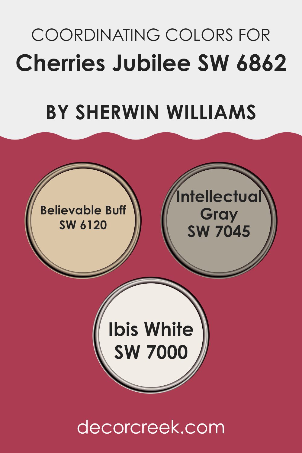
Coordinating Colors of Cherries Jubilee SW 6862 by Sherwin Williams
Coordinating colors are those that complement each other when used together in decorating or design. They create a balanced and harmonious look, making any space feel put together and aesthetically pleasing. When working with a vibrant shade like Cherries Jubilee, it’s important to choose coordinating colors that can help to balance its intensity and bring out its best tones, without overpowering the room.
Believable Buff is a warm, neutral beige that provides a soft backdrop for the bolder Cherries Jubilee. This color is perfect for creating a cozy and inviting space, as it pairs well with richer tones, lending a subtle contrast that enhances both hues. Intellectual Gray offers a more subdued but still rich option, featuring a mix of gray with hints of green.
This color is ideal for adding a touch of elegance to rooms that feature Cherries Jubilee, as it supports the vibrant red without clashing. Ibis White is a crisp, clean white that works perfectly as a balancing color. It offers a fresh look that can help to lighten up spaces dominated by darker shades, ensuring that the room feels vibrant yet spacious.
You can see recommended paint colors below:
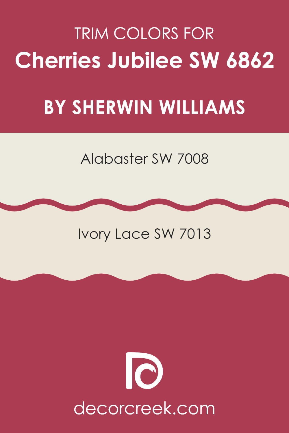
What are the Trim colors of Cherries Jubilee SW 6862 by Sherwin Williams?
Trim colors are generally used to accentuate the architectural details of a room, providing a visual frame that separates and enhances the wall color. Using trim colors can create a clear distinction which makes the wall colors stand out more profoundly.
Specifically for a vibrant color like Cherries Jubilee by Sherwin Williams, choosing the right trim colors is essential to ensure that the boldness of the cherry hue is grounded without clashing. Alabaster and Ivory Lace are excellent choices as they are neutral and subtle, allowing the vividness of Cherries Jubilee to shine while maintaining an appealing contrast.
Alabaster by Sherwin Williams is a warm, off-white color that brings a gentle brightness to the trim, offering a soft contrast without overwhelming the senses. It can make the edges of a room appear smooth and more defined when paired with a stronger main color. Ivory Lace, on the other hand, has a hint of warmth that is slightly deeper than Alabaster but still soothing and light. This color works well in balancing the intensity of deeper hues, ensuring that the room feels harmonious and pleasantly arranged without stark transitions.
You can see recommended paint colors below:
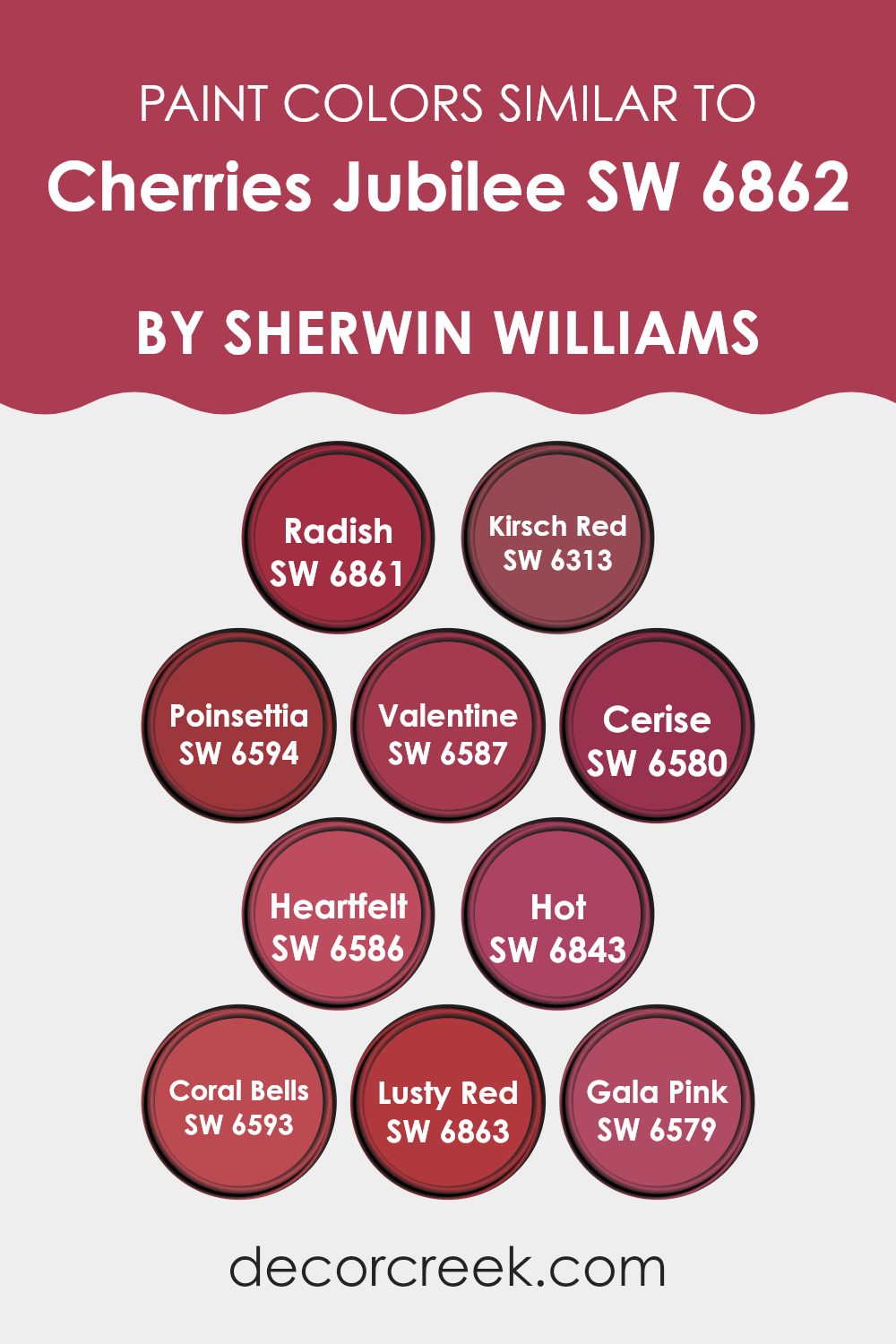
Colors Similar to Cherries Jubilee SW 6862 by Sherwin Williams
Using similar colors in design can create a harmonious look that gently blends the elements of a space together, offering a pleasing visual experience. When colors like those close to Cherries Jubilee are employed, they bring a sense of unity without being overpowering, allowing each color to complement the others smoothly. This is particularly useful in achieving a cohesive theme or mood in interiors, artworks, or even fashion.
SW 6861 – Radish has a vibrant, energetic red hue that brings warmth and excitement to any palette. SW 6313 – Kirsch Red is slightly deeper, giving a rich backdrop that pairs wonderfully with lighter or darker shades for a full-bodied appearance.
SW 6594 – Poinsettia is reminiscent of the classic holiday red that adds a bold, festive touch. SW 6587 – Valentine carries a soft yet poignant red that feels both romantic and inviting. SW 6580 – Cerise offers a pinkish-red that shines with youthful energy and playfulness. SW 6586 – Heartfelt has a more muted red, ideal for creating a subtle yet impactful ambiance. SW 6843 – Hot presents a fiery personality that catches the eye and stimulates the senses. SW 6593 – Coral Bells introduces a soft, coral-like blush that infuses lightness into the grouping.
SW 6863 – Lusty Red is intense and full of passion, providing depth and drama wherever used. Lastly, SW 6579 – Gala Pink brightens its surroundings with a light, cheerful pink that’s both sweet and elegant, perfect for more delicate applications. These colors, when used together, can stitch together any design or space with a thread of consistency and attractive allure.
You can see recommended paint colors below:
- SW 6861 Radish
- SW 6313 Kirsch Red
- SW 6594 Poinsettia
- SW 6587 Valentine
- SW 6580 Cerise
- SW 6586 Heartfelt
- SW 6843 Hot
- SW 6593 Coral Bells
- SW 6863 Lusty Red
- SW 6579 Gala Pink
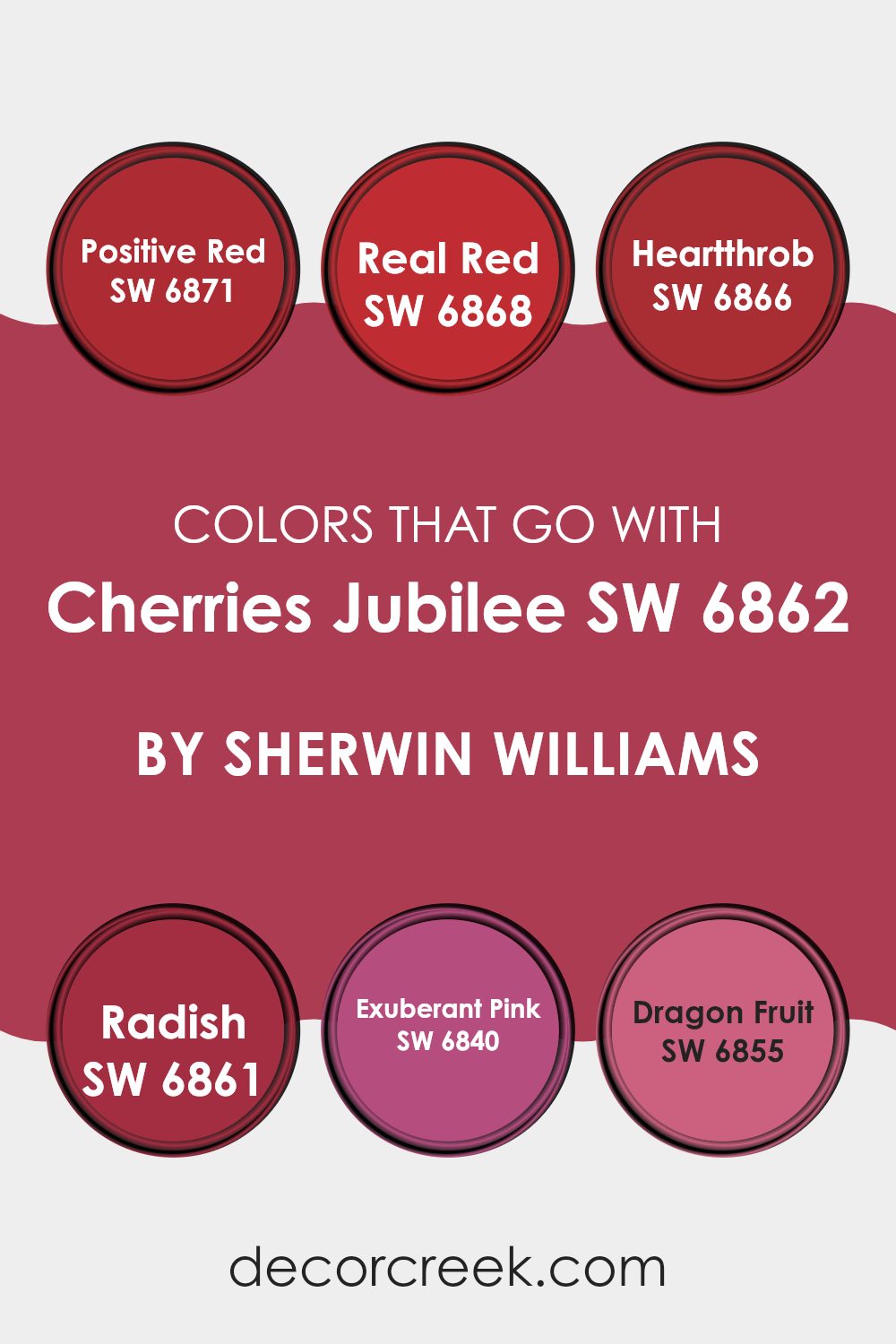
Colors that Go With Cherries Jubilee SW 6862 by Sherwin Williams
Choosing the right colors to pair with Cherries Jubilee SW 6862 by Sherwin Williams can significantly enhance the aesthetic of any space. These complementary colors help in creating a harmonious and vibrant environment. When combined with shades like Positive Red and Real Red, the setup introduces a bold and energetic vibe, which is perfect for areas that benefit from a lively atmosphere such as living rooms or dining areas. Adding these colors together can make a space feel more alive and inviting.
Among the colors that pair well with Cherries Jubilee, Heartthrob presents a deep, passionate red that adds a touch of drama and intensity. It’s great for accent walls or decor items to create focal points in a room. Radish has a slightly lighter tone that is vibrant yet not overwhelming, offering a fresh pop of color that is quite eye-catching.
For those who enjoy a bit of playfulness, Exuberant Pink provides a bright, cheerful pink that injects fun into any space. Dragon Fruit is another energetic shade, slightly darker than Exuberant Pink, adding a sense of freshness and spirited appeal. By using these colors together, you can create a distinctive and appealing look that enhances the base color of Cherries Jubilee, making the entire palette work seamlessly to produce a warm and welcoming space.
You can see recommended paint colors below:
- SW 6871 Positive Red
- SW 6868 Real Red
- SW 6866 Heartthrob
- SW 6861 Radish
- SW 6840 Exuberant Pink
- SW 6855 Dragon Fruit
How to Use Cherries Jubilee SW 6862 by Sherwin Williams In Your Home?
Cherries Jubilee SW 6862 by Sherwin Williams is a vibrant, rich cherry red color that can add a bold touch to your home. This shade is perfect for creating a focal point in any room. For example, you could use it on a feature wall in your living room to make it stand out and give the space some personality.
This works especially well if the rest of the room has neutral colors, like whites or grays, making the red pop even more. In the dining room, painting one wall with Cherries Jubilee can make meal times more lively and fun. It’s a great backdrop for white dining sets, enhancing the overall dining experience.
Additionally, using this color in small doses, like on a backsplash in the kitchen or on a single bathroom wall, can add a splash of energy without overwhelming the space. Accessories like cushions or a throw rug in this cherry red can also brighten up a room effectively. It’s a versatile color that adds warmth and a welcoming feel wherever it’s used.
Cherries Jubilee SW 6862 by Sherwin Williams vs Hot SW 6843 by Sherwin Williams
Cherries Jubilee is a deep, vibrant maroon shade with a touch of burgundy, offering a classic and elegant look for any space. It’s a color that stands out and creates a feeling of warmth and richness, perfect for creating a focal point in a room.
On the other hand, Hot is a bold and bright red color that’s very eye-catching. It has a strong presence and can energize a space, making it feel lively and exciting. While both colors are on the red spectrum, Cherries Jubilee has a more muted, dark tone, which can be great for a cozy and somewhat dramatic effect.
In contrast, Hot’s vivid red is more straightforward and can instantly brighten up a space. The choice between them depends on the mood you’re trying to achieve; Cherries Jubilee is more reserved and soothing, while Hot is energetic and striking.
You can see recommended paint color below:
- SW 6843 Hot

Cherries Jubilee SW 6862 by Sherwin Williams vs Valentine SW 6587 by Sherwin Williams
Cherries Jubilee and Valentine, both by Sherwin Williams, are vibrant shades that pack a punch when it comes to adding bold color to a space. Cherries Jubilee has a deep, rich maroon hue that resembles the dark red of cherry desserts.
It’s perfect for creating a cozy and warm atmosphere. On the other hand, Valentine is a brighter, more vivid pink. It has a playful and cheerful vibe, which can instantly brighten up a room. While both colors are strong and lively, Cherries Jubilee offers a more muted, mature feel compared to the youthful and energetic tone of Valentine.
Depending on your preference for mood and space, either color could be a great choice. Cherries Jubilee works well in traditional settings, whereas Valentine fits perfectly in more modern or whimsical spaces.
You can see recommended paint color below:

Cherries Jubilee SW 6862 by Sherwin Williams vs Radish SW 6861 by Sherwin Williams
Cherries Jubilee and Radish are two vibrant shades by Sherwin Williams that offer distinctly robust and lively vibes. Cherries Jubilee is a deep, cherry red that has a rich and bold appeal. It can add a dramatic flair to any space, making it feel warm and welcoming. This color pairs well with neutral shades and wood finishes, bringing out a traditional yet striking aesthetic.
On the other hand, Radish is slightly lighter, leaning towards a bright, raspberry red. It’s more playful and punchy, offering a pop of color that is both fun and energizing. Ideal for spaces used for creativity and activity, Radish works great in kitchens, playrooms, or any area that benefits from a burst of cheer.
Overall, while both colors share a red base, Cherries Jubilee brings depth and warmth, suitable for more subdued or elegant designs. Radish, being brighter, injects vibrancy and enthusiasm, perfect for more lively environments.
You can see recommended paint color below:
- SW 6861 Radish
Cherries Jubilee SW 6862 by Sherwin Williams vs Gala Pink SW 6579 by Sherwin Williams
Cherries Jubilee and Gala Pink, both by Sherwin Williams, offer distinct vibes for any space. Cherries Jubilee is a deep, rich red with a hint of burgundy, making it perfect for creating a cozy and warm atmosphere. It draws inspiration from the dark red of cherry desserts, bringing a classic and inviting feel to rooms. Ideal for accent walls or rich decor themes, it pairs well with soft lighting and dark furniture.
On the other hand, Gala Pink is a brighter, more playful shade. This color is lighter and has a youthful pink that adds a fresh, cheerful touch to spaces. It’s great for bedrooms, bathrooms, or anywhere you want to add a splash of light-hearted color. Gala Pink works beautifully with white trimmings or light wooden furniture, creating a friendly and welcoming environment.
Together, these colors can be used to add contrast and vibrancy in a home, balancing deep sophistication with spirited playfulness.
You can see recommended paint color below:
- SW 6579 Gala Pink
Cherries Jubilee SW 6862 by Sherwin Williams vs Kirsch Red SW 6313 by Sherwin Williams
Cherries Jubilee is a bold, vibrant shade that leans towards a deep, rich red with a noticeable pink undertone, making it lively and festive. It’s a color that stands out and adds a lot of personality to a space. It’s perfect for creating a striking feature wall or for accent pieces that catch the eye.
On the other hand, Kirsch Red is also a strong color but has a more traditional red tone. It’s warmer and less pinkish than Cherries Jubilee, providing a classic look that feels cozy and inviting. Kirsch Red works well in spaces where you want to introduce warmth and a sense of welcome, like living rooms or dining areas.
Both colors are intense and can create dramatic effects in interior design. However, Cherries Jubilee offers a more modern and youthful flair, while Kirsch Red gives a timeless appeal. Choosing between them depends on the atmosphere you want to create and how much you wish to play with color warmth and vibrancy.
You can see recommended paint color below:
- SW 6313 Kirsch Red
Cherries Jubilee SW 6862 by Sherwin Williams vs Heartfelt SW 6586 by Sherwin Williams
Cherries Jubilee and Heartfelt are both rich, vibrant shades by Sherwin Williams, but they offer distinctly different vibes. Cherries Jubilee is a deep, bold maroon that resembles the enticing color of cherry desserts. This hue can make a strong statement in a room, bringing warmth and a sense of coziness. It works well in spaces where you want to foster an inviting, warm atmosphere, such as living rooms or dining areas.
On the other hand, Heartfelt is a soft, muted pink that brings a gentle touch of warmth to spaces. This color is more subdued compared to Cherries Jubilee and tends to provide a calming effect, making it suitable for bedrooms or spaces where relaxation is key. It pairs well with neutral tones, creating a soothing environment.
Both colors are suitable for different purposes and can dramatically alter the mood of a room, depending on what you’re aiming for in your decorating efforts.
You can see recommended paint color below:
- SW 6586 Heartfelt

Cherries Jubilee SW 6862 by Sherwin Williams vs Cerise SW 6580 by Sherwin Williams
Cherries Jubilee and Cerise by Sherwin Williams are both shades of red, but each carries a distinct personality. Cherries Jubilee is a deep, rich red with a hint of burgundy, making it warm and inviting. It’s the kind of color that would feel at home in a cozy reading nook or as an accent wall in a living room, giving the space a cozy, traditional feel.
On the other hand, Cerise is a brighter, more vibrant red. It has a pinkish undertone that makes it pop and feels more playful and energetic. This color would be great in a creative space or a child’s room, where it would add a fun splash of brightness and energy.
Each color serves a different purpose depending on the mood you want to set. While Cherries Jubilee offers warmth and depth, Cerise brings excitement and vibrancy.
You can see recommended paint color below:
- SW 6580 Cerise
Cherries Jubilee SW 6862 by Sherwin Williams vs Lusty Red SW 6863 by Sherwin Williams
Cherries Jubilee and Lusty Red are both vibrant, striking shades from Sherwin Williams, though they present unique tones that can influence the mood of a space differently. Cherries Jubilee is a deep maroon with a rich burgundy undertone that offers a cozy and inviting feel, often ideal for creating a warm and comfortable ambiance in a room. It pairs well with soft lighting and can make large spaces feel more intimate.
On the other hand, Lusty Red is a bold, bright red that leans slightly towards a classic red with hints of brightness that can energize a space. It is perfect for areas where you want to make a strong impression, such as an entryway or a focal accent wall. This color is also great for stimulating conversation in a dining area or kitchen.
While both colors are in the red family, Cherries Jubilee provides a more muted, subdued backdrop, whereas Lusty Red stands out with its more vivid and brighter appeal. The choice between them would depend on whether you’re looking for a color that brings warmth and subtlety or one that adds vibrancy and impact.
You can see recommended paint color below:
- SW 6863 Lusty Red
Cherries Jubilee SW 6862 by Sherwin Williams vs Poinsettia SW 6594 by Sherwin Williams
Cherries Jubilee and Poinsettia are both vibrant red hues from Sherwin Williams, but they have distinct tones that set them apart. Cherries Jubilee has a deeper, slightly more subdued shade of red, resembling the rich color of cherry desserts. This color offers a cozy, warm feeling, making it great for spaces that aim for a comfortable and inviting atmosphere.
On the other hand, Poinsettia is a brighter and more vivid red. It mirrors the lively color of the poinsettia flower, often associated with festive joy. This makes it a perfect choice for areas where you want to inject energy and a hint of cheerfulness.
In terms of application, Cherries Jubilee might be better suited for bedrooms or living rooms where a softer red can add depth without overwhelming the space. Poinsettia, with its bold flair, could be ideal for accent walls or spaces that benefit from a strong, lively pop of color. Both colors bring warmth and excitement to a room, but the choice depends on the mood you want to create.
You can see recommended paint color below:
- SW 6594 Poinsettia
Cherries Jubilee SW 6862 by Sherwin Williams vs Coral Bells SW 6593 by Sherwin Williams
Cherries Jubilee and Coral Bells by Sherwin Williams are two vibrant colors that contrast in their visual impact and mood. Cherries Jubilee is a bold, deep cherry red that brings a strong and energetic feel to spaces, making it ideal for areas where you want to make a statement or stir excitement.
On the other hand, Coral Bells has a much softer presence, with its gentle coral tone giving a warm and inviting atmosphere. This color works well in spaces meant for relaxation or friendly gatherings.
While Cherries Jubilee can be thought of as more dramatic and daring, Coral Bells offers a sense of calm and cheerfulness. Each color has its unique charm and can distinctly influence the mood and style of a room.
You can see recommended paint color below:
- SW 6593 Coral Bells
Writing the conclusion for the discussion on SW 6862 Cherries Jubilee by Sherwin Williams, I must say, choosing the right paint color can really make any room feel special. Cherries Jubilee isn’t just any red. It’s a warm, inviting color that can make a room cozy and welcoming. Using this paint can add a touch of excitement to spaces like the living room or make your kitchen feel warm like a sunny afternoon.
Whether you’re just wanting to change up one wall as an accent or maybe paint the whole room, Cherries Jubilee provides a rich, deep color that isn’t too bright but still stands out. It works well with different colors like soft whites or even tans, which means it’s pretty easy to find decorations that look good with it.
So, if you’re looking to brighten up your home with some color, SW 6862 Cherries Jubilee is a great choice that brings warmth and charm to any area. It’s not just about making a space look good; it’s also about making it feel good, where every corner seems inviting, making it a place you love to be in.

Ever wished paint sampling was as easy as sticking a sticker? Guess what? Now it is! Discover Samplize's unique Peel & Stick samples.
Get paint samples

