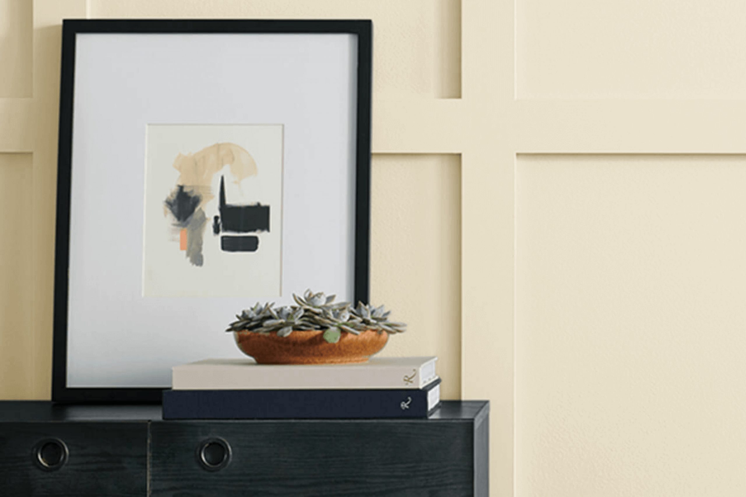
SW 7564 Polar Bear by Sherwin Williams is more than just a paint color; it’s a warm and welcoming shade of off-white that invites comfort and elegance into any space.
When I saw Polar Bear for the first time, I was drawn to its subtle warmth that distinguishes it from cooler whites. It has a cozy vibe without being too overpowering, which makes it perfect for creating a serene and inviting atmosphere in your home.
This color is versatile, working wonderfully in both modern and traditional settings. Whether used on walls, trim, or even furniture, it adds a touch of sophistication while maintaining a relaxed feel. You might find it perfect for a living room where you want to enhance natural light, or in a bedroom to create a calm sanctuary.
Polar Bear harmonizes beautifully with a range of other colors, from soft pastels to vibrant hues, allowing for creative combinations that reflect your personality.
It can be the perfect backdrop, giving you the freedom to decorate and redecorate as your tastes evolve. With Polar Bear, you get more than a simple off-white; you create a space that feels like home.
What Color Is Polar Bear SW 7564 by Sherwin Williams?
Polar Bear SW 7564 by Sherwin Williams is a soft, warm white that adds a cozy and inviting feel to any space. Its gentle hue makes it a versatile choice for various interior styles, lending brightness without the starkness of a cool white. This color works beautifully in traditional, farmhouse, and rustic settings, where its warmth complements natural elements.
Pair Polar Bear with rich wood tones, like oak or walnut, for a classic and timeless look. It goes well with materials such as linen and cotton, enhancing a relaxed and comfortable atmosphere. Textured fabrics, like burlap or wool, add depth and interest alongside this color, creating a homey and layered feel.
In modern interiors, Polar Bear serves as a neutral backdrop, balancing bold colors and contemporary furniture. It can soften the metallic sheen of stainless steel or chrome finishes, bringing a touch of homeliness into sleek spaces. Additionally, this shade complements earthy materials like stone and leather, tying in organic textures seamlessly.
Polar Bear is not only easy on the eyes but easy to use, making it an excellent choice for any room, whether you undertake a full remodel or a simple refresh. Its versatility and warmth make it suitable for living rooms, bedrooms, or even kitchens, providing a snug and welcoming ambience.
Is Polar Bear SW 7564 by Sherwin Williams Warm or Cool color?
Polar Bear SW 7564 by Sherwin Williams is a soft white paint color that creates a calming and airy atmosphere in homes. Its subtle warmth makes spaces feel inviting and cozy without being overwhelming.
Compared to harsh bright whites, Polar Bear has a gentle tone that works well in both modern and traditional interiors.
In living rooms, this color enhances natural light, making the space feel more open and cheerful. It pairs nicely with pastel accents or bold colors, providing a versatile backdrop for any decor style. In bedrooms, the soothing aspect of Polar Bear helps foster a restful environment, perfect for relaxation.
This color also works well in kitchens and bathrooms, giving these areas a fresh, clean look. It brightens the space while maintaining a comfortable ambiance. Overall, Polar Bear SW 7564 is a versatile and adaptable shade that enhances the look and feel of various rooms in a home, making it a popular choice among homeowners.
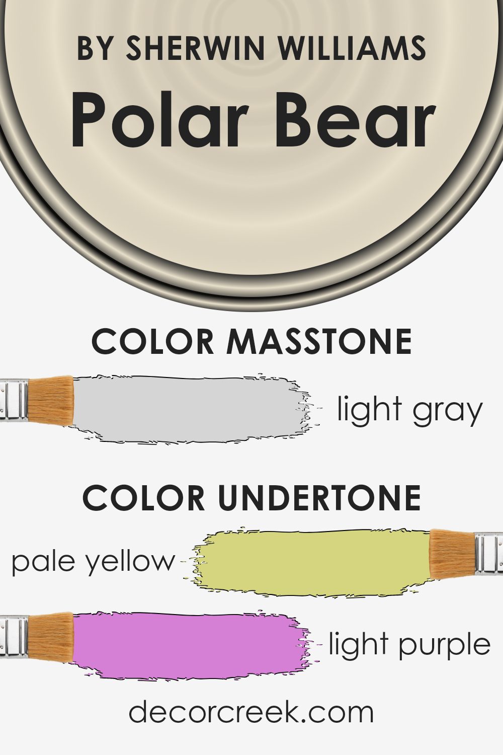
Undertones of Polar Bear SW 7564 by Sherwin Williams
Understanding the undertones of Polar Bear by Sherwin Williams can help you perceive this color in different ways. This shade has a complex mix of pale yellow, light purple, light blue, pale pink, mint, lilac, and grey undertones. These subtle hints can influence how this paint color looks on your walls in various lighting conditions and settings.
For instance, if your room gets a lot of natural sunlight, the pale yellow and mint undertones might become more noticeable, giving the room a warmer, softer glow. In contrast, in a space with less natural light or under cooler artificial lighting, the light purple, lilac, and grey undertones may be more dominant, lending a cooler, more subdued feel to the walls.
The light pink and light blue elements add a gentle vibrancy to the color, preventing it from feeling too stark or cold. This combination of undertones makes Polar Bear a versatile choice for different rooms.
It pairs well with various color schemes, whether you are looking for something neutral to balance bolder colors or a calm backdrop for a minimalist aesthetic. Understanding these undertones can help ensure the paint color works well with your room’s lighting and existing decor.
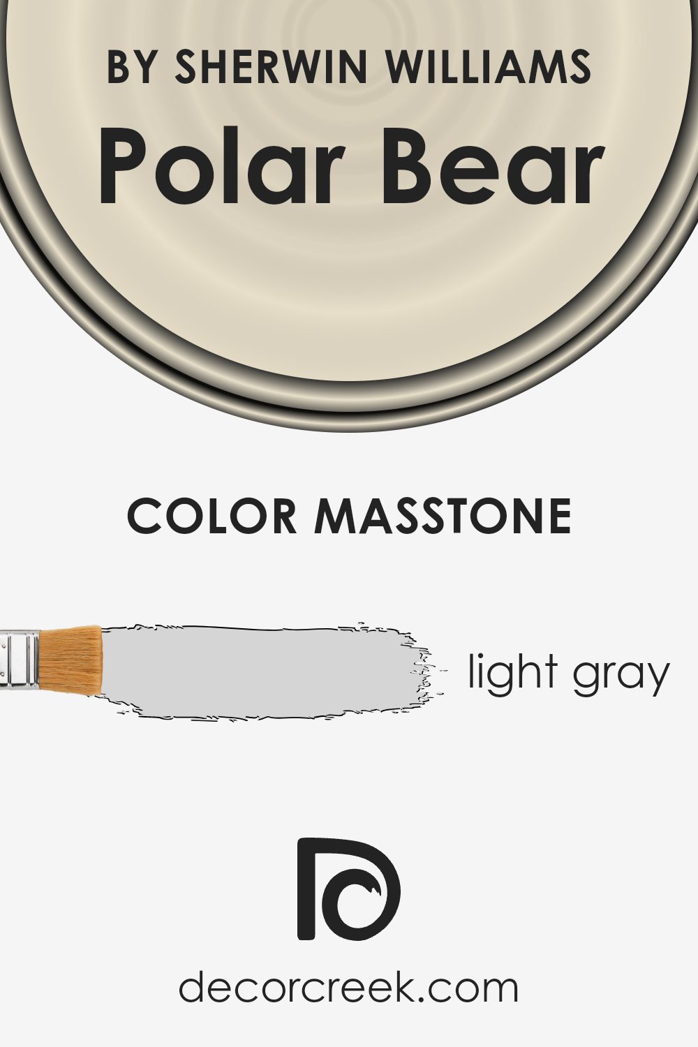
What is the Masstone of the Polar Bear SW 7564 by Sherwin Williams?
Polar Bear SW 7564 by Sherwin Williams is a light gray with a masstone resembling #D5D5D5. This shade carries a sense of calm and simplicity, making it versatile for various spaces in the home.
The light gray tone works well as a neutral backdrop, allowing other colors in the room to stand out. It pairs nicely with both warm and cool colors, making it easy to coordinate with furniture and decorations. In living rooms or bedrooms, this color can create a peaceful atmosphere, reflecting natural light to make spaces feel airy and open.
In kitchens or bathrooms, it offers a fresh, clean look that complements stainless steel and white fixtures. Additionally, its subtle nature means it doesn’t overpower, making it ideal for those who prefer understated elegance in their home decor. Overall, this shade fits effortlessly into many design styles, enhancing the look and feel of a home.
How Does Lighting Affect Polar Bear SW 7564 by Sherwin Williams?
Lighting plays a crucial role in how we perceive colors. It can change the way a color looks on walls or objects, affecting our mood and the overall ambiance of a space. Natural light changes throughout the day, while artificial light sources can have different color temperatures that influence how colors appear.
The color Polar Bear SW 7564 by Sherwin Williams is an off-white shade with warm undertones, which means it might look different depending on the lighting conditions. In natural light, this color will interact with the varying levels of sunlight to create subtle shifts in appearance throughout the day.
In north-facing rooms, the light tends to be cooler and more subdued because these rooms receive less direct sunlight. This cooler light might bring out the warmer undertones of Polar Bear, making the color appear a little warmer than it is.
On the other hand, south-facing rooms receive more direct sunlight throughout the day, especially during midday. The intense light in these rooms will likely make the Polar Bear color seem brighter and more vibrant.
East-facing rooms catch the morning light, which is softer and warmer. This will enhance the warm tones in the Polar Bear color in the morning, making the room feel cozy. However, as the day progresses and the natural light fades, the color may appear more subdued.
West-facing rooms get the best light in the late afternoon and evening. During these times, the light is warmer and can exaggerate any warm undertones. In the case of Polar Bear, this could make the room feel quite inviting during these hours.
Artificial light also has a significant impact. Cool white LEDs may make Polar Bear feel more neutral, while warm bulbs will emphasize the warm elements of the color. Adjusting the lighting allows for flexibility in how this color is experienced.
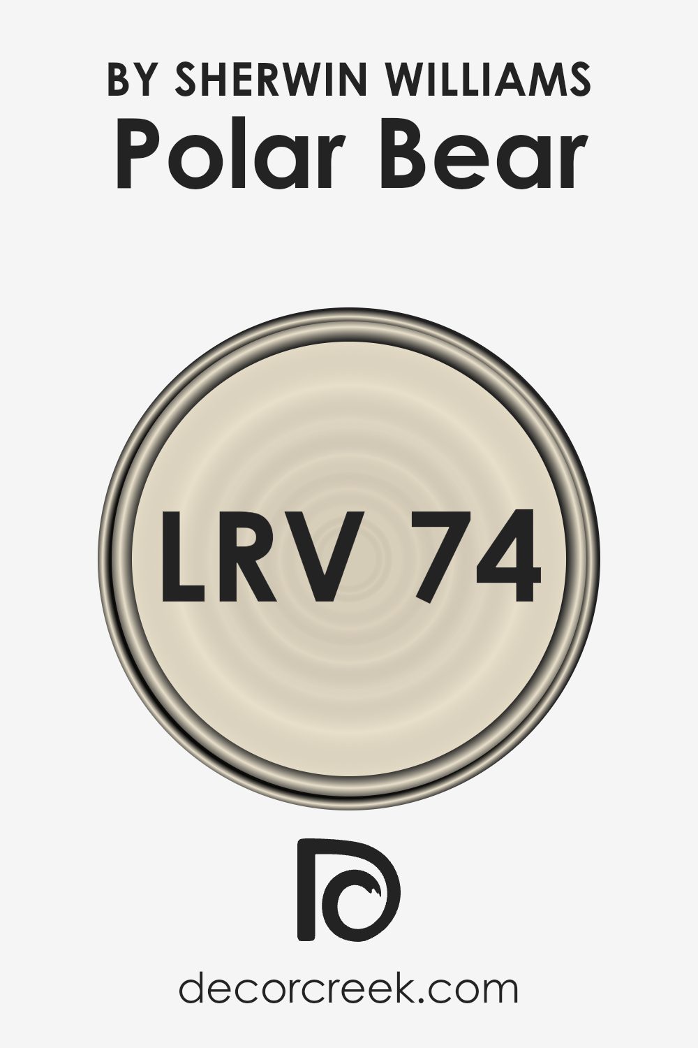
What is the LRV of Polar Bear SW 7564 by Sherwin Williams?
The Light Reflectance Value, or LRV, measures how much light a color reflects and absorbs. The scale ranges from 0 to 100, where 0 is absolute black (absorbing all light) and 100 is pure white (reflecting all light). Generally, higher LRV numbers mean the color is lighter and reflects more light.
When you use a color with a high LRV on your walls, it will reflect more light into the room, making spaces feel brighter and more open. Conversely, colors with lower LRV values absorb more light, making rooms feel cozier but darker.
For the Polar Bear color with an LRV of 74.208, it means the color is quite light and will reflect a lot of light. This characteristic will brighten up a room, making it feel airy and spacious.
The high reflectance value also means it can make small spaces appear larger and more inviting. In well-lit rooms, this color will help maintain that natural, open atmosphere, while in darker rooms, it will aid in lifting the overall light level.
Polar Bear is a versatile choice, helping to make homes feel more open and cheerful.
Coordinating Colors of Polar Bear SW 7564 by Sherwin Williams
Coordinating colors are a selection of hues that complement each other and work together to create a harmonious look in a space. When paired with Polar Bear, a soft and warm white by Sherwin Williams, these colors bring out the best in each other without clashing. The idea is to have colors that enhance each other’s beauty and provide a balanced aesthetic, whether it’s in interior design, fashion, or artwork.
Alabaster (SW 7008) is a warm, creamy white that pairs perfectly with Polar Bear, providing a subtle contrast that keeps spaces light and airy while adding a touch of coziness. Eclipse (SW 6166), on the other hand, is a rich, deep brownish-gray that adds depth and a grounded feel when used as a secondary color, perfect for accent walls or furniture.
At Ease Soldier (SW 9127) offers a gentle, muted green that brings a hint of nature indoors, adding a calming effect to the overall palette. Together, these colors can create a balanced and inviting environment, making any room feel comfortable and coherent. By choosing colors that coordinate well, it’s easy to create an inviting and visually appealing atmosphere.
You can see recommended paint colors below:
- SW 7008 Alabaster
- SW 6166 Eclipse
- SW 9127 At Ease Soldier

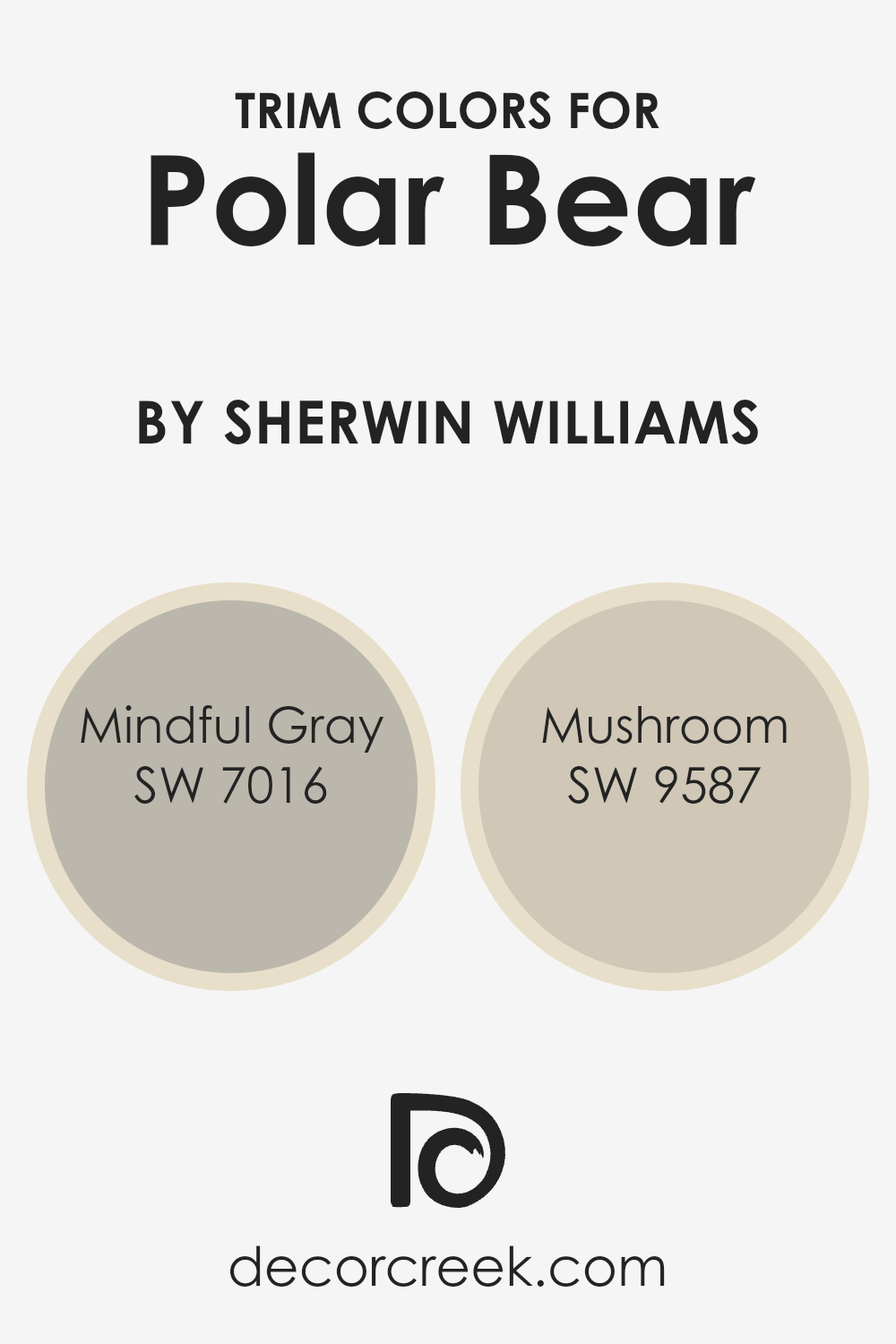
What are the Trim colors of Polar Bear SW 7564 by Sherwin Williams?
Trim colors are used to highlight or outline certain parts of a space, like doors, windows, and baseboards, adding depth and definition to the overall design. When using Polar Bear SW 7564 as the main wall color, choosing the right trim colors can enhance its warmth and subtle beauty.
Mindful Gray SW 7016 is a soft, warm gray with green undertones, which provides a gentle contrast against Polar Bear’s creamy white. This subtle difference allows the main wall color to stand out more, while Mindful Gray frames the space in a complementary hue.
Meanwhile, Mushroom SW 9587 offers a deeper, earthy tone, adding richness to the setting when used as a trim. This color is a muted brown with gray undertones that adds warmth and coziness without overwhelming. Its depth helps to ground the lighter walls, giving a balanced look to the room.
Trim colors like Mindful Gray and Mushroom are essential as they can influence the mood of the entire space, ensuring that the chosen wall color, like Polar Bear, is both highlighted and supported.
You can see recommended paint colors below:
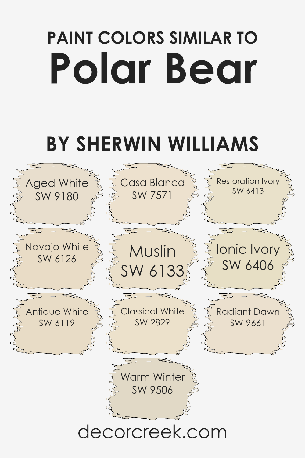
Colors Similar to Polar Bear SW 7564 by Sherwin Williams
Similar colors are important because they help create a cohesive and harmonious color palette. When you use colors that are close to each other on the color spectrum, they blend naturally and offer a pleasing, balanced look. This approach is practical for interior design, as it allows you to create spaces that feel connected and comfortable without jarring contrasts.
For instance, Aged White has a warm, subdued hue that complements Polar Bear with its soft beige undertones. Navajo White offers a gentle creamy tone that pairs nicely with Polar Bear’s lightness, and Antique White delivers a timeless off-white shade that feels welcoming next to other warm colors.
Warm Winter has a cozy, muted glow that echoes the gentle feel of Polar Bear. Casa Blanca is a soothing creamy beige that fits well into any warm color scheme. Muslin gives a slightly deeper hue with a hint of earthiness, adding depth when placed alongside Polar Bear.
Classical White has an elegant charm with its clean and bright appearance, perfect for enhancing lighter tones. Restoration Ivory features a pale, refreshing essence that blends well with similar neutrals.
Ionic Ivory presents a soft, inviting ivory shade, while Radiant Dawn brings a hint of warmth that ties all these colors together beautifully. These similar colors work together to create a harmonious and inviting environment.
You can see recommended paint colors below:
- SW 9180 Aged White
- SW 6126 Navajo White
- SW 6119 Antique White
- SW 9506 Warm Winter
- SW 7571 Casa Blanca
- SW 6133 Muslin
- SW 2829 Classical White
- SW 6413 Restoration Ivory
- SW 6406 Ionic Ivory
- SW 9661 Radiant Dawn
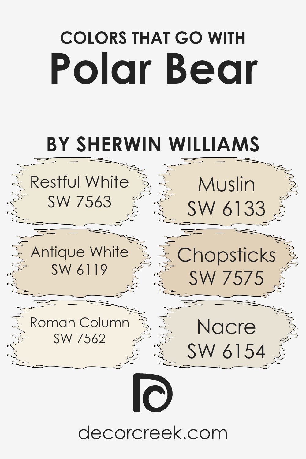
Colors that Go With Polar Bear SW 7564 by Sherwin Williams
Choosing colors that complement Polar Bear SW 7564 by Sherwin Williams is key to creating a harmonious and inviting space. Each color works together with Polar Bear to enhance the overall ambiance. Restful White SW 7563 pairs well with Polar Bear as it maintains a soft and clean feel.
Restful White adds a touch of warmth without overwhelming the space, making it perfect for a soothing atmosphere. Antique White SW 6119 brings a sense of timelessness, offering a gentle backdrop that highlights Polar Bear without overshadowing it.
Roman Column SW 7562 is another great companion, offering a subtle elegance that balances well with the lightness of Polar Bear. Muslin SW 6133 adds a touch of earthiness, grounding the light and airy feel of Polar Bear for a more cohesive look.
Chopsticks SW 7575 introduces a hint of depth, adding a richer tone that complements the lighter shades. Finally, Nacre SW 6154 works well by providing a soft, natural highlight that coordinates beautifully with the other colors. Together, these colors create a balanced, inviting palette that enhances any space with Polar Bear at its heart.
You can see recommended paint colors below:
- SW 7563 Restful White
- SW 6119 Antique White
- SW 7562 Roman Column
- SW 6133 Muslin
- SW 7575 Chopsticks
- SW 6154 Nacre
How to Use Polar Bear SW 7564 by Sherwin Williams In Your Home?
Polar Bear SW 7564 by Sherwin-Williams is a lovely, soft color that can brighten up any room in your house. It’s a calm off-white shade with a hint of warmth, making it versatile for many styles and spaces. You can use it on your living room walls to create an inviting and open atmosphere. It’s also a great choice for bedrooms, offering a peaceful backdrop for relaxation.
This color works well with both modern and traditional furniture, allowing different pieces to stand out without clashing. Pair it with bold accents, such as colorful cushions or artwork, to give the room some personality.
In kitchens, Polar Bear can be used on cabinets for a fresh, clean look, especially if you want to keep the space looking bright and airy. Because it’s a neutral shade, you can easily change your room’s decor over time without needing to repaint. It’s a timeless choice that suits any style.
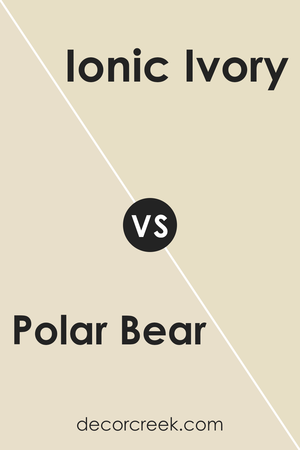
Polar Bear SW 7564 by Sherwin Williams vs Ionic Ivory SW 6406 by Sherwin Williams
Polar Bear SW 7564 by Sherwin Williams is a soft, off-white color with warm undertones. It’s a versatile shade that brings a gentle, inviting feel to any space. Polar Bear works well in rooms where you want a calm, light atmosphere—perfect for living rooms or bedrooms.
On the other hand, Ionic Ivory SW 6406 also brings warmth but with a touch more color. It’s a light, creamy beige with a hint of yellow-green, adding a muted elegance to the walls. Ionic Ivory can make a room feel cozy without being too dark, complementing earthy or natural tones beautifully.
While both colors are warm and inviting, Polar Bear leans more towards a traditional off-white, making it slightly more versatile and neutral. Ionic Ivory, with its subtle hints of color, may work better in spaces where you want a bit more personality without overwhelming the room.
You can see recommended paint color below:
- SW 6406 Ionic Ivory
Polar Bear SW 7564 by Sherwin Williams vs Antique White SW 6119 by Sherwin Williams
Polar Bear SW 7564 by Sherwin Williams is a soft white that feels clean and bright. It’s a perfect choice for spaces where you want a fresh, airy feel. Its lightness makes it versatile, working well in various settings and with different decor styles.
On the other hand, Antique White SW 6119 by Sherwin Williams has a warm, creamy tone. It brings a cozy, welcoming atmosphere to a room. This color has yellow undertones, giving it a gentle warmth that makes spaces feel inviting.
When comparing the two, Polar Bear gives a cooler, modern look due to its pure white appearance, while Antique White offers a more traditional, warm vibe. The choice between them depends on the mood you want to create: Polar Bear for a crisp and refreshing feel, or Antique White for a soft and comforting environment. Both are beautiful, but their impact is quite different.
You can see recommended paint color below:

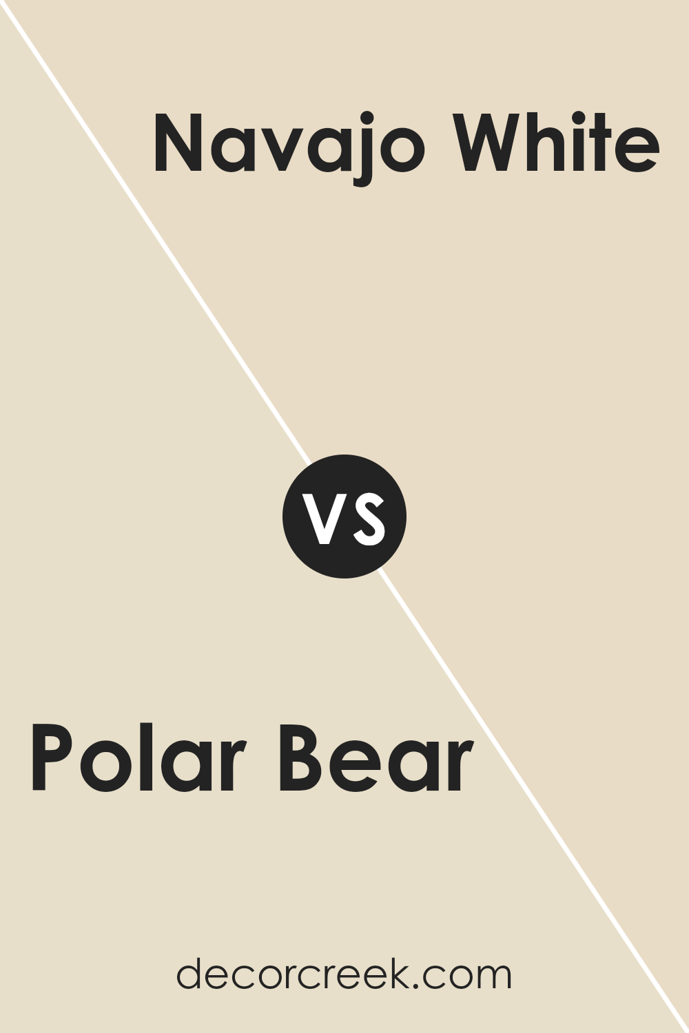
Polar Bear SW 7564 by Sherwin Williams vs Navajo White SW 6126 by Sherwin Williams
Polar Bear SW 7564 by Sherwin Williams is a soft, warm white that offers a clean and bright appearance. It has subtle yellow undertones, which can bring a touch of warmth to any space without overwhelming it. This color is ideal for creating a light, airy atmosphere while maintaining a cozy feel.
Navajo White SW 6126, on the other hand, is a warm, creamy off-white with stronger yellow and beige undertones, giving it a more earthy and inviting look. It adds a sense of warmth and softness that is perfect for spaces meant to feel welcoming and comfortable.
When comparing the two, Polar Bear is brighter and crisper, suitable for modern spaces or those looking to maximize light. Navajo White provides a richer, more traditional feel, ideal for rooms that benefit from added warmth and depth. Each color has its strengths depending on the mood and style you wish to create.
You can see recommended paint color below:
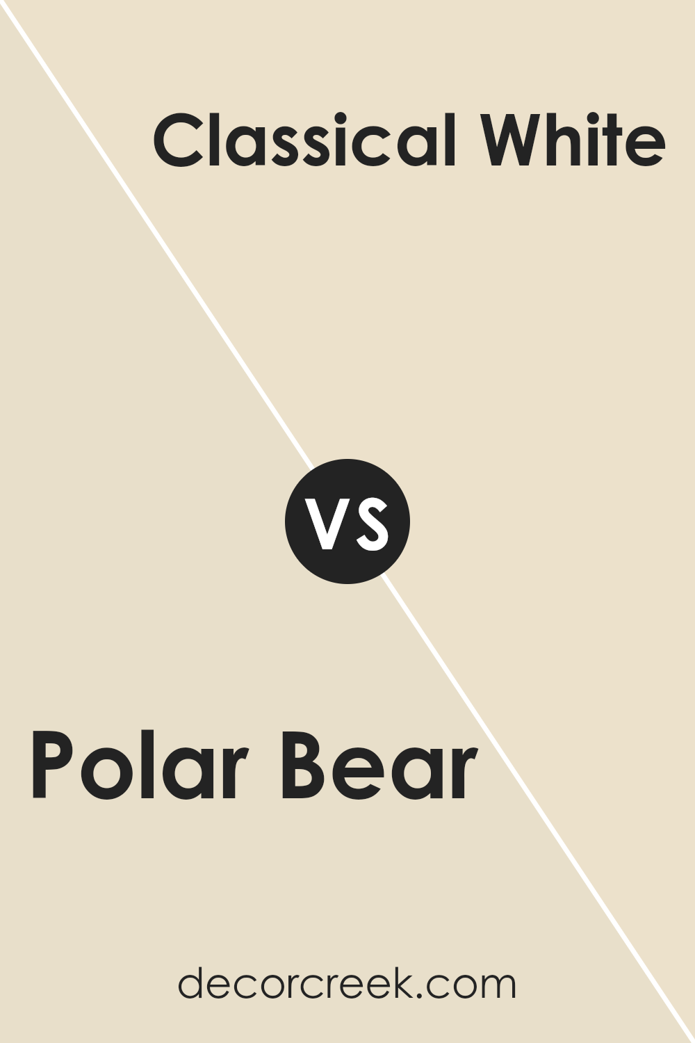
Polar Bear SW 7564 by Sherwin Williams vs Classical White SW 2829 by Sherwin Williams
Polar Bear SW 7564 by Sherwin Williams is a soft, warm white with a hint of cream, making it cozy and inviting. It works well in spaces where you want a gentle, comforting atmosphere. This color can make a room feel light and airy without being stark or too cold.
On the other hand, Classical White SW 2829 by Sherwin Williams is a more traditional white with a slightly cooler undertone compared to Polar Bear. This color is straightforward and clean, offering a crisp look that suits more formal or classic styles.
While Polar Bear feels warmer and more relaxed, Classical White gives off a more timeless and refined vibe. Choosing between the two depends on whether you want a slightly warmer, casual feel or a classic, crisp appearance. Both colors are versatile and can complement various design elements and furnishings.
You can see recommended paint color below:
Polar Bear SW 7564 by Sherwin Williams vs Restoration Ivory SW 6413 by Sherwin Williams
Polar Bear SW 7564 by Sherwin Williams is a soft, off-white color that feels clean and fresh. It’s a versatile shade that can make a room feel bright and open, easily pairing with a wide range of other colors.
On the other hand, Restoration Ivory SW 6413 offers a warm, neutral tone with a hint of yellow, providing a cozy and inviting atmosphere. While Polar Bear is light and crisp, Restoration Ivory brings a touch of warmth and richness. Both colors work well in various spaces but create different moods. Polar Bear is great for a modern or minimalist look, helping spaces feel airy and spacious.
Ivory, being warmer, can make a room feel more traditional and comforting. When choosing between them, consider the mood you want: Polar Bear for brightness and spaciousness, or Restoration Ivory for warmth and coziness.
You can see recommended paint color below:
- SW 6413 Restoration Ivory
Polar Bear SW 7564 by Sherwin Williams vs Muslin SW 6133 by Sherwin Williams
Polar Bear SW 7564 and Muslin SW 6133, both by Sherwin Williams, are light, neutral shades that can brighten up any space. Polar Bear is a soft, creamy white that leans slightly warm, making it perfect for creating an airy and clean look. It works well in spaces where you want a neutral backdrop without the starkness of a pure white.
On the other hand, Muslin is a warm beige with yellow undertones, giving a cozier, earthier feel compared to Polar Bear’s crispness. It adds a touch of warmth and can be ideal for rooms where you want to create a welcoming and comfortable atmosphere.
While Polar Bear is great for a modern, minimalist look, Muslin brings in a bit more color, making it suitable for more traditional or rustic settings. Both colors are versatile, but your choice would depend on whether you prefer a cooler or warmer vibe.
You can see recommended paint color below:
Polar Bear SW 7564 by Sherwin Williams vs Warm Winter SW 9506 by Sherwin Williams
Polar Bear SW 7564 and Warm Winter SW 9506, both by Sherwin Williams, are two distinct colors with unique qualities. Polar Bear is a soft, off-white shade with a subtle hint of warmth, making it versatile for various spaces.
It pairs well with a range of colors and creates a clean, fresh look. On the other hand, Warm Winter is a richer, creamier white with more depth, giving it a cozy and inviting feel. This color leans more toward beige, which provides warmth and comfort to a room. While Polar Bear is great for brightening spaces, Warm Winter adds a touch of coziness and sophistication without being too dark.
Both colors are excellent choices for creating a warm environment, yet the subtle differences in their tones make them suitable for diverse design preferences. They work well in both modern and traditional settings, offering flexibility in home design projects.
You can see recommended paint color below:
Polar Bear SW 7564 by Sherwin Williams vs Casa Blanca SW 7571 by Sherwin Williams
Polar Bear SW 7564 and Casa Blanca SW 7571 by Sherwin Williams are two warm, neutral paint colors. Polar Bear is a soft, creamy white with subtle yellow undertones. It feels bright and airy, making it a great choice for spaces where you want a fresh and open feel.
On the other hand, Casa Blanca is a bit darker, leaning towards a creamy beige with stronger yellow and taupe tones. It brings a cozy and welcoming atmosphere, making it suitable for living rooms or bedrooms where a warmer, more grounded vibe is desired.
Both colors work well in many settings, but Polar Bear might be better if you’re aiming for a lighter, brighter look, while Casa Blanca offers a rich, comforting hue. Together, they can complement each other, with Polar Bear serving as a backdrop and Casa Blanca providing accent or feature walls to create depth and interest in a room.
You can see recommended paint color below:
Polar Bear SW 7564 by Sherwin Williams vs Radiant Dawn SW 9661 by Sherwin Williams
Polar Bear SW 7564 and Radiant Dawn SW 9661 are two paint colors by Sherwin Williams that offer unique vibes for a space. Polar Bear is a warm, off-white shade with creamy undertones. It provides a soft, classic look that makes it a versatile choice for creating a cozy, welcoming environment. It pairs well with both neutral and bold accents, adding a clean backdrop without feeling stark.
On the other hand, Radiant Dawn stands out with its gentle, light peach tones. This subtle color brings warmth and a hint of color to any room, making it ideal for spaces where you want a touch of warmth without overpowering other design elements. Radiant Dawn is perfect for a soft, sunny atmosphere, offering a cheerful and uplifting presence.
While Polar Bear is ideal for a neutral setting, Radiant Dawn offers a bit of color while maintaining a light and airy feel. Both colors suit different moods and preferences.
You can see recommended paint color below:
- SW 9661 Radiant Dawn
Polar Bear SW 7564 by Sherwin Williams vs Aged White SW 9180 by Sherwin Williams
Polar Bear SW 7564 and Aged White SW 9180 are two neutral paint colors by Sherwin Williams, each offering a distinct look. Polar Bear is a soft, warm white with subtle undertones that lend coziness to a space.
It’s great for brightening up a room while adding a touch of warmth. Its simplicity makes it versatile, complementing both modern and classic interiors.
Aged White, on the other hand, carries a slightly creamier hue. It has a deeper, more antique feel, bringing a sense of timelessness and comfort to a room. This shade is perfect for creating a cozy, intimate atmosphere and pairs well with earth tones or rustic decor.
Both colors are gentle and understated, but while Polar Bear works well for spaces that benefit from a brighter touch, Aged White adds an element of depth and richness, making it ideal for spaces that seek warmth and a lived-in feel.
You can see recommended paint color below:
As I wrap up my thoughts on SW 7564 Polar Bear by Sherwin Williams, I find myself really appreciating what this paint color brings to a room.
It’s clean and soft, kind of like fresh snow. This color is great for lighting up any room, making small areas feel bigger and more open without being too bright or harsh.
I noticed how Polar Bear matches with lots of other colors. You can pair it with bright colors if you want a fun look or with darker shades for something more calm. It’s like having a blank canvas that lets other things in the room stand out, whether it’s colorful furniture or artwork.
One of the best parts is how easy it is to use. Whether you’re painting a bedroom, bathroom, or living room, this color can fit in anywhere. It’s also a good choice if you want a color that will look good for a long time without getting old or boring.
So, if you’re thinking about changing a room’s feel or starting a new project at home, SW 7564 Polar Bear by Sherwin Williams is definitely worth considering. It’s simple, friendly, and brings a fresh feel to any wall.
Ever wished paint sampling was as easy as sticking a sticker? Guess what? Now it is! Discover Samplize's unique Peel & Stick samples.
Get paint samples

