If you’re considering a fresh coat of paint for your room, Sherwin Williams’ SW 6192 Coastal Plain might just be on your shortlist. Picking the right color can often feel challenging, given the plethora of shades available. Here’s a look at what you should know about Coastal Plain to decide if it’s the right fit for your home before you take the plunge.
Coastal Plain is a subtle and soothing shade, not too loud but definitely full of character. It has a way of bringing a calm, earthy vibe wherever it’s applied, making it suitable for both living rooms and bedrooms. Whether you’re refurbishing a room or just looking for a quick update to your color scheme, understanding the nuances of this color will help ensure you’re pleased with the final result.
I’ll take you through the key features of Coastal Plain, such as its undertones and best complementary colors, as well as discuss how lighting can impact its appearance.
This way, you can make an informed decision that brings out the best in your interiors.
Is Coastal Plain SW 6192 Right for My Home?
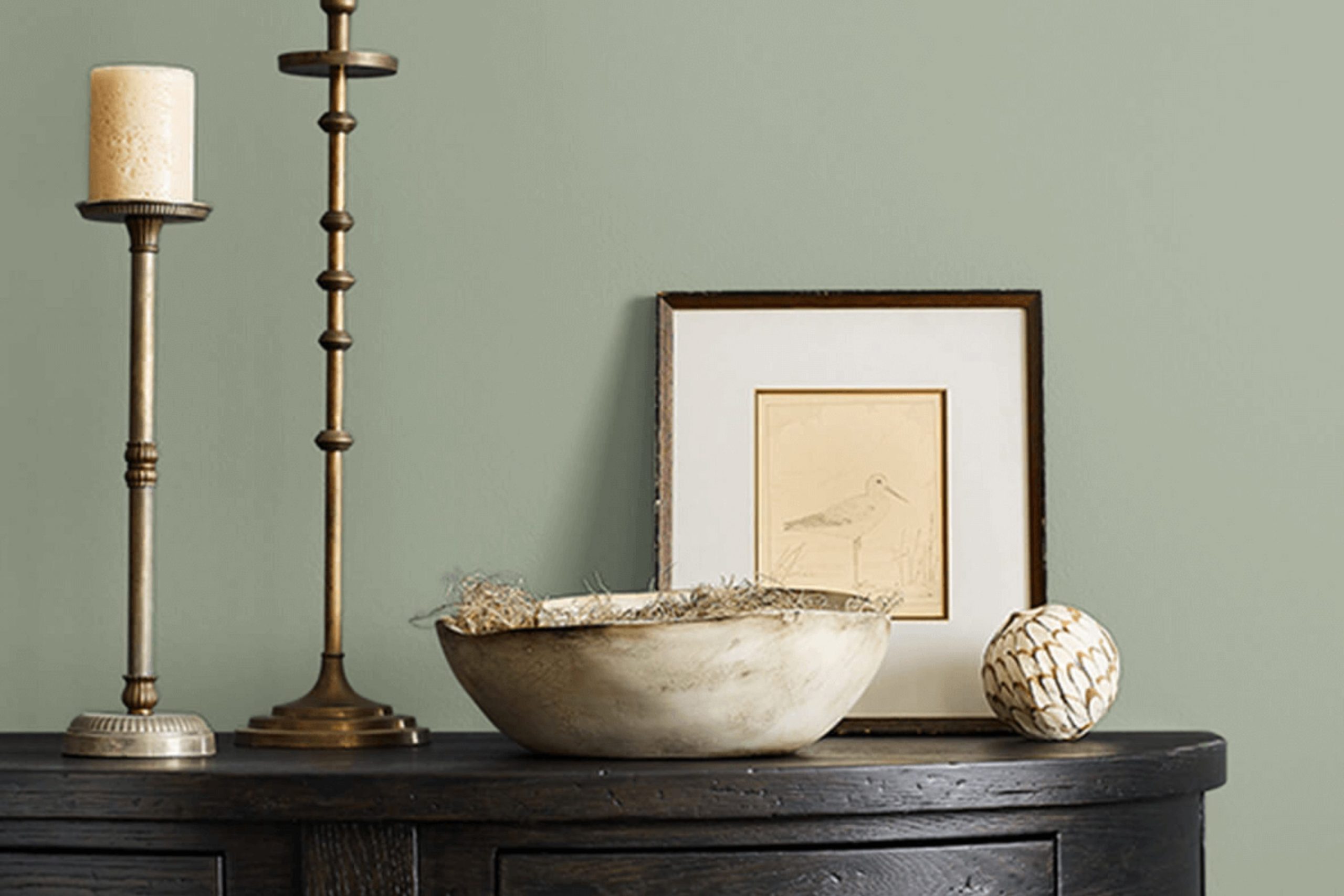
I recently had the chance to use a lovely color called Coastal Plain by Sherwin Williams for a home renovation project, and I can’t help but share how wonderfully adaptable it is. This shade is a soft, muted green that feels fresh and soothing. It’s not too bright but has just enough vibrancy to add a splash of natural charm to any room.
This color works beautifully in various interior styles, particularly in farmhouse, coastal, and Scandinavian-inspired rooms. The subtlety of Coastal Plain creates a calm backdrop, allowing other decor elements to stand out. In a farmhouse setting, pairing it with distressed wood furniture and natural linens enhances its rustic charm. For coastal vibes, blending it with sandy tones and textures like jute or rattan brings out a beachy feel.
I’ve found that Coastal Plain pairs exceptionally well with soft whites and muted grays. These combinations allow for a gentle contrast that’s pleasing to the eye. Adding in materials with a natural texture, such as linen curtains or a woolen throw, makes the room feel warm and inviting. I also love mixing in elements with a slight metallic sheen, like brushed nickel hardware or a simple silver photo frame, to add a touch of understated elegance.
Using Coastal Plain has made each room feel more connected to the natural world, providing a calm, welcoming environment. It’s a color that plays well with light, shifting subtly from dawn to dusk, which adds to its appeal in my daily experience.
decorcreek.com
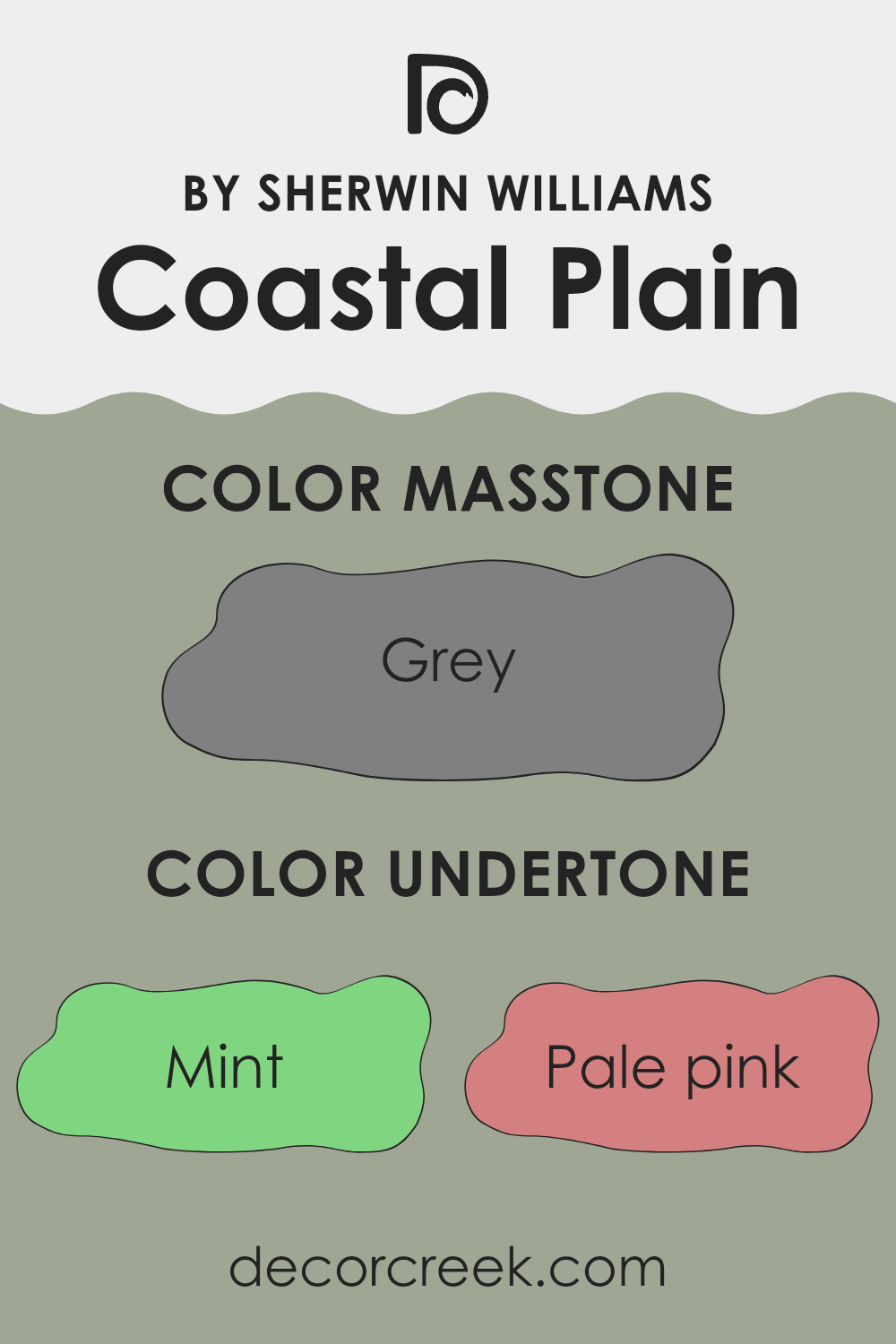
What are the right undertones of Coastal Plain SW 6192 ?
Coastal Plain is a unique paint color that brings a subtle richness to any room where it is applied. The color itself is adaptable, mainly due to the wide range of undertones it contains. Undertones are the underlying qualities of the color, seen more clearly under different lighting conditions, and they significantly influence how we perceive the color overall.
For instance, Coastal Plain has multiple undertones including mint, pale pink, and pale yellow, which can make the color appear fresher and softer in bright, natural light. In contrast, darker undertones like olive and dark turquoise give the paint a deeper, more nuanced look in dimmer, artificial lighting. This makes the color flexible enough to use in a variety of settings, adapting to changes in light throughout the day.
When this color is applied to interior walls, these varied undertones play a crucial role. The lighter undertones like lilac and light blue can make small rooms look bigger by reflecting light, creating an airy feel. Conversely, the darker undertones can add depth and warmth to a larger room, making it feel more inviting.
The complexity of Coastal Plain’s undertones also means it pairs well with a variety of decor styles and colors, from furniture to accessories. This adaptability makes it a popular choice for those seeking a paint color that can support a wide range of aesthetic choices without clashing or overpowering the design elements in the room. So, whether you’re up for a lively, light-filled kitchen or a cozy, warm bedroom, this color can meet various personal styles and preferences.
decorcreek.com
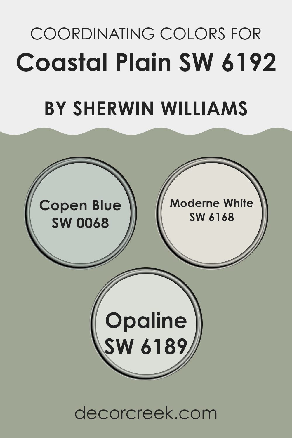
Best Coordinating Colors to use with Coastal Plain SW 6192 by Sherwin Williams this year.
Coordinating colors are chosen to complement a primary paint color, helping to create a harmonious and aesthetically pleasing look in any room. When you select a main color like Coastal Plain from Sherwin Williams, you can enhance its appearance and impact with carefully chosen coordinating colors. These coordinating shades can either blend seamlessly with the main color or provide a striking contrast, designed to highlight specific features or create a dynamic ambiance in the room.
For instance, Copen Blue is a soft, gentle blue that brings a breath of fresh air into any room, working beautifully to calm the senses when paired with the earthy tones of Coastal Plain. Modern White offers a crisp, clean look and acts as a perfect backdrop for more saturated colors, ensuring that the room feels balanced and not too intense.
Lastly, Opaline is a subtle off-white with a hint of green that reflects light delicately, creating a soothing atmosphere when used alongside deeper, more vibrant tones. These coordinating colors all work together to enhance the beauty and personality of a main color, making decorating a cohesive and enjoyable task.
You can see recommended paint colors below:
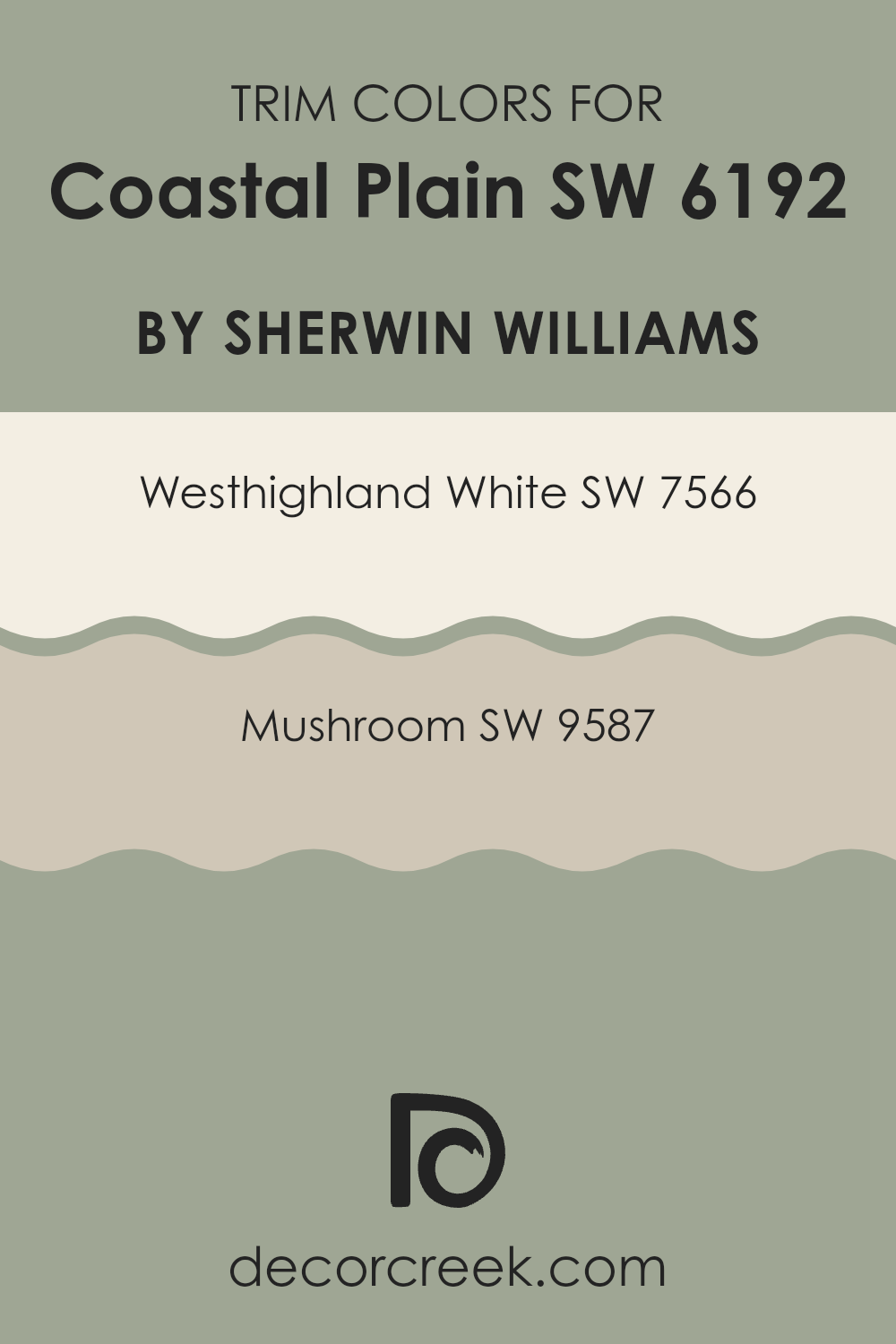
Trendy Trim Colors of Coastal Plain SW 6192 by Sherwin Williams to use this year.
Trim colors, such as those that frame windows, doors, and baseboards, play an essential role in defining and accentuating the architectural elements of a room. Complementing the primary wall color, they highlight the home’s details and enhance its overall aesthetic appeal.
For instance, when paired with an adaptable hue like Coastal Plain by Sherwin Williams, trim colors need to be thoughtfully selected to create a harmonious contrast that also ties the room’s decor together.
Westhighland White SW 7566 is a clean and bright white that can bring clarity and freshness to any room when used as a trim color with Coastal Plain. It’s particularly useful in making rooms appear larger and more open. On the other hand, Mushroom SW 9587 provides a warm and earthy tone that offers an understated contrast, adding a touch of warmth to the environment without creating an intense feeling. Both colors support a balanced yet inviting atmosphere, making them excellent choices for trim, enhancing both the look and feel of the room.
You can see recommended paint colors below:
- SW 7566 Westhighland White
- SW 9587 Mushroom
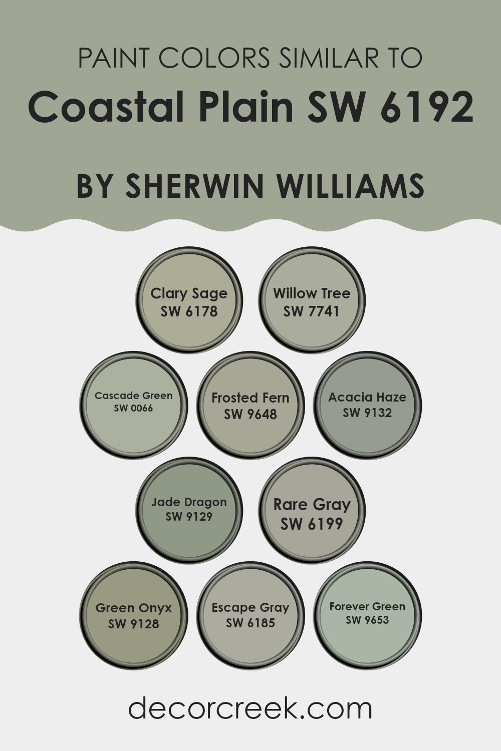
Evergreen Colors Similar to Coastal Plain SW 6192 by Sherwin Williams
Understanding the importance of using similar colors in a design palette can be incredibly helpful for creating a cohesive and unified room. Colors that harmonize well can enhance the aesthetic appeal and create a subtle yet impactful visual experience.
The colors similar to Coastal Plain by Sherwin Williams, such as Clary Sage, Willow Tree, and Cascade Green, share a natural and earthy vibe, making them perfect for rooms that aim to have a calm and coherent look. These greens draw from nature’s palette, bringing the outdoors inside for a fresh and invigorating feel.
Clary Sage is a soft and muted green with a hint of gray that adds a gentle, soothing touch to rooms. Willow Tree, slightly deeper, brings a richer hue that can add depth to a room without creating an intense feeling with color. Cascade Green offers a touch of brightness, livelier than the other shades, perfect for accentuating details. Frosted Fern, Acacia Haze, and Jade Dragon lean towards subtle and muted greens, providing a touch of elegance without being too bold.
Rare Gray and Escape Gray stand out by infusing gray undertones, making them ideal for a look that is soft yet defined. Forever Green and Green Onyx, on the other hand, offer deeper and more intense hues, perfect for making a statement while maintaining harmony within the color scheme. All these colors work together seamlessly, creating an environment that feels connected and intentionally designed.
You can see recommended paint colors below:
- SW 6178 Clary Sage
- SW 7741 Willow Tree
- SW 0066 Cascade Green
- SW 9648 Frosted Fern
- SW 9132 Acacia Haze
- SW 9129 Jade Dragon
- SW 6199 Rare Gray
- SW 9128 Green Onyx
- SW 6185 Escape Gray
- SW 9653 Forever Green
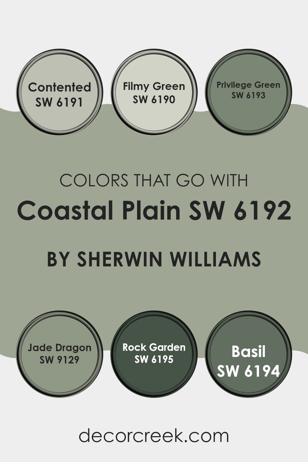
Colors that Go With Coastal Plain SW 6192 by Sherwin Williams
Choosing the right colors to complement Coastal Plain SW 6192 by Sherwin Williams is crucial. These colors play a vital role in creating a cohesive and pleasant aesthetic that feels harmonious and appealing. The colors that pair well with Coastal Plain, like SW 6191 – Contented and SW 6190 – Filmy Green, help in setting a soothing and friendly atmosphere in any room.
These shades offer a gentle and fresh look, making rooms feel open and relaxed. On the other hand, darker tones like SW 6193 – Privilege Green and SW 9129 – Jade Dragon add depth and contrast, providing a dynamic visual interest that keeps the room lively and engaging.
For instance, SW 6191 – Contented is a gentle gray-green that mirrors the softness of early morning mist, perfect for rooms needing a touch of calm. SW 6190 – Filmy Green is even lighter, resembling a faint whisper of color, ideal for enhancing natural light in a room.
Moving to the deeper hues, SW 6193 – Privilege Green offers a more pronounced green that suggests the richness of dense foliage, great for adding a touch of nature indoors. SW 9129 – Jade Dragon sports a vibrant teal that recalls the depth of ocean waters, suitable for feature walls or accents. SW 6195 – Rock Garden is a dark, earthy green that reminds one of shadowy pine forests, excellent for grounding a room’s decor.
Finally, SW 6194 – Basil is a robust medium green that brings to mind lush garden leaves, perfect for creating focal points or adding energetic splashes of color. Each of these colors supports Coastal Plain in different ways, enhancing the overall mood and style of the decorating scheme.
You can see recommended paint colors below:
- SW 6191 Contented
- SW 6190 Filmy Green
- SW 6193 Privilege Green
- SW 9129 Jade Dragon
- SW 6195 Rock Garden
- SW 6194 Basil
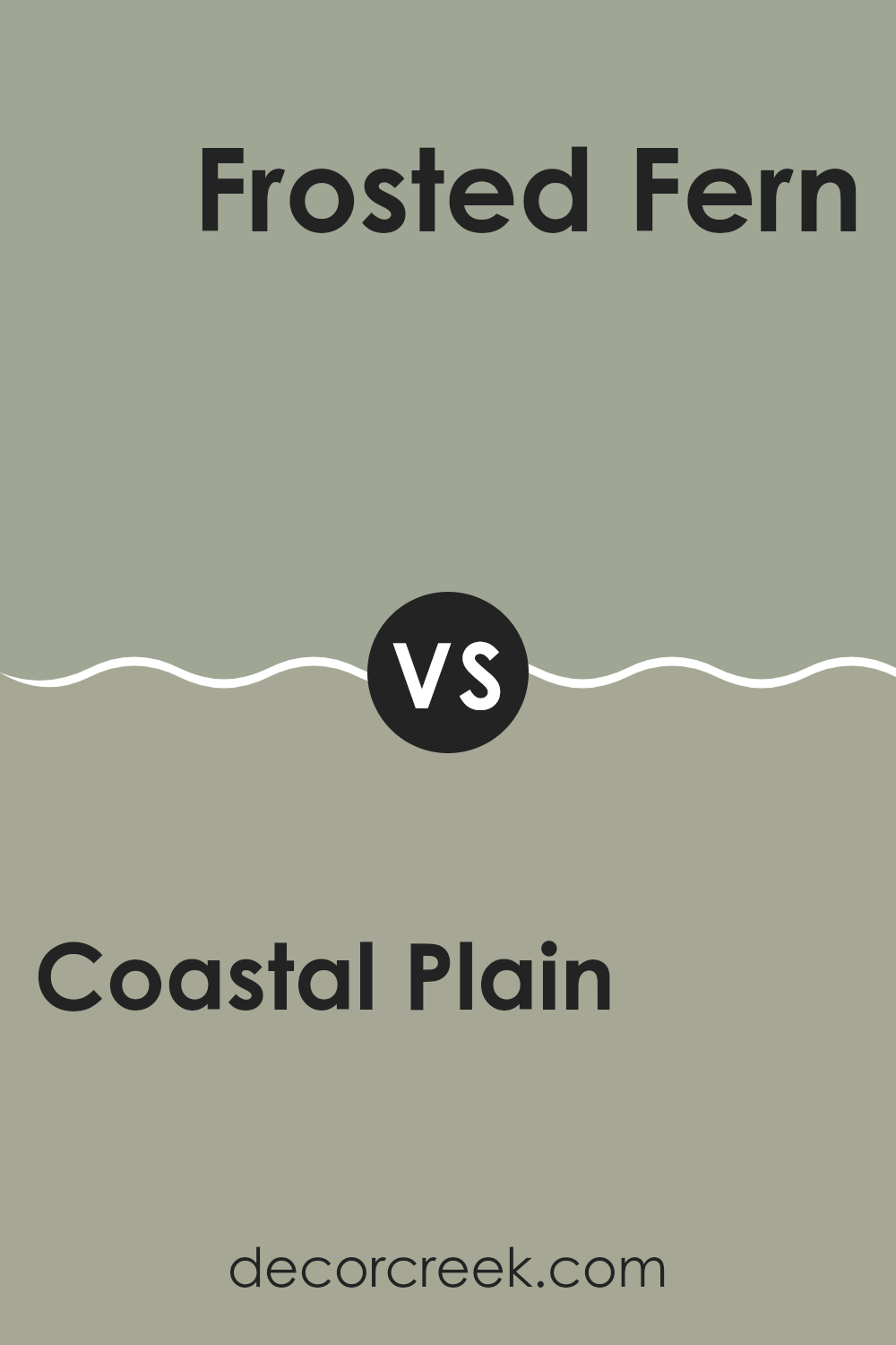
Coastal Plain SW 6192 by Sherwin Williams vs Frosted Fern SW 9648 by Sherwin Williams
Coastal Plain and Frosted Fern by Sherwin Williams are both subtle colors, but they carry different tones and vibes. Coastal Plain is a soft, muted green with a gray undertone, giving it a calm and low-key appearance. It’s an adaptable shade that can easily fit into various rooms, enhancing the room without creating an intense feeling.
On the other hand, Frosted Fern is a lighter and fresher green, almost reminiscent of early spring foliage. It has a brighter and more vibrant feel compared to Coastal Plain, making it a great choice if you want to add a touch of freshness to your room. This color is particularly useful for smaller rooms or areas where you want to visually expand the room with a brighter shade.
In summary, if you’re looking for a green that’s more understated and blends seamlessly with various decor elements, Coastal Plain is ideal. If you prefer something livelier and fresher that can brighten up your room, Frosted Fern would be the better pick.
You can see recommended paint color below:
Coastal Plain SW 6192 by Sherwin Williams vs Rare Gray SW 6199 by Sherwin Williams
Coastal Plain and Rare Gray, both by Sherwin Williams, offer unique takes on green and gray tones. Coastal Plain is a soft, mild green with a dose of warmth that makes it inviting and cozy, ideal for rooms meant to relax and welcome.
It reflects a natural, earthy vibe that can easily complement a variety of decor styles and colors. On the other hand, Rare Gray has a more muted appearance with a blend of gray and subtle green undertones. This color is adaptable, as it fits well in modern rooms but can also look great in more traditional settings.
Rare Gray is perfect if you want a hint of color without creating an intense feeling. In summary, while both colors bring their own charm, Coastal Plain leans more towards a clear green, making rooms feel homey, whereas Rare Gray offers a softer, more understated look with its grayish-green hues.
You can see recommended paint color below:
- SW 6199 Rare Gray
Coastal Plain SW 6192 by Sherwin Williams vs Cascade Green SW 0066 by Sherwin Williams
Coastal Plain and Cascade Green are two distinct shades offered by Sherwin Williams, each bringing its own unique vibe to a room. Coastal Plain is like a soft, muted green with a touch of gray, giving it a subtle and understated feel. It’s the kind of color that works well in almost any room, adding a gentle touch of nature without creating an intense feeling.
On the other hand, Cascade Green is a deeper, richer green. It’s brighter and more vibrant than Coastal Plain, reminiscent of lush forests and fresh foliage. This color is great for making a statement or adding a dynamic burst of freshness to a room.
While Coastal Plain is more reserved and adaptable, fitting easily with many decor styles, Cascade Green stands out more and can serve as a focal point in a design. Both colors can freshen up a room, but they do so in very different ways. Coastal Plain keeps things low-key and calm, whereas Cascade Green brings energy and life.
You can see recommended paint color below:
- SW 0066 Cascade Green
Coastal Plain SW 6192 by Sherwin Williams vs Jade Dragon SW 9129 by Sherwin Williams
Coastal Plain and Jade Dragon, both by Sherwin Williams, offer unique green tones that can each distinctly enhance the mood of a room. Coastal Plain is a soft, muted green with grey undertones, lending a subtle and soothing feel to any room. It’s light enough to make a room feel airy while still adding a touch of color.
On the other hand, Jade Dragon is a deeper, more vibrant shade of green. It has a vividness that can add a lively and dynamic element to a room. This color is richer and tends to draw more attention, making it a great choice for a focal point in a room.
When comparing these two, Coastal Plain is better for those who prefer a softer, more understated look. Jade Dragon is ideal for creating a bolder statement. Depending on the atmosphere you wish to create, either color offers a beautiful way to bring the freshness of nature indoors.
You can see recommended paint color below:
Coastal Plain SW 6192 by Sherwin Williams vs Acacia Haze SW 9132 by Sherwin Williams
Coastal Plain and Acacia Haze are both Sherwin Williams paint colors that share a natural, earthy vibe, but they possess distinct tones. Coastal Plain is a soft, muted green that has a subtle, soothing quality. It can give rooms a fresh and airy feel, making it a great choice for creating a light and relaxing atmosphere in a room.
In contrast, Acacia Haze leans more towards a deeper, smoky green, incorporating hints of gray that add a feeling of depth and richness. This color is ideal for adding a touch of elegance to any room without creating an intense feeling with darkness.
Both colors work well for someone looking to bring elements of nature into their home, but the choice between a lighter, breezier feel with Coastal Plain and a moodier, richer ambiance with Acacia Haze depends on personal preference and the specific mood you want to set in your room.
You can see recommended paint color below:
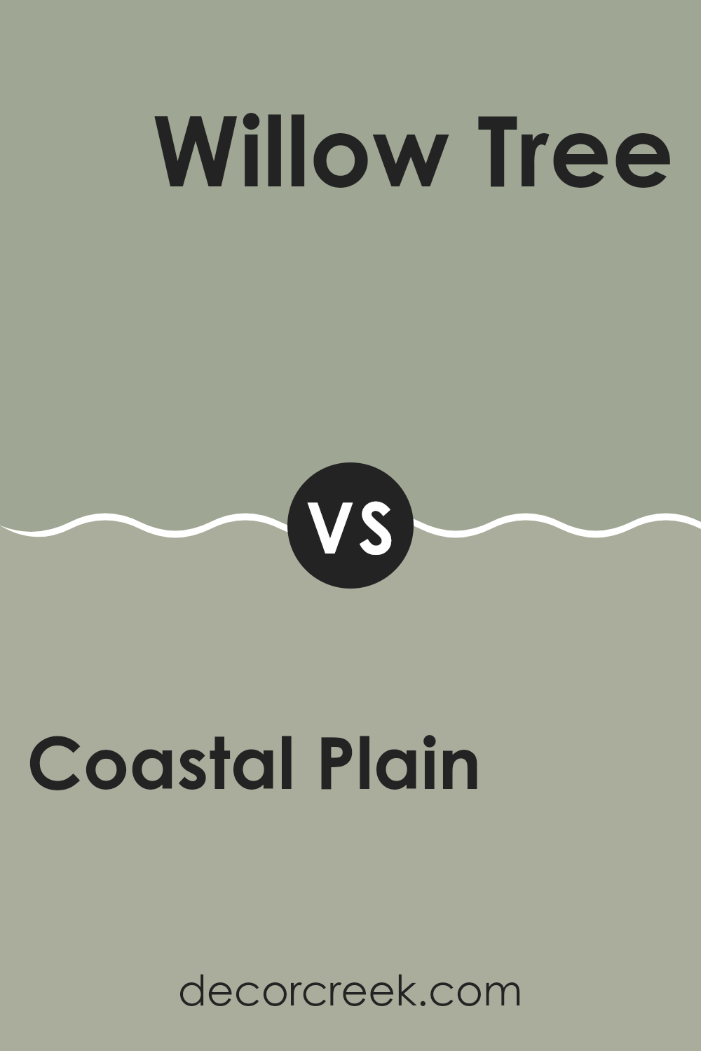
Coastal Plain SW 6192 by Sherwin Williams vs Willow Tree SW 7741 by Sherwin Williams
Coastal Plain and Willow Tree, both by Sherwin Williams, present subtle yet distinct green tones that can influence the mood of a room. Coastal Plain is a softer, muted green with a hint of gray, lending it a calming presence. It works well in rooms where you want a gentle, soothing backdrop that doesn’t overpower the room’s other features.
In contrast, Willow Tree is a deeper, more defined green. This color has a stronger presence and can make more of a statement. It’s an excellent choice for areas where a bolder, yet still natural, feel is desired. Willow Tree could potentially dominate a smaller room, but it adds depth and character to larger areas.
Both colors offer a connection to nature but in different intensities and moods. Coastal Plain is better for a subtle, light feel, while Willow Tree suits a room where a richer, more noticeable green is needed.
You can see recommended paint color below:
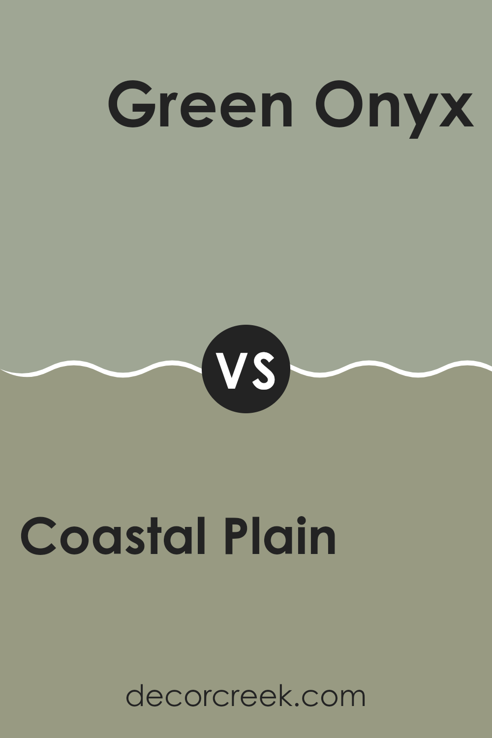
Coastal Plain SW 6192 by Sherwin Williams vs Green Onyx SW 9128 by Sherwin Williams
Coastal Plain is a shade that appears soft and subtle, closely resembling the color of sage. It gives off a quiet and gentle vibe, providing a calm backdrop suitable for any room that aims for a relaxed atmosphere.
Green Onyx, on the other hand, is significantly lighter and leans more towards a green with a hint of ivory. This color is fresh and airy, making rooms feel open and light.
Between these two, Coastal Plain is deeper and more muted, making it easier to pair with a variety of decor styles and colors. It can act as a neutral base in a room, allowing for more vibrant or contrasting colors to stand out. Green Onyx is more of an accent color due to its brighter and lighter tone, perfect for bringing a crisp, clean look to an area.
Overall, the choice between these two would depend on the mood and style you want for your room. Coastal Plain offers a more grounded feel, while Green Onyx provides a splash of freshness and brightness.
You can see recommended paint color below:
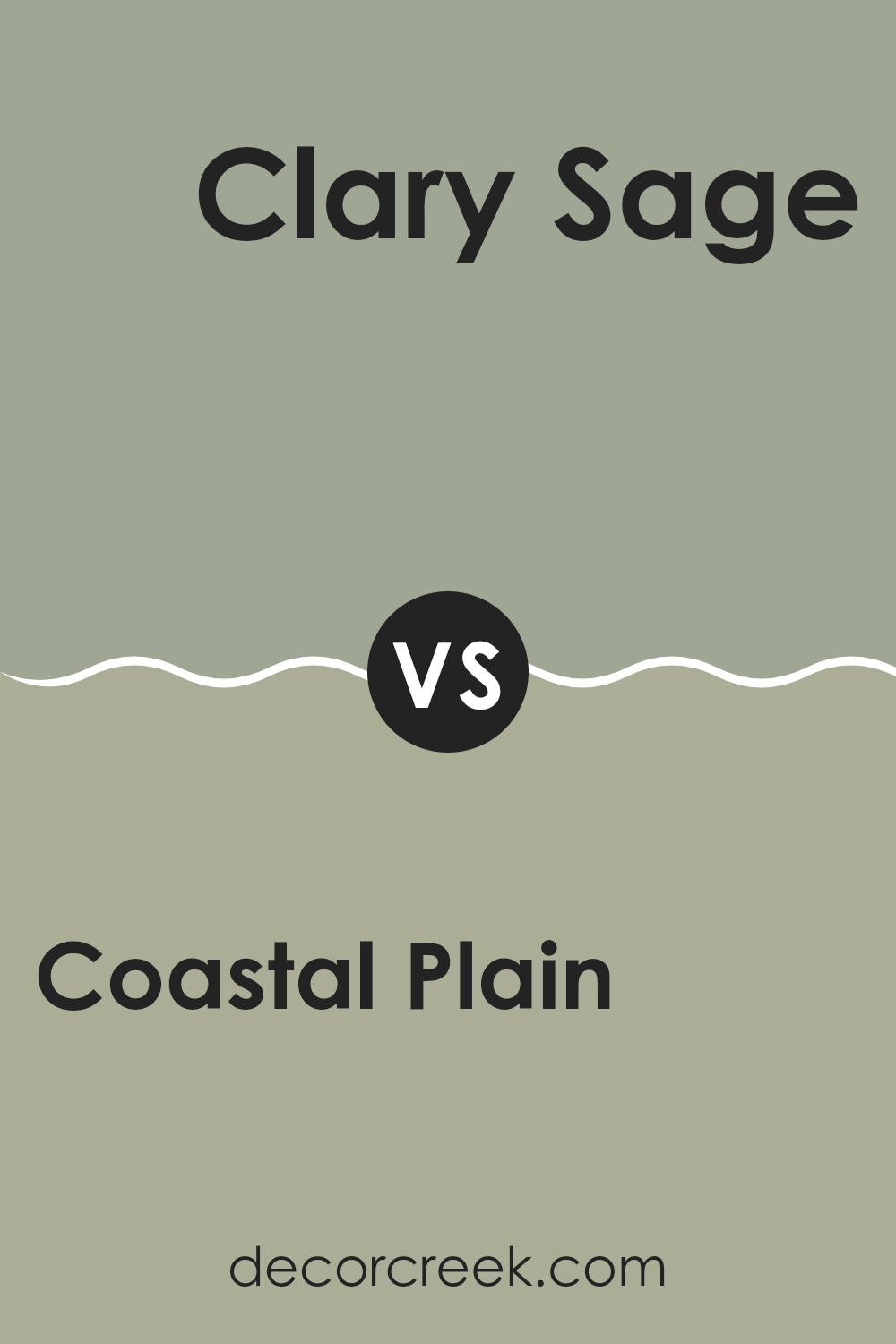
Coastal Plain SW 6192 by Sherwin Williams vs Clary Sage SW 6178 by Sherwin Williams
Coastal Plain and Clary Sage are two distinct paint colors made by Sherwin Williams, each offering its own unique vibe. Coastal Plain is a deeper, grayish-green color that gives a rich and earthy feel.
It’s quite muted, making it ideal for those who want to add a touch of nature to their room without creating an intense feeling with bright colors. On the other hand, Clary Sage is a lighter, more subtle green with hints of gray and sage.
This color is soft and gentle, perfect for creating a calm and welcoming atmosphere in any room. Comparing the two, Coastal Plain is the darker and more striking shade, while Clary Sage offers a lighter, fresher look. Both colors work well for those looking to bring elements of the outdoors into their home, but the choice between them depends on how bold or subtle you want the green hue to be.
You can see recommended paint color below:
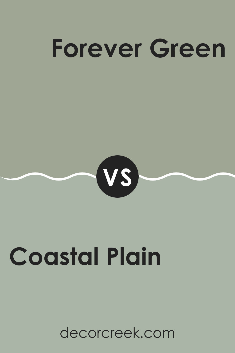
Coastal Plain SW 6192 by Sherwin Williams vs Forever Green SW 9653 by Sherwin Williams
Coastal Plain and Forever Green are two distinct shades from Sherwin Williams. Coastal Plain is a soft, muted green that has a subtle gray undertone, making it an adaptable choice for creating a cozy and relaxed atmosphere in any room. It pairs well with various decor styles and adds a gentle touch of nature-inspired color without creating an intense feeling.
On the other hand, Forever Green is a bolder and deeper green. This color has a vibrant, more pronounced presence that can make a striking statement in a room. It’s an excellent option if you’re looking to add a dash of energy and personality to your environment. Forever Green works particularly well in areas that benefit from a pop of color, like accent walls or furniture pieces.
Overall, Coastal Plain provides a more understated and gentle aesthetic, whereas Forever Green offers a more lively and dynamic vibe. Both colors reflect the beauty of nature but achieve very different effects in interior rooms.
You can see recommended paint color below:
- SW 9653 Forever Green
Coastal Plain SW 6192 by Sherwin Williams vs Escape Gray SW 6185 by Sherwin Williams
Coastal Plain and Escape Gray are both colors by Sherwin Williams that add a subtle yet distinct feel to any room. Coastal Plain leans towards a gentle, muted green hue that gives a fresh and peaceful vibe, ideal for creating a relaxing environment in rooms like bedrooms or living areas.
On the other hand, Escape Gray is a shade that combines gray with subtle green undertones, providing a cooler tone that works well in rooms that benefit from a calm, but slightly crisper atmosphere.
When comparing both, Coastal Plain appears warmer due to its more pronounced green influence, making rooms feel more welcoming. Escape Gray, keeping its foundation in gray, offers a more neutral backdrop that pairs easily with a wide range of decor, possibly giving it a bit more adaptability in interior design. Both colors offer their own unique touch and will influence the mood of a room differently based on their warm and cool undertones, respectively.
You can see recommended paint color below:
- SW 6185 Escape Gray
In wrapping up my thoughts on SW 6192 Coastal Plain by Sherwin Williams, I must say I’m really impressed. This paint color brings a fresh breath of air to any room, making it feel like a calm, gentle day by the seaside. It has a unique quality that magically lightens up a room, yet holds a cozy charm that can make any room feel more welcoming.
Using Coastal Plain in our home was a smart choice. It worked beautifully in our living room, turning it into a warm and inviting place for family and friends to gather. Similarly, when we tried it in the bathroom, it created a relaxing atmosphere that made bath time something to look forward to.
Overall, choosing SW 6192 Coastal Plain wasn’t just about picking a pretty color for the walls, it was about making our home a nicer place to live. It makes rooms feel bigger, brighter, and more cheerful, which is wonderful. So, if you’re thinking about giving your room a new look, I’d definitely recommend considering Coastal Plain. It’s not just a color; it’s a breath of fresh air that can brighten up your entire home!
decorcreek.com
Ever wished paint sampling was as easy as sticking a sticker? Guess what? Now it is! Discover Samplize's unique Peel & Stick samples.
Get paint samples

