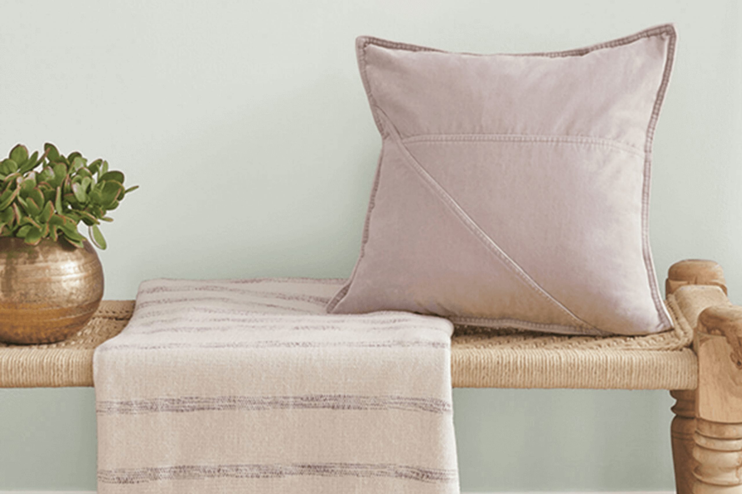
If you’re considering a fresh new look for your room, you might find Sherwin Williams’ SW 6189 Opaline to be a delightful choice. This particular shade has a gentle, soothing presence that can breathe new life into any room without overpowering it. It’s a soft, subtly vibrant green that pairs beautifully with a variety of decor styles, from modern minimalism to cozy cottage aesthetics.
In using Opaline, you can revitalize a dimly lit kitchen or create a peaceful backdrop in a busy home office. The adaptability of this color makes it a reliable option for those looking to refresh their walls, furniture, or even cabinets. What’s more, this color aligns well with natural elements and materials, such as wooden features or woven textures, enhancing the overall calming effect of your environment.
Choosing the right color can often feel like a challenge, but I’ve found that Opaline has a unique way of complementing various rooms with its freshness and understated elegance.
Whether you’re aiming for a subtle change or planning a major renovation, consider how Opaline could be the perfect hue to uplift your home’s ambiance.
What Color Is Opaline SW 6189 by Sherwin Williams?
Opaline is a soft and gentle green hue with subtle blue undertones that can bring a refreshing and calming feeling to any room. This color is particularly good for creating a cozy and inviting atmosphere without overpowering the senses. It’s light enough to make small rooms appear larger while still adding just the right touch of color to be engaging.
Opaline works wonderfully in a variety of interior design styles, including modern, Scandinavian, and coastal. Its muted quality blends seamlessly with the clean lines and simple aesthetics typical of modern rooms, while the natural green tones complement the wood and soft textures found in Scandinavian decor. For those looking to create a beachy vibe, Opaline pairs well with sandy beiges and cool blues, reminiscent of the seaside.
When it comes to materials, Opaline goes beautifully with light woods, such as oak or birch, enhancing their natural grains. It also matches well with soft, cozy fabrics like cotton, linen, or wool, helping to create a soft, textured look. For a bit of contrast, incorporating metals like brushed nickel or stainless steel can add a subtle hint of elegance without breaking the calm and soothing atmosphere that Opaline helps create.
decorcreek.com
Is Opaline SW 6189 by Sherwin Williams Warm or Cool color?
Opaline SW 6189 by Sherwin Williams is a soft, muted green with a hint of gray, making it a flexible choice for many home styles. It’s light enough to brighten up a room but also holds enough color to add a subtle character to any area. This particular shade works great in rooms that get a lot of natural light, as the sunlight enhances its gentle tones creating a fresh and airy feel.
In smaller rooms, like bathrooms or small offices, Opaline can make the area appear larger and more open, without the starkness that a plain white might bring. When used in bedrooms, this color adds a soft backdrop, promoting a calm atmosphere which is ideal for relaxation and sleep.
Moreover, its neutrality means it can easily pair with a wide range of decor styles and colors, from natural wood furnishings to more vibrant decorative elements. Whether you’re looking to paint an entire room or just an accent wall, Opaline is adaptable and enduring, making it a practical choice for creating a pleasant and inviting home environment.
Undertones of Opaline SW 6189 by Sherwin Williams
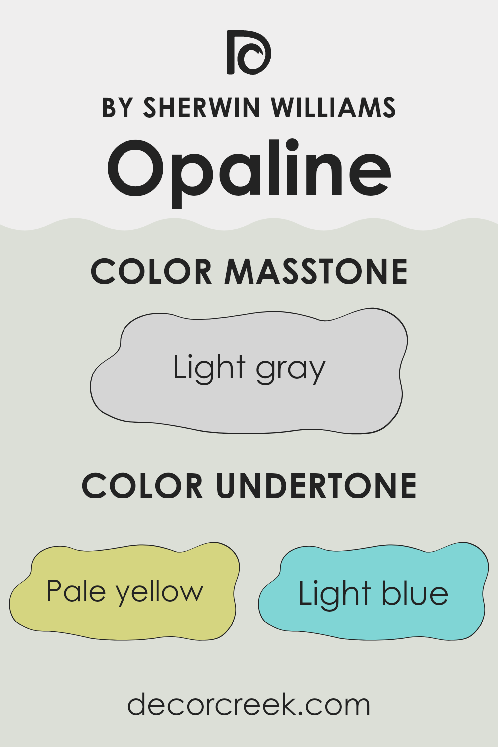
Opaline by Sherwin Williams is a unique color with a subtle complexity due to its range of undertones. These undertones include pale yellow, light blue, light purple, mint, pale pink, lilac, and grey. Understanding these undertones can help us see why this color can appear differently under various lighting conditions or when placed next to other colors.
Undertones are like hidden colors within the main color that influence how it looks. For instance, with Opaline, the pale yellow undertone can bring a gentle warmth to a room, making it feel cozy. The light blue and mint undertones introduce a fresh, airy feeling, which can make a room feel more open and light.
Light purple and lilac add a touch of softness, which can be calming. The grey undertone helps balance these effects, making Opaline a flexible paint color that can adjust to different styles and rooms. When applied to interior walls, these undertones of Opaline interact with both the natural and artificial light in a room. This interaction can cause the color to look subtly different at various times of day.
For example, in bright daylight, the lighter undertones might be more noticeable, giving the room a vibrant feel. In the evening under artificial light, the grey and pale pink undertones might become more apparent, creating a more grounded and cozy atmosphere. This makes Opaline an excellent choice for those looking to add a dynamic and adaptable color to their home.
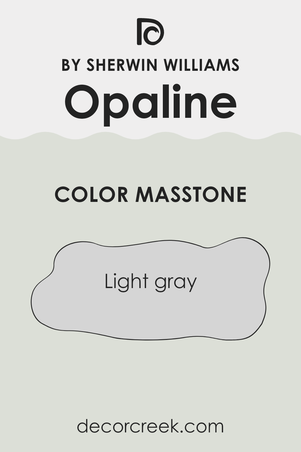
What is the Masstone of the Opaline SW 6189 by Sherwin Williams?
Opaline, a soft shade by Sherwin Williams, has a masstone of light gray, giving it a calm and gentle look. This light gray color is very practical for homes as it serves as a neutral background that can pair well with almost any other color.
It’s perfect for living areas and bedrooms where you want a subtle, soothing atmosphere. The simplicity of light gray can make small rooms appear larger and brighter, bringing an airy feel to the area. This light gray does not overpower other accents or furniture, which means you can mix and match different styles and colors in your decor.
It also does a great job at hiding minor wall imperfections. Overall, this color is a flexible choice that can fit into various interior styles, from modern to classic, without overpowering the senses, keeping the room looking clean and welcoming.
How Does Lighting Affect Opaline SW 6189 by Sherwin Williams?
Lighting plays a crucial role in how colors appear in a room. The type of light—whether natural or artificial—can greatly affect the perception of color on your walls.
When considering a specific paint color, like Opaline by Sherwin Williams, it’s important to see how it behaves under different lighting conditions. Opaline is a soft shade that can look different depending on the light source.
Natural Light: Sunlight changes throughout the day, and the direction your room faces will influence how the shade appears.
- North-Facing Rooms: These rooms get less direct sunlight, which can make colors appear cooler and slightly more muted. Opaline will look more subdued and softer here, perfect if you want to keep the room calm and relaxed.
- South-Facing Rooms: With more direct sunlight, south-facing rooms can make Opaline appear brighter and more lively. The warm light enhances the color, giving it a fresher feel.
- East-Facing Rooms: Morning light brings out the brightness in Opaline, making it appear very gentle and pleasant early in the day. As the light shifts, the color may take on a cooler tone.
- West-Facing Rooms: Evening light in west-facing rooms can warm up Opaline, giving it a cozier feel toward the end of the day. It’s ideal for rooms used mainly in the afternoons or evenings.
Artificial Light: The type of bulbs used can also influence how Opaline looks.
- Incandescent Bulbs: These warm-toned lights can deepen the color, making it appear warmer than usual.
- Fluorescent Lights: Cooler light from fluorescent bulbs might highlight the cooler undertones in Opaline, giving the room a crisp and clean look.
When selecting colors for a room, always test paint samples in different lighting conditions and times of day to see how the color interacts with light. This approach works especially well for Opaline, ensuring the chosen hue matches your vision in every lighting scenario.
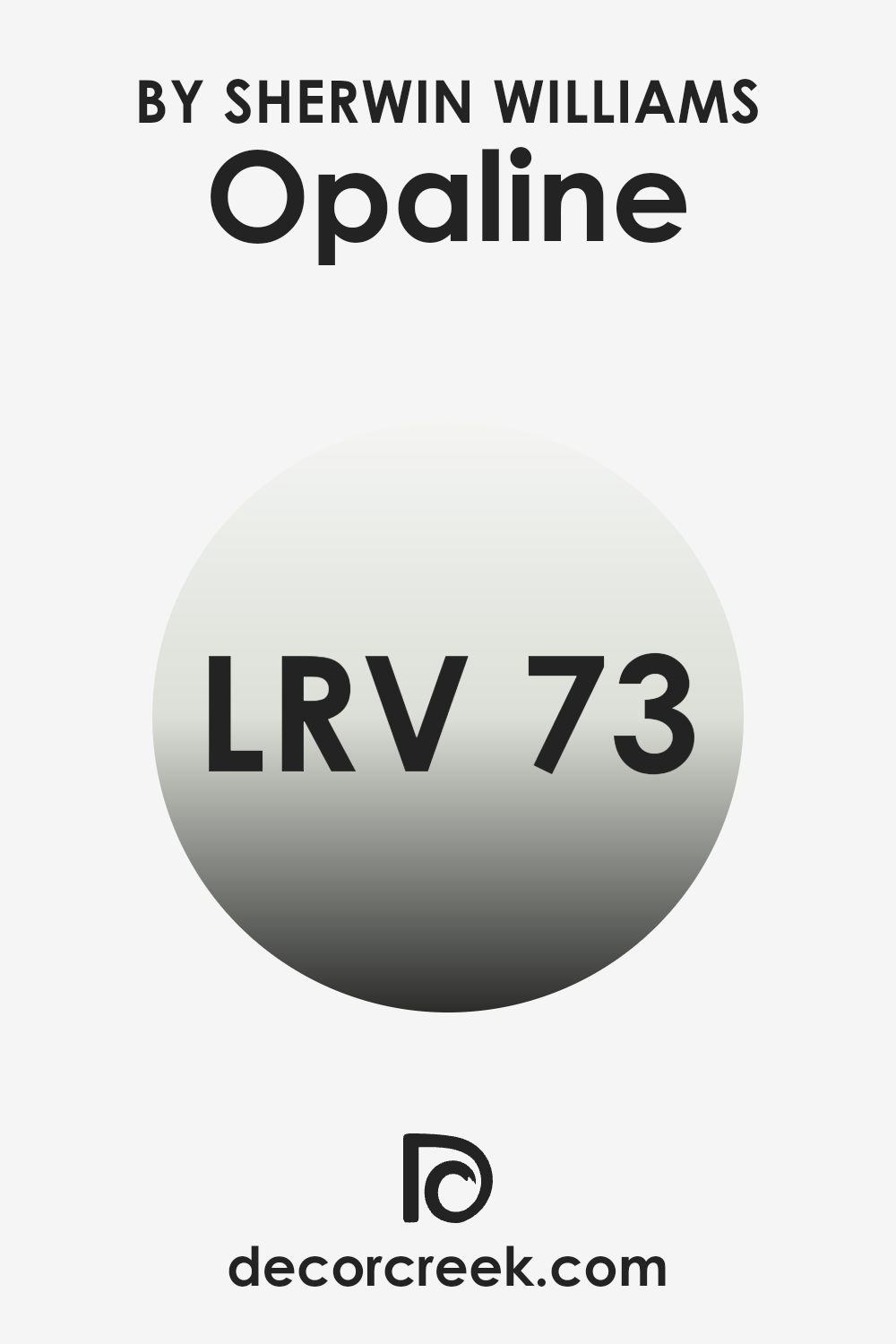
What is the LRV of Opaline SW 6189 by Sherwin Williams?
LRV stands for Light Reflectance Value, which is a measurement used to determine how much light a paint color will reflect when it’s applied to a wall. LRV is given as a percentage, and it ranges from a low value, which means the color absorbs more light, to a high value, indicating higher reflectance.
This concept is essential when choosing paint colors because it helps predict how light or dark a color will look once it’s on your walls. Bright, well-lit rooms might benefit from colors with lower LRV to avoid the room feeling too bright, whereas darker rooms can be made to feel lighter with a higher LRV paint.
In the case of Opaline with an LRV of around 73, this means the color is quite light and will reflect a good amount of light, making it a popular choice for making smaller or darker rooms appear brighter and more open. Since the color is closer to the higher end of the LRV scale, it does not absorb much light, ensuring that the room will feel airy and more spacious. This makes it an excellent choice for areas of the home that do not receive ample natural sunlight or for rooms intended to have a light, fresh feel.
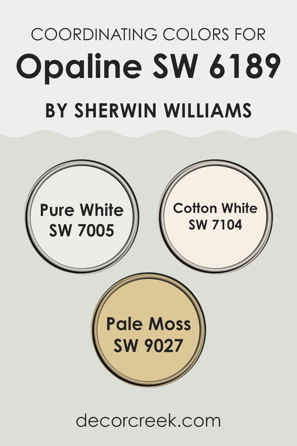
Coordinating Colors of Opaline SW 6189 by Sherwin Williams
Coordinating colors work to complement and enhance the main hue in any color scheme, creating a balanced and unified look. For example, Opaline by Sherwin Williams can be beautifully paired with shades like Pure White, Cotton White, and Pale Moss, each bringing out unique aspects of Opaline’s character without overpowering it. These coordinating colors are selected to support the primary shade, ensuring that the overall aesthetic remains cohesive and visually appealing.
Pure White (SW 7005) is a clean and bright shade that adds a fresh and crisp quality to any room, enhancing the lightness of Opaline without competing for attention. Cotton White (SW 7104) offers a slightly warmer tone, providing a subtle contrast that helps soften the overall appearance and add depth to the pairing with Opaline.
Lastly, Pale Moss (SW 9027) introduces a gentle hint of green, infusing a touch of nature-inspired calm that complements the soothing qualities of Opaline—ideal for creating a relaxed atmosphere. Together, these colors blend effortlessly, offering flexibility and a pleasing palette that works beautifully in many interiors.
You can see recommended paint colors below:
- SW 7005 Pure White
- SW 7104 Cotton White
- SW 9027 Pale Moss
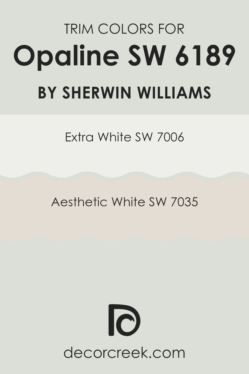
What are the Trim colors of Opaline SW 6189 by Sherwin Williams?
Trim colors are essential in painting and decoration as they help define and highlight areas such as doors, window frames, and skirtings, offering a visual contrast that enhances the main wall color. For example, when used with a soft and subtle shade like Opaline by Sherwin Williams, trim colors like Extra White and Aesthetic White can add a crisp, clean touch to the edges and details of a room, making the wall color stand out more clearly.
These trim colors can also balance the overall look by adding brightness or easing the transition between shades. Extra White by Sherwin Williams is a very bright white that brings a fresh and clean appearance to any room.
It’s especially effective as a trim color because it creates a sharp contrast, making it ideal for pairing with lighter wall shades like Opaline to make the edges stand out and give more definition to the architectural details in a room. On the other hand, Aesthetic White is a softer, warmer white with a hint of beige, offering a gentle contrast that can blend beautifully with warmer tones in the décor, enhancing the cozy feel of a room without overpowering the main color scheme.
You can see recommended paint colors below:
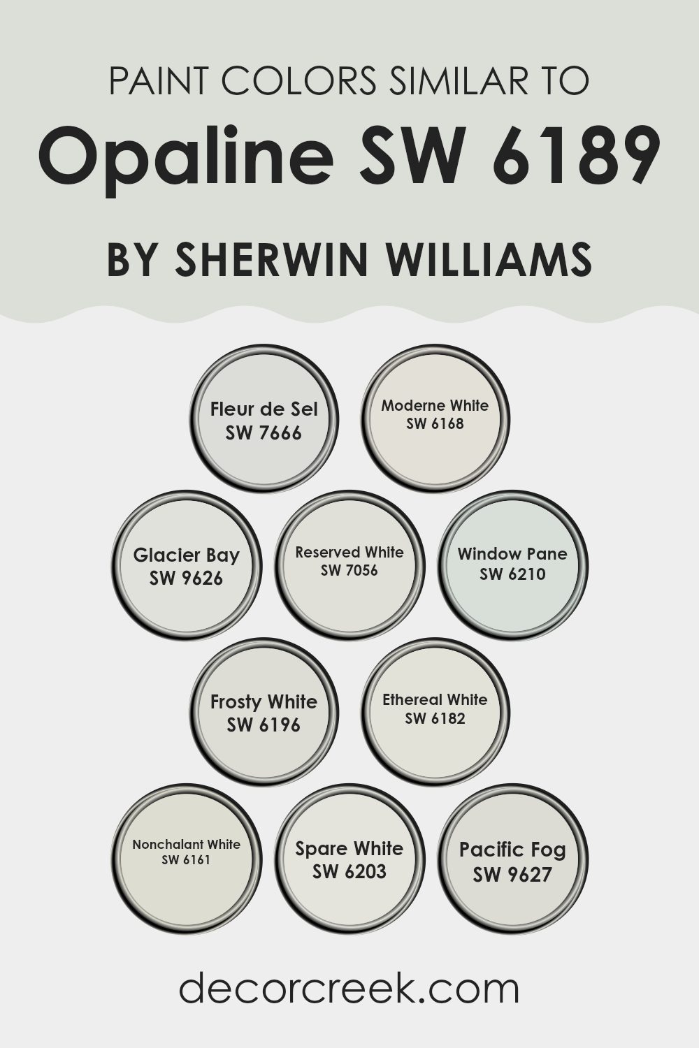
Colors Similar to Opaline SW 6189 by Sherwin Williams
When working with a palette of similar colors, it’s useful to understand their subtle differences and how they can be used together to create a balanced look. Similar colors, like those comparable to Opaline by Sherwin Williams, offer a range of options from cool to warm tones, making it easier to coordinate with different furnishings and accents in a room. These shades can flow smoothly together, reducing strong contrasts and creating a unified atmosphere.
For example, Fleur de Sel is a gentle gray with a hint of warmth, ideal for creating a soft, inviting mood in rooms like living areas or bedrooms. Moderne White, on the other hand, offers a crisp touch, great for brightening up kitchens and bathrooms.
Glacier Bay brings a cooler, almost icy vibe, perfect for a modern style or for pairing with metal fixtures and finishes. Reserved White is subtle and restrained, ideal for areas where you need a quiet backdrop that doesn’t draw attention away from artwork or bold furniture. Window Pane has a hint of blue, adding a refreshing energy to any room it enhances.
Frosty White leans cooler, fitting beautifully in minimalist interiors. Ethereal White, true to its name, offers a soft, barely-there hue that works perfectly in peaceful rooms. Nonchalant White is relaxed and effortless, ideal for any area that calls for a casual, easy mood.
Spare White is clean and simple, making it a great option for creating a sense of openness and light. Lastly, Pacific Fog offers a deeper tone that can be used for accent walls or to ground a room with its rich, elegant depth.
You can see recommended paint colors below:
- SW 7666 Fleur de Sel
- SW 6168 Moderne White
- SW 9626 Glacier Bay
- SW 7056 Reserved White
- SW 6210 Window Pane
- SW 6196 Frosty White
- SW 6182 Ethereal White
- SW 6161 Nonchalant White
- SW 6203 Spare White
- SW 9627 Pacific Fog
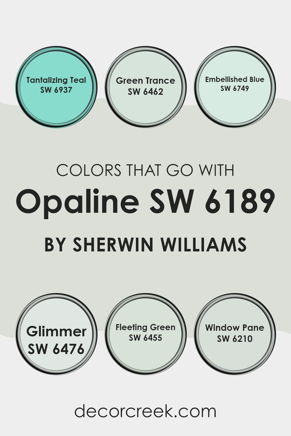
Colors that Go With Opaline SW 6189 by Sherwin Williams
Choosing complementary colors for Opaline SW 6189 by Sherwin Williams is crucial because they help to create a harmonious and visually pleasing environment. When paired correctly, these colors can enhance the aesthetic of a room, making it feel more inviting and balanced. Opaline, a soft and gentle greenish hue, needs colors that blend well while adding either a contrast or a subtle differentiation to maintain interest and flow.
Tantalizing Teal SW 6937 is a vibrant and deep shade that adds a splash of energy and cheerfulness to rooms styled with Opaline. This color is great for creating a focal point or for use in accents due to its dynamic and lively nature.
Green Trance SW 6462 offers a more subdued, yet rich shade of green that complements the lighter tones of Opaline by adding depth and warmth to the color palette. It’s perfect for those looking to keep a calm and consistent green theme throughout their room. Embellished Blue SW 6749, on the other hand, provides a crisp, standout shade that not only enriches the surrounding neutrals but also evokes a sense of freshness and vitality.
For a lighter and airier feel, Glimmer SW 6476 is an excellent choice. This soft, almost ethereal light gray with a hint of blue provides a subtle contrast that will not overpower the gentle nature of Opaline.
Fleeting Green SW 6455 is another light and airy option, with a delicate green that’s both refreshing and easy on the eyes, perfect for creating a relaxed atmosphere. Finally, Window Pane SW 6210, a clear and soothing shade, brings a touch of simplicity and brightness, enhancing the open and light feel of a room decorated with Opaline. Together, these colors can seamlessly create a cohesive and appealing look.
You can see recommended paint colors below:
- SW 6937 Tantalizing Teal
- SW 6462 Green Trance
- SW 6749 Embellished Blue
- SW 6476 Glimmer
- SW 6455 Fleeting Green
- SW 6210 Window Pane
How to Use Opaline SW 6189 by Sherwin Williams In Your Home?
Opaline SW 6189 by Sherwin Williams is a soft and gentle green color that can add a calm, refreshing touch to your home. It works well in a variety of rooms, making it a flexible choice for any decorating style. If you want to create a relaxed and welcoming atmosphere, Opaline is a great option for living rooms or bedrooms.
It pairs beautifully with white trim and can also complement wooden furniture and natural textures, which helps to create a cozy, inviting environment. For a more subtle effect, you can use Opaline as an accent color, perhaps on a single wall or within a smaller room like a bathroom or hallway.
This approach adds a splash of color without overpowering the room. Kitchens can benefit from Opaline too, especially if you’re aiming for a fresh, clean look. Consider it on cabinets or walls where it can brighten the room and bring a sense of freshness.
Opaline SW 6189 by Sherwin Williams vs Reserved White SW 7056 by Sherwin Williams
Opaline SW 6189 and Reserved White SW 7056 from Sherwin Williams are two distinct paint colors, each bringing its own unique mood to a room. Opaline is a soft, muted green with a hint of grey, making it a subtle and calming choice for walls.
It’s particularly suited for creating a peaceful and pleasant atmosphere in a room. In contrast, Reserved White is a neutral off-white with a clean and crisp appearance. This color is incredibly adaptable and can act as a perfect backdrop in any room, helping other colors stand out or simply keeping the decor light and airy.
When used together, Opaline provides a gentle splash of color, while Reserved White complements it by adding brightness and openness. This combination can make any room feel balanced and welcoming.
You can see recommended paint color below:
Opaline SW 6189 by Sherwin Williams vs Pacific Fog SW 9627 by Sherwin Williams
Opaline SW 6189 and Pacific Fog SW 9627, both by Sherwin Williams, are unique in their own ways. Opaline is a soft, pastel green with a subtle hint of blue, giving it a light, refreshing look. It’s perfect for creating a calm atmosphere in rooms like bedrooms or bathrooms.
On the other hand, Pacific Fog is a deeper, muted gray with blue undertones. This color is great for adding a touch of elegance to living areas or offices without being too bold. When comparing these two, Opaline is noticeably lighter, which could make a room feel larger and more open.
Pacific Fog, while also soft, offers a more grounded feel, making it suitable for a room where you might want a bit more formality or focus. Both colors work well in different settings, depending on the mood you’re aiming for.
You can see recommended paint color below:
Opaline SW 6189 by Sherwin Williams vs Fleur de Sel SW 7666 by Sherwin Williams
Opaline SW 6189 and Fleur de Sel SW 7666 are two colors by Sherwin Williams that each offer a unique atmosphere to any room. Opaline is a soft green with a hint of gray, giving it a calm and peaceful feel. It’s perfect for rooms where you want to create a soothing and fresh look.
On the other hand, Fleur de Sel is a delicate pale gray that almost borders on white. This color is great for making small rooms appear larger and brighter, as it reflects light beautifully. Both shades bring their own subtle charm without being overpowering.
Opaline works well in areas where a touch of nature is desired, while Fleur de Sel is ideal for achieving a clean and graceful backdrop. You can use either color in rooms like living areas, kitchens, or bedrooms for a gentle and airy setting. Depending on your decor, each one can fit seamlessly, creating a comfortable room.
You can see recommended paint color below:
Opaline SW 6189 by Sherwin Williams vs Nonchalant White SW 6161 by Sherwin Williams
Opaline SW 6189 and Nonchalant White SW 6161 are both calming colors by Sherwin Williams, but they offer different moods due to their tones. Opaline has a soft, pale green shade that brings a gentle hint of nature into a room, making it feel fresh and airy.
This color is great for anyone looking to add a subtle touch of color without overpowering a room. It works well in living areas and bedrooms where you want a soothing, light atmosphere. On the other hand, Nonchalant White is a light gray with a warm undertone, making it very adaptable for various rooms.
It’s particularly effective in areas that need a clean and open look. Because it’s a neutral color, it pairs well with almost any decor style and adds a bright and lifted feel to any room. Nonchalant White is ideal for small rooms or areas with limited natural light, as it helps to make them appear larger and more welcoming.
You can see recommended paint color below:
- SW 6161 Nonchalant White
Opaline SW 6189 by Sherwin Williams vs Frosty White SW 6196 by Sherwin Williams
Opaline and Frosty White, both by Sherwin Williams, offer subtle differences in their hues, ideal for those interested in fine tonal contrasts. Opaline has a gentle, soothing green undertone that brings a hint of nature indoors. It’s a light and airy color that subtly adds a touch of warmth to any room. This makes it particularly suitable for rooms where a peaceful, soft ambiance is desired.
On the other hand, Frosty White leans more towards a classic neutral white with a very slight cool undertone. This color is remarkably adaptable and works beautifully in virtually any room to create a clean, fresh look. It’s particularly useful in areas that need to feel more open and bright.
When deciding between the two, Opaline provides a whisper of color, giving rooms a more distinct yet subtle character, while Frosty White is excellent for creating a crisp, neutral backdrop that won’t clash with other colors and decor elements. Both paints offer unique advantages depending on the mood and style you want to achieve in your room.
You can see recommended paint color below:
Opaline SW 6189 by Sherwin Williams vs Moderne White SW 6168 by Sherwin Williams
Opaline SW 6189 and Moderne White SW 6168 by Sherwin Williams are two distinct yet subtly different paint colors that can create a calm and inviting atmosphere in any room. Opaline is a soft, pale green with a hint of gray, giving it a muted, soothing vibe. This color works well in rooms where you want to add a touch of nature without overpowering the senses with brighter greens. It’s great for bedrooms or living areas where a peaceful mood is desired.
On the other hand, Moderne White is a light, neutral color with a warm undertone. It is not a stark white but has a creamy hint that makes it ideal for giving a room a cozy, warm feel. It pairs well with a variety of decor styles and can help brighten up rooms that do not get a lot of natural light.
While both colors are light and airy, Opaline brings a subtle hint of color and earthiness, while Moderne White offers a clean, simple backdrop that can make other features in a room stand out. Choose Opaline if you want a whisper of color, or Moderne White for a classic, enduring look.
You can see the recommended paint color below:
Opaline SW 6189 by Sherwin Williams vs Window Pane SW 6210 by Sherwin Williams
Opaline SW 6189 and Window Pane SW 6210 by Sherwin Williams are two similar yet distinctly different colors. Opaline is a soft, muted green with a subtle hint of gray. This color feels light and airy, making it perfect for a calm and soothing environment. It works well in rooms that aim for a relaxed vibe, like bedrooms or living areas.
In contrast, Window Pane is a lighter shade that leans more towards a pale blue-green. It has a fresh, clean look that can make a room feel more open and bright. This color is ideal for bathrooms and kitchens where you want to create a sense of cleanliness and freshness.
Both colors are gentle and work well in homes looking for a touch of nature without going too vibrant. They complement each other nicely, with Opaline offering more warmth due to its greener undertone, while Window Pane brings a crisper feel with its bluer influence.
You can see recommended paint color below:
Opaline SW 6189 by Sherwin Williams vs Ethereal White SW 6182 by Sherwin Williams
Opaline and Ethereal White, both by Sherwin Williams, present subtle yet distinct differences in tone and mood. Opaline has a soft, greenish hue that adds a light and airy feel to rooms. It’s a gentle color with a hint of freshness, making it a great choice for creating a calming but cheerful atmosphere.
On the other hand, Ethereal White leans more towards a very pale, soft gray, offering an almost pure white look but with a touch of warmth. This color is perfect for those who prefer a clean and minimal style, as it provides a subtle enhancement without overpowering a room.
When deciding between the two, consider the lighting and size of your room. Opaline works beautifully in areas with natural light, highlighting its vibrant yet soft green undertones, while Ethereal White is excellent for smaller rooms or areas with less natural light, as its pale tone helps make rooms appear larger and brighter.
You can see recommended paint color below:
Opaline SW 6189 by Sherwin Williams vs Glacier Bay SW 9626 by Sherwin Williams
Opaline and Glacier Bay are two distinct paint colors by Sherwin Williams, each offering a unique mood to any room. Opaline is a soft, muted green with a hint of gray. It’s a subtle color that adds a gentle touch of nature to rooms, making them feel calm and inviting. This color works well in living areas and bedrooms where you want a peaceful atmosphere.
On the other hand, Glacier Bay is a cooler, more vibrant blue. It suggests the freshness of an ocean breeze or a clear sky, making it great for bathrooms or kitchens where a clean, refreshing feel is desired. It tends to brighten rooms and can make smaller areas appear more open and airy.
When comparing these two, Opaline leans towards a warmer, earthier tone with its green-gray blend, while Glacier Bay offers a crisp, energizing look with its clear blue hue. Both colors offer their own unique charm but cater to different tastes and room functions.
You can see recommended paint color below:
Opaline SW 6189 by Sherwin Williams vs Spare White SW 6203 by Sherwin Williams
Opaline and Spare White, both from Sherwin Williams, have subtle differences that make each unique. Opaline has a softly muted green hue, giving it a light and airy feel, perfect for bringing a touch of freshness to any room without being too vibrant or overpowering. It can create a relaxed atmosphere in rooms like bedrooms or living areas where you want a hint of color.
On the other hand, Spare White is cooler and more neutral. It leans towards a very light gray, making it incredibly adaptable for various decorating styles. It works well in areas that require a neutral backdrop that still offers a touch of warmth to prevent the room from feeling too stark or cold.
Both colors are light enough to make small rooms appear larger and are excellent choices for mixing with bolder colors or playing with different textures and finishes in home décor. Whether you choose the subtle green undertones of Opaline or the clean, airy feel of Spare White, both colors offer a beautiful canvas for your room.
You can see recommended paint color below:
After learning about SW 6189 Opaline by Sherwin Williams, I think it’s a really nice paint color that can make rooms feel fresh and calm. This color looks a bit like the soft green of early spring leaves, which is pretty and soothing. People who have used it say that it helps make their homes feel more cheerful and relaxing.
Opaline pairs beautifully with other colors too. You can match it with soft browns, gentle blues, or even some light grays and get great results. Whether you want to paint a bedroom, a living room, or even a kitchen, Opaline can be a good choice. It’s light enough to make small rooms look bigger and bright enough to cheer up rooms that don’t get a lot of sunlight.
Overall, if you’re looking for a paint color that feels soft, fresh, and friendly, SW 6189 Opaline by Sherwin Williams could be the perfect choice. It’s easy on the eyes, blends well with many other colors, and helps create a pleasant atmosphere in any room. I really think it could make many homes look and feel more welcoming and cheerful.
Ever wished paint sampling was as easy as sticking a sticker? Guess what? Now it is! Discover Samplize's unique Peel & Stick samples.
Get paint samples

